Introduction
In the realm of data-driven decision-making, the ability to create impactful reports using Power BI is a game changer for organizations striving for operational excellence. This article outlines essential steps that empower users to transform raw data into compelling visual narratives. From defining the purpose of a report to selecting the right visualizations and enhancing interactivity, each phase plays a crucial role in delivering actionable insights. By leveraging advanced features and best practices, businesses can not only streamline their reporting processes but also foster a culture of informed decision-making that drives growth and innovation. Whether a novice or seasoned analyst, understanding these foundational elements can significantly elevate the effectiveness of Power BI reports, ensuring that data becomes a powerful ally in achieving strategic objectives.
Essential Steps for Creating Power BI Reports
-
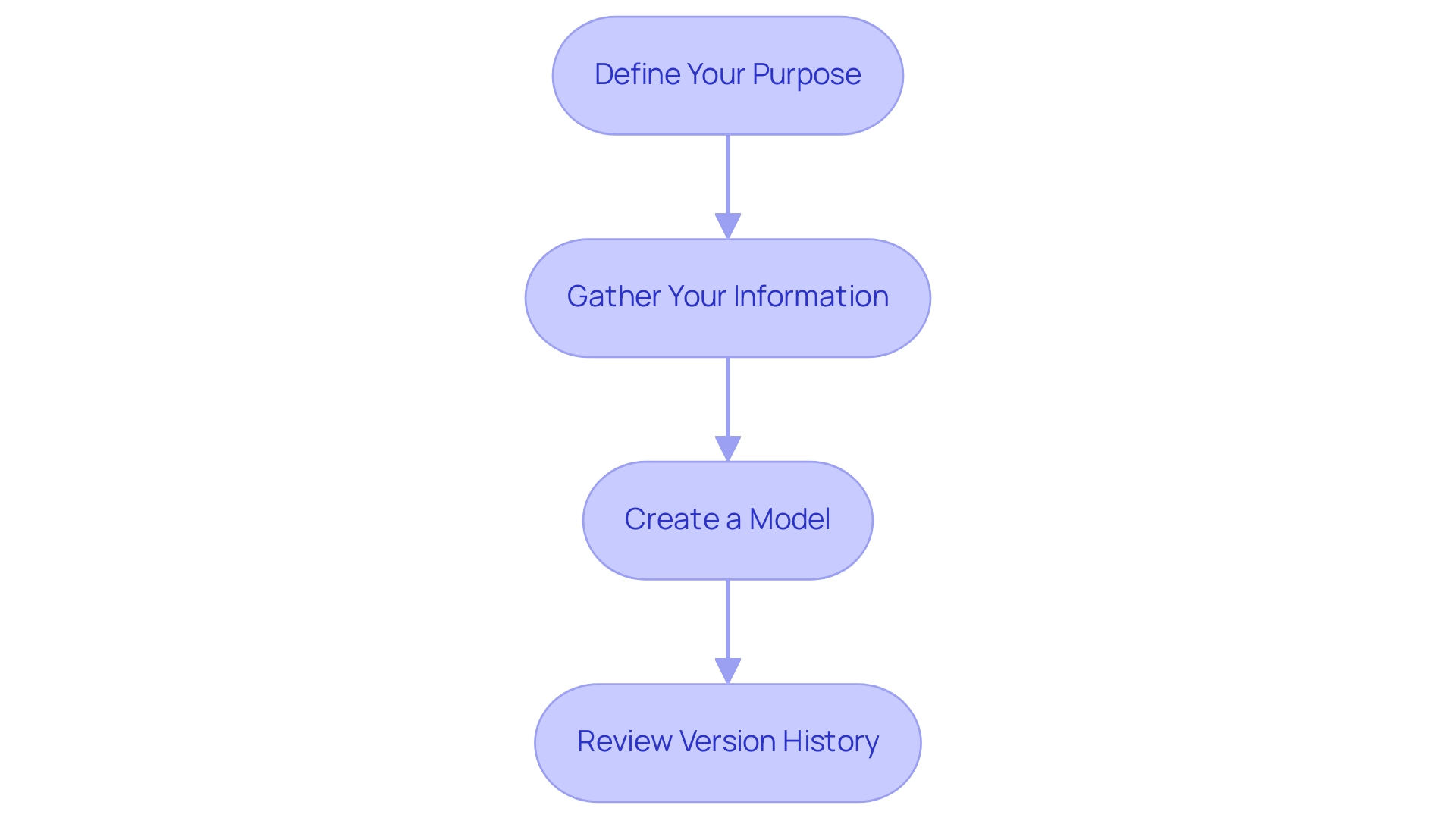
Define Your Purpose: Begin by pinpointing the core objective of your document. What particular understandings do you aim to convey? Creating this clarity will not only determine your information selection but also affect your visualization decisions, resulting in more effective presentations. This focus is essential in a data-rich environment where actionable insights are pivotal for driving growth and innovation.
-
Gather Your Information: Collect information from a variety of sources, ensuring its relevance to the report’s intent. The flexibility of BI enables connections to databases, Excel files, and online services, facilitating comprehensive integration and addressing common challenges such as inconsistencies.
Load Information into Power BI: Launch Power BI Desktop and utilize the ‘Get Information’ feature to import your selected sources. Prioritize information cleanliness and structure, as this is essential for effective reporting. Remember, the quality of your insights depends on the integrity of your data.
- Create a Model: If necessary, establish relationships between different tables. This modeling phase is vital for ensuring accurate reporting and insightful analysis, which is essential for understanding how to build Power BI reports and paving the way for informed decision-making that drives operational efficiency.
Start Learning How to Build Power BI Reports: With your information loaded and structured, initiate the report-building process by selecting a blank report page in Power BI Desktop. Incorporate features like bookmarks, drillthrough pages, and tooltips to streamline information presentation and enhance user interaction. Utilizing these features can significantly reduce the amount of data loaded on a page, improving performance and user experience. Furthermore, think about utilizing the ‘3-Day BI Sprint’ to swiftly generate professionally crafted documents, ensuring efficiency in your reporting process.
- Review Version History: Regularly review and utilize version history to track changes made to reports and dashboards. This practice not only aids in maintaining clarity but also ensures that all stakeholders are aligned with the latest updates. As you engage in this process, consider leveraging Power Automate to streamline workflows, enabling a risk-free ROI assessment and professional execution. Furthermore, automating repetitive tasks can enhance efficiency and employee morale, tackling staffing shortages and outdated systems.
As highlighted by statistical analysis enthusiast Douglas Rocha, > Even though one can assume it is the simplest of all statistical measures since it is only the most common value in the dataset, there isn’t a native DAX function to calculate it. This highlights the necessity of thoughtful planning and execution in your report-building journey. Furthermore, consider the significance of naming conventions for sources and datasets, as discussed in the case study, to document their origins clearly and maintain security without compromising sensitive information.
Furthermore, utilize the General Management App for comprehensive management and smart reviews to enhance your overall reporting strategy.
Selecting Data and Visualization Techniques for Impactful Reports
-
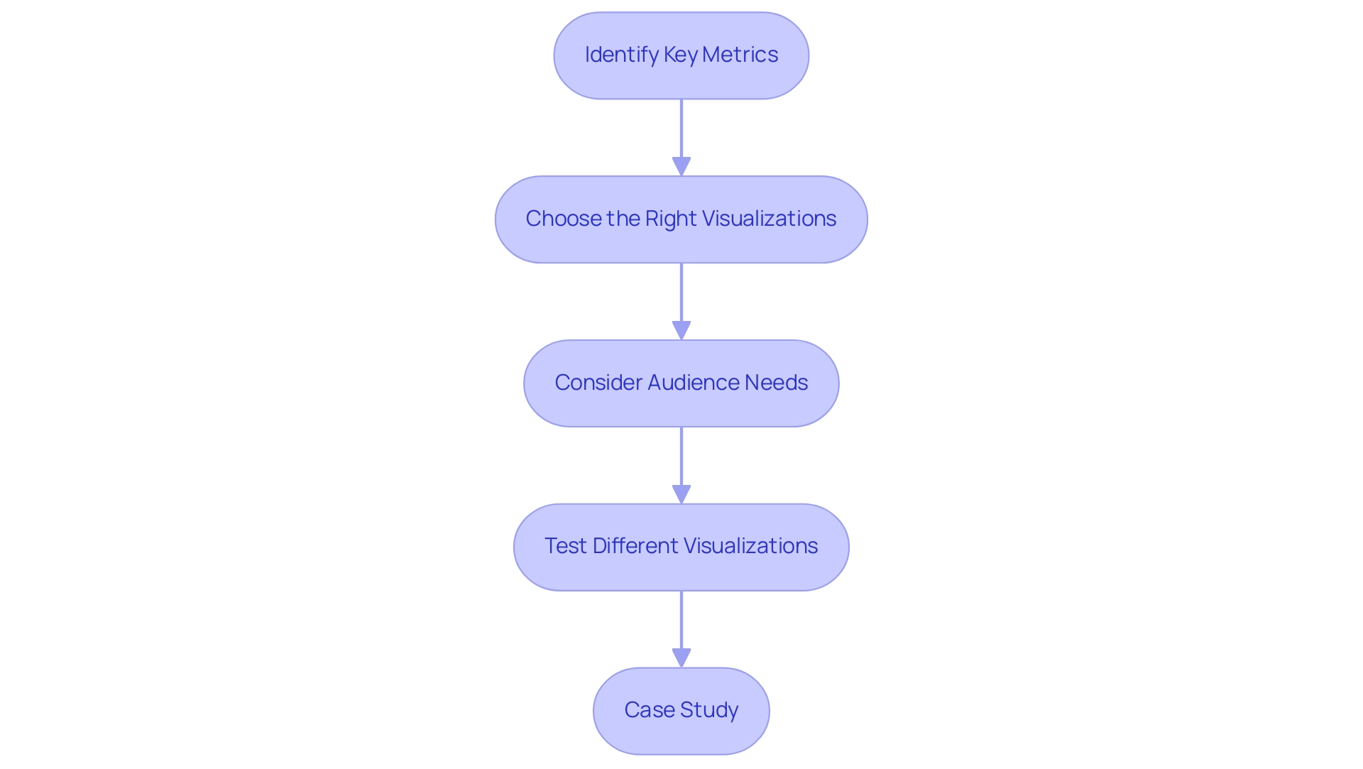
Identify Key Metrics: Start by pinpointing the metrics that are vital for your analysis. Focus on information that directly aligns with your report’s objectives, ensuring relevance and clarity in your presentation. As noted by Dmytro Chashnyk, companies that learn how to build Power BI reports typically see significant improvements, including a 29% increase in revenue and a 34% boost in sales team productivity, highlighting the importance of selecting impactful metrics.
-
Choose the Right Visualizations: Effectively represent your information by selecting the appropriate visualization types. For example, bar charts are ideal for comparisons, while line charts excel at illustrating trends over time. Pie charts effectively showcase parts of a whole, making it easier for stakeholders to grasp complex data at a glance.
-
Consider Audience Needs: Tailor your metric selection and visualizations to the specific needs of your audience. Consider what insights will be most valuable to them, enabling you to create a document that resonates and drives action. By concentrating on audience expectations, you can significantly enhance how to build Power BI reports for effectiveness and engagement.
-
Test Different Visualizations: Leverage Power BI’s flexibility by experimenting with various visualization types. This not only enables you to recognize which formats showcase your data most clearly and engagingly but also empowers you to enhance your documents continuously. Integrating Robotic Process Automation (RPA) can streamline the manual workflows associated with report generation, significantly reducing the time spent on how to build Power BI reports and updating dashboards while also minimizing errors. Real-time dashboards provide immediate insights, enhance operational efficiency, and enable continuous monitoring, offering a significant competitive advantage in today’s fast-paced environment.
-
Case Study: For instance, in the case of CellVerse Inc., understanding how to build Power BI reports for Metrics allowed for centralized monitoring of KPIs across departments, streamlining the tracking process and improving accountability among stakeholders. Furthermore, remember that the usage metrics document only encompasses documents or dashboards that have been accessed in the past 90 days, highlighting the significance of employing current information in your reporting. RPA not only tackles the issues of time-consuming document creation and inconsistencies but also improves the overall precision of your submissions.
Incorporating Visual Elements: Charts, Maps, and More
-
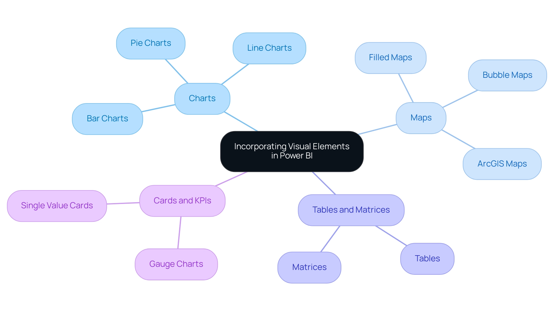
Add Charts: Power BI offers an array of chart types, such as bar, line, and pie charts, each tailored to specific data visualization needs. According to recent statistics, bar charts are the most frequently used visualizations, favored by 40% of document creators. However, are you spending more time creating documents than utilizing insights? To understand how to build Power BI reports efficiently, simply drag and drop the relevant fields into the visualizations pane. This functionality enables creators to choose the most effective tools for their narratives, enhancing the clarity and impact of the information presented. It’s important to note that a lack of governance strategy can lead to inconsistencies across reports. Therefore, visualizing information effectively is crucial to provide stakeholders with clear, actionable guidance. As noted in the industry, “In this article, we will explore in detail how to build Power BI reports, what makes BI the best business intelligence platform, highlight its biggest benefits and standout features, and help you decide whether it is the right choice for your business.”
-
Utilize Maps: For datasets that include geographical information, leveraging maps can significantly enrich your visual storytelling. Power BI accommodates various map types, including filled maps and bubble maps, which can effectively display location-based information. Recent advancements, such as the integration of ArcGIS maps, highlight the importance of this feature for comprehensive information analysis and representation, addressing the challenge of inconsistencies that often arise from a lack of governance.
-
Incorporate Tables and Matrices: When detailed information representation is required, tables and matrices are invaluable tools. They enable the presentation of multiple dimensions of information in a structured manner, allowing users to explore the intricacies of the content more deeply. As creators of documents explore various visual components, the adaptability of tables and matrices can play a vital role in effective presentation, ensuring that contents are not just filled with figures but also offer clear guidance on actionable insights.
-
Use Cards and KPIs: To emphasize key performance indicators (KPIs), consider utilizing cards that showcase single values prominently. Gauge charts, for example, show the current value of a point relative to a predetermined range, resembling a speedometer. This design choice not only draws attention to the most critical metrics but also enhances the overall visual hierarchy of your documents. By effectively highlighting KPIs, you can provide immediate insights into performance targets and results, transforming information into actionable guidance that addresses the confusion stakeholders may feel when reports lack clarity.
Enhancing Interactivity with Slicers and Filters
-
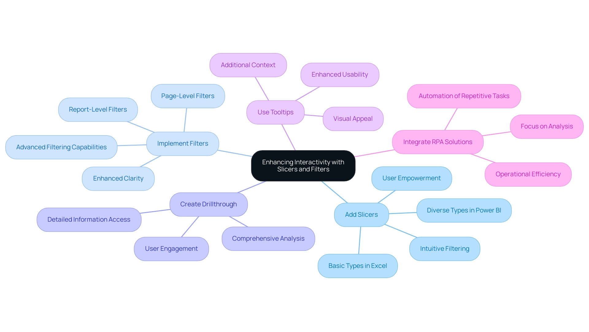
Add Slicers: Slicers serve as a powerful tool for enhancing user interaction with information. By simply dragging a field into the slicer visual, you create an intuitive filter that users can manipulate directly. This strategic integration of slicers empowers users to independently explore information, leading to informed decision-making. Based on industry knowledge, effective slicer implementation can greatly enhance user engagement by enabling simpler information navigation. Significantly, Power BI offers various slicer types that cater to complex structures, whereas Excel provides basic slicer types with limited formatting options. By integrating these features, businesses can leverage actionable insights to drive growth.
-
Implement Filters: Utilize report-level or page-level filters to refine the information displayed in your visualizations. This targeted approach not only sharpens the focus of your document but also enhances clarity, allowing users to concentrate on the most relevant information. As emphasized by Aashi Verma, filters are more suitable when you need precise control over what information is displayed across different levels of your report. This precision is critical in delivering actionable insights. The recent enhancement of advanced filtering capabilities in the filter pane allows for the selection of more than two values, providing users with greater flexibility, addressing the challenges of inconsistencies that can hinder effective BI utilization.
-
Create Drillthrough: Activate drillthrough functionality to enhance information exploration. This feature allows users to click on specific points and access detailed information on a separate page, thereby deepening their understanding of the context. The ability to drill through information enhances user engagement, allowing for a more comprehensive analysis of complex datasets. This capability is essential for overcoming the time-consuming nature of document creation while providing actionable guidance.
-
Use Tooltips: Customizing tooltips can significantly enhance user experience by providing additional context when users hover over data points. This functionality offers deeper insights without cluttering the report, making it easier for users to grasp key information at a glance. Utilizing well-crafted tooltips can enhance the usability and visual appeal of your dashboards, aligning with current best practices in BI. Additionally, implementing best practices for customizing slicers in Excel, such as organized arrangement and consistent design, can further enhance user interaction and visual appeal in BI, ultimately driving operational efficiency and business growth.
-
Integrate RPA Solutions: Consider incorporating Robotic Process Automation (RPA) tools like EMMA RPA and Power Automate alongside Power BI. These solutions can automate repetitive tasks, reduce staffing shortages, and enhance operational efficiency. By optimizing information gathering and document creation processes, RPA can reduce the strain of task repetition fatigue, enabling teams to concentrate on analysis and strategic decision-making.
Finalizing and Sharing Your Power BI Reports
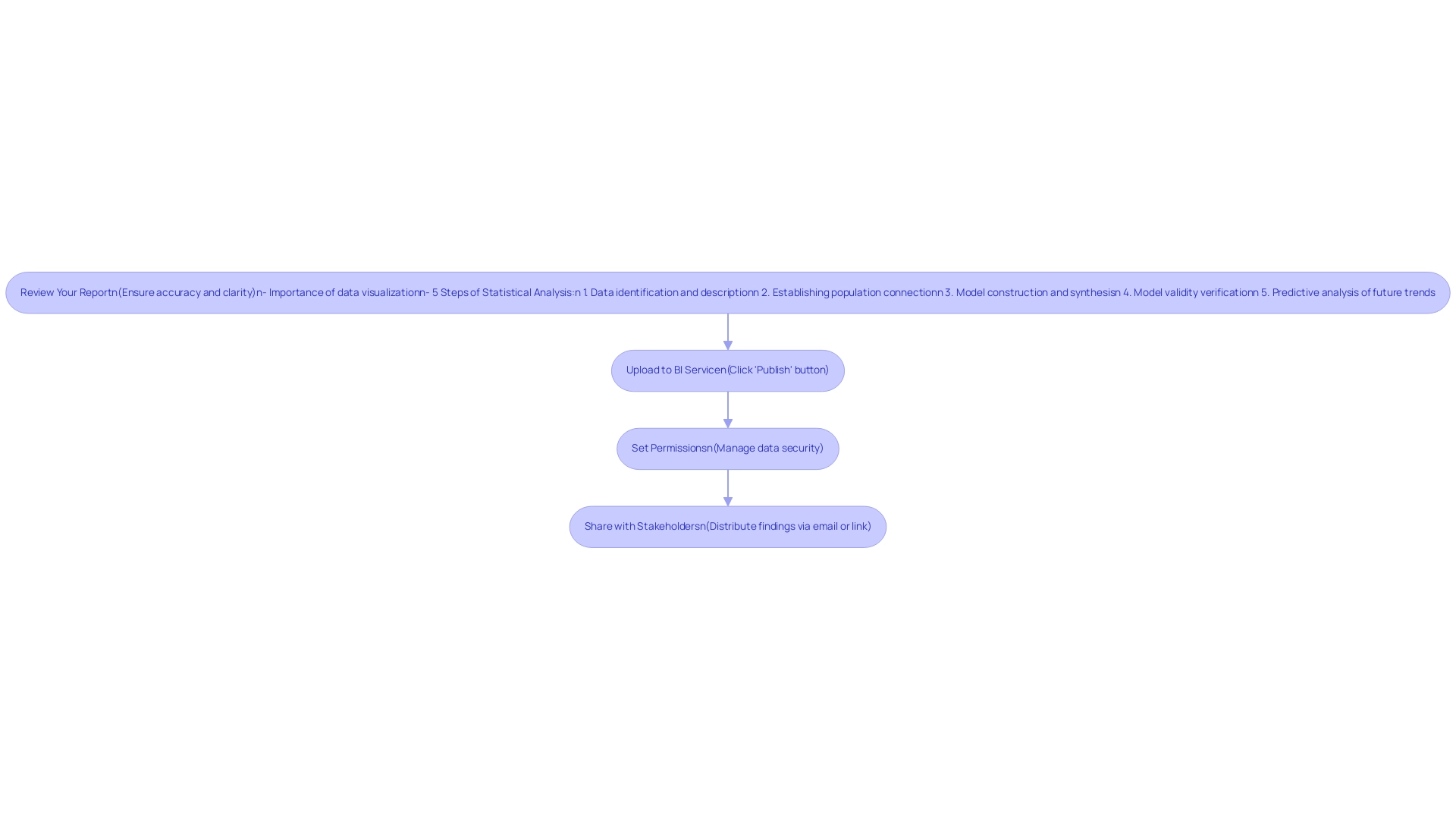
- Review Your Report: Before sharing, conduct a meticulous review of your report to ensure both accuracy and clarity. Verify that all visuals accurately depict the information, as this foundational step significantly impacts the effectiveness of your insights. As Vika Smilansky, Director of Product Marketing, emphasizes,
Data visualization allows you to convey complex information in a way that is easy to understand and interpret, which is crucial for facilitating stakeholder engagement.
Remember, a good analyst spends around 70-90% of their time cleaning information, highlighting the significance of this stage in learning how to build Power BI reports and ensuring accuracy while overcoming challenges related to inconsistent information.
To further enhance the review process, consider the five steps of the statistical analysis process:
1. Data identification and description
2. Establishing population connection
3. Model construction and synthesis
4. Model validity verification
5. Predictive analysis of future trends
Incorporating these steps will help ensure that your understanding of how to build Power BI reports results in a report that is not only accurate but also insightful, enabling informed decision-making that drives growth and innovation.
Referencing the case study titled ‘Statistical Analysis for Organizational Insights,’ we see how statistical analysis offers organizations understanding of customer behavior and operational efficiency. This practical application reinforces the importance of thorough analysis in decision-making and highlights how to build Power BI reports that transform raw data into actionable insights.
-
Upload to BI Service: To make your document accessible online, click the ‘Publish’ button in BI Desktop. This action transfers your document to the BI service, facilitating wider accessibility and collaboration, essential for addressing technology implementation challenges.
-
Set Permissions: After publishing, it is vital to configure permissions meticulously. This enables you to manage who can view or modify the document, thereby upholding data security and ensuring that sensitive information is protected.
-
Share with Stakeholders: Utilize the sharing features available in BI to distribute your findings effectively to relevant stakeholders. You can choose to share via email or generate a link for easier access.
Ensure that stakeholders are familiar with how to build Power BI reports, as well as how to navigate and interact with them, fostering an environment where data-driven decisions can thrive, ultimately enhancing efficiency with RPA solutions. Automating repetitive tasks through tools like EMMA RPA and Power Automate can further streamline workflows, allowing your team to focus on strategic initiatives.
Conclusion
Transforming raw data into actionable insights through Power BI is not just a technical skill; it’s a strategic imperative for any organization aiming for operational excellence. By following the essential steps outlined—from defining the report’s purpose to enhancing interactivity with slicers and filters—users can create impactful reports that resonate with stakeholders and drive informed decision-making.
The importance of selecting the right metrics and visualizations cannot be overstated. Tailoring these elements to meet audience needs ensures that reports are not only informative but also engaging. Incorporating diverse visual elements, such as charts, maps, and KPIs, further enriches the narrative, making complex data accessible and actionable.
Finally, the process of finalizing and sharing reports is critical to fostering a culture of transparency and collaboration. By reviewing reports meticulously and leveraging tools like Power Automate for automation, organizations can enhance efficiency and accuracy in their reporting processes. As businesses increasingly rely on data-driven strategies, mastering Power BI becomes an essential component in achieving strategic objectives and maintaining a competitive edge in today’s fast-paced environment. Embracing these practices will empower teams to harness the full potential of their data, paving the way for sustained growth and innovation.

