Overview:
Power BI matrix visualizations are crucial for organizing and analyzing complex datasets, allowing users to make meaningful comparisons and derive actionable insights. The article highlights their effectiveness in enhancing clarity through features like expand/collapse functionality and advanced techniques such as conditional formatting and dynamic titles, which collectively improve user engagement and facilitate informed decision-making.
Introduction
In the realm of data visualization, Power BI matrix visualizations stand out as a critical tool for Directors of Operations Efficiency seeking to transform complex datasets into clear, actionable insights. By structuring data into an easily navigable grid format, these visuals empower users to uncover trends and make comparisons that might otherwise remain hidden.
As organizations grapple with the challenges of report creation and data consistency, harnessing the full potential of matrix visuals becomes essential. This article delves into the intricacies of Power BI matrix visualizations, offering a comprehensive guide on their creation, advanced techniques for optimization, and best practices to avoid common pitfalls.
With a focus on integrating innovative features, this exploration aims to equip professionals with the knowledge needed to elevate their data storytelling and drive informed decision-making in a fast-paced, data-driven environment.
Understanding Power BI Matrix Visualizations
Power BI matrix visualization is essential for showcasing information in a structured format, enabling Directors of Operations Efficiency to make significant comparisons across different dimensions effortlessly. Their design excels in summarizing extensive datasets and uncovering hidden trends that traditional visualizations may overlook. By organizing information into rows and columns, the Power BI matrix visualization enhances clarity through the ability to expand and collapse details, significantly bolstering narrative expression.
This capability not only assists in deriving actionable insights from complex datasets but also addresses common challenges such as time-consuming report creation and inconsistencies. Furthermore, integrating RPA solutions like EMMA RPA and Automate can streamline these processes, helping to mitigate staffing shortages and outdated systems that often hinder operational efficiency. As Douglas Rocha aptly states,
Last but definitely not least is the Mode,
emphasizing the pivotal role that Power BI matrix visualization plays in effective information analysis.
Moreover, the new usage report in Power BI provides detailed, user-specific metrics that offer deeper insights into the performance of these visualizations in real-world applications. Each report automatically creates a Usage Metrics Report semantic model that refreshes daily, ensuring real-time analysis capabilities are at users’ fingertips. A practical illustration of this can be found in the ‘Active Reports and Viewer Statistics’ case study, which tracks active reports across the workspace, revealing total views and identifying underutilized reports.
As companies place greater emphasis on Environmental, Social, and Governance (ESG) reporting, mastering storytelling through matrix visuals, alongside RPA tools, becomes essential for driving informed decision-making in today’s analytics-driven landscape.
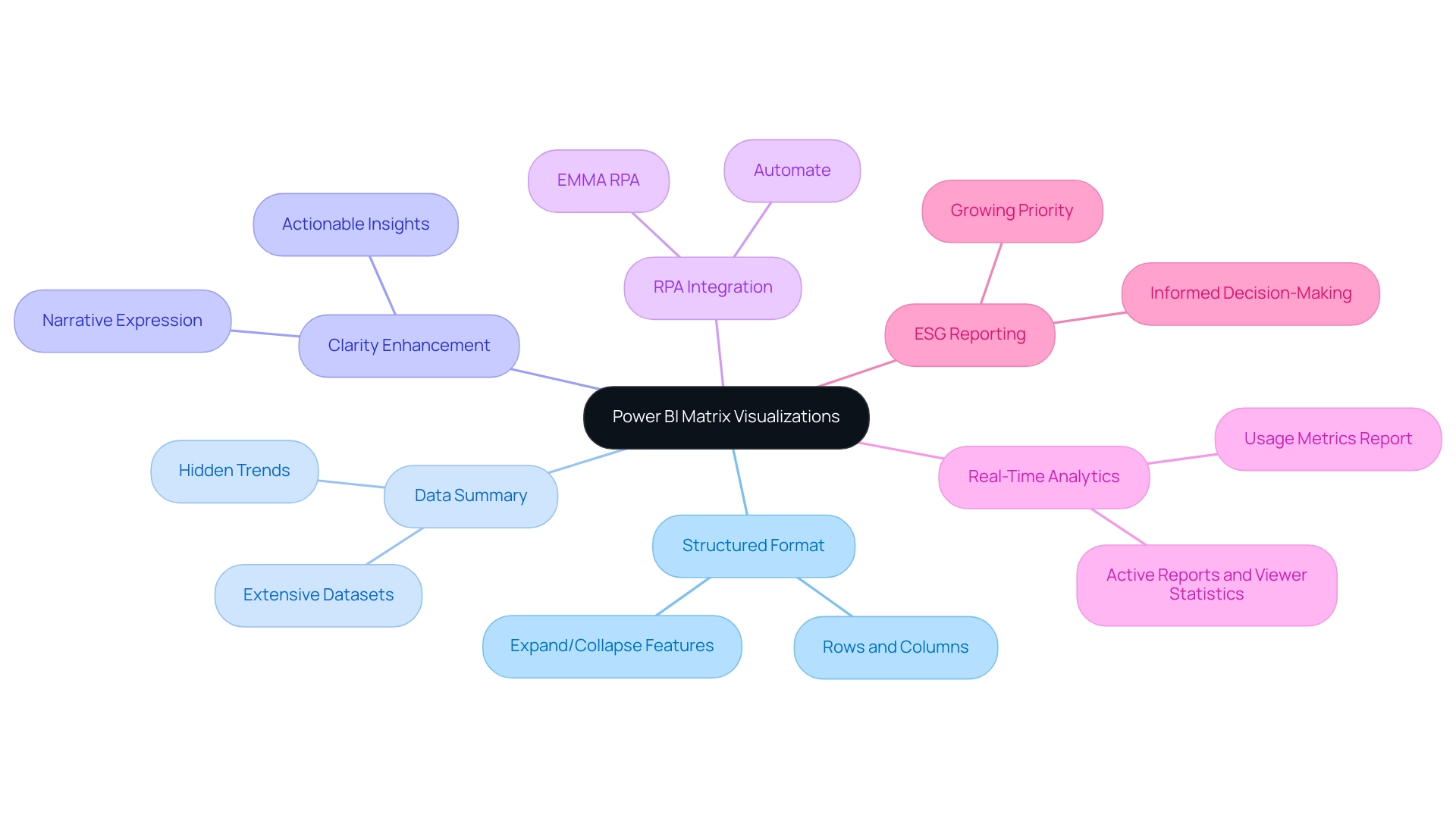
Step-by-Step Guide to Creating a Matrix Visual in Power BI
- Open BI Desktop: Start by launching the BI Desktop application, your canvas for information transformation.
- Load Your Data: Import the dataset you wish to analyze. Click on ‘Get Data’ and choose your information source to import your details into the Power BI environment.
- Select the Table Visual: Within the ‘Visualizations’ pane, click on the ‘Table’ icon to initiate the creation of your table visual, a powerful tool for addressing common reporting challenges.
- Add Fields: Drag and drop the relevant fields from the ‘Fields’ pane into the Rows, Columns, and Values areas of the visual representation, organizing your information for insightful analysis. This step helps mitigate inconsistencies, which can often stem from a lack of governance strategy, by ensuring that all relevant information is cohesively presented in the power bi matrix visualization.
- Customize the Visual: Utilize the ‘Format’ pane to refine your table. Adjust settings such as font size, grid lines, and colors to enhance readability and make your information visually appealing. For instance, as emphasized in a recent case study, users can modify font sizes, colors, and header styles to personalize their visuals, significantly enhancing clarity and presentation. This customization of the power bi matrix visualization not only enhances visual appeal but also supports actionable insights, enabling stakeholders to easily interpret the information and make informed decisions.
- Save Your Report: After fine-tuning your data to your satisfaction, save your report by clicking on ‘File’ and then ‘Save’. By diligently following these steps, you will create a visual representation that not only presents your information effectively but also captivates your audience with its clarity and design. Remember, before you go, sign up for my free BI course, which has over 100,000 students, to further enhance your skills and tackle the challenges of report creation with confidence and a strategic approach!
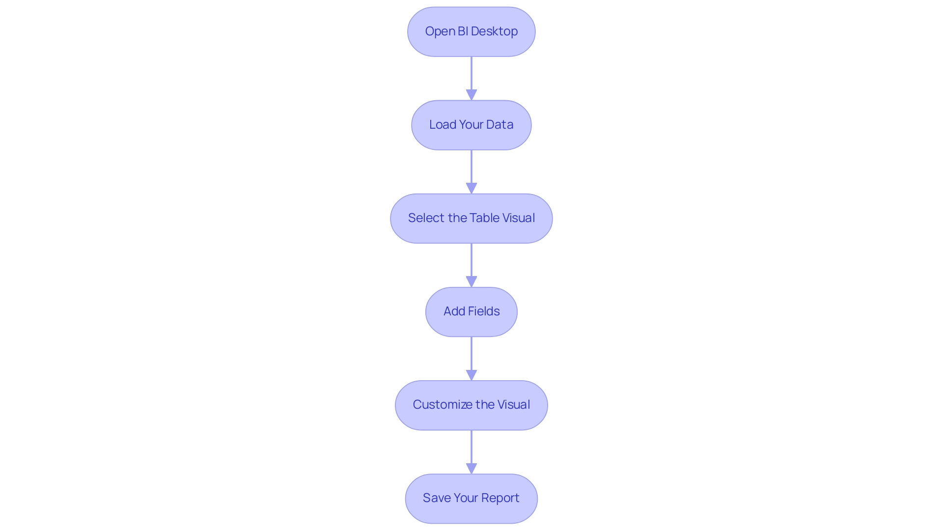
Advanced Techniques for Power BI Matrix Visuals
To genuinely enhance your Power BI table visual and address frequent challenges such as time-consuming report creation, inconsistencies, and a lack of governance strategy, consider implementing these advanced techniques:
-
Conditional Formatting: This powerful feature allows you to highlight key values or trends directly within your table. By selecting your matrix and navigating to the ‘Format’ pane, you can easily configure the ‘Conditional Formatting’ options. Employing this strategy not only attracts focus to essential information points but also boosts overall interpretation, making trends more apparent and actionable, which is vital for rebuilding confidence in your information.
-
Using Hierarchies: Introducing information hierarchies can significantly enhance experience by enabling detailed drill-down capabilities. Simply drag a relevant field into the Rows or Columns section to establish a hierarchy. This method encourages individuals to investigate information at different levels, promoting deeper insights and interaction, thus fulfilling the requirement for clearer guidance.
-
Dynamic Titles: Enhance engagement further by employing DAX functions to create dynamic titles that adapt based on selections within the report. This personalization not only enhances the visual experience but also communicates relevant context, assisting individuals in comprehending the current emphasis of their analysis, which can reduce confusion arising from prior reports.
-
Utilizing Slicers: Incorporating slicers into your visual representations allows individuals to filter information in real-time, boosting interactivity. By incorporating slicers for key fields, individuals can adjust the information shown in the table, facilitating a focus on particular segments of interest, thereby enhancing the guidance offered by your reports.
In accordance with best practices, Xiaoxin Sheng suggests,
Perhaps you can consider relocating the currency fields to row fields instead of column fields. Then, the power bi matrix visualization will group your records based on company and currency fields. This strategic adjustment not only arranges your information more effectively but also facilitates users in deriving insights.
Additionally, Jain’s recent observations highlight the significance of improving visual representations to impress clients and reveal actionable insights. By implementing these techniques, you will not only enhance the functionality of your visuals but also create a more engaging and informative experience for your audience. Furthermore, these strategies can help mitigate the confusion and mistrust that often arise from inconsistent data and lack of governance, ultimately addressing the prevalent challenges in leveraging insights from BI dashboards.
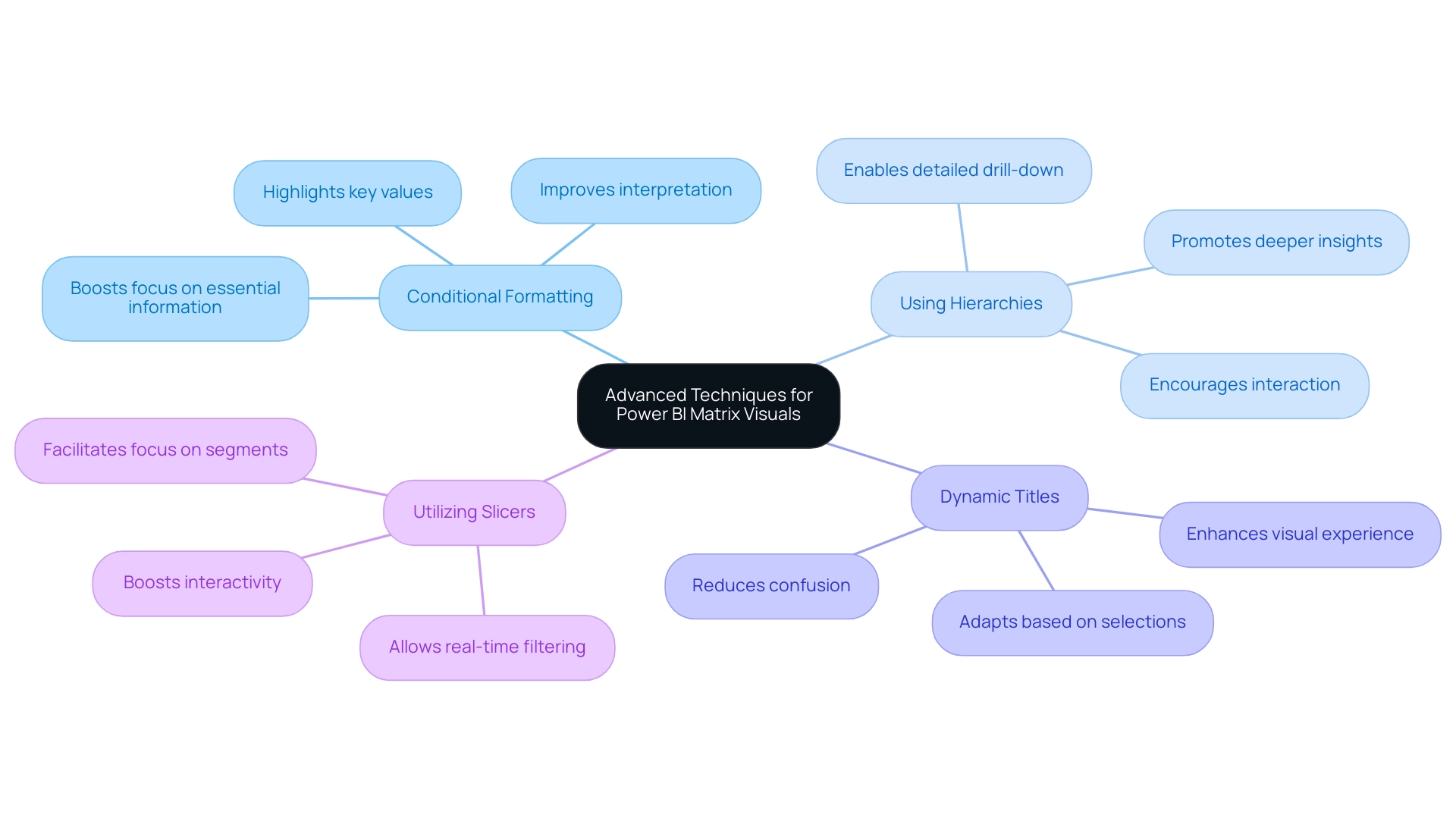
Common Pitfalls and Best Practices in Matrix Visualization
Creating impactful Power BI matrix visualizations requires a thoughtful approach to avoid common pitfalls. Here are some essential best practices to enhance clarity and effectiveness:
- Avoid Overloading with Data: It’s crucial to avoid cluttering the matrix with excessive information. Focus on key metrics that convey the most important insights.
Overwhelming charts with excessive information can hinder understanding, making it difficult for users to discern the most relevant details, especially in an information-rich environment where extracting meaningful insights is vital for maintaining a competitive edge.
-
Prioritize Formatting: Proper formatting is key to enhancing readability. Utilize appropriate font sizes and contrasting colors to distinguish between points. As Edward Tufte, known as the ‘Galileo of graphics,’ aptly stated,
Graphical excellence is that which gives to the viewer the greatest number of ideas in the shortest time with the least ink in the smallest space.
This principle underscores the need for clarity in your visual representations. Additionally, incorrect labeling and using scales that do not accurately reflect information can lead to confusion, further emphasizing the importance of careful formatting. Implementing RPA solutions like EMMA RPA can streamline the report generation process, reducing errors and freeing up time for more strategic analysis. Power Automate can also facilitate efficient information integration and automation, enhancing overall operational efficiency. -
Enhance User Experience: Always consider your audience when designing visuals. An intuitive and easily navigable framework can greatly enhance the user experience. Pay attention to labeling and ensure that scales accurately represent the information, as neglecting these aspects can lead to misinterpretation. Utilizing customized AI solutions together with BI can assist in overcoming frequent challenges like inconsistencies and absence of actionable guidance, ultimately promoting informed decision-making.
By following these best practices, you can create Power BI matrix visualizations that effectively convey insights and significantly engage your audience. It is essential to remain vigilant against the manipulation of information through misleading visualizations, as illustrated in Becca Cudmore’s work, Five Ways to Lie with Charts. This case study serves as a cautionary reminder of how information can be misrepresented, urging professionals to critically evaluate their visualizations to uphold ethical representation and facilitate accurate understanding.
With a following of 2.6K on this platform, it is crucial to maintain integrity in information presentation. To learn more about how EMMA RPA and Automate can enhance your reporting processes, book a free consultation today.
Integrating Matrix Visuals with Other Power BI Features
To enhance your visual representation in Power BI and fully utilize the insights from your information, combining it with complementary features is crucial for a more interactive and engaging experience. Here are essential strategies to consider:
-
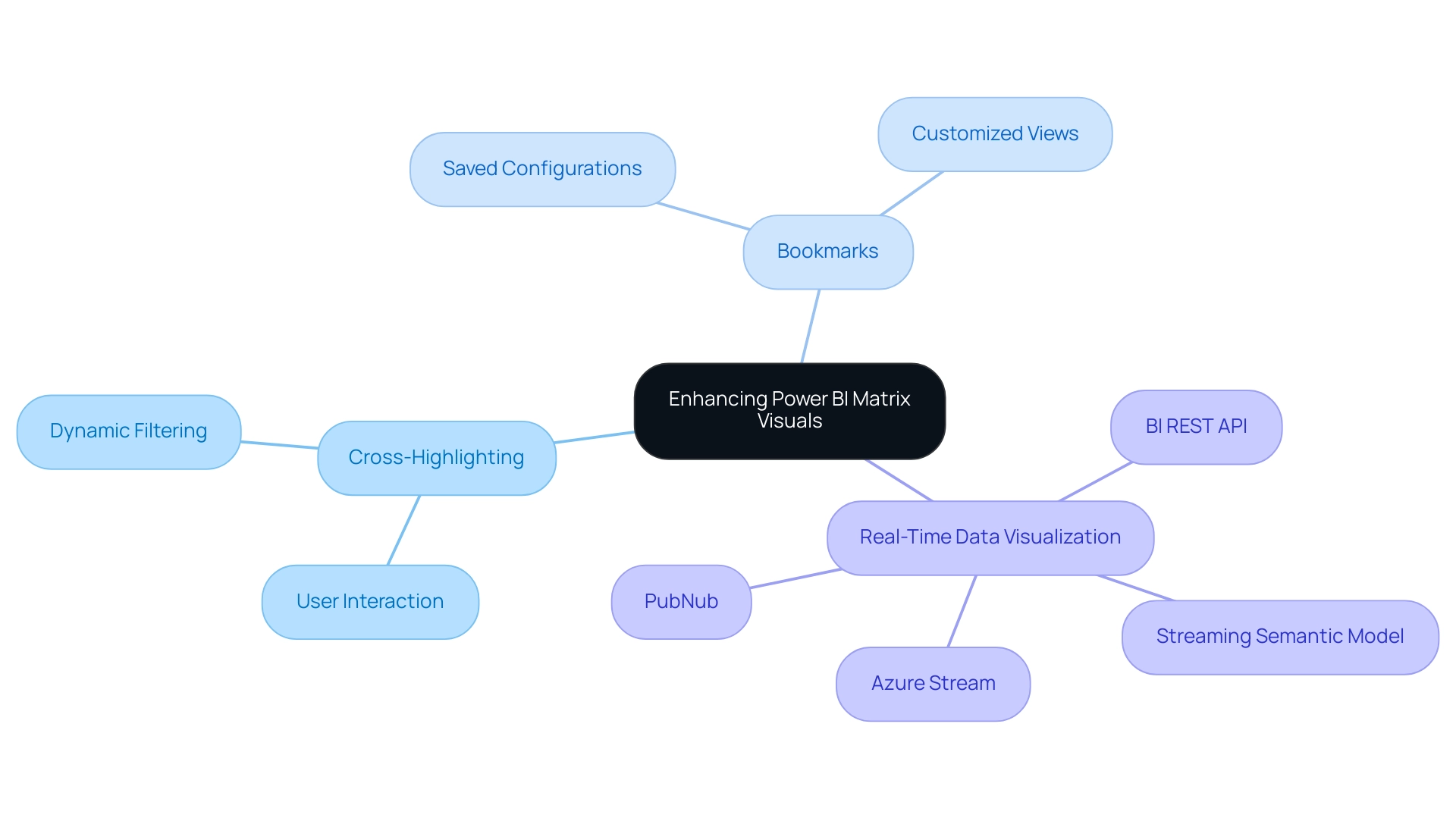
Cross-Highlighting: Activating cross-highlighting allows individuals to filter information interactively across various visuals by simply selecting points within the grid. This dynamic interaction not only boosts participant engagement but also enables deeper understanding of the information. Recent statistics show that interaction rates with cross-highlighting greatly enhance information interpretation, making it an essential feature for effective analysis. Incorporating value bars within your visual representation provides an immediate visual depiction of values, offering quick insights at a glance. This feature can be activated through the ‘Conditional Formatting’ options, making it a straightforward enhancement that adds depth to your information representation.
-
Bookmarks: Utilize bookmarks to save specific configurations of your matrix visual, allowing individuals to toggle between various perspectives effortlessly. This feature simplifies the experience by offering customized views that address particular analytical requirements.
Furthermore, it’s essential to guarantee the promptness of your information. For instance, information in a streaming semantic model will clear itself after 1 hour, emphasizing the need for real-time information visualization. Developing a streaming semantic model can be achieved through the BI REST API, Azure Stream, or PubNub, facilitating the visualization of real-time data.
Furthermore, the effectiveness of the Power BI matrix visualization significantly relies on the individual’s familiarity with its features, including adding multiple columns and applying various formatting options. As highlighted in the case study titled ‘Effective Use of Power BI Matrix Visualization in Business Intelligence,’ users are encouraged to explore the capabilities of Power BI matrix visualization to enhance data visualization and improve audience interpretation of findings.
By leveraging these integrations, you can transform your Power BI matrix visualization into a compelling storytelling tool that not only conveys information effectively but also invites user interaction and exploration. As you embark on this journey, consider our 3-Day BI Sprint, where we promise to create a fully functional, professionally designed report tailored to your needs. This experience not only enhances your understanding of Power BI features but also equips you with the skills to utilize insights effectively.
As BI Engineer Denys Arkharov aptly noted, effective data visualization is pivotal in interpreting findings and decision-making processes. Therefore, mastering these features will significantly enhance your matrix’s impact and utility, thus driving operational efficiency and supporting informed decision-making.
Conclusion
Harnessing the power of Power BI matrix visualizations is key to transforming complex datasets into clear, actionable insights. By utilizing these structured grid formats, Directors of Operations Efficiency can effortlessly summarize data, uncover hidden trends, and enhance their data storytelling capabilities. The step-by-step guide provided serves as an essential roadmap for creating effective matrix visuals, ensuring clarity and engagement from the outset.
Advanced techniques such as:
- Conditional formatting
- Data hierarchies
- Dynamic titles
further elevate the functionality of matrix visuals, allowing users to interact with and explore their data in meaningful ways. By avoiding common pitfalls and adhering to best practices, organizations can enhance the clarity and effectiveness of their visualizations, ultimately driving better decision-making processes.
Integrating matrix visuals with other Power BI features, such as:
- Cross-highlighting
- Data bars
transforms data representation into a dynamic storytelling tool. This approach not only improves user engagement but also fosters a deeper understanding of complex data sets. As organizations continue to navigate the challenges of data consistency and reporting efficiency, mastering Power BI matrix visualizations will be crucial for informed decision-making and operational success. Embracing these strategies equips professionals to lead in a data-driven landscape, turning insights into impactful actions that propel their organizations forward.