Overview
To create a bell curve in Power BI, one must prepare the data, calculate the mean and standard deviation using DAX functions, and then visualize the distribution through a line chart. The article outlines these steps while emphasizing the importance of statistical accuracy and data integrity to ensure meaningful insights and effective decision-making in business intelligence applications.
Introduction
In the realm of data analysis, the bell curve emerges as a vital instrument that not only simplifies complex information but also enhances strategic decision-making. As organizations grapple with the intricacies of data distribution in an increasingly automated landscape, understanding the significance of the normal distribution becomes paramount.
This article delves into the mechanics of creating a bell curve in Power BI, illustrating step-by-step how to leverage this powerful visualization tool to transform raw data into actionable insights. From identifying key statistical functions to troubleshooting common pitfalls, readers will discover practical strategies to harness the bell curve’s full potential, driving operational efficiency and informed decision-making in their organizations.
With the integration of Robotic Process Automation (RPA), the journey towards data mastery becomes even more achievable, empowering teams to focus on analysis rather than mundane data handling.
Understanding the Bell Curve: Definition and Importance
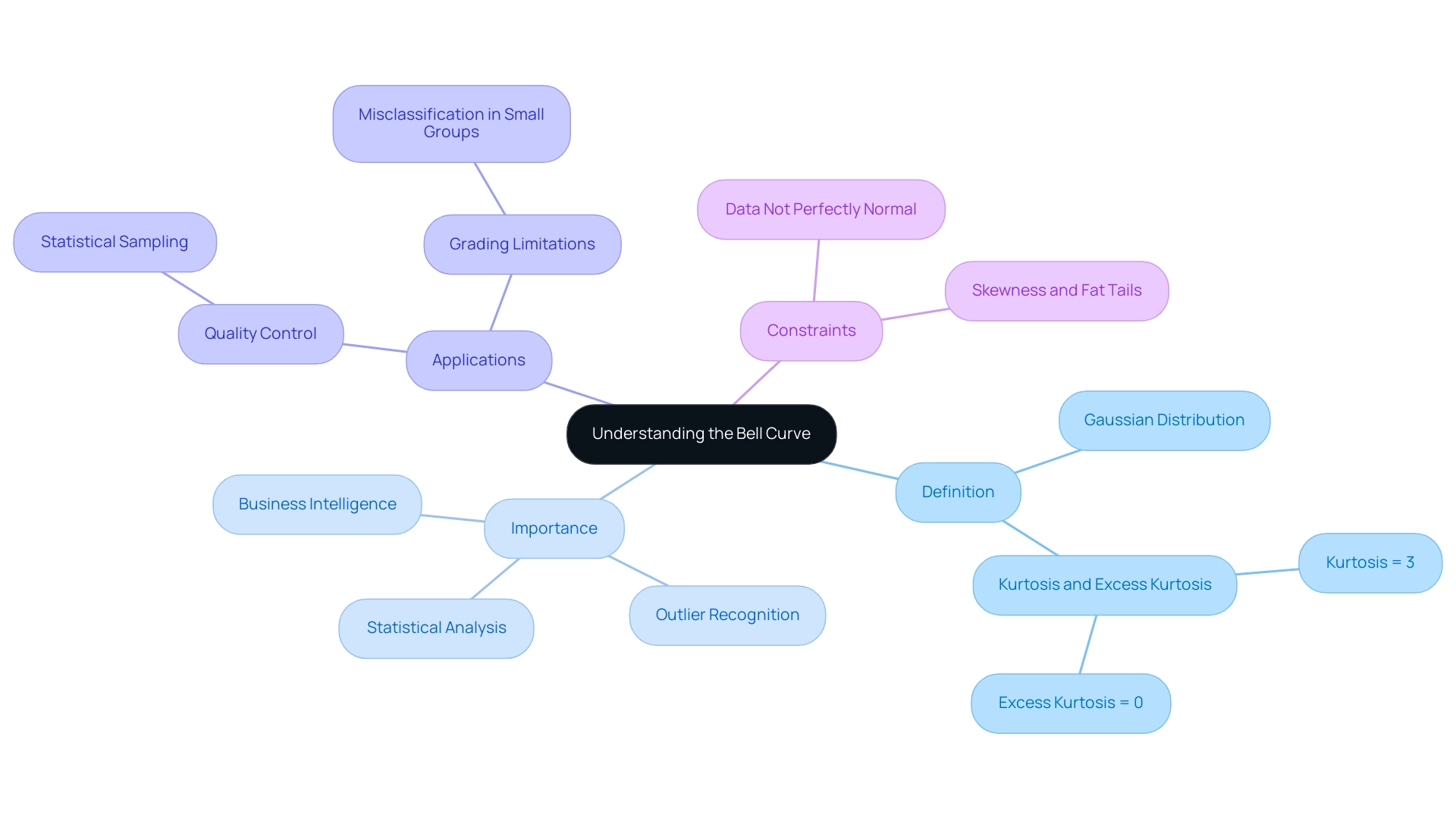
The Gaussian distribution, or normal distribution, acts as an essential tool in statistical analysis, visually demonstrating how values group around a central average. Its characteristic shape peaks at the mean, median, and mode, providing valuable insights into trends and enhancing Business Intelligence efforts. In the setting of a dominant AI environment, comprehending the distribution pattern can assist companies in maneuvering through different choices by offering insight on information allocation.
Notably, a normal distribution has a kurtosis of 3, with an excess kurtosis of 0, essential for understanding the distribution’s shape and behavior. One of the most persuasive reasons to comprehend the distribution is its function in recognizing outliers and enabling informed decision-making grounded in solid statistical analysis. In fact, approximately 99.7% of points fall within three standard deviations of the mean, underscoring its relevance in various applications, especially when addressing challenges like time-consuming report creation and inconsistencies often encountered in Power BI dashboards.
Unlocking the power of Business Intelligence to transform raw data into actionable insights is vital, and creating a distribution visualization within Power BI enables analysts to clearly see the spread of data points, empowering them to extract improved insights for strategic planning. As noted by industry expert Julie Bang, ‘The high performers and the lowest performers are represented on either side with the dropping slope,’ emphasizing how this statistical tool can highlight performance variations. Additionally, recent research shows that the distribution remains crucial in quality control processes, such as in metal fabrication, where statistical sampling aids in estimating population traits from smaller subsets, enhancing operations’ feasibility and cost-effectiveness.
Comprehending the constraints of utilizing a normal distribution is similarly important. For instance, using the bell curve power bi for grading can misclassify individuals, particularly in smaller groups where information often isn’t perfectly normal. This can push all individuals into average categories despite varying performance levels, as highlighted in the case study titled ‘Limitations of a Bell Curve Power BI Analysis.’
This insight underscores the necessity of integrating normal distribution principles into data-driven decision-making in business, particularly in leveraging BI and RPA to enhance operational efficiency and drive growth.
Step-by-Step Guide to Creating a Bell Curve in Power BI
-
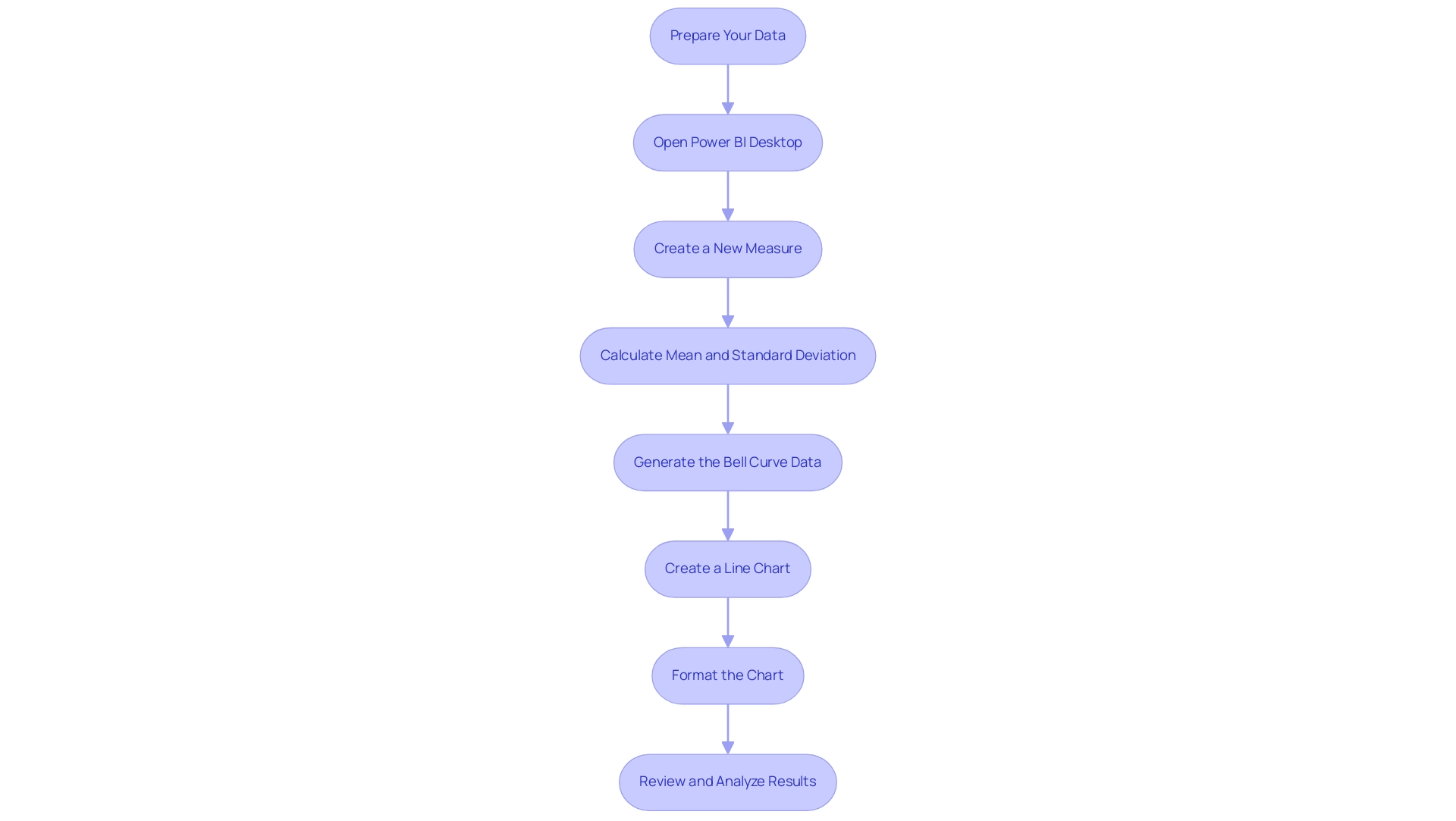
Prepare Your Data: Begin by ensuring your dataset is clean and organized. A numerical column is essential for analysis, so check for any inconsistencies or missing values. This foundational step is crucial to avoid the common challenge of inconsistencies that can undermine your insights.
-
Open Power BI Desktop: Launch Power BI Desktop and import your cleaned dataset to set the stage for your analysis. This is where Business Intelligence tools can convert your raw information into actionable insights.
-
Create a New Measure: Navigate to the ‘Modeling’ tab and select ‘New Measure’. This step is crucial as it allows you to calculate the mean and standard deviation for your dataset, empowering you to derive significant statistics.
-
Calculate Mean and Standard Deviation: Use DAX formulas to derive these statistical measures. For instance:
- Mean:
Mean = AVERAGE(YourTable[YourColumn]) -
Standard Deviation:
StdDev = STDEV.P(YourTable[YourColumn]) -
Generate the Bell Curve Power BI Data: Formulate another table that captures a range of values surrounding the mean. Employ the NORM.DIST function to calculate the distribution values related to these points, which is essential in illustrating the information distribution and providing clarity within intricate datasets.
-
Create a Line Chart: Select the line chart visualization option and plot your data against the established range of values, effectively transforming your statistical measures into a visual representation. This visual clarity is essential to combat the issue of reports filled with numbers but lacking actionable guidance.
-
Format the Chart: Enhance your chart’s clarity by customizing it with appropriate labels, titles, and color schemes. A well-organized chart not only enhances readability but also facilitates effective communication of findings, countering the prevalent confusion arising from poorly presented data.
After constructing your bell curve power bi, it is important to take the time to review and analyze the results. This step is essential for extracting meaningful insights from your information distribution, enabling you to recognize trends and outliers. As you analyze, consider how Robotic Process Automation (RPA) can streamline information collection and reporting processes, enhancing operational efficiency and decreasing the time spent on report creation. Pay special attention to outliers, such as the statistic regarding cars sold for over 180 thousand Reais, as these can significantly affect your interpretation and the overall distribution visualization. By addressing these steps and challenges, you empower your organization to leverage insights effectively, driving growth and operational efficiency.
Utilizing DAX and Statistical Functions for Bell Curve Creation
To effectively create a bell curve in Power BI, several DAX functions are essential for accurate data representation, which directly support your goals of enhancing operational efficiency and leveraging Business Intelligence:
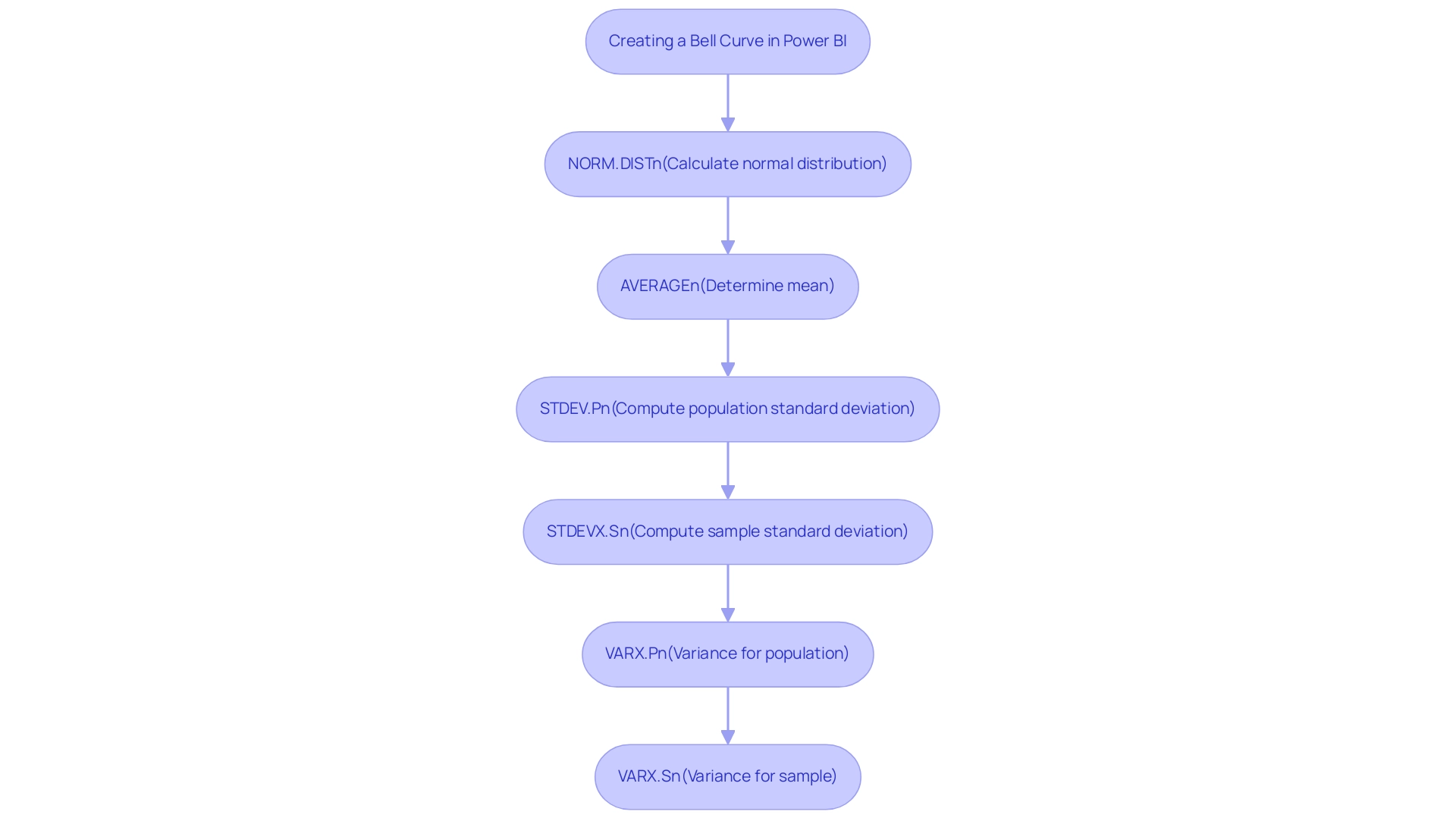
- NORM.DIST: This crucial function calculates the normal distribution for a specified mean and standard deviation, utilizing the syntax:
NORM.DIST(x, mean, standard_dev, cumulative). Mastering this function allows you to visualize the probability of a dataset falling within a specific range, a key aspect of statistical analysis that empowers informed decision-making. - AVERAGE: Employ this function to determine the mean of your dataset. The average serves as the focal point of the distribution, offering a basis for your analysis.
- STDEV.P: This function computes the population standard deviation, a vital component that influences the width of your bell curve. Understanding population variance is critical for accurate visualizations.
Additionally, consider using STDEVX.S for sample standard deviation and VARX.P and VARX.S for variance calculations, which can further enhance your statistical analysis. However, many businesses encounter challenges in leveraging insights from Power BI dashboards, such as time-consuming report creation and inconsistencies in information. This is where Robotic Process Automation (RPA) solutions can play a pivotal role.
By automating repetitive tasks and streamlining information processes, RPA enhances operational efficiency, allowing teams to focus on analysis rather than entry. When merged, these functions produce the essential points for your bell curve Power BI visualization, which facilitates precise statistical analysis and enables improved decision-making. The recent advancements in DAX for information visualization in 2024 have further refined these tools, making it more straightforward to implement complex statistical measures.
As noted by Walter Shields, an expert in analytics, ‘the integration of these functions opens new avenues for interpretation and visualization, empowering users to leverage analytics effectively.’ Furthermore, a case study titled ‘Visualizing Statistical Measures‘ illustrates the challenges of visualizing percentiles and quartiles in Power BI, highlighting the importance of using DAX functions to overcome limitations in built-in summaries. This practical insight emphasizes the importance of mastering these statistical tools for effective visualization, ultimately driving business growth.
Troubleshooting Common Issues in Bell Curve Creation
-
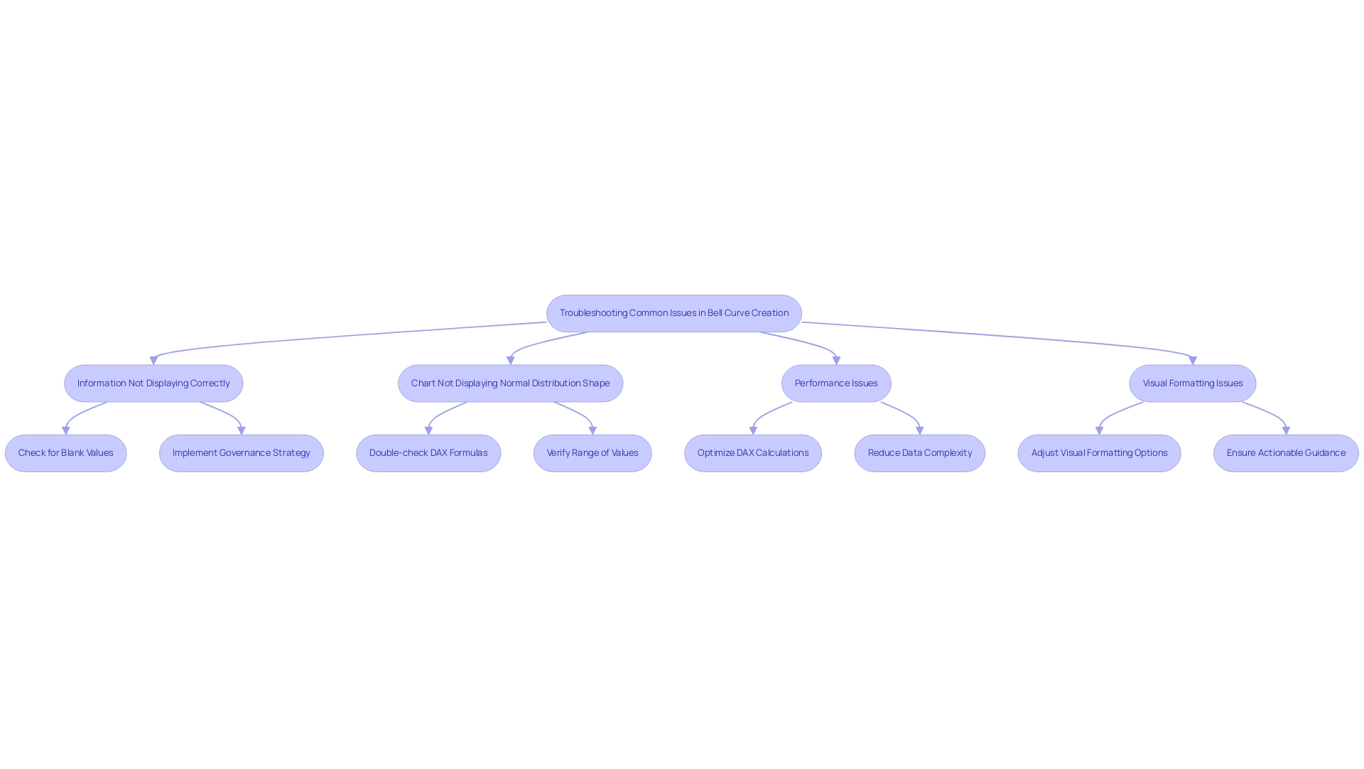
Information Not Displaying Correctly: The basis of effective visualization lies in integrity. Begin by ensuring that your numerical columns are free from blank or erroneous values, as these can significantly impact your visual outputs. Poor master information quality can lead to inconsistent results, making it vital to address this issue upfront. Additionally, implementing a governance strategy can help maintain data consistency across reports. Remember that statistics can also be performed in Power BI without DAX or measures, which can be beneficial for users unfamiliar with DAX.
-
Chart Not Displaying Normal Distribution Shape: A normal distribution relies on accurate statistical computations. Double-check your DAX formulas, particularly those related to the mean and standard deviation. Moreover, verify that you are using the appropriate range of values to accurately represent the shape of the distribution. Referencing the case study on Excel’s matrix format, ensure your information is in a columnar format to minimize transformation steps and reduce the risk of errors in your visualizations using bell curve power bi.
-
Performance Issues: When Power BI demonstrates slow or unresponsive behavior, it’s essential to evaluate the volume of information being processed. Consider optimizing your DAX calculations to enhance performance. Reducing data complexity not only improves speed but also aids in maintaining a smooth user experience. Addressing these performance challenges can empower your organization to better utilize knowledge without the common barriers associated with AI integration, such as the perception of AI projects being time-intensive and costly. Remember that the Clear button for original slicer visuals becomes visible only when the user hovers over it, which can help streamline your interactions with the data.
-
Visual Formatting Issues: A cluttered chart can hinder information extraction. Take time to adjust the visual formatting options in Power BI. Enhancements such as modifying line thickness or color can significantly improve clarity and make your visualizations more impactful. Additionally, ensure that your reports offer actionable guidance instead of merely figures and graphs, as this can assist stakeholders in making informed decisions.
By proactively tackling these common challenges, including those arising from poor master information quality and the complexities of report creation, you can enhance your Power BI experience. This will enable you to concentrate on deriving valuable information from your visualizations, ultimately enhancing efficiency and informed decision-making in your organization.
Applications of Bell Curves in Data Analysis and Visualization
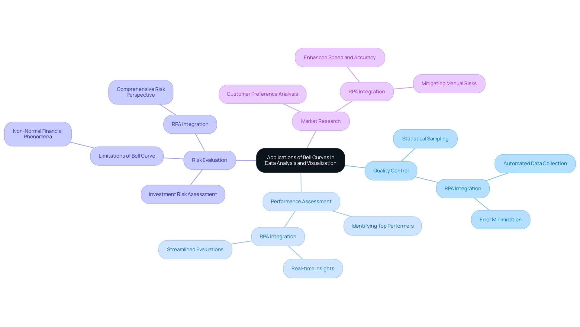
Bell shapes play an essential role in analysis and visualization, providing insights that can greatly improve operational efficiency, particularly when integrated with Robotic Process Automation (RPA). Key applications include:
-
Quality Control: In the manufacturing sector, bell curves are instrumental in assessing product quality by analyzing variations within measurements. This method allows organizations to uphold consistent quality and performance, as demonstrated by the fact that 99.7% of points typically fall within three standard deviations of the mean. Grasping statistical sampling and the normal distribution is essential for maintaining this consistency, especially when RPA is employed to automate information collection and analysis processes, thus minimizing errors and liberating team resources for more strategic activities.
-
Performance Assessment: Organizations utilize statistical distributions to systematically evaluate employee performance. By identifying top performers and those in need of improvement, leaders can make informed decisions that foster team development and enhance overall productivity. Integrating RPA in performance metrics tracking can further streamline these evaluations, allowing for real-time insights while addressing the challenges of manual data entry and analysis.
-
Risk Evaluation: Financial analysts employ probability distributions to assess investment risks, which guides their decision-making processes. However, it is important to acknowledge the constraints of depending exclusively on statistical distributions in finance. As highlighted in the case study, financial phenomena often do not conform to a normal distribution, which can lead to unreliable predictions if analysts do not consider alternative statistical distributions. RPA can assist in gathering various information points that offer a more comprehensive risk perspective, enabling better-informed decisions.
-
Market Research: Marketers utilize statistical distributions to analyze customer preferences and behaviors. This data-driven approach enables them to tailor marketing strategies effectively, ensuring they resonate with target audiences. By automating the analysis process through RPA, organizations enhance the speed and accuracy of their market research efforts, mitigating the risks associated with manual handling.
By grasping these applications and integrating RPA into your workflows, you can harness the bell curve power bi to elevate your data analysis and visualization practices. As Rich Marker, co-founder of All Metals Fabrication, states, “embracing effective planning and continuous improvement is key to achieving success.” This philosophy underscores the importance of integrating statistical insights with automation into your operations, positioning your organization for enhanced performance and quality control.
Furthermore, exploring tailored AI solutions alongside RPA can further optimize your operational efficiency, ensuring that your business is well-equipped to navigate the complexities of the evolving AI landscape.
Conclusion
Understanding the bell curve and its applications in data analysis is crucial for any organization aiming to enhance operational efficiency and make informed decisions. By mastering the creation of bell curves in Power BI, teams can transform complex datasets into clear visual representations, allowing for better insights into performance evaluation, quality control, and risk assessment. Each step, from preparing data to troubleshooting common issues, underscores the importance of accuracy and clarity in data visualization.
The integration of Robotic Process Automation (RPA) further amplifies these efforts by streamlining data collection and reporting processes. By automating repetitive tasks, RPA frees teams to focus on strategic analysis rather than mundane data handling, ultimately driving growth and operational efficiency. As organizations embrace these techniques, they position themselves to leverage data-driven insights effectively, ensuring that every decision is backed by robust statistical analysis.
In a rapidly evolving data landscape, the bell curve remains an indispensable tool. By understanding its mechanics and applying it thoughtfully within Power BI, organizations can unlock the full potential of their data, paving the way for smarter strategies and improved outcomes. Embracing these methodologies not only enhances individual performance but also cultivates a culture of data-driven decision-making across the organization, setting the stage for sustained success.