
Overview
The article provides a comprehensive step-by-step guide on creating and utilizing funnel visuals in Power BI, emphasizing their significance in tracking and optimizing processes within business intelligence, particularly in sales and marketing contexts. It supports this by detailing the functionality of funnel charts, the importance of data accuracy, and customization strategies, along with best practices that enhance decision-making and operational efficiency through effective data visualization.
Introduction
In the realm of data visualization, funnel charts in Power BI have emerged as powerful tools for organizations seeking to enhance their understanding of complex processes. These visuals not only track the journey from initial engagement to final conversion but also reveal critical insights into customer behavior, enabling teams to make informed decisions.
As the adoption of funnel visuals continues to rise, with a notable increase in usage reported in 2024, businesses are discovering their potential for transforming data into actionable strategies. By delving into the various types of funnel charts, learning how to create them effectively, and exploring customization options, organizations can unlock new opportunities for growth and operational efficiency.
This article explores the intricacies of funnel visuals in Power BI, offering practical guidance and best practices to help teams harness the full potential of their data storytelling capabilities.
Understanding Funnel Visuals in Power BI
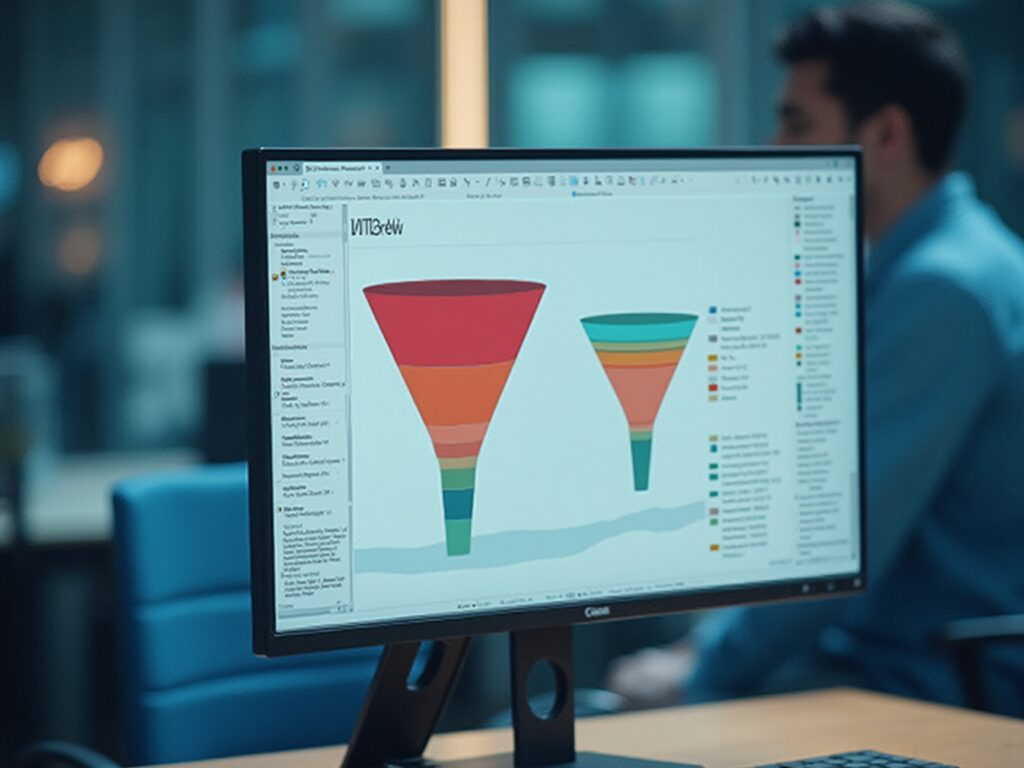
In Business Intelligence, the Power BI funnel visual is essential for illustrating the different phases of a process, enabling organizations to efficiently monitor key metrics from initial engagement to final conversion. The Power BI funnel visual is particularly advantageous within sales and marketing contexts, as it helps teams pinpoint specific drop-off points in the customer journey, allowing for timely adjustments to optimize workflows. Based on recent statistics, the utilization of visual representations in Power BI has risen by 35% in 2024, highlighting their increasing significance in narrative presentation.
The Power BI funnel visual typically depicts stages of a process with diminishing values, clearly illustrating the transition of data from one phase to the next. This representation not only highlights areas for potential improvement but also uncovers opportunities for growth. For instance, a case study on a leading e-commerce platform showcased how incorporating visual aids resulted in a 20% increase in sales conversion rates by identifying critical drop-off points in their sales process.
As organizations increasingly adopt the Power BI funnel visual in 2024, they have reported significant enhancements in their decision-making processes. Denys Arkharov, a BI Engineer at Coupler.io, states, ‘The Power BI funnel visual provides clarity in understanding the sales pipeline, allowing teams to make data-driven decisions that enhance performance.’ However, many organizations struggle with extracting meaningful insights from their information, which can lead to a competitive disadvantage.
By incorporating RPA solutions alongside Business Intelligence, companies can automate repetitive tasks, thus enhancing operational efficiency and allowing teams to concentrate on analyzing information instead of handling it. By utilizing the capabilities of flow diagrams, improved reporting through services such as our 3-Day BI Sprint, and workflow automation through Automate, teams can better grasp their sales conversion rates and enhance operational efficiency, ultimately resulting in more informed strategies that promote success.

Exploring Different Types of Funnel Charts in Power BI
Power BI offers a varied selection of graphical options, each crafted to meet particular analytical requirements while tackling typical obstacles in utilizing insights from information. Comprehending these types is essential for impactful storytelling with information:
- Standard Funnel Chart: This type visually represents the flow of information through various stages, illustrating the proportion of information at each stage. It is especially beneficial for monitoring conversion rates or project advancement, addressing the challenge of lengthy report generation by offering clear visual insights with the power bi funnel visual.
- Stacked Visualization: By enabling users to analyze information by categories, stacked visualizations provide deeper understanding of the composition at each stage, facilitating the identification of trends within subcategories. Recent statistics indicate that stacked graphs have gained popularity, with a reported 60% of users favoring them over standard representations because of their capacity to offer more granularity, thus improving consistency and trust.
- 100% Stacked Graph: This variant displays the relative percentage of each category within the total at each stage, making it suitable for comparing proportions across various categories, such as market share or budget allocations. This assists in tackling the issue of ambiguous direction frequently encountered in conventional reports.
To demonstrate the efficacy of these visual representations, consider a case study where a retail company employed stacked visuals to assess customer conversion rates across various marketing channels. The insights acquired enabled them to enhance their marketing approach, leading to a 15% rise in conversions, showcasing the effectiveness of utilizing Business Intelligence for informed decision-making.
Furthermore, although flow visuals are impactful, alternative instruments like pie graphs can swiftly illustrate how a whole is segmented into components, such as market share or budget distributions, and the decomposition tree visualization permits users to observe information across various dimensions, facilitating deeper analysis and addressing governance strategy challenges. Furthermore, incorporating Robotic Process Automation (RPA) into the reporting process can simplify information collection and reduce manual tasks, enhancing operational efficiency. The selection among these graphical representations can greatly affect the clarity and influence of information analysis.
By choosing the appropriate format for the visual representation and ensuring reports offer clear, actionable guidance, users can guarantee their presentation is not only informative but also engaging, ultimately improving operational efficiency.

Step-by-Step Guide to Creating Funnel Charts in Power BI
Constructing a power bi funnel visual is a simple process that facilitates effective visualization and storytelling, which is crucial for utilizing Business Intelligence in enhancing operational efficiency. Here’s a step-by-step guide to help you get started:
-
Open BI Desktop: Begin by launching the application and either opening an existing report or creating a new one.
-
Load Your Information: Import your information into Power BI, sourcing it from platforms like Excel, SQL Server, or cloud services. This versatility is crucial for addressing the common challenge of data inconsistencies.
-
Choose Power BI Funnel Visual: In the Visualizations pane, find and click on the Power BI funnel visual icon shaped like a funnel to include it in your report.
-
Drag Fields to the Visual: Populate your chart by dragging relevant fields into the ‘Values’ and ‘Group’ sections. The ‘Values’ section captures the information points, while the ‘Group’ section delineates the distinct stages of your funnel.
-
Adjust the Information: Ensure that the information is arranged suitably to represent the stages of the process precisely. This step is crucial for clarity and insight, particularly in overcoming the challenges of creating actionable reports.
-
Review Your Diagram: After creating the funnel diagram, take a moment to review it. Verify that it accurately illustrates your information flow and adjust any settings necessary to enhance clarity. This review process helps to avoid the frustration of investing time in report creation rather than leveraging insights, and using the power bi funnel visual is particularly beneficial for tracking progress through various stages, such as the 565 users who completed purchases, calculating potential revenue, and identifying bottlenecks in processes. Additionally, they can reveal insights into conversion and retention rates, making them essential tools for data analysis.
As noted by data analyst Bukola Ejalonibu, > Data visualization tools like Power BI are essential for turning raw data into meaningful insights that drive results.
By concentrating on the specific phases of your process, you can derive actionable insights that guide decision-making and enhance operational efficiency. Integrating annotations for every phase, as emphasized in the case study named ‘Statistics to Highlight in Funnel Charts,’ can further improve your diagram’s usefulness by offering clear insights into drop-off rates and user movement without needing external calculations. By adhering to this guide, you can effectively leverage the strength of flow diagrams to visualize user movement and enhance your analysis, assisting to alleviate the typical difficulties encountered when using BI.

Customizing Your Funnel Charts for Enhanced Insights
Customization in Power BI is crucial for enhancing the effectiveness of chart visuals, particularly the Power BI funnel visual, especially for professionals aiming to adhere to best practices as outlined in the Microsoft Certified: Power BI Data Analyst Associate certification. Here are several impactful strategies:
- Change Colors: Adjusting the colors of the funnel stages not only aligns with your brand identity but also enhances visual appeal, making information easier to interpret. Research indicates that effective color choices can significantly enhance visualization effectiveness, thereby increasing user engagement.
- Add Labels: Enabling labels at each stage provides immediate insights into the flow of information, allowing viewers to quickly grasp key metrics. As noted by Jeremy Caney,
One of the ‘simplest’ ways you can use to solve this issue and the one I use pretty much all the time is appending the ‘Order code’ to the name of the column and then you use it to sort.
This emphasizes the significance of clarity in information representation, particularly considering the frequent challenges of inconsistencies across reports. - Modify Tooltips: Customizing tooltips to present additional context enhances interactivity, making your visuals more engaging and informative. This allows users to delve deeper into the data without cluttering the visual space, addressing the frequent issue of reports lacking actionable guidance.
- Adjust Axis Titles: Clear and descriptive axis titles are essential for helping viewers understand what the visualization represents, ensuring that the insights derived are accurate and actionable.
By implementing these customizations, you can transform your visuals into powerful tools for storytelling, driving better decision-making and deeper insights into conversion and retention rates across various processes. For example, case studies have shown how the Power BI funnel visual is utilized in sales tracking and marketing campaign analysis, demonstrating the tangible benefits of these strategies.
Furthermore, to tackle the challenges of time-consuming report creation and inconsistencies, it is essential to implement a governance strategy that ensures accuracy and consistency across reports. With the upcoming DataViz World Championships offering participants four chances to enter, mastering these customization features is more relevant than ever, as they could provide a competitive edge in this dynamic field. In today’s data-rich environment, leveraging the power of Business Intelligence is essential to overcoming these hurdles, ultimately driving operational efficiency and growth.

Best Practices and Troubleshooting for Power BI Funnel Visuals
To maximize the effectiveness of your funnel visuals in Power BI, adhering to a set of best practices is essential:
- Ensure Data Accuracy: Prioritize accuracy and completeness in your data prior to constructing funnel charts. Flawed information can distort insights and mislead stakeholders, particularly in a resource-rich environment where extracting valuable insights is essential for sustaining a competitive edge. Implementing Business Intelligence solutions can help transform raw information into actionable insights, as demonstrated by PixelPlex’s track record of over 450 successful client stories, leading to significant improvements in user adoption and ROI.
- Limit the Number of Stages: A cluttered Power BI funnel visual can obscure insights; therefore, aim to present a clear and concise representation by limiting the number of stages. This simplicity is vital in overcoming challenges related to time-consuming report creation.
- Regularly Update Your Information: Consistently refresh your information to ensure it reflects the latest insights and trends, enhancing user adoption and improving ROI. The
STDEV.Sfunction can be particularly useful here, as it returns the sample standard deviation for expressions evaluated row by row, helping to ensure the accuracy of your values. - Troubleshooting Tips: If your funnel chart fails to display correctly, begin by verifying that the information is sorted appropriately and that the correct fields are in use. Should you encounter issues with information visibility, inspect the relationships in your model to ensure they are correctly configured. RPA solutions such as EMMA RPA and Automate can assist in automating data updates and troubleshooting processes, thereby improving efficiency. For instance, the case study titled “Statistical Measures in BI Without DAX” illustrates an alternative method to find statistical measures without using DAX or the Measure feature, which can be beneficial when troubleshooting flow visuals.
By following these best practices and troubleshooting tips, you can significantly enhance the reliability and effectiveness of your Power BI funnel visual. As Antoine de Saint-Exupery aptly stated, > perfection is finally attained not when there is no longer anything to add, but when there is no longer anything to take away <— this principle can guide your efforts in streamlining and optimizing your data presentations while leveraging RPA to automate repetitive tasks for improved operational efficiency.

Conclusion
Funnel charts in Power BI have proven to be invaluable tools for organizations aiming to visualize complex processes and improve decision-making. By effectively tracking the customer journey from initial engagement to final conversion, these visuals not only highlight critical drop-off points but also provide actionable insights that can lead to significant enhancements in sales and operational efficiency.
The article has explored various types of funnel charts, offering a clear understanding of their unique capabilities. From standard and stacked funnel charts to 100% stacked options, each type serves specific analytical needs, allowing teams to dissect data and identify trends. The step-by-step guide provided simplifies the process of creating these visuals, ensuring that users can leverage their full potential for data storytelling.
Customization plays a crucial role in maximizing the effectiveness of funnel charts. By adjusting colors, adding data labels, and modifying tooltips, organizations can enhance the clarity and engagement of their visuals. Furthermore, adhering to best practices such as ensuring data accuracy, limiting the number of stages, and regularly updating data can significantly improve the reliability and impact of these visuals.
In conclusion, as the adoption of funnel visuals continues to rise, particularly in 2024, it is clear that these tools are not just a passing trend but a fundamental aspect of effective data analysis. By harnessing the power of funnel charts in Power BI, organizations can unlock new opportunities for growth, streamline their workflows, and ultimately drive informed strategies that lead to success. Embracing these practices will empower teams to transform raw data into meaningful insights, ensuring a competitive edge in today’s data-driven landscape.