Overview
BI charts play a pivotal role in data visualization, transforming complex datasets into clear visuals. This transformation enables organizations to swiftly analyze trends and make informed decisions. How effectively are you leveraging these tools? The significance of BI charts is underscored by their ability to enhance comprehension and drive strategic initiatives. Particularly in Power BI, tailored solutions can profoundly improve data representation and operational efficiency. By adopting these practices, organizations can elevate their data-driven strategies and foster a culture of informed decision-making.
Introduction
In the realm of business intelligence, effective data visualization is paramount for making informed decisions. Business Intelligence (BI) charts emerge as essential instruments that transform complex datasets into accessible visuals. These charts simplify information for stakeholders and highlight trends and insights that can drive strategic actions.
As organizations increasingly rely on data to navigate market complexities, understanding the different types of charts available—such as waterfall, bar, and line charts—becomes crucial.
This article delves into the significance of BI charts, explores their various types, and provides practical guidance on creating and customizing these visualizations to enhance clarity and impact. With the right approach, businesses can leverage these tools to unlock actionable insights and foster growth in an ever-evolving data landscape.
What Are BI Charts and Their Importance in Data Visualization?
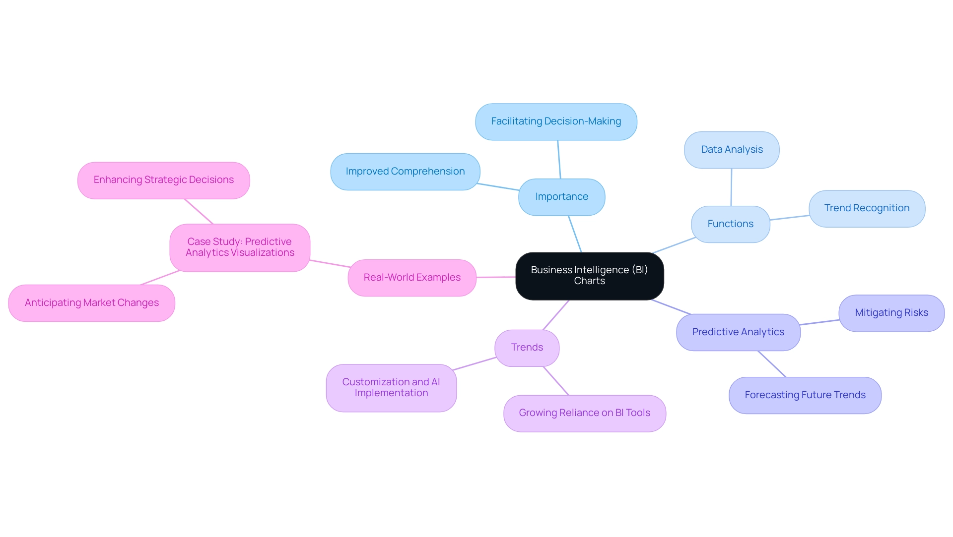
Business Intelligence (BI) visuals are essential tools that empower organizations to analyze and interpret complex datasets with precision. By transforming unprocessed information into clear visuals, these representations streamline details, enabling stakeholders to recognize insights and trends swiftly. In the context of Power BI, BI visuals not only enhance the communication of insights but also facilitate rapid, informed decision-making.
The significance of BI graphs in information representation lies in their ability to improve comprehension and promote strategic initiatives within organizations. For instance, predictive analytics representations allow companies to forecast future trends based on historical data, enabling them to anticipate market shifts and mitigate risks. This capability is vital in today’s data-rich environment, where organizations must navigate complexities to maintain a competitive edge.
Recent trends indicate a growing reliance on BI charts, with 2025 poised to be a pivotal year for the adoption of these tools. As organizations increasingly recognize the value of visualization, the demand for tailored solutions that enhance quality and simplify AI implementation has surged. This aligns with Creatum GmbH’s unique value proposition, which emphasizes customized AI solutions that enable businesses to leverage information effectively.
Moreover, continuous learning is crucial in the realm of business intelligence. Engaging in initiatives like MDS@Rice equips individuals with the latest skills and knowledge, ensuring they stay ahead in the data-driven landscape.
Real-world examples underscore the impact of BI charts on decision-making. Organizations utilizing these graphical tools, as highlighted in the case study on predictive analytics representations, have reported enhanced clarity in their analyses, leading to more strategic and informed decisions. As Mussarat Nosheen aptly states, “Information representation is an essential element of contemporary business intelligence, allowing organizations to convert intricate information into actionable insights.”
This sentiment reflects a growing consensus on the vital role BI visuals play in shaping effective business strategies.
Exploring Different Types of Charts in Power BI
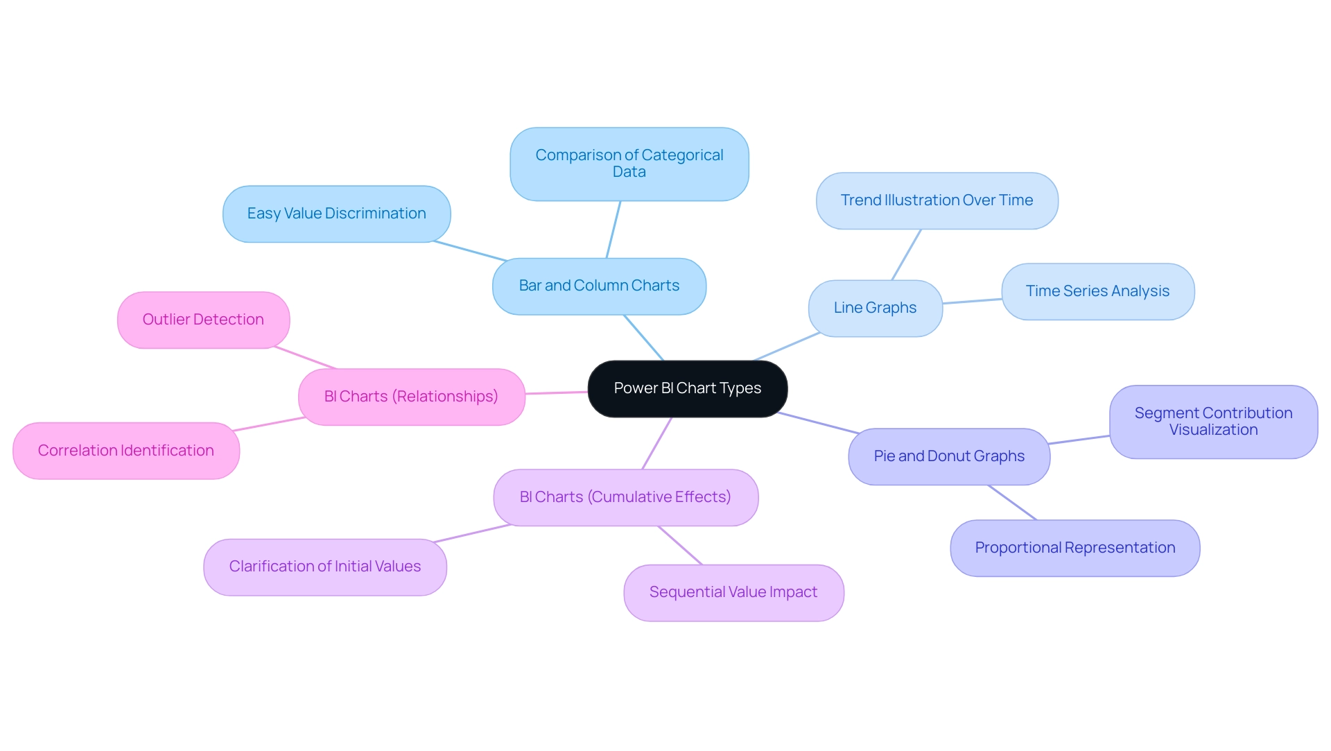
Power BI offers a wide variety of BI charts, each meticulously designed to meet specific visualization requirements. Understanding these options is crucial for effectively conveying insights, especially in light of common challenges such as time-consuming report creation, inconsistencies, and the lack of actionable guidance that can erode trust in the data presented. The primary chart types include:
- Bar and Column Charts: Excellent for comparing categorical data, these charts allow users to easily discern differences in values across categories.
- Line Graphs: Ideal for illustrating trends over time, line graphs enable users to track changes and patterns in data, making them essential for time series analysis, akin to BI charts.
- Pie and Donut Graphs: Effective for displaying proportions of a whole, these visuals help to visualize how individual segments contribute to the total, similar to BI charts.
- BI Charts: Particularly useful for visualizing the cumulative effects of sequentially introduced values, BI charts clarify how initial values are impacted by subsequent additions or subtractions.
- BI Charts: These are valuable for showcasing relationships between two variables, enabling users to identify correlations and outliers within their information.
In 2025, the latest updates to Power BI introduced enhanced features for these visual types, significantly improving usability and functionality. For instance, network diagrams have gained popularity for illustrating intricate connections, particularly in hierarchical information contexts. A case study on network diagrams demonstrated their effectiveness in displaying complex relationships, while also emphasizing the importance of clarity in design to prevent overwhelming users.
Expert opinions underscore the significance of selecting the appropriate graph type according to the information narrative being conveyed. As organizations increasingly adopt business intelligence tools, understanding the most popular types of graphs, such as BI charts, bar, and line, becomes essential for effective data analysis. Notably, out of 1,523 surveyed individuals, 843 voted ‘Yes’ on the effectiveness of these chart types, while 520 voted ‘No’, and 160 abstained, indicating a strong preference for certain representations.
Successful case studies illustrate how various organizations utilize these representations to derive actionable insights, ultimately enhancing operational efficiency and informed decision-making. As highlighted by Sascha Rudloff, Team Leader of IT and Process Management at PALFINGER Tail Lifts GMBH, “Mit dem Power BI Sprint von CREATUM haben wir nicht nur einen sofort einsetzbaren Power BI Bericht und ein Gateway Setup erhalten, sondern auch eine signifikante Beschleunigung unserer eigenen Power BI Entwicklung erlebt.” This testimonial underscores the transformative impact of Creatum’s Power BI Sprint on business intelligence development, particularly in addressing the challenges of report creation and providing clear, actionable guidance that enhances information quality and simplifies AI implementation.
Understanding Waterfall Charts: Definition and Use Cases
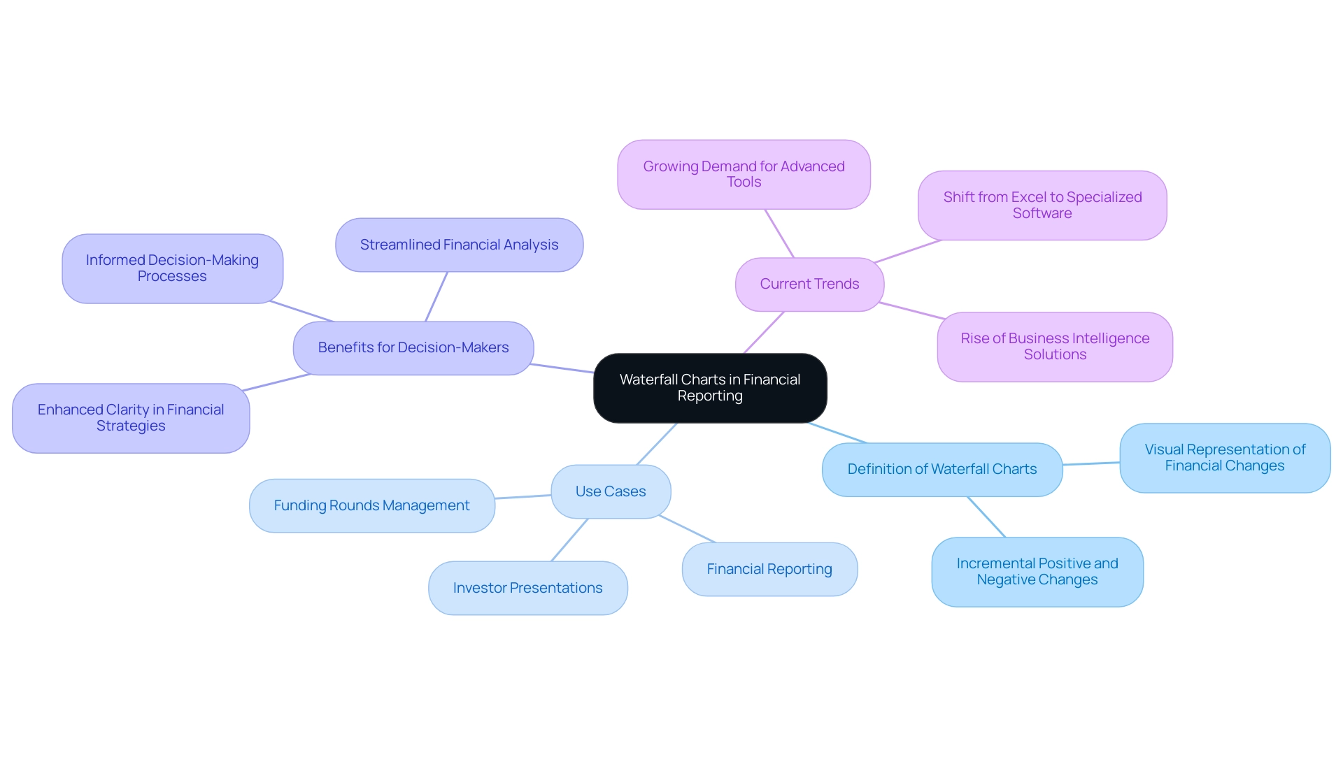
A cascading diagram serves as a powerful representation tool, effectively illustrating how a starting value is influenced by a series of incremental positive and negative changes. This visualization proves particularly advantageous in financial reporting, as it clearly depicts profit and loss over time, alongside the impact of various factors on revenue streams. For instance, a cascading diagram can adeptly showcase the progression of sales figures from one period to another, highlighting both increases and decreases in a visually clear manner.
The utility of cascading diagrams extends beyond mere representation; they are vital resources for decision-makers, distilling complex data into easily digestible insights. Current trends indicate that as businesses expand their investor bases and secure additional financing, the demand for sophisticated financial evaluation tools, such as graphical representations, becomes increasingly essential. Statistics reveal that organizations utilizing flow charts in their financial reporting have experienced heightened clarity in their financial strategies, ultimately fostering more informed decision-making processes.
Moreover, tiered analysis is poised to gain traction as a financial tool, particularly as companies expand and their shareholder pools grow. Case studies further underscore the rising significance of tiered analysis within the financial landscape. For example, Eqvista’s tiered analysis tool has proven instrumental for companies navigating intricate funding rounds, enabling them to manage future investments with greater efficacy. This tool streamlines the calculation of financial rounds upon exit, aligning with the overarching goal of enhancing financial strategy and decision-making processes.
As Excel becomes increasingly inadequate for sequential analysis—due to an expanding number of shareholders and complex scenarios—the demand for advanced tools like Eqvista is on the rise. By leveraging such tools, companies can gain deeper insights into their financial cycles, thereby refining their financial strategies and enhancing overall operational efficiency.
In today’s data-rich environment, employing Business Intelligence (BI) through tools like Power BI and BI charts can significantly augment the effectiveness of sequential diagrams. Creatum GmbH’s Power BI services facilitate efficient reporting and data consistency, empowering organizations to convert raw data into actionable insights. With offerings like the 3-Day Power BI Sprint, businesses can swiftly produce professionally crafted reports that amplify the insights derived from flow diagrams.
As the need for clear and actionable financial insights continues to escalate, BI charts, bolstered by robust BI solutions, are set to emerge as a pivotal component of business intelligence and financial reporting by 2025.
Step-by-Step Guide to Creating Waterfall Charts in Power BI
Creating BI charts, such as a waterfall chart in Power BI, is a straightforward process that significantly enhances visualization and facilitates informed decision-making across various business functions. This capability is particularly vital in the realm of Business Intelligence, where converting raw data into actionable insights is essential for driving growth and operational efficiency. Moreover, integrating Robotic Process Automation (RPA) can streamline information handling processes, further enhancing the effectiveness of BI tools like Power BI.
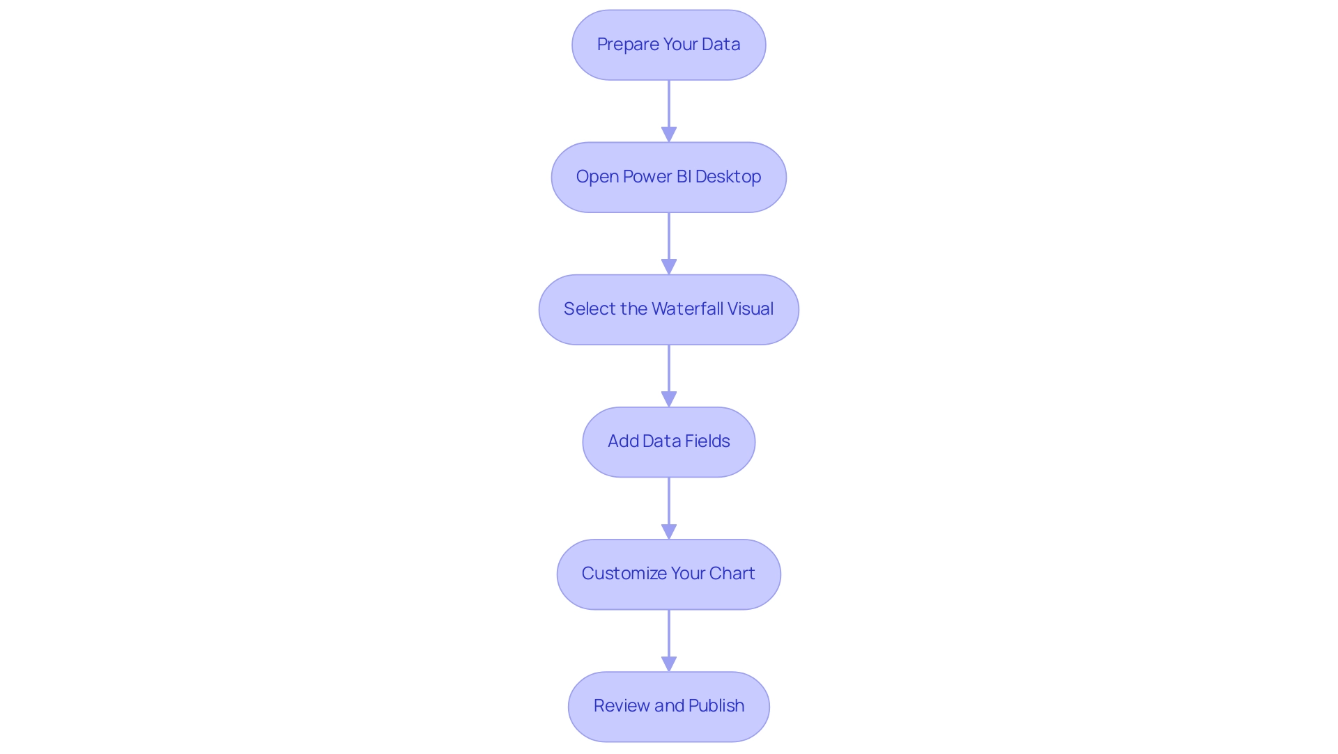
To effectively create and customize your chart, follow these steps:
- Prepare Your Data: Ensure your dataset includes the necessary values for both the initial state and subsequent changes. This foundational step is crucial for accurate representation in BI charts, helping to mitigate challenges such as data inconsistencies.
- Open Power BI Desktop: Launch the application and load your prepared dataset to begin the visualization process.
- Select the Waterfall Visual: In the Visualizations pane, locate and select the waterfall icon to initiate the creation of the visual. Add Data Fields: Drag and drop the relevant fields into the ‘Values’ and ‘Category’ areas. This step establishes how your information will be illustrated in the graph, enabling a clear representation of changes over time.
- Customize Your Chart: Tailor the appearance of your chart by adjusting colors, labels, and titles. Customization enhances clarity, ensuring that your audience can easily interpret the data displayed in BI charts, which is essential for effective decision-making.
- Review and Publish: After finalizing your visualization, review it for accuracy and clarity. Once satisfied, save your work and publish it to the Power BI service for sharing with stakeholders.
In practical applications, note that March has the largest positive variance while July has the largest negative variance, effectively demonstrated using BI charts. Furthermore, these charts allow users to perform ‘what-if’ evaluations, simulating various scenarios and illustrating possible results, including the effect of price alterations on customer loyalty.
While these types of graphs are beneficial, it’s crucial to acknowledge options like bar graphs, stacked bar graphs, and diverging bar graphs, each providing distinct benefits and drawbacks based on the information displayed. As Jon Oringer wisely noted, it’s essential to question whether specific tools are truly needed, aligning with a strategic focus on operational efficiency. Additionally, addressing issues like lengthy report preparation and inconsistencies in information can enhance the overall efficacy of insights obtained from Power BI dashboards.
By adhering to these measures and integrating best practices, users can effectively illustrate their information using BI charts, thereby enhancing their decision-making abilities and leveraging Business Intelligence and RPA to propel business growth.
Customizing Your Waterfall Chart for Enhanced Clarity
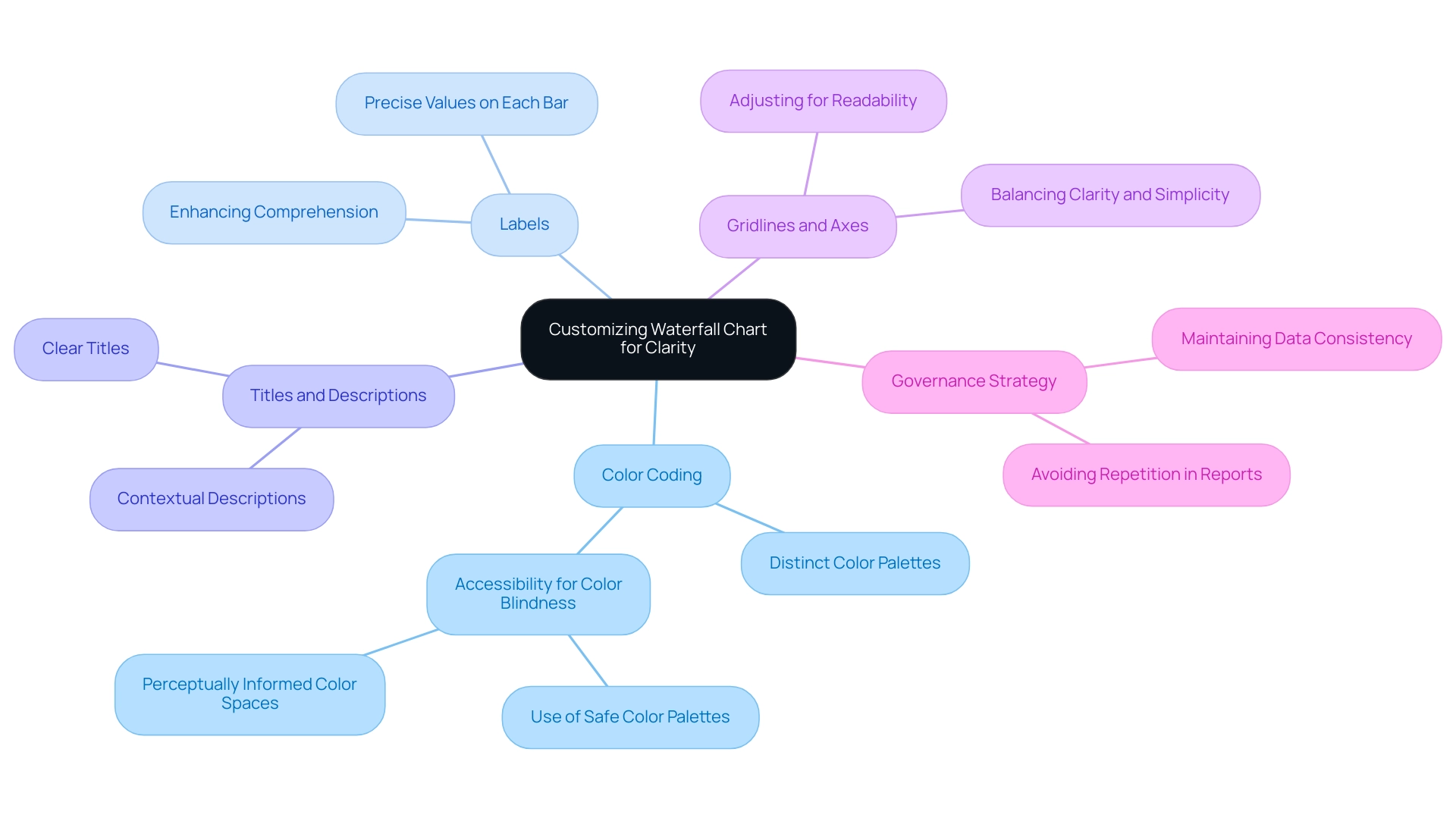
Customizing a waterfall chart in Power BI significantly enhances its clarity and effectiveness, thereby improving storytelling. Here are essential tips for customization:
-
Color Coding: Implement distinct color palettes to differentiate between positive and negative changes. This practice not only aids immediate understanding but also addresses accessibility requirements, ensuring that individuals with color blindness, including those with Protanopia—the most prevalent type of color blindness—can interpret the information accurately. Utilizing perceptually informed color spaces can further enhance differentiation among nominal classes.
-
Labels: Incorporate labels on each bar to provide precise values. This addition enhances the visual’s informational worth and enables viewers to quickly grasp the information, thus enhancing overall comprehension.
-
Titles and Descriptions: Clear titles and contextual descriptions are essential for guiding viewers through the visual. They assist in framing the narrative of the information, making it easier for the audience to comprehend the significance of the details presented.
-
Gridlines and Axes: Adjusting gridlines and axes can enhance readability without overcrowding the visual. Achieving a balance between clarity and simplicity is vital for sustaining viewer involvement. Research shows that effective customization of graphs can greatly influence viewer understanding. These strategies are not merely aesthetic options; they are fundamental elements of effective information presentation. For instance, a case study on accessibility in visual representation highlights the importance of creating inclusive visualizations that cater to diverse audiences. It recommends strategies such as using color palettes safe for color-blind viewers and employing dual encoding techniques to convey information effectively. Additionally, Helgeson & Moriarty observed that incorporating specific elements results in no enhancement in memory for the information, underscoring the necessity for careful customization.
By applying these customization strategies, users can develop more impactful BI charts that effectively convey their narratives, ultimately fostering informed decision-making. Furthermore, addressing challenges such as investing excessive time in constructing reports instead of leveraging insights from BI charts, along with inconsistencies, through tools like Robotic Process Automation (RPA) and customized AI solutions can further enhance productivity. This ensures that stakeholders receive clear, actionable insights from their BI charts. It is also crucial to avoid repeating information in tables or figures, as this can detract from the clarity and effectiveness of the presentation.
A governance strategy is essential to maintain data consistency and trustworthiness across reports.
Best Practices for Effective Waterfall Chart Usage
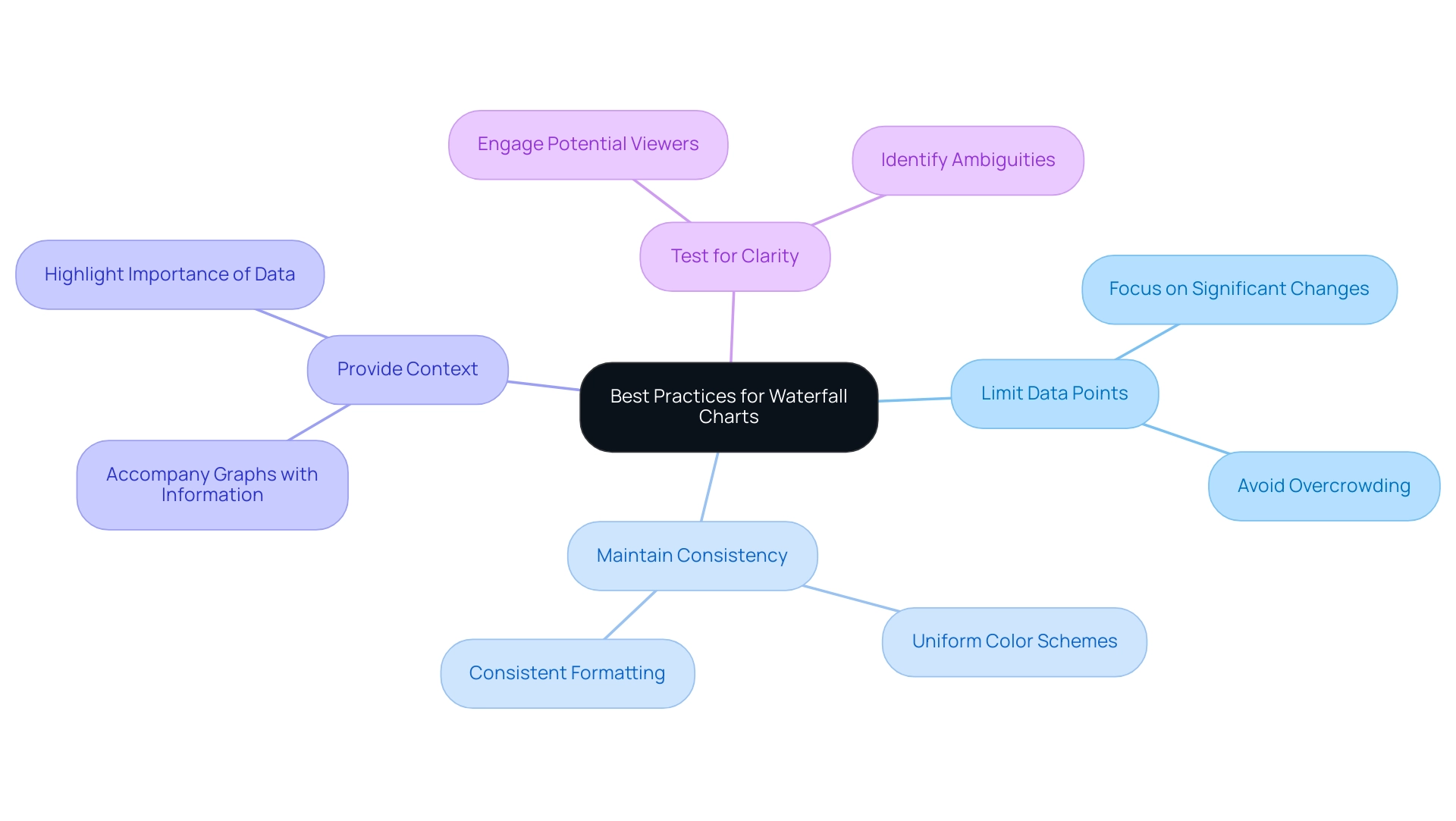
To maximize the effectiveness of waterfall charts in business intelligence, adhering to several best practices is essential:
- Limit Data Points: Focus on the most significant changes to avoid overcrowding the chart. A streamlined approach enhances clarity and allows viewers to grasp key insights quickly.
- Maintain Consistency: Employ uniform color schemes and formatting throughout all visuals. This intentional choice not only improves understanding but also prevents misleading interpretations of the information.
- Provide Context: Always accompany graphs with contextual information. This assists viewers in grasping the importance of the presented information, making the insights more actionable.
- Test for Clarity: Before finalizing, test the visual with potential viewers to ensure it communicates the intended message clearly. This step can reveal ambiguities and enhance overall effectiveness.
Organizations that implement these best practices often experience significant improvements in data visualization through BI charts. For instance, financial companies frequently utilize graphical representations to demonstrate financial gains and losses, effectively highlighting the cumulative impact of individual elements on overall outcomes. A case study involving employee headcount changes within a team over a year illustrates how a well-constructed flow diagram can clearly depict starting quantities, positive and negative changes, and the resulting ending quantity.
This case study also emphasizes the process of creating BI charts in Excel, detailing the use of an invisible series and mathematical adjustments to accurately represent information.
Moreover, the transformative effect of Creatum’s Power BI Sprint has empowered organizations like PALFINGER Tail Lifts GMBH to significantly enhance their analysis and reporting capabilities. As noted by Sascha Rudloff, Teamleader of IT- and Process Management, “With the Power BI Sprint from Creatum, we not only received an immediately deployable Power BI report and a gateway setup but also experienced a significant acceleration in our own Power BI development. The outcomes of the sprint surpassed our expectations and offered a vital enhancement to our analysis strategy.” By leveraging such innovative solutions alongside best practices in information presentation, businesses can refine their decision-making processes and stimulate growth in 2025 and beyond.
Incorporating Robotic Process Automation (RPA) can further simplify manual workflows, enabling teams to focus on strategic initiatives that enhance organizational value. This underscores the significance of efficient information representation practices.
Alternatives to Waterfall Charts: When to Use Other Visualizations
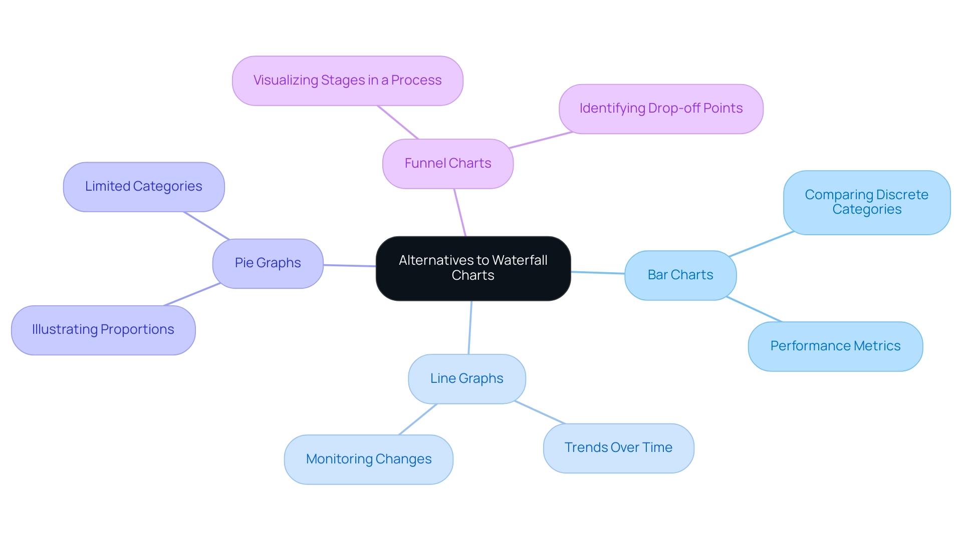
While waterfall graphs serve as powerful tools for visualizing cumulative information, there are specific scenarios where alternative visualizations may prove more effective. Understanding when to employ various types of BI charts can significantly enhance information analysis and decision-making, particularly within the realm of Business Intelligence (BI) and operational effectiveness. Consider the following alternatives:
-
Bar Charts: These are particularly effective for comparing discrete categories, enabling quick visual comparisons across different groups. Organizations frequently use bar graphs to evaluate performance metrics across various departments, simplifying the process of identifying areas needing improvement and fostering targeted strategies for growth.
-
Line Graphs: Best suited for illustrating trends over time, line graphs are invaluable for monitoring changes in data points, such as sales figures or website traffic. They provide a clear visual representation of growth or decline, empowering teams to make informed strategic choices based on historical data, which is crucial in a rapidly evolving AI landscape.
-
Pie Graphs: Although often debated, pie graphs can effectively illustrate proportions within a whole, particularly when the number of categories is limited. They assist stakeholders in quickly grasping the distribution of resources or market share among competitors, facilitating data-driven insights that enhance operational efficiency.
-
Funnel Charts: These charts excel in visualizing stages in a process, such as sales funnels. They enable organizations to identify drop-off points in customer journeys, facilitating targeted strategies to improve conversion rates and optimize workflows through Robotic Process Automation (RPA).
Selecting the appropriate illustration hinges on the specific data available and the narrative you wish to convey. A recent case study titled “Business Intelligence Empowerment” emphasized how a retail company effectively utilized bar graphs to compare sales performance across various regions, resulting in actionable insights that fueled targeted marketing initiatives. This case study underscores the importance of transforming raw data into actionable insights through effective visualization, which is essential for creating BI charts.
Moreover, expert advice highlights that understanding the strengths and weaknesses of each diagram type is crucial. As Sara Dholakia notes, it is essential to consider the audience’s familiarity with the subject matter of your data and the context they possess versus what you should provide. For instance, while waterfall diagrams excel in illustrating how an initial value is influenced by a series of positive and negative values, they may not be as effective in scenarios requiring straightforward comparisons of categories.
In navigating the overwhelming AI landscape, tailored AI solutions can assist organizations in selecting the most suitable BI chart representation techniques that align with their specific business goals. Statistics indicate that users can explore various display tools, such as Datylon, with a free 14-day trial, allowing them to experiment with different chart types without commitment. This flexibility encourages organizations to discover the most suitable representation methods tailored to their specific needs, ultimately enhancing operational efficiency.
In summary, employing the appropriate graphical method not only improves clarity but also enables organizations to make knowledgeable choices that foster growth and innovation. A keen mind and vision for technical illustration and data representation are essential for success in the field, ensuring that the chosen methods align with the overarching goals of business intelligence and operational excellence.
Key Takeaways: Choosing the Right BI Chart for Your Data
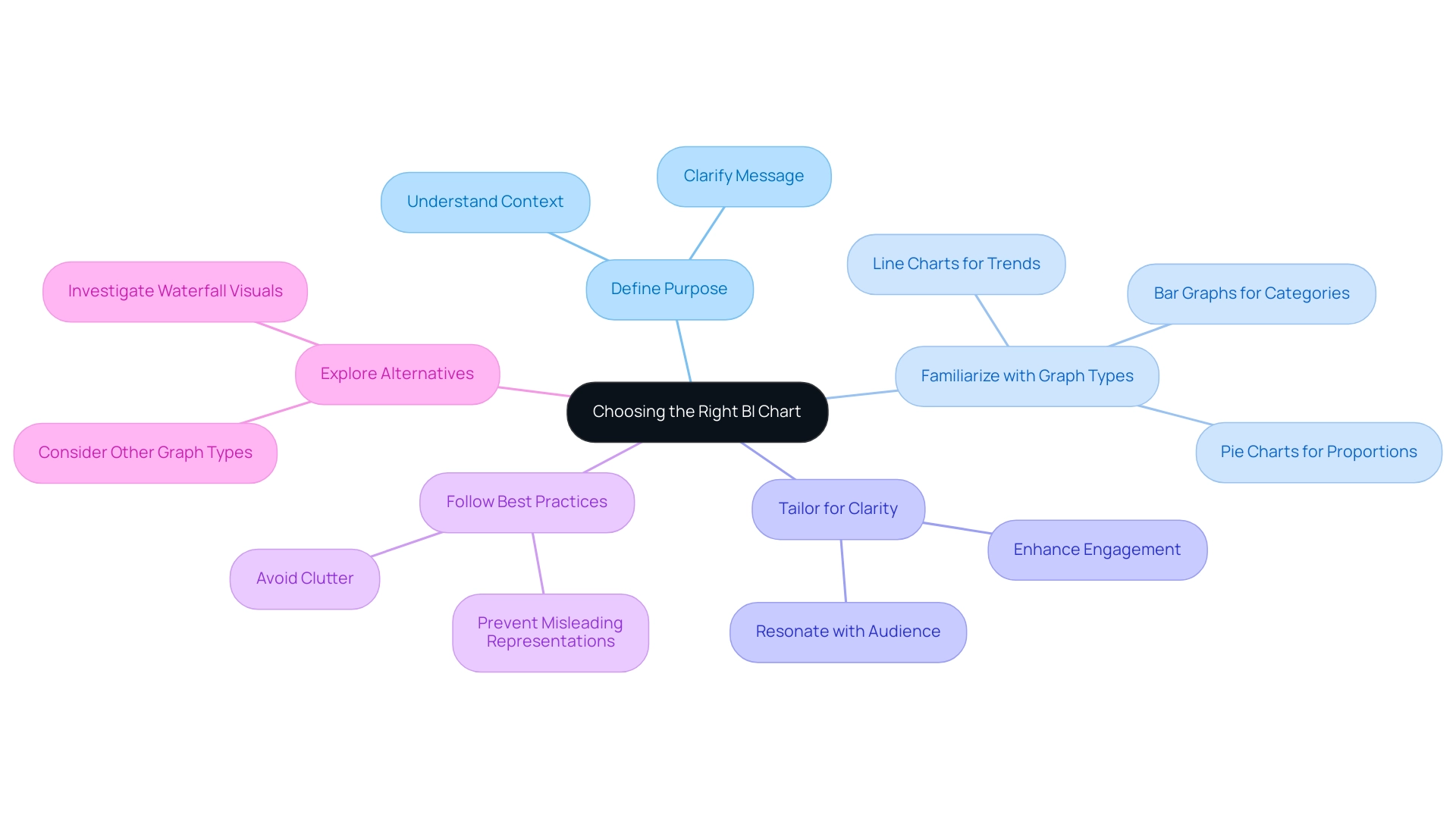
When selecting BI charts for data visualization in Power BI, it is essential to consider the following key takeaways:
- Clearly define the purpose of your data and the specific message you wish to convey. Grasping the context will direct your selection of visuals.
- Familiarize yourself with the different types of graphs available, such as bar graphs, which are especially effective for presenting lengthy text in category labels and organized information.
- Tailor your visuals to enhance clarity and engagement, ensuring that they resonate with your audience.
- Follow best practices to avoid common pitfalls in visualization, such as cluttered visuals or misleading representations.
- Investigate options besides waterfall visuals when needed, as other graphical types may offer a more precise representation of your information.
By utilizing these principles, users can leverage the power of BI charts to effectively convey insights, ultimately enhancing decision-making processes. For example, organizations that have strategically selected suitable BI charts have reported significant enhancements in their capability to extract actionable insights from their information. With over 1,500,000 Zebra BI users creating insightful reports, the effect of appropriate visual selection on data insights is evident.
As Raimonds Simanovskis noted, “We are launching AI assistants to help our users to make complex things easier,” which underscores the potential of AI tools in simplifying the selection and use of BI visuals. Furthermore, the transformative impact of Creatum GmbH’s Power BI Sprint is highlighted in a recent testimonial from Sascha Rudloff, Team leader of IT- and Process management at PALFINGER Tail Lifts GMBH, who stated, “Die Ergebnisse des Sprints haben unsere Erwartungen übertroffen und waren ein wichtiger Impuls für unsere Datenanalysestrategie.” This reinforces the importance of proper chart selection and the role of tailored AI solutions from Creatum GmbH in driving data-driven insights and operational efficiency.
Embracing these best practices not only streamlines the visualization process but also drives growth and innovation in a data-rich environment.
Conclusion
In the intricate realm of business intelligence, effective data visualization through BI charts is essential for organizations striving to make informed decisions. By transforming complex datasets into intuitive visuals, these charts enhance understanding and unveil actionable insights that propel strategic actions. This article underscores the necessity of familiarizing oneself with various chart types, including waterfall, bar, and line charts, to effectively convey data insights and navigate market complexities.
The practical guidance on creating and customizing waterfall charts demonstrates how organizations can improve clarity and impact in their visualizations. By adhering to best practices—such as limiting data points, maintaining consistency, and providing context—businesses can optimize the effectiveness of their charts, ensuring that stakeholders can readily extract meaning from the data presented.
As reliance on data continues to escalate, so too does the imperative for organizations to adopt tailored BI solutions that align with their distinct objectives. By leveraging appropriate visualization techniques and following best practices, businesses can unlock the full potential of their data, fostering growth and innovation in an ever-evolving landscape. The insights derived from these visualizations not only inform decision-making but also pave the way for a data-driven future.
Frequently Asked Questions
What are Business Intelligence (BI) visuals?
BI visuals are tools that help organizations analyze and interpret complex datasets by transforming unprocessed information into clear visual representations, enabling stakeholders to quickly recognize insights and trends.
How do BI visuals enhance decision-making?
In the context of Power BI, BI visuals improve communication of insights and facilitate rapid, informed decision-making by providing clear visual data representations.
Why are BI graphs significant for organizations?
BI graphs enhance comprehension of data and promote strategic initiatives by allowing companies to forecast future trends using predictive analytics, which helps them anticipate market shifts and mitigate risks.
What is the trend regarding the adoption of BI charts?
There is a growing reliance on BI charts, with 2025 expected to be a pivotal year for their adoption as organizations increasingly recognize the value of visualization.
How does Creatum GmbH contribute to the field of BI?
Creatum GmbH focuses on customized AI solutions that help businesses leverage information effectively, aligning with the increasing demand for tailored BI solutions.
What role does continuous learning play in business intelligence?
Continuous learning, such as participating in initiatives like MDS@Rice, is crucial for individuals to acquire the latest skills and knowledge necessary to thrive in the data-driven landscape.
Can you provide examples of the impact of BI charts on decision-making?
Real-world examples show that organizations using BI charts, particularly in predictive analytics, have reported enhanced clarity in their analyses, leading to more strategic and informed decisions.
What are the primary chart types available in Power BI?
The primary chart types in Power BI include: Bar and Column Charts for comparing categorical data, Line Graphs for illustrating trends over time, Pie and Donut Graphs for displaying proportions of a whole, and BI Charts for visualizing cumulative effects of sequentially introduced values and relationships between two variables.
What recent updates have been made to Power BI charts?
In 2025, Power BI introduced enhanced features for various visual types, including popular network diagrams for illustrating complex relationships, emphasizing the importance of clarity in design.
How important is it to select the appropriate graph type?
Selecting the right graph type is crucial as it affects the effectiveness of the information narrative being conveyed, with a strong preference shown for certain representations among surveyed individuals.
What benefits have organizations experienced from using Power BI?
Organizations have reported enhanced operational efficiency and informed decision-making through the use of Power BI, as illustrated by successful case studies and testimonials like that of PALFINGER Tail Lifts GMBH.

