Introduction
In the realm of business analytics, Power BI stands out as a transformative tool that empowers organizations to visualize and share data insights like never before. As the demand for effective data management grows, so does the need for solutions that can seamlessly integrate various data sources and enhance decision-making processes.
However, many organizations encounter significant hurdles, such as:
- Data integration issues
- Security concerns
These challenges can impede their analytics efforts. This article delves into the core functionalities of Power BI, from its robust visualization tools to the intricacies of data preparation and the integration of advanced analytics through R and Python. By exploring these features, organizations can unlock the full potential of their data, turning challenges into opportunities for growth and efficiency.
Whether it’s creating compelling reports or enhancing operational workflows, mastering Power BI is essential for any organization looking to thrive in today’s data-driven landscape.
Introduction to Power BI: Understanding Its Core Functions
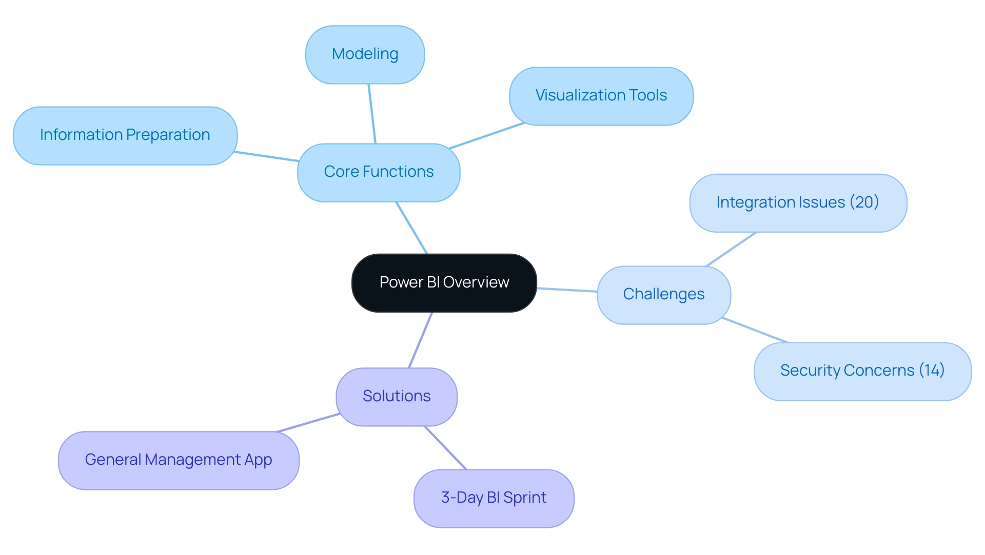
Power BI visualization tools serve as a leading business analytics solution designed to enable organizations to effectively visualize information and share insights across all levels. With core functionalities that encompass information preparation, modeling, and Power BI visualization tools, users can seamlessly connect to a multitude of data sources. This integration is crucial, especially as the social business intelligence market is expected to reach a remarkable $25,886.8 million by 2024.
However, organizations frequently encounter challenges in self-service business intelligence, particularly in integration and security, which represent 20% and 14% of the obstacles, respectively. To navigate these issues, our BI services offer improved reporting capabilities and actionable knowledge through features like:
- The 3-Day BI Sprint, which enables rapid creation of professionally designed reports.
- The General Management App, which provides comprehensive management tools and intelligent reviews to streamline decision-making processes.
Users can create interactive reports and dashboards with Power BI visualization tools that not only showcase information but also tell a compelling story, bolstered by built-in AI capabilities that provide deeper insights into trends and patterns.
For instance, the connected tables feature in the Power BI Datasets Add-in for Excel simplifies the process of integrating Power BI information into Excel workbooks, enhancing user-friendliness. As Kira Belova aptly states,
Embrace the power of BI with PixelPlex to transform your information into a strategic asset.
By leveraging these capabilities, organizations can effectively overcome the challenges of information integration and security, turning raw information into actionable intelligence that drives performance and enhances decision-making across the board.
Additionally, explore our Actions portfolio and book a free consultation to discover how we can tailor our solutions to meet your specific business needs.
Exploring Power BI Visualization Tools: Types and Features
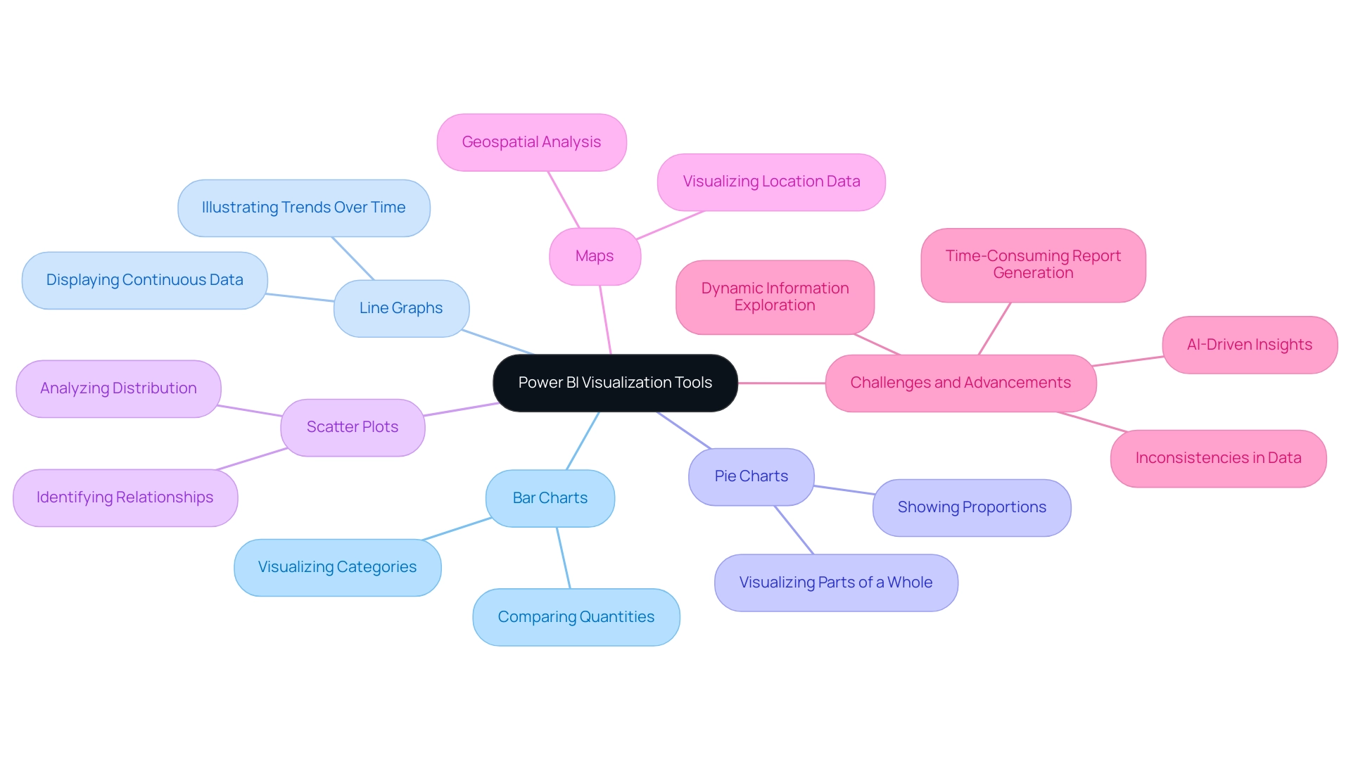
This software features a variety of visualization tools that are crucial for crafting interactive and insightful information presentations. Among the most popular options are:
- Bar charts
- Line graphs
- Pie charts
- Scatter plots
- Maps
Each serving distinct analytical purposes. For instance, bar charts excel at comparing quantities across categories, while line graphs effectively illustrate trends over time.
Furthermore, tables in Business Intelligence serve an essential function in presenting associated information in rows and columns, enabling quantitative comparisons and thorough analysis. However, numerous organizations encounter difficulties in utilizing information from BI dashboards, including:
- Time-consuming report generation
- Inconsistencies, which can obstruct effective decision-making
The capability to tailor visual representations with filters, slicers, and drill-through features enables users to investigate their information dynamically, revealing findings that might otherwise stay concealed.
Recent advancements in information visualization methods and the introduction of new tools in BI 2024 further enhance these capabilities. Notably, AI-driven insights are integrated, allowing for more intuitive information interpretation and helping to address issues of poor master information quality. As Ben Schneiderman aptly stated, ‘Visualization gives you answers to questions you didn’t know you had.’
Furthermore, with our 3-Day BI Sprint, organizations can quickly create professionally designed reports, while the General Management App ensures comprehensive management and smart reviews. Statistics indicate that organizations employing BI visualizations see a 30% rise in user engagement, emphasizing the effectiveness of these tools in narrative presentation. Mastering these resources, along with our GenAI Workshops and tailored Small Language Models, is crucial for anyone looking to elevate their data storytelling and engage their audience effectively.
Getting Started with Power BI: Installation and Setup
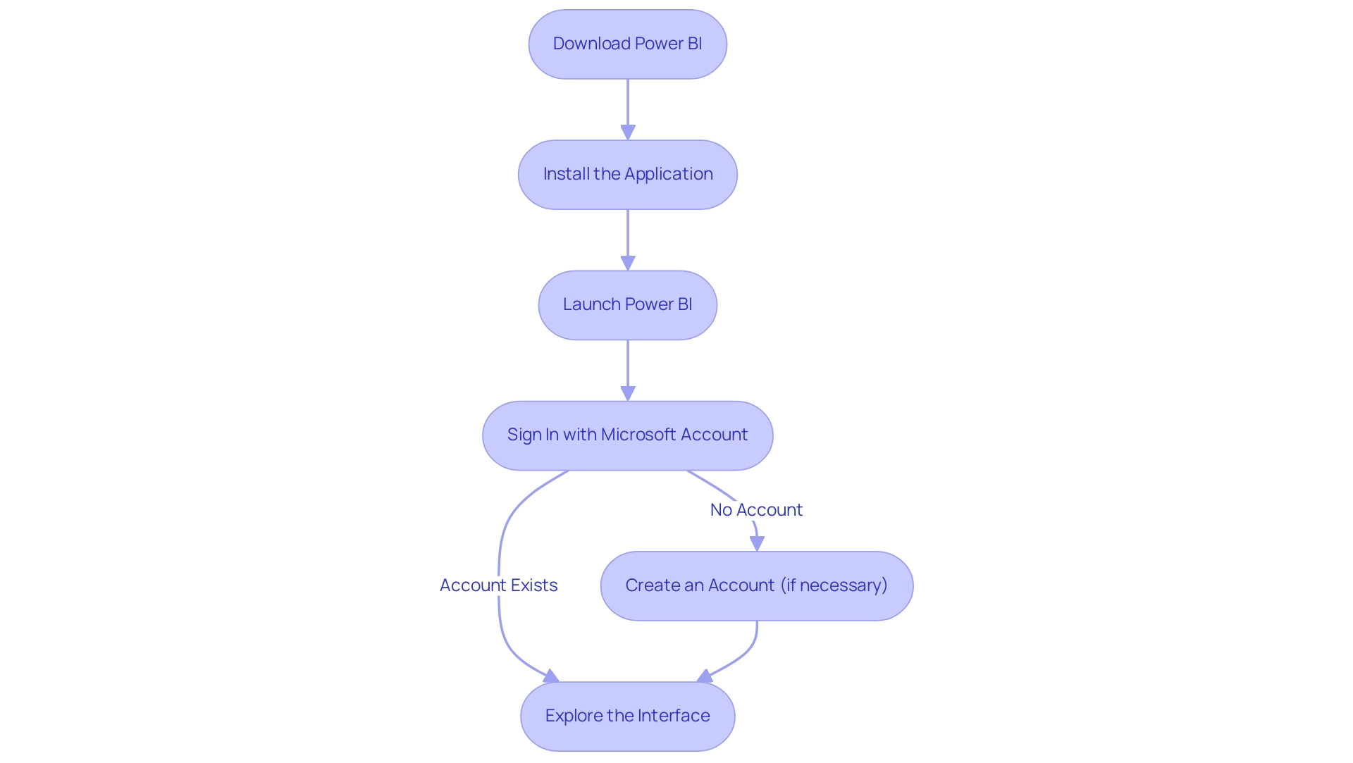
To begin your BI journey, the first step is to download the latest version from the Microsoft website. The installation process is straightforward: simply follow the prompts to install the application on your device. After installation, launch BI and sign in using your Microsoft account.
If you don’t have an account yet, you will have the option to create one during the sign-in process. Once you’re logged in, take a moment to explore the interface. Familiarize yourself with key components such as the ribbon, navigation pane, and report canvas.
This foundational step will empower you to utilize the power BI visualization tools effectively and maximize their features as you start to analyze and visualize your information. In today’s competitive environment, it is essential to utilize the capabilities of Business Intelligence and RPA solutions to enhance operational efficiency and derive valuable information. Notably, as the global cloud-based BI market is projected to reach $15.2 billion by 2026, with 80% of organizations reporting enhanced scalability and flexibility in information access, and 88% of organizations using cloud-based BI reporting increased flexibility in accessing and analyzing information, there’s never been a better time to invest in mastering this powerful tool.
However, companies frequently encounter obstacles such as time-consuming report creation, data inconsistencies, and a lack of actionable guidance when utilizing insights from power bi visualization tools. By understanding and navigating these challenges, you can make the most of Bi’s capabilities. As Tajammul Pangarkar, CMO at Prudour Pvt Ltd, aptly states, ‘When he’s not ruminating about various happenings in the tech world, he can usually be found indulging in his next favorite interest – table tennis.’
This emphasizes the significance of remaining informed about tools such as BI in a constantly changing tech environment, ensuring your business can succeed amidst challenges.
Data Preparation in Power BI: Transforming Your Data for Visualization
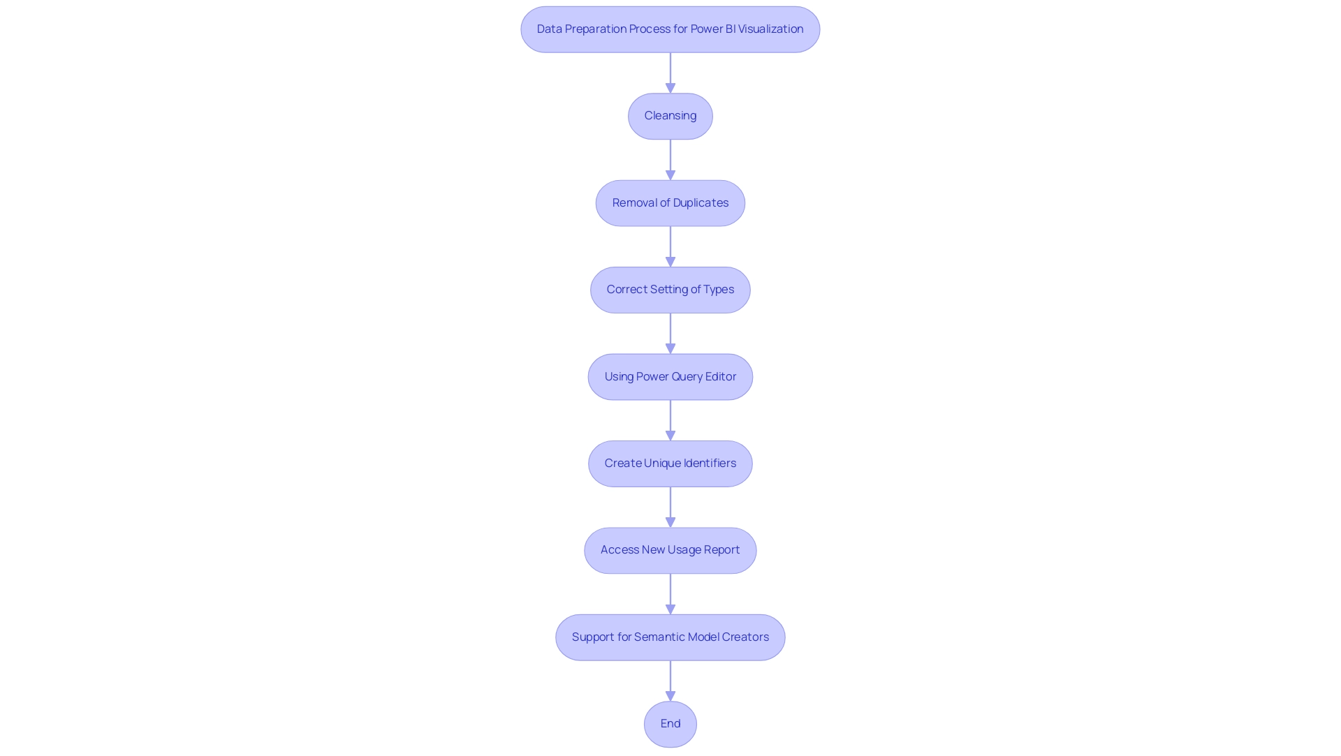
Effective visualization with Power BI visualization tools begins with meticulous preparation and transformation of the information at hand, a critical phase that addresses common challenges such as poor master quality and inconsistencies. This phase encompasses a variety of tasks, including:
- Cleansing
- Removal of duplicates
- Correct setting of types—ensuring dates, numbers, and other formats are accurately defined.
Notably, email or phone number fields must adhere to character limits between 3 to 128 characters, which is essential for validation.
Using the Power Query Editor is essential for executing these processes, as it enables the merging of diverse sources and the application of various transformations such as filtering and grouping. Additionally, unique identifiers can be created by adding prefixes to existing keys in the dataset, thus enhancing information management and tracking. As industry specialists highlight, the precision of visual interpretations greatly depends on the quality of the foundational information.
This highlights the significance of thorough information preparation: it not only improves the clarity and effectiveness of Power BI visualization tools, but it also ensures that the findings produced by these tools are both precise and practical. In light of the common apprehensions surrounding AI adoption, recent advancements in Business Intelligence, including the ‘New usage report on’ option, provide a fresh perspective on metrics, allowing users to access detailed insights over the past 30 days—an invaluable resource for refining strategies. Moreover, utilizing RPA tools such as EMMA RPA and Microsoft’s Automate can streamline these processes, addressing task repetition fatigue and enhancing operational efficiency.
A compelling case study involving the support for semantic model creators further illustrates the benefits of robust information preparation; it demonstrates how Power BI visualization tools streamline provisioning, reduce the workload for model creators, and maintain consistency across various models. By concentrating on these best practices for information preparation, especially in 2024, operations efficiency directors can significantly enhance their storytelling capabilities and overcome barriers to effective AI integration. As your supervisor once noted,
Orders were most likely to ship out on Tuesday,
illustrating how precise information preparation directly influences operational efficiency.
Enhancing Visualizations with R and Python Integration in Power BI
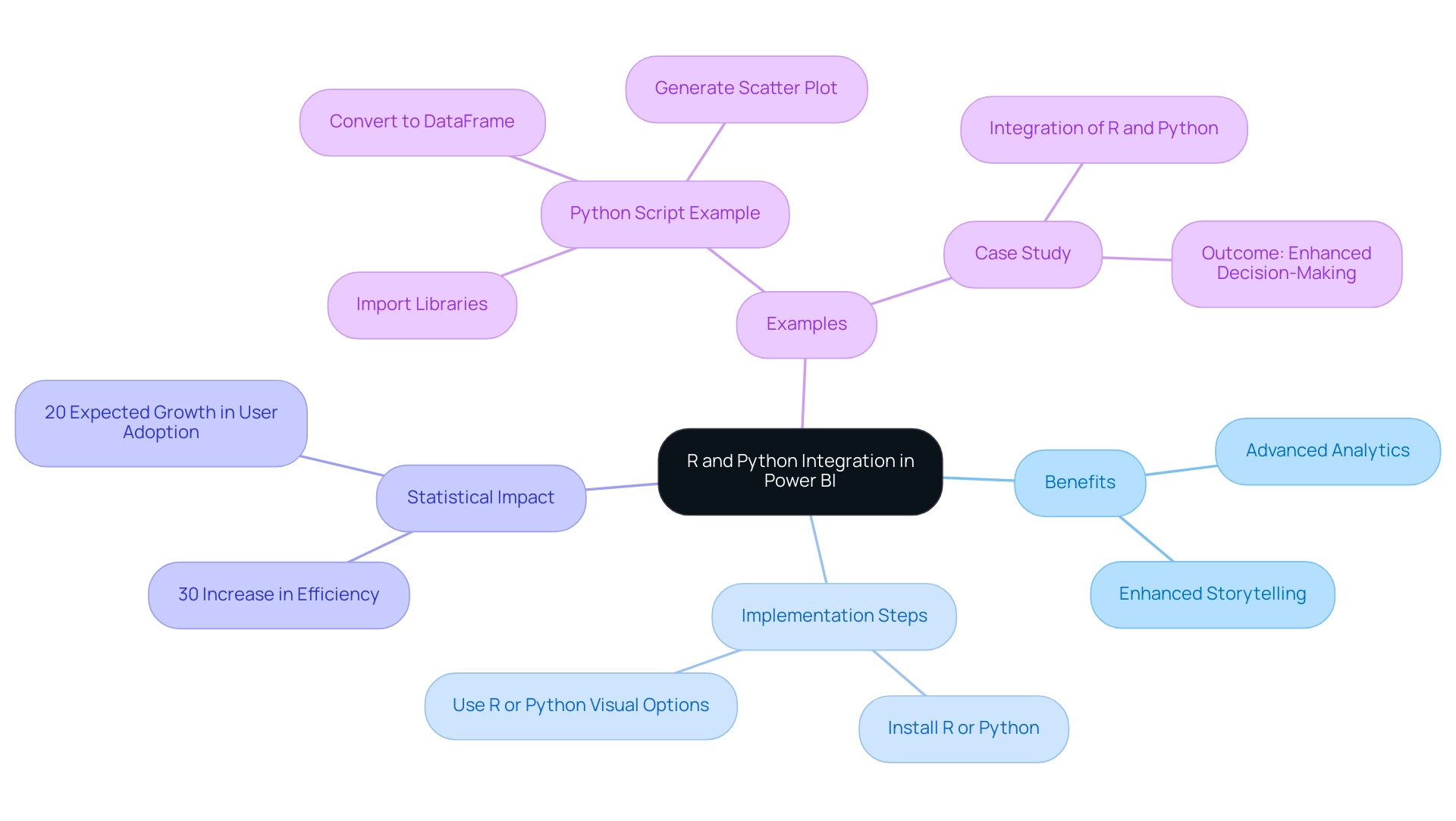
The integration of Bi’s R and Python provides users with vital Power BI visualization tools to unlock advanced analytics and create custom visualizations that enhance storytelling, ultimately leading to a deeper understanding and informed decision-making. In an era where extracting actionable insights is crucial for maintaining a competitive advantage, leveraging these languages can significantly enhance your analytical capabilities. To get started, ensure that either R or Python is installed on your machine.
Within Power BI, the R or Python visual options enable you to execute scripts directly in your reports, seamlessly merging coding capabilities with your analysis. This integration not only supports sophisticated statistical analysis and machine learning models but also enhances visualizations with Power BI visualization tools, tackling common challenges such as time-consuming report creation and inconsistencies. Additionally, our RPA solutions can complement these resources by automating repetitive tasks, further enhancing operational efficiency.
As Nirupama Srinivasan points out, R and Python visual usage will not contribute towards your Microsoft Fabric capacity usage for the first month, making it an ideal time to explore these options. For example, a fundamental Python script can include importing libraries such as matplotlib and pandas, converting your information into a DataFrame, and generating a scatter plot to illustrate relationships within your information. A case study on the integration of R and Python in Business Intelligence shows that organizations employing these resources reported a 30% increase in analytical efficiency and a significant enhancement in decision-making speed.
By utilizing these potent resources alongside RPA solutions, users can significantly improve their analysis and presentation abilities through Power BI visualization tools, tackling the challenges of today’s information-rich environment and advancing their Power BI expertise to new levels. Furthermore, recent statistics suggest that user adoption rates of R and Python in Power BI visualization tools are expected to rise by 20% in 2024, underscoring the growing importance of these languages in the analytics landscape. To learn more about how our solutions can benefit your organization, book a free consultation today.
Conclusion
Power BI represents a pivotal advancement in business analytics, enabling organizations to transform raw data into actionable insights through robust visualization and data integration capabilities. As explored in this article, the platform’s core functionalities—from data preparation and modeling to advanced analytics with R and Python—equip users to navigate common challenges such as data integration issues and security concerns. By leveraging these features, businesses can enhance their decision-making processes and foster a culture of data-driven insights.
The diverse visualization tools available in Power BI, including bar charts, line graphs, and AI-driven insights, empower users to create compelling narratives around their data. This capability not only improves user engagement but also facilitates a deeper understanding of trends and patterns. Moreover, the integration of R and Python further elevates analytical capabilities, allowing for sophisticated statistical modeling and custom visualizations that can lead to improved operational efficiency.
In conclusion, mastering Power BI is essential for organizations striving to thrive in today’s competitive landscape. By investing time in understanding its functionalities and overcoming initial hurdles, businesses can turn their data into a strategic asset that drives performance and innovation. Embracing the full potential of Power BI not only addresses current challenges but also positions organizations for future growth and success in an increasingly data-centric world.

