Introduction
In the rapidly evolving world of data analytics, the ability to create impactful Power BI reports is a game changer for organizations striving for operational efficiency and informed decision-making. By following a structured approach that encompasses everything from initial setup to effective data visualization, stakeholders can unlock the full potential of their data.
This article outlines essential steps for building, refining, and sharing Power BI reports, ensuring they not only convey critical insights but also resonate with users. As organizations navigate the complexities of data management, understanding user needs and applying design principles can significantly enhance the effectiveness of reporting, driving strategic outcomes and fostering a culture of continuous improvement.
Getting Started: Key Steps in Building Power BI Reports
To embark on building impactful Power BI reports while navigating common challenges, adhere to these essential steps:
-
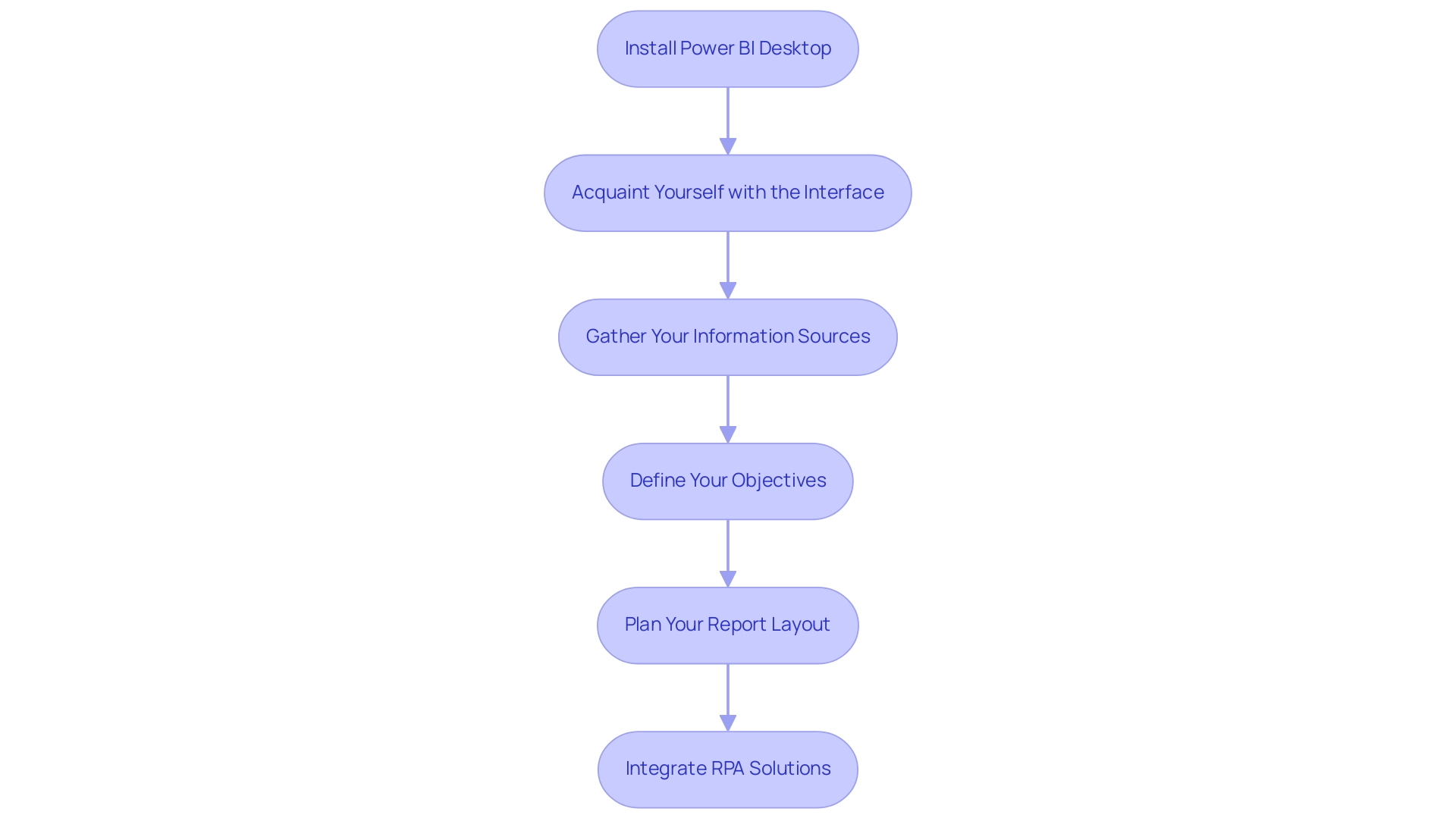
Install Power BI Desktop: Begin by downloading and installing Power BI Desktop from the official Microsoft website. This tool enables you to generate documents locally and is essential for leveraging insights effectively, fulfilling the requirement for a strong base in your reporting journey.
-
Acquaint Yourself with the Interface: Take the time to explore the user interface, including the ribbon, view for insights, and layout. Understanding the location of tools and features will streamline your reporting process and enhance your productivity, combating the inefficiencies often faced in report creation.
-
Gather Your Information Sources: Identify the sources you will utilize, which may include Excel spreadsheets, databases, or cloud services. Ensure you have secure access to this data and comprehend its structure, as the quality of your analysis hinges on reliable data. This step helps mitigate inconsistencies that can lead to confusion and mistrust in your documents.
-
Define Your Objectives: Before diving into creation, articulate what you aim to achieve. Identify key metrics and insights that will resonate with your audience and drive decision-making. This clarity prevents the situation where documents are filled with numbers and graphs yet lacking actionable guidance.
-
Plan Your Report Layout: Create a rough sketch of your report layout to visualize the presentation of information. Consider incorporating a mix of charts, tables, and visuals that will effectively convey your message and engage your audience, enhancing overall information visibility.
Integrating RPA solutions such as EMMA RPA and Automate can further simplify your reporting process, improving operational efficiency by automating repetitive tasks and merging information sources seamlessly. By diligently adhering to these fundamental steps, you will prepare for building Power BI reports that not only enhance visibility but also promote strategic insights within your organization. Remember, when a mere 10% of an organization’s workforce utilizes BI tools regularly, the company risks missing out on critical insights that could propel growth.
According to MicroStrategy, “88% of organizations using cloud-based BI reported increased flexibility in accessing and analyzing information from anywhere, anytime,” underscoring the importance of adopting such tools. Therefore, investing time in mastering these initial processes is essential for unlocking the full potential of business intelligence and driving operational efficiency.
Data Preparation and Visualization: Crafting Effective Reports
To create engaging BI reports that genuinely drive insights, it is crucial to concentrate on careful information preparation, visualization methods, and building Power BI reports. Here are key steps to consider:
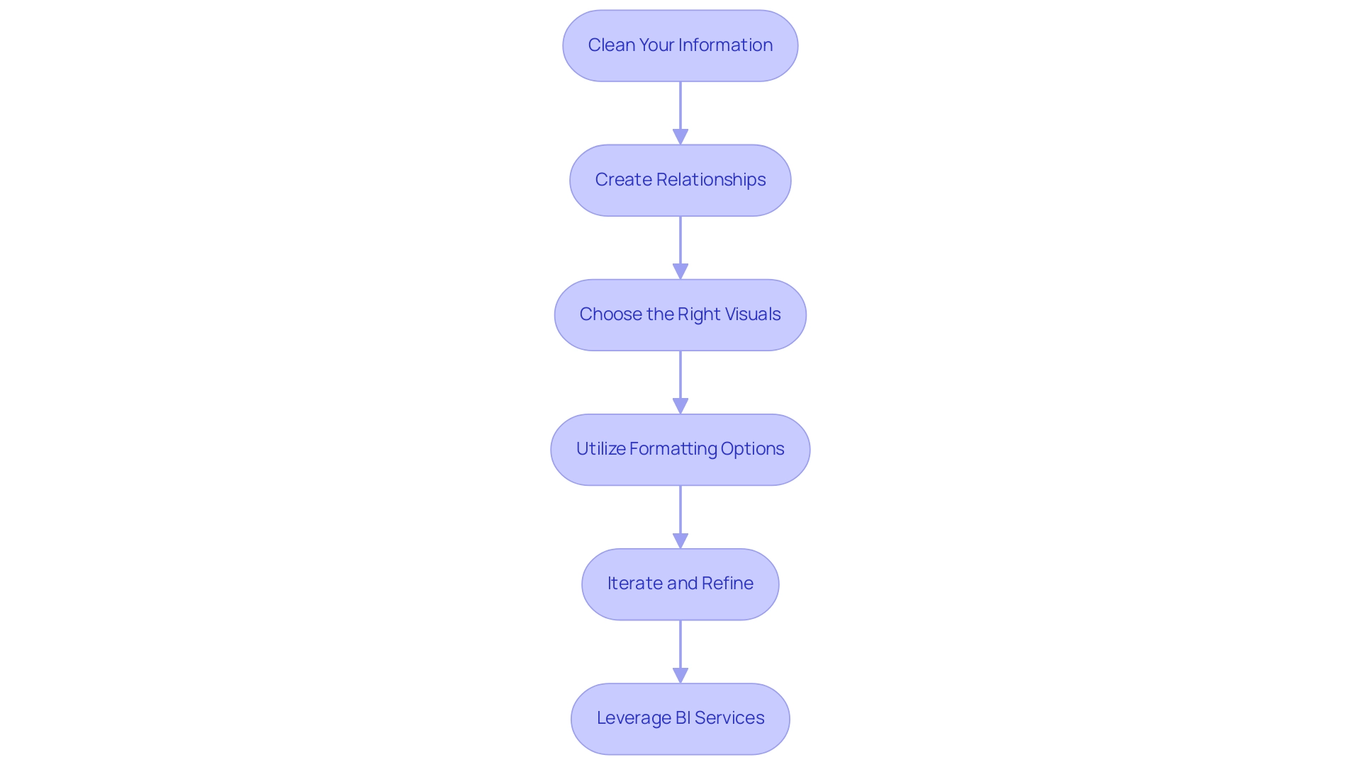
- Clean Your Information: Leverage Power Query to perform comprehensive cleaning and transformation.
- Eliminate duplicates, fill in missing values, and ensure that types are correctly assigned.
- This foundational step is crucial, as effective information cleaning enhances overall quality, leading to more reliable analytics and improved decision-making.
- By incorporating insights from our GenAI Workshops, you can further enhance your information quality, ensuring that your analytics are based on robust, high-quality insights.
-
As highlighted in the case study ‘Data Cleaning Best Practices,’ approaching information cleaning in a standardized, optimized way ensures efficiency and quality results.
-
Create Relationships: When using multiple information tables, establish meaningful relationships among them.
-
This can be done in the ‘Model’ view of Power BI, allowing for comprehensive analysis across datasets and facilitating deeper insights.
-
Choose the Right Visuals: Selecting appropriate visualizations is vital for presenting your information effectively.
- For instance, line charts are ideal for illustrating trends over time, while bar charts excel in comparing different categories.
-
The right visuals not only clarify your message but also engage your audience.
-
Utilize Formatting Options: Enhance the readability and impact of your visuals by employing formatting options such as colors, labels, and tooltips.
-
These elements provide context and clarity, ensuring that your audience can easily interpret the data presented.
-
Iterate and Refine: Continuously test various visualizations and layouts to determine what resonates best with your audience.
-
Collect feedback to enhance your documents, making necessary adjustments to improve clarity and engagement.
-
Leverage BI Services: Consider utilizing our 3-Day BI Sprint for rapid creation, ensuring professionally designed outputs.
- Furthermore, the General Management App can offer extensive oversight and intelligent evaluations, improving your reporting abilities.
By emphasizing information preparation and visualization, building Power BI reports can help generate BI reports that not only convey insights effectively but also enable stakeholders to make knowledgeable choices.
Our RPA solutions can also help automate repetitive reporting tasks, thus enhancing operational efficiency.
As mentioned by Maria S., a Microsoft Certified Power BI Data Analyst, ‘effective preparation is foundational to leveraging the full potential of Power BI, ensuring your analytics lead to actionable outcomes.’
This is particularly relevant in light of recent developments, such as Savant Labs’ $11M seed funding aimed at advancing analytics automation, underscoring the industry’s growing emphasis on data-driven decision-making.
Furthermore, integrating Small Language Models can enhance your data analysis processes, ensuring tailored AI solutions that meet your specific needs.
Understanding User Needs: Defining Report Objectives
To effectively understand user needs and express document objectives, consider the following steps:
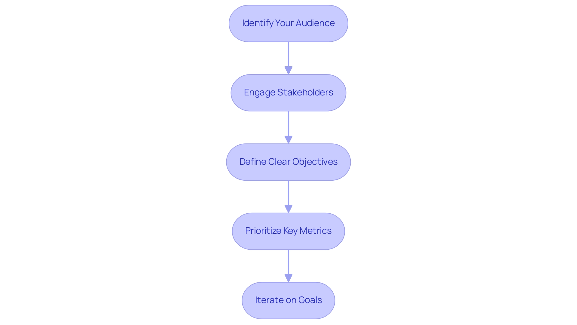
- Identify Your Audience: Start by defining who will use the document. Evaluate their roles and expertise to comprehend the kind of information they need, which is essential for addressing inconsistencies frequently found in various reports. A lack of governance strategy can lead to confusion and mistrust in the data presented, making this step vital.
- Engage Stakeholders: Conduct interviews or surveys to gather insights on expectations and requirements. This engagement not only encourages collaboration but also makes individuals feel appreciated, which is essential for enhancing satisfaction. Engaging participants can mitigate the confusion that arises from poorly governed data. In fact, UserGuiding has over 1,000 teams scaling successfully with its platform, underscoring the importance of understanding user needs.
- Define Clear Objectives: Based on the insights gathered, establish specific goals for the document. Determine what critical questions it should answer and the decisions it should support. Ceren Kurban emphasizes,
To kick off a needs analysis, you should first establish clear objectives using the SMART framework.
This approach ensures that objectives are specific, measurable, achievable, relevant, and time-bound, helping to avoid reports that are filled with numbers yet lack actionable guidance. Offering clear, actionable guidance can enable individuals to make informed decisions based on the data. - Prioritize Key Metrics: Identify the key performance indicators (KPIs) that align with your defined objectives. Concentrate on metrics that produce actionable insights for individuals, enabling them to make informed decisions and leverage the full potential of Business Intelligence.
- Iterate on Goals: As you create the document, consistently revisit and enhance your objectives in response to ongoing audience feedback and insights. This iterative process ensures that the document remains relevant and impactful. Conducting trend analysis to observe changing customer requirements is essential for modifying product features accordingly and improving operational efficiency through RPA solutions.
By thoroughly comprehending customer needs and setting clear goals, you can generate BI documents that facilitate building Power BI reports to communicate vital information and promote significant action. This approach is reflected in successful case studies, such as the one titled ‘Boosting User Satisfaction,’ where engaging users in the feedback process has proven to enhance satisfaction and reduce costs associated with feature updates.
Design Principles for Effective Power BI Reports
To effectively apply design principles in Power BI visuals while overcoming common challenges, such as time-consuming creation, data inconsistencies due to a lack of governance strategy, and a lack of actionable guidance, the following guidelines should be considered:
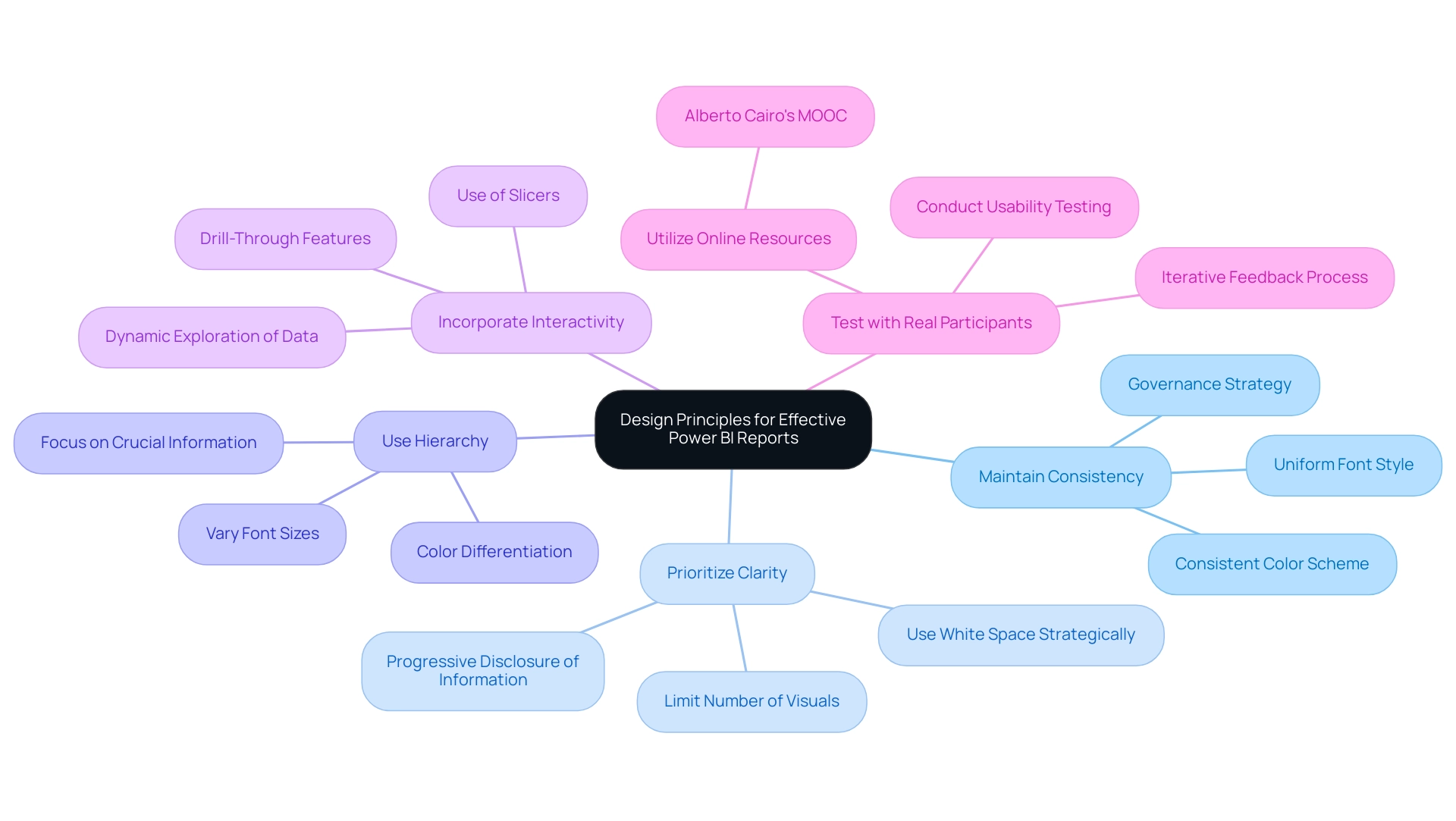
- Maintain Consistency: A cohesive look and feel can be achieved by using a consistent color scheme, font style, and layout throughout the document. This consistency helps reinforce brand identity and aids in navigation, ultimately reducing the time spent on report construction. Moreover, establishing governance around design choices can prevent inconsistencies in future reports.
- Prioritize Clarity: Visuals must be easy to read and interpret. The picture superiority effect suggests that visual information is more likely to be remembered than text, making it crucial to limit the number of visuals on each page and use white space strategically to reduce clutter. By doing this, you promote gradual sharing of information, enabling individuals to take in details step by step and construct a comprehensive understanding without overwhelming them. This clarity can help mitigate confusion and mistrust in information, particularly when governance strategies are lacking.
- Use Hierarchy: Establish a clear visual hierarchy by varying font sizes and colors. This method directs individuals’ focus toward the most crucial information, ensuring that important details stand out and offers actionable insights to stakeholders. This approach can help tackle the problem of documents being filled with numbers and graphs without clear direction.
- Incorporate Interactivity: Power BI’s interactive features, such as slicers and drill-throughs, enable individuals to explore information dynamically, promoting a deeper understanding of insights. This corresponds with the changing demand for data visualization specialists and meets the need for clear, actionable advice in documents, particularly when individuals may feel overwhelmed by the information provided.
- Test with Real Participants: Conduct usability testing with real individuals before finalizing the document to gather valuable feedback. This iterative process allows for adjustments that enhance the experience and ensure the design meets audience needs. Resources such as Alberto Cairo’s online MOOC on visualizations can serve as supplementary material for understanding best practices.
By adhering to these design principles, you can focus on building Power BI reports that not only address common challenges but are also visually appealing and effective in conveying insights. This facilitates decision-making and prepares users to navigate a data-driven landscape. As noted by John Tukey, who advocated for a coherent approach to data analysis, starting with a clear visual design is essential for effective exploratory data analysis, emphasizing that clarity in presentation fosters better understanding and engagement.
Publishing and Sharing Your Power BI Reports
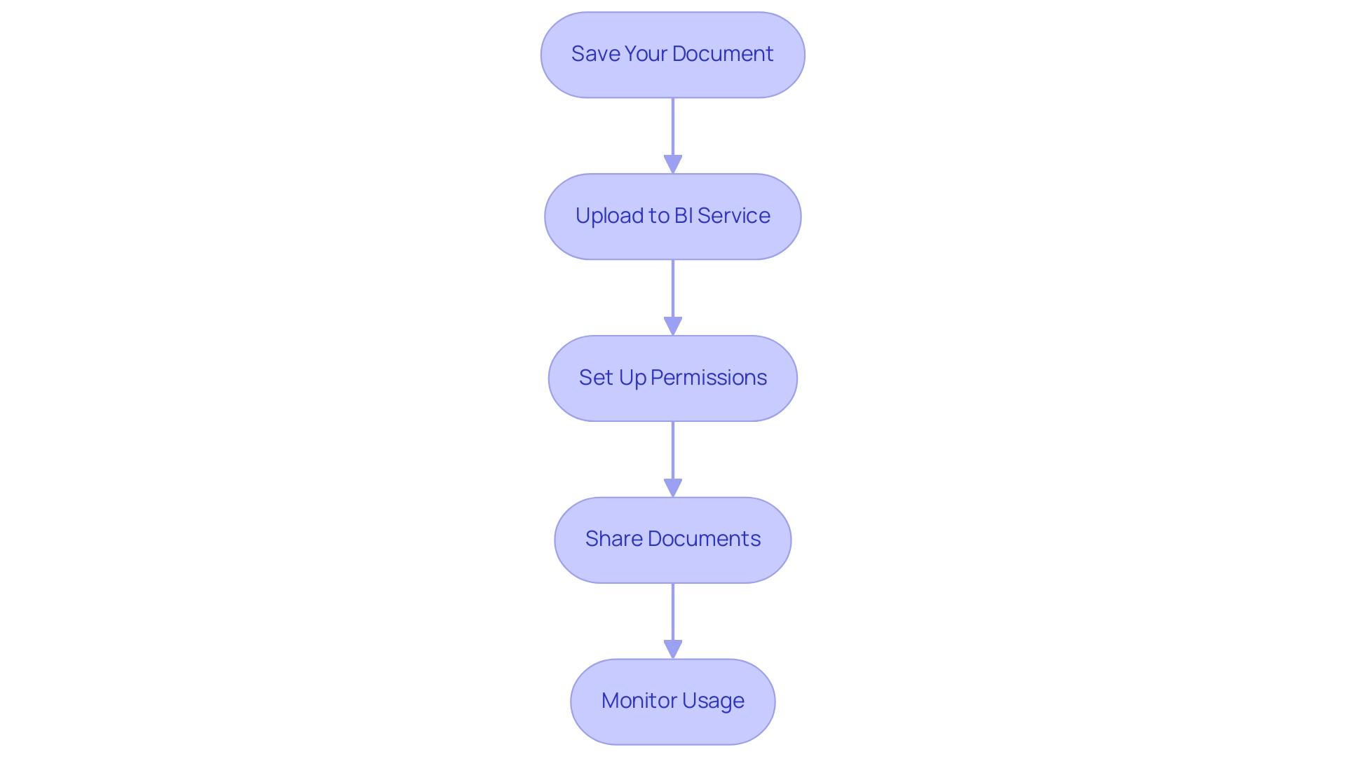
To effectively publish and share your BI analyses and maximize their impact on business operations, adhere to these essential steps:
- Save Your Document: Ensure that your document is saved in the desired format (.pbix) and that all necessary modifications are finalized before proceeding.
- Upload to BI Service: Click the ‘Publish’ button in BI Desktop to transmit your document to the BI Service, enabling online access for stakeholders and facilitating informed decision-making.
- Set Up Permissions: In the Power BI Service, meticulously configure access rights to dictate who can view or modify the document. This critical step safeguards sensitive data and maintains control over access, addressing common challenges in leveraging insights from your dashboards.
- Share Documents: Utilize the ‘Share’ feature to distribute documents to specific users or create a consolidated dashboard that aggregates multiple documents for broader visibility. This method enables teams to utilize insights efficiently, as highlighted in our 3-Day Business Intelligence Sprint, where we guarantee to produce a fully functional, professionally designed document on a topic of your choice, offering a template for future projects.
- Monitor Usage: After sharing, actively monitor utilization and solicit feedback to gain insights into how stakeholders engage with the document. This information is crucial for improving future versions and boosting operational effectiveness.
By adhering to these steps, you enable your organization to utilize the full capabilities of building Power BI reports, promoting informed decision-making and ensuring that important insights are easily accessible. Notably, as part of this process, users should be aware that usage metrics are not available when utilizing Private Links, which can significantly impact data visibility. It’s crucial to understand that usage metrics update daily, providing fresh insights into engagement and productivity.
Additionally, for a comprehensive view of metrics across all dashboards or reports, remove default filters that limit visibility to only the dashboard or report initially used. A practical example of this can be seen in the case study titled ‘Creating a Fresh Usage Metrics Report,’ which illustrates how the insights derived from our 3-Day Business Intelligence Sprint can help achieve similar outcomes. As Shubhangi Pandey aptly puts it, ‘Effective data management enhances productivity and engagement, making it vital to leverage tools like Power BI for insightful reporting.’
This iterative approach not only enhances report accuracy but also fosters a culture of continuous improvement within your organization, emphasizing the importance of building Power BI reports in driving growth and innovation.
Conclusion
In the realm of data analytics, mastering the creation of impactful Power BI reports is essential for organizations aiming to enhance operational efficiency and informed decision-making. By following a structured approach that begins with the installation of Power BI Desktop and familiarization with its interface, stakeholders can lay a solid foundation for their reporting journey. Identifying data sources, defining report goals, and planning layouts are crucial steps that ensure reports are both insightful and engaging.
The importance of meticulous data preparation and effective visualization cannot be overstated. Cleaning data, creating meaningful relationships, and selecting the right visuals are key to transforming raw data into actionable insights. By prioritizing clarity and interactivity in report design, organizations can foster a deeper understanding among users, leading to more informed decisions. Engaging with users to understand their needs further amplifies the relevance and impact of reports, ensuring they serve their intended purpose.
Publishing and sharing the reports effectively completes the cycle of report creation. By ensuring proper permissions, utilizing the sharing features, and monitoring usage, organizations can maximize the value derived from their Power BI reports. This iterative process not only enhances report accuracy but also cultivates a culture of continuous improvement, positioning organizations to thrive in a data-driven landscape.
Ultimately, the journey of building and refining Power BI reports is not just about the tools or techniques used; it is about empowering stakeholders to harness the full potential of their data. By embracing these practices, organizations can unlock critical insights that drive strategic outcomes and foster a culture of innovation and growth.

