Overview
The article focuses on best practices for using KPI icons in Power BI to enhance data visualization and decision-making. It emphasizes the importance of clarity, consistency, and relevance in designing KPI icons, supported by examples and guidelines on integration, which collectively contribute to improved operational efficiency and stakeholder engagement.
Introduction
In the realm of data-driven decision-making, Key Performance Indicator (KPI) icons have emerged as indispensable tools that simplify complex metrics into visually engaging formats. These icons not only serve as quick reference points for stakeholders but also enhance the clarity of performance evaluations, allowing organizations to focus on what truly matters. As businesses increasingly turn to real-time data tracking and Robotic Process Automation (RPA), the role of KPI icons in streamlining operations and driving efficiency becomes ever more critical.
This article delves into the significance of KPI icons, their effective design characteristics, and practical integration strategies within Power BI, providing a comprehensive guide for organizations aiming to leverage visual analytics for improved operational success.
Understanding KPI Icons: Definition and Importance
KPI icons, or Key Performance Indicator icons, are essential visual tools that encapsulate critical business metrics in an easily digestible format. These symbols act as quick reference points for stakeholders, enabling them to swiftly assess performance against established goals. Their importance resides in the simplification of intricate information, making it more accessible and actionable.
For instance, a green symbol might represent a sales target that has been successfully met, while a red symbol would indicate areas where performance has fallen short. Such visual cues not only streamline the decision-making process but also allow leaders to concentrate on urgent matters without wading through extensive reports. In 2024, as organizations increasingly depend on real-time information tracking, the effectiveness of KPI symbols in improving operational efficiency becomes even more evident.
This is further amplified by leveraging Robotic Process Automation (RPA) to automate manual workflows, which reduces errors and frees up teams for more strategic, value-adding work. According to Korea Lastiri, a leading expert in operational performance:
- Are your customers happy?
- Is your team motivated?
- Are your processes efficient?
These questions highlight the critical nature of visual information representation in driving business success, particularly as it intersects with RPA and Business Intelligence. Historically, the first KPI dashboard was created at a Scottish cotton mill in the 1800s, highlighting the long-standing evolution of KPI tools.
Furthermore, organizations that have implemented KPI icons, as illustrated in case studies like the understanding of KPIs and the Net Promoter Score (NPS), have reported improved focus and responsiveness to operational challenges. This supports the notion that effective visual analytics, combined with RPA, is pivotal for informed decision-making. Centralized data access is crucial for uncovering insights and enabling quick action on KPI findings, and KPI performance summaries provide an overview of progress, trends, and outcomes related to business objectives.
![]()
Characteristics of Effective KPI Icons
Effective kpi icons are distinguished by several essential characteristics: clarity, simplicity, and relevance. Icons must be easily recognizable and intuitively convey their meaning without necessitating additional explanation. This principle is particularly crucial in today’s fast-paced business environment, where performance metrics need to be updated frequently for timely interventions, especially as companies turn to Robotic Process Automation (RPA) to streamline these workflows.
RPA can automate the design and application of KPI icons, ensuring consistent updates and minimizing the potential for human error. Consistency is also crucial; elements should be designed with a uniform color scheme and style that aligns with the organization’s branding, promoting a cohesive visual identity. Furthermore, effective kpi icons must be relevant to the specific metrics they represent, ensuring they accurately reflect performance and facilitate swift comprehension.
For instance, a dollar sign symbol effectively communicates revenue metrics, while a clock symbol intuitively signifies time-related KPIs. Such traits form a visual language that enhances data communication, making it easier for teams, including HR and project managers, to identify bottlenecks and inefficiencies. In the case study of tracking project completion rates, kpi icons played a key role in highlighting delays, enabling timely interventions that improved operational efficiency.
As Sara Bullock aptly noted,
In today’s high-stakes retail environment, software is a must-have for CPGs that want to optimize their retail execution, sales, processes, and retailer relationships.
By incorporating customized AI solutions alongside kpi icons and RPA, businesses can further enhance their operational effectiveness, driving data-driven insights that foster growth in a rapidly evolving AI landscape.
![]()
Integrating KPI Icons into Power BI: Step-by-Step Guide
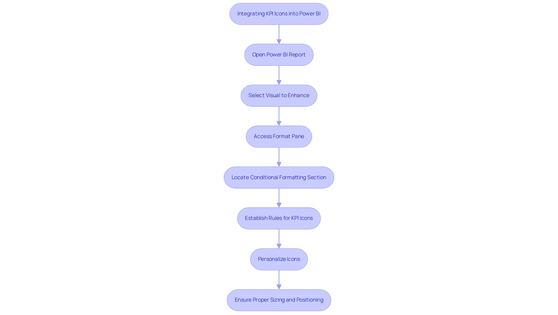
Incorporating KPI icons into Power BI is an uncomplicated procedure that significantly enhances visualization and addresses common challenges in utilizing insights. Begin by opening your Power BI report and selecting the visual you want to improve with KPI symbols. Access the ‘Format’ pane and locate the ‘Conditional formatting’ section, where you can establish rules dictating when specific KPI icons will appear based on the underlying values.
For instance, you might assign a green icon for values exceeding a defined threshold, while a red icon could indicate values that fall below it. Significantly, the real value in the performance indicator visual can reach 400, demonstrating the potential effect of successful performance indicator integration in addressing challenges such as time-consuming report creation and inconsistencies in information.
To effectively show multiple performance indicators and offer actionable guidance, it is advised to avoid clutter and utilize a variety of visuals. Organizing related performance indicators and upholding a uniform design improves comparison and clarity in reporting, ensuring stakeholders obtain clear guidance from the information presented. Furthermore, a well-defined governance strategy is essential for maintaining consistency and trust, which can be supported by the clear visual representation of KPIs.
Once the rules are established, you can further personalize the symbols by either uploading your own images or selecting from the extensive library available within Power BI. As Harris Amjad suggests, in the primary interface of Power BI desktop, click ‘Get Information’ in the ‘Home’ ribbon and select the ‘SQL Server’ option to start your information integration journey.
Finally, it’s essential to ensure that the symbols are sized and positioned effectively to enhance their visibility, resulting in a cohesive and informative visual presentation. This method not only improves the clarity of your KPI reporting but also encourages greater user adoption of KPI visuals, making them more intuitive and visually appealing while tackling the common challenges encountered in reporting. By enhancing transparency in reporting through the use of KPI icons, you can build greater trust in the data presented.

Types of KPIs and Their Visual Representation in Power BI
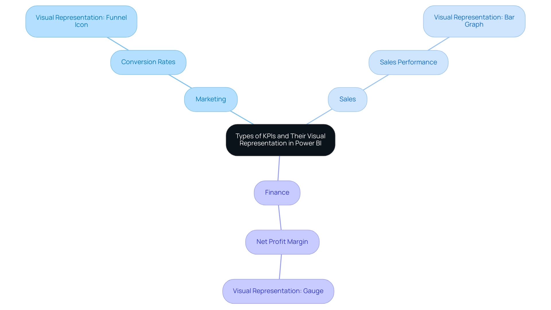
Organizations use varied performance indicators to drive different business functions, and Power BI offers robust tools for visualizing these metrics effectively. With services like the 3-Day Power BI Sprint, teams can quickly create professionally designed reports, ensuring efficient reporting and actionable insights. It’s crucial to ensure that performance indicators are sorted by Fiscal Month and that the Value well column is continuous without null values for accurate display.
For example, in marketing:
- Conversion rates can be illustrated with dynamic funnel icons that guide stakeholders through the customer journey.
In sales:
- Sales performance is best represented by bar graphs or line charts, showcasing revenue trends over time and offering a clear comparison of performance metrics.
In finance:
- Financial metrics, such as net profit margin, benefit from gauge visuals that succinctly convey performance relative to set targets.
Regular updates, typically monthly or quarterly, are essential to maintain accurate KPI reporting. A tailored approach to using KPI icons for representation ensures that stakeholders can swiftly interpret performance insights, fostering a culture of data-driven decision-making. As noted by Amway, the ability to collect comprehensive data swiftly allows for agile adjustments in advertising efforts, while companies like Henderson have experienced operational efficiency improvements of up to 85% through effective KPI integration.
Additionally, the Click-through Rate (CTR) case study illustrates how this metric measures engagement and content effectiveness, reinforcing the critical role that well-visualized KPIs play in organizational success. To explore our full range of services, including our Actions portfolio, and to discuss how we can assist you, we invite you to book a free consultation.

Best Practices for Designing and Using KPI Icons in Power BI
To maximize the effectiveness of KPI icons in Power BI, adhering to best practices is essential. Begin by ensuring symbols are consistently sized and spaced to create a clean visual layout. Utilizing contrasting colors can significantly enhance visibility, drawing attention to critical metrics that drive decision-making.
KPI dashboards, which utilize KPI icons, act as a unified reference for company performance indicators, emphasizing the significance of efficient graphic design. It’s crucial to avoid overcrowding visuals with excessive symbols; instead, focus on the most relevant KPIs, limiting the total to six to ten key indicators to prevent overwhelming users. Regular reviews and updates of KPI icons are necessary to accurately reflect any changes in business priorities or performance metrics.
Furthermore, actively gathering user feedback on the clarity and effectiveness of these KPI icons fosters continuous improvement in their design and functionality. The 3-Day Power BI Sprint service illustrates how organizations can swiftly generate professional reports that convert information into actionable insights, enabling informed decision-making that propels growth. Additionally, leveraging RPA solutions, such as EMMA RPA and Power Automate, can further enhance operational efficiency by automating repetitive tasks and streamlining processes.
As part of this strategy, the SMART criteria should guide KPI development to ensure relevance and effectiveness. As Stuart Kinsey, co-founder of SimpleKPI, emphasizes, embracing KPIs and visualizing performance is vital for any organization striving to grow. Implementing these best practices will create a more intuitive and informative visualization experience, ultimately aligning with organizational goals and enhancing operational efficiency.
To learn more about how our services can help you achieve these outcomes, book a free consultation today.
![]()
Overcoming Challenges in KPI Icon Implementation in Power BI
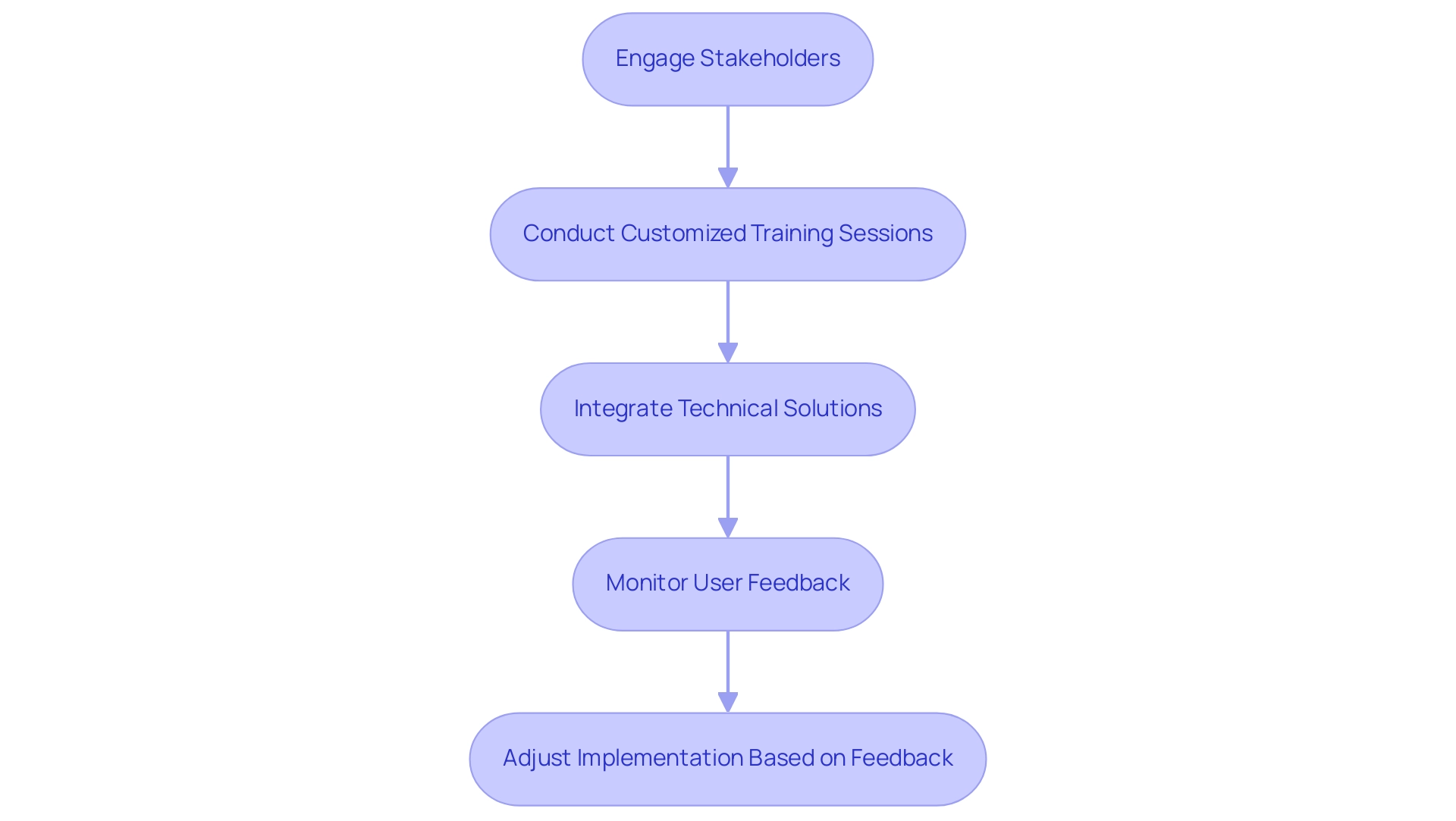
Implementing KPI icons in Power BI often involves navigating a range of challenges, including user resistance, technical difficulties, and potential misinterpretation of data. Engaging stakeholders early in the process is essential; this approach not only gathers valuable input but also fosters a sense of ownership and buy-in. To further enhance efficiency, consider participating in our 3-Day Power BI Sprint, designed to create professional reports that leverage insights for impactful decision-making.
In just three days, we promise to deliver a fully functional, professionally designed report on a topic of your choice, allowing you to focus on utilizing the insights. Additionally, you can use this report as a template for future projects, ensuring a professional design from the start. Customized training sessions can greatly enhance users’ comprehension of KPI icons, ensuring they interpret these icons accurately and utilize them effectively.
As highlighted by community advocate themistoklis, integrating rules and conditional formatting into measures is essential for enhancing the functionality of these symbols. For instance:
- If the category is A and the value is greater than 0, then it could be represented by an up arrow.
- A value less than 0 could indicate a down arrow.
Furthermore, ensuring that technical integration is managed by experienced personnel helps to mitigate implementation errors.
Regularly monitoring user feedback is vital; being responsive to their insights allows for timely adjustments that can enhance the user experience. By proactively tackling these challenges, organizations can significantly enhance the effectiveness of KPI icons, leading to improved overall visualization outcomes. The Maven Northwind Challenge exemplifies this, where participants creatively designed an executive KPI dashboard that effectively communicated critical information through dynamic KPI visuals, despite complexities.
The resulting dashboard demonstrated effective KPIs that conveyed substantial information in a compact format. Ultimately, overcoming user resistance to KPI icons in Power BI can transform data visualization and drive more informed decision-making. Additionally, as highlighted by bili you, providing adequate training and support for users is essential, especially for beginners looking to navigate these features.

Conclusion
KPI icons play a pivotal role in transforming complex data into visually engaging metrics that enhance decision-making processes across organizations. By simplifying critical performance indicators into easily digestible formats, these icons empower stakeholders to assess performance quickly and effectively. The integration of KPI icons with tools like Power BI and Robotic Process Automation (RPA) is essential for driving operational efficiency and fostering a data-driven culture.
The characteristics of effective KPI icons—clarity, simplicity, and relevance—are crucial for ensuring that these visuals communicate the intended message without confusion. A well-designed KPI icon not only aligns with organizational branding but also facilitates swift comprehension of performance metrics. Best practices, such as maintaining consistency and focusing on the most relevant indicators, further enhance the effectiveness of these visual tools.
As organizations continue to navigate the challenges of implementing KPI icons, engaging stakeholders and providing tailored training can significantly improve user adoption and interpretation. By addressing these challenges head-on, businesses can unlock the full potential of KPI icons, leading to improved data visualization and more informed decision-making. Ultimately, the strategic use of KPI icons can drive operational success, enabling organizations to stay agile and responsive in an increasingly data-centric landscape.
