Overview
Power BI comparison visuals are essential for effective data analysis, enabling organizations to accurately examine and contrast various data points, thereby enhancing operational efficiency and informed decision-making. The article emphasizes best practices such as simplicity in design, understanding the audience, and ensuring data quality, which collectively support the effective use of these visuals in driving actionable insights and addressing common pitfalls in data representation.
Introduction
In the dynamic landscape of data analytics, Power BI comparison visuals have emerged as essential tools for organizations seeking to harness the power of data-driven insights. These visuals, ranging from bar charts to scatter plots, not only simplify the process of analyzing complex datasets but also enhance decision-making capabilities by providing clear representations of trends and relationships.
As businesses increasingly turn to Business Intelligence solutions—projected to reach over half a million deployments in 2024—the importance of mastering these comparison visuals cannot be overstated. This article delves into the various types of comparison visuals available in Power BI, best practices for their design, and the critical role of data quality and user feedback in ensuring effective data communication.
By understanding these elements, organizations can unlock the full potential of Power BI, driving operational efficiency and strategic growth in an ever-evolving market.
Understanding Power BI Comparison Visuals
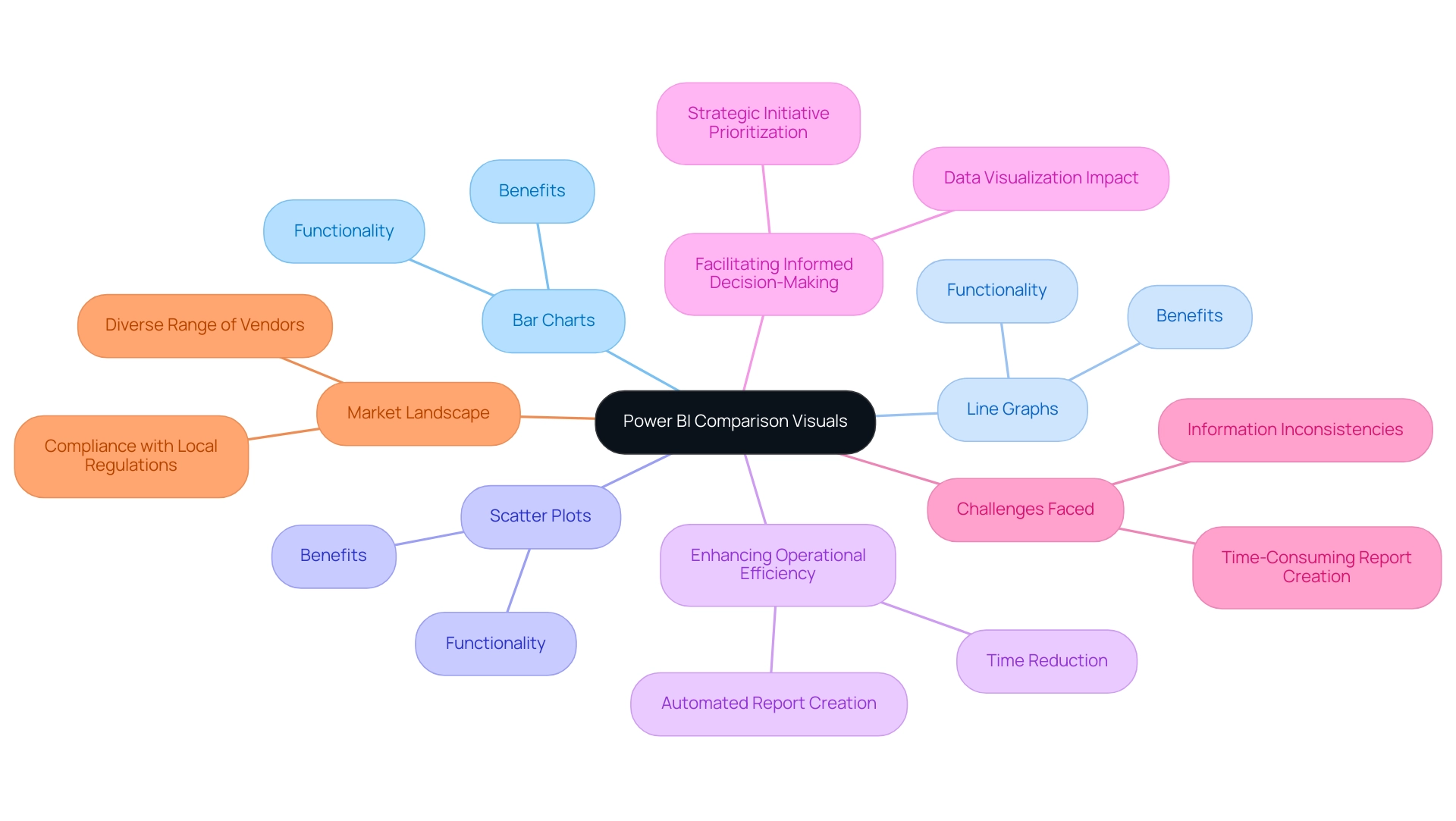
BI comparison representations function as effective instruments for examining and contrasting various information points with accuracy. Utilizing formats such as bar charts, line graphs, and scatter plots, these representations offer a transparent depiction of data relationships, trends, and performance metrics, making them indispensable for organizations aiming to enhance their operational efficiency. In 2024, approximately 587,000 companies are deploying Business Intelligence solutions, reflecting a growing reliance on data-driven strategies.
This statistic highlights the importance of power BI comparison visuals in improving operational efficiency and facilitating informed decision-making. By effectively utilizing these images, organizations can swiftly pinpoint discrepancies, monitor progress against targets, and facilitate informed decision-making. For instance, in the case study titled ‘Viewing Content for Usage Metrics Correlation,’ users must engage with content in their workspace to enable the processing of information for the Usage Metrics Report, illustrating the practical application of these visuals.
Additionally, integrating Robotic Process Automation (RPA) can further enhance these processes, allowing for automated report creation and reducing the time spent on manual tasks. However, challenges such as time-consuming report creation and information inconsistencies can hinder the effective use of BI insights. As emphasized by industry specialists, the capability to visualize information clearly influences decision-making effectiveness, allowing teams to prioritize strategic initiatives instead of maneuvering through complexity.
Furthermore, the evolving landscape of the Business Intelligence market, characterized by a multitude of vendors, reinforces the need for organizations to adopt advanced data visualization tools such as BI to stay competitive and compliant with local regulations. Key features of BI services, including the ‘3-Day BI Sprint’ for rapid report creation and the ‘General Management App’ for comprehensive oversight, are essential in addressing these challenges. As the Platform indicates, the technology a viewer used to open a report—whether via BI.com, Mobile, or Embedded—further emphasizes the versatility of BI in meeting diverse organizational needs.
Types of Comparison Visuals in Power BI
Power BI comparison visuals offer a diverse array of tools, each designed for distinct analytical tasks, which is crucial for driving data-driven insights in an increasingly competitive landscape. The primary types include:
-
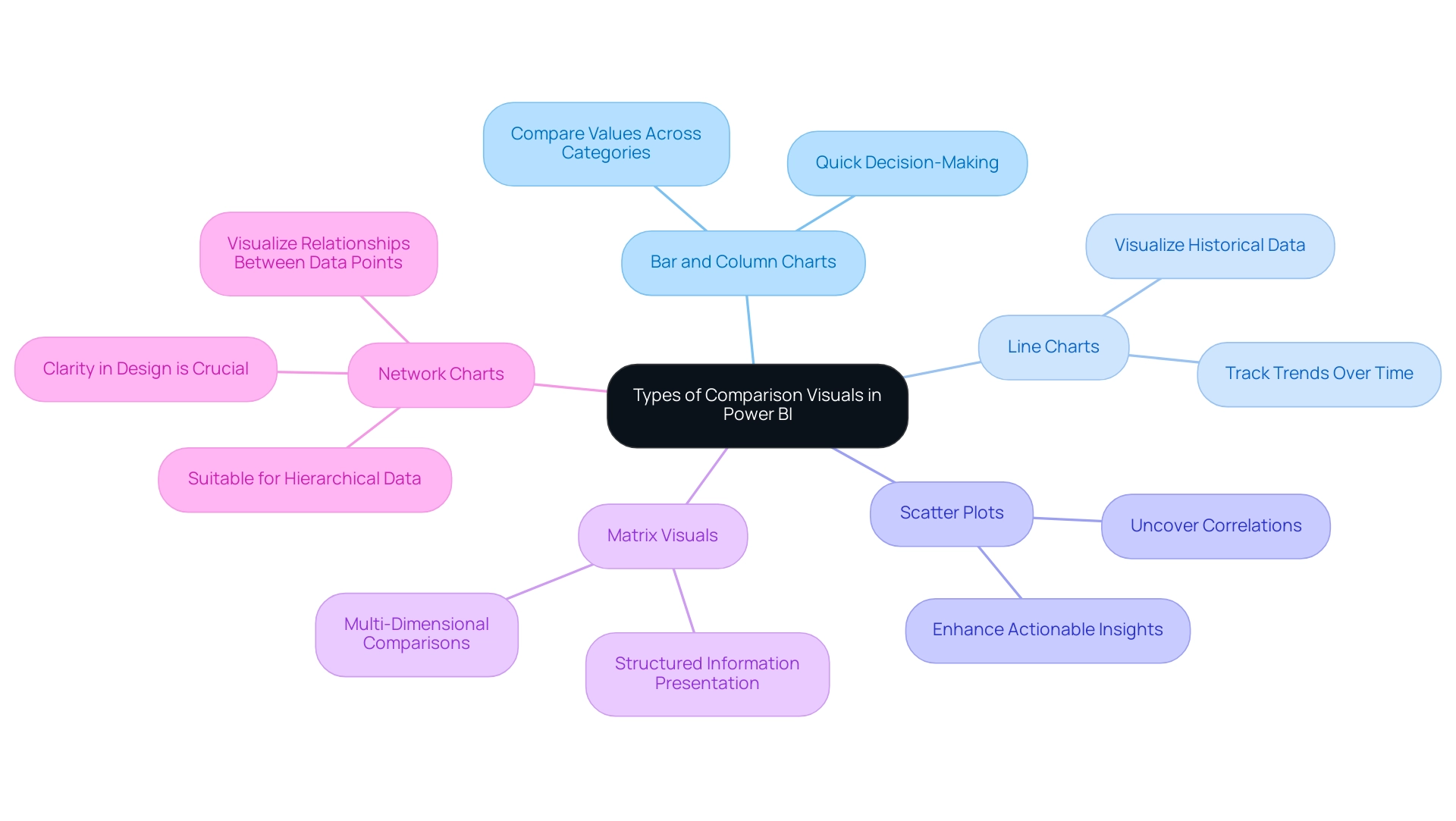
Bar and Column Charts: These charts excel in comparing values across different categories, making them vital for Power BI comparison visuals, as they effectively illustrate disparities in size and support quick decision-making. They assist in optimizing report generation by enabling individuals to swiftly visualize key metrics without extensive manual information handling.
-
Line Charts: Ideal for tracking trends over time, line charts serve as effective Power BI comparison visuals for comparing points across various intervals. This functionality addresses the challenge of time-consuming report creation by enabling users to visualize historical data trends at a glance, thus improving decision-making efficiency.
-
Scatter Plots: These representations are instrumental in uncovering correlations between two variables, offering insights into relationships that may otherwise remain hidden, particularly when analyzed through Power BI comparison visuals. By highlighting these correlations, scatter plots enhance the actionable guidance derived from BI tools, allowing for more informed strategic decisions.
-
Matrix Visuals: Providing a grid-like representation, matrix visuals enable multi-dimensional comparisons, which are essential for operational efficiency when utilizing Power BI comparison visuals in complex analytical tasks. They can help reduce inconsistencies by presenting information in a structured format that is easier to interpret.
In a recent project, our finalized leads totaled 12, highlighting the significance of effective information visualization in decision-making and how it can address issues like inconsistencies. As Satyam Chaturvedi, Digital Marketing Manager at Arka Softwares, states, “I love to spend my time studying the latest market insights,” emphasizing the importance of comprehending information in today’s market. Additionally, network charts, which visualize relationships between information points, are particularly useful for hierarchical structures but can become overwhelming if not designed with clarity in mind.
Comprehending these choices enables users to customize their visualizations effectively, ensuring alignment with the specific insights they seek to extract from their information. Furthermore, integrating RPA solutions can streamline the visualization process by automating repetitive tasks, thereby maximizing the potential of Business Intelligence and RPA in fostering business growth.
Best Practices for Designing Comparison Visuals
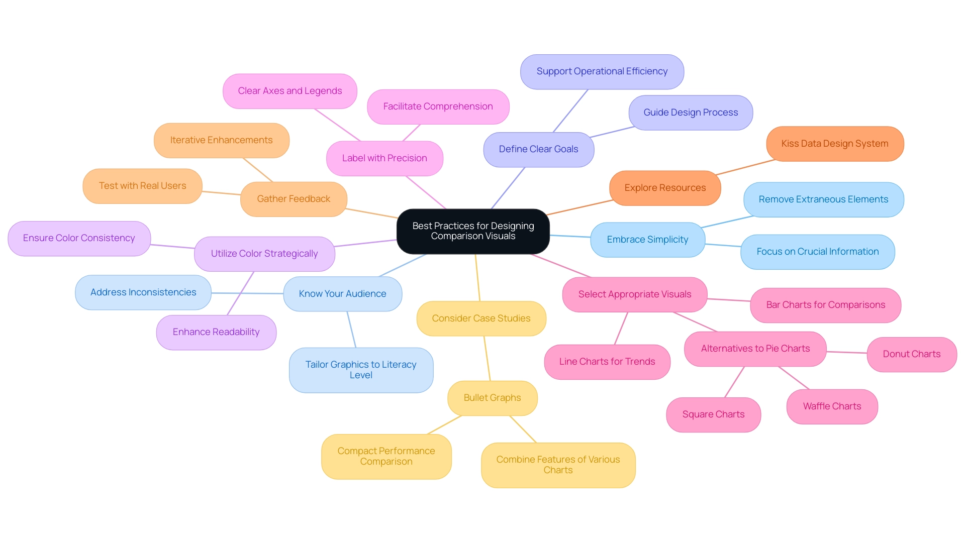
To create impactful Power BI comparison visuals, several best practices should be adopted:
-
Embrace Simplicity: A minimalist approach is crucial. Concentrate on crucial information while removing extraneous elements that may distract or confuse the viewer. This aligns with recent studies emphasizing the importance of simplicity in visualization design principles, particularly in the context of Business Intelligence, where clarity can drive better decision-making.
-
Know Your Audience: Understanding your audience’s literacy is vital. Tailor your graphics to their level of understanding, ensuring that the information presented is accessible and actionable. This consideration is especially important in overcoming challenges like inconsistencies that can arise in Power BI dashboards.
-
Define Clear Goals: Establishing clear objectives for your visualizations helps guide the design process and ensures that the visuals effectively communicate the intended message. Clear objectives support the overall mission of leveraging BI for operational efficiency and growth.
-
Utilize Color Strategically: A thoughtful color scheme can significantly enhance readability and differentiate between information series. Consistency is key; avoid overwhelming the audience by ensuring that colors serve a clear purpose. The influence of color schemes on readability cannot be overstated, as well-chosen colors can guide the viewer’s focus effectively.
-
Label with Precision: Clear labeling of all axes, legends, and points is essential to facilitate comprehension. This practice ensures that viewers can easily interpret the information presented, reinforcing the effectiveness of your visualizations and addressing potential confusion that may arise from lack of actionable guidance.
-
Select Appropriate Visuals: Choosing the right type of visual is paramount for accurately conveying your information. Line charts work well for illustrating trends over time, while bar charts are ideal for categorical comparisons. As pie charts are frequently criticized for their inefficiency—highlighting Edward Tufte’s claim that they can obstruct precise comparisons due to angle discrepancies—consider alternatives like donut, square, or waffle charts for clearer representation.
-
Explore Resources: The Kiss Data Design System is a valuable free information visualization kit that can assist in creating effective representations, contributing to the operational efficiency of your BI efforts.
-
Gather Feedback: Testing your representations with actual individuals is vital. Gathering feedback aids in confirming that your graphics convey the intended message effectively, allowing for iterative enhancements based on user experience. This practice is a cornerstone of creating effective BI graphics in 2024, ensuring they meet the needs of diverse audiences while adhering to contemporary information visualization design standards.
-
Consider Case Studies: For instance, bullet graphs combine features of thermometer charts, progress bars, and target indicators to display performance against benchmarks, providing a compact format for comparing actual performance to expectations.
Additionally, integrating Robotic Process Automation (RPA) can significantly enhance the efficiency of your reporting processes. RPA can automate repetitive tasks such as report generation, thereby alleviating time-consuming challenges and staffing shortages. By leveraging RPA alongside these best practices, you can streamline operations and improve the overall effectiveness of your BI representations.
By integrating these best practices and considering the role of RPA, you can enhance the clarity and effectiveness of your Power BI comparison visuals, leading to better storytelling, informed decision-making, and ultimately driving growth through robust Business Intelligence strategies.
Ensuring Data Quality for Effective Comparisons
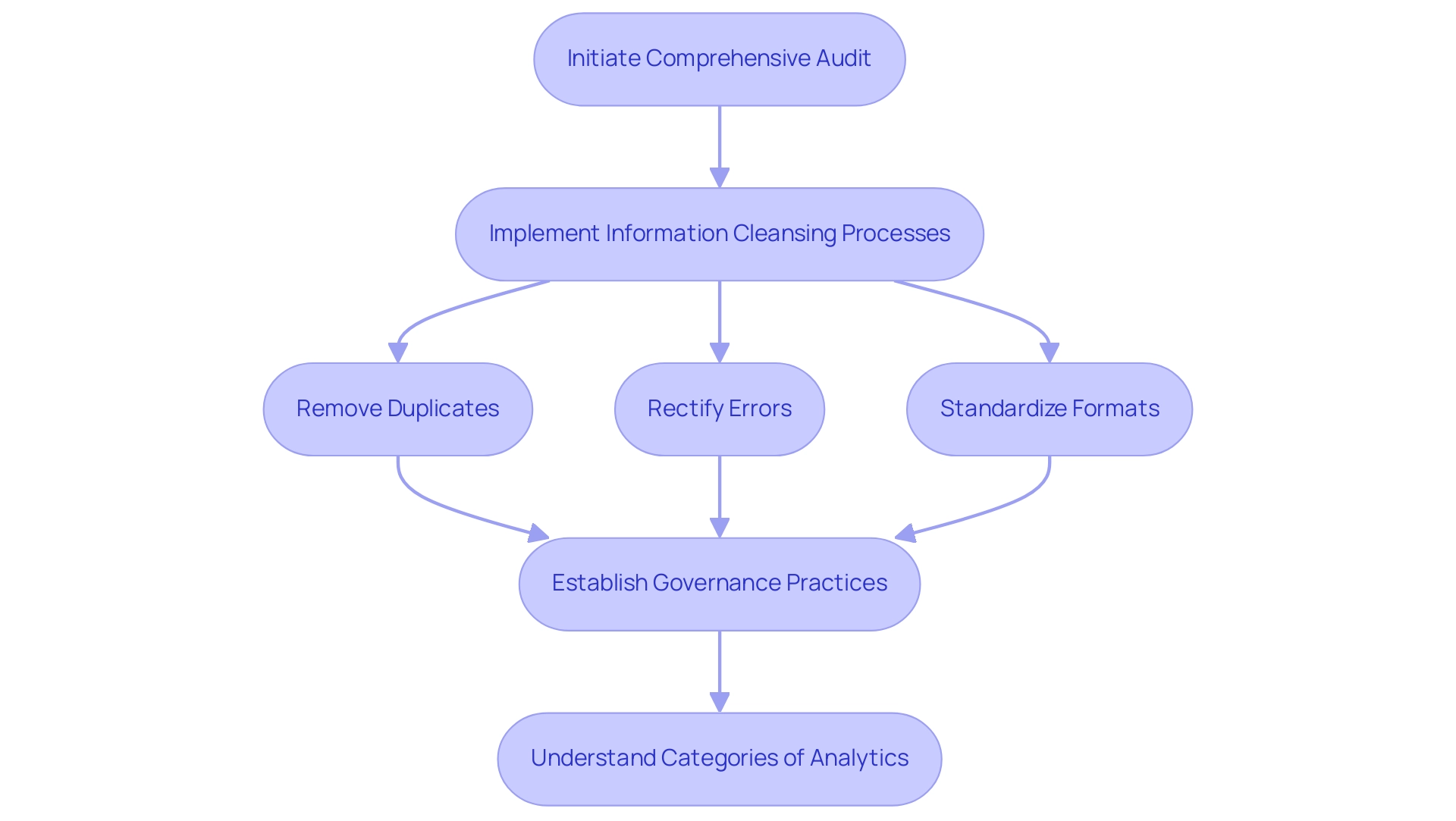
For organizations to leverage Power BI comparison visuals effectively, it is paramount to prioritize information quality. Initiating a comprehensive audit of information serves as the first step, allowing teams to pinpoint inaccuracies and inconsistencies within their datasets. Following this, implementing information cleansing processes is essential.
This involves:
- Removing duplicates
- Rectifying errors
- Standardizing formats to enhance overall reliability
Moreover, establishing robust governance practices is crucial; these frameworks should clearly define accountability for information quality and outline maintenance protocols. As Lior Solomon, VP of Data at Data, emphasizes, ‘secure, compliant, and reliable information is critical for the success of AI initiatives’.
He further notes that information quality must be prioritized throughout the model development life cycle. Furthermore, comprehending the four categories of analytics—descriptive, diagnostic, predictive, and prescriptive—can offer a wider view on how quality influences various analytical methods. Notably, a recent survey revealed that over 450 analytics professionals identified significant quality issues within organizations, underscoring the necessity of effective governance.
To combat the lack of data-driven insights that can leave organizations at a competitive disadvantage, our 3-Day Power BI Sprint offers a quick start to creating professional reports that leverage insights for actionable business outcomes. This sprint not only assists in enhancing quality but also tackles obstacles to AI adoption by ensuring that the information used in Power BI comparison visuals is both dependable and actionable. Additionally, incorporating RPA solutions can simplify information management processes, enhancing operational efficiency and allowing organizations to confidently depend on the insights gained from their comparison representations, ultimately facilitating more informed and strategic decision-making.
Avoiding Common Mistakes in Comparison Visuals
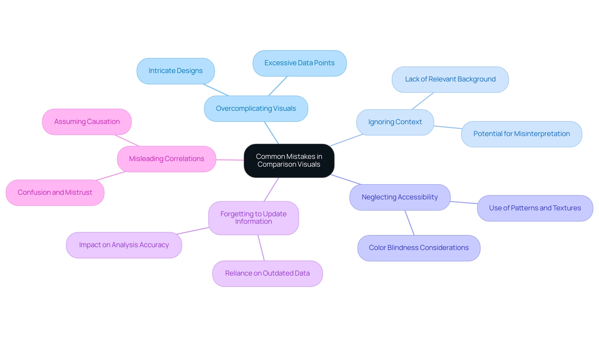
When utilizing comparison visuals in Power BI, it’s crucial to steer clear of several common mistakes that can hinder effective data communication, especially in an environment where leveraging insights is paramount for operational efficiency:
-
Overcomplicating Visuals: Incorporating excessive data points or overly intricate designs can overwhelm viewers and obscure the intended message. The principle of simplicity suggests that visuals should convey essential information clearly and efficiently, particularly when time-consuming report creation detracts from actionable insights.
-
Ignoring Context: Providing context is vital for accurate interpretation. Without relevant background information, users may misinterpret information, leading to flawed conclusions. As Edward Tufte aptly states,
Graphical excellence is that which gives to the viewer the greatest number of ideas in the shortest time with the least ink in the smallest space.
This highlights the necessity for clarity and context in visual storytelling, particularly considering frequent inconsistencies that can occur due to an absence of governance strategy. -
Neglecting Accessibility: Accessibility should be a primary consideration in data visualization. It’s essential to make visuals comprehensible to everyone, including those with color blindness. Incorporating patterns or textures alongside colors can significantly enhance accessibility and user experience.
-
Forgetting to Update Information: Relying on outdated information can distort analysis and lead to incorrect conclusions. Consistently updating information sources is essential to guarantee that insights obtained from representations are precise and pertinent.
-
Misleading Correlations: One of the critical pitfalls in visual representation is the potential for correlations in visuals to mislead users into assuming causation between unrelated factors. This can significantly distort the viewer’s understanding and interpretation of the information, particularly when reports are filled with numbers yet lack clear, actionable guidance. Failing to provide actionable guidance can lead stakeholders to confusion and mistrust, undermining the utility of the insights presented.
A relevant case study titled “Omitting Baseline and Truncating Scale” highlights how this issue is prevalent in political and sports visualizations, where such omissions can create misleading patterns or trends. Awareness of this problem is crucial to avoid misinterpretation of information, ensuring that visualizations accurately represent the details.
Coupler.io is utilized by over 24,000 companies worldwide, underscoring the importance of effective data visualization practices in enhancing decision-making across various industries. A well-designed dashboard prioritizes important variables and employs various visualization techniques to improve readability, ultimately enhancing user comprehension and engagement. Furthermore, failing to leverage insights from BI dashboards can place your business at a competitive disadvantage, emphasizing the urgency of addressing these challenges.
By steering clear of these frequent traps, you can create more effective and impactful BI representations, such as Power BI comparison visuals, that drive data-driven insights and operational efficiency.
Incorporating User Feedback for Continuous Improvement
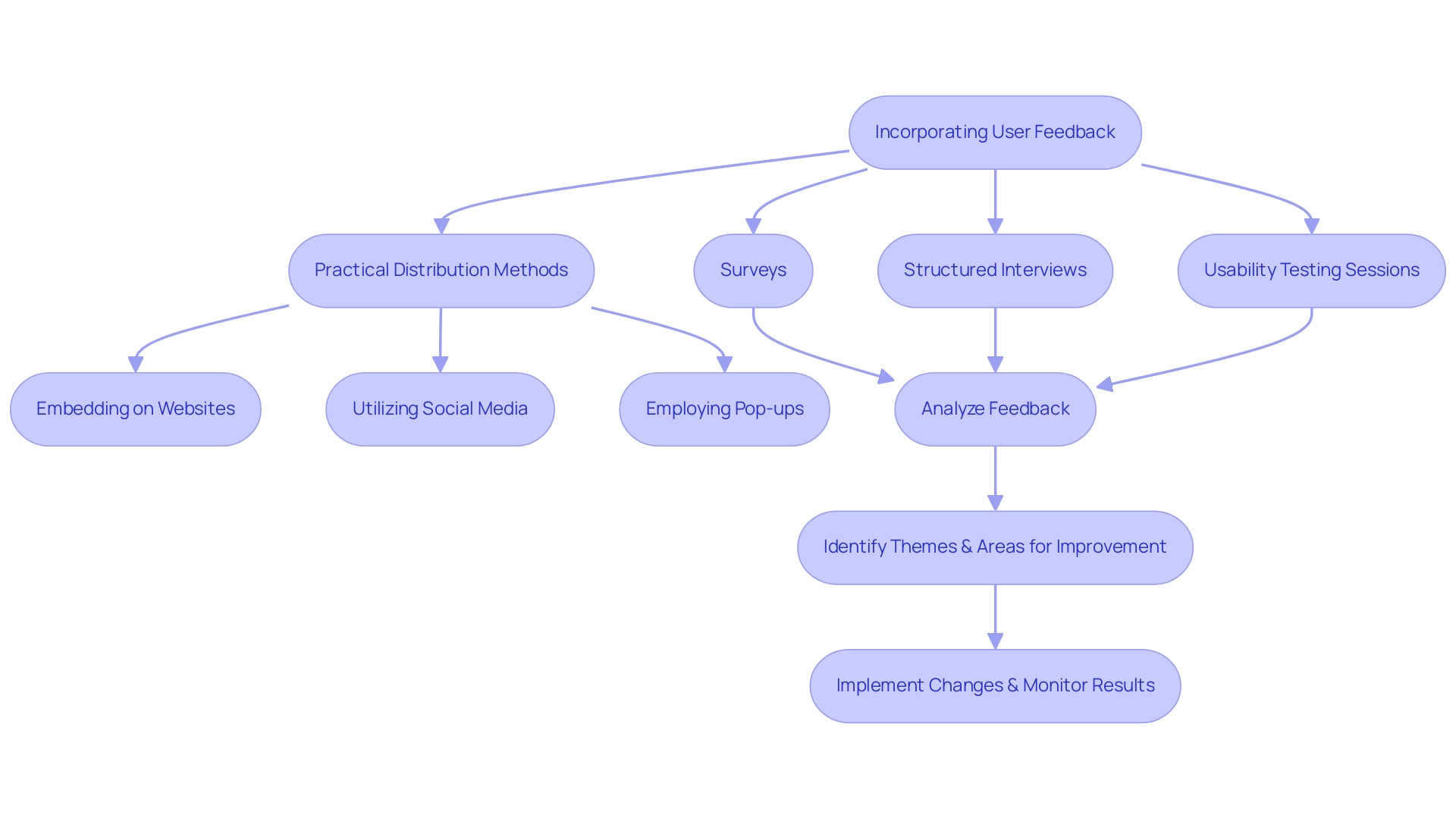
Incorporating feedback from participants is essential for the continuous improvement of Power BI comparison visuals. Creating regular feedback loops promotes a deeper understanding of experiences and challenges related to these visuals, particularly in addressing the common pitfalls of time-consuming report creation and data inconsistencies. To effectively gather insights, employ a variety of methods such as:
- Surveys
- Structured interviews
- Usability testing sessions
Notably, a case study by Hotjar illustrated that addressing feedback can lead to a remarkable 40% increase in conversion rates, highlighting the potential impact of insights on operational efficiency. Analyzing the resultant feedback can illuminate common themes and pinpoint areas ripe for improvement, thereby directly addressing the challenges in leveraging insights from Power BI dashboards. In a case study titled ‘Challenges in Gathering and Interpreting Feedback,’ it was revealed that despite inherent difficulties—such as individuals’ varying willingness to provide insights and the qualitative nature of the data—effective feedback mechanisms are essential for Product Managers.
By actively involving participants throughout the design process and implementing a governance strategy to ensure consistency of information, organizations can guarantee that their Power BI comparison visuals not only adapt to evolving needs but also significantly enhance information-driven decision-making and operational efficiency. Customized AI solutions can also play an essential role in this process, assisting in optimizing analysis and delivering actionable insights. Practical methods for distributing surveys and questionnaires include:
- Embedding them on websites
- Utilizing social media channels
- Employing pop-ups
All while keeping them concise and relevant to research goals.
As Syed Balkhi aptly notes,
You can collect feedback and other relevant data at any point in the UX design process.
This continuous improvement practice is crucial in creating visuals that resonate with users, drive satisfaction, and ultimately leverage the power of Business Intelligence and RPA for informed decision-making and enhanced productivity.
Conclusion
Power BI comparison visuals are indispensable tools that empower organizations to navigate the complexities of data analysis with clarity and precision. By utilizing various types of visuals, such as bar charts, line graphs, and scatter plots, businesses can uncover insights, monitor performance, and make informed decisions that drive operational efficiency. The article emphasizes the importance of mastering these tools as the demand for Business Intelligence solutions continues to grow, with projections indicating over half a million deployments by 2024.
Effective design practices play a critical role in maximizing the impact of comparison visuals. Embracing simplicity, understanding the audience, and ensuring data quality are fundamental to creating visuals that facilitate actionable insights. Additionally, gathering user feedback is essential for continuous improvement, allowing organizations to adapt their visualizations to meet evolving needs and enhance data-driven decision-making.
Ultimately, the successful integration of Power BI comparison visuals can transform how organizations leverage data, leading to strategic growth and competitive advantage. By prioritizing best practices in design and data quality, businesses can harness the full potential of their data, ensuring that insights are not only accessible but also actionable. As the landscape of data analytics continues to evolve, the ability to effectively communicate insights through powerful visuals will remain a key driver of success in the modern business environment.

