Overview
The Power BI error “There Weren’t Enough Elements in the Enumeration” typically occurs due to issues such as empty datasets, incorrect filter settings, mismatched data types, or overly complex queries. The article outlines systematic troubleshooting steps, including verifying data sources, reviewing filters, validating data types, simplifying queries, and refreshing data, which collectively help users address the error and improve their reporting processes.
Introduction
In the realm of data visualization, Power BI stands out as a powerful tool, yet it is not without its challenges. One of the most common hurdles users face is the perplexing ‘There Weren’t Enough Elements in the Enumeration’ error, which can derail even the most meticulously crafted reports. This issue often stems from various factors, such as:
- Empty datasets
- Incorrect filter settings
- Mismatched data types
All of which can significantly impede the flow of actionable insights. As organizations increasingly rely on data-driven decision-making, understanding the root causes of this error becomes essential. By exploring best practices, troubleshooting techniques, and community resources, users can not only resolve these errors but also enhance their overall Power BI experience, ensuring that their data visualization efforts are both effective and reliable.
Understanding the ‘There Weren’t Enough Elements in the Enumeration’ Error
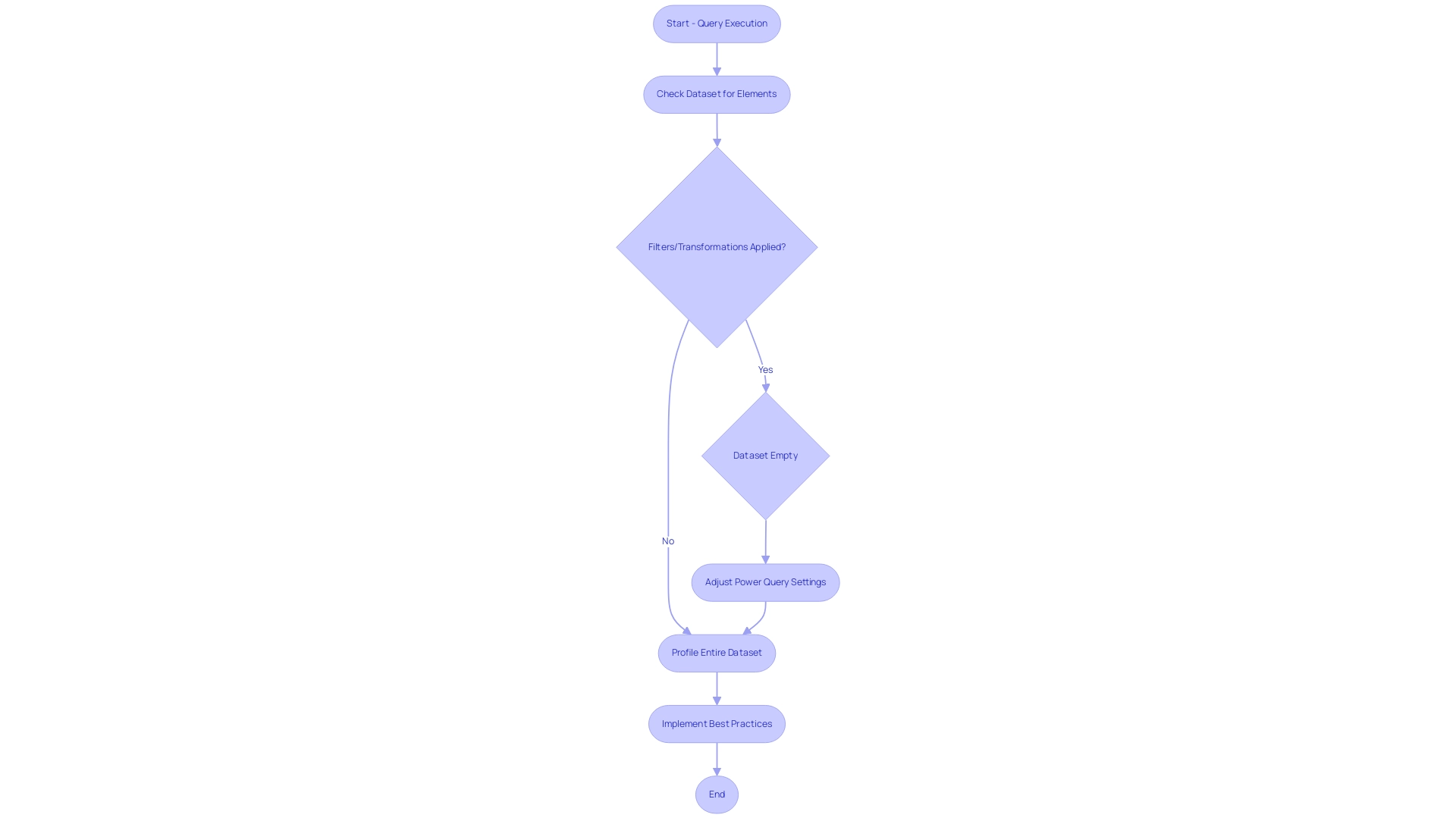
In Power BI, the error stating ‘there weren’t enough elements in the enumeration to complete the operation’ is a common issue that typically arises when a query attempts to access elements that are absent from a given dataset or collection. This situation often occurs when filters or transformations are applied, resulting in an empty dataset. Denis, a Super User, emphasizes that by default, Power Query is only loading and analyzing the first 1000 rows.
Consequently, users may overlook important information if they do not adjust their settings to profile the entire dataset. Comprehending this issue is essential, especially in Power BI, as there weren’t enough elements in the enumeration to complete the operation, which can significantly disrupt data visualization and reporting processes, thus hindering effective decision-making. In fact, the report usage metrics indicate that mistakes can occur frequently, affecting unique reports viewed over the past 90 days.
This underscores the challenges that many encounter in utilizing insights from BI dashboards, where time-consuming report creation may overshadow the analysis. To effectively tackle these concerns, users can refer to best practices for using Count Distinct, which emphasize the significance of verifying datasets for errors and integrating them with other BI functions. Furthermore, investing in RPA solutions, such as EMMA RPA and Automate, can streamline repetitive tasks and enhance governance, ultimately improving reporting precision and ensuring that insights based on information are effectively utilized.
Therefore, it is crucial for users to identify and address the underlying problems promptly to maintain effective data analysis and reporting, while also ensuring that stakeholders receive clear, actionable guidance from their data.
Common Causes of the Enumeration Error in Power BI
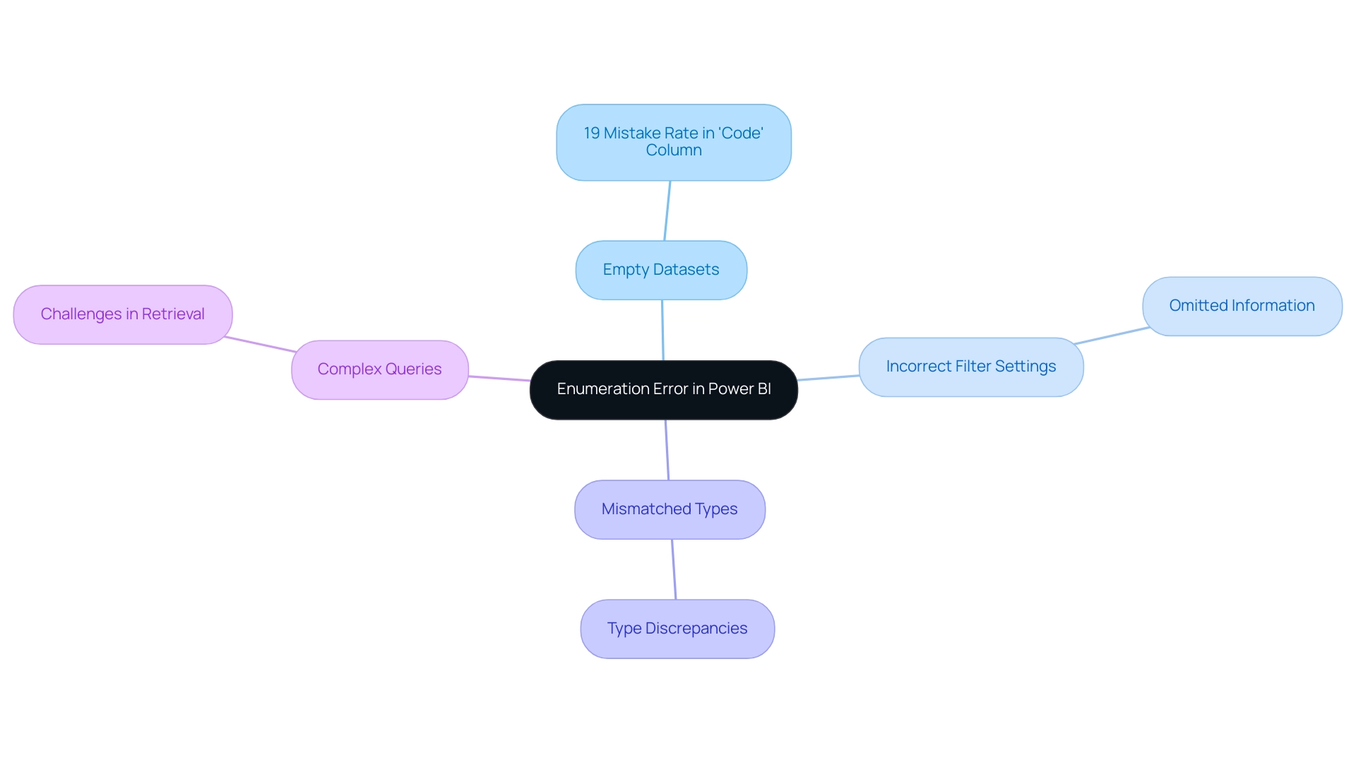
The ‘There Weren’t Enough Elements in the Enumeration’ issue in Power BI can arise from several common problems, each requiring careful examination:
-
Empty Datasets: A significant contributor to this issue is the presence of empty datasets. When a dataset lacks the necessary fields or information, any queries dependent on those elements will inevitably fail. Recent statistics show that the column titled ‘Code’ has a staggering 19% mistake rate, highlighting the prevalence of information quality issues that can impede effective insight generation.
-
Incorrect Filter Settings: Filters play a crucial role in analysis, but improper filter configurations can lead to an empty result set. When filters inadvertently omit all information, it leads to the enumeration issue in Power BI, where there weren’t enough elements in the enumeration to complete the operation, highlighting the necessity for accurate filter implementation to guarantee that actionable insights are obtained from your information.
-
Mismatched Types: In Power BI, there weren’t enough elements in the enumeration to complete the operation, which frequently arises from discrepancies in types. If the types specified in queries do not match the anticipated types, the system may face challenges handling the information, resulting in issues that could hinder operational efficiency.
-
Complex Queries: Lastly, overly complex queries can create challenges that result in enumeration errors. Inquiries or modifications that neglect to consider all possible information scenarios can unintentionally result in problems with retrieval, further complicating the extraction of significant insights.
A recent inquiry from a community member about obtaining server access underscores the relevance of ensuring that all required fields are present and accessible. Specialists in the BI community, like Apoorva Mathur, have highlighted the significance of preserving clarity in connections and query structures to prevent such pitfalls.
Moreover, a comparison with Trifacta Wrangler highlights that while Query is enhancing its user experience, it still has limitations in managing and displaying mistakes, which can contribute to enumeration issues. As organizations aim for efficiency, utilizing RPA solutions like EMMA RPA, which automates repetitive information tasks, and Automate, which optimizes workflows, can be essential in reducing these mistakes. By removing empty rows and columns, businesses can enhance information quality and operational outcomes, thus avoiding the competitive disadvantage of struggling to extract actionable insights.
Step-by-Step Troubleshooting for the Enumeration Error
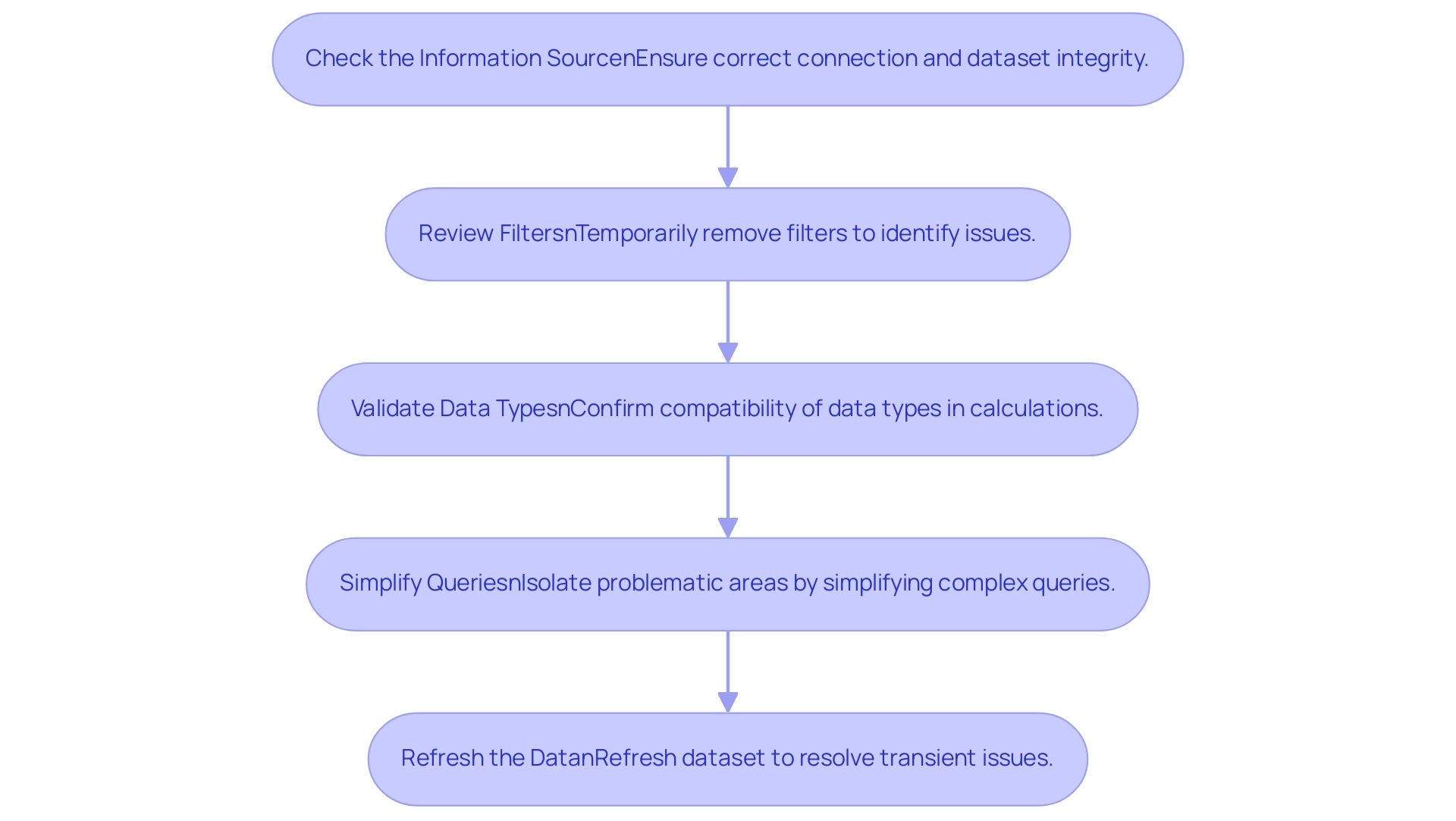
To effectively troubleshoot the error message ‘power bi there weren’t enough elements in the enumeration to complete the operation’, consider following these systematic steps:
-
Check the Information Source:
Begin by ensuring that your information source is correctly connected. Verify that the dataset is filled with the expected information, as nearly 30% of organizations report issues stemming from faulty integration, often leading to inconsistencies across reports.
Establishing a robust governance strategy can help mitigate these inconsistencies. -
Review Filters:
Examine any filters applied to your visuals or queries. Temporarily removing these filters may help determine if they are contributing to the error, allowing you to streamline report construction and focus on actionable insights.
Remember, clear guidance on what information is relevant can enhance your reporting process. -
Validate Data Types:
It’s crucial to confirm that the data types of the fields utilized in your calculations or queries are compatible. Proper validation can prevent many common issues and enhance overall functionality, reducing the time spent on report creation. -
Simplify Queries:
If your queries are complex, consider simplifying them to isolate the problematic areas. By testing each component of the query individually, you can more easily pinpoint where the issue arises and reduce confusion caused by complex reporting structures. -
Refresh the Data:
Often, simply refreshing the dataset can resolve transient issues that lead to this problem. This step is particularly important in scenarios where refresh events overlap. For instance, a case study highlighted how an administrator was advised to contact the owners of conflicting refreshes to reschedule them, ensuring smoother operations.
Additionally, be aware that when executing refreshes with both cloud and on-premises sources, the cloud source may time out or throw an error, causing the refresh to fail despite successful queries logged for on-premises sources.
Incorporating these steps not only aids in resolving the issue where power bi there weren’t enough elements in the enumeration to complete the operation, but also enhances the clarity and effectiveness of your BI reports. Remember, research shows that visuals with a clear focus can lead to a 70% increase in viewer retention, underscoring the importance of clean design and precise information. Addressing these common challenges, including establishing a governance strategy and ensuring actionable guidance, will empower you to leverage insights more effectively from your BI dashboards.
Best Practices to Prevent Enumeration Errors in Power BI
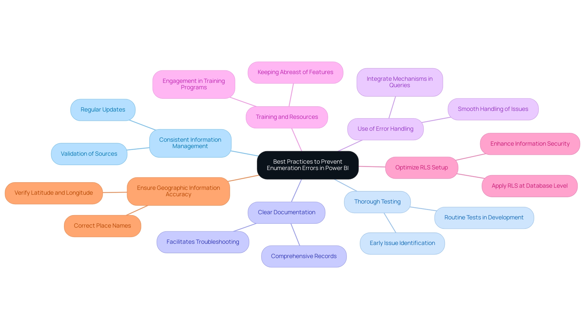
To effectively prevent the ‘There Weren’t Enough Elements in the Enumeration’ error in your Power BI projects and address the challenges of poor master information quality and AI adoption, consider implementing the following best practices:
-
Consistent Information Management:
Regularly update and validate your sources before generating reports. Consistency in information management is crucial for ensuring accurate and reliable reporting outcomes, ultimately enhancing your business intelligence and addressing issues related to quality. -
Thorough Testing:
Conduct routine tests of queries and reports in a controlled development environment. This proactive method enables the early identification and resolution of possible issues, minimizing disruptions during deployment and ensuring your insights are actionable, which is essential for effective AI integration. -
Clear Documentation:
Maintain comprehensive documentation of your information model and query logic. Clear records not only facilitate troubleshooting but also enhance team collaboration and knowledge transfer, positioning your organization to leverage insights more effectively and support AI adoption. -
Use of Error Handling:
Integrate error handling mechanisms within your queries. This enables you to handle unexpected issues smoothly, ensuring that your reports stay functional even when confronted with anomalies, thereby supporting operational efficiency and tackling the obstacles to effective information management. -
Training and Resources:
Keep abreast of the latest Power BI features and best practices by engaging in training programs, such as our 3-Day Power BI Sprint. This offering not only assists in creating fully functional, professionally designed reports but also empowers your team with the skills to optimize information management processes, which is essential for overcoming challenges related to AI adoption. -
Optimize RLS Setup:
To minimize performance impacts, apply Row-Level Security (RLS) at the database level where possible. This can enhance information security while maintaining system performance, addressing concerns related to poor master information quality. -
Ensure Geographic Information Accuracy:
Be mindful of the potential for incorrect representation in map visuals. To prevent misrepresentation, ensure that geographic information aligns with BI’s standards by verifying accuracy through latitude and longitude values or correcting place names.
Additionally, it is beneficial to clean your information by removing unnecessary whitespace and ensuring compatibility in formats before joining columns. For instance, using sensitivity labels to categorize information can raise awareness about security and proper handling, ultimately aiding in managing sharing within and outside the organization. These steps together help reduce the occurrence of management issues, which have been noted in various BI projects, ultimately resulting in more dependable reporting and analysis.
As of now, feedback from BI initiatives has garnered over 110,000 impressions, underscoring the importance of adhering to these best practices.
Leveraging Community Resources for Power BI Error Resolution
Encountering the ‘power bi there weren’t enough elements in the enumeration to complete the operation’ error can be frustrating, especially when you are already facing challenges in leveraging insights from BI dashboards due to time-consuming report creation, data inconsistencies, and a lack of actionable guidance. However, numerous community resources are available to assist in troubleshooting. Here are some effective avenues to explore:
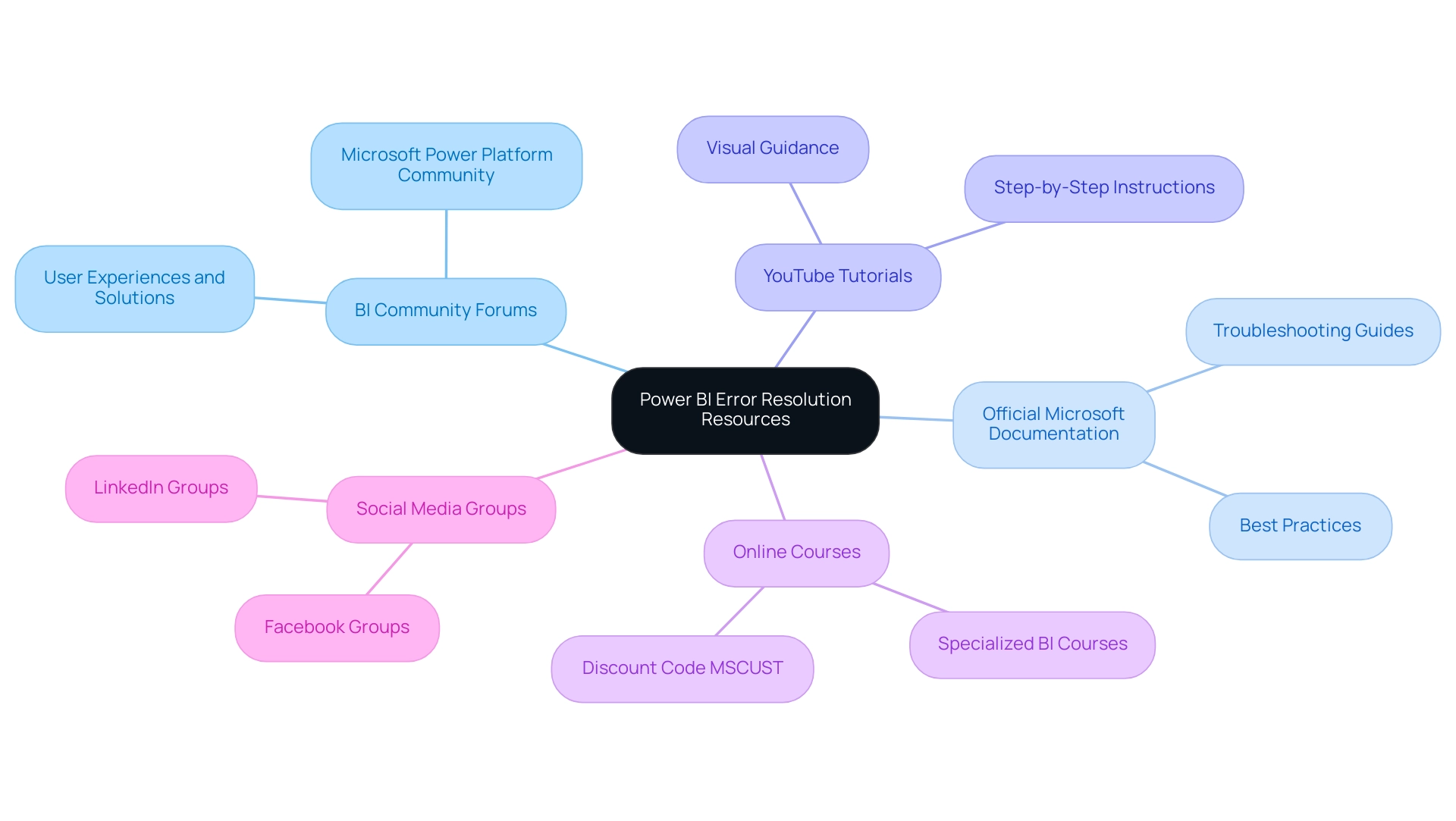
- BI Community Forums: These forums serve as a collaborative space where users share experiences and solutions, fostering a supportive environment for troubleshooting. Staying updated with the Microsoft Power Platform Community release plans can also provide insights into new features and fixes that may address existing issues.
- Official Microsoft Documentation: Microsoft provides extensive documentation that includes troubleshooting guides and best practices, which can be invaluable when addressing specific issues and offer actionable steps for resolution.
- YouTube Tutorials: Video tutorials provide visual guidance and step-by-step instructions, making complex resolutions more accessible, especially for those overwhelmed by data inconsistencies.
- Online Courses: Enrolling in specialized online courses can enhance your understanding of BI and provide targeted strategies for error resolution. For example, use code MSCUST for a $150 discount on registration, making these resources more accessible.
- Social Media Groups: Engaging with BI groups on platforms like LinkedIn and Facebook can facilitate real-time support and networking with other professionals facing similar challenges. A recent case involving a user encountering a problem with Automate, where emails were only sent to one person from an incomplete Planner task, underscores the importance of community support in resolving common challenges.
Additionally, the case study titled ‘Dataset Settings Investigation’ illustrates how one user accessed dataset settings for a usage metrics report, identifying a refresh issue that had not been originally set up. This situation exemplifies the importance of actionable guidance, as it led to the consideration of restarting the dataset schedule to resolve the problem. As Eason from the Community Support Team notes, “This is a known limitation and basically cannot be changed,” highlighting the importance of utilizing these resources for effective troubleshooting.
By leveraging these community resources and expert insights, users can navigate Power BI errors, such as the issue where there weren’t enough elements in the enumeration to complete the operation, more effectively, overcoming the challenges of report creation and data management.
Conclusion
The challenges associated with the ‘There Weren’t Enough Elements in the Enumeration’ error in Power BI are significant but manageable. By understanding the root causes, such as:
- empty datasets
- incorrect filter settings
- mismatched data types
- complex queries
users can proactively address these issues. Implementing systematic troubleshooting steps—like:
- checking data sources
- reviewing filters
- validating data types
- simplifying queries
- refreshing datasets
can significantly enhance the reliability of reports and insights.
Moreover, adopting best practices in data management, such as:
- consistent validation
- thorough testing
- clear documentation
- effective error handling
is vital for preventing errors from occurring in the first place. Engaging with community resources, including:
- forums
- official documentation
- tutorials
- online courses
provides invaluable support and knowledge-sharing opportunities that can further empower users in overcoming obstacles.
Ultimately, a well-rounded approach that combines technical understanding, proactive management, and community engagement not only resolves enumeration errors but also enhances the overall Power BI experience. As organizations increasingly rely on data for decision-making, ensuring the accuracy and reliability of data visualization efforts becomes paramount. By following these strategies, users can transform potential setbacks into opportunities for growth, ultimately enabling a more effective and efficient data-driven culture within their organizations.
Overview
To ensure your Power BI table shows all rows, it is essential to systematically check for common issues such as active filters, data relationships, and row-level security settings. The article outlines a step-by-step approach, emphasizing the importance of removing filters, verifying relationships, and refreshing data to enhance visibility and ensure comprehensive data representation.
Introduction
In the realm of data visualization, Power BI stands out as a powerful tool designed to transform raw data into meaningful insights. However, users often encounter challenges related to row visibility in tables, which can obscure critical information and lead to flawed decision-making. Understanding the intricacies of Power BI tables, including the significance of data relationships, filters, and security settings, is essential for maximizing the reporting experience.
By implementing best practices and leveraging advanced techniques like DAX and Power Query, users can ensure that their reports are not only comprehensive but also actionable. This article delves into common pitfalls, step-by-step solutions, and expert recommendations to enhance data visibility in Power BI, empowering organizations to harness the full potential of their data.
Understanding Power BI Tables and Row Visibility
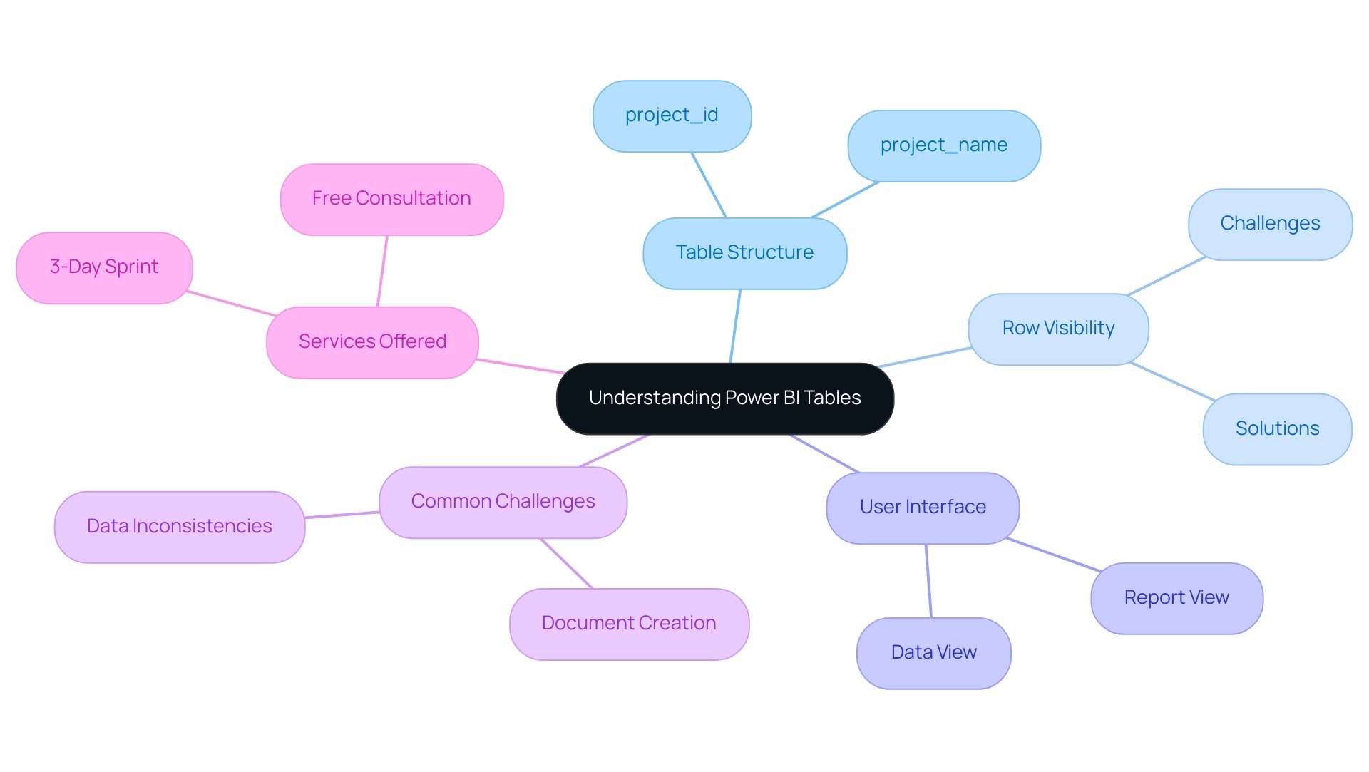
BI tables function as the backbone of effective reporting, enabling users to visualize information methodically. Each table comprises two essential columns: project_id and project_name, with every row corresponding to a distinct record. It is essential to guarantee the clarity of all rows in a power bi table not showing all rows, as any lapse in information completeness can result in distorted insights and misguided decisions.
Users are encouraged to become proficient with the Power BI interface, particularly the data view and report view, to fully grasp how data is showcased and interacted with. This foundational understanding is key to diagnosing and resolving potential row access issues in the reporting process, particularly when a power bi table not showing all rows is involved. However, it’s important to note that the solution for enhancing visibility may not yield the same results for specific visuals, such as Waterfall charts, Scatter plots, and Maps, due to their unique rendering methods.
Furthermore, utilizing BI effectively involves tackling typical obstacles like time-consuming document creation and data inconsistencies, which can hinder obtaining actionable insights. Our services, including the 3-Day Business Intelligence Sprint for rapid report creation—designed to deliver customized, visually appealing reports in just three days—and the General Management App for comprehensive management and smart reviews, are specifically tailored to tackle these challenges head-on. We also offer a free consultation to help you understand how to maximize the benefits of these services.
As highlighted by an Excel specialist turned BI expert,
There’s still a long way to go as you can see when we compare Query against other tools in the market, but it’s nice to know that the Query team is investing in improving the User Experience.
This dedication to user experience is further demonstrated by the ongoing updates and feature enhancements in BI, underscoring the significance of organized information representation for effective reporting.
Common Reasons Rows May Not Show in Power BI Tables
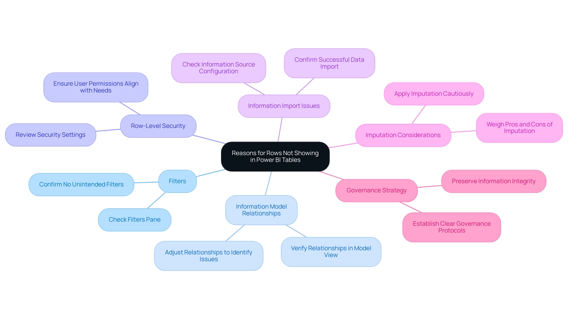
A variety of factors can contribute to the problem of a Power BI table not showing all rows, each requiring careful consideration during troubleshooting. Understanding these challenges is essential for the Director of Operations Efficiency looking to enhance insight generation:
-
Filters: The implementation of active filters on reports or specific pages can significantly restrict displayed information.
It is crucial to examine the filters pane to confirm that no unintended filters are restricting visibility, as this could result in the Power BI table not showing all rows. -
Information Model Relationships: Incorrectly configured relationships between tables can lead to gaps in the information displayed.
Regular verification of these relationships in the model view is essential to ensure they are accurately set up.
As mentioned in recent conversations, adjusting relationships may assist in identifying problems with display, as proposed by another user who advised turning on and off various relationships to check if the absent information shows up. -
Row-Level Security: Implementing row-level security can restrict visibility based on user permissions.
A thorough review of security settings is necessary to ensure they align with the needs of all users, allowing appropriate access to data. -
Information Import Issues: Problems during the information import process can also cause a Power BI table not showing all rows.
It is important to ensure that the information source is correctly configured and that all necessary details are successfully imported into Power BI. -
Imputation Considerations: As Pritha Bhandari states, ‘Imputation is a complicated task because you have to weigh the pros and cons.’
This emphasizes the significance of careful information management practices to avoid inaccuracies that could further complicate visibility issues. -
Governance Strategy: A lack of a proper governance strategy can exacerbate inconsistencies, leading to confusion and mistrust among stakeholders.
Establishing clear governance protocols is essential for preserving information integrity and ensuring that all users can depend on the details provided.
By tackling these challenges, including time-consuming report creation and inconsistencies, users can improve their management strategies and ensure a more effective use of BI. Furthermore, providing stakeholders with clear, actionable guidance will help transform insights into meaningful actions, preventing situations where information is presented without direction.
Step-by-Step Techniques to Display All Rows in Power BI Tables
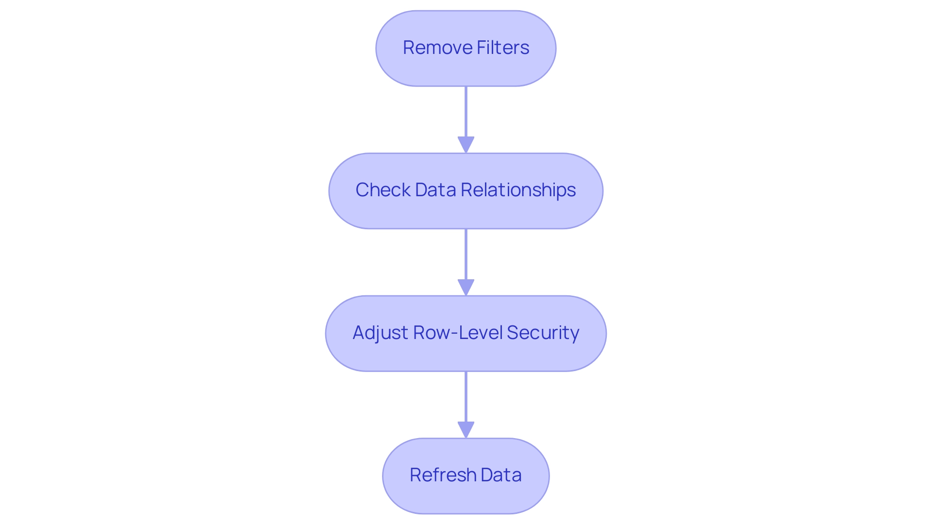
To effectively resolve the problem of a Power BI table not showing all rows, it’s essential to follow a structured approach that ensures optimal visibility. Here’s a comprehensive step-by-step guide:
-
Remove Filters: Begin by navigating to the filters pane.
Clear any filters that may limit the information you want to view. This fundamental step is crucial for ensuring that all pertinent information is considered. -
Check Data Relationships: Proceed to the model view and confirm that all necessary relationships between tables are correctly established.
If you identify any missing relationships, create them by dragging the appropriate fields together. Hubert Ferenc, the Power Platform Practice Lead at TTMS, emphasizes the importance of customized connections, stating,Webcon would have been too large and costly a solution, which is why we chose Power Apps—it met all our needs perfectly.
This emphasizes how essential it is to have well-defined relationships for effective reporting.
Furthermore, ensuring robust data management is essential to prevent confusion and mistrust in the data presented. -
Adjust Row-Level Security: If your report utilizes row-level security, review the settings under the ‘Manage Roles’ option in the modeling tab.
Ensure that the roles assigned to users are configured to allow visibility of the necessary rows. Properly set roles are vital for maintaining information integrity while allowing appropriate access. -
Refresh Data: Finally, click the ‘Refresh’ button located in the Home tab.
This action refreshes the most recent information into BI, addressing potential issues that may occur from outdated details. Frequently updating your information is a best practice for sustaining precise reporting and examination.
By executing these steps, you can address the issue of the Power BI table not showing all rows, greatly improving information visibility and ensuring that all pertinent details are readily accessible for analysis. It’s essential to recognize typical obstacles in utilizing insights from Power BI, such as time-consuming document creation and information inconsistencies. Additionally, addressing the lack of actionable guidance in reports is vital for informing stakeholders on the next steps.
Integrating best practices for information relationships further underscores the importance of tailored solutions in achieving operational efficiency and informed decision-making.
Leveraging DAX and Power Query for Enhanced Row Visibility
To effectively control information presentation in Power BI and leverage the full potential of Business Intelligence, it’s essential to utilize both DAX and Power Query techniques. Here are key approaches:
-
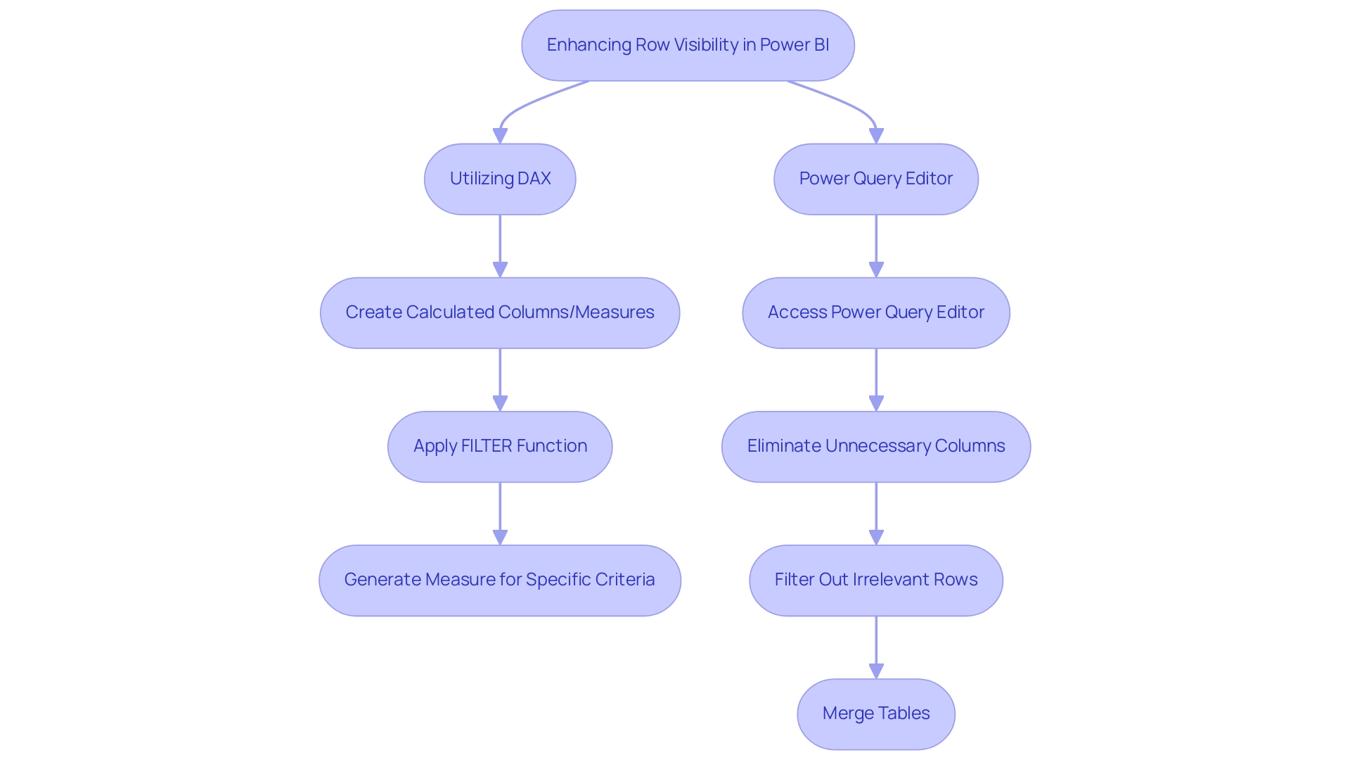
Utilizing DAX: By creating calculated columns or measures, you can dynamically filter information to display only the most relevant content.
For instance, applying the
FILTERfunction allows you to generate a measure that includes rows meeting specific criteria, thereby providing more precise control over visibility. This can greatly improve your summaries and dashboards, particularly in addressing issues like lengthy document creation and inconsistencies in information. Not utilizing information effectively can leave your business at a competitive disadvantage, making it crucial to maximize the impact of reports that have been viewed in the past 90 days. -
Power Query Editor: Access the Power Query Editor to refine your information prior to its integration into Power BI. This powerful tool enables you to eliminate unnecessary columns, filter out irrelevant rows, and merge tables to address the issue of the Power BI table not showing all rows, ensuring comprehensive information inclusion.
After making your adjustments, remember to apply the changes and close the editor to reflect these updates in your report. As mentioned by Jay from the Community Support Team, “If you are an Admin for BI, you could access this information in Admin portal Audit logs,” which highlights the significance of having administrative access to oversee visibility. Additionally, it’s crucial to remember that for information to be processed for the Usage Metrics Report, users must view the content from within the workspace at least once.
Moreover, incorporating RPA solutions can simplify repetitive tasks related to information management in BI, improving overall reporting efficiency. By employing these techniques, not only do you streamline data management, but you also improve overall reporting efficiency, thus enhancing your organization’s ability to make informed decisions and drive growth.
Best Practices for Ensuring Row Visibility in Power BI Tables
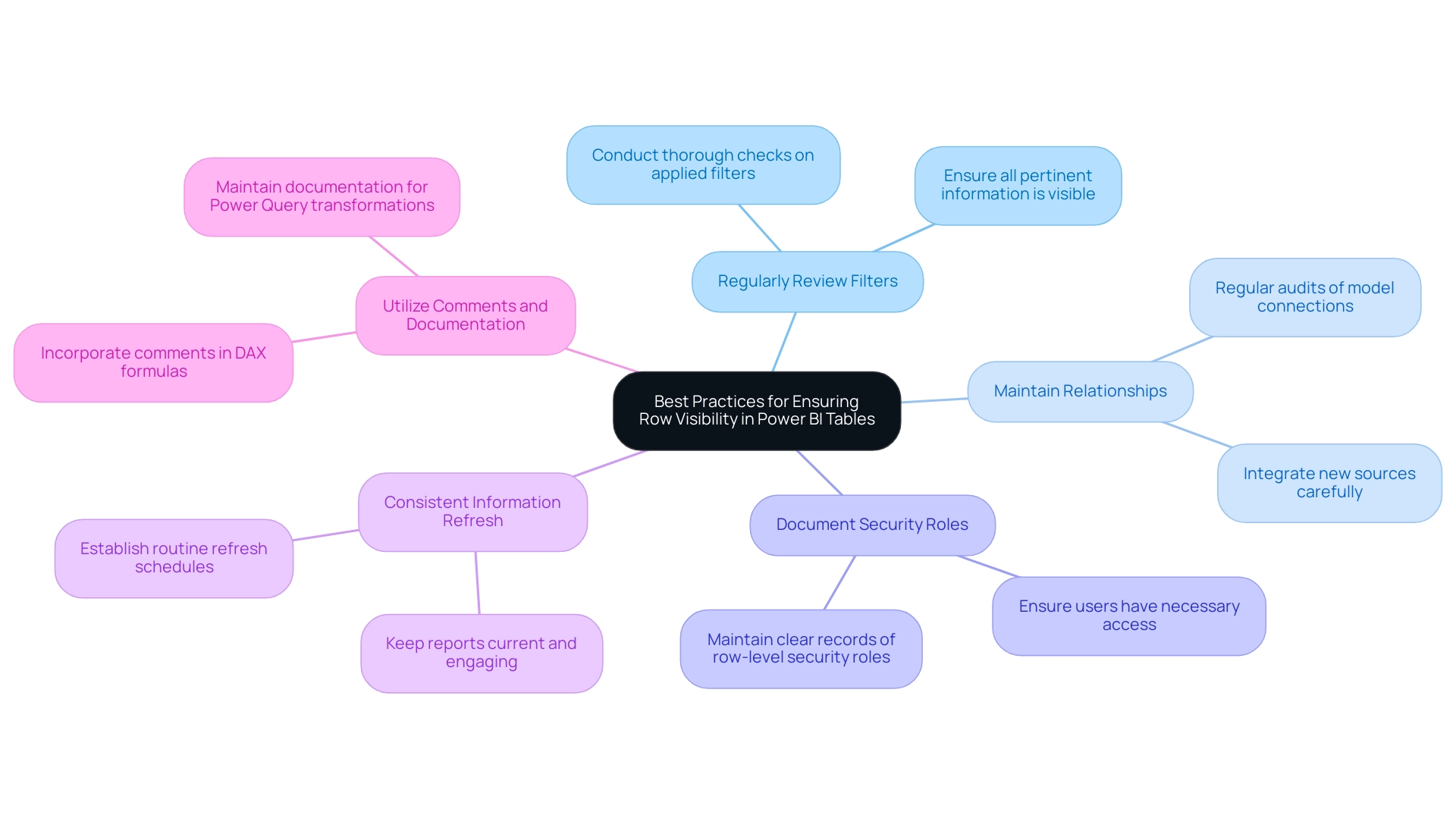
To ensure that the power bi table is not showing all rows and to leverage the full potential of Business Intelligence for data-driven insights, it is vital to implement the following best practices:
-
Regularly Review Filters:
Conduct thorough checks on applied filters to address the issue of the power bi table not showing all rows prior to finalizing reports. This step ensures that all pertinent information is visible, which is crucial in situations where a power bi table not showing all rows could lead to oversight of essential details that obstruct informed decision-making. -
Maintain Relationships:
Regular audits of your model are essential to confirm that connections remain intact as new sources are integrated. This practice reduces mistakes and improves information integrity across documents, thus driving operational efficiency. -
Document Security Roles:
Maintaining a clear record of row-level security roles and their associated permissions is crucial. This documentation reduces confusion and ensures users have access to the information they require, while also protecting sensitive details. -
Consistent Information Refresh:
Establish a routine schedule for refreshes to keep reports current and reflective of the latest information. Regular updates can enhance user engagement, as mobile optimization has been shown to increase engagement by up to 30%. -
Utilize Comments and Documentation:
Incorporate comments in your DAX formulas and maintain documentation for your Power Query transformations. This practice facilitates understanding among team members regarding the reasoning behind information manipulations.
As highlighted by experts,
Before joining columns, always clean your information by trimming whitespace and ensuring the values are in a compatible format.
Additionally, utilizing BI’s accessibility checker for dashboard design not only ensures inclusivity but also enhances user satisfaction and adoption rates. Incorporating RPA tools such as EMMA RPA and Automate can enhance processing tasks, minimizing the time required for creation and tackling challenges related to information access.
By adhering to these best practices, you can enhance row visibility, secure sensitive data, and drive better insights from your Power BI reports, ultimately helping to resolve the issue of the power bi table not showing all rows, while also overcoming the challenges of time-consuming report creation and data inconsistencies.
Conclusion
Effective data visualization in Power BI hinges on ensuring row visibility within tables, a critical factor for accurate reporting and informed decision-making. This article has explored the common challenges users face, including:
- Filters
- Data model relationships
- Row-level security
- Data import issues
By addressing these concerns, organizations can enhance their data management strategies and ultimately improve the insights derived from Power BI reports.
Implementing a structured approach to troubleshooting, such as:
- Removing filters
- Verifying data relationships
- Adjusting security settings
- Regularly refreshing data
is essential for displaying all relevant rows. Additionally, leveraging advanced techniques with DAX and Power Query can significantly enhance data visibility, enabling users to create dynamic and actionable reports.
Incorporating best practices—such as:
- Regular reviews of filters and data relationships
- Maintaining clear documentation
- Utilizing automation tools
ensures that Power BI serves as a powerful ally in data-driven decision-making. By focusing on these strategies, organizations can maximize their reporting capabilities and fully harness the potential of their data, paving the way for greater operational efficiency and strategic growth.
Overview
The article focuses on the essential icons in Power BI Report Builder that enhance report design and user engagement. It emphasizes that utilizing these icons, such as the Essential Data Visualization Icon and the Interactive Filter Icon, significantly improves the clarity, accessibility, and interactivity of reports, thereby facilitating better decision-making and operational efficiency through effective visual communication.
Introduction
In the world of data reporting, the tools and techniques employed can significantly influence the clarity and effectiveness of the insights conveyed. Power BI Report Builder stands out as a robust platform, enabling users to create visually appealing and structured reports that cater to diverse business needs.
With its ability to integrate various data sources and enhance report design through features like interactive icons and dynamic charts, this tool is essential for professionals aiming to elevate their data presentation skills.
As organizations increasingly rely on data-driven decision-making, mastering these reporting capabilities becomes not just beneficial but necessary for success in the competitive landscape of business intelligence.
1. Understanding Power BI Report Builder: A Brief Overview
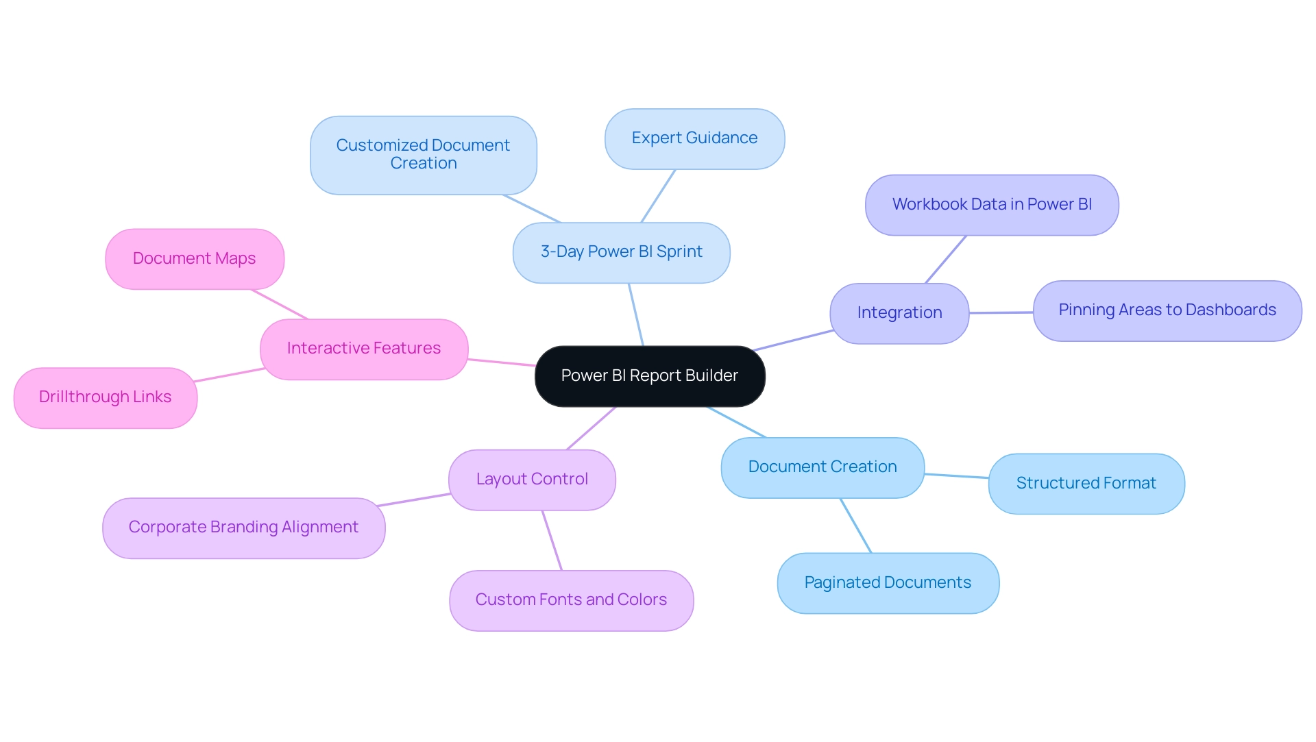
The power bi report builder icon serves as a powerful platform for crafting paginated documents that are suitable for both printing and sharing across various channels. This tool enables individuals to draw from a variety of information sources, presenting details in a structured and visually appealing format. With the rise of Power BI services, particularly highlighted by the 3-Day Power BI Sprint, individuals can swiftly generate professionally designed documents.
This sprint includes a concentrated, rigorous session where participants can work with specialists to create customized documents that fulfill their particular requirements, thereby improving their information reporting abilities and actionable insights. Recent statistics indicate that in 2024, the utilization of the power bi report builder icon has grown by 30%, underscoring its importance in the realm of business intelligence. Mastering its features is crucial for professionals aiming to refine their reporting skills, as it lays the groundwork for the effective use of diverse icons and elements in report design.
As Reza Rad, a trainer and consultant, notes, ‘If you have more than 5000 log rows, you need to create a kind of loop structure in PowerShell; there are some commands and ways to do that.’ Furthermore, the most recent updates improve experience by facilitating smooth integration of workbook information into Power BI dashboards, permitting individuals to pin particular areas for quick access. This capability not only streamlines the reporting process but also enhances the overall quality of information presentation.
Moreover, the General Management App plays a pivotal role in ensuring comprehensive management and smart reviews. It assists in preserving data uniformity by supplying tools for tracking and examining performance, presenting information that directs individuals in making knowledgeable choices. A case study on layout and formatting control illustrates this: the tool provides precise control over document layout and formatting, enabling individuals to customize fonts, colors, and styles to align with corporate branding.
Interactive features such as drillthrough links and document maps further improve navigation and experience within analyses, addressing common challenges in leveraging insights from Power BI dashboards.
2. The Role of Icons in Power BI Reports
Integrating icons in Power BI presentations acts as a strong instrument for improving experience through visual signals that clarify information interpretation. This method tackles frequent issues encountered by operations directors, such as time-consuming document generation and inconsistencies, often worsened by an absence of governance strategy. Studies show that effective visual communication can greatly influence how individuals interact with information, making it essential to present insights in a digestible format.
For example, well-crafted icons can simplify complex datasets, enabling users to swiftly understand key insights and navigate documents with ease, thus minimizing the time invested in document creation. Furthermore, by providing clarity, icons help reduce confusion and mistrust in the information presented, which can arise from inconsistent reporting practices. According to Annemarie Bufe, Content Manager,
It takes less than 500ms, or even just 50ms, to make a good first impression,
underscoring the importance of visual elements in creating an immediate impact.
Additionally, with over 1.3 million icons available from Icons8, including the Power BI report builder icon, the variety and availability of icons can greatly enhance the visual appeal and functionality of Power BI presentations, ensuring clarity amidst potential data inconsistencies. The effectiveness of icons is also evident in recent statistics showing that:
- 66% of mobile sites struggle with tappable elements being too closely spaced
- 32% present elements that are too small
This highlights the necessity for clarity and accessibility in the design of Power BI report builder icons, which is equally vital in Power BI reports.
The case study on Group Specificity in Icon Design reveals that tailoring the number of icons to specific groups not only reduces cognitive overload but also enhances relevance, ensuring individuals are presented with icons that truly matter to them. By explicitly linking icon usage to the overall user experience and actionable guidance, we strengthen the argument that a well-considered icon strategy can significantly enhance reporting and guide stakeholders toward clearer decision-making.
![]()
3. Icon 1: The Essential Data Visualization Icon
The Essential Visualization Icon serves as a vital tool for distilling complex information into clear, actionable insights, effectively aiding in storytelling and making intricate concepts comprehensible. By leveraging this icon, creators can design impactful charts, graphs, and other visual components that significantly enhance audience understanding. Research indicates that the human brain processes visuals 60,000 times faster than text, according to the University of Minnesota, reinforcing the importance of visual elements in communication.
This capability is essential in today’s information-driven environment, where 65% of companies indicate that employing visual representations in presentations has significantly enhanced client engagement and comprehension. Specifically, information visualization enhances client interactions and comprehension during presentations, fostering more productive discussions and decision-making. By effectively employing the Essential Data Visualization Icon, creators can ensure that their audience grasps vital messages without becoming overwhelmed by numbers.
Furthermore, integrating Power BI services, such as the 3-Day Power BI Sprint for swift creation and the General Management App for comprehensive insights, can elevate the effectiveness of these visual tools, enabling organizations to harness Business Intelligence for informed decision-making and operational efficiency. Additionally, our Actions portfolio offers a range of strategic options for enhancing your information capabilities, and we invite you to book a free consultation to explore how we can tailor our solutions to meet your specific needs. In navigating the overwhelming AI landscape, our tailored solutions can help you identify the right technologies that align with your business goals.
![]()
4. Icon 2: The Interactive Filter Icon
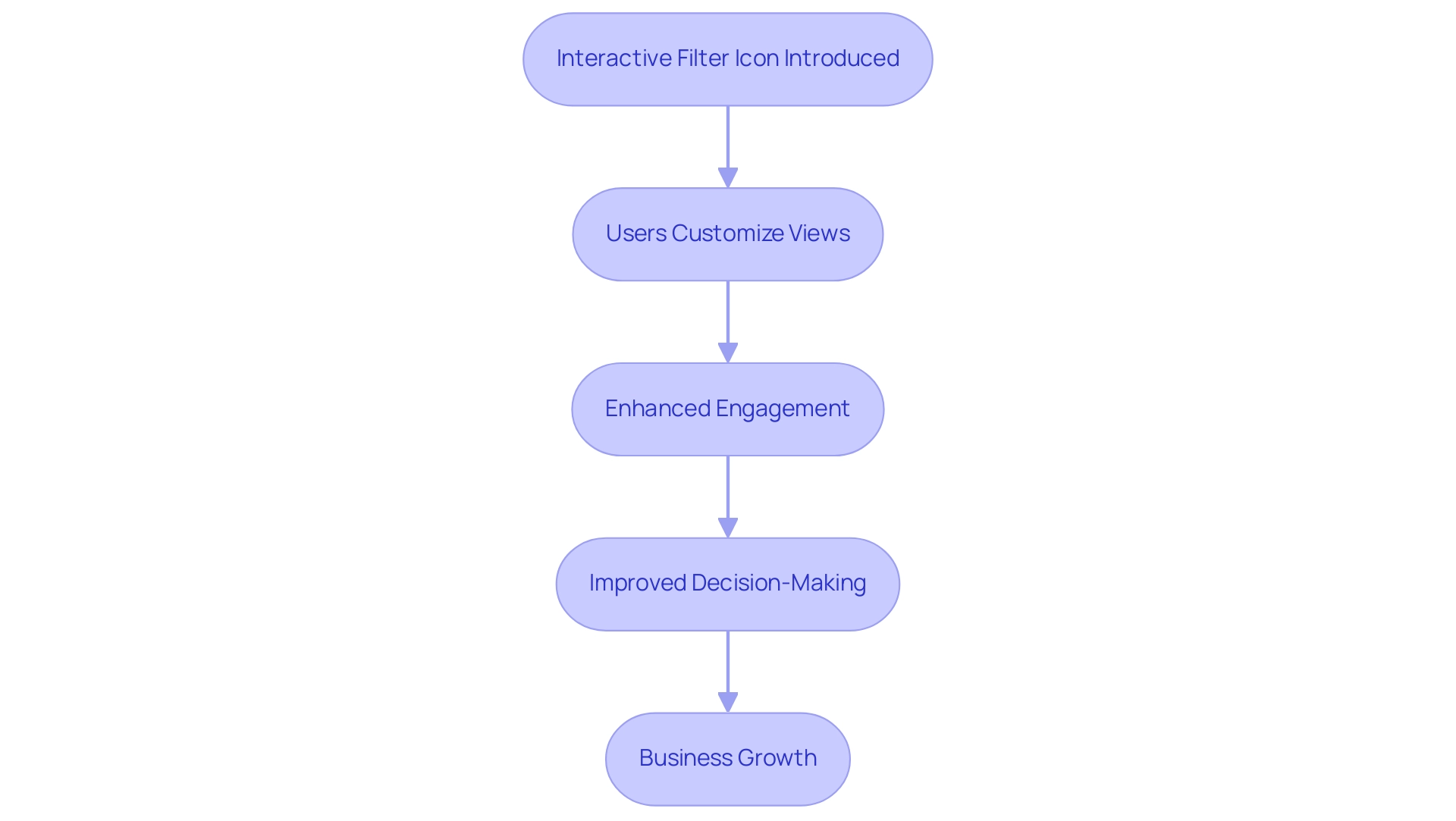
The Interactive Filter Icon is an essential element in Power BI documents, allowing individuals to customize their views based on particular criteria. This functionality is especially vital in documents with extensive datasets, as it enables individuals to focus on the information that is most pertinent to them. In the contemporary information-abundant setting, the capacity to derive significant understandings is crucial for sustaining a competitive advantage, and based on recent figures, 75% of individuals favor interactive information filtering alternatives as they greatly improve their capability to examine intricate collections.
By incorporating this symbol, creators can enhance audience engagement and operational efficiency, ensuring that documents address the varied needs of their viewers. As noted by content project manager Sophie Grigoryan,
Try Userpilot and Take Your UX to the Next Level.
The application of interactive filters not only streamlines information interaction but also enables users to obtain significant understandings effectively, tackling issues such as time-consuming document creation and information inconsistencies.
A notable example can be seen in the Inquiry Analysis Use Case, where the document utilizes Drill Down Visuals to provide insights into inquiry management. Users can dynamically interact with data, quickly identifying trends and performance metrics related to inquiries, which facilitates better decision-making and strategy development. Furthermore, the automated analytics tools within Power BI simplify the generation process, enabling organizations to save time and minimize errors.
Current discussions around examples of filters and stat types for calculating interactions further emphasize the role of interactive filter features in enhancing usability and user satisfaction, ultimately driving business growth.
5. Icon 3: The Dynamic Chart Icon
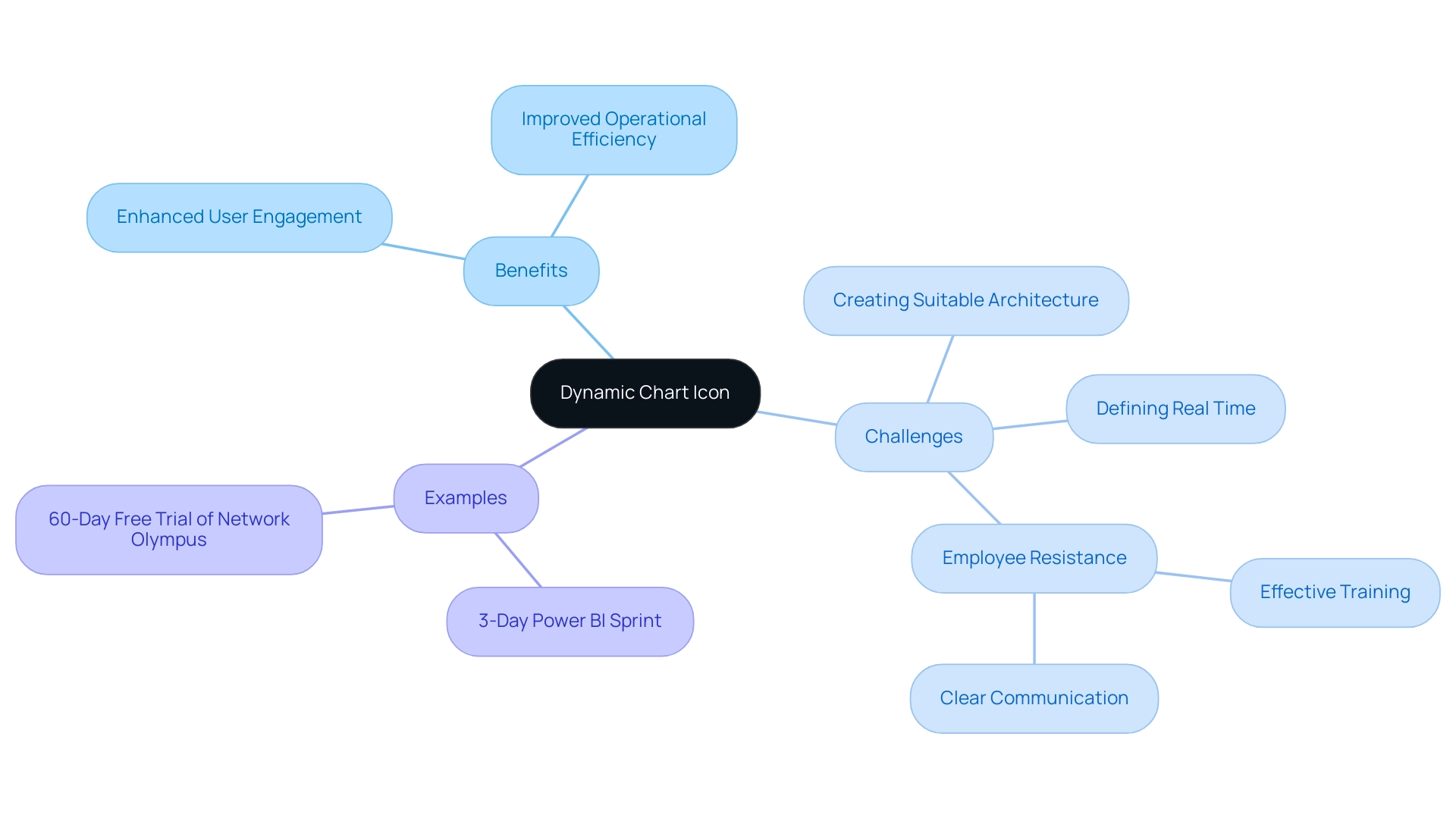
The Dynamic Chart Icon represents a pivotal tool in the realm of real-time data visualization, enabling charts to refresh automatically as data fluctuates. This capability is crucial for documents that necessitate constant oversight of critical metrics, akin to how self-driving cars must respond to new information within milliseconds. Such immediacy ensures individuals have access to the latest information at their fingertips, facilitating swift decision-making processes.
By leveraging dynamic charts, creators can significantly enhance user engagement and improve operational efficiency, aligning with the latest trends in Business Intelligence. The 3-Day Power BI Sprint offers rapid development of these dynamic reports, allowing organizations to quickly adapt to changing information needs, while the General Management App provides a comprehensive overview of performance metrics, enhancing strategic decision-making. However, integrating real-time information updates presents challenges; organizations must navigate:
- Defining ‘real time’
- Creating a suitable architecture
- Addressing employee resistance to change through effective training and clear communication about the advantages of real-time analytics
As thirty-three percent of elite marketers affirm, the right technologies, such as those offered in our 3-Day Power BI Sprint, and data collection systems are essential for acquiring understanding of customer behavior, underscoring the importance of adopting dynamic chart features in business reporting. Furthermore, a practical example can be seen in the 60-Day Free Trial of Network Olympus, allowing users to assess the effectiveness of dynamic charts in a real-world context. Ultimately, implementing such tools not only improves interactivity but also enhances data-driven insights, making them indispensable for effective documentation and business growth.
6. Icon 4: The Trend Analysis Icon
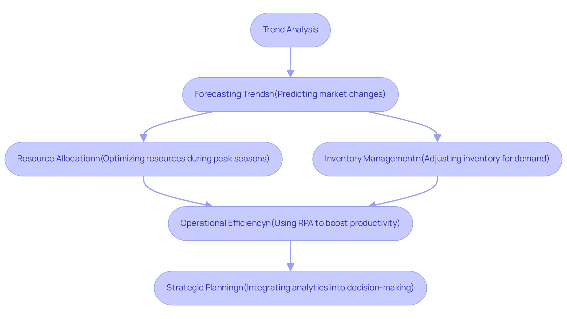
The Trend Analysis Icon functions as a critical component in visualizing trends over time, enabling creators to highlight significant changes and patterns within collections. By effectively utilizing this icon, businesses can facilitate informed predictions and strategic decision-making, particularly in areas such as resource allocation and inventory management during peak seasons. As noted by Michela Buttignol, trend analysis attempts to forecast a trend, such as a bull market run, and then follow that trend until evidence indicates a trend reversal.
This approach emphasizes the critical role of trend analysis in business decision-making, enabling organizations to adapt quickly to market shifts. Moreover, incorporating trend analysis into reports not only enhances their visual appeal but also enriches the narrative, making it more accessible for stakeholders. Businesses leveraging trend analysis tools, combined with Robotic Process Automation (RPA), are better positioned to monitor technology performance and identify efficiencies that optimize operations, ultimately leading to lower operational costs.
For instance, accurate forecasting allows retailers to prepare for consistent demand increases by adjusting inventory and staffing in advance, as demonstrated in the case study titled ‘Improving Forecasting Efforts.’ This proactive strategy is essential for maintaining operational efficiency and effectively responding to consumer needs. Furthermore, the automation of manual workflows through RPA not only boosts productivity but also reduces the likelihood of errors, further enhancing overall efficiency.
Additionally, the integration of trend analytics into strategic planning, risk management, and performance evaluation is crucial for businesses aiming to thrive in competitive environments. With the growing significance of customized AI solutions and science skills, as demonstrated by the Python for Science Bootcamp, which requires 30 hours and costs $1,495, organizations must invest in training to effectively utilize trend analysis tools and improve their operational strategies.
7. Icon 5: The Contextual Tooltip Icon
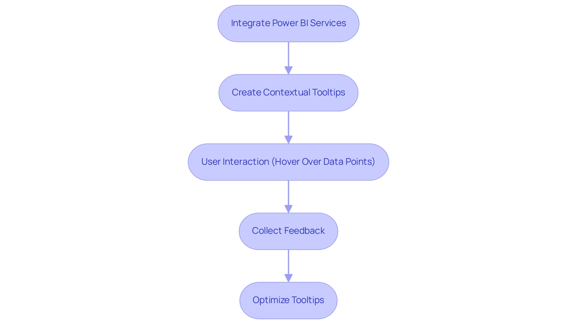
The Contextual Tooltip Icon is a powerful feature in Power BI that enhances user comprehension by providing additional information when users hover over specific data points. This functionality is crucial as it enables creators to present insights and explanations without cluttering the document with excessive text. Significantly, statistics show that 80% of tours within documents include a cover image, illustrating the importance of visual engagement.
Through the effective use of tooltips, creators can enhance the user experience and encourage deeper engagement with the information. Furthermore, integrating Power BI services, including the 3-Day Power BI Sprint, enables organizations to quickly create professionally designed documents, while the General Management App ensures comprehensive management and smart reviews, driving actionable insights that foster informed decision-making. Additionally, utilizing Power Automate for workflow automation can alleviate the challenges of time-consuming report creation and data inconsistencies.
Collecting feedback on custom tooltips through testing with various groups is essential for optimizing their effectiveness and ensuring they meet needs. As emphasized in the case study titled ‘Experience and Business Revenue,’ investing in experience design, including effective tooltips, can yield a return on investment of up to $100 for every $1 spent. As Bianca Almodovar aptly states,
Tooltips can provide helpful information in form fields.
This reinforces the critical role tooltips play in enhancing engagement and facilitating a more informative exploration of the data presented.
8. Icon 6: The Accessibility Icon
The Accessibility Icon plays a crucial role in ensuring that documents are accessible to individuals with diverse abilities. This icon encompasses essential features such as:
- Screen reader compatibility
- Color contrast adjustments
- Navigational aids
These features facilitate a more inclusive experience for users. With 22.1% of images missing alternative text in certain evaluations, as emphasized in recent analyses, the necessity for effective accessibility measures is evident.
As AudioEye states, ‘Don’t be just another web accessibility statistic.’ By prioritizing these elements, content creators can significantly broaden their audience reach, ensuring that critical insights are available to everyone. This approach not only promotes inclusivity in information presentation but also aligns with current trends emphasizing compliance with digital accessibility standards.
The City of New York’s Digital Accessibility Law, which mandates the development of a 5-Year Accessibility Plan, serves as a concrete example of the necessity for ongoing updates and audits in accessibility efforts. Organizations must acknowledge that accessibility is a continuous journey; adopting inclusive documentation practices is not merely a best practice, but essential for enhancing usability and accountability in data presentation.
![]()
9. Icon 7: The Navigation Shortcut Icon
The Navigation Shortcut Icon is a crucial element that enables individuals to swiftly move through various sections of a document, improving operational efficiency. This functionality is particularly beneficial in lengthy documents, as it allows individuals to access relevant information without the annoyance of scrolling through numerous pages. According to recent research, 88% of individuals are less likely to return to a site after encountering poor experience, highlighting the critical nature of effective navigation.
Furthermore, it is noteworthy that 66% of mobile sites struggle with poorly placed tappable elements, underscoring the need for intuitive navigation in reporting software. By incorporating navigation shortcuts, content creators can significantly elevate the user experience, ensuring that stakeholders can engage with the material seamlessly. This approach not only improves efficiency but also fosters greater interaction with the reports, ultimately leading to more informed decision-making.
In the context of a rapidly evolving AI landscape, leveraging RPA to automate manual workflows—often hindered by repetitive tasks—further complements these navigation features, driving data-driven understanding and contributing to business growth. Furthermore, as demonstrated in the case study titled ‘Other Considerations for Usage Metrics,’ users must interact with the content in their workspace to activate processing for usage metrics, highlighting the importance of efficient navigation. As the visual search market is projected to exceed $32 billion by 2028 (Data Bridge Market Research), the importance of navigation features in modern reporting tools cannot be overstated.
Tailored AI solutions can further enhance these navigation capabilities, ensuring they align with specific business goals and challenges.
![]()
10. Icon 8: The Summary Dashboard Icon
The Summary Dashboard Icon is crucial for providing a high-level overview of essential metrics and data, designed for executives and decision-makers who need quick access to vital information. Utilizing summary dashboards enables creators to condense large volumes of information into manageable observations, allowing stakeholders to swiftly understand the most crucial elements of performance. Experts underscore the importance of using the Executive Summary dashboard to prioritize security operations, monitor overall health, and evaluate organizational risk.
Current trends in business intelligence demonstrate that concise executive reports, often limited to a single page, significantly enhance decision-making efficiency by allowing leaders to focus on relevant data without unnecessary complexity. Moreover, identifying sources producing the least results over a specified period can provide valuable understanding into operational effectiveness and areas needing attention. An exemplary tool in this regard is the Agent Performance Dashboard, which provides supervisors with key performance indicators such as:
- Busy Hour
- Call Count By Exit Reason
- Average Handle Time
assisting in evaluating and improving team performance.
Additionally, the integration of Robotic Process Automation (RPA) within these frameworks can streamline manual workflows, enhancing overall efficiency and productivity. As companies maneuver through the changing AI environment, customized solutions become crucial in leveraging Business Intelligence for practical knowledge. Significantly, with individuals capable of sharing threat information within Splunk Enterprise Security, summary dashboards are becoming more pertinent, promoting clarity and enabling decision-makers with high-level insights essential for strategic planning and fostering data-driven growth.
To explore how these solutions can specifically address your business challenges, consider our Actions portfolio and book a free consultation to discuss your needs.
![]()
11. Icon 9: The Interactive Dashboard Icon
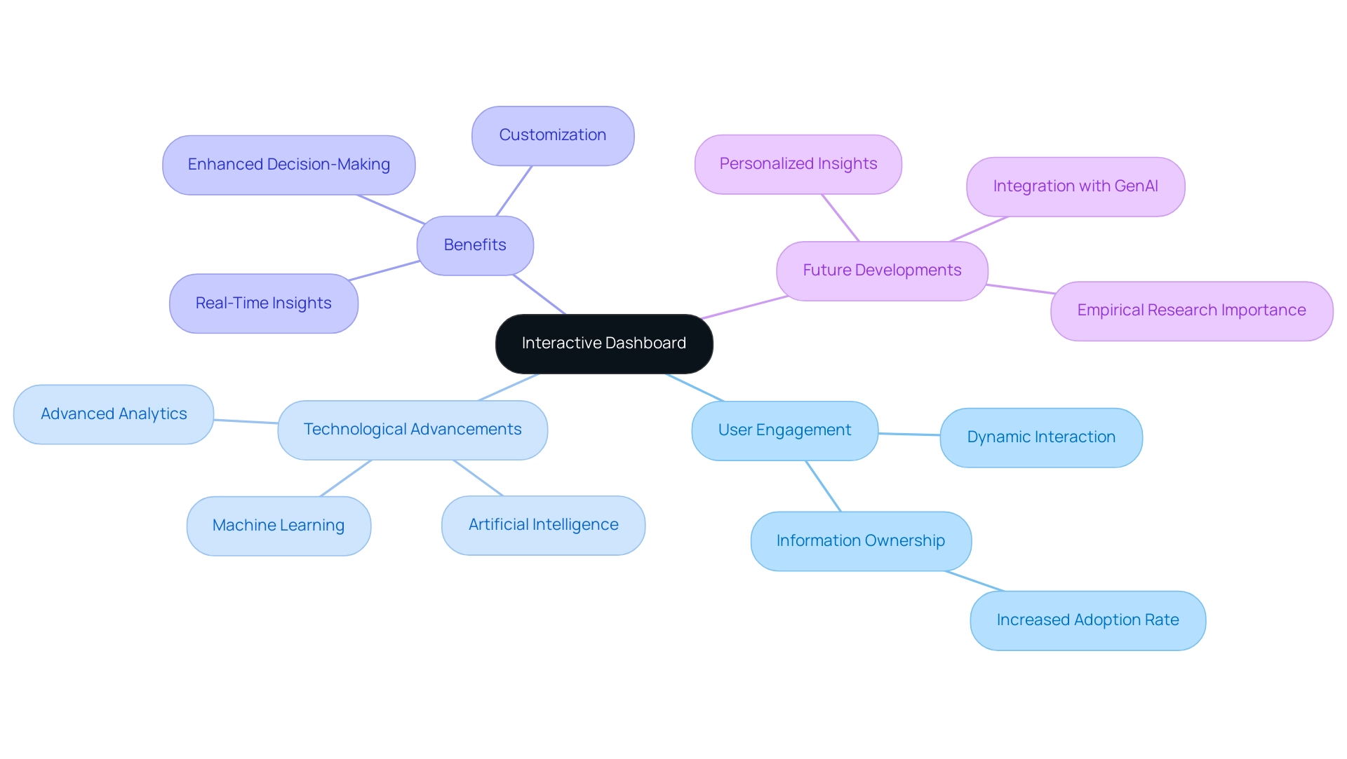
The Interactive Dashboard Icon is a pivotal feature that empowers individuals to engage with data dynamically, allowing for the manipulation and exploration of various data points. This capability significantly enhances participant engagement, providing a more immersive and interactive experience. As organizations increasingly demand user-centric solutions, the shift from static reports to interactive dashboards has become paramount.
A study shows that when non-technical individuals are engaged in information ownership, the adoption rate of modern analytics solutions rises to 80%. This illustrates an increasing movement towards enabling individuals to actively engage with information. Ram Prabhakar highlights the future potential of such tools, stating,
The integration of advanced analytics, artificial intelligence, and machine learning will further enhance the capabilities of interactive dashboards, enabling organizations to extract even more value from their information.
By incorporating interactive dashboards, creators can foster a deeper understanding of the information and encourage users to explore insights actively. Moreover, our Power BI services offer a 3-Day Sprint for rapid report creation, alongside a General Management App that facilitates comprehensive management and smart reviews. These services specifically address challenges like poor master data quality by ensuring data consistency and clarity in reporting.
The evolution of BI reporting demonstrates how these dynamic tools not only provide customization and real-time knowledge but also significantly increase engagement, making them the preferred option for organizations aiming to improve their decision-making processes. Furthermore, empirical research plays a crucial role in evaluating the effectiveness of these dashboards in decision-making contexts. Future BI tools, enhanced by Small Language Models and GenAI Workshops, are anticipated to provide customized information tailored to individual individuals based on their behavior and preferences, thereby improving the overall effectiveness of interactive dashboards.
12. Icon 10: The Visual Appeal Icon
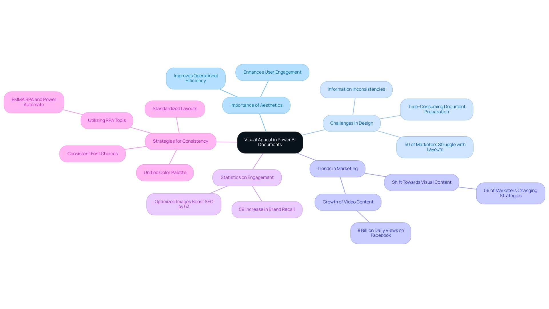
The Visual Appeal Icon acts as a crucial component in improving the aesthetics of Power BI documents, which is vital for promoting data-driven understanding. By encouraging creators to adopt visually engaging color schemes, typography, and layouts, this icon plays a pivotal role in capturing user attention and enhancing operational efficiency. In today’s information-rich environment, the significance of Business Intelligence cannot be overstated, as it enables businesses to transform raw information into actionable insights.
However, challenges such as time-consuming document preparation and information inconsistencies can hinder effective decision-making. Recent studies reveal that up to 50% of marketers struggle with identifying effective design layouts for their information, underscoring the need for intuitive visual strategies. Celeste Yates, a noted content writer, highlights a shift in marketing strategies, stating,
Over 56% of marketers are changing their perception and will be including visual content more in their strategies.
This trend is especially significant in information visualization, as immersive visuals not only make presentations more enjoyable to navigate but also enhance the clarity of insights provided. Research indicates that individuals exposed to visually appealing content are significantly more likely to engage with it; for instance, brands utilizing immersive ads on platforms like Pinterest experience a 59% increase in brand recall. This statistic highlights the significance of visual attractiveness in Power BI presentations, as greater brand recall can result in enhanced engagement with the information displayed.
Furthermore, maintaining consistency in visual branding across platforms can bolster recognition and trust. In the context of Power BI, this can be achieved by using a unified color palette, consistent font choices, and standardized layouts throughout documents, which can significantly enhance user experience. Additionally, utilizing RPA solutions like EMMA RPA and Power Automate can simplify the creation process, addressing issues of task repetition and data inconsistencies, thereby enhancing operational efficiency.
Optimized images can also enhance organic search visibility by up to 63%, further emphasizing the necessity of aesthetics in design. Ultimately, the significance of aesthetics in design is not merely a matter of preference; it directly influences user engagement, making effective communication of insights more impactful. By prioritizing visual aesthetics and integrating RPA tools, report creators can ensure their reports are not only informative but also compelling and user-friendly, facilitating better decision-making and operational efficiency.
Conclusion
Power BI Report Builder emerges as an essential tool in the realm of data reporting, providing users with the capability to create structured and visually appealing reports. The integration of diverse data sources, along with features like interactive icons and dynamic charts, significantly enhances the clarity and effectiveness of data presentation, making it indispensable for professionals aiming to elevate their reporting skills.
The strategic use of icons within Power BI reports not only simplifies complex data interpretation but also fosters user engagement and trust. Each icon serves a specific purpose, from data visualization to trend analysis, enabling users to interact with and understand their data more effectively. As organizations increasingly prioritize data-driven decision-making, mastering these visual elements becomes crucial for optimizing insights and driving strategic initiatives.
Ultimately, the emphasis on aesthetics, accessibility, and interactivity in report design cannot be overstated. By leveraging the full potential of Power BI Report Builder and its features, organizations can ensure that their data reporting is not only informative but also engaging and user-friendly. As the landscape of business intelligence continues to evolve, investing in these reporting capabilities will be vital for maintaining a competitive edge and achieving operational success.
Overview
To create a Power BI running total by category, users must follow a series of steps involving the DAX language, which includes opening Power BI Desktop, creating a new measure, and applying the appropriate DAX formula for cumulative calculations. The article emphasizes the importance of categorization and precision in DAX formulas to ensure accurate reporting, while also addressing common challenges and advanced techniques that enhance the overall analytical capabilities of Power BI.
Introduction
In the realm of data analysis, the ability to track performance trends through running totals is a game-changer. Power BI, a leading business intelligence tool, empowers users to create cumulative totals that reveal critical insights into metrics like sales and revenue over time. As organizations increasingly rely on data-driven strategies, mastering running totals not only enhances analytical capabilities but also supports informed decision-making.
However, the journey to effectively implementing this feature is fraught with challenges, from complex DAX formulas to data inconsistencies. This article delves into the nuances of creating and optimizing running totals in Power BI, offering:
- Step-by-step guidance
- Troubleshooting tips
- Advanced techniques that can elevate reporting efficiency and accuracy
Whether a novice or an experienced analyst, understanding these concepts is essential for navigating today’s data landscape.
Understanding Running Totals in Power BI
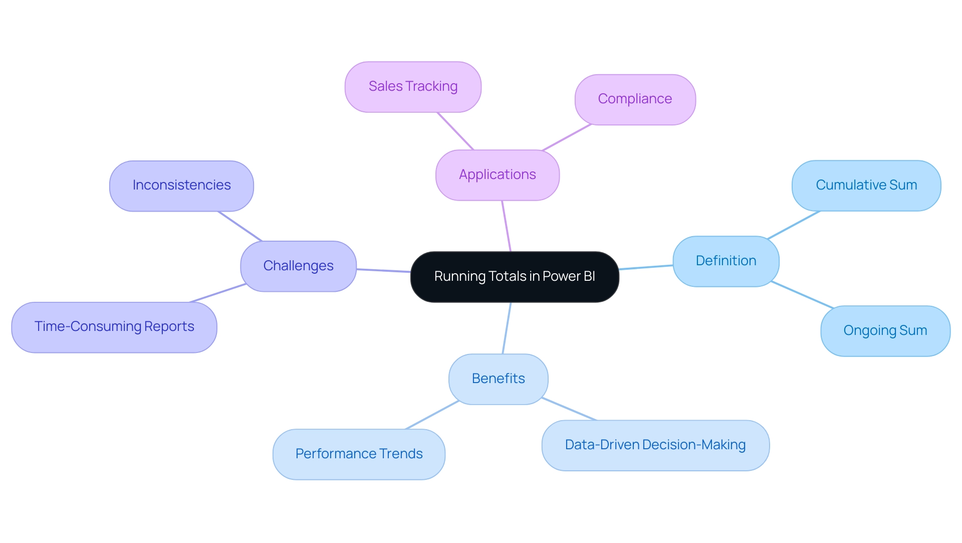
An ongoing sum, commonly known as a cumulative sum, signifies a calculation that persistently combines values from a dataset over a specified timeframe. In the framework of BI, the Power BI running total by category is crucial for tracking important metrics such as sales, revenue, and expenses over time. This functionality enables users to visualize the complete amount accumulated up to any given moment, thereby offering critical insights into performance trends and overall business health.
Recent trends suggest that organizations utilizing Power BI running total by category are better prepared for data-driven decision-making, as they can quickly identify patterns and shifts in their operations. However, challenges such as time-consuming report creation, inconsistencies, and a lack of actionable guidance can hinder the effective use of these insights. Employing Business Intelligence tools together with Robotic Process Automation (RPA) solutions such as EMMA RPA and Automate not only improves information accuracy but also simplifies the reporting process, tackling these common challenges.
With a considerable number of 3108 references to cumulative figures, it’s clear that this feature plays an essential role in modern analytical processes. For example, the case study on Power BI Admin Controls for Usage Metrics emphasizes how organizations can oversee user access to sensitive usage information while using a Power BI running total by category to uphold privacy and compliance. Furthermore, viewing Bayesian statistics as a substitute method to conventional techniques can offer a wider perspective for comprehending analysis methodologies in connection to cumulative sums.
By mastering the creation and use of cumulative sums, professionals can profoundly enhance their analytical capabilities, ultimately leading to more informed decisions and strategic planning, while effectively navigating the overwhelming AI landscape.
The Role of Categories in Running Total Calculations
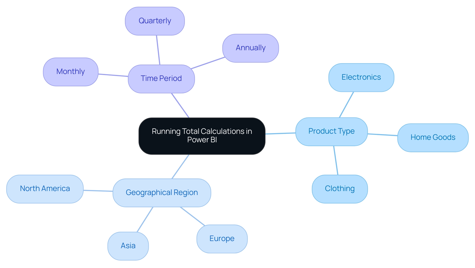
Efficient classification of information is essential when computing cumulative sums in Power BI. Categories can be established based on various dimensions, such as:
- Product type
- Geographical region
- Time period
For instance, when examining sales information, it is advantageous to create a Power BI running total by category for each product category separately.
This approach enables businesses to analyze the Power BI running total by category, helping them discern which categories are performing optimally over time and providing deeper insights into sales trends. Such segmentation not only streamlines analysis but also facilitates informed strategic decision-making. To categorize information effectively, it is imperative that your model incorporates relevant category fields, which can then be utilized in both visualizations and calculations.
In today’s information-rich environment, leveraging the capabilities of Power BI services, including:
- The 3-Day Sprint for rapid report creation
- The General Management App for comprehensive oversight
can significantly enhance reporting and provide actionable insights. Recent studies indicate that proper information categorization can enhance business analytics and directly influence sales performance. Furthermore, as of 2023, 3.5% of Chief Information Officers (CIOs) report to the Chief Financial Officer (CFO), underscoring the growing significance of analytics leadership in organizations.
BI services, including our Actions portfolio, provide customized solutions to address challenges such as information inconsistencies and time-consuming report creation. To further explore how these services can benefit your organization, we invite you to book a free consultation. Effective data segmentation in Business Intelligence not only leads to more accurate reporting but also enhances operational efficiency, exemplified by companies leveraging data analytics to optimize their operations and achieve significant cost savings.
Step-by-Step Guide to Creating Running Totals in Power BI
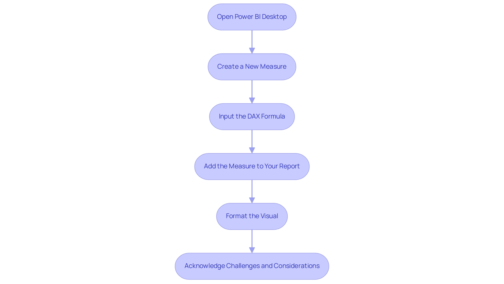
Establishing a cumulative sum using Power BI running total by category requires a sequence of distinct actions that utilize the robust DAX (Data Analysis Expressions) language. Here’s how to do it effectively:
-
Open Power BI Desktop: Start by launching Power BI Desktop and loading your dataset into the application.
-
Create a New Measure: In the Fields pane, find the table where you want to include the cumulative sum. Right-click on this table and select ‘New Measure’ from the context menu.
-
Input the DAX Formula: Enter a DAX formula to compute the Power BI running total by category.
A commonly used formula is:
RunningTotal = CALCULATE(SUM(Sales[Amount]), FILTER(ALLSELECTED(Sales[Date]), Sales[Date] <= MAX(Sales[Date])))This formula calculates the cumulative sum of the ‘Amount’ column in the ‘Sales’ table, considering the selected date range. As Douglas Rocha, a statistics enthusiast, emphasizes,
Can you perform analytics in BI without DAX? Yes, you can, you can do it without measures as well and I will teach you how at the end of this tutorial.
This emphasizes the flexibility of Power BI in managing analysis.
-
Add the Measure to Your Report: Drag and drop the newly created measure onto your report canvas.
This action will allow you to effectively visualize the Power BI running total by category.
-
Format the Visual: Adjust the visual settings to enhance readability, ensuring that your report conveys the information clearly and effectively.
In addition to these steps, it’s important to acknowledge common challenges faced by users: investing excessive time in report creation, inconsistencies in information, and a lack of actionable guidance can hinder decision-making and lead to confusion and mistrust in the information presented. Understanding these challenges reinforces the necessity of an effective governance strategy. Furthermore, the typical report opening time corresponds to the 50th percentile, which underscores the efficiency of utilizing BI for timely data analysis.
Tools like RPA can automate repetitive tasks, allowing you to focus on deriving insights rather than constructing reports. For example, once you have the cumulative amount, you can examine trends over time by contrasting the current 28 days with the prior 28 days, offering actionable insights into performance. This adaptability is crucial for meaningful insights.
Moreover, BI operates in separate national/regional clouds, ensuring compliance with local regulations while providing usage metrics, which reinforces the importance of security and privacy standards in your reporting.
Troubleshooting Common Issues with Running Totals
When handling cumulative sums in Power BI, users often face various significant hurdles that can affect report precision and performance:
-
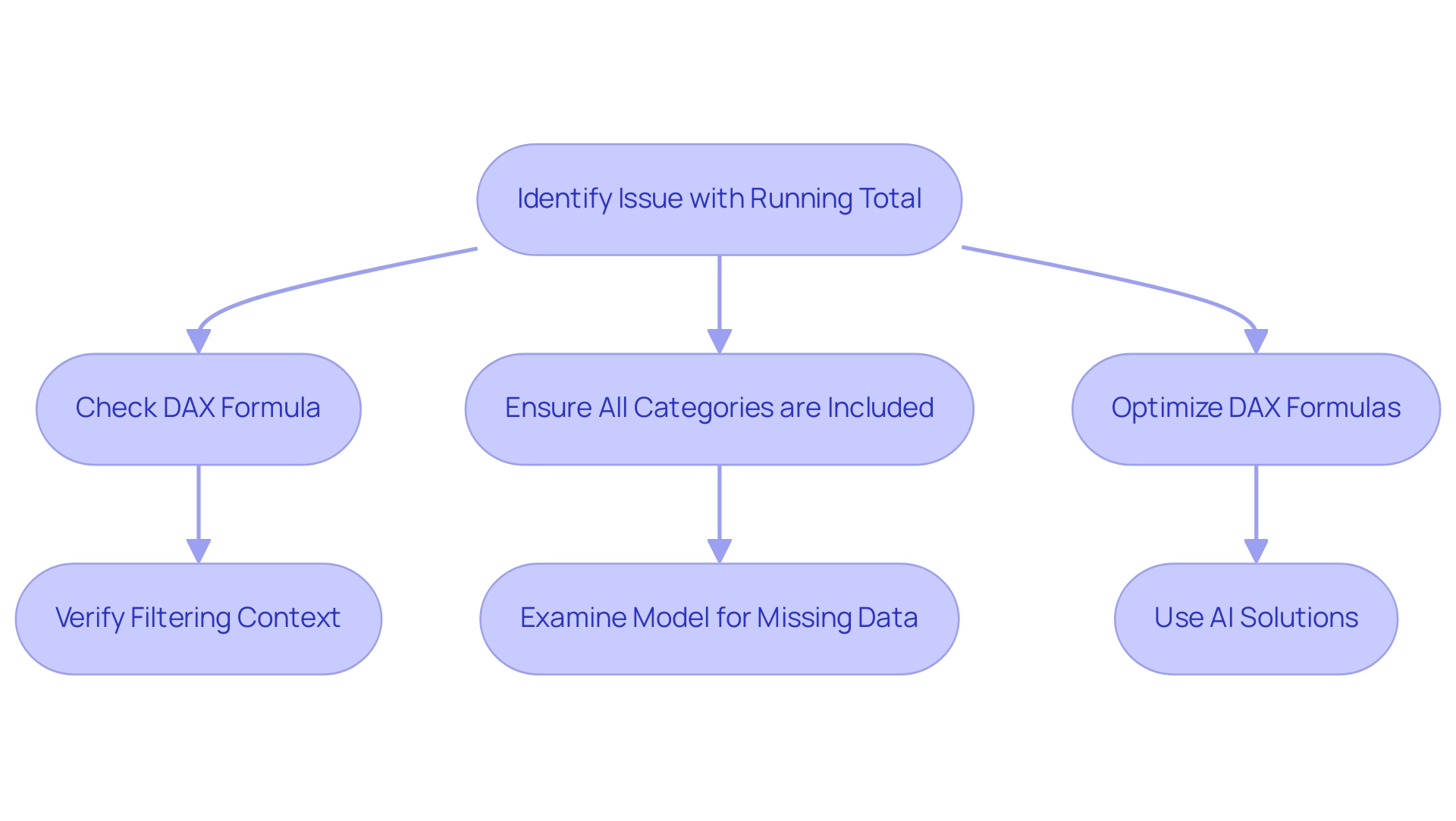
Incorrect Sums: An unexpected cumulative figure frequently arises from mistakes in the DAX formula. It is crucial to verify that the filtering context is appropriately established for the power bi running total by category. Incorrectly set filters can result in deceptive sums that do not represent the foundational information. This challenge highlights the significance of implementing Business Intelligence solutions, particularly power bi running total by category, that can simplify verification processes.
-
Missing Information: Instances where certain categories lack a power bi running total by category may indicate omissions in the model. A thorough examination of the model is necessary to ensure all relevant categories are included and that no records are missing from the dataset. By leveraging RPA tools like EMMA RPA and Power Automate, businesses can automate checks, which helps in creating a power bi running total by category, reducing the time spent on manual verifications and ensuring comprehensive sets. To combat this, optimizing DAX formulas is essential, as is potentially reducing the volume of information being analyzed. Streamlined calculations not only enhance performance but also improve user experience, particularly in the context of power bi running total by category. Incorporating tailored AI solutions can further assist in identifying performance bottlenecks and suggest optimizations. For instance, applying Business Intelligence strategies such as aggregation and indexing can significantly enhance report responsiveness.
Revisiting your calculations and the structure of your model can often remedy issues with power bi running total by category. As mentioned by Ari Entin, leader of sports marketing at AWS, ‘This is a new method to capture, visualize and analyze athletic performance information in real time,’ which emphasizes the significance of precise information management, including cumulative figures. Moreover, incorporating advanced methods, such as using R scripts, can greatly improve the analysis capabilities of Power BI running total by category.
For instance, the case study named ‘Power BI – Create an R Script Visual’ illustrates how R scripts can convert information into statistical analysis and machine learning algorithms, effectively resolving common cumulative issues. This integration not only enhances troubleshooting but also underscores the complexity of DAX formulas, which is reflected in the 4-minute read time of the DAX Trigonometric Functions section, emphasizing the importance of mastering these concepts for efficient operations.
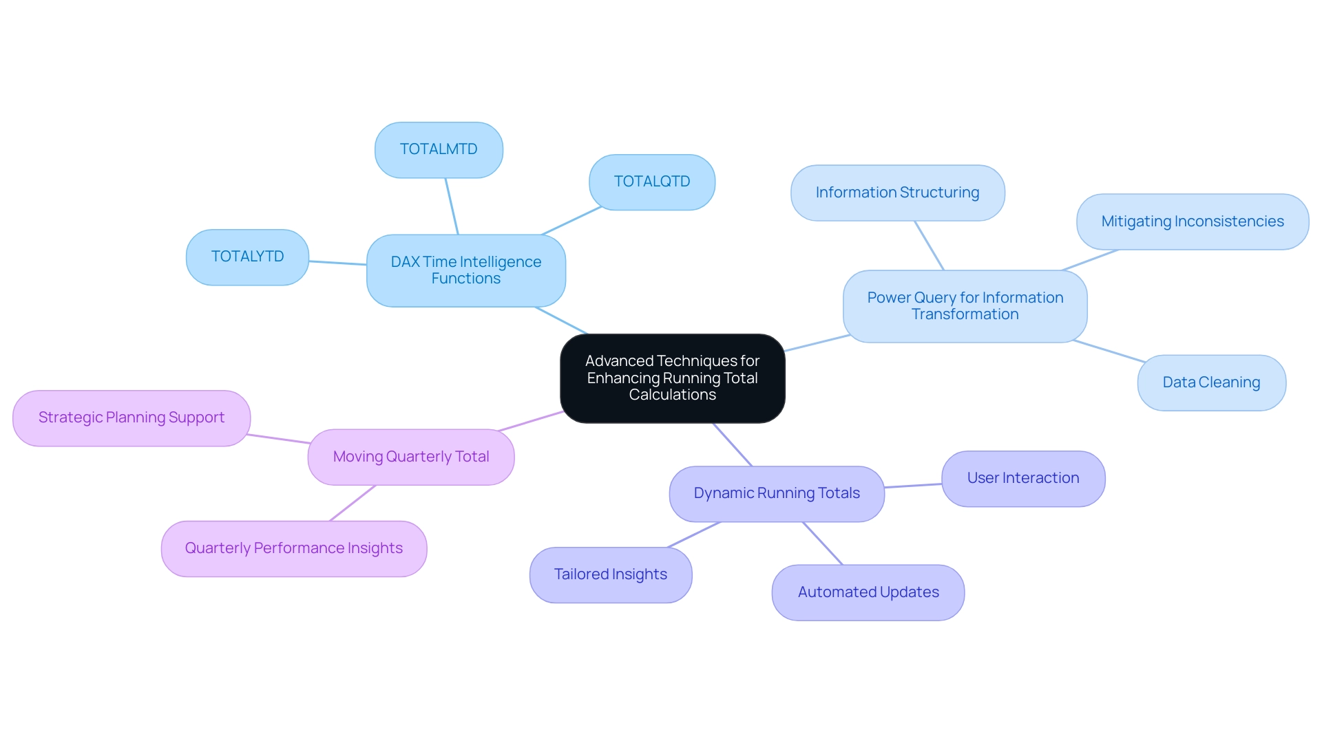
Advanced Techniques for Enhancing Running Total Calculations
To elevate your running total calculations in Power BI, consider implementing these advanced techniques that not only enhance operational efficiency but also leverage the power of automation and data insights:
-
Leveraging DAX Time Intelligence Functions: Functions such as
TOTALYTD,TOTALQTD, andTOTALMTDare indispensable for simplifying the creation of running totals across various time periods. For instance, theTOTALYTDfunction efficiently returns year-to-date values for a specified expression, enabling clearer insights into performance metrics. This is especially pertinent in a landscape where Robotic Process Automation (RPA) can optimize manual information handling processes, reducing errors and ensuring that the power bi running total by category captures all revenue from the beginning of time up until the last date, thereby highlighting the importance of this calculation in understanding overall performance. -
Utilizing Power Query for Information Transformation: Preprocessing your information with Power Query is essential. By ensuring your information is clean and well-structured prior to performing calculations, you enhance both performance and accuracy, which are vital for reliable reporting, especially when working with power bi running total by category. This approach not only mitigates challenges such as inconsistencies but also aids in deriving actionable insights, especially when utilizing power bi running total by category, which is a necessity in today’s information-rich environment. The cleaning process directly addresses the challenges posed by inconsistencies, ensuring that your reports are based on accurate and reliable information.
-
Creating Dynamic Running Totals: Implement measures for power bi running total by category that dynamically adjust in response to user selections within your reports. This interactivity grants users the ability to explore data more deeply and derive insights tailored to their specific queries, such as power bi running total by category, thereby enhancing decision-making.
Additionally, the Moving Quarterly Total function serves as an excellent example of how to use the power bi running total by category to calculate totals for dates up to one quarter prior, allowing for effective evaluation of quarterly trends. This technique can also be automated through RPA to ensure timely updates, facilitating better strategic planning and providing significant insights into overall performance, including the analysis of power bi running total by category, which reinforces the importance of Business Intelligence in driving growth. As noted by Super User smpa01, “Thanks @Alexis Olson, will report back here and let you know.
Did I answer your question? Mark my post as a solution! Proud to be a Super User!”
This community engagement highlights the practical application and importance of these techniques. By incorporating these advanced methods, your Power BI reports will utilize a power bi running total by category, resulting in more robust analytical capabilities and enhanced decision-making support.
Conclusion
Mastering running totals in Power BI is essential for any organization aiming to leverage data for strategic decision-making. This article provided a comprehensive overview of how to effectively create and optimize running totals, starting from the foundational concepts to advanced techniques and troubleshooting common challenges. Readers learned the importance of accurate data categorization, the step-by-step process of implementing running totals using DAX, and the role of automation in enhancing reporting efficiency.
The integration of advanced techniques, such as DAX time intelligence functions and Power Query for data transformation, further empowers users to create dynamic and insightful reports. By embracing these methodologies, analysts can not only overcome obstacles such as data inconsistencies and performance issues but also elevate their analytical capabilities to new heights.
Ultimately, the ability to track running totals transforms how organizations understand their performance metrics over time. As data continues to play a pivotal role in business strategies, mastering the art of running totals in Power BI equips professionals with the tools necessary to navigate the complexities of data analysis, leading to more informed decisions and a competitive edge in the market.
Overview
The article addresses the issue of why the “show items with no data” feature in Power BI may not function correctly, highlighting common causes such as connectivity problems, incorrect filtering, and misconfigured data models. It provides a step-by-step troubleshooting guide, emphasizing the importance of verifying data connections, adjusting filters, and ensuring proper permissions to resolve these visibility issues effectively.
Introduction
In the realm of data visualization, Power BI has emerged as a powerful tool, yet many users find themselves grappling with a common frustration: visuals that simply refuse to display data. This issue can stem from a myriad of factors, including:
- Connectivity problems
- Misconfigured data models
- Improper filtering
As organizations increasingly rely on data-driven insights to inform their strategies, understanding the intricacies of Power BI becomes essential. By delving into the reasons behind these visual failures and exploring effective troubleshooting techniques, users can not only enhance their individual experiences but also drive overall operational efficiency. This article offers a comprehensive guide to overcoming these challenges, ensuring that Power BI serves its purpose as a catalyst for informed decision-making and business growth.
Understanding the Challenge: Why Power BI Visuals May Not Display Data
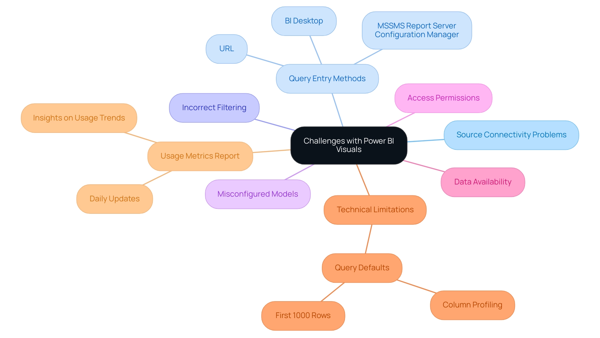
This tool is prominent as a strong visualization resource, yet many individuals often face challenges, particularly with the Power BI show items with no data not working. These issues can originate from different sources, including:
- Source connectivity problems
- Uncertainty regarding query entry methods—whether in BI Desktop, via a URL, or through MSSMS Report Server Configuration Manager
- Incorrect filtering
- Misconfigured models
These factors may lead to Power BI show items with no data not working. Understanding the context in which these visuals operate is crucial for effective troubleshooting, particularly when Power BI show items with no data not working.
For instance, identifying whether the issue arises from:
- Data availability
- Model relationships
- Access permissions
is crucial when troubleshooting why Power BI show items with no data not working. A common technical limitation to be aware of is that Query defaults to loading and analyzing only the first 1000 rows, which can impact the count of distinct values. Users can change the column profiling to analyze the entire dataset to see the correct number of distinct values.
As noted by Alireza, a Helper V,
To be honest, I could not find it by myself. It’s in a very wrong place, not user-friendly!
This sentiment underscores the necessity for clarity in user interfaces and processes.
Moreover, the significance of utilizing Business Intelligence tools such as BI alongside RPA solutions cannot be overstated. By automating repetitive tasks with tools such as EMMA RPA and Automate, organizations can enhance operational efficiency and reduce errors, ultimately driving informed decision-making. Additionally, Power BI produces a pre-constructed usage metrics summary for the past 90 days, enabling organizations to segment information based on access methods and engagement levels.
This report updates daily, providing ongoing insights into usage trends, which can assist in troubleshooting visibility issues effectively. With 2,931 individuals online last month facing similar challenges, it is evident that addressing these issues not only improves personal experience but also enhances overall operational efficiency and drives business growth.
Common Reasons for Power BI Visuals Not Displaying Data
Power BI users often face challenges where the ‘power bi show items with no data not working’ issue causes visuals to fail in displaying information, leading to frustration and inefficiencies. Understanding the underlying causes can streamline troubleshooting efforts, particularly when power bi show items with no data not working. Here are some key factors to consider:
-
Information Source Issues:
It is vital to confirm that the information source is properly connected and that the dataset is refreshed. Inconsistent information can lead to visual failures, as highlighted by Super User Pragati Jain, who remarked,This seems to be a consistency issue,
which could explain why power bi show items with no data not working. Without a robust governance strategy, these inconsistencies can escalate, impacting decision-making. -
Filters and Slicers:
Filters and slicers play a crucial role in information visibility; if they are applied incorrectly, they can cause the power bi show items with no data not working, thus restricting the information displayed in visuals. Recent statistics indicate that a significant percentage of Power BI users face issues related to source configurations, particularly when power bi show items with no data not working, underscoring the importance of proper filter management. -
Relationships Between Tables:
Ensuring that relationships between tables are accurately defined in the information model is essential for effective visualization to prevent issues like power bi show items with no data not working. -
Data Type Mismatches:
Any discrepancies in expected data types can prevent Power BI from showing items with no data not working correctly. -
Permissions:
With the introduction of audit logs in the Power BI Admin Portal, administrators can manage access rights effectively. However, exporting activities for all individuals remains problematic and may lead to errors. Thus, confirming that users possess the necessary permissions is critical for resolving issues related to Power BI show items with no data not working. Furthermore, BlueGranite promotes feedback on design elements, which can assist in enhancing the overall effectiveness of BI visuals.
Notably, the fifth message received 3,792 views, indicating a strong interest in resolving these common issues. Additionally, the case study titled ‘Power BI Admin Controls for Usage Metrics’ illustrates practical applications of managing access to usage metrics, emphasizing the significance of privacy and compliance. By systematically tackling these frequent issues and utilizing Business Intelligence to convert unprocessed information into practical insights, including clear, actionable guidance in reports, users can enhance their troubleshooting processes and improve overall visibility in BI.
Moreover, considering the integration of Robotic Process Automation (RPA) and tailored AI solutions can further streamline operations and help overcome these challenges, aligning with business goals and enhancing efficiency.
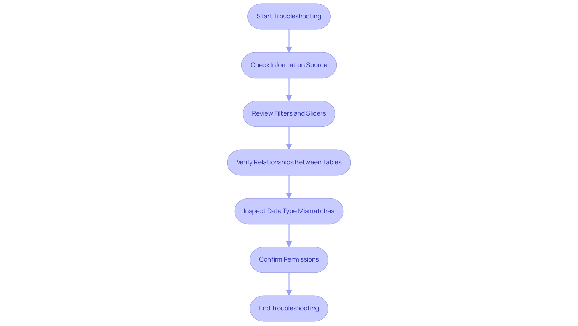
Step-by-Step Troubleshooting: Fixing Power BI Visuals
A systematic approach is required for troubleshooting when Power BI shows items with no data not working. Follow these detailed steps to identify and resolve the issue:
-
Check Connectivity: Start by accessing the source settings to ensure the connection is active.
Any interruptions can prevent information from loading properly, exacerbating the common challenge of spending more time on report creation than on deriving insights.
-
Inspect Filters: Review all filters applied to your visuals. Temporarily removing these filters can help determine if they are restricting visibility, which could contribute to inconsistencies and confusion among stakeholders.
-
Examine Data Model: Navigate to the model view to check the relationships between tables. This is crucial since improper relationships can impede information flow. Adjust or establish new relationships as needed to ensure all necessary information is linked correctly, enhancing the clarity and accuracy of your reports.
-
Validate Information Types: Confirm that the information types in your model are consistent with the requirements of the visuals. Mismatched information types can lead to display errors, further complicating the analysis process.
-
Test Permissions: It’s essential to verify that your user account possesses the necessary permissions to access the information.
Insufficient permissions can lead to information not being displayed, limiting your ability to leverage insights effectively.
-
Implement Governance Strategy: Establishing a governance strategy is vital to prevent inconsistencies and ensure that stakeholders can trust the information presented. This strategy should incorporate regular audits and standards for information management.
After making the necessary adjustments, refresh the visuals to check if the information appears correctly. Applying these troubleshooting techniques can significantly enhance your success rate in resolving display problems, particularly if you encounter the issue of Power BI showing items with no data not working, conforming to best practices in analysis. Given that the total revenue for the year 2023 was 850,000 units, effective visualization is critical for making informed operational decisions.
As Harris Amjad states, ‘Descriptive statistics also help us understand the world around us,’ underscoring the importance of accurately interpreting information. Failing to extract meaningful insights can place your business at a competitive disadvantage. For additional insights, think about checking out Andrew Gard’s YouTube channel, where he talks about practical troubleshooting methods in his videos, offering valuable analysis techniques that are relevant beyond BI.
By integrating Business Intelligence and RPA solutions, you can transform your operations and unlock powerful insights for continuous growth.
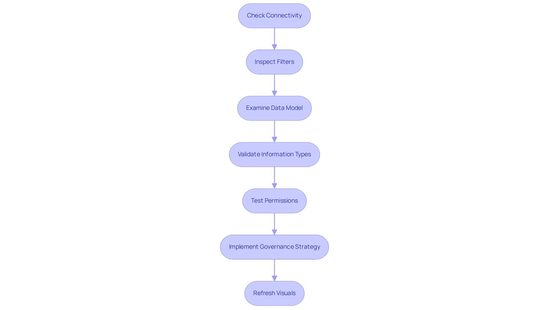
The Role of Data Modeling in Ensuring Visual Accuracy
Data modeling serves as a foundational pillar in Power BI, fundamentally shaping the accuracy and reliability of visual outputs. In a landscape where organizations generate approximately 2.5 quintillion bytes of information daily, establishing a robust information model becomes crucial for harnessing insights effectively. This is particularly important, as poor master information quality can hinder AI adoption and limit actionable insights.
Key practices to enhance information modeling include:
- Establishing Clear Relationships: Defining relationships between tables accurately reflects the underlying information flow and business logic, enhancing analytical coherence.
- Creating Calculated Columns and Measures: Utilizing DAX (Data Analysis Expressions) to formulate calculated columns and measures significantly enriches insights, offering deeper analytical capabilities.
- Enhancing Information Sources: Excluding non-contributory columns and rows simplifies information importation, improving BI’s responsiveness and clarifying visual presentations.
Recent trends suggest that aggregating information at the source level can further enhance responsiveness and accelerate query execution, addressing challenges like time-consuming report creation and inconsistencies. Additionally, challenges such as loading problems and query errors in Power BI can impede effective analysis, particularly when the Power BI show items with no data not working. A practical example of effective information modeling is illustrated in the case study titled ‘Clarifying Project Scope with Information Modeling,’ which showcases how modeling tools ensure accurate representation and confident decisions based on insights.
As Chris insightfully pointed out, approaching information modeling with an open mind leads to valuable learning experiences and improved outcomes. Investing in effective information modeling practices, alongside Business Intelligence and RPA solutions like EMMA RPA and Automate, ultimately fosters a trustworthy representation of information in BI, empowering teams to make confident, insight-driven decisions and enhancing operational efficiency.
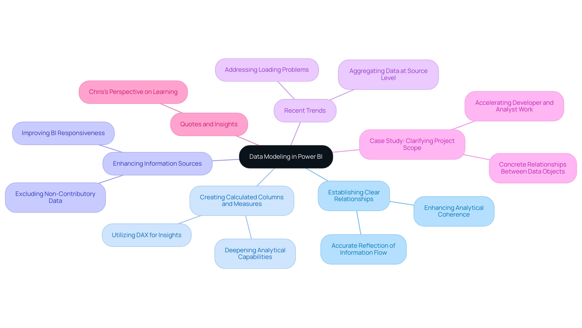
Best Practices for Managing Power BI Visuals and Data Display
To maximize the effectiveness of Power BI visuals and drive operational efficiency through data-driven insights, consider implementing the following best practices:
-
Utilize Tooltips: Incorporating tooltips can significantly enhance experience by providing additional context for information points within your visuals. This feature enables individuals to effortlessly understand the subtleties of the information provided, tackling the issue of interpretation errors.
-
Utilize Power BI Slicers: Power BI slicers allow individuals to filter information based on various dimensions, improving the interactivity of your visuals. Utilizing slicers such as checkboxes and dropdown lists can assist individuals in navigating through complex datasets more efficiently, mitigating time-consuming report creation.
-
Maintain Consistent Formatting: Consistency in colors, fonts, and styles across all visuals is crucial for improved readability and professionalism. A well-structured dashboard demonstrates attention to detail and boosts engagement, minimizing potential information inconsistencies.
-
Limit Visual Overload: Avoid cluttering dashboards with excessive visuals; instead, concentrate on key metrics that drive informed decision-making. A streamlined approach ensures that users can quickly identify the most important information, enabling actionable guidance.
-
Regularly Review Information Sources: Periodically examining and refreshing information sources is essential to ensure that your visuals reflect the most current details. Flawed or outdated information can lead to misguided conclusions, underscoring the importance of integrity.
-
Engage with Feedback: Actively seeking input from those utilizing the document can reveal areas for enhancement, promoting a culture of ongoing improvement in document effectiveness. This feedback can also guide how RPA solutions might be employed to automate data preparation or document creation, further improving the experience for individuals.
As Douglas Rocha, a Software Engineer, aptly puts it, ‘Hope I’ve helped you in some way and see you next time!’ This highlights the significance of participant involvement in enhancing your documents.
- Utilize Best Practices Analyzer: Consider using the BI Reporting Best Practices Analyzer, a complimentary tool designed to provide comparisons of documents between different versions and perform analysis. This tool enables users to examine document contents comprehensively, track metric usage, and compare documents based on various parameters.
By embracing these practices and integrating RPA solutions, you can create Power BI reports that are not only impactful but also user-friendly, driving better insights and decisions while enhancing operational efficiency.
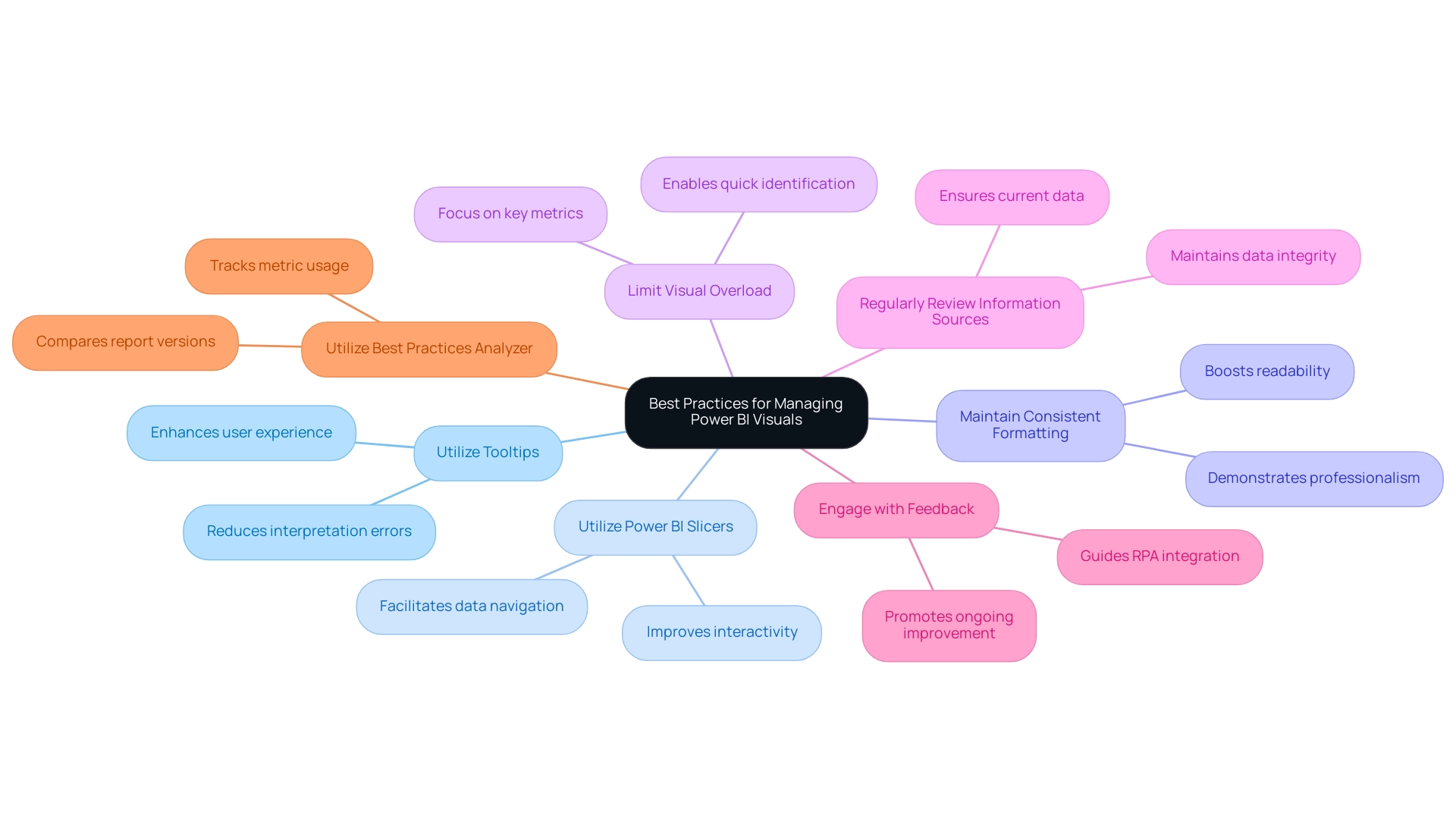
Conclusion
Power BI has proven to be an invaluable asset for organizations seeking to leverage data visualization for informed decision-making. However, the challenges associated with visuals not displaying data can hinder this potential. By understanding the root causes—such as:
- Data source connectivity issues
- Misconfigured data models
- Improper filtering
users can effectively troubleshoot and resolve these frustrations. Implementing systematic troubleshooting steps, along with best practices in data modeling, can greatly enhance the reliability and accuracy of visual outputs.
Moreover, embracing user feedback and maintaining consistent formatting across visuals ensures that reports remain user-friendly and insightful. The integration of Robotic Process Automation (RPA) solutions can further streamline operations, reinforcing the synergy between technology and data-driven insights.
Ultimately, by addressing these common challenges and employing strategic practices, organizations can unlock the full potential of Power BI. This not only enhances individual user experiences but also contributes to overall operational efficiency and business growth. In a landscape where data-driven decisions are crucial, mastering Power BI is essential for maintaining a competitive edge.
Overview
Power BI can replace null values using various methods, including Power Query transformations, DAX functions, and Robotic Process Automation (RPA) to maintain data integrity and enhance analytical accuracy. The article outlines these techniques, emphasizing their significance in preventing misleading insights and improving decision-making by ensuring that datasets are complete and reliable.
Introduction
In the realm of data analysis, the presence of null values can pose significant challenges, particularly within Power BI. As organizations increasingly rely on accurate data to drive decision-making, understanding and managing these missing or undefined data points becomes crucial.
With projections suggesting that nearly 30% of datasets may contain null values by 2024, the implications for operational efficiency and data integrity are profound. From distorting calculations to undermining visualizations, null values can lead to misleading insights that jeopardize business strategies.
This article delves into the intricacies of null values in Power BI, exploring effective methods for their management, the impact on visualizations, and best practices for maintaining data quality. By addressing these challenges head-on, organizations can enhance their analytical capabilities and foster a culture of data-driven decision-making.
Understanding Null Values in Power BI
In Power BI, absent indicators represent missing or undefined information within your datasets, arising from various factors such as entry errors, incomplete collection, or filtering operations. Considering that almost 30% of datasets might include empty entries by 2024, attentiveness in data management is essential for enhancing operational efficiency. The existence of missing entries can greatly distort your analysis, leading to possibly deceptive insights and erroneous decisions that obstruct data-driven strategies.
For instance, when calculating averages or totals, null values can distort these calculations, leading to inaccurate metrics. A case study from Weill Cornell Medicine emphasizes the effectiveness of a workshop that offered participants a thorough understanding of absent information techniques, merging theory with practical application. This experience enabled them to address absent information challenges more efficiently in their collections.
Moreover, examples from an orthodontic study demonstrate how absent metrics can influence treatment results and decision-making processes, highlighting the real-world consequences of inadequate information quality. A PhD candidate at Columbia University commented, ‘This was a comprehensive brief course on the theory behind absent information analysis and practical code implementation.’ I feel more prepared to approach this problem in my datasets and look forward to investigating.
Recognizing where and why null values arise is essential for effective management in Power BI, especially when you want to use power bi replace null to uphold quality and ensure reliable outcomes. Moreover, it is essential to report absent information transparently, as clear communication of these issues fosters trust in the analysis and its results while mitigating the challenges of inefficient operations and flawed decision-making. Furthermore, tackling the concerns surrounding AI adoption is crucial; inadequate master information quality can greatly obstruct effective AI integration.
Organizations must recognize that overcoming these challenges is essential for leveraging AI’s full potential, ultimately driving better operational efficiency and decision-making.
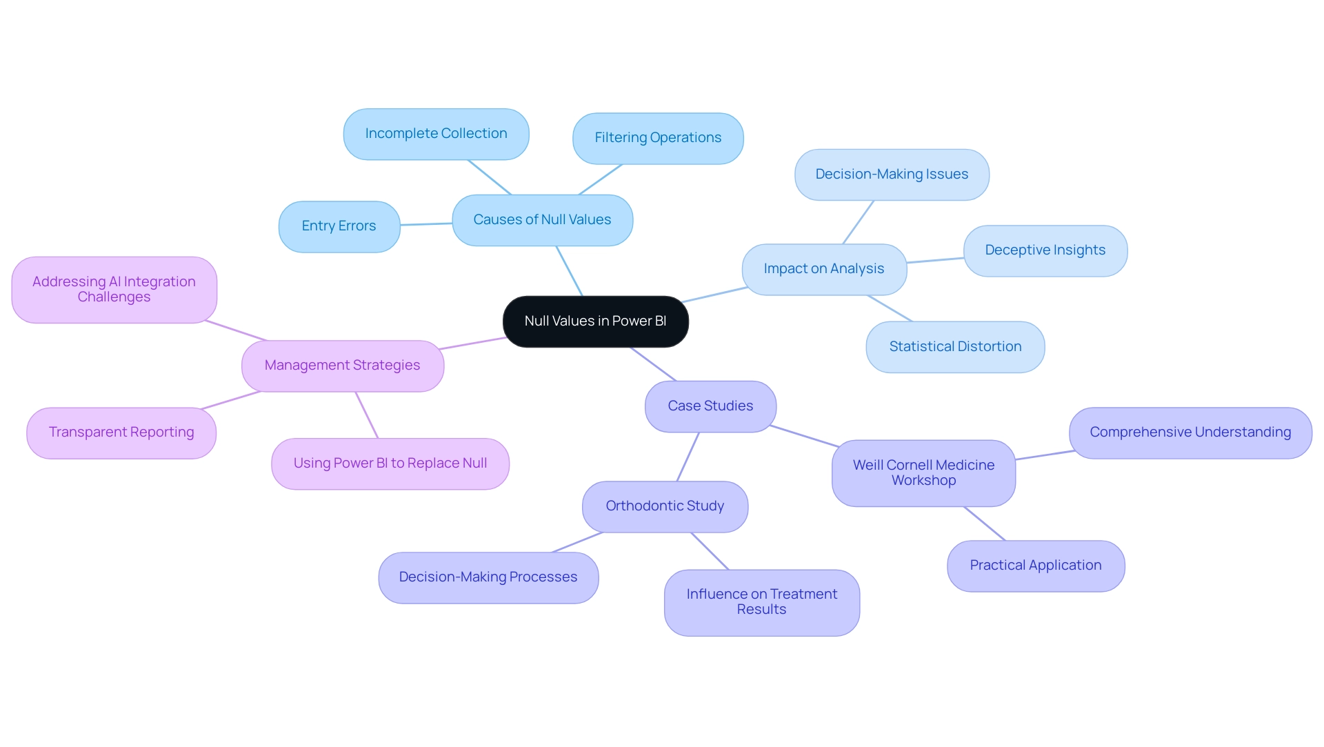
Methods for Replacing Null Values in Power BI
Power BI offers a range of efficient techniques that demonstrate how to power bi replace null values, which is crucial for preserving the integrity and quality of information. In the context of leveraging Business Intelligence for operational efficiency, here are key approaches:
-
Using Power Query, you can transform your information prior to loading it into the model by employing the ‘power bi replace null’ feature.
This enables Power BI to replace null entries with predefined options or creating conditional columns to apply tailored substitution logic based on your specific criteria. A case study titled ‘Handling Null and Blank Values in Conditional Columns’ illustrates this approach, demonstrating how a new quality column can be created to tag incomplete information, making it easier for developers to identify quality issues, which is crucial for deriving actionable insights.DAX Functions: The DAX (Data Analysis Expressions) language offers powerful functions such as
COALESCE()andIF().
These functions enable the dynamic substitution of empty entries directly within your measures or calculated columns, utilizing Power BI to replace null values, thereby enhancing analytical flexibility. The case analysis on ‘Mean and Median Imputation‘ emphasizes these methods, demonstrating how they can estimate absent figures in numerical information efficiently, tackling usual issues such as inconsistencies in the dataset.Information Structure Connections: Utilizing connections formed within your information structure can greatly assist in addressing gaps.
By utilizing information from related tables, you can enhance your dataset and reduce gaps, ensuring a more thorough analysis that aids in informed decision-making.Integrating RPA: Robotic Process Automation (RPA) can further improve the management of null entries by automating cleansing procedures, thus decreasing the time allocated to repetitive tasks and minimizing mistakes. This integration streamlines workflows, allowing teams to focus on more strategic initiatives.
As the Fabric community continues to evolve, these methods are gaining traction, with practitioners emphasizing the need to assess the impact of any imputation techniques on the overall analysis.
Notably, robust imputation tools can generate reliable datasets without the risk of introducing bias, which is critical when making informed decisions based on information. The article has garnered 9,235 views, highlighting the relevance and interest in this topic.
Furthermore, as noted by expert csaladenes, ‘Suggestion number 2 is excellent!
I was using it in conjunction with a USERELATIONSHIP and it worked like a charm!’ This feedback emphasizes the practical importance of these insights in driving operational efficiency.
Furthermore, tackling the challenges of time-consuming report creation and inconsistencies is crucial for organizations aiming to leverage the full potential of their BI tools, ensuring they do not lag in today’s competitive environment.
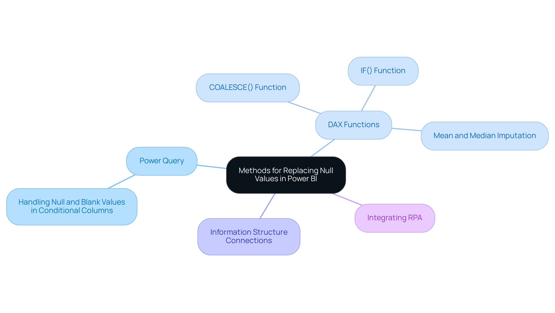
Replacing Null Values with Values from Another Column
To effectively replace missing values with values from another column in Power Query and enhance your data-driven insights, follow these steps:
- Begin by loading your dataset into Power Query.
- Ensure that Column Quality and Column Distribution are enabled in the View ribbon, as this is crucial for effective data management in Power Query, reflecting the importance of Business Intelligence in your operations.
- Identify and select the column that contains the empty values.
- Navigate to the ‘Transform’ tab and click on ‘Replace Values’.
- A dialog box will appear, allowing you to establish a conditional replacement rule. For example, if you need to replace blanks in Column A with matching entries from Column B, use the ‘Add Conditional Column’ feature. This allows you to generate a new column that assesses each row, verifies for empties in Column A, and assigns entries from Column B where needed. After setting the conditions, implement the modifications and load the revised information back into Power BI to replace null values.
For instance, the case study titled ‘Method 1 – Replace Missing Entries’ emphasizes that while substituting missing entries with a specific number, such as 0, is straightforward, it can change the average figures of columns and require different filters for credits and debits. By implementing these steps, you not only streamline your transformation process but also ensure that your analysis remains precise and significant.
Furthermore, failing to use Power BI to replace null entries can result in considerable inconsistencies in information, ultimately obstructing your decision-making process and placing your business at a competitive disadvantage. As Brian Julius, a noted Power BI expert, states, ‘I wanted to introduce you to this technique just I think it’s a great one.’ This highlights the critical role of effective information management techniques, complemented by RPA solutions, in delivering quality insights and driving operational efficiency in your business growth.
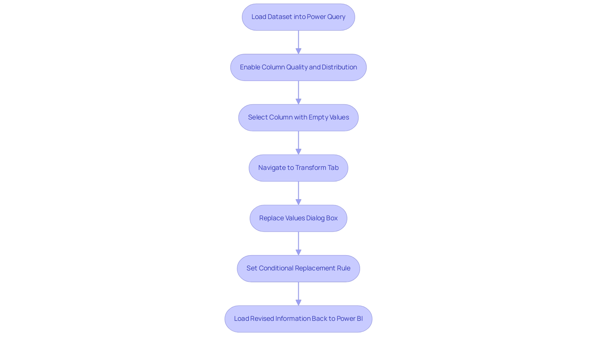
Impact of Null Values on Power BI Visualizations
The effectiveness of visual representations in Power BI can be drastically undermined by null entries, so it’s important to power bi replace null. For instance, when creating a bar chart, the occurrence of missing values may lead to specific categories being excluded completely, distorting interpretations of trends and information insights. Additionally, calculations that involve averages or totals can create misleading visuals because of the presence of missing values, further complicating analysis.
As articulated by author Danielle Albers Szafir, visualizations of incomplete datasets should allow analysts to draw conclusions from their information while effectively reasoning about the quality of the information and resulting conclusions. Thus, it is essential to actively tackle empty entries by using power bi replace null before creating reports. Interacting with colleagues and advisors can offer important perspectives on best methods for data validation, ensuring that analysts are prepared to manage missing data efficiently.
Implementing robust strategies for managing these missing data points, such as using power bi replace null, not only enhances the accuracy of visual representations but also fosters a more reliable reporting experience. This is critical in an era where data-driven insights, powered by Business Intelligence and RPA, are essential for organizational growth and operational efficiency. Statistics suggest that visual representation mistakes caused by missing data can result in misinterpretations in more than 30% of instances, emphasizing the significance of tackling this problem.
Moreover, challenges such as time-consuming report generation and inconsistencies can hinder effective decision-making. Particular characteristics of BI tools, such as automated information cleansing and validation procedures, can greatly assist in handling empty entries. Case studies emphasize that effective management of absent information not only enhances statistical analyses but also supports improved decision-making based on evidence, as shown in the research on the significance of managing missing information in the field of data science.
This ultimately leads to more accurate and dependable outcomes in Power BI visualizations, where users can apply the power bi replace null feature to derive actionable insights and maintain a competitive edge.
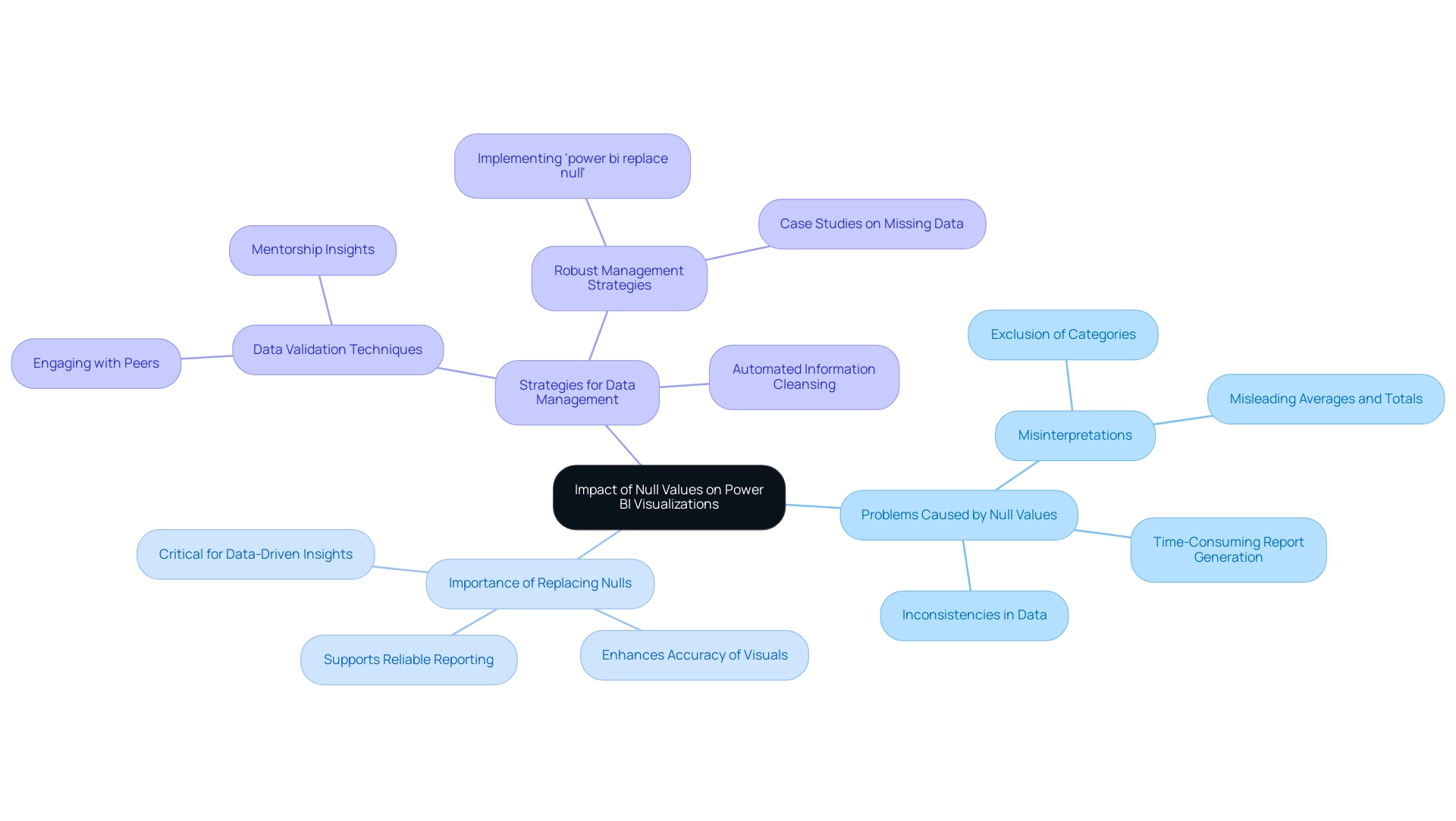
Best Practices for Managing Null Values in Power BI
Successfully handling missing entries in Power BI necessitates a structured method that conforms with best practices in information analysis, particularly regarding enhancing master information quality and promoting AI integration. Here are key strategies to consider:
-
Identify Sources of Absences: Regularly examine your information sources to determine where absent entries originate. Comprehending these sources is essential for tackling absent information effectively and can assist in alleviating future problems, thus minimizing operational inefficiencies. Utilizing Business Intelligence tools can aid in visualizing these sources, making it easier to spot patterns and anomalies.
-
Establish Replacement Rules: Define explicit guidelines for how to power bi replace null entries. Choices might consist of substituting them with zeroes, average figures, or information from related columns. Clarity in these rules ensures consistency across your analysis processes, enhancing the reliability of your Power BI dashboards, especially when you need to power bi replace null values. RPA can automate the application of these rules, ensuring they are consistently enforced across all datasets.
-
Document Changes: Maintaining a detailed record of how null values are managed is vital for transparency. As noted by Hyun Kang, M.D., Ph.D., “In general, multiple imputation is a good approach when analyzing sets with missing information.” Thorough documentation can lead to improved governance and quality assurance practices, helping to tackle the challenges of inconsistent and flawed information.
-
Use Visual Indicators: Incorporate visual cues within your reports to signify the presence of empty entries. This practice not only enhances understanding among stakeholders but also emphasizes the limitations of the information, fostering informed decision-making and addressing common challenges in leveraging insights from Power BI dashboards. BI tools can provide these visualizations effectively, highlighting areas that need attention.
-
Regularly Review and Update: As your information landscape evolves, it is essential to periodically assess and refine your strategies for managing null values. Ongoing enhancement is essential to guaranteeing your handling practices stay effective and pertinent in tackling current challenges, thereby supporting business intelligence initiatives and operational efficiency. RPA can facilitate this review process by automating checks and alerts for anomalies.
A pertinent case study named “Sensitivity Analysis in Incomplete Information” demonstrates how performing sensitivity analysis aids in evaluating the reliability of research results concerning assumptions made about absent information. Implementing these best practices can significantly enhance the quality of information; studies indicate that Power BI replace null strategies improve the reliability of your analytical outputs. By adopting a proactive approach, you can better prepare for the uncertainties associated with absent information, ultimately leading to more informed insights and decisions.
Additionally, Thaylise Nakamoto emphasizes that “All scientists need expertise in Python, but which skills are the most important for them to master?” This highlights the importance of skill development in effectively managing data, including null values.
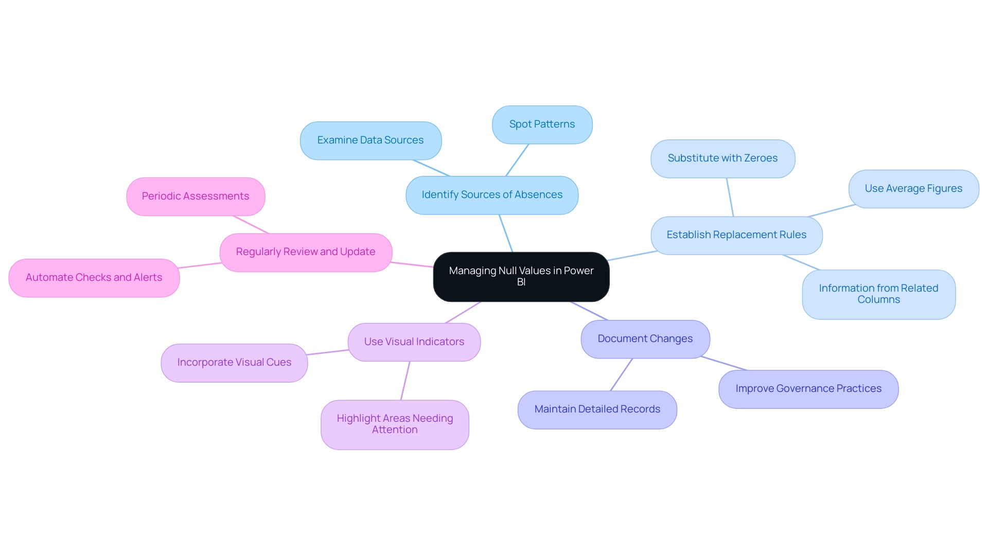
Conclusion
Addressing the challenges posed by null values in Power BI is essential for any organization striving for data integrity and operational efficiency. As explored throughout this article, understanding the origins of null values, implementing effective replacement methods, and maintaining transparent documentation are critical steps in managing these missing data points. The techniques discussed, including Power Query transformations and DAX functions, empower analysts to ensure their datasets are complete and reliable, thereby enhancing the quality of insights derived from visualizations.
Moreover, the impact of null values on visual representations cannot be overstated. By proactively tackling these issues, organizations can avoid misleading interpretations and ensure that their decision-making processes are informed by accurate data. Best practices, such as identifying sources of nulls and incorporating visual indicators, play a vital role in fostering a culture of data-driven decision-making.
In a landscape where nearly 30% of datasets are projected to contain null values by 2024, the importance of effective management strategies is more pronounced than ever. By embracing these practices, organizations not only enhance their analytical capabilities but also position themselves for success in an increasingly competitive environment. Ultimately, prioritizing the management of null values is a crucial investment in achieving reliable outcomes and fostering a robust data culture.
Overview
To replace blank values with text in Power BI, users can follow a straightforward process using Power Query, which ensures that all blank entries in a selected column are consistently replaced with meaningful descriptors. The article outlines a step-by-step guide for this method, emphasizing its importance in enhancing report clarity and decision-making quality by providing complete datasets, thereby preventing misinterpretation and improving operational efficiency.
Introduction
In the realm of data analytics, the integrity of information is paramount, especially when using powerful tools like Power BI. Blank values can obscure insights, leading to misguided decisions and operational inefficiencies. By replacing these blanks with meaningful descriptors, organizations can enhance data clarity and improve the accuracy of their reports.
This practice is not merely a technical necessity; it is a strategic imperative that empowers stakeholders to make informed choices based on complete datasets. As businesses increasingly rely on data-driven insights to navigate complex environments, understanding the methods and implications of handling blank values in Power BI becomes essential.
This article explores the importance of addressing blank values, outlines effective techniques for replacement, and discusses the broader impact on data analysis and decision-making processes.
Understanding the Importance of Replacing Blanks in Power BI
In Power BI, the ability to replace blank with text can help prevent confusion and misinterpretation of insights, significantly enhancing the quality of reports and positively impacting decision-making processes. For instance, a sales report with empty entries in the ‘Region’ column may obscure regional performance metrics, leading to misguided strategies. By utilizing Power BI to replace blank with text, such as ‘Unknown Region’, stakeholders can gain a comprehensive understanding of the information, facilitating informed decisions based on complete details.
This practice is essential in today’s data-rich environment, where the reliance on Business Intelligence is crucial for driving operational efficiency and growth. Furthermore, as highlighted by the National Academy of Sciences, relying on single imputation methods like last observation carried forward can be detrimental unless their underlying assumptions are scientifically validated. This highlights the challenges in utilizing insights from Power BI dashboards, such as time-consuming report creation and inconsistencies in information.
Ensuring completeness through methods like multiple imputation, regarded as the gold standard, not only enhances integrity but also improves analytical outcomes. Customized methods for managing absent data, especially in scenarios such as clinical trials, have shown improved validity by precisely representing variable relationships in analysis. Furthermore, incorporating Robotic Process Automation (RPA) can simplify the cleaning procedure, automating repetitive tasks related to spotting and resolving empty entries.
This synergy between BI and RPA not only mitigates the competitive disadvantage of lacking data-driven insights but also supports better decision-making and fosters a data-driven culture in organizations. Therefore, managing empty entries in BI is crucial for maintaining the quality and trustworthiness of information analysis, especially when using Power BI to replace blank with text.
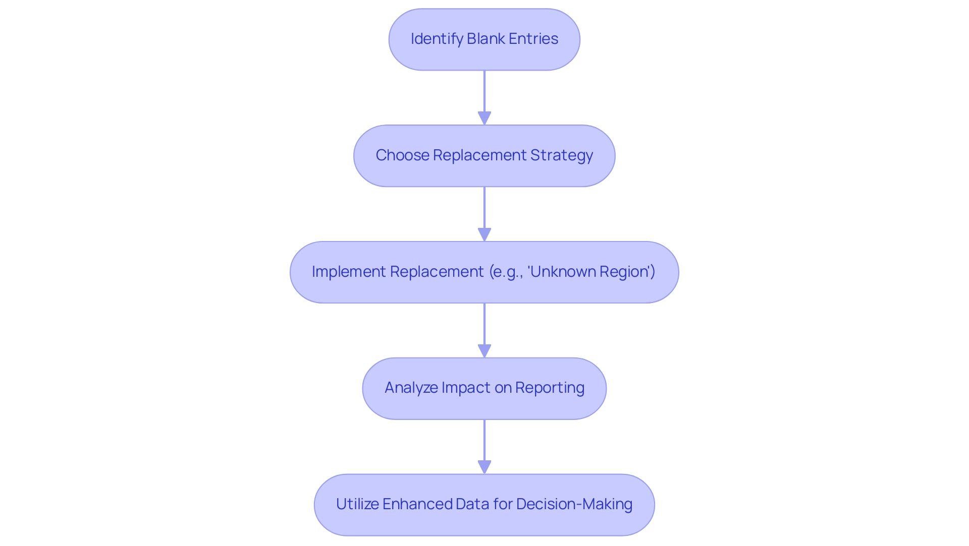
Methods for Replacing Blank Values with Text in Power BI
This tool provides various efficient techniques to implement Power BI to replace blank with text, each suitable for distinct situations and user choices. Here are some key techniques:
-
Using Power Query: This method aids in transforming information before it is loaded into the model, enabling the substitution of empty values at the information ingestion stage. It provides users with greater control over data cleaning processes, ensuring a more refined dataset from the outset—crucial for overcoming challenges in report creation and achieving consistency across data. Furthermore, incorporating Robotic Process Automation (RPA) can simplify these transformations, minimizing manual effort and improving operational efficiency.
-
DAX Formulas: DAX provides robust functions such as
IFandCOALESCE, which allow users to implement power bi replace blank with text in calculated columns or measures. As an expert notes, > If you see the image link above in the post or named: Visual with fields. That is how it is returned. The overall measure returns only if the field contains a quantity and if it does not, then it returns an empty result. This emphasizes the importance of utilizing DAX to handle empty entries efficiently, particularly when considering how to use Power BI to replace blank with text, ensuring that analyses stay strong and relevant in the context of actionable guidance and operational efficiency. -
Case Study – Hearts and Science München GmbH: This organization exemplifies effective information management practices. With a cookie duration of 60 days and the collection of IP addresses, they reset their cookie duration each session, underscoring the importance of maintaining precise information representation in real-time analytics. Such practices can guide how empty entries are handled in reporting, specifically addressing how to power bi replace blank with text, tackling the typical challenges of information governance and transparency. Their use of automated processes can also serve as a model for improving efficiency in handling blank values, particularly through the method of power bi replace blank with text.
-
Conditional Formatting: This visual method allows users to highlight blanks and implement visual replacements without modifying the underlying data. It enhances user experience by drawing attention to missing values, prompting further investigation or adjustments, and ultimately driving a more data-driven approach to operational efficiency.
Each of these methods has its own set of advantages, allowing users to choose the best approach based on the complexity of their datasets and their specific reporting needs. The decision between Query and DAX has been a topic of discussion, with statistics indicating that Query is favored for pre-load transformations, while DAX is often preferred for dynamic calculations post-load. With the changing environment of BI, grasping these tools, along with the incorporation of RPA, is crucial for enhancing information management and ensuring precise, actionable reporting.
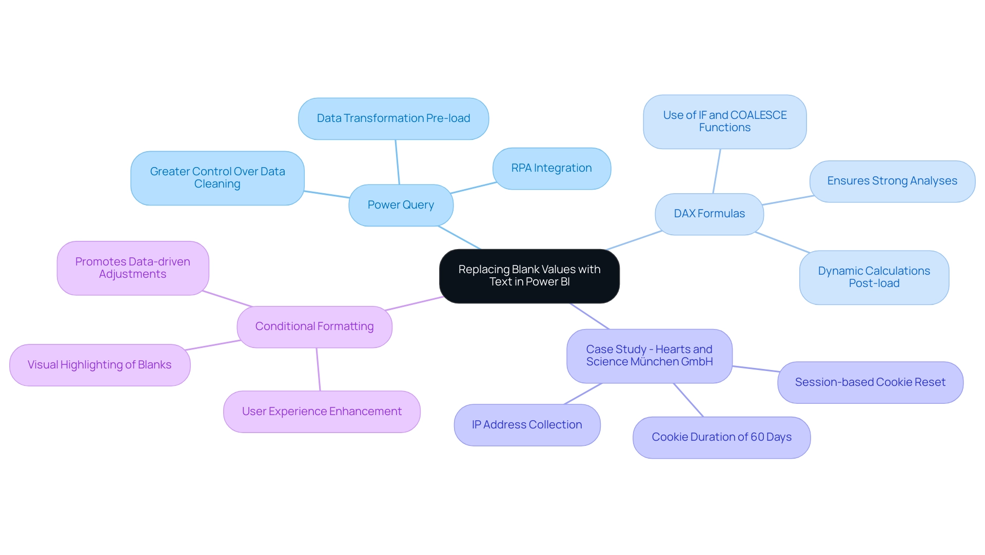
Step-by-Step Guide to Replace Blanks with Text in Power BI
In Power BI, to replace blank values with text using Query is simple and crucial for maintaining accuracy and offering actionable guidance. Follow these steps to ensure a smooth process:
- Open BI Desktop and create a new file by selecting ‘Get data’ followed by ‘Text/Csv’ for CSV files to load your dataset.
- Click on ‘Transform Data’ to access the Query Editor. Choose the column that contains the empty values.
- Navigate to the ‘Transform’ tab and choose ‘Replace Values’.
- In the dialog box, leave the ‘Value To Find’ field empty and enter your desired text, such as ‘N/A’, in the ‘Replace With’ field.
- Click ‘OK’ to apply the replacement.
- Finally, close the editor and apply your changes to load the updated information back into Power BI.
This method guarantees that all blank entries in the selected column are replaced consistently, thereby addressing the common challenge of using Power BI to replace blank with text, which can undermine trust in your reports. Precise information representation is vital, as it not only enhances the reliability of the reports but also enables informed decision-making that drives growth and innovation. Be mindful of common mistakes, such as overlooking the correct column selection, which can significantly impact your processing outcomes.
Interacting with your material in the workspace is essential, as shown in the case study regarding usage metrics, where viewing content is necessary to facilitate effective information processing. This connection emphasizes the significance of actionable insights obtained from precise information.
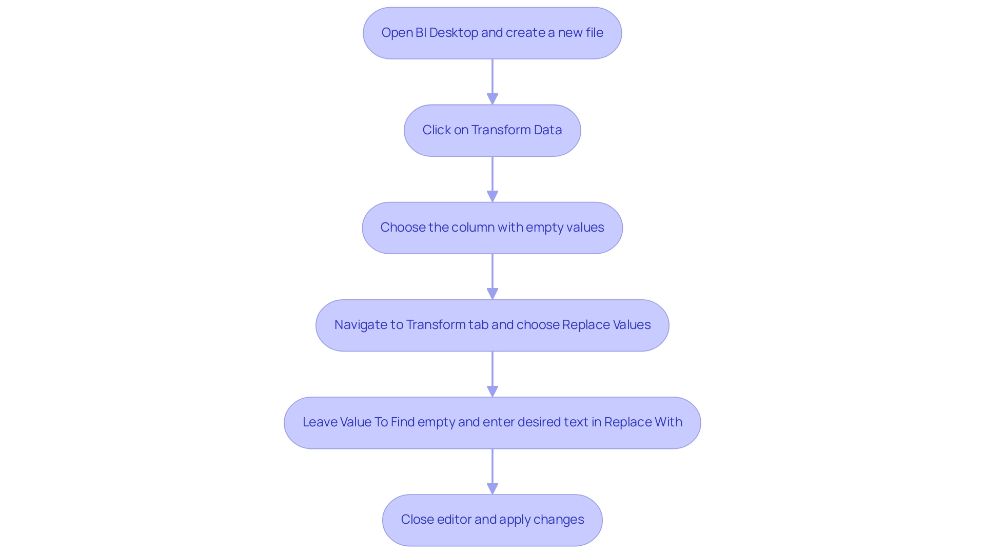
Troubleshooting Common Issues When Replacing Blanks
When addressing the challenge of replacing blank values in Power BI, users may encounter several common issues that can hinder their transformation efforts:
- No changes observed: It’s crucial to apply changes in Power Query before loading the information; failure to do so may result in no visible updates in your reports, reflecting the broader challenge of poor master quality that organizations often face.
- Incorrect replacements: Users should meticulously verify the ‘Value To Find’ and ‘Replace With’ fields to prevent unintended replacements, which can distort the analysis outcome, further complicating the decision-making process.
- Performance issues: Working with large sets can lead to performance degradation. To enhance efficiency, consider filtering the information prior to applying transformations. Employing the ‘Advanced Editor’ enables more intricate situations; confirming that the M code is appropriately organized is vital for optimal performance.
Moreover, consistent oversight of refresh schedules and enhancing query folding are essential for achieving successful refreshes, especially in environments with large collections. It’s important to note that for workspaces in Premium capacity, there is a storage limit of 100 TB, which can influence information management strategies. These issues emphasize the significance of performing thorough validation, as neglecting this step can lead to flawed insights and operational inefficiencies.
For instance, a recent case study highlighted that insufficient validation of information often introduces errors, which can affect the reliability of Power BI reports, especially when trying to power bi replace blank with text. As Liu Yang observed, ensuring proper configurations and participating in regular training can significantly reduce challenges, enhancing the overall user experience and strengthening the importance of Business Intelligence and RPA in driving data-driven insights and operational efficiency. Furthermore, organizations frequently hesitate to embrace AI because of views that it is time-consuming and expensive; nonetheless, incorporating AI into current processes can optimize information management and improve decision-making abilities, ultimately resulting in enhanced operational efficiency.
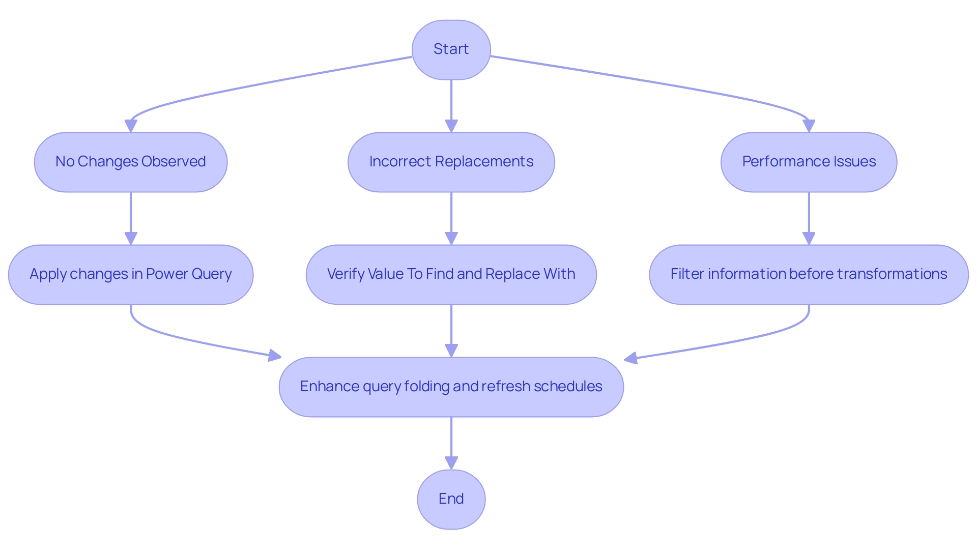
Impact of Replacing Blanks on Data Analysis and Reporting
Substituting blank values with meaningful descriptors can profoundly influence analysis and reporting in several key ways:
- Enhancing Clarity: When blank values are replaced, reports become more straightforward and easier to interpret. This clarity is essential for stakeholders who depend on information to guide their decisions, especially in sectors like healthcare where precise details can significantly influence outcomes.
- Improving Decision-Making: Complete datasets enable stakeholders to make informed choices, significantly reducing the risk of misinterpretation. As Cheryl Strauss Einhorn aptly notes,
Naming our feelings can help create a little space between our emotions and our actions. This principle applies to information interpretation as well; understanding context helps mitigate emotional biases in decision-making, allowing for clearer insights derived from trustworthy information. The case study of a mid-sized healthcare company demonstrates that by automating input entry and integrating legacy systems through GUI automation, they reduced entry errors by 70% and improved workflow efficiency by 80%. This case highlights how the ability to use Power BI to replace blank with text not only improves information quality but also promotes superior decision-making processes. - Increasing Operational Efficiency: Streamlined information presentation reduces the time spent on analysis, allowing teams to focus on strategic initiatives rather than resolving inconsistencies. The implementation of Robotic Process Automation (RPA) further enhances operational efficiency, liberating teams to focus on value-adding activities. When organizations tackle blank values and other quality challenges, they pave the way for a more agile and responsive organization.
Tackling blank values is not just a technical task; it is a crucial step towards achieving accurate and actionable insights, especially when using Power BI to replace blank with text. Case studies from various sectors, including healthcare, finance, and environmental decision-making, illustrate how trustworthy information plays a critical role in informed decision-making. In healthcare, for instance, precise patient information can significantly affect treatment outcomes, while in finance, it can influence investment strategies.
Ultimately, the benefits of data completeness in reporting enhance the overall effectiveness of an organization’s decision-making processes.
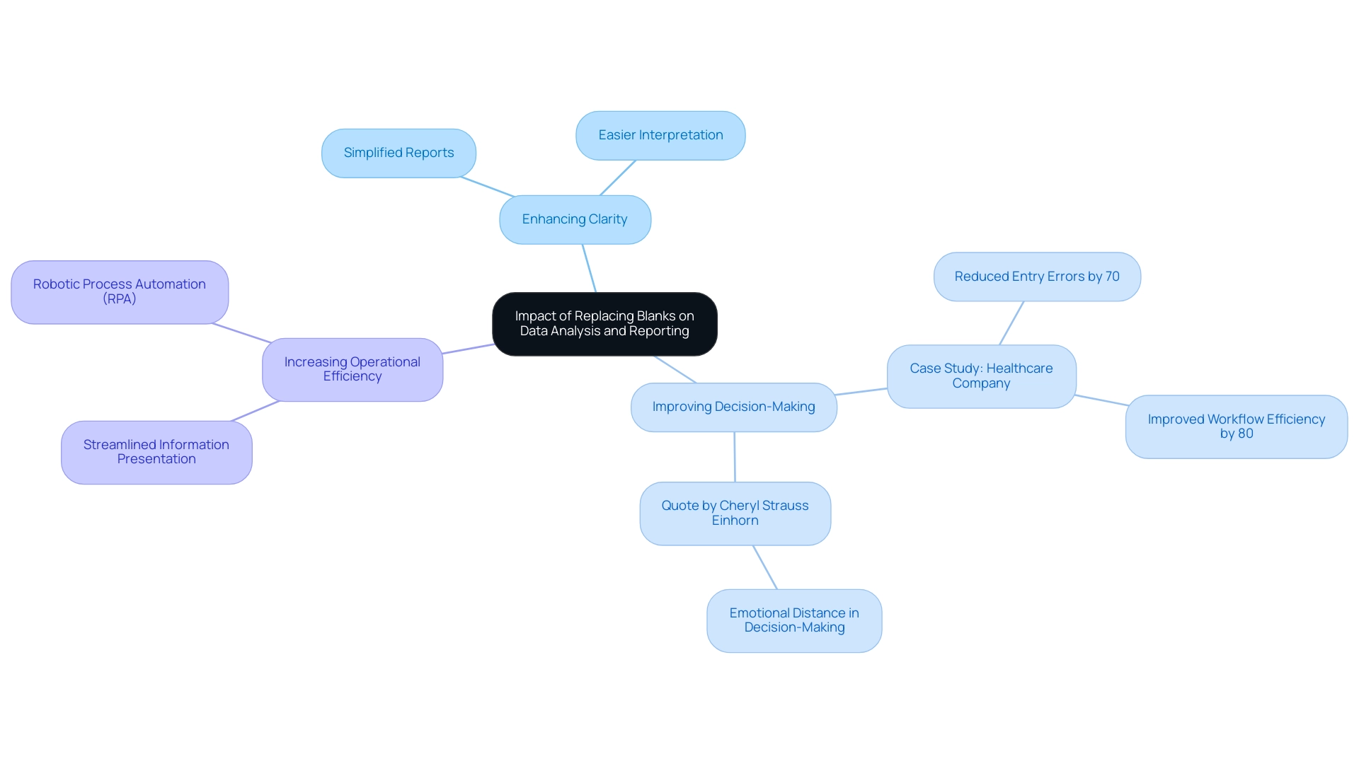
Conclusion
Blank values in Power BI pose significant challenges that can compromise data integrity and hinder effective decision-making. This article has delved into the critical importance of replacing these blanks with meaningful descriptors, emphasizing that doing so not only clarifies reports but also enhances the reliability of insights drawn from data. Techniques such as:
- Utilizing Power Query for pre-load transformations
- Employing DAX formulas for dynamic replacements
- Leveraging Robotic Process Automation (RPA)
have been outlined as effective strategies to address this issue.
Moreover, a step-by-step guide has been provided to ensure users can implement these changes efficiently, while troubleshooting common problems highlights the need for meticulous attention to detail during the process. The impact of replacing blank values extends beyond mere data cleaning; it facilitates improved decision-making, enhances operational efficiency, and ultimately drives organizational growth.
In a data-driven world, the ability to interpret complete datasets accurately is indispensable. By proactively addressing blank values, organizations can foster a culture of informed decision-making that relies on robust and actionable insights. The importance of this practice cannot be overstated, as it lays the groundwork for successful analytics and strategic initiatives across various industries. Embracing these methods is not just a technical necessity; it is a strategic imperative for any organization aiming to thrive in today’s competitive landscape.
Overview
The article provides a comprehensive guide on how to replace null values with blank entries in Power BI, emphasizing the importance of this practice for maintaining data integrity and enhancing report accuracy. It outlines step-by-step procedures for both DAX and Power Query methods, supported by expert insights and practical examples, highlighting how effective management of null values can lead to improved decision-making and operational efficiency.
Introduction
In the realm of data analytics, the clarity and integrity of information can make or break decision-making processes.
Within Power BI, the distinction between null values—indicating a complete absence of data—and blank values, which represent cells deliberately left empty, is pivotal.
Misinterpreting these values can lead to skewed calculations and misguided insights, posing significant challenges for organizations striving for accuracy in their reporting.
As the demand for data-driven insights grows, understanding how to effectively manage these values becomes essential.
From replacing nulls with blanks to employing advanced techniques like DAX and Power Query, mastering these strategies not only enhances data quality but also empowers stakeholders to make informed decisions.
This article delves into the intricacies of handling null and blank values in Power BI, offering practical guidance and insights to optimize data management and drive operational efficiency.
Understanding Null and Blank Values in Power BI
In Power BI, it is crucial to understand how to replace null with blank entries, which signify the absence of information and indicate cells intentionally left empty, for maintaining integrity. Null values can significantly skew calculations if treated as zeros, leading to misinterpretations that impact decision-making processes—a challenge many organizations face when dealing with poor master information quality. This issue is compounded by the time-consuming nature of report creation, where the focus shifts away from leveraging insights derived from dashboards.
Furthermore, the lack of actionable guidance in reports often leaves stakeholders without clear directions on how to proceed. As emphasized by experts like Nagarajan G., when incomplete information is regarded as missing at random (MAR), statistical software can assist in filling gaps, thus allowing organizations to utilize partial information effectively. Additionally, Pritha Bhandari highlights that absent information can manifest in various forms, each carrying distinct implications for analysis.
By diligently addressing the nuances between empty and blank entries and implementing a strong governance strategy, Directors of Operations Efficiency can enhance their analytical capabilities, ensure more accurate reporting in Power BI, and ultimately drive data-driven decision-making by using Power BI to replace null with blank. The significance of this topic is underscored by the considerable interest it has garnered, as evidenced by Benjamin Bodner’s post on the subject receiving 1.3K saves. Engaging with diverse information sets and seeking feedback can further bolster validation skills, ensuring that completeness and integrity are maintained.
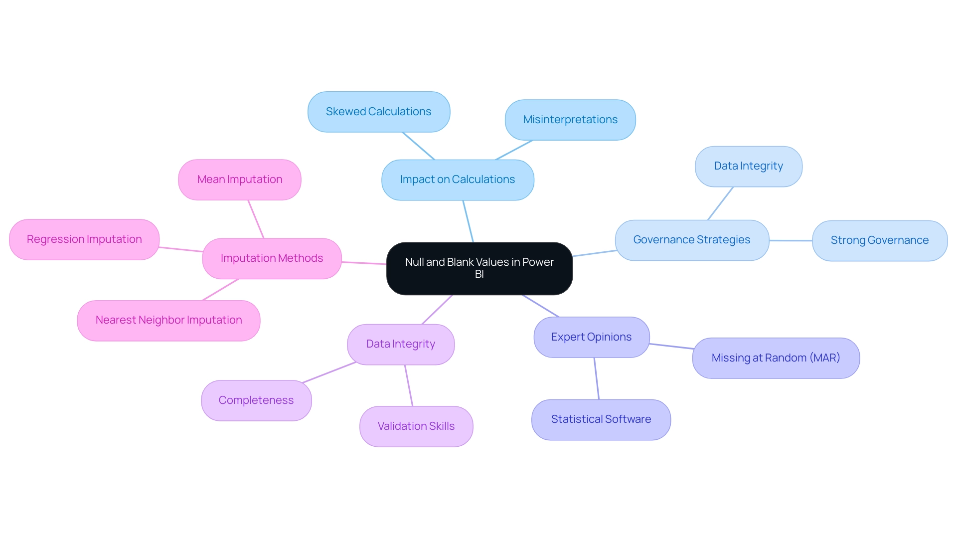
The Importance of Replacing Nulls with Blanks for Data Quality
Using Power BI to replace null with blank is a basic practice in enhancing quality, ensuring that reports precisely represent real-world situations without the risk of misinterpretation. The presence of nulls in visualizations can obscure trends, introduce gaps, and ultimately distort insights, so it’s important to know how to use Power BI to replace null with blank. In contrast, using Power BI to replace null with blank creates a more coherent representation of the underlying information, facilitating clearer analyses.
High-quality information is crucial for informed decision-making; as Suyebaanjum aptly states,
Cleaning this information is a vital aspect of data science, and addressing missing values is a common challenge.
Stakeholders depend on accurate insights derived from reliable datasets, making it imperative for organizations to use Power BI to replace null with blank values effectively. By adopting this approach, businesses can significantly enhance the clarity and dependability of their reports, leading to improved outcomes in their operational strategies.
Recent studies indicate that organizations that prioritize information quality through these adjustments experience notable improvements in their reporting accuracy, ultimately supporting better business decision-making processes. Furthermore, in an overwhelming AI landscape, leveraging tailored AI solutions can help organizations navigate these challenges. Business Intelligence tools, like our BI services, improve reporting and assist in obtaining actionable insights.
The 3-Day Power BI Sprint, for example, enables rapid creation of professionally designed reports, while using profiling tools that assess metrics like completeness and uniqueness can bolster quality efforts. The case study on Freshness Checks emphasizes the necessity of maintaining up-to-date information, ensuring that organizations can make informed decisions based on relevant and timely details. These practices not only enhance clarity but also emphasize the significance of strong management strategies in navigating the complexities of AI and BI solutions.
This dialogue between human curiosity and AI problem-solving exemplifies the essential role of tailored solutions in overcoming barriers to effective data management.
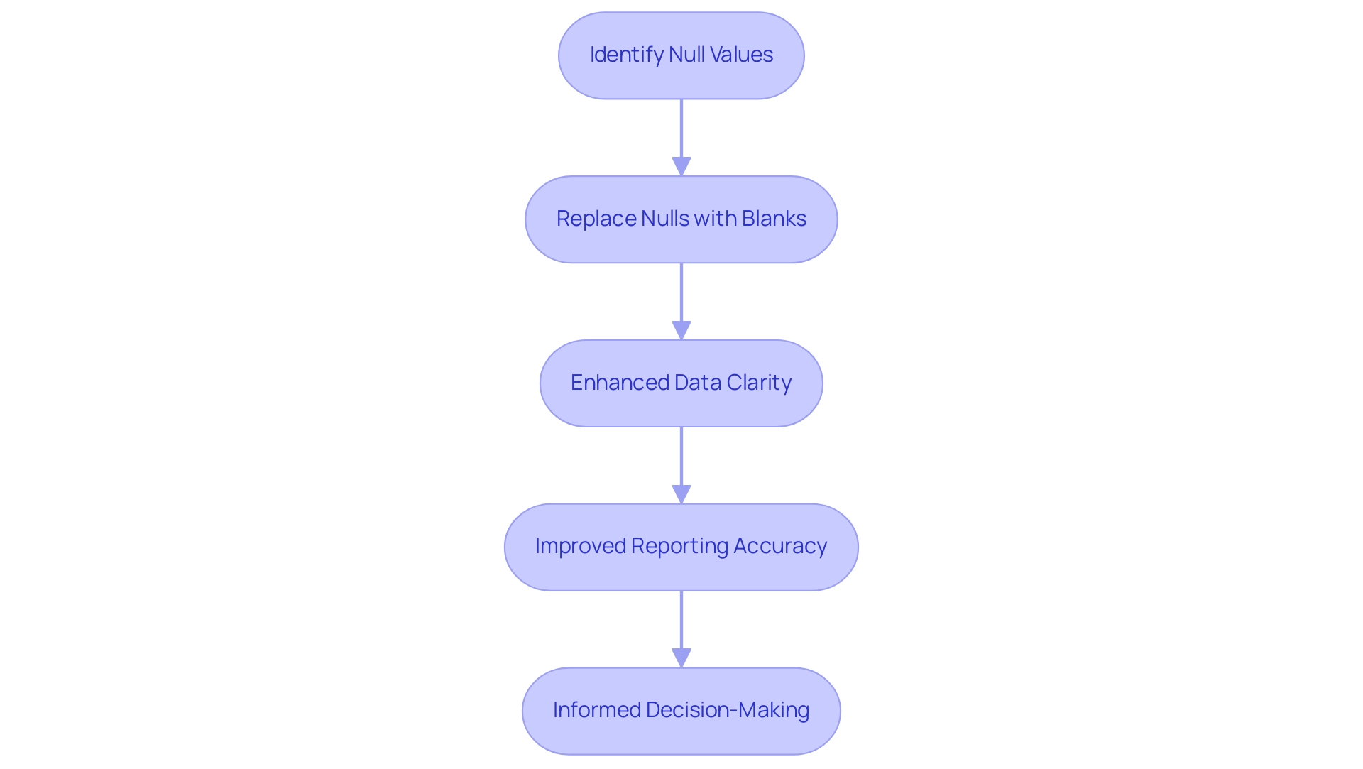
Step-by-Step Guide to Replacing Null Values in Power BI
- Launch Power BI Desktop and load the dataset you wish to modify.
- Access the ‘Data’ view by clicking on the table icon located in the left sidebar.
- Find the column that has empty values.
- Select the column header to concentrate on the information you want to change.
- Navigate to the ‘Transform’ tab in the ribbon and choose ‘Replace Values.’
- In the dialog box, input ‘null’ in the ‘Value to Find’ field to apply power bi replace null with blank.
- To execute the power bi replace null with blank, simply leave the ‘Replace With’ field empty.
- Confirm your changes by clicking ‘OK.’
- After applying the changes, take a moment to review your information to ensure that you use Power BI to replace null with blank values successfully, then save your updated dataset.
Douglas Rocha, a statistics enthusiast, emphasizes the versatility of Power BI by stating,
Can you do statistics in Power BI without DAX? Yes, you can, you can do it without measures as well and I will teach you how at the end of this tutorial.
This flexibility in information transformation plays a crucial role in enhancing operational efficiency and decision-making accuracy within organizations. By utilizing Robotic Process Automation (RPA), organizations can further automate these manual tasks, ensuring that information management becomes seamless and error-free. For instance, RPA can automatically identify and use Power BI to replace null with blank values, significantly reducing the potential for human error and enhancing the accuracy of insights derived from the information.
Additionally, it is important to process information for usage metrics reports, as content must be viewed from the workspace at least once to ensure accurate tracking. The case study on adoption tracking illustrates how effective information transformation can meet organizational needs, gathering information to measure and track indicators over time. Just as a clean windshield allows a driver to see the road clearly, effective adoption tracking through proper information management and the integration of RPA enables organizations to visualize their progress and avoid obstacles in decision-making.
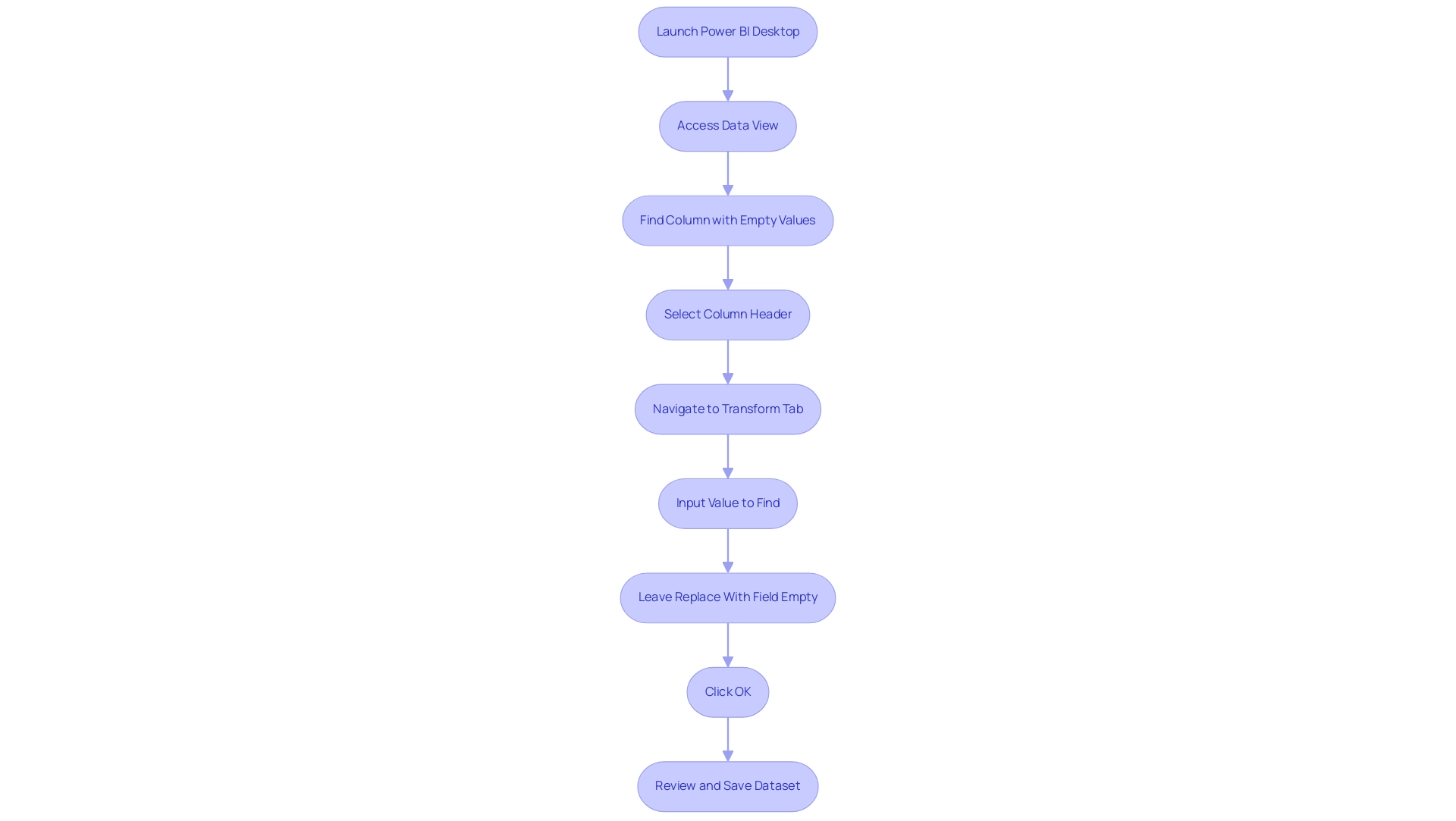
Techniques for Replacing Null Values: DAX and Power Query Methods
In Power BI, using the option to power bi replace null with blank is vital for efficiently handling absent entries, which upholds information integrity and analytical precision, especially in an environment where insight-driven conclusions are critical for business expansion. Struggling to derive actionable insights can place your organization at a competitive disadvantage, making the management of empty entries even more critical. Business Intelligence plays a pivotal role in transforming raw data into actionable insights, enabling informed decision-making that drives growth and innovation.
There are two primary approaches for replacing these null values: utilizing DAX functions and employing Power Query transformations.
-
DAX Method: One common technique involves creating a calculated column using the following DAX formula:
NewColumn = IF(ISBLANK([YourColumn]), BLANK(), [YourColumn])This formula evaluates whether the specified value is blank. If it is, the formula returns a blank; otherwise, it keeps the original amount. This method enables dynamic information handling directly within your model, enhancing the analytical capabilities of your reports by using Power BI to replace null with blank.
For instance, using the SUMX function can calculate total revenue generated by each product, demonstrating how DAX can be effectively applied to handle null values while performing critical calculations.
-
Query Method: Alternatively, Power BI provides a user-friendly ‘Replace Values’ feature that can be used to implement power bi replace null with blank efficiently. This method is particularly advantageous as it enables batch processing across multiple columns, simplifying the transformation process. Query’s intuitive interface makes it accessible for users of various skill levels, addressing the common challenges of inconsistencies and time-consuming report creation.
Incorporating regression analysis functions like LINEST and FORECAST can further broaden your analytical capabilities within BI. These functions enable users to model relationships between variables, offering deeper insights into trends and patterns, which are essential for informed decision-making. Furthermore, incorporating RPA solutions can automate repetitive tasks, improving operational efficiency and enabling your team to concentrate on strategic initiatives.
Selecting the appropriate method relies on your workflow and familiarity with BI. As highlighted by statistics enthusiast Douglas Rocha, can you perform analytics in BI without DAX? Yes, you can, you can do it without measures as well and I will teach you how at the end of this tutorial.
This insight emphasizes the versatility of Power BI in managing transformations, catering to both DAX experts and those who prefer Power Query techniques. Ultimately, leveraging these methods can significantly enhance your information cleaning processes, especially when using Power BI to replace null with blank, leading to more reliable analytics. Furthermore, with effective information management and the integration of RPA, organizations can enhance user engagement and analytics outcomes, ensuring that they remain competitive in today’s information-rich environment.
To learn more about how Business Intelligence and RPA can transform your information management strategies, consider booking a free consultation.
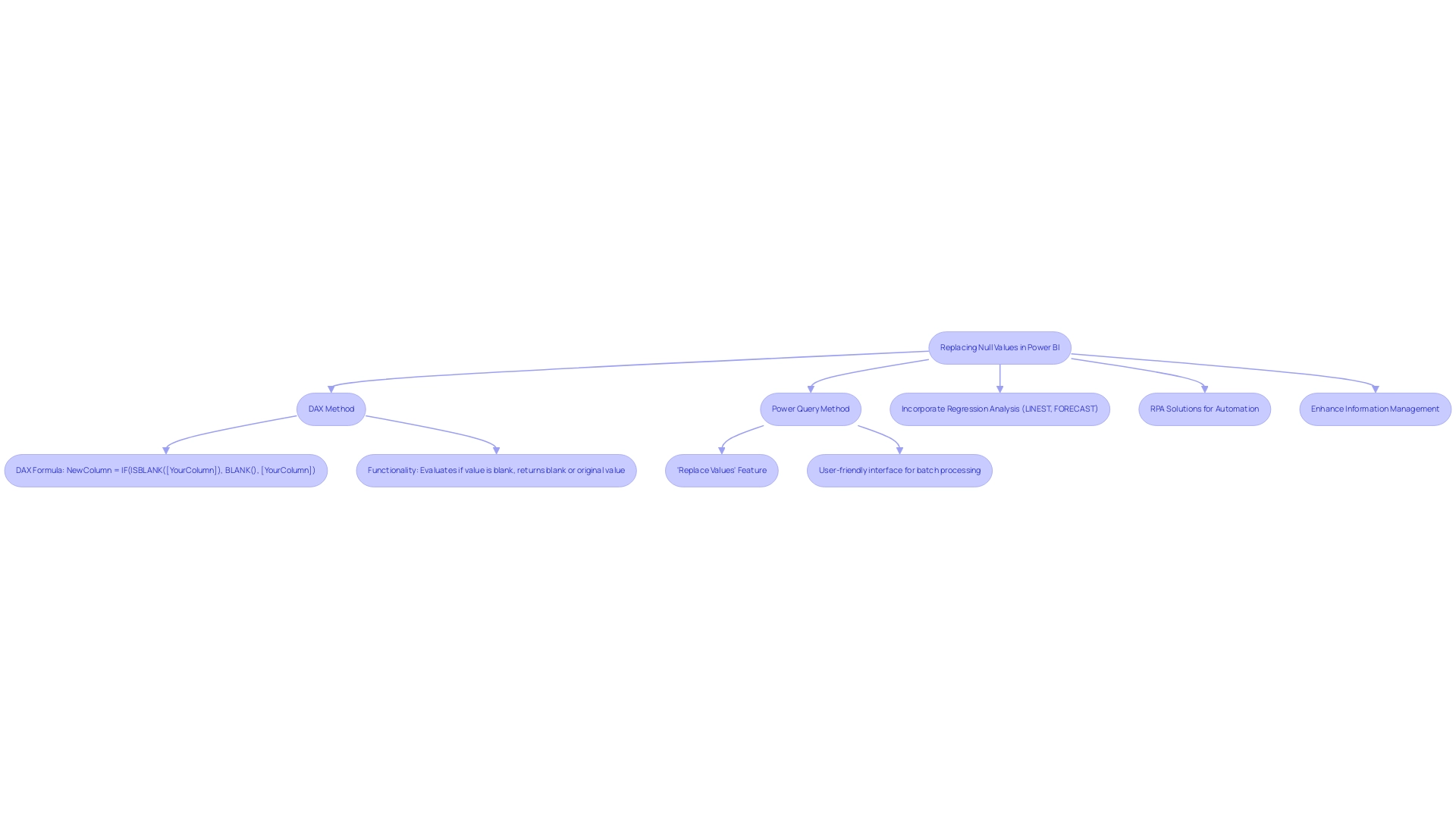
Troubleshooting Common Issues When Replacing Null Values
When users attempt to power bi replace null with blank values, they frequently encounter several typical challenges that can hinder efficient information management. Here are the key issues to be aware of:
-
Formula Errors: DAX formulas are powerful but can lead to miscalculations if syntax errors are present. Use the formula bar to identify and correct any mistakes.
-
Type Mismatch: Ensure that the types of the columns involved are compatible. Incompatible types can trigger errors that prevent successful replacements.
-
Visualizations Not Updating: After making changes, if the visualizations do not reflect the updates, consider refreshing the dataset or reviewing the filters applied to the visuals.
The challenges of utilizing insights from Power BI dashboards, including time-consuming report creation and inconsistencies, underscore the crucial role of Business Intelligence and RPA in driving operational efficiency and business growth. A practical illustration of tackling these challenges originates from a user named David, who faced empty entries in a new column while working with the Financial Reporting module. He sought a solution that would enable him to rename these empty entries without altering the original Excel data source.
By utilizing M-code in the query editor, David effectively substituted the empty entries with specific strings, demonstrating a successful method for troubleshooting. Significantly, the final result of the tutorial illustrates how to substitute empty entries with the computed average of 1.25 in the dataset, emphasizing the necessity of tackling both empty and blank entries to avoid miscalculations and reveal actionable insights through Business Intelligence. Moreover, RPA can play a significant role in automating the repetitive tasks involved in managing these empty entries, further enhancing operational efficiency.
Understanding these common issues can significantly streamline the process of using Power BI to replace null with blank values, ultimately enhancing data integrity and analytical accuracy. As Braulio Berlanga aptly noted,
If you found my article useful, feel free to show your appreciation by clapping it or leaving a nice comment.
This sentiment resonates with the broader community of Power BI users striving for operational efficiency and accuracy, empowered by the insights gained through effective Business Intelligence and RPA.
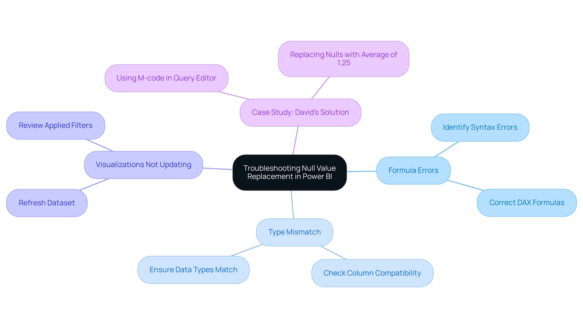
Conclusion
Understanding and effectively managing null and blank values in Power BI is essential for maintaining data integrity and enhancing decision-making processes. The distinction between these two types of values can significantly impact reporting accuracy, as misinterpreting nulls as zeros can lead to misleading insights. By employing strategies such as replacing nulls with blanks and utilizing advanced techniques like DAX and Power Query, organizations can ensure that their data not only reflects reality but also drives informed decisions.
The importance of high-quality data cannot be overstated. Organizations that prioritize data cleaning and management experience improved reporting accuracy, which ultimately supports better business outcomes. By leveraging tools like Power BI and integrating Robotic Process Automation (RPA), companies can streamline their data management processes, reducing the potential for human error and enhancing operational efficiency.
As the landscape of data analytics continues to evolve, embracing these techniques and best practices will empower stakeholders to derive actionable insights and maintain a competitive edge. Mastering the handling of null and blank values is not just a technical necessity; it is a strategic imperative for organizations aiming to thrive in a data-driven world.
Overview
The article compares Power BI’s reference and duplicate query techniques, highlighting that reference queries are more resource-efficient and promote a single source of truth, while duplicate queries allow for independent modifications without affecting the original data. This distinction is crucial for effective information management, as reference queries minimize redundancy and complexity, whereas duplicate queries facilitate diverse transformations tailored to specific reporting needs.
Introduction
In the world of data analytics, mastering the intricacies of Power BI can significantly enhance an organization’s ability to derive meaningful insights. Among the essential techniques that users must grasp are reference and duplicate queries, each serving unique purposes in data management.
- While reference queries streamline processes by allowing users to build upon existing queries without redundancy,
- duplicate queries provide the flexibility to modify data independently.
This article delves into the strategic applications of these querying techniques, exploring their impact on performance, reporting accuracy, and overall operational efficiency. By understanding when to employ each method, organizations can optimize their data models and drive informed decision-making, ultimately leading to improved business outcomes.
Understanding Power BI Query Techniques: Reference vs Duplicate
In Power BI, users explore information retrieval through two fundamental techniques: power bi reference vs duplicate requests. A reference request aids in the formation of a new request that directly refers to an existing one, enabling information transformation without producing a separate copy. This method is particularly efficient as it fosters a single source of truth, thereby minimizing redundancy and simplifying information management.
On the other hand, a duplicate query produces an entirely new iteration of the original query, enabling independent modifications without affecting the source. This can be advantageous in scenarios where divergent information transformations are necessary. Comprehending the strategic use of each technique, such as understanding the power bi reference vs duplicate, is vital for effective information management and evading unnecessary complexity in models.
As emphasized in our 3-Day Power BI Sprint, these techniques can greatly improve your reporting abilities, guaranteeing effective reporting and actionable conclusions. Additionally, our General Management App complements this process by providing comprehensive management and smart reviews to further streamline your operations. In today’s data-rich environment, organizations often struggle to extract meaningful insights from their dashboards, with statistics indicating that a significant percentage of dashboards remain underutilized.
This highlights the necessity of effective information management techniques. Furthermore, leveraging reference queries not only streamlines data processes but also enhances overall operational efficiency, aligning with best practices in data management. By incorporating Automate into your workflows, you can further enhance efficiency and ensure a risk-free ROI assessment, making informed decision-making easier and driving growth and innovation for your business.
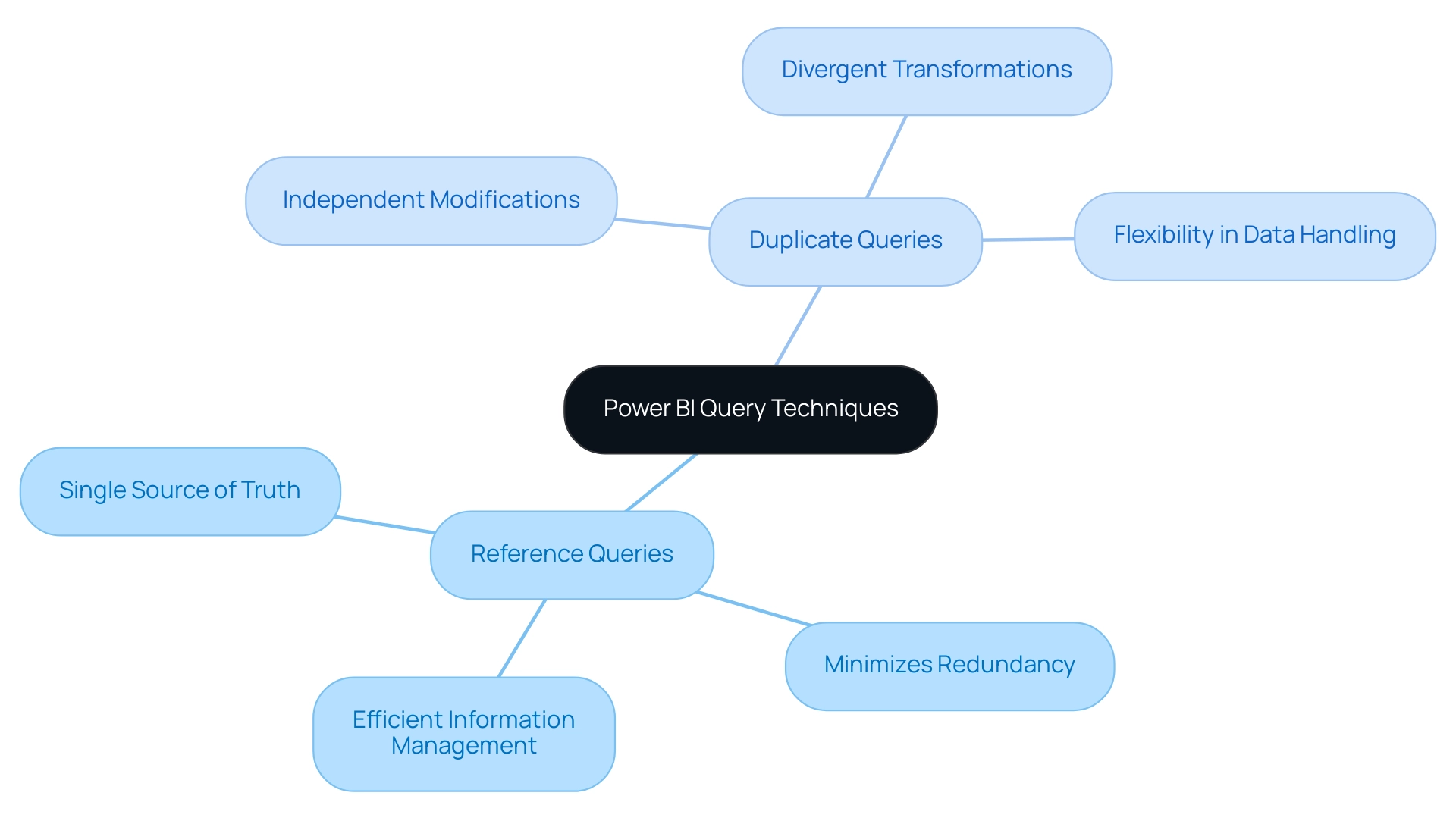
Implementing LOOKUPVALUE: Syntax and Practical Examples
The LOOKUPVALUE function in Power BI is structured as follows: LOOKUPVALUE(result_columnName, search_columnName, search_value). This powerful function enables users to obtain a specific value from a designated column based on defined search criteria, addressing common challenges in report creation and information analysis. For instance, consider a scenario involving a ‘Sales’ table alongside a ‘Products’ table.
The function can be utilized to obtain the product name linked to a particular product ID, as illustrated in the following syntax: LOOKUPVALUE(Products[ProductName], Products[ProductID], Sales[ProductID]). This command efficiently provides the product name for each related sale, improving the clarity and utility of reports, which frequently experience inconsistencies and a shortage of actionable information. Such functionality is invaluable in both Power BI reference vs duplicate queries, enriching data models by providing essential context and insights into the relationships between different data entities.
A relevant case study titled “Using BI Lookup Value Function in Expanded Tables” demonstrates this application by finding exchange rates based on currency and date, thus optimizing the retrieval process and aiding in effective decision-making. Moreover, as Joleen Bothma, a Data Science Consultant & Writer at Statistically Relevant, observes, “Explore the BI SWITCH function, what it is, how to use it, and some common pitfalls and best practices,” highlighting the importance of comprehending various BI functions for operational efficiency.
Moreover, it is crucial to acknowledge that employing the LOOKUPVALUE function not only enhances report accuracy but also converts raw information into actionable insights, ultimately fostering growth and innovation within the organization.
For those interested in enhancing their BI skills, using code MSCUST can provide a $150 discount on registration for relevant training. By implementing LOOKUPVALUE, analysts can enhance their reports, ensuring that the final deliverables are not only accurate but also comprehensive, ultimately leading to improved decision-making and operational success.
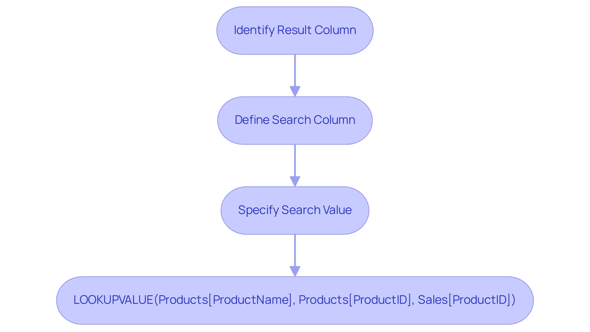
When to Use Reference vs Duplicate Queries in Power BI
Choosing between power bi reference vs duplicate options in Power BI depends on the particular needs of your model. Reference requests serve as a powerful tool for building upon existing inquiries without altering the foundational data structure, making them essential in a data-rich environment where Business Intelligence plays a crucial role in driving growth and informed decision-making. This method is especially beneficial for generating various perspectives or alterations of the same dataset while preserving the integrity of the initial request.
Conversely, duplicate requests operate independently, permitting changes that do not influence the source. Notably, all the request steps are duplicated when you rename ‘Sales (2)’ to ‘Duplicated Sales’, which highlights the mechanics involved in duplicate requests. This feature is particularly beneficial when alternative calculations or visualizations require different filtering or aggregations, addressing common challenges such as time-consuming report creation and inconsistencies.
As noted by data analyst Ali Noorani, in contrast to the power bi reference vs duplicate, the Duplicated request allows you to alter the source without changing the original request. Additionally, users can enhance their management of searches by clicking on the View tab in the Ribbon and selecting Dependencies in the Dependencies section to visualize relationships. By thoroughly evaluating the requirements of your report, considering best practices from case studies, and incorporating RPA solutions such as EMMA RPA and Automate to automate repetitive tasks, you can strategically select the most effective approach for organizing your inquiries. This method not only tackles the competitive drawback of not obtaining valuable insights but also enhances both data management and overall operational efficiency in your BI projects.
To learn more about how these tools can improve your strategy, book a free consultation.
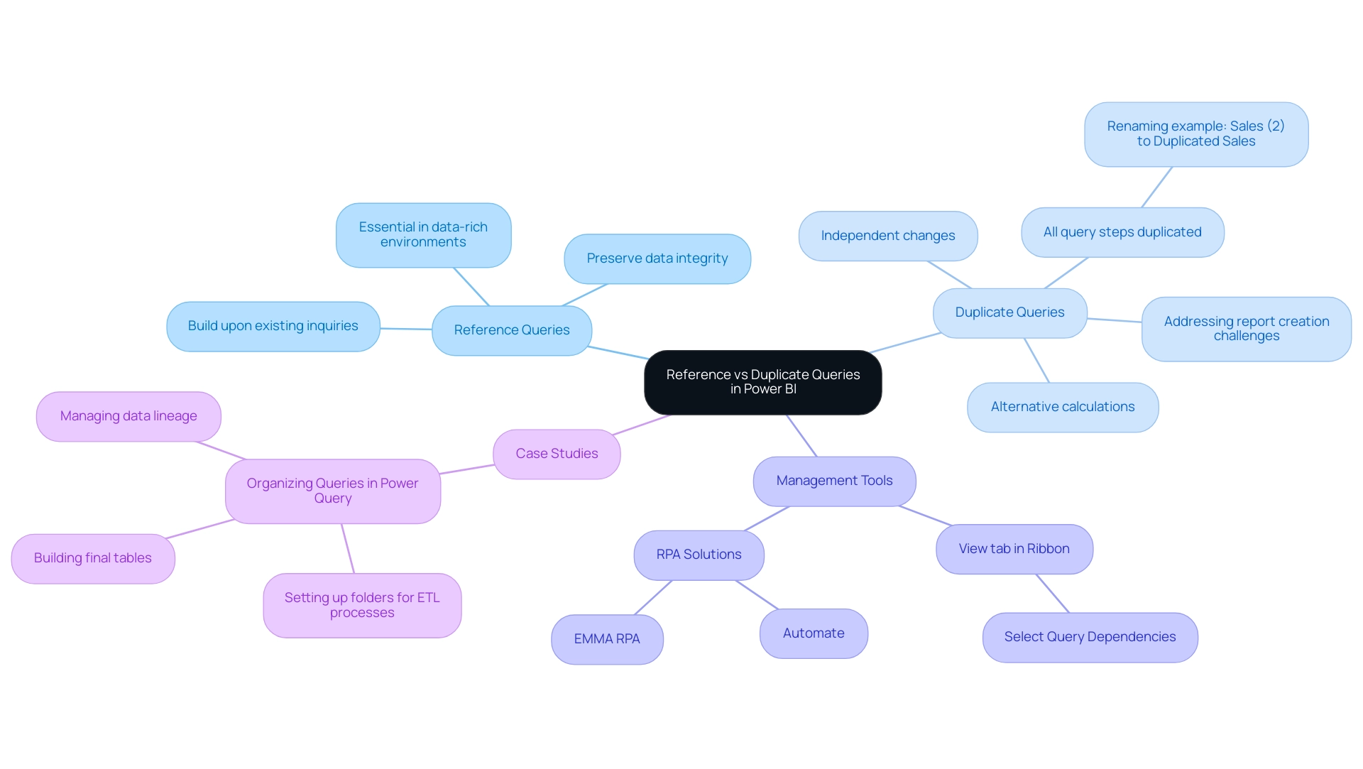
Performance Considerations: Optimizing Query Techniques in Power BI
In the realm of Power BI, the comparison of power bi reference vs duplicate queries reveals that reference queries stand out for their resource efficiency, consuming significantly fewer resources than their duplicate counterparts. This efficiency translates into quicker refresh times and enhanced responsiveness in reporting, crucial in a rapidly evolving AI landscape where operational efficiency is paramount. By leveraging Robotic Process Automation (RPA), organizations can further streamline these workflows, automating tasks such as information extraction and transformation, thereby freeing up valuable resources for strategic initiatives.
For instance, RPA can be employed to automate the process of updating data sources and refreshing reports, minimizing manual intervention and reducing the risk of errors. It’s essential to acknowledge that BI-certified visuals are the only custom visuals that can be viewed in Export to Presentation mode. However, when dealing with power bi reference vs duplicate requests, optimizing them effectively is crucial to prevent unnecessary calculations or transformations that could hinder performance.
Implementing techniques like query folding—where Power BI offloads transformations back to the source—can significantly boost performance across all query types. Regularly monitoring performance metrics is essential for pinpointing bottlenecks; this proactive approach helps ensure timely adjustments, ultimately enhancing operational efficiency. As highlighted in the case study on categorizing report data with sensitivity labels, automating the labeling process through RPA not only aids in managing data sharing and security but also raises awareness about data security.
As Grant Gamble aptly states,
Remember, every second saved in querying is a second gained in acquiring knowledge!
This highlights the essential aspect of optimizing performance, which not only boosts operational efficiency but also enhances the overall analytics experience, promoting data-driven understandings vital for business growth.
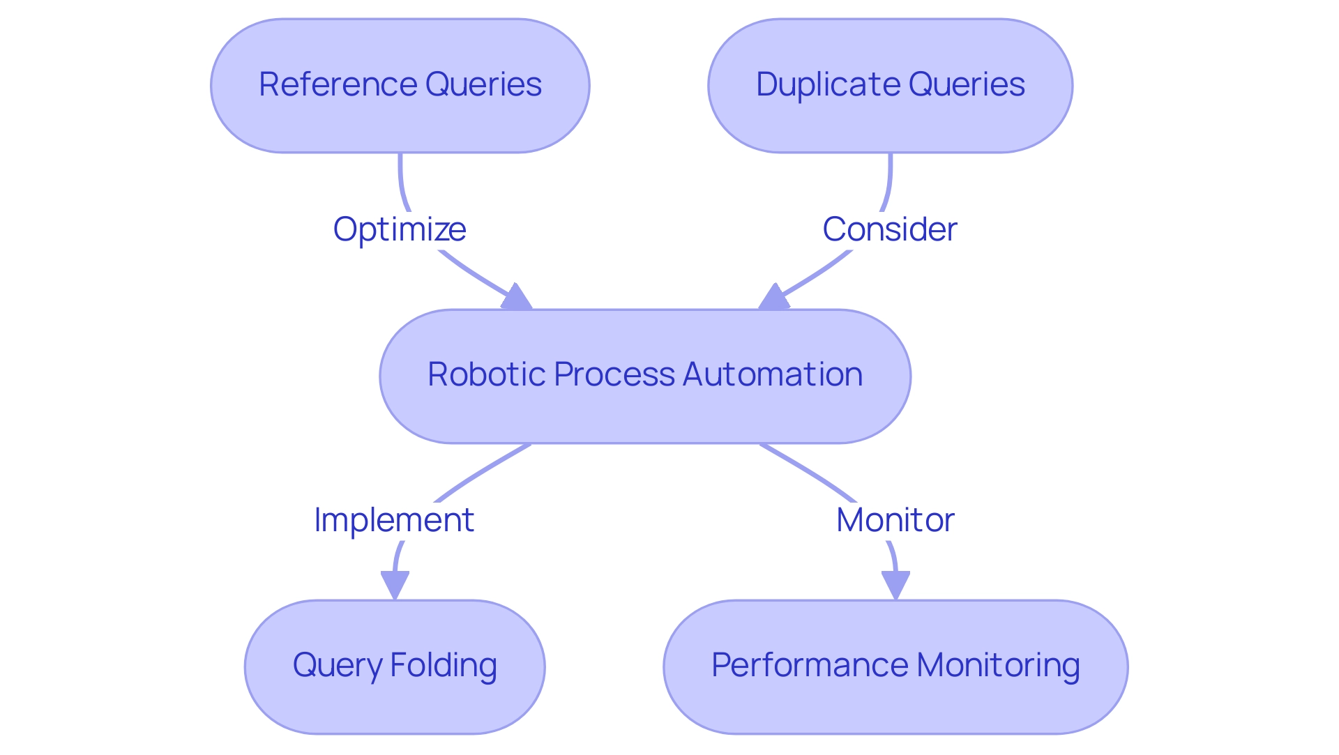
Troubleshooting Common Issues with Power BI Queries
Power BI users often face various challenges when working with requests, including data retrieval errors and performance slowdowns that can detract from effective reporting and insights. Among the most prevalent issues are circular references, which arise when a request indirectly refers to itself, leading to calculation errors. To effectively resolve these, it’s crucial to meticulously examine the dependencies of the inquiry and make necessary adjustments.
Furthermore, many users find themselves investing more time in constructing reports rather than leveraging insights from Power BI dashboards, which is a common challenge that detracts from analysis. Additionally, the absence of a governance strategy can lead to data inconsistencies, particularly in the context of power bi reference vs duplicate if the original request is altered after duplication. To alleviate this challenge, users should regularly update their duplicate queries or contemplate utilizing power bi reference vs duplicate queries as a more stable alternative.
Performance issues may further emerge from intricate transformations; simplifying these operations or utilizing Bi’s built-in performance analyzer can effectively help identify and resolve bottlenecks. Moreover, it’s important to note that Query operates in memory, which can lead to system crashes if the dataset is too large. As noted by Super User rajendraongole1, ‘Hope this helps.
Did I answer your question? Mark my post as a solution!’ This perspective highlights the significance of tackling these common pitfalls to improve user experiences and optimize performance.
Furthermore, when developing reports, users must choose between Power BI Desktop and Power BI Service; this decision can significantly impact query performance and overall efficiency, ensuring that stakeholders receive clear, actionable guidance from their data.
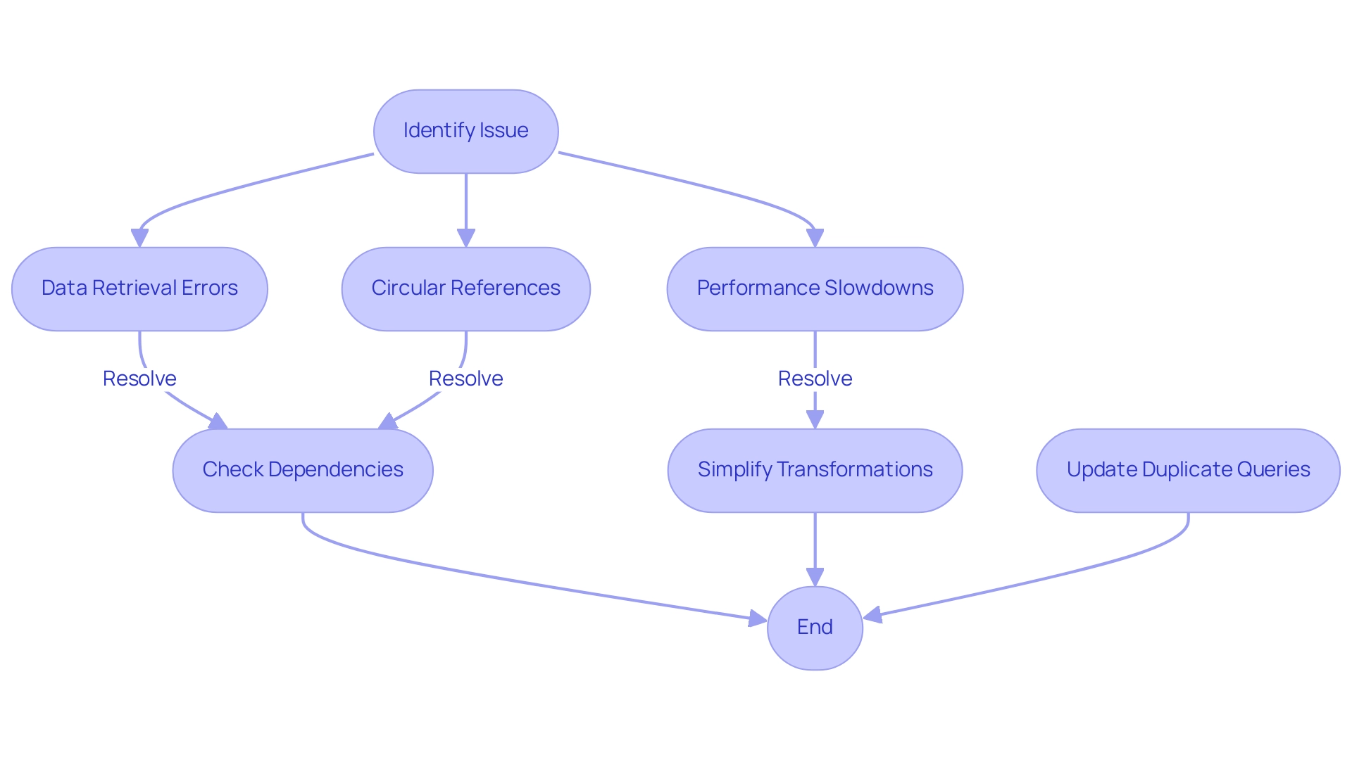
Conclusion
Understanding the strategic applications of reference and duplicate queries in Power BI is essential for optimizing data management and enhancing organizational performance. Reference queries streamline processes by building on existing queries, fostering a single source of truth and reducing redundancy. In contrast, duplicate queries allow for independent modifications, catering to diverse reporting needs without altering the original data structure.
The efficiency of these querying techniques significantly impacts performance, reporting accuracy, and operational effectiveness. By leveraging the power of functions like LOOKUPVALUE, users can enrich their data models, transforming raw data into actionable insights that drive informed decision-making. Moreover, integrating tools such as Power Automate and RPA can further enhance workflow efficiency, ensuring that organizations remain competitive in a data-rich environment.
In conclusion, mastering these querying techniques not only addresses common challenges faced by Power BI users but also empowers organizations to unlock the full potential of their data. By making informed choices between reference and duplicate queries, businesses can optimize their data strategies, leading to improved insights and ultimately fostering growth and innovation.
Overview
Power BI Premium is tailored for organizations needing advanced analytics and dedicated resources for large-scale data management, while Power BI Embedded is designed for developers looking to integrate BI capabilities into their applications. The article highlights that Premium offers enhanced performance and comprehensive reporting features, making it suitable for enterprise-level needs, whereas Embedded provides flexibility and customization, ideal for third-party applications, thus addressing distinct user requirements in the BI landscape.
Introduction
In the ever-evolving landscape of data analytics, organizations are faced with a critical choice between Power BI Premium and Power BI Embedded. Each solution caters to distinct needs, from comprehensive enterprise-level analytics to seamless integration of reporting capabilities within applications. As businesses strive to harness the power of data for informed decision-making, understanding the nuances of these platforms becomes essential.
With insights into licensing differences, key features, and real-world application scenarios, organizations can strategically align their analytics strategies to enhance operational efficiency and drive growth. This exploration delves into the unique offerings of Power BI Premium and Embedded, guiding organizations toward the most effective solution for their specific requirements.
Understanding Power BI Premium and Power BI Embedded
BI Premium serves organizations that require advanced analytical capabilities, providing dedicated cloud resources, enhanced performance, and the capacity to manage larger information volumes. This platform is particularly well-suited for enterprise-level applications, facilitating comprehensive reporting and in-depth data analysis. On the other hand, BI Embedded is specifically designed for developers aiming to incorporate analytics seamlessly into their applications.
This solution provides robust APIs and SDKs that enable the effortless embedding of BI reports and dashboards, making it an excellent choice for third-party applications and custom solutions. As Hubert Ferenc, Practice Lead of the Platform Team at TTMS, aptly noted,
Webcon would have been too large and costly a solution, which is why we chose Apps—it met all our needs perfectly.
This highlights the importance of selecting the right tool based on organizational needs.
Considering that numerous entities struggle with time-consuming report creation, data inconsistencies, and a lack of actionable guidance, understanding these distinctions is vital for strategizing their data analytics approach. A recent survey indicated that only 16% of companies achieved a 100% adoption rate of BI, revealing significant opportunities for improvement in defining roles, responsibilities, and stakeholder engagement. The case study on BI adoption rates highlights the challenges entities encounter in achieving full implementation, emphasizing the need for careful consideration when evaluating Power BI Premium vs Embedded.
Additionally, TTMS offers a 3-Day Business Intelligence Sprint, allowing organizations to quickly create professionally designed reports, and the General Management App, which provides comprehensive management and smart reviews. These features are crucial for improving reporting and actionable insights. Furthermore, the financial implications of TTMS’s offerings regarding BI services should be factored into the decision-making process, highlighting cost optimization strategies.
By aligning the appropriate BI solution with specific use cases and incorporating RPA solutions, enterprises can significantly enhance efficiency and effectiveness in information management, particularly when they prioritize confirming requirements and validating assumptions during the exploration phase.
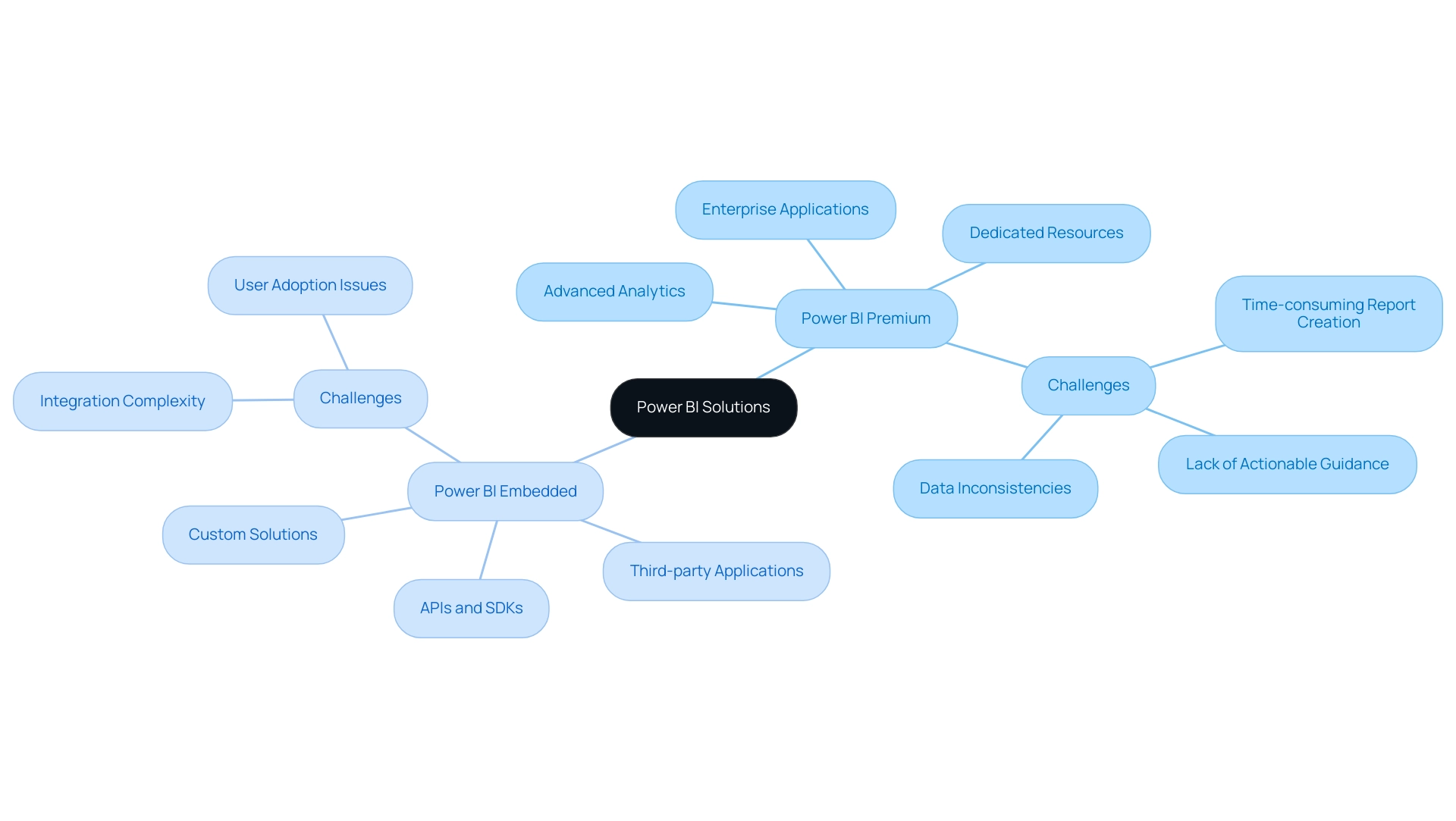
Key Features of Power BI Premium
When considering Power BI Premium vs Embedded, it is clear that BI Premium stands out with several key features that significantly enhance its utility for entities focused on data-driven decision-making. One of its primary advantages is the provision of dedicated cloud resources, ensuring faster performance and enabling users to manage and analyze large datasets effectively, particularly in the context of Power BI Premium vs Embedded. This ability is essential for entities aiming to extract insights from intricate information frameworks.
Furthermore, the Premium version enables sophisticated modeling, allowing individuals to generate detailed reports and dashboards that aid in more profound analytical procedures.
Among the remarkable features are paginated reports that offer a pixel-perfect formatting option for print and PDF outputs, serving entities requiring accurate reporting. Furthermore, the inclusion of advanced AI capabilities, through initiatives like Small Language Models and GenAI Workshops, empowers users to extract meaningful insights from their information quickly, streamlining the decision-making process. Significantly, the comparison of Power BI Premium vs Embedded enables organizations to share content throughout the whole organization without requiring individual licenses for each user, fostering collaboration and lowering total expenses.
Nonetheless, organizations frequently encounter difficulties when utilizing insights from BI dashboards, including time-consuming report generation and inconsistencies that can impede effective decision-making. Furthermore, inadequate master information quality can complicate analysis, making it crucial to tackle these issues to fully benefit from BI’s capabilities.
The BI services, including the 3-Day BI Sprint for quick report creation and the General Management App for comprehensive management, position BI Premium as a vital tool for enhancing operational efficiency and leveraging information strategically. As mentioned by Hubert Ferenc, Practice Lead at TTMS, ‘Webcon would have been too large and costly a solution, which is why we selected Apps—it met all our needs perfectly,’ emphasizing the significance of choosing the appropriate tools for efficiency. Moreover, case studies on BI Pro demonstrate its transformative influence on enterprises, highlighting how companies can uncover insights from information, improving collaboration and customizability in reporting.
With BI Pro billed at $9.99 per user monthly, BI Premium’s capabilities present a cost-effective solution for organizations looking to maximize their data utilization.
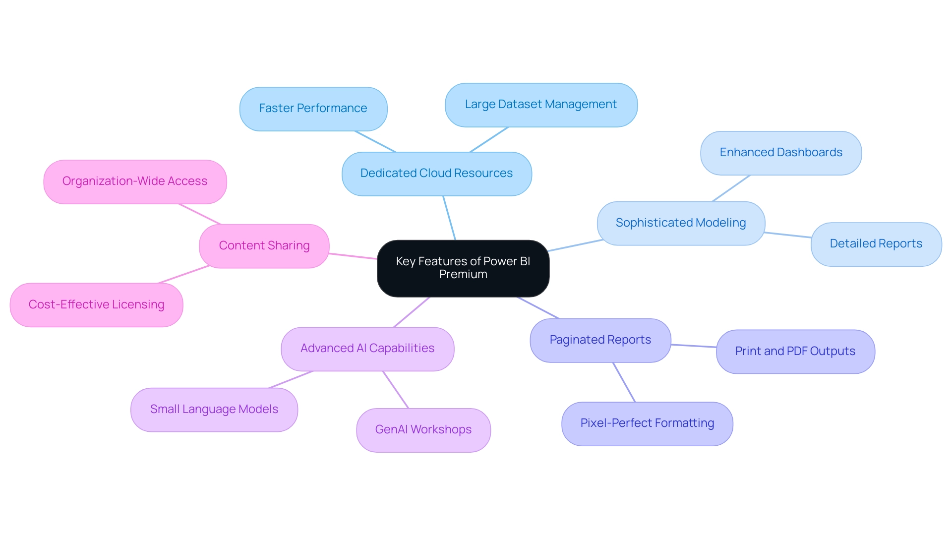
Exploring Power BI Embedded Features
When considering Power BI Premium vs Embedded, it’s clear that BI Embedded is designed with developers in mind, offering robust APIs that facilitate the direct embedding of reports and dashboards into applications. This capability not only allows for seamless integration of data analysis into existing workflows but also enables significant customization of the user interface, ensuring that the embedded features align with the overall application design in the context of Power BI Premium vs Embedded. A key advantage of Power BI Premium vs Embedded is its support for real-time updates, which is essential for applications requiring the most current information available.
However, leveraging insights from BI dashboards can present challenges, including:
- Time-consuming report creation
- Inconsistencies
- A lack of actionable guidance
Addressing these challenges is critical for enhancing operational efficiency and ensuring informed decision-making. For organizations seeking to expand their analytics capabilities, the pricing model of Power BI Premium vs Embedded makes it adaptable and appealing.
As Rico Zhou, a Community Support expert, notes,
‘From your statement, I know you use app owns data to embed reports to customers. So your customers don’t need to sign in BI; they can access reports by embed token.’
This reflects practical considerations for developers implementing BI Embedded in their applications.
Additionally, developers should be mindful of the complexities involved in building analytics solutions from scratch using open-source libraries, which can extend development timelines. For those interested in exploring BI Embedded, a $150 discount on registration is available with the code MSCUST. Moreover, a recent case study highlighted a user’s inquiry about obtaining user statistics from an embedded BI dashboard, underscoring the ongoing challenges developers face in tracking user metrics effectively, and reinforcing the role of tailored AI solutions and RPA in streamlining these processes for better efficiency and growth.
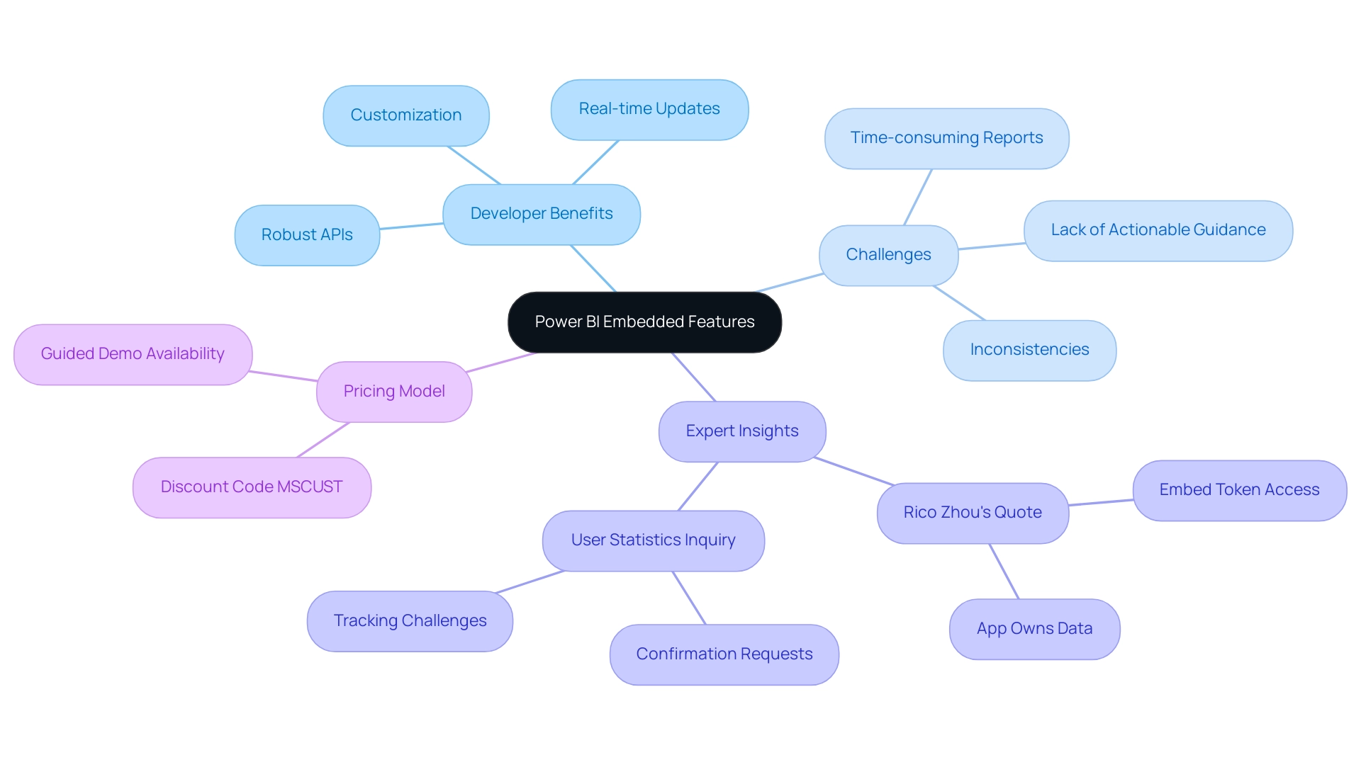
Licensing Differences: Power BI Premium vs. Embedded
In the discussion of Power BI Premium vs Embedded, Power BI Premium employs a capacity-based licensing model, enabling entities to secure dedicated resources that can be allocated among users. This structure is particularly advantageous for large enterprises facing extensive data demands, as it ensures consistent performance and access to powerful analytics tools essential for extracting actionable insights. However, many entities struggle with a lack of data-driven insights, which can hinder informed decision-making.
In contrast, when considering Power BI Premium vs Embedded, it is important to note that BI Embedded functions on a consumption-based model, where entities incur costs based on resource utilization. This flexibility makes it an ideal choice for applications with fluctuating user volumes, enabling businesses to manage expenses effectively while still leveraging the power of Business Intelligence to drive operational efficiency. As Isaac Chavarria, a Solution Specialist, notes, “BI Embedded is intended for integrating BI reports and dashboards into tailored applications, offering a budget-friendly alternative for businesses needing to present BI content to many users without necessitating complete access to all functionalities.”
Moreover, Norbert Kulski, a Business Intelligence specialist, highlights that “BI Premium Per User is an effort to address the requirements of small teams/companies in the realm of advanced features recognized from the Premium license.” It’s vital to note that BI Embedded starts from 679.58 € per capacity/month, a crucial statistic for entities evaluating their financial commitments. By grasping these licensing distinctions, particularly regarding Power BI Premium vs Embedded, entities can align their data strategies with their financial capabilities, ensuring that they choose the most suitable solution for enhancing efficiency and addressing challenges such as time-consuming report creation and data inconsistencies.
Additionally, integrating RPA solutions can automate repetitive tasks, further enhancing operational efficiency and addressing the challenges of extracting meaningful insights in today’s data-rich environment.
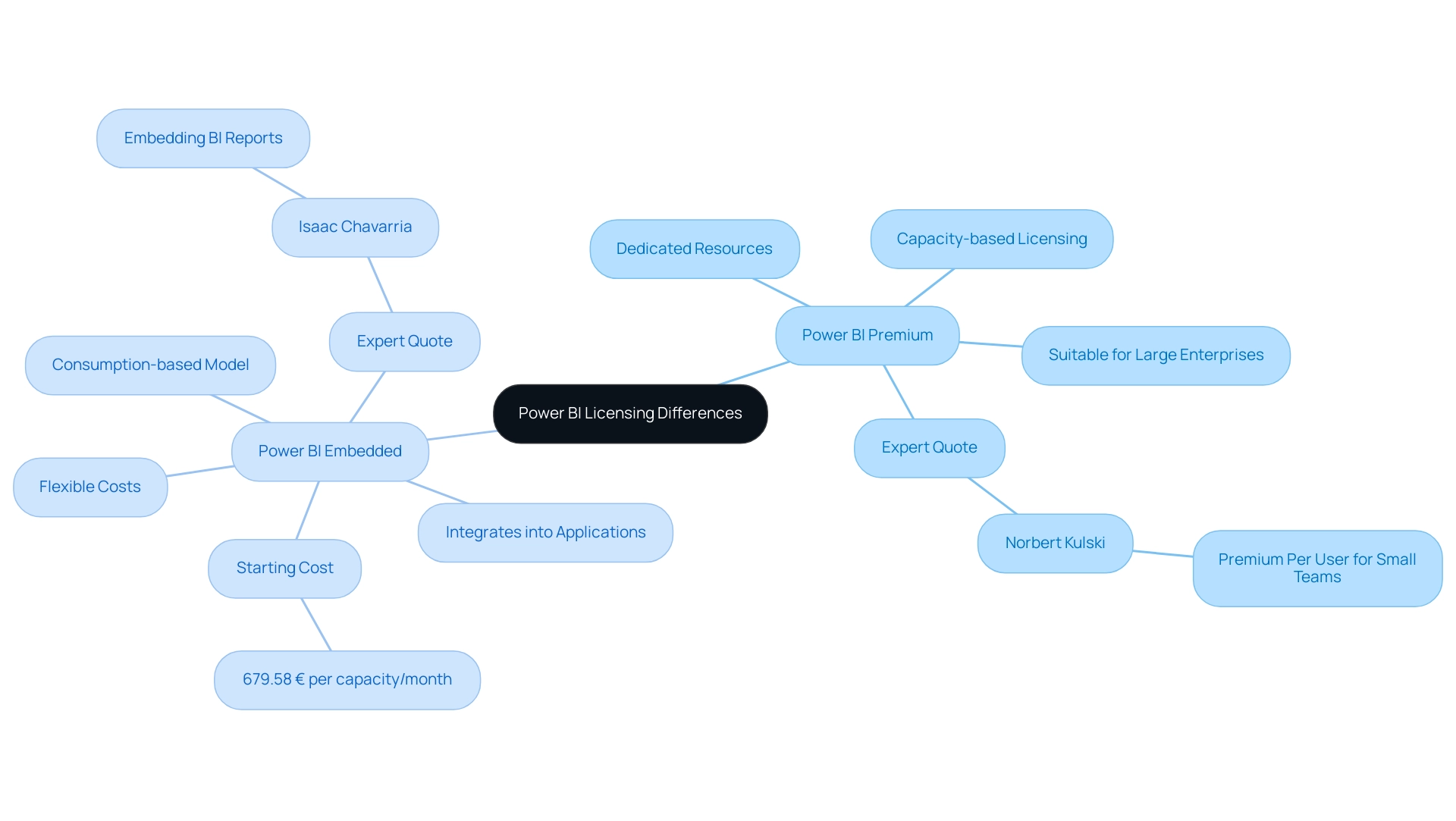
Use Cases: When to Choose Power BI Premium or Embedded
This Premium service acts as a strong data analysis solution for organizations needing extensive insights across multiple departments, such as finance, marketing, and operations, particularly in the context of Power BI Premium vs Embedded. It is particularly advantageous for enterprises aiming to disseminate insights broadly within their workforce. Conversely, when evaluating Power BI Premium vs Embedded, BI Embedded stands out as the optimal choice for companies seeking to incorporate advanced analytics directly into their applications or services, especially in Software as a Service (SaaS) products or customer-facing platforms.
As enterprises increasingly recognize the potential of data-driven decision-making, adoption rates of Power BI Premium vs Embedded in SaaS applications have surged. Companies that successfully integrate BI Embedded into their offerings gain a competitive edge, providing a seamless experience for their users while enhancing the overall functionality of their applications, particularly when evaluating Power BI Premium vs Embedded. Furthermore, the recent introduction of automation features like the Copilot in BI Desktop simplifies report generation, allowing users to create reports faster and overcome time-consuming report creation processes.
Additionally, customers with a renewal date after January 1, 2025, must replace their BI Premium subscription with Fabric capacity, making this transition crucial for businesses. However, challenges may arise, such as certain semantic models being incompatible with the modern infrastructure of the BI service. These hurdles necessitate careful consideration during implementation.
By utilizing RPA alongside Business Intelligence, companies can streamline their workflows, enhance operational efficiency, and make informed decisions that align with their strategic business goals, ultimately overcoming outdated systems and transforming business operations. Specific features like the 3-Day Power BI Sprint enable quick report creation, while the General Management App supports comprehensive management and smart reviews, further enhancing the integration of BI and RPA. Comprehending these features and the possible challenges in implementation is crucial for organizations seeking to fully utilize their capabilities.
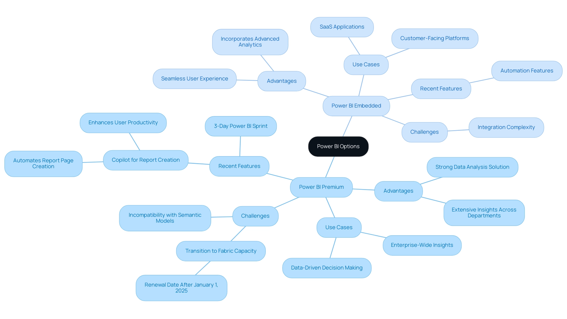
The Impact of Microsoft Fabric on Power BI Licensing
The launch of Microsoft Fabric signifies a crucial development in Microsoft’s approach to integration and analytics. As BI becomes increasingly intertwined with Fabric, users will encounter notable changes in licensing frameworks and operational capabilities, especially in the context of Power BI Premium vs Embedded. One of the core objectives of Microsoft Fabric is to streamline and unify services, which could lead to a more straightforward licensing process when considering Power BI Premium vs Embedded for users.
However, entities must be aware of the implications of these changes; for instance, pausing a Fabric capacity assigned to a workspace renders the datasets within that workspace inaccessible. Additionally, the introduction of the F64 capacity, priced at nearly double the previous P1 capacity, necessitates careful financial consideration and a thorough assessment of data needs to determine the most cost-effective capacity options, particularly when comparing Power BI Premium vs Embedded, to align with operational goals. To overcome technology implementation challenges, entities should navigate these changes strategically.
In light of these developments, it is essential for organizations to stay informed and adjust their strategies to fully leverage the innovative features that enhance their analytics capabilities. Significantly, the case study titled ‘Unify Your Data Estate’ demonstrates how BI enables the establishment of an open information hub with OneLake, allowing information engineers to effectively connect and organize various information sources. This integration ultimately supports comprehensive processing, analysis, monitoring, and visualization of information, exemplifying how Business Intelligence can transform raw information into actionable insights, driving growth and innovation while addressing the challenges of time-consuming report creation and inconsistencies.
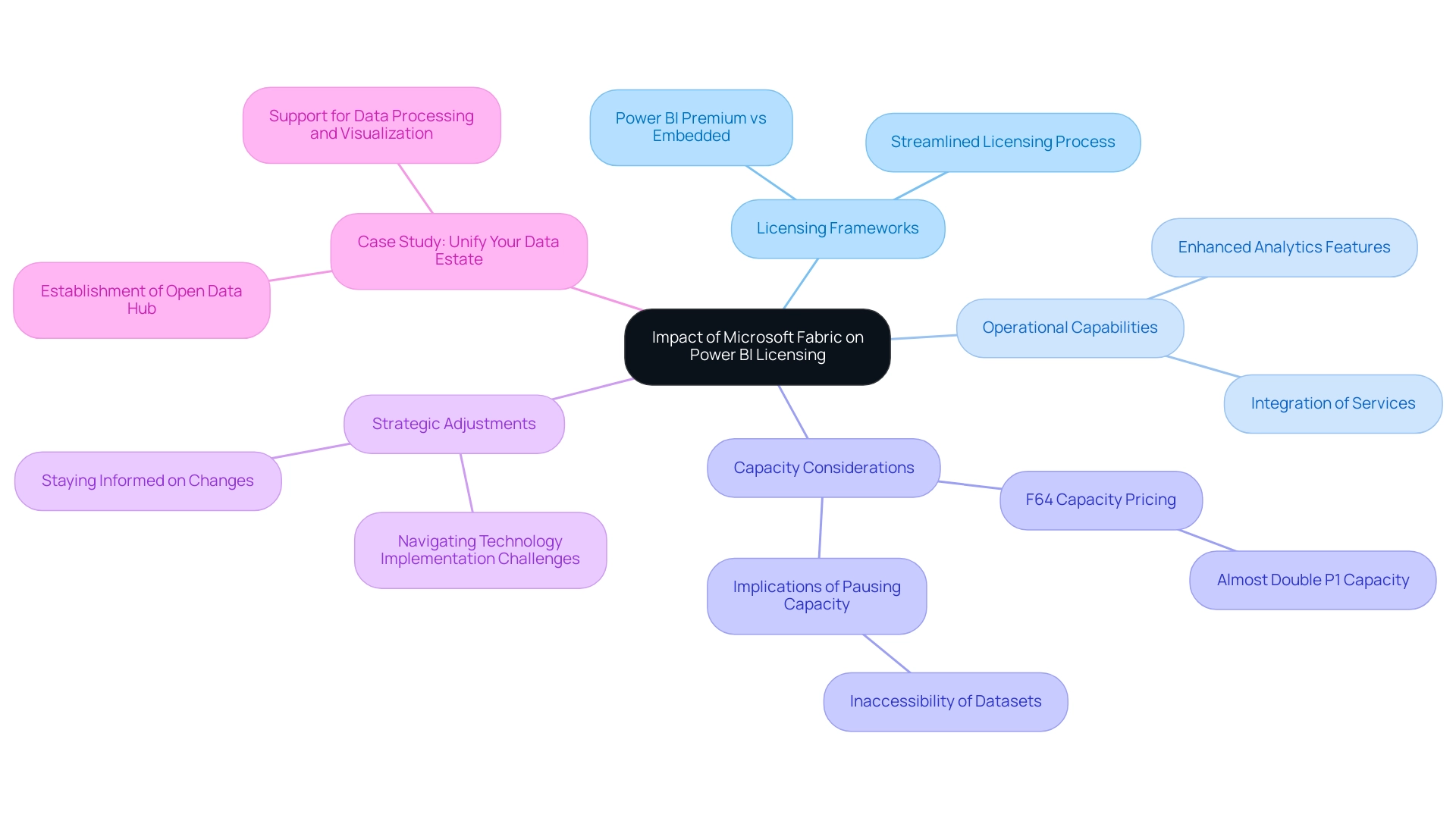
Choosing the Right Power BI Solution for Your Needs
Choosing between Power BI Premium vs Embedded requires a comprehensive evaluation of an organization’s specific operational requirements and strategic objectives. BI Premium is designed for enterprises that require comprehensive data evaluation capabilities, providing improved performance and advanced features for large-scale data analysis. In contrast, Power BI Embedded serves developers looking to seamlessly incorporate data insights into their applications, offering flexibility and scalability.
As organizations navigate these choices, it is essential to consider the latest insights: by 2025, 70% of organizations will utilize real-time data analysis to drive insights and decision-making. This trend underscores the growing necessity for tools that not only enhance operational efficiency through Robotic Process Automation (RPA), which reduces manual tasks and errors while freeing up team resources for more strategic, value-adding work, but also align with business objectives through tailored AI solutions that cut through the noise of overwhelming options. Significantly, the collaboration between IBM and Palantir Technologies emphasizes the essential function of AI-driven information analysis solutions in contemporary business settings.
Furthermore, this tool’s smooth integration with Microsoft products such as Excel and Azure promotes information sharing and teamwork, additionally improving operational efficiency. Expert opinions suggest that understanding the licensing differences, use cases, and specific functionalities of Power BI Premium vs Embedded is crucial for making informed decisions. Moreover, successful entities frequently perform a needs assessment to determine which BI option best suits their operational framework, ensuring alignment between data analysis capabilities and overall business objectives.
A relevant case study is Snowflake’s recent Series H funding, which highlights investor confidence in innovative data management solutions, reinforcing the importance of selecting the right analytics tools. Such comprehensive decision-making processes ultimately empower entities to implement the most suitable Power BI solution, driving efficiency and strategic growth. As Saumya Dubey observes, ‘Tableau, while equally strong, has a steeper learning curve due to its advanced visualization capabilities,’ offering a comparative viewpoint that entities should consider when assessing their choices.
Additionally, tailored AI solutions can help organizations navigate the overwhelming array of options, ensuring that businesses can effectively harness the power of data-driven insights.
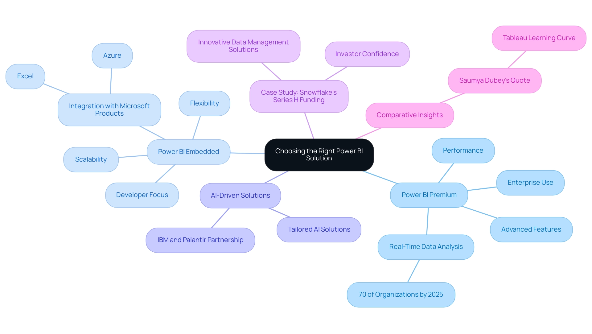
Conclusion
Understanding the distinctions between Power BI Premium and Power BI Embedded is crucial for organizations aiming to optimize their data analytics strategies. Power BI Premium offers advanced analytics capabilities suited for enterprises, providing dedicated resources and enhanced performance for comprehensive reporting and data analysis. In contrast, Power BI Embedded serves developers looking to integrate analytics seamlessly into applications, offering robust APIs and a flexible, consumption-based pricing model that adapts to varying user demands.
The choice between these two platforms hinges on specific organizational needs and operational goals. For large enterprises seeking detailed insights across departments, Power BI Premium is the clear choice. Conversely, for businesses focused on embedding analytics within customer-facing applications, Power BI Embedded stands out as the optimal solution. Additionally, the integration of RPA and AI-driven insights can further enhance operational efficiency, addressing common challenges such as time-consuming report creation and data inconsistencies.
As the landscape of data analytics continues to evolve with innovations such as Microsoft Fabric, organizations must remain agile and informed. By carefully evaluating the unique features, licensing models, and use cases of each solution, businesses can strategically align their analytics capabilities with their growth objectives. Ultimately, selecting the right Power BI solution not only empowers organizations to harness data effectively but also drives informed decision-making and operational excellence in today’s data-driven environment.
