Overview
Power BI may not show all data due to factors such as incorrect model configurations, applied filters, or issues with the underlying dataset. The article highlights that systematically checking source connections, filters, relationships, and permissions, along with refreshing datasets, can help troubleshoot and resolve visibility problems effectively.
Introduction
In the dynamic landscape of data analytics, Power BI stands out as a powerful tool that enables organizations to transform raw data into actionable insights. However, users often encounter frustrating visibility issues that can hinder effective decision-making.
- From misconfigured data models to improperly applied filters, the challenges are numerous and can lead to confusion and mistrust in the presented data.
- As organizations strive to enhance their reporting capabilities, understanding the root causes of these visibility problems becomes essential.
This article delves into common data visibility issues in Power BI, offering practical troubleshooting strategies and insights to empower users in their data journey. By addressing these concerns, organizations can unlock the full potential of their data, ensuring that stakeholders are equipped with the clarity and confidence needed to make informed decisions.
Understanding Data Visibility Issues in Power BI
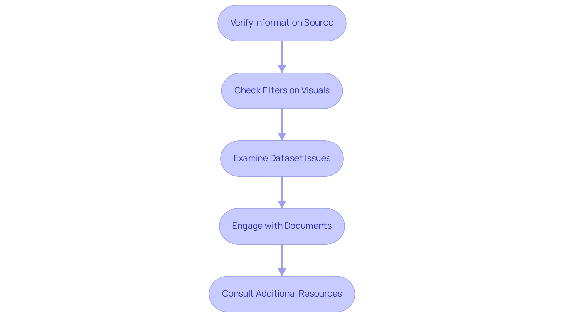
Visibility challenges in BI can stem from various factors, such as incorrect model configurations, applied filters on visuals, or issues with the underlying dataset, often resulting in Power BI not showing all data. A critical first step is to verify that the information source is properly connected and that content is being loaded into Power BI as intended. Many organizations face the challenge of spending excessive time on document creation, which often leads to inconsistencies across submissions due to a lack of established governance strategies.
This situation creates confusion and mistrust in the information presented. According to recent insights, the usage metrics document only reflects documents or dashboards accessed within the past 90 days, emphasizing the necessity for individuals to engage with their documents initially. This interaction is essential; as highlighted in a case study on usage metrics, individuals must view their content from within the workspace at least once for the information to be processed effectively.
Moreover, it is crucial to examine the filters utilized at both the document and visual levels, particularly because Power BI not showing all data can result from these filters unintentionally concealing information. By understanding these elements and addressing the common issues of time-consuming report generation and the resulting lack of actionable guidance, individuals can better troubleshoot and resolve visibility problems in Power BI, particularly when dealing with the issue of Power BI not showing all data. Brian, an Enterprise DNA Specialist, emphasizes the significance of member engagement in improving information visibility, stating, ‘Thanks for the feedback – always wonderful to hear people gaining great value from their memberships.’
This emphasizes that tackling visibility challenges not only improves information interaction but also enriches experience and satisfaction. Additionally, for further insights on common model configuration problems, Andrew Gard’s YouTube channel offers valuable analysis videos that can assist users in troubleshooting. Moreover, Brian’s recent discussion on combining exploratory information analysis with BI reporting offers a modern viewpoint on effectively tackling visibility challenges.
Emphasizing the need for clear, actionable guidance in documents is crucial to ensuring stakeholders can make informed decisions based on the insights provided.
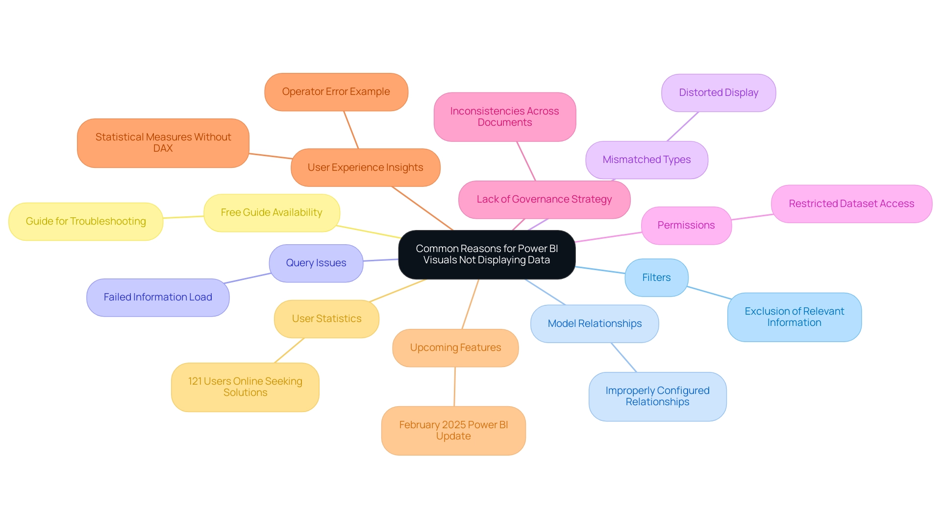
Common Reasons for Power BI Visuals Not Displaying Data
Power BI users often encounter several common issues, including power bi not showing all data, which can hinder visuals from displaying information effectively. Key reasons for power bi not showing all data include:
- Filters applied to the document or specific visuals that inadvertently exclude relevant information
- Improperly configured model relationships, which can lead to unexpected results
- Queries that fail to load information correctly due to various factors
- Mismatched types between the visuals and the underlying datasets, which can distort the intended display
- Permissions that restrict access to certain datasets, impacting visibility
Additionally, a lack of governance strategy can contribute to inconsistencies across various documents, leading to confusion and mistrust in the data presented.
Are you dedicating more time to creating documents than utilizing insights from Power BI dashboards? This is a common challenge, where the focus shifts from analysis to time-consuming report creation. As highlighted by an experience,
In my case, operator error, but this might assist someone else
this emphasizes the importance of reviewing settings, such as changing a number type column’s setting to ‘Not Summarize,’ which can resolve display issues.
A pertinent case study explores how individuals can discover statistical measures in BI without relying on DAX, demonstrating an alternative method for tackling visibility concerns. Furthermore, the forthcoming February 2025 Business Intelligence update is anticipated to bring new features that could influence model relationships, highlighting the necessity for individuals to remain updated on these modifications. By systematically examining these potential challenges, individuals can efficiently identify the root cause of their information visibility problems, particularly when experiencing issues like power bi not showing all data.
Furthermore, continuous conversations regarding model relationships and the most recent BI updates indicate that the power bi not showing all data issues continue to be widespread. Notably, statistical insights indicate that many users face similar challenges, with 121 users currently online seeking solutions. For those looking for further assistance, the guide is available for free download, serving as a valuable resource.
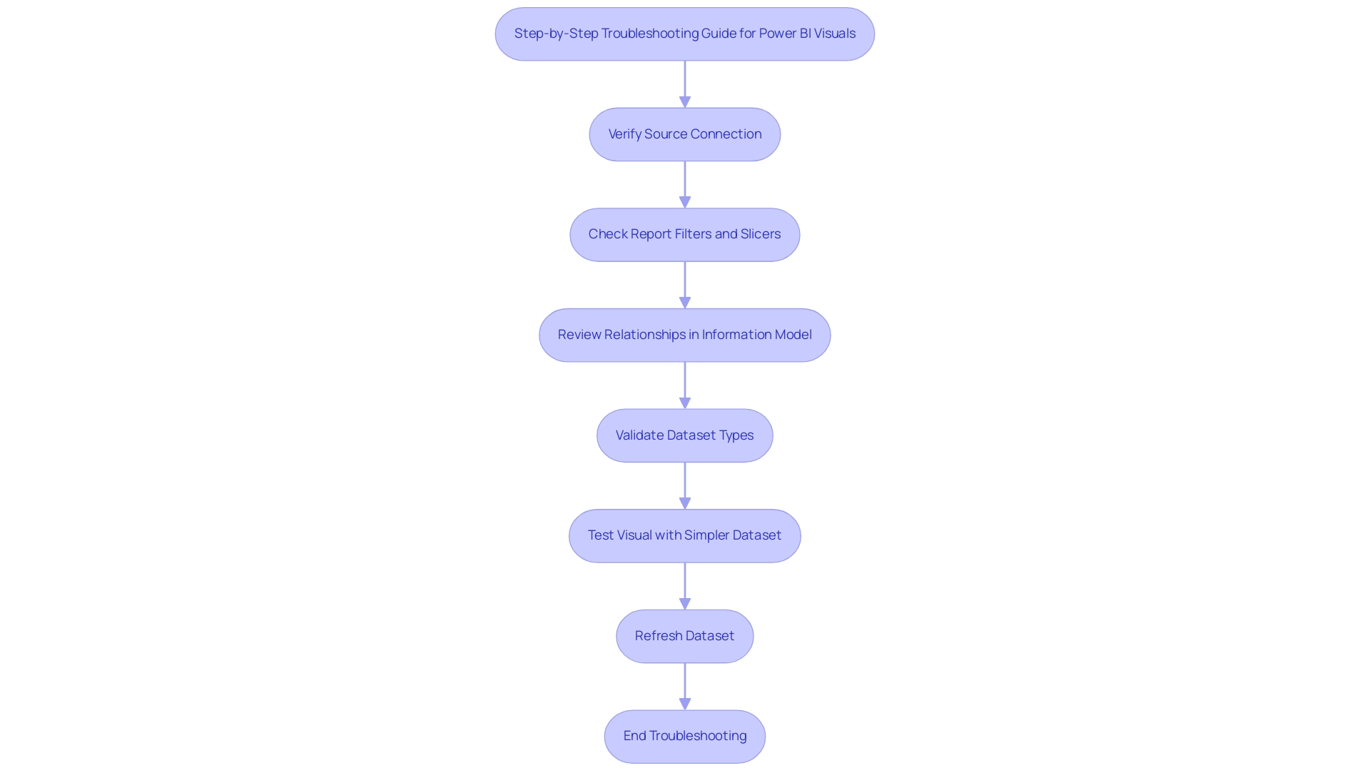
Step-by-Step Troubleshooting Guide for Power BI Visuals
To effectively troubleshoot Power BI visuals, especially when Power BI is not showing all data, it is essential to adopt a systematic approach that considers common challenges in leveraging insights. Start by verifying the source connection: ensure it is active and set up correctly. Next, scrutinize the report filters and slicers, as these controls may inadvertently result in Power BI not showing all data, contributing to inconsistencies that can lead to confusion and mistrust in the information presented, particularly when governance strategies are lacking.
It’s also crucial to review the relationships within your information model, confirming that they are set up accurately to facilitate information flow. Additionally, validate the types in your dataset to guarantee compatibility with the chosen visuals. A practical strategy involves testing the visual with a simpler dataset to ascertain whether the issue persists.
Finally, refresh the dataset to address the issue of Power BI not showing all data and to ensure that all information is up-to-date and reflects the most current details. By following these steps, users can effectively diagnose and resolve issues related to visibility in BI, such as when Power BI is not showing all data, thereby enhancing the overall user experience and analysis capabilities.
Furthermore, understanding the impact of outliers on data visibility is crucial; for instance, vehicles sold for over 180 thousand Reais can indicate significant outliers that may skew analysis. This emphasizes the significance of integrating statistical analysis into troubleshooting efforts, as demonstrated in the case study titled ‘Practical Application of Statistics in BI,’ which shows how employing statistical calculations can uncover key insights, such as total annual profit and standard deviation. Additionally, BI administrators have the ability to control access to usage metrics reports, enabling or disabling them for specific users or groups.
This control can significantly influence visibility and troubleshooting efforts, making it a vital consideration for effective management. As mentioned by analytics enthusiast Douglas Rocha, ‘Can you perform statistics in BI without DAX?’ Yes, you can; you can do it without measures as well, and I will teach you how at the end of this tutorial.
This underscores the versatility of BI in conducting statistical analysis, which can further aid in understanding data issues such as outliers. Moreover, the lack of actionable guidance in reports can leave stakeholders without clear direction, particularly when addressing issues like Power BI not showing all data, emphasizing the need for structured troubleshooting processes.
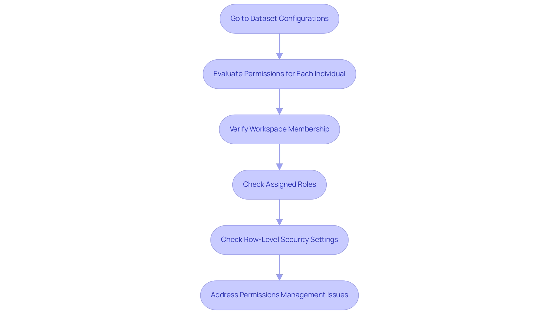
Verifying Permissions and Access Rights in Power BI
To efficiently validate permissions and access rights in Business Intelligence, begin by going to the dataset configurations and evaluating the permissions granted to each individual. It is crucial to verify that individuals needing access to particular information have the suitable permissions set. In the BI Service, verify that individuals belong to the appropriate workspace and have been assigned the required roles to access the information.
Furthermore, it is critical to check row-level security settings, as these can inadvertently limit access to certain information segments, which may be the reason for Power BI not showing all data. For example, the challenges emphasized in the 3-Day BI Sprint highlight that time-consuming report creation and information inconsistencies can complicate permissions management, ultimately hindering user experience and visualization effectiveness. Ineffective permissions management can lead to significant limitations when using Power BI, potentially resulting in Power BI not showing all data despite its capacity to ingest approximately 2 GB of data at a time.
As Allison Kennedy, a Microsoft trainer and consultant, emphasizes, proper access rights management is vital for maximizing BI’s capabilities. Additionally, the 3-Day Power BI Sprint provides a solution by creating a fully functional, professionally designed document on a topic of your choice in just three days, allowing you to focus on utilizing insights effectively. This report can also serve as a valuable template for future projects, ensuring consistent quality and design.
Staying informed about the 2024 updates on row-level security will enhance your ability to manage data visibility effectively. Participating in community forums can also be advantageous, as users are motivated to share helpful responses and identify solutions, fostering a collaborative environment around BI.
Ensuring Version Compatibility and Updates for Optimal Performance
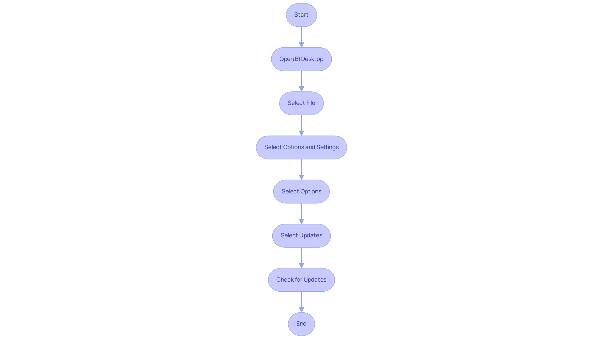
To maintain optimal performance in Business Intelligence, it is crucial to regularly check for software updates. This process can be easily accomplished by navigating to the BI Desktop application and selecting:
- ‘File’
- ‘Options and settings’
- ‘Options’
- ‘Updates’
Maintaining your software current can fix ongoing bugs and improve functionality, particularly to resolve issues such as Power BI not showing all data.
Furthermore, ensuring that your Power BI Desktop version is compatible with the sources being utilized is essential, as issues such as Power BI not showing all data can arise from discrepancies in version compatibility. Recent statistics suggest that organizations prioritizing regular updates experience a 30% enhancement in performance metrics, reinforcing the notion that software updates are not merely optional but crucial for effective information management and leveraging insights. As highlighted in the context of Business Intelligence, unlocking the power of information transformation into actionable insights is key for organizational growth.
Furthermore, as shown in the case study titled ‘Effective Strategies for BI Adoption’, 55% of organizations recognized training and ongoing education as essential strategies for successful BI implementation, tackling challenges such as time-consuming report creation and inconsistencies in information. This emphasizes the need for users to stay informed about the latest updates and best practices. Additionally, integrating Robotic Process Automation (RPA) can further enhance operational efficiency by automating repetitive tasks and addressing staffing shortages, allowing teams to focus on strategic initiatives.
Moreover, as Douglas Rocha, a data science enthusiast, highlights, ‘Understanding the complete functionalities of BI, including its updates, is crucial for maximizing its potential in analysis.’ This illustrates the flexibility of BI when used correctly, highlighting the importance of ensuring that all components of the software are functioning harmoniously to drive operational efficiency and growth.
Testing with New Reports to Isolate Data Issues
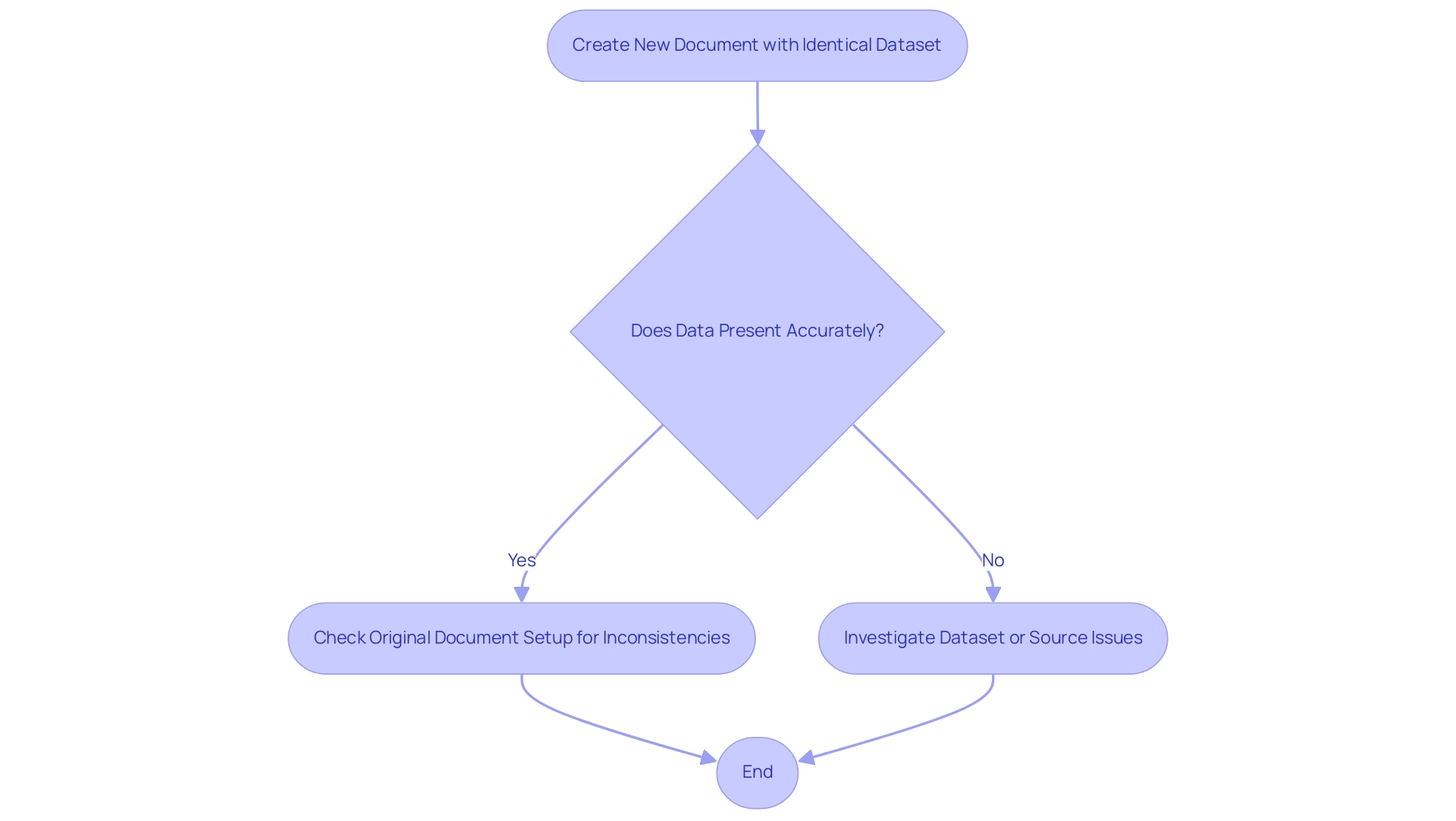
To efficiently separate information problems in Business Intelligence, a useful approach is to generate a new document and try to load the identical dataset. This approach tackles the common challenge of investing excessive time in creating documents instead of leveraging insights from existing Power BI dashboards. Should the information present accurately in this new document, it suggests that the cause of the problem likely resides within the setup of the initial document, which may be experiencing inconsistencies due to an absence of governance strategy.
Such inconsistencies can lead to confusion and mistrust in the information presented, particularly when Power BI is not showing all data, necessitating a careful review of the original document for any filters, relationships, or settings that may be impeding information visibility. Conversely, if the information is not displaying in the new report as well, it suggests that the concern may be related to the dataset or its source, possibly causing Power BI not showing all data. This method of testing serves as a robust approach in identifying and resolving display issues, particularly when dealing with the problem of Power BI not showing all data.
It’s important to note that importing datasets may yield different performance results based on location and network speed, which can significantly impact visibility. By adopting such systematic testing methods, stakeholders can clarify actionable guidance, ensuring that reports not only present data but also provide clear direction on the next steps, ultimately addressing the prevalent issues of unclear, actionable guidance often present in reports filled with numbers and graphs.
Conclusion
Addressing data visibility issues in Power BI is crucial for organizations seeking to transform their raw data into reliable insights. Throughout this article, the common challenges affecting data visibility have been explored, including:
- Misconfigured data models
- Improperly applied filters
- Inadequate permissions management
By understanding these factors, users are better equipped to troubleshoot and resolve visibility problems, ultimately enhancing their data analysis capabilities.
Practical strategies such as:
- Verifying data source connections
- Scrutinizing report filters
- Testing with new reports
have been highlighted as effective methods for isolating and diagnosing issues. Furthermore, the importance of staying informed about software updates and best practices cannot be overstated, as these elements are vital for maintaining optimal performance and ensuring data accuracy.
In summary, overcoming data visibility challenges in Power BI not only instills confidence in the insights presented but also empowers stakeholders to make informed decisions. By fostering a culture of continuous improvement and user engagement, organizations can unlock the full potential of their data, paving the way for more effective reporting and enhanced decision-making processes. With proactive troubleshooting and a commitment to best practices, the path to clearer, actionable insights becomes attainable for all Power BI users.
Overview
The article focuses on how to effectively group dates by month in Power BI, providing a step-by-step guide and various methods to enhance data analysis. It emphasizes the importance of utilizing built-in features, DAX functions, and best practices to streamline reporting processes, improve clarity, and ultimately drive informed decision-making in business intelligence.
Introduction
In the dynamic landscape of data analysis, mastering date grouping in Power BI emerges as a crucial skill for organizations aiming to derive actionable insights from their data. By aggregating information according to specific time intervals—be it days, months, or years—users can visualize trends and make informed decisions that significantly impact business operations.
Despite the potential benefits, many find themselves bogged down in the complexities of report construction, often losing sight of the valuable insights that Power BI dashboards can provide. With over 75% of users acknowledging the advantages of effective date grouping, the need for streamlined processes and consistent data representation has never been more critical.
This article delves into the methods, best practices, and DAX functions essential for harnessing the power of date grouping, ultimately empowering organizations to enhance their reporting capabilities and drive strategic decision-making.
Understanding Date Grouping in Power BI
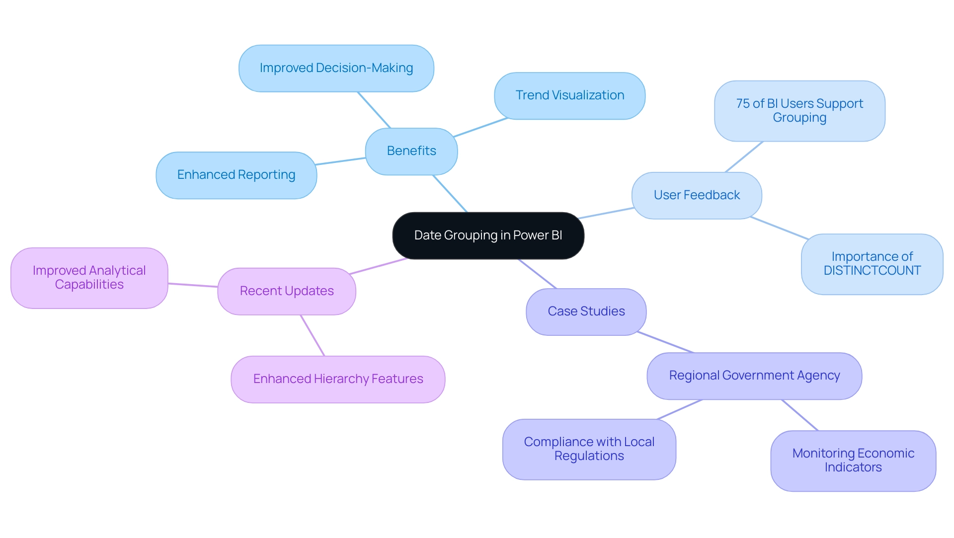
In Business Intelligence, the ability to power bi group dates by month allows users to aggregate information according to specific time intervals, such as days, months, or years, which is essential for visualizing trends and making informed decisions based on time-series information. This functionality allows businesses to analyze critical metrics such as sales performance and customer engagement over time, leading to enhanced insights into operations. However, numerous organizations discover that they spend more time creating reports than in utilizing insights from BI dashboards, which frequently leads to inconsistent information across reports and a deficiency of clear, actionable guidance for stakeholders.
Based on recent statistics, over 75% of BI users indicate that grouping significantly enhances their information examination abilities, highlighting its significance in efficient reporting. To tackle these challenges, our BI services, including the 3-Day BI Sprint for swift report creation and the General Management App for thorough management, not only ensure effective reporting and information consistency but also offer actionable guidance that assists stakeholders in grasping the implications of the information presented. As organizations increasingly acknowledge the significance of time-series data analysis, effective categorization of periods through power bi group dates by month has become essential for creating impactful visualizations and reports in BI.
A notable case study showcases how a regional government agency utilized date grouping in Business Intelligence to monitor economic indicators, ensuring compliance with local regulations while gaining insights into community engagement trends. By leveraging our services, the agency was able to streamline its reporting process and enhance clarity in decision-making. Recent updates in BI 2024 have introduced enhanced features for creating hierarchies, allowing users to start with a top-level group and drill down into relevant columns, thus enriching the analytical capabilities.
According to Stephen Tao, Use DISTINCTCOUNT to count the number of distinct values in a column, further underscoring the importance of precise data aggregation. Additionally, understanding distribution indicates how viewers accessed a report, while platform usage shows the technology used to open it. As businesses leverage these capabilities, they gain a clearer understanding of performance trends, ultimately driving strategic decision-making.
Methods for Grouping Dates by Month
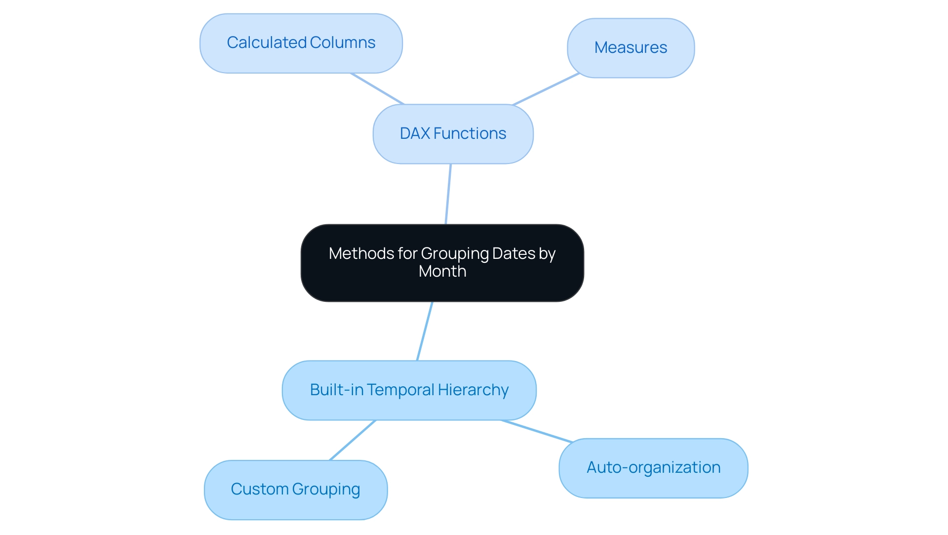
This tool offers a range of efficient techniques for organizing records by month, each customized to various analytical requirements:
- Utilizing the Built-in Temporal Hierarchy: This method streamlines the process by automatically organizing times into a structured hierarchy of year, quarter, month, and day. Users can simply drag the time field into their visualizations, allowing Power BI to generate this hierarchy seamlessly.
- Creating a Custom Group: For those who prefer a tailored approach, users can right-click on the time field within the Fields pane, select ‘New Group,’ and opt to group times by month. This flexibility caters to specific data requirements and user preferences.
- Utilizing DAX Functions: For sophisticated evaluation, DAX (Data Analysis Expressions) offers robust resources for intricate time manipulations. Users can create calculated columns or measures in Power BI to group dates by month, enabling sophisticated analysis and deeper insights into temporal trends. For instance, a case study titled ‘Adding a Dynamic Format String to a Calculation Item‘ demonstrates how enabling the dynamic format string in the properties pane allows users to specify a DAX expression for formatting, such as #,##0.00%, effectively changing the display format.
Each of these methods has its own advantages, and the choice between them should be guided by the specific requirements of the analysis task. As highlighted in our discussions on the importance of Business Intelligence, leveraging these techniques can mitigate challenges like time-consuming report creation and data inconsistencies, ultimately driving operational efficiency and business growth. Additionally, our RPA solutions, including EMMA RPA and Automate, complement BI by addressing staffing shortages and outdated systems, enhancing overall productivity.
Training modules and certifications are available for creating calculation groups and demonstrating best practices in BI, enhancing your skills and knowledge in this area. As a tangible incentive, use code MSCUST for a $150 discount on registration for these training sessions. As mentioned by Angelica Domenech, a trainer at Pragmatic Works,
In my example, I start with the ‘Continents’ group as the top-level of my hierarchy, emphasizing the significance of a well-structured approach to organization.
By leveraging these techniques, users can significantly enhance their analytical capabilities in BI.
Step-by-Step Guide to Grouping Dates by Month
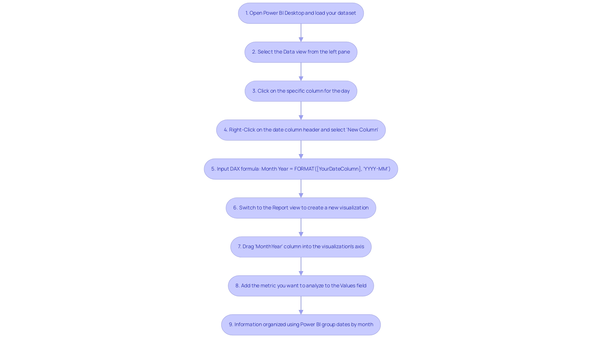
To efficiently categorize periods using the Power BI group dates by month feature and tackle frequent obstacles such as lengthy report generation and information inconsistencies, adhere to these simple steps:
- Open Power BI Desktop and load your dataset that includes temporal fields.
- Select the Data view from the left pane to access your data.
- Click on the specific column for the day you wish to group.
- Right-Click on the date column header and select ‘New Column’ to create a calculated column.
- Input the following DAX formula:
Month Year = FORMAT([YourDateColumn], 'YYYY-MM')to generate a new column that consolidates year and month into a single format. - Switch to the Report view to create a new visualization based on your information.
- Drag the newly created ‘MonthYear’ column into the visualization’s axis to arrange your information.
- Add the metric you want to analyze—such as sales figures—to the Values field.
- Your information will now be organized using Power BI group dates by month, allowing for a simplified examination of trends over time.
By efficiently utilizing the technique to Power BI group dates by month, you can reduce the time spent on report creation and enhance the clarity of your insights, ultimately providing clearer, actionable guidance to stakeholders. It’s important to mention that after removing the semantic model, it can take up to 24 hours for new usage information to be imported, so timely information evaluation is crucial. Additionally, when working with BI, especially in national or regional clouds, understanding the compliance and security aspects of usage metrics is vital for effective operations efficiency.
As Douglas Rocha, a Software Engineer, noted, “Hope I’ve helped you in some way and see you next time!” This personal touch highlights the cooperative aspect of information examination.
Leveraging DAX for Effective Date Grouping
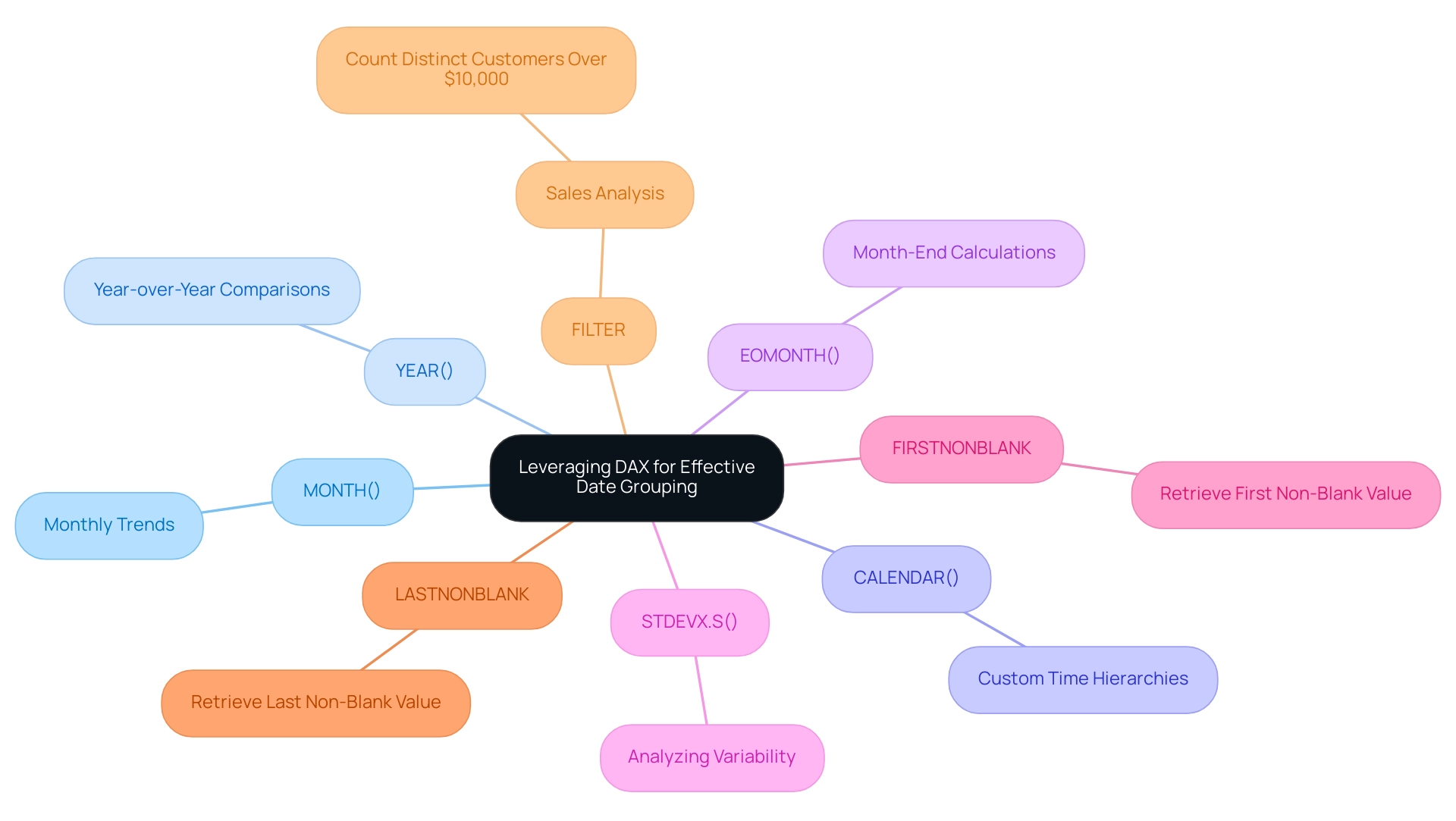
DAX functions act as crucial instruments for organizing timelines in BI, allowing users to conduct thorough analysis with accuracy while tackling frequent issues in utilizing insights. Many organizations find themselves investing excessive time in constructing reports rather than deriving actionable insights from Power BI dashboards. Here are some of the most utilized DAX functions that can help alleviate these issues:
- MONTH(): Extracts the month from a specified timestamp, providing a straightforward method to analyze monthly trends without the hassle of inconsistent information across reports.
- YEAR(): Extracts the year, facilitating year-over-year comparisons, crucial for identifying trends and making informed decisions.
- CALENDAR(): Generates a table featuring a continuous range of days, particularly useful for crafting custom time hierarchies tailored to specific analytical needs, thus reducing the time spent on report creation.
- EOMONTH(): Returns the last day of the month, aiding in month-end calculations and reporting that may otherwise lack clarity.
- STDEVX.S(): Returns the sample standard deviation for an expression evaluated row by row over a table, which can be useful for analyzing variability in monthly sales information, providing actionable insights rather than just numbers.
Leveraging these functions allows users to create calculated columns or measures that enhance the flexibility of date grouping, specifically in how to power bi group dates by month and analyze the results. For instance, using YEAR() and MONTH() in Power BI can help to group dates by month and yield granular insights into trends across specific months over multiple years. Furthermore, utilizing the FIRSTNONBLANK and LASTNONBLANK functions can help retrieve critical non-blank values, such as sales amounts, effectively managing gaps in data and ensuring that reports provide clear guidance.
A relevant case study illustrates how the FIRSTNONBLANK function was employed to retrieve the first non-blank sales amount, enhancing clarity in reporting. As Joleen Bothma notes,
Learn what DAX is and discover the fundamental DAX syntax and functions you’ll need to take your BI skills to the next level.
This highlights the increasing significance of mastering these DAX functions, which are essential for effective date evaluation in Power BI.
Additionally, the FILTER function counts the number of distinct customers who have made purchases totaling more than $10,000, underscoring its importance in sales analysis and improving overall operational efficiency. By utilizing these DAX functions, organizations can not only streamline report creation but also provide stakeholders with actionable guidance, addressing the critical need for clarity in data presentation.
Best Practices for Grouping Dates in Power BI
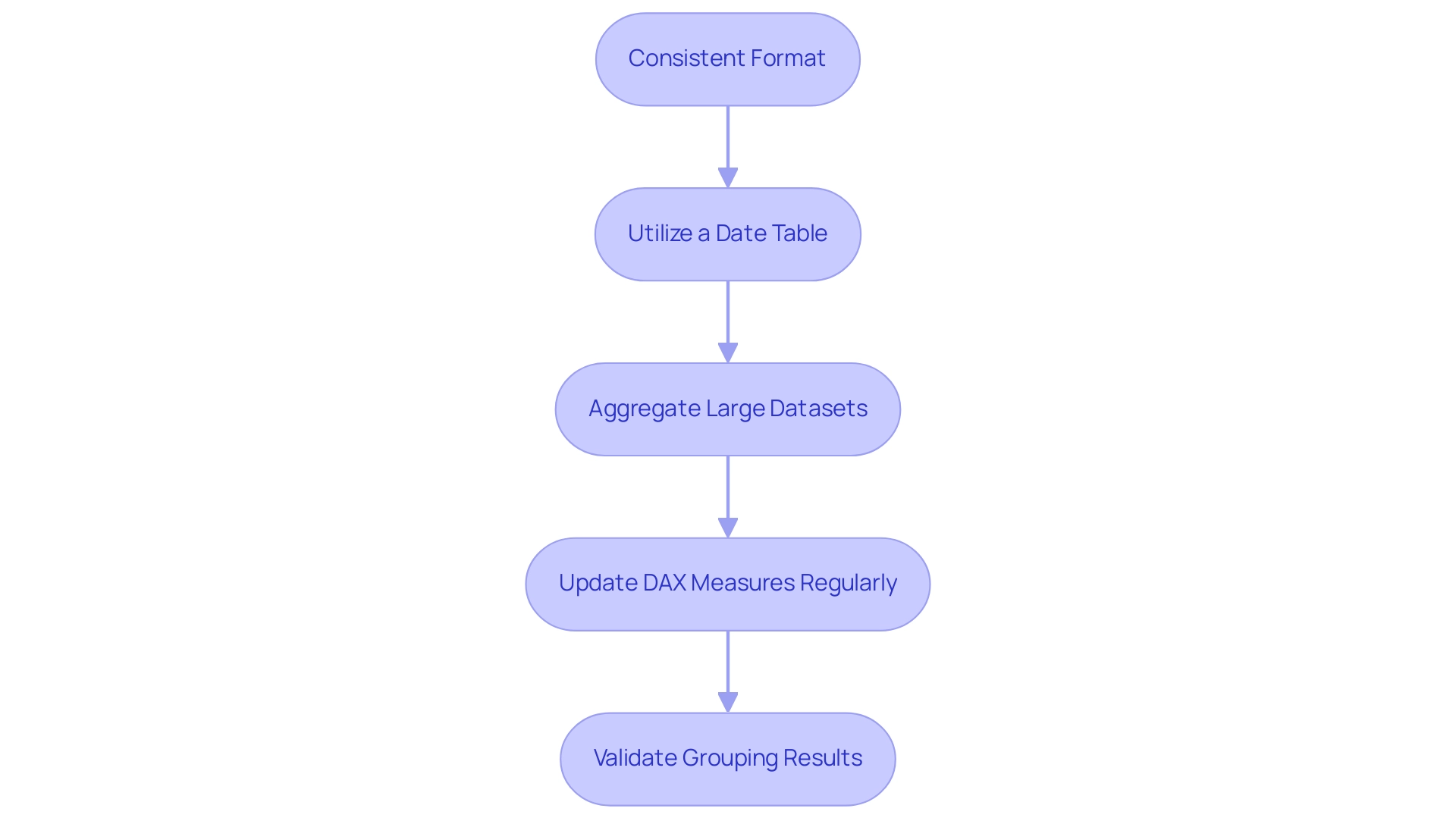
To optimize date grouping in Power BI effectively, adhere to these best practices:
-
Consistent Format: Maintaining a uniform format for all time fields is crucial. This consistency prevents errors during the grouping process and ensures accurate analysis.
-
Utilize a Date Table: Creating a dedicated date table that encompasses all relevant dates can significantly enhance grouping efficiency. This not only simplifies the process but also boosts performance metrics, particularly in large datasets.
-
Aggregate Large Datasets: For extensive collections, it is advisable to combine information at a higher level, such as quarterly, before using Power BI to group dates by month. This method can result in enhanced performance and faster evaluation.
-
Update DAX Measures Regularly: As information evolves, so should your DAX measures. Regularly revisiting and updating these measures ensures that any groupings remain accurate and reflective of the current dataset.
-
Validate Grouping Results: After implementing grouping, it is essential to verify the outcomes. This step guarantees that your data is represented precisely, facilitating more insightful evaluations.
Adhering to these optimal methods can greatly improve your skill in grouping information within BI tools, resulting in more dependable and informative evaluations. As Matt Allington, a Community Champion, notes, “It should be one to many. Do you have a month column in your calendar table that you are using?”
This highlights the importance of structured data tables in optimizing your analytical capabilities.
Regarding practical uses, a significant statistic is that Angelica establishes a bin size of 10 years for the age column in BI, illustrating how particular bin sizes can influence evaluation considerably. Moreover, Manuel Quintana’s recent conversation on December 2, 2024, concerning Power BI Dynamic Subscriptions highlights the significance of comprehending subscription features, which can improve your overall information evaluation strategy.
A practical example of these principles in action can be observed in Angelica’s case study on using age bins for evaluation. After establishing age bins, she demonstrated how incorporating them into visuals, specifically through a slicer, allows for a deeper exploration of sales information across various age groups. The result was a more streamlined analysis that revealed trends effectively by replacing the original age column with age bins in the slicer.
Moreover, tackling the typical challenges of creating reports instead of utilizing insights can aid in streamlining efforts, ensuring that your focus stays on actionable guidance rather than merely presenting information.
Furthermore, to tackle the lack of data-driven insights, integrating RPA solutions can further enhance operational efficiency. By automating repetitive reporting tasks, businesses can concentrate more on analyzing information rather than spending excessive time on report creation. This synergy between Power BI best practices and RPA capabilities can lead to a more effective data analysis strategy, ultimately driving better decision-making and growth.
Conclusion
By mastering date grouping in Power BI, organizations can significantly enhance their data analysis capabilities, allowing for clearer insights and more informed decision-making. The various methods of grouping dates—whether through built-in hierarchies, custom groups, or powerful DAX functions—provide flexibility and precision, catering to diverse analytical needs. Adopting best practices, such as maintaining consistent date formats and creating dedicated date tables, ensures that the grouping process is efficient and effective.
Moreover, the integration of DAX functions not only streamlines report creation but also empowers users to derive actionable insights from their data. As organizations incorporate these techniques, they can overcome common challenges associated with data reporting, transforming raw data into valuable intelligence that drives strategic initiatives.
Ultimately, effective date grouping in Power BI is not just a technical skill; it is a foundational element that supports enhanced reporting capabilities and operational efficiency. By embracing these strategies, businesses can harness the full potential of their data, fostering a culture of data-driven decision-making that leads to sustained growth and success.
Overview
The article outlines best practices for effectively utilizing Power BI KPI cards with arrows to enhance data visualization and performance tracking. It emphasizes the importance of simplicity, meaningful metrics, and thoughtful design, supported by evidence that visual indicators, such as arrows, significantly improve understanding and decision-making in organizations.
Introduction
In the modern business landscape, the ability to swiftly interpret performance metrics is crucial for success. KPI cards in Power BI serve as powerful tools that allow organizations to visualize key indicators such as sales figures and customer satisfaction ratings with clarity and precision. These cards not only streamline the assessment of progress toward goals but also enhance decision-making through visual elements like color codes and directional arrows.
As organizations increasingly adopt tools like Robotic Process Automation (RPA) to optimize their workflows, the integration of KPI cards becomes even more significant. By effectively customizing these cards and addressing common challenges, businesses can leverage data insights that drive operational efficiency and strategic growth, ensuring they remain competitive in an ever-evolving market.
Understanding KPI Cards in Power BI
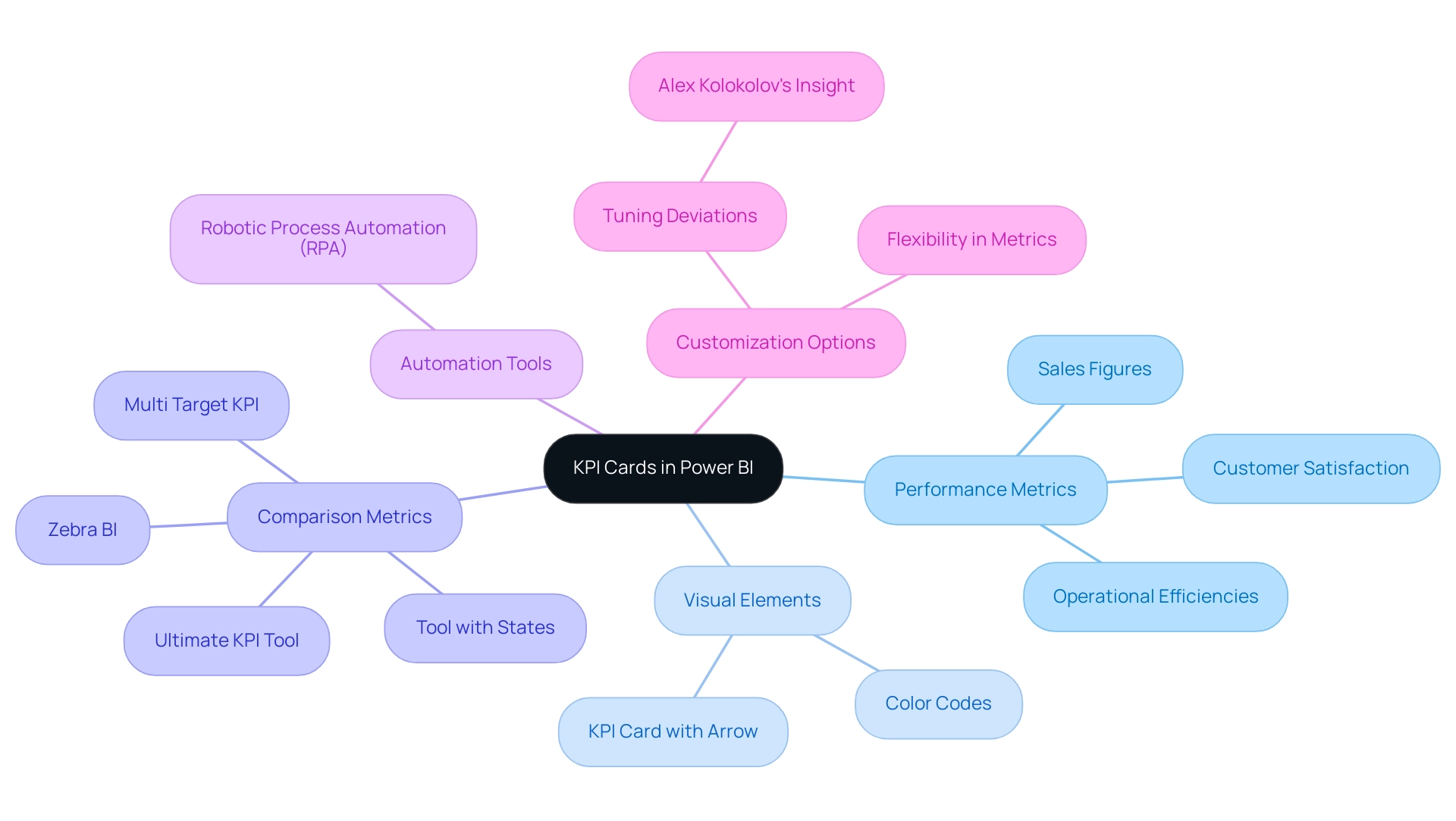
The power bi kpi card with arrow is an essential tool in Power BI for organizations aiming to present critical performance metrics succinctly and effectively. By showcasing key indicators such as sales figures, customer satisfaction ratings, or operational efficiencies, these tools enable a quick evaluation of progress toward specific goals. With visual elements like color codes and a power bi kpi card with arrow, KPI displays convey performance trends at a glance, allowing stakeholders to effortlessly identify successes and areas for improvement.
The Multi Target KPI and Zebra BI visuals exemplify this trend, enabling individuals to incorporate up to three additional metrics for comparative analysis, significantly enhancing the analytical capabilities of these tools. Furthermore, leveraging tools like Robotic Process Automation (RPA) alongside Power BI can automate manual workflows, driving operational efficiency and enabling organizations to focus on strategic initiatives. RPA streamlines repetitive tasks, reducing the time spent on manual processes and minimizing errors, which is crucial in today’s fast-paced business environment.
However, it is important to note that while these selected KPI displays received high ratings, they are not universally suitable for all users. Recent statistics indicate that KPI tools like the Ultimate KPI Tool and Tool with States have achieved ratings of over 6 out of 9, underscoring their effectiveness in providing actionable insights. As highlighted in the case study titled ‘Adding Additional Metrics to KPI Cards,’ the power bi kpi card with arrow allows for the addition of multiple metrics, which enhances comparative analysis and demonstrates the critical importance of flexibility in performance monitoring.
As Alex Kolokolov aptly states, ‘One significant aspect of customization is the ability to finely tune how deviations are represented,’ reinforcing the value of adaptable KPI displays. The effective use of KPI tools is not just beneficial; it is critical for data-driven decision-making, as they enable organizations to interpret vital insights rapidly without wading through complex reports. By embracing these tools, including Power BI and RPA solutions, businesses can enhance their operational performance metrics and make informed decisions that drive success.
Additionally, tailored AI solutions can assist organizations in navigating the overwhelming AI landscape, ensuring they adopt the right technologies that align with their specific business goals and challenges.
The Role of Arrows in Enhancing KPI Visualization
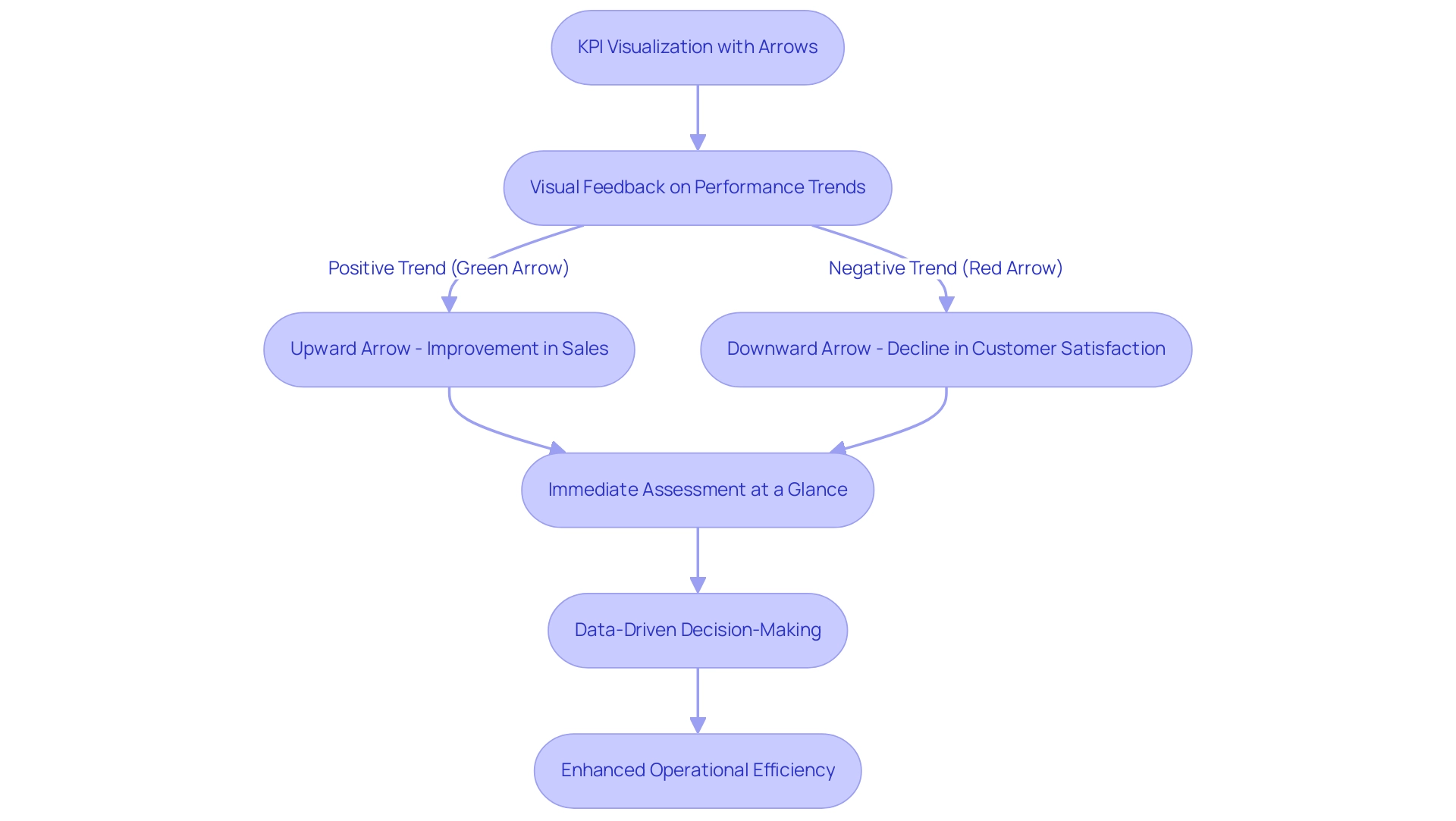
Incorporating arrows into a Power BI KPI card with arrow significantly enhances its effectiveness by providing immediate visual feedback on performance trends. Research suggests that visual indicators can enhance understanding of information, with studies demonstrating that individuals are 30% more likely to accurately interpret information when visual cues are utilized. For instance, a Power BI KPI card with arrow clearly signifies an improvement in sales figures with an upward arrow, while a downward arrow on the same card may alert stakeholders to a decline in customer satisfaction.
This straightforward representation enables users to assess performance at a glance without the need for deep analysis.
Moreover, employing a Power BI KPI card with arrow enhances this clarity; green arrows typically symbolize positive trends, while red arrows highlight areas requiring attention. As pointed out by visualization specialists, “But it’s not just about making information look good—it’s about making it understandable and actionable.” This strategic use of a Power BI KPI card with arrow not only sharpens performance tracking but also fosters a culture of data-driven decision-making within organizations.
However, businesses must also navigate the challenges associated with KPI dashboards, such as time-consuming report creation, data inconsistencies, and a lack of actionable guidance. These challenges can hinder the effective use of Business Intelligence tools like Power BI, where the role of RPA becomes crucial. By utilizing solutions like EMMA RPA and Power Automate to automate repetitive tasks, organizations can ensure insights are readily accessible and actionable.
This approach not only enhances overall operational efficiency and responsiveness to emerging challenges but also addresses the competitive disadvantage that arises from struggling to extract meaningful insights, driving growth and innovation.
Best Practices for Implementing KPI Cards with Arrows
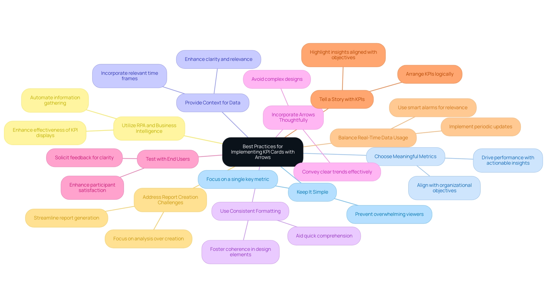
When implementing KPI indicators with arrows in Power BI, adherence to key best practices can significantly enhance their effectiveness:
- Keep It Simple: Focus each KPI card on a single key metric to prevent overwhelming viewers with excessive information. This clarity is crucial for effective decision-making, particularly in an environment where businesses risk falling behind due to ambiguous insights.
- Choose Meaningful Metrics: Ensure that selected KPIs are closely aligned with organizational objectives and yield actionable insights that drive performance. Metrics should reflect the strategic goals of the business, addressing the challenges of data inconsistency highlighted in common reporting practices.
- Provide Context for Data: Incorporate relevant time frames and current trends to enhance the clarity and relevance of the KPI displays, allowing for better decision-making and overcoming the pitfalls of typical report creation.
- Use Consistent Formatting: Consistency in design elements, such as font sizes and colors, across all KPI cards fosters coherence and aids in quick comprehension, which is crucial for stakeholders seeking clear guidance from their data.
- Incorporate Arrows Thoughtfully: In the Power BI KPI card with arrow, ensure they convey clear trends effectively while avoiding complex designs or excessive colors that could confuse users. The visual representation of data should be directly proportional to the numerical quantities represented, as emphasized by Edward Tufte.
- Test with End Users: Solicit feedback from stakeholders regarding the clarity and utility of the KPI cards. This iterative process allows for adjustments that enhance participant satisfaction and engagement, addressing the need for actionable guidance in reporting.
- Tell a Story with KPIs: Arrange KPIs logically to narrate a story that highlights insights and aligns with strategic business objectives, thus transforming raw data into actionable insights that drive growth.
- Balance Real-Time Data Usage: Referencing the case study titled ‘Managing Real-Time Data Usage,’ it is important to implement periodic updates and smart alarms to ensure dashboards remain relevant without overwhelming users with constant changes.
- Address Report Creation Challenges: Recognize that the process of creating reports can be time-consuming; implementing KPI visuals can streamline this process, allowing teams to focus more on analysis rather than report generation.
- Utilize RPA and Business Intelligence: Incorporate RPA solutions to automate information gathering and reporting processes, enhancing the effectiveness of KPI displays and ensuring that insights are readily accessible for decision-making.
By following these practices, organizations can develop KPI displays that are not only visually appealing but also serve as impactful tools for performance tracking, ultimately aligning insights with strategic business objectives and addressing the operational efficiencies needed for growth.
Customizing Your KPI Cards for Maximum Impact
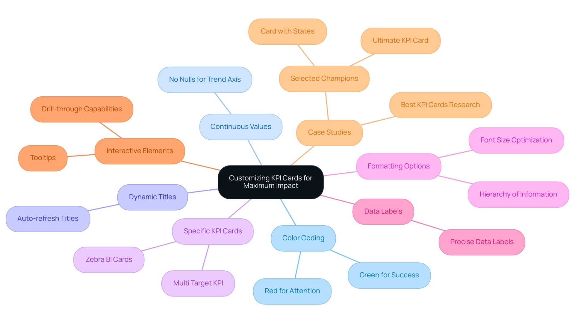
Customizing a power bi kpi card with arrow is essential for maximizing their effectiveness and enabling improved information interpretation, especially in a landscape where utilizing Business Intelligence and RPA can drive substantial operational efficiency and growth. Here are several key customization strategies:
-
Color Coding: Employ colors thoughtfully to represent various performance levels—green typically denotes success, while red highlights areas requiring immediate attention.
This visual difference helps individuals in swiftly evaluating information health. -
Continuous Values: Ensure that continuous values without nulls are used for the trend axis to display effectively in a KPI.
This is essential for precise trend analysis and decision-making, particularly in the context of overcoming inconsistencies. -
Dynamic Titles: Employ dynamic titles that automatically refresh to represent the current context, ensuring relevance and boosting engagement with the metrics shown.
-
Specific KPI Cards: Consider utilizing a power bi kpi card with arrow, along with Multi Target KPI and Zebra BI cards, which enable individuals to include up to three extra metrics for improved comparative analysis.
This capability can significantly enhance the depth of insights obtained from the information, addressing the challenges of time-consuming report creation. -
Formatting Options: Tailor font sizes and styles to optimize readability.
Larger fonts can be used to emphasize critical metrics, while smaller fonts are suitable for supplementary details, maintaining a clear hierarchy of information. -
Data Labels: Incorporate precise data labels adjacent to trend arrows, allowing individuals to view exact figures alongside visual representations.
This feature enhances clarity and supports informed decision-making. -
Interactive Elements: Enhance user experience by adding tooltips or drill-through capabilities, which provide context and deeper insights when users engage with KPI displays.
This interactivity is crucial for extracting actionable insights. -
Case Studies: Referencing research into the strengths and limitations of various KPI tools can provide valuable insights into customization strategies.
For instance, the selected champions—Multi Target KPI, Ultimate KPI Card, and Card with States—each received high ratings but vary based on individual needs and budget considerations.
Furthermore, incorporating RPA can automate repetitive tasks associated with information gathering and reporting, simplifying the customization process of KPI displays.
By effectively personalizing KPI displays, such as the power bi kpi card with arrow, and leveraging RPA, organizations can create a more engaging and informative visualization experience, ultimately driving growth and innovation through actionable insights.
This emphasizes the importance of careful design in information presentation, especially in today’s information-rich environment.
Troubleshooting Common Issues with KPI Cards in Power BI
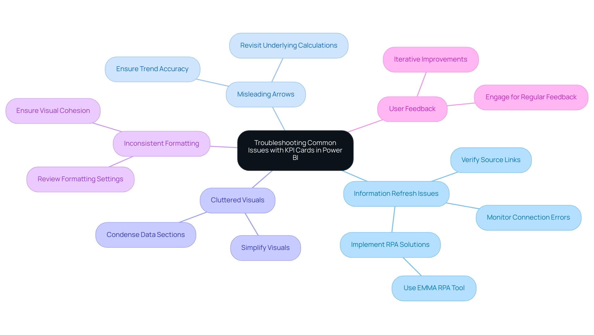
In the realm of Power BI, users frequently confront challenges when utilizing the power bi kpi card with arrow, which can hinder effective visualization and analysis. Here are essential troubleshooting tips to overcome these common issues:
-
Information Refresh Issues: Regularly verify that your sources are properly linked and updated.
Frequent refresh failures can lead to outdated metrics, impacting decision-making and placing your business at a competitive disadvantage. It is vital to monitor connection errors that may disrupt the flow of accurate information. Precise information is essential for efficient KPI utilization, as highlighted by Acceldata’s Data Observability Platform.
Moreover, implementing RPA solutions, such as the EMMA RPA tool, can automate data refresh tasks, reducing the burden on your team and ensuring timely updates.
-
Misleading Arrows: Inconsistencies in trend representation can create confusion. If the arrows on your power bi kpi card with arrow do not accurately reflect the intended trends, revisit the underlying calculations to ensure they align with the metrics you aim to communicate.
This attention to detail can enhance the reliability of the information presented, supporting better business decisions.
-
Cluttered Visuals: A disorganized KPI display can overwhelm individuals. Simplify your visuals by removing unnecessary elements and condensing data into fewer sections.
A cleaner design not only enhances readability but also aids in quicker decision-making, allowing teams to focus on actionable insights.
-
Inconsistent Formatting: Uniformity in design is critical for understanding. Review formatting settings across all KPI displays to ensure they are visually cohesive.
This consistency can help avoid confusion and improve overall usability, leading to better operational efficiency.
-
Engaging with individuals for regular feedback is crucial. Addressing usability concerns through iterative improvements based on user input can lead to a more effective power bi kpi card with arrow.
Organizations should cultivate a culture of open communication to refine their visual tools continually.
As an engaging context, the Power BI DataViz World Championships, scheduled from February 14 to March 31, present four opportunities for participants to showcase their skills and potentially win a conference package. This event highlights the importance of effective data visualization.
For instance, Walmart has effectively utilized inventory visualization in Power BI to minimize stockouts and reduce overstock, leading to improved supply chain efficiency. By proactively addressing these common issues and utilizing services like our 3-Day Power BI Sprint, organizations can create professional reports that facilitate better decision-making, ensuring that KPI Power BI dashboards are powered by accurate, timely, and reliable data—further supporting informed choices and unlocking the potential for growth and innovation.
Conclusion
KPI cards in Power BI are indispensable tools for modern organizations aiming to enhance their performance tracking and decision-making capabilities. By providing a clear and concise visualization of key performance indicators, these cards enable stakeholders to assess progress towards goals quickly. The incorporation of visual elements such as arrows and color coding further enriches the user experience, allowing for immediate recognition of trends and areas that require attention.
However, the effectiveness of KPI cards relies heavily on thoughtful implementation and customization. Best practices, such as:
- Simplicity in design
- Meaningful metric selection
- Consistent formatting
are crucial for optimizing these tools. Additionally, the integration of Robotic Process Automation can streamline data collection and reporting processes, ensuring that insights are readily available and actionable.
In conclusion, organizations that leverage KPI cards effectively, while addressing common challenges, position themselves for strategic growth and operational efficiency. By embracing these tools and adopting best practices, businesses can transform raw data into actionable insights, fostering a culture of data-driven decision-making that is essential for success in today’s competitive landscape. The future of performance monitoring lies in the ability to customize and adapt these visual tools, ensuring they meet the unique needs of each organization.
Overview
The article provides a comprehensive guide on using the Power BI IF statement with text, detailing its syntax, applications, and troubleshooting strategies. It emphasizes the importance of mastering this function for effective data analysis and reporting, illustrating its utility through practical examples and addressing common pitfalls to enhance user efficiency in business intelligence tasks.
Introduction
In the realm of data analysis, Power BI emerges as a powerful ally for organizations striving to make sense of their data. At the heart of this tool lies the IF statement, a fundamental function that empowers users to perform logical tests and generate tailored outputs based on specific conditions. With its simple yet effective syntax, the IF statement allows for dynamic reporting that adapts to fluctuating data trends, making it indispensable in today’s fast-paced business landscape.
As companies increasingly rely on data-driven strategies, mastering this function not only enhances reporting accuracy but also addresses common challenges like time-consuming report creation and data inconsistencies. This article delves into the intricacies of the IF statement, exploring its syntax, applications, and the potential of nested IF statements and alternative functions like SWITCH, all aimed at enhancing data manipulation and decision-making processes.
Understanding the IF Statement in Power BI
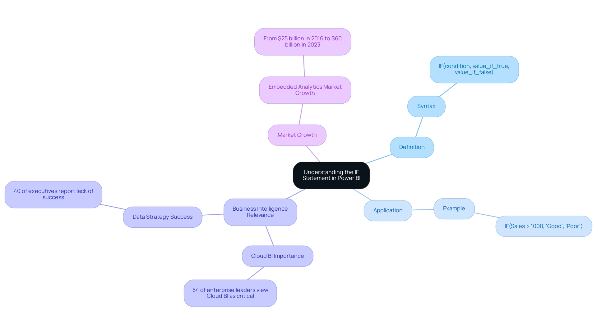
The power bi if statement with text serves as a vital function for conducting logical tests and generating specific outputs based on the evaluation of conditions. Its straightforward syntax—IF(condition, value_if_true, value_if_false)—makes it accessible for users looking to enhance their analysis capabilities using a power bi if statement with text. For example, to evaluate sales performance, one could utilize a Power BI IF statement with text like IF(Sales > 1000, 'Good', 'Poor'), effectively categorizing results based on performance thresholds.
This fundamental comprehension is crucial, as it enables users to create flexible documents that adjust to changes in information. Considering that 54% of enterprise leaders view Cloud BI as essential for strategic initiatives, mastering functions like IF expressions becomes even more relevant, particularly as 40% of executives feel their organizations’ information strategies have not produced success. The capacity to implement a power bi if statement with text can significantly enhance reporting accuracy and decision-making processes, thereby addressing the challenges of time-consuming report creation and information inconsistencies.
Furthermore, the projected growth of the embedded analytics market, from $25 billion in 2016 to $60 billion in 2023, underscores the necessity of making BI tools like BI more accessible and user-friendly. The growing presence of Chief Information Officers in sectors like insurance and banking further emphasizes the essential function of information roles in driving successful strategies. To explore how our BI services can enhance your reporting capabilities, including our 3-Day BI Sprint and General Management App, please check our Actions portfolio and consider booking a free consultation.
Mastering the Syntax of IF Statements
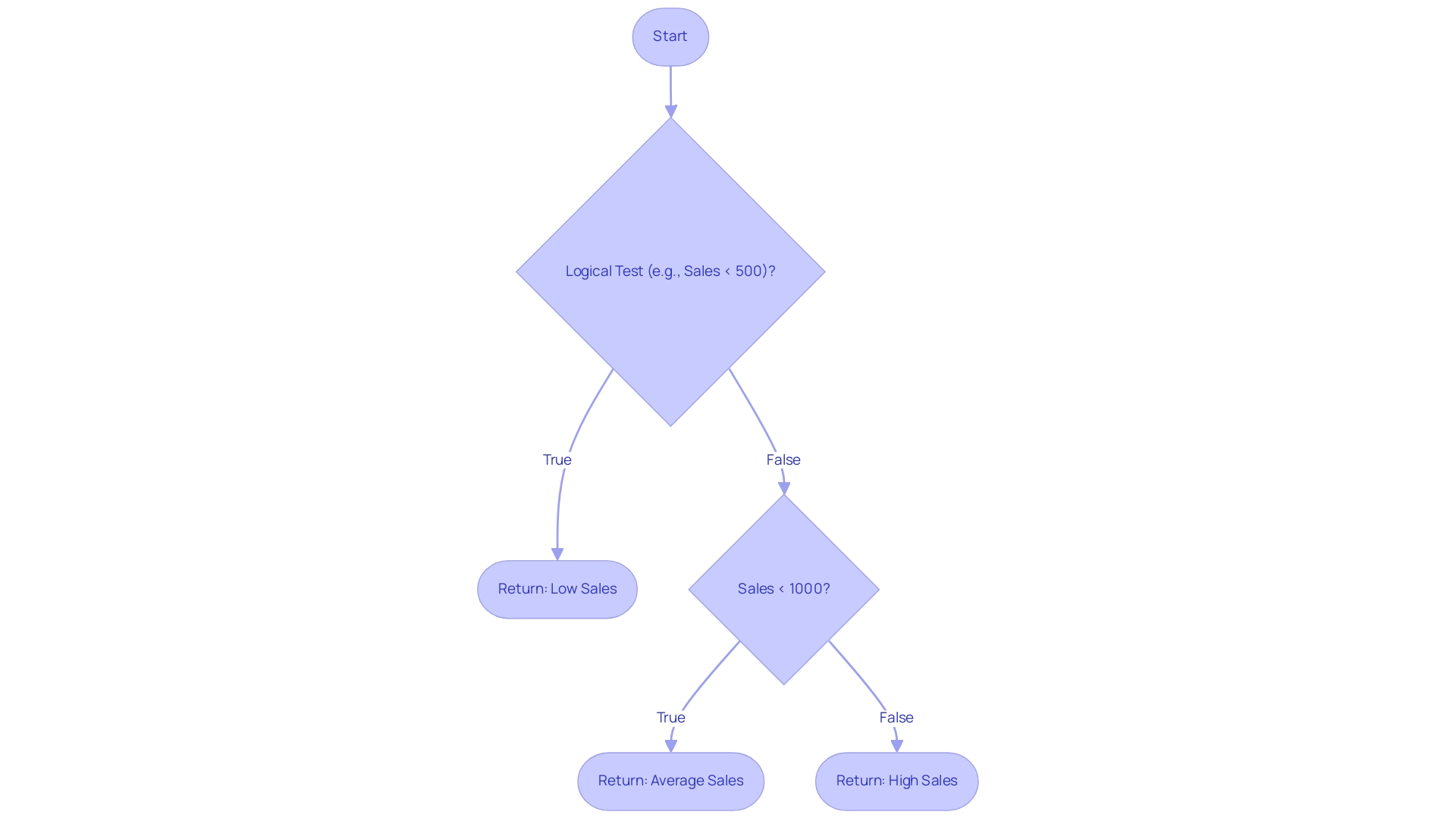
Grasping the syntax of the Power BI if statement with text is crucial for efficient data handling, especially in light of the typical difficulties of lengthy report generation, data inconsistencies, and the absence of a governance strategy. The fundamental structure of a Power BI if statement with text is straightforward: IF(<logical_test>, <value_if_true>, <value_if_false>). It is crucial to ensure that the logical test in a Power BI if statement with text is a condition recognizable by Power BI, such as Sales < 500.
In a Power BI if statement with text, the results returned can be text, numbers, or other expressions. For instance, consider the expression: IF(Sales < 500, "Low Sales", IF(Sales < 1000, "Average Sales", "High Sales")), which is an example of a Power BI IF statement with text. This example illustrates how to nest conditions within a single IF clause, which not only enhances your document’s functionality but also tackles the issue of delivering clear, actionable insights amidst complex data.
A common mistake to avoid in a Power BI if statement with text is neglecting to enclose text values in double quotes, which may lead to errors in your DAX expressions. Additionally, it is important to remember that when comparing values, ensure you are using single values rather than entire columns, as this can lead to errors in your calculations. As Nathaniel, a Super User, notes,
Try ‘if’ in M language which is what Power Query uses.
Or try using a conditional column rather than a custom column. This advice emphasizes the significance of employing the appropriate tools and techniques to master IF syntax effectively, thus enhancing your efficiency in report generation. Moreover, examine the case study named “Power BI IF Statement with Text,” which demonstrates how to classify employees according to their experience levels, offering a practical illustration of how the Power BI IF statement with text can be utilized in real-world situations and how mastering it can assist in alleviating problems associated with inconsistencies and improving governance strategies.
Lastly, for those interested in enhancing their BI skills, use code MSCUST for a $150 discount on registration.
Utilizing Nested IF Statements for Complex Logic
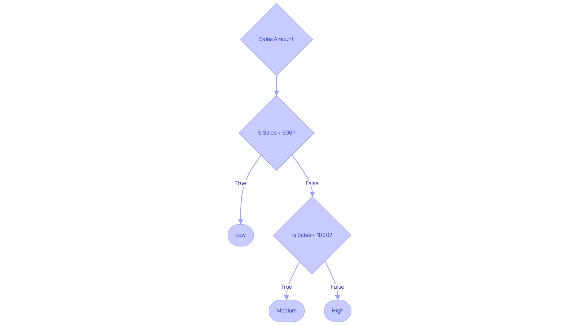
Power BI if statement with text is essential when using nested IF functions, especially for managing multiple criteria for categorization. For example, consider the scenario where you want to classify sales performance into tiers such as ‘Low’, ‘Medium’, and ‘High’. This can be achieved by using a power bi if statement with text through nested IF conditions, utilizing the formula:
IF(Sales < 500, 'Low', IF(Sales < 1000, 'Medium', 'High'))
This structured approach permits logical categorization based on defined thresholds, enhancing the clarity of your analysis. In today’s data-rich environment, the struggle to extract meaningful insights can leave your business at a competitive disadvantage. Effectively employing BI methods like nested IF conditions is crucial to address challenges such as time-consuming report generation and inconsistencies, which can impede informed decision-making.
RPA solutions, such as EMMA RPA and Microsoft’s Power Automate, can further enhance operational efficiency by automating repetitive tasks, allowing teams to focus on deriving insights from data rather than getting bogged down in manual processes. Similar techniques can also be applied to categorize employees into career levels based on their years of experience, showcasing the versatility of nested IF constructs. However, it’s important to exercise caution when creating nested statements, as excessive complexity can lead to difficulties in readability and maintenance.
As Denys Arkharov, a BI Engineer at Coupler.io, emphasizes, ‘effective data manipulation is key to successful analysis.’ Strive for clarity in your logic to avoid pitfalls associated with convoluted expressions. Additionally, consider the case study on creating a new column in Power BI that uses a power bi if statement with text to assign the value ‘Good’ based on specific conditions, which illustrates the practical application of complex logic in DAX.
By doing so, you not only improve the performance of your DAX formulas but also ensure that your reports remain user-friendly and efficient, ultimately driving business growth and innovation.
Exploring the SWITCH Function as an Alternative
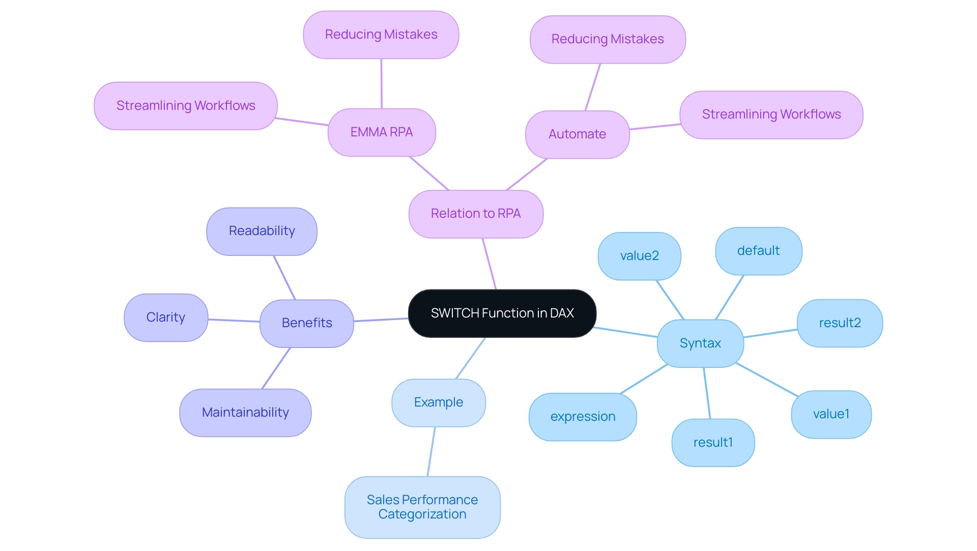
The SWITCH function serves as a powerful tool for simplifying DAX expressions, particularly when evaluating multiple conditions. Its syntax is structured as follows: SWITCH(expression, value1, result1, [value2, result2], …, [default]). For instance, when categorizing sales performance, you could implement it like this: SWITCH(TRUE(), Sales < 500, 'Low', Sales < 1000, 'Medium', 'High').
This method enhances the clarity of your code and offers a straightforward alternative to nested IF statements, making it easier to implement a power bi if statement with text, which improves both readability and maintainability in your DAX calculations. As Luca Liu, a passionate BI Developer, aptly states,
- Simplifying expressions is essential for effective analysis.
This perspective underscores the value of leveraging the SWITCH function in BI to enhance operational efficiency and user engagement.
In the context of Robotic Process Automation (RPA), tools like EMMA RPA and Automate can further streamline workflows, reduce mistakes in information processing, and automate repetitive tasks that hinder productivity. For practical applications, the case study titled ‘Power BI Dashboards vs Reports: A Comprehensive Guide’ provides valuable insights into utilizing these functions effectively in real-world scenarios, addressing challenges such as time-consuming report creation and inconsistencies in information. By combining RPA with BI techniques, organizations can convert raw information into actionable insights, ultimately driving growth and innovation.
Practical Examples of IF Statements with Text
Using a Power BI IF statement with text can significantly enhance analysis efficiency, especially when paired with Robotic Process Automation (RPA) strategies. RPA not only streamlines these processes but also reduces errors, allowing teams to focus on more strategic, value-adding activities. For instance, Coupler.
Io can replace multiple dependencies from custom connectors and API calls, enabling smoother and more efficient management. Here are several practical examples:
-
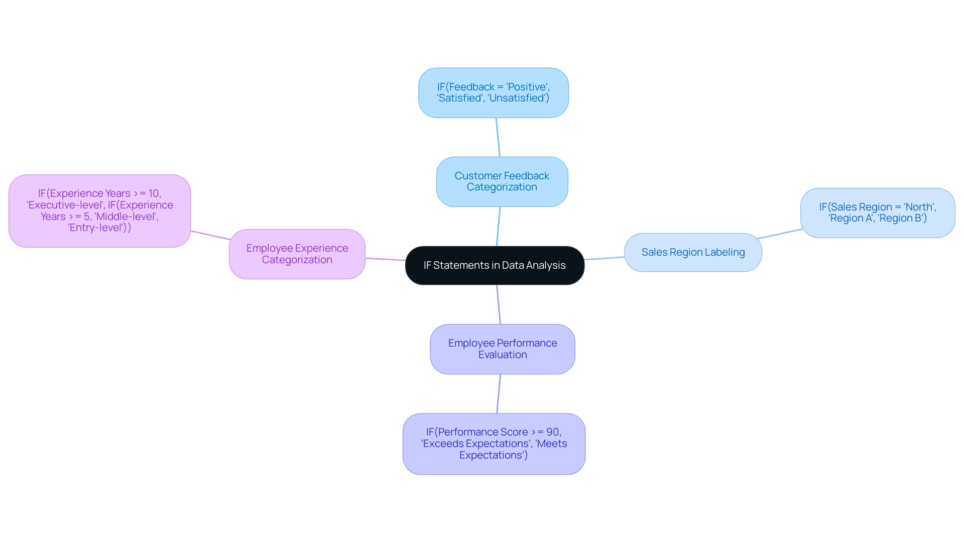
Categorizing Customer Feedback: You can use the formula
IF(Feedback = "Positive", "Satisfied", "Unsatisfied")to quickly assess customer satisfaction levels.
This allows businesses to pivot strategies based on real-time feedback, crucial in a rapidly evolving AI landscape. -
Labeling Sales Regions: By applying
IF(Sales Region = "North", "Region A", "Region B"), organizations can effectively segment their data for in-depth analysis and targeted marketing efforts. -
Employee Performance Evaluation: The expression
IF(Performance Score >= 90, "Exceeds Expectations", "Meets Expectations")categorizes employee performance, offering valuable insights that can inform strategic decisions regarding talent management and resource allocation.
Additionally, a relevant case study titled “Power BI IF Statement with Text” demonstrates how to implement a Power BI IF statement with text that categorizes employees into ‘Executive-level’, ‘Middle-level’, or ‘Entry-level’ based on their years of experience in the current domain.
These techniques illustrate the power of categorization in analytics, which is pivotal for driving business growth and operational efficiency. However, challenges such as time-consuming report creation, inconsistencies, and lack of actionable guidance can hinder effective insights from BI dashboards. As emphasized by Denys Arkharov, effective data categorization is critical in overcoming these challenges.
With over 40 years of experience in Machine Learning, AI, and Statistics, Statology’s team provides a credible foundation for these insights, reinforcing the importance of integrating BI with RPA to enhance operational effectiveness.
Troubleshooting Common Issues with IF Statements
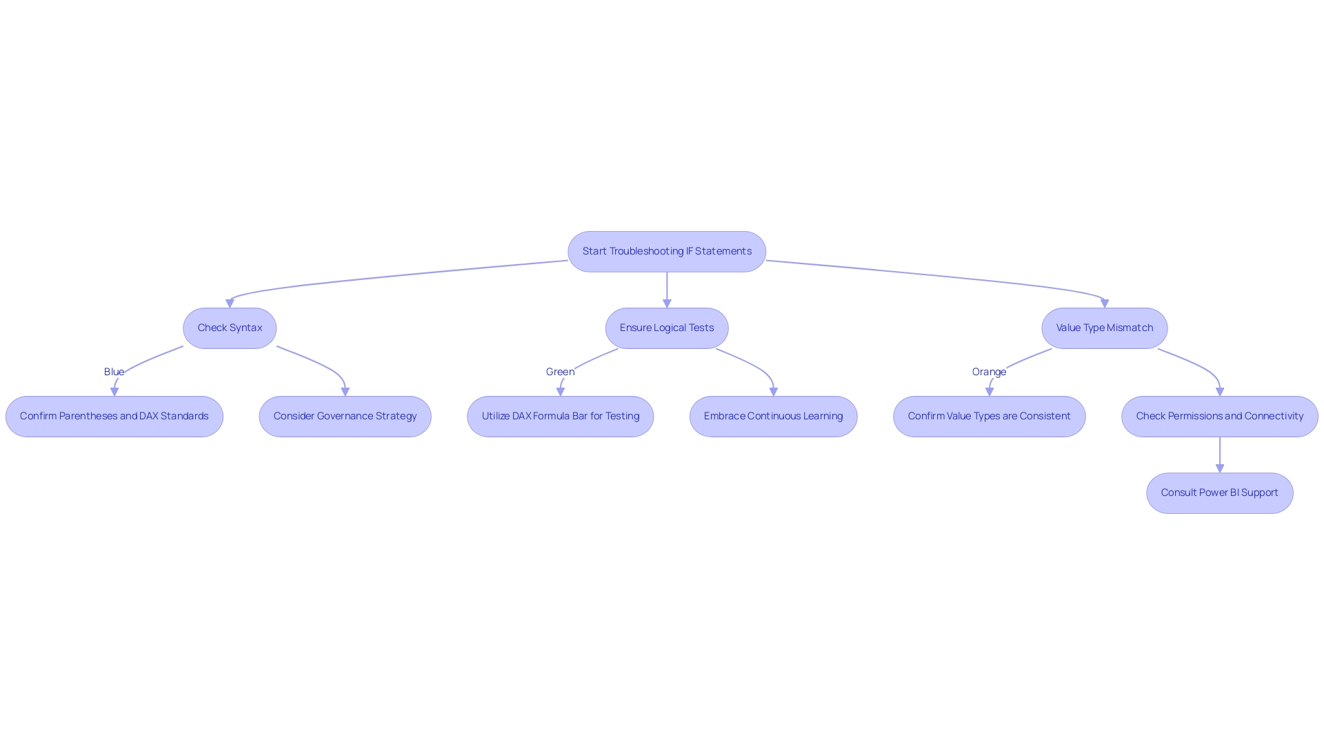
Common pitfalls when using a Power BI IF statement with text often include syntax errors, logical inconsistencies, and unexpected results. With over 3,132 users online, these issues are prevalent and can significantly affect accuracy, ultimately hindering the ability to leverage insights effectively. To address the common challenges of time-consuming report creation, inconsistencies, and a lack of actionable guidance, consider the following troubleshooting strategies:
- Check Syntax: Confirm that all parentheses are in their correct positions and that the syntax adheres to DAX standards when implementing a Power BI IF statement with text.
- When using a Power BI IF statement with text, ensure that your logical tests accurately reflect the conditions you wish to evaluate.
- Utilize the DAX formula bar for testing your expressions to identify any discrepancies.
- Value Type Mismatch: Confirm that the values being compared in your Power BI IF statement with text are of the same type, such as ensuring text is not mixed with numbers.
Understanding the difference between M language and DAX is also crucial, as highlighted by Phil Thomas’s inquiry, underscoring the importance of these languages in troubleshooting IF statements. Furthermore, establishing a strong governance strategy can avert inconsistencies and promote confidence in your documents. Embracing continuous learning is vital in overcoming these challenges in Power BI, as the digital landscape is ever-evolving.
As Zhengdong Xu highlights,
This is a dialectical question. Just as @Alex87 said, the use of variables is important. Variables can enhance performance by avoiding redundant calculations.
Furthermore, attention to detail in permissions and connectivity can prevent issues, as illustrated in the case study on publishing problems. By systematically checking these aspects and transforming raw data into actionable insights, you can resolve issues efficiently, improve the overall accuracy and performance of your reports, and effectively harness Business Intelligence for informed decision-making that drives growth and innovation.
Conclusion
Mastering the IF statement in Power BI is crucial for any organization aiming to leverage data effectively. This powerful function allows users to conduct logical tests and generate tailored outputs, enhancing reporting accuracy and decision-making processes. The article has examined the syntax of the IF statement, the potential of nested IF statements for complex logic, and the advantages of alternative functions like SWITCH, all of which are essential for navigating the challenges of data manipulation.
Moreover, the integration of Robotic Process Automation (RPA) can significantly streamline data processes, enabling teams to shift their focus from manual tasks to strategic insights. Practical examples, such as:
- Categorizing customer feedback
- Evaluating employee performance
illustrate how these functions can drive actionable insights and improve operational efficiency.
In today’s data-driven landscape, the ability to utilize IF statements effectively is not just a technical skill but a strategic advantage that can set organizations apart. By embracing these techniques, businesses can transform their data into a powerful asset, fostering growth and innovation in an increasingly competitive environment. The commitment to mastering these tools ultimately paves the way for enhanced data governance and more informed decision-making, ensuring that organizations remain agile in the face of ever-evolving market demands.
Overview
The article addresses the key differences between Power BI duplicate and reference queries, highlighting their distinct functionalities and implications for data management. It explains that duplicate queries create independent copies of original requests for isolated analysis, while reference queries maintain a live link to the original, ensuring real-time updates and consistency across reports, thereby optimizing workflows and enhancing operational efficiency.
Introduction
In the realm of data analysis, understanding the intricacies of query management within Power BI is paramount for organizations striving to harness the full potential of their data. This article delves into the critical differences between duplicate and reference queries, illuminating how each serves distinct purposes in data transformation and modeling.
While duplicate queries allow for independent manipulation of data, preserving the integrity of the original source, reference queries ensure real-time updates that enhance consistency across reports. As the demand for efficient data management rises, particularly with the projected increase in Power BI query usage, mastering these query types becomes essential for optimizing workflows and driving informed decision-making.
Through a combination of best practices and the integration of Robotic Process Automation (RPA), organizations can streamline their processes, reduce redundancy, and ultimately transform raw data into actionable insights that propel business growth.
Understanding Duplicate and Reference Queries in Power BI
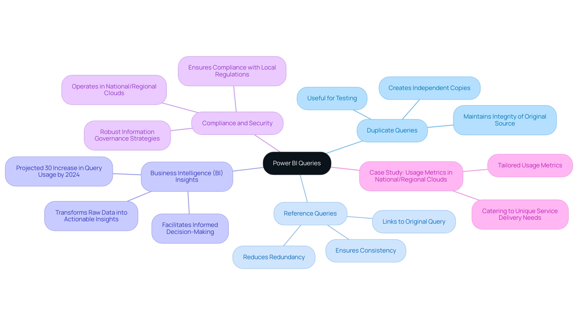
Requests play a crucial role in information transformation and modeling within Power BI, making it vital for users to understand the distinctions in Power BI duplicate vs reference requests. Repeated requests produce a precise copy of a current request, allowing users to handle information separately while maintaining the integrity of the initial source. This feature is particularly beneficial for testing and experimenting with different information scenarios, addressing common challenges such as time-consuming report creation.
On the other hand, citation inquiries create a new request that directly pertains to the original. Therefore, any alterations made to the original query will automatically propagate to the reference query, ensuring consistency and reducing redundancy, which is vital for overcoming inconsistencies and enhancing actionable insights. Comprehending these differences is essential for optimizing workflows and improving management strategies within BI.
Furthermore, leveraging Business Intelligence (BI) can transform raw data into actionable insights, facilitating informed decision-making that drives growth. RPA solutions can also streamline processes, reducing the time spent on report creation and minimizing errors, thus enhancing overall operational efficiency. Statistics indicate that BI query usage is projected to rise by 30% in 2024, emphasizing the necessity for efficient query management to support data-driven decision-making.
Additionally, Power BI operates in separate national/regional clouds, ensuring compliance with local regulations while providing the same security and privacy as the global version. This is especially pertinent for organizations needing to adhere to specific residency requirements. A case study titled ‘Usage Metrics in National/Regional Clouds’ highlights how usage metrics are tailored to these unique service delivery needs, reinforcing the importance of robust information governance strategies.
Douglas Rocha, a data science enthusiast, aptly summarizes this need:
Can you do statistics in BI without DAX? Yes, you can, you can do it without measures as well and I will teach you how at the end of this tutorial.
By mastering both Power BI duplicate vs reference requests, users can harness the full potential of BI’s capabilities, ultimately driving operational efficiency and business growth.
Key Characteristics of Duplicate Queries
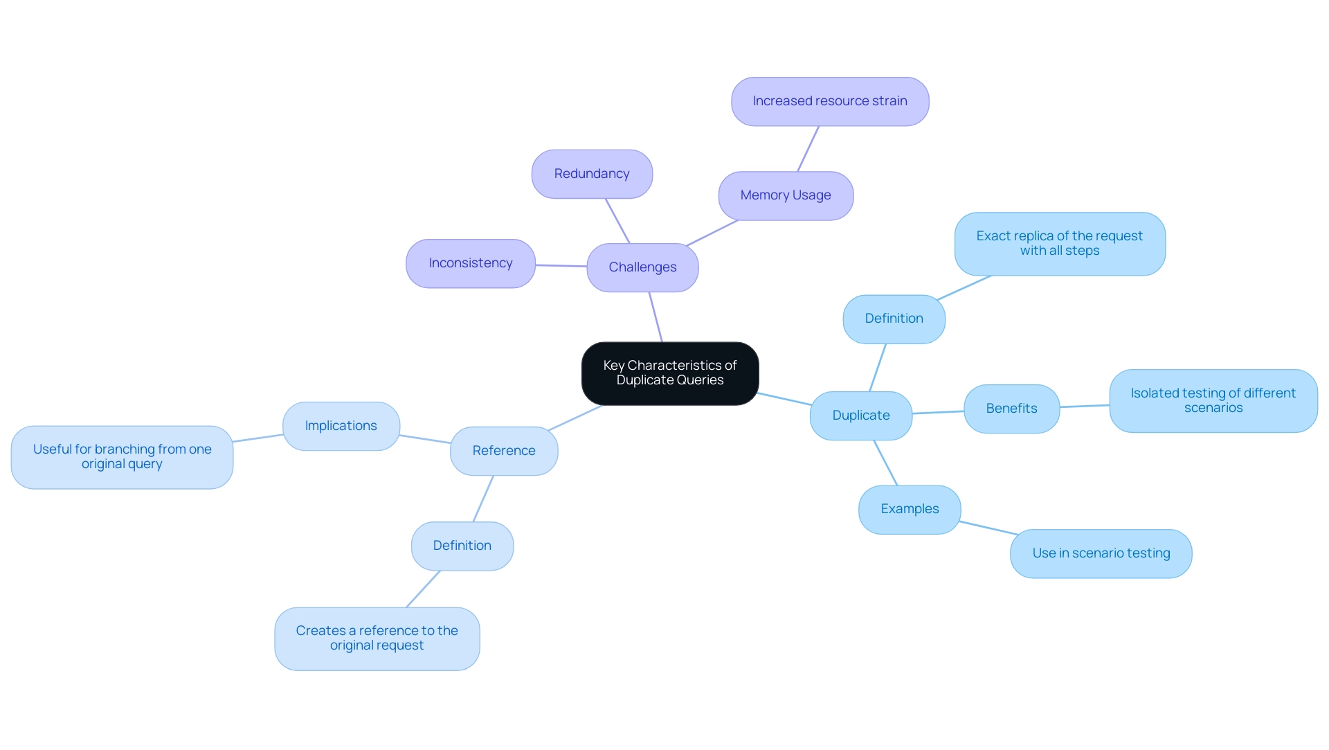
In the analytics tool, replicated requests stand out due to their complete independence from the initial request, allowing users to explore various transformations or analyses without jeopardizing the integrity of the original dataset. However, many organizations face challenges in leveraging insights effectively, often spending more time constructing reports than extracting value from Power BI dashboards. As Caitlyn from the Community Support Team explains, ‘In Power BI duplicate vs reference, these are two different actions, and they are also different from Copy and Paste of a request.’.
In the context of Power BI duplicate vs reference:
- Duplicate will provide you an exact replica of the request with all steps.
- Reference will establish a reference to the original request instead as a new request.
Although this functionality is advantageous for analysts wishing to test different scenarios, it can exacerbate issues like inconsistencies and a lack of clear, actionable guidance if not managed carefully. Unrestrained use of duplicate queries may lead to redundancy and significantly increased memory usage. Each duplicate retains its own distinct information set, which can strain system resources if not managed judiciously.
This can further complicate efforts to provide stakeholders with clear next steps, as the proliferation of information can obscure actionable insights. For instance, each Report ObjectId is uniquely represented by a 32 hexadecimal GUID, emphasizing the technical aspects of Power BI’s management capabilities. Comprehending these implications is essential for sustaining efficiency in analysis workflows.
A practical example of addressing these challenges is illustrated in the case study on Usage Metrics in National/Regional Clouds, which demonstrates how organizations can effectively utilize duplicate requests while ensuring compliance with local regulations and providing clear guidance to stakeholders.
Distinct Features of Reference Queries
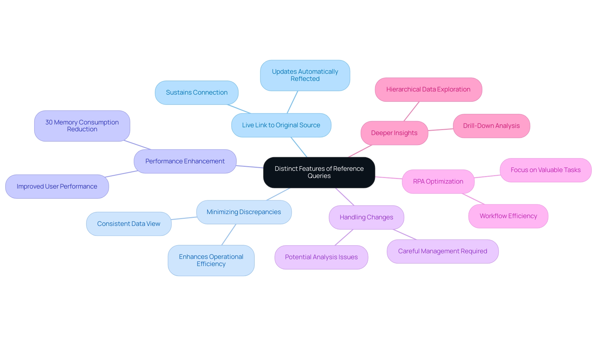
In the context of power bi duplicate vs reference, reference requests fulfill an important role by sustaining a live link to the original information source, which is vital for addressing technology implementation obstacles. This functionality ensures that any updates or modifications made to the source are automatically reflected in the reference query, providing a consistent and accurate view across all reports and dashboards. Such capabilities are particularly beneficial in fast-paced environments where data is frequently updated, as they minimize discrepancies and enhance operational efficiency.
Additionally, leveraging Business Intelligence tools like Power BI can drive data-driven insights that are vital for business growth. By employing lookup searches, organizations can decrease memory consumption by as much as 30%, thereby enhancing performance for users. However, it is essential to handle the power bi duplicate vs reference feature carefully; changes to the original request can disturb the established connection, leading to potential issues in analysis and reporting.
Moreover, Robotic Process Automation (RPA) can optimize workflows related to inquiries, enabling teams to concentrate on more valuable tasks while ensuring information accuracy and consistency. Microsoft Data Platform MVP Paul Turley emphasizes the practical uses of lookup requests, stating, ‘I wanted to share the outcomes of a few experiments I recently carried out with one of my favorite sets of example information,’ which highlights the importance of this feature in a dynamic business environment. The case study named ‘Using Groups for Better Analysis‘ demonstrates how inquiries can promote deeper examination by establishing hierarchies, allowing users to conduct drill-down analysis and obtain more profound insights into their information.
By tackling the challenges of extracting meaningful insights, RPA and BI tools such as BI together enable organizations to make informed decisions that drive growth and innovation.
Practical Implications of Using Duplicate vs Reference Queries
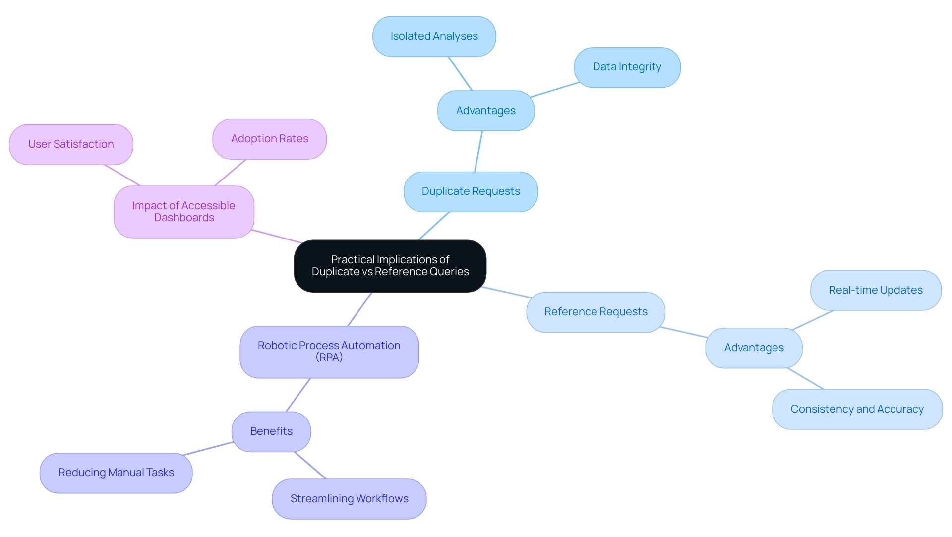
When organizations assess whether to implement the Power BI duplicate vs reference requests in Power BI, it is crucial to align these decisions with specific information management goals. In the context of Power BI duplicate vs reference:
- Duplicate requests are particularly advantageous for conducting isolated analyses, as they allow users to manipulate data without affecting the original dataset, fostering innovative insights while ensuring data integrity.
- Conversely, reference requests are optimal when real-time updates across multiple reports are crucial, promoting consistency and accuracy vital for informed decision-making.
The incorporation of Robotic Process Automation (RPA), featuring tools such as EMMA RPA and Automate, can also improve these processes, automating manual workflows and decreasing the time spent on repetitive tasks. For instance, the recent case study titled ‘Semantic Model Performance in Fabric and BI’ demonstrated how different query types can significantly impact performance metrics and inform future BI architecture decisions. By understanding these distinctions and leveraging RPA alongside Business Intelligence, organizations can streamline their workflows, optimize resource allocation, and enhance overall operational efficiency in Power BI, particularly in the context of Power BI duplicate vs reference.
Furthermore, failing to implement RPA or effective Business Intelligence can leave organizations at a competitive disadvantage, as the inability to extract meaningful insights from information hampers growth and innovation. With over 2 million hits on our blog, the significance of these insights is highlighted, stressing the importance of selecting the appropriate strategy. As research indicates, accessible dashboards enhance user satisfaction and adoption rates, making effective management strategies not only inclusive but also essential for assisting users to perform on the same levels as their able peers.
Best Practices for Managing Duplicate and Reference Queries in Power BI
Effectively handling requests related to power bi duplicate vs reference in Power BI is crucial for optimizing performance and improving operational efficiency. Here are essential best practices to consider:
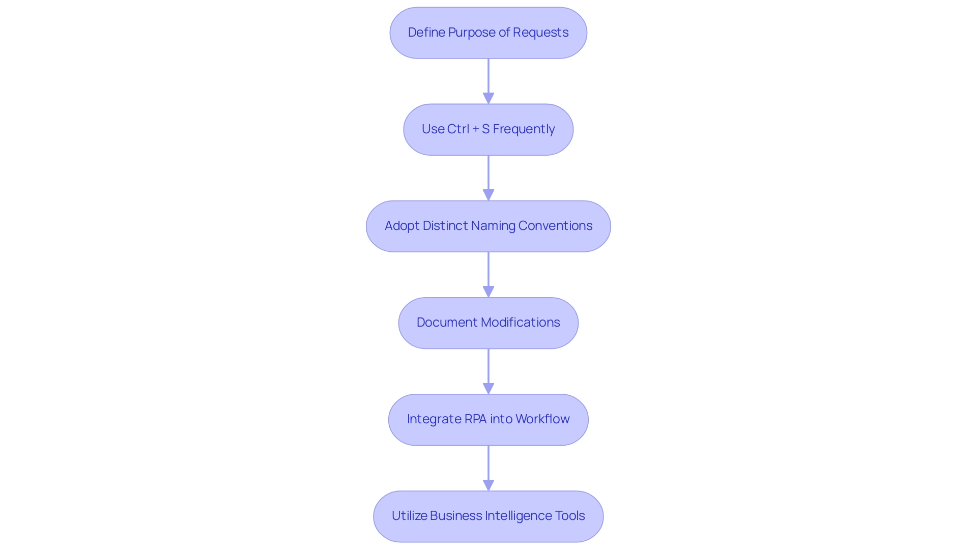
- Clearly define the purpose of each type of request before creation, ensuring that the distinction between power bi duplicate vs reference requests is well understood to avoid unnecessary repetition.
- Adopt the habit of using Ctrl + S frequently, especially after completing key steps in your report development, to facilitate regular reviews and clean up of unused items; this practice not only streamlines data management but also significantly boosts performance.
- Employ distinct naming conventions that distinguish between inquiries related to power bi duplicate vs reference, enabling simpler identification and management.
- Document any modifications made to original requests meticulously; this step is crucial to ensure that reference requests remain functional and up to date.
By integrating Robotic Process Automation (RPA) into your workflow, you can automate these management tasks, such as automatically identifying and merging duplicate queries, significantly reducing manual effort and error rates.
Furthermore, utilizing Business Intelligence tools will enable your team to derive actionable insights from the information handled in BI, improving informed decision-making. By adhering to these best practices and embracing RPA and Business Intelligence, organizations can significantly improve their data management strategies, leading to enhanced efficiency and operational growth in Power BI operations.
Conclusion
Understanding the differences between duplicate and reference queries in Power BI is essential for organizations aiming to enhance their data management strategies. Duplicate queries offer the flexibility to manipulate data independently, fostering innovation while preserving the integrity of the original dataset. On the other hand, reference queries ensure real-time updates and consistency across reports, which is vital in today’s fast-paced business environment where accuracy is paramount.
Implementing best practices, such as:
- Clearly defining the purpose of each query type
- Utilizing Robotic Process Automation
can significantly streamline workflows and reduce redundancy. As the demand for effective data analysis grows, especially with the projected increase in Power BI usage, mastering these query types will empower organizations to transform raw data into actionable insights that drive informed decision-making and foster business growth.
Ultimately, the strategic use of both duplicate and reference queries, combined with robust data governance and automation tools, will enhance operational efficiency and position organizations for success in an increasingly data-driven landscape. By embracing these practices, businesses can ensure they remain competitive and capable of leveraging their data to its fullest potential.
Overview
The article provides a comprehensive step-by-step guide on creating and utilizing funnel visuals in Power BI, emphasizing their significance in tracking and optimizing processes within business intelligence, particularly in sales and marketing contexts. It supports this by detailing the functionality of funnel charts, the importance of data accuracy, and customization strategies, along with best practices that enhance decision-making and operational efficiency through effective data visualization.
Introduction
In the realm of data visualization, funnel charts in Power BI have emerged as powerful tools for organizations seeking to enhance their understanding of complex processes. These visuals not only track the journey from initial engagement to final conversion but also reveal critical insights into customer behavior, enabling teams to make informed decisions.
As the adoption of funnel visuals continues to rise, with a notable increase in usage reported in 2024, businesses are discovering their potential for transforming data into actionable strategies. By delving into the various types of funnel charts, learning how to create them effectively, and exploring customization options, organizations can unlock new opportunities for growth and operational efficiency.
This article explores the intricacies of funnel visuals in Power BI, offering practical guidance and best practices to help teams harness the full potential of their data storytelling capabilities.
Understanding Funnel Visuals in Power BI
In Business Intelligence, the Power BI funnel visual is essential for illustrating the different phases of a process, enabling organizations to efficiently monitor key metrics from initial engagement to final conversion. The Power BI funnel visual is particularly advantageous within sales and marketing contexts, as it helps teams pinpoint specific drop-off points in the customer journey, allowing for timely adjustments to optimize workflows. Based on recent statistics, the utilization of visual representations in Power BI has risen by 35% in 2024, highlighting their increasing significance in narrative presentation.
The Power BI funnel visual typically depicts stages of a process with diminishing values, clearly illustrating the transition of data from one phase to the next. This representation not only highlights areas for potential improvement but also uncovers opportunities for growth. For instance, a case study on a leading e-commerce platform showcased how incorporating visual aids resulted in a 20% increase in sales conversion rates by identifying critical drop-off points in their sales process.
As organizations increasingly adopt the Power BI funnel visual in 2024, they have reported significant enhancements in their decision-making processes. Denys Arkharov, a BI Engineer at Coupler.io, states, ‘The Power BI funnel visual provides clarity in understanding the sales pipeline, allowing teams to make data-driven decisions that enhance performance.’ However, many organizations struggle with extracting meaningful insights from their information, which can lead to a competitive disadvantage.
By incorporating RPA solutions alongside Business Intelligence, companies can automate repetitive tasks, thus enhancing operational efficiency and allowing teams to concentrate on analyzing information instead of handling it. By utilizing the capabilities of flow diagrams, improved reporting through services such as our 3-Day BI Sprint, and workflow automation through Automate, teams can better grasp their sales conversion rates and enhance operational efficiency, ultimately resulting in more informed strategies that promote success.
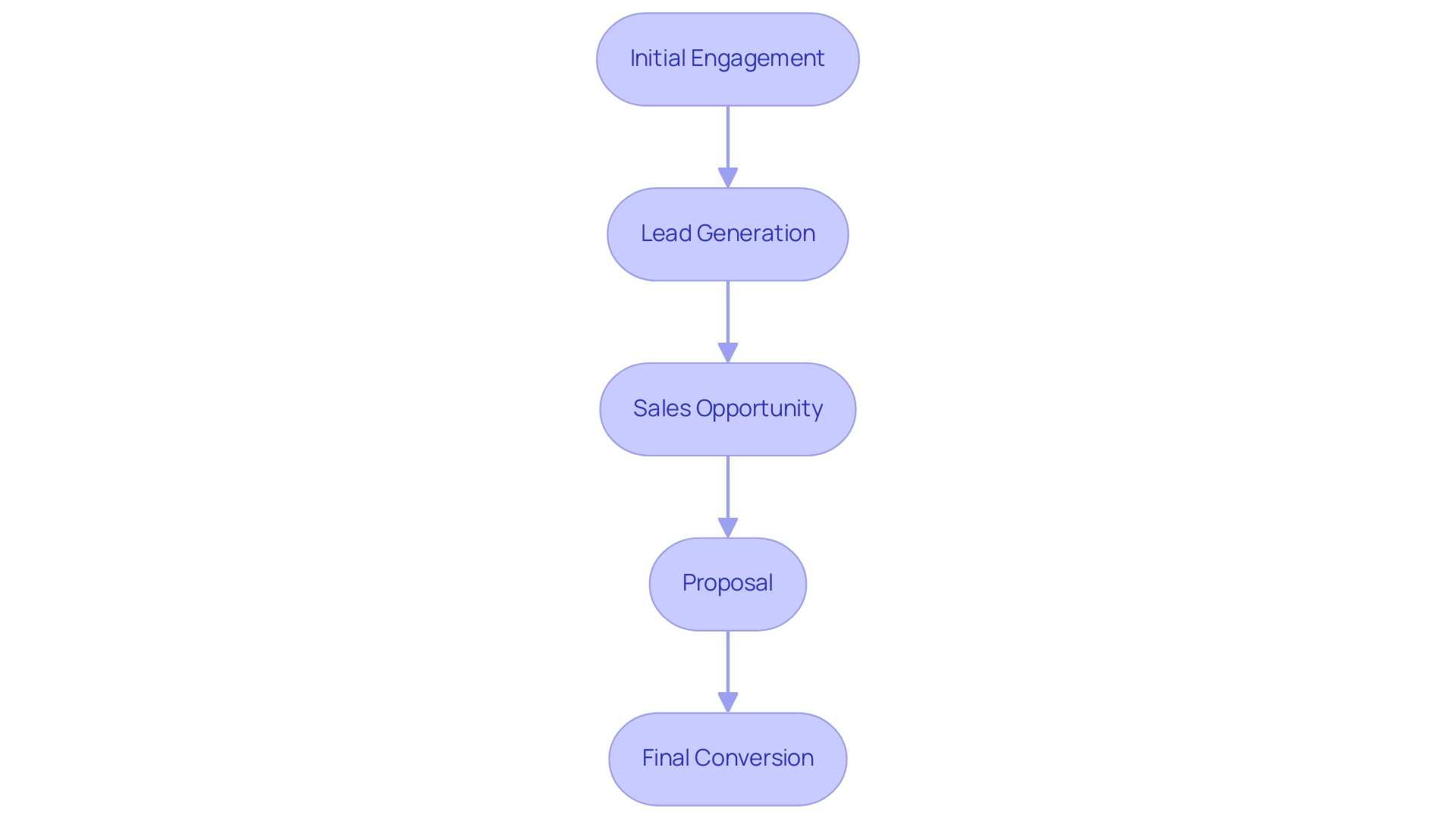
Exploring Different Types of Funnel Charts in Power BI
Power BI offers a varied selection of graphical options, each crafted to meet particular analytical requirements while tackling typical obstacles in utilizing insights from information. Comprehending these types is essential for impactful storytelling with information:
- Standard Funnel Chart: This type visually represents the flow of information through various stages, illustrating the proportion of information at each stage. It is especially beneficial for monitoring conversion rates or project advancement, addressing the challenge of lengthy report generation by offering clear visual insights with the power bi funnel visual.
- Stacked Visualization: By enabling users to analyze information by categories, stacked visualizations provide deeper understanding of the composition at each stage, facilitating the identification of trends within subcategories. Recent statistics indicate that stacked graphs have gained popularity, with a reported 60% of users favoring them over standard representations because of their capacity to offer more granularity, thus improving consistency and trust.
- 100% Stacked Graph: This variant displays the relative percentage of each category within the total at each stage, making it suitable for comparing proportions across various categories, such as market share or budget allocations. This assists in tackling the issue of ambiguous direction frequently encountered in conventional reports.
To demonstrate the efficacy of these visual representations, consider a case study where a retail company employed stacked visuals to assess customer conversion rates across various marketing channels. The insights acquired enabled them to enhance their marketing approach, leading to a 15% rise in conversions, showcasing the effectiveness of utilizing Business Intelligence for informed decision-making.
Furthermore, although flow visuals are impactful, alternative instruments like pie graphs can swiftly illustrate how a whole is segmented into components, such as market share or budget distributions, and the decomposition tree visualization permits users to observe information across various dimensions, facilitating deeper analysis and addressing governance strategy challenges. Furthermore, incorporating Robotic Process Automation (RPA) into the reporting process can simplify information collection and reduce manual tasks, enhancing operational efficiency. The selection among these graphical representations can greatly affect the clarity and influence of information analysis.
By choosing the appropriate format for the visual representation and ensuring reports offer clear, actionable guidance, users can guarantee their presentation is not only informative but also engaging, ultimately improving operational efficiency.
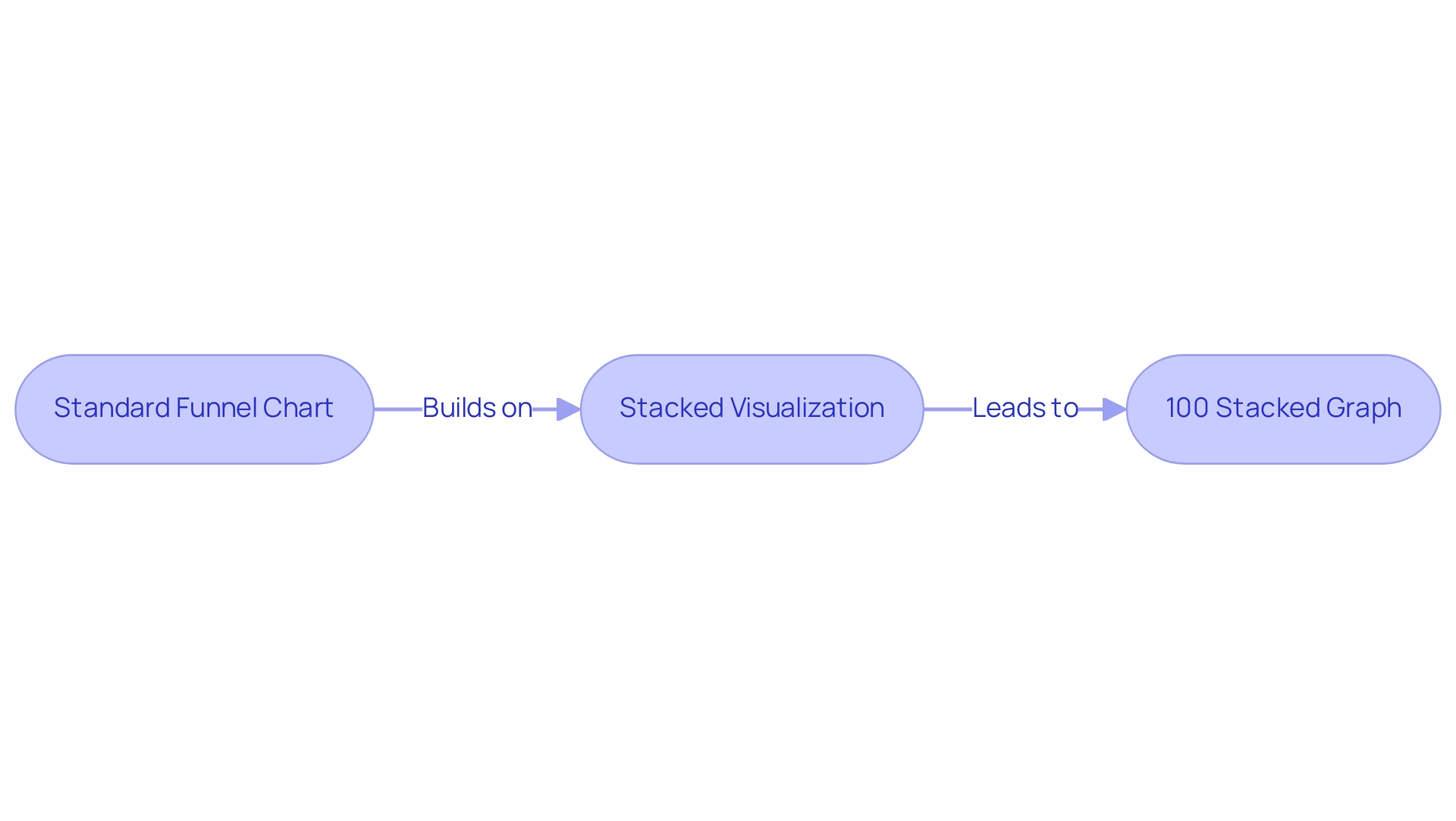
Step-by-Step Guide to Creating Funnel Charts in Power BI
Constructing a power bi funnel visual is a simple process that facilitates effective visualization and storytelling, which is crucial for utilizing Business Intelligence in enhancing operational efficiency. Here’s a step-by-step guide to help you get started:
-
Open BI Desktop: Begin by launching the application and either opening an existing report or creating a new one.
-
Load Your Information: Import your information into Power BI, sourcing it from platforms like Excel, SQL Server, or cloud services. This versatility is crucial for addressing the common challenge of data inconsistencies.
-
Choose Power BI Funnel Visual: In the Visualizations pane, find and click on the Power BI funnel visual icon shaped like a funnel to include it in your report.
-
Drag Fields to the Visual: Populate your chart by dragging relevant fields into the ‘Values’ and ‘Group’ sections. The ‘Values’ section captures the information points, while the ‘Group’ section delineates the distinct stages of your funnel.
-
Adjust the Information: Ensure that the information is arranged suitably to represent the stages of the process precisely. This step is crucial for clarity and insight, particularly in overcoming the challenges of creating actionable reports.
-
Review Your Diagram: After creating the funnel diagram, take a moment to review it. Verify that it accurately illustrates your information flow and adjust any settings necessary to enhance clarity. This review process helps to avoid the frustration of investing time in report creation rather than leveraging insights, and using the power bi funnel visual is particularly beneficial for tracking progress through various stages, such as the 565 users who completed purchases, calculating potential revenue, and identifying bottlenecks in processes. Additionally, they can reveal insights into conversion and retention rates, making them essential tools for data analysis.
As noted by data analyst Bukola Ejalonibu, > Data visualization tools like Power BI are essential for turning raw data into meaningful insights that drive results.
By concentrating on the specific phases of your process, you can derive actionable insights that guide decision-making and enhance operational efficiency. Integrating annotations for every phase, as emphasized in the case study named ‘Statistics to Highlight in Funnel Charts,’ can further improve your diagram’s usefulness by offering clear insights into drop-off rates and user movement without needing external calculations. By adhering to this guide, you can effectively leverage the strength of flow diagrams to visualize user movement and enhance your analysis, assisting to alleviate the typical difficulties encountered when using BI.
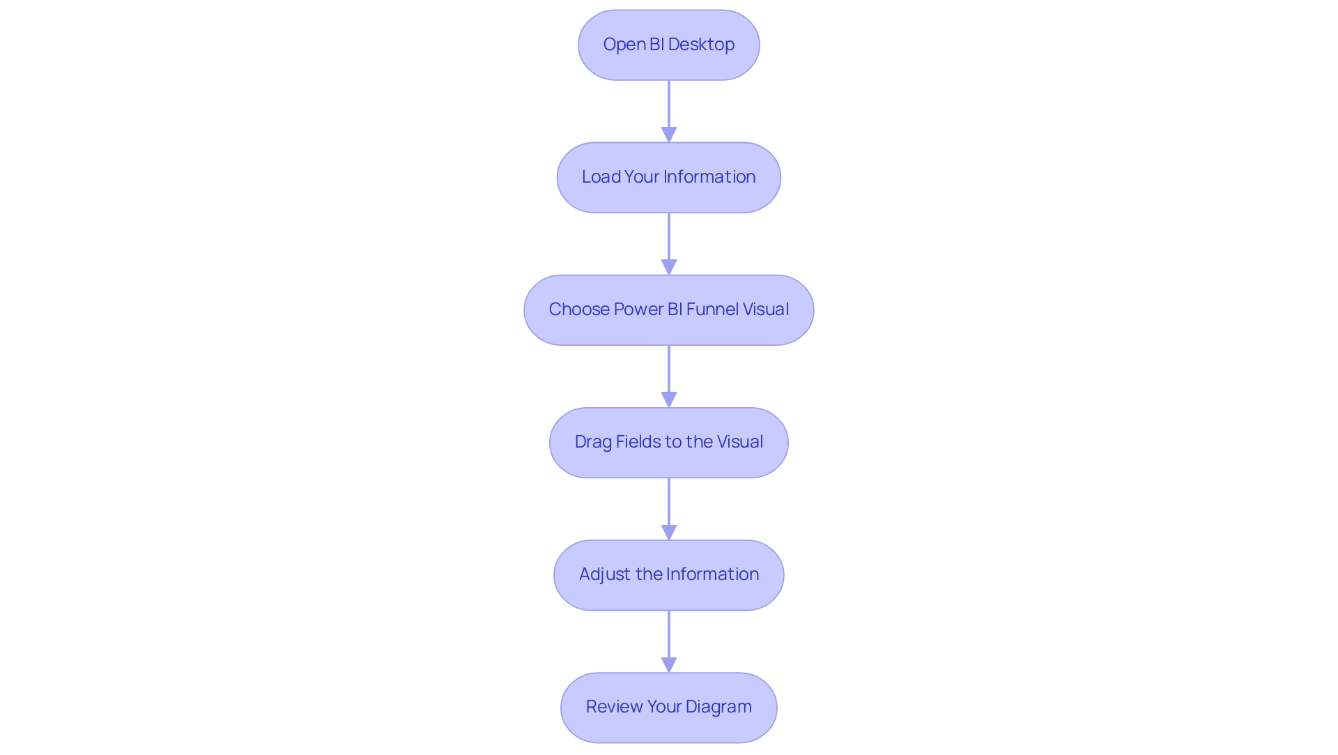
Customizing Your Funnel Charts for Enhanced Insights
Customization in Power BI is crucial for enhancing the effectiveness of chart visuals, particularly the Power BI funnel visual, especially for professionals aiming to adhere to best practices as outlined in the Microsoft Certified: Power BI Data Analyst Associate certification. Here are several impactful strategies:
- Change Colors: Adjusting the colors of the funnel stages not only aligns with your brand identity but also enhances visual appeal, making information easier to interpret. Research indicates that effective color choices can significantly enhance visualization effectiveness, thereby increasing user engagement.
- Add Labels: Enabling labels at each stage provides immediate insights into the flow of information, allowing viewers to quickly grasp key metrics. As noted by Jeremy Caney,
One of the ‘simplest’ ways you can use to solve this issue and the one I use pretty much all the time is appending the ‘Order code’ to the name of the column and then you use it to sort.
This emphasizes the significance of clarity in information representation, particularly considering the frequent challenges of inconsistencies across reports. - Modify Tooltips: Customizing tooltips to present additional context enhances interactivity, making your visuals more engaging and informative. This allows users to delve deeper into the data without cluttering the visual space, addressing the frequent issue of reports lacking actionable guidance.
- Adjust Axis Titles: Clear and descriptive axis titles are essential for helping viewers understand what the visualization represents, ensuring that the insights derived are accurate and actionable.
By implementing these customizations, you can transform your visuals into powerful tools for storytelling, driving better decision-making and deeper insights into conversion and retention rates across various processes. For example, case studies have shown how the Power BI funnel visual is utilized in sales tracking and marketing campaign analysis, demonstrating the tangible benefits of these strategies.
Furthermore, to tackle the challenges of time-consuming report creation and inconsistencies, it is essential to implement a governance strategy that ensures accuracy and consistency across reports. With the upcoming DataViz World Championships offering participants four chances to enter, mastering these customization features is more relevant than ever, as they could provide a competitive edge in this dynamic field. In today’s data-rich environment, leveraging the power of Business Intelligence is essential to overcoming these hurdles, ultimately driving operational efficiency and growth.
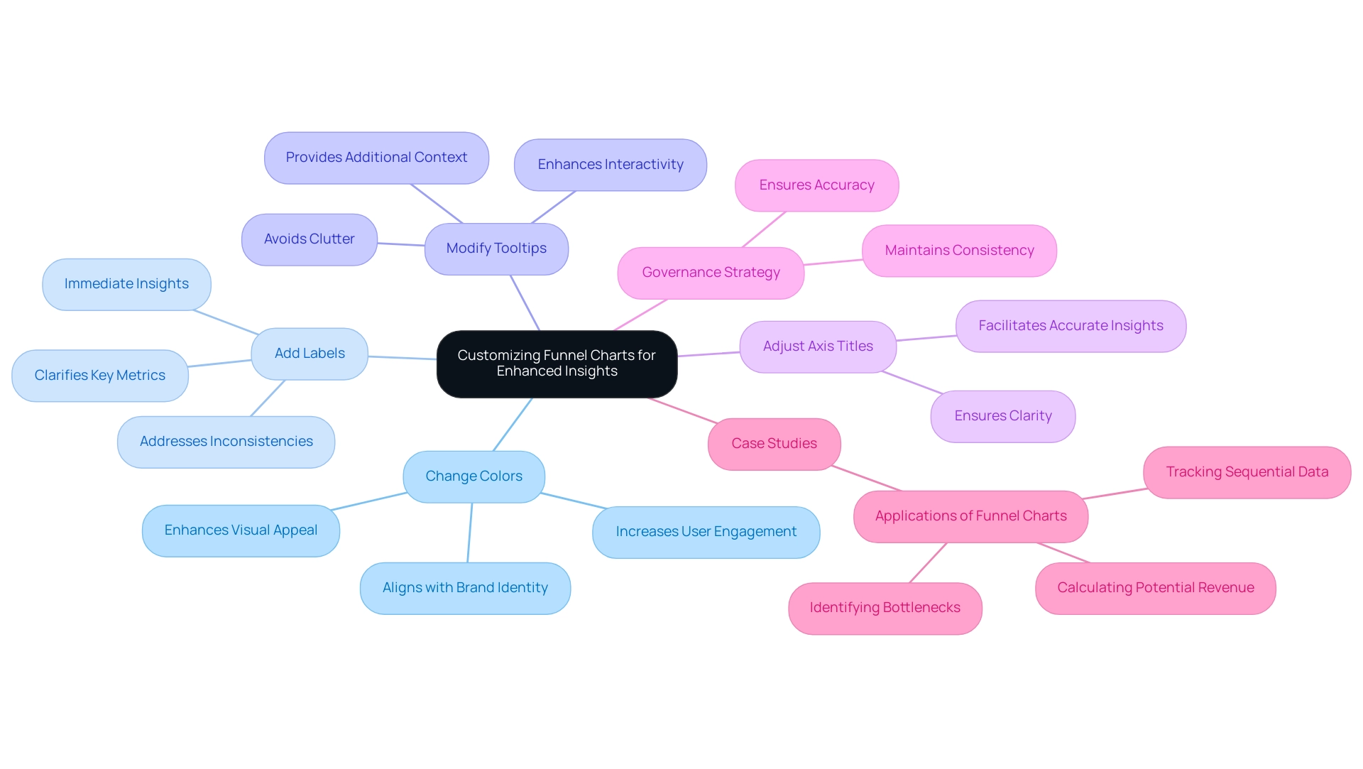
Best Practices and Troubleshooting for Power BI Funnel Visuals
To maximize the effectiveness of your funnel visuals in Power BI, adhering to a set of best practices is essential:
- Ensure Data Accuracy: Prioritize accuracy and completeness in your data prior to constructing funnel charts. Flawed information can distort insights and mislead stakeholders, particularly in a resource-rich environment where extracting valuable insights is essential for sustaining a competitive edge. Implementing Business Intelligence solutions can help transform raw information into actionable insights, as demonstrated by PixelPlex’s track record of over 450 successful client stories, leading to significant improvements in user adoption and ROI.
- Limit the Number of Stages: A cluttered Power BI funnel visual can obscure insights; therefore, aim to present a clear and concise representation by limiting the number of stages. This simplicity is vital in overcoming challenges related to time-consuming report creation.
- Regularly Update Your Information: Consistently refresh your information to ensure it reflects the latest insights and trends, enhancing user adoption and improving ROI. The
STDEV.Sfunction can be particularly useful here, as it returns the sample standard deviation for expressions evaluated row by row, helping to ensure the accuracy of your values. - Troubleshooting Tips: If your funnel chart fails to display correctly, begin by verifying that the information is sorted appropriately and that the correct fields are in use. Should you encounter issues with information visibility, inspect the relationships in your model to ensure they are correctly configured. RPA solutions such as EMMA RPA and Automate can assist in automating data updates and troubleshooting processes, thereby improving efficiency. For instance, the case study titled “Statistical Measures in BI Without DAX” illustrates an alternative method to find statistical measures without using DAX or the Measure feature, which can be beneficial when troubleshooting flow visuals.
By following these best practices and troubleshooting tips, you can significantly enhance the reliability and effectiveness of your Power BI funnel visual. As Antoine de Saint-Exupery aptly stated, > perfection is finally attained not when there is no longer anything to add, but when there is no longer anything to take away <— this principle can guide your efforts in streamlining and optimizing your data presentations while leveraging RPA to automate repetitive tasks for improved operational efficiency.
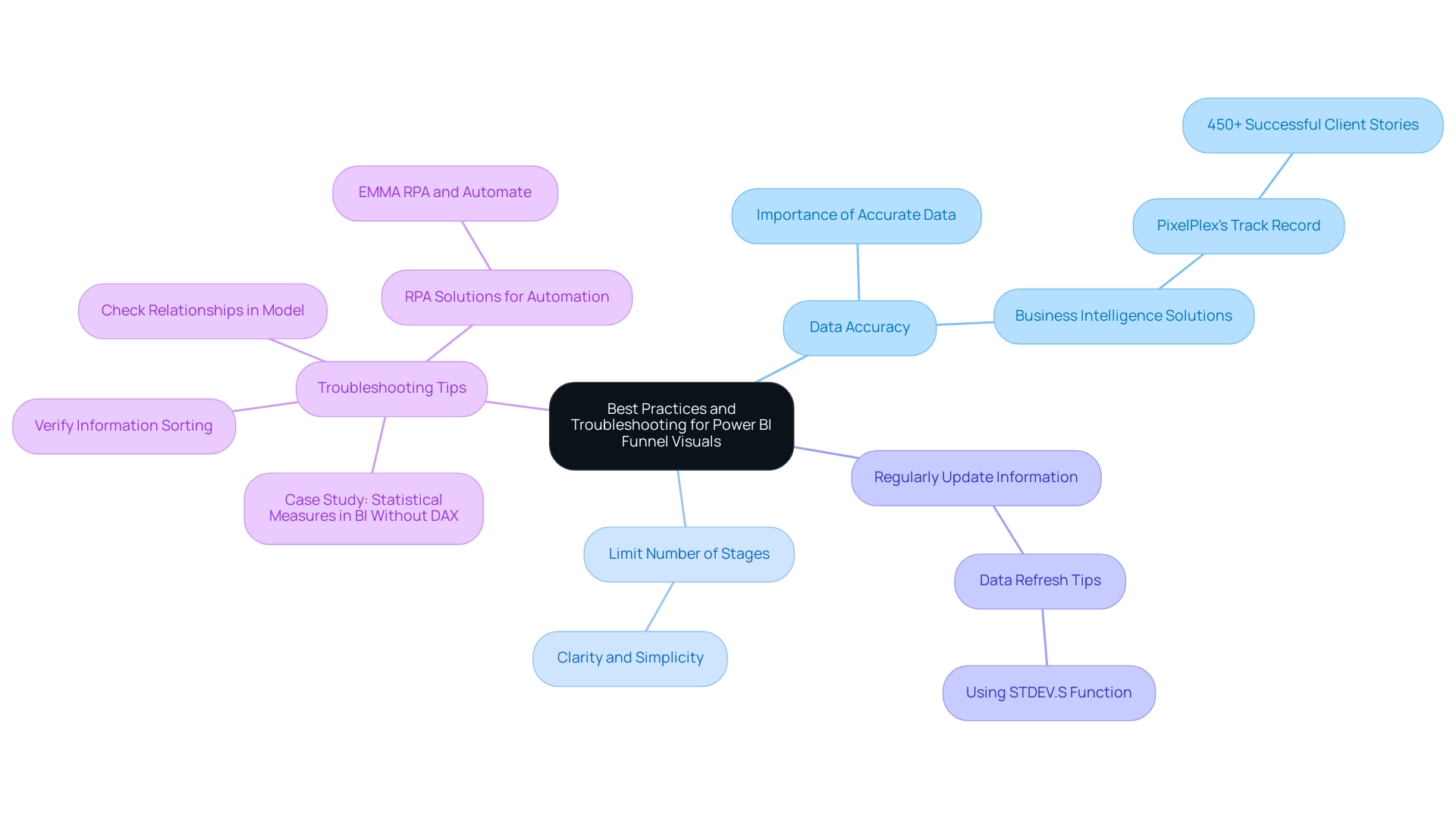
Conclusion
Funnel charts in Power BI have proven to be invaluable tools for organizations aiming to visualize complex processes and improve decision-making. By effectively tracking the customer journey from initial engagement to final conversion, these visuals not only highlight critical drop-off points but also provide actionable insights that can lead to significant enhancements in sales and operational efficiency.
The article has explored various types of funnel charts, offering a clear understanding of their unique capabilities. From standard and stacked funnel charts to 100% stacked options, each type serves specific analytical needs, allowing teams to dissect data and identify trends. The step-by-step guide provided simplifies the process of creating these visuals, ensuring that users can leverage their full potential for data storytelling.
Customization plays a crucial role in maximizing the effectiveness of funnel charts. By adjusting colors, adding data labels, and modifying tooltips, organizations can enhance the clarity and engagement of their visuals. Furthermore, adhering to best practices such as ensuring data accuracy, limiting the number of stages, and regularly updating data can significantly improve the reliability and impact of these visuals.
In conclusion, as the adoption of funnel visuals continues to rise, particularly in 2024, it is clear that these tools are not just a passing trend but a fundamental aspect of effective data analysis. By harnessing the power of funnel charts in Power BI, organizations can unlock new opportunities for growth, streamline their workflows, and ultimately drive informed strategies that lead to success. Embracing these practices will empower teams to transform raw data into meaningful insights, ensuring a competitive edge in today’s data-driven landscape.
Overview
Best practices for Power BI group visuals involve organizing related charts and tables to enhance reporting clarity and interactivity while reducing visual clutter. The article highlights that effective grouping not only streamlines document creation but also fosters a coherent narrative, ensuring that stakeholders can easily understand insights and make informed decisions based on the presented data.
Introduction
In the world of data visualization, the ability to effectively group visuals in Power BI stands out as a crucial skill for creating impactful reports. As organizations grapple with the challenges of report creation and data inconsistencies, mastering the art of visual grouping can lead to clearer narratives and actionable insights.
By organizing related visuals into cohesive units, users can enhance the storytelling aspect of their data presentations, guiding stakeholders through complex information with ease. This article delves into the significance of grouping visuals, practical techniques for implementation, and the myriad benefits that come with a well-structured approach to reporting in Power BI.
Through expert insights and real-world examples, it highlights how effective visual grouping not only streamlines the reporting process but also fosters trust and clarity in data interpretation.
Understanding the Importance of Grouping Visuals in Power BI
Organizing images in BI is crucial for developing reports that achieve a harmony between aesthetic attraction and logical arrangement, particularly when confronted with frequent obstacles like lengthy report preparation and information inconsistencies. Each Power BI chart type serves specific visualization needs, and careful selection enhances storytelling while addressing the prevalent concern of producing actionable insights. When using Power BI group visuals, they can be managed as a single entity, streamlining layout adjustments and interactivity, thus reducing the clutter that often leads to confusion and mistrust in the information presented.
For instance, by utilizing Power BI group visuals to group related charts and tables, users can construct a cohesive narrative that effectively guides viewers through the insights being communicated, overcoming the issue of documents filled with numbers yet lacking clear direction. Furthermore, implementing a robust governance strategy is crucial to ensure consistency across reports, reinforcing the reliability of the insights derived. Angelica Domenech, a trainer at Pragmatic Works, exemplifies this approach by starting with the ‘Continents’ Power BI group visuals as the top-level of her hierarchy, demonstrating how structured grouping can enhance clarity and provide actionable guidance.
Furthermore, network charts act as a practical demonstration of this concept; they illustrate relationships between points and simplify complex hierarchies, making them effective for showcasing intricate structures. By clearly illustrating connections and hierarchies, network charts can mitigate confusion and enhance trust in the information presented. Furthermore, statistics show that cars sold for over 180 thousand Reais indicate the existence of outliers, underscoring the importance of logical grouping in identifying key trends and anomalies.
As observed in the latest trends for 2024, effective documentation design increasingly depends on logically structured imagery, such as Power BI group visuals, to convey complex information succinctly, reinforcing the necessity of best practices in graphical grouping and governance strategies to mitigate the challenges faced by operations directors.
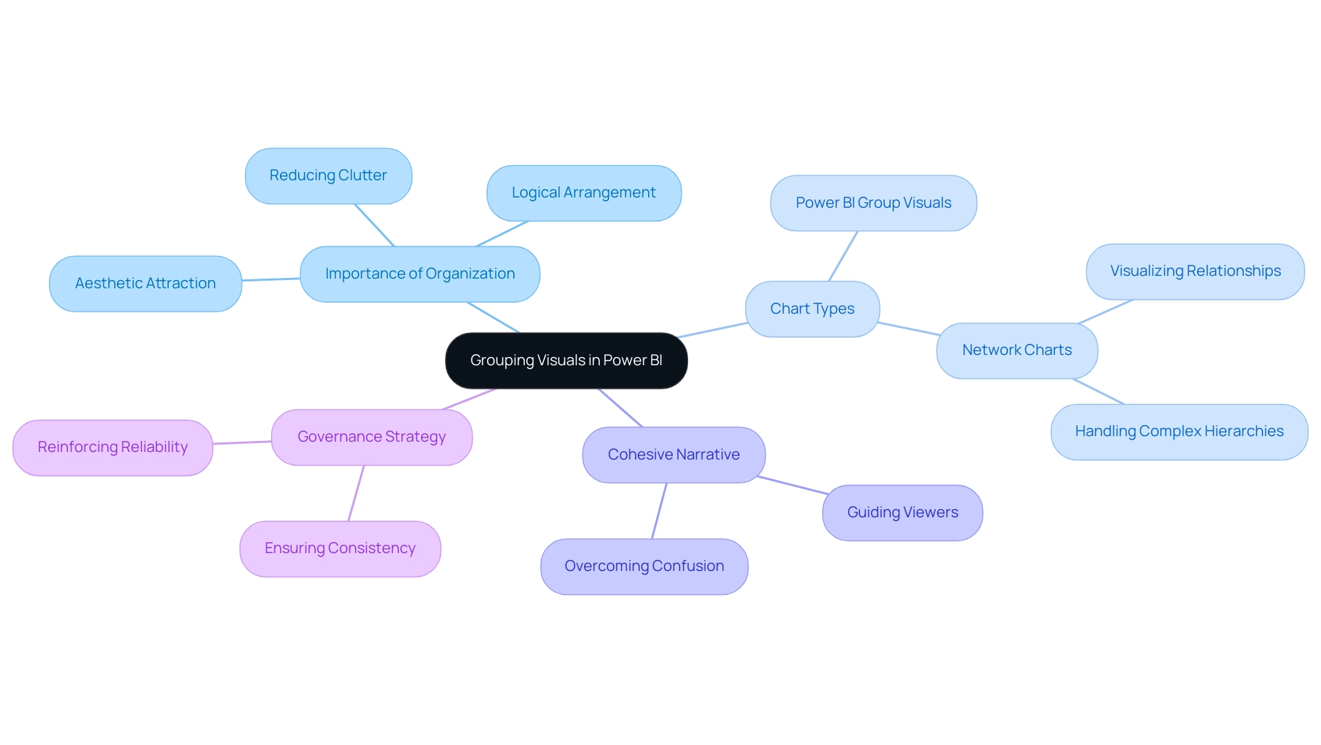
Practical Techniques for Grouping Visuals
To efficiently organize images in Power BI, which can assist in tackling typical issues such as lengthy document creation and data discrepancies, start by choosing the items you want to merge. Hold down the Ctrl key and click on each visual to include them in your selection. After selecting your images, right-click and choose ‘Group’ from the context menu.
This grouping action in Power BI group visuals allows you to move and resize the elements as a single unit, ultimately streamlining the design process and ensuring that stakeholders are presented with coherent and actionable insights. Additionally, binning can be applied by right-clicking a Field and selecting ‘New group.’ Users can set the Bin size in the Groups dialog box, resulting in a new field with (bins) appended in the Fields pane, which can be dragged onto the canvas for use in a visual.
Utilizing the ‘Selection Pane’ is crucial for managing the visibility and layering of your Power BI group visuals, enhancing the overall user experience amid potential data inconsistencies. Notably, with 3,896 users online, the adoption of these grouping techniques is gaining momentum, as they can significantly reduce the time spent on document creation. Consistent practice of these techniques will result in proficiency in organizing your documents effectively.
As highlighted by trainer Angelica Domenech,
In her example, she starts with the ‘Continents’ group as the top-level of her hierarchy, showcasing how strategic grouping can enhance narrative storytelling. Furthermore, it is essential to implement a governance strategy to ensure consistency across reports, as this can mitigate confusion and mistrust in the information presented. By utilizing Power BI group visuals to cluster images, you can offer clearer, actionable guidance for stakeholders, ensuring they comprehend the next steps based on the information presented.
Case studies, like the one concentrating on utilizing age bins for analysis, demonstrate that substituting original columns with grouped fields can result in streamlined exploration and clearer trend identification across defined categories.
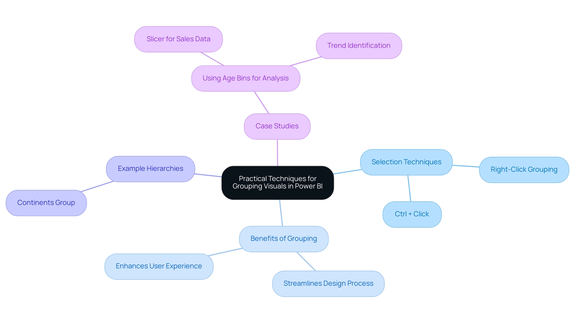
Benefits of Using Grouped Visuals for Enhanced Reporting
Employing Power BI group visuals offers numerous benefits that greatly enhance information presentation and narrative, particularly in addressing common challenges such as time-consuming document creation, inconsistencies in information, and the lack of practical direction. One of the primary advantages is the reduction of visual clutter, fostering clarity and allowing complex information insights to be communicated more effectively. As emphasized by Dong Kyu Lee, M.D., Ph.D., selecting the appropriate figure types and components is crucial; he states,
To maximize the positive aspects of figure presentation and increase the accuracy of the content.
Power BI group visuals enhance storytelling by allowing a logical order of information display, leading the audience through a coherent narrative, which is crucial when documents are filled with figures yet lack clear, actionable direction. This technique not only strengthens the narrative flow but also enhances interactivity; for instance, filtering one visual within a group prompts dynamic responses from the others, enriching the analytical experience. Statistical analyses have shown significant interactions between treatment and time (F[3, 336.4] = 3.535, P = 0.015), highlighting the effectiveness of grouped representations in presenting complex relationships.
A case study assessing the absorbance of bacterial flora in relation to two antibiotics through a 4-parameter log-logistic model exemplifies this; the fitted model provided effective dose estimates and clarified relationships in data, directly addressing the challenges of report creation and data inconsistencies. Together, these benefits lead to more effective reporting, making Power BI group visuals an essential tool in BI for enhancing operational efficiency.
Advanced Features for Grouping Visuals in Power BI
Power Bi’s advanced grouping features in power bi group visuals significantly elevate reporting capabilities, allowing users to customize group properties effectively. For example, incorporating titles, borders, and customized imagery can improve the visual hierarchy, making the information more accessible and interpretable. As Angelica Domenech, a trainer at Pragmatic Works, emphasizes,
To add depth to your analysis, you can create hierarchies.
Users can start with power bi group visuals at a top-level group and add relevant columns, enabling drill-down features. Nevertheless, numerous operations efficiency managers frequently discover that they spend more time creating documents than utilizing insights from BI dashboards, facing obstacles like inconsistent information and an absence of clear, actionable direction. Our solutions, including the 3-Day Power BI Sprint and the General Management App, are designed to tackle these issues by streamlining document creation and ensuring data consistency, ultimately providing actionable insights.
Additionally, the integration of bookmarks allows users to save specific views of power bi group visuals, facilitating customized presentations tailored to various audiences. This dynamic functionality not only transforms traditional reports into interactive experiences but also resonates more with stakeholders, enhancing user satisfaction. A practical application of this is evident in the case study titled ‘Binning Data in BI Desktop,’ where users can define custom bin sizes, grouping sales figures into meaningful increments, ultimately improving clarity in reporting.
To explore how our services can specifically benefit your organization, check out our Actions portfolio and book a free consultation today.
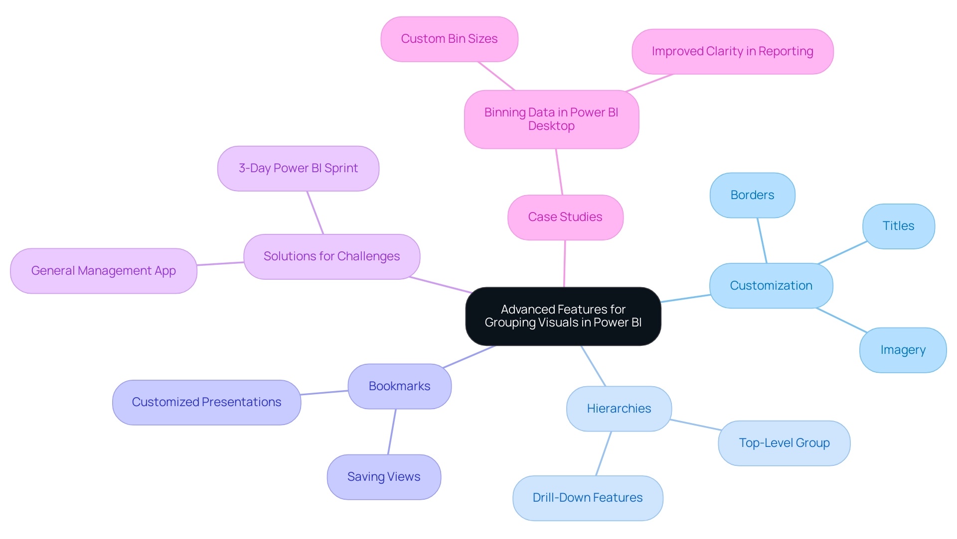
Common Challenges in Grouping Visuals and How to Overcome Them
Organizing images using Power BI group visuals can significantly improve narrative presentation, yet users frequently face obstacles such as unintentional ungrouping and difficulties in managing grouped items. These hurdles can be exacerbated by poor master data quality, which leads to data inconsistencies that hinder effective reporting and can result in inefficient operations and flawed decision-making. Statistics indicate that displays with a clear focus can lead to a 70% increase in viewer retention, reinforcing the need for effective visual management.
Additionally, 70% of users prefer straightforward designs over complex aesthetics, emphasizing the importance of clarity in visual presentation. To mitigate these issues, it’s crucial to:
- Regularly save your work
- Utilize the ‘Selection Panel’ for tracking grouped images
Pragati Jain, a Super User, notes, “Thanks for responding so quickly. Yes, you are right in understanding my scenario,” reflecting the common frustrations users experience. In a notable case, she also faced performance issues while employing a GROUP BY clause on a dataset of 50 million rows, highlighting the complexities that can arise in larger datasets. If a group becomes cumbersome, breaking it down into smaller, more manageable segments can help maintain clarity and organization.
Furthermore, leveraging tailored AI solutions and Business Intelligence tools can enhance the ability to extract actionable insights from Power BI dashboards, addressing both the time-consuming report creation process and the lack of guidance on information interpretation. Using the ‘Show DataView’ tool can grant access to the hierarchy after dragging in the appropriate values, assisting in the management of Power BI group visuals. Ensuring that all visuals within Power BI group visuals are compatible in size and type can prevent layout problems.
By proactively tackling these challenges and identifying the barriers to AI adoption, such as perceived costs and implementation difficulties, users can maintain a streamlined reporting workflow, ultimately enhancing the clarity and effectiveness of their presentations.
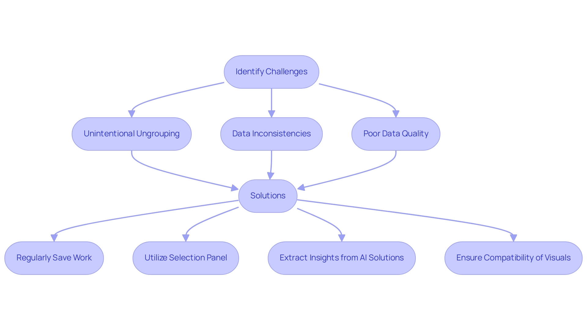
Staying Updated: Continuous Learning in Power BI Group Visuals
The realm of data visualization is in a state of constant evolution, and BI exemplifies this dynamic landscape. Users must prioritize continuous learning to remain competitive, which involves staying informed about the latest BI updates, participating in webinars, and actively engaging with the broader community through forums and user groups. Resources like the Microsoft Power BI blog and various online courses offer crucial insights into new features and best practices.
As Helalm aptly stated, > Thank you Pat, I believe I can contribute, as you proposed, a few extra stats, but I question whether custom Table.Profile will provide me with summaries like the ones I shared with pictures. This highlights a common challenge among users regarding effective reporting capabilities, further emphasizing the need for comprehensive training to overcome issues such as time-consuming report creation and data inconsistencies. Notably, 93% of finance teams still depend on Excel, indicating a significant opportunity for BI users to enhance their skills.
Furthermore, evidence shows that 40% of employees with inadequate training leave their companies within the first year, showcasing the critical importance of ongoing professional development. By investing time in learning, users can maximize the potential of BI for impactful reporting and storytelling. Additionally, the integration of RPA solutions, such as EMMA RPA and Automation, can further streamline operations, alleviate task repetition fatigue, and enhance employee morale, reinforcing the efficiency of BI in driving business growth.
These RPA tools automate repetitive tasks, allowing teams to focus on strategic initiatives rather than mundane processes. It is also important to note that articles on BI resources are organized chronologically from February 2025 back to July 2013, illustrating the evolution of available learning materials. Future enhancements will also enable administrators to configure logging independently for their specific scope of control, demonstrating BI’s adaptability.
By leveraging these resources and updates, users can further enrich their learning experience and improve their proficiency in using Power BI.
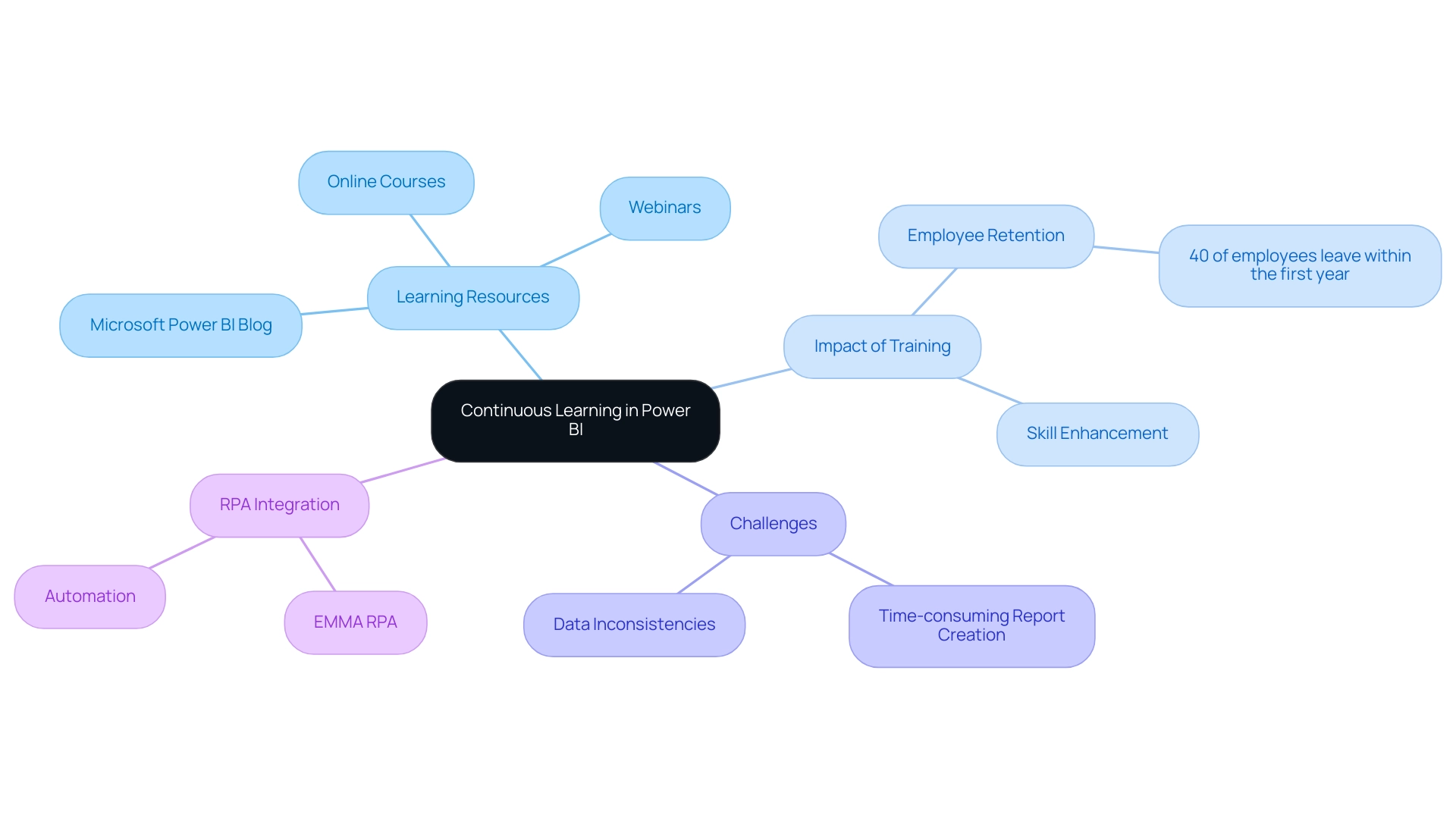
Conclusion
Effectively grouping visuals in Power BI is a transformative strategy that significantly enhances data presentation and narrative clarity. By organizing related visuals into cohesive units, users can streamline the report creation process, reduce clutter, and foster a clearer understanding of complex data insights. The techniques discussed, such as utilizing the Selection Pane and implementing governance strategies, empower users to maintain consistency and reliability in their reporting, ultimately leading to more actionable insights.
The benefits of employing grouped visuals extend beyond aesthetics; they create a logical flow that guides stakeholders through the data, making it easier to identify trends and anomalies. Advanced features, including customizable group properties and the integration of bookmarks, further enrich the user experience, allowing for tailored presentations that resonate with diverse audiences.
As the landscape of data visualization continues to evolve, continuous learning and adaptation remain vital. By staying informed about the latest updates and best practices in Power BI, users can maximize the potential of grouped visuals to enhance operational efficiency and foster a culture of data-driven decision-making. Embracing these strategies not only improves the quality of reports but also builds trust and clarity in data interpretation, paving the way for more effective storytelling in the world of data visualization.
Overview
The best practices for using the Power BI Databricks connector focus on optimizing performance through effective integration and data management techniques. The article outlines essential strategies such as utilizing DirectQuery mode for real-time data access, transforming data within Power BI, and monitoring performance metrics, which collectively enhance efficiency and decision-making capabilities in organizations leveraging these tools.
Introduction
In the rapidly evolving landscape of data analytics, the integration of Power BI with Azure Databricks emerges as a game-changer for organizations striving to harness the full potential of their data. This powerful combination not only facilitates seamless analysis of vast datasets but also enhances the visualization capabilities that are essential for informed decision-making.
By connecting these two platforms, businesses can unlock actionable insights and streamline their analytics processes, ultimately driving better outcomes. As organizations navigate the complexities of this integration, understanding the essential requirements, overcoming common challenges, and applying best practices will be crucial for maximizing performance and operational efficiency.
This article delves into the intricacies of Power BI and Databricks integration, offering valuable insights and strategies to empower users in their data-driven journey.
Understanding the Power BI and Databricks Integration
The combination of BI tools with Azure services unlocks significant potential for organizations seeking to utilize extensive analytics and visualization. The business intelligence tool, known for its strength, allows individuals to create interactive reports and dashboards, while the analytics platform functions as a complete solution that simplifies engineering and machine learning processes. The Power BI Databricks connector enables organizations to efficiently analyze large datasets housed in Databricks, facilitating the rapid generation of actionable insights by connecting these two platforms.
In fact, with our Power BI services, including a focused 3-Day Sprint for report creation, individuals can quickly create professionally designed reports that improve information accessibility and enable real-time analysis. This timely access empowers individuals to make informed decisions based on the latest information, ultimately driving better business outcomes. Recent benchmarks highlight that while Direct Lake outperforms SQL warehouse endpoints for data volumes under 100GB, challenges arise with larger datasets, particularly those exceeding 10TB.
Consequently, understanding these performance dynamics is crucial for optimizing the integration process. Moreover, the repository provides reusable samples and best practices for enhancing BI solutions on SQL, offering practical guidance for users. A notable case study on logical partitioning in BI illustrates how this technique enhances performance and manageability of large datasets, demonstrating significant improvements in refresh times and resource consumption when comparing partitioned and non-partitioned tables.
As David Kaminski notes, ‘Here’s a breakdown of the latest Microsoft Fabric updates and why they matter for your business,’ underscoring the relevance of staying informed about advancements in these technologies. Overall, the combination of BI and another analytics platform not only streamlines the analytics process but also significantly enhances the decision-making capabilities of organizations. Our GenAI Workshops and customized AI solutions, including Small Language Models, focus on enhancing quality and offering practical training to support ongoing improvement and operational efficiency.
Additionally, our RPA solutions address task repetition fatigue, further enhancing operational efficiency and employee morale.
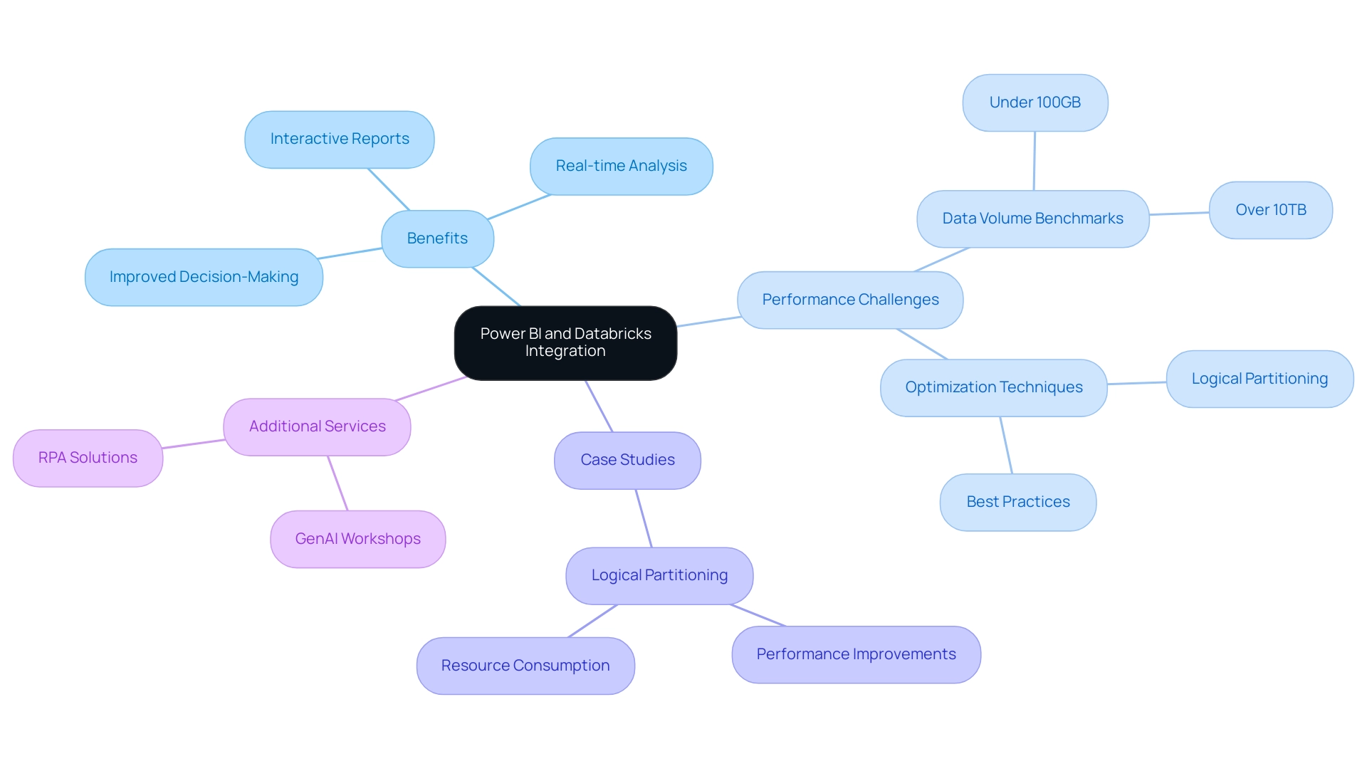
Essential Requirements for Connecting Power BI to Databricks
For a smooth link between BI and the data platform, it is essential to have several prerequisites established. First and foremost, users must have a valid account with the necessary permissions to access the required information. Additionally, having BI Desktop installed on your local machine is essential for local data handling and visualization.
An important component is the Databricks ODBC driver, which facilitates communication between the Power BI Databricks connector and Databricks; ensuring the installation of this driver is crucial for successful integration. Furthermore, individuals need to verify that they have the correct workspace URL and appropriate authentication credentials—either personal access tokens or Azure Active Directory credentials—to establish a secure connection. By confirming these foundational requirements, users can streamline the integration process and significantly reduce potential complications, enabling them to leverage the full capabilities of both platforms efficiently.
It’s critical to recognize that without addressing common challenges such as time-consuming report creation and inconsistencies, organizations may struggle to derive actionable insights from their information. Moreover, integrating RPA solutions can enhance operational efficiency by automating repetitive tasks, allowing teams to focus on analysis rather than report generation. As Gus Santaella, Sr. Director of Information, noted, ‘Sigma has become almost like a verb here,’ highlighting the importance of effective information integration practices.
Additionally, with over 540 hands-on courses available through DataCamp, professionals can enhance their skills in utilizing these tools effectively. Participating in gatherings such as the forthcoming PASS Community Summit also provides important perspectives on current trends and educational opportunities connected to BI integration. To advance, organizations should prioritize implementing RPA alongside these integrations to transform raw information into actionable insights that drive business growth.
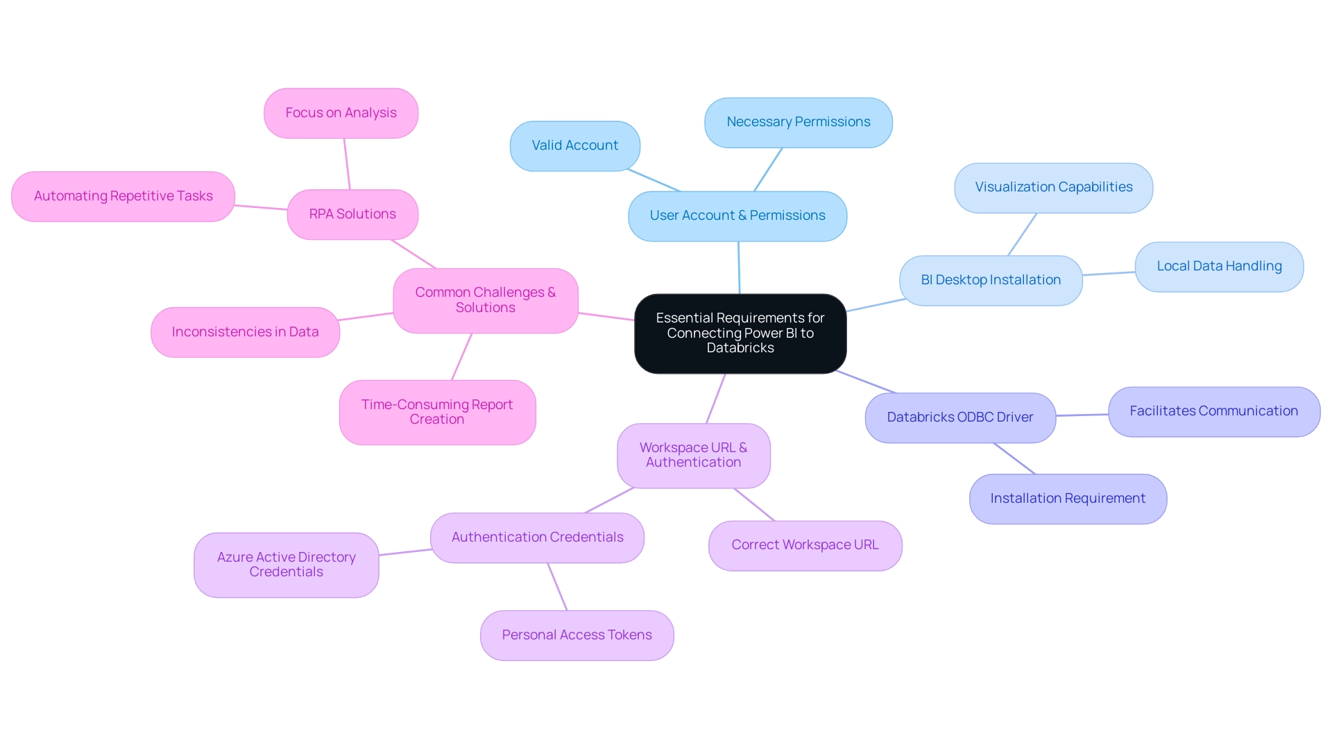
Overcoming Common Challenges in Power BI-Databricks Connection
Integrating Power BI with the data platform can present several notable challenges, particularly around authentication errors and connectivity issues. A common statistic reveals that authentication error rates in analytics tools can significantly hinder user experience. Additionally, the cost of operating a cluster is just over $11/hour, which highlights the financial implications of performance issues.
To mitigate these challenges, it is essential to meticulously verify authentication credentials and confirm the correct workspace URL is utilized. Users frequently experience performance delays; in such situations, optimizing queries in the platform is essential for improving retrieval speeds. Furthermore, ensuring that the ODBC driver is current can effectively prevent compatibility issues that may arise.
For those struggling with refreshes, it’s beneficial to configure Power BI settings for scheduled updates, ensuring that reports remain current. Tackling quality challenges is essential since inadequate master information quality can result in ineffective operations; to this end, the platform provides various techniques for deduplication, including:
- MERGE
- distinct()
- drop Duplicates()
- ranking windows
These techniques can be crucial in preserving information integrity. By incorporating tailored AI solutions, organizations can better navigate these challenges, optimizing their integration processes and enhancing decision-making capabilities.
Additionally, incorporating Robotic Process Automation (RPA) allows organizations to automate repetitive tasks involved in information management, thereby enhancing efficiency and freeing up resources for more strategic initiatives. Proactively addressing these challenges allows users to significantly improve their integration experience with the Power BI Databricks connector, unlocking the full potential of Power BI and Databricks. As one expert noted, ‘Quarantining allows transformations to insert good information while storing bad information separately for later review,’ emphasizing the importance of managing quality throughout the integration process.
Furthermore, leveraging Business Intelligence can transform raw information into actionable insights, enabling informed decision-making that drives growth and innovation. The Time Travel functionality of Delta Lake enables individuals to manually revert to earlier versions of information, offering a practical solution for addressing inaccuracies during integration, thereby empowering informed decision-making.
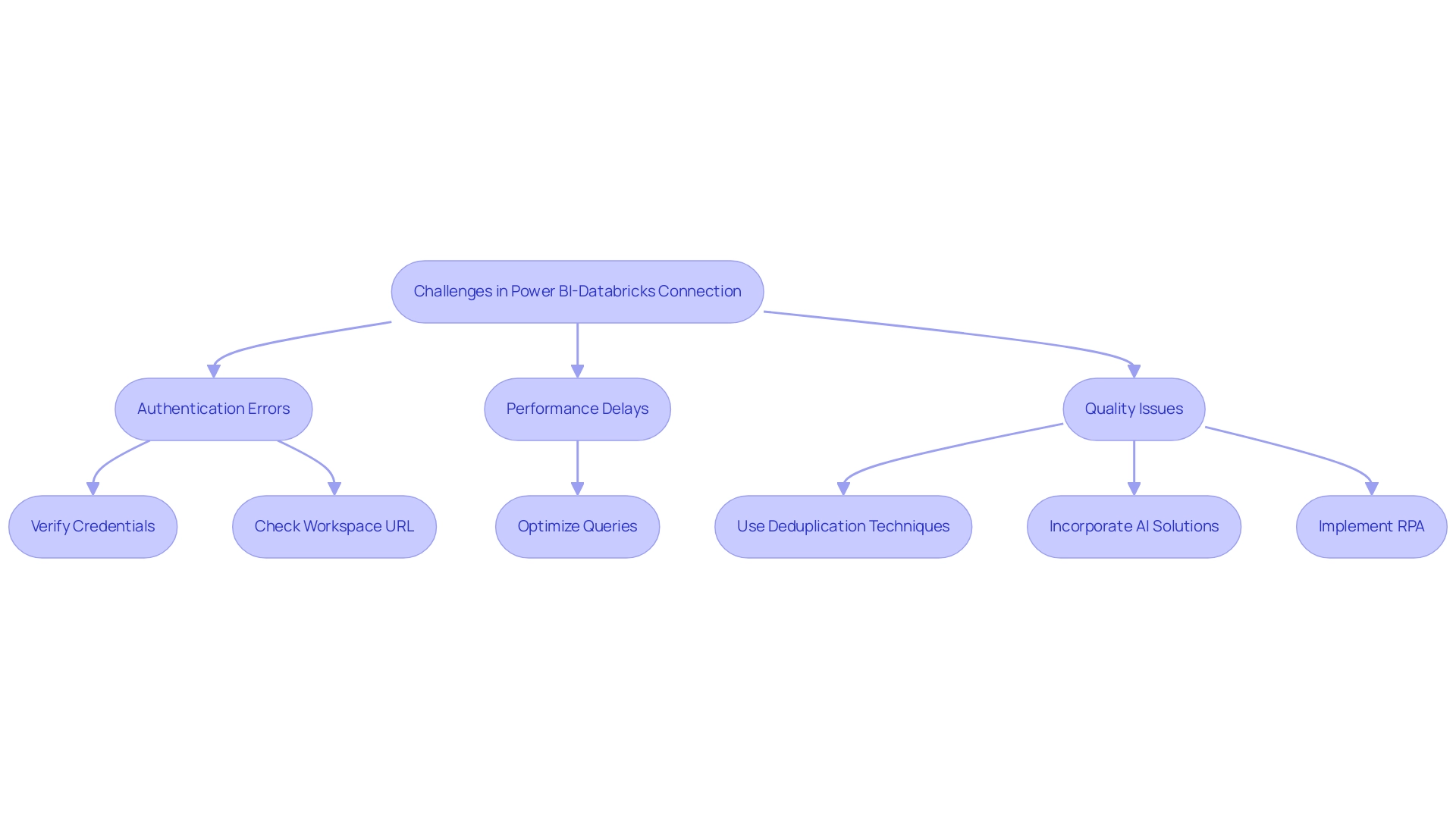
Best Practices for Optimizing Power BI with Databricks
To fully harness the potential of the Power BI Databricks connector, implementing the following best practices is essential for optimizing performance.
-
Utilize the Power BI Databricks connector in DirectQuery mode, which enables real-time information access, ensuring that users work with the latest insights without the need to import it into BI. This approach not only enhances responsiveness but also aligns with best practices for information analysis, addressing the common challenge of time-consuming report creation.
-
Focus on information transformation within Power BI by utilizing the Power BI Databricks connector to streamline datasets prior to visualization. This step reduces the workload on Databricks, enabling efficient information handling and mitigating inconsistencies. Additionally, implementing incremental updates can significantly enhance performance, especially when managing larger collections.
-
Regularly monitor and analyze performance metrics, which is vital for identifying further optimization opportunities. As emphasized by Jaylen from Community Support, it’s crucial to avoid bi-directional relationships unless absolutely necessary, as they can lead to performance degradation and increased model complexity. Furthermore, using the VACUUM command can help clean up old files and improve performance, which is a critical aspect of maintaining an efficient system.
-
Aim for a maximum of five to seven visuals per report page to optimize performance and ensure clarity, addressing the lack of actionable guidance often experienced.
-
Consider the case study on optimizing visual interactions; every visual interacts with others on the page through cross-filtering or cross-highlighting. Evaluating relevant interactions is crucial, and for DirectQuery reports, using the Optimize Ribbon can enhance interactivity.
By following these best practices, individuals can effectively improve their analytical capabilities, leading to more informed and strategic decision-making that drives growth and innovation. Moreover, integrating RPA tools such as EMMA RPA and Automate can further streamline processes, reduce task repetition, and mitigate the competitive disadvantages associated with lacking data-driven insights.
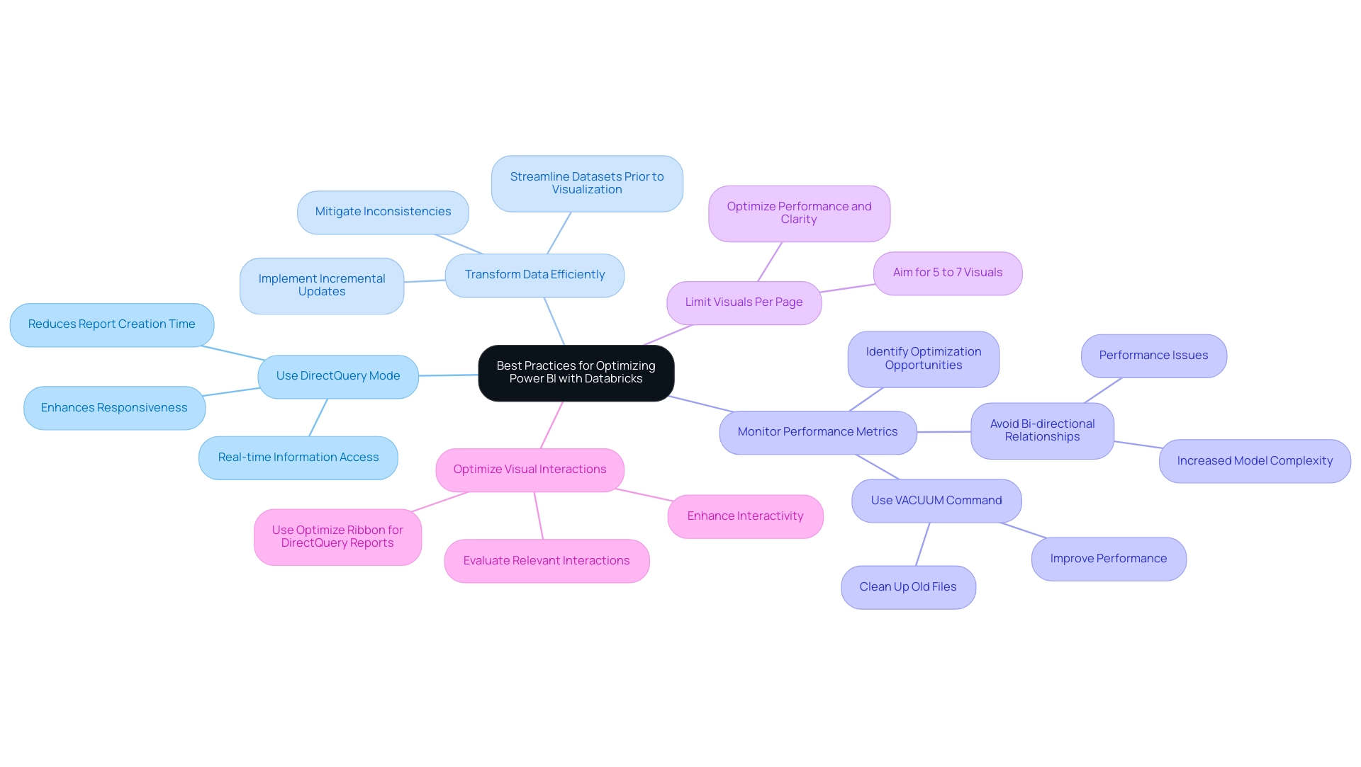
Advanced Techniques for Leveraging Power BI with Databricks
To utilize the advanced features of the analytics tool alongside Azure, individuals can apply a range of sophisticated techniques that tackle common issues such as time-consuming report generation, data inconsistencies, and the necessity for a strong governance strategy. One effective method is utilizing custom visuals within BI to craft dashboards tailored to specific business requirements, enhancing user engagement and providing clear, actionable guidance. Furthermore, the integration of machine learning models created in Databricks into BI reports using the power bi databricks connector enables organizations to leverage predictive analytics, facilitating deeper insights into trends and patterns crucial for operational efficiency.
Accurate forecasts rely on adequate historical information to identify these patterns, underscoring the need for organizations to gather and analyze relevant information over time. Another key technique involves utilizing parameters in Power BI, which enables individuals to dynamically filter information based on their input, significantly enhancing interactivity and experience. Moreover, implementing lineage tracking is essential for monitoring the flow of information throughout analytics processes, ensuring both integrity and compliance with regulatory standards.
The General Management App enhances these capabilities by integrating Microsoft Copilot and providing comprehensive management tools that specifically address the challenges of time-consuming report creation and the need for clear guidance. It provides functionalities such as Small Language Models for enhanced information quality and GenAI Workshops that enable individuals with the skills to optimize insights. A practical example of these techniques can be seen in the case study titled ‘Cost Management and Resource Monitoring,’ where Azure Monitor and Microsoft Cost Management were utilized to analyze resource telemetry and manage cloud spending, maximizing performance and reliability while controlling costs across the Azure environment.
By leveraging these advanced techniques and tools, organizations empower users to extract maximum value from their data, enhancing their overall analytical capabilities—a necessity in today’s data-driven landscape. As highlighted by industry expert Bharat Ruparel, ‘This is a really good article Kyle. Good to see you doing great things at Databricks; the integration of the power bi databricks connector represents a significant step forward in operational efficiency.
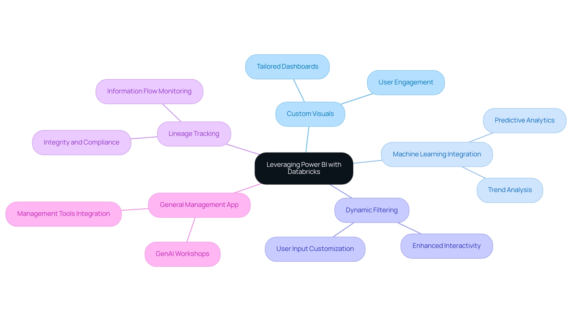
Conclusion
Integrating Power BI with Azure Databricks represents a transformative opportunity for organizations eager to enhance their data analytics and visualization capabilities. This article has explored the essential requirements for establishing a successful connection, including:
- The importance of having a valid Databricks account
- The necessary ODBC driver
- The correct authentication credentials
By ensuring these foundational elements are in place, organizations can streamline their integration processes and effectively leverage the strengths of both platforms.
The discussion has also addressed common challenges encountered during the integration, such as:
- Authentication errors
- Connectivity issues
Emphasizing the importance of meticulous verification and optimization of queries. Furthermore, implementing best practices, like utilizing DirectQuery mode and focusing on data transformation, can significantly enhance performance and user experience. By adopting these strategies, organizations can not only overcome obstacles but also unlock actionable insights that drive informed decision-making.
In conclusion, the synergy between Power BI and Databricks is a powerful catalyst for innovation and efficiency in data analytics. By embracing advanced techniques, such as machine learning integration and custom visuals, organizations can further enhance their analytical capabilities and maintain a competitive edge. As the landscape of data analytics continues to evolve, staying informed about technological advancements and best practices is crucial for maximizing the potential of this integration, ultimately leading to better business outcomes and strategic growth.
Overview
Power BI conditional formatting based on date is applied by selecting the visual, accessing the conditional styles, and setting rules to modify colors or fonts according to date conditions, enhancing report clarity and urgency. The article outlines a step-by-step process to implement this feature, emphasizing its role in improving decision-making by visually distinguishing time-sensitive information, thus facilitating quicker responses to critical tasks.
Introduction
In the realm of data visualization, Power BI stands out as a powerful tool, particularly when it comes to enhancing reports through conditional formatting. This feature not only streamlines the creation of visually appealing reports but also addresses critical issues such as data inconsistencies and the need for swift decision-making. By applying tailored visual cues based on specific conditions, users can transform complex data into clear, actionable insights.
As organizations increasingly recognize the importance of timely data interpretation, the integration of advanced techniques—such as dynamic formatting and color gradients—becomes essential. This article delves into the intricacies of conditional formatting in Power BI, exploring its significance, practical applications, and best practices to optimize reporting efforts.
Understanding Conditional Formatting in Power BI
Conditional styling in Power BI acts as a transformative tool for visualization, tackling common issues such as time-consuming report creation and inconsistencies, often worsened by an absence of governance strategy. By applying distinct visual cues based on predefined conditions, users can enhance the interpretability of their reports and ensure consistency in information presentation. To implement Power BI conditional formatting based on date, select the visual, go to the Format pane, and define rules based on field values.
This feature allows for modifications in colors, fonts, and styles of data points, making it easier to derive actionable insights. For instance, employing Power BI conditional formatting based on date to highlight dates according to their status—past, present, or future—enables users to swiftly identify time-sensitive information that demands immediate attention. As Yash Arora, Content Manager at Hevo Data, points out,
The Background color or font color dialogue box will appear with the title containing the name of the field you’re adjusting,
underscoring the intuitive nature of the adjustment process.
A notable statistic shows that red was used for higher numbers of failed banks, representing a negative outcome, illustrating how color choices can convey critical information in information presentation and lead to better decision-making. Recent statistics suggest a rising trend in the use of specialized styling, with many organizations utilizing this feature to improve their information presentation and address the challenge of providing clear, actionable guidance. Moreover, the capability to incorporate web URLs directly into Power BI reports—shown in a case study where clickable links guided users to pertinent Wikipedia pages—highlights the practical uses of situational style, allowing users to concentrate on extracting insights instead of dealing with information logistics.
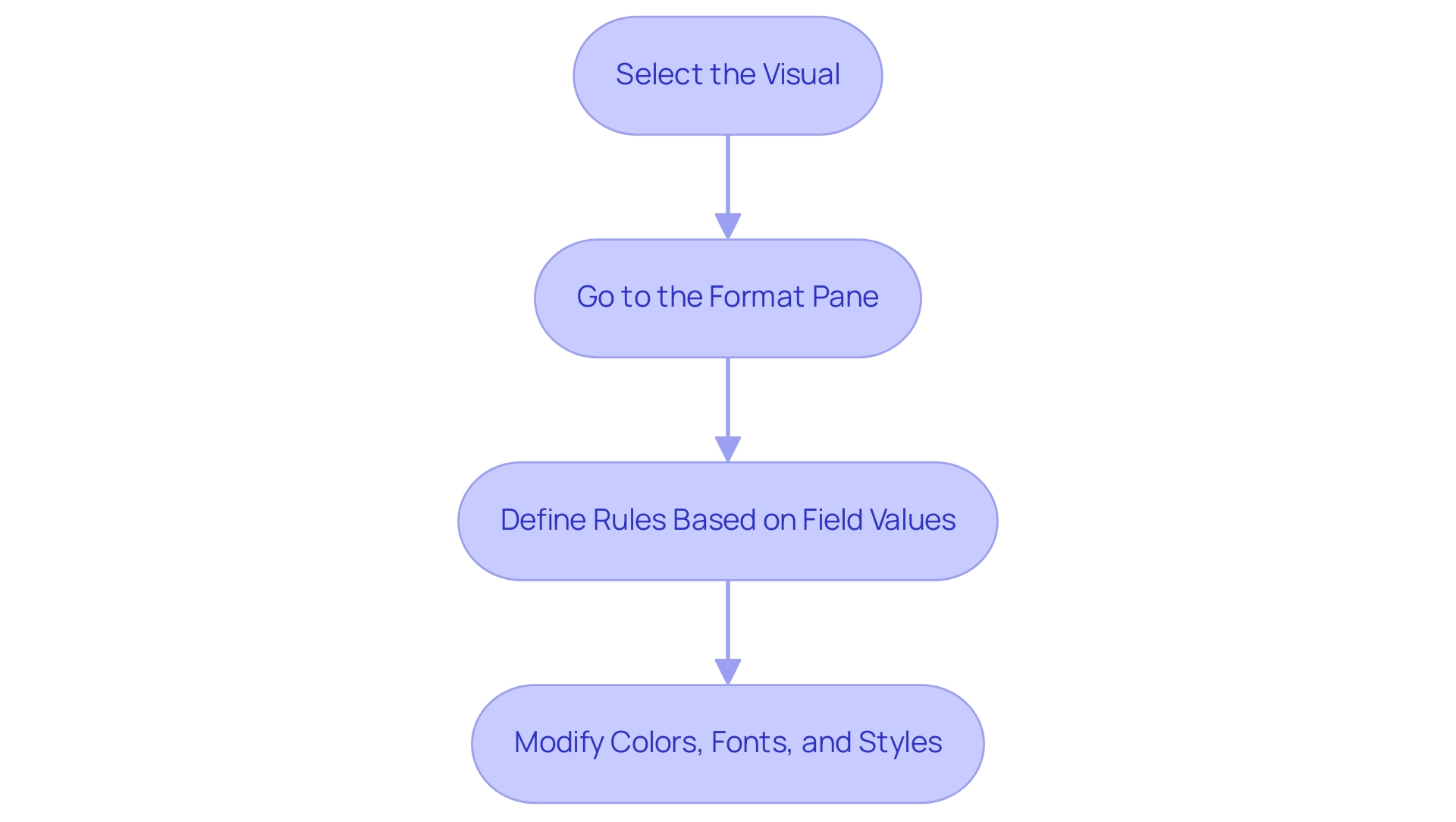
The Importance of Date-Based Conditional Formatting
Date-oriented conditional styling, such as Power BI conditional formatting based on date, plays a vital role in organizations that rely on timely information for informed decision-making. As Laiba Siddiqui notes, ‘Learn to identify and format all types of data in Excel, then explore valuable tips on converting between data types to make your spreadsheet more functional.’ For example, studies show that effective project deadline management can significantly enhance operational efficiency.
Utilizing Robotic Process Automation (RPA) enables teams to automate the identification and organization of overdue tasks, which can be highlighted in red as a prompt visual cue, indicating areas that need urgent attention. RPA can simplify the arrangement of rules based on conditions, decreasing the repetitive manual effort usually required in this process. Conversely, using green to signify upcoming deadlines, facilitated by RPA, allows teams to prioritize their tasks effectively.
This method of visual differentiation not only simplifies information interpretation but also facilitates quicker responses to potential delays while minimizing the risk of human error. The case analysis named ‘Conclusion on Conditional Styles‘ emphasizes how individuals are encouraged to investigate pre-designed styles and custom regulations, showcasing the simplicity and efficiency of these techniques in highlighting significant information in spreadsheets. Moreover, recent studies highlight that organizations utilizing Power BI conditional formatting based on date alongside RPA experience enhancements in project management results and decision-making processes, with statistics showing that companies employing these practices observe a 30% rise in meeting project deadlines.
By exploring pre-built styles and customizing rules within Excel, and integrating RPA, users can significantly enhance their data analysis capabilities, ultimately leading to better strategic decisions.
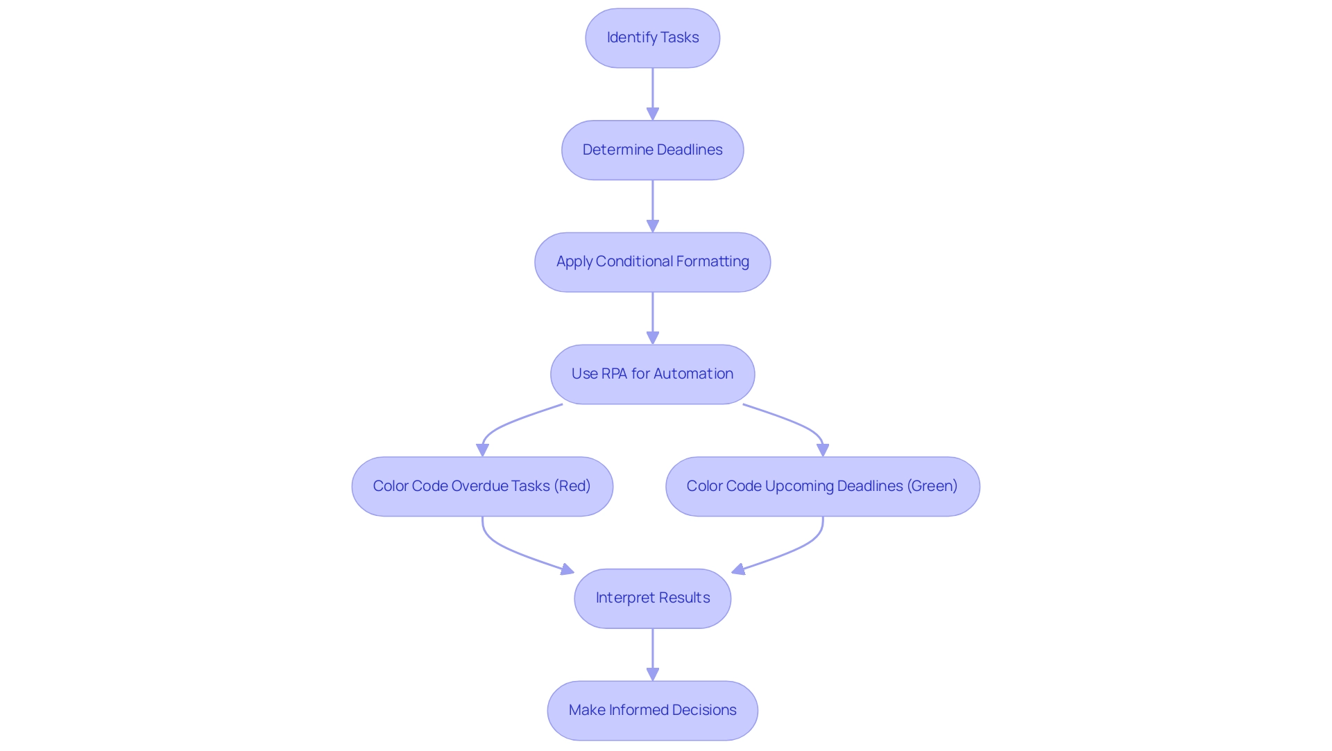
Step-by-Step Process for Applying Date Conditional Formatting
To successfully apply date-specific styles in Power BI while ensuring compliance with usage metrics and enhancing operational efficiency through data-driven insights, adhere to the following detailed steps:
- Open Your Report: Begin by launching Power BI Desktop and opening the specific report where you intend to apply the conditional formatting.
- Select the Visual: Click on the desired visual that includes the date field requiring adjustment. This could be a table, matrix, or any other relevant visual representation.
- Access Conditional Styles: In the Visualizations pane, click the dropdown arrow next to the date field located in the Values section, then select ‘Conditional styles’ to proceed.
- Choose Background Color or Font Color: Decide whether you want to format the ‘Background color’ or the ‘Font color’ according to your visual design preferences.
- Set Rules: In the conditional styling dialog, select ‘Format by’ and choose ‘Rules’. Define conditions based on your date values, such as ‘is before today’ or ‘is after today’, and specify the color that corresponds to each condition to utilize Power BI conditional formatting based on date effectively.
- Apply and Review: After establishing your rules, click ‘OK’ to implement the changes. Take a moment to review your visual to ensure that the conditional formatting reflects as intended and enhances visibility.
It’s crucial to recognize that all new metrics created within scorecards have a default daily tracking cycle, underlining the significance of consistent monitoring in Power BI. Additionally, ensure compliance with NinjaOne’s End User License Agreement (EULA) when utilizing these features. Incorporating RPA can further streamline your information preparation processes, eliminating repetitive tasks and enhancing overall efficiency.
As highlighted in our emphasis on leveraging Business Intelligence, utilizing these guidelines not only streamlines your reporting processes but also aligns with best practices in data visualization, allowing you to overcome challenges such as data inconsistencies and time-consuming report creation while achieving potential cost savings and productivity improvements.
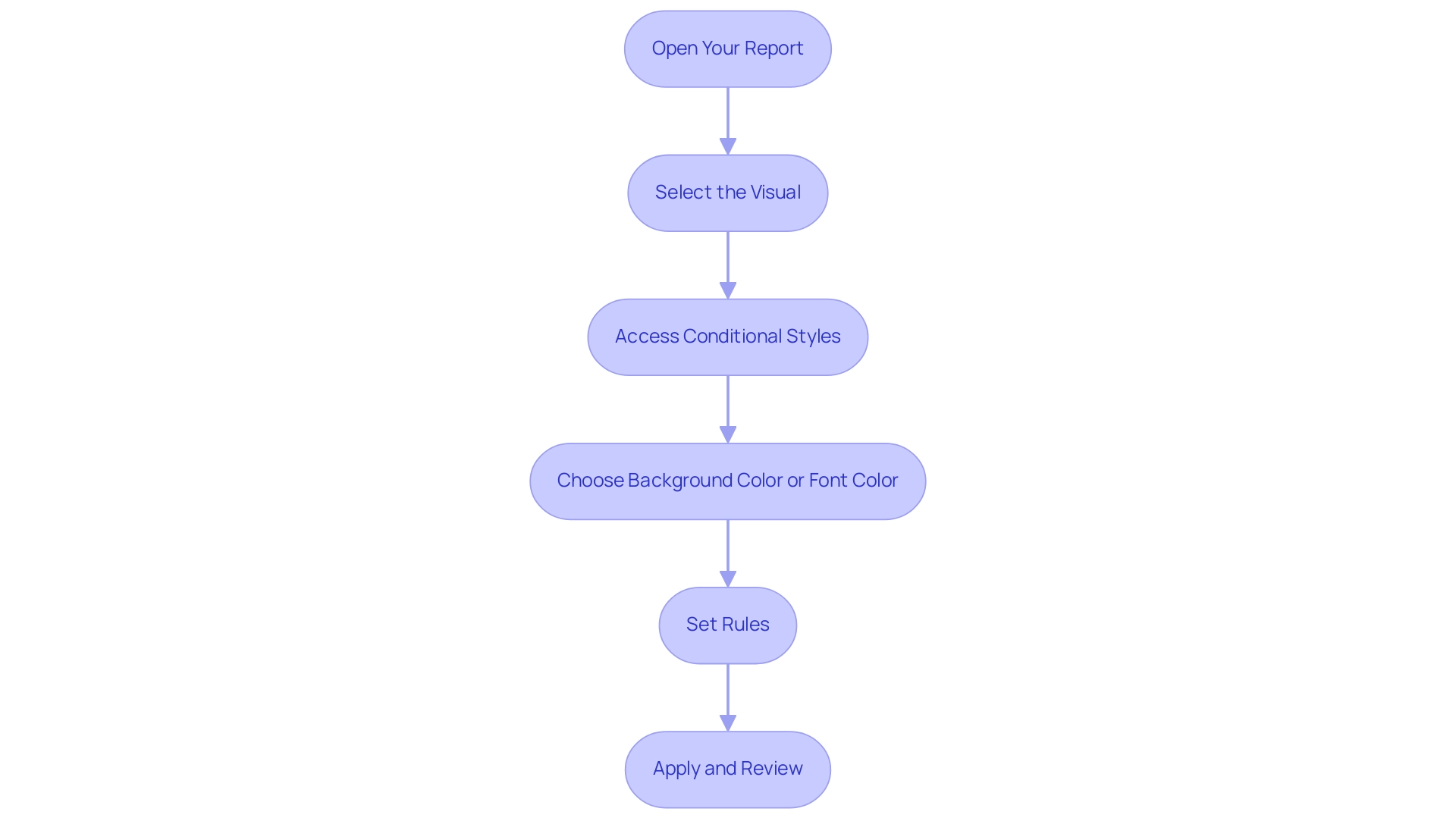
Common Challenges and Solutions in Date Conditional Formatting
The challenges users face with date specific styling can be addressed through Power BI conditional formatting based on date, particularly when overcoming technology implementation issues. Here are some common problems and their solutions:
-
Incorrect Date Formats: A frequent hurdle is ensuring that your date fields are recognized correctly by Power BI. If dates are not in the appropriate format, conditional formatting will not be applied.
It’s essential to convert any text fields into date formats within Power BI to ensure proper functionality, thereby enhancing efficiency and reducing mistakes in interpretation. Additionally, implementing Robotic Process Automation (RPA) can streamline this conversion process, further improving operational efficiency.
-
Overlapping Rules: Multiple rules applied to the same information can lead to confusion; the order of those rules can significantly impact the end result. Users should regularly examine and modify the priority of their rules to ensure that the intended display is shown correctly. This practice connects directly to the wider challenge of inadequate master information quality, which can weaken the effectiveness of AI solutions and business intelligence tools, such as Power BI conditional formatting based on date. Subpar master data quality can result in inconsistent result displays, making it essential to tackle these data problems in advance.
-
Performance Issues: An excess of format rules can impede report performance, worsening difficulties such as lengthy report creation. Statistics indicate that reports with excessive styling can suffer up to a 30% reduction in performance efficiency. To combat this, it’s advisable to limit the number of conditions applied and simplify the rules where possible. This not only enhances performance but also ensures that the report remains responsive and actionable. Leveraging Business Intelligence tools can provide insights into which conditions are most effective, allowing for better decision-making regarding Power BI conditional formatting based on date.
These challenges highlight the importance of strategic management in Power BI conditional formatting based on date. For instance, addressing overlapping rules can be particularly crucial; as noted by community member William Moura,
That’s because somehow, when I select the red and the yellow together, the yellow becomes white.
This underscores the need for clear and prioritized rules to avoid unexpected results. Furthermore, the case study on dynamic filtering illustrates that optimizing conditions can lead to enhanced interactivity and experience in reports. By utilizing multiple slicers effectively, individuals can ensure that their visuals, including the Card visual, display relevant messages based on selected filters, enhancing overall functionality and responsiveness while leveraging insights from Power BI dashboards.
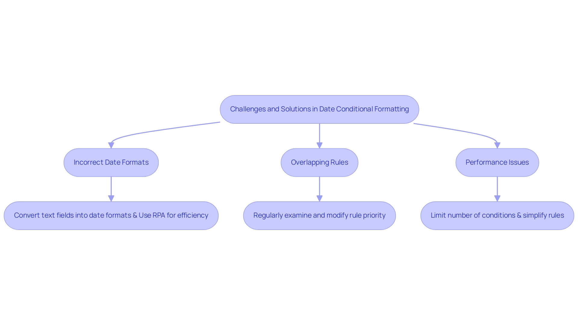
Advanced Techniques for Optimizing Date Conditional Formatting
To enhance your date conditional formatting in Power BI effectively and leverage the power of Business Intelligence, consider implementing the following advanced techniques while also addressing common challenges faced in leveraging insights from Power BI dashboards:
-
Dynamic Formatting: Leverage Data Analysis Expressions (DAX) to establish dynamic rules that adapt based on user inputs or slicers. This method enables the development of interactive reports that react to real-time information changes, significantly enhancing engagement and tackling issues such as time-consuming report generation.
-
Utilize Tooltips: Enhance the overall experience by integrating tooltips that provide additional context when individuals hover over formatted dates. These tooltips can show essential information such as the number of days left until a deadline or comparisons to historical records, enhancing the analytical depth of your reports and ensuring actionable guidance.
-
Color Gradients: Move beyond solid color applications and consider using color gradients to visually convey the urgency of dates. For instance, using a gradient that shifts from green to red can effectively indicate the proximity of deadlines, presenting a more nuanced perspective on the information and allowing users to quickly assess critical timelines.
As shown in a recent case study by Angelica Domenech, applying background color styling can significantly improve information interpretation. Angelica stated, ‘In the example presented, I demonstrated how to apply conditional formatting to show failed banks by state.’ In her example, she utilized color coding to illustrate the number of failed banks by state, where green represented lower numbers (a positive outcome) and red indicated higher figures (a negative outcome).
This method not only clarified the information but also made it visually engaging for users.
Moreover, the challenges of inconsistencies can be mitigated by utilizing COUNTIF in conjunction with these techniques, while also applying Power BI conditional formatting based on date to enhance your management and decision-making processes. By embracing these BI practices alongside RPA solutions, such as EMMA RPA and Microsoft’s Power Automate, you can transform raw data into actionable insights that drive growth and operational efficiency.
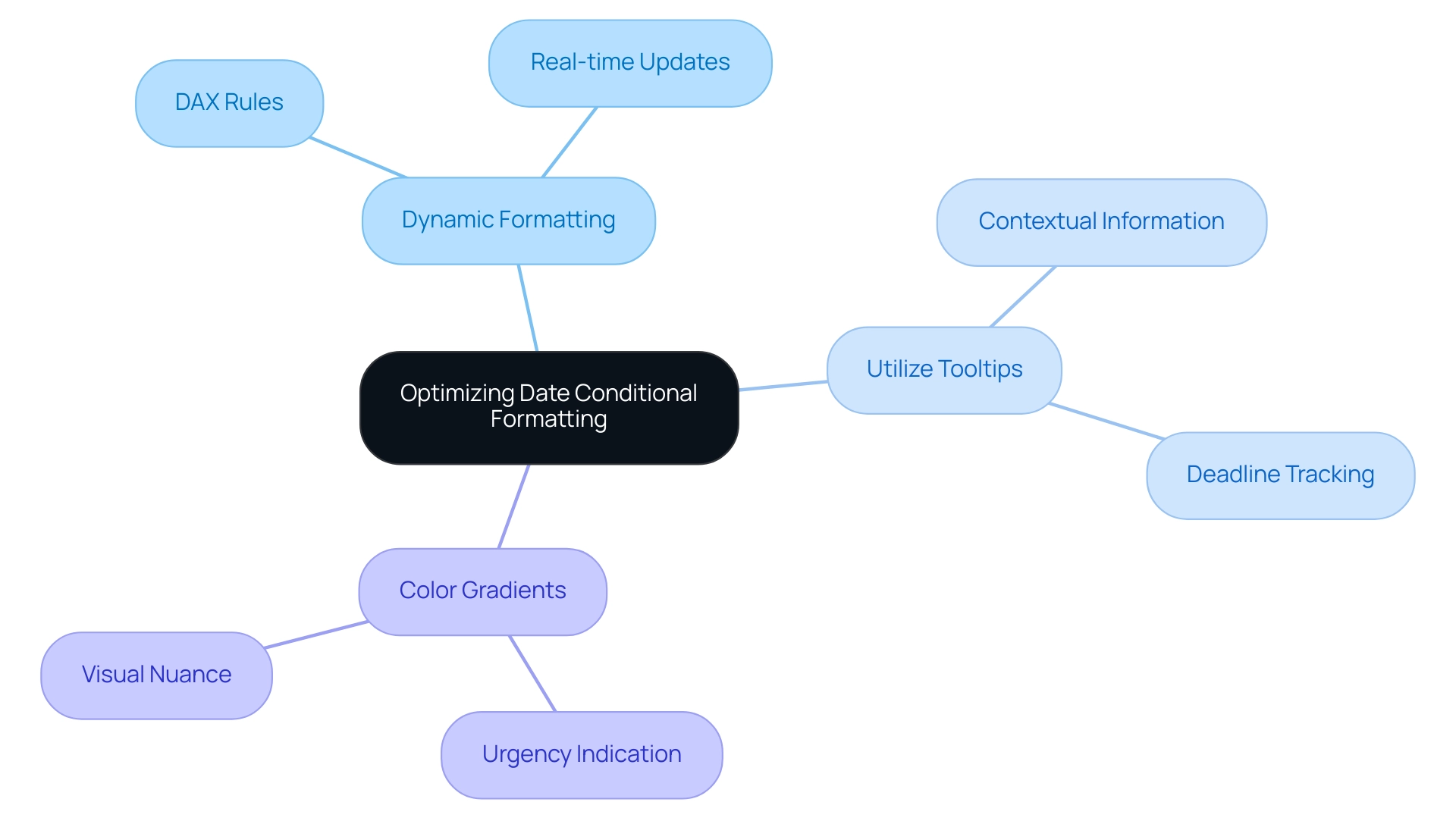
Conclusion
Conditional formatting in Power BI is a game-changer for organizations striving to enhance their data visualization capabilities. By applying tailored visual cues based on specific conditions, users can simplify complex data sets and ensure consistency in reporting. The practical application of this feature, particularly in highlighting critical information such as deadlines, empowers teams to make swift and informed decisions, ultimately boosting operational efficiency.
The importance of date-based conditional formatting cannot be overstated. It not only aids in effective project management by providing immediate visual cues for overdue tasks but also enhances overall productivity through automation. Leveraging tools like Robotic Process Automation (RPA) alongside Power BI allows organizations to streamline their reporting processes, facilitating better data analysis and strategic decision-making.
Despite the advantages, challenges such as incorrect date formats and overlapping rules can hinder the effectiveness of conditional formatting. By understanding these common pitfalls and implementing advanced techniques like dynamic formatting and color gradients, users can optimize their reports for improved clarity and responsiveness. This strategic approach not only enhances user engagement but also transforms raw data into actionable insights, paving the way for greater organizational success.
In conclusion, as the reliance on data-driven decision-making continues to grow, the integration of conditional formatting in Power BI is essential. Organizations that embrace these practices will find themselves better equipped to navigate complex data landscapes, ensuring that their reporting efforts lead to meaningful insights and improved outcomes. The time to harness the full potential of Power BI is now, and doing so will undoubtedly yield significant benefits for teams and stakeholders alike.
Overview
To change the Power BI date format to MM/DD/YYYY, users can follow a straightforward five-step process that includes selecting the time column, navigating to the Modeling tab, and applying the desired format. The article supports this by detailing the importance of proper data type settings and regional configurations, ensuring that the date format is consistently displayed across reports, thereby enhancing clarity and trust in the presented information.
Introduction
In the intricate world of data analysis, the significance of date formatting in Power BI cannot be overstated. As organizations strive to create impactful reports that drive insights, the challenge of inconsistent date representations often looms large. With various formats like DD/MM/YYYY and MM/DD/YYYY competing for attention, the potential for misinterpretation is ever-present.
This article delves into the nuances of date formats in Power BI, offering a comprehensive guide on how to:
- Navigate common pitfalls
- Implement best practices
- Leverage advanced techniques for seamless data management
By understanding the implications of date formatting, users can enhance the clarity and accuracy of their reports, ultimately empowering stakeholders to make informed decisions based on reliable data.
Understanding Date Formats in Power BI
In this tool, the diversity of temporal representations can significantly affect how information is shown and understood, which is especially vital for effective reporting and analysis. Unfortunately, many organizations face challenges such as investing more time in constructing reports than leveraging insights from Power BI dashboards. The standard time representation may not consistently align with user preferences or adhere to local norms, resulting in possible misunderstandings.
For example, while DD/MM/YYYY is common in many regions, the Power BI date format mm/dd/yyyy is prevalent in others, and YYYY-MM-DD is often recommended for clarity and consistency. Furthermore, data inconsistencies can occur from mishandled time representations; a significant statistic emphasizes that in Excel-style Julian numbers, day 60 is inaccurately shown as 2/29/1900, demonstrating how temporal misrepresentation can happen in data analysis. As highlighted by Steve Simon, PhD, ‘If you are entering information yourself, use the ISO 8601 standard,’ which emphasizes the importance of using four-digit years to avoid confusion.
The importance of clear representations of time is further demonstrated in a case study titled ‘Ambiguity in Time Representations,’ where storing timestamps in various styles led to misinterpretations, such as insect counts appearing as if they were gathered in the future. To alleviate such issues and offer practical guidance, it is recommended to store temporal information across distinct fields for day, month, and year, ensuring both clarity and precision in global datasets. Moreover, organizations ought to establish a strong governance approach to standardize time representations across reports, thus minimizing discrepancies and boosting confidence in the information.
Ultimately, comprehending how this tool interprets time, especially in the Power BI date format mm/dd/yyyy, and the implications of utilizing various styles is essential for users to avoid common pitfalls when visualizing and analyzing information, thereby enhancing operational efficiency.
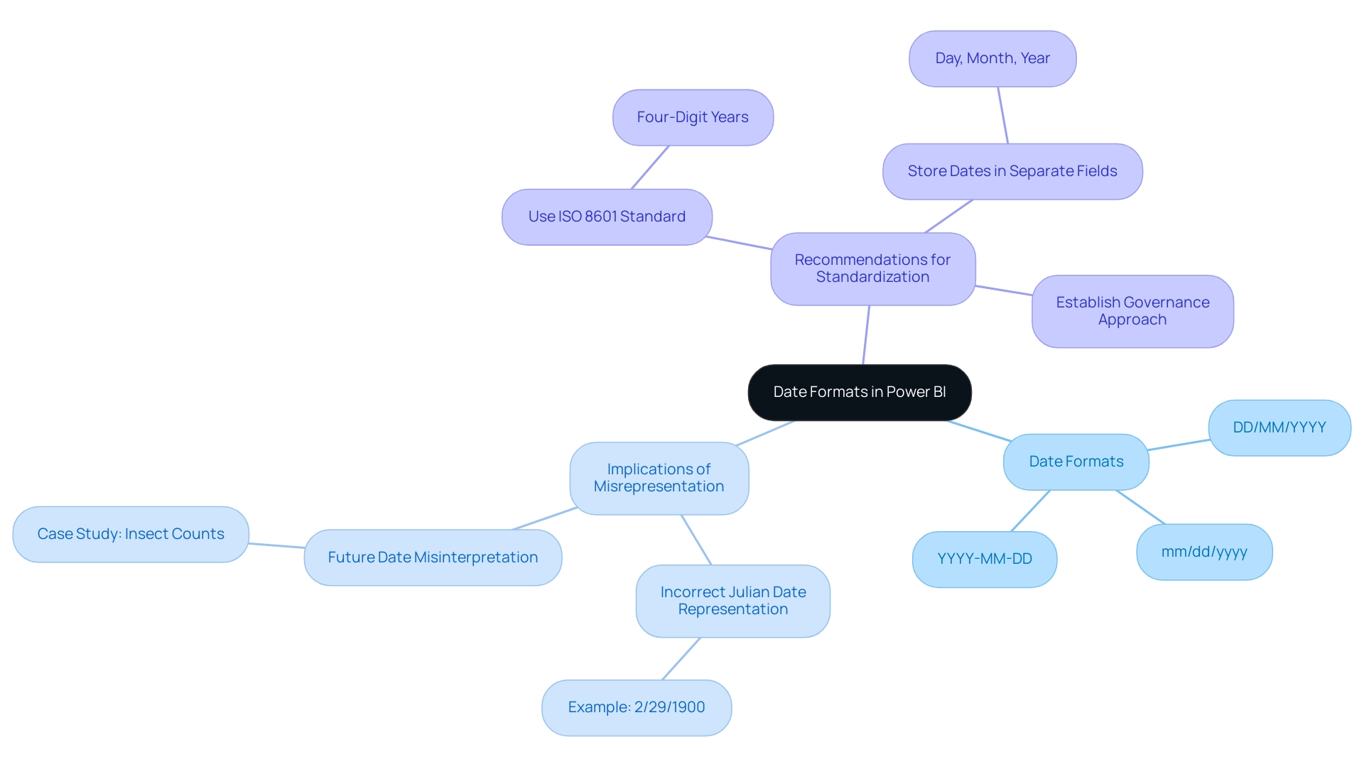
Step-by-Step Guide to Changing Date Format to MM/DD/YYYY
Modifying the time style in BI to the Power BI date format mm/dd/yyyy is an uncomplicated task that can improve the clarity of your reports, particularly in a competitive setting where participants have 4 opportunities to enter the BI DataViz World Championships. Considering typical obstacles in report generation, like lengthy procedures and data discrepancies arising from an absence of governance strategy, adhere to these steps to organize your information accurately and ensure your insights are actionable:
- Open Power BI Desktop: Start the application and load the report you are working on.
- Select the Time Column: Locate the column containing the times you wish to format in the Fields pane and click on it.
- Navigate to the Modeling Tab: Click on the ‘Modeling’ tab located in the ribbon at the top of the screen.
- Format the Date: In the ‘Formatting’ section, verify that the ‘Data type’ is set to ‘Date’. Then, in the ‘Format’ dropdown, choose ‘MM/DD/YYYY’. Davor DSouza, a data analyst at Hevo Data, highlights the significance of utilizing the ‘Date/Time’ format for information that necessitates both temporal and chronological details, ensuring precise organization. This practice is essential, particularly as DAX has been employed in Pivot in Excel and SQL Server Analysis Services for numerous years, emphasizing the wider significance of BI in data analysis.
- Apply Changes: After making your selection, the time arrangement will immediately refresh in your visuals. Ensure you examine your reports to verify that the modifications are represented accurately.
For example, Janice, a sales manager at Contoso, successfully established a new metric in BI to compute anticipated sales, which involved altering time representations for improved clarity. By adhering to these procedures, you can guarantee that your temporal information is consistently displayed in the Power BI date format mm/dd/yyyy, improving the professionalism and clarity of your BI reports. This clarity not only addresses the challenges of report clarity and actionable insights but also builds trust in the information presented, guiding stakeholders in their decision-making processes.
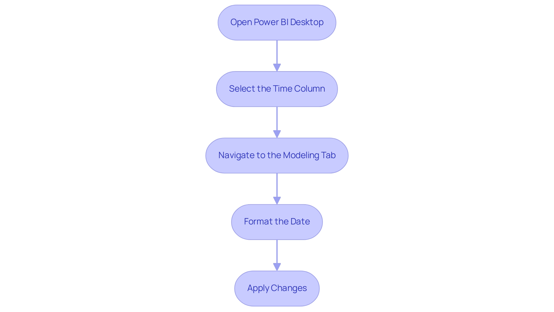
Common Challenges in Changing Date Formats
Modifying format styles in BI can introduce various difficulties that may obstruct efficient information management and reporting. Typically, users may find themselves investing excessive time in constructing reports rather than leveraging insights from BI dashboards. This time-consuming report creation often stems from:
- Data Type Confusion: A prevalent issue arises when users fail to set the date column as a ‘Date’ data type. Power BI supports information types such as ‘Date’ and ‘Date/Time,’ and without this essential step, any format changes may not be applied correctly. Ensuring that the information type is accurately designated before attempting to modify formatting is crucial. As a recommended approach, you should utilize the ‘Date/Time’ information type for information that requires both time and calendar details.
- Regional Settings: Power BI defaults to specific regional settings that may not match your preferred time representation. Checking and adjusting these settings is vital to avoid discrepancies in representation, which can lead to confusion and mistrust in the information presented.
- Inconsistent Information: Errors can occur when date entries are formatted inconsistently, such as a mix of the Power BI date format mm/dd/yyyy and other formats like DD/MM/YYYY. To prevent these issues, it is essential to clean the information to maintain uniformity prior to formatting it in the Power BI date format mm/dd/yyyy, ensuring that stakeholders receive clear, actionable guidance from the reports. The lack of a governance strategy can exacerbate these inconsistencies, making it critical to implement one to ensure data integrity.
- Visual Updates: After modifying the layout, there may be instances where visuals do not reflect the updates immediately. To ensure that changes are accurately displayed, refreshing your report or visuals is recommended.
Additionally, a recent case study highlighted users facing parsing errors due to locale settings. Despite choosing the appropriate locale, some still faced challenges with recognizing the time. The recommended solution was to delete the automatic ‘Changed Type’ step and manually apply the locale settings, which resolved the issue for several users.
This highlights the importance of meticulousness in setting both information types and regional formats to minimize complications during the formatting process. Furthermore, with the upcoming February 2025 Power BI update introducing new features, staying informed about these changes is essential for optimizing data management practices. Embracing solutions like Robotic Process Automation (RPA) can also streamline workflows and enhance efficiency, allowing you to focus on deriving insights from information rather than getting bogged down by report creation.
It is vital that reports not only present data but also provide clear direction on the next steps for stakeholders.
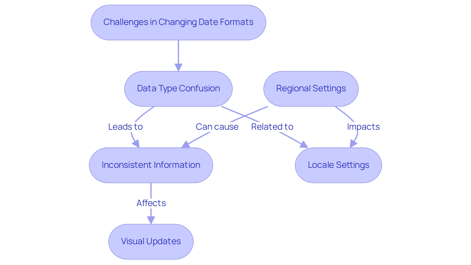
Best Practices for Consistent Date Formatting
To ensure uniformity in temporal structuring across your BI reports and to alleviate the frequent difficulties of lengthy report generation, it’s crucial to adopt several best practices:
- Standardize Styles: Choose a consistent temporal structure, such as MM/DD/YYYY, and implement it across all datasets and reports to prevent inconsistencies.
- Document Guidelines: Keep a thorough record that specifies the standard temporal structures used in your reports. This resource will assist in making sure that all team members follow the same guidelines, promoting uniformity in your reporting.
- Regular Audits: Conduct periodic reviews of your reports to check for consistency in format. This practice is especially vital after bringing in new datasets, as it aids in spotting any inconsistencies that might occur.
- Training and Resources: Provide training sessions as part of our 3-Day Business Intelligence Sprint, emphasizing the significance of formatting time and how to apply it efficiently in Business Intelligence. As one user, Gianluca88, pointed out, addressing common frustrations—such as needing to set the property of the X-axis to categorical rather than continuous—can significantly enhance clarity and usability in data visualizations. Moreover, a case study emphasized annoyance with BI showing timestamps in label formats despite the column being set up correctly. This highlights the need for enhanced format management in BI visuals, reinforcing the importance of embracing these best practices. To further enhance your reporting capabilities, consider our 3-Day BI Sprint, where we’ll assist you in creating polished reports that not only meet formatting standards but also enable you to leverage actionable insights for improved business decisions. By actively promoting these practices, you can create a more efficient reporting environment that mirrors the superior formatting capabilities of Excel.
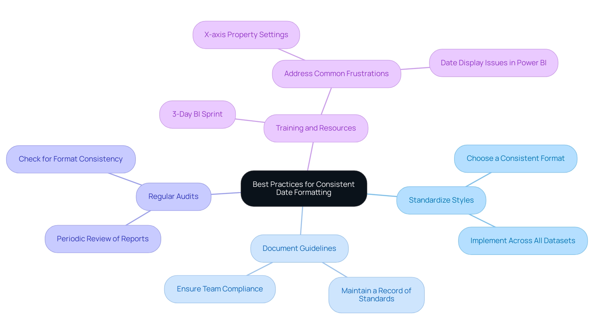
Advanced Techniques for Date Formatting in Power BI
For those aiming to refine their temporal formatting skills in BI, several advanced techniques can significantly enhance your capabilities:
-
Dynamic Formatting with DAX: Harness the strength of DAX by creating calculated columns that allow for dynamic temporal formatting. For example, utilizing the FUNCTION option, you can customize time presentations according to particular criteria, modifying your reports to satisfy various analytical requirements.
-
Effective Power Query Transformations: Use the ‘Transform’ tab in Power Query to modify time styles before the data enters Power BI. This method is especially beneficial for large datasets with multiple time columns, as it enables simultaneous format adjustments, ensuring consistency from the outset.
-
Custom Time Formats: Explore the potential of custom time formats that align with your reporting requirements. This capability provides improved flexibility in how time periods are represented across your visuals, making your reports more intuitive and user-friendly.
-
Utilization of Time Hierarchies: Implement time hierarchies in your reports to enable effective drill-down analysis. This feature enables users to explore information at different levels—year, quarter, month, and day—offering a thorough view of trends and patterns.
It is important to emphasize that appropriately formatting temporal information is vital before exporting from BI tools, as this guarantees precise information representation and analysis. Davor DSouza, a research analyst at Hevo Data, highlights the importance of these techniques:
Data-driven decisions are enhanced by accurate temporal formatting, making it essential to master these methods in BI.
Additionally, ensuring that Power BI Desktop is configured to the appropriate regional settings is vital for using the Power BI date format mm/dd/yyyy.
For example, setting regional settings correctly can significantly influence how times are formatted and displayed. This foundational step enhances the accuracy of temporal formats, ultimately leading to better data representation and analysis, particularly with the Power BI date format mm/dd/yyyy. For those interested in exploring these tools further, Hevo offers a 14-day free trial, allowing users to experience the benefits of advanced date formatting techniques in Power BI.
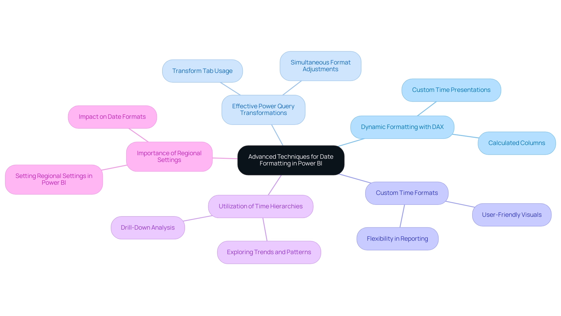
Conclusion
Understanding and implementing proper date formatting in Power BI is essential for ensuring clarity and accuracy in data representation. This article has explored the various challenges users face, from data type confusion to regional settings, and highlighted the importance of a standardized approach. By adopting best practices such as:
- Maintaining uniform date formats
- Conducting regular audits
- Providing adequate training
organizations can significantly enhance the effectiveness of their reports.
Moreover, advanced techniques such as dynamic formatting with DAX and efficient Power Query transformations offer powerful tools for refining date presentation. These strategies not only improve usability but also empower stakeholders to make informed decisions based on reliable data. As the landscape of data analysis continues to evolve, staying informed about new features and best practices will be crucial for maximizing the potential of Power BI.
Ultimately, the implications of date formatting extend far beyond mere aesthetics. By prioritizing accurate date representations and establishing a robust governance strategy, organizations can foster trust in their data, streamline reporting processes, and unlock valuable insights that drive business success. Embracing these practices will pave the way for clearer, more actionable reporting in Power BI, enabling stakeholders to navigate data with confidence.
