Overview
The article provides a comprehensive guide on how to use the DISTINCTCOUNTNOBLANK function in Power BI, emphasizing its role in counting unique values while excluding blank entries for accurate data analysis. It outlines practical implementation steps, common troubleshooting issues, and performance optimization strategies, demonstrating how mastering this function enhances operational efficiency and data-driven decision-making in business intelligence contexts.
Introduction
In the realm of data analytics, the ability to extract meaningful insights from vast datasets is paramount, especially for organizations striving for operational excellence. The DISTINCTCOUNTNOBLANK function in Power BI emerges as a powerful tool, enabling users to accurately count unique values while filtering out blank entries that can skew results. This function is not just a technical detail; it represents a critical capability for ensuring data integrity and enhancing the quality of business intelligence.
As companies navigate the complexities of data analysis, mastering DISTINCTCOUNTNOBLANK becomes essential for unlocking the full potential of their reports. This article explores its:
– Definition
– Practical applications
– Troubleshooting tips
– Performance optimization strategies
Empowering professionals to leverage this function effectively and drive informed decision-making within their organizations.
Understanding DISTINCTCOUNTNOBLANK: Definition and Purpose
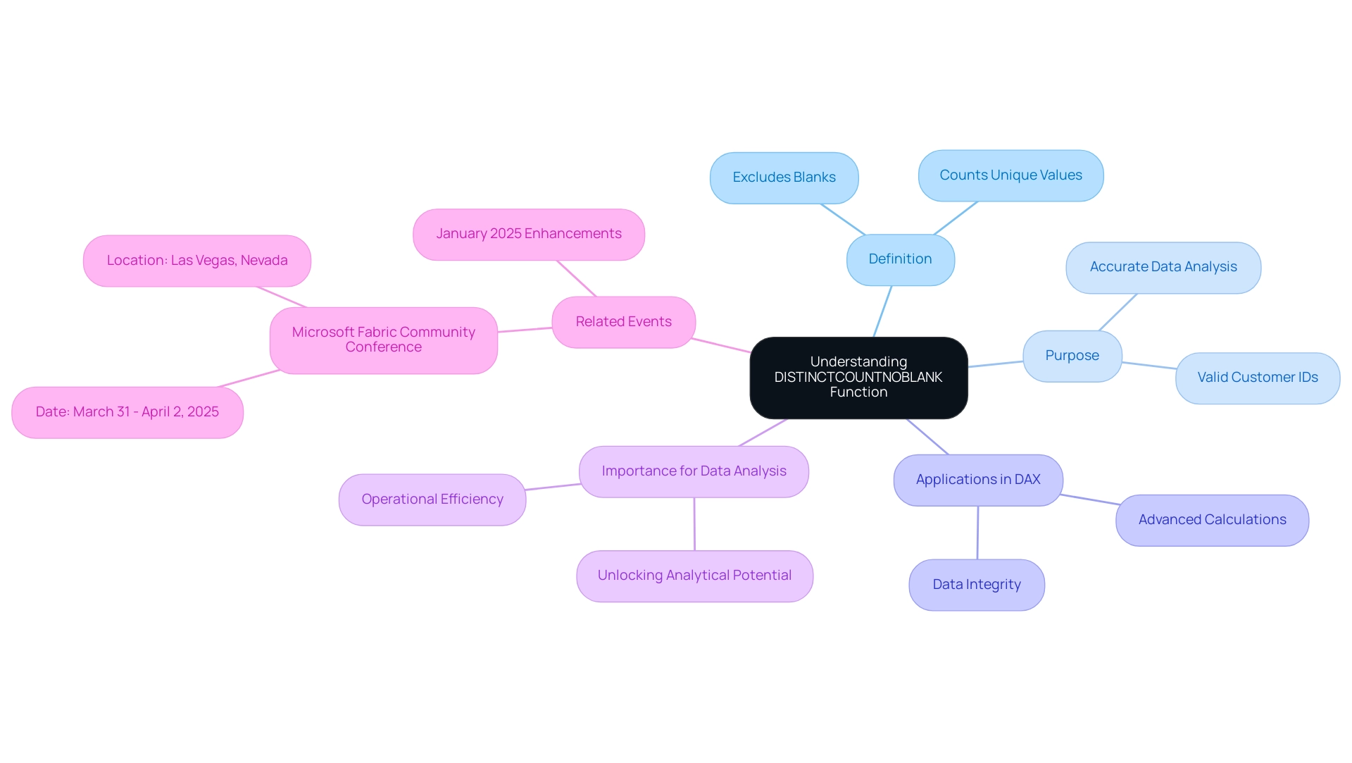
The function in Power BI plays a pivotal role by using distinctcountnoblank to count unique values in a column while excluding any blank entries. This capability is essential for accurate data analysis, particularly when evaluating unique customer IDs in a sales report. By utilizing the distinctcountnoblank function, you ensure that only valid, non-empty IDs are considered, thus providing a true representation of your dataset’s integrity.
This function is integral to Data Analysis Expressions (DAX), the language that enables users to create advanced calculations within BI. Mastering its use is vital for unlocking the full analytical potential of your reports, especially as BI continues to evolve with updates like the January 2025 enhancements across Reporting, Modeling, and Data Connectivity. Moreover, our Power BI services, including the 3-Day Power BI Sprint, allow for rapid creation of professionally designed reports, while the General Management App supports comprehensive management and smart reviews to enhance operational efficiency.
As we get ready for the Microsoft Fabric Community Conference from March 31 to April 2, 2025, in Las Vegas, Nevada, attendees can explore DAX capabilities and best practices more thoroughly. Additionally, feedback from professionals like Wisdom Wu emphasizes the importance of precise data analysis for effectively accessing usage metrics and highlights how integrating RPA solutions like EMMA can help overcome outdated systems, reinforcing the critical role of business intelligence in driving data-driven insights and operational efficiency for business growth.
Practical Applications: How to Implement DISTINCTCOUNTNOBLANK in Power BI
To effectively implement the DISTINCTCOUNTNOBLANK function in Power BI and harness the power of Business Intelligence for informed decision-making, follow these structured steps:
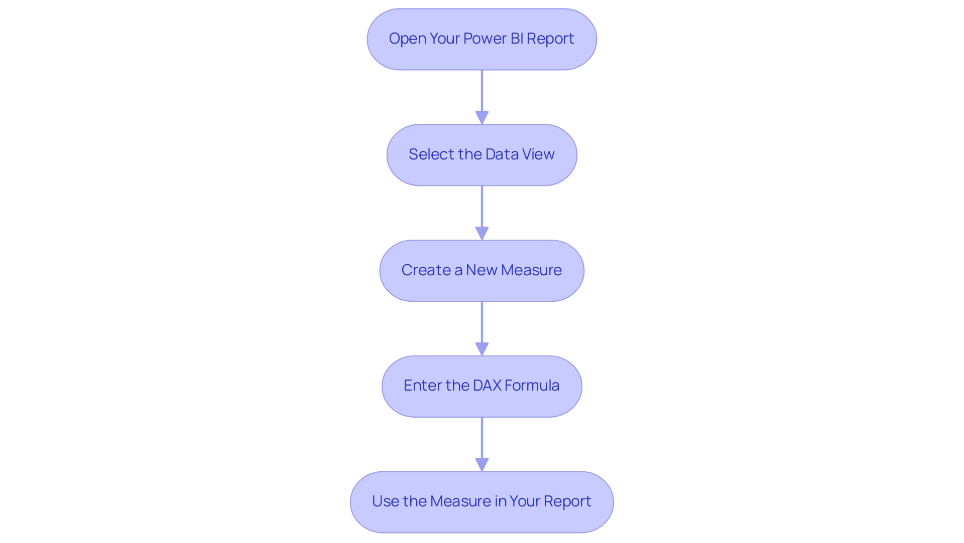
- Open Your Power BI Report: Launch Power BI Desktop and open the report you wish to modify.
- Select the Data View: Navigate to the Data view, where you can access your tables and columns.
- Create a New Measure: In the Fields pane, right-click on the table where you want the measure created and select ‘New measure’.
- Enter the DAX Formula: In the formula bar, input the DAX expression:
UniqueCount = COUNTAX(TableName[ColumnName]). Be sure to replaceTableNameandColumnNamewith the actual names relevant to your dataset. - Use the Measure in Your Report: Once your measure is created, you can incorporate it into your report visuals. For instance, if you’re analyzing sales information, this measure will clearly count the unique customers who made purchases, effectively ignoring any blank entries.
As Nirmal Pant states, “The distinctcountnoblank function is a powerful tool in Power BI for scenarios where you need to perform a distinct count while ignoring any blank values.” This highlights the significance of employing this feature for precise information analysis, particularly in an environment where obstacles like lengthy report creation and inconsistencies can hinder operational efficiency.
Incorporating RPA solutions can significantly enhance this process. For instance, automating the preparation steps can decrease the time allocated for report creation, enabling you to concentrate on analyzing the insights obtained from your information. RPA can also assist in maintaining data consistency, which is essential when using operations such as COUNTNOBLANK.
For a practical application, consider a dataset from the Global Super Store, where you may have customer orders with some missing product names. By using the formula Distinct Products Sold = DISTINCTCOUNTNOBLANK('Global Super Store'[Product Name]), you can effectively count the distinct products sold while ignoring any blanks. In this case, the operation counted four distinct products, showcasing its utility in real-world scenarios and highlighting how BI can drive growth and innovation by providing actionable insights.
Additionally, as of November 23, 2023, the order amount in Hyderabad was 110. Examining such information with the specified method can offer insights into customer purchasing behavior, assisting you in making informed operational choices in your position as a Director of Operations Efficiency.
By adhering to these steps and incorporating RPA into your workflow, you enable yourself to utilize a specific function, greatly improving your analysis capabilities in Power BI. This feature not only offers precision in your counts but also guarantees that your reports reflect an accurate depiction of your information, aligning with best practices in DAX usage and alleviating the common challenges encountered in BI reporting.
Troubleshooting DISTINCTCOUNTNOBLANK: Common Issues and Solutions
When utilizing the DISTINCTCOUNTNOBLANK function, users may face several typical challenges that can impede their data analysis efforts, particularly in the context of leveraging Business Intelligence effectively:
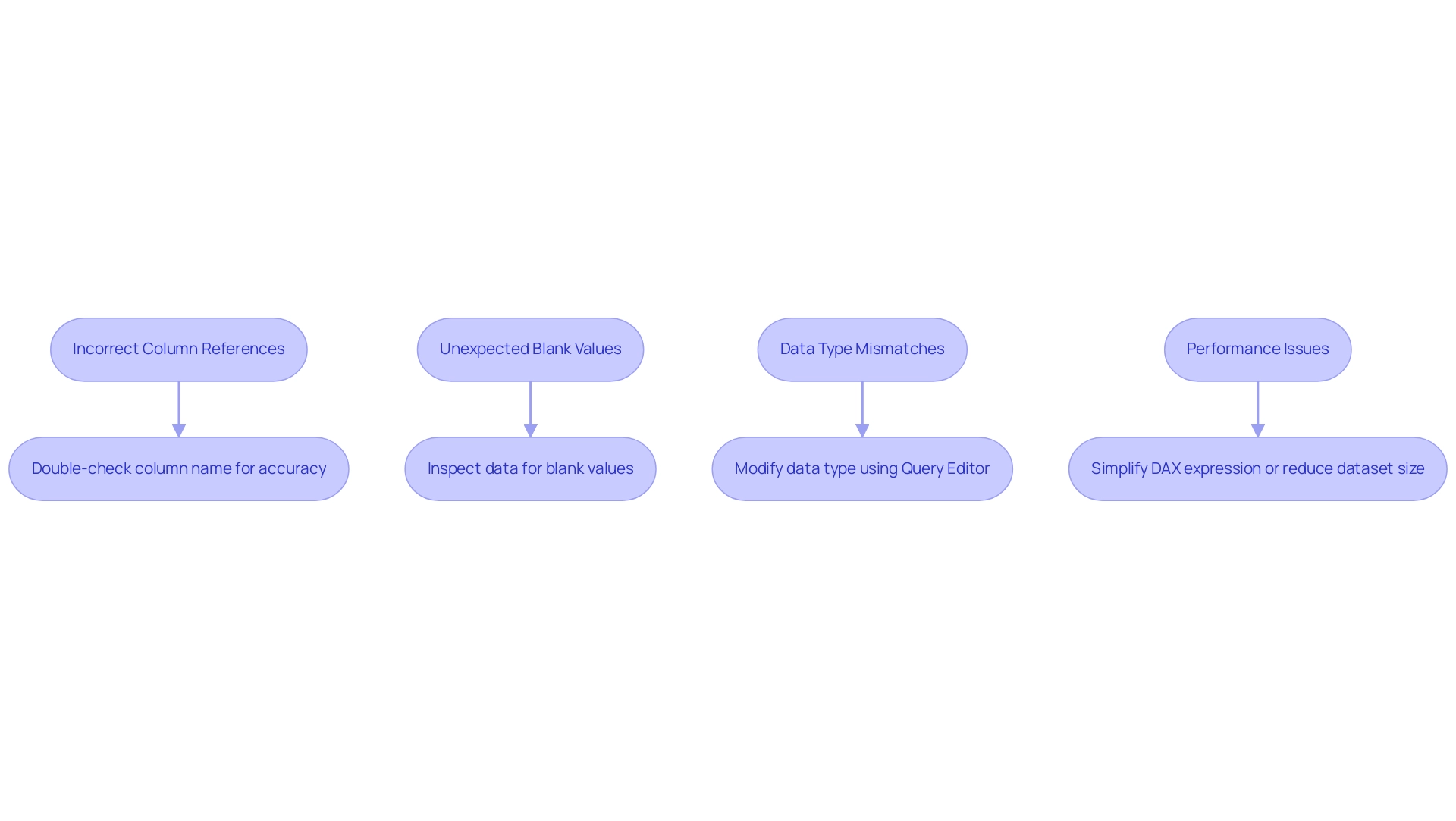
- Incorrect Column References: It’s crucial to ensure that the column referenced in the DISTINCTCOUNTNOBLANK function is accurately spelled and that it exists within the specified table. In the event of an error, double-check the column name for accuracy. This aligns with the need for accurate information management, a critical step in overcoming implementation challenges.
- Unexpected Blank Values: If the count yields unexpected results, verify the presence of blank values in your information. Utilize the ‘Data View’ feature to inspect and confirm the actual entries, ensuring that your analysis is based on clean information, which is essential for informed decision-making.
- Data Type Mismatches: The operation may not work as intended if the column’s type is incompatible. Ensure the column is formatted as either text or numeric. If needed, modify the data type using Query Editor before applying the operation. This step is vital for maintaining operational efficiency and maximizing the effectiveness of your BI tools.
- Performance Issues: Should you encounter slow report performance, consider whether a specific counting method is utilized within a complex calculation. Simplifying the DAX expression or reducing the dataset size can often enhance performance significantly, thus addressing potential bottlenecks in your reporting process.
As Nirmal Pant notes, “The distinctcountnoblank function is an essential tool in BI for scenarios that require a distinct count while ignoring blank values.” By recognizing these common issues and implementing the suggested solutions, users can navigate challenges with confidence, ultimately enhancing their experience and effectiveness in Power BI.
Furthermore, leveraging Robotic Process Automation (RPA) can help automate repetitive information tasks related to these challenges. For instance, RPA can be used to clean information by automatically identifying and removing blank entries, ensuring that the dataset is ready for analysis without manual intervention. This not only improves efficiency but also allows teams to focus on deriving strategic insights from the data.
A case study named “Utilizing a specific counting method in Business Intelligence” illustrates how implementing this approach on a dataset of customer orders using DISTINCTCOUNTNOBLANK precisely calculated the number of unique products sold, leading to a total of 4 unique products when blanks were omitted. The result of this analysis resulted in enhanced inventory management and sales strategies, demonstrating how effective application of DISTINCTCOUNTNOBLANK can enhance operational efficiency and utilize BI insights for business growth. Furthermore, instructions for visualizing the distinct count in BI can guide users in creating a new measure and adding it to their reports effectively, illustrating the strength of actionable insights in driving business growth.
Performance Considerations: Optimizing DISTINCTCOUNTNOBLANK Usage
To optimize the DISTINCTCOUNTNOBLANK function in Power BI effectively, consider the following performance enhancement strategies that align with the goals of Business Intelligence and operational efficiency, while also addressing common challenges faced in leveraging insights from Power BI dashboards:
-
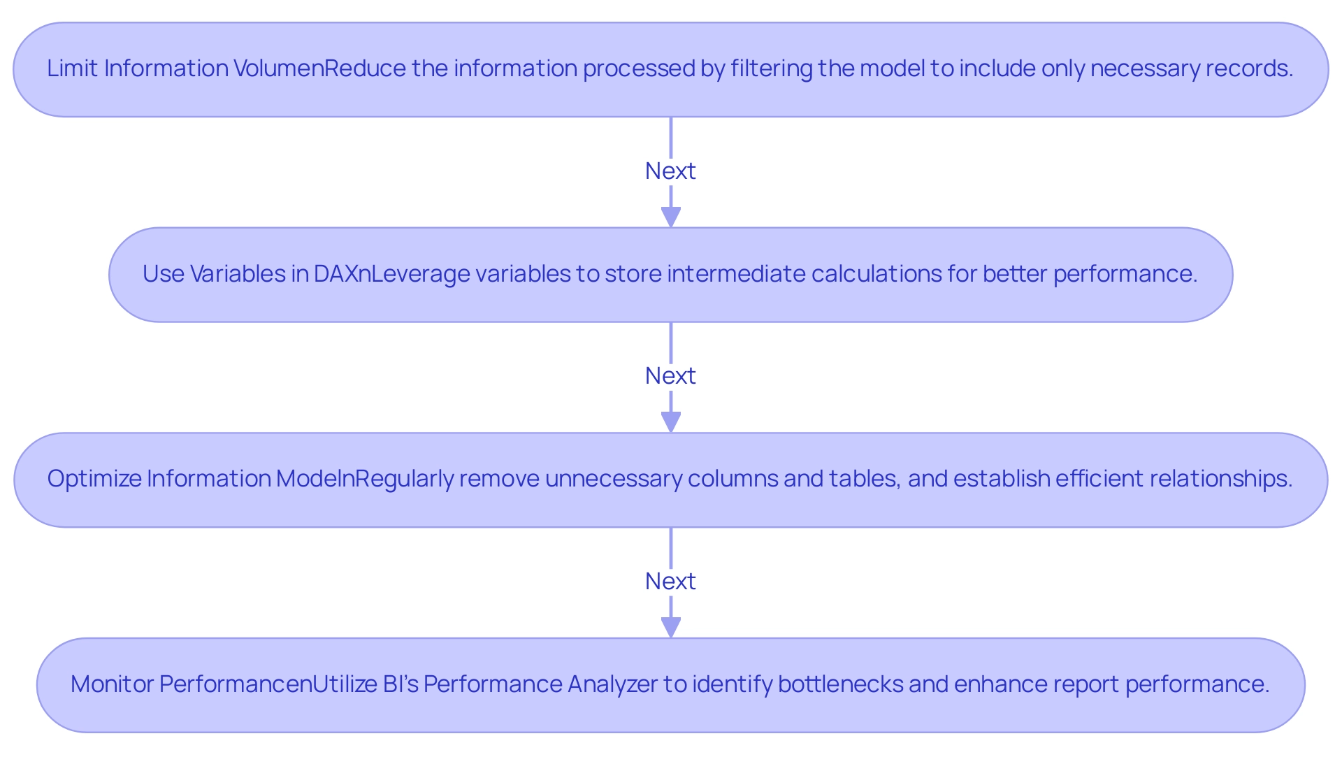
Limit Information Volume:
Reducing the information being processed is crucial for enhancing performance. Filter your model to include only the records that are necessary before applying the DISTINCTCOUNTNOBLANK function. This step not only speeds up calculations but also minimizes resource consumption. With 5,822 users currently online, the demand for efficient information handling is evident, reflecting the need for strong BI strategies to overcome the challenge of extracting meaningful insights. -
Use Variables in DAX:
When constructing complex DAX measures, leverage variables to store intermediate calculations. This practice simplifies your formulas and can significantly enhance performance by decreasing the frequency of processing, making your calculations more efficient. This method reflects the operational efficiencies pursued through RPA, tackling task repetition fatigue, especially in report generation and management. -
Optimize Information Model:
An optimally structured information model is essential. Regularly remove unnecessary columns and tables, and ensure that relationships are established efficiently. A streamlined information model minimizes calculation complexity and enhances performance across the board. As mentioned by lbendlin, ‘For import mode information sources, your only option is to optimize the DAX code.’ For Direct Query information sources, you can also examine the SQL code produced by the queries and apply optimizations at the source (indexes, statistics etc). This optimization supports the BI goal of transforming raw information into actionable insights, addressing the issues of inconsistencies. -
Monitor Performance:
Utilize BI’s Performance Analyzer to pinpoint bottlenecks in your reports. This powerful tool offers insights into loading times for each visual, empowering you to make informed adjustments and enhancements. Furthermore, consider the case study titled ‘Use Native Queries When Possible,’ which illustrates how leveraging the query engine of the data source directly can speed up query execution and utilize optimizations in the underlying database, thereby improving overall performance. This proactive monitoring aligns with the need to navigate the overwhelming AI landscape effectively, ensuring that your BI strategies remain relevant and impactful.
Implementing these strategies will not only improve the performance of your reports using DISTINCTCOUNTNOBLANK but also elevate the overall efficiency of your Power BI reports, enabling you to deliver insights more effectively and drive growth and innovation through informed decision-making.
Conclusion
Harnessing the power of the DISTINCTCOUNTNOBLANK function is essential for organizations aiming to enhance their data analysis capabilities. By accurately counting unique values while excluding blanks, this function ensures that reports reflect true data integrity. The practical applications outlined illustrate how to implement this function effectively, empowering professionals to derive actionable insights from their datasets.
As challenges arise in data analysis, recognizing common issues and applying troubleshooting strategies becomes crucial. Addressing:
- Incorrect column references
- Unexpected blank values
- Data type mismatches
will lead to more reliable results. Moreover, the integration of Robotic Process Automation can streamline these processes, allowing teams to focus on strategic insights rather than repetitive tasks.
Performance optimization strategies further enhance the efficacy of DISTINCTCOUNTNOBLANK. By:
- Limiting data volume
- Utilizing variables in DAX
- Regularly optimizing the data model
users can ensure efficient report generation and insightful analysis. Monitoring performance with tools like Power BI’s Performance Analyzer allows organizations to proactively identify and resolve bottlenecks.
Ultimately, mastering the DISTINCTCOUNTNOBLANK function not only elevates data accuracy but also drives operational efficiency. As organizations embrace these capabilities, they position themselves to make informed decisions that propel growth and innovation. Now is the time to leverage these insights and transform data challenges into opportunities for success.
Overview
Integrating Delta Lake with Azure Synapse enhances data management by combining Delta Lake’s advanced capabilities with Azure Synapse’s analytics features, facilitating real-time insights and operational efficiency. The article outlines a step-by-step setup process and highlights best practices, such as effective partitioning and the use of Robotic Process Automation (RPA), to streamline workflows and improve data handling while addressing common integration challenges.
Introduction
In the rapidly evolving landscape of data management, organizations are increasingly turning to advanced technologies to optimize their operations and extract actionable insights. The integration of Delta Lake with Azure Synapse represents a powerful synergy that enhances the reliability and efficiency of data lakes. By leveraging features such as:
- ACID transactions
- schema enforcement
- time travel capabilities
businesses can manage extensive datasets with confidence. This article delves into the critical aspects of this integration, offering a comprehensive guide that not only covers setup and troubleshooting but also highlights best practices and advanced features. As companies strive to harness the full potential of their data, understanding the nuances of Delta Lake and Azure Synapse becomes essential for driving strategic decision-making and fostering innovation.
Understanding Delta Lake and Azure Synapse Integration
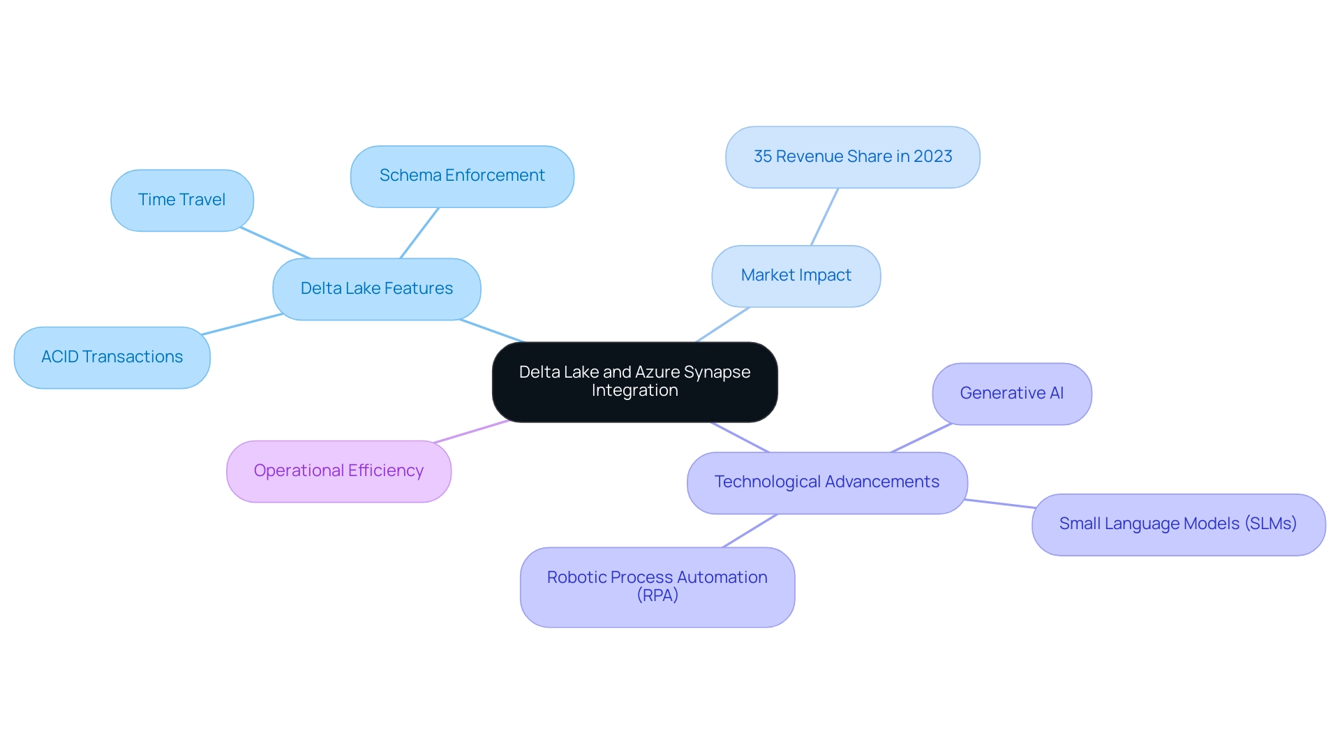
Delta Lake functions as a crucial open-source storage layer that improves the reliability of lakes by allowing users to manage extensive datasets with ACID transactions, schema enforcement, and time travel features. According to recent reports, the information lake market in the United States accounted for approximately 35% of revenue share in 2023, illustrating its significant growth and relevance in today’s analytics-driven landscape. The technological advancement found in North America, along with the existence of leading lake providers, further strengthens this market development.
Azure Synapse, which combines large-scale information and information warehousing into a cohesive analytics experience, becomes even more powerful when paired with a specific storage solution. The synergy between these two platforms facilitates real-time analytics, empowering organizations to extract actionable insights from their information efficiently. As firms increasingly adopt the principles of mesh—decentralizing ownership and fostering collaboration across teams—understanding the integration of Delta Lake Synapse is vital with Azure Synapse.
This combination not only streamlines workflows but also significantly enhances operational efficiency, positioning businesses to leverage their information strategically in a competitive market. Furthermore, the integration of Generative AI and Small Language Models (SLMs) in information engineering exemplifies how AI tools are transforming workflows in management, automating tasks, improving user interactions, and ensuring enhanced privacy and cost-effectiveness. Additionally, leveraging Robotic Process Automation (RPA) can further automate manual workflows, reducing errors and freeing teams for more strategic tasks.
These advancements tackle the challenges of inadequate master information quality, emphasizing the necessity for organizations to remain informed on recent progress in information management that facilitates the integration of delta lake synapse and Delta Storage.
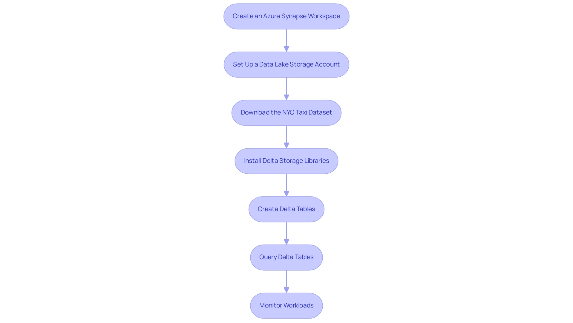
Step-by-Step Setup of Delta Lake in Azure Synapse
-
Create an Azure Synapse Workspace: Begin by logging into the Azure portal. Initiate a new Synapse workspace, selecting the optimal region and resource group that aligns with your operational needs. This foundational step ensures that you have a dedicated environment for your management tasks, crucial for leveraging Robotic Process Automation (RPA) to streamline operations by automating the setup of workflows.
-
Set Up a Data Lake Storage Account: Establish a new Azure Data Lake Storage Gen2 account. This account will be essential for storing your information efficiently. Ensure it is seamlessly linked to your Delta Lake Synapse workspace to facilitate smooth operations and retrieval, thereby enhancing workflow automation and operational efficiency. RPA can automate the information ingestion processes, reducing manual input and errors.
-
Download the NYC Taxi Dataset: Users should download the NYC Taxi – green trip dataset, rename it to
NYCTripSmall.parquet, and upload it to the primary storage account in Synapse Studio. This collection will serve as a practical example for your implementation, demonstrating how structured information can drive actionable insights. Automating this data upload process through RPA can save time and minimize human error. -
Install Delta Storage Libraries: Within your Synapse Studio, navigate to the Manage hub. Choose Apache Spark pools and continue to install the required storage libraries customized for your Spark environment. This installation is essential for enabling advanced information management capabilities in Azure Synapse, particularly through delta lake synapse, supporting RPA initiatives aimed at reducing manual tasks and enhancing accessibility. According to Azure specialists, implementing the latest delta lake synapse libraries ensures optimal performance and compatibility with your workflows, thereby enhancing RPA effectiveness.
-
Create Delta Tables: Utilize Spark SQL or DataFrame APIs to create Delta tables in your lake. Carefully define the schema and load your information into these tables. By structuring your information correctly, you lay the groundwork for efficient querying and manipulation, key for enhancing business intelligence. RPA can automate the schema definition and information loading processes, ensuring consistency and accuracy.
-
Query Delta Tables: Leverage Azure Synapse’s SQL capabilities to execute queries on your delta lake synapse. This integration allows you to harness the strengths of both platforms, optimizing performance and enhancing your analytical capabilities, thus aligning with your goal of data-driven decision-making. RPA can facilitate automated querying processes, delivering insights without manual intervention.
-
Monitor Workloads: Continuously monitor workloads within Azure Synapse to maintain optimal performance and troubleshoot any potential issues. Utilize the
STATS_DATE()function to monitor when statistics were last refreshed, ensuring your information remains pertinent and actionable. As pointed out by scientist Moez Ali, Azure Synapse supports hybrid cloud environments by enabling seamless integration between on-premises systems and the cloud, making it a robust choice for modern management. To maximize the benefits of Azure Synapse, users should follow best practices such as optimizing storage formats, managing compute resources, implementing security measures, and monitoring workloads. RPA can automate these monitoring tasks, allowing your team to focus on strategic initiatives.
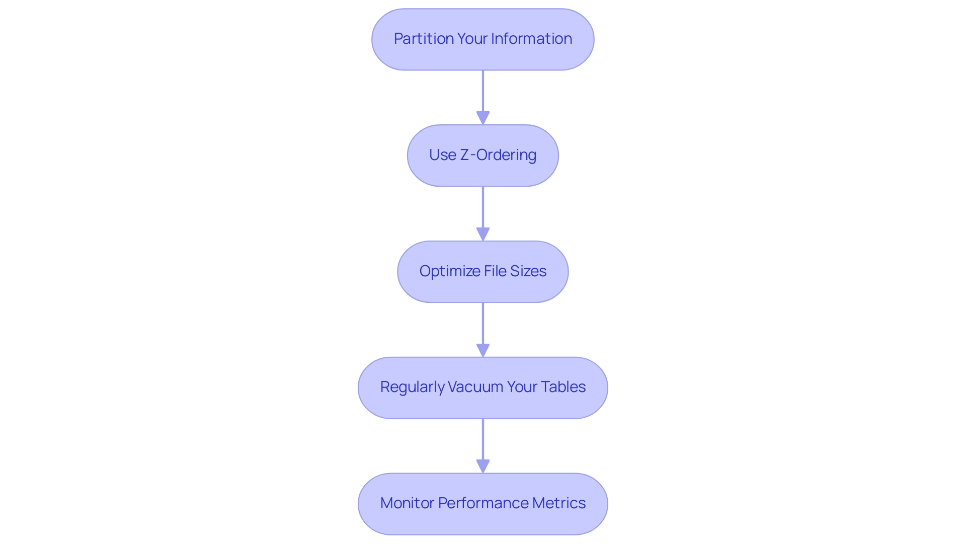
Optimizing Performance: Best Practices for Delta Lake in Azure Synapse
-
Partition Your Information: Strategically organizing your information into partitions based on access patterns is essential for enhancing query performance. By implementing targeted partitions, you can significantly reduce the volume scanned during queries, leading to faster results. Utilizing the OPTIMIZE command allows you to specify partitions directly with a WHERE clause, ensuring that the underlying information in the Delta table remains intact while still optimizing performance. This strategic approach reflects the efficiency improvements provided by Robotic Process Automation (RPA), which can automate manual information management tasks and free your team for higher-level analytical work, ultimately decreasing the likelihood of errors.
-
Use Z-Ordering: Implementing Z-ordering on columns that are frequently queried together can drastically enhance retrieval speeds. This technique reorganizes the information based on column values, allowing for more efficient access and minimizing the need for extensive scanning. As RPA tools can streamline information retrieval processes, combining Z-ordering with automation techniques can lead to even greater operational efficiency, allowing your team to focus on strategic initiatives.
-
Optimize File Sizes: Maintaining Delta file sizes between 128 MB and 1 GB strikes an optimal balance between read and write performance. Following this file size guideline assists in efficient information management and ensures better performance during operations. RPA can aid in keeping these file sizes by automating regular checks and adjustments, which helps prevent human error and enhances overall information integrity.
-
Regularly Vacuum Your Tables: Executing the VACUUM command is crucial for managing storage and maintaining performance. By removing old versions of data, you free up space, which enhances overall system performance and ensures that your data environment remains streamlined. Automating this process through RPA can save time and reduce the potential for human error, ensuring that your team can redirect their efforts toward more strategic tasks.
-
Monitor Performance Metrics: Leverage Azure Synapse’s monitoring tools to continuously track performance metrics. By consistently evaluating these metrics, you can pinpoint bottlenecks and areas for enhancement, enabling proactive modifications that improve the efficiency of your implementation. Recent updates, such as the new operation metrics for SQL UPDATE, DELETE, and MERGE commands in version 2.1.0, provide valuable dataframes with operation metadata, simplifying logging and tracking for developers and enhancing management capabilities. Additionally, integrating RPA to automate the monitoring and reporting process can lead to a more data-driven decision-making environment. Finally, remember that Delta Lake Synapse 2.0.0 requires a minimum Synapse Runtime of Apache Spark 3.3 to function effectively. In the context of the rapidly evolving AI landscape, leveraging tailored AI solutions alongside RPA can further enhance your information management strategies, ensuring they align with your specific business goals and challenges.
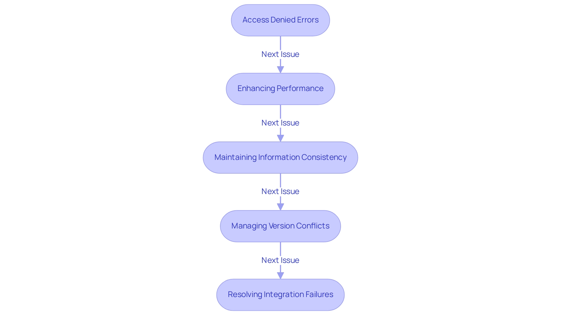
Troubleshooting Common Issues in Delta Lake and Azure Synapse Integration
-
Addressing Access Denied Errors: To resolve access denied errors in Azure Synapse, it’s crucial to verify that your workspace has the appropriate permissions to interact with the delta lake synapse and the Data Lake Storage account. Begin by auditing the IAM roles and access policies associated with your Synapse workspace. Abdennacer Lachiheb emphasizes the importance of ensuring that all configurations are correct, stating,
Try to set this spark conf to false:
spark.databricks.delta.formatCheck.enabledfalse.
This adjustment can enhance access reliability. Additionally, with recent Microsoft Entra authentication changes causing queries to fail after one hour, consider implementing a solution that maintains active connections without rebuilding your setup from scratch, leveraging RPA to automate these monitoring processes. -
Enhancing Performance: If you notice that your queries are running slower than expected, take a close look at your partitioning strategy. Effective partitioning is essential for enhancing structured tables, and employing Business Intelligence tools can offer insights into usage patterns. Regularly reviewing and refining this aspect can significantly improve query performance, thus enhancing overall operational efficiency. Additionally, not utilizing these tools can leave your business at a competitive disadvantage due to missed insights. Moreover, be aware of the potential for buffer overflow attacks, as understanding this feasibility can help in securing your information management practices.
-
Maintaining Information Consistency: To combat consistency errors, leverage the
MERGEcommand in Delta Lake Synapse. This command allows for seamless updates to records, ensuring that your tables remain consistent and accurate. Consistency is essential, particularly in settings where information integrity is paramount, and integrating RPA can assist in automating these consistency checks. -
Managing Version Conflicts: If you face version conflicts within your datasets, implementing a robust version control strategy is essential. Regularly purging older versions of information can prevent conflicts and streamline management processes, thus enhancing the efficiency of your operations. Utilizing tailored AI solutions can assist in identifying and resolving potential conflicts before they escalate, ensuring that your information management practices align with your business goals.
-
Resolving Integration Failures: Lastly, should you encounter integration failures, it’s important to examine your network configurations and Spark environment settings. Misconfigurations can lead to integration issues that hinder the performance of your workflows. Ensuring that these settings align with best practices will mitigate potential failures and optimize your integrations. For instance, token expiration can lead to errors during query execution; switching to a service principal or managed identity for long-running queries is recommended to avoid such issues, which can also be automated through RPA solutions.
Exploring Advanced Features of Delta Lake in Azure Synapse
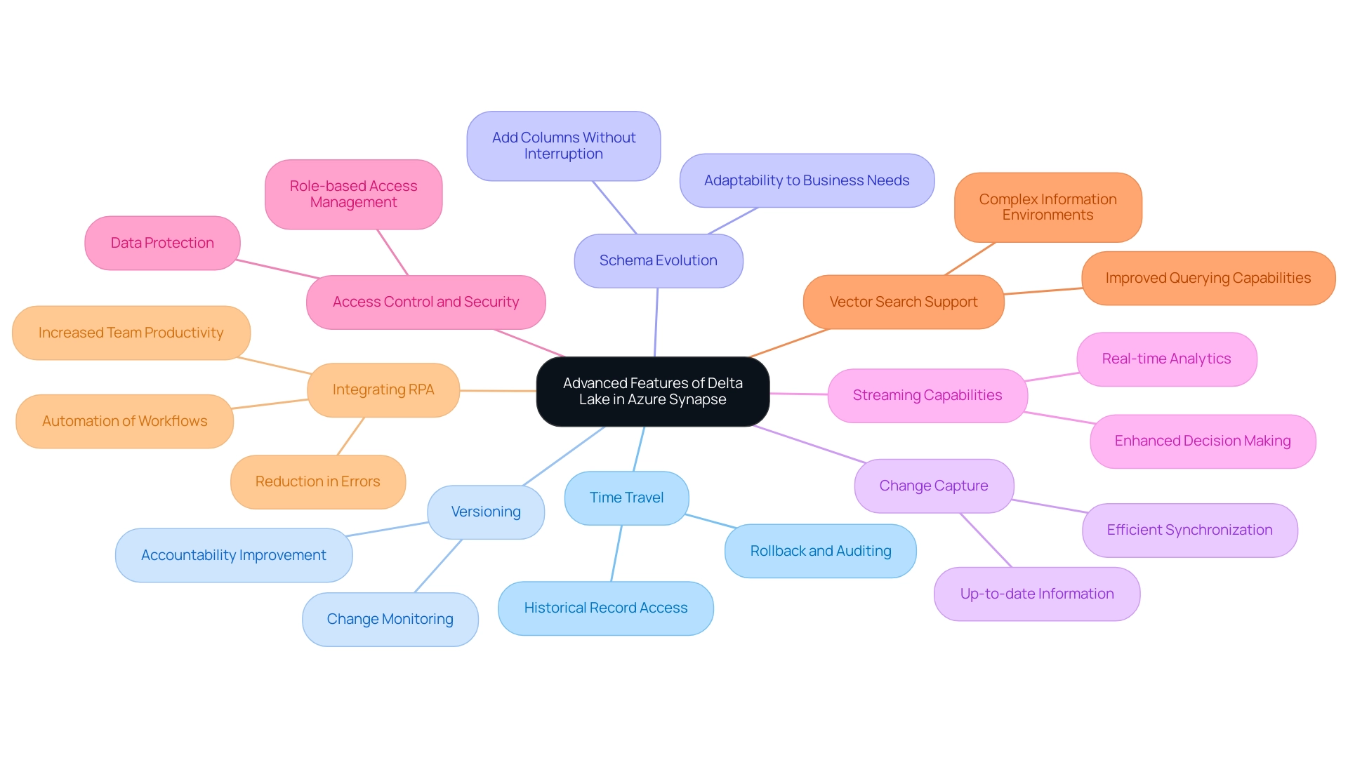
Time Travel: This storage solution provides a robust feature that allows you to query earlier versions of your information, facilitating rollback and auditing capabilities. By using the VERSION AS OF syntax in your SQL queries, you can effortlessly access historical records, which is invaluable for compliance and verification processes.
Versioning: Keeping a comprehensive history of changes in your tables is crucial for maintaining compliance and ensuring integrity. This versioning capability enables you to monitor changes efficiently, thereby improving accountability within your information management practices.
Schema Evolution: The support for schema evolution in this technology is revolutionary, allowing you to add new columns or alter types without any interruption. This flexibility not only streamlines the management process but also ensures that your structures can adapt to evolving business needs seamlessly.
Change Capture (CC): Implementing CC is essential for tracking changes in your information, allowing for efficient synchronization with other systems. This capability guarantees that your information stays up-to-date and precise across platforms, which is essential for operational efficiency.
Streaming Capabilities: Utilize Delta’s strong support for streaming information to create real-time analytics applications. This functionality empowers you to react instantly to incoming information, enhancing your decision-making processes. Dileep Raj Narayan Thumula highlights that comprehending distribution of information is essential for query enhancement, making these streaming functionalities even more significant in your operational strategies.
Access Control and Security: Delta Tables also facilitate effective access regulation and security management through Databricks’ built-in features, ensuring that your information remains safeguarded while permitting necessary access based on roles and responsibilities.
Vector Search Support: In Q3, Databricks introduced a gated Public Preview for Vector Search support in Databricks SQL, improving the capabilities of information querying and analysis, which can complement the features of these tables, particularly in complex information environments.
Case Study on Extended Statistics Querying: An example using a sales_data table illustrates how to compute statistics for specific columns, such as product_name and quantity_sold, and how to query extended statistics to verify results. This process aids in comprehending the distribution of information, which is vital for query optimization, with specific statistics like min, max, and distinct count being emphasized.
Integrating RPA for Enhanced Efficiency: By automating manual workflows with Robotic Process Automation (RPA), organizations can significantly reduce the time spent on repetitive tasks, freeing up resources for strategic information management. For example, a firm that adopted RPA to manage information entry tasks alongside a storage solution reported a 30% decrease in mistakes and a significant boost in team productivity. This synergy between the capabilities of Delta Lake and RPA within the delta lake synapse environment not only enhances operational efficiency but also drives actionable insights, allowing your team to focus on high-value projects amidst the rapidly evolving AI landscape.
Moreover, RPA addresses challenges within this landscape by ensuring that data processes are streamlined and less prone to human error.
Conclusion
The integration of Delta Lake with Azure Synapse offers organizations a transformative approach to data management, enabling them to harness the full potential of their data assets. By leveraging features such as ACID transactions, schema enforcement, and time travel capabilities, businesses can ensure data reliability and integrity, which are essential for informed decision-making.
The step-by-step setup guide provided emphasizes the importance of:
1. Creating a dedicated environment
2. Automating workflows through Robotic Process Automation (RPA)
3. Optimizing data performance
Implementing best practices like:
– Data partitioning
– Z-ordering
– Regular monitoring
not only enhances query performance but also streamlines operations, allowing teams to focus on strategic initiatives rather than repetitive tasks.
Addressing common challenges such as:
– Access errors
– Performance issues
– Data consistency
is crucial for maintaining an efficient data ecosystem. By utilizing advanced features like time travel, schema evolution, and change data capture, organizations can ensure compliance and adapt swiftly to evolving business needs. The integration of RPA further amplifies these benefits, driving operational efficiency and minimizing errors.
In conclusion, embracing the synergy between Delta Lake and Azure Synapse equips organizations with the tools necessary to thrive in a data-driven world. By prioritizing effective data management strategies and leveraging automation, businesses can not only enhance their operational efficiency but also foster innovation and strategic growth in an increasingly competitive landscape.
Overview
The article “Mastering DAX ISNULL Functions: An In-Depth Tutorial for Data Analysts” focuses on how the DAX ISNULL function can be effectively utilized to manage null values in data analysis, enhancing data integrity and reporting accuracy. It supports this by outlining practical applications, best practices, and troubleshooting tips for ISNULL, emphasizing that proper handling of null values is crucial for reliable analytics outcomes and informed decision-making in business intelligence contexts.
Introduction
In the world of data analysis, understanding how to effectively manage null values is paramount for ensuring accuracy and integrity in reporting. As organizations increasingly rely on powerful tools like DAX and Power BI, the challenge of addressing missing data can significantly impact decision-making processes.
By utilizing functions such as ISNULL, analysts can replace null entries with meaningful alternatives, enhancing the clarity of reports and fostering a data-driven culture. This article delves into the importance of recognizing and addressing null values, offering practical applications and best practices that empower data professionals to optimize their workflows and drive operational efficiency.
By mastering these strategies, organizations can transform raw data into actionable insights, paving the way for informed decisions and sustained growth.
Understanding Null Values in DAX: A Foundation for Data Analysis
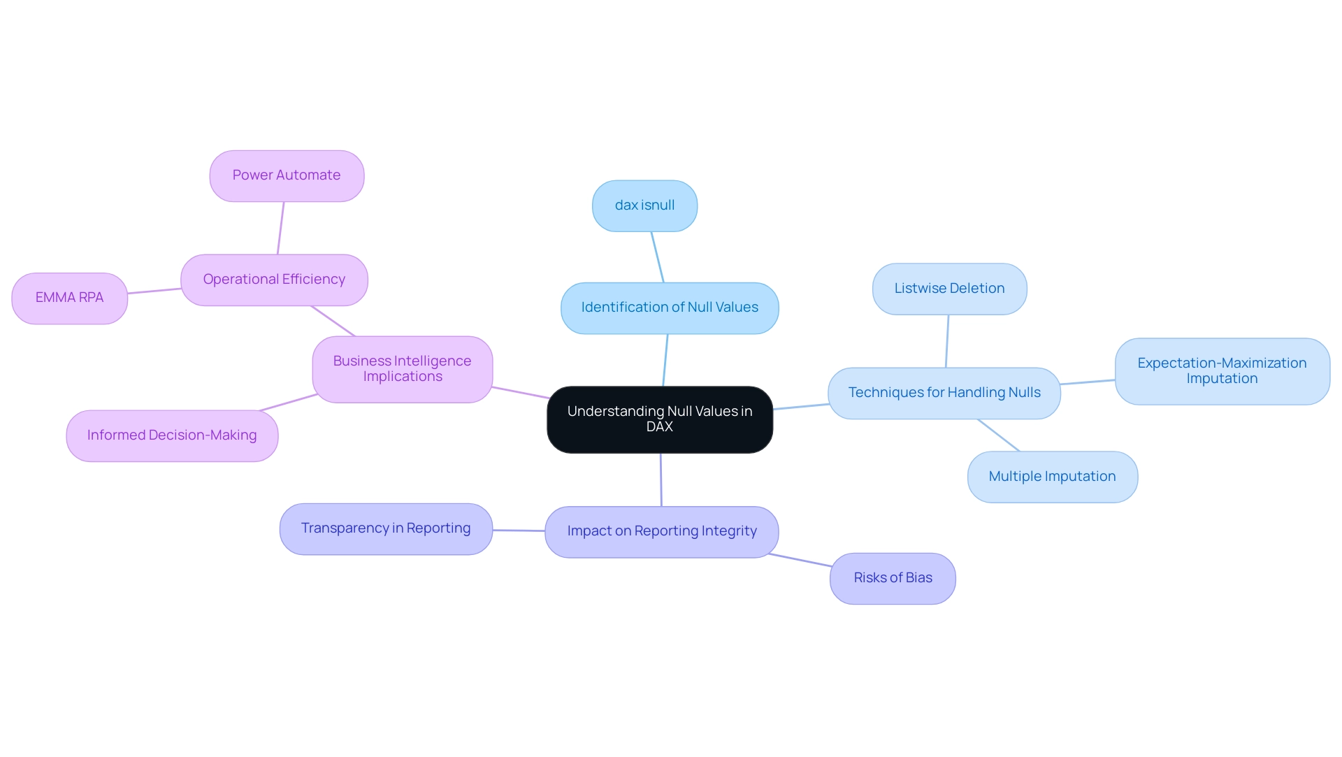
In the domain of DAX, the dax isnull function can help identify missing entries, indicating the lack of information within a specific field, which is essential to comprehend for achieving precise reporting. Struggling with these null values can be a significant challenge, especially when dax isnull is not utilized for leveraging insights from Power BI dashboards. Neglecting to address these gaps can lead to misleading conclusions, particularly during summarization, where calculations affected by absent entries may yield unexpected results.
The expectation-maximization imputation technique, for example, can be time-consuming, particularly with extensive collections containing a significant portion of missing information. Listwise deletion poses its own risks, potentially biasing estimates if information is not missing completely at random (MCAR). Recognizing and managing null values with dax isnull not only enhances the integrity of reports and dashboards but also fosters informed decision-making, a critical aspect of driving growth through Business Intelligence and RPA.
As mentioned by Hyun Kang from Chung-Ang University College of Medicine, ‘In general, multiple imputation is a good approach when analyzing datasets with absent information.’ Furthermore, best practices for reporting results emphasize the necessity of transparency in managing absent information, significantly enhancing the credibility of analyses. By adopting these practices, organizations can not only enhance their information management strategies but also build trust in their findings, thus empowering their operations and fostering a culture driven by insights.
Failing to extract meaningful insights from information can leave businesses at a competitive disadvantage, underscoring the transformative power of BI in turning raw information into actionable insights. Integrating specific RPA solutions, such as EMMA RPA and Power Automate, can further streamline processes and enhance operational efficiency.
Practical Applications of ISNULL in DAX: Enhancing Data Integrity
The function dax isnull serves a critical purpose in DAX: it identifies null values and allows you to return an alternative in their place. This capability is essential for maintaining information integrity, particularly in reports where clear, trustworthy insights are paramount. For instance, in a sales report, if a customer ID is missing, displaying ‘Unknown Customer’ instead of leaving the field blank ensures a more comprehensive understanding of the data.
The syntax for the function is simple yet powerful: <expression>, <alternate_value>. Here’s a structured approach to implementing it effectively:
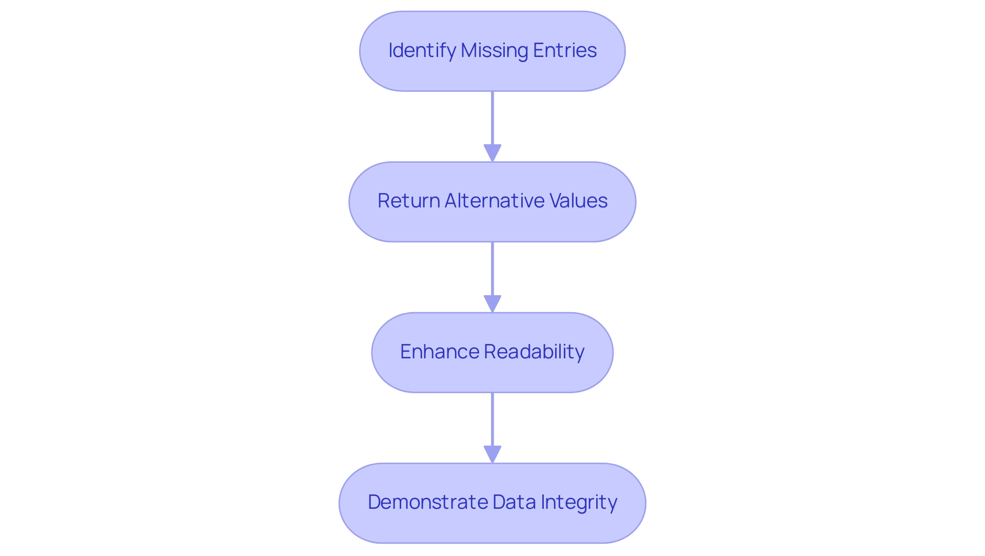
- Identify Missing Entries: Begin by using dax isnull to find any missing entries within your dataset. This step is crucial for ensuring your data is complete and reliable.
- Return Alternative Values: Determine what alternative value should be displayed when a non-existent value is encountered. An example implementation could be:
DAX

SalesPerson = IF(ISNULL(Sales[SalesPerson]), "Unknown", Sales[SalesPerson]) - Enhance Readability: By replacing nulls with descriptive text, you significantly improve the readability of your reports and dashboards, making them more user-friendly and actionable.
- Demonstrate Data Integrity: The application of ISNULL not only clarifies the information but also fosters trust among users, as they can comprehend the insights derived from your reports. This practice is essential in the ongoing monitoring and enhancement of ETL pipelines, ensuring integrity across analytics processes.
However, organizations often face challenges in leveraging insights from Power BI dashboards, such as time-consuming report creation and inconsistencies in information. Integrating Robotic Process Automation (RPA) can be a game-changer in this regard, automating repetitive tasks and streamlining the preparation process for DAX functions like ISNULL. This not only enhances operational efficiency but also allows analysts to focus on deriving actionable insights.
A recent study conducted by Precisely and Drexel University’s LeBow College of Business highlighted that organizations prioritizing information integrity saw improved efficiency and cost-cutting benefits. Specifically, 70% of respondents noted that maintaining information integrity led to more reliable analytics outcomes.
By efficiently utilizing the NULL function alongside RPA, analysts can enhance their workflows, presenting clearer and more precise datasets to stakeholders while reinforcing the integrity of their analytics. As one analyst mentioned, “Managing missing entries with precision is vital for precise reporting and decision-making,” highlighting the significance of effective practices in generating insights and enhancing operational efficiency.
Common Scenarios for Using ISNULL in DAX
Analysts frequently encounter difficulties with null values in different contexts, which makes DAX ISNULL a crucial instrument for efficient information management. With more than 200 hours of learning and guidance from Generative AI specialists, comprehending functions like this one is vital for improving information integrity—particularly when tackling inadequate master information quality and the obstacles to AI implementation in organizations. Here are several scenarios where ISNULL can be particularly beneficial:
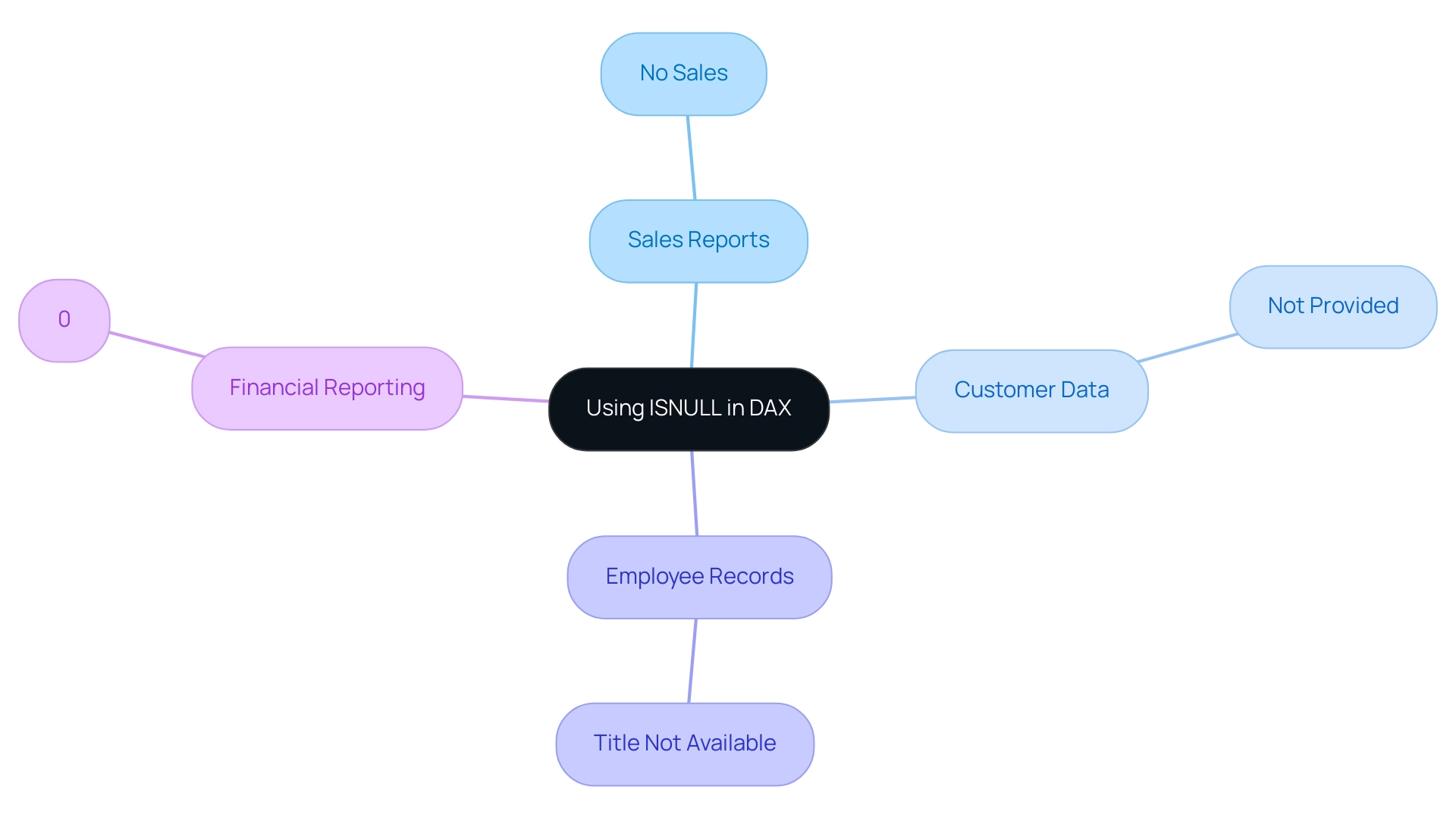
- Sales Reports: Null values in sales information may indicate a lack of transactions for specific products. By using ISNULL, you can present ‘No Sales’ instead of leaving this field blank, enhancing clarity for stakeholders:
DAX

   SalesStatus = IF(ISNULL(Sales[SalesAmount]), "No Sales", Sales[SalesAmount])
- Customer Data: Missing contact information in customer databases can lead to incomplete records. Applying ISNULL allows you to replace these gaps with placeholders, ensuring that your data remains comprehensive:
DAX

   ContactEmail = IF(ISNULL(Customers[Email]), "Not Provided", Customers[Email])
- Employee Records: In HR datasets, null entries for job titles can misrepresent employee roles. Using ISNULL can help fill in default values, maintaining accuracy in reporting:
DAX

   JobTitle = IF(ISNULL(Employees[Title]), "Title Not Available", Employees[Title])
- Financial Reporting: Null entries for budget categories can lead to skewed analyses. Implementing ISNULL ensures that your financial reports are clear and informative:
DAX

   Budget = IF(ISNULL(Finances[BudgetAmount]), 0, Finances[BudgetAmount])
These scenarios illustrate how the ISNULL function not only enhances data integrity but also ensures that your reports are both comprehensive and user-friendly. As mentioned by Katie Wampole, Research Data Curator, “Managing absent entries effectively is essential for preserving the quality of analysis.” Considering that a notable portion of sales reports might have null values, using COALESCE can result in more dependable analysis outcomes, consistent with best practices in information management.
Moreover, utilizing Small Language Models can deliver customized AI solutions that improve the use of DAX functions such as NULL, while GenAI Workshops provide practical training for teams to efficiently incorporate these methods into their management workflows. By tackling these challenges and utilizing AI tools, organizations can overcome barriers to AI adoption and enhance information quality. Comparable to the functionalities of the SimpleImputer, which can substitute missing entries with mean, mode, median, or a constant, the function offers an uncomplicated method for handling gaps in DAX.
By integrating these practices into your Power BI services, you can enhance reporting efficiency and gain actionable insights.
Best Practices for Using ISNULL in DAX
To maximize the effectiveness of the ISNULL function in DAX, adopting the following best practices is essential, particularly in light of the challenges posed by poor master data quality and the barriers to AI adoption in organizations:
-
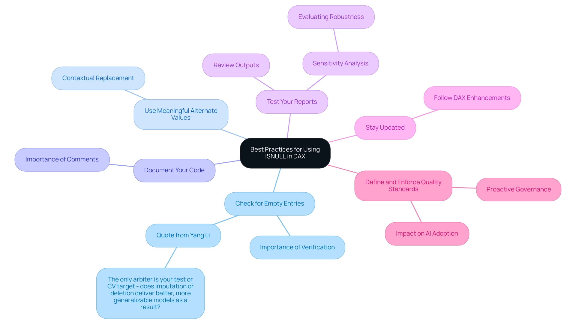
Always Check for Empty Entries: Before conducting any calculations, use
dax isnullto verify the existence of empty entries. This step is critical to avoid skewed results that could mislead stakeholders. As Yang Li states, “The only arbiter is your test or CV target – does imputation or deletion deliver better, more generalizable models as a result?” This quote highlights the significance of rigorously testing various information handling methods to ensure reliable insights. -
Use Meaningful Alternate Values: When replacing nulls, select substitute values that offer context. This method significantly improves the clarity of reports, making information more interpretable and decision-making more effective.
-
Document Your Code: It’s vital to comment clearly on your use of the function within DAX expressions. This practice not only helps your future self in understanding the logic behind your code but also supports other team members who may work with your reports, fostering a collaborative environment focused on quality.
-
Test Your Reports: After applying
dax isnull, thoroughly review your reports to ensure that outputs align with expectations and that substitutions are relevant and accurate. Performing sensitivity analysis can assist in evaluating the robustness of your findings against assumptions made about absent information, ultimately leading to improved business intelligence. -
Stay Updated: Keep abreast of DAX updates and enhancements. As new functions emerge, they may present more efficient methods for managing null values, improving your analysis workflows and supporting your organization’s data-driven goals. This adaptability is crucial for overcoming the challenges of integrating AI into existing processes.
-
Define and Enforce Quality Standards: A proactive approach to governance includes defining and enforcing clear and consistent quality standards. This practice is crucial to guarantee that information handling techniques, including the application of null-checking, result in dependable and actionable insights that enhance operational efficiency. Enhanced information quality not only improves reporting but also establishes a strong basis for successful AI adoption.
By adhering to these best practices, analysts can ensure that their use of null checks not only meets industry standards but also enhances the overall quality and reliability of their analyses, ultimately empowering organizations to leverage insights for growth and innovation. Effective data handling is integral to unlocking the full potential of Business Intelligence, enabling informed decision-making that propels business success.
Troubleshooting Common Issues with ISNULL in DAX
When using the dax isnull function in DAX, analysts may encounter several common challenges that reflect broader issues in technology implementation. Here’s how to effectively troubleshoot them:
-
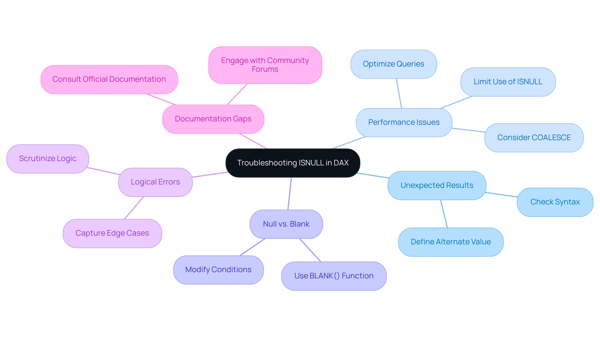
Unexpected Results: If the output seems incorrect, double-check the syntax of your null-check function. Ensure that both the expression and the alternate value are accurately defined to avoid misinterpretations. This is particularly vital in a landscape where tailored AI solutions can streamline the identification of such errors.
-
Performance Issues: In large datasets, dependence on null-check functions can significantly hinder performance. For instance, a user reported a drastic reduction in runtime from 25.2 hours to 102 seconds by optimizing a query that utilized dax isnull in conjunction with OVER. As Steve A. notes,
“Watch out if using a null-check function with a subquery as the replacement_value. Seems like it runs the subquery even if the check_expression value is not NULL which doesn’t help performance.”
Limit the use of dax isnull to essential cases and consider alternatives like COALESCE, which can enhance efficiency, particularly in data-rich environments. RPA can also be leveraged here to automate repetitive data checks, further improving performance. -
Null vs. Blank: Recognizing that null values, particularly when using dax isnull, and blank values are distinct is essential. For checks against blanks, employ the
BLANK()function or modify your conditions accordingly to ensure accurate results. This distinction can be crucial for leveraging Business Intelligence effectively to gain actionable insights. -
Logical Errors: Scrutinize the logic applied in your DAX expressions and consider using dax isnull to ensure comprehensive coverage of all scenarios. Additional conditions may be necessary to capture edge cases effectively, which is vital for overcoming common challenges in report creation and ensuring information consistency. RPA tools can assist in automating logic checks to enhance accuracy.
-
Documentation Gaps: If uncertainties arise regarding how this function integrates with other DAX functions, consulting official documentation or engaging with community forums can yield valuable insights and enhance your understanding. This proactive approach is essential in navigating the complexities of technology implementation.
Additionally, with the upcoming event on DAX handling of Boolean expressions scheduled for February 18-20, 2025, in Phoenix, analysts may find it advantageous to attend for further insights and networking opportunities. Such events can provide critical knowledge that aids in overcoming specific challenges related to technology implementation.
By proactively addressing these common issues, data analysts can significantly improve their proficiency with the ISNULL function, leading to more efficient data analysis and optimal performance. Furthermore, just as addressing a blockage in a ganged switch requires systematic troubleshooting, so too does mastering DAX functions demand a thorough approach to problem-solving.
Conclusion
Addressing null values in data analysis is not just a technical requirement; it is a fundamental necessity for ensuring the reliability and clarity of insights derived from data. Throughout this article, the critical role of the ISNULL function in DAX has been underscored, highlighting its ability to transform incomplete datasets into comprehensive reports. By replacing null entries with meaningful alternatives, organizations can significantly enhance the integrity of their analytics, thereby fostering informed decision-making.
The practical applications of ISNULL in various scenarios, from sales reports to financial analyses, illustrate its versatility in improving data quality. Best practices include:
- Checking for null values
- Using contextually relevant alternatives
- Documenting code
These practices are essential for maximizing the effectiveness of this function. Additionally, understanding and troubleshooting common issues with ISNULL ensures analysts can maintain optimal performance and accuracy in their reports.
Ultimately, embracing these strategies not only empowers data professionals to streamline their workflows but also contributes to a robust data-driven culture within organizations. By effectively managing null values, businesses can harness the full potential of their data, paving the way for informed strategies and sustained growth in an increasingly competitive landscape.
Overview
To delete a Power BI workspace, users must follow a straightforward step-by-step process that includes signing into their account, navigating to the workspace section, and confirming the deletion after backing up necessary data. The article emphasizes the importance of understanding the implications of deletion, such as potential data loss and access changes, which underscores the need for careful consideration and communication with team members before proceeding.
Introduction
In the dynamic landscape of data analytics, Power BI workspaces emerge as critical hubs for collaboration and insight generation. Understanding how to effectively navigate these environments can significantly enhance operational efficiency and empower teams to make informed decisions.
From the essential steps of deleting a workspace to the best practices for maintaining data integrity, this article delves into the intricacies of Power BI workspace management. It highlights the importance of strategic planning, robust data governance, and proactive communication, ensuring organizations can harness the full potential of their data while mitigating risks associated with workspace changes.
By exploring these key considerations, professionals can transform challenges into opportunities, paving the way for improved business intelligence and streamlined operations.
Understanding Power BI Workspaces: An Overview
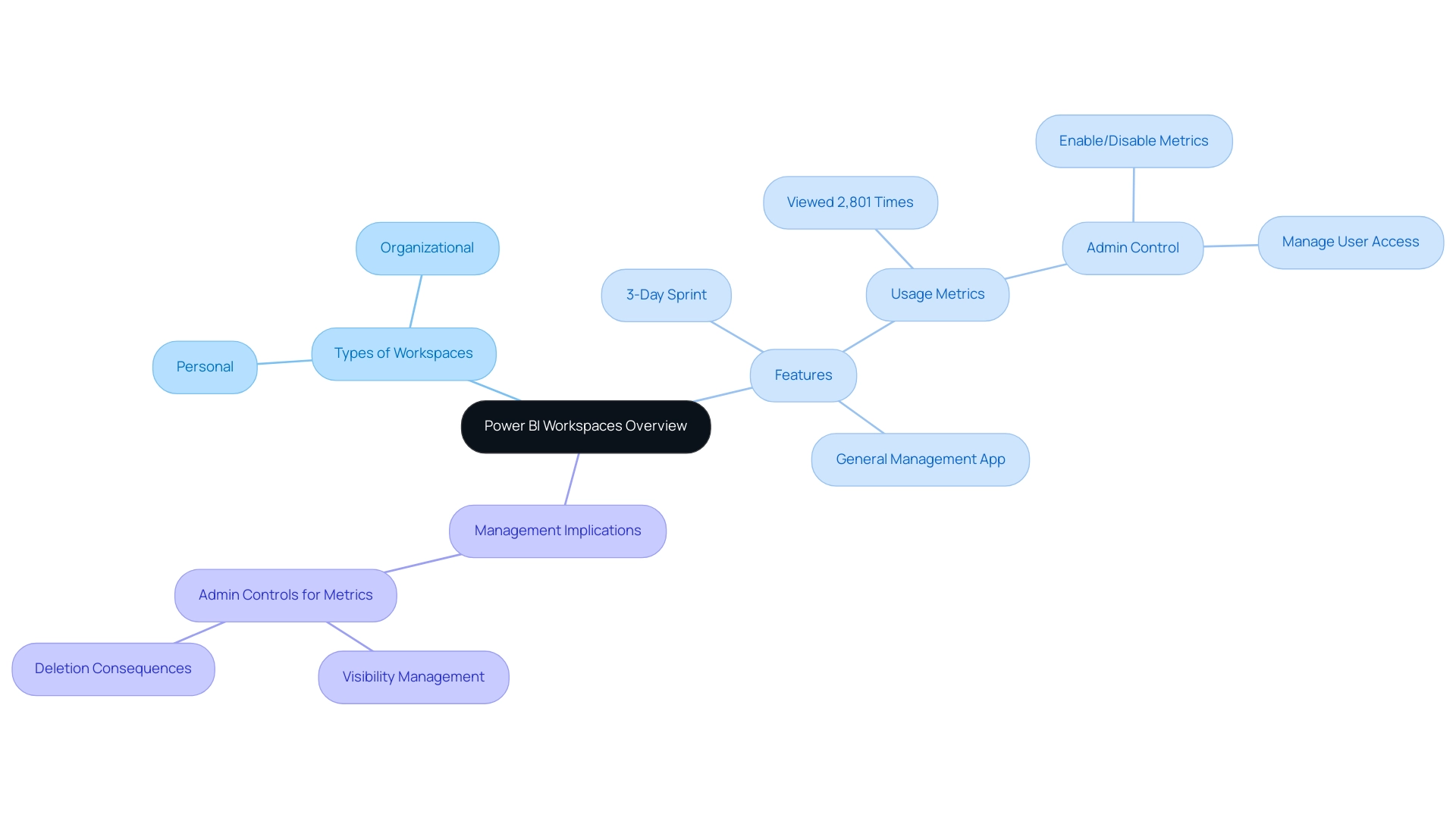
Power BI areas act as crucial collaborative settings where users can develop, oversee, and distribute reports and dashboards efficiently, becoming vital instruments for improving reporting and obtaining actionable insights. Each environment serves as a dedicated container for related projects, facilitating seamless teamwork and enhancing project efficiency. A comprehensive understanding of the structure of the environment is crucial, as it directly impacts how data is organized, accessed, and shared among users.
Notably, the usage metrics feature has been viewed 2,801 times, underscoring its relevance in managing work environments. Workspaces are classified into two primary types:
- Personal
- Organizational
Personal areas remain private, accessible solely to their creators, while organizational settings encourage collaboration by being shared among team members.
Additionally, the 3-Day Power BI Sprint allows for the rapid creation of professionally designed reports, addressing the challenge of time-consuming report generation. The General Management App further enhances operational efficiency by providing comprehensive management tools and smart reviews, enabling teams to streamline their processes effectively. However, it is important to note that there are concerns regarding the accessibility of Usage Metrics Reports, as only an admin can now provide this information that was previously available to all users.
Getting to know the nuances of these environments not only helps in enhancing collaboration but also provides you with the understanding necessary to navigate the implications of workspace management, including the irreversible effects when you delete Power BI workspace and its contained information. According to the case study on Admin Controls for Usage Metrics, administrators can manage access to usage metrics, enabling or disabling metrics for specific users and managing data visibility. Recognizing these dynamics is essential for optimizing your use of BI and ensuring that collaborative efforts yield the desired insights.
To further explore how our solutions can address your unique challenges, consider booking a free consultation and discovering the potential of our actions portfolio tailored to enhance your business intelligence capabilities.
Step-by-Step Process to Delete a Power BI Workspace
To effectively remove a BI environment and maintain operational efficiency, adhere to the following steps:
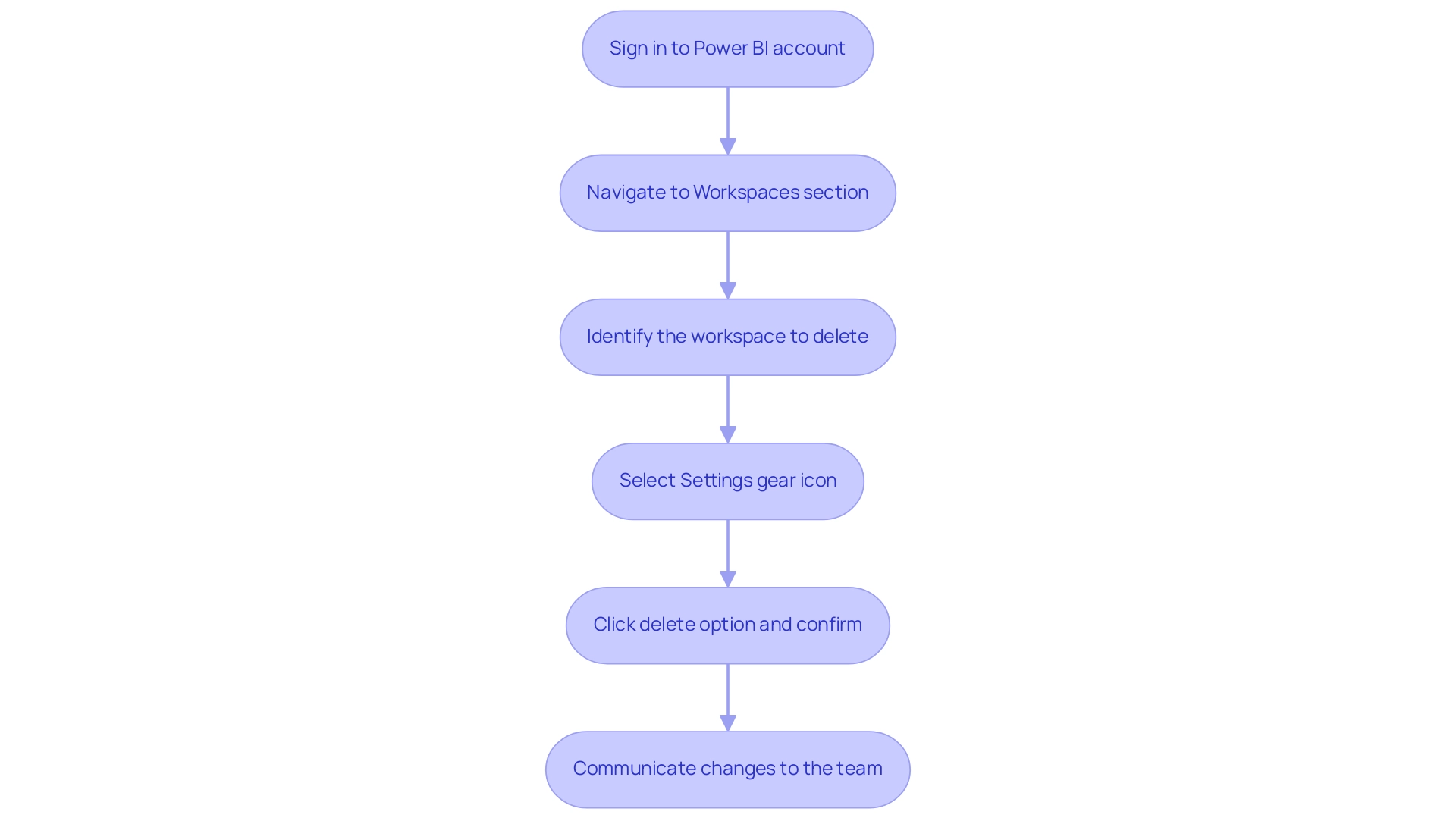
- Sign in to your Power BI account.
- Navigate to the Workspaces section located in the left-hand menu.
- Identify the area you intend to delete in the Power BI workspace and click on it to delete the Power BI workspace.
- Select the Settings gear icon positioned in the top right corner of the workspace.
- Scroll down to the bottom of the settings page and click on the option to delete power bi workspace. Confirm the deletion by entering the project name as prompted, then click Delete to delete the power bi workspace.
- After the deletion, it is crucial to communicate the changes to your team to prevent any potential confusion.
While the removal process is straightforward, as noted by Power BI professional PVO3,
Unfortunately, I don’t think there will be an easy solution for this.
This highlights the significance of grasping the implications of such actions, particularly considering that an environment becomes inactive if no reports or dashboards have been accessed in the past 60 days. Therefore, monitoring activity in the work environment before deletion is essential.
Additionally, RPA solutions such as EMMA RPA and Automation can be utilized to automate repetitive tasks associated with workspace management, enhancing operational efficiency. After removing the semantic model, users should refresh their browser and generate a new usage metrics report in the BI service to ensure precise tracking. Furthermore, it’s vital to recognize that BI operates in separate national/regional clouds, which comply with local regulations while offering the same security and privacy as the global version.
This case study illustrates how usage metrics are available in specific national/regional clouds, ensuring compliance with local data residency and access regulations. Being proactive in informing your team about these changes can mitigate disruptions and enhance overall operational efficiency, reflecting the transformative power of Business Intelligence and RPA in driving data-driven decision-making.
Key Considerations Before Deleting a Workspace
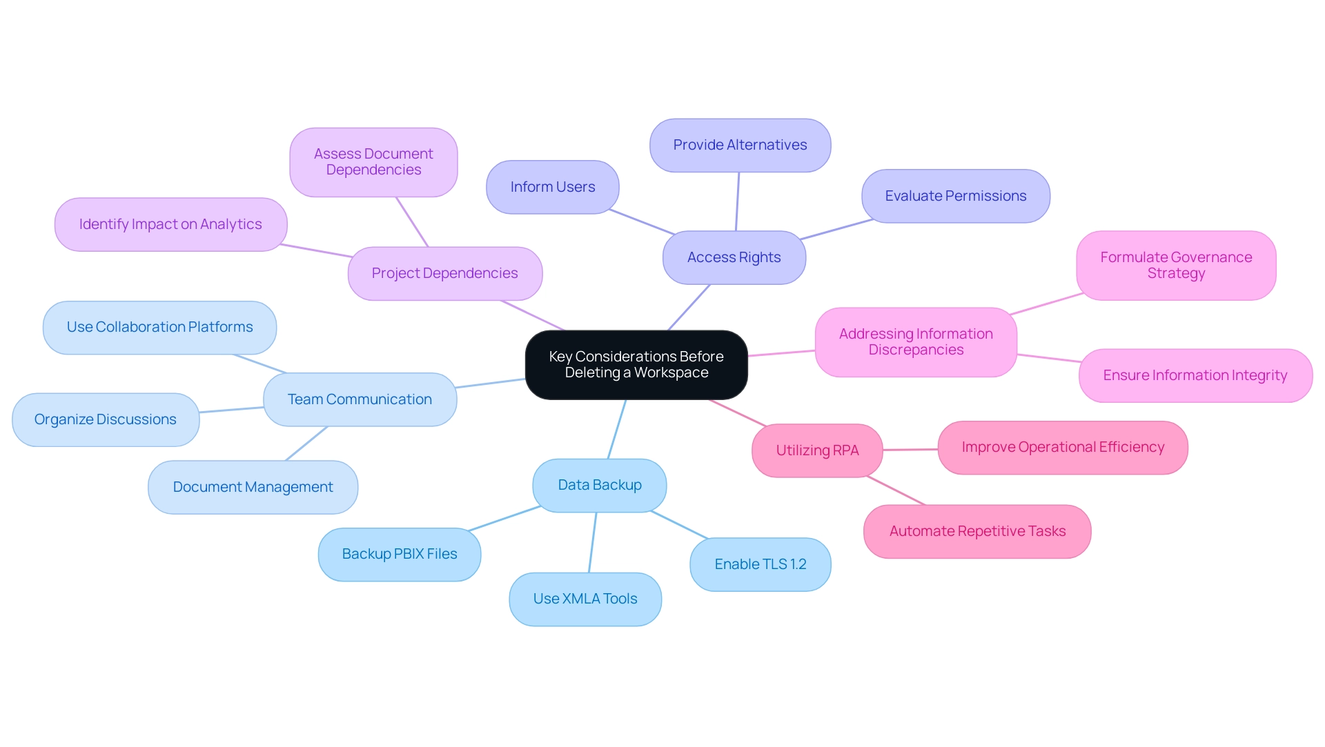
Before continuing with the removal of a BI environment, it is essential to consider several significant factors:
-
Data Backup: Prioritize backing up all reports and datasets within the environment. Utilize XMLA-based tools such as SQL Server Management Studio (SSMS) to create secure backups, as Power BI automatically generates backup folders when attached to a workspace. According to the case study on the Backup and Restore Process, these operations depend on the semantic models residing on Premium or PPU capacity, and backup files are stored in a designated folder. This step is vital to prevent information loss and ensure continuity in your reporting capabilities. In an era where extracting meaningful insights is critical, ensuring your data integrity is the first step towards leveraging Business Intelligence effectively. Additionally, enabling TLS 1.2 or higher for encryption settings during the backup process is essential for securing your data.
-
Team Communication: Clear communication among team members is essential before any area deletion. Informing the team helps mitigate confusion and avoids disruptions in ongoing projects. As emphasized by Johanna, a Continued Contributor, using a collaboration platform like Microsoft Teams can facilitate effective communication regarding such changes, allowing for organized discussions and documentation management. Liu Yang also emphasized that the ‘Power BI Service’ connector enables users to generate documents without the capability to remove the dataset, reinforcing the significance of maintaining backups in Desktop files. Regular involvement can assist in tackling the frequent issue of time-intensive document preparation by making certain that all are coordinated on data utilization.
-
Access Rights: Perform a comprehensive evaluation of the existing access permissions to the area. If you delete the Power BI workspace, it will revoke access for all users, potentially impacting their work. Ensuring that everyone is aware of this change and has alternative access options is critical to maintain operational efficiency.
-
Project Dependencies: Assess any dependencies that other documents or dashboards may have on the workspace. If you delete the Power BI workspace, it could adversely affect their functionality, leading to unexpected issues in your analytics and reporting processes. Lacking practical advice in documents can be a considerable obstacle, and comprehending these dependencies can aid in preserving clarity and direction.
-
Addressing Information Discrepancies: It is also essential to contemplate the possible confusion and mistrust in information due to discrepancies across documents. Formulating a governance strategy can assist in guaranteeing information integrity and trustworthiness, which is vital for efficient decision-making.
-
Utilizing RPA: Think about how Robotic Process Automation (RPA) can ease the difficulties encountered in the context of Business Intelligence. By automating repetitive tasks, RPA can simplify document creation and improve operational efficiency, enabling your team to concentrate on deriving actionable insights instead of being hindered by manual processes.
By addressing these factors, you not only protect your information but also enhance team effectiveness and uphold project integrity throughout the process. Remember, always create a backup of the PBIX file before making any modifications, and consider the ramifications of your actions on the broader BI environment. In a landscape where data-driven insights fuel growth, these steps are essential for empowering your organization and ensuring informed decision-making.
Implications of Deleting a Power BI Workspace
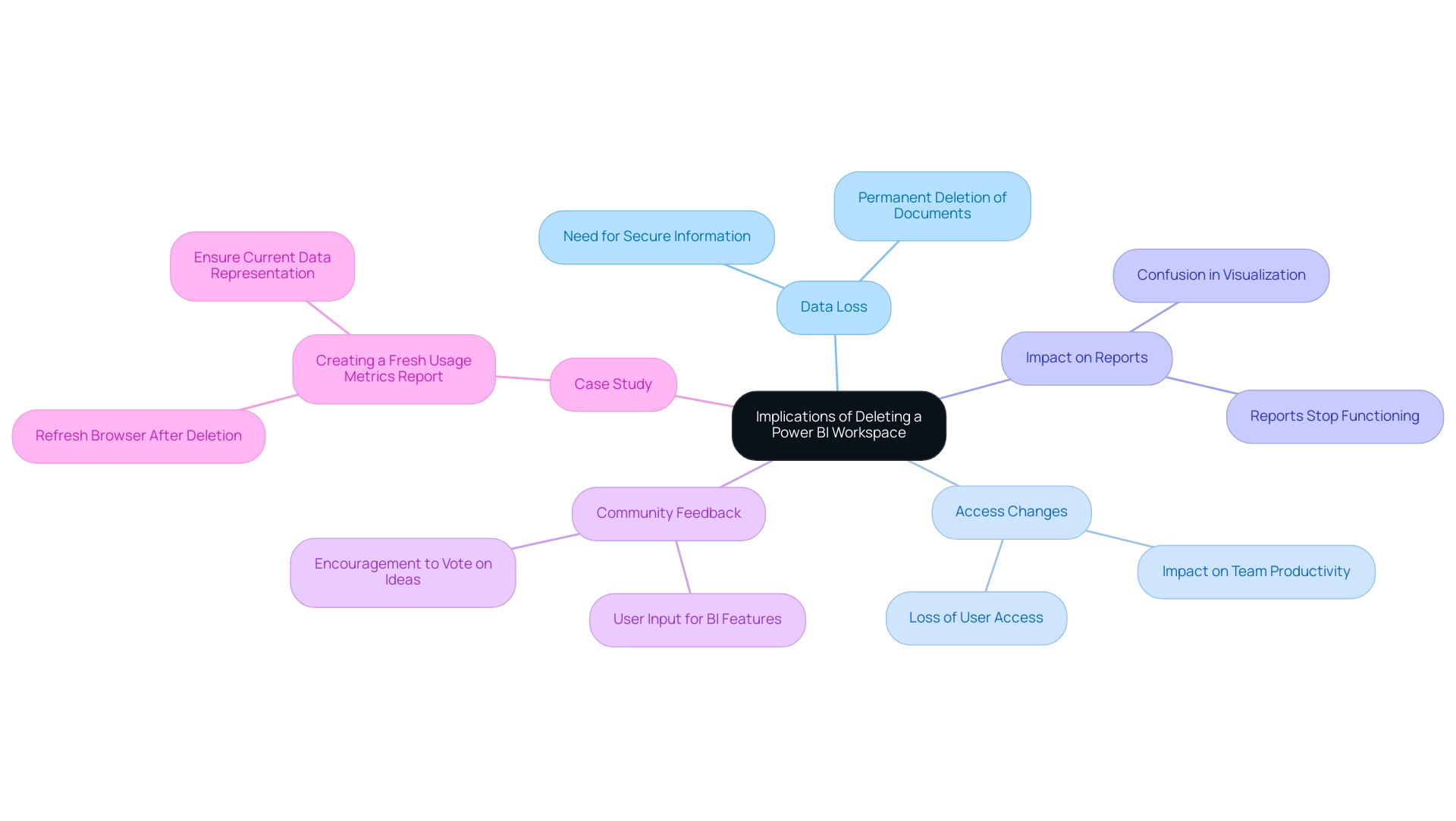
Removing a Power BI environment carries significant implications that every Director of Operations Efficiency should be aware of:
-
Data Loss: The elimination of an environment results in the permanent deletion of all associated documents, dashboards, and datasets. Considering the frequent issue of investing too much time in document preparation instead of utilizing insights, it is essential to secure any important information before moving forward with removal to reduce this risk. Moreover, having clear actionable guidance on what to do with the information prior to the delete power bi workspace can streamline the process and ensure that critical insights are not lost.
-
Access Changes: Users will lose access to the environment and any shared content, potentially leading to disruptions in ongoing projects and hindering collaborative efforts. This can significantly affect team productivity and overall information accessibility, compounding the challenges of maintaining consistent information across reports. A well-defined governance strategy can assist in managing user access and preventing such disruptions.
-
Impact on Reports: Reports and dashboards associated with the deleted project will stop functioning, which can create confusion or mistakes in visualization. As noted by Season from the Community Support Team, if you delete power bi workspace and the area has been deleted for 90 days, its status changes to ‘Removing,’ and the associated datasets will no longer appear in the ‘Refresh Summary’ of the Admin portal. This emphasizes the importance of having a governance framework to manage information dependencies efficiently.
-
Community Feedback: Community members are encouraged to vote on ideas for Microsoft to consider concerning BI features, underscoring the significance of user input in enhancing management practices and tackling common challenges.
-
Case Study: After the removal of a semantic model, users are advised to refresh their browsers and create a new usage metrics document in BI. This practice guarantees that the metrics report represents the most up-to-date data available, facilitating informed decision-making and precise reporting.
Being aware of these implications enables you to navigate the complexities of managing BI environments effectively, ensuring minimal disruption and maintaining operational efficiency while addressing the prevalent challenges in data governance and actionable insights.
Best Practices for Managing Power BI Workspaces
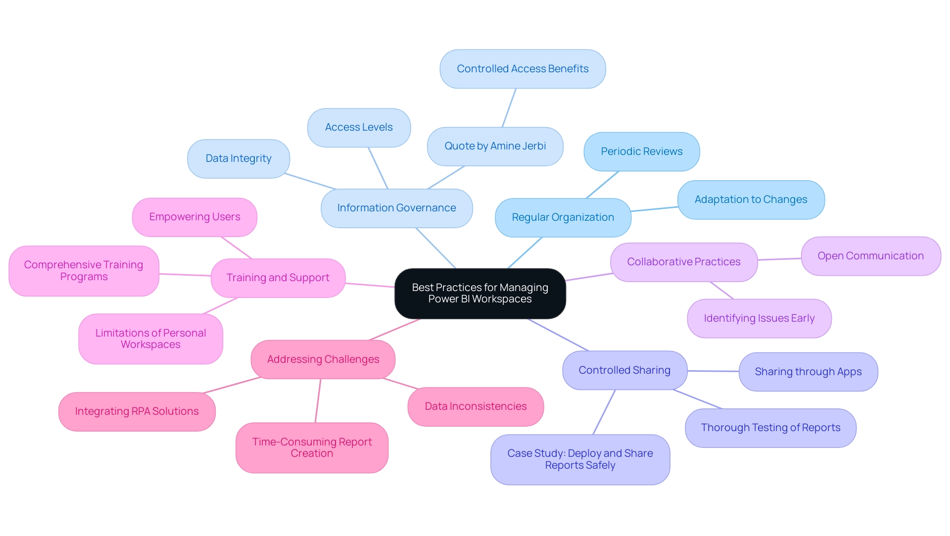
To effectively manage Power BI workspaces, implementing the following best practices is essential:
-
Regular Organization: Schedule periodic reviews of your workspaces to keep them organized and efficient. This practice ensures that your workspaces remain relevant to your current projects and organizational goals, adapting to any changes in your operational landscape. Leveraging Business Intelligence tools effectively can help streamline this process and enhance your decision-making capabilities.
-
Information Governance: Establish robust information governance policies that dictate access levels and promote integrity. By clearly defining who can access what, you safeguard sensitive information and enhance overall information security. As Amine Jerbi aptly states, > Having the same item in two different environments with limited access helps recover it, emphasizing the value of controlled access in data management. With 3,202 users currently online, the scale of Power BI usage highlights the necessity for stringent governance measures to avoid inconsistencies that could hinder insights.
-
Controlled Sharing: The case study titled “Deploy and Share Reports Safely” illustrates the importance of thoroughly testing reports before deployment and sharing them through Apps or collaborative environments. This approach minimizes the risk of disseminating incorrect information and enhances data security, reinforcing the need for controlled sharing practices to ensure reliable insights that drive operational decisions.
-
Collaborative Practices: Encourage open communication among team members regarding area usage and updates. Regular collaboration helps identify potential issues early and promotes a shared understanding of functionalities, ultimately leading to more effective usage and fostering a culture of data-driven decision-making.
-
Training and Support: Invest in comprehensive training for team members on environment management and best practices. Well-informed users are better equipped to navigate the complexities of BI, enhancing overall efficiency and productivity. This emphasis on training not only empowers your team but also aligns with the recent trend of integrating best practices for managing BI environments into daily operations. Additionally, it is crucial to acknowledge that personal workspaces have limitations in sharing content and cannot publish BI apps, which are essential for content distribution within organizations.
-
Addressing Challenges: It is vital to recognize the challenges associated with leveraging insights from BI dashboards, such as time-consuming report creation, data inconsistencies, and the lack of actionable guidance. By implementing the best practices outlined above, organizations can mitigate these challenges, ensuring that their BI environments are well-managed, secure, and aligned with their operational objectives, which can help prevent the need to delete Power BI workspace. Moreover, integrating RPA solutions can automate repetitive tasks, further enhancing efficiency and effectiveness in workspace management.
By following these guidelines and integrating RPA solutions alongside BI practices, organizations can ensure their Power BI environments are well-managed, secure, and aligned with their operational objectives, ultimately driving growth and innovation.
Conclusion
Power BI workspaces are indispensable for fostering collaboration and driving insightful decision-making within organizations. Understanding the nuances of workspace management—ranging from the deletion process to the implications of such actions—enables teams to maintain data integrity and operational efficiency. By prioritizing data backup, ensuring clear communication, and conducting thorough assessments of access rights and project dependencies, organizations can safeguard their data while minimizing disruption.
Implementing best practices such as regular organization, robust data governance, and controlled sharing further enhances the effectiveness of Power BI workspaces. These strategies not only streamline processes but also empower teams to focus on deriving actionable insights rather than getting bogged down by administrative challenges. Additionally, leveraging Robotic Process Automation can significantly alleviate the burden of repetitive tasks, allowing teams to dedicate their efforts to strategic initiatives that drive growth.
In an era where data-driven decision-making is paramount, adopting a proactive approach to managing Power BI workspaces is essential. By embracing these practices, organizations can transform potential challenges into opportunities, ensuring that their Power BI environments contribute meaningfully to their business intelligence objectives. The path to operational excellence lies in the thoughtful management of data resources, paving the way for informed decisions that propel organizations forward.
Overview
Databricks and Power BI integration enhances analytics capabilities by enabling organizations to visualize and analyze large datasets efficiently, ultimately improving decision-making and operational efficiency. The article discusses how this integration addresses challenges such as data latency and report creation time while showcasing real-world applications that demonstrate significant business benefits, such as increased sales and improved patient outcomes.
Introduction
In the rapidly evolving landscape of data analytics, the integration of Databricks and Power BI stands out as a game-changer for organizations seeking to harness the full potential of their data. By combining the robust capabilities of Databricks—known for its powerful big data processing and machine learning features—with the dynamic visualization tools of Power BI, businesses can unlock actionable insights that drive strategic decision-making.
However, this integration is not without its challenges; issues such as data latency, security concerns, and the complexities of report generation can impede progress. Yet, with the right strategies and tools, including Robotic Process Automation (RPA), organizations can streamline their workflows, enhance operational efficiency, and ultimately transform their data into a competitive advantage.
This article delves into best practices, real-world applications, and practical solutions to empower organizations in their journey towards data-driven excellence.
Understanding Databricks and Power BI: A Comprehensive Overview
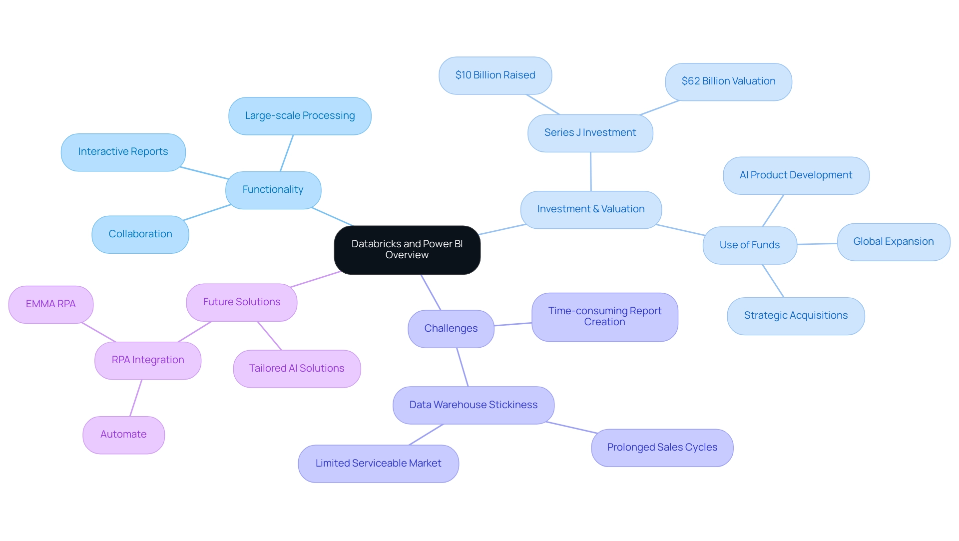
This platform functions as a powerful unified analytics solution intended to simplify large-scale processing and machine learning projects, offering a strong basis for leveraging Business Intelligence. By leveraging the capabilities of Apache Spark, it fosters collaboration between scientists and engineers within a cloud-based ecosystem, enabling them to perform large-scale analytics with unprecedented efficiency. Recently, the company raised a $10 billion Series J investment at a $62 billion valuation as of December 17, 2024, underscoring its financial strength and market position.
As noted by Sacra, ‘Databricks closed its Series J funding round in December 2024, raising $10 billion in non-dilutive financing, with $8.6 billion completed to date.’ In the meantime, this tool distinguishes itself as a top business analytics application that enables users to visualize information and share insights across the organization. By seamlessly linking to various information sources, including databricks and power bi, the platform facilitates the creation of interactive reports and dashboards that enhance insight-driven decision-making.
However, challenges persist in leveraging insights effectively, such as time-consuming report creation and inconsistencies. The integration of databricks and power bi not only enables companies to analyze extensive information sets but also transforms the way they visualize insights, ultimately enhancing business intelligence and operational efficiency. Additionally, the application of RPA solutions, such as EMMA RPA and Automate, can automate repetitive tasks, enhancing efficiency and employee morale.
As the AI landscape continues to evolve, tailored solutions that address these challenges can empower organizations to cut through the noise and fully leverage their data for growth.
Integrating Databricks with Power BI: Best Practices and Techniques
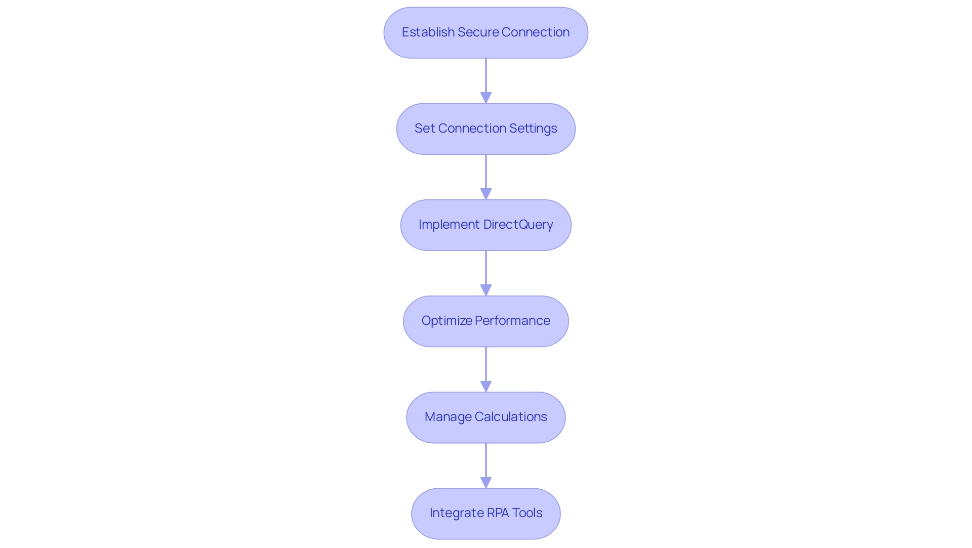
To effectively integrate Azure with Business Intelligence tools and leverage the full potential of data analysis, the first step is to establish a secure connection through Azure. Utilizing the connector within Power BI allows users to seamlessly connect to their workspace, addressing the challenges of time-consuming report creation. It is vital to set up connection settings precisely, including the cluster configuration, to ensure optimal performance and information consistency.
Significantly, the Azure connector restricts the quantity of imported rows to the Row Limit established previously, emphasizing the necessity for meticulous information management. Implementing DirectQuery facilitates real-time data access, empowering teams to engage with the most current data without the manual burden of dataset refreshes. Moreover, employing performance optimization techniques, such as caching frequently used queries and leveraging materialized views in Databricks and Power BI, can significantly enhance operational efficiency.
As illustrated in the case study on ‘Understanding Lazy Evaluation,’ avoiding unnecessary recomputation by saving computed results for reuse can lead to optimized performance. Additionally, to manage calculations effectively in BI, it is advisable to prefer calculated columns over measures when necessary and to optimize DAX queries with simpler functions. Furthermore, integrating RPA tools like EMMA RPA and Automate can streamline these processes, reduce manual workloads, and ultimately improve employee morale by allowing staff to focus on more strategic tasks.
As noted by Jules Damji,
Often, small things make a huge difference, hence the adage that some of the best ideas are simple!
By adhering to these best practices and leveraging the right RPA solutions, organizations can achieve a seamless integration that not only enhances their analytical capabilities but also empowers informed decision-making, ultimately driving business growth and innovation.
Challenges and Solutions in Databricks and Power BI Integration
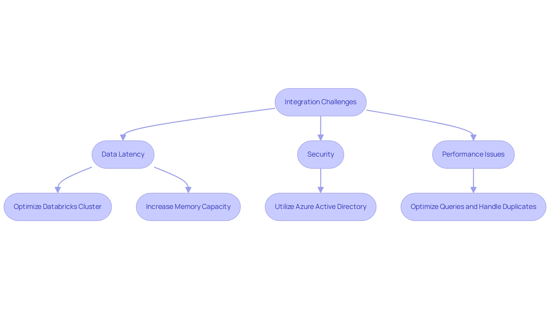
Combining Databricks and Power BI with the analytics platform can present considerable difficulties, especially regarding data latency, security, and performance. Addressing these challenges is essential for enhancing operational efficiency. Data latency is a common hurdle, often stemming from suboptimal connections that delay report generation.
To combat this, ensure your Databricks cluster is adequately sized and configured to handle the expected workload effectively. Yalan Wu, a community support expert, emphasizes the importance of resource allocation, stating,
Power BI runs on memory. Thus, the larger the collection of information, the more memory it will need.
Make sure you have plenty of memory, and that you are on a 64-bit system. This insight is vital for optimizing performance in data-heavy environments. Moreover, leveraging Delta Lake’s ACID compliance at the table level ensures reliable information handling, which is crucial for maintaining integrity during integration processes.
Security remains a paramount concern; utilizing Azure Active Directory for authentication can significantly enhance access protection. Performance issues frequently arise from complex queries and duplicate records, which can be mitigated through the mechanisms of Databricks and Power BI for handling duplicates and effective query optimization techniques. The classic trade-off between throughput and latency further complicates performance, as highlighted in case studies where innovative designs and technologies like Photon and Delta Lake have been developed to improve both metrics.
For example, entities have effectively utilized RPA to automate repetitive information preparation tasks, greatly decreasing the time needed for report creation and reducing mistakes. By proactively tackling these challenges with RPA and Business Intelligence strategies, companies can significantly improve their integration experience, resulting in more efficient information management and informed decision-making.
Real-World Applications of Databricks and Power BI Integration
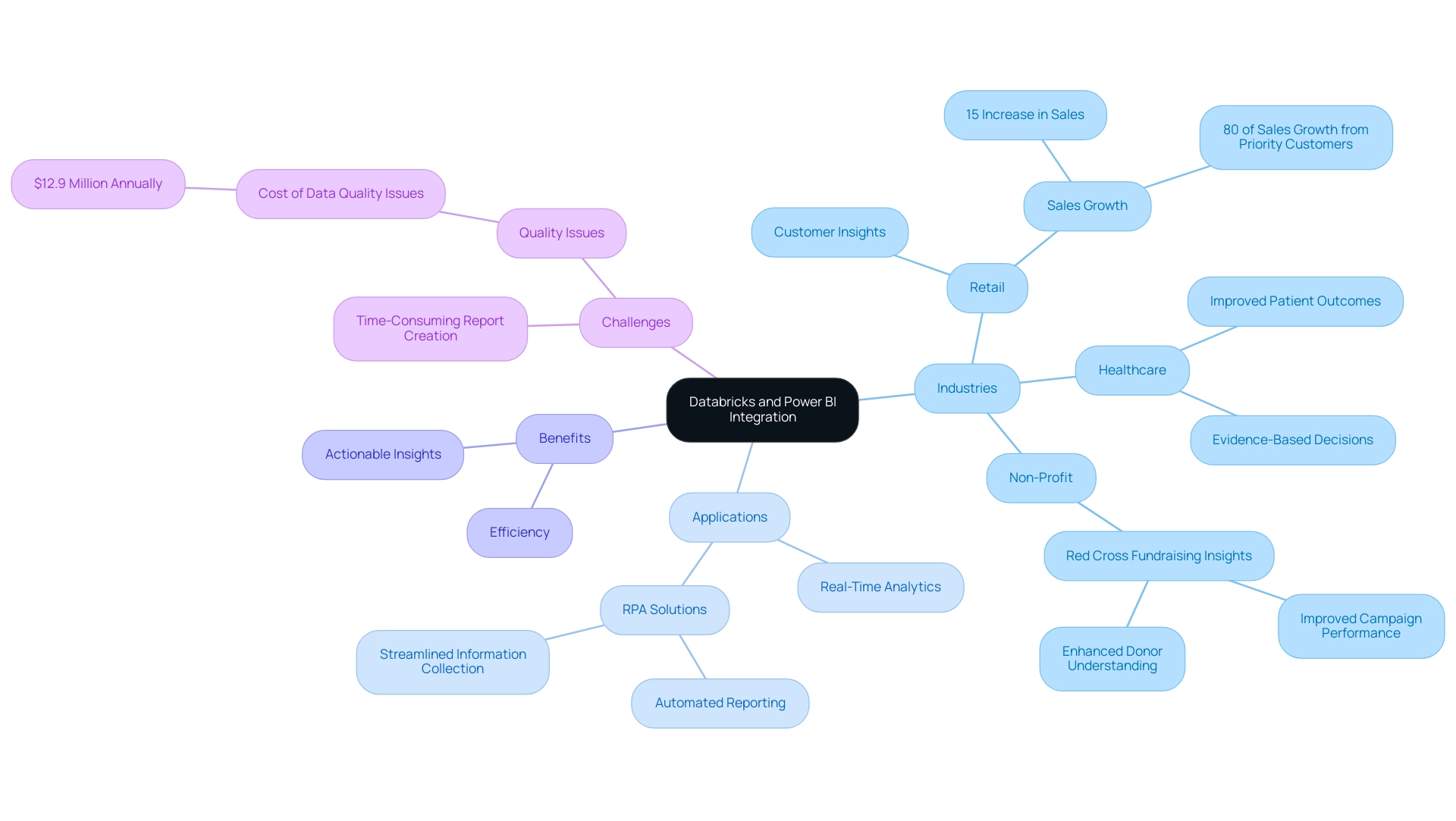
Organizations across diverse industries are leveraging the combined power of Databricks and Power BI to enhance their analytics capabilities. A notable example includes a retail company that effectively utilized this integration to analyze customer purchasing patterns, leading to a remarkable 15% increase in sales within just one quarter. This surge can be attributed to their customized marketing strategies, driven by real-time information insights.
In fact, PepsiCo’s priority customers accounted for 80% of the product’s sales growth in the first 12 weeks after launch, showcasing the significant impact of analytics in retail. However, challenges such as time-consuming report creation and inconsistencies often hinder effective insights from Power BI dashboards. As Lara Rachidi, a Solutions Architect, observes, ‘Quality problems in information cost the typical enterprise $12.9 million annually,’ highlighting the significance of integrity in these processes.
To alleviate these challenges, RPA solutions can automate repetitive tasks, streamlining information collection and reporting processes, thus enhancing overall efficiency. In the healthcare industry, another entity utilized BI dashboards that leverage Databricks and Power BI to analyze treatment information, enabling evidence-based decisions that greatly improved patient outcomes. Moreover, the Red Cross implemented Power BI for enhanced fundraising insights, improving campaign performance and donor understanding.
These real-world applications underscore how the synergy of these advanced tools, along with RPA solutions, not only fosters operational improvements but also provides a strategic edge in today’s competitive landscape, empowering organizations to transform raw data into actionable insights that drive growth and innovation.
Conclusion
Harnessing the integration of Databricks and Power BI can profoundly transform an organization’s approach to data analytics. By leveraging Databricks’ powerful big data processing alongside Power BI’s dynamic visualization capabilities, businesses can unlock actionable insights that drive strategic decision-making. However, challenges such as data latency, security, and report generation complexities must be navigated effectively to realize the full potential of this integration.
Implementing best practices—like establishing secure connections, optimizing performance, and employing RPA tools—can significantly enhance operational efficiency. Organizations that prioritize these strategies can streamline workflows, reduce manual workloads, and empower their teams to focus on strategic initiatives rather than repetitive tasks. Real-world applications demonstrate that when these platforms are effectively integrated, they can lead to substantial improvements in:
- Sales
- Patient outcomes
- Operational performance
In an era where data-driven decision-making is crucial for competitive advantage, embracing the integration of Databricks and Power BI is not just a technical upgrade; it is a strategic imperative. By proactively addressing the challenges and leveraging the capabilities of these powerful tools, organizations can transform their data into a formidable asset, ultimately fostering innovation and growth in a rapidly evolving business landscape.
Overview
The article provides a comprehensive guide on how to use the DAX DATEADD function, particularly focusing on its application in time intelligence calculations to enhance data analysis and reporting. It explains the syntax, common use cases, troubleshooting strategies, and advanced techniques, illustrating how mastering DATEADD can significantly improve operational efficiency and facilitate insightful decision-making through effective date manipulation.
Introduction
In the dynamic landscape of data analysis, the DAX DATEADD function emerges as a vital tool for organizations seeking to harness the power of time intelligence. This function enables users to shift dates seamlessly across various intervals, facilitating meaningful comparisons and insights that drive strategic decision-making. By mastering DATEADD, analysts can unlock the potential of their data, transforming reports and dashboards into powerful instruments for evaluating performance over time.
From calculating year-over-year growth to visualizing seasonal trends, the application of DATEADD is crucial for organizations aiming to enhance their operational efficiency and data-driven strategies. As the demand for robust data analysis continues to grow, understanding and leveraging functions like DATEADD will empower teams to navigate challenges and optimize their analytical capabilities effectively.
Introduction to the DAX DATEADD Function
The DAX tool, which incorporates dax dateadd today, serves as a cornerstone in the domain of data analysis expressions, enabling users to shift dates across specified intervals—be it days, months, or years. This powerful capability, especially with dax dateadd today, plays a crucial role in time intelligence calculations, allowing analysts to conduct meaningful comparisons across various time frames. By mastering the time addition function, users can significantly enhance their reports and dashboards, transforming them into insightful tools for decision-making.
Its utility shines particularly bright when analyzing trends, calculating year-over-year growth, or measuring current performance against past information. Organizations can effectively visualize seasonal trends using date manipulation functions, making data-driven strategies more actionable and targeted. Furthermore, the dax dateadd today procedure directly tackles the crucial problem of insufficient insight-driven information, enabling organizations to utilize their information more efficiently.
The recent DAX Optimizer launch illustrates how powerful DAX capabilities can enhance operational efficiency in the face of challenges such as lengthy report creation and inconsistencies in information. This tool, combined with Tabular Editor 3, helps users in pinpointing bottlenecks in DAX code for Power BI and Fabric, highlighting the crucial role of DAX operations in improving Business Intelligence initiatives. Moreover, RPA solutions can enhance the use of DAX capabilities by automating repetitive tasks, further optimizing the analysis process.
As Rabia Keyif aptly notes,
With this documentation report you’ve created, you can dynamically and consistently access up-to-date information about your model.
This underscores the significance of maintaining analytical tools, such as time functions, at the forefront of operational efficiency initiatives. For continuous insights and updates on DAX operations, users can sign up for the SQLBI newsletter and join the YouTube channel, ensuring they stay informed about the latest trends and best practices in analysis.
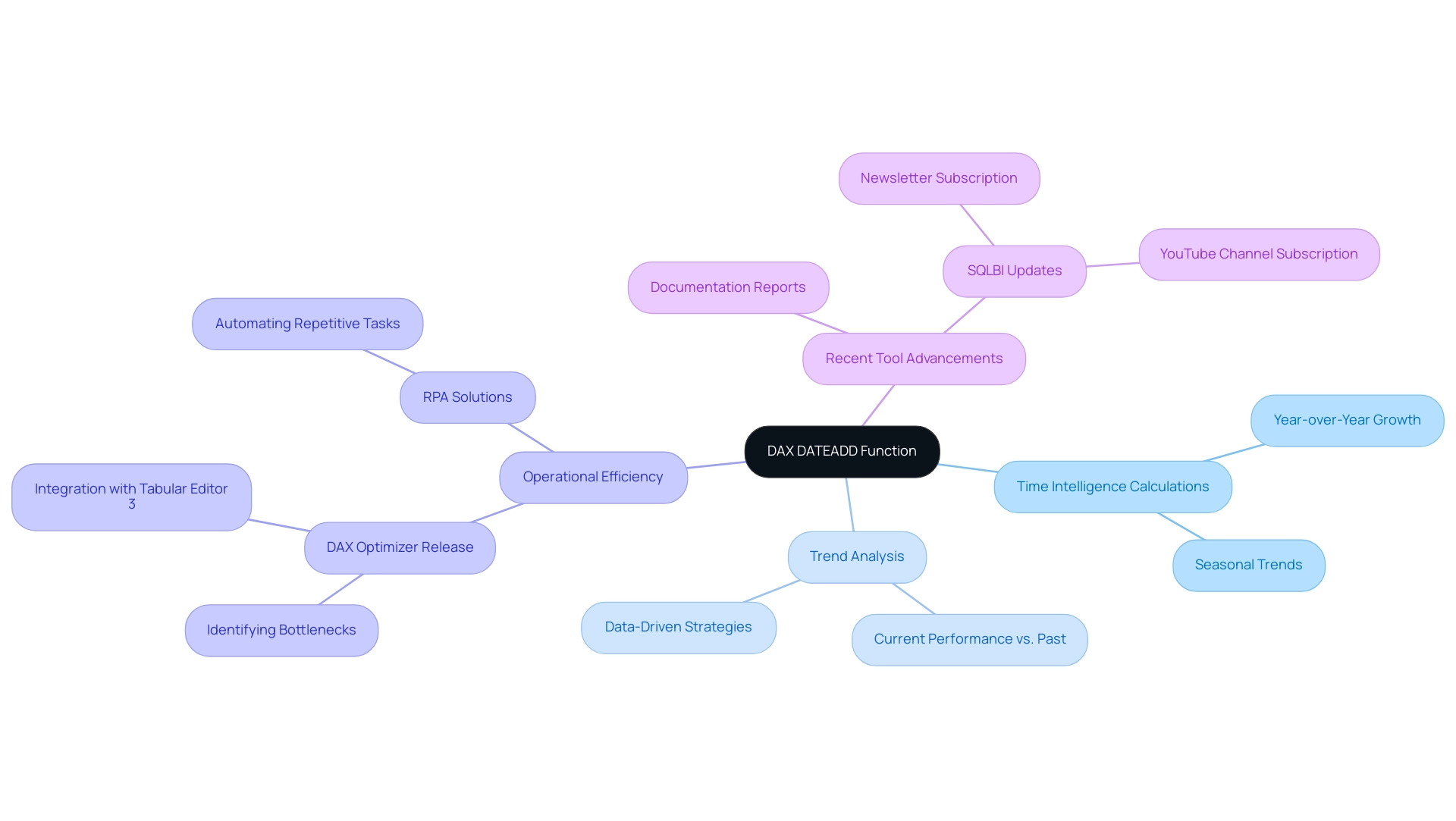
Understanding the Syntax and Parameters of DATEADD
The dax dateadd today operation is a powerful tool in DAX for manipulating date values, structured as follows: DATEADD(<dates>, <number_of_intervals>, <interval>). Each parameter is crucial for your calculations:
<dates>: This requires a column containing date values, forming the basis for your analyses and insights.<number_of_intervals>: This indicates how many intervals to shift the dates. Use a positive number to advance in time or a negative number to regress.<interval>: This defines the time unit for the shift, which can be DAY, MONTH, or YEAR.
For example, to adjust dates by one month, the expression DATEADD(DateColumn, 1, MONTH) would be utilized.
Understanding this syntax is essential for effectively applying the dax dateadd today function in your DAX calculations, particularly when addressing common challenges such as time-consuming report creation and data inconsistencies. As a Microsoft employee noted, In Power BI, it only accepts a comma as a separator, emphasizing the importance of aligning your regional settings with this requirement. The date table discussions have drawn considerable attention, with 13,762 views, showing the strong interest in mastering operations such as adding dates.
Users often face confusion when using slicers that feature only one year but multiple months, complicating date calculations. A case study demonstrates a common problem where a user faced a syntax error while utilizing the time addition feature due to regional settings influencing the argument separator. This was resolved by changing the Windows language settings to ‘English (United States)’, allowing the use of a comma as the argument separator and fixing the error.
By mastering the parameters of this function, and leveraging Business Intelligence tools and RPA solutions, you will enhance your analysis capabilities, driving the insights essential for operational efficiency and business growth.
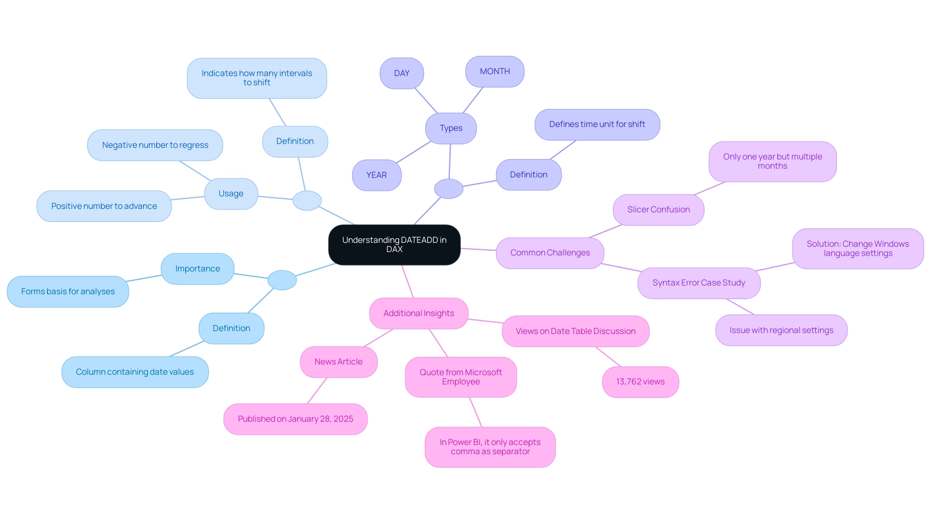
Common Use Cases for DATEADD in Time Series Analysis
The function serves multiple essential purposes in data analysis, particularly in tracking performance over time, especially when integrated with Robotic Process Automation (RPA) and Business Intelligence tools like Power BI. Here are some notable use cases:
-
Calculating Year-to-Date (YTD) Values: By utilizing the dax dateadd today function for date addition, organizations can effectively compare current year performance against that of the previous year. For instance, the formula
YTD Sales = CALCULATE(SUM(Sales[Amount]), Shift(Date[Date], -1, YEAR))allows for a seamless assessment of sales trends over time, enabling informed decision-making and supporting operational efficiency. -
Month-over-Month Analysis: This function is instrumental in analyzing shifts in performance by juxtaposing this month’s sales figures with those of the previous month. For example, utilizing the formula
Last Month Sales = CALCULATE(SUM(Sales[Amount]), SHIFT(Date[Date], -1, MONTH))provides valuable insights into sales momentum and helps identify patterns in consumer behavior, further enhancing data-driven strategies. -
Trend Analysis: A specific function can be utilized to create moving averages or other trend indicators over designated periods, enhancing the depth of data insights. Such analysis is crucial for identifying long-term growth patterns and making strategic business decisions. The integration of RPA can automate these reporting processes, significantly improving efficiency and accuracy.
Additionally, utilizing Power BI features such as the 3-Day Power BI Sprint enables organizations to quickly create professionally designed reports that incorporate these analyses. The General Management App further supports comprehensive management and smart reviews, allowing teams to leverage insights derived from time addition and other DAX calculations effectively.
These functions not only facilitate dynamic visualizations but also empower organizations to transition from cumbersome reporting processes to more streamlined, automated solutions. As Johann, the founder of Data Bear, aptly puts it, “Empowering organizations to move from a time-consuming frustration with reporting processes into automated dynamic visualizations is what he takes pleasure in.” This underscores the transformative potential of the function and RPA in enhancing operational efficiency and driving business performance.
Given the surge in demand for information engineers by 45% in 2020, the significance of analysis roles has only intensified. Additionally, the availability of prebuilt customizable templates for financial modeling can significantly aid in YTD or month-over-month analysis when implementing dax dateadd today, allowing organizations to save time, reduce errors, and ultimately enhance their financial health.
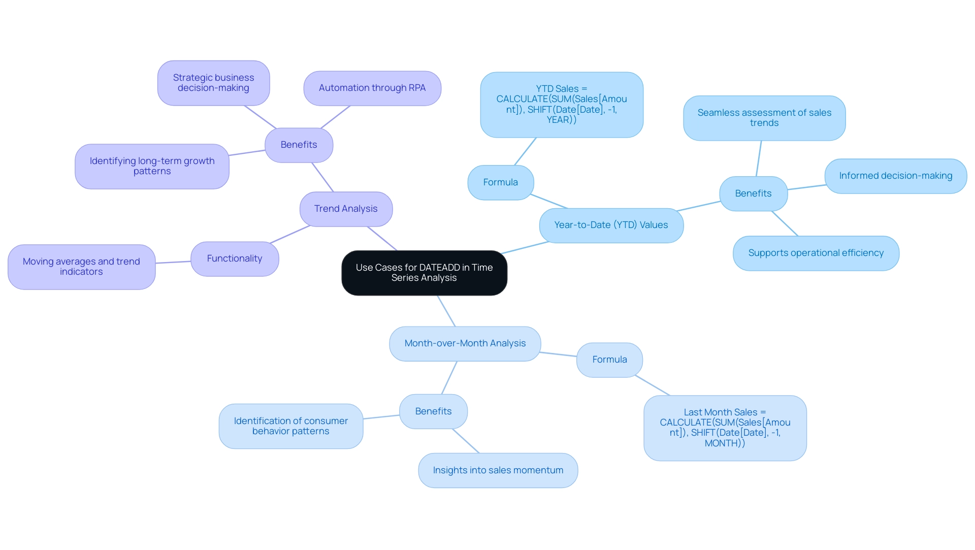
Troubleshooting and Optimizing DATEADD in DAX
When employing the dax dateadd today function in DAX, users may encounter difficulties such as erroneous outcomes or performance lags, particularly in environments impacted by low master information quality. To effectively troubleshoot these issues, consider the following strategies:
- Check Data Types: Ensure that the date column used within the date addition function is appropriately formatted as a date type. Mismatched information types can lead to significant errors in calculations, especially if your organization struggles with inconsistent or incomplete information.
- Avoid Circular References: Be vigilant about creating measures that reference themselves, as this can lead to circular dependency errors, further complicating your information model.
- Optimize Performance: Enhance performance by minimizing the number of calculations within your measures and ensuring that your information model is streamlined for efficiency. When working with substantial datasets, utilizing dax dateadd today may lead to slowdowns in calculations; therefore, it’s advisable to leverage pre-aggregated information when feasible. Investing in Business Intelligence and RPA solutions can help automate information management, thereby enhancing overall efficiency.
Jihwan Kim emphasizes the importance of incorporating a dim-data table in your model, which can simplify data management and significantly enhance the overall performance of DAX calculations. Furthermore, as noted by the Super User ‘some_bih’, if you simply need to obtain some new or future date based on a column you already have, consider using an alternative solution with a new column utilizing Date.AddYears, like Date.AddYears([<your column name>], your reference for adding).
Additionally, challenges in publishing Power BI reports to the cloud can stem from permission settings or network connectivity issues. Users should confirm permissions, check internet stability, and consider logging out and back in to refresh permissions, or consult Power BI support if problems persist. By adhering to these best practices and tackling quality issues, users can effectively reduce common problems related to the dax dateadd today operation and enhance their DAX performance.
Moreover, to tackle the challenge of time-consuming report creation, leveraging BI tools like Power BI can automate data visualization and streamline the reporting process, allowing for quicker insights. Testimonials from organizations that have implemented these solutions successfully highlight the transformative impact on operational efficiency and data-driven decision-making.
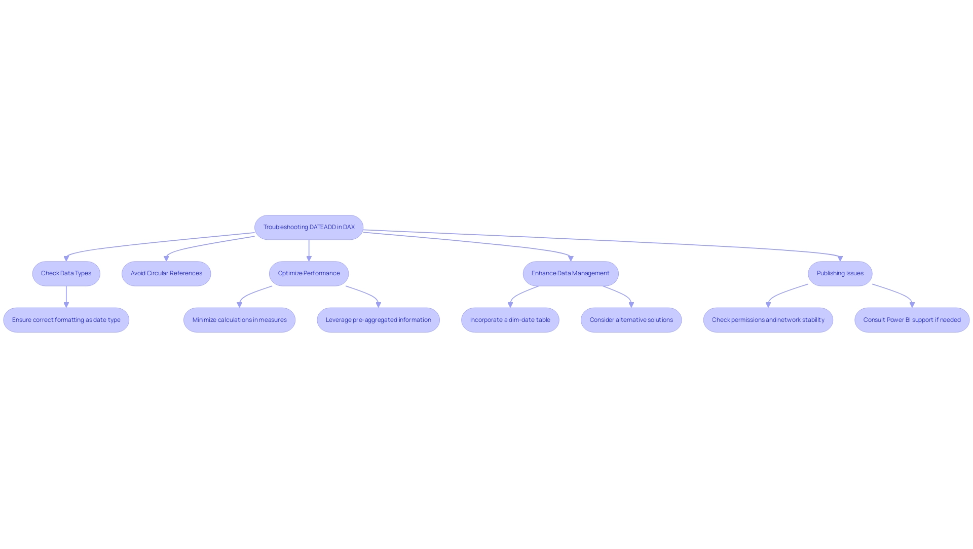
Advanced Techniques: Nested DATEADD Functions and Complex Calculations
Advanced techniques using DAX DATEADD today for time addition can significantly improve your DAX calculations, ultimately promoting operational efficiency and data-driven insights essential for business growth. Here are some key methods:
-
Nested Time Addition Techniques: Nesting time addition techniques enables the creation of complex date calculations. For example, the formula
Sales Last Year = CALCULATE(SUM(Sales[Amount]), SHIFT(SHIFT(Date[Date], -1, YEAR), 1, YEAR))allows the examination of sales from two years ago, enhancing your reporting and tackling the frequent issue of lengthy report creation. -
Combining with Other Operations: To develop dynamic measures that react to user selections, consider using
SHIFTalongside other DAX operations likeCALCULATEandFILTER. This combination enables you to create more engaging reports, improving user experience while reducing problems associated with inconsistencies in information. -
Creating Custom Time Frames: By incorporating additional date operations, you can specify custom time frames for analysis. This approach allows for targeted calculations, such as evaluating sales over a specific quarter or selected month range, ensuring that actionable guidance is readily available.
Incorporating best practices for DAX usage, such as using meaningful names and documenting calculations, is crucial for maintaining clarity and efficiency in your DAX models. A case study on advanced DAX techniques highlighted how a company improved its reporting accuracy by implementing nested DATEADD functions, showcasing the benefits of DAX DATEADD today and resulting in a 30% reduction in calculation time. Moreover, RPA (Robotic Process Automation) can complement these advanced DAX techniques by automating repetitive tasks involved in preparation and report generation. This synergy not only enhances operational efficiency but also allows teams to focus on strategic analysis rather than manual processes. Embracing these advanced techniques, alongside RPA, aids in managing calculation complexity and leads to more robust and insightful data analysis, empowering you to leverage your BI tools to their fullest potential.
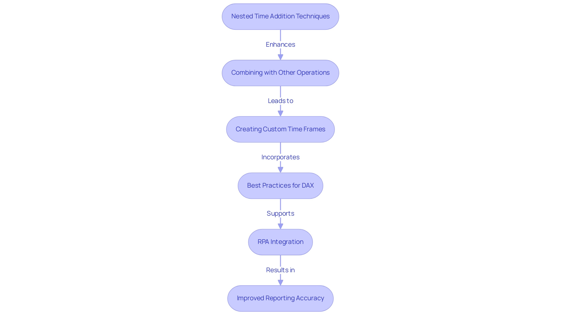
Conclusion
Mastering the DAX DATEADD function is essential for organizations looking to elevate their data analysis capabilities. As highlighted throughout the article, DATEADD not only facilitates the manipulation of date values across various intervals but also empowers analysts to derive meaningful insights that drive strategic decision-making. By utilizing DATEADD effectively, teams can streamline their reporting processes, conduct year-over-year comparisons, and visualize trends that inform operational strategies.
The practical applications of DATEADD, from calculating year-to-date values to conducting month-over-month analyses, underscore its significance in enhancing performance tracking. Moreover, integrating DATEADD with advanced techniques and tools like RPA and Power BI can significantly improve efficiency, allowing organizations to transition from cumbersome manual processes to automated, dynamic reporting solutions.
As the demand for data-driven insights continues to grow, leveraging the full potential of DATEADD will be crucial. Organizations that embrace these strategies will not only optimize their analytical capabilities but also foster a culture of informed decision-making that drives operational success. Investing in the mastery of DATEADD is a pivotal step towards unlocking the transformative power of data within any business environment.
Overview
The article outlines the top 10 DAX best practices for efficient data analysis, emphasizing principles such as clarity, consistency, performance awareness, and effective use of variables. These best practices are supported by techniques that enhance DAX code performance, such as optimizing data models and avoiding common pitfalls, ultimately driving operational efficiency and improving analytical capabilities in platforms like Power BI.
Introduction
In the realm of data analysis, DAX (Data Analysis Expressions) stands as a cornerstone for professionals looking to elevate their operational efficiency and drive actionable insights. As organizations grapple with the complexities of data management, mastering the fundamental principles and best practices of DAX becomes not just beneficial but essential.
This article delves into a comprehensive guide that outlines key strategies for:
1. Optimizing DAX performance
2. Leveraging variables
3. Refining data models
By embracing these techniques, analysts can streamline their workflows, reduce errors, and enhance the clarity of their analyses, ultimately leading to smarter decision-making. Through practical examples and expert insights, the path to DAX mastery is illuminated, empowering teams to navigate the intricacies of data with confidence and precision.
Fundamental Principles of DAX Best Practices
DAX (Data Analysis Expressions) functions are an essential tool for modeling and analysis in platforms like Power BI and Excel. For any analyst aspiring to boost operational efficiency amidst challenges like time-consuming report creation, data inconsistencies, and a lack of actionable guidance, mastering DAX best practices is essential. Here are the key principles to guide your DAX journey:
-
Clarity and Simplicity: Strive for clear and concise formulas. Complex expressions can introduce errors and obscure understanding for others. Emphasizing simplicity not only aids comprehension but also enhances the effectiveness of your analyses.
-
Consistency: Maintain uniform naming conventions and formatting throughout your DAX code. This practice fosters readability and minimizes confusion, allowing team members to follow your logic with ease.
-
Documentation: Invest time in commenting your code. A well-documented process, particularly for intricate formulas, facilitates future revisions and supports collaboration by helping others interpret your work.
-
Performance Awareness: Prioritize performance when crafting DAX formulas. Efficient code accelerates calculations and boosts overall report responsiveness, making your analyses more impactful.
-
Testing and Validation: Regularly verify your DAX formulas to ensure they deliver expected outcomes. Consistent testing helps identify errors early, preserving the integrity of your analysis.
To illustrate these principles, consider the case study on regression analysis, where DAX functions like LINEST and FORECAST are utilized to model relationships between variables. This application not only assists in predictive modeling and trend analysis but also demonstrates the clarity and simplicity required in DAX for effective interpretation.
By embracing DAX best practices, you can enhance your analysis capabilities, drive insights based on information, and improve operational efficiency in your organization. Moreover, integrating Robotic Process Automation (RPA) can further streamline your workflows, allowing for automation of repetitive tasks and freeing up time for more strategic analysis. As Walter Shields aptly states in his work on launching a data analytics career, “For anyone looking to excel in data analysis, mastering DAX best practices is crucial.
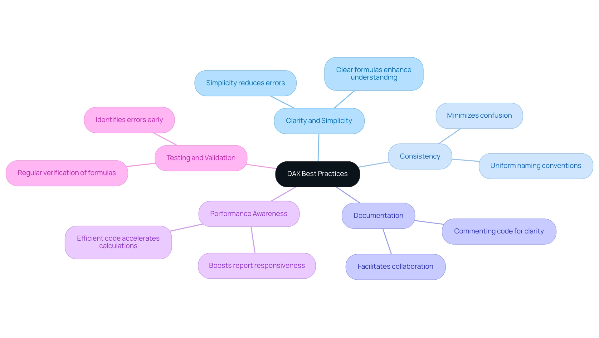
Techniques for Optimizing DAX Code for Performance
To improve the efficiency of your DAX code, consider implementing the following techniques:
-
Utilize CALCULATE Effectively: Although the CALCULATE function is a powerful tool for dynamic assessments, its overuse can impede efficiency. Limit its application to essential computations to ensure efficiency.
Reduce Row Context: Streamlining row context can significantly improve performance. It’s advisable to use iterator functions judiciously and to avoid unnecessary calculations on extensive datasets, which can lead to slower processing times. -
Avoid Using SELECTEDVALUE in Calculated Columns: Instead of applying SELECTEDVALUE in calculated columns, reserve it for measures, where it can yield a more substantial positive impact on performance.
-
Leverage SUMMARIZE: Utilizing the SUMMARIZE function allows the creation of summary tables, which helps to minimize the volume of information DAX must handle, thereby enhancing overall processing speed.
Limit the Use of DISTINCT: Although DISTINCT is helpful for eliminating duplicates, its frequent use can diminish efficiency. Employ it sparingly and only when absolutely necessary to maintain efficiency. -
Utilize Performance Analysis Tools: Performance analysis tools in Power BI Desktop are essential for tracking rendering times for visuals and DAX queries. Regularly monitoring these metrics can help identify bottlenecks and areas for improvement.
-
Replace High-Cardinality Columns: Substituting high-cardinality columns, such as Guide, with surrogate keys can significantly enhance your models. This change reduces complexity and improves processing speed.
-
Case Study – Minimize Cardinality in Columns: A practical example of optimization involves reducing the cardinality of columns. For instance, using the LEFT function to shorten product names can lower complexity and enhance processing speed.
These techniques are essential for optimizing DAX performance and adhering to DAX best practices, ensuring that your operations run smoothly and effectively. As noted by expert Priyanka P Amte, mastering DAX optimization can lead to faster queries in Power BI, allowing for more responsive and insightful data analysis.
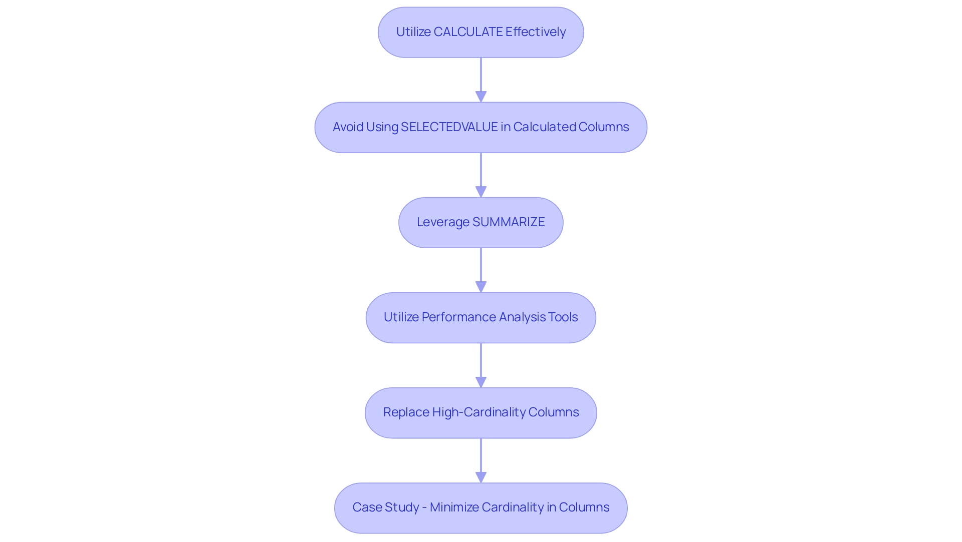
Leveraging Variables to Enhance DAX Formulas
Harnessing variables in DAX best practices is a powerful strategy that can significantly boost the efficiency of your formulas, especially within the context of Business Intelligence and RPA. Here’s how to effectively leverage them:
-
Simplify Complex Processes: Variables enable you to break down intricate processes into smaller, more manageable segments.
This not only enhances clarity but also makes it easier for others to follow your logic, vital for teams striving for data-driven insights. -
Improve Performance: By storing intermediate results within variables, you minimize the frequency of repeated calculations.
This can result in substantial improvements, particularly in complex expressions.
A relevant case study shows that without DAX variables, the execution time for a Sales amount measure soared to 1198 ms, highlighting the performance degradation linked to repeated computations, which can hinder data consistency and actionable guidance. -
Enhance Readability: Appropriately named variables can transform your formulas into more understandable scripts, facilitating easier comprehension and collaboration, thus overcoming challenges in time-consuming report creation.
-
Reduce Repetition: When a computation appears multiple times within a formula, utilizing a variable to store that result prevents redundancy.
This not only streamlines your formulas but also enhances overall efficiency, addressing staffing shortages and outdated systems. -
Scope Control: Variables enable precise management of the scope of computations, ensuring they are used only where necessary.
This targeted approach helps in reducing potential errors in your measures, aligning with the goal of driving operational efficiency through automation, and it exemplifies DAX best practices.
Additionally, integrating RPA solutions such as EMMA RPA and Power Automate can further enhance the effectiveness of your DAX formulas.
By automating repetitive tasks, these tools can help mitigate staffing shortages and enhance consistency, allowing for more reliable insights.
As noted by Zhengdong Xu, Community Support,
Just as @Alex87 said, using variables is important. Variables can enhance performance by avoiding redundant calculations.
This underscores the crucial role that variables play in optimizing DAX formulas and improving overall operational efficiency while leveraging Business Intelligence for growth, in accordance with DAX best practices.
For those interested in ongoing learning opportunities, users can register to download relevant files and receive a bi-weekly newsletter about BI news.
Engaging with the Fabric community, which currently has 3,132 active users, can also provide valuable insights and discussions surrounding DAX variables and their applications.
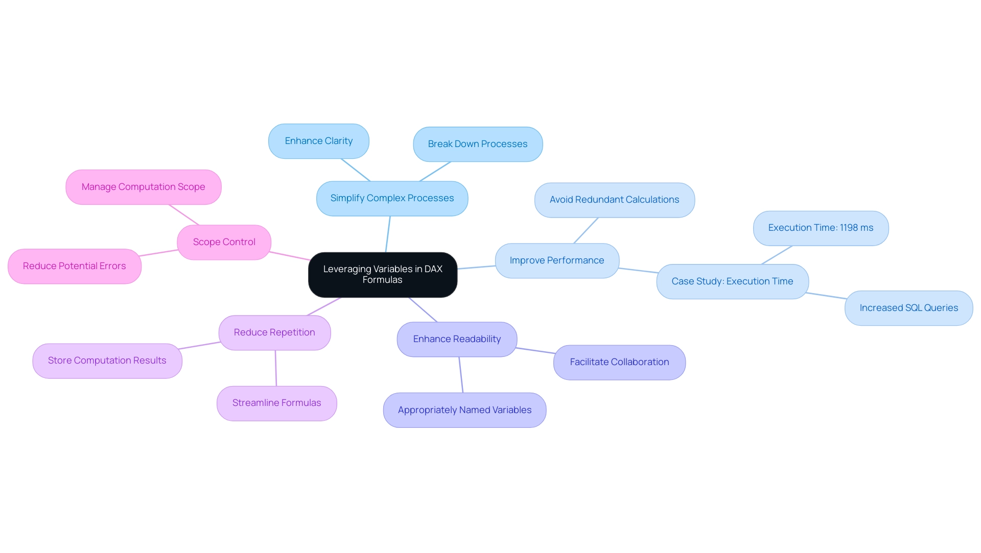
The Role of Data Modeling in DAX Efficiency
Effective information modeling is essential for maximizing DAX efficiency and leveraging insights for impactful business decisions. Here are key strategies to enhance your information models:
-
Establish Proper Relationships: Defining accurate relationships between tables is crucial for facilitating precise calculations. A well-structured relationship enhances the integrity of your analyses and supports the actionable outcomes of your reports.
-
Utilize Star Schema Design: Whenever possible, implement a star schema. This design arranges information into fact and dimension tables, significantly enhancing query efficiency by decreasing redundancy in organization. By adhering to this framework, you can improve overall effectiveness and simplify your information model, aligning with the objectives of the 3-Day Power BI Sprint.
-
Minimize Table Size: Streamline your tables by removing unnecessary columns and rows. This practice is essential as it not only accelerates query execution but also results in more efficient processing, ensuring that your model is both clear and effective, ultimately driving operational efficiency.
-
Create Calculated Columns Judiciously: Limit the use of calculated columns; instead, consider leveraging measures for computations. Measures typically offer improved results and contribute to clearer, more effective information models, boosting your capacity to obtain actionable insights.
-
Optimize Information Types: Choosing the most efficient types for your columns is essential. By optimizing data types, you minimize memory usage and enhance overall efficiency, making your reports more effective.
Incorporating these best practices not only improves the clarity and scalability of your Power BI data models but also leads to faster queries and more effective reporting. This ultimately supports better decision-making and drives growth, ensuring your organization can navigate challenges in leveraging insights from Power BI dashboards. Additionally, during our 3-Day Power BI Sprint, we will assist you in applying these strategies to create a fully functional, professionally designed report tailored to your needs.
You can also use this report as a template for future projects, ensuring a professional design from the start. Moreover, our training workshops will provide further insights into these practices, enhancing your team’s capability to utilize Power BI effectively.
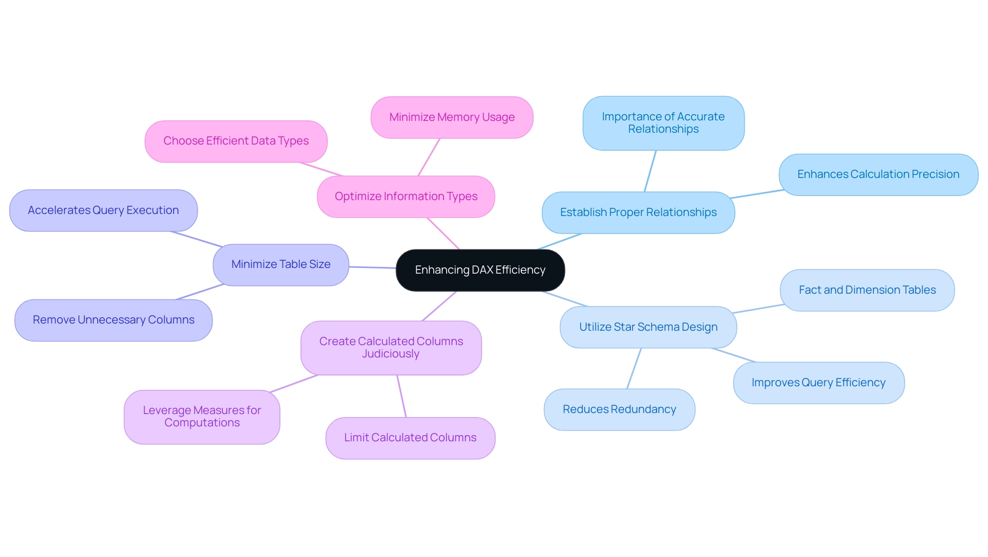
Avoiding Common DAX Pitfalls and Anti-Patterns
To maximize efficiency in DAX and leverage the benefits of Robotic Process Automation (RPA), it is crucial to be mindful of these common pitfalls:
-
Overusing Calculated Columns: Excessive reliance on calculated columns can significantly hinder performance. When feasible, choose methods that are enhanced for dynamic computations and can boost overall efficiency.
-
Ignoring Filter Context: A deep understanding of filter context is essential. Neglecting this aspect can lead to unexpected results in your calculations, ultimately affecting the accuracy of your reports.
-
Neglecting Testing: Regular evaluation of your DAX formulas is vital. Not testing DAX formulas before deployment can result in undetected errors, leading to sluggish reports that undermine the user experience and decision-making process.
-
Using Too Many DISTINCT Calls: The overuse of DISTINCT can lead to performance degradation. Employ this function judiciously to maintain optimal processing speeds.
-
Not Leveraging the Power of Measures: Measures are specifically designed for dynamic computations, and neglecting to utilize them can restrict your DAX capabilities. Embracing measures will enhance your analytical prowess and reporting accuracy.
-
Neglecting a Dedicated Date Table: Many DAX functions require a dedicated date table for accurate time intelligence computations. Failing to implement this can lead to incorrect calculations and insights.
Integrating RPA into your DAX workflows can help automate manual processes such as data entry, report generation, and data validation, eliminating repetitive tasks and reducing the potential for human error. This allows your team to focus on strategic analysis and decision-making. As Mazhar Shakeel aptly states,
Remember, Power BI is a tool that rewards careful planning and thoughtful design.
By adhering to DAX best practices and avoiding common pitfalls, such as those discussed in the case studies on advancing DAX skills, you can foster a more effective DAX environment, improve operational efficiency, and enhance the overall quality of your insights.
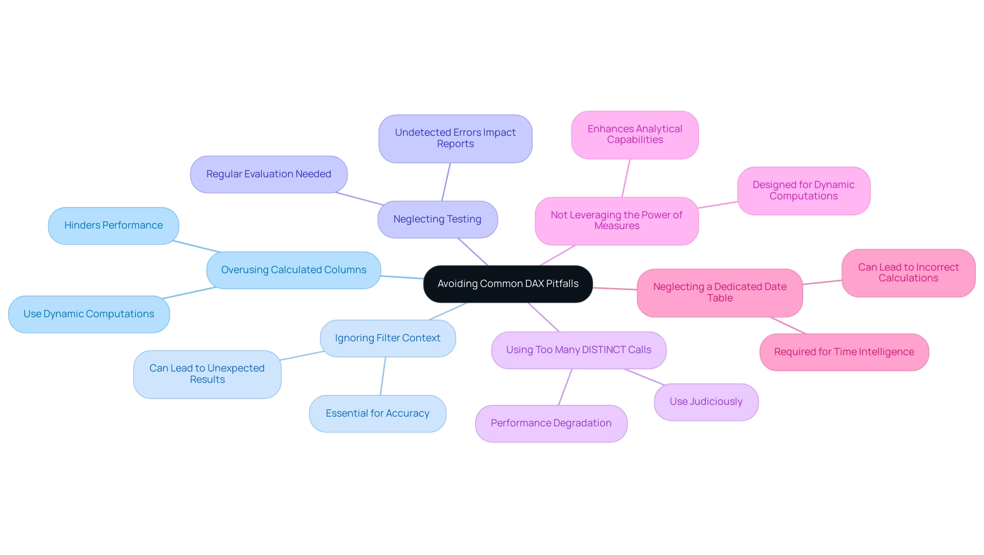
Conclusion
Mastering DAX is a transformative step for any organization looking to enhance its data analysis capabilities. By adhering to the fundamental principles of:
- Clarity
- Consistency
- Documentation
- Performance awareness
- Rigorous testing
analysts can craft DAX formulas that are not only effective but also easy to understand and maintain. These best practices lay the groundwork for more efficient workflows and help mitigate common data management challenges.
Optimizing DAX performance requires strategic techniques, such as:
- Judicious use of the CALCULATE function
- Reducing row context
- Leveraging summary tables
By implementing these strategies, analysts can significantly enhance the speed and responsiveness of their reports, allowing for quicker decision-making and more impactful insights. Additionally, incorporating variables into DAX formulas streamlines complex calculations, reduces redundancy, and improves readability, further elevating operational efficiency.
Effective data modeling is equally crucial in maximizing DAX performance. Establishing proper relationships, adopting a star schema design, and optimizing data types are essential steps that lead to clearer, faster, and more actionable reports. Recognizing and avoiding common pitfalls, such as overusing calculated columns and neglecting performance testing, empowers analysts to create robust and efficient DAX environments.
In conclusion, mastering DAX is not merely a technical skill; it is a strategic advantage that enables organizations to navigate the complexities of data analysis with confidence. By embracing these principles, techniques, and best practices, teams can unlock the full potential of their data, driving informed decisions and fostering a culture of data-driven excellence.
Overview
Content packs in Power BI are pre-packaged sets of models, reports, and dashboards designed to enhance data visualization and streamline reporting processes for organizations. The article emphasizes their role in overcoming common challenges like time-consuming report creation and data inconsistencies, while also highlighting the importance of customization and integration with various data sources to drive informed decision-making.
Introduction
In the rapidly evolving landscape of data analytics, Power BI content packs emerge as a game-changing solution for organizations seeking to optimize their data management processes. These pre-packaged collections of data models, reports, and dashboards not only streamline access to critical information but also empower teams to transform raw data into actionable insights with unprecedented efficiency.
As organizations grapple with common challenges such as time-consuming report creation and data inconsistencies, the ability to leverage content packs provides a pathway to enhanced collaboration and informed decision-making.
With the integration of advanced features like Robotic Process Automation and AI-driven analytics, Power BI stands poised to revolutionize how businesses approach data visualization and reporting.
This article delves into the myriad benefits, practical applications, and strategic considerations of utilizing Power BI content packs, equipping organizations with the knowledge to harness their full potential and drive operational success.
Understanding Power BI Content Packs: An Overview
Content packs in Power BI signify a crucial advancement in management, consisting of pre-packaged sets of models, reports, and dashboards intended to enable efficient access and visualization. These tools enable organizations to tackle typical challenges such as time-consuming report creation, inconsistencies, and the absence of actionable guidance. By using the 3-Day BI Sprint, users can swiftly create professionally designed reports, enabling a more streamlined approach to analysis.
Additionally, the General Management App enhances comprehensive management capabilities, integrating Microsoft Copilot for smarter insights and predictive analytics. In Power BI, users can create a resource bundle by clicking on ‘Workspaces’ and then ‘My Workspaces,’ allowing for easy engagement with these tools. Organizations can also obtain resource collections from external suppliers, facilitating smooth information integration from various services and applications.
This flexibility ensures that users, regardless of their technical proficiency, can swiftly import and analyze essential information. By providing a structured approach to data visualization, content packs in Power BI empower organizations to derive actionable insights rapidly. Furthermore, the ‘Actions portfolio’ provides additional resources for users, and we invite you to book a free consultation to explore how these tools can benefit your organization.
As mentioned in the Microsoft Fabric Blog, it would be wonderful if an Admin could verify that the upcoming retirement of the BI Admin portal Usage metrics dashboard is solely in reference to the Admin report, emphasizing the changing landscape of BI. Additionally, the case study titled ‘How to Create Interactive BI Dashboards?’ demonstrates the practical uses of these resource collections, highlighting information relationships and visualization options that promote collaborative insights within teams.
This foundational understanding is essential for harnessing the full potential of BI, particularly in an environment where efficiency and informed decision-making are paramount. In 2024, the use of content packs in Power BI is anticipated to rise considerably, indicating their increasing significance in the visualization domain.
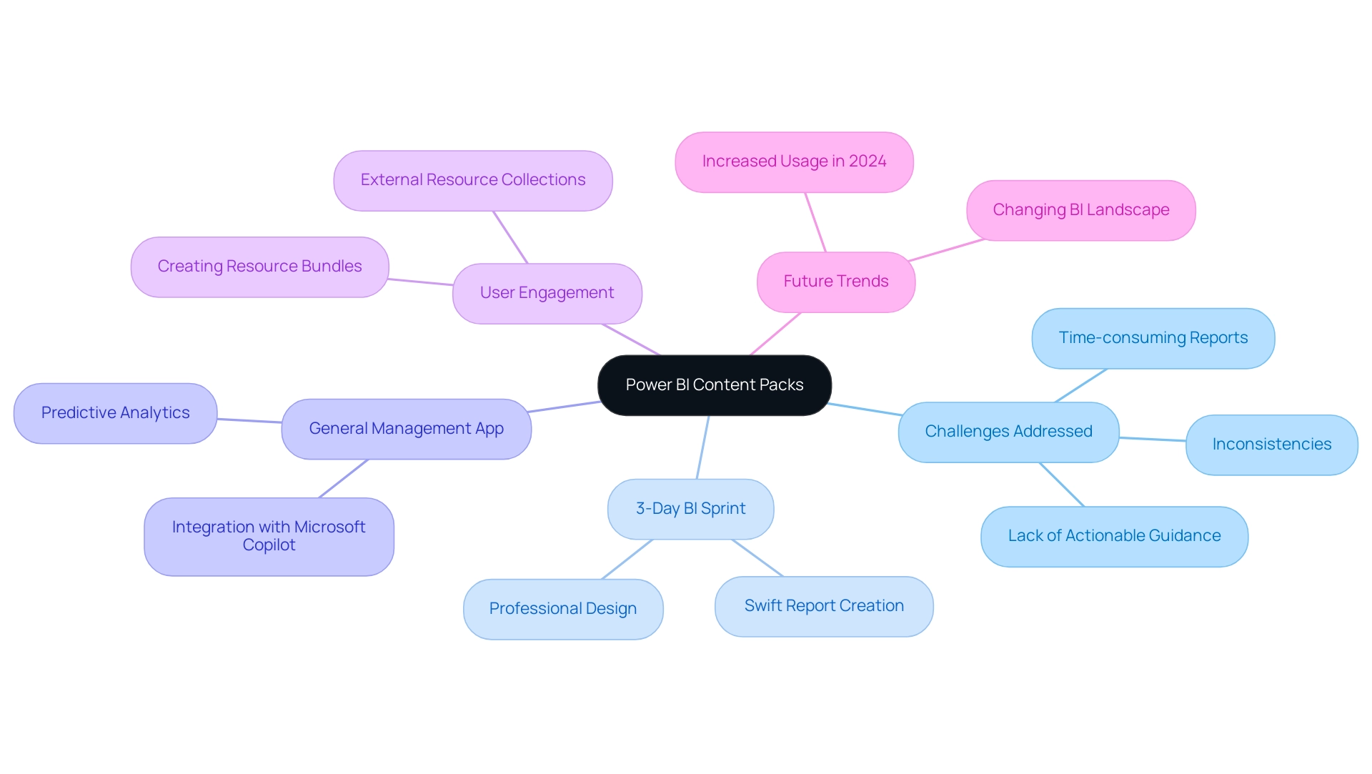
Benefits and Applications of Power BI Content Packs
Content packs in Power BI offer a wealth of advantages that significantly improve analysis and reporting capabilities, empowering organizations to make informed decisions swiftly. By harnessing the power of Business Intelligence, businesses can overcome challenges such as:
- Time-consuming report creation
- Inconsistencies
- Task repetition fatigue
- Staffing shortages
One standout advantage is the immediate access to pre-built reports and dashboards, which drastically reduces the time spent on preparation and visualization.
This efficiency shift enables teams to concentrate on interpreting insights rather than getting bogged down in setup processes. Furthermore, RPA solutions, including EMMA RPA and Power Automate, can automate repetitive tasks, promoting operational efficiency and improving employee morale. Content packs in Power BI encourage collaboration by creating a standardized perspective of information across the organization, ensuring all stakeholders are aligned and working from the same source of truth.
Their seamless integration with a variety of data sources, including both cloud services and on-premises databases, simplifies the consolidation of data environments. Notably, the Max Direct Lake model size on OneLake is 300 GB, showcasing the robust capabilities of BI in handling large datasets. This multifaceted approach not only enhances decision-making processes but also drives operational efficiency, ultimately fostering a culture that prioritizes data-driven insights.
As Youssef Shoukry, Senior Program Manager, stated, ‘With numerous collaborators consistently creating new resource bundles and refreshing current ones, we aimed to initiate a monthly blog entry to share with you the recently added resource bundles in the BI service.’ This strengthens the continuous development and usefulness of BI resource bundles in enabling organizations to leverage information effectively. Furthermore, this software includes several AI functionalities, such as AI Visuals like Key Influencers and Decomposition Tree, which enable users to examine information intuitively, create reports automatically, and identify anomalies, greatly enhancing the analysis process.
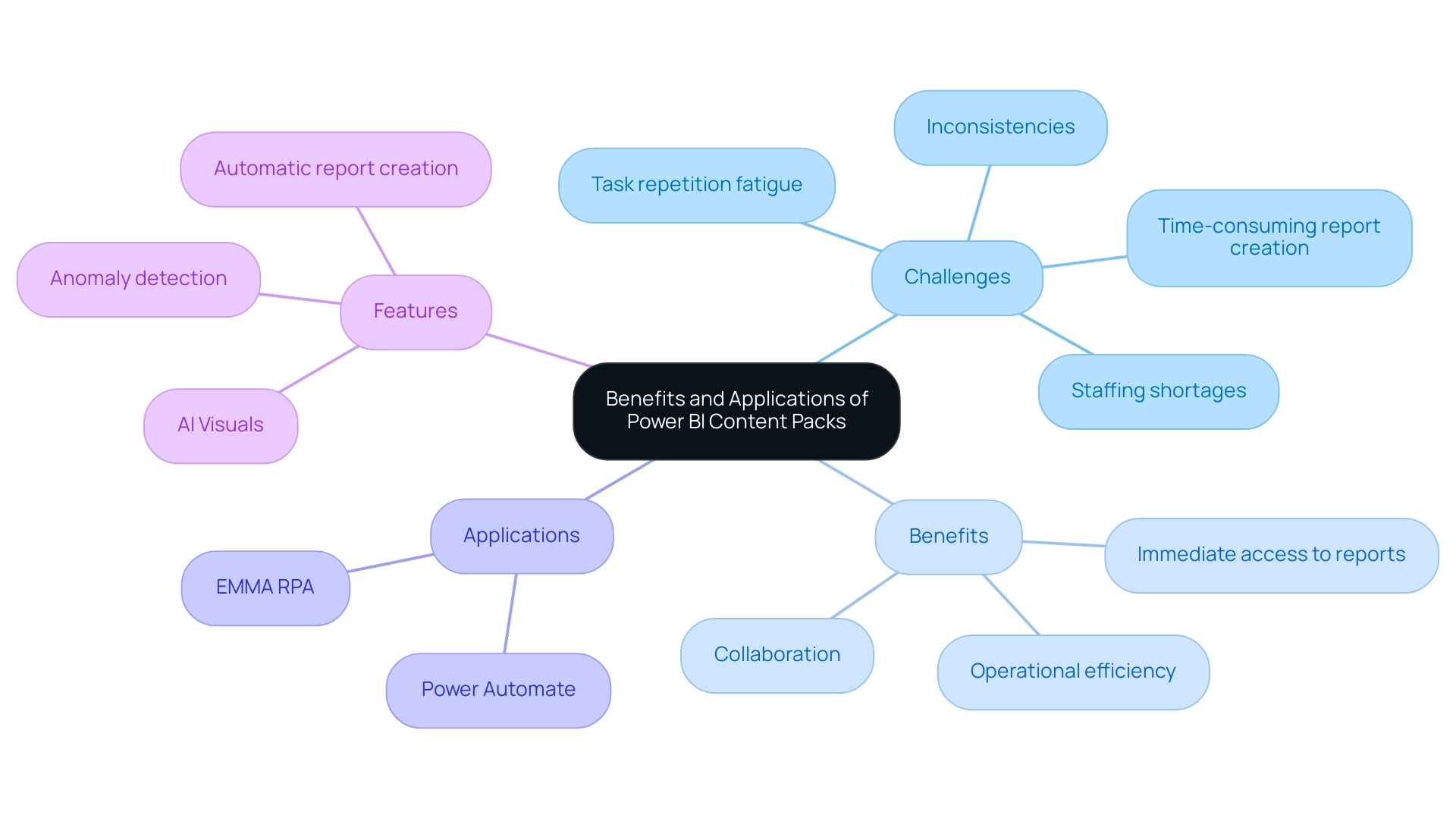
Creating Custom Content Packs for Specific Business Needs
Organizations can harness the power of Power BI by creating custom resources tailored to their specific business needs. This process starts with pinpointing key metrics and information sources that align closely with the organization’s strategic objectives. By personalizing resource collections, companies can generate reports and dashboards aimed at addressing specific operational challenges, effectively converting unprocessed information into actionable insights.
This level of personalization enables the integration of exclusive information, offering insights that extend beyond standard content packs in Power BI. However, organizations often face challenges such as time-consuming report creation and inconsistencies that hinder effective decision-making. To combat these issues, integrating Robotic Process Automation (RPA) solutions can streamline handling and reporting processes, enhancing operational efficiency.
Such flexibility is crucial for organizations seeking to implement targeted visualizations and analytics, ultimately driving more informed decision-making processes. Jason Himmelstein emphasizes the necessity of using up-to-date web browsers for accessing BI, indicating that users should upgrade to versions newer than Chrome 94, Edge 94, Safari 16.4, or Firefox 93 by August 31, 2024. This proactive approach to data management not only enhances operational efficiency but also empowers teams to make data-driven decisions that align with their specific requirements.
Additionally, community support is readily available for users needing assistance with BI and Google Analytics integration, further enhancing the user experience. The introduction of new and updated connectors, including OneStream, Zendesk Data, and enhancements to existing connectors like Azure Databricks, showcases the evolving capabilities of BI, making it an even more valuable tool for organizations seeking to drive growth and innovation through data-driven insights. To explore these solutions further, we encourage users to engage with our resources and community support.
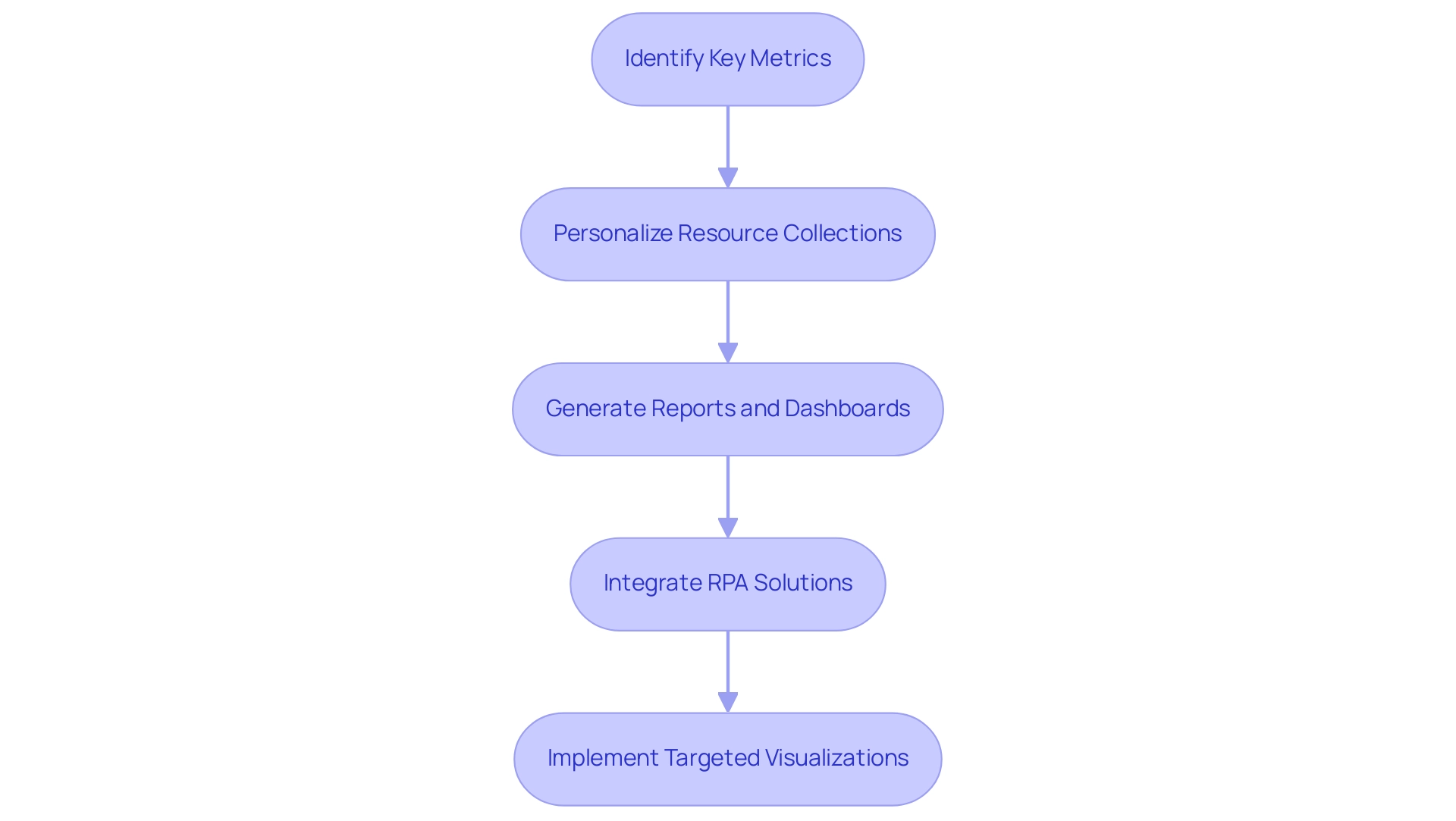
Challenges and Considerations When Using Content Packs
While content packs in Power BI offer substantial benefits, organizations frequently encounter significant challenges during their implementation. A prevalent concern is governance of information, where ensuring quality and compliance becomes paramount when integrating diverse sources. Having numerous models refreshing simultaneously can strain storage and processing capacities, potentially leading to performance issues.
To prevent discrepancies in reporting, organizations must prioritize the establishment of clear guidelines and robust processes for effective information management. The 3-Day Power BI Sprint service by Creatum addresses these issues head-on; in just three days, we will create a fully functional, professionally designed report tailored to your needs, allowing you to focus on leveraging insights for impactful decisions. This report can also serve as a template for future projects, ensuring a professional design from the start.
Furthermore, the new content packs in Power BI replace the previous Project Online Content Pack and offer more reports and enhanced capabilities, facilitating better data management. Resistance from team members familiar with traditional reporting methods can also pose a barrier. To combat this, it is essential for organizations to invest in comprehensive training and change management strategies that emphasize the advantages of utilizing content packs in Power BI.
As Jasper Taminau, a specialist in BI Azure Business Analytics, aptly puts it,
Don’t ignore the pitfalls, tackle them like a Ninja!
Additionally, Microsoft Fabric supports version control and CI/CD workflows for BI datasets and reports, facilitating collaboration among developers and data professionals. By proactively addressing these challenges, organizations can significantly enhance the effectiveness of content packs in Power BI, ultimately boosting their data-driven decision-making capabilities.
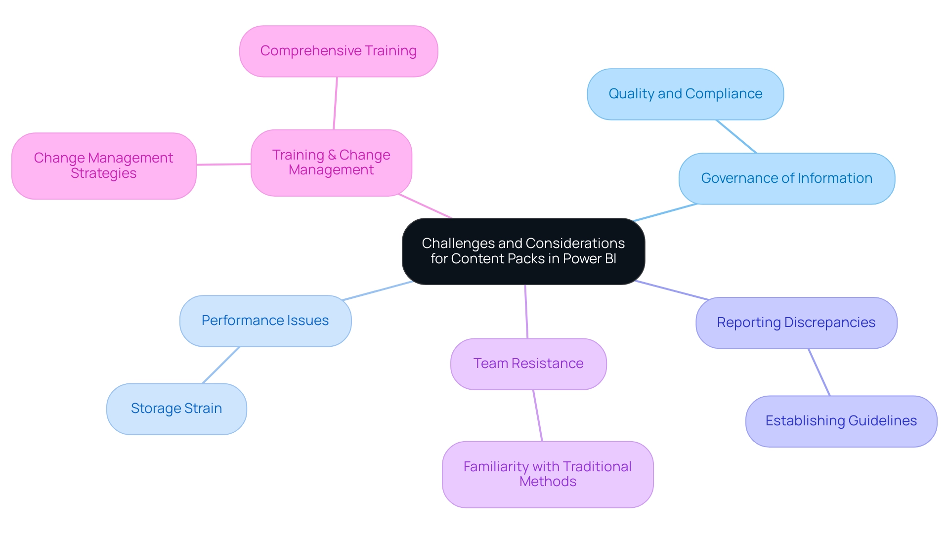
Conclusion
Power BI content packs represent a transformative advancement in data management, offering organizations the tools they need to streamline their data analysis and reporting processes. By providing pre-packaged data models, dashboards, and reports, these content packs enable teams to overcome common obstacles such as time-consuming report creation and data inconsistencies. The ability to quickly access and utilize these resources not only enhances operational efficiency but also fosters a collaborative environment where informed decision-making thrives.
The benefits of Power BI content packs extend beyond just ease of use. By integrating advanced features such as Robotic Process Automation and AI-driven analytics, organizations can automate repetitive tasks and leverage intelligent insights to drive operational success. Custom content packs tailored to specific business needs allow for deeper analysis and a more personalized approach to data management, ensuring that insights align closely with strategic objectives.
However, it is crucial to navigate the challenges associated with implementing content packs, such as data governance and user resistance. Establishing clear guidelines for data management and investing in training can significantly enhance the effectiveness of these tools. By proactively addressing these considerations, organizations can fully harness the potential of Power BI content packs, leading to a more data-driven culture that prioritizes informed decision-making and operational excellence.
As the landscape of data visualization continues to evolve, the adoption of Power BI content packs is expected to grow, reflecting their vital role in optimizing data management processes. Embracing these innovations positions organizations to thrive in an increasingly data-centric world, unlocking the true power of their data and transforming it into actionable insights that drive success.
Overview
Creating stunning visuals with Charticulator in Power BI involves mastering the design canvas, data binding, and leveraging customizable templates to craft unique graphical representations. The article outlines a step-by-step guide that emphasizes the importance of clear labeling, simplicity, and the integration of advanced features, all aimed at enhancing data storytelling and improving decision-making processes within organizations.
Introduction
In the realm of data visualization, the ability to create custom visuals that resonate with audiences is paramount. Charticulator emerges as a powerful tool within Power BI, enabling users to transcend traditional limitations and craft unique representations of their data. By mastering key components such as:
- The design canvas
- Data binding
- Customizable templates
users can transform complex datasets into compelling visual stories. As organizations increasingly recognize the value of data-driven insights, understanding how to effectively utilize Charticulator becomes essential for enhancing decision-making processes. This article delves into the intricacies of Charticulator, offering a comprehensive guide on:
- Creating stunning visuals
- Best practices for design
- Solutions to common challenges
all while empowering organizations to elevate their data storytelling capabilities.
Understanding Charticulator: The Basics of Custom Visuals in Power BI
Charticulator power bi is an innovative tool that stands out for crafting custom visuals, transcending the limitations of standard offerings. At the core of this process is the design canvas, a dynamic workspace where users can effortlessly drag and drop information fields to create distinctive graphical representations. Key components to master include:
- Design Canvas: This is your primary workspace for visual creation, allowing the integration of elements such as shapes, text, and data fields.
- Data Binding: The cornerstone of effective visual design, data binding connects your data to the visual elements. Mastering this process is crucial for generating impactful and meaningful images.
- Templates: This tool provides a variety of customizable templates, which can significantly expedite your design process by offering a solid foundation to build upon.
Understanding these foundational elements equips you to explore the practical steps involved in creating stunning visuals using charticulator power bi. Moreover, in an era where information storytelling is increasingly essential—evidenced by a global search volume reaching 16,000 in 2023—the ability to present information compellingly has never been more vital. As emphasized in the Client Reporting Guide of the digital analytics company Agency Analytics, “Utilizing a storytelling approach, the marketing agency offers a clear narrative that assists the client in comprehending the effect of the marketing agency’s efforts.”
This emphasizes the necessity of effective information presentation in decision-making processes. Furthermore, the case study titled “Importance of Data Storytelling” illustrates how storytelling with information facilitates better decision-making and comprehension, indicating its growing significance as information volume expands. While Charticulator offers unique advantages, it’s crucial to recognize that other popular visualization tools like Adobe Spark, InDesign, and Canva also contribute to the evolving landscape of presentation.
By leveraging custom visuals, you can enhance your storytelling capabilities and facilitate better decision-making within your organization, addressing the challenges of time-consuming report creation and inconsistencies effectively.
Furthermore, integrating tools such as EMMA RPA and Power Automate can further simplify your processes. EMMA RPA automates repetitive tasks, decreasing the time utilized for report creation, while Power Automate assists in ensuring consistency across platforms by automating workflows. For example, a recent case study from a top retail firm showed how adopting EMMA RPA decreased their report generation time by 50%, enabling their team to concentrate on analysis instead of information gathering.
These tools not only improve operational efficiency but also provide actionable insights that drive business growth.
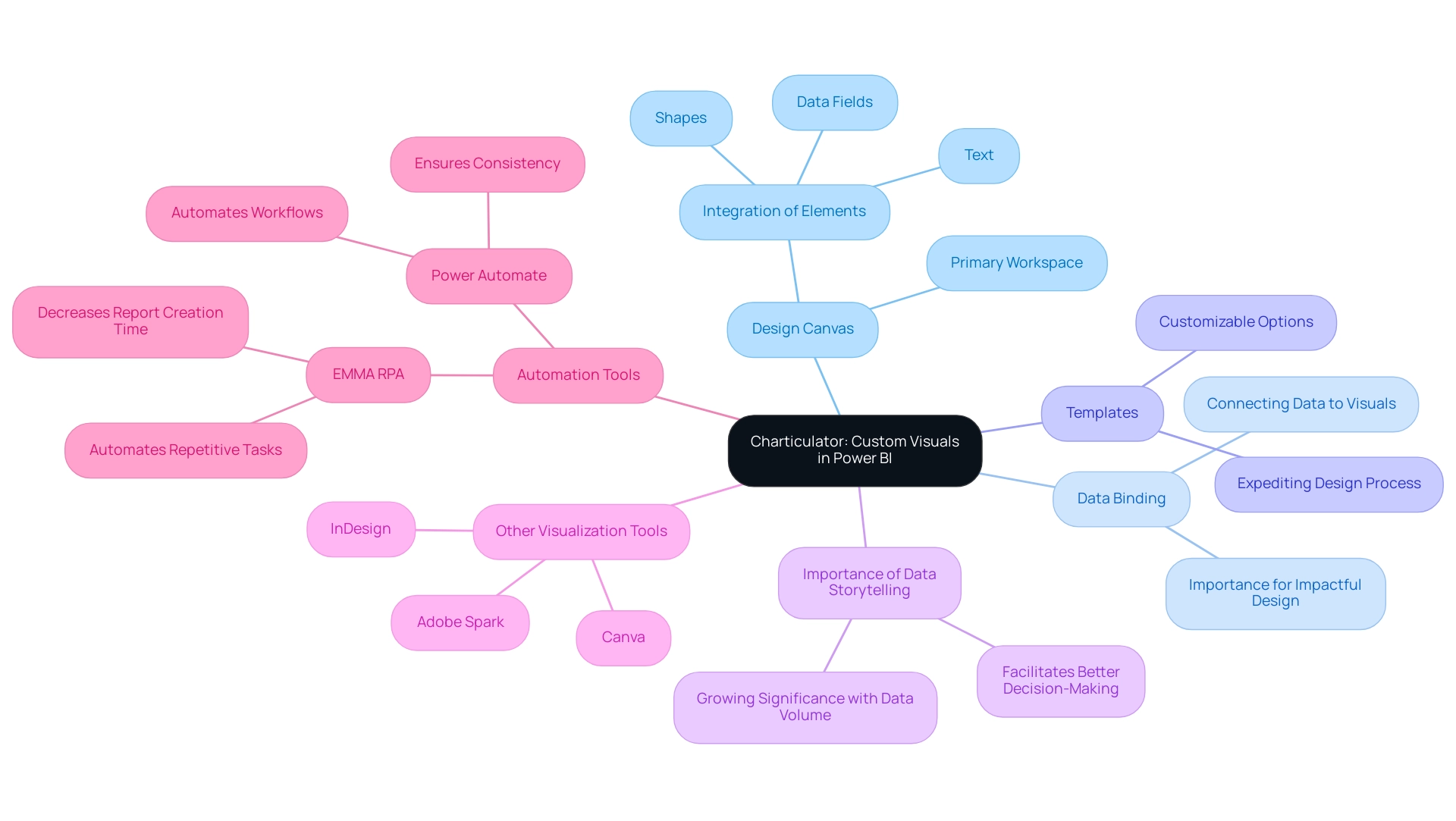
Step-by-Step Guide to Creating Stunning Visuals with Charticulator
Creating stunning visuals in Power BI using Charticulator Power BI is a straightforward process that enhances your data storytelling while overcoming common implementation challenges. With an active community of 2,497 users online, you can find support and inspiration as you embark on this journey. Follow these steps for success:
-
Open Power BI and Access the Visualizations pane: Click on the icon to access the interface.
Create a New Chart: Initiate a fresh project by clicking on ‘New.’ This action will direct you to the design canvas. -
Bind Your Data: Import the dataset you wish to visualize. Drag the relevant fields from the information pane onto the canvas, enabling Charticulator Power BI to create graphical elements based on your information.
As mentioned by Daniel, a Super User, challenges can arise with binding, so be attentive to ensure that each visual element is correctly linked to your dataset. Utilizing Business Intelligence tools can assist in enhancing this process, ensuring that the information is consistent and actionable. Additionally, RPA can automate binding tasks, reducing manual errors and saving time. -
Design Your Representation: Utilize the design tools to customize your display. Add shapes, text, and adjust colors to suit your narrative. Experiment with various layouts to find the optimal representation for your information.
RPA can also assist in automating layout adjustments, allowing for a more efficient design process. -
Set Up Data Binding: It is essential to ensure that each graphical element is correctly bound to your data. This step is crucial for enabling your representation to dynamically reflect any changes in the dataset.
Remember, as highlighted in a case study on error handling, issues can arise when adding calculated measures, so troubleshooting may be necessary to ensure smooth integration. Implementing RPA can streamline repetitive tasks in this phase, allowing for greater focus on strategic analysis. -
Preview Your Display: Click on the ‘Preview’ button to evaluate how your display will appear in Power BI. Make necessary adjustments to enhance clarity and aesthetic impact.
Export Your Visual: Once you are satisfied with the design, export the visual back to Power BI. You can now integrate it into your reports and dashboards.
By carefully adhering to these steps and being mindful of frequent obstacles, you can produce visually appealing and informative custom representations in Power BI with Charticulator Power BI, thereby significantly improving your storytelling abilities. Furthermore, the integration of RPA and tailored AI solutions will empower your operations to become more data-driven and efficient. For instance, companies that have implemented RPA in their visualization processes have reported a 30% reduction in time spent on report creation, showcasing the tangible benefits of these technologies.
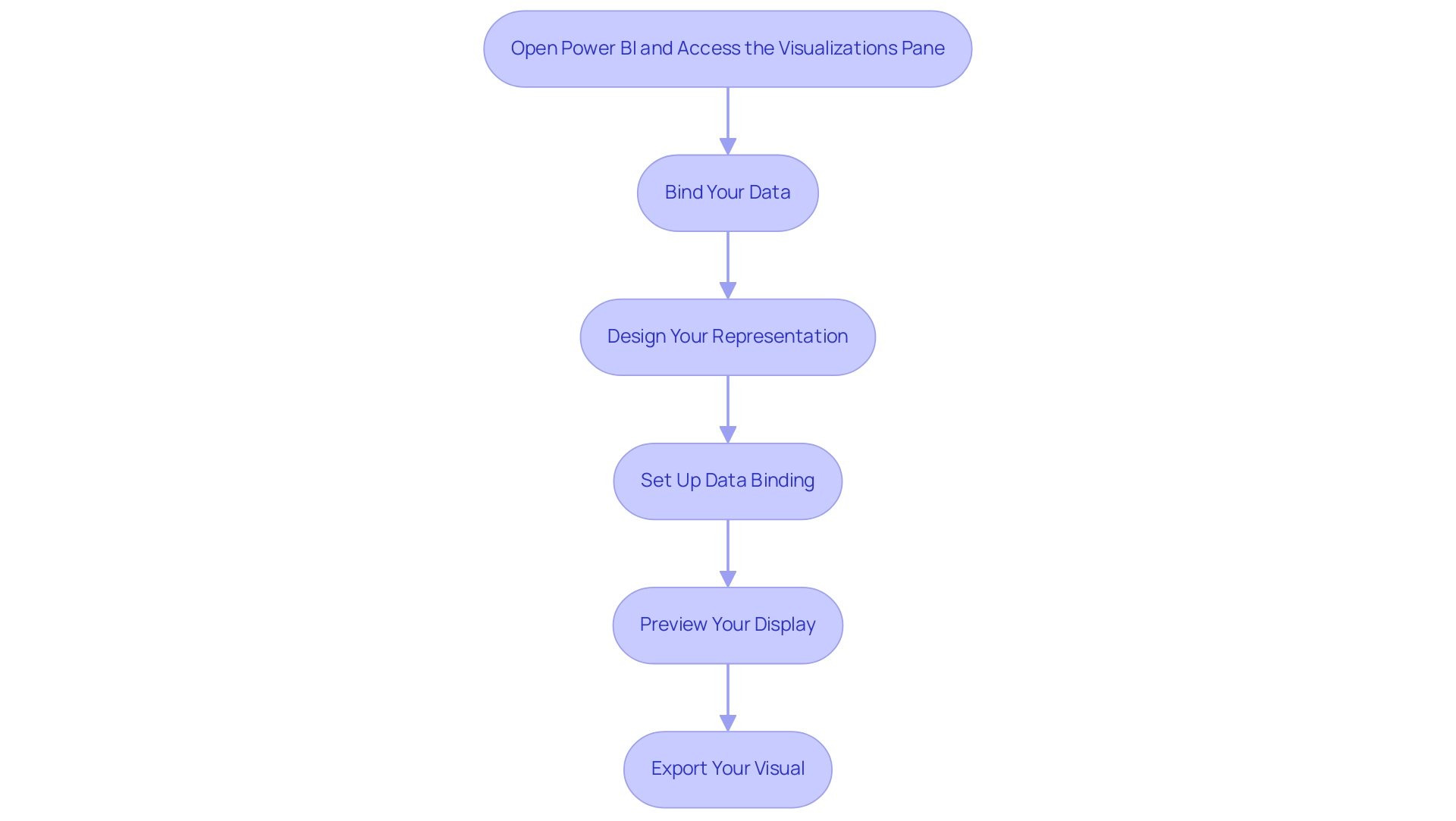
Best Practices for Designing Custom Visuals
To create impactful custom visuals in Power BI and effectively overcome common challenges such as time-consuming report creation, data inconsistencies, and lack of actionable guidance, it is essential to adhere to several best practices:
- Embrace Simplicity: Clarity is paramount; avoid overloading visuals with extraneous information. Concentrate on the core message that you wish to communicate. Statistics indicate that 65% of businesses claim that utilizing visualization in pitches has enhanced client engagement and comprehension, emphasizing the significance of simplicity in design and the necessity for actionable guidance.
- Utilize Color Strategically: Select a color palette that not only enhances readability but also accommodates individuals with color vision deficiencies. Thoughtful color choices can significantly enhance understanding and engagement. Additionally, be mindful of accessibility concerns, as choropleth maps can be difficult to decipher for individuals with sight differences.
- Provide Clear Labels: Ensure that axes, legends, and points are clearly labeled. This clarity offers viewers the necessary context, allowing them to grasp the data’s significance without confusion.
- Solicit Feedback: Share your images with colleagues for constructive feedback. This collaborative testing process can uncover opportunities for improvement and validate that your graphics convey the intended message effectively.
- Maintain Design Consistency: Consistency in design elements—such as colors, fonts, and styles—across all visuals fosters a unified presentation, enhancing the overall effectiveness of your storytelling. The case study titled “Don’t Distort the Information” illustrates that precise information representation is crucial for clear storytelling in visualizations, as misleading representations can undermine a designer’s credibility.
- Implement Governance Strategies: Establishing a governance strategy is essential to manage inconsistencies effectively. This includes defining data sources, ensuring data quality, and regularly auditing reports to maintain trust and reliability in the insights presented.
By implementing these best practices, you can elevate the quality of your custom graphics using Charticulator Power BI, transforming them into not just eye-catching presentations but also insightful, functional tools that drive understanding and engagement while addressing the significant challenges managers face in leveraging Power BI insights.
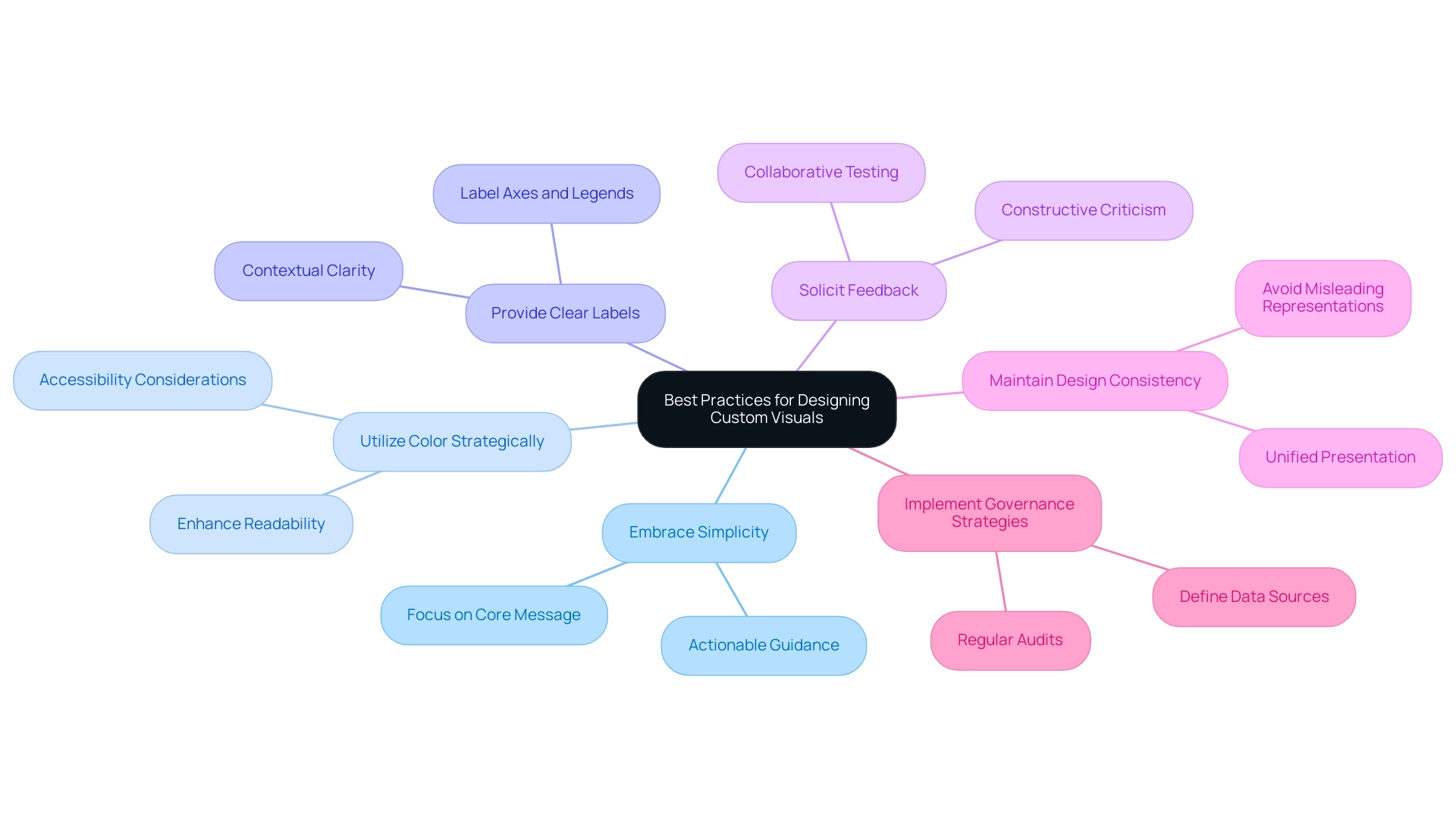
Common Challenges and Solutions in Using Charticulator
Working with Charticulator Power BI can present several challenges, but understanding these hurdles—and how to overcome them—can empower you to create impressive visuals with ease. Here are some common problems and effective solutions:
-
Binding Issues: If your information isn’t displaying correctly, it’s crucial to verify that you’ve accurately linked the fields to the graphical elements. Ensure that the types align with the expected formats; mismatches can lead to display errors. Frequent visitor David highlights this concern, stating,
My question comes because when I see the preview table in Charticulator, I can’t see more than 10,000 rows, and that makes me suspect that there’s a limit in the number of rows that the visual can manage.
This limitation can be critical for users working with large datasets when using Charticulator Power BI. Utilizing Business Intelligence and Charticulator Power BI can assist you in effectively managing and visualizing large volumes of information, improving your reporting capabilities. Additionally, tailored AI solutions can assist in optimizing information handling, ensuring smoother integration and visualization processes. -
Visuals Not Rendering: Occasionally, visuals may fail to render as anticipated. This is often resolved by refreshing your connection or restarting Power BI. Regular upkeep of your connections can significantly enhance your experience. Implementing Robotic Process Automation (RPA) can streamline these processes, ensuring that your graphics are consistently up-to-date and accurately represented. Furthermore, customized AI solutions can examine rendering patterns to anticipate and avert possible problems before they occur.
-
Performance Lag: If you observe that the tool is functioning slowly, think about simplifying your representation by decreasing the number of data points or graphical elements. High complexity can lead to performance bottlenecks, so a more straightforward design may enhance responsiveness. Tailored AI solutions can help optimize performance by analyzing usage patterns and suggesting more efficient visual strategies, ensuring that your visuals remain responsive and effective.
-
Lack of Documentation: Difficulty in locating specific features can be frustrating. In such cases, refer to the documentation or engage with community forums. With 2,611 users online, the active community surrounding the application can offer valuable insights and tips from fellow users, enhancing your ability to leverage the tool effectively. By leveraging Business Intelligence, you can utilize community insights as a resource to overcome challenges and enhance your experience with Charticulator Power BI as the visualization tool.
-
Understanding the Tool’s Capabilities: It is presented as an interactive authoring instrument that employs a constraint-solving algorithm for layout attributes. This unique feature allows for bespoke chart layouts without requiring coding knowledge, which can be both a strength and a challenge for users unfamiliar with its functionalities. By utilizing the strength of Business Intelligence and customized AI solutions, you can acquire deeper insights into how to optimize the functionalities of Charticulator Power BI, empowering you to produce graphical representations that truly resonate with your audience.
Comprehending these common obstacles and their respective solutions will allow you to traverse this environment with assurance, enabling you to concentrate on crafting impressive representations tailored to your requirements. Additionally, insights from qualitative studies, such as those surrounding the Data Illustrator framework, can provide further context about effective visualization practices and user experiences.
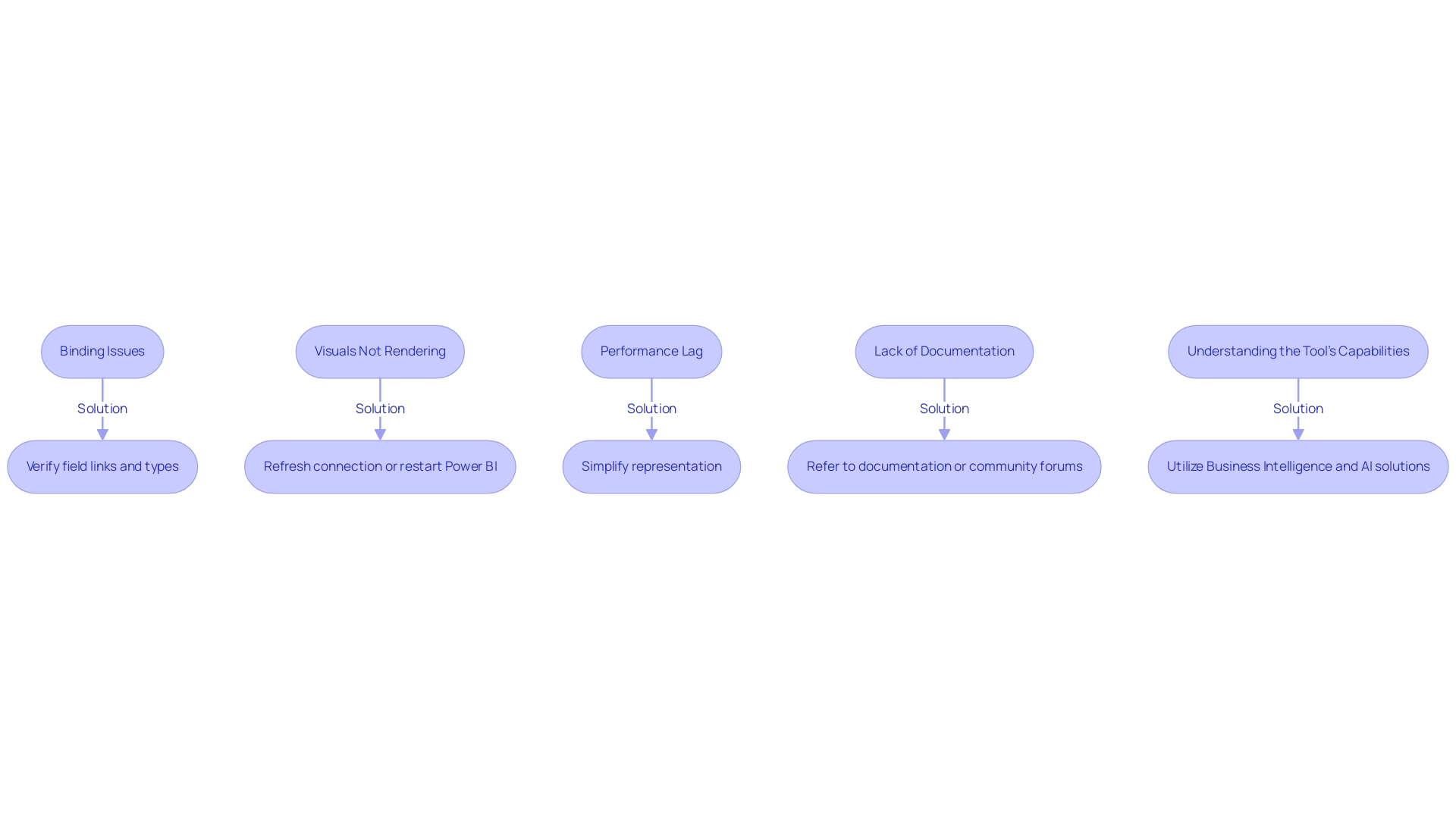
Exploring Advanced Features of Charticulator
Once you have mastered the foundational aspects of Power BI, it’s time to delve into the advanced features offered by Charticulator that can significantly enhance your representations, especially in light of common challenges faced in leveraging insights:
- Custom Shapes: Empower your graphics by creating and importing custom shapes. This capability enables you to add a unique touch to your presentations, distinguishing your graphics from traditional charts and graphs.
- Dynamic Information Binding: Learn how to apply dynamic information binding, which guarantees your graphics automatically update and represent alterations in your foundational information. This feature is crucial for sustaining precision and relevance in your reports, especially to address the challenges of time-consuming report creation and inconsistencies.
- Interactivity: Enhance user engagement by incorporating interactive elements such as tooltips and drill-down capabilities. These features offer users deeper insights and a more immersive experience, allowing them to explore the information on their own terms, thereby addressing the often-missed actionable guidance and the lack of insight-driven recommendations.
- Export Options: Familiarize yourself with the diverse export choices available, enabling you to share your graphics in various formats tailored for presentations or detailed reports. This versatility ensures that your insights are accessible and impactful across various platforms.
Incorporating these advanced features aligns with the reporting standards and best practices defined by Aegis Softtech’s Power BI consultants, who emphasize the importance of secure and compliant information management. Robust governance frameworks are essential for ensuring that your visuals not only convey insights effectively but also adhere to regulations like GDPR and HIPAA. For instance, Aegis’s case study on information governance and security expertise illustrates how advanced features can support compliance efforts, ensuring robust access management.
Furthermore, incorporating RPA solutions can further improve operational efficiency, enabling the automation of repetitive tasks that often detract from analysis. By leveraging these advanced features alongside RPA, you can transform your data visualizations using Charticulator in Power BI into not only visually stunning displays but also powerful tools for analysis and decision-making, effectively addressing the challenges of data-driven insights.
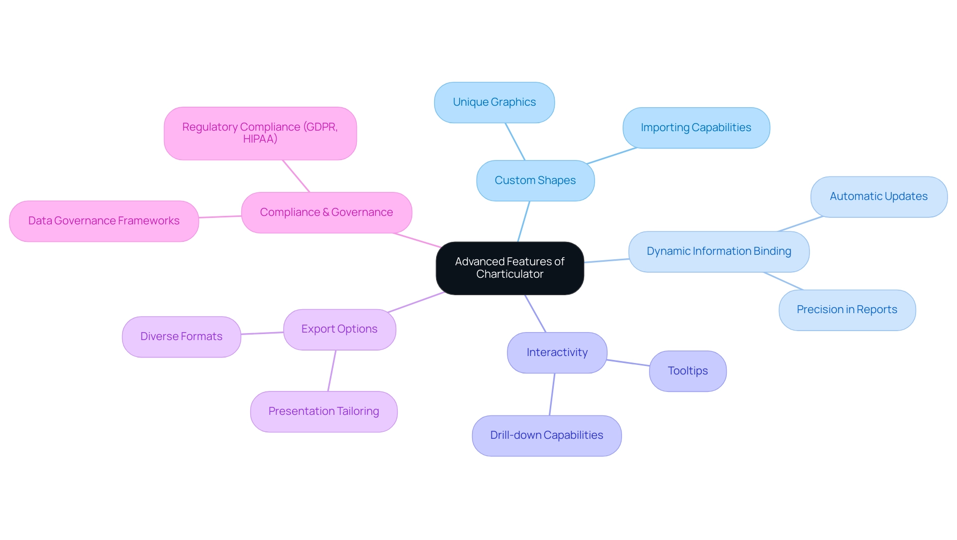
Conclusion
By mastering Charticulator, users can unlock the potential of custom visuals in Power BI, transforming complex data into engaging narratives. The article outlines the essential components, such as:
- The design canvas
- Data binding techniques
- Customizable templates
These components serve as the foundation for effective data storytelling. With practical steps for creating stunning visuals and best practices for design, users are well-equipped to elevate their presentations while addressing common challenges.
The insights provided emphasize the importance of:
- Simplicity
- Strategic use of color
- Clear labeling in visual design
These elements collectively enhance understanding and engagement. Furthermore, the integration of RPA and tailored AI solutions not only streamlines processes but also promotes efficiency, allowing organizations to focus on analysis rather than report generation.
As organizations increasingly prioritize data-driven decision-making, leveraging advanced features within Charticulator becomes crucial. From dynamic data binding to interactive elements, these capabilities enable users to create visuals that are not only aesthetically pleasing but also functional and insightful. Embracing these tools and best practices empowers users to effectively communicate their data stories, ultimately driving better outcomes and fostering a culture of informed decision-making within their teams.
Overview
The article provides a comprehensive step-by-step guide on creating effective business intelligence (BI) pictures that enhance decision-making and operational efficiency. It emphasizes the importance of understanding the audience, ensuring data relevance, and utilizing storytelling techniques, supported by best practices in design and evaluation methods to ensure the visuals effectively convey insights and engage stakeholders.
Introduction
In the realm of business intelligence, the ability to create impactful visuals is not just an art; it is a strategic necessity. As organizations navigate through an increasingly complex data landscape, the challenge lies in transforming raw data into clear, actionable insights that resonate with stakeholders.
This article delves into the essential components of crafting effective BI visuals, offering practical techniques and best practices that empower decision-makers. From understanding the audience and maintaining clarity to leveraging automation tools, each section provides a roadmap to enhance the effectiveness of BI presentations.
By embracing these strategies, businesses can not only improve their data storytelling but also drive operational efficiency and foster a culture of informed decision-making.
Understanding the Basics of BI Picture Creation
Developing effective business intelligence (BI) pictures starts with a clear understanding of their purpose. These representations, such as BI pictures, are not just charts or graphs; they are powerful tools that convey insights concisely and clearly, empowering stakeholders to make informed decisions. In today’s overwhelming AI landscape, where identifying the right solutions can be challenging, ensuring your BI pictures are impactful is vital.
Key components to consider include:
- Audience: Identifying who will view the BI pictures is paramount. Tailor the complexity and detail of your representations to match their level of understanding, ensuring that the message resonates.
- Data Relevance: The data presented must directly relate to the specific business question or objective at hand. Presenting irrelevant information can lead to confusion and misinterpretation, detracting from the overall effectiveness of your visuals.
- Clarity: Strive for simplicity. Utilize clear and straightforward images, avoiding unnecessary clutter. Highlight the most critical insights in your BI pictures to effectively drive your message home.
- Consistency: Consistency in colors, fonts, and styles across all graphics fosters a cohesive narrative. This uniformity enhances comprehension and maintains viewer engagement.
- Storytelling: Approach your BI representations as a narrative. They ought to steer viewers through the information, logically directing them to essential points and insights.
Emphasizing these fundamental elements not only improves the effectiveness of your BI pictures but also guarantees they connect with your audience. As Bang Wong, Creative Director of MIT’s Broad Institute, insightfully notes,
Plotting the information allows us to see the underlying structure of the information that you wouldn’t otherwise see if you’re looking at a table.
Moreover, with 85% of talent professionals indicating that people analytics will be ‘very important’ in shaping the future of HR and recruiting, the significance of effective BI pictures in this context cannot be overstated.
Additionally, 39.7% of US marketers utilize online tools for data visualization, underscoring the importance of these tools in modern marketing strategies. Lastly, case studies such as ‘Business Intelligence and Data Visualization ROI‘ illustrate that organizations that utilize BI pictures and have advanced analytics capabilities are more likely to perform better financially, yielding an ROI of $13.01 for every dollar spent on BI tools. By applying these principles and leveraging customized AI solutions, you create the environment for impactful BI pictures that drive decision-making and foster stakeholder engagement.
Failing to leverage BI pictures effectively can result in a significant competitive disadvantage, highlighting the necessity of utilizing these tools to remain ahead in a data-driven market.
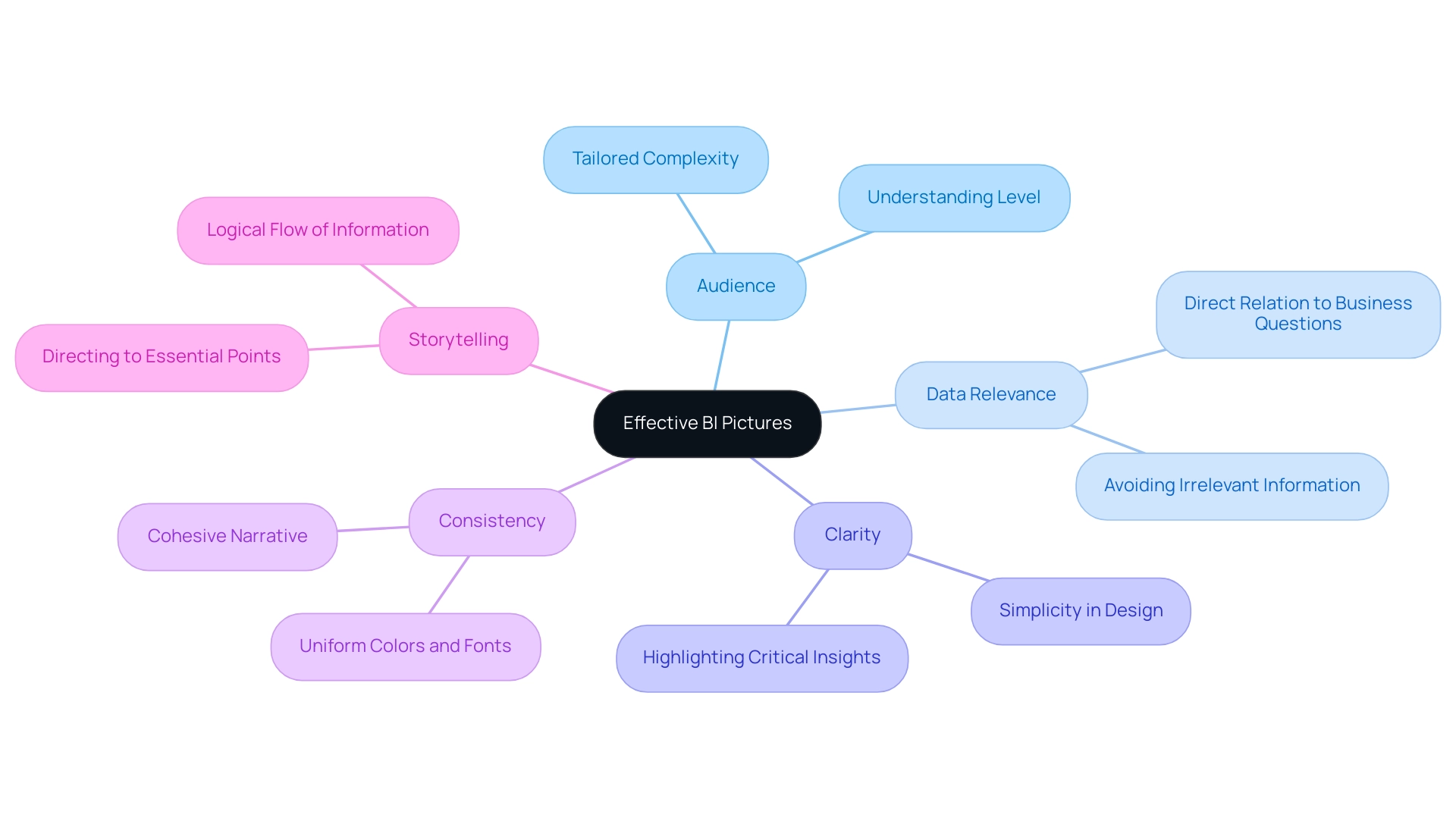
Step-by-Step Techniques for Crafting Effective BI Visuals
To craft compelling BI visuals that drive informed decision-making and enhance operational efficiency, follow these step-by-step techniques:
-
Select the Right Tool: Begin by choosing a business intelligence tool that aligns with your specific needs. Leading options such as Tableau, Power BI, and Google Data Studio each offer unique capabilities that can significantly enhance your visualizations, including the use of bi pictures. However, it’s important to consider challenges like information integration and information security, which account for 20% and 14% of issues in self-service business intelligence, respectively.
-
Leverage Robotic Process Automation (RPA): Consider integrating RPA to automate manual information workflows. This not only boosts efficiency but also reduces errors, freeing up your team for more strategic tasks that can drive business growth. Additionally, be aware of the potential risks and ROI assessment related to workflow automation, ensuring a risk-free implementation.
-
Data Preparation: Prioritize the cleaning and organization of your information prior to visualization. Accurate, complete, and well-organized information is crucial to avoid misrepresentation and ensure insightful analysis. As Sean Dougherty, an experienced copywriter in branding and advertising, observes, “Effective information preparation is the basis of powerful bi pictures.”
-
Choose the Right Visualization Type: Select the visualization type that best suits your data and the message you intend to communicate. For instance, bar charts are excellent for comparisons, line charts effectively illustrate trends, and pie charts are ideal for showcasing proportions.
-
Design Your Visuals: Implement design principles such as alignment, contrast, and hierarchy to develop visually appealing graphics. Thoughtful color choices are essential to enhance accessibility and facilitate comprehension for your audience.
-
Iterate and Get Feedback: Once your BI representations are created, seek constructive feedback from colleagues or stakeholders. Their perspectives can be essential in enhancing your imagery, ensuring they connect with your audience’s needs.
-
Test Your Visuals: Before finalizing your work, test the effectiveness of your visuals in conveying the intended message. Assess clarity and ease of understanding, making necessary adjustments to optimize impact.
-
Explore Power BI Services: Take advantage of Power BI services for improved reporting and actionable insights. Features like the 3-Day Power BI Sprint can help you quickly create professionally designed reports, while the General Management App ensures comprehensive management and smart reviews.
-
Leverage Tailored AI Solutions: Address the challenges of poor master information quality and AI complexities by utilizing tailored AI solutions and participating in GenAI Workshops. These resources can significantly enhance quality and improve your ability to leverage AI effectively.
-
Case Study Reference: Consider the TIBCO Statistica case study, which illustrates how AI-driven algorithms can enhance workflow refinement in BI tools. Despite its complex user interface, it effectively supports predictive analytics, showcasing the importance of mastering the right tool for your needs.
By following these steps and utilizing RPA with effective bi pictures and customized AI solutions, you can create representations that do more than merely present data—they narrate a compelling story that encourages informed decision-making throughout your organization.
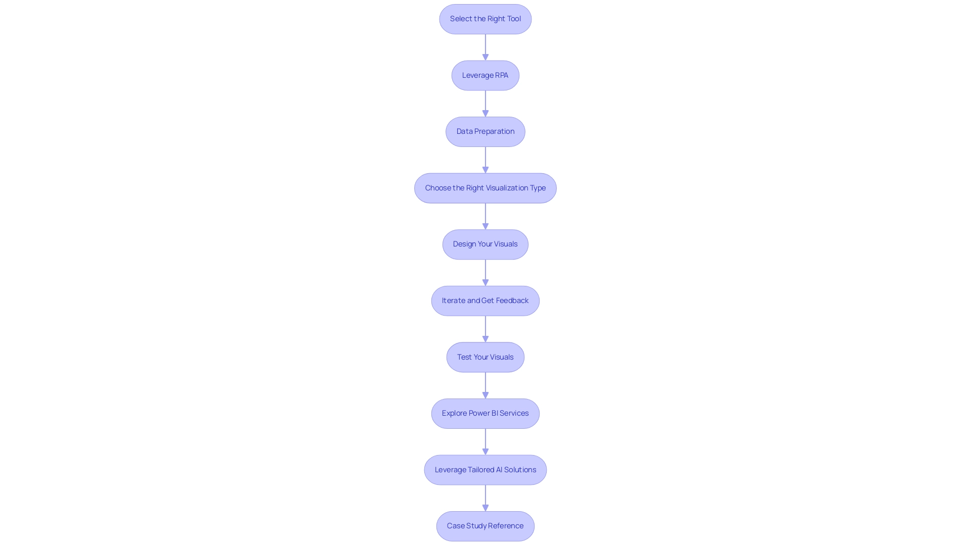
Incorporating Data Storytelling Techniques
Incorporating storytelling techniques into your BI pictures can significantly enhance the effectiveness of your presentations. Here are essential steps to achieve this:
-
Define Your Message: Start by identifying the core insight or message you wish to convey.
This clarity will act as the foundation of your narrative, ensuring your audience comprehends the purpose of your information from the outset. -
Create a Narrative Arc: Organize your presentation into a coherent structure with a clear beginning, middle, and end.
The introduction presents the information, the middle explores analysis and understanding, and the conclusion provides suggestions or practical steps.
This flow mirrors effective storytelling, making it easier for your audience to follow along. -
Use Visual Cues: Enhance comprehension and engagement by incorporating visual elements such as arrows, annotations, and highlights.
These cues guide the audience through your story, drawing attention to key points and facilitating understanding.
This is particularly vital considering that many organizations face challenges with inconsistencies and time-consuming report creation when utilizing insights from tools like Power BI. -
Engage Emotionally: Connect with your audience on a personal level by using relatable examples or scenarios.
This emotional resonance makes the information more memorable and impactful.
Significantly, 49% of individuals feel their organizations lack storytelling abilities, regardless of differing levels of literacy.
By addressing this gap through effective storytelling, you can elevate the impact of your presentations and drive operational efficiency through data-driven insights. -
Summarize Key Takeaways: Conclude your presentation by summarizing the main insights and necessary actions.
This recap reinforces your narrative, ensuring that your audience leaves with a clear understanding of the information’s implications for their decision-making process.
By effectively integrating these storytelling techniques into your BI pictures, you not only inform your audience but also engage and inspire them.
This method can result in improved decision-making and practical outcomes, aligning with current trends in storytelling, where the global search volume for the term reached 16,000 in 2023.
Moreover, as emphasized by the Purdue Online MBA program, which concentrates on business analytics and narrative analytics, students are being equipped with the skills to navigate the complexities of information presentation.
The program emphasizes the need for effective storytelling to transform how data and analytics are consumed, reinforcing the importance of these skills in the evolving landscape of business intelligence.
Additionally, by integrating RPA solutions like EMMA RPA and Power Automate, businesses can automate repetitive tasks, further enhancing employee morale and productivity.
These tools streamline operations, allowing teams to focus on strategic initiatives rather than mundane tasks, ultimately driving growth and innovation.
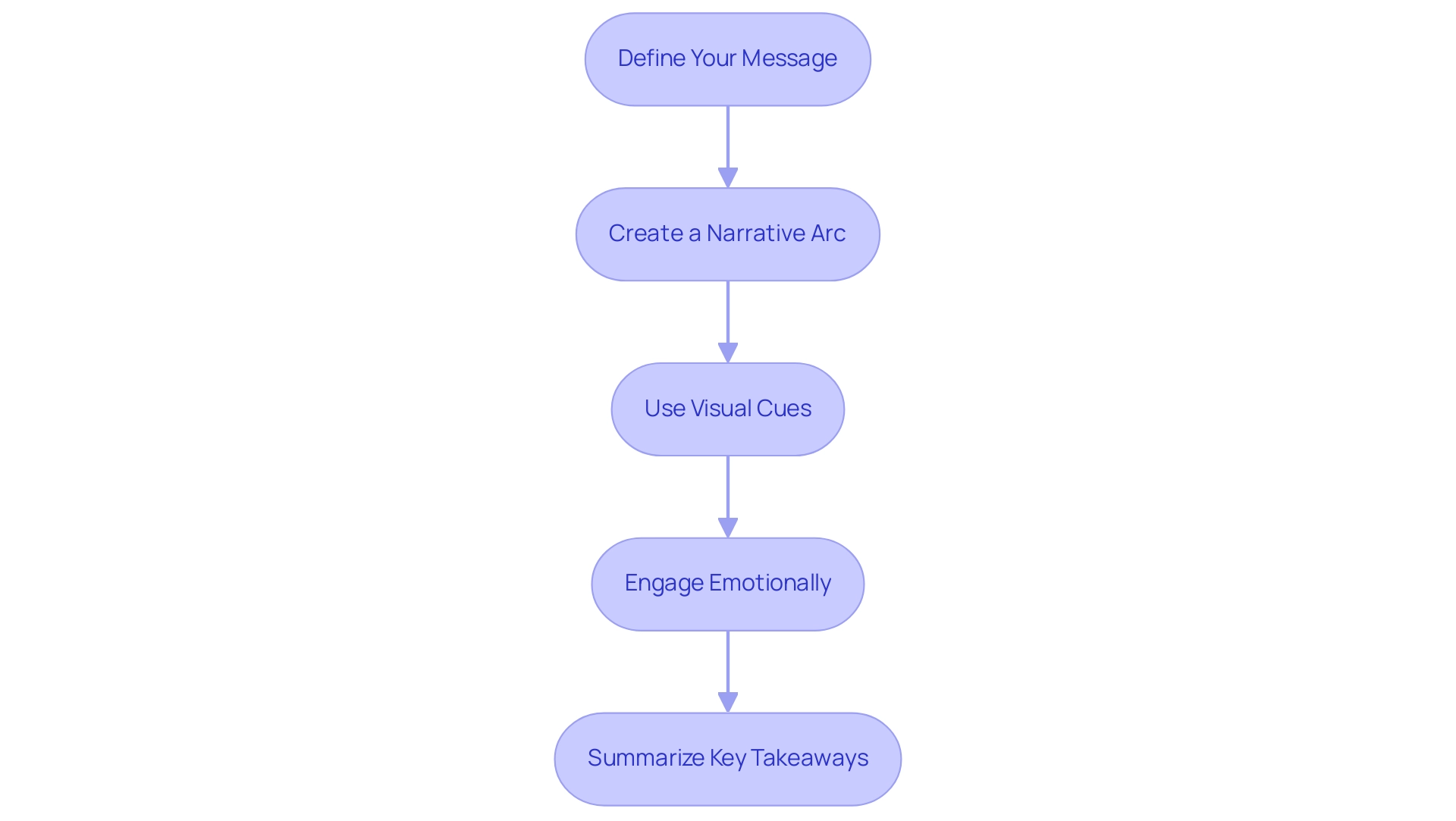
Best Practices for BI Picture Design
To maximize the impact of your Business Intelligence (BI) representations and drive operational efficiency, consider these essential best practices:
- Simplicity is Key: Strive for clarity by avoiding clutter in your designs. Focus on the most critical data points to facilitate comprehension and decision-making. Simplified images are more likely to resonate with users, enhancing their ability to grasp complex information quickly.
-
Engage Users in Feedback: Actively involving users in the feedback process is crucial for ensuring that dashboards evolve to meet their needs and expectations. Consistent feedback from users can direct design enhancements, making your BI displays more relevant and effective. RPA can streamline the feedback collection process, allowing for quicker iterations based on user insights.
-
Use Color Wisely: A thoughtfully chosen color palette not only enhances your designs but also significantly boosts readability. Employ contrasting colors to clearly differentiate between various datasets, making it easier for viewers to interpret the information presented.
-
Maintain Text Legibility: Ensure that any text within your images is easily readable. Select appropriate font sizes and styles, steering clear of overly decorative typefaces that may distract or confuse users. Remember, clear communication is paramount in data visualization.
-
Optimize for Different Devices: As accessibility is crucial, design your BI visuals to be responsive across multiple devices—desktops, tablets, and smartphones. This adaptability guarantees that information is accessible to users whenever and wherever they require it.
-
Utilize Filters and Slicers: Implementing effective filters and slicers in your dashboards allows for extensive exploration and drill-down capabilities. This functionality enables users to engage with the information, obtaining understandings customized to their particular requirements.
-
Regularly Update Your Visuals: Given the dynamic nature of data, it is imperative to keep your BI visuals current. Regular updates will reflect the latest information, thus maintaining user satisfaction and engagement. According to a case study on performance optimization, user satisfaction is closely linked to the speed of accessing information; minimizing wait times is essential for enhancing user experience. Enhancing query efficiency and information retrieval times will guarantee that users obtain prompt understanding, further boosting their involvement with BI reports.
-
Utilize RPA for Automation: Consider incorporating Robotic Process Automation (RPA) to automate the repetitive tasks involved in report generation and information management. This not only speeds up the process but also decreases errors, enabling your team to concentrate on analyzing information rather than spending time on manual data management. RPA can also alleviate task repetition fatigue and help address staffing shortages by streamlining workflows.
By implementing these best practices and harnessing the power of RPA alongside your BI pictures, you can create representations that are not only informative but also visually compelling, fostering greater audience engagement and understanding. As Sudha, a recognized author in the field, aptly advises,
Before you start making the dashboard, ask yourself one simple question: ‘Who is going to consume the dashboard?’
This mindset will guide you in tailoring your designs to meet the needs of your users effectively, ensuring that the insights provided are actionable and relevant.
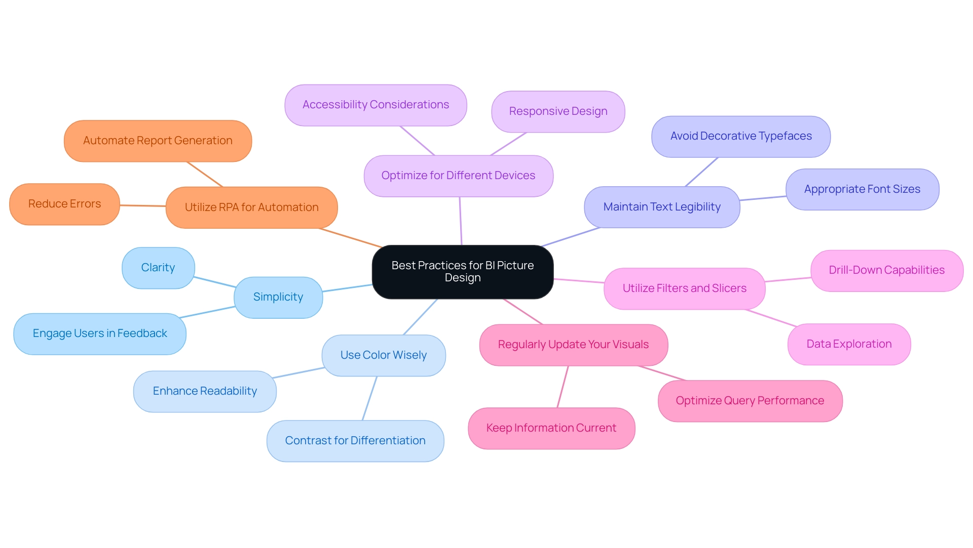
Evaluating the Effectiveness of Your BI Pictures
To effectively assess the impact of your BI representations, consider implementing the following strategies:
-
Collect feedback: After presenting your BI pictures, actively seek feedback from your audience. Inquire about the strengths and weaknesses of each visual to understand their perspectives and areas for improvement. This feedback can help gauge the average satisfaction, which ranges from -1 (negative) to 1 (positive), providing a quantifiable measure of effectiveness.
-
Analyze engagement metrics for BI pictures that are digitally shared, by scrutinizing metrics such as views, shares, and the duration of time spent on each representation. These metrics, along with understanding how viewers accessed the report (distribution) and the technology used to open it (platform), offer valuable information about audience interest and the overall effectiveness of your presentations.
-
Conduct A/B Testing: Experiment with various iterations of your designs to determine which concepts resonate more effectively with your audience. This method allows you to identify the most impactful design elements that facilitate better comprehension and engagement.
-
Review Decision Outcomes: Assess whether the insights obtained from your BI pictures influenced informed decision-making. By analyzing the outcomes of these decisions, you can gauge the real-world impact of your visuals on strategic initiatives. For instance, in national/regional clouds, Power BI ensures compliance with local regulations while providing usage metrics that help assess the effectiveness of BI visuals.
-
Integrate RPA: Automate repetitive tasks associated with data collection and presentation to enhance efficiency and accuracy. By implementing RPA solutions such as EMMA RPA and Power Automate, you can reduce errors, streamline workflows, and free up your team to concentrate on analyzing information rather than spending time on manual processes.
-
Iterate and Enhance: Use the knowledge obtained from feedback and metrics to refine and boost your future BI representations. Continuous improvement is essential for creating compelling data presentations, or BI pictures, that consistently drive informed decision-making within your organization. By applying these evaluation techniques and leveraging RPA alongside your BI pictures, you can ensure that your visuals remain effective and aligned with your organization’s objectives, fostering an environment of informed decision-making and operational efficiency while gaining a competitive advantage through actionable insights.
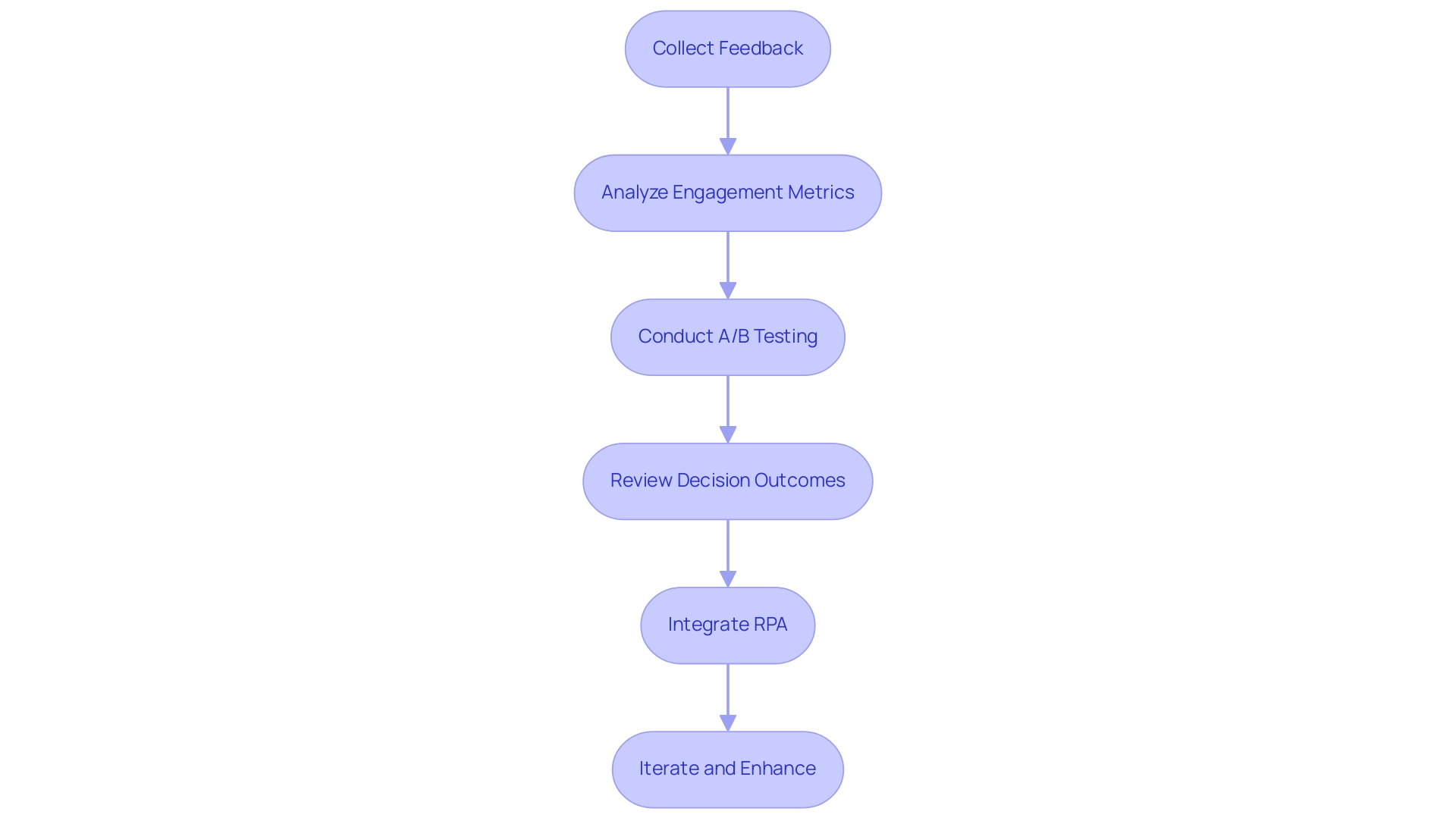
Conclusion
The journey to creating impactful business intelligence visuals is one that combines understanding, strategy, and creativity. By recognizing the importance of:
- Audience
- Data relevance
- Clarity
- Consistency
- Storytelling
organizations can transform raw data into compelling visuals that drive decision-making. Each component plays a crucial role in ensuring that BI presentations resonate with stakeholders, ultimately enhancing operational efficiency.
Implementing step-by-step techniques, such as:
- Selecting the right tools
- Leveraging automation
- Preparing data meticulously
lays a solid foundation for effective visuals. Furthermore, integrating data storytelling techniques not only informs but also engages the audience, creating a narrative that enhances comprehension and retention. Best practices like:
- Simplicity
- User feedback
- Regular updates
are vital to maintaining the relevance and effectiveness of BI visuals, ensuring they adapt to the dynamic nature of business needs.
Finally, evaluating the effectiveness of BI visuals through feedback, engagement metrics, and A/B testing is essential for continuous improvement. By embracing these strategies and leveraging advanced tools, organizations can foster a culture of informed decision-making that not only meets current challenges but also positions them for future success in an increasingly data-driven world. The time to elevate BI visuals is now—empower your teams to harness the full potential of their data and drive meaningful outcomes.
