Introduction
In the realm of business analytics, Microsoft Power BI emerges as a transformative tool, enabling organizations to harness the power of data for strategic decision-making. With its impressive market share and robust features, Power BI not only simplifies data visualization but also enhances collaboration and operational efficiency.
From creating engaging reports to leveraging automation, this comprehensive guide delves into the essential steps for maximizing Power BI’s potential. By embracing best practices in data preparation, visualization, and report sharing, organizations can unlock actionable insights that drive growth and innovation, positioning themselves at the forefront of their industries.
Understanding Power BI: An Overview of Its Features and Benefits
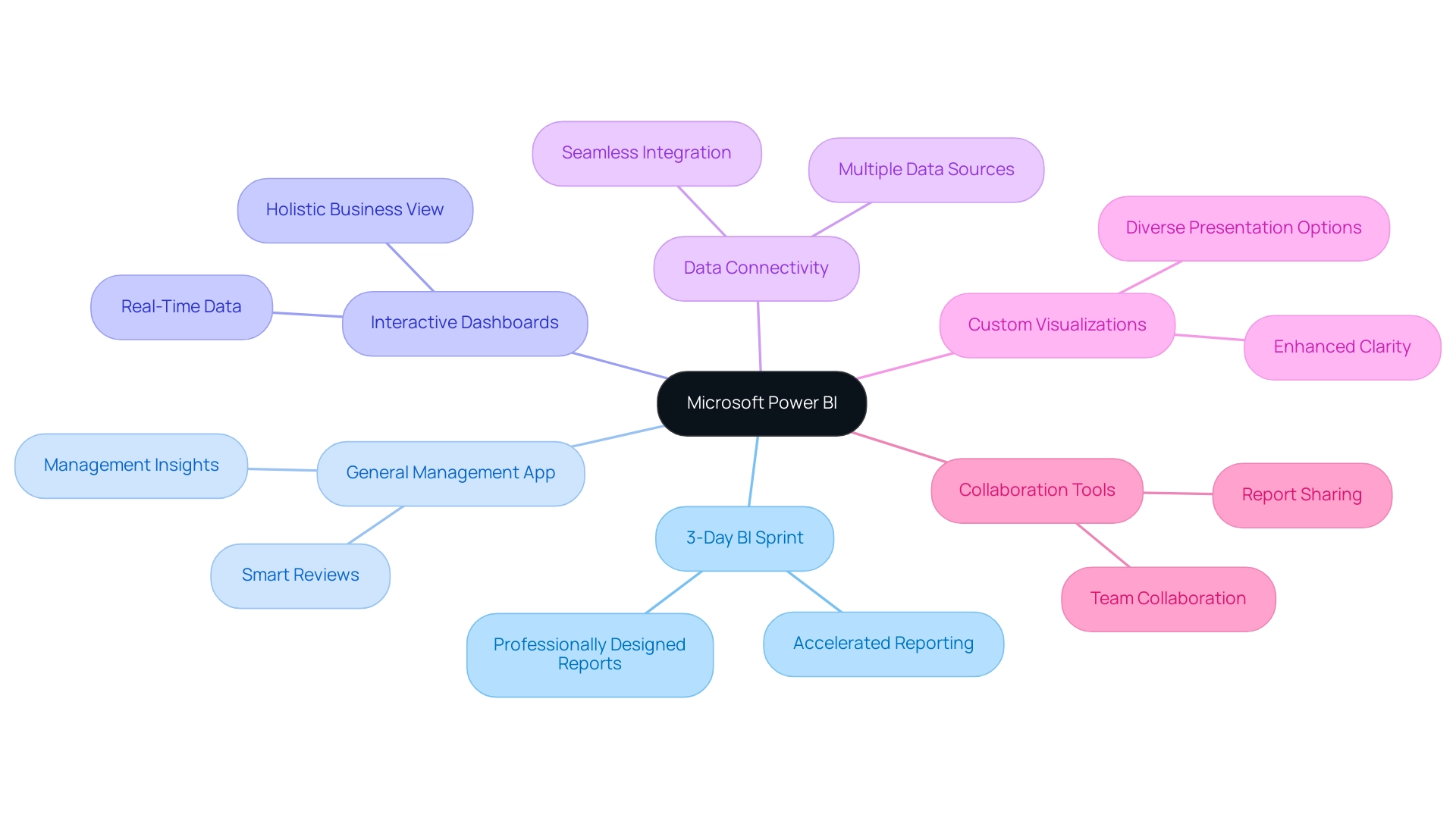
Microsoft Power BI distinguishes itself as a top business analytics instrument, enabling organizations to visualize information, share insights, and support informed decision-making. As of 2021, BI commanded over 30% of the market share among business intelligence platforms, followed closely by Tableau at approximately 19% and Qlik at around 10%. This demonstrates its significant adoption and trust within the industry.
Key features of BI include:
- 3-Day BI Sprint: Accelerate your reporting capabilities with professionally designed reports created in just three days.
- General Management App: A comprehensive solution that offers smart reviews and management insights to drive efficiency.
- Interactive Dashboards: Craft real-time dashboards that deliver a holistic view of your business metrics, allowing for quick and informed decisions.
- Data Connectivity: Seamlessly connect to a variety of data sources such as Excel, SQL Server, and numerous cloud-based services, ensuring your data is always accessible.
- Custom Visualizations: Leverage a diverse array of visualizations to effectively present your data, enhancing clarity and engagement.
- Collaboration Tools: Effortlessly create reports in Power BI and share reports and dashboards with team members and stakeholders, fostering a collaborative environment that drives operational efficiency.
The advantages of utilizing BI are profound: it enhances data-driven decision-making, promotes collaboration, and transforms raw data into actionable insights, ensuring data consistency and providing clear guidance for strategic decisions. This makes BI an indispensable asset for organizations striving to maximize their operational efficiency. As industry leaders like Tajammul Pangarkar, CMO at Prudour Pvt Ltd, emphasize, understanding technological trends and capabilities is crucial for leveraging tools like BI effectively.
Furthermore, the integration of RPA solutions like EMMA can overcome outdated systems and automate repetitive tasks, further enhancing operational efficiency and employee morale. By merging the functionalities of Business Intelligence with RPA solutions, organizations can optimize workflows and enhance the quality of insights obtained from their information. The recent merger of Salesforce and Tableau illustrates the evolving landscape of BI platforms, enhancing the business intelligence solutions available to customers by combining Salesforce’s CRM platform with Tableau’s visualization capabilities.
Lastly, a comprehensive guide detailing the differences between BI Desktop, Pro, and Premium has been published, providing valuable insights into the product offerings that would benefit decision-makers.
Step-by-Step Guide to Creating Your First Power BI Report
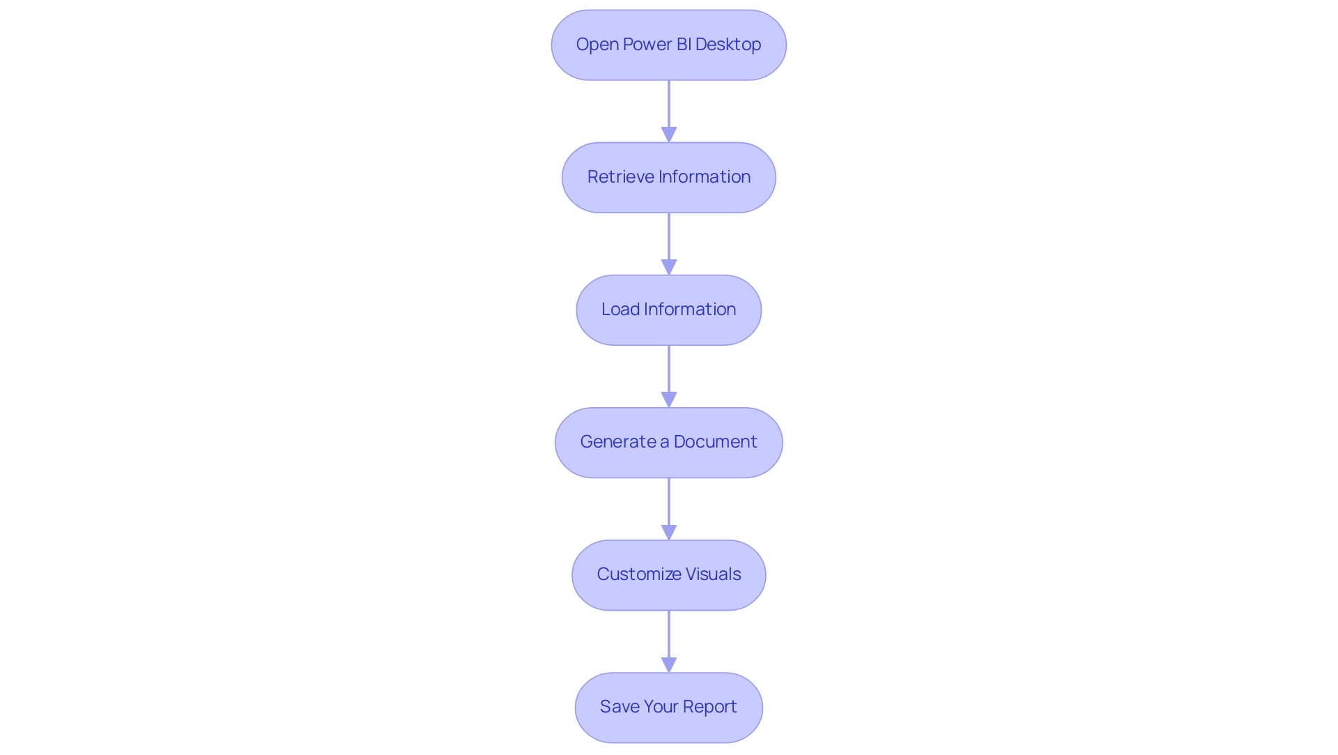
Developing your initial BI report is an empowering step toward utilizing analytics effectively and enhancing operational efficiency. Follow these streamlined steps to get started:
- Open Power BI Desktop: Launch the application on your machine to begin your journey.
- Retrieve Information: Click on the ‘Retrieve Information’ button to establish a connection with your preferred source, ensuring you have the right details at your fingertips. Integrating RPA solutions such as EMMA RPA can automate this information gathering, reducing time and minimizing errors, thus addressing the challenge of time-consuming report creation.
- Load Information: After choosing your information source, seamlessly load the relevant information into Power BI. This step is crucial, as Tijani Azeez Titilope emphasizes understanding the boundaries for the lowest, middle, and upper quarters of information to make informed decisions. By automating this process, you can avoid inconsistencies that often slow down analysis.
- Generate a Document: In the document view, drag and drop fields from the information pane onto the canvas, crafting visualizations that effectively convey your insights. For instance, the case study on augmenting data to documents demonstrates how users can link to different data sources, ensuring their documents are founded on precise and pertinent information.
- Customize Visuals: Utilize the formatting options available to tailor the appearance of your visuals, making sure they align with your analytical goals and enhance readability. RPA tools such as Automate can assist in preserving uniformity in visual formatting throughout documents, further improving the quality of insights.
- Save Your Report: Conclude your work by saving your progress—click the ‘Save’ icon or use the shortcut Ctrl + S.
By following these steps, you will successfully create your first BI report, setting the stage for further enhancements and in-depth analysis. Mastering BI equips you with robust analytics features and seamlessly integrates with other Microsoft products, enhancing your operational efficiency while overcoming common implementation challenges. This transformative potential of Business Intelligence is crucial for informed decision-making and driving growth.
Preparing and Cleaning Your Data for Effective Reporting
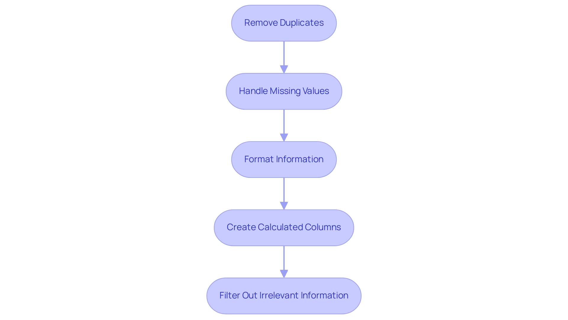
To effectively prepare and clean your information for Power BI reporting, consider implementing the following best practices:
- Remove Duplicates: Begin by identifying and eliminating any duplicate entries in your dataset. RPA can automate this process by using algorithms to detect and remove duplicates, ensuring your analysis remains accurate and efficient.
- Handle Missing Values: Carefully address missing values using logical reasoning. RPA tools can be programmed to fill in gaps through imputation methods or to flag incomplete entries for review, maintaining the integrity of your dataset. Rui Gao emphasizes the importance of these approaches in ensuring realistic information representation in his article, stating that proper handling of missing values is essential for reliable analysis.
- Format Information: Ensure that all types are accurately formatted. RPA can streamline this process by automatically converting information into the required formats, such as dates and currency, which minimizes errors in reporting and enhances insights that are driven by information.
- Create Calculated Columns: Add necessary calculated fields that enhance your analysis. RPA can help in automating the creation of these columns based on predefined rules, offering additional insights that make your documents more informative and actionable.
- Filter Out Irrelevant Information: Remove any information that does not contribute to the report’s objectives. RPA can assist in automating this filtering process, improving clarity and enhancing the overall quality of your reporting, enabling your team to concentrate on strategic initiatives.
A recent case study exemplifies the critical nature of precise information reporting, where confusion over the interpretation of mortgage amounts—whether $1,400 or $1.4 million—led to significant inaccuracies. This emphasizes the potential consequences of not following best practices in information cleaning. By rectifying such discrepancies and aligning the information with property purchase prices, organizations can significantly improve the accuracy of their analyses and leverage RPA to automate these processes for enhanced efficiency.
The advantages of effective information cleaning include increased productivity, removal of errors, improved client satisfaction, and more efficient business practices. By adhering to these steps and utilizing RPA, you will ensure that your data is not only clean and relevant but also primed to create reports in Power BI that generate actionable insights, driving operational efficiency and supporting your business growth goals.
Creating Engaging Visualizations in Your Power BI Report
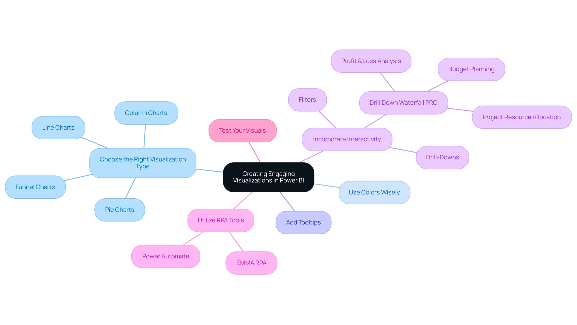
To create engaging visualizations in Power BI that drive data-driven insights and operational efficiency, consider the following best practices:
-
Choose the Right Visualization Type: Selecting the appropriate format—be it column charts for comparative analysis, line charts for trend analysis, pie charts for parts-of-a-whole, or funnel charts for visualizing processes with stages—can significantly enhance understanding and tackle challenges like time-consuming report creation. According to Divyansh Sharma, a Marketing Research Analyst at Hevo Data,
Line charts and area charts are effective for trend analysis over time, which is essential for illustrating changes in information over specific periods. -
Use Colors Wisely: A consistent color scheme is vital. Colors should not only enhance the visual appeal but also improve readability and help convey the message clearly, thereby reducing inconsistencies in information presentation.
-
Add Tooltips: Tooltips provide additional context when users hover over visuals, enhancing understanding by offering extra information without cluttering the visual space. This feature is essential for making actionable insights easily accessible.
-
Incorporate Interactivity: Features like drill-downs and filters empower users to engage with the information dynamically, allowing them to explore underlying details and trends. For example, the Drill Down Waterfall PRO is especially effective for Profit & Loss analysis, budget planning, and project resource allocation, illustrating how interactivity can offer deeper insights into financial information and improve operational efficiency.
-
Utilize RPA Tools: Incorporating Robotic Process Automation (RPA) tools like EMMA RPA and Power Automate can enhance the procedure of information gathering and document creation, decreasing the time dedicated to these activities and boosting precision. By automating repetitive data handling tasks, businesses can focus on deriving insights rather than getting bogged down by manual processes.
-
Test Your Visuals: Rigorous testing is essential to ensure that your visuals communicate the intended message clearly and concisely. This step aids in recognizing any possible confusion and permits adjustments prior to sharing the findings, ensuring that the insights obtained are actionable and trustworthy.
By concentrating on these strategies, including the integration of RPA, you can create compelling visualizations that not only enhance the clarity of your BI analysis but also significantly increase user engagement, ultimately driving growth and innovation in your organization.
Publishing and Sharing Your Power BI Reports with Stakeholders
To effectively publish and share your Power BI reports, follow these comprehensive steps:
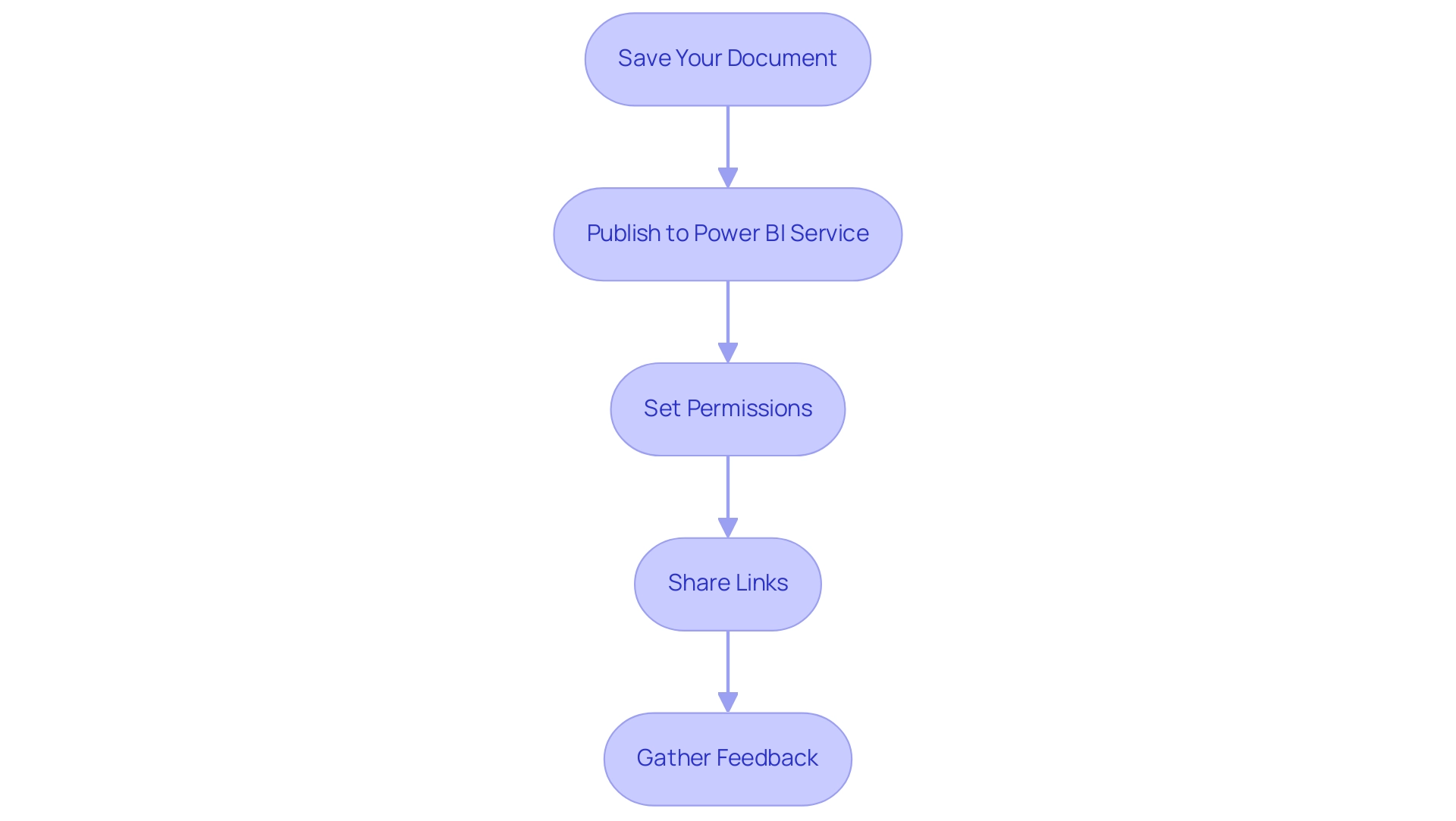
- Save Your Document: Begin by ensuring that your document is saved and finalized for sharing.
- Publish to Power BI Service: Click the ‘Publish’ button to upload your document to the Power BI service, making it accessible to your stakeholders and enhancing your organization’s Business Intelligence capabilities.
- Set Permissions: Carefully adjust the sharing settings to determine who can view or edit the document. This is crucial, especially when sharing with groups that include external email addresses; using a security group is recommended, as distribution groups may not function properly for this purpose.
- Share Links: Generate shareable links or invite stakeholders directly via email. Note that email notifications for shared documents are sent only to individual users, not groups, ensuring that each stakeholder is informed and engaged.
- Gather Feedback: Actively encourage stakeholders to provide input on the document. This input is invaluable for refining and enhancing future documents, fostering a culture of collaboration and informed decision-making. By utilizing the insights obtained, your organization can tackle obstacles such as time-consuming document preparation and inconsistencies in information. Implementing RPA solutions can significantly streamline the generation process, reducing the time spent on repetitive tasks and minimizing errors in data presentation.
Furthermore, statistics indicate that the total count in the usage document represents distinct entries viewed over 90 days, highlighting the significance of interaction with your documents. A practical example of effective document management is illustrated in the case study on viewing all workspace usage metrics; users must remove default filters to gain a broader analysis of usage across all documents, enhancing overall management of BI resources. As Shubhangi Pandey, a Product Marketing Enthusiast, notes, “The ability to share and receive feedback on documents is vital for continuous improvement and effective decision-making.”
By following these steps, you will successfully create a report in Power BI, publish it, and share it, enhancing collaboration and empowering your organization to make data-driven decisions while addressing the operational challenges that may arise.
Conclusion
Harnessing the power of Microsoft Power BI can truly transform the way organizations approach business analytics. By understanding its core features—such as interactive dashboards, data connectivity, and customizable visualizations—companies can significantly enhance their decision-making processes. The integration of Robotic Process Automation (RPA) further streamlines workflows, allowing teams to focus on deriving valuable insights rather than getting bogged down by manual tasks.
Creating effective Power BI reports involves a systematic approach, including:
- Data preparation and cleaning
- Crafting engaging visualizations
Implementing best practices in each of these areas ensures that the insights generated are both accurate and actionable. By prioritizing clarity and interactivity in visualizations, organizations can foster a deeper understanding of their data, ultimately driving operational efficiency and innovation.
Furthermore, the ability to publish and share reports with stakeholders enhances collaboration and encourages a culture of feedback. This continuous improvement loop is essential for adapting to the dynamic landscape of business intelligence. As organizations embrace these strategies, they position themselves to leverage data as a strategic asset, paving the way for sustained growth and a competitive edge in their respective industries. Now is the time to fully embrace Power BI and unlock its potential to drive informed decision-making and operational excellence.
Introduction
In the dynamic landscape of data analytics, Power BI Premium Workspaces emerge as a transformative solution for organizations eager to enhance collaboration, streamline data management, and improve reporting capabilities. These specialized environments not only provide advanced features such as increased data capacity and superior performance but also empower teams to share insights effortlessly, facilitating informed decision-making across all levels.
However, many organizations face hurdles like time-consuming report creation and data inconsistencies that can impede their progress. By leveraging tailored services such as the 3-Day Power BI Sprint and innovative management tools, businesses can effectively overcome these challenges, unlocking the full potential of their data.
As organizations embark on this journey, they will discover that integrating Power BI Premium into their analytics strategies not only optimizes operational efficiency but also drives growth through actionable insights and enhanced productivity.
Understanding Power BI Premium Workspaces: An Overview
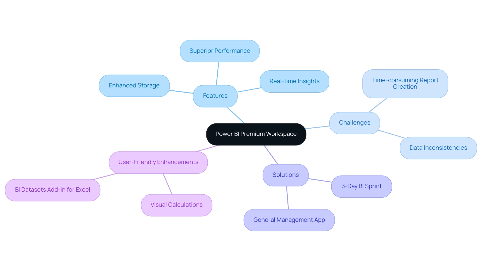
Power BI Premium Workspace serves as specialized settings designed to improve collaboration, simplify information management, and enhance reporting capabilities within Microsoft Power BI. Unlike standard workspaces, the Power BI Premium Workspace provides advanced features, including enhanced storage capacity and superior performance due to dedicated cloud resources. These environments empower teams to share dashboards and reports seamlessly, ensuring that all stakeholders can access real-time insights effortlessly.
However, many organizations struggle with challenges such as time-consuming report creation and data inconsistencies, which can hinder effective decision-making. Our BI services, including the 3-Day BI Sprint, enable rapid creation of professional reports to combat these issues, while the General Management App facilitates comprehensive management and smart reviews, ensuring clear, actionable guidance. Significantly, users can access their BI and Fabric artifacts for a minimum of 90 days after their BI capacity subscription has concluded, emphasizing the enduring value of these tools.
As organizations integrate Power BI Premium Workspace into their analytics strategies, they experience a significant improvement in decision-making and operational efficiency. Expert Jason Himmelstein notes, ‘Visual calculations are now on by default, so you can start using them right away without having to enable the preview feature,’ emphasizing the platform’s user-friendly enhancements. Moreover, the linked table function in the BI Datasets Add-in for Excel enables users to seamlessly integrate BI information into Excel workbooks, optimizing workflows and enhancing information management.
Furthermore, the user-friendly digitalization and business process automation solutions provided by EMMA RPA and Automate significantly enhance productivity and operational efficiency. This convergence of features, along with these enhancements, positions the Power BI Premium Workspace as a vital resource for entities aiming to improve their analytics processes and foster growth through informed decision-making.
Key Features and Benefits of Power BI Premium Workspaces
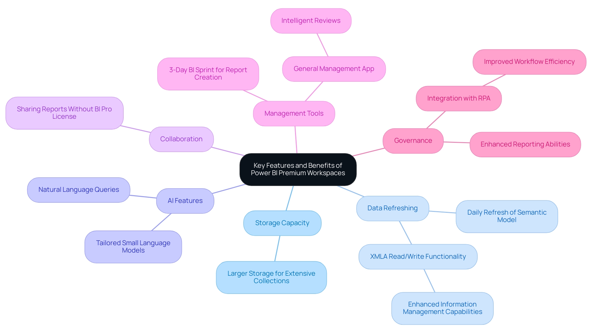
Power BI Premium Workspaces offer a suite of essential features aimed at enhancing operational efficiency and user satisfaction. One of the standout advantages is the significantly larger storage capacity, allowing organizations to manage extensive collections effectively. Users benefit from the ability to refresh information once per day, a crucial functionality for maintaining up-to-date insights without interruption.
Additionally, BI Premium introduces advanced AI features, including natural language queries, streamlining the analysis process and enhancing quality through tailored Small Language Models. A significant aspect is the ability to share reports and dashboards without requiring recipients to hold a BI Pro license, fostering greater collaboration across teams and enhancing organizational transparency. Furthermore, the XMLA read/write functionality allows entities to utilize the XMLA endpoint for enhanced information management capabilities, further promoting operational efficiency.
Key features like the ‘3-Day BI Sprint’ enable the swift creation of professionally designed reports, while the ‘General Management App’ offers thorough management and intelligent reviews, ensuring effective reporting and information consistency. As emphasized in the case study on Target Organizations for Power BI Premium Workspace, organizations with extensive datasets and frequent information refresh requirements greatly benefit from these features, ultimately enhancing their reporting abilities and governance. As companies progressively depend on information-driven decision-making, the integration of Robotic Process Automation (RPA) with BI services improves workflow efficiency, enabling teams to concentrate on strategic initiatives and directly tackle issues such as inadequate master information quality.
Overall, these features not only enhance governance but also empower teams to collaborate more efficiently, leading to better business outcomes. As Lindsay Pinchot states, ‘Power BI Enhanced makes this tool more robust and adaptable than ever before,’ emphasizing its essential role in contemporary data management.
Power BI Premium vs. Pro vs. Free: Understanding the Licensing Landscape
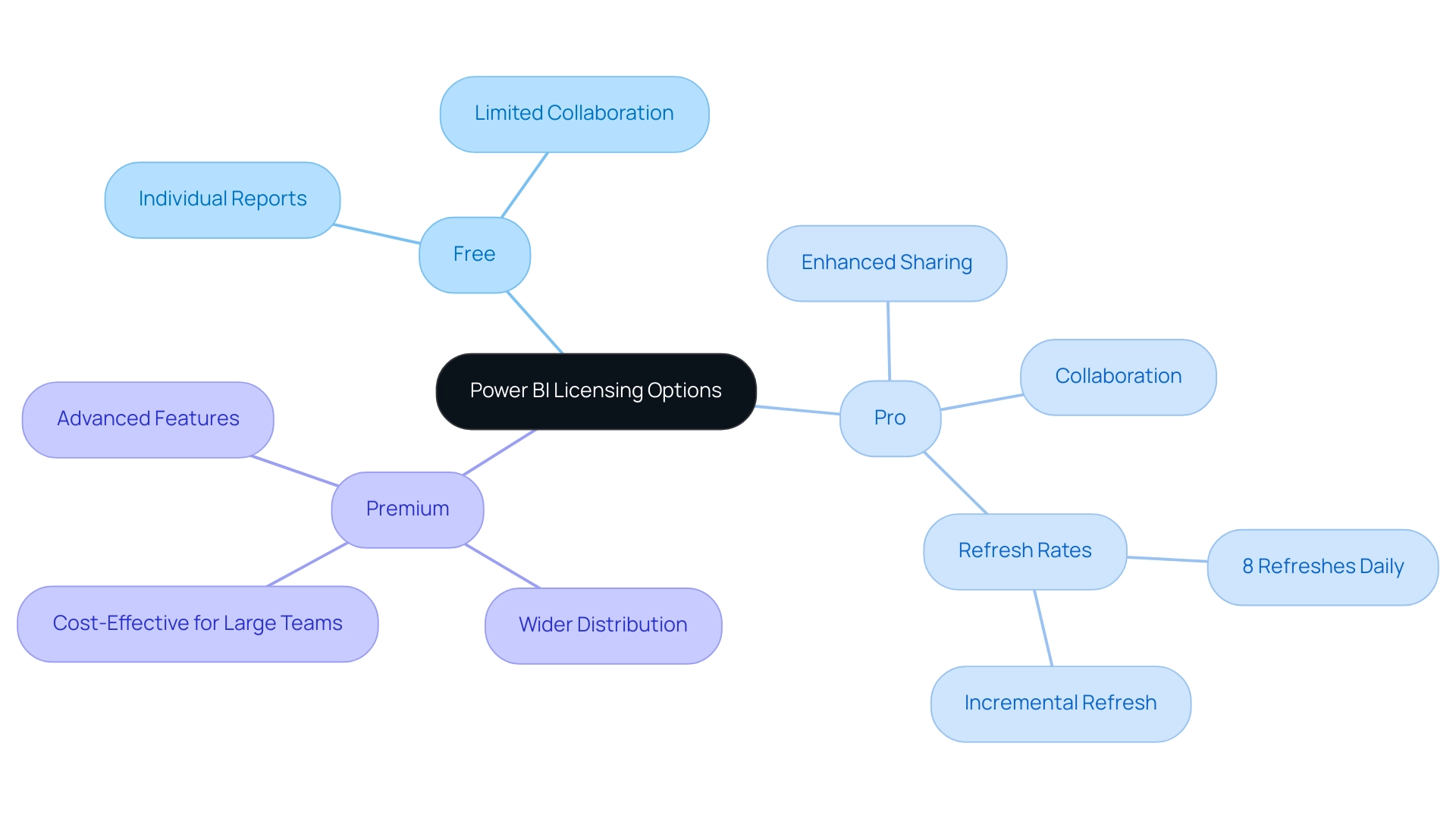
BI presents three primary licensing options: Free, Pro, and Premium, each tailored to different organizational needs and operational efficiencies. The Free version enables individual users to create and share reports but falls short on collaboration features, which can hinder data-driven decision-making. BI Pro enhances sharing capabilities and collaboration, necessitating that each user hold a Pro license, a potential barrier for some organizations.
Significantly, BI Pro permits eight refreshes daily and supports incremental refresh for dataset tables, making it a strong choice for those who need frequent updates. For larger entities, Power BI Pro emerges as the optimal choice, offering superior performance and capacity. With the Power BI Premium workspace, entities can distribute content widely without the necessity for every user to hold a Pro license, making it a more economical solution for groups that require extensive collaboration and profound insights.
Grasping these differences is crucial for entities to align their licensing choices with their operational goals and address common issues such as lengthy report generation and information inconsistencies. Furthermore, integrating RPA solutions can significantly enhance operational efficiency by automating repetitive tasks and addressing staffing shortages, thereby allowing teams to focus on data analysis rather than data collection. As emphasized by recent findings, companies should evaluate their user base size and performance requirements to decide whether BI Pro or Premium is the best option, particularly since Pro is typically more appropriate for smaller teams.
Furthermore, the case study ‘How to Get a BI Pro License’ illustrates that the steps to acquire a BI Pro license include navigating through the Microsoft 365 admin center, selecting the desired subscription, and completing the purchase, allowing users to successfully obtain a Pro license for their organization. Moreover, as Contoso points out, ‘Many of the capabilities described in this article aren’t available to Fabric administrators,’ underscoring the importance of selecting the right licensing to unlock the full potential of BI in driving business growth and innovation while leveraging RPA to streamline operations.
Creating and Managing Power BI Premium Workspaces: A Practical Guide
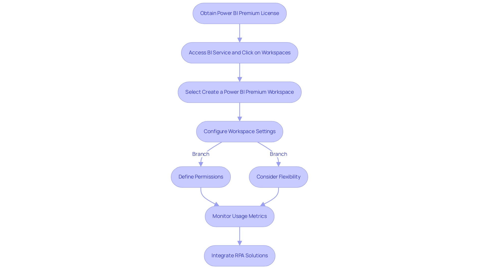
Establishing a Power BI Premium Workspace begins with obtaining a Power BI Premium license, which is vital for unlocking advanced features. As Amine Jerbi notes, ‘Many documentations and videos you can find on the internet to answer your first question,’ highlighting the wealth of resources available for users. After securing the license, users can access the BI service, click on ‘Workspaces’, and select ‘Create a power bi premium workspace’ to begin the setup process.
Configuring workspace settings is crucial; this includes defining permissions and roles to ensure that team members have appropriate access levels tailored to their needs. It’s important to consider flexibility in content ownership and viewing strategies based on specific scenarios and team member involvement. Additionally, while sharing content through BI apps is beneficial, maintaining a structured workspace is essential for certain functionalities.
Organizations often face challenges in leveraging insights from BI dashboards, such as:
- Time-consuming report creation
- Data inconsistencies
- Lack of actionable guidance
These challenges can hinder effective decision-making and place them at a competitive disadvantage. To combat these issues and maintain optimal performance, regular management practices such as monitoring usage metrics and refreshing datasets should be adopted. Furthermore, integrating RPA solutions can automate repetitive tasks, significantly improving efficiency and employee morale.
By adhering to these practical guidelines, businesses can develop strong power bi premium workspaces that enhance collaboration and support data-informed decision-making, ultimately fostering growth and innovation.
Integrating Power BI Premium Workspaces with Microsoft Services
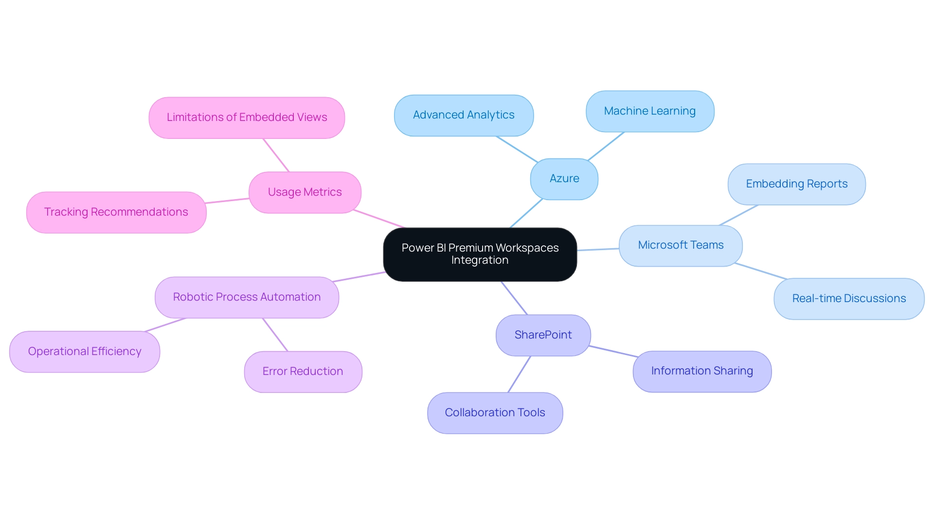
The Power BI Premium Workspace acts as a robust center for integration with various Microsoft services, including Azure, Microsoft Teams, and SharePoint. This seamless connectivity significantly improves information sharing and collaboration across various platforms. For instance, users can embed Power BI reports directly into Teams channels, fostering real-time discussions and immediate access to insights, which improves usability and engagement.
However, it is important to note that usage metrics do not capture views from these embedded dashboards and reports; thus, utilizing existing web analytics platforms for tracking is recommended. Moreover, the integration with Azure services unlocks advanced analytics capabilities, such as predictive modeling and machine learning, allowing companies to utilize their information more effectively. As noted by Jurriaan Amesz, Lead Product Owner at ABN AMRO Bank, ‘Power BI and Azure … provided us with the performance for hundreds of concurrent users handling tens of billions of records.’
By utilizing these integrations with Robotic Process Automation (RPA), which decreases errors and liberates team resources for more strategic tasks, organizations can automate manual workflows, improve operational efficiency, and create a unified information ecosystem. This not only propels business growth through informed decision-making but also emphasizes the transformative effect of CREATUM’s Power BI Sprint on clients like PALFINGER, which has enhanced their analysis capabilities and their Power BI Premium workspace development. As Sascha Rudloff, Team leader of IT- and Process management at PALFINGER Tail Lifts GMBH, stated, ‘The results of the sprint exceeded our expectations and were an important boost for our data analysis strategy.
Conclusion
Power BI Premium Workspaces represent a pivotal advancement in the realm of data analytics, offering organizations a robust platform to enhance collaboration, streamline data management, and elevate reporting capabilities. By leveraging the advanced features of Power BI Premium, such as increased data capacity and seamless sharing of insights, organizations can overcome common challenges like time-consuming report creation and data inconsistencies. The integration of tailored services, including the 3-Day Power BI Sprint, allows for rapid report generation, further empowering teams to make informed decisions quickly and effectively.
Moreover, the ability to merge Power BI with other Microsoft services, including Azure and Microsoft Teams, amplifies the potential for real-time collaboration and data-driven insights. This interconnectedness not only fosters a culture of transparency but also enhances operational efficiency, enabling teams to focus on strategic initiatives rather than getting bogged down by repetitive tasks. As organizations continue to embrace these powerful tools, they will experience significant improvements in their decision-making processes and overall productivity.
In conclusion, adopting Power BI Premium Workspaces is a strategic move for any organization looking to harness the full potential of their data. By prioritizing advanced analytics capabilities and integrating innovative solutions like Robotic Process Automation, businesses can drive growth and ensure they remain competitive in an increasingly data-driven world. Embracing this transformative technology will undoubtedly lead to enhanced operational efficiency and a stronger foundation for future success.
Introduction
In the realm of data analysis, linear regression stands as a cornerstone technique, providing invaluable insights into the relationships between variables. As organizations increasingly rely on data-driven decision-making, understanding how to effectively implement and interpret linear regression models is essential for operational success.
This article delves into the foundational aspects of linear regression, from creating accurate trendlines to exploring various models and the critical role of data preprocessing. By integrating these statistical methods with Robotic Process Automation (RPA), businesses can streamline their workflows, reduce manual errors, and empower their teams to focus on strategic initiatives.
With practical steps and real-world applications, this guide equips professionals with the tools needed to enhance their analytical capabilities and drive efficiency in a rapidly evolving landscape.
Understanding Linear Regression: The Foundation of Trendlines
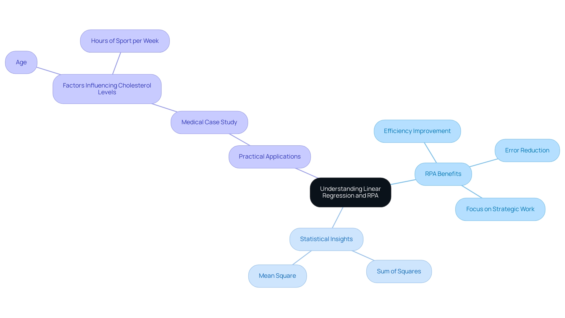
Linear regression is an essential statistical method that models the relationship between a dependent variable and one or more independent variables. This technique is invaluable for predicting outcomes and identifying trends within information, which can be further enhanced by leveraging Robotic Process Automation (RPA) to automate manual workflows. RPA can enhance efficiency by:
- Decreasing the time spent on repetitive information entry tasks
- Minimizing errors linked with manual calculations
- Freeing up your team for more strategic, value-adding work
Understanding linear analysis is pivotal, as it serves as the foundation for developing a linear regression trendline—visual representations that elucidate the relationships in datasets. A linear regression trendline is essentially the best-fit line, meticulously calculated to minimize the distances between observed values and the line itself. This process not only highlights the underlying trends but also improves interpretation.
Recent statistics indicate that the residuals from linear models show a Sum of Squares of 1.1810e+10 and a Mean Square of 454222144, underscoring the model’s effectiveness in capturing variability. Furthermore, results can be visually represented using a scatter plot, which is an effective way to illustrate the relationship between variables. By integrating these data-driven insights with RPA solutions, you can streamline operations and make informed decisions that drive operational efficiency and enhance predictive modeling capabilities.
RPA can specifically enhance the workflow associated with linear analysis tasks by automating information gathering and processing, allowing for quicker examination and reporting. A practical application of linear analysis can be seen in a medical case study examining cholesterol levels, where factors such as age and hours of sport per week were analyzed to identify key determinants influencing cholesterol levels, aiding in health assessments. As Jim noted, ‘By adding M (mediator), it might be capturing some of the variance that was initially attributed to X.’
This interconnected approach empowers you to harness the full potential of both statistical analysis and automation, fostering business growth in a rapidly evolving AI landscape.
Step-by-Step Guide to Creating Linear Regression Trendlines
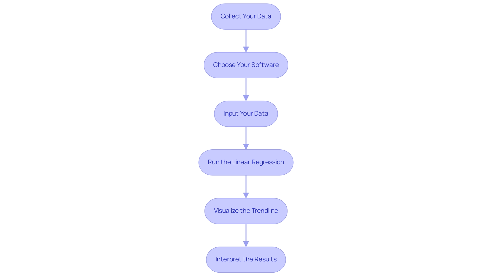
Creating a linear regression trendline involves a systematic approach that can significantly enhance your data analysis capabilities, particularly in the context of utilizing Business Intelligence and Robotic Process Automation for operational efficiency. Follow these detailed steps to ensure a successful implementation:
-
Collect Your Data: Begin with a dataset that features a well-defined dependent variable—the outcome you aim to predict—and one or more independent variables that influence this outcome. This foundational step is critical for accurate analysis and aligns with the need for data-driven insights.
-
Choose Your Software: Select suitable software tools for your analysis. Popular options include Excel, Python (utilizing libraries such as Pandas and Scikit-Learn), and R. Each of these platforms offers unique advantages for statistical analysis, enabling you to tailor your approach based on your operational needs.
-
Input Your Data: Import your dataset into your chosen software. For Excel, ensure your information is organized in columns, while in Python, you can load your dataset using Pandas for efficient handling—key for streamlining workflows through RPA.
-
Run the Linear Regression: In Excel, utilize the ‘Add Trendline’ feature after generating a scatter plot to create your linear regression representation. For Python users, utilize the
Linear Regressionclass from Scikit-Learn, which offers a strong framework for fitting your system to the information. Remember to consider how Lambda values, which can range from 0 to 1.0, may influence your system’s performance. -
Visualize the Trendline: Once your model is established, visualize the trendline alongside your information points. This step is crucial as it allows you to evaluate how well the trendline fits the information, making any patterns or discrepancies more apparent. As Joleen Bothma states, “Explore conditional formatting in Excel with simple to advanced examples and their best practices,” which can be particularly helpful when highlighting your trendline against the dataset.
-
Interpret the Results: Examine the analysis output to assess the connection between your elements. Pay particular attention to metrics such as the R-squared value, which quantifies how well your model explains the variability in the data. For instance, a correlation coefficient of approximately 0.65 indicates a moderate positive correlation, providing valuable insights into your dataset’s dynamics. Consulting the case study named ‘Interpreting Results of Analysis’ can further improve your comprehension, demonstrating different output elements such as statistics, ANOVA, and coefficients, assisting you in gaining insights into the strength of connections between factors.
By following these steps and utilizing the latest software tools, you can effectively create and interpret linear regression trendlines, harnessing the power of Business Intelligence and RPA to enhance your operational efficiency and decision-making processes. Additionally, consider exploring tailored AI solutions that can help identify the right technologies for your specific business needs, further reducing manual, repetitive tasks and optimizing your overall productivity.
Exploring Different Types of Linear Regression Models
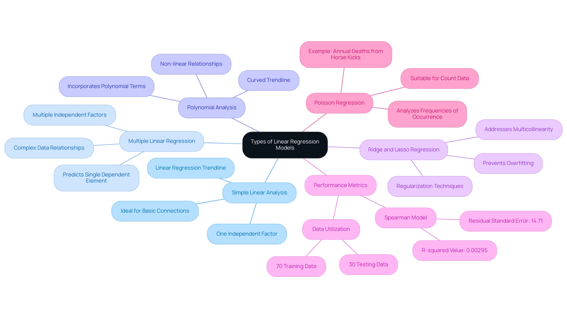
Linear analysis includes different frameworks, each customized for particular data situations, allowing you to choose the most efficient method for your examination.
-
Simple Linear Analysis: This basic framework employs one independent factor to forecast a dependent factor. Its straightforward nature makes it ideal for examining fundamental connections between two factors using a linear regression trendline.
-
Multiple Linear Regression: In contrast, this approach incorporates several independent factors to predict a single dependent element. It is especially valuable when various elements together affect the result, enabling a more subtle comprehension of the data.
-
Polynomial Analysis: This approach improves linear analysis by incorporating polynomial terms, leading to a curved trendline. It becomes essential when the relationship between variables is non-linear, providing a more accurate representation of complex datasets.
-
Ridge and Lasso Regression: As regularization techniques, these approaches impose penalties on large coefficients, which is instrumental in preventing overfitting, especially in datasets with numerous predictors. They are especially efficient when addressing multicollinearity, enabling more trustworthy performance of the framework.
Grasping these frameworks is essential for choosing the suitable analysis method, such as utilizing a linear regression trendline, based on the traits of your information and your analytical goals. As mentioned by KAVITA, it is crucial to acknowledge the assumptions and possible drawbacks in linear analysis, such as overfitting and multicollinearity, which can greatly influence your analytical results.
In practice, it is important to recognize that 70% of the information is generally utilized for training, while 30% is set aside for testing, ensuring the effectiveness of the framework. The Spearman linear framework, for example, has a residual standard error of 14.71 and an R-squared value of 0.00295, indicating its performance metrics.
Moreover, Poisson analysis serves as a valuable example in the realm of statistical analysis. It is particularly suitable for count values that often follow the Poisson distribution, such as the analysis of annual deaths caused by horse kicks in the Prussian Army from 1875-1894. This case study illustrates how statistical models can be utilized in practical situations, offering insights into the frequencies of occurrence for count information.
The Role of Data Preprocessing in Linear Regression
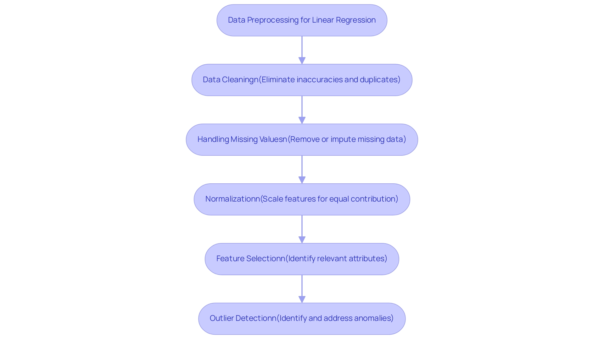
Data preprocessing is essential for preparing your dataset for the linear regression trendline analysis, enhancing both accuracy and reliability. Here are the key steps involved:
- Data Cleaning: Begin by eliminating inaccuracies or inconsistencies in your dataset. This involves eliminating duplicates and rectifying erroneous entries to ensure integrity.
- Handling Missing Values: It is crucial to address absent information effectively. Options include removing records with missing values or employing imputation techniques to fill in gaps based on existing data patterns. Recent statistics indicate that over 20% of datasets may contain missing values, underscoring the need for robust handling methods.
- Normalization: If your independent variables vary significantly in scale, applying normalization techniques is vital. This guarantees that all features contribute equally to the system’s performance. As highlighted in recent discussions, data normalization is required after splitting the dataset into test and train sets, and StandardScaler is a recommended tool for this purpose.
- Feature Selection: Concentrate on pinpointing the most pertinent attributes for your analysis. This step reduces complexity and enhances interpretability, leading to more effective modeling outcomes.
- Outlier Detection: Outliers can significantly skew your results. It’s important to identify and address these anomalies; depending on the context, you may choose to remove or adjust them to enhance robustness.
Furthermore, efficient information preprocessing can assist in resolving challenges associated with imbalanced datasets in predictive analysis, guaranteeing that the model operates effectively across all categories. By diligently following these preprocessing steps, you lay the groundwork for more accurate and reliable results of the linear regression trendline in your linear modeling analysis. As analytics science enthusiast Nagesh Singh Chauhan states, “Information preprocessing is the backbone of reliable analysis; engaging with experts can provide additional insights into best practices and emerging techniques in this area.”
Interacting with specialists can offer further perspectives on best practices and new methods in data preprocessing for linear analysis.
Evaluating the Effectiveness of Linear Regression Models
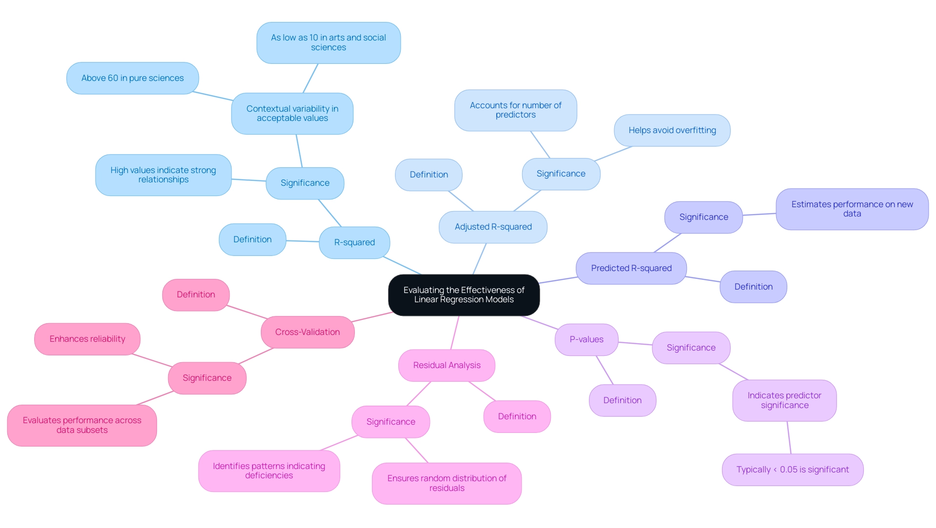
To effectively assess the performance of your linear regression models, it is essential to utilize the following evaluation metrics:
-
R-squared (Coefficient of Determination): This statistic quantifies how much of the variability in your dependent variable can be explained by the independent variables. Values nearing 1 suggest a strong relationship, while lower values indicate the necessity for further exploration into influencing factors.
-
Adjusted R-squared: Unlike R-squared, this metric considers the number of predictors in the analysis, providing a more precise depiction of performance, particularly in multiple regression situations. This adjustment helps avoid overfitting by penalizing the addition of irrelevant predictors.
-
Predicted R-squared: This statistic addresses specific issues with R-squared by providing an estimate of how well the system will perform on new data. It is especially helpful in confirming the system’s predictive capability.
-
P-values: These values assist in assessing the significance of each predictor. Typically, a p-value of less than 0.05 suggests that the variable plays a significant role in the analysis, guiding decisions on variable retention or removal.
-
Residual Analysis: Analyzing residuals—the differences between observed and predicted values—ensures they are randomly distributed. This indicates a well-fitted system and helps identify any patterns that may suggest deficiencies.
-
Cross-Validation: Employing techniques such as k-fold cross-validation allows you to evaluate performance across various subsets of data, enhancing reliability and ensuring applicability in different scenarios.
Understanding that acceptable R-squared values can vary by field is crucial. For instance, pure sciences often necessitate values above 60% due to their predictability, while in the arts and social sciences, a value as low as 0.10 may suffice. This variation highlights the significance of context in evaluation.
As Jim aptly states, “Theoretical issues can override the other statistical issues when you have solid theoretical reasons for including a variable or not.” This reinforces the need for a thoughtful approach in evaluating frameworks, considering both statistical metrics and theoretical foundations. By employing these evaluation techniques, you will not only discern the effectiveness of your linear regression trendline but also identify areas for enhancement to optimize your models.
Conclusion
Linear regression is a fundamental technique in data analysis that provides valuable insights into variable relationships and enables accurate predictions. Mastering this method is crucial for professionals aiming to enhance data-driven decision-making. The integration of Robotic Process Automation (RPA) further streamlines processes, reduces manual errors, and allows teams to focus on strategic goals.
This article provided a clear pathway for creating effective linear regression trendlines, covering essential steps such as:
- Data collection
- Software selection
- Result interpretation
It also explored various regression models, from simple to complex forms, emphasizing the importance of selecting the appropriate model based on data characteristics.
Data preprocessing is vital for ensuring the accuracy and reliability of regression analyses. Addressing data quality, normalizing variables, and selecting relevant features lay the groundwork for successful modeling. Additionally, evaluating model effectiveness through metrics like R-squared and cross-validation ensures that models perform well in real-world scenarios.
In summary, leveraging linear regression in conjunction with RPA equips organizations with the tools necessary to enhance analytical capabilities and operational efficiency. By adhering to best practices and understanding different regression methodologies, businesses can make informed decisions that drive growth and maintain a competitive edge in a rapidly changing environment. Embracing these statistical techniques empowers teams to utilize data strategically, ultimately leading to sustained operational excellence.
Introduction
In the dynamic landscape of business intelligence, organizations are often faced with the critical decision of selecting the right tools to enhance their data capabilities. Power BI and Tableau emerge as two frontrunners in this arena, each offering unique strengths tailored to different operational needs. As businesses increasingly seek to integrate these platforms with Salesforce, understanding their functionalities becomes paramount.
While Power BI boasts seamless integration with Microsoft applications and user-friendly features, Tableau stands out for its advanced visualization capabilities. However, the journey to effective data utilization is not without its challenges, including:
- Report creation inefficiencies
- Data inconsistencies
This article delves into a comparative overview of Power BI and Tableau, examining their strengths and weaknesses, integration techniques, and the future trends that will shape the BI landscape for Salesforce users. By exploring these elements, organizations can make informed decisions that drive operational efficiency and foster growth in an ever-evolving data environment.
Comparative Overview of Power BI and Tableau for Salesforce Integration
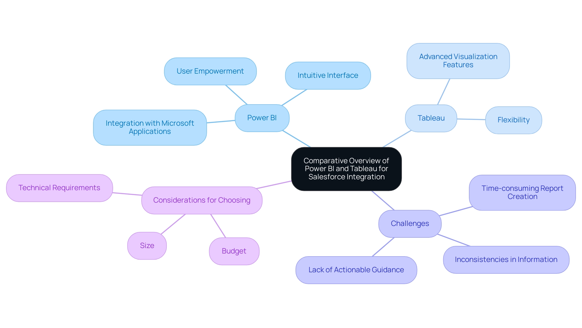
Business Intelligence (BI) tools like Power BI and other platforms are prominent, each designed to address various organizational needs. BI, created by Microsoft, excels in its effortless integration with other Microsoft applications, coupled with an intuitive interface that empowers users with limited technical expertise to harness its capabilities effectively. In contrast, the platform is renowned for its sophisticated visualization features and flexibility, attracting analysts and professionals seeking advanced analytical tools.
When examining Salesforce integration, both Salesforce BI and Tableau provide strong solutions for extracting, analyzing, and visualizing information, yet their methodologies and functionalities distinctly diverge. However, companies frequently encounter challenges in utilizing insights from BI dashboards, including:
- Time-consuming report creation
- Inconsistencies in information
- A lack of actionable guidance
These challenges can impede decision-making and result in a competitive disadvantage. Notably, 88% of organizations using cloud-based BI reported increased flexibility in accessing and analyzing information, highlighting the advantages of utilizing these tools in a cloud environment.
Furthermore, as organizations assess their alternatives, the case study titled ‘Choosing the Right Tool for 2024‘ highlights the significance of factoring in budget, size, and technical requirements when choosing between Tableau and BI. This practical framework is essential as the global information landscape continues to expand, with a staggering 64.2 zettabytes generated in 2020 projected to escalate to 181 zettabytes by 2025. As organizations maneuver through this information flood, harnessing the potential of Business Intelligence alongside RPA solutions such as EMMA RPA and Automate becomes essential for fostering growth and operational efficiency.
These RPA tools automate repetitive tasks, enhance information accuracy, and streamline processes, ultimately empowering businesses to make informed decisions faster. As Tajammul Pangarkar, CMO at Prudour Pvt Ltd, notes, ‘Understanding tech trends is crucial for leveraging the right tools in business intelligence.’ To explore how these tools can transform your operations, book a free consultation today.
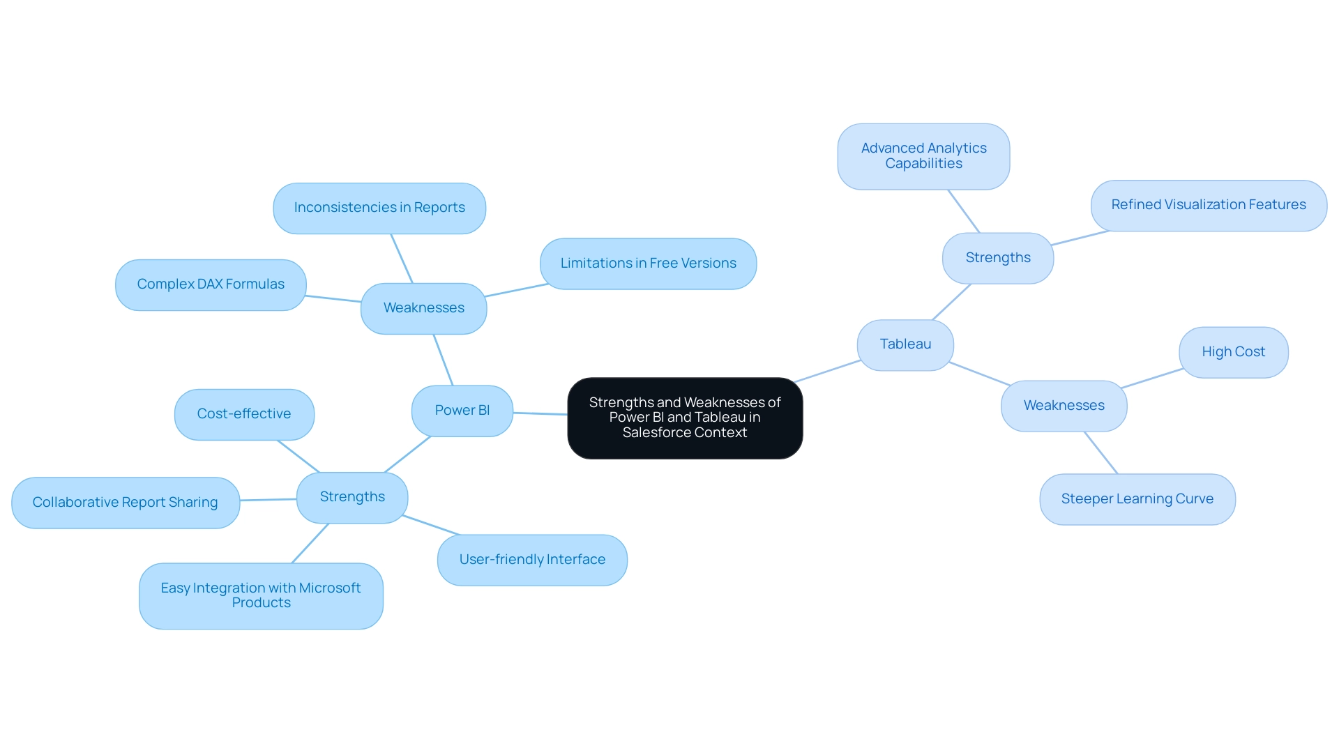
Strengths and Weaknesses of Power BI and Tableau in Salesforce Context
In the realm of Salesforce integration, Salesforce BI stands out for its cost-effectiveness and user-friendly interface, making it an appealing choice for organizations seeking quick and straightforward dashboard and report creation. According to Leila Gharani, an expert in data analytics, the Business Intelligence tool connects easily to Excel, Azure, and many other data sources. It’s a great choice for teams already using Microsoft products.
This seamless integration is particularly beneficial for users familiar with Excel and other Microsoft programs, further simplifying the learning curve. However, the challenges of leveraging insights from BI are notable. Many Directors of Operations Efficiency find themselves spending more time on constructing reports than on extracting meaningful insights, leading to inefficiencies.
Additionally, inconsistencies in information across reports due to a lack of governance can foster confusion and mistrust. While BI excels with its user-friendly interface and collaborative report sharing, it does have limitations, including complex DAX formulas and restrictions in free versions concerning handling. Some users view its visualization features as less refined compared to the platform recognized for its advanced visual options.
Thus, businesses must carefully evaluate their budget constraints, technical expertise, and specific analytical needs to make an informed decision between these powerful tools. A recent analysis indicates that while BI is preferred by cost-conscious businesses, Tableau remains the go-to for those requiring advanced analytics and visualization capabilities. To enhance the effectiveness of Business Intelligence, organizations should concentrate on delivering clear, actionable guidance from their dashboards and implement governance strategies to ensure consistency and reliability.
Integration Techniques: Connecting Power BI and Tableau with Salesforce
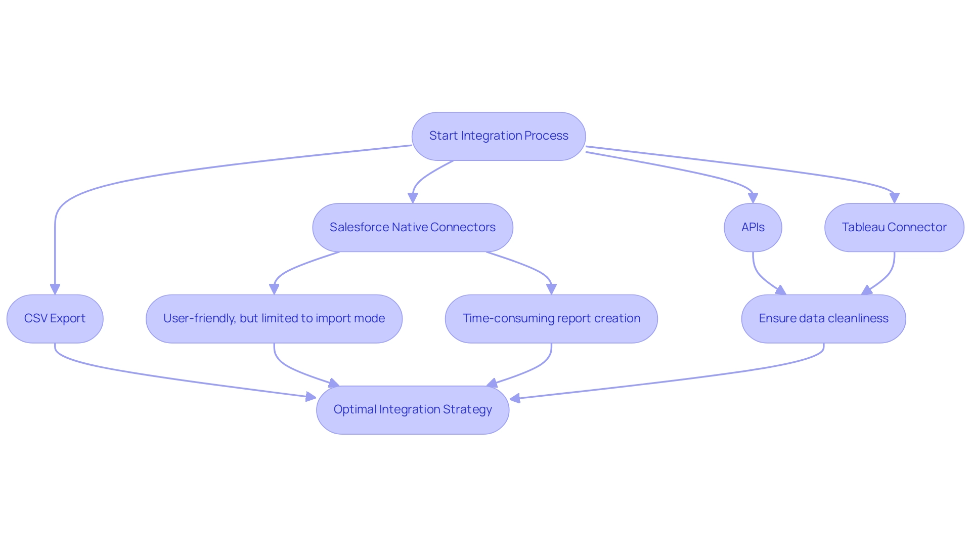
Integrating Power BI with Salesforce BI offers several effective methods, including Salesforce’s native connectors and APIs, which facilitate seamless information exchange. However, as lbendlin, a Super User, points out, ‘Neither Salesforce Objects nor Salesforce Reports connector offer real-time (Direct Query) connectivity. Both are strictly import mode…
If you need real-time reports, use Salesforce Reports, in Salesforce.’ This highlights a significant limitation for users seeking real-time reporting capabilities. In today’s information-rich environment, it’s critical to address challenges like time-consuming report creation and inconsistencies, which can be mitigated through a robust governance strategy to ensure integrity and build trust in the insights presented.
BI does provide pre-built templates designed to simplify the connection process, making it more user-friendly, yet many organizations find themselves investing excessive time in constructing reports rather than leveraging insights effectively. In contrast, Tableau enables a more nuanced integration through its Tableau Connector for Salesforce or by utilizing extracts, providing users with greater flexibility. An alternative method is to export Salesforce Reports to CSV, store them on SharePoint, and then ingest them into Power BI, which is suitable for handling large datasets where real-time reporting is not necessary.
To enhance the integration experience and promote operational efficiency, best practices suggest ensuring cleanliness and a well-structured format prior to integration, along with regular updates to connection settings for sustained accuracy. An important technique is to create measures instead of combining tables when addressing varying levels of granularity, as suggested by feedback on effective information handling. For instance, individuals have reported that creating measures has led to improved performance and clearer insights compared to merging tables, indicating a preference for this approach.
Organizations should assess their current IT infrastructure and resources to identify the most suitable integration method, customizing their strategy to address specific operational requirements and information complexity while maximizing the potential of Salesforce BI solutions.
Data Visualization and Reporting: Power BI vs. Tableau
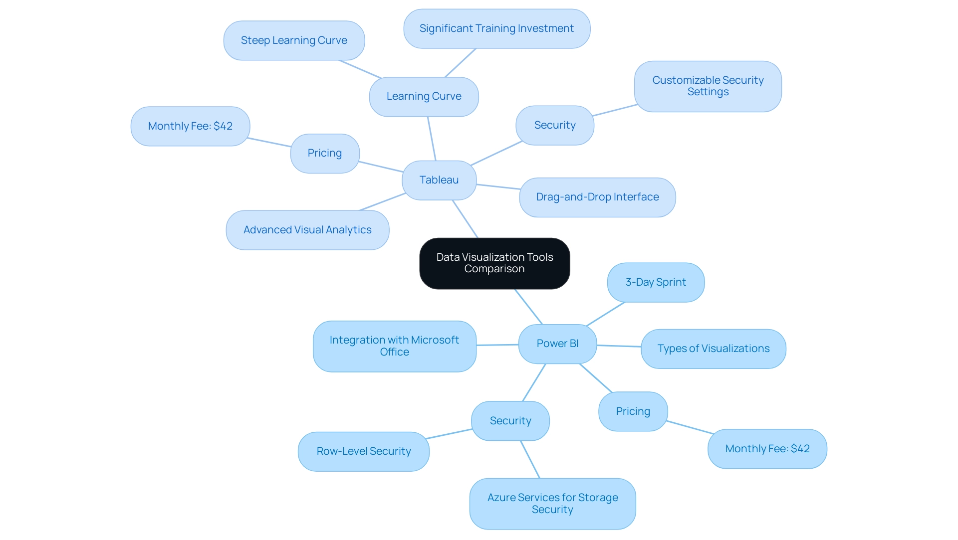
This software excels in information visualization, especially because of its smooth integration with Microsoft Office tools, enabling individuals to create visually appealing reports directly linked to applications like Excel. It provides a diverse array of visualization types—from charts and maps to tables—along with customization options that cater to various reporting needs. This functionality ensures that users can present information in a manner that resonates with their audience, promoting informed decision-making that drives growth.
Additionally, the 3-Day Power BI Sprint allows for rapid creation of professionally designed reports, while the General Management App supports comprehensive management and smart reviews, enhancing overall operational efficiency. Moreover, our actions portfolio provides customized strategies to enhance the effect of your initiatives, and we encourage you to schedule a complimentary consultation to discover how we can support you additionally.
On the other hand, a well-known tool is acknowledged for its advanced visual analytics features, allowing the development of highly interactive dashboards that reveal key insights. Its intuitive drag-and-drop interface provides individuals the flexibility to create intricate visualizations, making it perfect for comprehensive analysis and narrative through information. However, while the business intelligence tool serves well for straightforward reporting tasks and offers a risk-free ROI assessment, the other platform excels in scenarios demanding comprehensive exploration.
It is essential to note that this software incurs a fee of $42 monthly for each individual, which may affect budget considerations for organizations.
Both platforms implement robust security measures; Power BI utilizes Azure services for storage security and offers row-level security for access, while this software allows individuals to configure authentication and security with various roles for access permissions. However, the steep learning curve of Tableau requires significant training investment for users to master its features, presenting a challenge for the Director of Operations Efficiency when evaluating these tools. With the right tools and strategies, including addressing the challenges of time-consuming report creation and inconsistencies, businesses can unlock the power of Business Intelligence and RPA, transforming information into actionable insights that foster growth and innovation.
Future Trends in BI Tools: What Lies Ahead for Salesforce Users
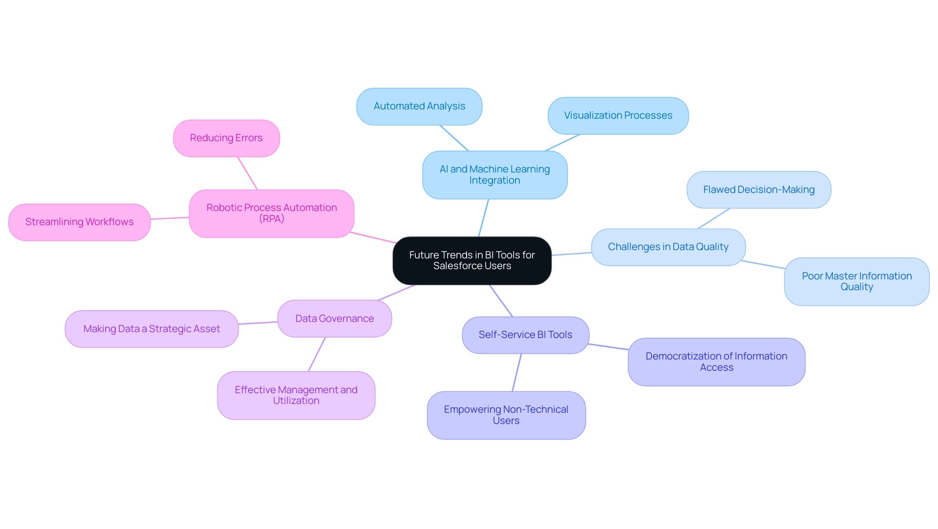
As business intelligence (BI) tools continue to advance, organizations can anticipate increasingly robust integration capabilities with Salesforce BI, driven by rapid developments in artificial intelligence (AI) and machine learning. Predictions from BI experts indicate a significant shift towards automated analysis and visualization processes, aiming to reduce the time currently consumed by manual preparation—an estimated 45% of scientists’ efforts. This evolution will enable individuals to extract valuable insights with minimal intervention, enhancing productivity across the board.
However, organizations often face challenges related to poor master information quality, which can hinder effective AI implementation and lead to flawed decision-making. Furthermore, the perception that AI projects are time-intensive and costly can deter businesses from adopting these transformative technologies. The emergence of self-service BI tools is set to democratize information access, enabling non-technical users to independently create reports and dashboards, fostering a culture of informed decision-making throughout organizations.
Statista highlights that annual spending on cloud IT infrastructure is steadily growing, reflecting the financial commitment businesses are making to enhance their Salesforce BI capabilities. To fully capitalize on these transformative trends, companies must prioritize making information a strategic asset through effective Governance, ensuring optimal management and utilization of their resources. Moreover, leveraging Robotic Process Automation (RPA) can significantly streamline workflows, reduce errors, and free up teams for more strategic work.
A case study on decentralized data management in the pharmaceutical sector illustrates how effective data governance can bolster operational effectiveness and data integrity, underscoring the necessity for organizations to adapt their strategies and harness the full potential of Salesforce BI investments to drive operational excellence.
Conclusion
Power BI and Tableau are both formidable players in the business intelligence landscape, each catering to distinct organizational needs while offering robust integration with Salesforce. Power BI’s strength lies in its cost-effectiveness and user-friendly interface, making it accessible for teams familiar with Microsoft products. However, the inefficiencies in report creation and data inconsistencies can pose challenges for organizations looking to derive actionable insights. Conversely, Tableau’s advanced visualization capabilities make it a preferred choice for data analysts seeking deeper analytical tools, although it may require a more significant investment and a steeper learning curve.
As businesses look to the future, the integration of AI and machine learning with BI tools promises to transform how organizations interact with data. This evolution, coupled with the rise of self-service BI tools, will empower users to generate insights with greater autonomy and efficiency. However, to fully leverage these advancements, organizations must prioritize data governance and ensure data integrity. Transforming data into a strategic asset will be essential for driving informed decision-making and operational excellence.
In conclusion, the choice between Power BI and Tableau hinges on a careful assessment of an organization’s specific needs, budget constraints, and technical capabilities. By understanding the strengths and weaknesses of each platform, along with the integration techniques and future trends in BI, organizations can make informed decisions that not only enhance their data capabilities but also pave the way for sustained growth and operational efficiency in an increasingly data-driven world.
Introduction
In the realm of data analysis, the ability to forge meaningful connections between various datasets is paramount for driving operational efficiency and informed decision-making. Power BI stands out as a powerful tool that facilitates this by enabling users to create and manage relationships between tables. Understanding the intricacies of these relationships—ranging from one-to-one to many-to-many—is essential for building a robust data model that not only enhances reporting accuracy but also streamlines the analytical process.
As organizations grapple with challenges such as data inconsistencies and time-consuming report generation, mastering the art of relationship management within Power BI can unlock a treasure trove of insights. This article delves into the fundamentals of Power BI relationships, offering practical solutions and strategies that empower users to transform raw data into actionable intelligence, ultimately fostering business growth and innovation.
Understanding the Basics of Power BI Relationships
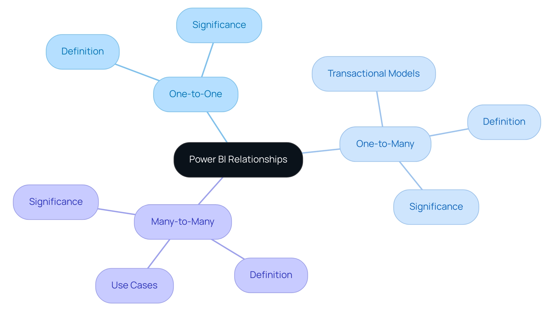
In this tool, understanding power bi relationships explained between various tables is crucial for building an efficient model that enhances operational effectiveness. These connections enable the creation of cohesive datasets that Power BI can analyze with precision, facilitating informed decision-making. Mastering the three main types of relationships—one-to-one, one-to-many, and many-to-many—illustrates the concept of power bi relationships explained, which is crucial for optimizing information modeling.
For example, a one-to-many relationship permits a single record in a primary table to link to several records in a secondary table, a structure frequently observed in transactional information models. This understanding of power bi relationships explained is crucial for achieving precise reporting and perceptive analysis.
Our BI services include a 3-Day Sprint aimed at accelerating the development of expertly designed reports, ensuring effective reporting and information consistency. One of the standout features is the General Management App, which offers comprehensive management and smart reviews to enhance your workflow.
Moreover, a recent case study underscores the introduction of the 100% Stacked Area Chart in Business Intelligence, which significantly aids users in visualizing the relative percentage of multiple information series over time. This visual not only enhances interpretation but also illuminates how relationships between different points evolve, providing deeper insights into operational trends.
As emphasized by Microsoft, certification ensures that visuals, including the new chart, do not interact with external services, thereby guaranteeing that your PDF files are securely stored and encrypted within the report, in accordance with your report sensitivity settings. This aspect reinforces the significance of secure information management in Business Intelligence.
Additionally, utilizing effective information modeling, as demonstrated by user MaineGuy1993, highlights that having SQL open on the server while using BI on a laptop can significantly enhance operational efficiency. By adopting these concepts and using our BI services alongside RPA solutions such as EMMA RPA and Automate, you can convert unrefined information into actionable insights. These RPA tools enhance BI by automating repetitive tasks, thus overcoming challenges like time-consuming report creation and data inconsistencies, ultimately driving business growth.
Creating and Managing Relationships in Power BI
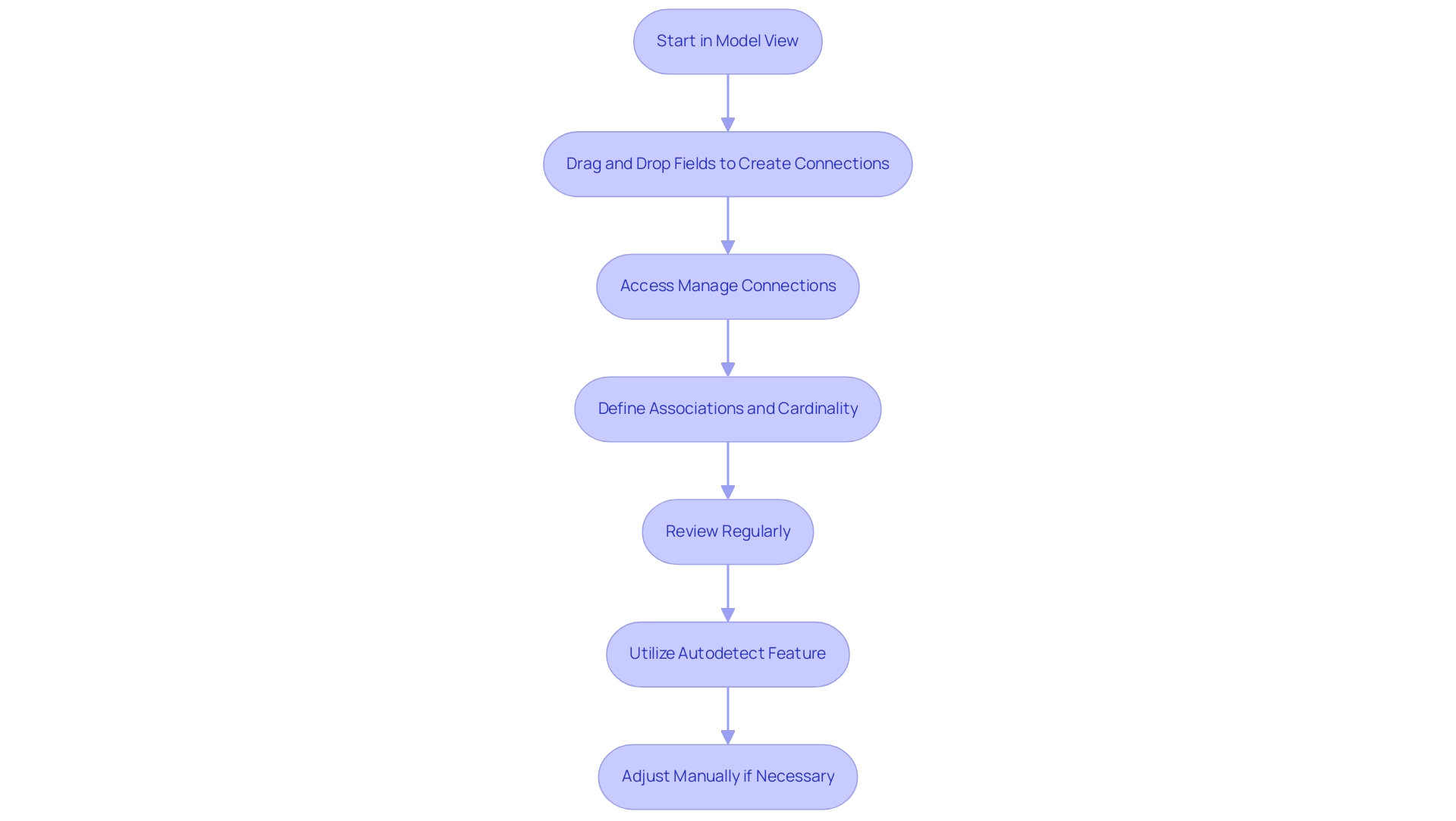
The process of establishing connections in Power BI relationships explained starts in the ‘Model’ view, yet many users find themselves caught in a cycle of time-consuming report creation. This interface allows you to visually create connections between datasets, which is an example of power bi relationships explained, by simply dragging and dropping fields. Alternatively, you can access the ‘Manage Connections’ option in the Home tab to manually define new associations, specify the involved tables, and set the appropriate cardinality, as power bi relationships explained suggests.
However, without a robust governance strategy, inconsistencies can arise, leading to confusion and a lack of trust in your insights. To tackle these challenges, regular review and management of these connections is crucial for maintaining accuracy and efficiency. Power BI’s autodetect feature assists in the process of power bi relationships explained by recognizing potential connections based on matching column names and types, though manual adjustments may still be necessary to ensure optimal performance.
As industry expert Ricardo notes, ‘I confirmed the values in the matrix were correct by comparing them to the measures I had previously created for each attribute (entrega, forecast, venda).’ This emphasizes the need for actionable guidance — without clear direction, stakeholders may be left with information that lacks context. For additional support, the case study titled ‘Guidance for Relating Higher Grain Facts‘ offers essential insights on managing connections effectively in scenarios with higher granularity.
By utilizing Business Intelligence and RPA solutions, along with a strong governance strategy, you can improve operational efficiency and convert raw information into actionable insights, ultimately fostering growth and innovation.
Exploring Types of Relationships: Cardinality and Direction
In Power BI, the concept of power bi relationships explained emphasizes that cardinality is essential as it determines the nature of connections between tables, influencing how information interacts within your models. Grasping these connections, as power bi relationships explained, is vital for utilizing Business Intelligence and Robotic Process Automation (RPA) to foster data-driven insights and operational efficiency necessary for business growth. Common challenges include time-consuming report creation, data inconsistencies, and a lack of actionable guidance, which can hinder effective decision-making.
The most common types of relationships are:
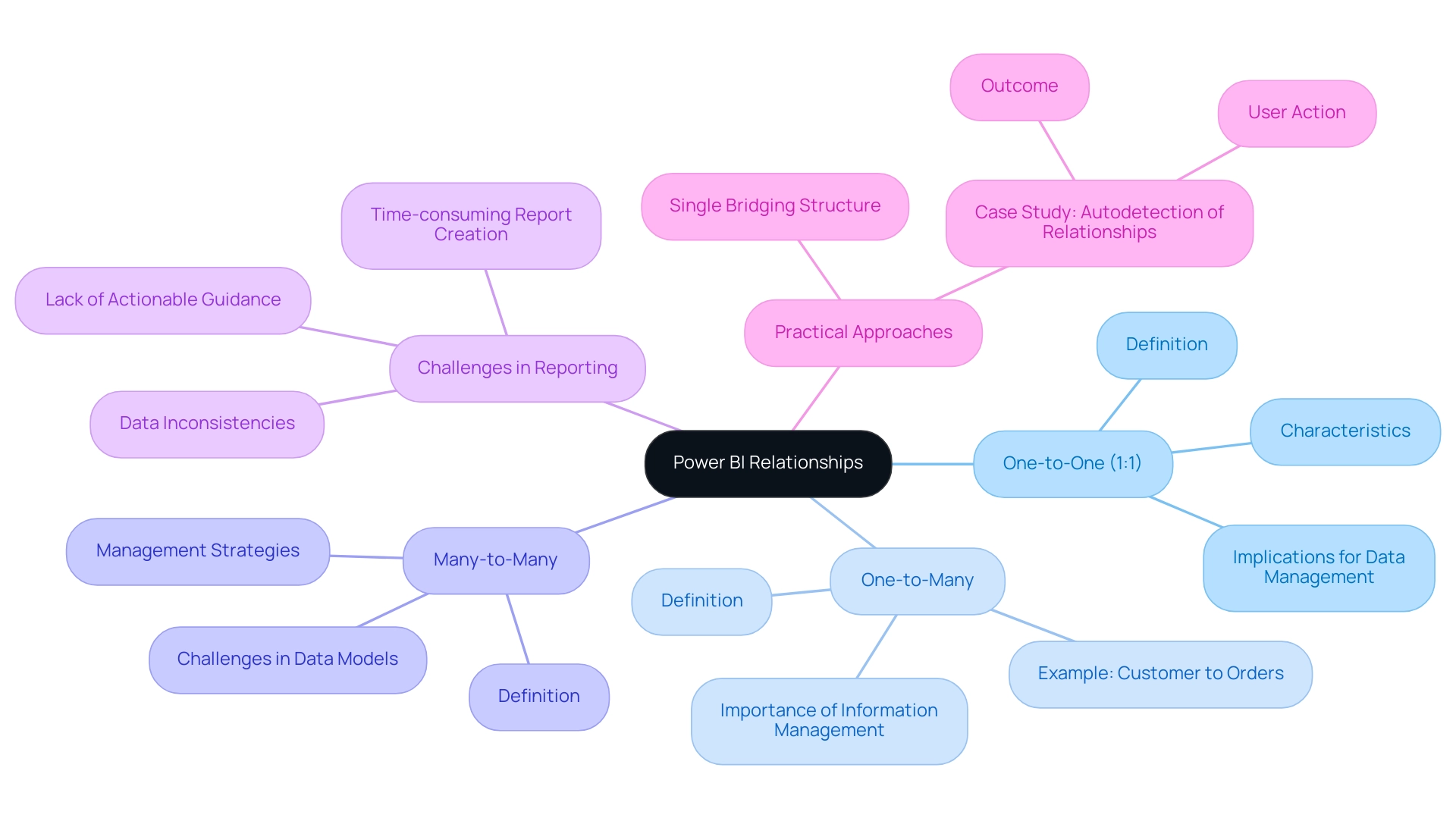
- One-to-One (1:1): In this scenario, each row in one dataset is associated with one, and only one, row in the second dataset. This relationship is straightforward and ensures information integrity.
- One-to-Many: Here, a record in one dataset can relate to multiple records in another. A classic example illustrating power bi relationships explained is the connection between a customer and their orders, where one customer can place multiple orders, showcasing the need for effective information management and reporting.
- Many-to-Many: This type complicates data models as entries in both datasets can relate to multiple entries in each other, creating a more intricate web of connections that can hinder timely insights if not managed properly.
Furthermore, understanding how power bi relationships explained affects the orientation of these connections is essential, especially in how filters are utilized across datasets. By default, Power BI creates single-directional connections, meaning that filters applied to one dataset will influence associated datasets, but not vice versa. As noted by Priyanka P Amte, “Both direction filtering, filters can flow in both directions between datasets.”
This emphasizes the complexity of managing data connections and the significance of understanding power bi relationships explained for deriving insights.
A practical approach for managing connections is to utilize a single bridging structure, which can simplify intricate associations and improve reporting efficiency. Furthermore, in a case study titled ‘Autodetection of Connections,’ a user successfully removed all other columns from the table, allowing the link to other tables to be auto detected as one-to-many, effectively fixing the issue. Grasping these dynamics, as highlighted in power bi relationships explained, is crucial for developing effective reports and dashboards, allowing you to manipulate and examine your information with confidence, ultimately overcoming challenges such as time-consuming report creation and inconsistencies.
Troubleshooting and Optimizing Power BI Relationships
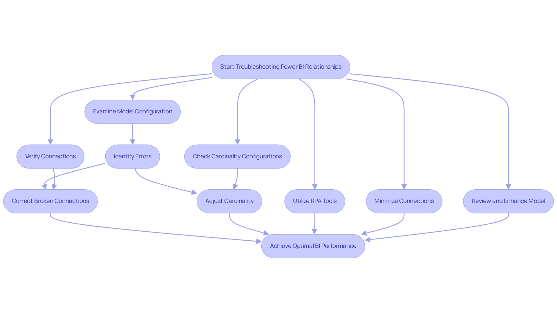
BI users frequently face typical connection problems, such as unclear associations, circular dependencies, and incorrect cardinality configurations, which can greatly obstruct analysis. To troubleshoot these issues effectively, begin by carefully examining your model configuration for any errors identified by BI, as these frequently indicate broken connections. It’s crucial to verify that all connections are accurately formed and that the cardinality corresponds with the foundational structure, as illustrated by the Employee Role table that presents 8 distinct employees with different roles, highlighting how connections can differ in complexity.
Utilizing RPA, especially tools such as EMMA RPA and Power Automate, can automate repetitive tasks linked to information management, enhancing operational efficiency and offering a competitive edge through improved insights. To optimize your model, consider minimizing the number of connections where feasible or employing calculated columns to streamline complex models. Furthermore, altering connections and introducing constraints to visuals can further improve your information model.
Frequently reviewing and enhancing your model is not only a best practice; it can greatly improve performance and result in more precise insights. As pointed out by a frequent community visitor, maintaining clarity in power bi relationships explained is crucial for effective decision-making, especially in data-rich environments. Additionally, resolving typical data connection problems, as outlined in the case study ‘Troubleshooting Techniques for Data Connection Issues,’ is essential for accessing current information in BI reports.
Proactively addressing these challenges will enable you to utilize BI’s full potential, driving data-driven insights and promoting business growth.
Advanced Relationship Management: DAX and Virtual Relationships
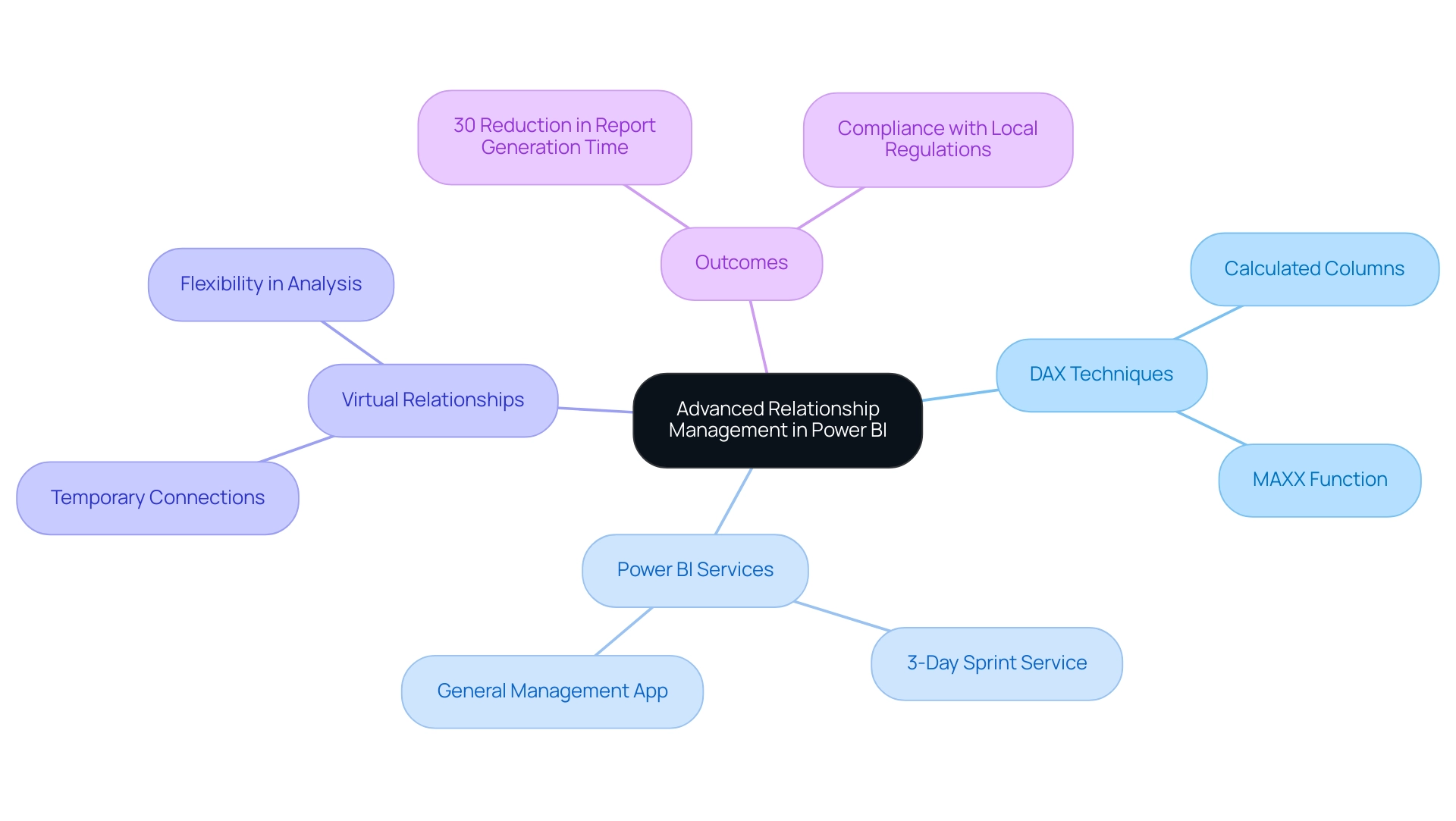
Mastering advanced relationship management in business intelligence, as outlined in Power BI relationships explained, is pivotal for enhancing analytical capabilities and driving operational efficiency. By utilizing DAX (Data Analysis Expressions), you can create calculated columns and measures that reference multiple tables, offering a robust framework for analysis. Our Power BI services, especially the 3-Day Sprint for quick report creation and the General Management App for thorough management, enable you to tackle common challenges such as time-consuming report generation and inconsistencies, ensuring efficient reporting and actionable insights.
One of the most powerful features available to you is the use of virtual connections. These temporary connections allow you to conduct analyses without altering the underlying data model, offering remarkable flexibility. For instance, the MAXX function can be utilized to determine the maximum total amount across all orders, showcasing the depth of insights that can be derived.
Furthermore, BI’s operation in separate national and regional clouds ensures compliance with local regulations, which is crucial for organizations. Real-world case studies, such as ‘Usage Metrics in National/Regional Clouds,’ illustrate how organizations have successfully employed advanced DAX techniques to maintain high standards of security and privacy while supporting local service delivery needs. For example, one organization reported a 30% reduction in report generation time after implementing our 3-Day Sprint service.
This method not only emphasizes the practical advantages of using virtual relationships in BI but also provides an explanation of Power BI relationships explained in real-world applications. By familiarizing yourself with these advanced techniques and utilizing our Power BI solutions, you can unlock new dimensions of insight, ensuring that your data analysis is both efficient and impactful.
Conclusion
Understanding the intricacies of Power BI relationships is fundamental for any organization striving to harness the full potential of its data. From the foundational concepts of:
- one-to-one
- one-to-many
- many-to-many relationships
to the advanced management techniques utilizing DAX and virtual relationships, each aspect plays a crucial role in constructing an effective data model. This comprehensive approach not only enhances reporting accuracy but also streamlines the analytical process, ultimately leading to better-informed decision-making.
By implementing robust governance strategies and leveraging tools like RPA, organizations can address common challenges such as:
- data inconsistencies
- time-consuming report generation
Regularly reviewing and optimizing relationships within Power BI ensures that insights drawn from data remain relevant and actionable. The incorporation of features like autodetection of relationships and calculated columns further empowers users to create dynamic and efficient models that adapt to changing business needs.
As organizations continue to navigate the complexities of data analysis, mastering relationship management in Power BI stands as a key differentiator. By embracing these strategies and solutions, businesses can transform raw data into actionable insights, fostering innovation and driving growth. The time to invest in understanding and optimizing Power BI relationships is now, as the benefits extend far beyond immediate operational efficiencies, paving the way for a data-driven future.
Introduction
In the realm of data analysis, the significance of a well-structured date table in Power BI cannot be overstated. As organizations strive to unlock the full potential of their data, time-based calculations become crucial for informed decision-making. A dedicated date table serves as the backbone for executing year-to-date totals, period comparisons, and trend analyses, addressing the common pitfalls of report creation and data inconsistencies.
By implementing practical strategies and leveraging DAX functions, users can enhance their analytical capabilities, leading to clearer insights and more efficient operations. This article delves into the essential steps for creating and optimizing date tables, equipping professionals with the tools needed to transform their data into actionable intelligence.
Understanding the Importance of Date Tables in Power BI
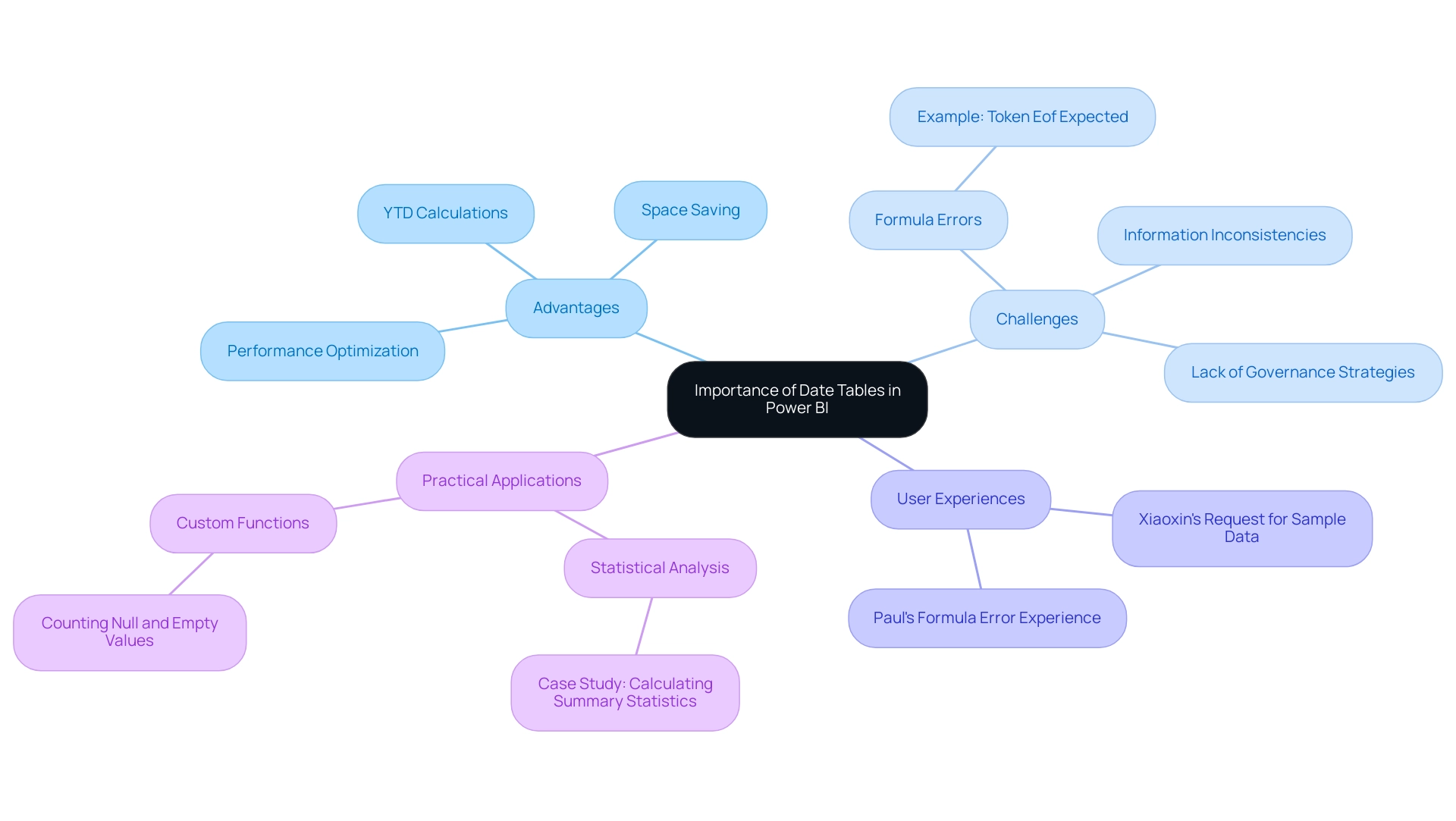
In Power BI, having a dedicated date table dax structure is not only advantageous; it is crucial for performing time-related calculations such as year-to-date (YTD) totals, period comparisons, and trend analysis. By establishing a year-to-date hierarchy within your date table, you can significantly optimize space and enhance your model’s performance, directly addressing common challenges like time-consuming report creation and information inconsistencies. Without this structured approach, users may encounter substantial limitations in their analysis capabilities, leading to confusion and mistrust in the information presented, often exacerbated by a lack of governance strategies.
For practical application, Xiaoxin has requested a pbix file with sample data for testing, facilitating hands-on experience in utilizing these features effectively. Additionally, users often face challenges, as illustrated by Paul’s experience with formula errors, highlighting the importance of proper implementation:
“I’m also entering the formula you provided and substituting Sheet1 for Office Stats – I assume that’s the right way? Once it’s entered, I’m getting an error message at the bottom: ‘Token Eof expected.’
Any thoughts on that?”
A well-constructed schedule matrix that incorporates a date table dax serves as the backbone of your reporting framework, supporting various time intelligence functions that enable precise filtering and calculations across different visualizations. This foundational element is vital for overcoming challenges in leveraging insights from Power BI, ensuring that documents are not only filled with numbers and graphs but also provide clear, actionable guidance.
Additionally, the case study titled ‘Calculating Summary Statistics in Power BI’ illustrates how calendar records can be employed effectively, preparing for conducting statistical analysis. By utilizing a timeline resource, users can access a thorough perspective of time-related metrics, resulting in more insightful analyses that promote informed decision-making, ultimately improving operational efficiency.
Step-by-Step Guide to Creating a Date Table Using DAX
Establishing a date table DAX in Power BI is not only a powerful method to enhance your analysis capabilities but also a crucial step in tackling common challenges like time-consuming report creation and inconsistencies. Each step outlined below directly contributes to overcoming these challenges and provides actionable guidance for effective insights:
-
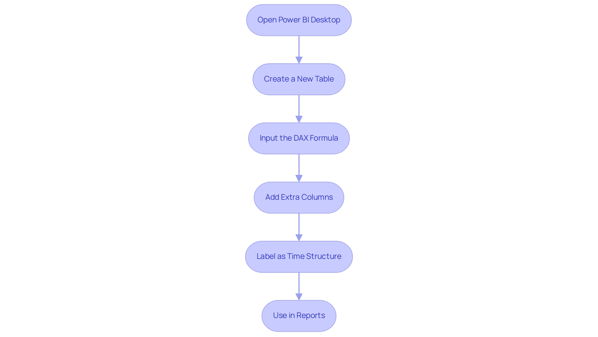
Open Power BI Desktop: Start by launching the application and navigating to the ‘Data’ view. This initial step ensures you are in the right workspace to manage your information effectively.
-
Create a New Table: In the ‘Modeling’ tab, select ‘New Table’. This action opens a formula bar for you to input DAX expressions, allowing you to customize your data structure to meet reporting needs.
-
Input the DAX Formula: To generate a date range, enter the following DAX formula:
DAX

   date table = CALENDAR(MIN(YourDataTable[YourDateColumn]), MAX(YourDataTable[YourDateColumn]))
Make sure to replace YourDataTable and YourDateColumn with the relevant names from your dataset. This formula addresses inconsistencies by ensuring the time range is accurately captured from your dataset.
- Add Extra Columns: Enhance your timeline by incorporating columns for year, month, quarter, and more. Use these DAX formulas:
- Year:
Year = YEAR(date table[Date]) - Month:
Month = FORMAT(DateTable[Date], "MMMM") - Quarter:
Quarter = QUARTER(DateTable[Date])
These additional columns provide a structured way to analyze data over time, making it easier to derive actionable insights from reports.
-
Label as Time Structure: After your time structure is established, make sure you label it correctly by selecting ‘Label as Time Structure’ in the ‘Modeling’ tab and choosing the appropriate time column. This step is crucial for Power BI to comprehend how to use the time structure effectively in calculations and visualizations, thereby supporting information governance.
-
Use in Reports: Once your calendar structure is established, utilize it in reports for effective time-based analysis. Drag and drop fields from your temporal dataset into your visualizations to filter and segment data based on time, thus providing clearer, actionable insights.
For example, utilizing the calendar resource enables stakeholders to swiftly recognize trends over particular intervals, resulting in informed decision-making.
Case Study: Cloning a Date Table
In scenarios where you may need to create a new date table for a role-playing dimension, consider cloning an existing date table. This can be accomplished by creating a calculated dataset that references the original. While the new furniture will have the same columns, it will not carry over model properties such as formats or hierarchies, which is essential to keep in mind.
By following these steps, you will successfully create a robust date table dax in Power BI, enabling you to perform advanced time-based analytics and significantly improve your documentation capabilities, alleviating the challenges of generating outputs and information governance. Remember, a robust governance approach is essential for maintaining information integrity and reliability in your documents. Thanks for reading!
Also, keep in mind that the DAX query view now supports multiple query tabs that can be renamed or removed, offering a more streamlined experience while working with your information.
Enhancing Your Date Table with Additional Attributes
Enhancing your date table DAX in Power BI can significantly improve the depth of your analysis and address common challenges like time-consuming report creation and inconsistencies. Consider integrating the following attributes to enrich your datasets:
- Fiscal Year: If your organization follows a fiscal calendar, adding a fiscal year column is essential.
You can implement this with the following DAX formula:
DAX

   Fiscal Year = IF(MONTH(Date Table[Date]) >= 7, YEAR(Date Table[Date]) + 1, YEAR(Date Table[Date]))
This formula assumes that the fiscal year begins in July, helping you align your data analysis with fiscal reporting requirements. As noted by Venesectrix, having the ability to recalibrate summary statistics is crucial when summarization requirements change, emphasizing the need for accurate fiscal year calculations.
- Week Number: For weekly information analysis, it’s beneficial to include a week number column.
This can be accomplished using:
DAX

   WeekNumber = WEEKNUM(DateTable[Date])
This allows for easier aggregation and insights on a weekly basis, adapting to various reporting needs while ensuring a streamlined approach to data analysis.
- Holiday Flags: Identifying holidays can add significant context to your analyses. You can create a column that flags specific dates as holidays with this formula:
DAX

   IsHoliday = IF(DataTable[Date] IN {DATE(2023, 1, 1), DATE(2023, 12, 25)}, TRUE(), FALSE())
Adjust the dates in the curly braces to reflect your organization’s holidays, enabling quicker adjustments in your reporting processes and providing clearer guidance for decision-making.
Additionally, it’s important to consider the statistics created due to AUTO_CREATE_STATISTICS, which are named with a prefix of _WA.
Properly created statistics can significantly enhance query performance by providing the optimizer with precise distribution information. A case study on generating statistics demonstrates how single-column statistics, created using default options that sample 20 percent of the dataset, can enhance query performance. By incorporating these additional attributes, your date table DAX will serve as a more powerful tool for generating meaningful insights from your information.
This enhancement not only aids in accurately tracking performance but also aligns your analyses with key business metrics, ultimately supporting informed decision-making and addressing the recurring challenges faced in document creation. Moreover, utilizing Business Intelligence tools can convert these raw insights into strategic actions, while RPA can automate repetitive tasks in document generation, enhancing overall efficiency and information accuracy.
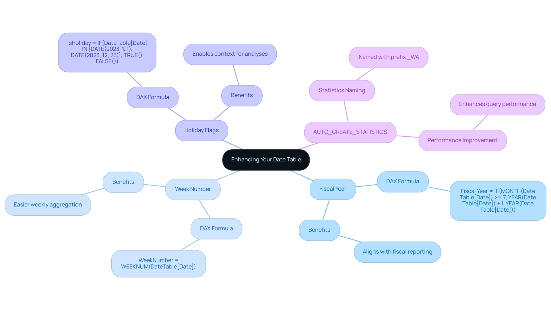
Utilizing Time Intelligence Functions with Your Date Table
After creating your date table DAX, which is a prerequisite for utilizing most time intelligence functions, harness the power of DAX with various time intelligence functions to elevate your analytical capabilities. These functions not only streamline your reporting process but also align with Business Intelligence goals to enhance operational efficiency. By integrating DAX functions, you can effectively tackle challenges such as time-consuming documentation creation and information inconsistencies, which are common in technology implementation.
Here are essential examples for effective reporting:
-
Year-to-Date (YTD) Calculation: To compute YTD sales, utilize the following DAX formula:
DAX

   YTDSales = CALCULATE(SUM(Sales[Amount]), DATESYTD(DateTable[Date]))
This function aggregates sales from the beginning of the year to the current date, providing valuable insights into overall performance and driving growth through data-driven decision-making. -
Month-to-Date (MTD) Calculation: For tracking MTD sales, apply this formula:
DAX

   MTDSales = CALCULATE(SUM(Sales[Amount]), DATESMTD(Date Table[Date]))
It enables you to analyze sales figures from the start of the month, allowing for timely adjustments and strategy refinements, thus addressing common challenges in report creation and data inconsistencies. -
Prior Year Comparison: To evaluate sales against the previous year, implement this DAX function:
DAX

   PriorYearSales = CALCULATE(SUM(Sales[Amount]), SAMEPERIODLASTYEAR(Date Table[Date]))
This comparison highlights trends and shifts in performance, empowering you to make informed decisions and tailor strategies according to historical data insights.
These time intelligence functions facilitate the creation of dynamic reports that adapt based on date contexts, enriching your analysis and enhancing reporting accuracy. Additionally, users can navigate temporal hierarchies (day, month, quarter, year) for deeper analysis, as demonstrated in the case study titled ‘Comparing Performance Across Temporal Hierarchies.’ Furthermore, by implementing RPA solutions, you can automate the reporting process, addressing repetitive tasks and freeing your team to focus on strategic initiatives.
Finally, remember that email and print options for sharing content are also provided, enhancing the usability of insights derived from these calculations.
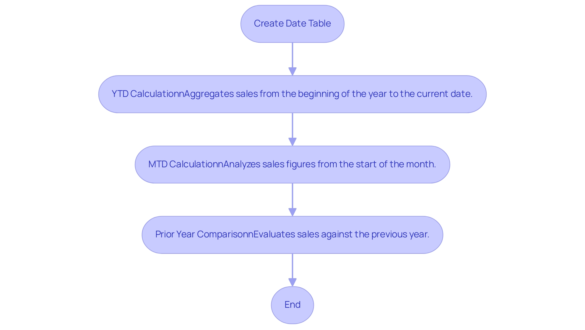
Best Practices for Maintaining Your Date Table
To maximize the effectiveness of your time series in Power BI and enhance your organization’s data-driven insights, implementing the following best practices is essential:
-
Frequent Refreshes: Consistently revise your timeline framework in reaction to alterations in your information model or the necessity to include new time spans. Proactively ensuring your analysis remains relevant and precise is vital in today’s information-rich environment, where unlocking the power of Business Intelligence can prevent competitive disadvantages.
-
Remove Unused Columns: Conduct periodic reviews to identify and eliminate any columns that are no longer necessary. This practice not only helps maintain a streamlined model but also enhances efficiency and performance—key aspects when leveraging RPA solutions to automate repetitive tasks and reduce task repetition fatigue.
-
Document Changes: Maintain a comprehensive log of modifications made to the calendar’s structure and attributes. This documentation offers clarity for future users and monitors the evolution of the model, supporting informed decision-making that drives growth and innovation.
-
Optimize Performance: Continuously monitor the performance of your date table within the information model. Implement adjustments as needed to minimize loading times and improve calculation efficiency. Accurate histograms are crucial for columns with highly skewed information distribution, particularly in WHERE clauses, as they significantly enhance query performance. As emphasized in the challenges of utilizing insights from Power BI, such as time-consuming documentation creation and information inconsistencies, strategic performance management is essential. RPA solutions can aid in automating preparation processes, significantly reducing the time spent on report generation and enhancing accuracy.
-
Backup and Restore of Statistics: Before gathering new statistics, consider backing up the original ones. This precaution allows for quick restoration in case performance issues arise, ensuring that any negative impacts from new statistics can be swiftly addressed. The importance of having a fallback plan in performance management is underscored by the case study on the backup and restore of statistics, which can prevent inconsistencies in reporting.
By adhering to these best practices, your date table DAX will remain a robust asset for data analysis, delivering precise insights that support your organization’s adaptation and growth in a competitive landscape.
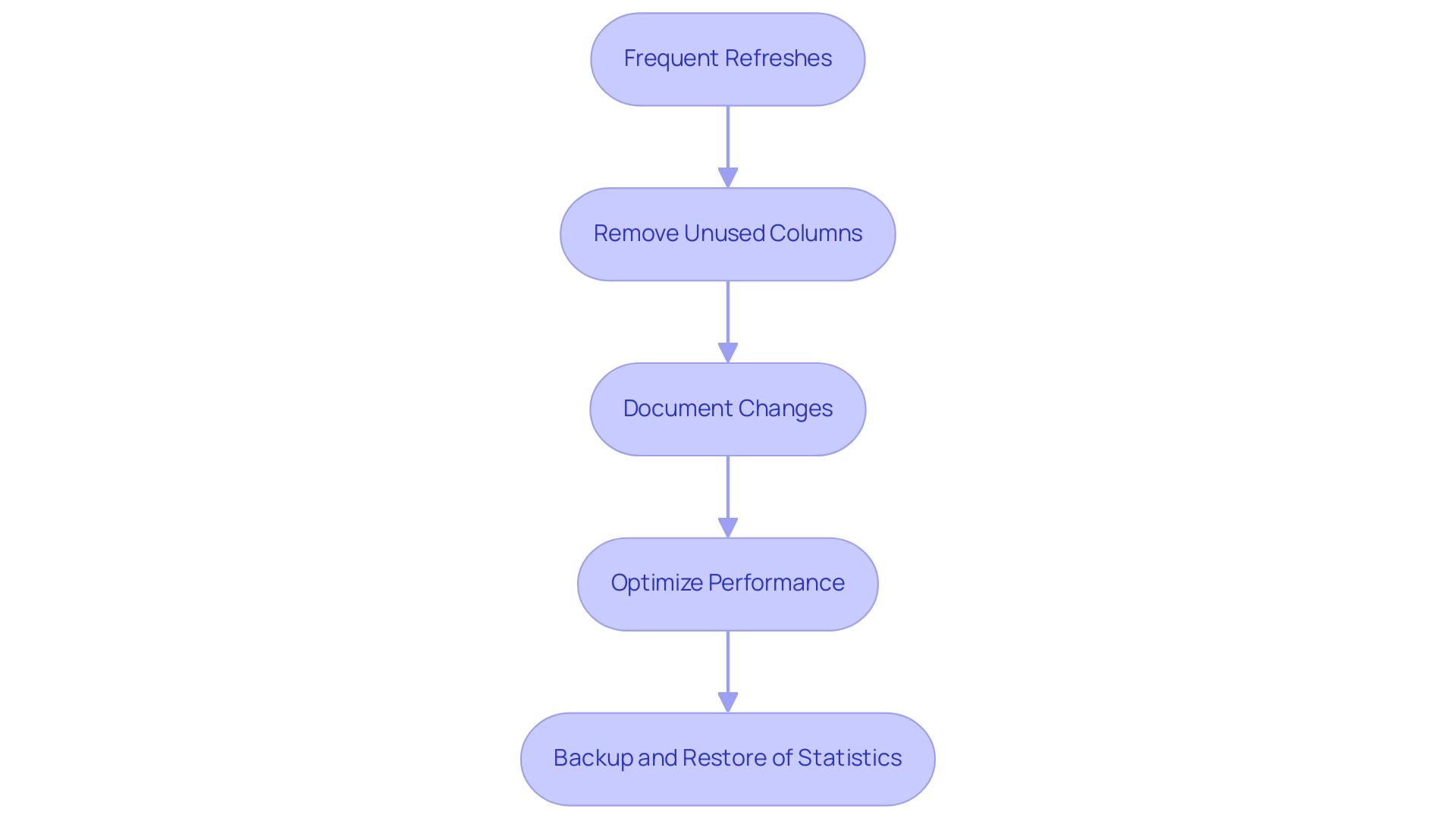
Conclusion
A well-structured date table is fundamental to harnessing the full power of data analysis in Power BI. Throughout this article, the critical importance of creating and optimizing date tables has been emphasized, showcasing how they serve as the backbone for essential time-based calculations. By implementing DAX functions and integrating additional attributes like fiscal years and holiday flags, users can significantly enhance their analytical capabilities, leading to clearer insights and informed decision-making.
The step-by-step guide provided illustrates the practical strategies needed to create a robust date table, address common challenges such as data inconsistencies, and streamline report creation. Furthermore, the importance of maintaining and regularly updating this table ensures that it remains a reliable resource for generating meaningful insights over time. Best practices such as optimizing performance and documenting changes are vital to sustaining the effectiveness of the date table in evolving data environments.
In summary, leveraging a well-constructed date table not only improves operational efficiency but also empowers organizations to transform raw data into actionable intelligence. By embracing these strategies, professionals can overcome obstacles in data analysis, ensuring that their reporting processes yield accurate and actionable insights that drive strategic growth and success.
Introduction
In the digital age, where data reigns supreme, organizations are increasingly turning to the Power BI REST API to unlock the full potential of their business intelligence capabilities. This powerful interface not only facilitates seamless integration with existing applications but also empowers teams to automate workflows, enhance reporting, and manage data more efficiently.
As companies navigate the complexities of data management, understanding the functionalities and best practices associated with the Power BI REST API becomes essential. From streamlining report generation to safeguarding sensitive information, this article delves into the myriad ways organizations can leverage this tool to drive operational efficiency and informed decision-making.
With real-world case studies and practical examples, readers will discover how to transform their data processes and embrace a future where insights are readily accessible and actionable.
Understanding the Power BI REST API: An Overview
The BI REST API serves as a robust interface that enables organizations to incorporate BI’s advanced capabilities into their applications, effectively leveraging Robotic Process Automation (RPA) to automate manual workflows. This API functions as a crucial connection between various software systems, allowing businesses to automate important tasks, handle information effectively, and improve their reporting capabilities. By utilizing the REST API, organizations can significantly streamline their workflows, ensuring real-time access and manipulation of information—an essential component for informed decision-making in a rapidly evolving AI landscape.
This integration not only enhances operational efficiency but also reduces errors, freeing up teams to focus on more strategic, value-adding work. A case study on Admin Controls for Usage Metrics shows how BI administrators can handle privacy and security effectively, enabling or disabling usage metrics documents as necessary, which is essential for safeguarding sensitive information while enhancing management processes. The interest in the BI REST API is evident, as highlighted in the Power BI API documentation, which has garnered significant attention, underscoring its relevance and demand in the industry.
To fully utilize the potential of the Power BI API documentation and advance business intelligence initiatives, users must have a comprehensive understanding of its structure and functionalities, which include features for automated document generation and visualization, thereby enhancing productivity and decision-making capabilities.
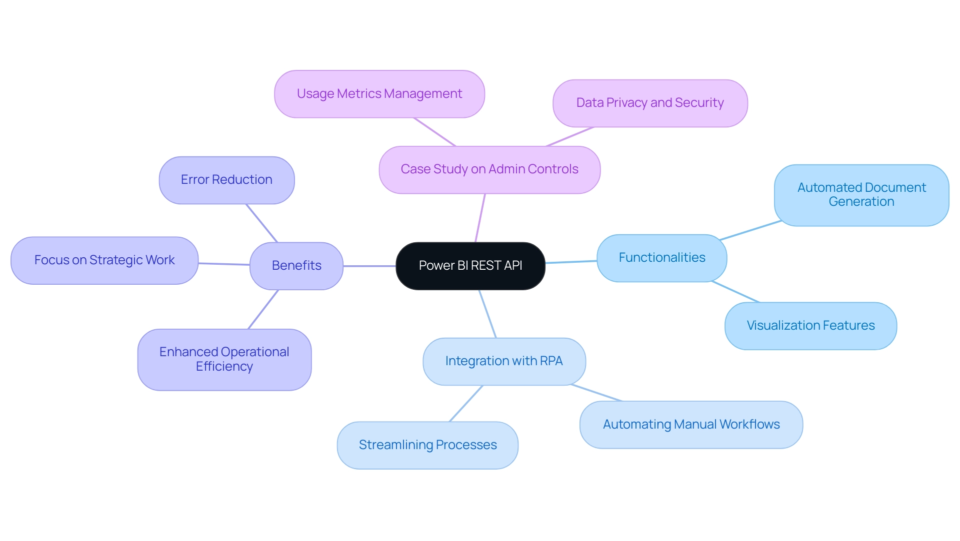
Exploring the Capabilities of Power BI REST API: Operations and Use Cases
The Power BI REST API, as detailed in the powerbi api documentation, is an essential tool that supports vital operations for contemporary enterprises, including:
- Embedding visuals
- Dataset management
- Source refreshing
Its integration is designed to scale alongside application growth, adeptly managing increased information volume and user demands, which is vital for organizations maneuvering through the complexities of management in 2024. This functionality allows for the seamless automation of report updates, ensuring stakeholders have immediate access to the latest insights.
Additionally, the API enables the development of custom applications that visualize information innovatively, catering to specific business needs. For instance, by automating routine reporting tasks, businesses can significantly reduce manual effort, thereby enhancing accuracy and efficiency. As highlighted in a recent case study on a mid-sized company that adopted GUI automation, the implementation led to a remarkable 70% reduction in data entry errors and streamlined operations, showcasing the transformative impact of such technologies on operational efficiency.
This case study also illustrates how the integration of BI services, including the General Management App, can further enhance management capabilities through comprehensive oversight and smart reviews. Moreover, the integration of BI dashboards within enterprise applications exemplifies the API’s capability to boost productivity. A practical application of this can be seen with DLP Policies, where Purview data loss prevention policies empower admins to restrict access to sensitive information within semantic models, enhancing control and data security enforcement.
As organizations continue to utilize the PowerBI API documentation, it becomes a critical resource for automating reporting processes and fostering informed decision-making across the enterprise.
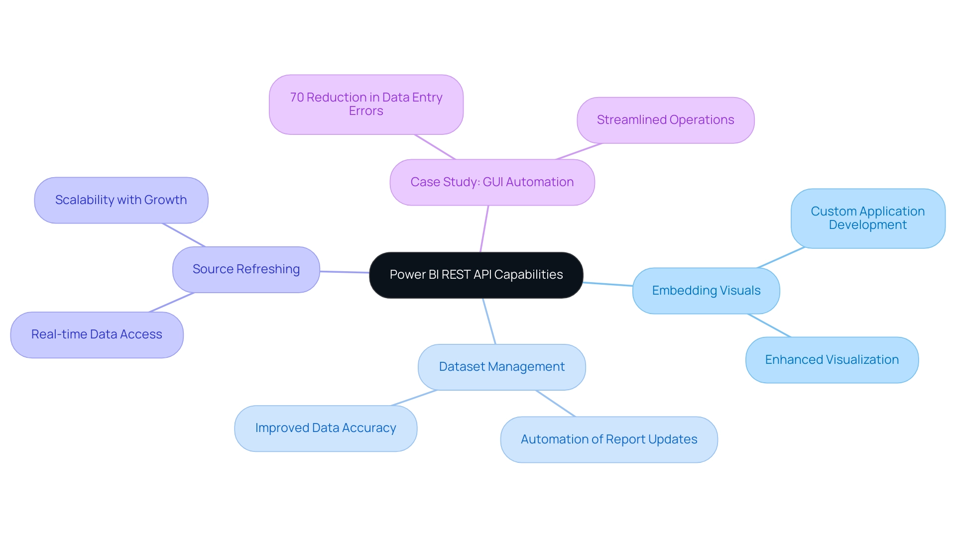
Getting Started with Power BI REST API: Registration and Authorization Steps
To effectively harness the capabilities of the BI REST API, the first step involves registering your application in the Azure portal. This process requires creating a unique application ID and configuring the necessary permissions to access the BI service. Once registration is complete, it is crucial to implement OAuth 2.0 for API authorization, ensuring secure access to the API.
This involves obtaining an access token, which is essential for making API calls. As companies increasingly acknowledge the importance of Business Intelligence, application registrations in Azure for BI are anticipated to expand considerably in 2024, indicating a trend toward utilizing API integrations for enhanced data insights. Tariq Usmani, CEO, shares his experience:
“I built a million-dollar manufacturing business by using QuickBooks and Excel but had trouble scaling the business further.
Down-to-the penny decisions were only made possible with the integrated BI tools within the Dynamics 365 Business Central ERP. This highlights how signing up for the BI REST API can improve decision-making and operational efficiency. Moreover, automating repetitive tasks through Robotic Process Automation (RPA) can enhance BI tools by optimizing information processing, thereby tackling issues such as time-consuming documentation generation and inconsistencies frequently faced with BI dashboards.
The powerbi api documentation provides detailed guidance that is readily available, helping users through each step of the registration process, which lays a solid foundation for effective API utilization.
The next segment of this series will address utilizing Graph Explorer and Postman to test API calls and prepare information for Power BI, vital for maximizing the advantages of API integrations. Additionally, the case study on the Usage Metrics Report highlights how these tools evolve with dashboards, providing ongoing insights into user engagement and report effectiveness. By adopting these practices, businesses not only streamline their processes but also unlock the full potential of their analytics capabilities.
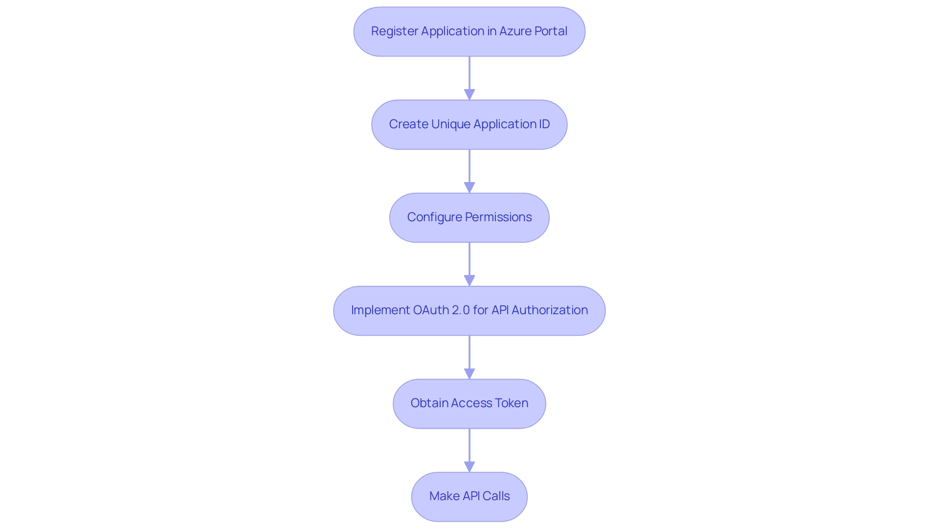
How to Call the Power BI API: Practical Examples and Code Snippets
Interacting with the BI API, as explained in the Power BI API documentation, is a straightforward process that empowers developers to enhance business intelligence operations. However, many organizations encounter challenges such as time-consuming documentation creation, data inconsistencies, and a lack of actionable guidance that can hinder the effectiveness of their BI efforts. Are you dedicating more time to creating documents than utilizing insights from Power BI dashboards?
This common challenge shifts focus from analysis to document creation. Do you notice inconsistencies in information across various reports due to a lack of governance strategy? This widespread issue can lead to confusion and mistrust in the information presented.
By making HTTP requests to designated endpoints with the correct access token, users can effectively manage their information. For instance, to retrieve a list of reports, one can implement the following Python code snippet:
“`
import requests
url = ‘https://api.powerbi.com/v1.0/myorg/reports’
headers = {‘Authorization’: ‘Bearer ‘ + access_token}
response = requests.get(url, headers=headers)
print(response.json())
“`
This code executes a GET request directed at the reports endpoint, yielding a JSON response that details all reports available within the user’s workspace. Such functionality streamlines report management and assists in tackling the challenges of report creation by offering prompt access to essential information. Furthermore, it opens the door for several other activities such as generating datasets or updating information, effectively utilizing insights from BI dashboards.
Notably, the BI API refreshes the semantic model once per day, highlighting its operational efficiency. In the rapidly evolving AI landscape, integrating Robotic Process Automation (RPA) can further automate manual workflows, enhancing operational efficiency while freeing up teams for more strategic tasks. Community support is vital in this journey; as noted by a Super User, “If my solution proved useful, I’d be delighted to receive Kudos.
It’s a small gesture that shows appreciation and encouragement!” This sentiment highlights the importance of collaboration in utilizing tools like Python with the Power BI API documentation, which can significantly streamline data workflows. Additionally, BI offers usage metrics in separate national/regional clouds, ensuring compliance with local regulations while providing the same security and privacy as the global version, tailored to local service delivery needs.
This compliance aspect is crucial for organizations looking to enhance their operational efficiency while adhering to regulatory requirements.
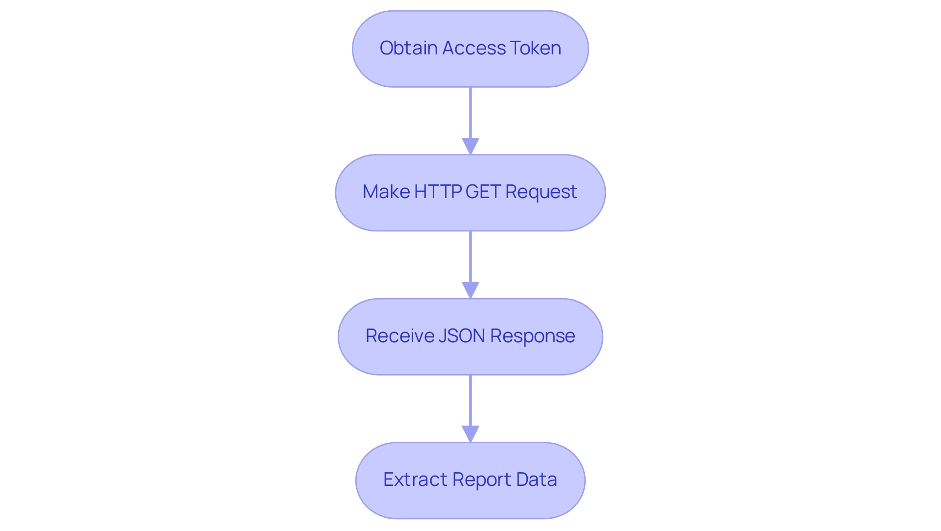
Understanding Power BI REST API Limitations and Best Practices
While the Power BI API documentation offers extensive functionalities, understanding its limitations is crucial for effective utilization. Exceeding API rate limits can result in a 429 Too Many Requests error, severely impacting application performance, particularly for those making frequent requests. Furthermore, certain operations necessitate specific permissions that must be carefully configured within the Azure portal.
To optimize API usage and improve information operations, particularly in the context of Business Intelligence and RPA, several best practices should be adopted:
- Implement robust error handling for API calls to prevent disruptions and ensure consistent information flow.
- Cache information effectively to minimize the number of requests made, thus streamlining report generation and addressing time-consuming creation challenges.
- Regularly review permission settings to ensure compliance and security, reducing the risk of inconsistencies.
- Utilize API key vault security tools, as 27% of organizations not using them leave their APIs vulnerable to cyberattacks, emphasizing the importance of monitoring API performance and employing proper governance.
- Consider the efficiency gains highlighted by the statistic that 67% of teams using Postman team workspaces can produce an API in less than a week, compared to 58% of those who don’t use workspaces, underscoring the effectiveness of collaborative tools.
Furthermore, organizations should be mindful of the upcoming PCI DSS changes regarding API security set to take effect in March 2024, which will necessitate stricter adherence to security protocols. By embracing these best practices outlined in the Power BI API documentation, users can not only optimize their Power BI API usage but also enhance their overall information security strategy. Unlocking the power of Business Intelligence to transform raw data into actionable insights is essential for informed decision-making that drives growth and innovation. Additionally, integrating tailored AI solutions can further improve operational efficiency and decision-making processes. By adopting these strategies, organizations can significantly enhance productivity and reduce operational costs.
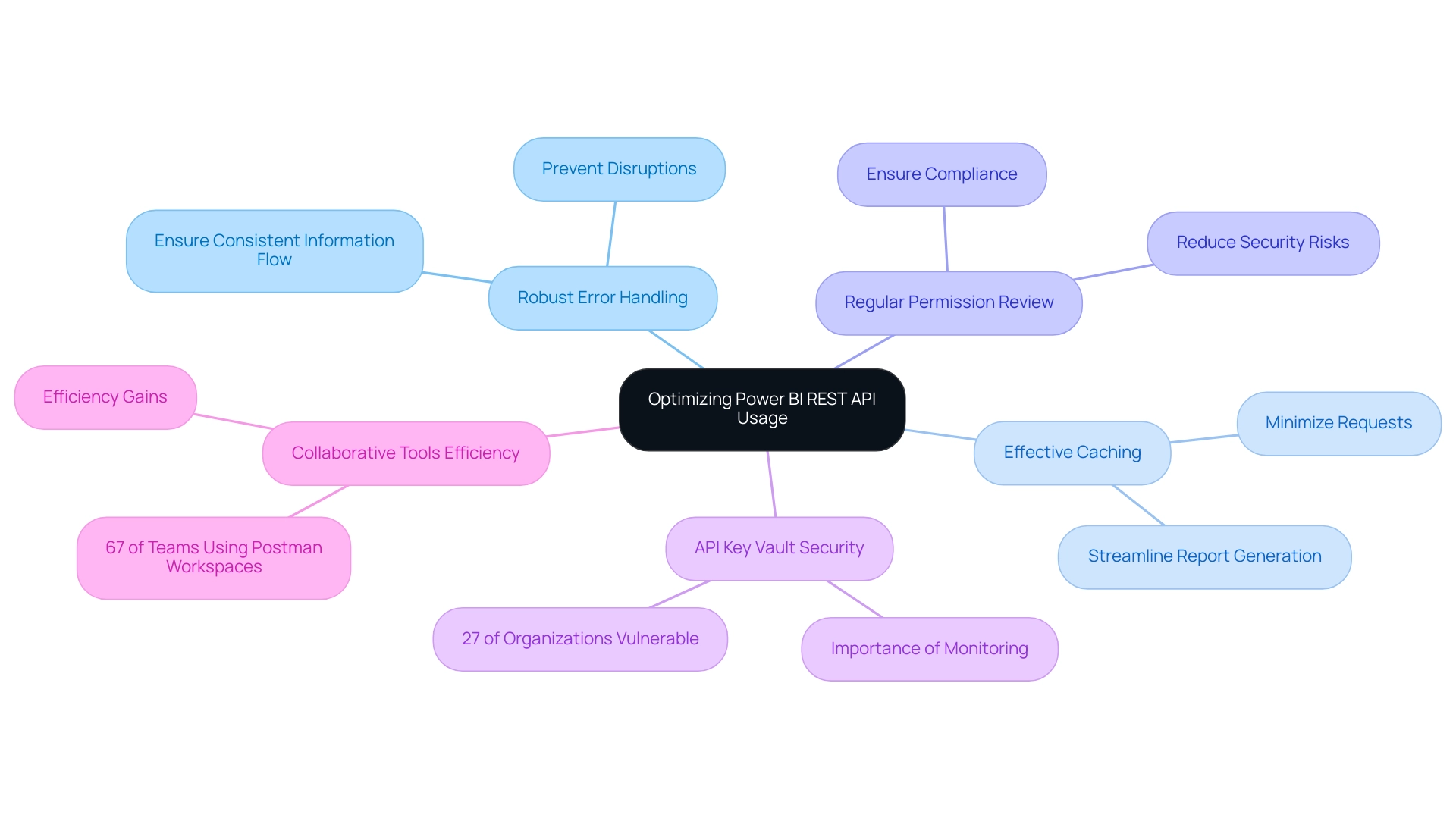
Conclusion
Leveraging the Power BI REST API provides organizations with an unparalleled opportunity to enhance their business intelligence capabilities. Through seamless integration and automation, this powerful tool streamlines workflows, improves reporting accuracy, and fosters informed decision-making. By understanding its functionalities—from report embedding to dataset management—businesses can tap into a wealth of insights that drive operational efficiency.
As highlighted through various case studies, the practical applications of the Power BI REST API not only reduce manual workloads but also minimize errors, allowing teams to focus on strategic initiatives. The importance of registering applications within the Azure portal and implementing robust security measures cannot be overstated, as these steps lay the groundwork for effective API utilization and data protection.
Moreover, adopting best practices when interacting with the API ensures a smooth and efficient experience. Organizations must remain vigilant about API limitations and security protocols, especially with upcoming changes that affect compliance. By embracing these strategies, businesses can unlock the full potential of their data, transforming it into actionable insights that fuel growth and innovation. The Power BI REST API is not just a tool; it is a catalyst for change in the way organizations manage and derive value from their data.
Introduction
In the evolving landscape of data analytics, organizations are presented with powerful tools that can transform their decision-making processes. Descriptive and diagnostic analytics stand out as essential methodologies, each offering unique insights into performance and underlying causes of trends.
As businesses strive to become more data-driven, understanding the differences between these analytics types is crucial for optimizing operations and enhancing strategic initiatives. With the right tools and techniques, such as Power BI and Robotic Process Automation, companies can not only streamline their reporting processes but also gain actionable insights that drive success.
This article delves into the fundamentals of descriptive and diagnostic analytics, their applications across various industries, and the benefits and challenges they present, equipping organizations with the knowledge to harness data effectively and stay ahead in a competitive market.
Understanding Descriptive and Diagnostic Analytics
Descriptive analysis plays an essential role in summarizing past information, allowing businesses to recognize trends and patterns that guide strategic choices. By leveraging tools such as dashboards and visual reports, organizations can gain insights into past performance within specified timeframes. For example, a retail firm could employ descriptive analysis to assess quarterly sales information, revealing peak shopping periods and pinpointing top-selling items that generate income.
This information is invaluable for optimizing inventory and enhancing customer experience. In 2024, as 36% of information leaders indicate their budgeting for analysis staying constant, the dependence on descriptive tools will be essential for companies to utilize historical information effectively.
Conversely, investigative examination delves deeper into the details, aiming to uncover the causes behind particular results. Methods such as information mining and correlation analysis are used to reveal the relationships and causes behind observed trends. For example, if a retail store experiences a sales decline during a particular period, diagnostic analytics could reveal that adverse weather conditions led to reduced foot traffic.
This insight not only clarifies past performance but also equips businesses with the knowledge needed to devise effective strategies moving forward.
However, businesses often face challenges in leveraging insights from their information, including time-consuming report creation and inconsistencies. Tools such as Power BI can tackle these issues by offering efficient reporting capabilities and ensuring consistency. The 3-Day Power BI Sprint enables organizations to swiftly develop professionally crafted reports, while the General Management App provides extensive management and intelligent evaluations to improve oversight and decision-making.
With the expected rise of up to 1.4 million new positions in information science and analysis between 2023 and 2027, fueled by a 30-35% surge in demand for information-related roles, the significance of these analytical methods in decision-making cannot be overstated. As companies progress towards becoming more data-driven, the capability to utilize both descriptive and diagnostic analytics, along with Business Intelligence tools like Power BI and RPA solutions, will be crucial for sustained success. These tools not only improve reporting and consistency but also provide actionable insights through features like the 3-Day Power BI Sprint for rapid report creation and General Management Apps for comprehensive oversight.
Furthermore, not being able to derive significant insights from information can place companies at a competitive disadvantage, highlighting the urgency of embracing these advanced analytical methods and tools. As indicated by NewVantage Partners, 28.3% of Chief Data Officers report to the Chief Operating Officer, emphasizing the organizational significance of data-related roles in driving business strategy.
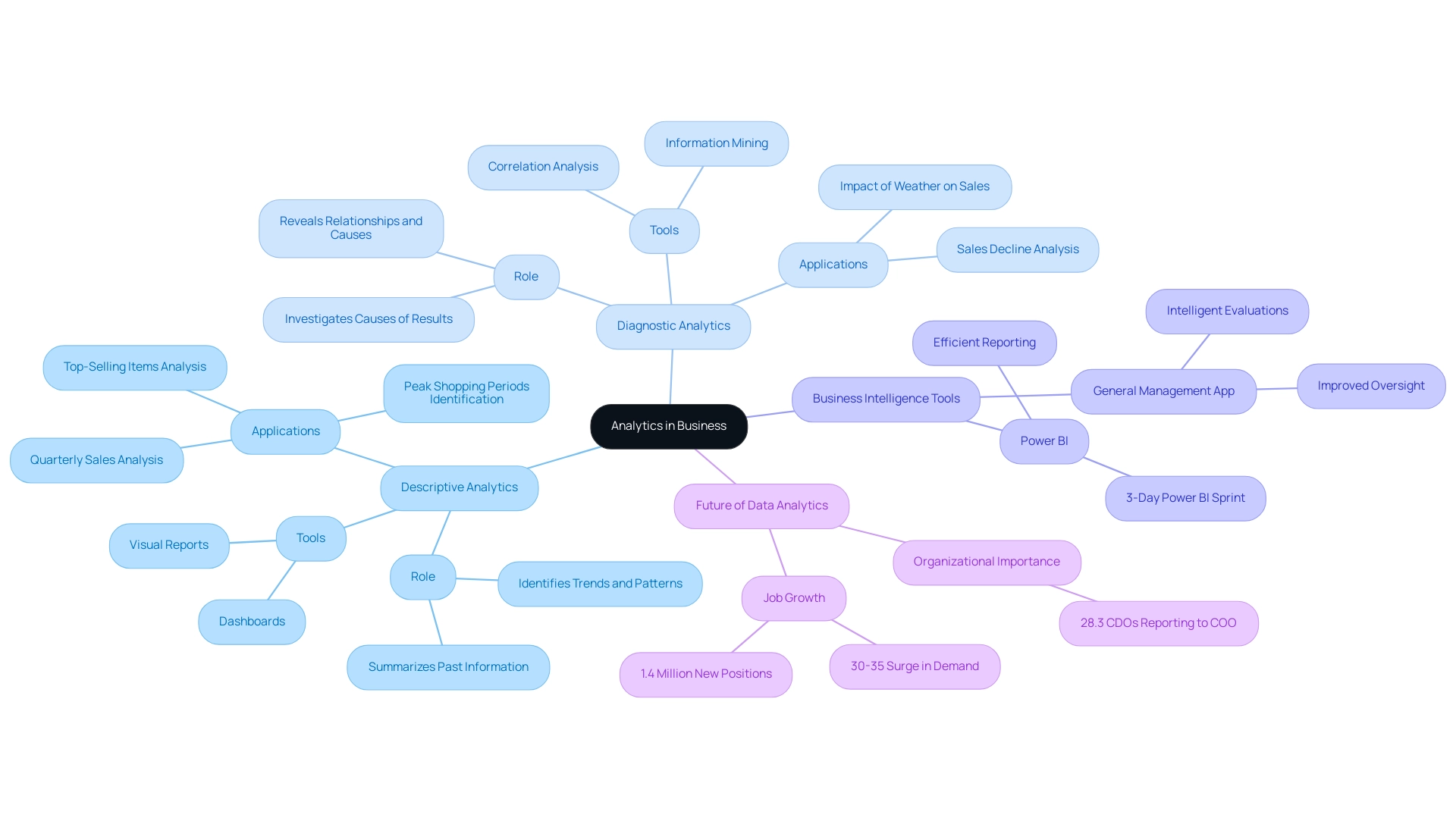
Applications of Descriptive vs. Diagnostic Analytics in Various Industries
Descriptive and diagnostic analytics play a crucial role in industries such as retail and finance, where organizations examine sales reports and financial statements to gain insights into their performance. For instance, banks utilize descriptive analysis to track transaction volumes and gauge customer engagement metrics, ensuring they stay attuned to client needs and market trends. In 2024, the applications of descriptive analysis continue to evolve, with retail companies utilizing extensive information examination to deliver personalized customer experiences, optimize inventory management, and enhance supply chain efficiency.
Conversely, analytical methods are especially influential in the healthcare sector, where they assist providers in examining patient histories and treatment outcomes to identify root causes of patient readmission rates. This approach not only improves patient care but also enhances operational efficiency. Recent case studies highlight the significance of analytical processes; for instance, hospitals are increasingly utilizing GUI automation to simplify information entry, software testing, and legacy system integration, resulting in a 70% decrease in entry mistakes and an 80% enhancement in workflow efficiency.
These measurable outcomes demonstrate the transformative impact of automation in healthcare service delivery.
Moreover, leveraging Robotic Process Automation (RPA) can address the challenges posed by manual, repetitive tasks that slow down operations. RPA solutions, such as automated data entry and process monitoring, enable healthcare entities to boost efficiency, reduce errors, and free up teams for strategic initiatives. This not only improves operational efficiency but also enables entities to navigate the rapidly evolving AI landscape with customized solutions that align with their specific business objectives.
Moreover, diagnostic analysis can be applied in manufacturing to examine production delays, allowing firms to identify inefficiencies that obstruct their processes. Both descriptive and diagnostic analytics are valuable in marketing, as they help organizations evaluate campaign effectiveness and comprehend customer behavior more deeply.
The recent acquisitions in the data analysis landscape, such as IBM’s purchase of Turbonomic for $1.5 billion in 2023, highlight the growing acknowledgment of the importance of advanced data analysis in enhancing operational efficiency and customer insights. As IBM stated, ‘In 2023, IBM acquired Turbonomic, an AI-powered application resource management (ARM) platform, for $1.5 billion.’ Furthermore, Microsoft’s purchase of Nuance Communications for $19.7 billion further demonstrates the trend of utilizing sophisticated data analysis to improve operational efficiency.
As industry leaders adopt these technologies, the potential for enhanced decision-making and strategic planning becomes even more evident.
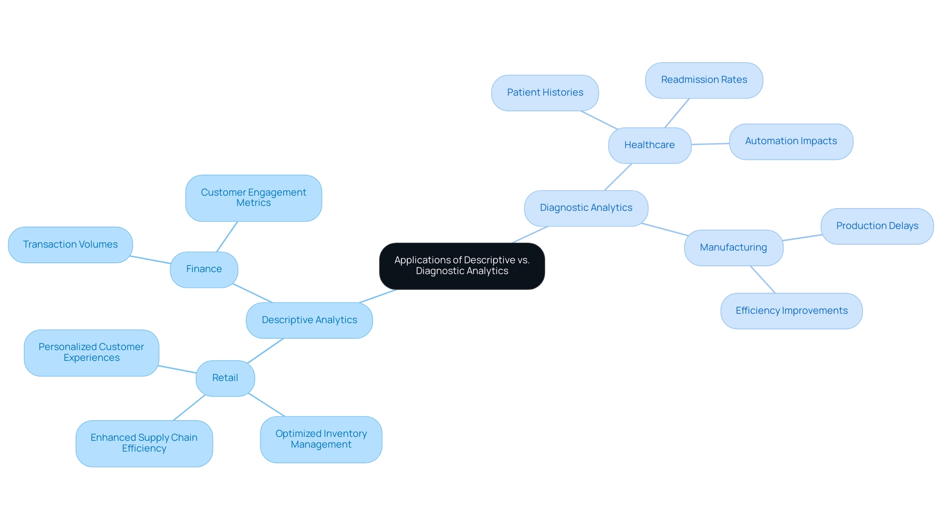
Key Differences Between Descriptive and Diagnostic Analytics
The fundamental distinction between descriptive and diagnostic analytics resides in their specific objectives, particularly in enhancing operational efficiency through innovative technologies like Robotic Process Automation (RPA). Descriptive analytics answers the essential question of ‘What happened?’ by providing a retrospective overview of trends and patterns.
This method usually utilizes fundamental statistical techniques and visualization tools, such as those provided by Power BI, to summarize historical information, offering a clear snapshot of performance metrics. Conversely, evaluative analysis explores further by addressing the question of ‘Why did it occur?’ Through advanced methodologies such as regression analysis and information mining, evaluative studies aim to reveal underlying causes and correlations that clarify observed outcomes.
For example, in healthcare, assessment tools can link patient symptoms to detect infectious agents, effectively clarifying sudden increases in emergency room visits, which facilitates improved decision-making. Skills.ai acts as a proficient analysis partner, providing valuable tools for scientists to utilize these evaluation techniques effectively. The integration of RPA can further streamline these processes by automating repetitive manual tasks, ensuring that workflows are efficient and freeing up resources for more strategic analysis.
While descriptive and diagnostic analytics lay the groundwork for understanding business performance, the diagnostic examination builds upon this foundation, delivering profound insights that guide corrective actions and strategic adjustments. As Codal states, ‘Whether a custom profitability forecast solution or a Google Analytics dashboard to better understand customer behavior, we assist businesses in achieving a comprehensive analytics solution.’ Additionally, leveraging AI through Small Language Models enhances information quality by enabling more precise analysis, while GenAI Workshops provide hands-on training that equips teams with the skills needed to effectively implement AI solutions.
This layered approach not only enhances operational efficiency but also empowers entities to make informed decisions that drive success. Statistics indicate that Codal has effectively provided a microservices back-end to store and examine medical device information, showcasing the significant influence of analysis in healthcare and various sectors.
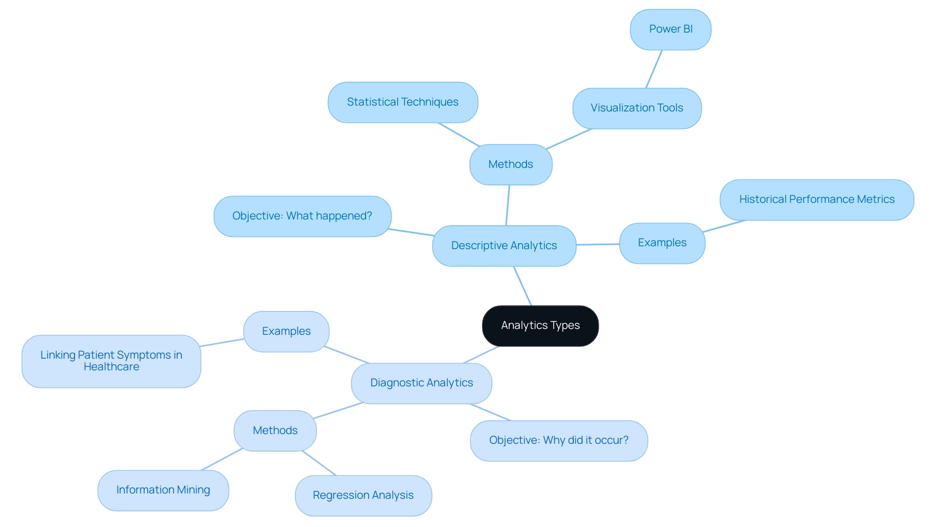
Benefits and Challenges of Descriptive and Diagnostic Analytics
Descriptive analysis acts as a powerful instrument for companies, providing swift insights into performance metrics and enabling the creation of reports and dashboards effortlessly. Its user-friendly nature allows teams to quickly track key performance indicators (KPIs) and generate actionable data. For example, in the case study named ‘Progress to Goals,’ descriptive analysis is used to track progress toward KPIs, such as monthly unique page views, allowing entities to evaluate if they are on course to achieve their objectives and implement necessary changes to enhance performance.
However, it is important to recognize that while descriptive analysis can highlight trends, it often falls short in explaining the underlying reasons for these patterns. In contrast, analytical assessment explores further, providing essential insights into causation and allowing entities to proactively tackle operational challenges. This depth of analysis, however, comes with its own set of complexities; implementing diagnostic analytics can be resource-intensive and requires specialized skills and tools.
A major obstacle entities encounter is ensuring information quality and integration, as incorrect or poorly combined details can lead to misleading conclusions. Here, leveraging Robotic Process Automation (RPA) can automate manual workflows, enhancing operational efficiency and freeing up valuable resources for strategic initiatives. For example, RPA can reduce errors by automating data entry tasks, which minimizes human intervention and the potential for mistakes.
Additionally, investing in training is crucial, with programs like the Python for Data Science Bootcamp, which requires 30 hours and costs $1,495, serving as an example of the commitment needed to empower teams. Moreover, the integration of tailored AI solutions alongside RPA can address specific business challenges, ensuring that entities are equipped with the right technologies. The integration of AI-powered OEE dashboards also plays a vital role in transforming manufacturing processes, reinforcing the necessity of investment in technology alongside training.
To effectively leverage the strengths of both descriptive and diagnostic data analysis, organizations must prioritize these investments, empowering their teams to harness the full potential of these types. As Catherine Cote aptly states, ‘Descriptive analysis is especially useful for communicating change over time and uses trends as a springboard for further examination to drive decision-making.’ This underscores the significance of combining both analytical methods with RPA and BI to improve overall business performance.
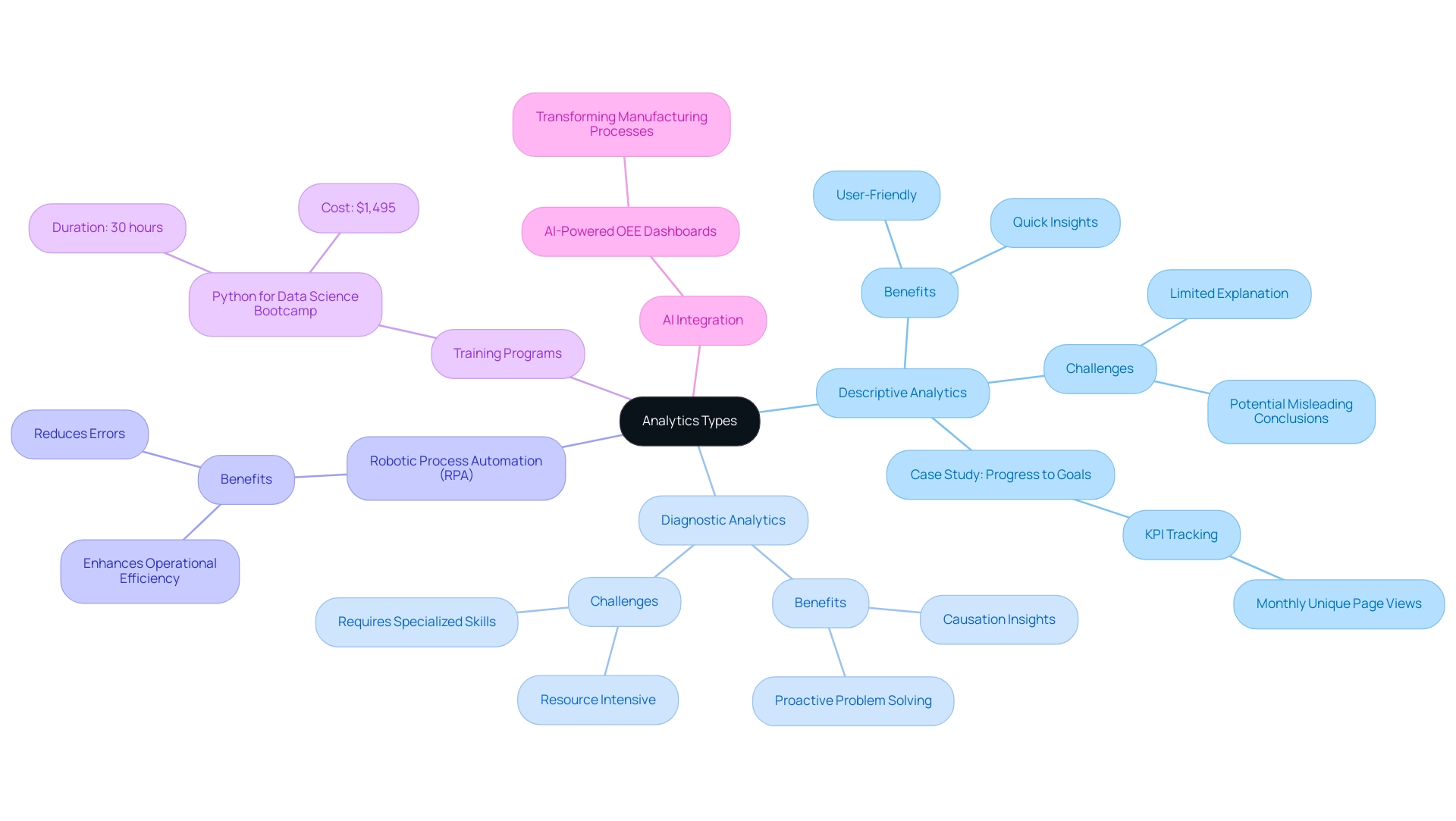
Tools and Techniques for Effective Descriptive and Diagnostic Analytics
Descriptive analytics tools, including Tableau, Microsoft Power BI, and Google Data Studio, are highly regarded for their intuitive interfaces that enhance visualization and reporting. These platforms empower entities to design comprehensive dashboards that effectively summarize key performance indicators, enabling quick decision-making and insight generation. However, many organizations face challenges in leveraging these insights due to:
- Time-consuming report creation
- Data inconsistencies
- Lack of actionable guidance
These challenges can leave them at a competitive disadvantage.
For instance, in healthcare, data analysis tools enable professionals to develop personalized treatment plans based on a patient’s medical history and genetic profile, significantly improving outcomes and optimizing resource allocation. In contrast, diagnostic analytics often necessitates more sophisticated software solutions, such as SAS, IBM SPSS, and R, which feature advanced statistical analysis capabilities. Techniques such as:
- Cohort analysis
- Root cause analysis
- Regression modeling
are crucial in this field, enabling organizations to explore their information more thoroughly and derive valuable insights.
Creatum’s 3-Day Power BI Sprint addresses the need for streamlined report creation by delivering a fully functional, professionally designed report on a topic of your choice in just three days. This service not only saves time but also converts raw information into actionable insights, enabling you to focus on utilizing insights rather than grappling with report-building challenges. According to recent statistics, leading descriptive data tools include:
- Microsoft Power BI
- Tableau
- Google Data Studio
- Qlik Sense
- SAS Visual Analytics
This underscores their effectiveness in the market.
As Aashi Verma observes, ‘The convergence of technology and data examination not only enhances efficiency but also promotes innovation across various sectors.’ Organizations must strategically assess their unique requirements and capabilities when selecting tools to fully leverage the benefits of both descriptive and diagnostic analytics, thereby enhancing their operational efficiency and decision-making processes. Moreover, integrating RPA solutions like EMMA RPA and Power Automate can further streamline operations, addressing task repetition fatigue and outdated systems, ultimately driving business growth.
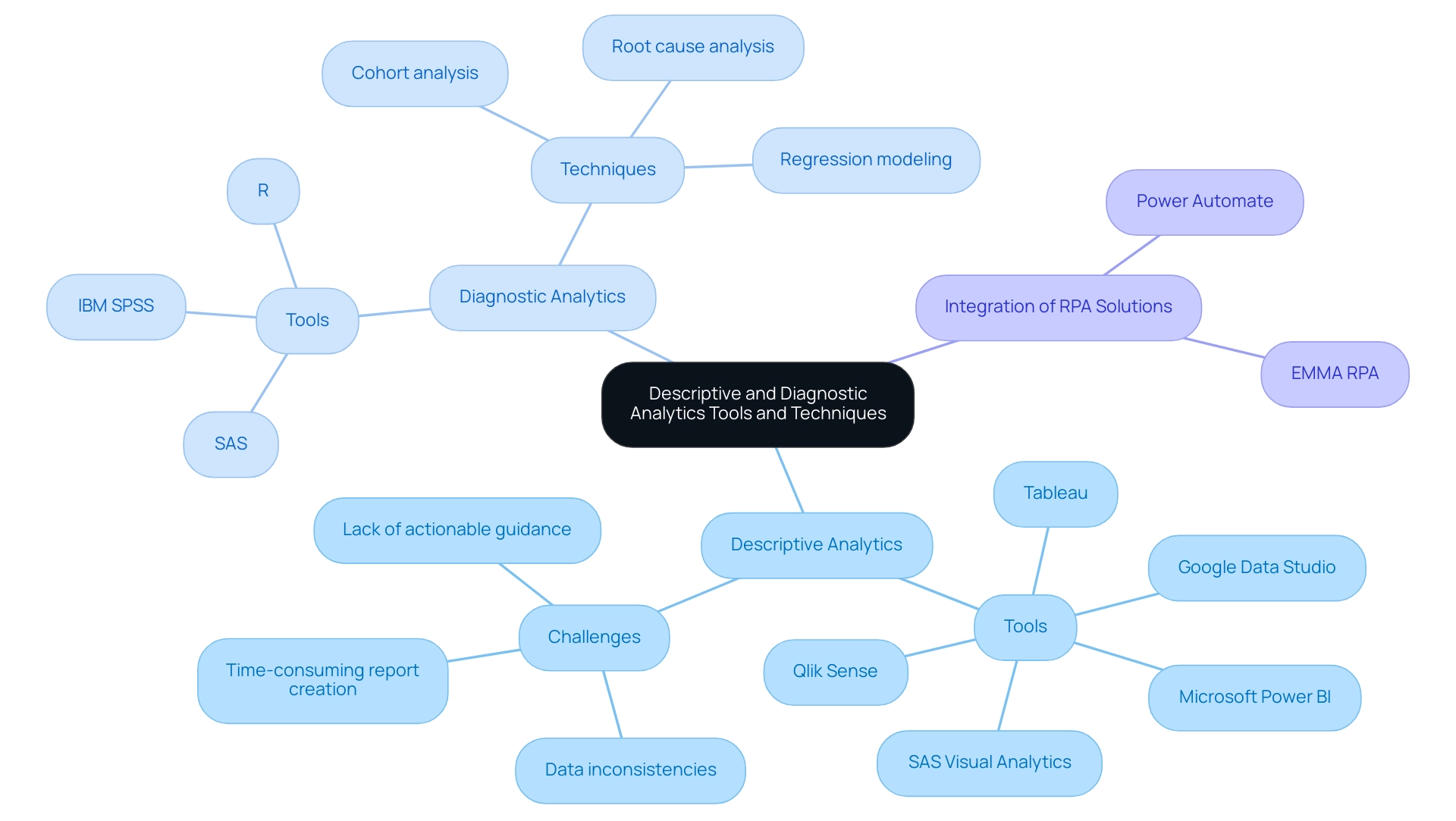
Conclusion
Harnessing the power of descriptive and diagnostic analytics is essential for organizations aiming to optimize their operations and enhance strategic initiatives. Descriptive analytics provides a comprehensive overview of historical performance, enabling businesses to identify trends and make informed decisions. Tools like Power BI and Tableau facilitate this process, allowing teams to create intuitive dashboards that summarize key performance indicators effortlessly.
On the other hand, diagnostic analytics digs deeper, uncovering the reasons behind specific outcomes. This level of analysis enables organizations to address operational challenges proactively, making it crucial for sectors like healthcare and manufacturing. By utilizing advanced methodologies and techniques, businesses can gain insights that foster continuous improvement and innovation.
However, the journey to effective analytics is not without challenges. Organizations must prioritize data quality and integration while investing in training and advanced tools to fully leverage these analytics types. The integration of Robotic Process Automation alongside analytics can streamline workflows, enhance data accuracy, and free up resources for strategic initiatives.
As the demand for data-driven decision-making continues to rise, adopting both descriptive and diagnostic analytics will be pivotal for sustained success. By understanding their distinct roles and effectively implementing the right tools and techniques, organizations can transform their data into actionable insights that drive growth and maintain a competitive advantage in an increasingly complex market.
Introduction
In the rapidly evolving world of data analytics, the ability to create impactful Power BI reports is a game changer for organizations striving for operational efficiency and informed decision-making. By following a structured approach that encompasses everything from initial setup to effective data visualization, stakeholders can unlock the full potential of their data.
This article outlines essential steps for building, refining, and sharing Power BI reports, ensuring they not only convey critical insights but also resonate with users. As organizations navigate the complexities of data management, understanding user needs and applying design principles can significantly enhance the effectiveness of reporting, driving strategic outcomes and fostering a culture of continuous improvement.
Getting Started: Key Steps in Building Power BI Reports
To embark on building impactful Power BI reports while navigating common challenges, adhere to these essential steps:
-
Install Power BI Desktop: Begin by downloading and installing Power BI Desktop from the official Microsoft website. This tool enables you to generate documents locally and is essential for leveraging insights effectively, fulfilling the requirement for a strong base in your reporting journey.
-
Acquaint Yourself with the Interface: Take the time to explore the user interface, including the ribbon, view for insights, and layout. Understanding the location of tools and features will streamline your reporting process and enhance your productivity, combating the inefficiencies often faced in report creation.
-
Gather Your Information Sources: Identify the sources you will utilize, which may include Excel spreadsheets, databases, or cloud services. Ensure you have secure access to this data and comprehend its structure, as the quality of your analysis hinges on reliable data. This step helps mitigate inconsistencies that can lead to confusion and mistrust in your documents.
-
Define Your Objectives: Before diving into creation, articulate what you aim to achieve. Identify key metrics and insights that will resonate with your audience and drive decision-making. This clarity prevents the situation where documents are filled with numbers and graphs yet lacking actionable guidance.
-
Plan Your Report Layout: Create a rough sketch of your report layout to visualize the presentation of information. Consider incorporating a mix of charts, tables, and visuals that will effectively convey your message and engage your audience, enhancing overall information visibility.
Integrating RPA solutions such as EMMA RPA and Automate can further simplify your reporting process, improving operational efficiency by automating repetitive tasks and merging information sources seamlessly. By diligently adhering to these fundamental steps, you will prepare for building Power BI reports that not only enhance visibility but also promote strategic insights within your organization. Remember, when a mere 10% of an organization’s workforce utilizes BI tools regularly, the company risks missing out on critical insights that could propel growth.
According to MicroStrategy, “88% of organizations using cloud-based BI reported increased flexibility in accessing and analyzing information from anywhere, anytime,” underscoring the importance of adopting such tools. Therefore, investing time in mastering these initial processes is essential for unlocking the full potential of business intelligence and driving operational efficiency.
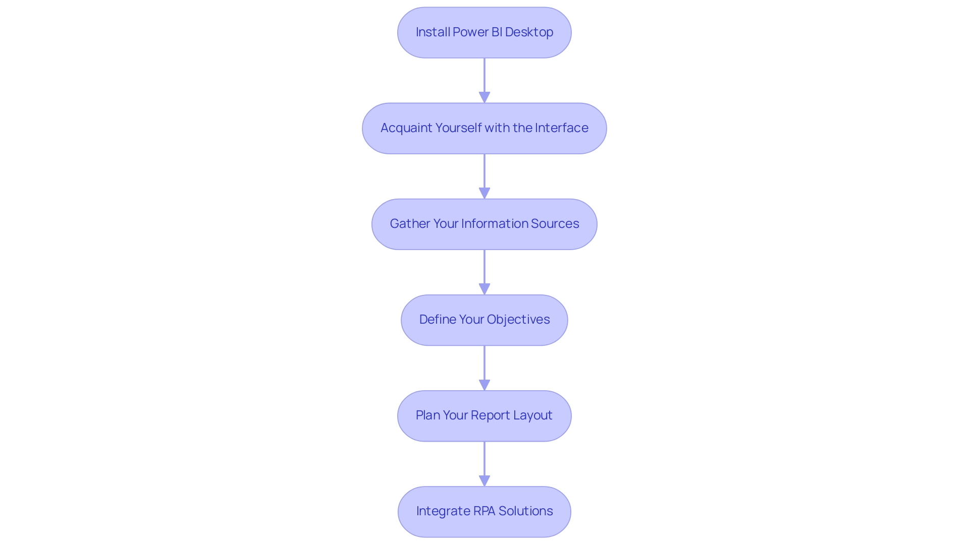
Data Preparation and Visualization: Crafting Effective Reports
To create engaging BI reports that genuinely drive insights, it is crucial to concentrate on careful information preparation, visualization methods, and building Power BI reports. Here are key steps to consider:
- Clean Your Information: Leverage Power Query to perform comprehensive cleaning and transformation.
- Eliminate duplicates, fill in missing values, and ensure that types are correctly assigned.
- This foundational step is crucial, as effective information cleaning enhances overall quality, leading to more reliable analytics and improved decision-making.
- By incorporating insights from our GenAI Workshops, you can further enhance your information quality, ensuring that your analytics are based on robust, high-quality insights.
-
As highlighted in the case study ‘Data Cleaning Best Practices,’ approaching information cleaning in a standardized, optimized way ensures efficiency and quality results.
-
Create Relationships: When using multiple information tables, establish meaningful relationships among them.
-
This can be done in the ‘Model’ view of Power BI, allowing for comprehensive analysis across datasets and facilitating deeper insights.
-
Choose the Right Visuals: Selecting appropriate visualizations is vital for presenting your information effectively.
- For instance, line charts are ideal for illustrating trends over time, while bar charts excel in comparing different categories.
-
The right visuals not only clarify your message but also engage your audience.
-
Utilize Formatting Options: Enhance the readability and impact of your visuals by employing formatting options such as colors, labels, and tooltips.
-
These elements provide context and clarity, ensuring that your audience can easily interpret the data presented.
-
Iterate and Refine: Continuously test various visualizations and layouts to determine what resonates best with your audience.
-
Collect feedback to enhance your documents, making necessary adjustments to improve clarity and engagement.
-
Leverage BI Services: Consider utilizing our 3-Day BI Sprint for rapid creation, ensuring professionally designed outputs.
- Furthermore, the General Management App can offer extensive oversight and intelligent evaluations, improving your reporting abilities.
By emphasizing information preparation and visualization, building Power BI reports can help generate BI reports that not only convey insights effectively but also enable stakeholders to make knowledgeable choices.
Our RPA solutions can also help automate repetitive reporting tasks, thus enhancing operational efficiency.
As mentioned by Maria S., a Microsoft Certified Power BI Data Analyst, ‘effective preparation is foundational to leveraging the full potential of Power BI, ensuring your analytics lead to actionable outcomes.’
This is particularly relevant in light of recent developments, such as Savant Labs’ $11M seed funding aimed at advancing analytics automation, underscoring the industry’s growing emphasis on data-driven decision-making.
Furthermore, integrating Small Language Models can enhance your data analysis processes, ensuring tailored AI solutions that meet your specific needs.
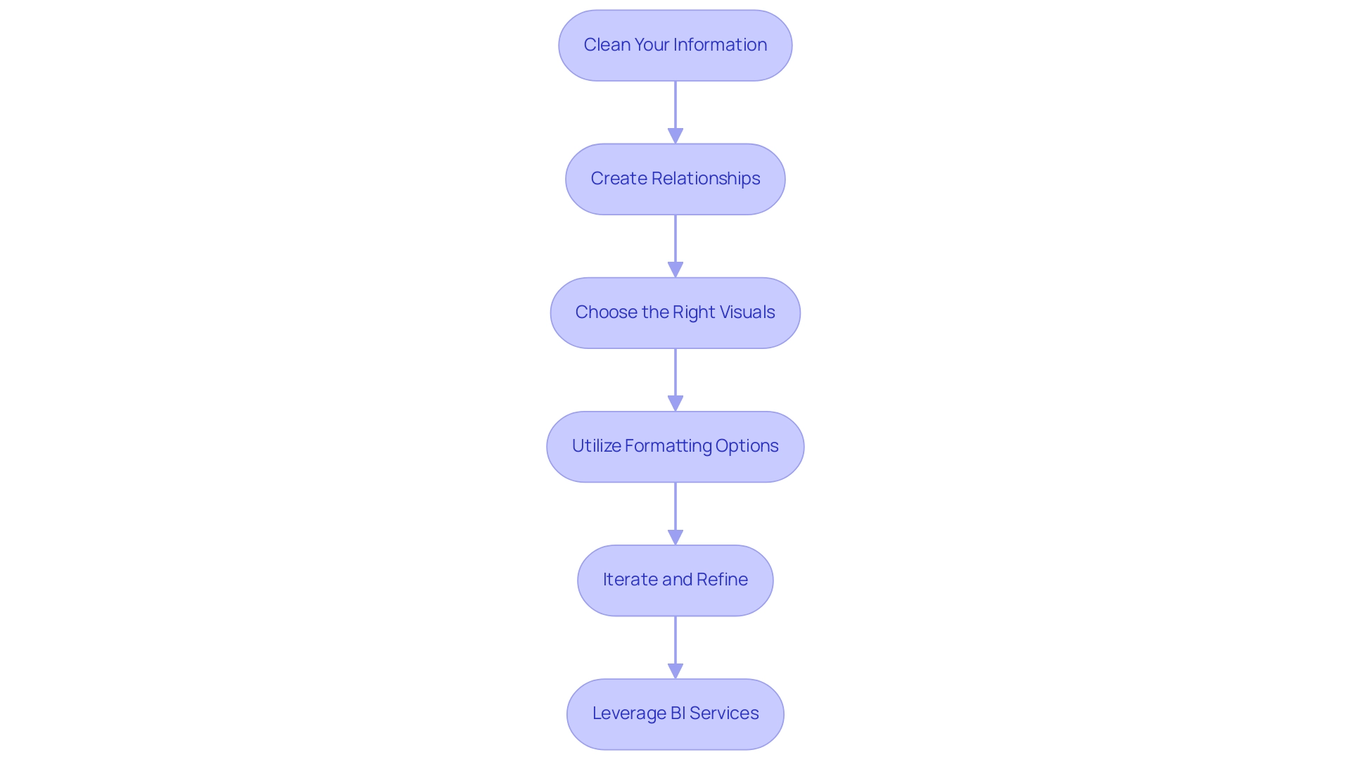
Understanding User Needs: Defining Report Objectives
To effectively understand user needs and express document objectives, consider the following steps:
- Identify Your Audience: Start by defining who will use the document. Evaluate their roles and expertise to comprehend the kind of information they need, which is essential for addressing inconsistencies frequently found in various reports. A lack of governance strategy can lead to confusion and mistrust in the data presented, making this step vital.
- Engage Stakeholders: Conduct interviews or surveys to gather insights on expectations and requirements. This engagement not only encourages collaboration but also makes individuals feel appreciated, which is essential for enhancing satisfaction. Engaging participants can mitigate the confusion that arises from poorly governed data. In fact, UserGuiding has over 1,000 teams scaling successfully with its platform, underscoring the importance of understanding user needs.
- Define Clear Objectives: Based on the insights gathered, establish specific goals for the document. Determine what critical questions it should answer and the decisions it should support. Ceren Kurban emphasizes,
To kick off a needs analysis, you should first establish clear objectives using the SMART framework.
This approach ensures that objectives are specific, measurable, achievable, relevant, and time-bound, helping to avoid reports that are filled with numbers yet lack actionable guidance. Offering clear, actionable guidance can enable individuals to make informed decisions based on the data. - Prioritize Key Metrics: Identify the key performance indicators (KPIs) that align with your defined objectives. Concentrate on metrics that produce actionable insights for individuals, enabling them to make informed decisions and leverage the full potential of Business Intelligence.
- Iterate on Goals: As you create the document, consistently revisit and enhance your objectives in response to ongoing audience feedback and insights. This iterative process ensures that the document remains relevant and impactful. Conducting trend analysis to observe changing customer requirements is essential for modifying product features accordingly and improving operational efficiency through RPA solutions.
By thoroughly comprehending customer needs and setting clear goals, you can generate BI documents that facilitate building Power BI reports to communicate vital information and promote significant action. This approach is reflected in successful case studies, such as the one titled ‘Boosting User Satisfaction,’ where engaging users in the feedback process has proven to enhance satisfaction and reduce costs associated with feature updates.
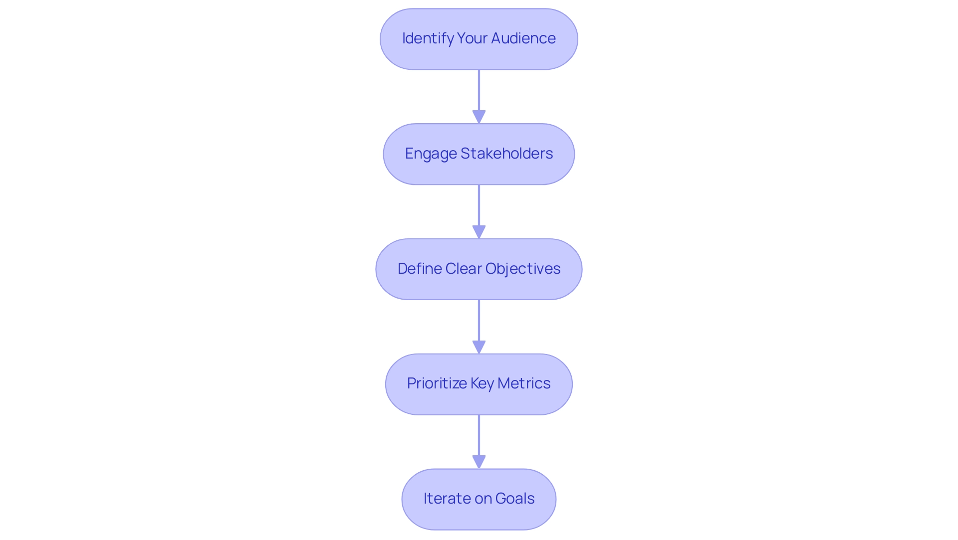
Design Principles for Effective Power BI Reports
To effectively apply design principles in Power BI visuals while overcoming common challenges, such as time-consuming creation, data inconsistencies due to a lack of governance strategy, and a lack of actionable guidance, the following guidelines should be considered:
- Maintain Consistency: A cohesive look and feel can be achieved by using a consistent color scheme, font style, and layout throughout the document. This consistency helps reinforce brand identity and aids in navigation, ultimately reducing the time spent on report construction. Moreover, establishing governance around design choices can prevent inconsistencies in future reports.
- Prioritize Clarity: Visuals must be easy to read and interpret. The picture superiority effect suggests that visual information is more likely to be remembered than text, making it crucial to limit the number of visuals on each page and use white space strategically to reduce clutter. By doing this, you promote gradual sharing of information, enabling individuals to take in details step by step and construct a comprehensive understanding without overwhelming them. This clarity can help mitigate confusion and mistrust in information, particularly when governance strategies are lacking.
- Use Hierarchy: Establish a clear visual hierarchy by varying font sizes and colors. This method directs individuals’ focus toward the most crucial information, ensuring that important details stand out and offers actionable insights to stakeholders. This approach can help tackle the problem of documents being filled with numbers and graphs without clear direction.
- Incorporate Interactivity: Power BI’s interactive features, such as slicers and drill-throughs, enable individuals to explore information dynamically, promoting a deeper understanding of insights. This corresponds with the changing demand for data visualization specialists and meets the need for clear, actionable advice in documents, particularly when individuals may feel overwhelmed by the information provided.
- Test with Real Participants: Conduct usability testing with real individuals before finalizing the document to gather valuable feedback. This iterative process allows for adjustments that enhance the experience and ensure the design meets audience needs. Resources such as Alberto Cairo’s online MOOC on visualizations can serve as supplementary material for understanding best practices.
By adhering to these design principles, you can focus on building Power BI reports that not only address common challenges but are also visually appealing and effective in conveying insights. This facilitates decision-making and prepares users to navigate a data-driven landscape. As noted by John Tukey, who advocated for a coherent approach to data analysis, starting with a clear visual design is essential for effective exploratory data analysis, emphasizing that clarity in presentation fosters better understanding and engagement.
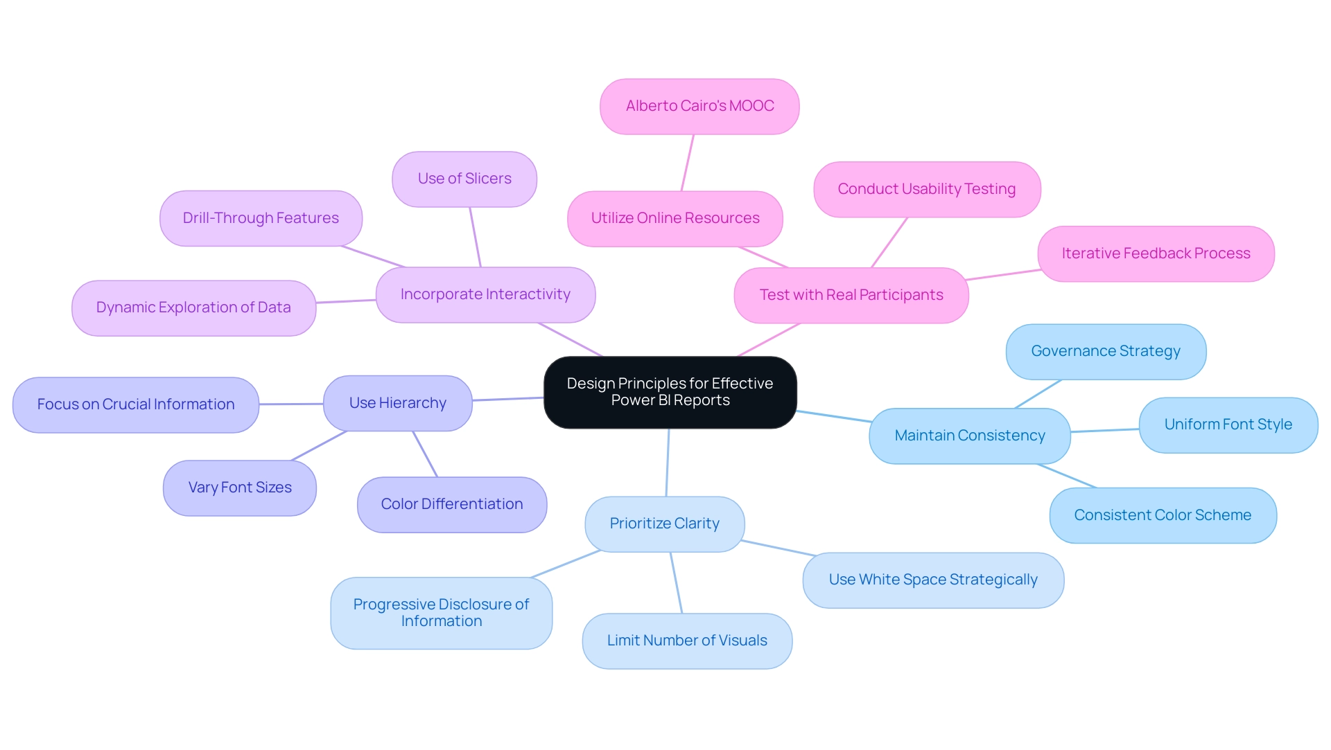
Publishing and Sharing Your Power BI Reports
To effectively publish and share your BI analyses and maximize their impact on business operations, adhere to these essential steps:
- Save Your Document: Ensure that your document is saved in the desired format (.pbix) and that all necessary modifications are finalized before proceeding.
- Upload to BI Service: Click the ‘Publish’ button in BI Desktop to transmit your document to the BI Service, enabling online access for stakeholders and facilitating informed decision-making.
- Set Up Permissions: In the Power BI Service, meticulously configure access rights to dictate who can view or modify the document. This critical step safeguards sensitive data and maintains control over access, addressing common challenges in leveraging insights from your dashboards.
- Share Documents: Utilize the ‘Share’ feature to distribute documents to specific users or create a consolidated dashboard that aggregates multiple documents for broader visibility. This method enables teams to utilize insights efficiently, as highlighted in our 3-Day Business Intelligence Sprint, where we guarantee to produce a fully functional, professionally designed document on a topic of your choice, offering a template for future projects.
- Monitor Usage: After sharing, actively monitor utilization and solicit feedback to gain insights into how stakeholders engage with the document. This information is crucial for improving future versions and boosting operational effectiveness.
By adhering to these steps, you enable your organization to utilize the full capabilities of building Power BI reports, promoting informed decision-making and ensuring that important insights are easily accessible. Notably, as part of this process, users should be aware that usage metrics are not available when utilizing Private Links, which can significantly impact data visibility. It’s crucial to understand that usage metrics update daily, providing fresh insights into engagement and productivity.
Additionally, for a comprehensive view of metrics across all dashboards or reports, remove default filters that limit visibility to only the dashboard or report initially used. A practical example of this can be seen in the case study titled ‘Creating a Fresh Usage Metrics Report,’ which illustrates how the insights derived from our 3-Day Business Intelligence Sprint can help achieve similar outcomes. As Shubhangi Pandey aptly puts it, ‘Effective data management enhances productivity and engagement, making it vital to leverage tools like Power BI for insightful reporting.’
This iterative approach not only enhances report accuracy but also fosters a culture of continuous improvement within your organization, emphasizing the importance of building Power BI reports in driving growth and innovation.
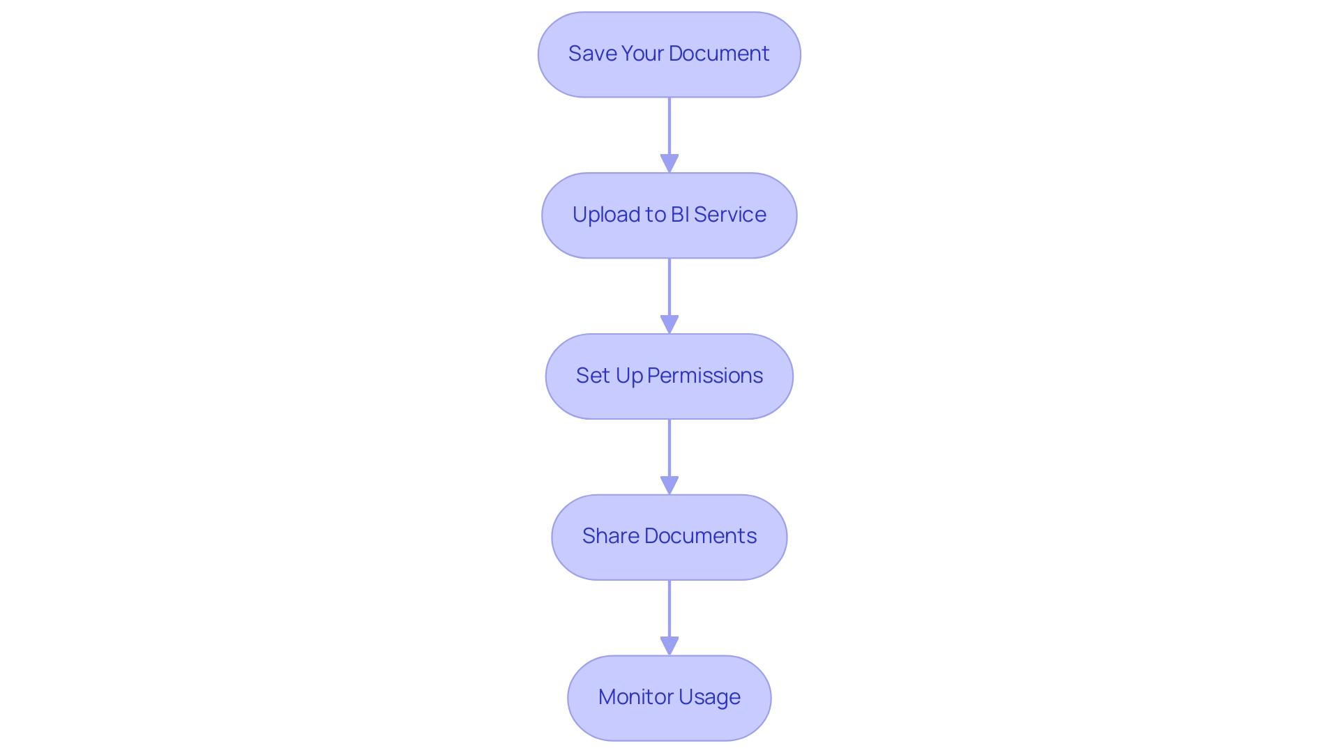
Conclusion
In the realm of data analytics, mastering the creation of impactful Power BI reports is essential for organizations aiming to enhance operational efficiency and informed decision-making. By following a structured approach that begins with the installation of Power BI Desktop and familiarization with its interface, stakeholders can lay a solid foundation for their reporting journey. Identifying data sources, defining report goals, and planning layouts are crucial steps that ensure reports are both insightful and engaging.
The importance of meticulous data preparation and effective visualization cannot be overstated. Cleaning data, creating meaningful relationships, and selecting the right visuals are key to transforming raw data into actionable insights. By prioritizing clarity and interactivity in report design, organizations can foster a deeper understanding among users, leading to more informed decisions. Engaging with users to understand their needs further amplifies the relevance and impact of reports, ensuring they serve their intended purpose.
Publishing and sharing the reports effectively completes the cycle of report creation. By ensuring proper permissions, utilizing the sharing features, and monitoring usage, organizations can maximize the value derived from their Power BI reports. This iterative process not only enhances report accuracy but also cultivates a culture of continuous improvement, positioning organizations to thrive in a data-driven landscape.
Ultimately, the journey of building and refining Power BI reports is not just about the tools or techniques used; it is about empowering stakeholders to harness the full potential of their data. By embracing these practices, organizations can unlock critical insights that drive strategic outcomes and foster a culture of innovation and growth.
Introduction
In the dynamic landscape of data visualization, Power BI themes emerge as vital tools that not only enhance the aesthetic appeal of reports but also ensure consistency and clarity in data presentation. By employing predefined color palettes and formatting options, organizations can create a unified visual identity that resonates with stakeholders and fosters trust. As the demand for actionable insights grows, the ability to customize and apply these themes becomes essential for streamlining report creation and addressing common challenges such as data inconsistencies.
This article delves into the myriad benefits of utilizing Power BI themes, offers practical steps for customization, and highlights best practices that empower teams to transform raw data into compelling narratives. By understanding the strategic application of themes, organizations can elevate their reporting processes, drive engagement, and ultimately make informed decisions that propel growth and innovation.
Understanding Power BI Themes: An Overview
The power BI themes gallery is a crucial resource that offers predefined color schemes and formatting choices, allowing users to establish a cohesive visual identity throughout all documents. By standardizing elements like colors and fonts, these designs greatly improve both readability and the overall professionalism of documents. A well-selected subject not only elevates aesthetics but also effectively directs the viewer’s focus to critical data points, thereby improving insight delivery.
As Jason Himmelstein aptly puts it, ‘We encourage you to leave them on though!’ This highlights the significance of preserving uniform concepts for maximum document effectiveness. The power BI themes gallery offers a variety of available themes—including light, dark, and customizable options—that empower organizations to select the designs that best resonate with their brand and reporting goals.
For example, the case study on ‘Visualization Templates’ demonstrates how adaptable designs simplify the development of documents customized for business situations, ensuring uniformity across visualizations. As organizations progressively utilize real-time information and AI capabilities to identify patterns and correlations, the role of consistent design through the Power BI themes gallery becomes increasingly essential in enhancing user experience and document effectiveness. Moreover, incorporating RPA solutions, like EMMA RPA and Automate, can ease the difficulties of labor-intensive documentation generation and information discrepancies, enabling teams to concentrate on actionable insights that foster growth and innovation.
By unlocking the power of Business Intelligence and RPA, organizations can transform raw information into meaningful insights, enhancing operational efficiency and fostering informed decision-making. To explore how these solutions can benefit your organization, consider booking a free consultation.
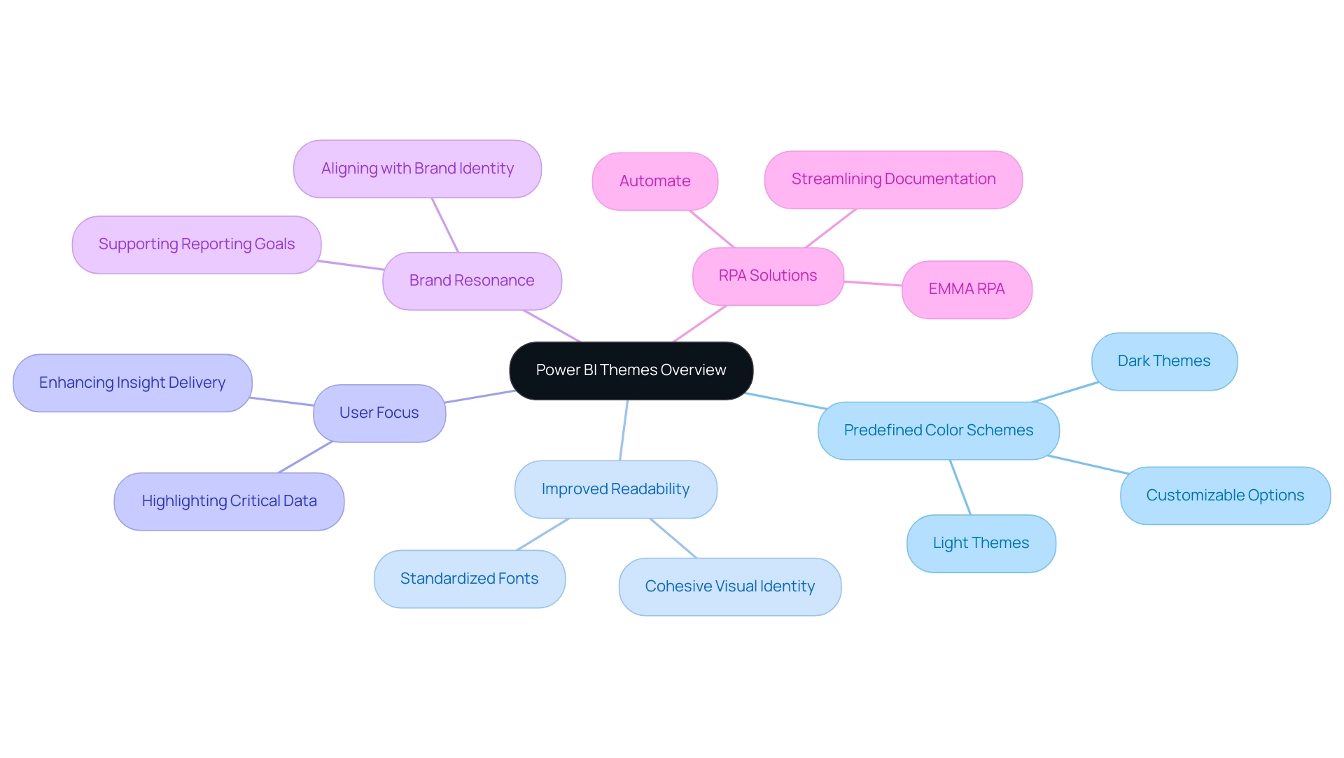
Customizing and Applying Themes in Power BI
Customizing and applying themes in Business Intelligence is a straightforward process that can significantly enhance the visual appeal and coherence of your documents, addressing common challenges such as time-consuming creation and data inconsistencies. Additionally, incorporating Robotic Process Automation (RPA) can further streamline this customization process, allowing for quicker adjustments and greater efficiency in document generation. With over 1,803,674 views on related content, it’s clear that many are interested in this topic.
Follow these steps to get started:
-
To access the Power BI themes gallery, launch Power BI Desktop and navigate to the ‘View’ tab. Click on ‘Themes’ to open the Power BI themes gallery, allowing you to explore your options.
-
Choose a Predefined Design: Explore the available styles to discover one that enhances your document’s aesthetic. Simply click on your selected design to apply it instantly.
-
Create a Custom Theme: For a more personalized approach, click on ‘Customize Current Theme.’ This feature enables you to adjust colors, fonts, and other visual elements to align with your brand or goals, promoting clearer, actionable insights.
-
Export Your Design: After finalizing your customizations, save your design by selecting ‘Export Design.’ This is a significant step, as it enables you to utilize your personalized design across future documents, streamlining your workflow and decreasing the time spent on document creation.
-
Explore the Power BI themes gallery for diverse visual options. Apply Your Design: To utilize your newly created design, return to the Power BI themes gallery and select ‘Import Design.’ Locate your saved theme file and apply it to enhance the visual consistency of your document.
By following these steps, you are not just enhancing aesthetics but also fostering user adoption of your reports, ultimately aligning everyone with your organizational goals. Additionally, it is crucial to implement a strong governance strategy to address data inconsistencies, ensuring that all stakeholders can trust the data presented. As BI operates on a cost-effective SaaS model, it remains accessible for businesses of all sizes.
Participation in webinars and training sessions can further enhance your skills, keeping you informed about trends and best practices in theme customization. As one expert stated,
Your BI adoption strategy should help you identify your goals and get everyone rowing in the same direction.
This approach not only improves quality but also enhances data governance and security, essential elements for businesses, particularly in regulated industries.
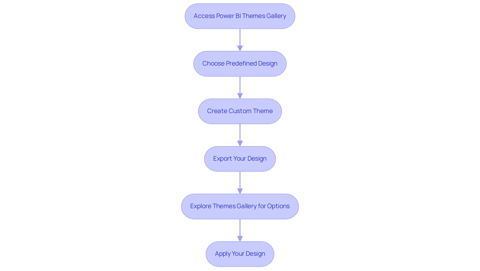
Exploring the Benefits of Using Themes
Implementing custom themes in Power BI significantly enhances the reporting experience through several key benefits:
-
Enhanced Consistency: By utilizing the Power BI themes gallery to apply a uniform theme across all documents, organizations can maintain a cohesive brand identity, which is crucial for building trust and recognition among stakeholders. This consistency directly addresses the prevalent issue of inconsistencies, ensuring that stakeholders see reliable information across various reports. A robust governance strategy can further mitigate these inconsistencies, fostering confidence in the information presented.
-
Improved Readability: Thoughtfully crafted color schemes enhance readability, allowing viewers to concentrate on insights without the distraction of inconsistent formatting. This clarity is vital, as the effectiveness of data visualization often hinges on how easily information can be interpreted.
-
Time Efficiency: Applying a single theme from the Power BI themes gallery to multiple documents streamlines the preparation process, enabling users to focus on analysis rather than formatting. By reducing the time spent on document creation, operations teams can leverage insights from Power BI dashboards more effectively, driving better decision-making across the organization. Incorporating Business Intelligence tools can further improve this process, converting raw information into actionable insights.
-
Heightened Involvement: Visually appealing designs attract attention and make documents more captivating, resulting in greater interaction from stakeholders. As noted by experts, engaging graphics from the Power BI themes gallery play a pivotal role in communicating insights effectively, underscoring the importance of visual appeal in driving engagement.
-
Impact on Stakeholder Engagement: Consistent motifs not only enhance visual attractiveness but also promote a more professional display of information, which can significantly boost stakeholder involvement and confidence in the details presented.
-
Industry Expert Insights: Specialists concur that the Power BI themes gallery can enhance information storytelling, crafting a cohesive visual narrative that connects with viewers, thereby tackling the frequent issue of reports missing clear, actionable guidance.
-
Case Studies on Engagement: The case study titled “Synergy of Text and Graphics” highlights the vital interplay between text and graphics in conveying insights. Engaging in discussions about graphics can enhance understanding and interpretation, demonstrating the practical advantages of a consistent visual approach. Numerous organizations have reported enhanced stakeholder engagement when implementing structured concepts, demonstrating these benefits in action. By understanding and leveraging these advantages, users can elevate their reporting process and ensure that their narratives are compelling and effective.
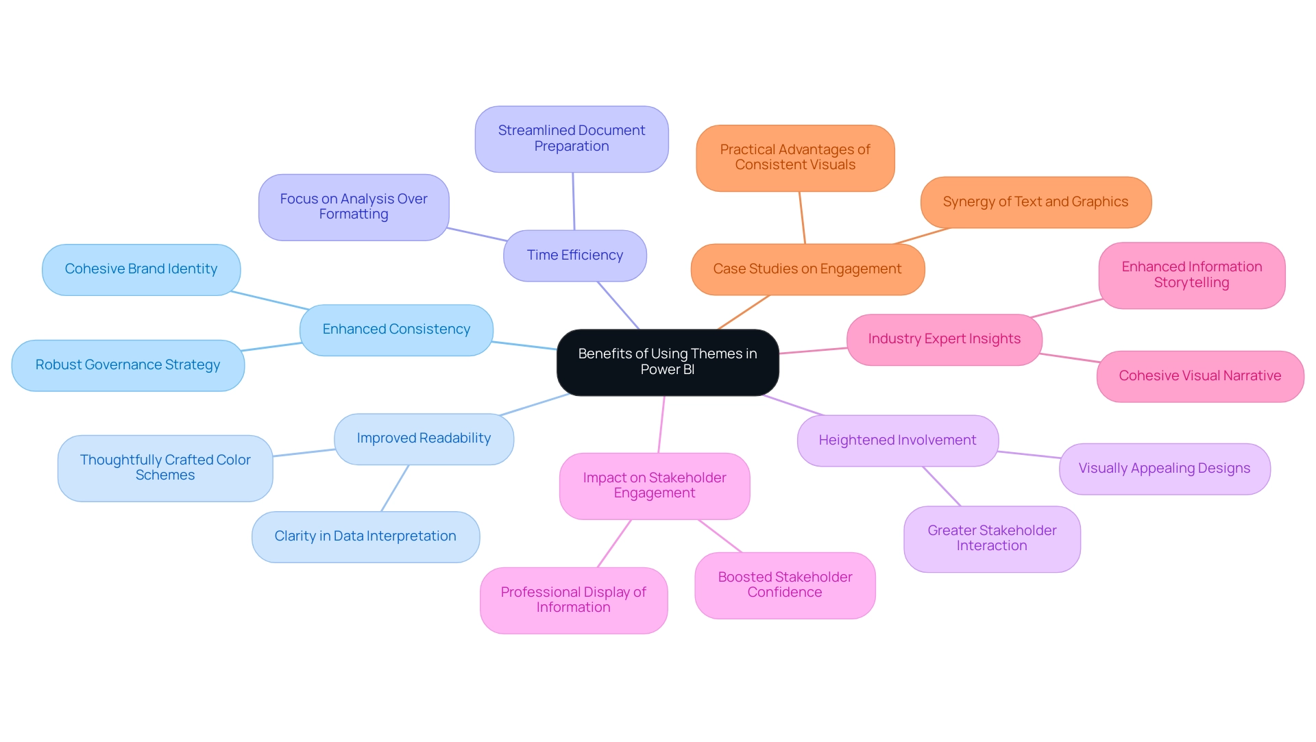
Best Practices for Designing Custom Themes
When utilizing the Power BI themes gallery to design custom themes, it’s crucial to follow several best practices that improve both aesthetics and functionality, particularly given the typical challenges of time-consuming project creation, inconsistencies, and absence of actionable guidance. First, limit your color palette to a maximum of five hues to prevent overwhelming viewers and ensure clarity in your visual communications. Select colors that not only complement each other but also align with your brand identity.
According to Tufte’s Chapter 5 from ‘Envisioning Information’, distinctive hues in diverging palettes are crucial for differentiating between positive and negative values relative to the center, which can effectively convey information variance and help mitigate confusion from inconsistent information across documents. Second, ensure that text and background colors provide sufficient contrast to enhance readability—this is crucial for effective information interpretation and actionable guidance. To offer practical insights, think about adding a summary section in your documents that converts intricate information into clear suggestions or next steps based on the visualized information.
Consistency is essential; apply uniform font styles and sizes across all visuals to foster a cohesive appearance, thereby reducing the time spent on adjustments. Furthermore, consider accessibility in your design choices by selecting color combinations that are accommodating to color-blind users, ensuring that your data is interpretable by everyone. Ultimately, always test your design by previewing it within various reports to confirm its effectiveness across different contexts.
Applying these best practices will enable you to design visually attractive BI styles that efficiently serve their intended purpose, utilizing the Power BI themes gallery. As Hussain Ismail Lokhandwala notes,
Sequential color schemes are beneficial for visualizations representing ordered data, utilizing variations in a single hue to indicate a natural progression from low to high values.
This insight underscores the importance of thoughtful color selection in facilitating viewer comprehension and supporting stakeholders in making data-driven decisions.
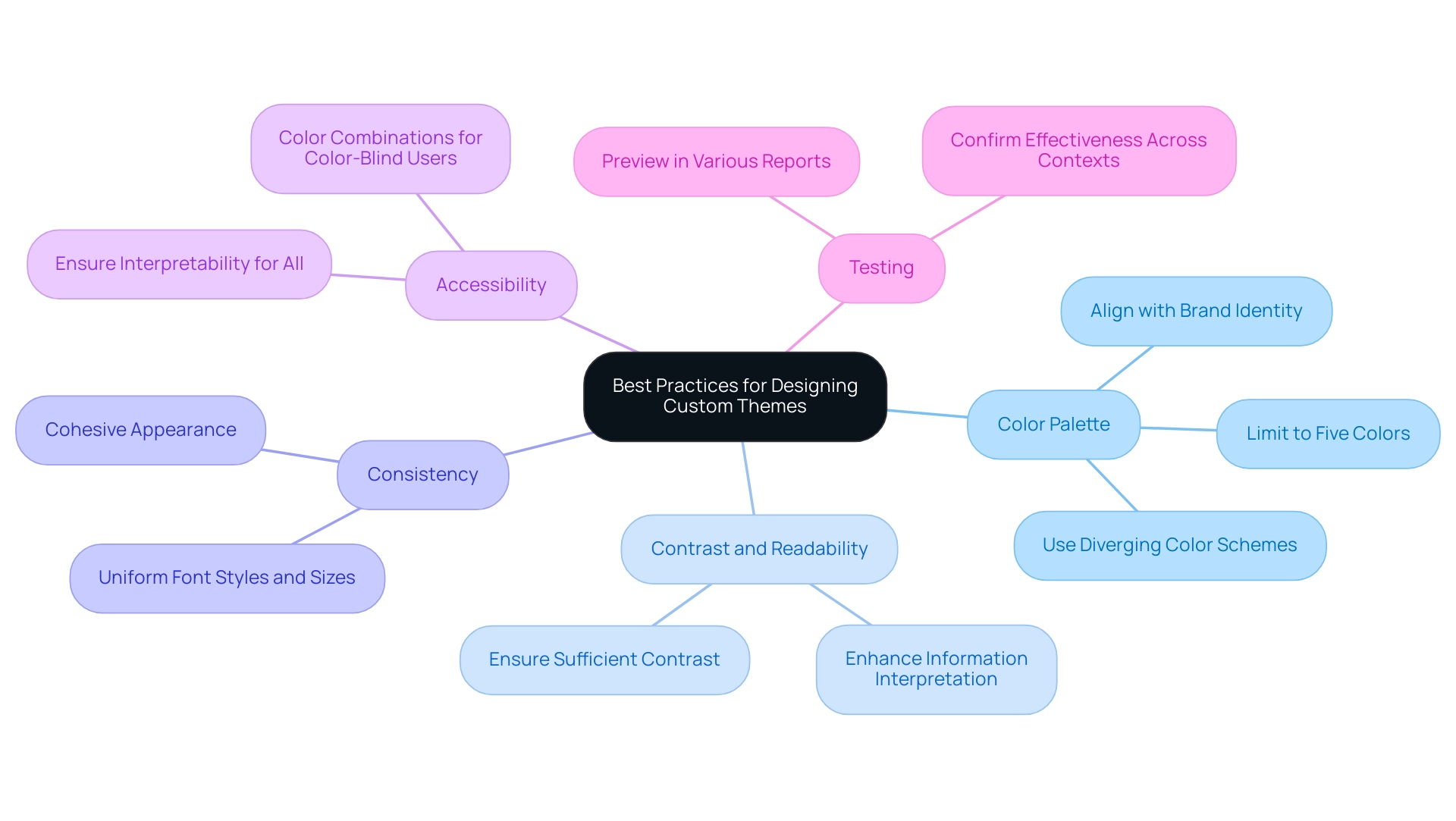
Sharing and Reusing Themes in Power BI
Utilizing the Power BI themes gallery for sharing and reusing styles is an effective way to enhance collaboration and ensure consistency in your reports. Here’s how to do it:
- Export Your Design: Once you’ve customized your design to fit your needs, click on ‘Export Design’ in the Designs Gallery to save the JSON file.
- Distribute the Theme File: Share the saved JSON file with your colleagues through email, shared drives, or collaboration tools, ensuring everyone has access to the latest version.
- Import the Design: Colleagues can easily import the design by navigating to the Power BI themes gallery, selecting ‘Import Design,’ and then choosing the shared file.
- Document Your Concepts: Consider creating a brief guide detailing how to use the concept and its intended purpose, which will help others understand its application effectively.
By sharing themes, users not only promote visual consistency across documents but also foster collaborative insights that enhance data presentation. Furthermore, publishing documents to the web allows anyone on the Internet to view Power BI visuals without needing a license, which can significantly broaden access and collaboration.
To maximize the potential of your Power BI capabilities, consider participating in our 3-Day Power BI Sprint, where we create fully functional, professionally designed visuals tailored to your needs, ensuring a quick start and a polished finish. This initiative frees you from the tedious aspects of document creation, enabling you to focus on leveraging insights for impactful decision-making. Furthermore, the document produced during the sprint can act as a valuable template for future projects, ensuring a professional design from the start.
Granting users build access to create new documents and dashboards based on shared content can further enhance teamwork and efficiency. A case study showcasing the benefits of utilizing OneDrive for Power BI files illustrates this point: it demonstrates how loading PBIX files from OneDrive enables automatic hourly refreshes and built-in version control, allowing users to manage their files effectively and ensure that team members have access to the latest versions of documents. Recent statistics indicate that effective theme sharing practices can significantly boost user engagement levels with shared reports.
As Mike Carlo, an expert in Sharing & Administration, puts it,
Make sure you share this blog with another person if you found it valuable.
This highlights the importance of spreading knowledge and resources within teams for improved operational efficiency.
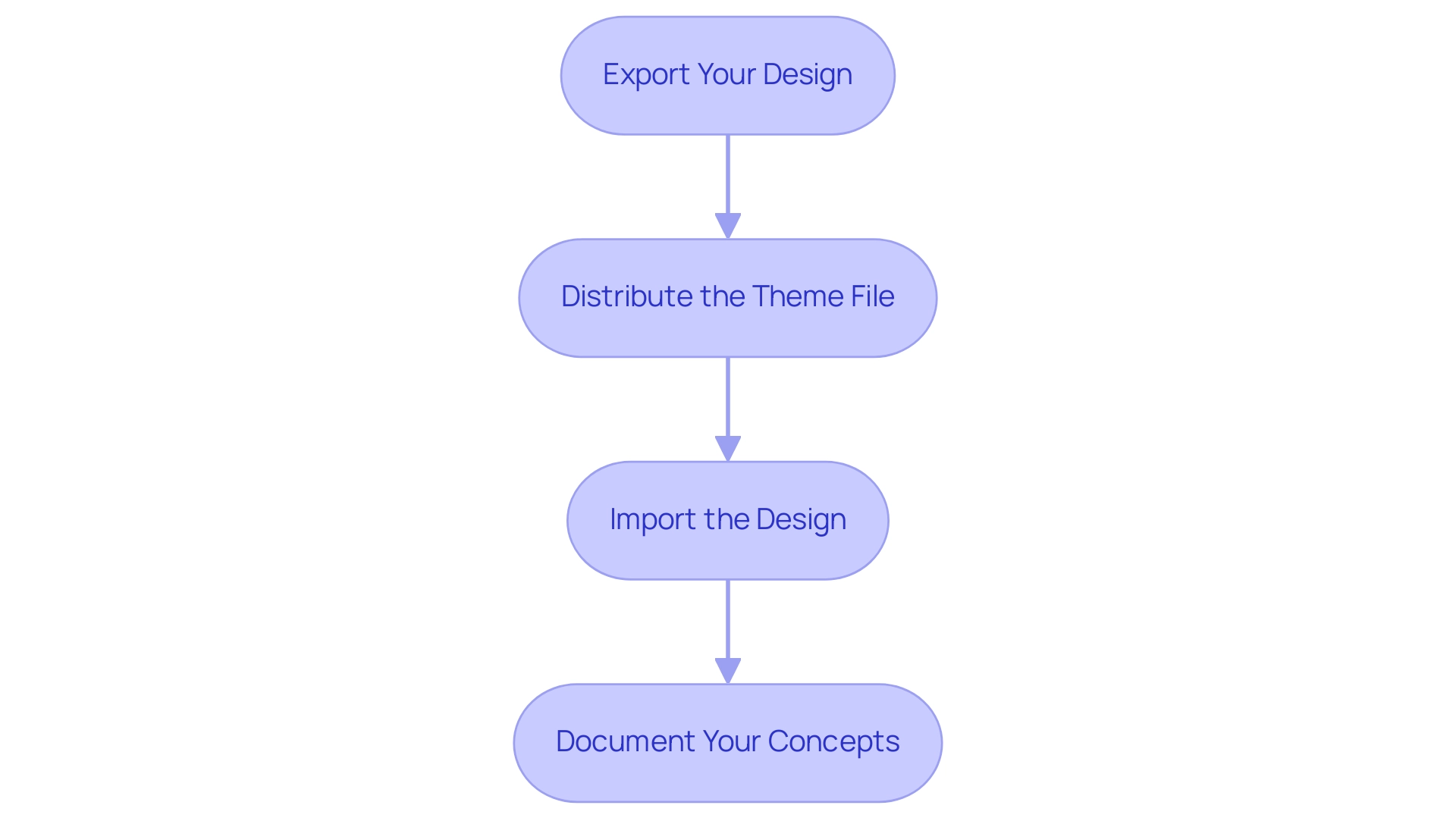
Conclusion
Implementing Power BI themes is a strategic move that can transform the way organizations present data. By standardizing color palettes and formatting options, teams can create a unified visual identity that not only enhances the aesthetic appeal of reports but also improves clarity and consistency. This approach addresses common challenges such as data inconsistencies and time-consuming report creation, allowing teams to focus on extracting actionable insights that drive growth.
Customization is key, as it enables organizations to tailor themes to their specific branding and reporting objectives. Following practical steps for theme customization and adhering to best practices can significantly improve readability and engagement. By limiting color palettes, ensuring adequate contrast, and maintaining consistency in fonts, reports become more accessible and easier to interpret, ultimately leading to better decision-making.
Moreover, sharing and reusing themes fosters collaboration and enhances the overall reporting experience. This practice not only ensures consistency across reports but also encourages a culture of knowledge sharing and teamwork. By leveraging these strategies, organizations can elevate their data visualization efforts, transforming raw data into compelling narratives that resonate with stakeholders and support informed decision-making. Embracing the power of Power BI themes is not just about aesthetics; it’s about creating a robust framework for effective communication and operational efficiency that propels organizations towards success.
