Overview
Power BI allows users to effectively compare dates through various techniques, including the use of built-in and custom calendar tables, DAX functions, and visualizations, which enhance data analysis and reporting efficiency. The article emphasizes that mastering these methods is crucial for addressing common challenges such as data inconsistencies and time-consuming report creation, ultimately enabling organizations to derive actionable insights for informed decision-making.
Introduction
In the world of data analysis, the ability to compare dates effectively in Power BI is not just a technical skill; it is a vital component that can transform raw data into strategic insights. As organizations strive to harness the power of their data, understanding the nuances of date comparison becomes essential for identifying trends, forecasting outcomes, and making informed decisions.
With challenges such as time-consuming report generation and data inconsistencies, mastering date functions can empower users to navigate these complexities. This article delves into the critical aspects of date comparison in Power BI, exploring practical techniques, best practices, and the role of DAX functions in enhancing data analysis capabilities.
By unlocking these tools, decision-makers can drive operational efficiency and derive actionable insights that propel their organizations forward.
Understanding Date Comparison in Power BI
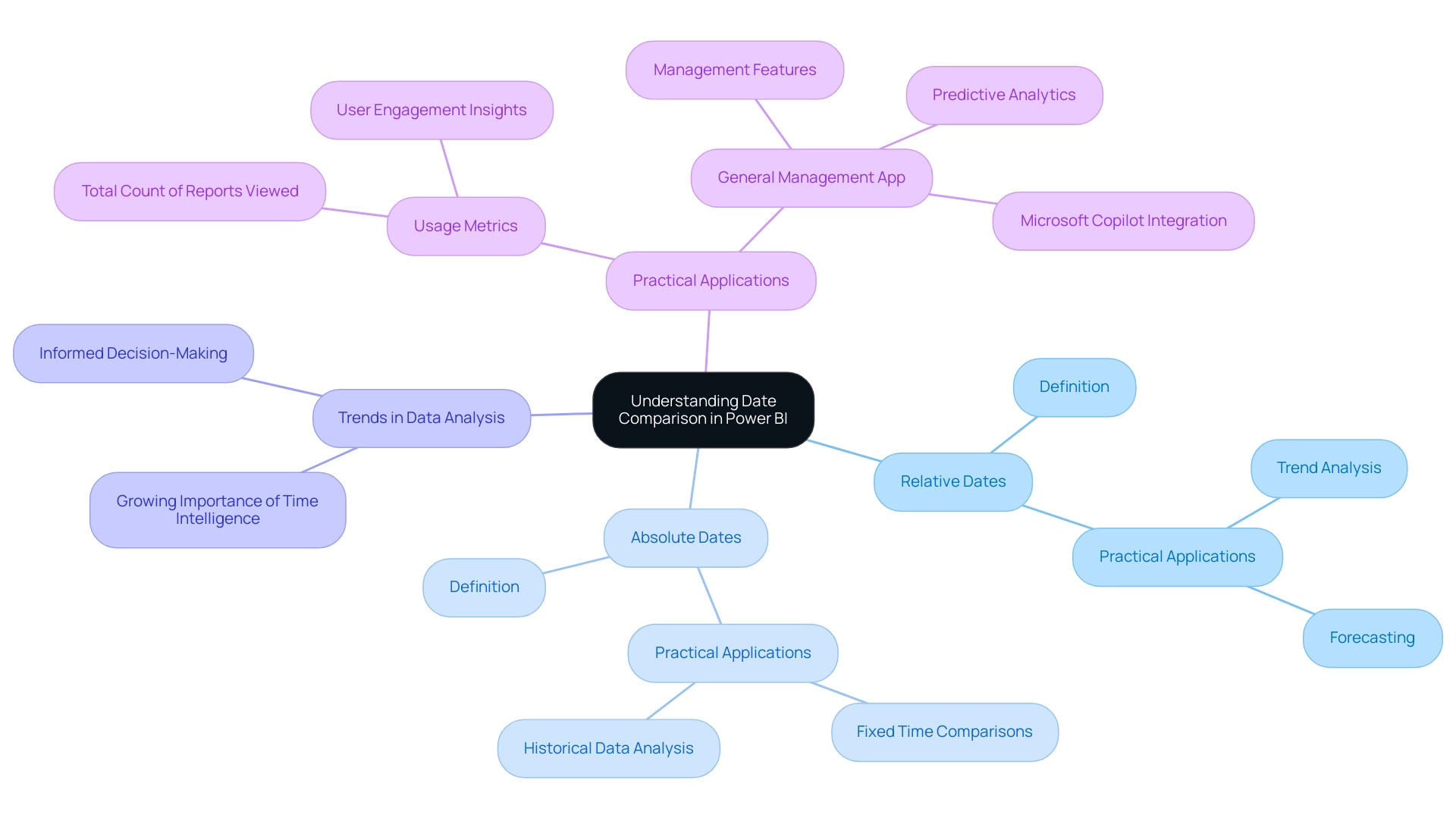
In Power BI, the feature to compare dates is a fundamental capability that empowers users to analyze and contrast information across various time periods. Mastery of time functions is essential, as it facilitates the identification of trends, enables accurate forecasting, and provides critical insights into performance over time. This is especially crucial considering the typical obstacles encountered by organizations, such as the time-intensive process of creating documents, inconsistencies in information that can result in mistrust, and the absence of practical advice in findings.
Key concepts in Power BI compare dates include:
- Relative dates: which enable comparisons based on current time frames.
- Absolute dates: which indicate fixed points in time.
Grasping these differences is essential for analyzing time-related information efficiently and tackling the absence of practical advice frequently seen in documents. Recent trends underscore the growing importance of time intelligence in data analysis, with organizations increasingly recognizing its value for informed decision-making.
For instance, the ‘total count’ in usage metrics represents unique entries viewed over a span of 90 days, illustrating user engagement. As emphasized in a case study named ‘Worked Example of View and Viewer Metrics,’ various users engage with numerous reports, illustrating how usage metrics are determined and the knowledge they offer regarding user behavior. Furthermore, the platform tracks the technology used by viewers to access reports—whether via PowerBI.com, mobile, or embedded solutions—further illuminating user engagement patterns over time.
By utilizing Power BI to compare dates, decision-makers can obtain practical knowledge that enhances operational efficiency. The General Management App specifically tackles these challenges by providing comprehensive management features, enhanced by Microsoft Copilot integration and predictive analytics, ensuring users can navigate and utilize information effectively for better outcomes.
Creating Effective Date Tables for Comparison
Creating an effective time table in Power BI is essential for accurately comparing dates in data analysis and reporting, especially when categorizing report data by business impact using sensitivity labels for data security. In today’s data-rich environment, the ability to extract meaningful insights from Power BI dashboards can significantly drive business growth and operational efficiency. There are two primary methods to achieve this: utilizing the built-in calendar function or constructing a custom time table.
Here’s a detailed guide to both approaches:
-
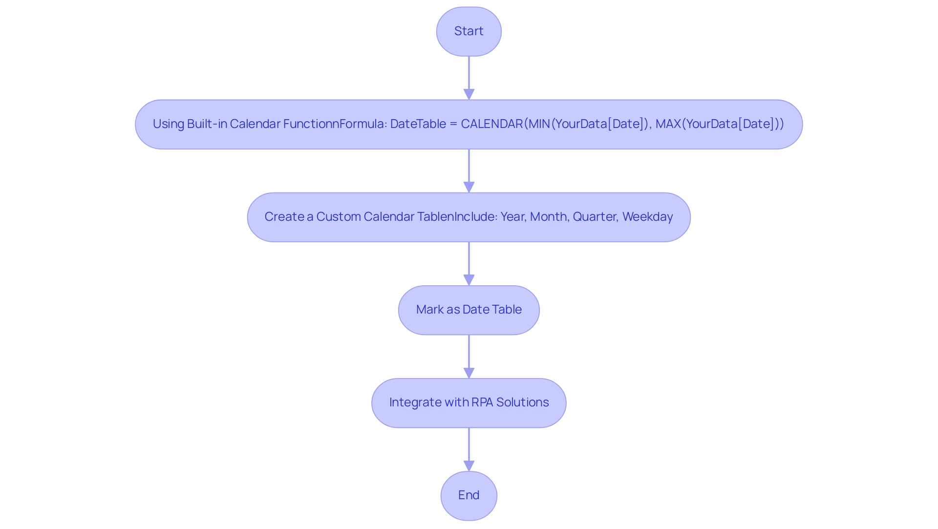
Using the Built-in Calendar Function:
Navigate to the ‘Modeling’ tab and select ‘New Table’. Enter the following formula:
DateTable = CALENDAR(MIN(YourData[Date]), MAX(YourData[Date])).This command generates a thorough time range that corresponds to the information present in your dataset, which is essential when you want to power bi compare dates, helping mitigate challenges like data inconsistencies and time-consuming report creation.
-
Creating a Custom Calendar Table:
Alternatively, you can create a calendar table manually in Excel, which allows for greater customization. When designing your table, ensure it includes critical columns such as Year, Month, Quarter, and Weekday.This approach facilitates more granular analysis tailored to specific reporting needs, ultimately enhancing operational efficiency through better data-driven insights.
-
Marking as a Time Table:
Once your time table is prepared, it is crucial to mark it as a time table in Power BI. Do this by selecting ‘Mark as Date Table’ and choosing the suitable column for dates.This step is crucial, as it enables Power BI to efficiently employ time intelligence functions, which enhances its ability to compare dates and improve overall data analysis capabilities.
Integrating effective temporal tables can greatly enhance interactivity and user experience in documents, as Power BI can compare dates to tackle the challenges faced by many organizations in utilizing insights. Additionally, integrating Robotic Process Automation (RPA) solutions can streamline the generation process, reducing the burden of staffing shortages and outdated systems. As evidenced by case studies demonstrating the optimization of visual interactions, effective schedules enhance report relevance to the audience.
A Principal Consultant for 3Cloud Solutions, who focuses on Business Intelligence and Power BI, emphasizes that ‘the proper arrangement of time tables is foundational to unlocking the full potential of your insights.’ This content has resonated with many, receiving 2,394 views, underscoring the importance of mastering temporal tables in Power BI.
Leveraging DAX Functions for Date Comparison
DAX (Data Analysis Expressions) serves as a powerful formula language in Power BI, enabling users to perform advanced calculations, particularly when they need to power bi compare dates. However, it is important to note that not all DAX functions are supported or included in earlier versions of Power BI Desktop, Analysis Services, and Power Pivot in Excel, which can affect their usability in various scenarios. These limitations can exacerbate common challenges such as time-consuming report creation and data inconsistencies, ultimately hindering the generation of actionable insights.
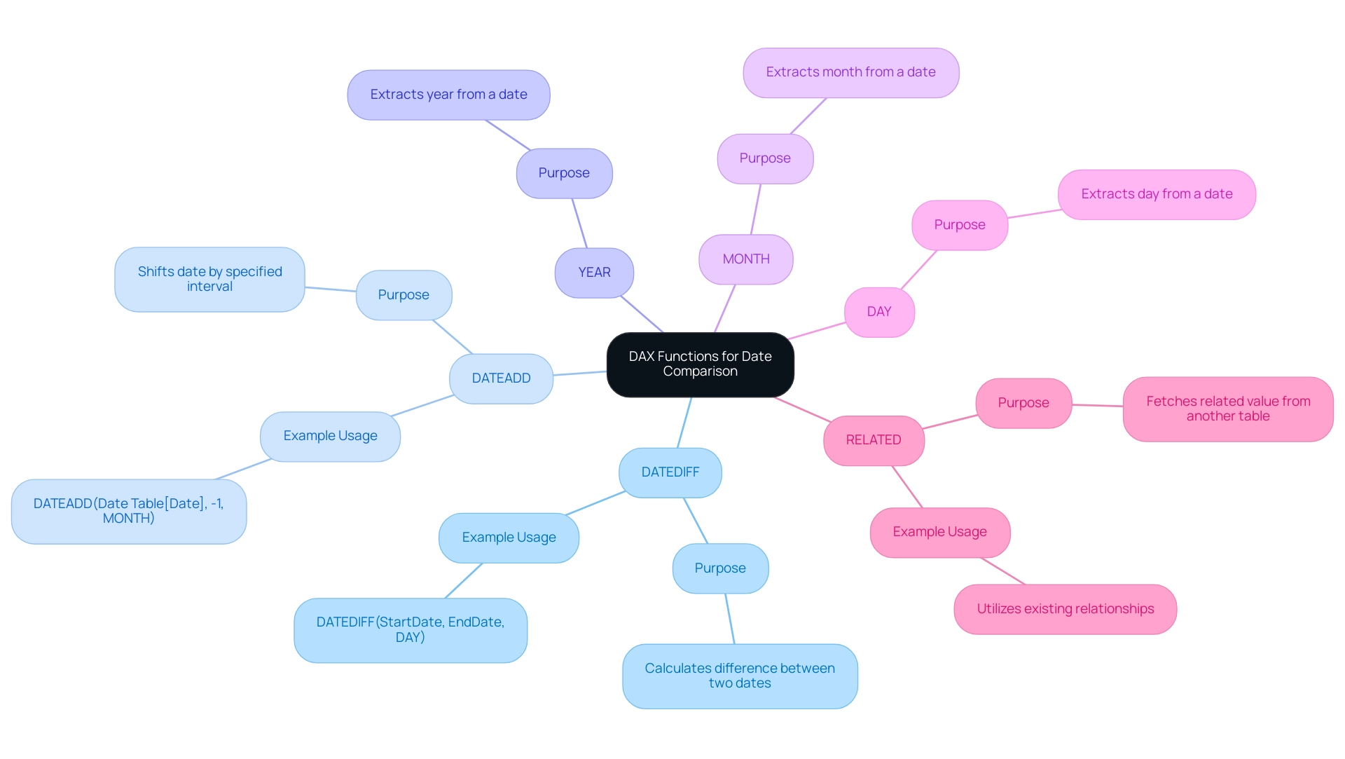
Several DAX functions are essential for power bi compare dates.
-
DATEDIFF: This function calculates the difference between two points in time. For instance,
DATEDIFF(StartDate, EndDate, DAY)will return the total number of days separating the two specified points in time, allowing analysts to assess time intervals effectively.This can provide actionable insights by utilizing Power BI to compare dates and highlight trends over specific periods.
-
DATEADD: This function allows users to modify timestamps by a specified interval. A case in point would be
DATEADD(Date Table[Date], -1, MONTH), which shifts the entries back by one month, facilitating the ability to power bi compare dates across different time periods and aiding in providing clearer guidance on performance changes. -
YEAR, MONTH, DAY: These functions extract specific elements from a timestamp, serving as critical components for creating calculated columns that enable more nuanced comparisons.
Mastery of these functions not only enhances analytical capabilities but also addresses the challenges of report creation and clarity, particularly when using Power BI to compare dates, fostering the development of dynamic reports that reflect evolving trends. As Joleen Bothma notes, ‘Learn what DAX is and discover the fundamental DAX syntax and functions you’ll need to take your Power BI skills to the next level,’ emphasizing the importance of understanding these tools.
Furthermore, recent case studies demonstrate that the RELATED function in DAX effectively retrieves associated values from other tables, which can be invaluable when making comparisons across different datasets.
By utilizing the RELATED function, analysts can improve their capacity to extract understandings from interconnected information, directly tackling problems of inconsistencies and delivering actionable findings that enhance analysis, drive operational efficiency, and provide clearer guidance for stakeholders.
Practical Techniques for Comparing Dates in Power BI
To effectively compare dates in Power BI and enhance operational efficiency through actionable insights, several techniques stand out for improving user engagement and data analysis:
-
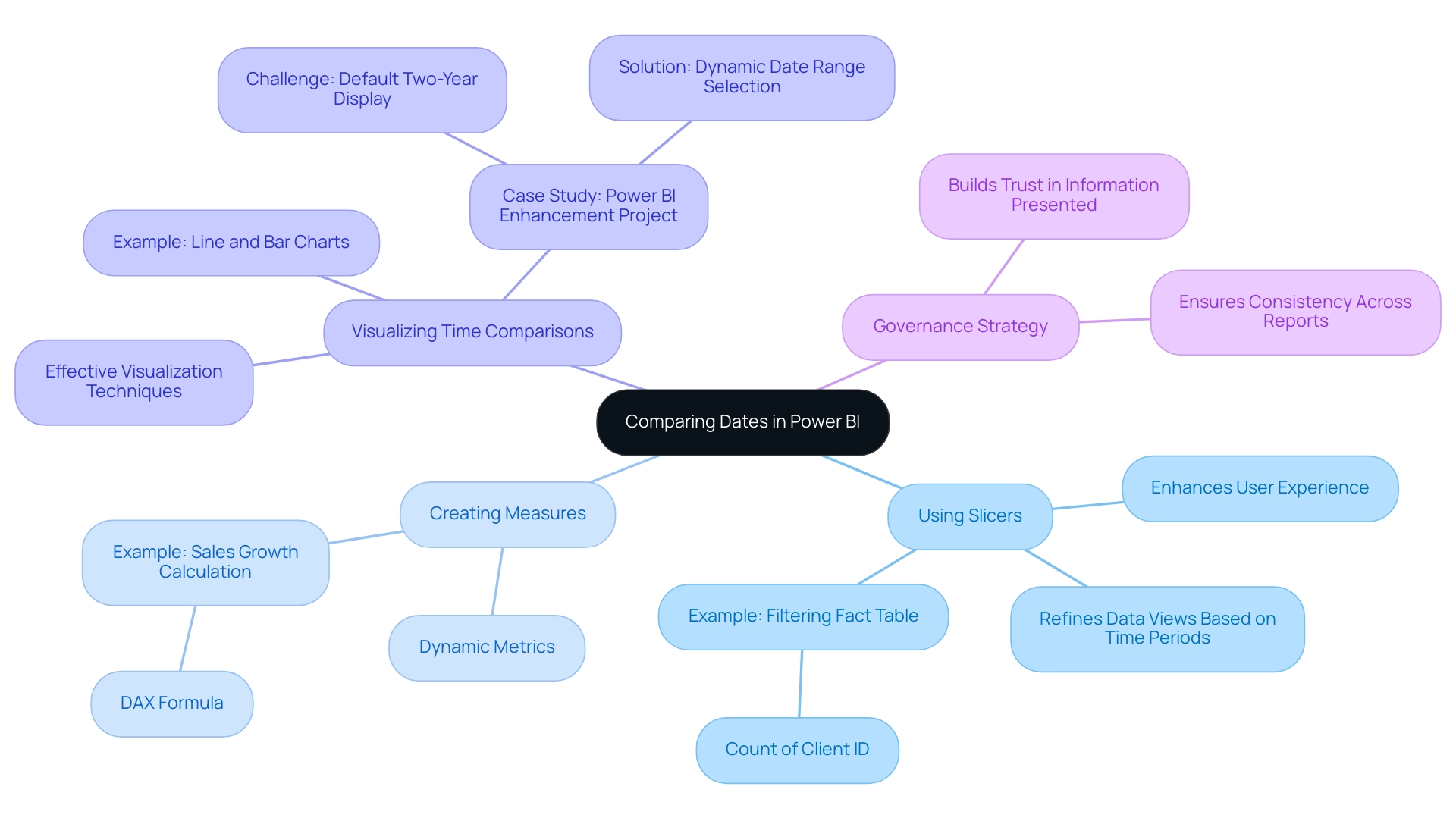
Using Slicers: Implementing time slicers allows users to filter data by specific time ranges seamlessly. This interactivity not only enhances user experience but also significantly boosts report engagement. As mentioned by a Data Insights Super User,
The concept is to filter Fact Table for the rows that correspond to the time slicer and then calculate the count of Client ID in the context of the filtered Fact Table.
This emphasizes the usefulness of slicers in refining data views based on user-chosen time periods. Importantly, the overall tally in usage metrics signifies distinct documents viewed over the past 90 days, highlighting the significance of efficient time filtering. -
Creating Measures: Develop measures using Data Analysis Expressions (DAX) to calculate performance metrics across different time periods. For example, calculating sales growth over the previous year can be achieved with the following DAX measure:
sales growth = (SUM(Sales[Current Year]) - SUM(Sales[Previous Year])) / SUM(Sales[Previous Year]).
This approach enables dynamic metrics that adjust to the chosen time periods, allowing for the use of Power BI to compare dates, which offers valuable insights into performance trends and tackles the challenge of time-consuming report creation. -
Visualizing Time Comparisons: Utilize line charts or bar charts for effective visualization of time comparisons. By configuring the x-axis to the time field, trends over time can be clearly illustrated. This visual depiction not only assists in the rapid understanding of information patterns but also improves the overall efficiency of comparisons in reports, particularly when using Power BI to compare dates. A pertinent case study, the ‘Power BI Enhancement Project,’ demonstrates how the Apps team encountered challenges in providing a default display of the last two years’ information while allowing users to select alternative time ranges. The solution required utilizing DAX and a calculated column to allow dynamic range selection while preserving the default view. Additionally, the recent integration of two Power BI slicers allows users to switch between default and custom date ranges seamlessly.
Furthermore, it is crucial to tackle the issue of dedicating additional time to creating documents instead of utilizing information from Power BI dashboards. This shift can lead to inefficiencies and hinder decision-making. Implementing a governance strategy is crucial to ensure consistency across reports, thereby building trust in the information presented.
The combination of these techniques not only simplifies data analysis but also corresponds with recent advancements in Power BI visualization methods, ensuring that users can extract valuable information effectively and tackle the prevalent problems of data inconsistencies and absence of actionable guidance.
Best Practices and Common Pitfalls in Date Comparison
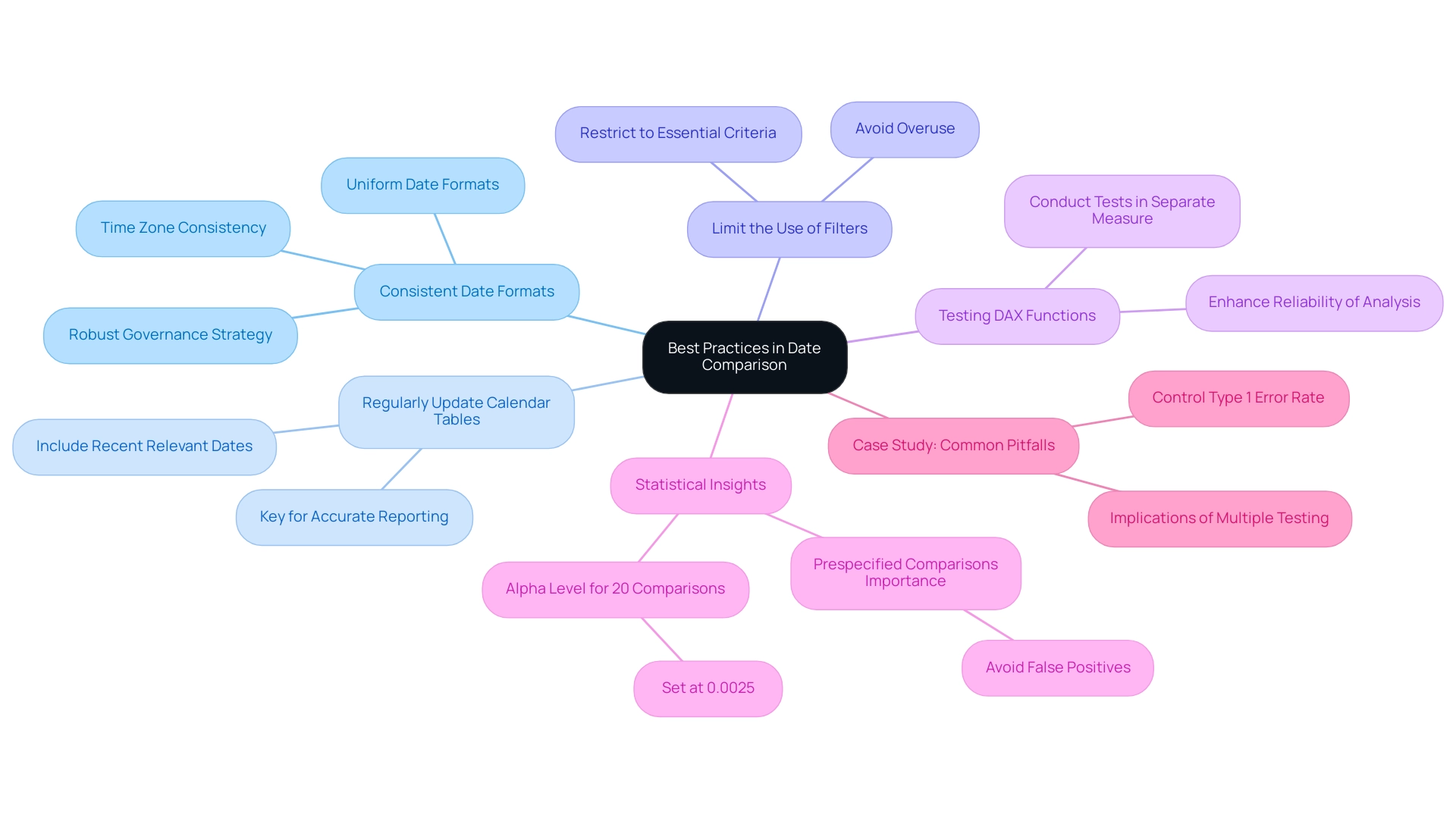
To optimize date comparisons in Power BI and effectively leverage insights from your dashboards, it is essential to follow these best practices:
-
Consistent Date Formats: Maintaining uniform date formats across all fields is critical to prevent errors during comparisons. Equally important is using the same time zone to ensure accuracy in your data analysis, addressing common inconsistencies that can lead to confusion. Implementing a robust governance strategy can help maintain these standards across reports.
-
Regularly Update Calendar Tables: For those utilizing custom calendar tables, it is vital to update these tables consistently. This ensures that your analyses include the most recent relevant dates, which is key for accurate reporting and decision-making.
-
Limit the Use of Filters: While filters are useful for refining datasets, overusing them can lead to confusion and misinterpretation of results. It is advisable to restrict filters to essential criteria to maintain clarity, thus providing actionable guidance for stakeholders.
-
Testing DAX Functions: Before applying any DAX functions in your documents, conduct tests in a separate measure. This practice ensures that the functions yield the expected results, enhancing the reliability of your analysis and reducing the time spent on report creation.
In the context of statistical analysis, Ranganathan P. emphasizes the importance of prespecifying comparisons to avoid serious problems—”It is to avoid these serious problems that all intended comparisons should be fully prespecified in the research protocol, with appropriate adjustments for multiple testing.” This principle is particularly relevant as, with 20 comparisons, the alpha level for significance should be set at 0.0025 to control for false positives effectively.
The case study titled “Common pitfalls in statistical analysis: The perils of multiple testing” highlights the implications of multiple testing in data analysis. It underscores the necessity of prespecified comparisons to mitigate the risk of false-positive findings, reinforcing the importance of these best practices.
By unlocking the power of Business Intelligence, you can transform raw data into practical knowledge, enabling informed decision-making that drives growth and innovation. Furthermore, integrating RPA solutions can improve operational efficiency by automating repetitive tasks, enabling your team to concentrate on utilizing information instead of report generation. By adhering to these guidelines, you can significantly improve the reliability and effectiveness of how you Power BI compare dates, while also addressing the common challenges faced in leveraging insights effectively.
Conclusion
Mastering date comparison in Power BI is an indispensable skill that can significantly enhance data analysis and decision-making capabilities. By understanding the fundamental concepts of date comparison, such as relative and absolute dates, users can identify trends and generate insights that drive operational efficiency. The article highlighted practical techniques, including:
- The creation of effective date tables
- The utilization of DAX functions
These techniques empower users to perform advanced calculations and comparisons seamlessly.
Incorporating best practices, such as:
- Maintaining consistent date formats
- Regularly updating date tables
ensures that analyses remain accurate and relevant. It is crucial to limit the use of filters to avoid confusion and to rigorously test DAX functions to enhance the reliability of the insights derived. By addressing common pitfalls and following these guidelines, organizations can transform raw data into strategic insights that facilitate informed decision-making.
Ultimately, leveraging the full potential of date comparison in Power BI not only helps in overcoming challenges like data inconsistencies and time-consuming report generation but also paves the way for actionable insights that propel organizations forward. Embracing these techniques and best practices will lead to improved data analysis, fostering a culture of data-driven decision-making that is essential in today’s fast-paced business environment.
Overview
Power BI comparison visuals are essential for effective data analysis, enabling organizations to accurately examine and contrast various data points, thereby enhancing operational efficiency and informed decision-making. The article emphasizes best practices such as simplicity in design, understanding the audience, and ensuring data quality, which collectively support the effective use of these visuals in driving actionable insights and addressing common pitfalls in data representation.
Introduction
In the dynamic landscape of data analytics, Power BI comparison visuals have emerged as essential tools for organizations seeking to harness the power of data-driven insights. These visuals, ranging from bar charts to scatter plots, not only simplify the process of analyzing complex datasets but also enhance decision-making capabilities by providing clear representations of trends and relationships.
As businesses increasingly turn to Business Intelligence solutions—projected to reach over half a million deployments in 2024—the importance of mastering these comparison visuals cannot be overstated. This article delves into the various types of comparison visuals available in Power BI, best practices for their design, and the critical role of data quality and user feedback in ensuring effective data communication.
By understanding these elements, organizations can unlock the full potential of Power BI, driving operational efficiency and strategic growth in an ever-evolving market.
Understanding Power BI Comparison Visuals
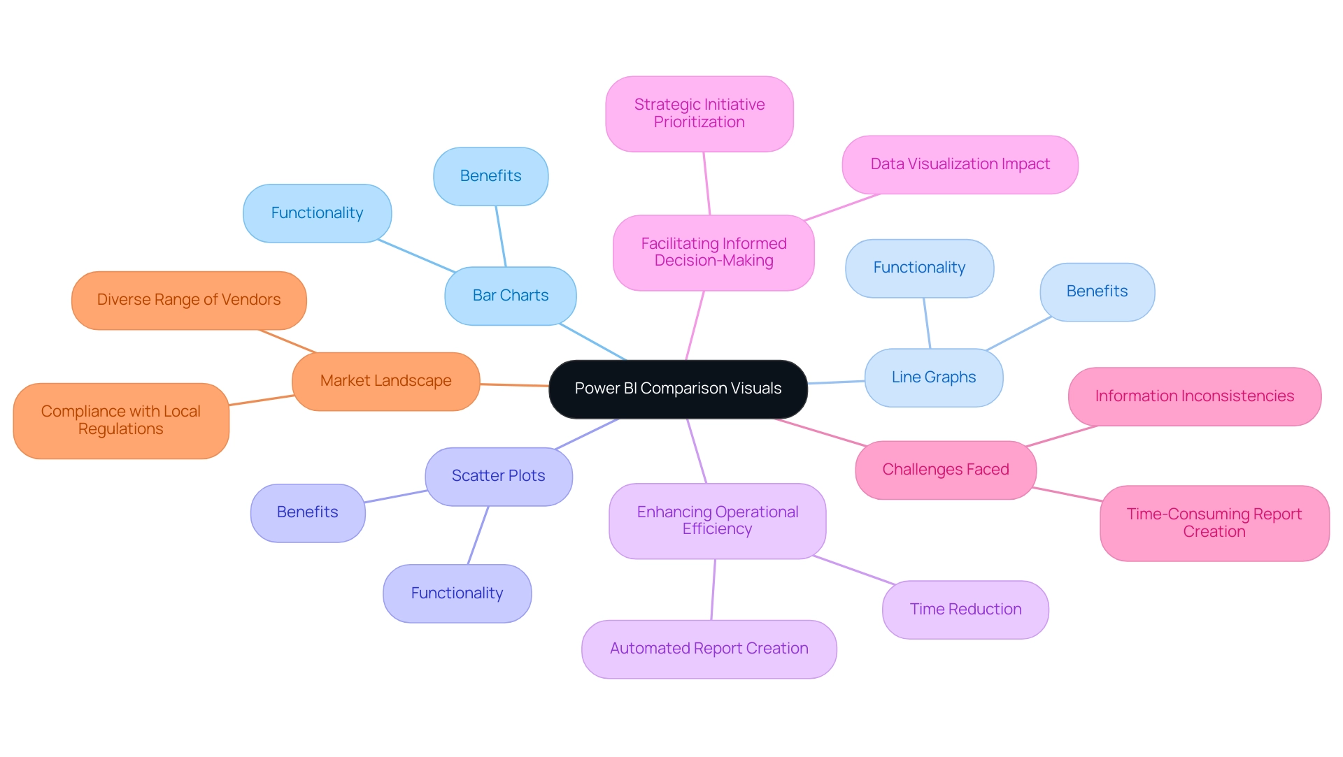
BI comparison representations function as effective instruments for examining and contrasting various information points with accuracy. Utilizing formats such as bar charts, line graphs, and scatter plots, these representations offer a transparent depiction of data relationships, trends, and performance metrics, making them indispensable for organizations aiming to enhance their operational efficiency. In 2024, approximately 587,000 companies are deploying Business Intelligence solutions, reflecting a growing reliance on data-driven strategies.
This statistic highlights the importance of power BI comparison visuals in improving operational efficiency and facilitating informed decision-making. By effectively utilizing these images, organizations can swiftly pinpoint discrepancies, monitor progress against targets, and facilitate informed decision-making. For instance, in the case study titled ‘Viewing Content for Usage Metrics Correlation,’ users must engage with content in their workspace to enable the processing of information for the Usage Metrics Report, illustrating the practical application of these visuals.
Additionally, integrating Robotic Process Automation (RPA) can further enhance these processes, allowing for automated report creation and reducing the time spent on manual tasks. However, challenges such as time-consuming report creation and information inconsistencies can hinder the effective use of BI insights. As emphasized by industry specialists, the capability to visualize information clearly influences decision-making effectiveness, allowing teams to prioritize strategic initiatives instead of maneuvering through complexity.
Furthermore, the evolving landscape of the Business Intelligence market, characterized by a multitude of vendors, reinforces the need for organizations to adopt advanced data visualization tools such as BI to stay competitive and compliant with local regulations. Key features of BI services, including the ‘3-Day BI Sprint’ for rapid report creation and the ‘General Management App’ for comprehensive oversight, are essential in addressing these challenges. As the Platform indicates, the technology a viewer used to open a report—whether via BI.com, Mobile, or Embedded—further emphasizes the versatility of BI in meeting diverse organizational needs.
Types of Comparison Visuals in Power BI
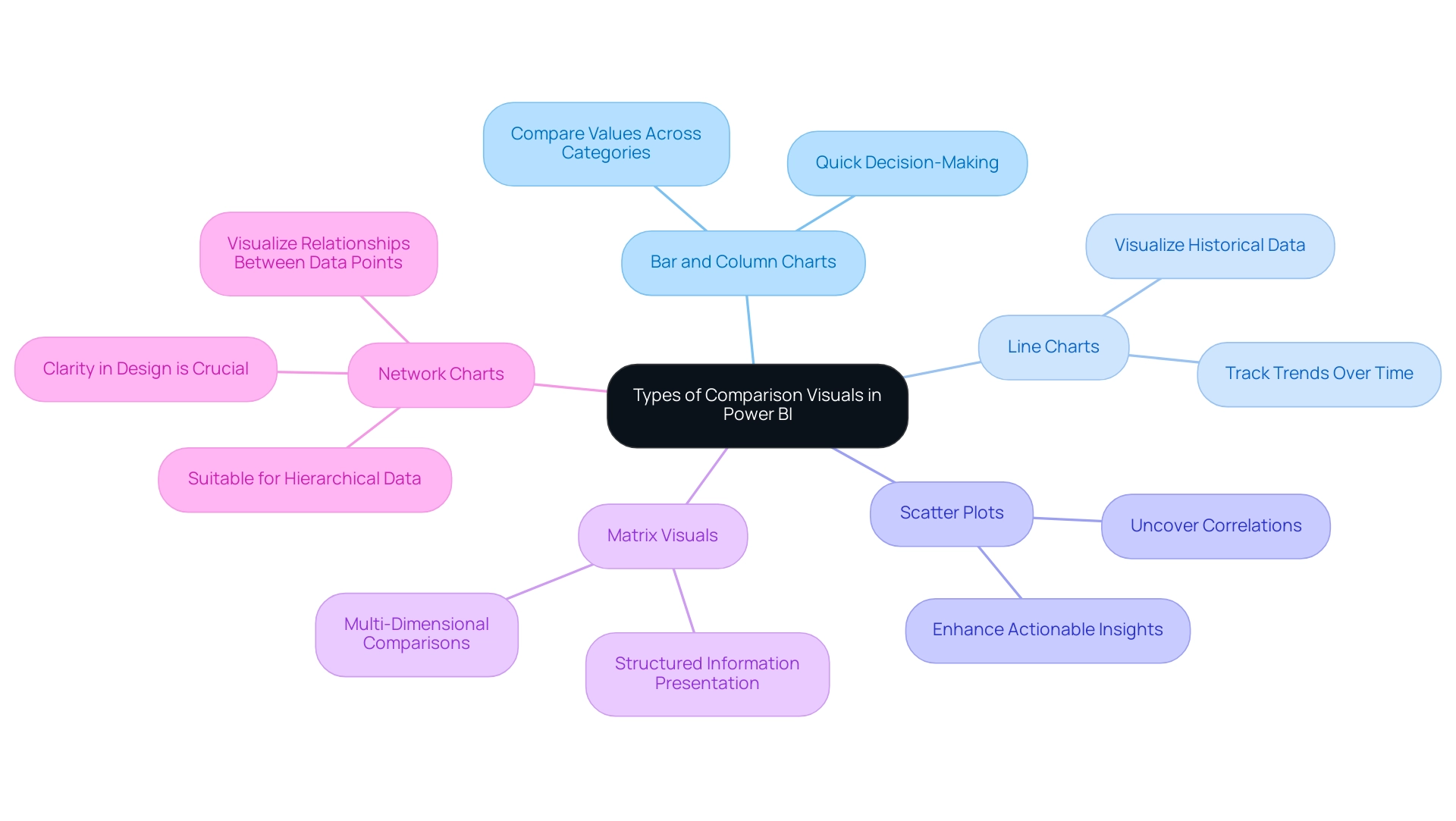
Power BI comparison visuals offer a diverse array of tools, each designed for distinct analytical tasks, which is crucial for driving data-driven insights in an increasingly competitive landscape. The primary types include:
-
Bar and Column Charts: These charts excel in comparing values across different categories, making them vital for Power BI comparison visuals, as they effectively illustrate disparities in size and support quick decision-making. They assist in optimizing report generation by enabling individuals to swiftly visualize key metrics without extensive manual information handling.
-
Line Charts: Ideal for tracking trends over time, line charts serve as effective Power BI comparison visuals for comparing points across various intervals. This functionality addresses the challenge of time-consuming report creation by enabling users to visualize historical data trends at a glance, thus improving decision-making efficiency.
-
Scatter Plots: These representations are instrumental in uncovering correlations between two variables, offering insights into relationships that may otherwise remain hidden, particularly when analyzed through Power BI comparison visuals. By highlighting these correlations, scatter plots enhance the actionable guidance derived from BI tools, allowing for more informed strategic decisions.
-
Matrix Visuals: Providing a grid-like representation, matrix visuals enable multi-dimensional comparisons, which are essential for operational efficiency when utilizing Power BI comparison visuals in complex analytical tasks. They can help reduce inconsistencies by presenting information in a structured format that is easier to interpret.
In a recent project, our finalized leads totaled 12, highlighting the significance of effective information visualization in decision-making and how it can address issues like inconsistencies. As Satyam Chaturvedi, Digital Marketing Manager at Arka Softwares, states, “I love to spend my time studying the latest market insights,” emphasizing the importance of comprehending information in today’s market. Additionally, network charts, which visualize relationships between information points, are particularly useful for hierarchical structures but can become overwhelming if not designed with clarity in mind.
Comprehending these choices enables users to customize their visualizations effectively, ensuring alignment with the specific insights they seek to extract from their information. Furthermore, integrating RPA solutions can streamline the visualization process by automating repetitive tasks, thereby maximizing the potential of Business Intelligence and RPA in fostering business growth.
Best Practices for Designing Comparison Visuals
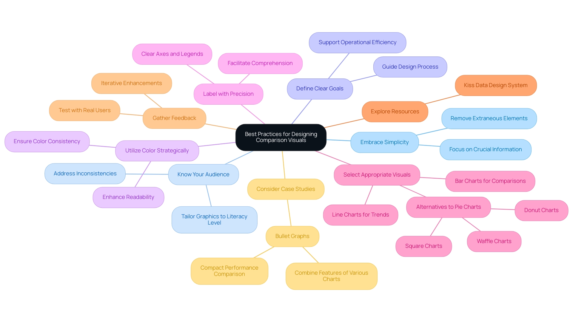
To create impactful Power BI comparison visuals, several best practices should be adopted:
-
Embrace Simplicity: A minimalist approach is crucial. Concentrate on crucial information while removing extraneous elements that may distract or confuse the viewer. This aligns with recent studies emphasizing the importance of simplicity in visualization design principles, particularly in the context of Business Intelligence, where clarity can drive better decision-making.
-
Know Your Audience: Understanding your audience’s literacy is vital. Tailor your graphics to their level of understanding, ensuring that the information presented is accessible and actionable. This consideration is especially important in overcoming challenges like inconsistencies that can arise in Power BI dashboards.
-
Define Clear Goals: Establishing clear objectives for your visualizations helps guide the design process and ensures that the visuals effectively communicate the intended message. Clear objectives support the overall mission of leveraging BI for operational efficiency and growth.
-
Utilize Color Strategically: A thoughtful color scheme can significantly enhance readability and differentiate between information series. Consistency is key; avoid overwhelming the audience by ensuring that colors serve a clear purpose. The influence of color schemes on readability cannot be overstated, as well-chosen colors can guide the viewer’s focus effectively.
-
Label with Precision: Clear labeling of all axes, legends, and points is essential to facilitate comprehension. This practice ensures that viewers can easily interpret the information presented, reinforcing the effectiveness of your visualizations and addressing potential confusion that may arise from lack of actionable guidance.
-
Select Appropriate Visuals: Choosing the right type of visual is paramount for accurately conveying your information. Line charts work well for illustrating trends over time, while bar charts are ideal for categorical comparisons. As pie charts are frequently criticized for their inefficiency—highlighting Edward Tufte’s claim that they can obstruct precise comparisons due to angle discrepancies—consider alternatives like donut, square, or waffle charts for clearer representation.
-
Explore Resources: The Kiss Data Design System is a valuable free information visualization kit that can assist in creating effective representations, contributing to the operational efficiency of your BI efforts.
-
Gather Feedback: Testing your representations with actual individuals is vital. Gathering feedback aids in confirming that your graphics convey the intended message effectively, allowing for iterative enhancements based on user experience. This practice is a cornerstone of creating effective BI graphics in 2024, ensuring they meet the needs of diverse audiences while adhering to contemporary information visualization design standards.
-
Consider Case Studies: For instance, bullet graphs combine features of thermometer charts, progress bars, and target indicators to display performance against benchmarks, providing a compact format for comparing actual performance to expectations.
Additionally, integrating Robotic Process Automation (RPA) can significantly enhance the efficiency of your reporting processes. RPA can automate repetitive tasks such as report generation, thereby alleviating time-consuming challenges and staffing shortages. By leveraging RPA alongside these best practices, you can streamline operations and improve the overall effectiveness of your BI representations.
By integrating these best practices and considering the role of RPA, you can enhance the clarity and effectiveness of your Power BI comparison visuals, leading to better storytelling, informed decision-making, and ultimately driving growth through robust Business Intelligence strategies.
Ensuring Data Quality for Effective Comparisons
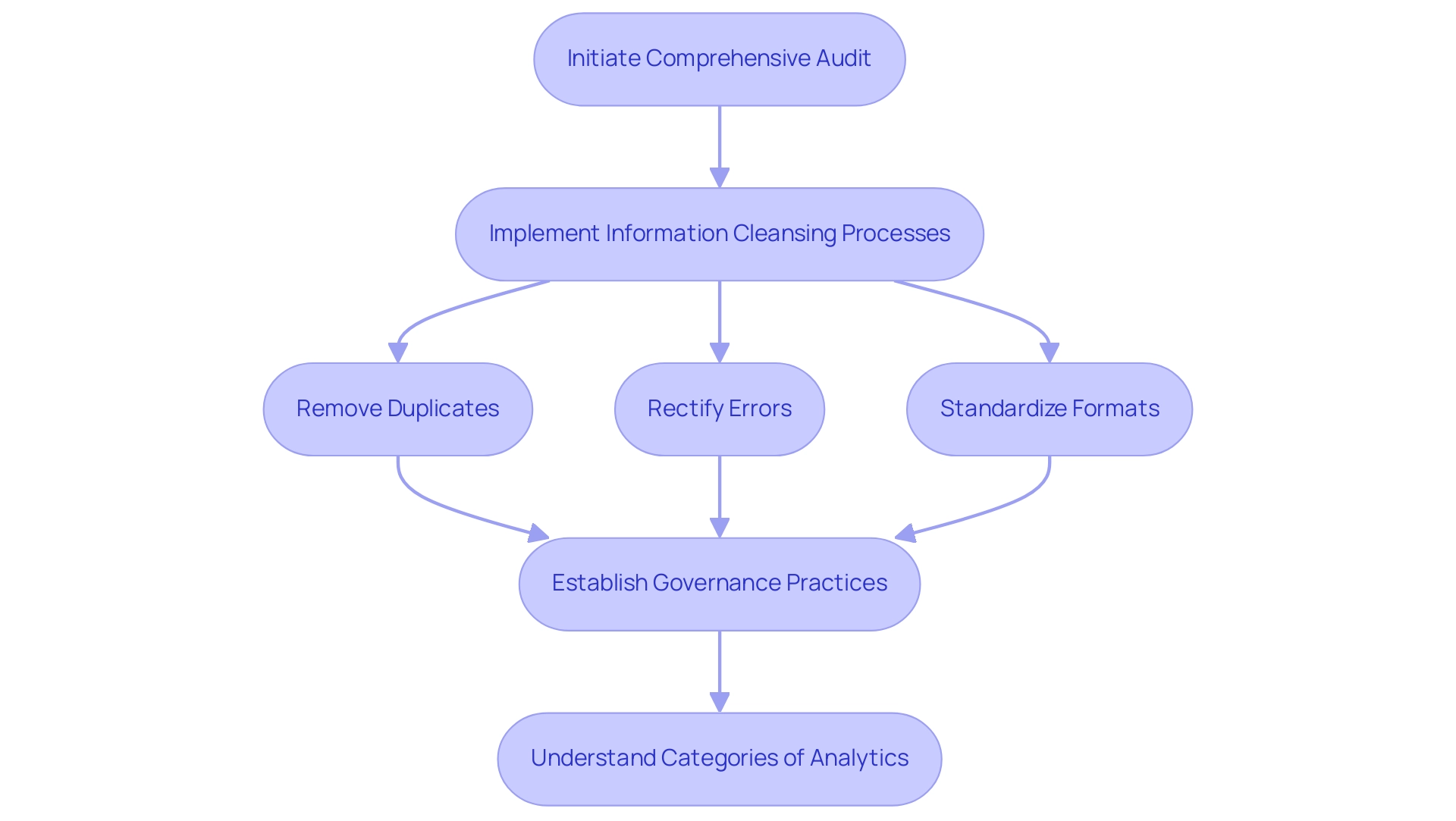
For organizations to leverage Power BI comparison visuals effectively, it is paramount to prioritize information quality. Initiating a comprehensive audit of information serves as the first step, allowing teams to pinpoint inaccuracies and inconsistencies within their datasets. Following this, implementing information cleansing processes is essential.
This involves:
- Removing duplicates
- Rectifying errors
- Standardizing formats to enhance overall reliability
Moreover, establishing robust governance practices is crucial; these frameworks should clearly define accountability for information quality and outline maintenance protocols. As Lior Solomon, VP of Data at Data, emphasizes, ‘secure, compliant, and reliable information is critical for the success of AI initiatives’.
He further notes that information quality must be prioritized throughout the model development life cycle. Furthermore, comprehending the four categories of analytics—descriptive, diagnostic, predictive, and prescriptive—can offer a wider view on how quality influences various analytical methods. Notably, a recent survey revealed that over 450 analytics professionals identified significant quality issues within organizations, underscoring the necessity of effective governance.
To combat the lack of data-driven insights that can leave organizations at a competitive disadvantage, our 3-Day Power BI Sprint offers a quick start to creating professional reports that leverage insights for actionable business outcomes. This sprint not only assists in enhancing quality but also tackles obstacles to AI adoption by ensuring that the information used in Power BI comparison visuals is both dependable and actionable. Additionally, incorporating RPA solutions can simplify information management processes, enhancing operational efficiency and allowing organizations to confidently depend on the insights gained from their comparison representations, ultimately facilitating more informed and strategic decision-making.
Avoiding Common Mistakes in Comparison Visuals
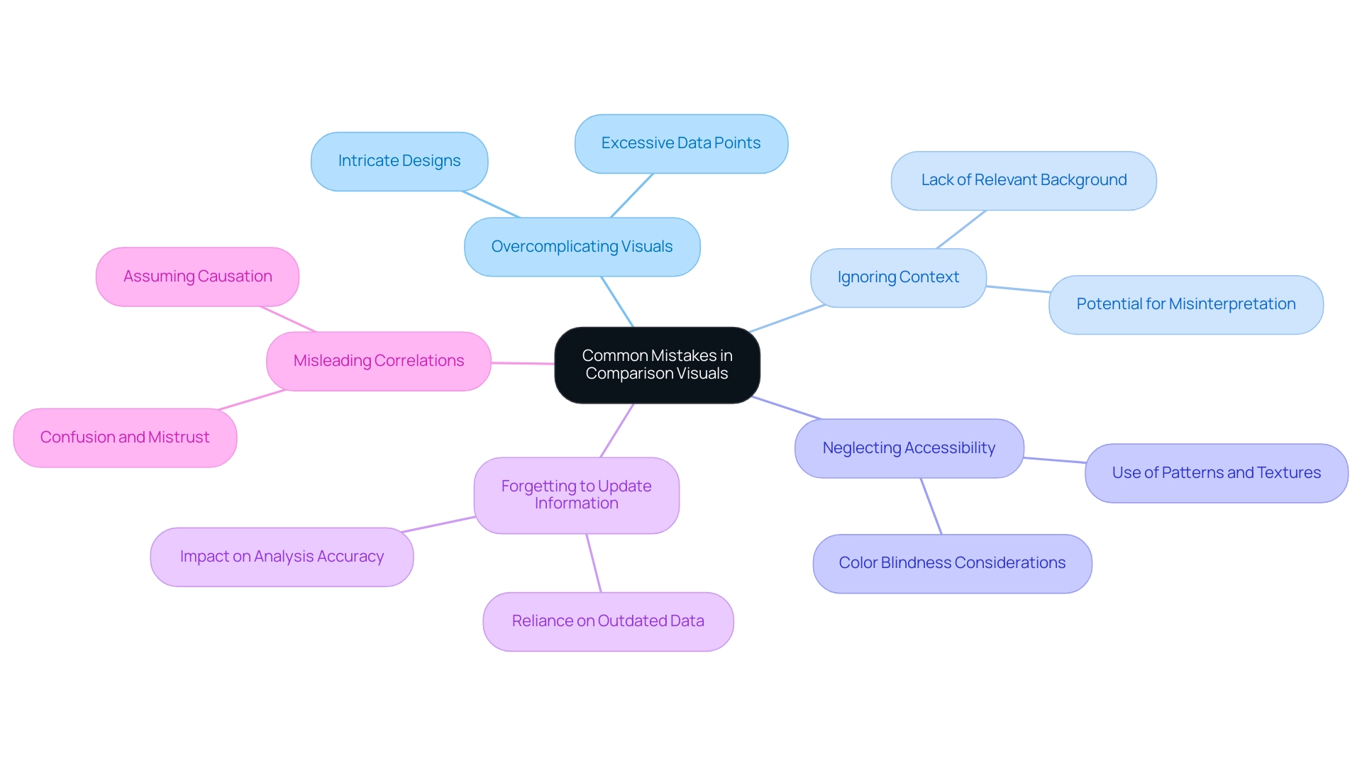
When utilizing comparison visuals in Power BI, it’s crucial to steer clear of several common mistakes that can hinder effective data communication, especially in an environment where leveraging insights is paramount for operational efficiency:
-
Overcomplicating Visuals: Incorporating excessive data points or overly intricate designs can overwhelm viewers and obscure the intended message. The principle of simplicity suggests that visuals should convey essential information clearly and efficiently, particularly when time-consuming report creation detracts from actionable insights.
-
Ignoring Context: Providing context is vital for accurate interpretation. Without relevant background information, users may misinterpret information, leading to flawed conclusions. As Edward Tufte aptly states,
Graphical excellence is that which gives to the viewer the greatest number of ideas in the shortest time with the least ink in the smallest space.
This highlights the necessity for clarity and context in visual storytelling, particularly considering frequent inconsistencies that can occur due to an absence of governance strategy. -
Neglecting Accessibility: Accessibility should be a primary consideration in data visualization. It’s essential to make visuals comprehensible to everyone, including those with color blindness. Incorporating patterns or textures alongside colors can significantly enhance accessibility and user experience.
-
Forgetting to Update Information: Relying on outdated information can distort analysis and lead to incorrect conclusions. Consistently updating information sources is essential to guarantee that insights obtained from representations are precise and pertinent.
-
Misleading Correlations: One of the critical pitfalls in visual representation is the potential for correlations in visuals to mislead users into assuming causation between unrelated factors. This can significantly distort the viewer’s understanding and interpretation of the information, particularly when reports are filled with numbers yet lack clear, actionable guidance. Failing to provide actionable guidance can lead stakeholders to confusion and mistrust, undermining the utility of the insights presented.
A relevant case study titled “Omitting Baseline and Truncating Scale” highlights how this issue is prevalent in political and sports visualizations, where such omissions can create misleading patterns or trends. Awareness of this problem is crucial to avoid misinterpretation of information, ensuring that visualizations accurately represent the details.
Coupler.io is utilized by over 24,000 companies worldwide, underscoring the importance of effective data visualization practices in enhancing decision-making across various industries. A well-designed dashboard prioritizes important variables and employs various visualization techniques to improve readability, ultimately enhancing user comprehension and engagement. Furthermore, failing to leverage insights from BI dashboards can place your business at a competitive disadvantage, emphasizing the urgency of addressing these challenges.
By steering clear of these frequent traps, you can create more effective and impactful BI representations, such as Power BI comparison visuals, that drive data-driven insights and operational efficiency.
Incorporating User Feedback for Continuous Improvement
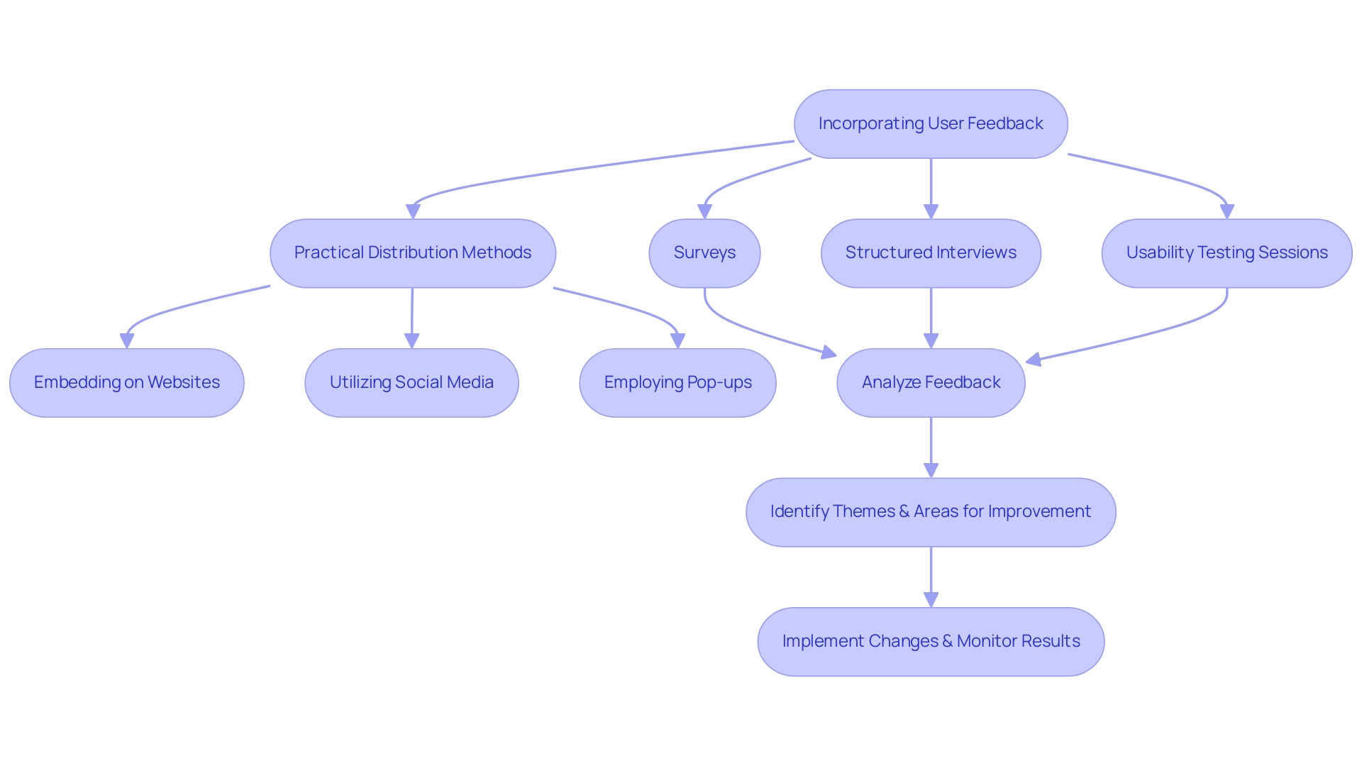
Incorporating feedback from participants is essential for the continuous improvement of Power BI comparison visuals. Creating regular feedback loops promotes a deeper understanding of experiences and challenges related to these visuals, particularly in addressing the common pitfalls of time-consuming report creation and data inconsistencies. To effectively gather insights, employ a variety of methods such as:
- Surveys
- Structured interviews
- Usability testing sessions
Notably, a case study by Hotjar illustrated that addressing feedback can lead to a remarkable 40% increase in conversion rates, highlighting the potential impact of insights on operational efficiency. Analyzing the resultant feedback can illuminate common themes and pinpoint areas ripe for improvement, thereby directly addressing the challenges in leveraging insights from Power BI dashboards. In a case study titled ‘Challenges in Gathering and Interpreting Feedback,’ it was revealed that despite inherent difficulties—such as individuals’ varying willingness to provide insights and the qualitative nature of the data—effective feedback mechanisms are essential for Product Managers.
By actively involving participants throughout the design process and implementing a governance strategy to ensure consistency of information, organizations can guarantee that their Power BI comparison visuals not only adapt to evolving needs but also significantly enhance information-driven decision-making and operational efficiency. Customized AI solutions can also play an essential role in this process, assisting in optimizing analysis and delivering actionable insights. Practical methods for distributing surveys and questionnaires include:
- Embedding them on websites
- Utilizing social media channels
- Employing pop-ups
All while keeping them concise and relevant to research goals.
As Syed Balkhi aptly notes,
You can collect feedback and other relevant data at any point in the UX design process.
This continuous improvement practice is crucial in creating visuals that resonate with users, drive satisfaction, and ultimately leverage the power of Business Intelligence and RPA for informed decision-making and enhanced productivity.
Conclusion
Power BI comparison visuals are indispensable tools that empower organizations to navigate the complexities of data analysis with clarity and precision. By utilizing various types of visuals, such as bar charts, line graphs, and scatter plots, businesses can uncover insights, monitor performance, and make informed decisions that drive operational efficiency. The article emphasizes the importance of mastering these tools as the demand for Business Intelligence solutions continues to grow, with projections indicating over half a million deployments by 2024.
Effective design practices play a critical role in maximizing the impact of comparison visuals. Embracing simplicity, understanding the audience, and ensuring data quality are fundamental to creating visuals that facilitate actionable insights. Additionally, gathering user feedback is essential for continuous improvement, allowing organizations to adapt their visualizations to meet evolving needs and enhance data-driven decision-making.
Ultimately, the successful integration of Power BI comparison visuals can transform how organizations leverage data, leading to strategic growth and competitive advantage. By prioritizing best practices in design and data quality, businesses can harness the full potential of their data, ensuring that insights are not only accessible but also actionable. As the landscape of data analytics continues to evolve, the ability to effectively communicate insights through powerful visuals will remain a key driver of success in the modern business environment.
Overview
To change the date format in Power BI to DD/MM/YYYY, users should follow a step-by-step process that includes selecting the date column, ensuring its data type is set to ‘Date’, and applying the custom format. The article emphasizes the importance of proper date formatting for accurate data analysis and decision-making, highlighting that incorrect formats can lead to misinterpretations and inefficiencies in reporting.
Introduction
Navigating the complexities of date formatting in Power BI is essential for organizations seeking to enhance their data analysis capabilities. With various formats like:
- MM/DD/YYYY
- DD/MM/YYYY
- YYYY-MM-DD
the choice of date format can significantly influence how data is interpreted, sorted, and filtered. Missteps in date formatting can lead to confusion and erroneous insights, which can ultimately derail informed decision-making.
This article delves into the intricacies of date formats in Power BI, providing a comprehensive guide on best practices, common challenges, and advanced techniques to ensure accurate and efficient data management. By understanding and implementing these strategies, organizations can leverage the full potential of their data, driving growth and innovation in an increasingly data-driven world.
Understanding Date Formats in Power BI
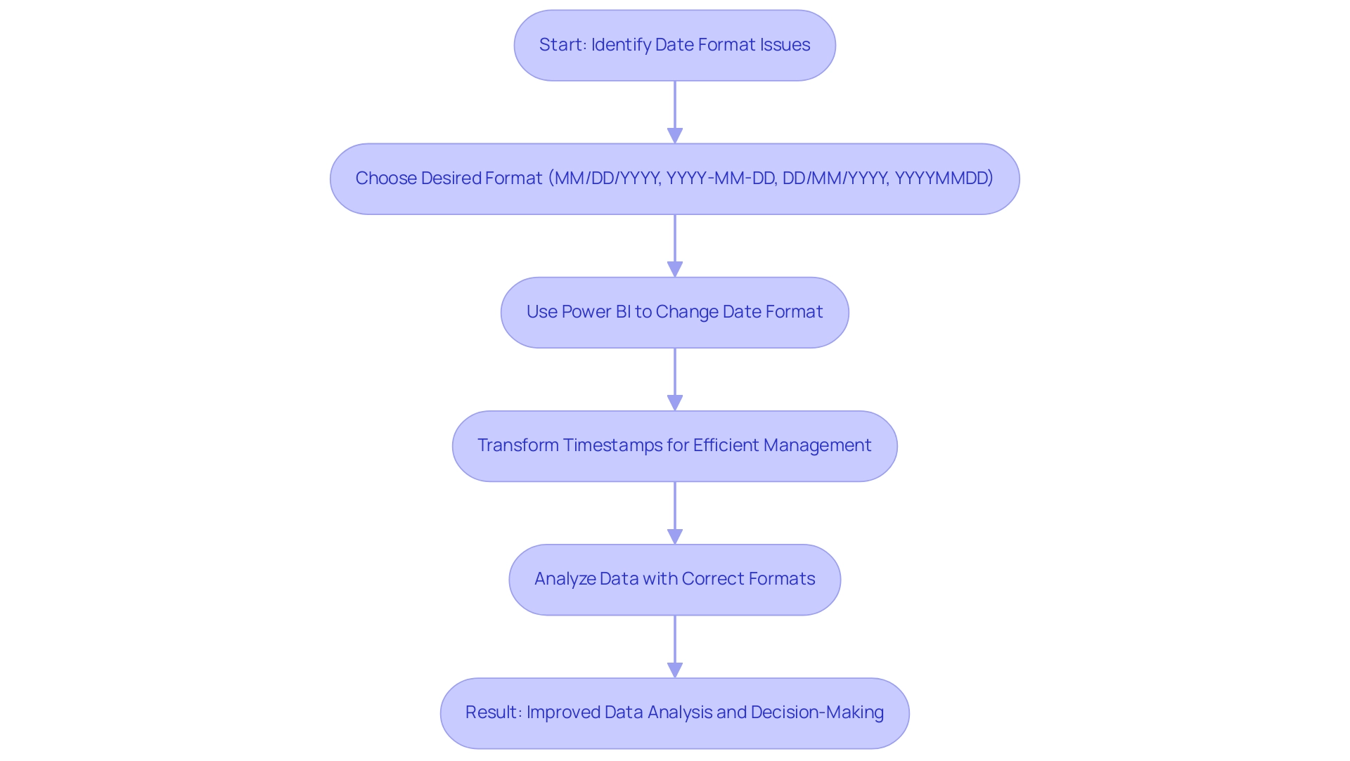
In Power BI, the choice of date styles plays a crucial role in how information is interpreted and displayed, significantly affecting operational efficiency. Common layouts like MM/DD/YYYY and YYYY-MM-DD have unique implications for calculations, sorting, and filtering of date-related information, especially when using the power bi change date format to dd/mm/yyyy. For organizations functioning in areas where DD/MM/YYYY is the standard, it is crucial to use Power BI to change date format to dd/mm/yyyy to avoid confusion and reduce mistakes during analysis.
Improper formatting of dates can result in misinterpretations that distort insights and influence decision-making processes, especially in a data-rich environment where extracting actionable insights is crucial for business growth. As mentioned, ‘Handling timestamps as several elements instead of a single one facilitates their management and guarantees that reports are both precise and user-friendly.’ Moreover, transforming timestamps into a unified string style such as YYYYMMDD can enhance sorting and processing.
For example, the case study titled ‘Converting Dates to YYYYMMDD Format’ emphasizes how this method streamlines the management of temporal information, ensuring correct chronological order and enabling simpler information administration. Entities that embraced the YYYYMMDD structure reported enhanced efficiency in information analysis and minimized mistakes in temporal interpretation, tackling the usual issues of time-consuming report generation and information inconsistencies. Moreover, utilizing RPA solutions like EMMA RPA and Automate can streamline the formatting of timestamps, further improving efficiency and precision in information management.
Comprehending and accurately applying these structures, along with using RPA tools, is a fundamental step toward effective data analysis in BI, enabling operations directors to leverage insights that foster growth and innovation.
Step-by-Step Guide to Changing Date Format to DD/MM/YYYY
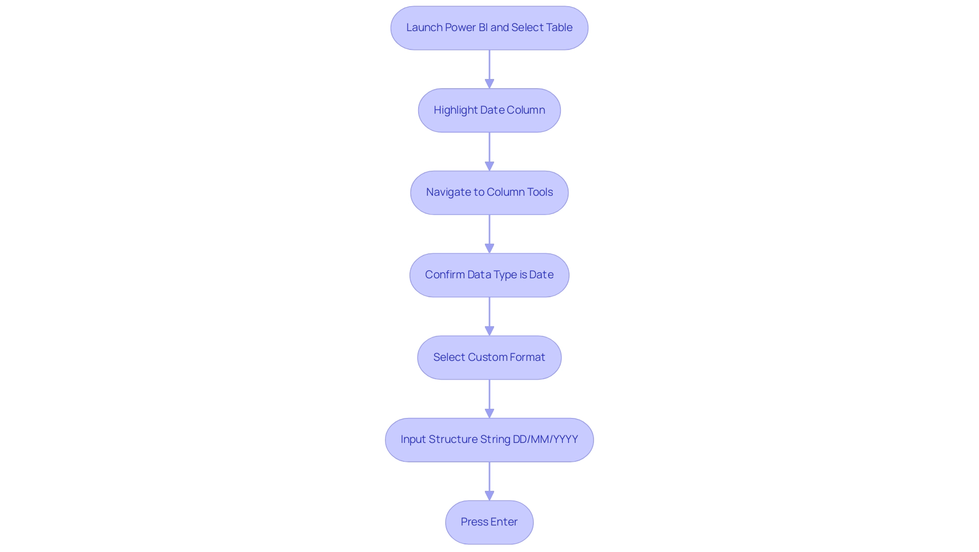
To change the date format to DD/MM/YYYY in Power BI, adhere to these steps for a seamless adjustment:
- Launch your Power BI report and select the table containing the column you intend to format.
- In the ‘Fields’ pane, click on the column that displays the date to highlight it.
- Navigate to the ‘Column tools’ tab located in the ribbon at the top of the window.
- In the ‘Data type’ dropdown, confirm that the data category is set to ‘Date’; it is crucial to ensure that a valid column includes year, month, and day, as any deviation will result in it being treated as text.
- Next, locate the ‘Format’ dropdown menu and opt for ‘Custom’.
- Input the structure string ‘DD/MM/YYYY’.
- Press ‘Enter’ to apply your changes.
After finishing these steps, you will understand how to power bi change date format to dd/mm/yyyy, ensuring your entries consistently show in the preferred DD/MM/YYYY arrangement throughout your report. This approach reflects best practices emphasized in community discussions, highlighting the importance of converting any textual representations of times into recognizable formats for optimal functionality in BI.
For example, in a case study regarding the creation of a Calendar Table in Power BI, it was emphasized that possessing a recognizable column for timestamps is crucial for forming connections with sales information, especially when dealing with a ‘Period’ column formatted as whole numbers. As community expert Jimmy801 advises, “Hello @DanielPasalic as a first step, transform your Period into a genuine moment.” Add a custom column called ‘Date’ and insert this formula:
Date From Text Period '01' 'de-DE'
This creates a Date-Column with the first day of your month. When you have this new column in your information model, you can apply every YEAR, MONTH function in DAX. Utilizing a distinct format for timestamps not only improves your information analysis abilities but also guarantees that your reports are precise and dependable.
Common Challenges and Solutions in Date Formatting
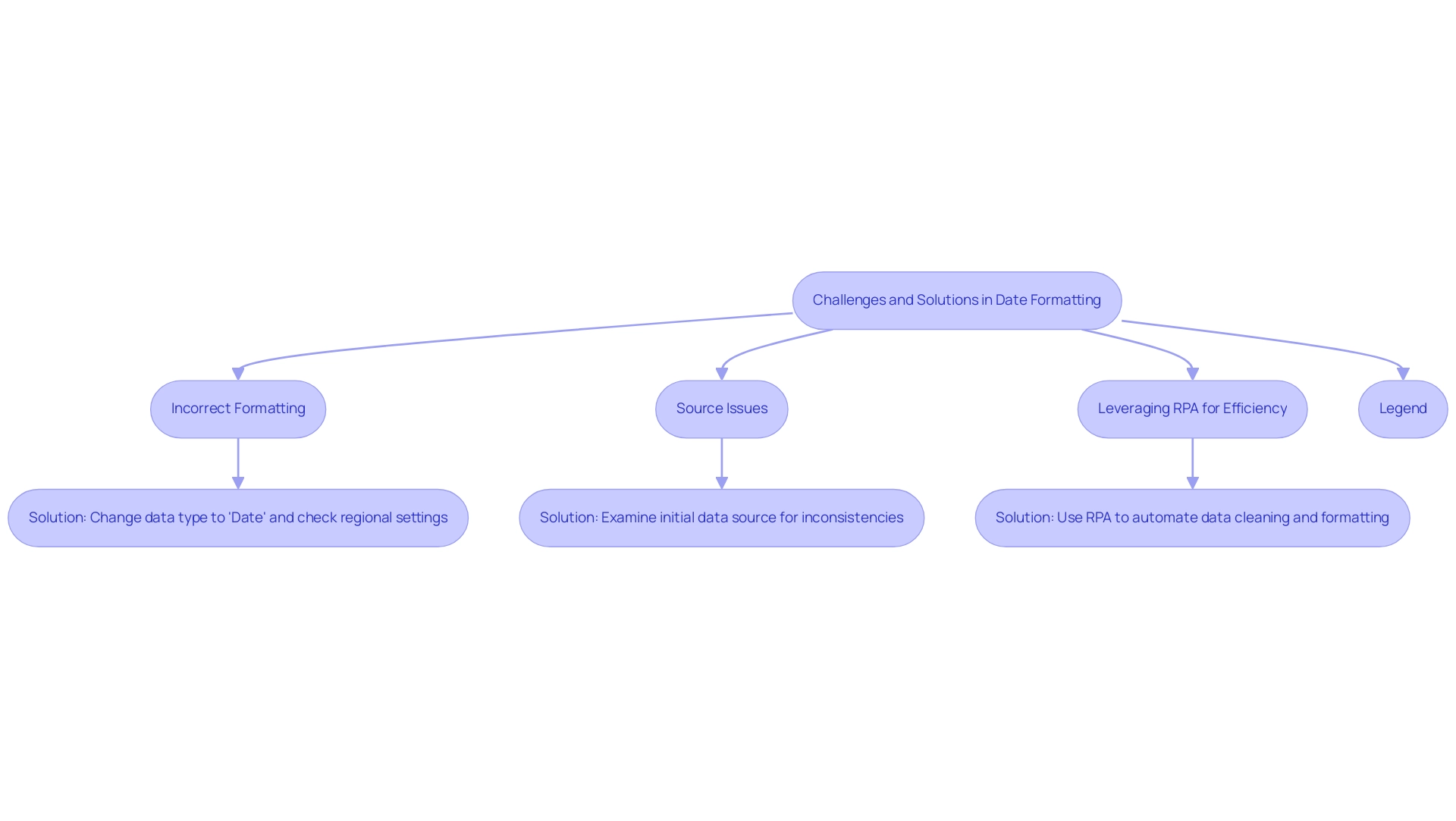
When navigating the intricacies of date formatting in BI tools, users often face several challenges that can hinder their workflow:
-
Incorrect Formatting: One of the most common issues is when dates do not display as expected. To resolve this, ensure that the data type is designated as ‘Date’ rather than ‘Text’ so that you can use Power BI to change date format to dd/mm/yyyy. This simple adjustment can often rectify formatting dilemmas and enhance efficiency by reducing errors, particularly when you need to power bi change date format to dd/mm/yyyy due to conflicts arising from regional settings. To ensure the power bi change date format to dd/mm/yyyy, it is essential to verify these settings by navigating to ‘File’ > ‘Options and settings’ > ‘Options’ > ‘Regional Settings’. As mentioned by community champion az38, users should be aware of both Global and Current File local settings to modify styles effectively. They shared insights on the importance of these settings:
@Mengerdahl where exactly did you try to change local? There are 2 places – Global and Current File local settings. With current file local settings English (United States) 04/01/10 00:00:00 was recognized as 2010 year for me.
This emphasizes the importance of comprehending how these configurations influence styling and the difficulties in attaining uniformity and precision, especially when trying to execute a power bi change date format to dd/mm/yyyy. -
Source Issues: If the preferred time structure remains difficult to find, it is wise to examine the initial source for legitimate time values. Data imported from Excel or CSV files may contain inconsistencies that require cleaning, particularly when you need to use Power BI to change date format to dd/mm/yyyy for accurate formatting. This relates to the broader challenge of poor master data quality, which can complicate the adoption of AI solutions in organizations seeking reliable insights.
-
Leveraging RPA for Efficiency: To streamline the data formatting process, organizations can utilize Robotic Process Automation (RPA) to automate data cleaning and formatting tasks. This not only improves efficiency but also minimizes the chances of human mistakes, enabling teams to concentrate on more strategic initiatives. Alongside these challenges, there is an increasing demand for Microsoft to improve time handling in BI visuals, as users desire greater flexibility and choices in styling. A relevant case study titled ‘Custom Format Request’ illustrates this frustration, where a user expressed the desire for a custom format like ‘Mon, Oct 14,’18’. This underscores the need for improved solutions in this area, particularly as businesses strive to leverage Business Intelligence for informed decision-making. Furthermore, with the upcoming February 2025 BI update promising new features, users may find relief from some of these formatting challenges in the near future. By proactively addressing these challenges and staying informed about updates, users can facilitate a more seamless experience when working with time formatting in Business Intelligence.
Best Practices for Consistent Date Formatting in Reports
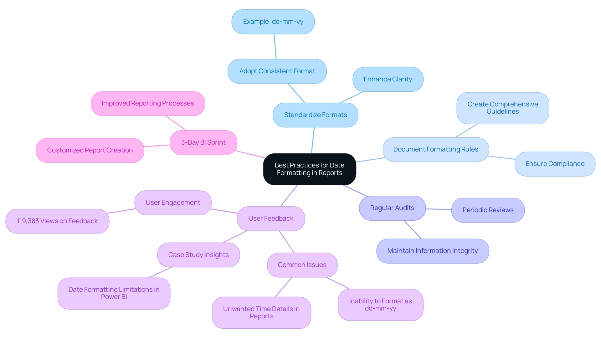
To ensure consistent date formatting across your Power BI reports and maximize the effectiveness of your insights, implement the following best practices:
- Standardize Formats: Adopt a date format that aligns with your organization’s standards, such as dd-mm-yy, and apply it uniformly across all reports. This approach not only fosters familiarity but also reduces confusion among users, ultimately enhancing the clarity of your reports.
- Document Formatting Rules: Create an extensive document detailing the formatting guidelines for time entries. Ensuring that all report creators are aware of and adhere to these guidelines is crucial for maintaining consistency and compliance across your organization’s reporting efforts.
- Regular Audits: Conduct periodic reviews of reports to verify adherence to established time formatting standards. This practice not only helps maintain information integrity but also enhances report clarity for stakeholders, making it easier to leverage the insights generated by your reports.
A common issue highlighted by users pertains to the constraints in Power BI’s formatting options, particularly when they want to power bi change date format to dd/mm/yyyy. For instance, one user expressed frustration over the inability to power bi change date format to dd/mm/yyyy, noting that while the data view displayed the information correctly, the report view included unwanted time details. This feedback, which received significant attention with over 119,383 views, reflects a widespread concern among users regarding formatting inconsistencies related to time.
To tackle these challenges, our 3-Day BI Sprint service provides a customized approach to report creation, ensuring that time formatting and other essential elements are expertly managed. Clients have reported significant improvements in their reporting processes after utilizing our service, demonstrating its effectiveness in resolving similar issues.
The case study titled “Date Formatting Limitations in BI” further illustrates this issue, as it discusses how users have echoed similar frustrations and the discussions it prompted about potential workarounds. These insights emphasize the essential need for organizations to establish and enforce consistent time formats in their reporting processes. By following these best practices and considering our 3-Day BI Sprint, organizations can enhance the quality and clarity of their business intelligence reports, ultimately leading to more impactful decision-making.
Advanced Techniques for Date Formatting in Power BI
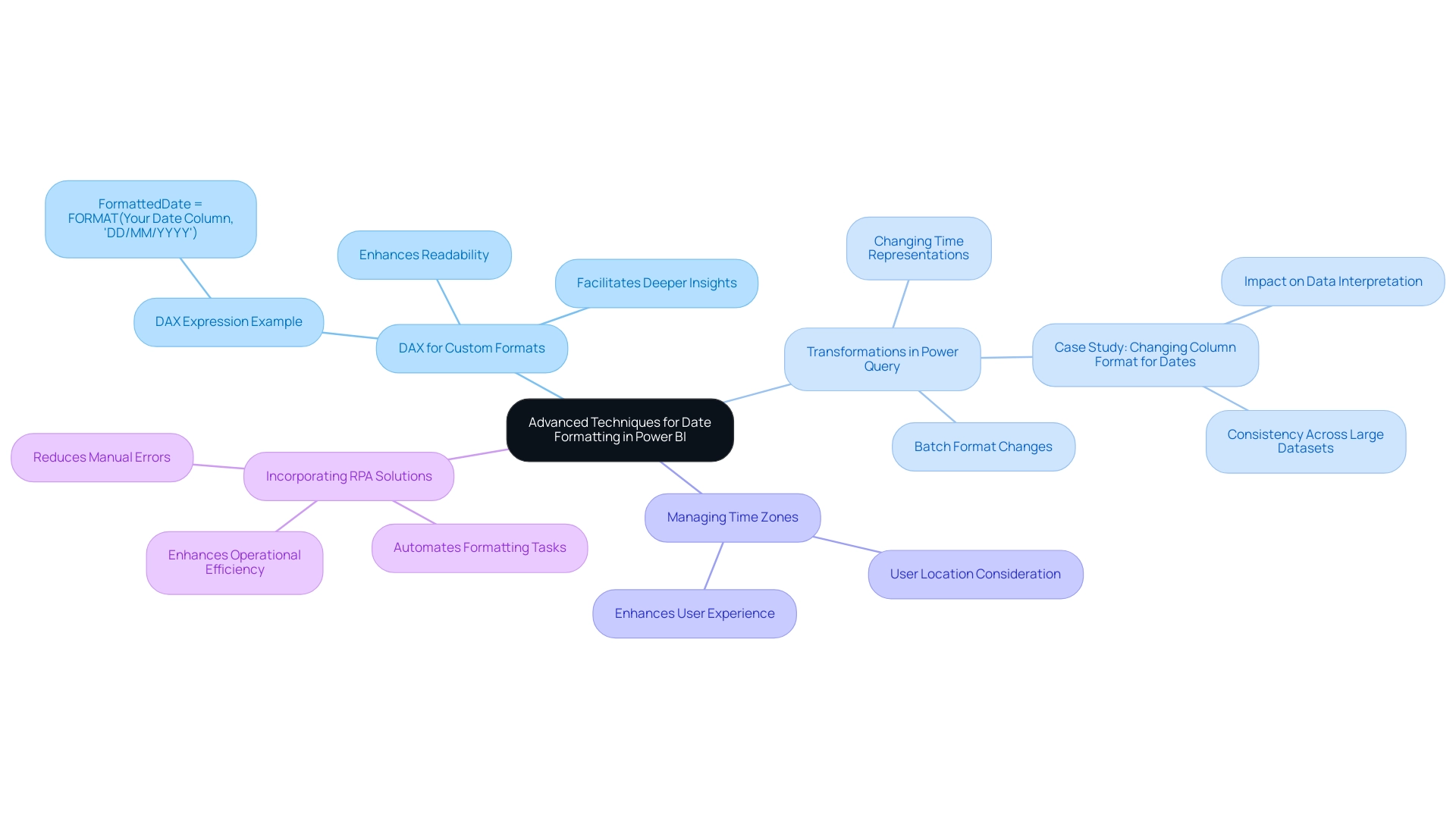
To harness advanced date formatting techniques in Power BI effectively, consider implementing the following strategies:
-
Employing DAX for Custom Formats: Dynamic date formatting can be achieved through calculated columns using DAX. For example, use the DAX expression:
FormattedDate = FORMAT(Your Date Column, 'DD/MM/YYYY')to apply the power bi change date format to dd/mm/yyyy, ensuring that your entries conform to the desired presentation style. This approach not only enhances readability but also facilitates deeper insights during analysis, a crucial factor in leveraging Business Intelligence for operational efficiency. -
Transformations in Power Query: Throughout the information loading phase, Power Query provides strong tools for altering time representations. Navigate to the ‘Transform’ tab to change the time arrangements before they are incorporated into your report. This step is essential as it can significantly influence information interpretation and ensure consistency across large collections. A pertinent case study named “Changing Column Structure for Dates in BI” illustrates how altering the structure of a column for dates can influence interpretations and calculations, especially when demonstrating how to power bi change date format to dd/mm/yyyy from ‘MM/DD/YYYY’. Using Power Query to change formats for multiple columns simultaneously can save time and ensure consistency across large datasets, addressing common challenges in report creation.
-
Managing Time Zones: In situations where your data includes multiple time zones, it’s essential to modify time values accordingly. Incorporating a computed column that considers the user’s location enables precise representations of time. This practice not only fosters relevance in your reports but also enhances user experience by providing contextually appropriate information, a key aspect in driving data-driven insights.
Moreover, incorporating RPA solutions can simplify the process of formatting and report creation in BI, alleviating the strain of manual modifications and reducing mistakes. By automating repetitive tasks, RPA enhances operational efficiency and allows teams to focus on more strategic initiatives.
To monitor report performance effectively, consider setting the max item for a ‘Top N’ filter to larger than what users would need, for example, 10,000. This can help identify and address bottlenecks in your reports.
Vikas Srivastava succinctly advises, > Efficiently manipulate timestamps in BI with these practical tips: Ensure proper formats, create dedicated temporal tables, leverage DAX functions, customize calculations, adapt to fiscal calendars, utilize relative filters, visualize trends, and optimize performance for enhanced analytics. By following these guidelines, you can navigate the complexities of date formatting in Power BI and learn how to power bi change date format to dd/mm/yyyy, ensuring both accuracy and clarity in your data presentations while unlocking the full potential of Business Intelligence and RPA in your operations.
Conclusion
Understanding the complexities of date formatting in Power BI is essential for organizations aiming to optimize their data analysis processes. By adopting the correct date formats, such as:
- MM/DD/YYYY
- DD/MM/YYYY
- YYYY-MM-DD
businesses can significantly enhance operational efficiency and reduce the risk of misinterpretation that can lead to erroneous insights. Implementing best practices, such as standardizing formats and documenting rules, ensures consistency across reports, facilitating clearer communication of insights to stakeholders.
Organizations face common challenges in date formatting, including:
- Incorrect settings
- Data source inconsistencies
Addressing these issues through regular audits and leveraging tools like Robotic Process Automation (RPA) can streamline processes and mitigate human error. Advanced techniques, including the use of DAX for custom formats and transformations in Power Query, provide additional layers of control and accuracy, allowing for tailored date presentations that meet specific analytical needs.
Ultimately, mastering date formatting in Power BI is not just about aesthetics; it is a foundational step in driving informed decision-making and fostering growth. By understanding the nuances of date handling and implementing effective strategies, organizations can unlock the full potential of their data, leading to improved insights, enhanced reporting capabilities, and a competitive edge in an increasingly data-driven landscape.
Overview
Power Automate enables users to efficiently export data to Excel by automating workflows and minimizing manual errors through a structured step-by-step process. The article supports this by outlining specific actions, such as creating flows and mapping information, while emphasizing the benefits of reduced mistakes and increased productivity, demonstrated through real-world case studies and best practices.
Introduction
In the ever-evolving landscape of business technology, automation has emerged as a critical driver of efficiency and productivity. Power Automate stands at the forefront of this revolution, offering organizations a robust platform to streamline workflows and minimize manual tasks without requiring extensive coding knowledge.
With its ability to integrate seamlessly with various applications and services, Power Automate not only enhances operational efficiency but also empowers users to leverage data analytics for informed decision-making.
As businesses increasingly turn to automation to navigate the complexities of data management and operational processes, understanding the capabilities of Power Automate becomes essential.
This article delves into the intricacies of Power Automate, providing a comprehensive guide on its functionalities, best practices, and the transformative impact it can have on modern organizations.
Understanding Power Automate: The Key to Automation
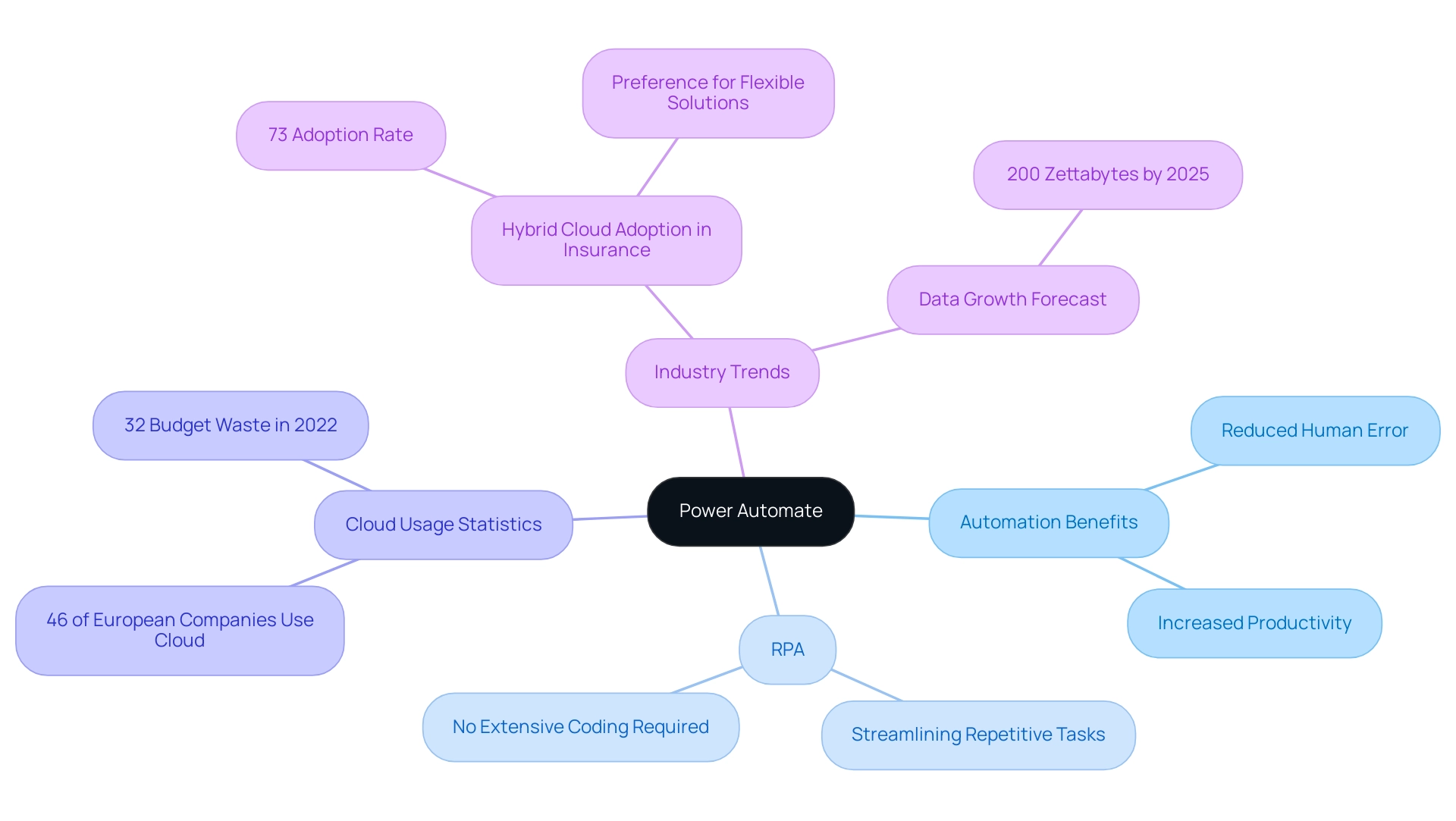
Power Automate export to Excel serves as a powerful cloud-based platform designed to facilitate the automation of workflows between diverse applications and services. This tool empowers users to streamline repetitive tasks without requiring extensive coding expertise, thereby enhancing business productivity through Robotic Process Automation (RPA). By utilizing pre-built templates and a wide range of connectors, organizations can effortlessly design automated workflows that facilitate power automate export to Excel, significantly saving time and minimizing the potential for human error.
As emphasized in a recent case study, a mid-sized company enhanced productivity by automating information entry and legacy system integration, decreasing entry mistakes by 70% and boosting workflow productivity by 80%. This underscores the practical benefits of RPA in real-world applications. Additionally, tailored AI solutions can further enhance these processes by identifying the right technologies that align with specific business needs, thereby complementing the capabilities of RPA.
Moreover, as Thales observes,
-
46% of European companies keep all their data in the cloud,
highlighting the increasing dependence on cloud solutions for operational effectiveness. However, with 32% of cloud budgets squandered in 2022, there is a growing demand for efficient automation tools like Power Automate, especially for tasks such as export to Excel. The adoption of hybrid cloud infrastructures, particularly in the insurance industry, where 73% of organizations prefer this model, illustrates a shift towards flexible cloud solutions that can enhance operational efficiency.
With forecasts suggesting that the globe will retain 200 zettabytes of information by 2025, grasping the functionalities of automation tools becomes progressively essential. By leveraging this tool and integrating Business Intelligence, organizations can transform raw information into actionable insights, enhancing productivity, reducing operational costs, and ultimately driving better outcomes across their processes, making informed decisions that foster growth and innovation.
Step-by-Step Process for Exporting Data to Excel
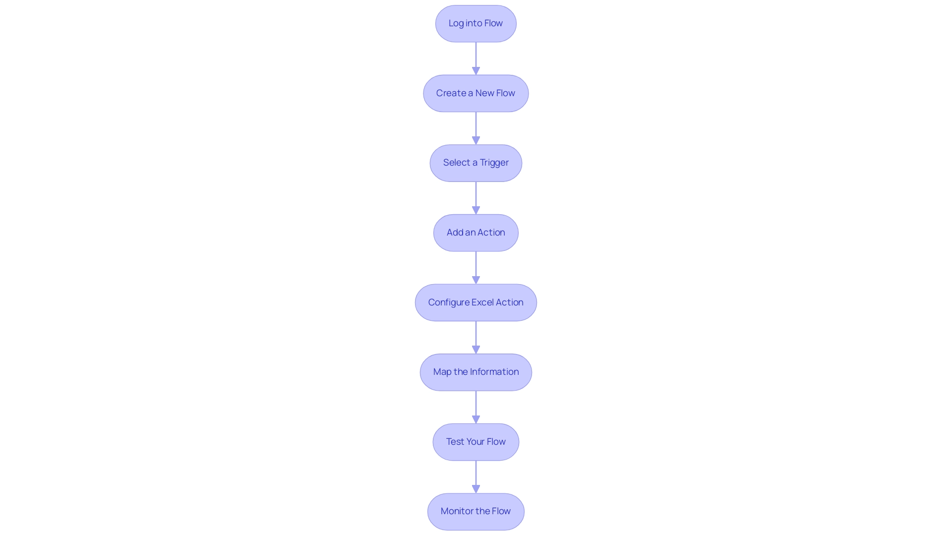
Using power automate export to excel, exporting information to Excel is a straightforward process that not only improves operational efficiency but also harnesses the capabilities of Robotic Process Automation (RPA) to simplify manual workflows, minimize errors, and allow your team to focus on more strategic tasks. It’s important to note that Excel has a limitation of 1,048,576 rows per worksheet, which can influence your management strategy. Follow these steps to successfully carry out this task:
- Log into Flow: Begin by accessing your account at flow.microsoft.com.
- Create a New Flow: Click on ‘Create’ and select either ‘Instant flow’ or ‘Scheduled flow’ according to your specific requirements.
- Select a Trigger: Choose an appropriate trigger that will set off the flow, such as ‘When an item is created’ in SharePoint, ensuring that the process responds to real-time events.
- Add an Action: Click on ‘New step’, search for ‘Excel’, and pick ‘Add a row into a table’. This action is pivotal for the information export process, demonstrating how power automate export to excel enhances productivity by automating repetitive tasks and minimizing the potential for human error.
- Configure Excel Action: Specify the location of your Excel file and select the table where the information will be integrated, benefiting from the enhanced integration capabilities introduced in the latest Power Automate updates.
- Map the Information: Align the information fields from your trigger to the corresponding columns in your Excel table, ensuring accurate representation.
- Test Your Flow: Save your flow and execute a test to confirm that the information exports correctly and meets your operational needs.
- Monitor the Flow: Finally, review the run history to ensure successful execution, and troubleshoot any issues that may arise, as common errors can impede the efficiency of information export workflows.
Utilizing tools like Flow allows for seamless integration of information, which is crucial in today’s information-rich environment. As Uber stated, ‘We knew we needed an accurate and reliable source of real-time flight data… we’re confident that OAG is the right partner.’ This emphasizes the significance of having reliable information sources in your operations.
Furthermore, in a case study centered on collecting case overview statistics in Process Mining, various metrics such as new events, active cases, case duration, and utilization were highlighted, showcasing the practical benefits and outcomes of utilizing this tool for information management. By adhering to this guide, you can effectively utilize the features of the automation tool and RPA, including Power Automate export to Excel, to simplify your export procedures, boost business efficiency, and obtain a competitive edge through insights based on information.
Troubleshooting Common Export Issues
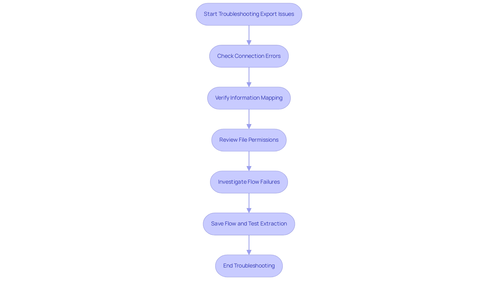
Transferring information via automation can be effective, yet individuals frequently encounter various obstacles that impede the procedure. Understanding these common issues is crucial for successful automation:
-
Connection Errors: A frequent hurdle is ensuring that the connection to Excel is correctly configured. Verify authentication settings and permissions to avoid disruption.
Statistics show that Power Automate interprets 500 errors thrown by connectors as a BadGateway error, complicating troubleshooting efforts. Overcoming these connectivity challenges is vital for maintaining operational efficiency, especially in a landscape where workflows are streamlined through power automate export to excel.
-
Information Mapping Issues: When information fails to appear in Excel, it’s essential to check that fields are appropriately mapped. Confirm that the column names in Excel match the information being sent to prevent miscommunication. Effective information mapping is a critical component of leveraging Business Intelligence for informed decision-making.
-
File Permissions: Permissions play a vital role in the export process. Ensure you have the necessary rights to write to the Excel file. If the file is stored in OneDrive or SharePoint, reviewing sharing settings is crucial to maintain access. Addressing file permission issues can significantly enhance the efficiency of your automated workflows, particularly when you utilize power automate export to excel.
-
Flow Failures: In the event of a flow failure, consult the run history for specific error messages. This feedback can guide adjustments to your flow, ensuring it aligns with the intended output. Utilizing RPA effectively involves continuous monitoring and refinement of these flows, with the final steps including saving the flow and testing the extraction process to ensure it works correctly for the power automate export to excel. This step is essential to confirm that all configurations are properly set and the information exports as intended. Tim Weinzapfel, an expert in Automation and Analytics, highlights the importance of addressing these issues, stating, > A big thanks to Colin Tomb for inquiring on this and I’m hoping this is useful. Such insights are invaluable as organizations navigate the complexities of power automate export to excel. Additionally, when a CSV file is created in SharePoint during this process, it includes a filename with the current date in ‘MM-dd-yyyy’ format, which helps in organizing exported data effectively. To illustrate the potential impact of resolving these challenges, consider the case of Stratos Wealth Partners, which implemented Encodian to streamline client agreement management. Their transformation resulted in improved productivity and operational advancements, highlighting the advantages of effectively tackling export challenges and utilizing RPA and Business Intelligence for business growth. Furthermore, tailored AI solutions can provide additional support in automating these processes, ensuring smoother operations and reducing the likelihood of errors, ultimately freeing up teams for more strategic work.
Best Practices for Efficient Use of Power Automate
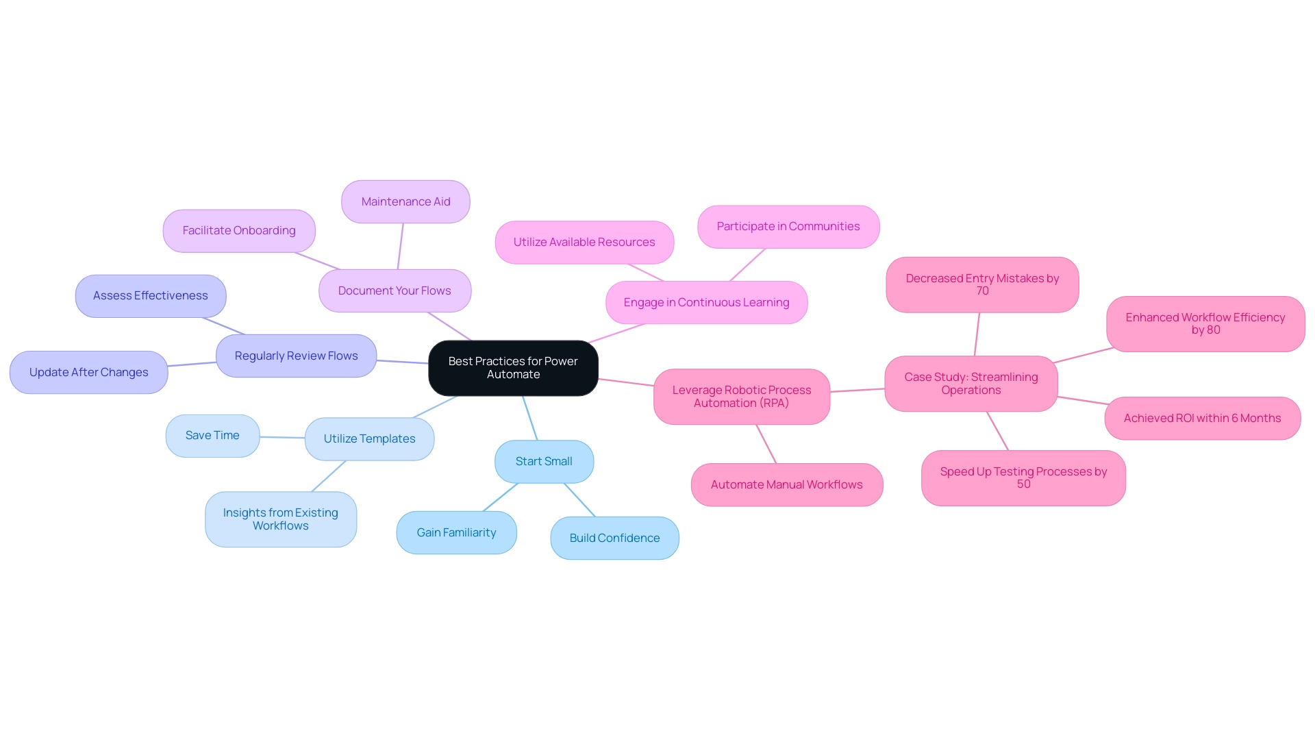
To maximize efficiency with Power Automate, implementing the following best practices can significantly enhance your workflows:
- Start Small: Initiate your journey with simple automations to gain familiarity with the tool. This approach allows you to build confidence before advancing to more complex workflows.
- Utilize Templates: Take advantage of the myriad pre-built templates in Power Automate, especially those designed for power automate export to excel. These templates not only save time but also provide insights into best practices derived from existing workflows, making them an invaluable resource for efficiency.
- Regularly Review Flows: Consistently assess and update your flows to ensure they remain effective and relevant, particularly after changes in source information or connected applications. This proactive approach can prevent potential bottlenecks and inefficiencies.
- Document Your Flows: Thorough documentation of your flows, including their purposes and operational details, is crucial. This practice aids in maintenance and facilitates onboarding for new team members, ensuring continuity and clarity in operations.
- Engage in Continuous Learning: Keep abreast of the latest features and best practices by actively participating in Power Automate communities and utilizing available resources. As Cornellius Yudha Wijaya, a data science assistant manager, aptly states,
AI has become a tool that certainly helps our data analysis process.
This sentiment highlights the transformative potential of automation tools in optimizing workflows and improving operational effectiveness.
Moreover, leveraging Robotic Process Automation (RPA) to automate manual workflows can further improve operational performance in today’s rapidly evolving AI landscape. A pertinent case study named ‘Streamlining Operations with GUI Automation’ demonstrates how a mid-sized company enhanced productivity by automating information entry, software testing, and legacy system integration. They decreased entry mistakes by 70%, sped up testing processes by 50%, and enhanced workflow efficiency by 80%, achieving ROI within 6 months.
This example exemplifies how tailored AI solutions and Business Intelligence can drive informed decision-making and enhance productivity.
Additionally, it is noteworthy that for a table containing 2 million rows, statistics are updated every 44,721 modifications, emphasizing the importance of maintaining accurate information for effective automation. Business Intelligence plays a crucial role in transforming this raw data into actionable insights, enabling organizations to make informed decisions that drive growth. By following these best practices, organizations can significantly enhance their automation initiatives, ensuring that the power automate export to Excel is utilized to its fullest potential while adapting to evolving operational requirements.
Integrating Power Automate with Other Tools for Enhanced Functionality
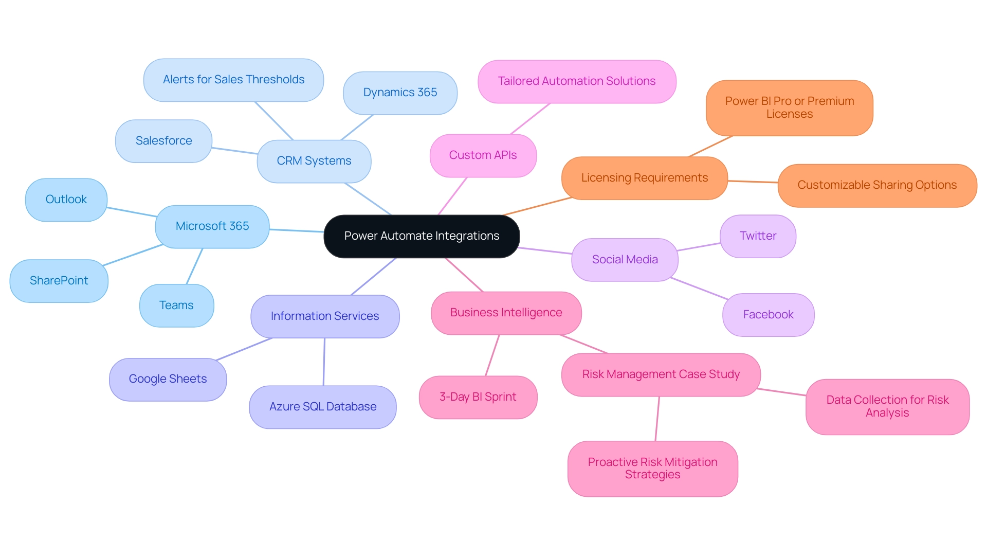
This automation solution stands out for its capacity to seamlessly connect with a diverse range of tools and platforms, significantly enhancing operational functionality and efficiency. Key integrations include:
- Microsoft 365: Connect with essential applications such as Outlook, SharePoint, and Teams to streamline communication and automate collaboration tasks. This integration is particularly beneficial, as it allows for real-time updates and enhanced teamwork, leading to more informed decision-making.
- CRM Systems: Integrate with leading platforms like Salesforce and Dynamics 365 to automate customer relationship management processes.
With a significant rise in usage rates anticipated for 2024, utilizing the automation solution for CRM tasks can enhance customer interactions and improve information accuracy, while also sending alerts if sales fall below a specified threshold to boost operational efficiency.
- Information Services: Employ connectors for services like Azure SQL Database or Google Sheets to automate information retrieval and processing, which can lead to more effective information management and reporting, essential for utilizing Business Intelligence.
- Social Media: Automate postings and interactions on social media platforms such as Twitter and Facebook, improving digital engagement without manual effort, thus freeing up resources for more strategic activities.
- Custom APIs: For advanced users, the automation solution provides the flexibility to create custom connectors, allowing for integration with proprietary systems. This capability fosters tailored automation solutions that directly meet unique business needs.
Additionally, the 3-Day BI Sprint enables teams to quickly create professionally designed reports, while the General Management App provides comprehensive management and smart reviews, enhancing the overall data reporting experience.
A relevant case study on Risk Management illustrates how organizations can use Automate to collect data on potential risks and feed it into BI for comprehensive analysis, enabling proactive risk mitigation strategies through detailed risk analysis reports.
As Caroline Mayou aptly states,
Their primary role is to bridge the gap between the technical potential of Automate and the practical needs of your business, ensuring that your investment in automation yields measurable outcomes.
This highlights the importance of aligning technical integrations with operational goals to achieve significant efficiency gains. Furthermore, it’s important to note that users must have Power BI Pro or Premium licenses to share dashboards and reports, which is crucial for maximizing the benefits of these integrations.
By focusing on Business Intelligence and Robotic Process Automation, organizations can enhance productivity and drive data-driven insights that foster growth and innovation.
Conclusion
Power Automate offers organizations a powerful solution to streamline workflows and enhance productivity through automation. By simplifying the process of integrating diverse applications and services, it enables users to tackle repetitive tasks efficiently without the need for extensive coding skills. As discussed, the platform’s capabilities extend beyond basic automation, incorporating Robotic Process Automation (RPA) and Business Intelligence to drive informed decision-making and operational efficiency.
The step-by-step approach to exporting data to Excel illustrates how easy it is to harness the full potential of Power Automate to improve data management and reporting. Addressing common export issues and adhering to best practices further ensures that organizations can maximize their investment in this technology. By engaging in continuous learning and utilizing pre-built templates, users can build confidence and enhance their automation strategies over time.
Ultimately, the seamless integration of Power Automate with various tools not only enhances operational functionality but also fosters collaboration and data-driven insights. As organizations navigate the complexities of today’s data-rich environment, leveraging the capabilities of Power Automate becomes essential for driving growth and innovation. By embracing automation, businesses position themselves to thrive in an increasingly competitive landscape, transforming their operations and achieving significant efficiency gains.
Overview
Changing the date format in Power BI visualizations is crucial for accurate data representation and can be achieved through methods such as using the Modeling Tab, Power Query, DAX expressions, and the DATE() function. The article emphasizes that these techniques not only enhance clarity and consistency in reporting but also mitigate common errors stemming from regional settings and incorrect interpretations, thus improving the overall operational efficiency of data analysis.
Introduction
In the realm of data analysis, the significance of date formatting in Power BI cannot be overstated. As organizations strive to make sense of vast amounts of information, the way dates are presented can greatly influence the clarity and accuracy of insights derived from data. With various formats like ‘MM/DD/YYYY’, ‘DD/MM/YYYY’, and ‘YYYY-MM-DD’ in play, understanding these nuances becomes essential to avoid costly misinterpretations that can lead to operational inefficiencies.
This article delves into the intricacies of date formats, explores effective methods for changing them, and highlights best practices that ensure data integrity and enhance decision-making capabilities. By mastering date formatting in Power BI, professionals can transform their reports into powerful tools that drive actionable insights and foster trust in the data presented.
Understanding Date Formats in Power BI
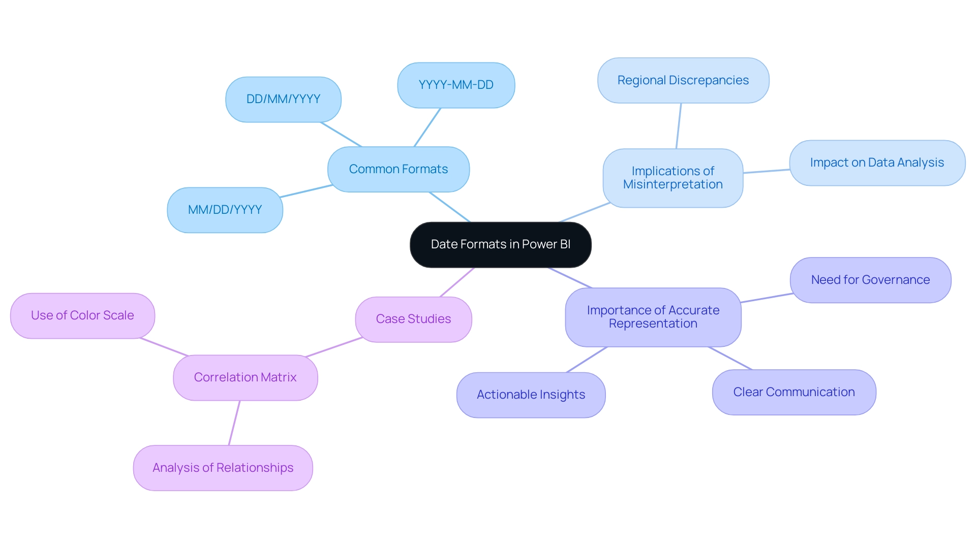
In Power BI, the option to change date format in visualization is essential as it influences how dates are displayed in dashboards, directly affecting operational efficiency. Among the most common styles are ‘MM/DD/YYYY’, ‘DD/MM/YYYY’, and ‘YYYY-MM-DD’. A comprehensive understanding of these formats is crucial; misinterpretations can result in significant errors in data analysis, adding to the difficulties of time-consuming documentation creation and data inconsistencies that many organizations encounter.
This issue is often exacerbated by a lack of governance strategy, which can result in discrepancies across reports. For instance, a format like ’01/02/2023′ could be interpreted as either January 2nd or February 1st, depending on the viewer’s regional settings. This ambiguity highlights the significance of clear communication in information visualization and actionable insights.
A recent study indicates that the error rate for the suggested approach to managing temporal representations was considerably lower than baseline methods, emphasizing the essential nature of precise temporal depiction. Furthermore, the correlation matrix case study demonstrates how format issues can impact the analysis of relationships between various information points in business contexts, ultimately resulting in confusion and mistrust in the information presented.
As Zixuan Liang from the Department of Computer and Information Sciences at Harrisburg University of Science & Technology states,
We present a second Normal Language Handling (NLP) strategy for creating a similar temporal design space language with comparable exactness, stretching out the calculation to deal with syntax variations and imperatives extraordinary to temporal structures.
This emphasizes the need for actionable insights derived from precise information representation. By identifying various temporal representations and their implications, you can ensure that your visualizations in Power BI change date format in visualization to convey precise information and offer clear, actionable guidance. Comprehending these subtleties is crucial for improving the reliability of your analysis and ensuring that documents, while filled with information, also provide clear guidance on the next steps.
Methods to Change Date Format in Power BI
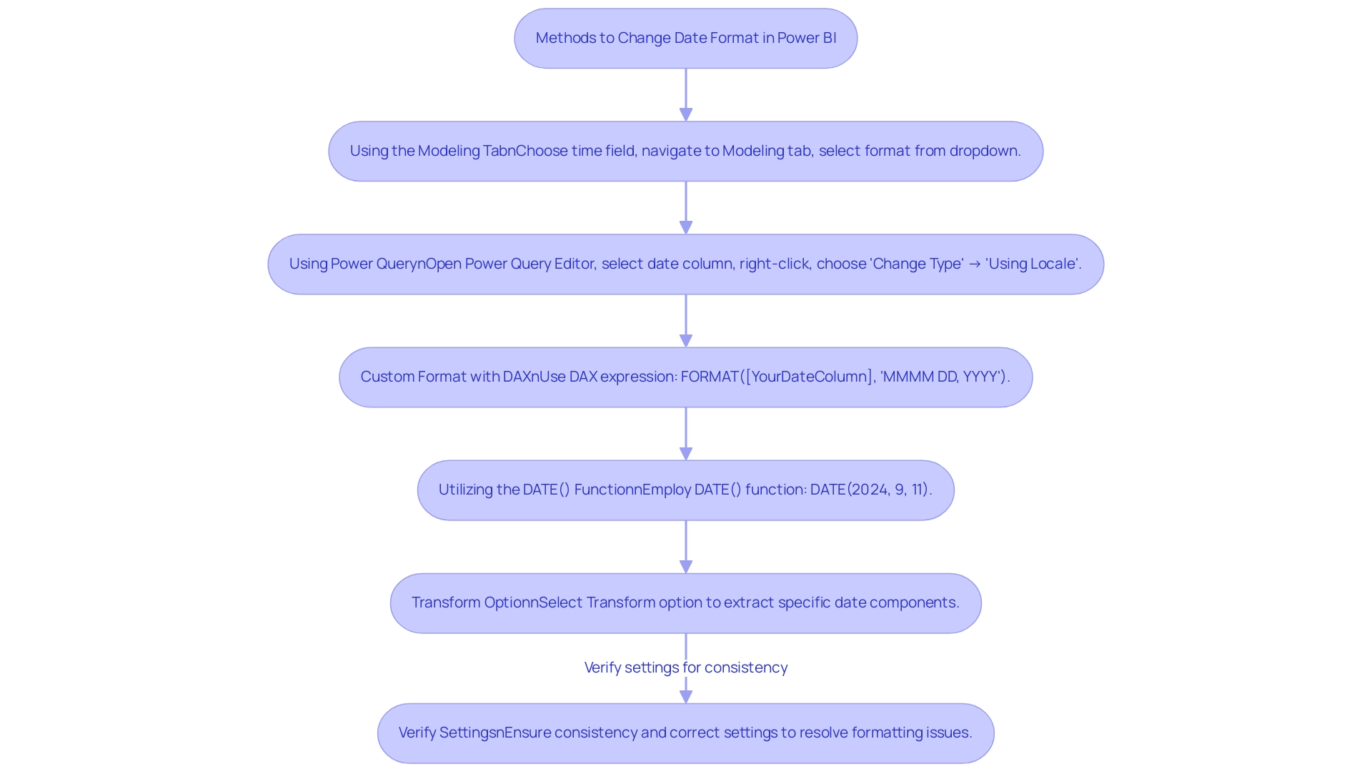
Changing date formats in Power BI can be accomplished through several effective methods, which not only enhance data presentation but also address common challenges faced by operations directors regarding report efficiency and clarity:
-
Using the Modeling Tab: Begin by choosing your time field in the Fields pane. Navigate to the Modeling tab, where you can choose your desired format from the ‘Format’ dropdown menu, ensuring that your data aligns with reporting standards and minimizes inconsistencies.
This method also offers clear guidance on how to present time effectively. -
Using Power Query: Open the Power Query Editor, select the date column, right-click, and choose ‘Change Type’ followed by ‘Using Locale.’
This permits you to define the format based on your regional or organizational requirements, improving consistency and trust in your documents, which directly tackles the confusion that may result from inconsistent information presentation. -
Custom Format with DAX: For unique formatting requirements, DAX expressions provide a powerful solution.
For instance, utilizingFORMAT([YourDateColumn], 'MMMM DD, YYYY')will transform the display to ‘January 01, 2023.’ This flexibility guarantees your documents are actionable and pertinent, offering stakeholders with clear next steps based on the information presented. -
Utilizing the DATE() Function: To generate specific timestamps, you can employ the DATE() function, such as
DATE(2024, 9, 11), which guarantees that the timestamp is correctly depicted in your documents, minimizing the time allocated for adjustments and reinforcing the dependability of your information. -
Transform Option: By selecting the Transform option, users can extract specific time components, such as the year, which can be particularly useful for analysis and reporting purposes.
These methods not only provide flexibility in how timestamps are presented in your reports but also ensure clarity and relevance in your visual representations.
Moreover, frequent problems with time formatting in Power BI, such as incorrect settings or invalid formats, can be resolved by verifying settings and ensuring consistency when attempting to change date format in visualization. This is emphasized in the case study ‘Troubleshooting Date Formatting Issues,’ which demonstrates how proper formatting of time can reduce confusion and mistrust in information.
By effectively employing these techniques, you can enhance your reporting capabilities in Power BI, transforming the way you leverage insights and make decisions.
Utilizing DAX for Advanced Date Formatting
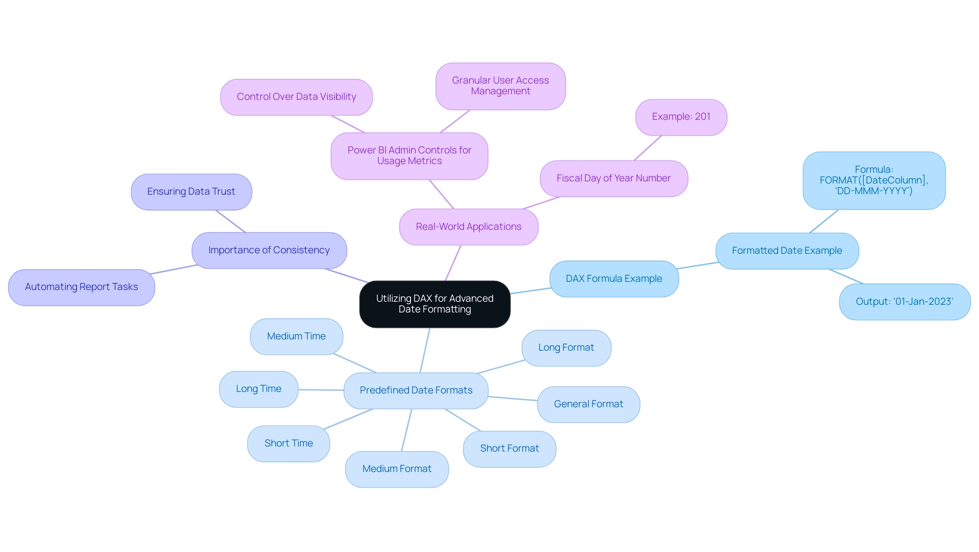
DAX (Data Analysis Expressions) functions as a powerful formula language within Power BI, allowing users to conduct complex calculations and custom formatting that can mitigate typical obstacles such as time-consuming documentation creation and information inconsistencies. For example, the following DAX formula exemplifies how to create a formatted date string:
FormattedDate = FORMAT([DateColumn], 'DD-MMM-YYYY')
This formula converts dates into a standardized format, resulting in outputs like ’01-Jan-2023′. By utilizing DAX, users can not only automate tedious report tasks but also ensure consistency across various reports, which is crucial for maintaining trust in the information presented.
Additionally, establishing a governance strategy is essential to prevent inconsistencies and confusion in reporting. DAX’s versatility encompasses its use in calculated columns and measures, enabling dynamic formatting that reacts to user interactions or filters, thus offering actionable insights instead of merely raw data. For instance, using DAX to create measures that summarize key performance indicators can guide stakeholders in decision-making processes.
Predefined date/time formats available in DAX include:
- ‘General Format’
- ‘Long Format’
- ‘Medium Format’
- ‘Short Format’
- ‘Long Time’
- ‘Medium Time’
- ‘Short Time’
This variety offers users options for presenting information clearly. Furthermore, the Fiscal Day of Year Number statistic, such as 201, can be utilized in DAX calculations for fiscal reporting, illustrating the practical application of temporal functions in a business context. As mentioned in professional circles,
You should utilize the ‘Date/Time’ information type for information that requires both temporal and chronological details,
highlighting the importance of appropriate information types for effective temporal manipulation.
Moreover, the case study on Power BI Admin Controls for Usage Metrics demonstrates how DAX can be employed to manage visibility and reporting, showcasing its real-world applications. Mastering DAX not only enhances your ability to adapt time formats for various reporting contexts but also empowers you to power bi change date format in visualization, allowing you to leverage advanced temporal formatting techniques that can significantly improve the clarity and efficacy of your information presentation.
Troubleshooting Common Date Formatting Issues
Users must navigate a variety of challenges when they need to power bi change date format in visualization, which impacts operational efficiency and the quality of data-driven insights. Understanding these common issues and their solutions can significantly enhance the accuracy and presentation of your visualizations, particularly when you need to power bi change date format in visualization. Here are some key problems and recommended fixes:
-
Incorrect Time Interpretation: When times seem incorrect, it’s crucial to check the data type of the relevant column. Ensure that it is set to ‘Date’ in Power BI to avoid misinterpretation, which can hinder informed decision-making.
-
Regional Settings Conflicts: If your temporal representation does not match your expectations, check the regional settings within Power BI.
Navigate to ‘File’ > ‘Options and settings’ > ‘Options’ > ‘Regional Settings’ to adjust these as necessary, ensuring consistency across your reports. -
DAX Errors: Encountering errors in DAX formulas can be frustrating. Ensure that any referenced column exists and that your syntax is correct.
It’s advisable to meticulously review your DAX expressions for typographical errors to maintain report integrity.
Additionally, user feedback highlights that recent Power BI releases have lacked styling options, prompting some to create calculated columns with a ‘Short Date’ setting to power bi change date format in visualization, as noted by Dharman:
However, the below solution works for me: Create a Calculated Column ref.
To troubleshoot date formatting issues effectively, users can power bi change date format in visualization by applying the ‘Short Date’ format to the original Date column. Additionally, a case study titled ‘Troubleshooting Date Formatting Issues in Power BI’ highlights the significance of checking formatting settings, verifying formats, and ensuring consistency across sources to resolve common formatting problems, particularly focusing on how to power bi change date format in visualization.
Implementing these strategies not only enhances accuracy but also ensures that your reports maintain their integrity and clarity, thereby driving better operational outcomes. To further streamline these processes, Robotic Process Automation (RPA) can be utilized to automate repetitive tasks associated with preparation and formatting in Power BI. By integrating RPA, businesses can reduce the time spent on manual adjustments, allowing teams to focus on analyzing insights rather than fixing formatting errors.
The importance of precise information representation is emphasized by current events, such as the low approval rating of President Zelensky, highlighting the need for trustworthy information in analysis. Lastly, it is worth noting that other governments provide open data repositories similar to Statistics Canada, which can serve as valuable resources for your data analysis and further reinforce the importance of maintaining data integrity.
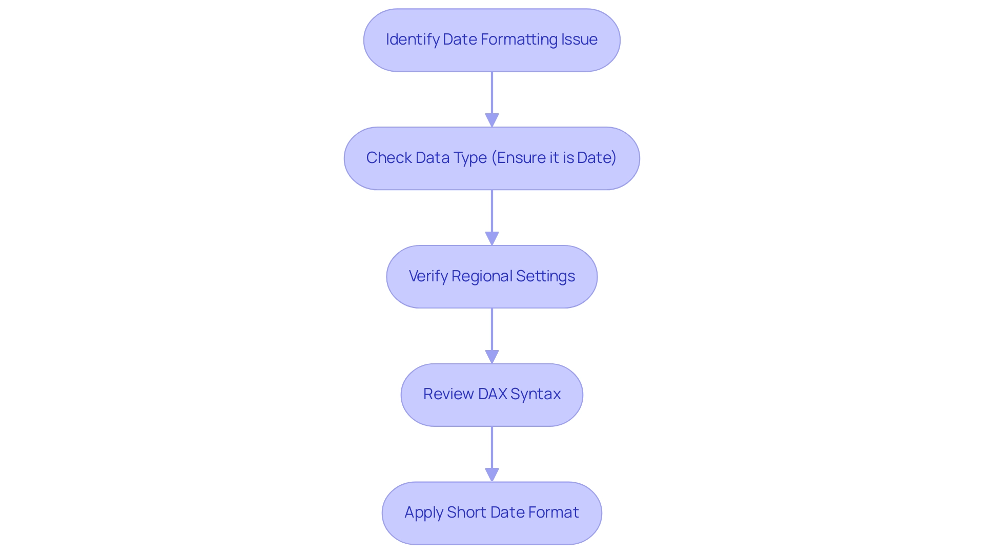
Best Practices for Effective Date Formatting in Visualizations
To achieve effective time formatting in your Power BI visualizations while addressing common challenges in leveraging insights, adhere to these best practices:
- Consistency: Maintain a uniform date format across your documents to eliminate confusion and enhance comprehension. This consistency is essential, as 65% of businesses report a boost in client engagement when information is clearly visualized, thus reducing the time spent on report creation. Inconsistent information can lead to confusion and mistrust, making clarity essential.
- Clarity: Choose structures that are easily readable and straightforward, particularly for stakeholders who may not be intimately familiar with the underlying data. Effective design guidelines can help prevent common pitfalls, ensuring that your visuals convey the intended message. As Krzywinski and Altman remind us, clarity in communication is essential for ensuring the significance of the information presented.
- Contextual Relevance: Modify time formats to conform with the document’s context. For example, financial reports may be more effective when presented using fiscal year formatting, while operational reports would benefit from standard calendar references. This tailored approach not only enhances clarity but also supports informed decision-making based on accurate data insights, especially when using Power BI to change date format in visualization.
- Use Relative Dates: Incorporate relative date filters, such as ‘Last 30 Days’, when appropriate. This approach not only enhances the dynamism of your documents but also keeps them relevant to ongoing operations, addressing the challenge of providing actionable guidance.
- Leverage RPA: Consider using Robotic Process Automation to streamline the document creation process. By automating repetitive tasks, you can focus more on analysis and less on manual report generation, further enhancing productivity and reducing the potential for errors.
By implementing these best practices, you can significantly improve the clarity and effectiveness of your Power BI visualizations, particularly when you learn how to power bi change date format in visualization, fostering more informed decision-making based on your data. Remember, following guidelines for effective figure design can help avoid common pitfalls, improve information dissemination, and ultimately enhance business productivity.
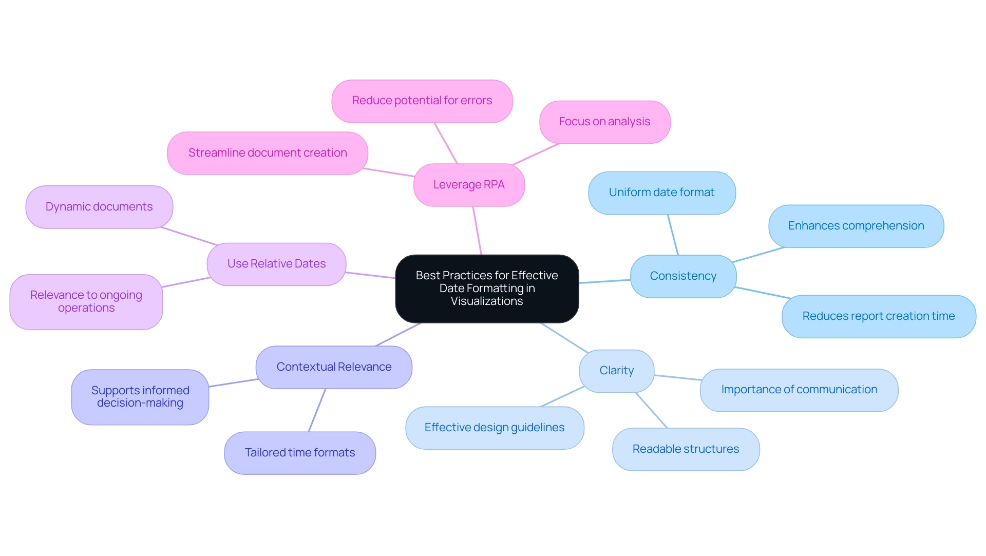
Conclusion
Mastering date formatting in Power BI is essential for transforming data into actionable insights. Throughout the article, the critical importance of understanding various date formats, including:
- ‘MM/DD/YYYY’
- ‘DD/MM/YYYY’
- ‘YYYY-MM-DD’
has been emphasized. Misinterpretations of these formats can lead to significant errors, affecting operational efficiency and the clarity of reports. By employing effective methods to change date formats, such as using the Modeling Tab, Power Query, and DAX, users can enhance the presentation of their data while ensuring consistency and trustworthiness.
Furthermore, troubleshooting common date formatting issues plays a vital role in maintaining the integrity of data visualizations. By addressing problems like incorrect date interpretation and regional settings conflicts, users can significantly improve the overall quality of their reports. Best practices, including maintaining consistency, ensuring clarity, and adapting formats to context, are crucial for effective communication of insights derived from data.
Ultimately, the ability to accurately format dates in Power BI not only enhances reporting capabilities but also fosters better decision-making processes. By prioritizing clear and consistent date representation, organizations can build trust in their data and drive operational success. Embracing these strategies will empower professionals to leverage the full potential of their data analysis efforts, ensuring that insights derived from Power BI are both impactful and reliable.
Overview
Mastering Power Automate dashboards enhances operational efficiency by automating repetitive tasks and streamlining workflows, which significantly reduces errors and improves productivity. The article provides a detailed tutorial that includes statistics on time savings, successful case studies demonstrating measurable outcomes, and best practices for dashboard design, all reinforcing the effectiveness of Power Automate in modern business operations.
Introduction
In the digital age, where efficiency is paramount, organizations are increasingly turning to automation tools like Power Automate to transform their operations. This powerful solution not only alleviates the burden of repetitive tasks but also enhances productivity by streamlining workflows across various applications.
As companies grapple with challenges such as staffing shortages and manual data entry errors, the ability to automate processes becomes a game changer. Recent statistics highlight the significant time savings and operational improvements that can be achieved, making it clear that understanding and implementing Power Automate is essential for any organization looking to thrive in today’s competitive landscape.
From integrating with Power BI for enhanced reporting to designing effective dashboards, the journey toward operational excellence through automation is both compelling and impactful.
Understanding Power Automate: A Key to Operational Efficiency
This automation tool stands out as a transformative resource designed to automate repetitive tasks and streamline workflows across various applications and services. This innovative solution addresses challenges such as manual information entry errors, slow software testing, and staffing shortages, enhancing operational efficiency significantly. With its user-friendly interface, even those without extensive coding knowledge can create automated workflows, reducing the risk of errors and inefficiencies.
Recent statistics reveal that employees estimate a potential time saving of approximately 240 hours per year through task automation, underscoring the tool’s effectiveness in enhancing productivity. Additionally, a 2022 study from Salesforce indicated that over 90% of organizations experienced an increased demand for automation across different departments, reflecting a broader shift towards efficiency-driven solutions. Significantly, 45% of individuals intend to use AI for replying to messages and emails, emphasizing the increasing dependence on automation tools such as Flow in daily business activities.
The case study titled ‘Streamlining Operations with GUI Automation’ illustrates how implementing GUI automation has led to a 70% reduction in data entry errors and a 50% acceleration in testing processes, showcasing measurable outcomes that resonate with the goals of directors of operations efficiency. Furthermore, the implementation achieved a return on investment (ROI) within six months, emphasizing the financial benefits of automation. The smooth integration of Microsoft’s automation tools with other applications and third-party services enhances the power automate dashboard, optimizing business processes and enabling organizations to link diverse systems while promoting improved operational efficiency.
Moreover, the 2024 Global State of IT Automation report emphasizes the importance of understanding the evolving landscape of automation tools, encouraging IT leaders to adapt to current trends. For companies striving to enhance their task management efficiency, comprehending and utilizing the features of automation tools and RPA solutions like EMMA RPA is crucial for attaining a risk-free ROI and better employee morale.
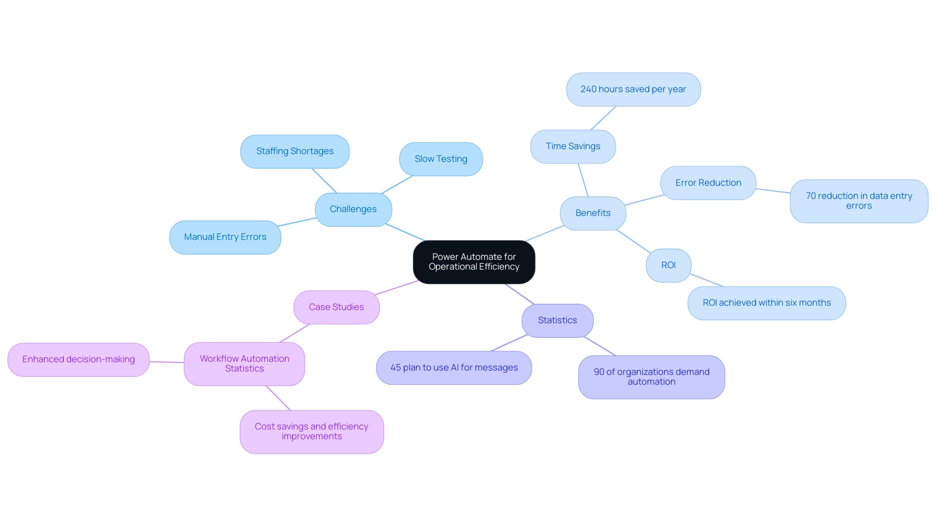
Integrating Power Automate with Power BI for Enhanced Dashboards
Integrating Flow with Business Intelligence enables organizations to automate refreshes, greatly simplifying reporting procedures while tackling typical workplace issues. For example, by creating a flow in Automate that triggers updates in BI, organizations can combat repetitive tasks that often burden teams. Creating a flow that automatically refreshes your BI dataset whenever new information is entered into a linked Excel file ensures that your dashboards are consistently updated with the most recent insights, enhancing decision-making capabilities and responsiveness to operational changes.
According to Bianca Barragan,
In our example, we’ll start our workflow from BI, where the trigger will always be a button within the BI report.
Moreover, this integration addresses staffing shortages by reducing the manual effort required for data handling, allowing teams to focus on more strategic tasks. Additionally, BI test plans can be scheduled, and key stakeholders are automatically notified by email, further demonstrating the efficiency of this integration.
This synergy between the automation tool and BI not only enhances the effectiveness of the power automate dashboard but also offers crucial insights at a glance, promoting a data-driven environment vital for long-term success. A case study titled ‘Optimizing Business Processes with Automation’ illustrates how integrating these tools accelerates decision-making and improves productivity. The case study reveals that by implementing these automation strategies, the company achieved a 30% reduction in reporting time and a 25% increase in data accuracy, demonstrating the tangible benefits of modernization.
Furthermore, the recent development of automatically storing BI test results in a centralized repository enhances collaboration and sharing across teams, making it a crucial strategy for operational efficiency, especially in sectors like healthcare, where timely information can revolutionize service delivery. Importantly, by alleviating the burden of repetitive tasks, organizations can improve employee morale, allowing teams to engage in more meaningful work and fostering a positive workplace culture.
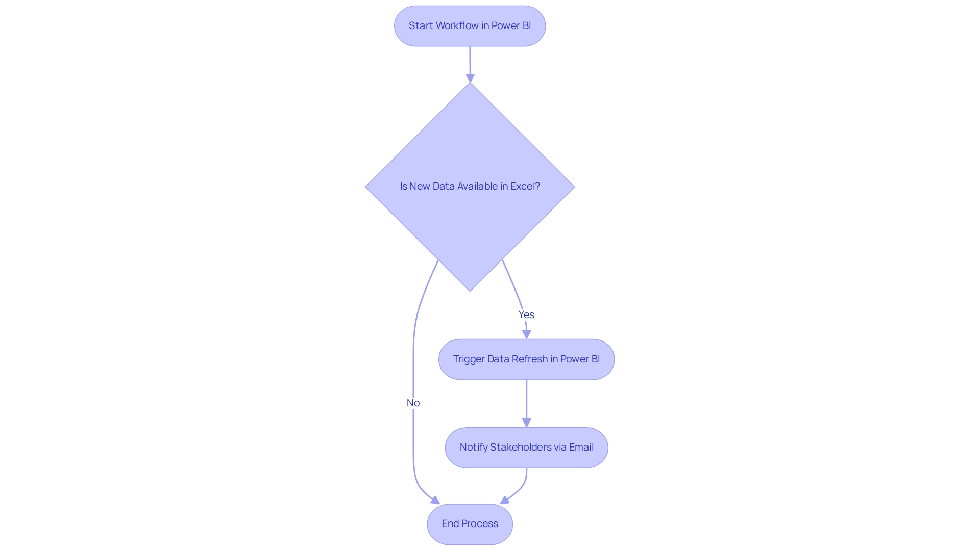
Step-by-Step Guide to Creating Power Automate Dashboards
Creating a power automate dashboard involves several key steps that streamline the process and enhance operational efficiency while addressing common workplace challenges. Here’s a detailed guide:
-
Identify the Information Sources: Begin by determining the information sources to include in your dashboard.
Common options are SharePoint lists, Excel files, or various databases. A comprehension of your information landscape is crucial for effective visualization, especially as outdated systems can stifle innovation and hinder productivity. -
Create a Power Automate dashboard: Navigate to Power Automate and set up a new flow.
Choose the type of flow that aligns with your operational needs, whether it’s automated, instant, or scheduled. This foundational step ensures that your power automate dashboard updates consistently with new information, ultimately reducing the repetitive tasks that burden your team and allowing them to focus on higher-value tasks to address staffing shortages. -
Connect to Information Sources: Integrate the chosen information sources by adding appropriate connectors.
Ensure you verify each connection to maintain security and reliability, followed by testing to confirm that transfers are accurate. This step is pivotal in modernizing your operations, particularly in overcoming challenges posed by outdated systems. -
Design the Dashboard in BI: Open BI and create a new report.
Import the information from your Power Automate dashboard, facilitating a seamless transition from information collection to visualization. By utilizing BI’s capabilities, you can improve reporting and gain actionable insights that guide decision-making processes. -
Visualize the Data: Utilize BI’s robust visualization tools to craft meaningful charts, graphs, and tables.
This step is essential as it converts raw information into insights, assisting in decision-making processes. For instance, ClickUp Dashboards can visualize task statuses, workload, and productivity, providing valuable insights into team performance and highlighting the efficiency gains from RPA implementation. -
Release the Interface: Once your interface is refined and prepared, release it to the BI service.
This action grants access to your team and stakeholders, ensuring that everyone is aligned with operational metrics. By doing so, you not only improve operational visibility but also promote efficiency throughout business processes.
By following these steps, you can create a practical and informative display using a power automate dashboard that enhances your analytical capabilities. As Douglas Rocha, a statistics enthusiast, emphasizes,
Can you perform analytics in BI without DAX? Yes, you can, you can do it without measures as well and I will teach you how at the end of this tutorial.
Furthermore, consider the statistics from projects A, B, C, and D, which provide a quantitative foundation for your dashboard design. Moreover, the case study on visualizing statistical measures in Business Intelligence illustrates practical applications and alternative methods for information representation, enriching your instructional content and demonstrating how these tools can significantly enhance productivity and operational efficiency through effective information utilization.
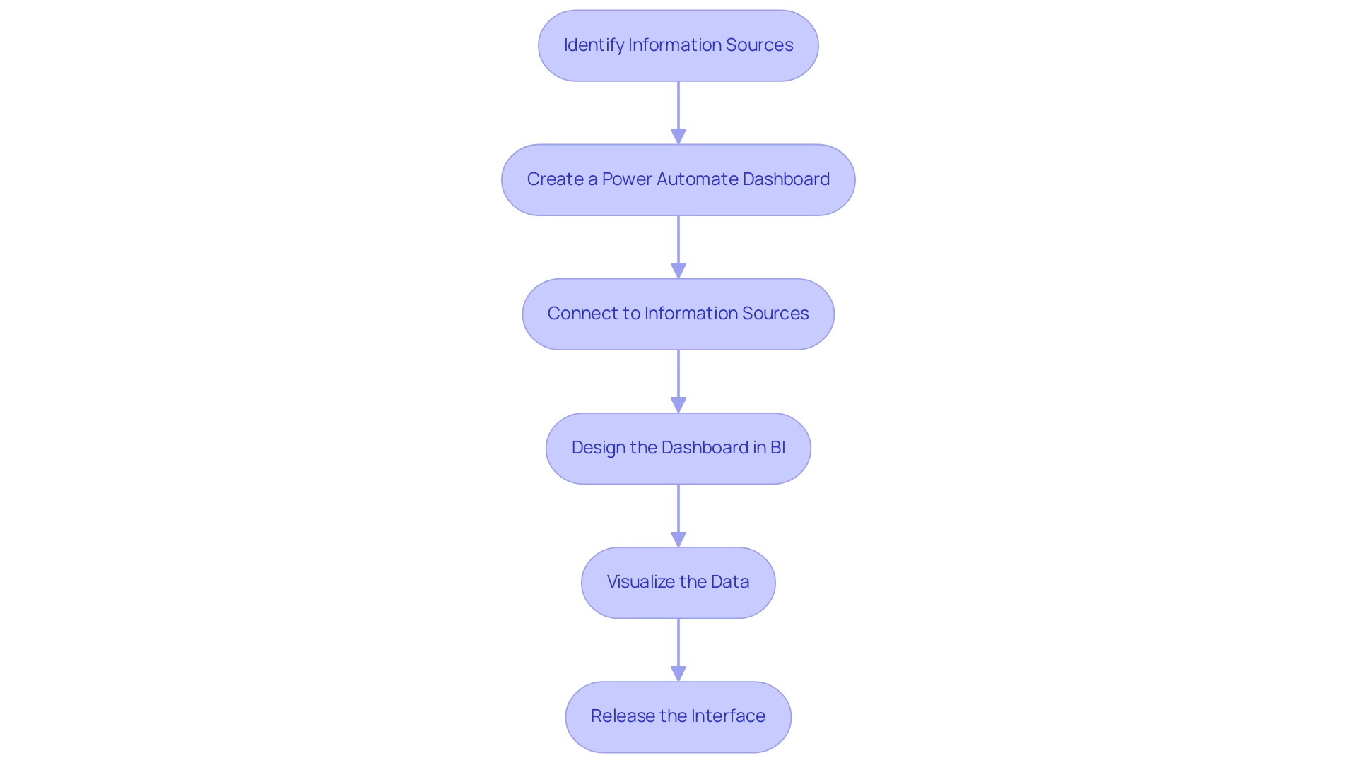
Automating Reports and Dashboards in Power BI
Automating reports in BI is a game changer for enhancing operational efficiency, significantly reducing the time traditionally spent on manual report generation. By utilizing Automation tools, companies can effortlessly schedule information refreshes and alerts, streamlining the reporting process. For example, organizations can configure a flow that automatically refreshes a Power BI dataset daily at a specified time, coupled with an automated email notification sent to stakeholders once the refresh is complete.
This approach not only guarantees that all team members have immediate access to the latest insights but also eliminates the need for manual updates, combating the exhaustion caused by repetitive tasks. Consequently, teams can shift their attention towards analysis and informed decision-making, instead of being hindered by collection. Furthermore, addressing workplace challenges such as staffing shortages and outdated systems is crucial for maintaining morale and productivity.
Contemporary RPA solutions can effectively address these challenges; for example, a mid-sized firm enhanced efficiency by automating entry processes and other repetitive tasks using GUI automation, leading to a 70% reduction in entry errors and an 80% improvement in workflow efficiency. It’s essential to remember that to ensure information is accurately represented in the Usage Metrics Report, users must access the content from within the workspace at least once; otherwise, the information will not be processed. The ‘total count’ in usage metrics represents unique reports viewed over 90 days, highlighting the effectiveness of automated reporting.
In this landscape of automated reporting, the emphasis on efficiency becomes paramount, paving the way for organizations to harness their data effectively. As Arish Siddiqui aptly states, ‘If you need any help, don’t hesitate to reach out to us,’ underscoring the support available for users navigating automated reporting and addressing the challenges of implementing RPA solutions.
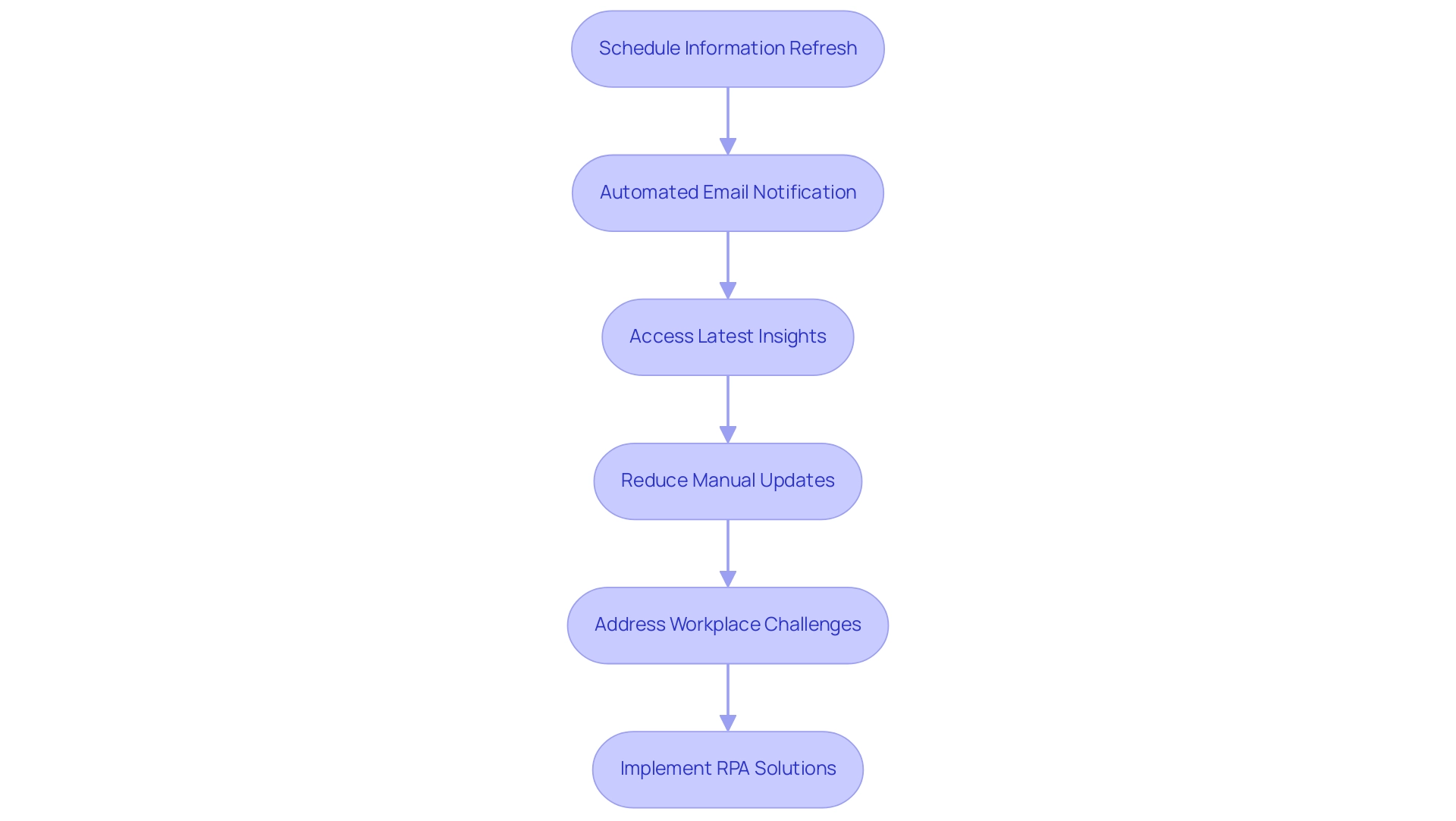
Best Practices for Designing Effective Power Automate Dashboards
When creating effective Power Automate displays, it’s crucial to adhere to several best practices:
- Maintain Simplicity: Clutter can overwhelm users, so prioritize a clean design that showcases only the key metrics aligned with your operational objectives. Studies suggest that display panels should ideally present an at-a-glance view and fit within a single screen, facilitating quick comprehension. For instance, the CleanMax dashboard exemplifies how a simple design can help users easily manage memory and usage without feeling overwhelmed.
- Establish Visual Hierarchy: Organizing information logically is vital. Utilize size, color, and layout strategically to highlight the most critical information points, as Edward Tufte aptly noted,
[the visual representation of the information](https://rib-software.com/en/blogs/bi-dashboard-design-principles-best-practices) should be directly proportional to the numerical quantities represented. - Integrate Interactive Features: Incorporate slicers and filters to allow users to explore data dynamically. This interactivity not only enhances user engagement but also fosters deeper insight discovery, making the Power Automate dashboard a more effective tool. Utilizing Business Intelligence tools such as BI can further enhance this aspect by providing actionable insights through well-structured reporting. Notably, the ‘3-Day Power BI Sprint’ offers a rapid way to create professionally designed reports, while the ‘General Management App’ supports comprehensive management and smart reviews.
- Conduct User Testing: Engaging with actual users to gather feedback on usability and effectiveness is essential. Adjustments made based on user input can significantly enhance the overall user experience.
- Utilize Analytical Displays: Ensure that your displays showcase critical metrics in tables and charts for trend analysis and predictions. This approach offers users a thorough understanding of their information and supports informed decision-making. By incorporating insights from RPA, organizations can streamline manual workflows, thus significantly boosting operational efficiency. However, it is essential to address challenges such as poor master data quality and barriers to AI adoption, which can hinder the effective implementation of visual displays. By following these best practices, you can create visual displays that effectively meet operational needs while ensuring a positive experience for users.
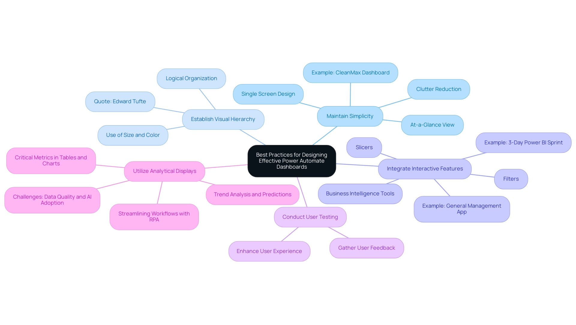
Overcoming Challenges in Implementing Power Automate Dashboards
The execution of automation displays is frequently faced with several difficulties, particularly staff opposition to change and technical barriers. Addressing these issues effectively is crucial for fostering a smooth transition, especially in the context of leveraging Robotic Process Automation (RPA) to automate manual workflows and enhance operational efficiency. According to the case study titled ‘Challenges in Business Process Automation,’ decision-makers frequently cite time constraints and budget limitations as significant barriers to successful implementation.
Here are some strategies to consider:
- Communicate Benefits Clearly: Articulating the advantages of RPA and visual displays is vital. Clearly explain how these tools can alleviate workloads, reduce errors, and enhance efficiency, significantly fostering buy-in from team members.
- Provide Training and Resources: Comprehensive training sessions are essential. Ensuring that all users are well-acquainted with the new tools and processes will help build confidence and reduce anxiety associated with technological changes. Our 3-Day BI Sprint can be an excellent starting point, enabling teams to create fully functional, professionally designed reports that facilitate informed decision-making.
- Highlight Tailored AI Solutions: Consider integrating tailored AI solutions that can help your organization identify the right technologies to streamline processes and enhance productivity. These solutions can cut through the noise of the rapidly evolving AI landscape, aligning with your specific business goals.
- Start Small: Initiating a pilot program with a small team allows organizations to gather valuable feedback and make necessary adjustments before a full-scale rollout. This approach minimizes disruption and builds a foundation for broader adoption.
- Monitor and Adjust: Post-implementation, it is important to regularly check in with users to identify any issues and adapt processes as needed. By keeping open channels of communication, organizations can quickly tackle issues and improve user experience.
These proactive strategies not only reduce opposition but also establish a foundation for successful implementation of automated visual displays. Given that 51% of companies are currently utilizing marketing automation, embracing these strategies can lead to significant operational efficiency gains. Moreover, insights from the G2 Buyer Behavior Report indicate that 78% of respondents across various regions expect to see a return on investment within six months of software implementation, further emphasizing the potential benefits of overcoming initial implementation challenges.
As advancements in AI, machine learning, robotics, and the Internet of Things (IoT) continue to evolve, organizations that effectively implement power automate dashboards will be better positioned to leverage these technologies for improved business processes.
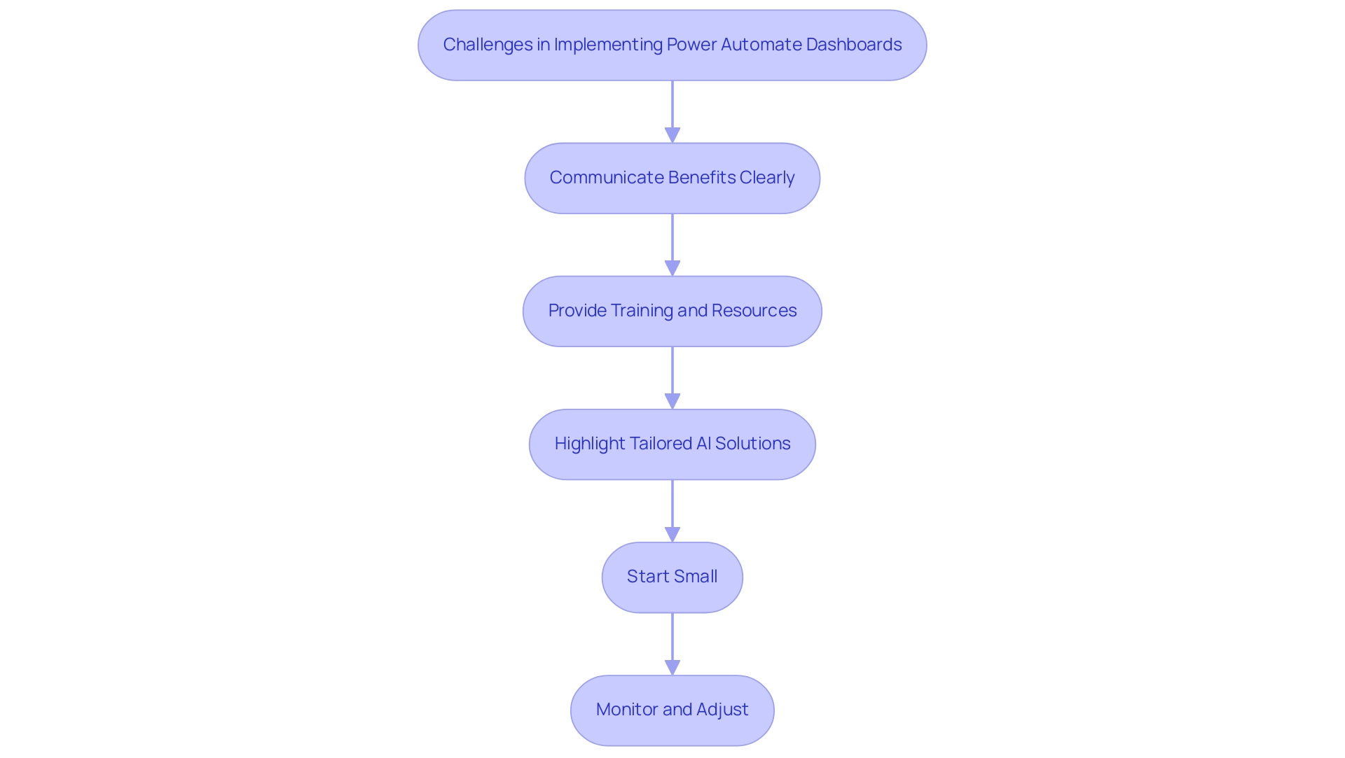
Conclusion
The integration of Power Automate into organizational workflows marks a significant shift towards greater operational efficiency and productivity. By automating repetitive tasks and streamlining processes, this tool addresses crucial challenges such as staffing shortages and data entry errors, enabling employees to focus on more strategic initiatives. The evidence speaks volumes, with statistics indicating that employees can save approximately 240 hours annually through automation, thereby allowing organizations to reap substantial benefits.
Moreover, the synergy between Power Automate and Power BI fosters a data-driven environment that enhances decision-making capabilities. By automating data refreshes and report generation, businesses can ensure that they are always working with the most up-to-date information, which is essential for agile responses in today’s fast-paced market. The case studies presented highlight the tangible success stories of organizations that have embraced these automation strategies, showcasing significant reductions in reporting times and improvements in data accuracy.
As organizations navigate the complexities of implementing Power Automate dashboards, adherence to best practices and proactive strategies can mitigate challenges and foster user acceptance. By clearly communicating the benefits, providing comprehensive training, and starting with pilot programs, businesses can effectively overcome resistance to change. The future of operational efficiency lies in the ability to leverage automation tools like Power Automate, which not only enhance productivity but also contribute to a positive workplace culture.
In summary, embracing automation through Power Automate is not merely a trend but a necessity for organizations aiming to thrive in a competitive landscape. By integrating these technologies and fostering a culture of innovation, organizations can unlock new levels of efficiency and drive sustainable growth.
Overview
The article focuses on mastering percentile DAX calculations, which are essential for analysts to interpret data distributions accurately and derive actionable insights from complex datasets. It supports this by detailing various DAX functions, such as PERCENTILEX and RANKX, and emphasizing the importance of understanding their applications and challenges in the context of Business Intelligence, particularly in improving operational efficiency and decision-making processes.
Introduction
In the realm of data analysis, percentiles emerge as crucial indicators that reveal the relative position of values within a dataset. For professionals working with DAX, the ability to accurately calculate and interpret these statistical measures is essential, especially in an era dominated by the need for actionable insights from complex data.
As organizations strive to harness the full potential of Business Intelligence tools like Power BI, understanding the intricacies of percentile calculations becomes paramount. This article delves into the fundamentals of percentiles, the various methods available for their calculation within DAX, and practical applications that can drive strategic decision-making.
By exploring both the challenges and advanced techniques involved, analysts can enhance their proficiency, ensuring they are well-equipped to navigate the evolving landscape of data analysis in 2024.
Understanding Percentiles: The Basics of DAX Calculations
Percentiles serve as vital statistical measures that reflect the relative standing of a specific value within a dataset. For analysts using DAX, mastering percentile dax calculations is vital for precisely interpreting information distributions, which is critical in today’s information-driven environment. The significance of Business Intelligence (BI) is highlighted by the challenges organizations encounter in producing actionable insights from Power BI dashboards, including time-consuming report creation and inconsistencies that obstruct effective decision-making.
A rank indicates the percentage of values that lie below a given number; for instance, the 70th rank signifies that 70% of the points are less than that threshold. Comprehending these concepts is crucial, particularly as the environment of analysis evolves in 2024. The PERCENTILEX function in DAX offers a robust method for computing these values, allowing experts to leverage percentile dax to extract significant insights from intricate datasets.
Understanding its syntax and parameters lays the groundwork for more advanced analytical techniques. As emphasized by Avijeet Biswal, a Senior Research Analyst at Simplilearn:
You have learnt about what is percentile and how you can calculate the percentile of any collection with the help of a formula.
This expertise not only enhances information interpretation but also empowers analysts to leverage Business Intelligence effectively, improving operational efficiency.
Furthermore, platforms like Secoda exemplify effective information management, leveraging AI to centralize discovery, lineage tracking, and governance. By enhancing collaboration and efficiency, Secoda allows users to easily find, understand, and trust their information, thus improving overall analytical effectiveness. Moreover, comprehending distorted distributions is vital, as they can greatly influence rank calculations, making it important for analysts to consider how values fall on either side of the distribution.
Recent conversations in the field also indicate the absence of a standard definition of percent rank, with various methods such as linear interpolation being employed to compute percent ranks, emphasizing the evolving techniques in information analysis. Moreover, the integration of Robotic Process Automation (RPA) can streamline the report creation process, reducing the time and effort required to generate insights, thus addressing some of the operational challenges faced by organizations.
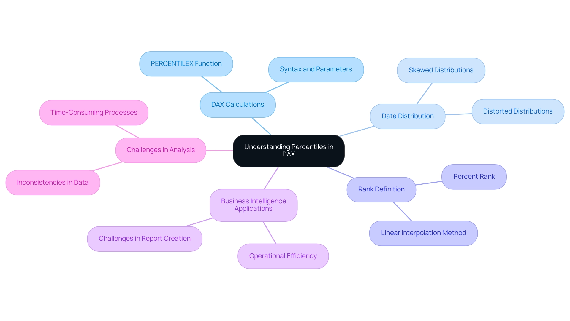
Exploring Different Approaches to Percentile Calculations in DAX
Calculating rankings in DAX can be accomplished through multiple methods, each offering unique advantages depending on the context of the data. The PERCENTILE function stands out as a robust option for determining the k-th value across a specified table or column, making it particularly effective for large datasets. It functions effectively, enabling professionals to obtain significant insights without extensive computational overhead.
On the other hand, RANKX can be utilized alongside calculated columns to establish percentile dax rankings, making it a suitable choice for smaller or less complex datasets. This versatility enables analysts to select the most appropriate method based on their specific analytical requirements. As numerous organizations encounter challenges in leveraging insights from Power BI dashboards—such as time-consuming report creation and inconsistencies—understanding the nuances between PERCENTILE and RANKX becomes essential for optimizing analysis workflows.
To tackle these challenges, incorporating Robotic Process Automation (RPA) can significantly streamline the workflow, reducing the time spent on report creation and improving information governance. For instance, RPA can automate the information extraction and report generation processes, ensuring consistency and accuracy across reports. Moreover, grasping the distinctions in user preferences about customized advertising—like those retained for as long as 390 days—can offer valuable perspectives on how analytical methods can be enhanced for operational efficiency.
Ultimately, leveraging RPA alongside robust analysis methods not only enhances operational efficiency but also ensures that stakeholders are equipped with actionable insights for informed decision-making.
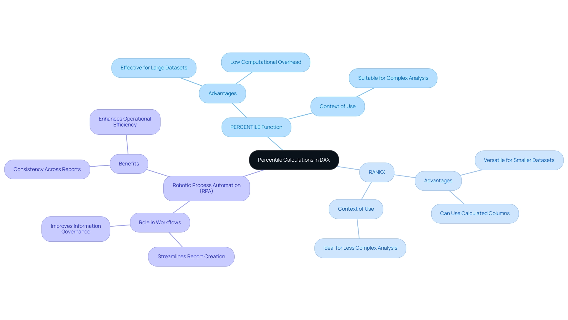
Practical Applications of Percentile Calculations in Power BI
In Power BI, percentage calculations play a crucial role in assessing key performance indicators (KPIs) and evaluating distributions across various categories. For instance, analysts can visually represent sales performance by categorizing products into specific percentile dax ranges, allowing for a clearer understanding of which items are performing best. However, challenges such as time-consuming report creation and inconsistencies can hinder effective analysis.
Unlocking the power of Business Intelligence through RPA, particularly tools like EMMA RPA and Power Automate, can streamline these processes, transforming raw information into actionable insights that drive growth and inform strategic decision-making. It’s important to note that the P and S versions of these functions differ based on whether the calculation considers the whole population or a sample, which is crucial for precise analysis. Utilizing the PERCENTILEX function empowers analysts to create dynamic reports that segment information effectively, enabling the identification of top-performing sales representatives and a deeper understanding of customer satisfaction levels derived from survey scores, particularly through the lens of percentile dax.
Douglas Rocha, a statistics enthusiast, notes,
Can you do statistics in Power BI without DAX?
Yes, you can, you can do it without measures as well and I will teach you how at the end of this tutorial. Such practical applications not only improve narrative techniques but also guide strategic decision-making by providing clear perspectives on performance metrics. Moreover, present features in Power BI, like the capacity to incorporate dynamic reference lines via the Analytics pane, enable users to emphasize significant trends and observations.
The recent incorporation of Analytics features to the Strip Plot further enhances this capability, making it easier for analysts to visualize important information points. As Marta Garcia states,
You can highlight interesting trends and insights by creating dynamic reference lines with the Analytics pane.
Additionally, understanding the default line width of 3 and transparency settings of 50% can aid in better data representation when utilizing these features.
This synergy of ranking calculations, RPA, and visualization techniques significantly contributes to effective KPI analysis in Power BI, ultimately guiding organizations toward more informed business strategies. To explore how EMMA RPA and Power Automate can further enhance your operational efficiency, book a free consultation today.
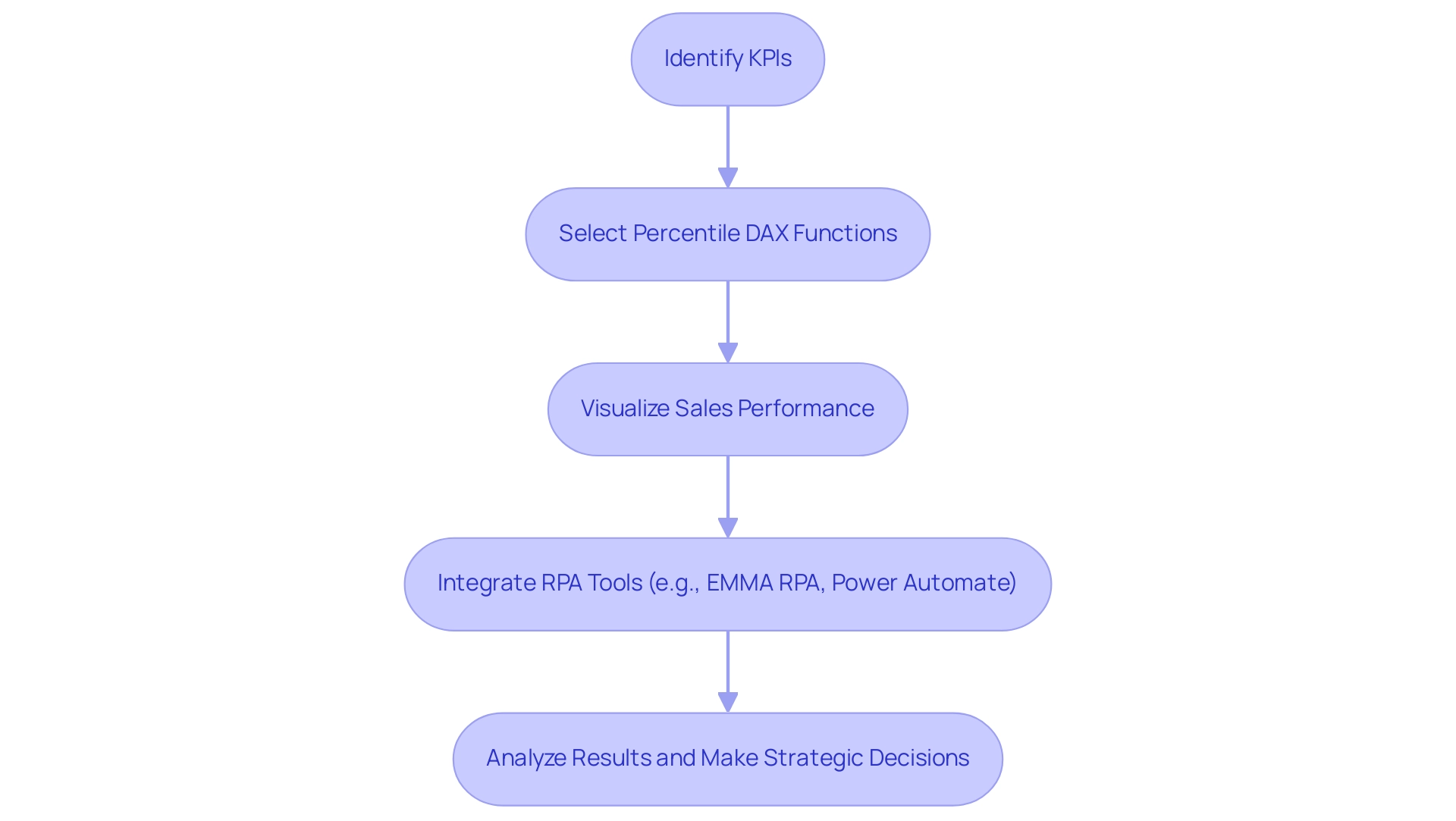
Overcoming Challenges in DAX Percentile Calculations
Calculating percentile dax can pose significant challenges, particularly when working with large datasets. Analysts must navigate issues such as ensuring precise information filtering and avoiding syntactical errors in functions. A frequent pitfall arises from the incorrect application of the percentile dax function; if the information context is not meticulously managed, it can result in misleading outcomes.
As Henry Chukwunwike Morgan-Dibie aptly states,
Simplifying complex topics to empower understanding and decision-making.
Therefore, it is crucial for analysts to be acutely aware of the context in which they operate and to effectively employ the appropriate functions, including percentile dax. Utilizing Business Intelligence tools, along with RPA solutions such as EMMA RPA and Power Automate, can convert raw information into actionable insights, which is vital for informed decision-making that propels growth and innovation.
Understanding the implications of information types and maintaining consistency in modeling can significantly reduce errors during calculations. Additionally, the use of the BI Connector can enhance visualization capabilities, making it easier to connect and analyze information accurately. DAX, designed specifically for creating calculated columns, measures, and calculated tables in Power BI, emphasizes the importance of correct function application.
Regularly reviewing and testing DAX formulas is essential for identifying potential issues at an early stage, thereby enhancing the reliability and accuracy of analyses. By tackling these typical issues and gaining insights from case studies such as ‘Understanding Data Models and Analysis Services,’ which demonstrate real-world applications and difficulties encountered in DAX calculations, data professionals can create more effective strategies for overcoming barriers in their data processes while enhancing operational efficiency. Automating repetitive tasks through RPA solutions can further streamline these processes, enabling professionals to concentrate on deriving insights instead of getting bogged down by manual calculations.
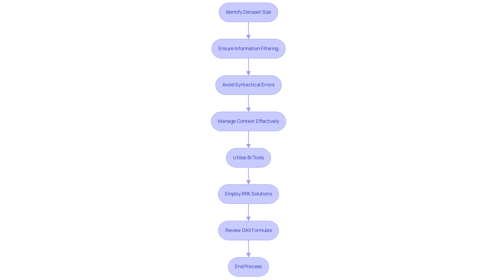
Advanced Techniques for Optimizing Percentile Calculations in DAX
To improve the effectiveness of ranking calculations in DAX, professionals should adopt several advanced methods, including percentile dax, that align with the principles of Robotic Process Automation (RPA) and Business Intelligence. One effective strategy is to aggregate information prior to applying percentile dax functions, which significantly reduces the computational burden during report generation and minimizes the potential for errors. Utilizing calculated tables to pre-calculate values offers a robust approach to streamline processes, echoing the efficiency goals of RPA and freeing up team resources for more strategic, value-adding work.
Moreover, leveraging iterator functions like SUMX can further optimize performance by iterating over each row in a table, allowing for more efficient calculations while minimizing the need for recalculating filter context during iterations. The use of variables within DAX formulas enhances performance by capturing filter context and minimizing redundant calculations, improving code readability and execution speed. Analysts are encouraged to utilize Power Bi’s built-in performance analyzer to identify bottlenecks in their DAX queries, enabling targeted optimizations that can lower operational costs.
Furthermore, incorporating ISINSCOPE can provide faster and more reliable results in specific scenarios. By mastering these advanced techniques, analysts can not only enhance the efficiency of their analyses but also leverage Business Intelligence and percentile dax to drive more impactful business outcomes in 2024, making informed decisions that are essential in today’s rapidly evolving AI landscape. For more insights on optimizing your data analysis processes, consider exploring our latest publication on advanced DAX techniques.
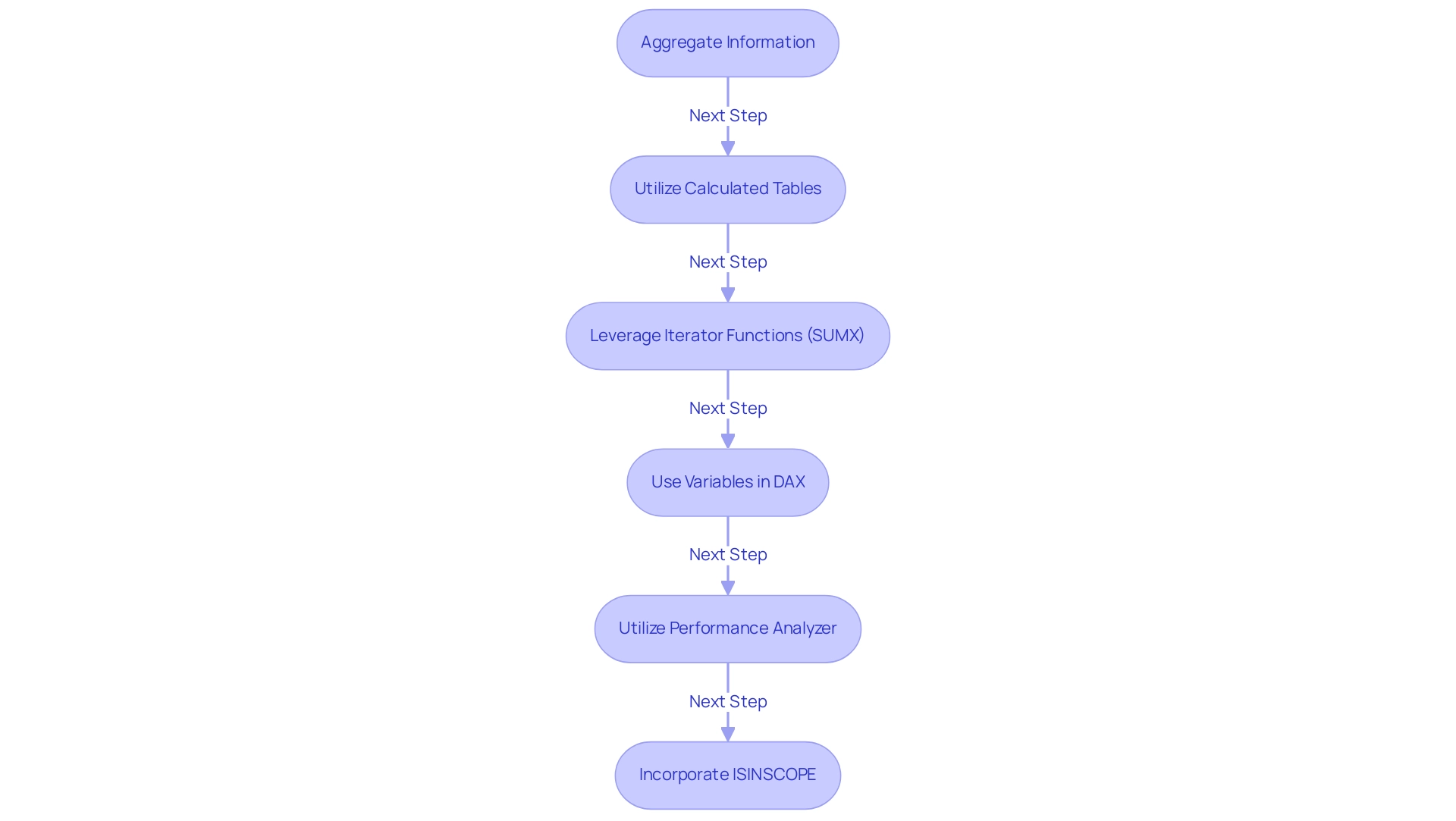
Conclusion
Percentiles are essential tools for data analysts, especially when utilizing DAX in Power BI. This article has explored the foundational concepts of percentiles, emphasizing their significance in interpreting data distributions and enhancing decision-making processes. By mastering functions like PERCENTILEX and RANKX, analysts can navigate large datasets with greater efficiency, unlocking valuable insights necessary for driving strategic initiatives.
The practical applications of percentile calculations extend beyond mere statistical measures; they play a critical role in evaluating key performance indicators and visualizing data effectively. By leveraging advanced techniques and integrating Robotic Process Automation, analysts can streamline workflows, reduce errors, and ensure that their insights are both accurate and actionable. These methods not only improve operational efficiency but also empower stakeholders to make informed decisions based on rich, data-driven narratives.
As the landscape of data analysis continues to evolve in 2024, staying abreast of the latest techniques and tools will be paramount. The challenges associated with percentile calculations are surmountable through careful data management and the application of best practices. By embracing these strategies, analysts can enhance their proficiency and contribute significantly to their organizations’ success in an increasingly complex data environment.
Overview
The article provides a comprehensive guide on how to implement Object Level Security (OLS) effectively, emphasizing the importance of granular access control, role-based access control, and audit trails in protecting sensitive information. It outlines a step-by-step process for implementation, including assessing current security measures, defining user roles, selecting appropriate tools, and conducting ongoing training and audits, thereby highlighting that a structured approach is crucial for enhancing data protection and operational efficiency in organizations.
Introduction
In an age where data breaches and cyber threats loom large, organizations are increasingly turning to Object Level Security (OLS) as a crucial defense mechanism. OLS not only regulates access to sensitive information but also enhances operational efficiency by ensuring that employees have the necessary permissions to perform their roles effectively.
With the rise of stringent data protection regulations and the alarming statistics surrounding internal vulnerabilities, understanding the core concepts of OLS—such as:
- Granular access control
- Role-based access control
- The importance of audit trails
has never been more essential. As organizations seek to bolster their security protocols, the implementation of OLS emerges as a vital strategy for safeguarding data integrity and fostering a culture of compliance in an ever-evolving digital landscape.
Understanding Object Level Security: Key Concepts and Definitions
Object level security (OLS) encompasses the strategies and mechanisms that manage access to individual objects within a database or application, including files, records, and various information entities. By implementing object level security, organizations can ensure that only authorized users can utilize or manipulate specific objects in accordance with their designated roles and permissions. The key concepts of OLS include:
- Granular Access Control: This feature allows organizations to establish highly detailed access permissions, ensuring users can only access data that is essential for their roles. This is becoming increasingly essential as 50% of internal application vulnerabilities are categorized as high or critical risks, highlighting the need for targeted protective measures.
- Role-Based Access Control (RBAC): A prevalent approach within object level security, RBAC assigns permissions based on user roles rather than individual identities, thereby streamlining management processes. Considering that 73% of organizations depend on VPN connections for remote connectivity, RBAC can greatly improve security by limiting information retrieval to authorized individuals only, particularly in settings where remote connectivity is prevalent and presents additional risks.
- Audit Trails: Object level security typically includes logging mechanisms that meticulously track access and modifications made to objects, thereby fostering accountability and supporting compliance efforts. In an environment where the average financial impact of a supply chain attack reached $1.4 million in 2021, maintaining comprehensive audit trails is essential for organizations aiming to protect their integrity.
Grasping these concepts is crucial for effectively implementing object level security and enhancing data protection protocols within any organization. The origins of cyber attacks, particularly from countries like China and Russia, highlight the critical nature of OLS; social engineering tactics, especially phishing, are implicated in 90% of breaches. As highlighted by expert Aneesh Bhargav, continual learning is essential in today’s digital landscape: ‘Never stop learning with AppSecEngineer!’
This serves as a reminder that organizations must prioritize the integration of robust object level security practices and ongoing education on security measures.
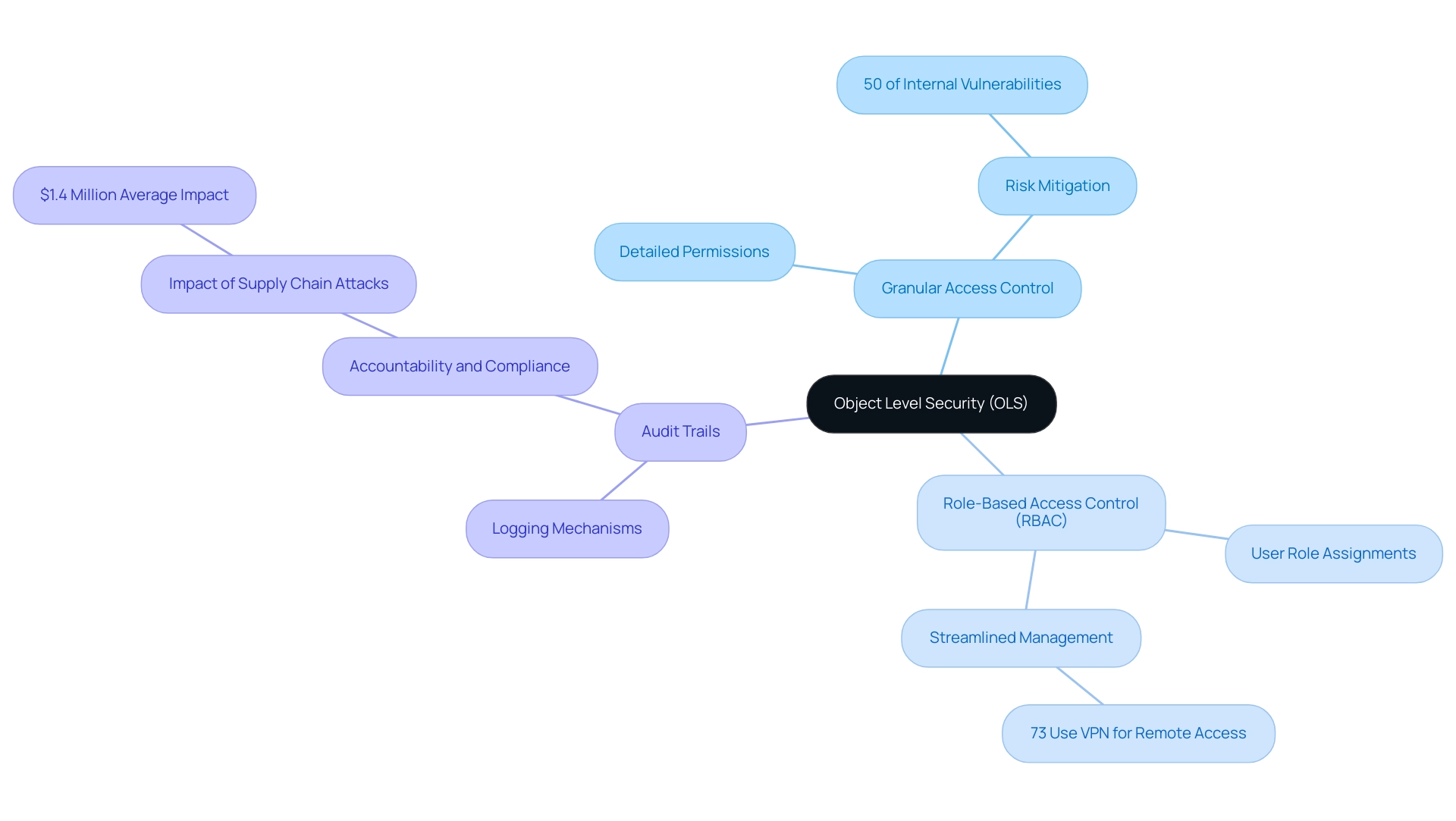
The Importance of Object Level Security in Data Protection
Object level security is crucial in protecting sensitive information from unauthorized entry and potential breaches, especially in a landscape where Robotic Process Automation (RPA) and Business Intelligence are increasingly vital for operational efficiency. Its importance is highlighted by several key factors:
- Compliance with Regulations: With industries facing stringent information protection regulations such as GDPR and HIPAA, OLS helps organizations adhere to these standards by ensuring that only authorized personnel can retrieve sensitive information, thus mitigating compliance risks.
- Minimizing Risk of Breaches: Implementing object level security can dramatically lower the likelihood of information breaches. Combined with RPA, which automates manual workflows and decreases human errors, organizations can improve their protective measures while streamlining processes. Object level security (OLS) ensures tight control and monitoring of privileges, thereby protecting against the alarming statistic that 32% of vulnerabilities in internet-facing applications are rated as high or critical.
- Real-World Consequences: A case study that illustrates the importance of OLS is the Target Data Breach, where cyber attackers used malware to steal information from Target’s point of sale systems, compromising details for approximately 110 million customers. This incident emphasizes weaknesses in retail cybersecurity and the crucial necessity for thorough protective measures.
- Enhancing Operational Efficiency: Apart from safeguarding information, implementing object level security aids in operational efficiency by granting employees the access they need to execute their tasks effectively, without unnecessary obstacles. Utilizing RPA in conjunction with OLS can further boost productivity, facilitating a balanced approach between protection and accessibility. RPA not only streamlines processes but also frees up team members for more strategic, value-adding work. Furthermore, Business Intelligence plays a crucial role in transforming raw data into actionable insights that inform decision-making, ensuring that object level security is not just a compliance tool, but also a facilitator of informed strategic choices. In essence, object level security is an indispensable element of a comprehensive data protection strategy, especially in a rapidly evolving AI landscape. Organizations aiming to strengthen their protective stance should view object level security not just as a compliance tool but as a fundamental aspect of their operational framework, enhanced by tailored AI solutions and RPA for informed decision-making. As Gartner notes, cloud protection statistics reveal that 25% of the world’s total cyber attacks are cloud-related incidents, further emphasizing the need for robust practices like OLS in cloud environments.
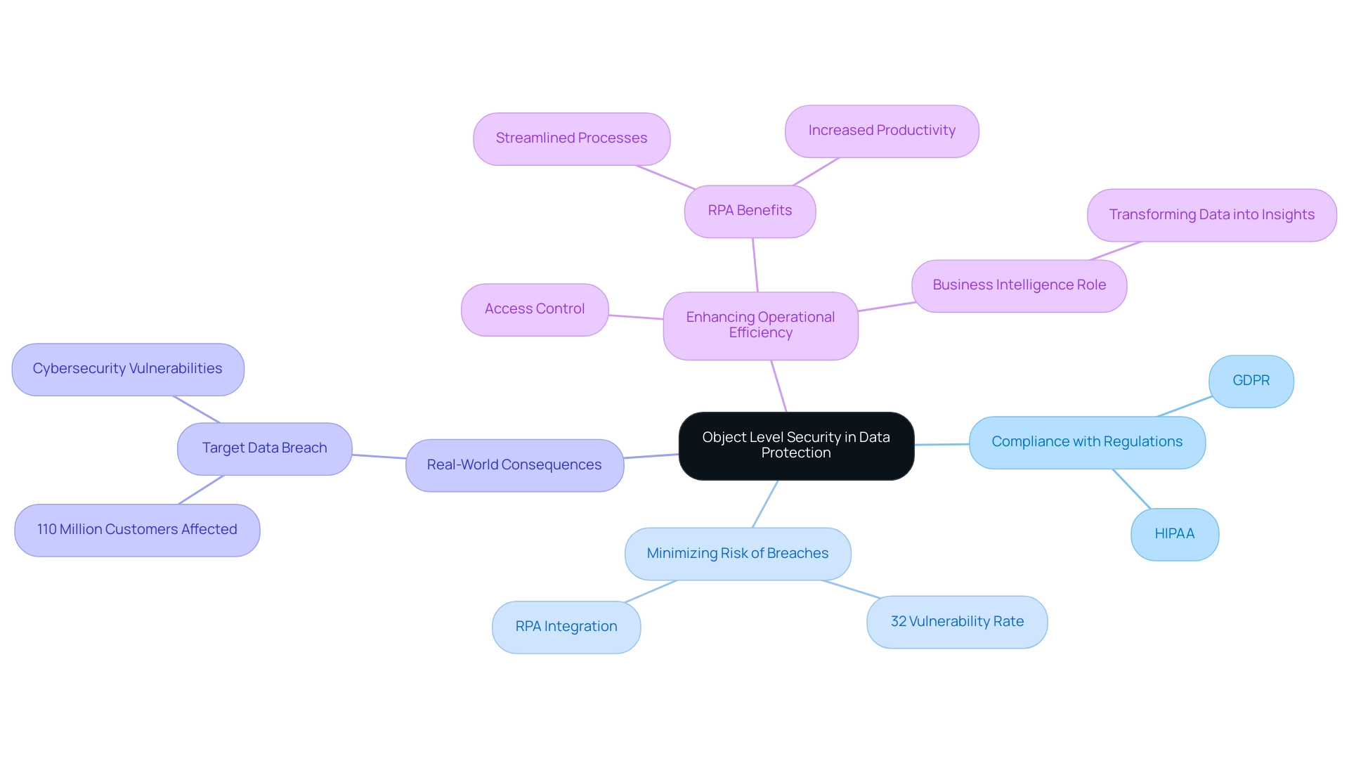
Preparing for Implementation: Tools and Requirements for OLS
Before embarking on the implementation of Object Level Security (OLS), organizations should take several essential steps to ensure a smooth and effective process:
-
Access Control Software: Invest in robust access control software that enables granular access management. This software should be compatible with existing systems to streamline integration and enhance security frameworks. For example, the free version of Tabular Editor (Tabular Editor 2) offers essential features for managing Power BI models, making it a valuable tool in this context. Implementing such technologies can enhance operational efficiency, reducing time spent on manual tasks.
-
User Role Definitions: Clearly delineate user roles within the organization. This clarity is essential as it dictates the permission levels for various data objects, ensuring that users only engage with information relevant to their functions. As emphasized in discussions regarding object level security, defining user roles is crucial for establishing effective control over entry. As one expert aptly stated, “Here comes the Object-level security feature to the rescue!” By customizing control according to specific roles and ensuring object level security, organizations can reduce confusion and improve compliance.
-
Training and Documentation: Provide comprehensive training for staff on object level security principles and protocols. Coupled with detailed documentation, this training will serve as a valuable resource, helping users navigate the complexities of OLS effectively. This step is crucial in overcoming technology implementation challenges, ensuring that employees are well-equipped to utilize these systems with object level security effectively.
-
Information Classification: Conduct a thorough information classification exercise to identify sensitive objects within the information model. This step is vital for establishing which elements require object level security, thereby minimizing the risk of unauthorized access. Utilizing Business Intelligence tools can assist in converting raw information into actionable insights, facilitating this classification process. This process also addresses the challenges of extracting meaningful insights, as it helps prioritize information that is critical for decision-making.
-
Audit and Monitoring Tools: Implement tools capable of providing audit trails and monitoring capabilities. These tools will track access and modifications to sensitive objects, ensuring compliance with security policies and enabling swift responses to any irregularities. By utilizing these technologies, organizations can enhance their information governance practices and support informed decision-making.
In comparing RLS and OLS, it is important to note that while RLS uses DAX filters to restrict the display of information, OLS employs object level security by completely removing restricted objects from the semantic model for unauthorized users. This key difference can lead to potential confusion if users encounter errors when accessing reports that reference hidden measures.
By proactively addressing these prerequisites, organizations can significantly enhance the effectiveness of their object level security implementation, ultimately leading to a more secure environment for managing sensitive information and fostering operational efficiency through advanced technology solutions. Moreover, integrating RPA can specifically help alleviate manual tasks associated with OLS implementation, further streamlining processes and enhancing overall productivity.
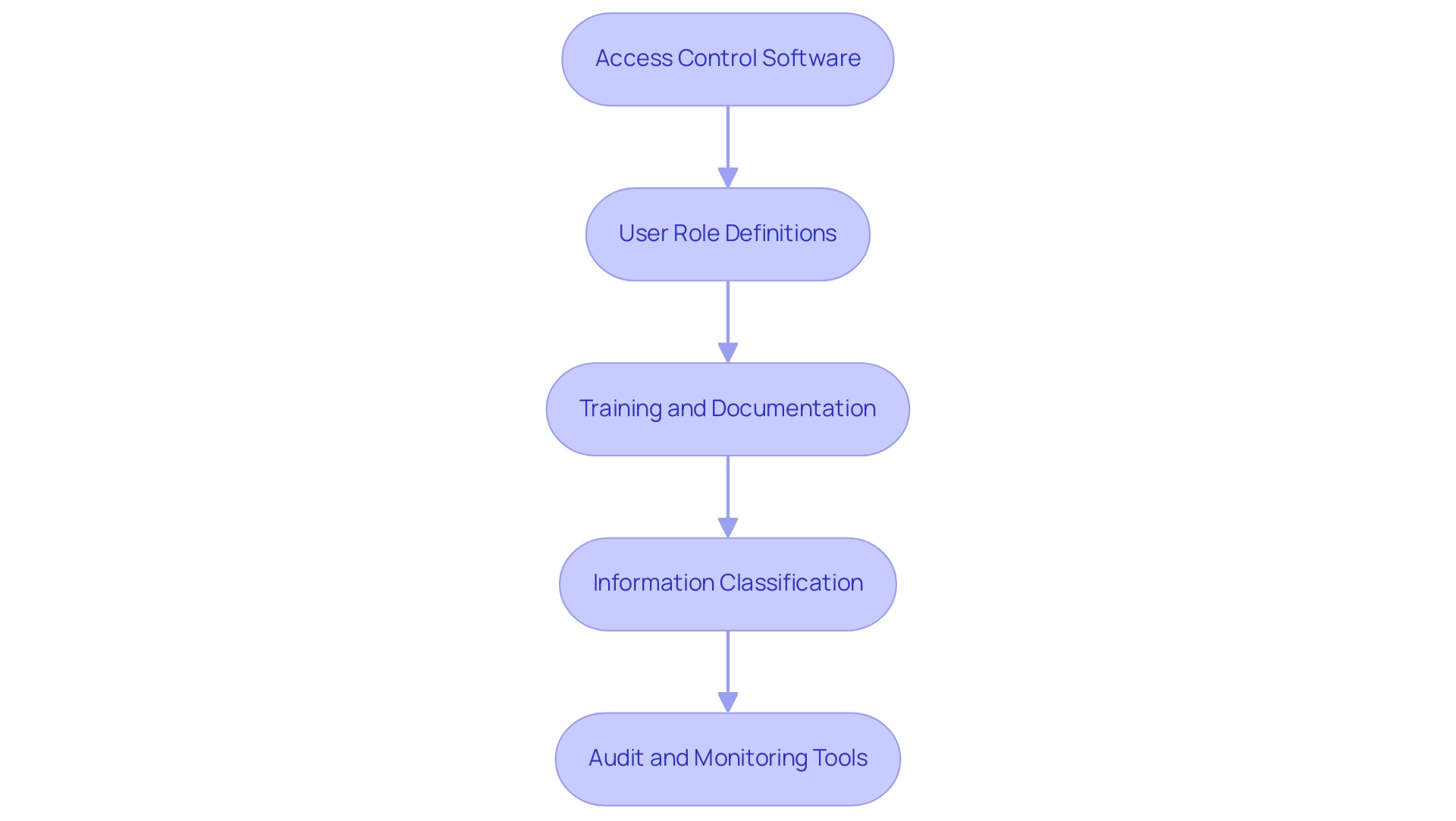
Step-by-Step Guide to Implementing Object Level Security
Implementing object level security in Power BI is essential for safeguarding sensitive customer information and enhancing operational efficiency through insights based on information. Here is a step-by-step guide to effectively set up OLS:
-
Assess Current Protection Posture:
Begin by evaluating your existing measures to identify gaps where OLS can enhance defense.
This foundational understanding will help overcome challenges like data inconsistencies that can hinder actionable insights. -
Define User Roles and Permissions:
Engage with stakeholders across departments to establish clear user roles and the specific permissions necessary for each role.
This collaborative approach ensures that all critical perspectives are considered, fostering a culture of security awareness that aligns with the principles of Business Intelligence. -
Choose Appropriate Tools:
Select the right control software and monitoring tools tailored to your organization’s unique needs.
The choice between free and paid versions, such as Tabular Editor 2 and Tabular Editor 3, should be made based on the complexity of your models and required features.
Tabular Editor 2 offers basic functionalities suitable for simpler models, while Tabular Editor 3 provides advanced features for more complex scenarios.
As Balivada Ganesh Bhargav notes,Tabular Editor is a widely used model metadata editor that provides a simple GUI for editing the Model Metadata instead of making changes in the script.
-
Implement Permissions Controls:
Configure the chosen software to enforce permissions controls based on the defined user roles.
Ensuring that these controls are correctly aligned with organizational requirements is crucial for effective data governance and can streamline the report creation process in Power BI. -
Test the Implementation:
Conduct comprehensive testing to verify that control measures operate as intended and confirm that users can reach only the objects for which they are authorized.
This step is vital to ensure the integrity of your protection framework and to maintain the reliability of data-driven insights. -
Train Employees:
Provide thorough training for employees on the new access protocols and the significance of OLS.
Training your team promotes a culture of awareness and compliance, which is crucial considering that organizations implementing object level security have reported success rates of over 80% in improving data protection.
Furthermore, by automating protective processes through OLS, employees can concentrate on more strategic tasks, enhancing overall morale and productivity. -
Monitor and Audit:
Establish a routine for monitoring and auditing access logs to ensure compliance and quickly identify any unauthorized access attempts.
Routine evaluations assist in upholding an efficient defense stance and improving the trustworthiness of insights obtained from Power BI dashboards.
By adhering to these steps, organizations can effectively implement object level security, which greatly strengthens their information safeguarding measures and ensures adherence to privacy regulations.
It’s important to note that while Row Level Security (RLS) and OLS can be validated separately in Power BI, understanding their relationship and limitations is crucial for effective information management.
The combination of RLS and OLS highlights the significance of a layered protection approach for sensitive data management.
Moreover, utilizing Robotic Process Automation (RPA) alongside OLS can additionally streamline processes, minimizing manual efforts and improving operational efficiency.
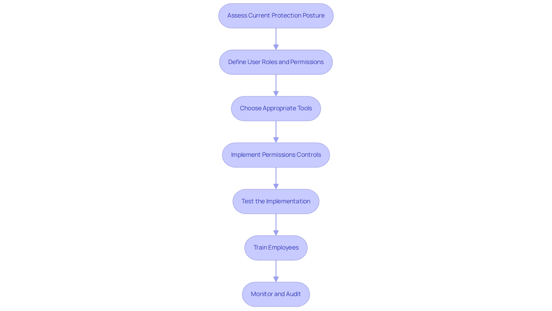
Overcoming Challenges: Common Pitfalls in OLS Implementation
Implementing object level security presents various challenges that organizations must navigate to ensure successful deployment. The following are common pitfalls along with strategies to overcome them:
-
Resistance to Change: Employee resistance can significantly hinder the adoption of new control measures. Research indicates that this resistance is a prevalent issue, with a considerable percentage of employees expressing concerns over new protective measures. To mitigate this, involving employees early in the process and clearly communicating the benefits of object level security can foster a sense of ownership and acceptance.
-
Over-Complication of Roles: Creating overly complex user roles can lead to confusion and inefficiencies in management. Experts suggest simplifying roles whenever feasible to enable smoother operations and clearer comprehension of privileges.
-
Neglecting Regular Audits: Without regular audits, organizations may unintentionally leave gaps that can be exploited. It is essential to schedule periodic reviews of access logs and permissions to uphold the integrity of protective measures. This practice not only fortifies defenses but also aligns with best practices in cybersecurity. Notably, statistics show that only 1 in 4 companies were able to thwart ransomware attacks before their data was fully encrypted, highlighting the critical need for robust protective measures.
-
Inadequate Training: Comprehensive training on new policies and procedures related to object level security is crucial for fostering compliance and understanding among employees. Ensuring that all staff members are well-informed can significantly reduce resistance and enhance the overall stance.
By being proactive in addressing these challenges, organizations can significantly improve the success of their object level security implementation. The development of advanced systems like DetectorGuard demonstrates how focusing on localized features and removing adversarial patches can enhance detection performance. As Liang et al. emphasize, there is potential to significantly improve the performance of mainstream object detection systems by extending the width and depth of the backbone network. Furthermore, the expansion of application scope through the fusion of multi-dimensional targets showcases real-world applications of object level security, which enhances adaptability and robustness in protective measures.
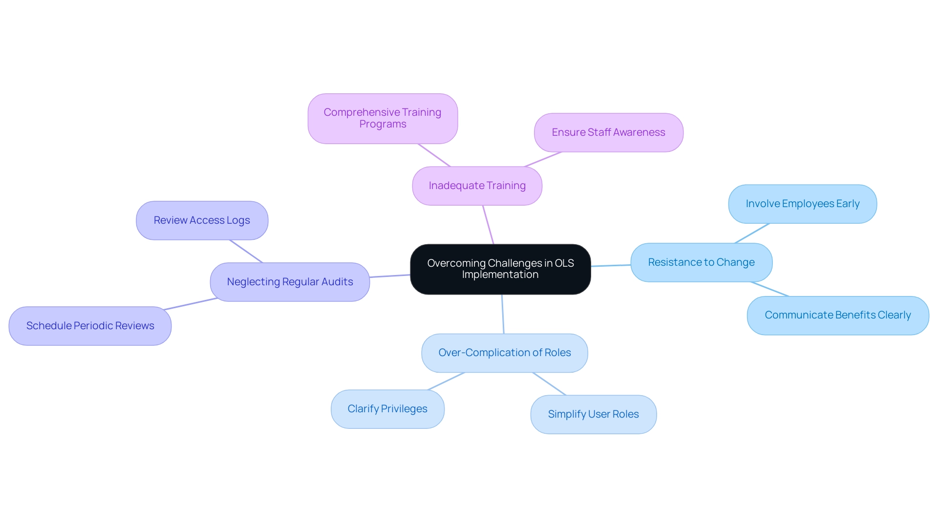
Best Practices for Maintaining Object Level Security
To effectively maintain Object Level Security (OLS), organizations should adhere to the following best practices:
-
Regularly Review Access Permissions: Conduct periodic assessments of user roles and permissions to ensure they are aligned with current job functions and responsibilities. This proactive strategy not only assists in reducing unauthorized entry but also improves overall safety effectiveness. Routine evaluations are crucial in spotting and correcting inconsistencies, which is essential for maintaining object level security to protect sensitive information. Data protection is designed to mitigate the threat of unauthorized data access, emphasizing the importance of these reviews.
-
Update Security Policies: Security policies should be revised regularly to accommodate changes in regulations, technology, and organizational structure. Updating these policies is critical, as highlighted by experts who stress the need for agility in response to evolving threats. A well-organized policy framework guarantees that protective measures remain strong and effective. As noted, a bucket policy that allows a wildcard action “*” can potentially allow a user to perform any action in the bucket, underscoring the risks associated with inadequate policy updates.
-
Conduct Training Refreshers: Ongoing training sessions are essential for keeping employees informed about best practices and updates related to object level security. Regular refreshers ensure that staff are aware of their roles in maintaining safety and can promptly act in accordance with established protocols.
-
Utilize Automation: The integration of Robotic Process Automation (RPA) tools can significantly streamline the monitoring of access logs and alerts for unauthorized access attempts. Recent advancements in automation not only enhance efficiency but also improve the precision of monitoring, allowing organizations to respond swiftly to potential threats. Organizations are increasingly adopting automated systems not only to strengthen their protective measures but also to reduce the burden on IT teams and enhance overall productivity. Additionally, implementing RPA can lead to cost savings by minimizing manual interventions and optimizing resource allocation.
-
Implement Incident Response Plans: A clear incident response plan is vital for preparing for potential breaches. This plan should outline specific steps for containment and recovery, ensuring that organizations can respond effectively to incidents. As highlighted in the case study on Access Control Entries (ACE), managing ACEs defines specific permissions for users, including view, read, create, write, execute, delete, permission change, and ownership. By managing ACEs, administrators can refine user permissions and control over objects, improving the overall safety of the system. Thus, having a robust incident response framework is crucial for mitigating risks associated with such policies.
-
Leverage Business Intelligence: Utilizing Business Intelligence tools can transform raw information into actionable insights, enabling organizations to make informed choices regarding their protection practices. By analyzing access patterns and identifying anomalies, businesses can proactively address potential vulnerabilities.
By following these best practices, organizations can ensure that their object level security measures remain effective and responsive to evolving threats, ultimately enhancing their data security landscape while leveraging RPA, tailored AI solutions, and Business Intelligence for informed decision-making.
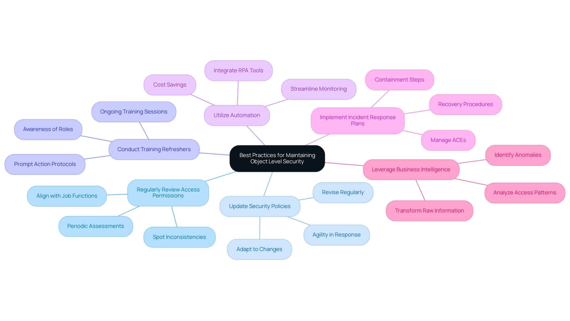
Conclusion
Implementing Object Level Security (OLS) is not just a strategic advantage; it is a fundamental necessity for organizations operating in today’s complex digital landscape. By understanding and applying key concepts such as:
- Granular access control
- Role-based access control
- The importance of audit trails
organizations can significantly enhance their security posture. These measures are essential in mitigating risks associated with data breaches and ensuring compliance with stringent regulations.
Moreover, the integration of OLS not only protects sensitive data but also fosters operational efficiency, allowing employees to perform their roles effectively without unnecessary barriers. As organizations embrace technologies like Robotic Process Automation and Business Intelligence, the synergy between these tools and OLS becomes increasingly vital, transforming security into a facilitator of informed decision-making.
As organizations prepare to implement OLS, it is crucial to focus on best practices such as:
- Regular access reviews
- Ongoing training
- The utilization of automation to streamline security processes
By proactively addressing common challenges and continuously refining security measures, organizations can safeguard their data integrity and foster a culture of compliance.
In conclusion, the proactive adoption of Object Level Security is an indispensable aspect of a robust data protection strategy. It is a vital investment in both security and operational efficiency, empowering organizations to navigate the evolving cyber threat landscape with confidence and resilience.
Overview
The article focuses on best practices for using KPI icons in Power BI to enhance data visualization and decision-making. It emphasizes the importance of clarity, consistency, and relevance in designing KPI icons, supported by examples and guidelines on integration, which collectively contribute to improved operational efficiency and stakeholder engagement.
Introduction
In the realm of data-driven decision-making, Key Performance Indicator (KPI) icons have emerged as indispensable tools that simplify complex metrics into visually engaging formats. These icons not only serve as quick reference points for stakeholders but also enhance the clarity of performance evaluations, allowing organizations to focus on what truly matters. As businesses increasingly turn to real-time data tracking and Robotic Process Automation (RPA), the role of KPI icons in streamlining operations and driving efficiency becomes ever more critical.
This article delves into the significance of KPI icons, their effective design characteristics, and practical integration strategies within Power BI, providing a comprehensive guide for organizations aiming to leverage visual analytics for improved operational success.
Understanding KPI Icons: Definition and Importance
KPI icons, or Key Performance Indicator icons, are essential visual tools that encapsulate critical business metrics in an easily digestible format. These symbols act as quick reference points for stakeholders, enabling them to swiftly assess performance against established goals. Their importance resides in the simplification of intricate information, making it more accessible and actionable.
For instance, a green symbol might represent a sales target that has been successfully met, while a red symbol would indicate areas where performance has fallen short. Such visual cues not only streamline the decision-making process but also allow leaders to concentrate on urgent matters without wading through extensive reports. In 2024, as organizations increasingly depend on real-time information tracking, the effectiveness of KPI symbols in improving operational efficiency becomes even more evident.
This is further amplified by leveraging Robotic Process Automation (RPA) to automate manual workflows, which reduces errors and frees up teams for more strategic, value-adding work. According to Korea Lastiri, a leading expert in operational performance:
- Are your customers happy?
- Is your team motivated?
- Are your processes efficient?
These questions highlight the critical nature of visual information representation in driving business success, particularly as it intersects with RPA and Business Intelligence. Historically, the first KPI dashboard was created at a Scottish cotton mill in the 1800s, highlighting the long-standing evolution of KPI tools.
Furthermore, organizations that have implemented KPI icons, as illustrated in case studies like the understanding of KPIs and the Net Promoter Score (NPS), have reported improved focus and responsiveness to operational challenges. This supports the notion that effective visual analytics, combined with RPA, is pivotal for informed decision-making. Centralized data access is crucial for uncovering insights and enabling quick action on KPI findings, and KPI performance summaries provide an overview of progress, trends, and outcomes related to business objectives.
![]()
Characteristics of Effective KPI Icons
Effective kpi icons are distinguished by several essential characteristics: clarity, simplicity, and relevance. Icons must be easily recognizable and intuitively convey their meaning without necessitating additional explanation. This principle is particularly crucial in today’s fast-paced business environment, where performance metrics need to be updated frequently for timely interventions, especially as companies turn to Robotic Process Automation (RPA) to streamline these workflows.
RPA can automate the design and application of KPI icons, ensuring consistent updates and minimizing the potential for human error. Consistency is also crucial; elements should be designed with a uniform color scheme and style that aligns with the organization’s branding, promoting a cohesive visual identity. Furthermore, effective kpi icons must be relevant to the specific metrics they represent, ensuring they accurately reflect performance and facilitate swift comprehension.
For instance, a dollar sign symbol effectively communicates revenue metrics, while a clock symbol intuitively signifies time-related KPIs. Such traits form a visual language that enhances data communication, making it easier for teams, including HR and project managers, to identify bottlenecks and inefficiencies. In the case study of tracking project completion rates, kpi icons played a key role in highlighting delays, enabling timely interventions that improved operational efficiency.
As Sara Bullock aptly noted,
In today’s high-stakes retail environment, software is a must-have for CPGs that want to optimize their retail execution, sales, processes, and retailer relationships.
By incorporating customized AI solutions alongside kpi icons and RPA, businesses can further enhance their operational effectiveness, driving data-driven insights that foster growth in a rapidly evolving AI landscape.
![]()
Integrating KPI Icons into Power BI: Step-by-Step Guide
Incorporating KPI icons into Power BI is an uncomplicated procedure that significantly enhances visualization and addresses common challenges in utilizing insights. Begin by opening your Power BI report and selecting the visual you want to improve with KPI symbols. Access the ‘Format’ pane and locate the ‘Conditional formatting’ section, where you can establish rules dictating when specific KPI icons will appear based on the underlying values.
For instance, you might assign a green icon for values exceeding a defined threshold, while a red icon could indicate values that fall below it. Significantly, the real value in the performance indicator visual can reach 400, demonstrating the potential effect of successful performance indicator integration in addressing challenges such as time-consuming report creation and inconsistencies in information.
To effectively show multiple performance indicators and offer actionable guidance, it is advised to avoid clutter and utilize a variety of visuals. Organizing related performance indicators and upholding a uniform design improves comparison and clarity in reporting, ensuring stakeholders obtain clear guidance from the information presented. Furthermore, a well-defined governance strategy is essential for maintaining consistency and trust, which can be supported by the clear visual representation of KPIs.
Once the rules are established, you can further personalize the symbols by either uploading your own images or selecting from the extensive library available within Power BI. As Harris Amjad suggests, in the primary interface of Power BI desktop, click ‘Get Information’ in the ‘Home’ ribbon and select the ‘SQL Server’ option to start your information integration journey.
Finally, it’s essential to ensure that the symbols are sized and positioned effectively to enhance their visibility, resulting in a cohesive and informative visual presentation. This method not only improves the clarity of your KPI reporting but also encourages greater user adoption of KPI visuals, making them more intuitive and visually appealing while tackling the common challenges encountered in reporting. By enhancing transparency in reporting through the use of KPI icons, you can build greater trust in the data presented.
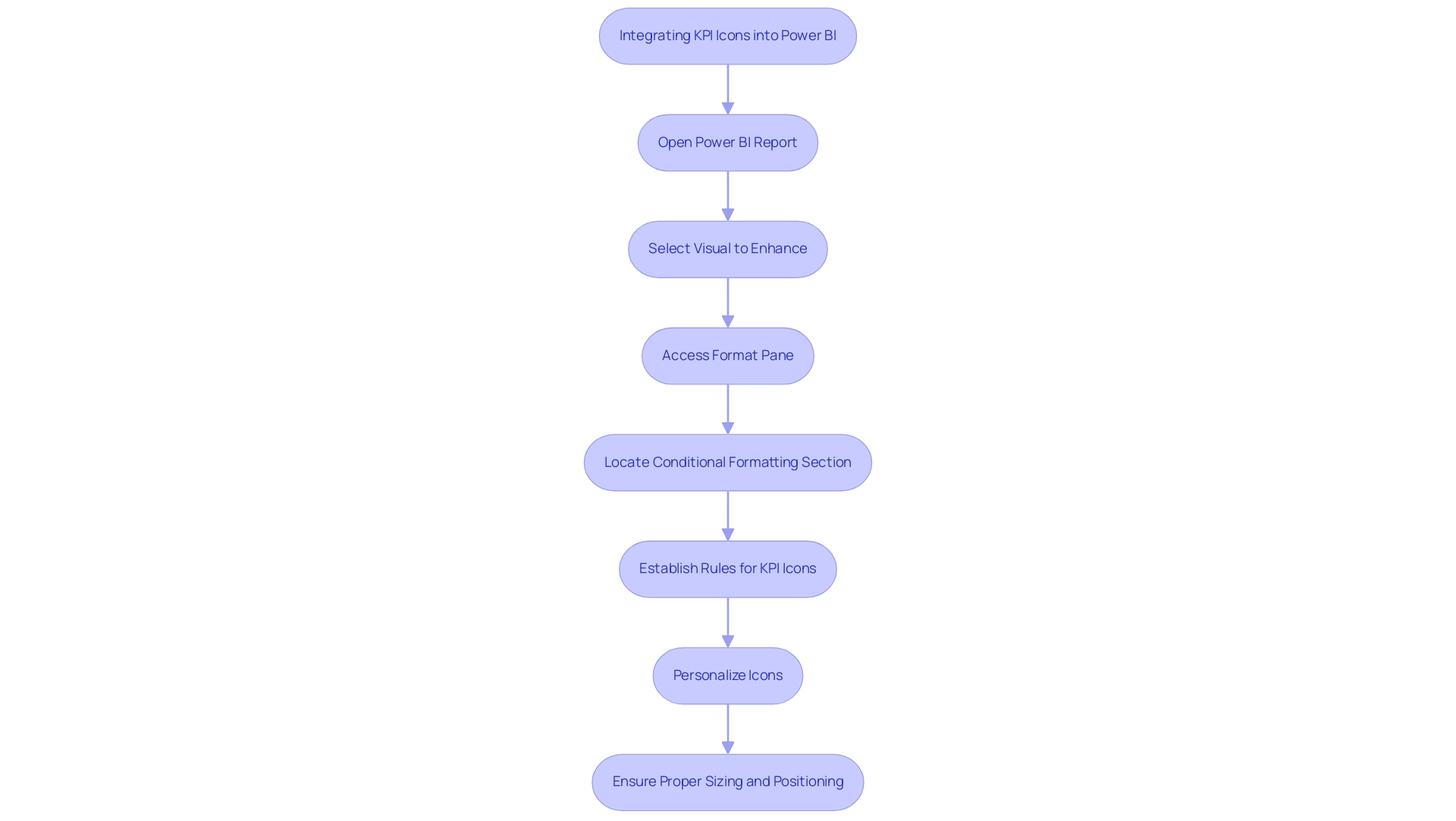
Types of KPIs and Their Visual Representation in Power BI
Organizations use varied performance indicators to drive different business functions, and Power BI offers robust tools for visualizing these metrics effectively. With services like the 3-Day Power BI Sprint, teams can quickly create professionally designed reports, ensuring efficient reporting and actionable insights. It’s crucial to ensure that performance indicators are sorted by Fiscal Month and that the Value well column is continuous without null values for accurate display.
For example, in marketing:
- Conversion rates can be illustrated with dynamic funnel icons that guide stakeholders through the customer journey.
In sales:
- Sales performance is best represented by bar graphs or line charts, showcasing revenue trends over time and offering a clear comparison of performance metrics.
In finance:
- Financial metrics, such as net profit margin, benefit from gauge visuals that succinctly convey performance relative to set targets.
Regular updates, typically monthly or quarterly, are essential to maintain accurate KPI reporting. A tailored approach to using KPI icons for representation ensures that stakeholders can swiftly interpret performance insights, fostering a culture of data-driven decision-making. As noted by Amway, the ability to collect comprehensive data swiftly allows for agile adjustments in advertising efforts, while companies like Henderson have experienced operational efficiency improvements of up to 85% through effective KPI integration.
Additionally, the Click-through Rate (CTR) case study illustrates how this metric measures engagement and content effectiveness, reinforcing the critical role that well-visualized KPIs play in organizational success. To explore our full range of services, including our Actions portfolio, and to discuss how we can assist you, we invite you to book a free consultation.
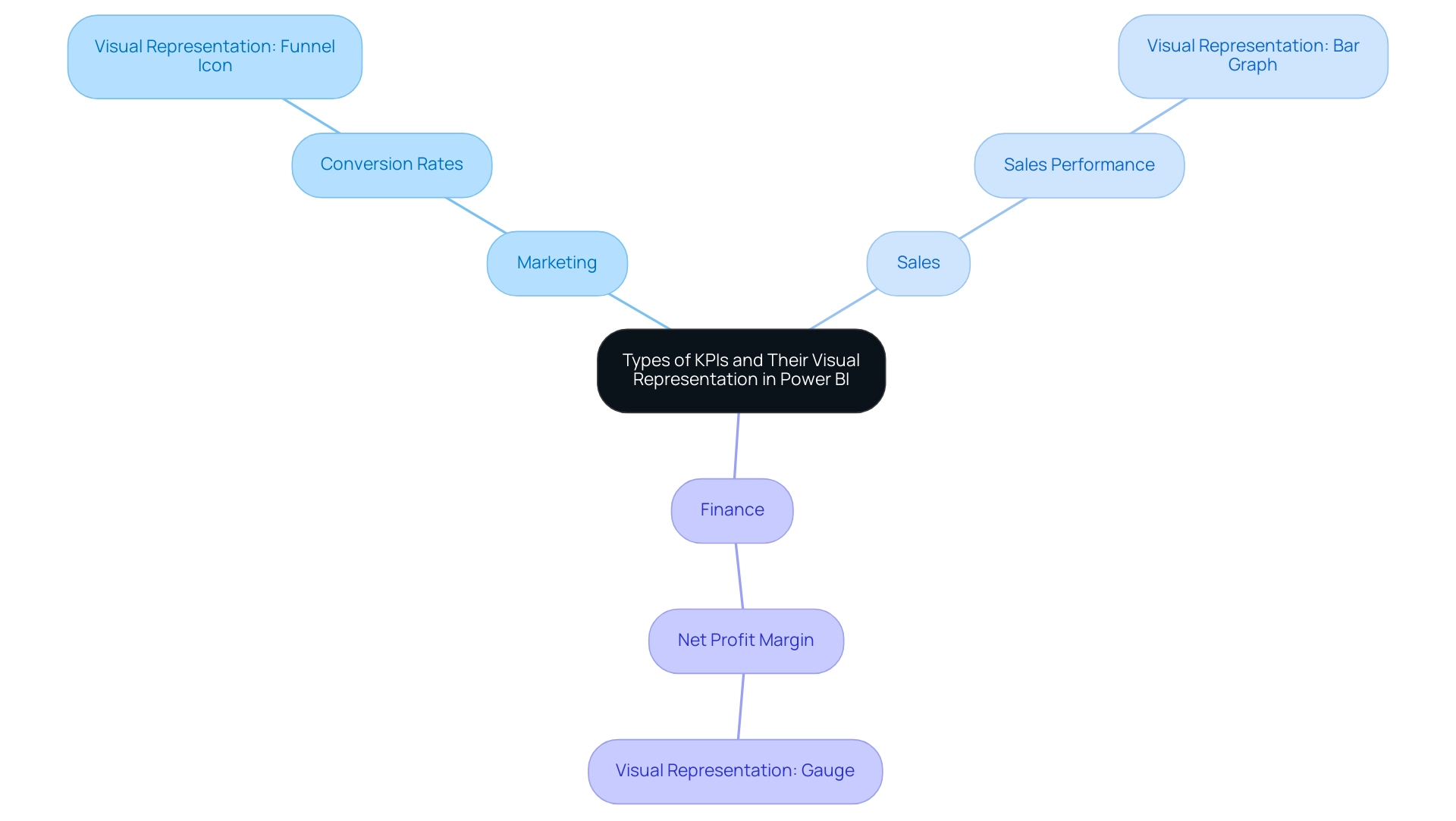
Best Practices for Designing and Using KPI Icons in Power BI
To maximize the effectiveness of KPI icons in Power BI, adhering to best practices is essential. Begin by ensuring symbols are consistently sized and spaced to create a clean visual layout. Utilizing contrasting colors can significantly enhance visibility, drawing attention to critical metrics that drive decision-making.
KPI dashboards, which utilize KPI icons, act as a unified reference for company performance indicators, emphasizing the significance of efficient graphic design. It’s crucial to avoid overcrowding visuals with excessive symbols; instead, focus on the most relevant KPIs, limiting the total to six to ten key indicators to prevent overwhelming users. Regular reviews and updates of KPI icons are necessary to accurately reflect any changes in business priorities or performance metrics.
Furthermore, actively gathering user feedback on the clarity and effectiveness of these KPI icons fosters continuous improvement in their design and functionality. The 3-Day Power BI Sprint service illustrates how organizations can swiftly generate professional reports that convert information into actionable insights, enabling informed decision-making that propels growth. Additionally, leveraging RPA solutions, such as EMMA RPA and Power Automate, can further enhance operational efficiency by automating repetitive tasks and streamlining processes.
As part of this strategy, the SMART criteria should guide KPI development to ensure relevance and effectiveness. As Stuart Kinsey, co-founder of SimpleKPI, emphasizes, embracing KPIs and visualizing performance is vital for any organization striving to grow. Implementing these best practices will create a more intuitive and informative visualization experience, ultimately aligning with organizational goals and enhancing operational efficiency.
To learn more about how our services can help you achieve these outcomes, book a free consultation today.
![]()
Overcoming Challenges in KPI Icon Implementation in Power BI
Implementing KPI icons in Power BI often involves navigating a range of challenges, including user resistance, technical difficulties, and potential misinterpretation of data. Engaging stakeholders early in the process is essential; this approach not only gathers valuable input but also fosters a sense of ownership and buy-in. To further enhance efficiency, consider participating in our 3-Day Power BI Sprint, designed to create professional reports that leverage insights for impactful decision-making.
In just three days, we promise to deliver a fully functional, professionally designed report on a topic of your choice, allowing you to focus on utilizing the insights. Additionally, you can use this report as a template for future projects, ensuring a professional design from the start. Customized training sessions can greatly enhance users’ comprehension of KPI icons, ensuring they interpret these icons accurately and utilize them effectively.
As highlighted by community advocate themistoklis, integrating rules and conditional formatting into measures is essential for enhancing the functionality of these symbols. For instance:
- If the category is A and the value is greater than 0, then it could be represented by an up arrow.
- A value less than 0 could indicate a down arrow.
Furthermore, ensuring that technical integration is managed by experienced personnel helps to mitigate implementation errors.
Regularly monitoring user feedback is vital; being responsive to their insights allows for timely adjustments that can enhance the user experience. By proactively tackling these challenges, organizations can significantly enhance the effectiveness of KPI icons, leading to improved overall visualization outcomes. The Maven Northwind Challenge exemplifies this, where participants creatively designed an executive KPI dashboard that effectively communicated critical information through dynamic KPI visuals, despite complexities.
The resulting dashboard demonstrated effective KPIs that conveyed substantial information in a compact format. Ultimately, overcoming user resistance to KPI icons in Power BI can transform data visualization and drive more informed decision-making. Additionally, as highlighted by bili you, providing adequate training and support for users is essential, especially for beginners looking to navigate these features.
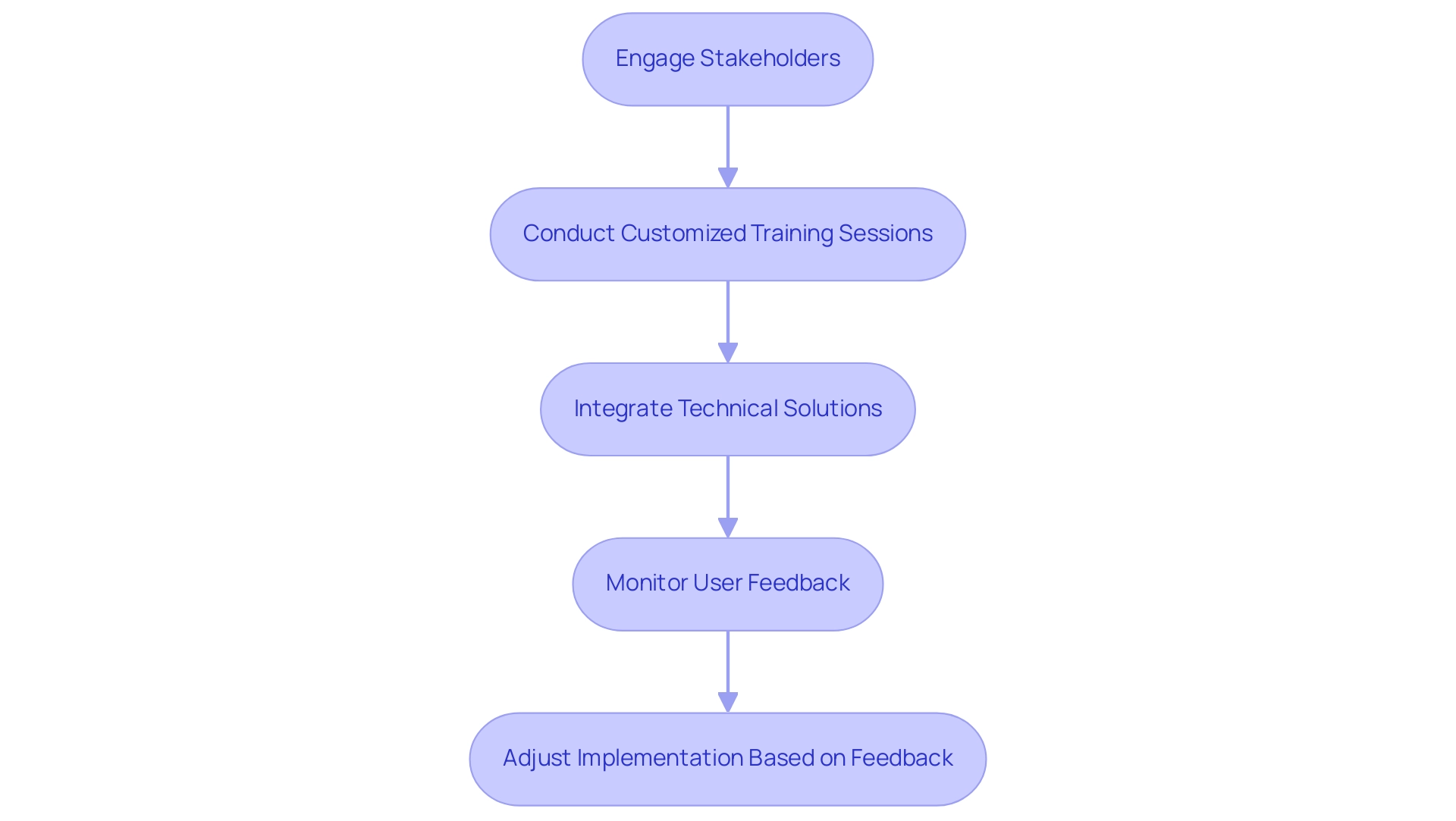
Conclusion
KPI icons play a pivotal role in transforming complex data into visually engaging metrics that enhance decision-making processes across organizations. By simplifying critical performance indicators into easily digestible formats, these icons empower stakeholders to assess performance quickly and effectively. The integration of KPI icons with tools like Power BI and Robotic Process Automation (RPA) is essential for driving operational efficiency and fostering a data-driven culture.
The characteristics of effective KPI icons—clarity, simplicity, and relevance—are crucial for ensuring that these visuals communicate the intended message without confusion. A well-designed KPI icon not only aligns with organizational branding but also facilitates swift comprehension of performance metrics. Best practices, such as maintaining consistency and focusing on the most relevant indicators, further enhance the effectiveness of these visual tools.
As organizations continue to navigate the challenges of implementing KPI icons, engaging stakeholders and providing tailored training can significantly improve user adoption and interpretation. By addressing these challenges head-on, businesses can unlock the full potential of KPI icons, leading to improved data visualization and more informed decision-making. Ultimately, the strategic use of KPI icons can drive operational success, enabling organizations to stay agile and responsive in an increasingly data-centric landscape.
Overview
To update Power BI data effectively, users can choose between full updates, which replace all current information, and incremental updates, which modify only the changed content, thereby optimizing performance and reducing resource usage. The article emphasizes the importance of selecting the right update method based on operational needs and highlights best practices, such as automating processes with Robotic Process Automation (RPA) and monitoring refresh performance, to ensure reliable and timely access to accurate data.
Introduction
In the dynamic landscape of data-driven decision-making, ensuring that insights are timely and accurate is paramount for organizations striving to maintain a competitive edge. Power BI offers robust solutions for data refresh, enabling users to harness the latest information from their source systems effectively.
This article delves into the intricacies of data refresh in Power BI, exploring various methods such as:
- Manual refresh
- Scheduled refresh
- On-demand refreshes
While providing practical steps for setting up automatic refresh features. Additionally, it addresses common troubleshooting challenges and outlines best practices that can significantly enhance operational efficiency.
By understanding these concepts and implementing effective strategies, organizations can transform their data management processes, ultimately driving growth and innovation.
Understanding Data Refresh in Power BI
Understanding how to update Power BI data is an essential procedure that guarantees your reports and dashboards represent the most recent information from source systems, facilitating informed decision-making. This process primarily revolves around two types of updates:
- Full update
- Incremental update
A full update replaces all current information, offering a comprehensive upgrade, while an incremental update selectively modifies only the content that has altered since the previous update.
Understanding these distinctions is crucial for effective data management, particularly given the challenges organizations face, such as time-consuming report creation and data inconsistencies. As emphasized in recent discussions, it can take the business intelligence tool up to 60 minutes to update a semantic model when utilizing the ‘Refresh now’ option. This statistic highlights the significance of choosing the suitable update strategy to enhance performance.
As mjmowle noted, ‘We have BI Premium per-user licenses, and while we have found that up to 48 refreshes can be assigned in a 24-hour period, they still appear to be limited to 30-minute intervals.’ This insight offers a real-world viewpoint on the constraints and functionalities of update schedules in BI. Moreover, users are encouraged to monitor update durations closely; if update times exceed two hours, they may need to explore how to update Power BI data by transitioning models to Power BI Premium or implementing incremental updates for larger datasets.
Additionally, users can periodically check for refresh errors and review the refresh history of semantic models to monitor their status. By incorporating Robotic Process Automation (RPA) into your strategy, you can automate repetitive tasks related to information management, further enhancing operational efficiency and alleviating the competitive disadvantage of struggling to extract meaningful insights. Getting acquainted with these concepts will enable you to utilize BI more effectively, enhancing the accuracy of your insights and driving operational growth.
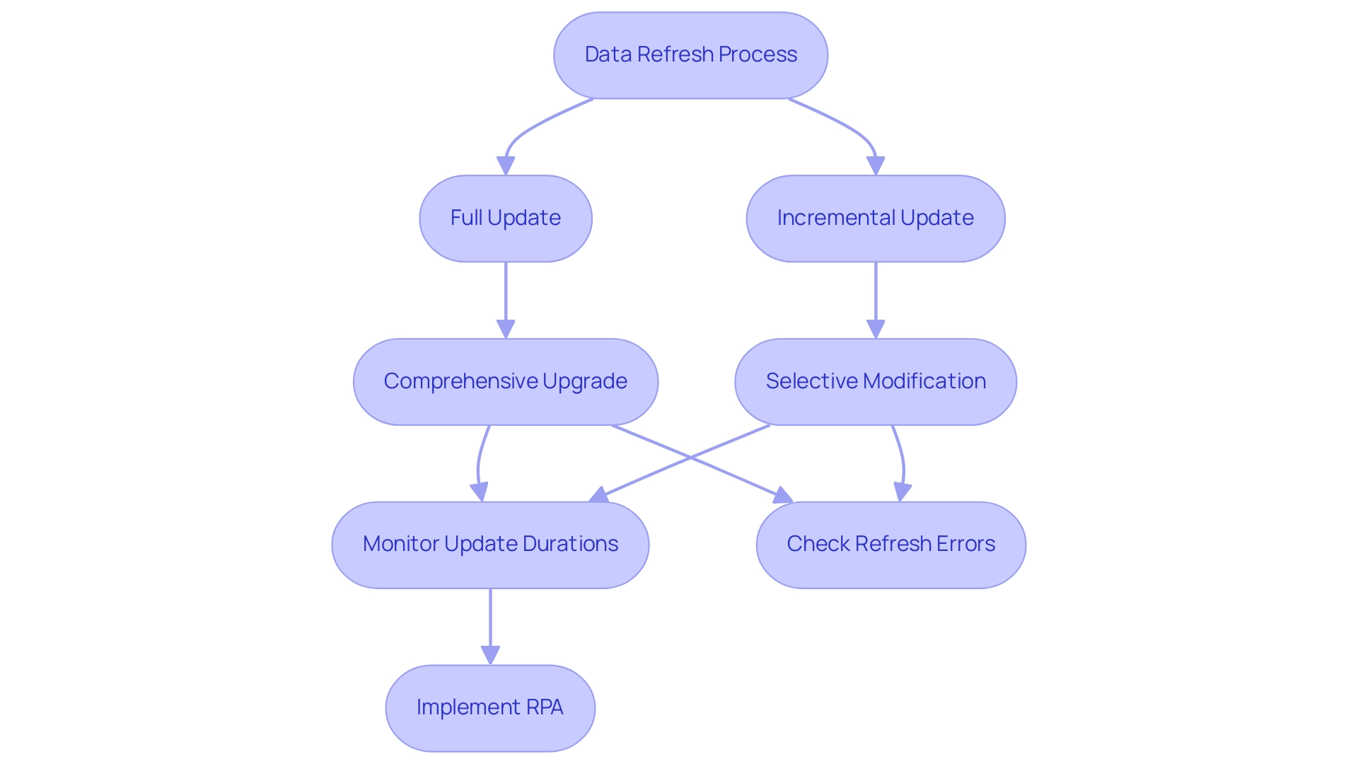
Exploring Refresh Methods: Manual, Scheduled, and On-Demand
This tool provides three main approaches for how to update Power BI data: manual, scheduled, and on-demand, each customized for various operational requirements, ultimately fostering insights based on information and improving operational efficiency.
-
Manual Refresh: This approach allows users total control, enabling them to refresh their documents at their discretion. By simply clicking the ‘Refresh’ button in either Power BI Desktop or the Power BI Service, users can learn how to update Power BI data to instantly see the most recent information. As mentioned by Da Data Guy, comprehending this process is vital:
I concentrate on crafting high-quality articles that deconstruct each phase of the procedure so you can follow along and learn as well.
This enables teams to make informed choices based on the most up-to-date information. -
Scheduled Update: Perfect for guaranteeing that documents stay up-to-date without requiring user involvement, scheduled update allows individuals to establish specific times for automatic updates. This approach tackles typical obstacles like lengthy document generation and information discrepancies, enhancing update intervals by minimizing the volume of information handled. Incremental updates further improve this approach, reducing the information that requires updating, resulting in quicker update times. Recent statistics indicate that organizations typically schedule refreshes multiple times a day to maintain the accuracy of their reporting. Significantly, as companies prepare for future expansion, there is an imminent inquiry on how to update Power BI data automatically in a BI report linked to Fabric Lakehouse, set for July 2024, emphasizing the importance of scheduled update techniques in future strategies. Incorporating RPA tools such as EMMA RPA and Power Automate can further optimize these processes, improving efficiency and alleviating staffing shortages.
-
On-Demand Update: This approach is ideal for on-the-fly reporting needs, allowing users to update information in real-time based on urgent requirements. It provides flexibility to adapt to changing circumstances and is particularly useful in dynamic operational environments, ensuring that leaders can respond swiftly to new insights. By utilizing RPA, organizations can automate the update process, thus enhancing employee morale by decreasing manual workloads.
A practical example of update methods can be observed in the case study of deploying a personal information gateway. When an enterprise information gateway is unavailable, users can manage their own semantic models without sharing sources, although personal gateways have limitations. Selecting the appropriate update approach depends on your reporting requirements and understanding how to update Power BI data based on how often your information changes.
Optimal methods recommend evaluating your operational needs and adjusting the update strategy correspondingly to enhance efficiency and effectiveness, while also contemplating how RPA can simplify these procedures, converting raw information into actionable insights that foster growth and innovation.
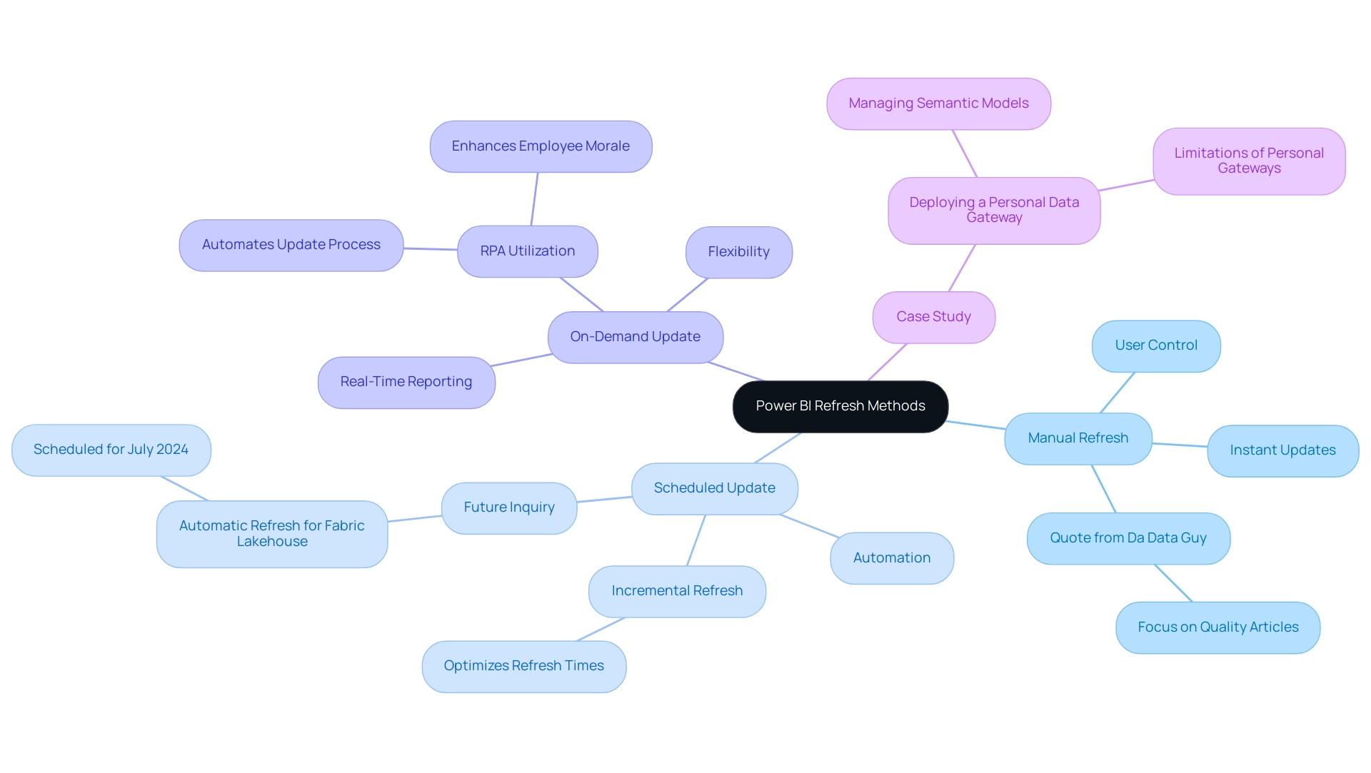
Setting Up Automatic Data Refresh in Power BI
Establishing automated data updates in BI is crucial for sustaining current insights that can facilitate informed decision-making, especially when considering how to update power bi data to address issues such as time-intensive document creation and data discrepancies. Follow these steps to streamline the process:
-
Release Your Document: Start by confirming your BI analysis is shared with the BI Service.
This step is crucial as it enables the renewal functionality, allowing you to leverage the full potential of Business Intelligence. -
Navigate to Dataset Settings: In the Power BI Service, access ‘My Workspace’ or the relevant workspace housing your report. Click on ‘Datasets’ to locate the dataset you wish to refresh automatically.
This guarantees that your information remains consistent and reliable. -
Configure Refresh Settings: Click the ellipsis (…) next to the dataset and select ‘Settings’. Within the ‘Data source credentials’ section, confirm that your credentials are correctly configured to avoid any disruptions.
This step is vital to prevent inconsistencies across reports, which can often lead to confusion and mistrust. -
Schedule Update: Scroll to the ‘Scheduled update’ section. Activate the ‘Keep information updated’ toggle and define your preferred refresh frequency and time zone.
It is important to note that to view report metrics for all dashboards or reports in a workspace, filters must be removed from the report. This customization ensures the data aligns with your operational needs and provides clear, actionable guidance. -
Save Settings: Conclude by clicking ‘Apply’ to save your settings.
Your dataset is now set up to update automatically, enabling you to focus on analysis rather than manual updates.
Recent user feedback indicates that many BI users find documentation complex and often tailored for software engineers rather than end users. This highlights the necessity for clear, practical instructions, as expressed by frequent visitor wolf, who lamented, > I got so lost today!
By following these straightforward steps on how to update power bi data, you can reduce common frustrations and fully utilize BI’s automatic updating features. Utilizing these features not only improves efficiency but is progressively becoming standard, with a significant percentage of BI users choosing automatic refresh to maintain their insights updated.
Furthermore, incorporating RPA solutions like EMMA RPA and Automate can further enhance your reporting processes, alleviating the burden of manual report creation and ensuring information consistency. A case study titled ‘Configuring Scheduled Refresh in BI’ emphasizes how to update power bi data by establishing connectivity between BI and information sources, which is crucial for configuring scheduled refreshes to ensure information remains current.
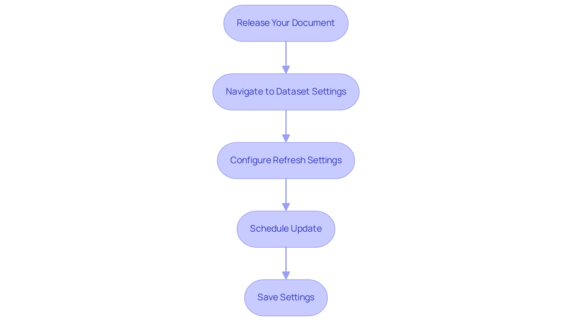
Troubleshooting Data Refresh Issues in Power BI
Data refresh in Power BI can often present challenges such as connection errors, credential issues, and timeout errors, which can hinder operational efficiency. Here are strategic steps to troubleshoot these common issues effectively while leveraging Business Intelligence and Robotic Process Automation (RPA) for informed decision-making:
- Check Data Source Connection: First and foremost, ensure that your data source is accessible. Network issues can frequently interrupt the connection, so verify that your information source is online and reachable. This foundational step is crucial for unlocking the full potential of your BI tools.
- Verify Credentials: Navigate to the dataset settings in Power BI Service to confirm that your data source credentials are accurate and have not expired. Keeping current credentials prevents failures and ensures a smooth workflow.
- Review Update History: Utilize the update history feature to monitor past synchronization cycles. This enables you to identify error messages that give vital information about what went wrong during the update. Understanding these errors is vital for improving operational efficiency and productivity.
- Adjust Timeout Settings: If you encounter timeout errors, consider increasing the timeout settings in your information source. Additionally, optimizing your queries can significantly reduce execution time, leading to smoother refresh operations. Efficient query management is a key component in maximizing the effectiveness of your information management strategy.
Moreover, it’s important to recognize that manual, repetitive tasks can significantly slow down your operations and lead to wasted time and resources. By integrating RPA into your data management processes, you can automate these repetitive tasks, enhancing overall efficiency and allowing your team to focus on more strategic initiatives.
It’s essential to note that the BI tool deactivates your update schedule after four consecutive failures, underscoring the importance of proactive monitoring. As BI Super User Uzi 2019 emphasizes, “If you make any changes in your BI desktop file (add a new chart, new column to your table, any DAX), you have to publish every time to BI service.” This reinforces the need for careful management of your Power BI environment.
Additionally, in cases where DirectQuery sources with enforced primary keys are used, adjusting the Assume Referential Integrity setting can optimize query performance. This adjustment can accelerate query execution by utilizing inner joins instead of slower outer joins, further enhancing the efficiency of your update operations.
By applying these troubleshooting measures and monitoring your update status closely, you can effectively address typical update problems and guarantee your operations function seamlessly, ultimately fostering growth and innovation by understanding how to update power bi data.
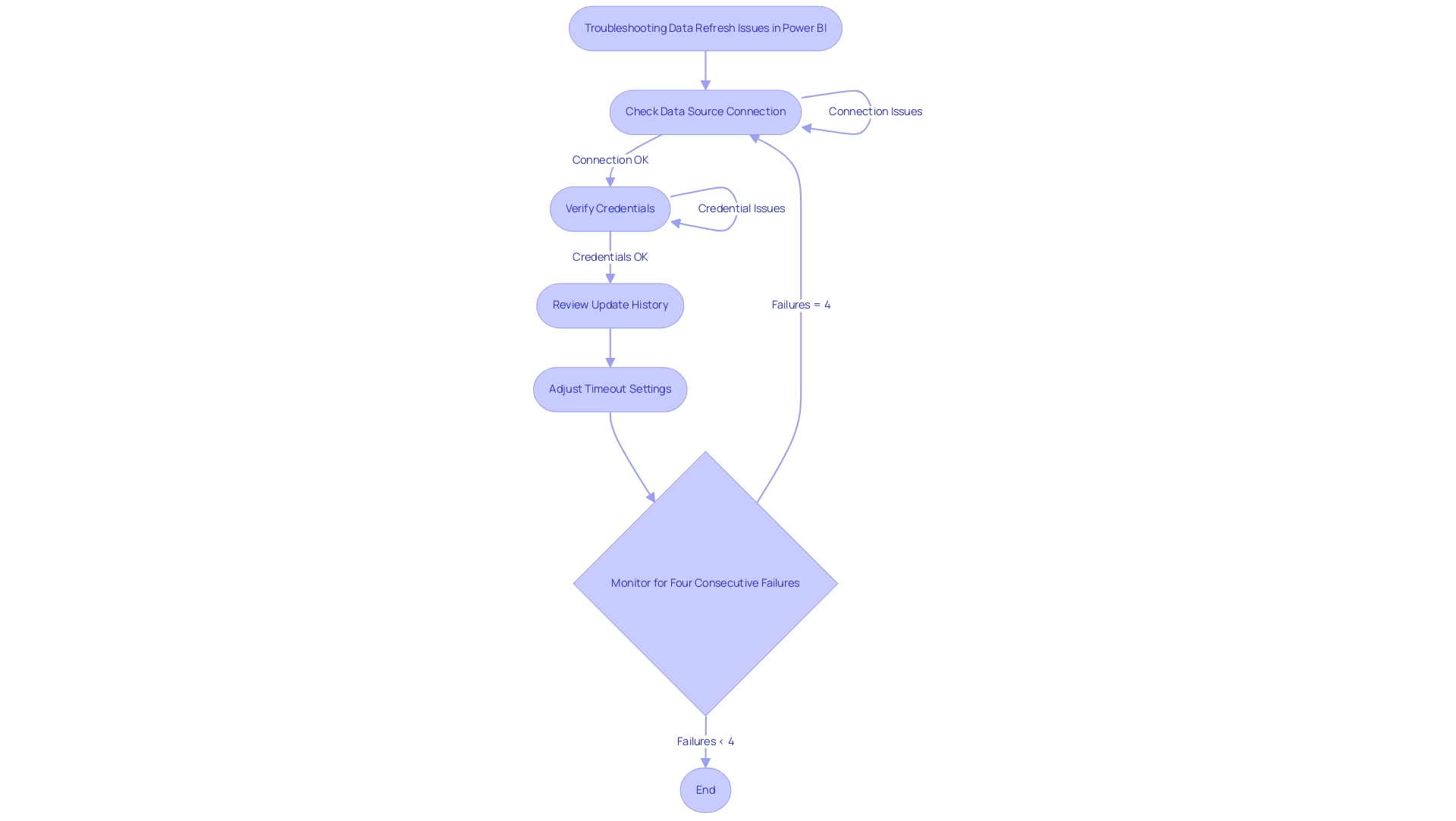
Best Practices for Effective Data Refresh in Power BI
To ensure effective data refresh in Power BI, consider implementing the following best practices:
-
Optimize Data Models: Streamlining your data models is crucial for enhancing refresh performance. Begin by removing unnecessary columns and tables that do not add value to your reports. This not only decreases memory usage but also accelerates the update process. It is essential to remember that during a complete update, your system needs twice the amount of memory that the semantic model requires, making optimization critical for efficient information handling.
-
Utilize Incremental Update: For large datasets, adopting incremental update is a game-changer. This technique shows you how to update Power BI data by modifying only the information that has altered, significantly reducing update time and resource usage. Recent findings show that this approach can lead to substantial efficiency gains in information handling, which can be further enhanced by utilizing EMMA RPA to automate repetitive tasks, such as entry and report generation, ensuring that your team can focus on strategic analysis.
-
Monitor Refresh Performance: Regularly reviewing refresh history and performance metrics is vital. By keeping an eye on these metrics, you can proactively identify and address any issues that may arise, which is essential for understanding how to update Power BI data and ensuring consistent and reliable data availability. Integrating Power Automate can streamline this monitoring process, making it easier to track performance metrics automatically and alert your team to any anomalies in real time.
-
Document Refresh Schedules: Maintaining a well-documented record of your refresh schedules and settings is essential for consistency and easy reference. This practice supports operational efficiency and aids in maintaining a clear overview of your management processes, especially when combined with RPA solutions that automate documentation tasks, reducing the administrative burden on your team.
In the context of collaboration, encouraging comments and annotations within documents enhances teamwork. The case study focusing on collaborative practices illustrates that implementing dedicated workspaces and utilizing version history not only encourages meaningful discussions but also preserves a record of changes. By utilizing EMMA RPA and Automate, organizations can enhance these collaborative practices by automating notifications for updates and ensuring that all team members have access to the most recent information insights, ultimately improving the quality of shared insights.
Moreover, as PaulDBrown, a Community Champion, mentions, “If the Excel file is stored on OneDrive and you configure the source to link to the online file, the update will be automatic… so you can utilize the report online with current information, and thus don’t need to concern yourself with manually updating.” This practical advice emphasizes the significance of utilizing technology, such as EMMA RPA and Automate, to streamline processes related to how to update Power BI data and ensure that high-quality data is consistently available for informed decision-making. By adhering to these best practices, you can significantly enhance your Power BI experience and drive operational efficiency.
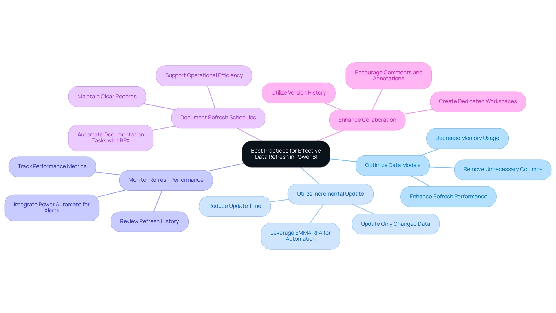
Conclusion
In the realm of data-driven decision-making, the significance of effective data refresh methods in Power BI cannot be overstated. This article has explored the key strategies for refreshing data, including:
- Manual refresh
- Scheduled refresh
- On-demand refresh
Each serving specific operational needs. Understanding the nuances of full and incremental refreshes is essential, as it enables organizations to optimize performance and maintain accurate reporting.
Setting up automatic data refresh is a crucial step in ensuring timely insights. By following straightforward steps for configuration and integrating Robotic Process Automation, organizations can streamline their reporting processes and alleviate the burdens of manual updates. Proactive troubleshooting of common data refresh issues ensures smooth operations, minimizing disruptions that can hinder efficiency.
Implementing best practices, such as:
- Optimizing data models
- Leveraging incremental refresh
can dramatically enhance the performance of Power BI reports. Regular monitoring of refresh performance and documenting schedules contribute to a sustainable data management strategy that supports operational efficiency.
Ultimately, by mastering these data refresh techniques and strategies, organizations are empowered to harness the full potential of their data, driving informed decision-making and fostering innovation. Embracing these practices not only enhances data accuracy but also positions organizations to thrive in an increasingly competitive landscape, transforming challenges into opportunities for growth.
