Overview:
The article addresses the common causes of blank visuals in Power BI, identifying issues such as data connectivity problems, incorrect filters, and information refresh problems as key contributors. It supports these points through statistical data and practical solutions, emphasizing the importance of proper data management and the use of automation tools to enhance report integrity and operational efficiency.
Introduction
In the dynamic landscape of data visualization, blank visuals in Power BI pose significant challenges that can hinder effective decision-making and operational efficiency. Understanding the root causes behind these frustrating occurrences is crucial for any organization striving to harness the full potential of its data. From connectivity issues and incorrect filters to data refresh problems and type mismatches, the reasons for blank visuals are varied and often interlinked. By identifying these pitfalls and implementing proactive solutions, organizations can transform their reporting processes, ensuring that stakeholders receive accurate and actionable insights.
This article delves into the common scenarios leading to blank visuals, explores effective troubleshooting strategies, and offers best practices to maintain visual integrity, empowering teams to navigate the complexities of Power BI with confidence and clarity.
Understanding the Causes of Blank Visuals in Power BI
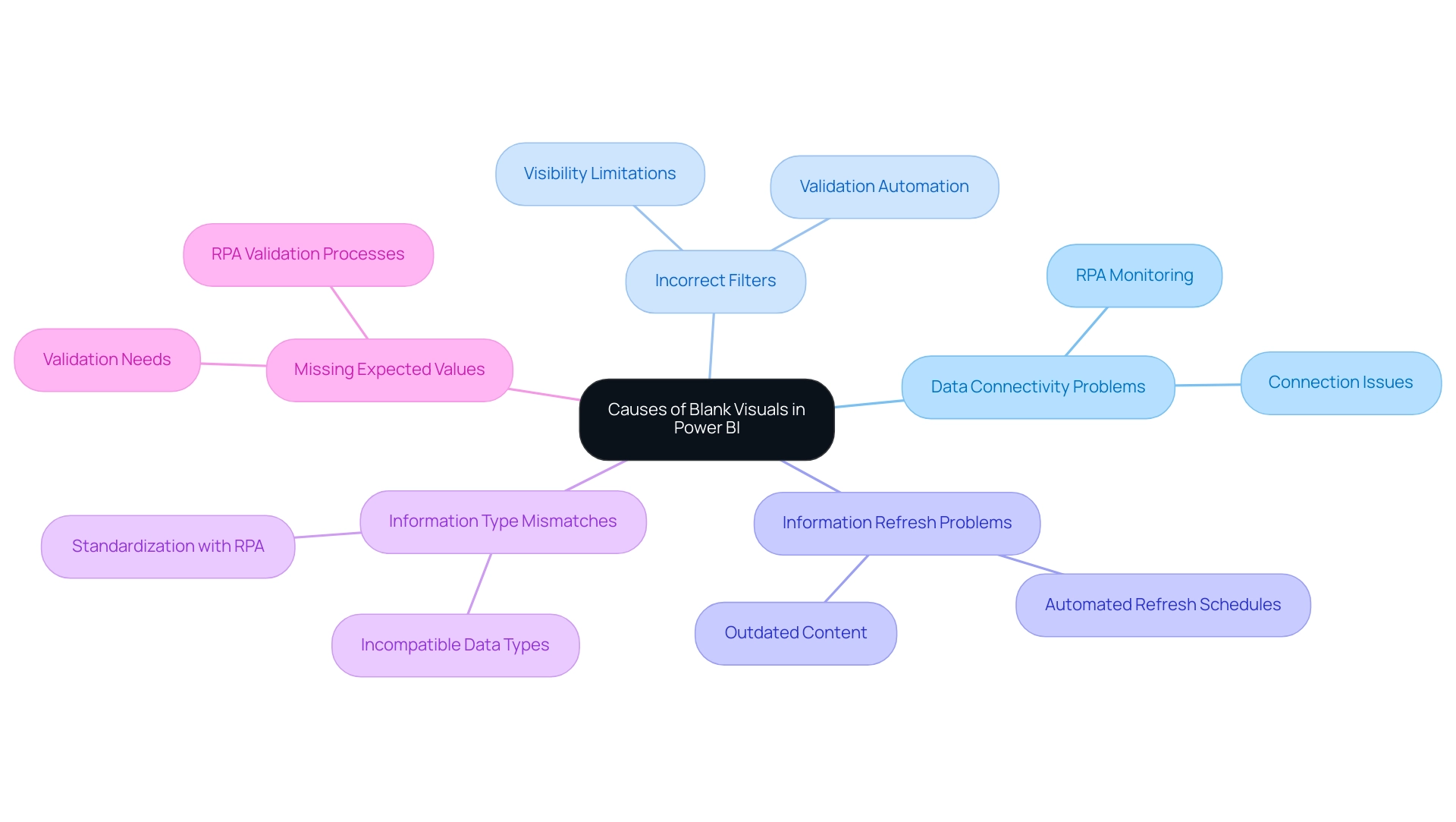
Empty displays in Power BI blank can result from various factors, making it crucial to determine the root causes for effective troubleshooting. Here are some common reasons that lead to blank images:
-
Data Connectivity Problems: When Power BI encounters a power bi blank because it fails to establish a connection with the information source, visuals may not render, leading to frustration and potential misinformation. Recent statistics indicate that approximately 30% of users experience connectivity issues, highlighting the prevalence of this challenge. RPA solutions can automate the monitoring of connections, ensuring seamless integration and reducing downtime.
-
Incorrect Filters: Filters applied to visuals or the document can inadvertently limit information visibility, resulting in empty outputs. It’s essential to ensure that filters align with the information being analyzed, as incorrect filtering has been a common source of frustration among users. RPA can help automate the validation of filter settings, ensuring they are set correctly before report generation.
-
Information Refresh Problems: If content is not refreshed post-updates, visuals may result in a Power BI blank, displaying outdated or no information at all, which hinders decision-making processes. This corresponds with the case study titled ‘Other Considerations for Usage Metrics,’ which highlights that users must interact with the content in their workspace to enable the processing of usage metrics information. Utilizing RPA tools can automate refresh schedules, ensuring that reports reflect the most current information.
-
Information Type Mismatches: Employing incompatible types within representations can also lead to power bi blank outputs, as Power BI necessitates consistency to interpret values correctly. RPA can assist in standardizing information types across datasets, minimizing errors and enhancing visual accuracy.
-
Power BI blank: When the underlying information is missing expected values, it results in a Power BI blank, preventing visuals from rendering as intended and highlighting the need for thorough validation prior to visualization. RPA solutions can automate validation processes, ensuring that all necessary information is present and correct before visualization.
As guillermosantos, a frequent visitor, noted, ‘I’ve been tracking the problem, and it looks like someone found a temporary solution.’ This emphasizes the persistent difficulties users encounter with Power BI blank visuals.
Tackling these problems proactively can greatly enhance the precision and dependability of your documents, ensuring that stakeholders are provided with the insights they require. By utilizing Business Intelligence tools and RPA solutions such as EMMA RPA and Automate, you can enhance report creation, remove inconsistencies, and ultimately promote operational efficiency for business growth.
Effective Solutions to Resolve Blank Visuals in Power BI
To effectively tackle empty graphics in BI and improve your operational efficiency, implement the following best practices:
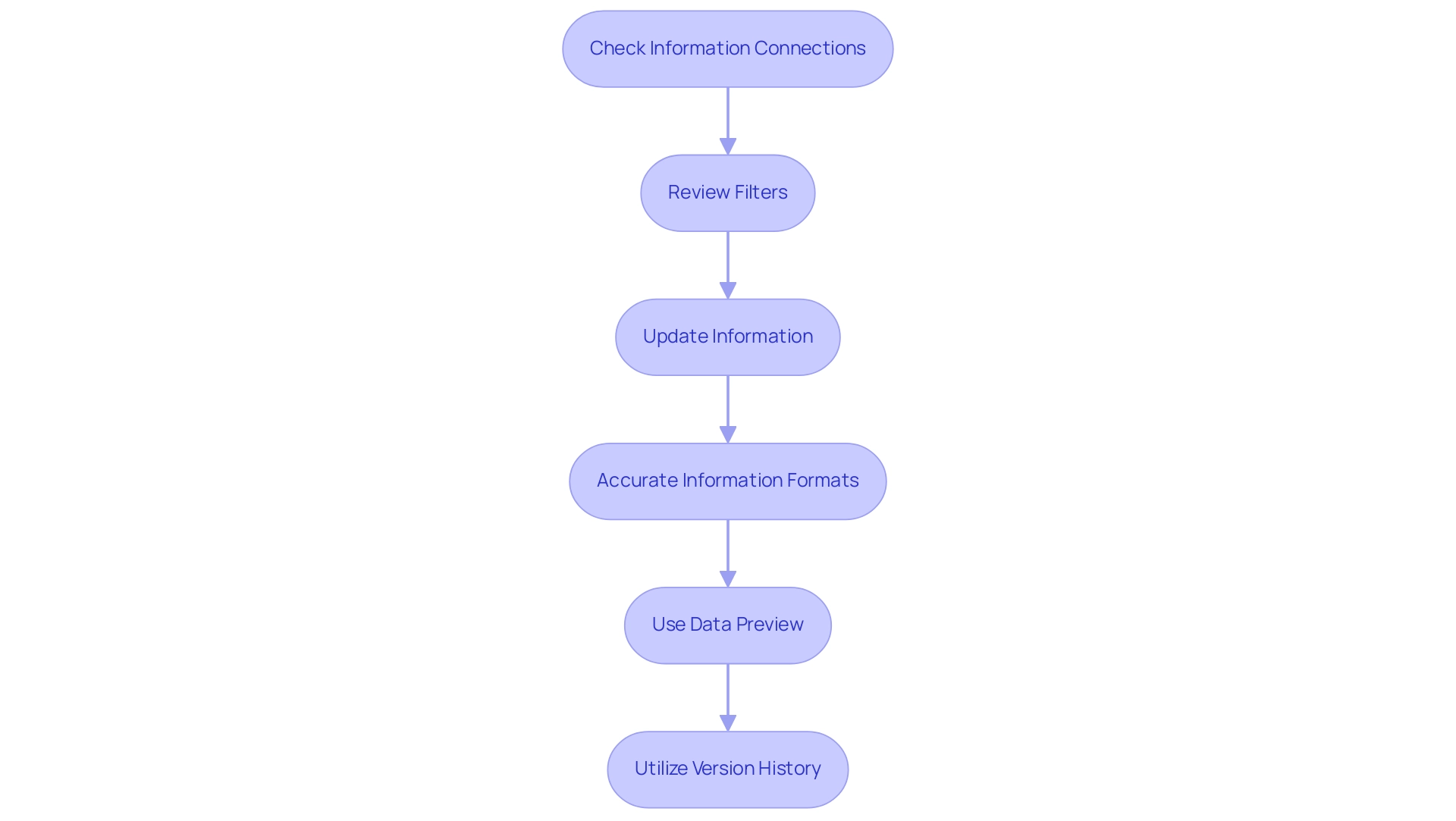
- Check Information Connections: Confirm that your sources are correctly connected and accessible. Utilize Power BI’s integrated testing functions to confirm connections, ensuring that your Power BI blank graphics have the required information to populate effectively.
- Review Filters: Analyze any filters applied to your images. Adjust or remove filters as necessary to ensure they are not limiting the information you wish to display, thereby enhancing the actionable insights derived from your reports.
- Update Information: Regularly update your information to maintain displays current. Consider scheduling automatic refreshes to streamline this process and ensure real-time accuracy, which is vital for informed decision-making.
- Accurate Information Formats: Ensure that the types in your representations align with the expected formats. This may require adjustments to your information model to maintain compatibility, reducing the risk of inconsistencies.
- Use Data Preview: Leverage Power BI’s data preview feature to inspect for any missing or unexpected data before creating visuals. This proactive step can save time and enhance the reliability of your documents in Power BI blank, addressing the challenges of time-consuming document creation.
- Utilize Version History: Regularly review and utilize version history to track changes made to reports and dashboards. This practice is crucial for maintaining effective BI assets and ensuring that you can revert to previous versions if necessary.
Incorporating these strategies will help you maintain a reliable and efficient BI environment, ultimately empowering you to make data-driven decisions with confidence. Additionally, consider attending the upcoming Microsoft Fabric Community Conference from March 31 to April 2 in Las Vegas, Nevada, to further enhance your knowledge and connect with other BI professionals. It is important to recognize that failing to extract meaningful insights can place your business at a competitive disadvantage, making these practices essential.
Lastly, utilizing RPA alongside BI can streamline repetitive tasks, further enhancing your operational efficiency. The case study on backup and recovery strategies underscores the significance of resilience and continuity in managing your BI assets, which aligns with your operational efficiency goals and the transformative potential of RPA and BI in driving growth.
Common Scenarios Leading to Blank Visuals
Several scenarios can lead to blank visuals in BI, and understanding these can empower Directors of Operations Efficiency to troubleshoot effectively and streamline their reporting processes:
-
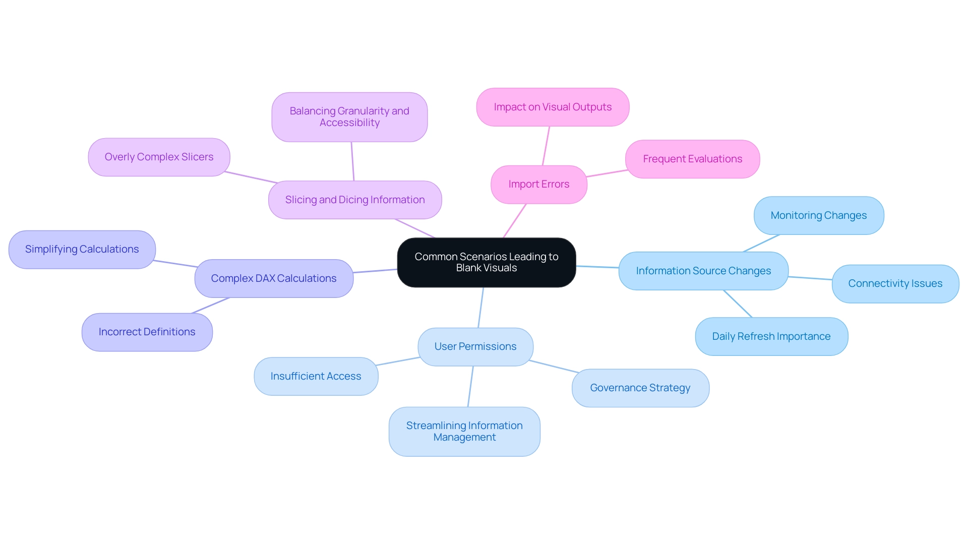
Information Source Changes:
Alterations to the structure or location of the information source can create connectivity issues. Monitoring these changes is crucial for maintaining visual integrity. Note that Power BI refreshes the usage metrics semantic model daily, underscoring the importance of accuracy in your reports. -
User Permissions:
Insufficient permissions can hinder access to specific information, resulting in Power BI blank visuals for users affected by these limitations. As mentioned by a Super User at Data Insights, ‘This approach also allows for the exclusion of unnecessary columns and rows, streamlining information management.’ Properly managing user permissions guarantees that all stakeholders have the necessary access to pertinent information, which is vital in establishing a reliable governance strategy. -
Complex DAX Calculations:
Incorrectly defined or overly complex DAX measures may yield results that are Power BI blank instead of the expected outcomes. Simplifying these calculations can enhance visual output and provide clearer insights for decision-making. -
Slicing and Dicing Information:
Utilizing overly complex slicers can inadvertently filter out all available content in Power BI, leading to Power BI blank visuals. It’s essential to strike a balance between information granularity and accessibility, ensuring that reports not only present information but also offer actionable insights. -
Import Errors:
Errors during import can lead to Power BI blank datasets, which directly impacts visual outputs. Frequent evaluations of imports can assist in reducing these risks and uphold the integrity of your reporting.
Furthermore, the case study on usage metrics in national/regional clouds illustrates how organizations can uphold compliance with local regulations while ensuring effective management practices. These insights underline the importance of proper user permissions and a robust governance strategy in ensuring effective visualization in BI, ultimately transforming your reporting process from time-consuming tasks into valuable insights.
The Role of Data Modeling and DAX in Preventing Blanks
Information modeling and Data Analysis Expressions (DAX) are instrumental in preventing blank visuals in Power BI, especially when grappling with the challenges of time-consuming report creation and inconsistencies. Here are essential considerations to enhance your reporting experience:
-
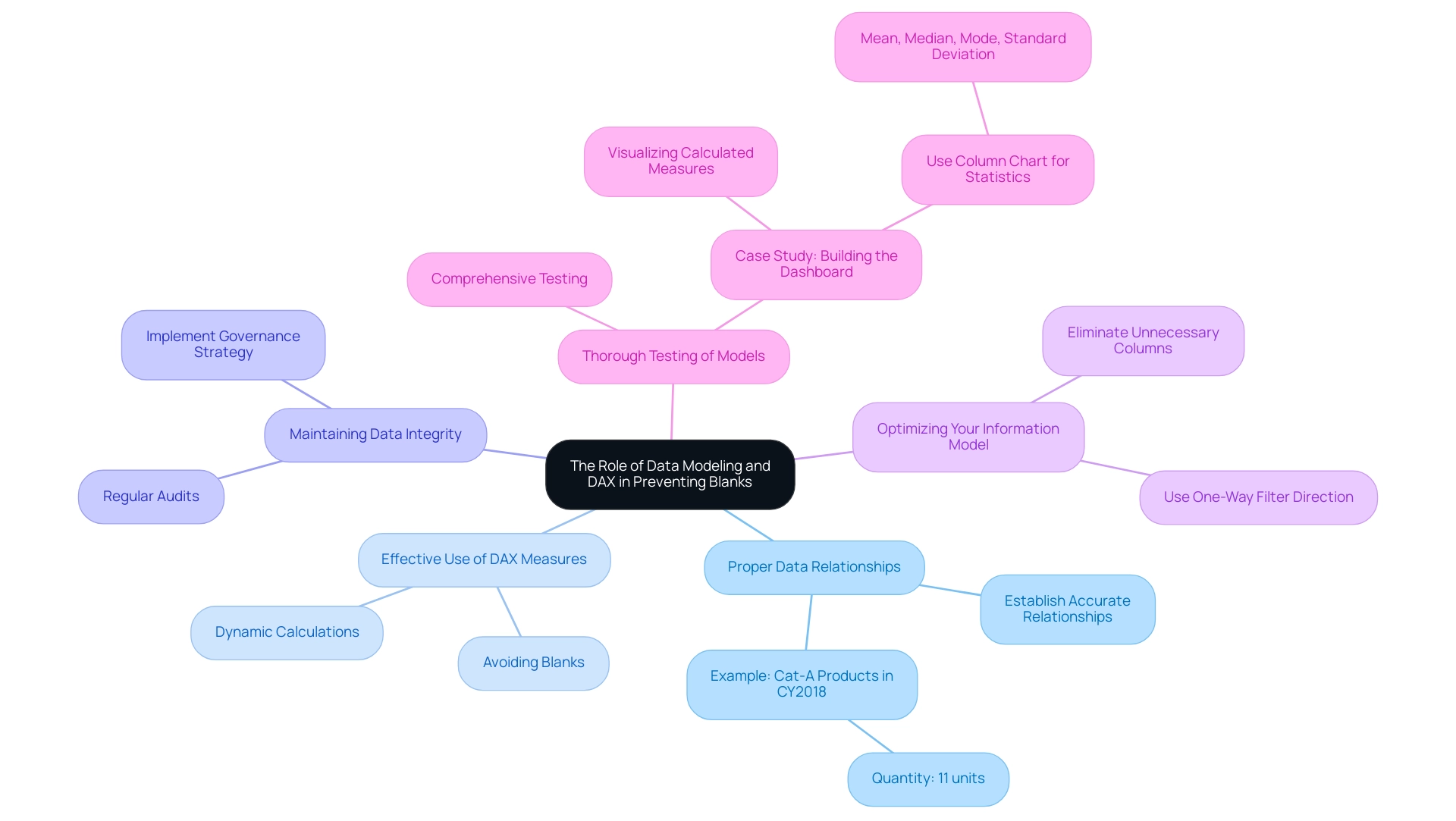
Proper Data Relationships: Establishing accurate relationships between tables is crucial.
This foundational step ensures your information can be retrieved correctly, which is vital for meaningful analysis. For instance, the quantity value returned for products assigned to category Cat-A and ordered in year CY2018 is 11 units, highlighting the significance of accurate relationships in analyzing specific product performance. -
Effective Use of DAX Measures: Utilize DAX measures to dynamically calculate values.
Well-constructed DAX formulas are key to avoiding blanks, as they ensure calculations yield valid results even in the presence of null values, directly addressing the issue of missing actionable guidance in your reports. -
Maintaining Data Integrity: Regular audits of your dataset for integrity issues, such as duplicates or null entries, are essential.
These discrepancies can disrupt visual outputs, leading to confusion and mistrust in the information presented. Implementing a governance strategy can help maintain information quality and consistency across reports. -
Optimizing Your Information Model: Streamline your information model by eliminating unnecessary columns and tables to simplify calculations and enhance performance.
A well-optimized model improves efficiency and makes the analytical process more intuitive. Utilizing a one-way filter direction whenever possible helps avoid discrepancies and confusion. -
Thorough Testing of Models: Conduct comprehensive testing of your models before creating representations.
Recognizing potential problems early can conserve time and resources, ensuring your final visuals accurately depict the foundational information.
The case study titled ‘Building the Dashboard’ highlights the significance of visualizing calculated measures in a dashboard instead of merely in a view, recommending the use of a column chart to present mean, median, mode, and standard deviation.
As Software Engineer Douglas Rocha states,
My goal is fulfilled if you now know how to use BI’s assistance to find some statistics of your dataset.
By applying these strategies and offering clear next steps based on the insights obtained from your reports, you can greatly enhance the quality and dependability of your BI reports, effectively addressing the challenges of report creation and information management.
Best Practices for Maintaining Visual Integrity in Power BI
To uphold visual integrity in Power BI and eliminate blank visuals, implementing the following best practices is essential:
-
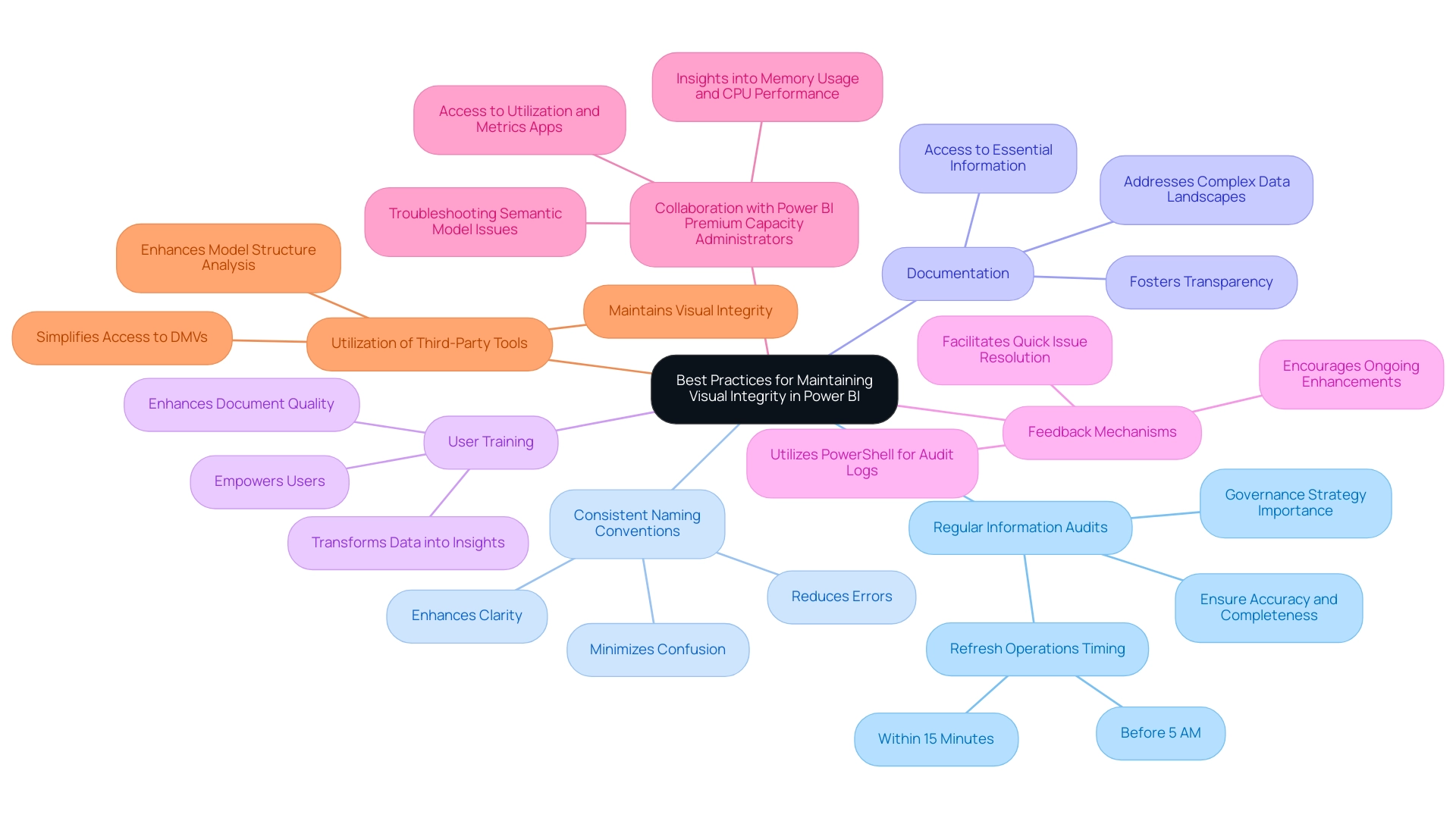
Regular Information Audits: Conduct regular audits of your information to ensure accuracy and completeness. This proactive method detects inconsistencies early and highlights the importance of keeping refresh operations within a 15-minute interval before 5 AM, ensuring that your documents are based on the most up-to-date information.
This is crucial for overcoming challenges related to data inconsistencies and highlights the importance of a governance strategy in maintaining data integrity. -
Consistent Naming Conventions: Adopting consistent naming conventions for tables and fields minimizes confusion and reduces errors, ultimately enhancing clarity. A well-structured naming system significantly improves the usability of Power BI reports, providing clear guidance for stakeholders.
-
Documentation: Thoroughly documenting your information sources, relationships, and measures fosters transparency and collaboration. This clarity ensures that all stakeholders have access to essential information, addressing the common challenge of navigating complex data landscapes.
-
User Training: Offering training sessions on best practices in Power BI is imperative.
Well-informed users are less likely to make errors, enhancing overall document quality and efficiency. Empowering users with knowledge directly contributes to smoother operations and better utilization of insights, enabling the transformation of raw data into actionable insights. -
Feedback Mechanisms: Establishing robust feedback mechanisms enables users to communicate issues with visuals promptly.
This continuous feedback loop facilitates quick resolution of issues and encourages ongoing enhancement of documents. As Reza aptly states, there are now easier methods to fetch audit logs using PowerShell scripts, which eliminate the 5000 rows limitation, streamlining the auditing process. -
Collaboration with Power BI Premium Capacity Administrators: Engaging with Power BI Premium capacity administrators is crucial for troubleshooting semantic model issues.
Their access to utilization and metrics applications offers valuable insights into memory usage and CPU performance, assisting in the resolution of model-related issues and improving quality. -
Utilization of Third-Party Tools: Incorporating third-party tools like DAX Studio simplifies access to DMVs and enhances your ability to analyze model structures.
These tools can maintain visual integrity and ensure that your documents are built on a solid foundation.
By embracing these best practices, you can significantly enhance the integrity and reliability of your Power BI visuals, ultimately driving better decision-making and operational efficiency. This approach not only addresses the challenges of report creation and data governance but also leverages Business Intelligence effectively for growth and innovation.
Conclusion
Identifying and addressing the root causes of blank visuals in Power BI is essential for any organization looking to optimize its reporting capabilities. By understanding factors such as:
- Data connectivity issues
- Incorrect filters
- Data refresh problems
- Type mismatches
teams can proactively troubleshoot and resolve these challenges. Implementing best practices, such as:
- Regular data audits
- Maintaining consistent naming conventions
- Providing user training
can significantly enhance the integrity of visuals and ensure stakeholders receive accurate insights.
The integration of automation tools like RPA can further streamline these processes, making it easier to maintain data quality and refresh schedules. By simplifying complex data models and leveraging effective DAX measures, organizations can minimize the risk of encountering blank visuals and maintain a reliable reporting environment.
Ultimately, these strategies not only improve operational efficiency but also empower teams to make informed, data-driven decisions. Embracing these practices will transform the way organizations utilize Power BI, enabling them to extract valuable insights and foster a culture of continuous improvement. Now is the time to take decisive action, ensuring that reporting processes are robust, reliable, and aligned with the organization’s goals for growth and success.
Overview:
Personalizing visuals in Power BI involves customizing report elements like colors, layouts, and information presentation to enhance user engagement and improve data insights. The article provides a detailed step-by-step guide that outlines the process for enabling personalization features, highlighting the benefits of tailored visuals while also addressing potential challenges such as repetitive document creation and collaboration issues.
Introduction
In the realm of data visualization, Power BI stands out as a transformative tool that empowers organizations to tailor their reporting experiences to meet specific needs. Personalization in Power BI visuals not only enhances user engagement but also turns complex data into actionable insights, driving informed decision-making.
As organizations grapple with the challenges of report creation and data inconsistencies, understanding how to effectively customize visuals becomes essential. This article delves into the intricacies of personalizing Power BI reports, offering a step-by-step guide to unlock features that enhance clarity and relevance.
It also addresses common pitfalls and limitations, ensuring users can navigate their data landscape with confidence and precision. From adjusting colors and layouts to managing personalized visuals effectively, the insights presented here will equip users to transform their reporting processes and maximize operational efficiency.
Understanding Personalization in Power BI Visuals
The ability to personalize visuals in Power BI enables individuals to customize their reports to align with their unique needs and preferences, significantly enhancing the experience. By using Power BI to personalize visuals according to specific roles, users can convert information into actionable insights. They can alter visual elements—including colors, layouts, and the information presented—to create an intuitive and efficient reporting environment.
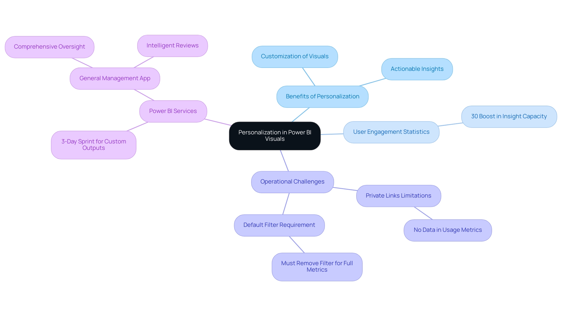
Such customization to personalize visuals in Power BI not only enhances the relevance of information but also fosters deeper engagement with the data. Statistics indicate that users who interact with customized analyses in BI experience a 30% boost in their capacity to obtain meaningful insights, directly influencing decision-making processes. Furthermore, our Power BI services, including the 3-Day Sprint for quick, professionally crafted documents, enable organizations to swiftly develop customized outputs that meet specific business needs, while the General Management App provides comprehensive oversight and intelligent reviews to enhance operational efficiency.
However, organizations using Private Links encounter restrictions in transferring client information, which can lead to usage metrics lacking any information, as indicated in the case study ‘Usage Metrics Not Supported with Private Links.’ Additionally, to see metrics for all dashboards or documents in a workspace, individuals must remove the default filter applied to the document, highlighting the necessity for awareness of these operational nuances. By leveraging Business Intelligence and RPA, individuals can maximize the effectiveness of their information presentations, ultimately leading to improved operational efficiency and informed strategic decisions.
Step-by-Step Guide to Enabling Personalization Features
Activating features that allow you to personalize visuals Power BI is a robust method to improve your data visualization experience, particularly considering issues such as time-consuming document creation and data inconsistencies arising from an absence of governance strategy. By following this straightforward guide, you can empower users to customize their documents effectively, transforming these challenges into opportunities for improvement:
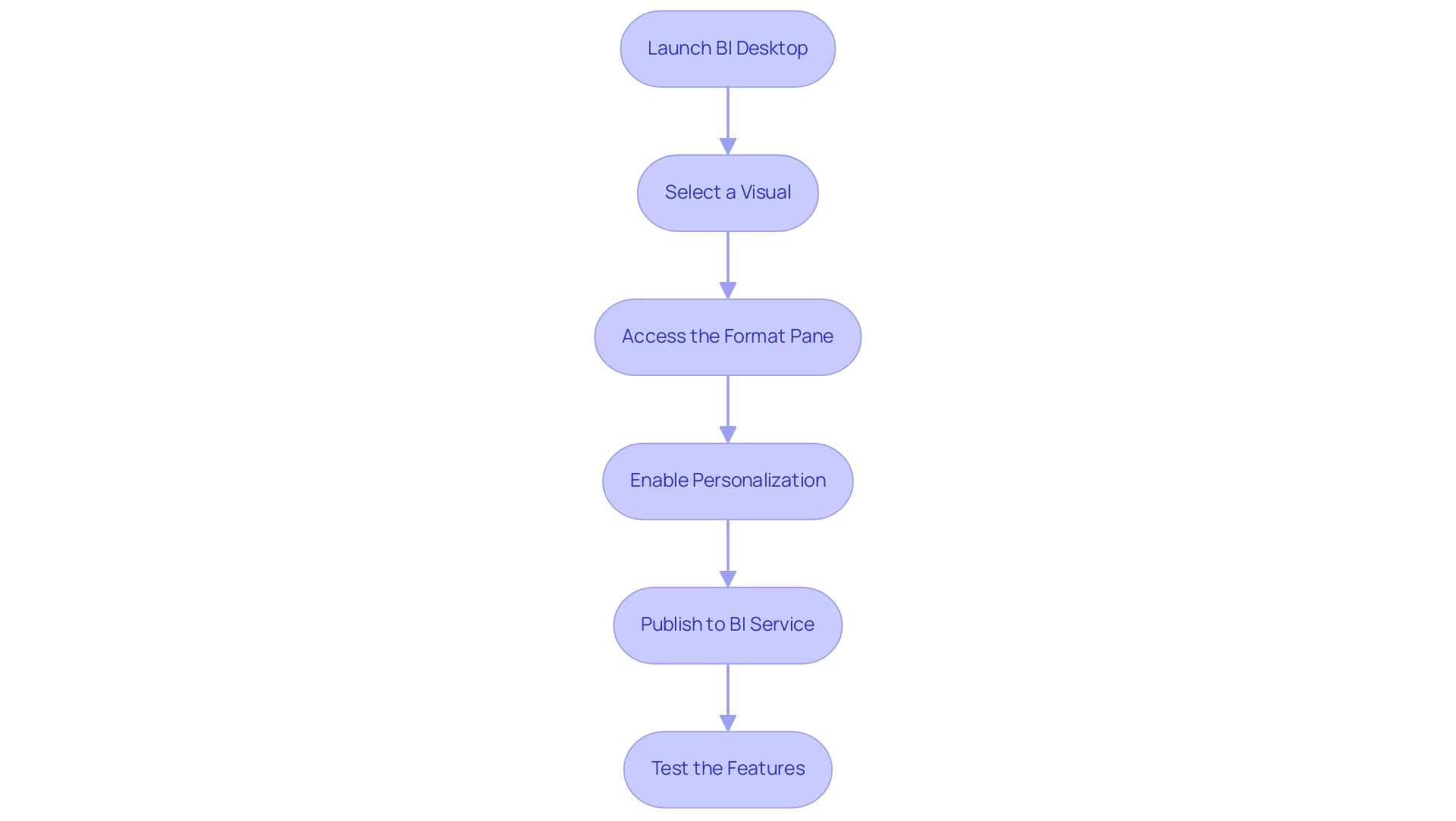
- Launch BI Desktop: Begin by starting the application and loading the document you wish to customize, an essential first step in addressing ineffective document creation.
- Select a Visual: Click on the specific visual element you want to personalize to focus your customization, which helps mitigate the confusion caused by inconsistent data presentations.
- Access the Format Pane: Locate the Format pane on the right side of your screen, represented by a paint roller icon.
- Enable Personalization: Scroll down in the Format pane until you find the ‘Personalize this visual’ option, which allows you to personalize visuals Power BI, then toggle it to ‘On’. This step activates the capability to personalize visuals Power BI for that visual, addressing the need for clearer, actionable guidance in your reports.
- Publish to BI Service: Ensure your document is published to the BI Service, which is essential for utilizing personalization features online.
- Test the Features: Open your document within the Power BI Service environment and check that the personalization options are now accessible for interaction.
By implementing these steps, individuals gain the ability to personalize visuals Power BI for their visual presentations, better meeting their needs and fostering an environment of self-service business intelligence. This adaptability not only enhances user engagement but also increases the overall effectiveness of your analysis efforts. Significantly, usage metrics reports refresh daily with new information, highlighting the significance of personalization features in maintaining content up-to-date and pertinent.
As Andy states, ‘Interacting with each visual to edit as needed’ is essential for maximizing the value of BI. Furthermore, the case study titled ‘Conclusions on BI’s Personalize Visuals Power BI Feature’ illustrates that enabling the personalize visuals Power BI features assists organizations in embracing Self-Service BI, granting users enhanced control over their information presentation and ensuring that insights are effectively utilized. Clear, actionable guidance in documents is essential to assist stakeholders navigate the information effectively, especially in the context of governance challenges.
Customizing Visuals: Colors, Fonts, and Layouts
To improve report engagement and clarity while addressing common challenges like time-consuming report creation, inconsistencies, and the absence of a governance strategy, it is effective to personalize visuals in Power BI. Here’s a step-by-step guide to effectively adjust colors, fonts, and layouts:
-
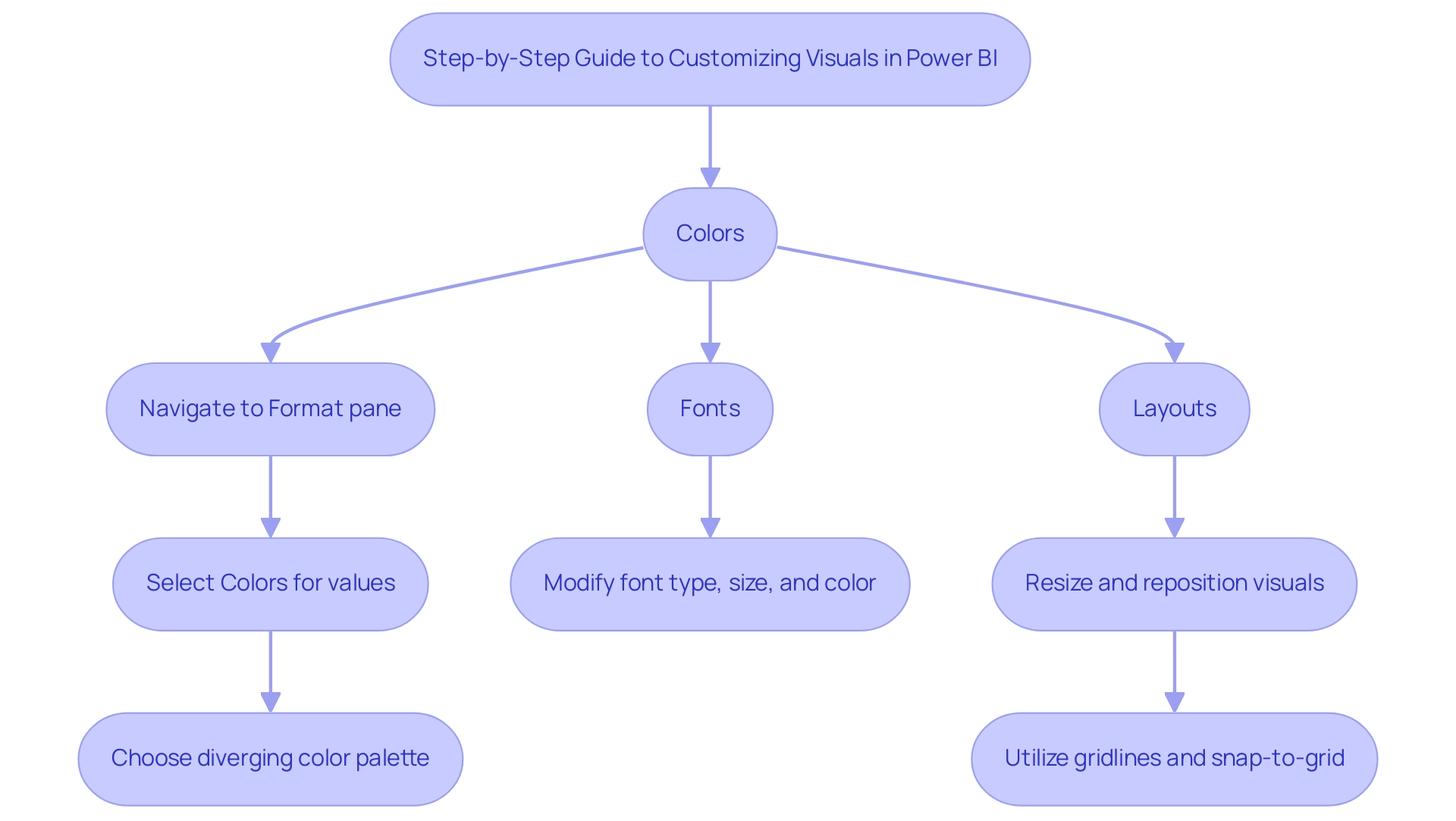
Colors: Navigate to the Format pane and select ‘Colors for the values’ to specify colors for your points. Utilizing the color picker allows you to align with your organization’s branding or enhance visual distinctiveness. Current trends emphasize the use of diverging color palettes, which effectively display differences from a central point, such as a mean or median. A well-designed diverging palette, as detailed in the case study on diverging color palette design, enhances the viewer’s ability to interpret information by clearly indicating positive and negative values, thus improving the overall effectiveness of the visualization and assisting stakeholders in deriving actionable insights from complex datasets.
-
Fonts: In the ‘Title’ and ‘Labels’ sections of the Format pane, you can modify the font type, size, and color. This customization is crucial for improving readability and making your visuals more visually appealing. According to Jonathan Schwabish from the Urban Institute, “considerate font selections can enhance audience engagement and satisfaction in information presentations,” ensuring that documents are not just filled with figures but also offer clear direction for subsequent actions, thereby addressing the need for practical insights in governance.
-
Layouts: The ‘General’ section within the Format pane allows for resizing and repositioning visuals on the canvas. Utilizing gridlines and the snap-to-grid feature ensures precise alignment, contributing to a polished and professional layout. Practical uses, like a hospital’s implementation of a style guide to illustrate patient satisfaction scores, show how customized layouts can connect with particular audience needs and reduce confusion created by inconsistent information presentation.
By integrating these customization techniques, users can personalize visuals in Power BI to effectively communicate information and address the challenges of report creation along with the need for a strong governance strategy. This article reflects the latest trends as of February 2024, ensuring that the guidance provided remains relevant to current practices in data visualization.
Saving and Managing Personalized Visuals
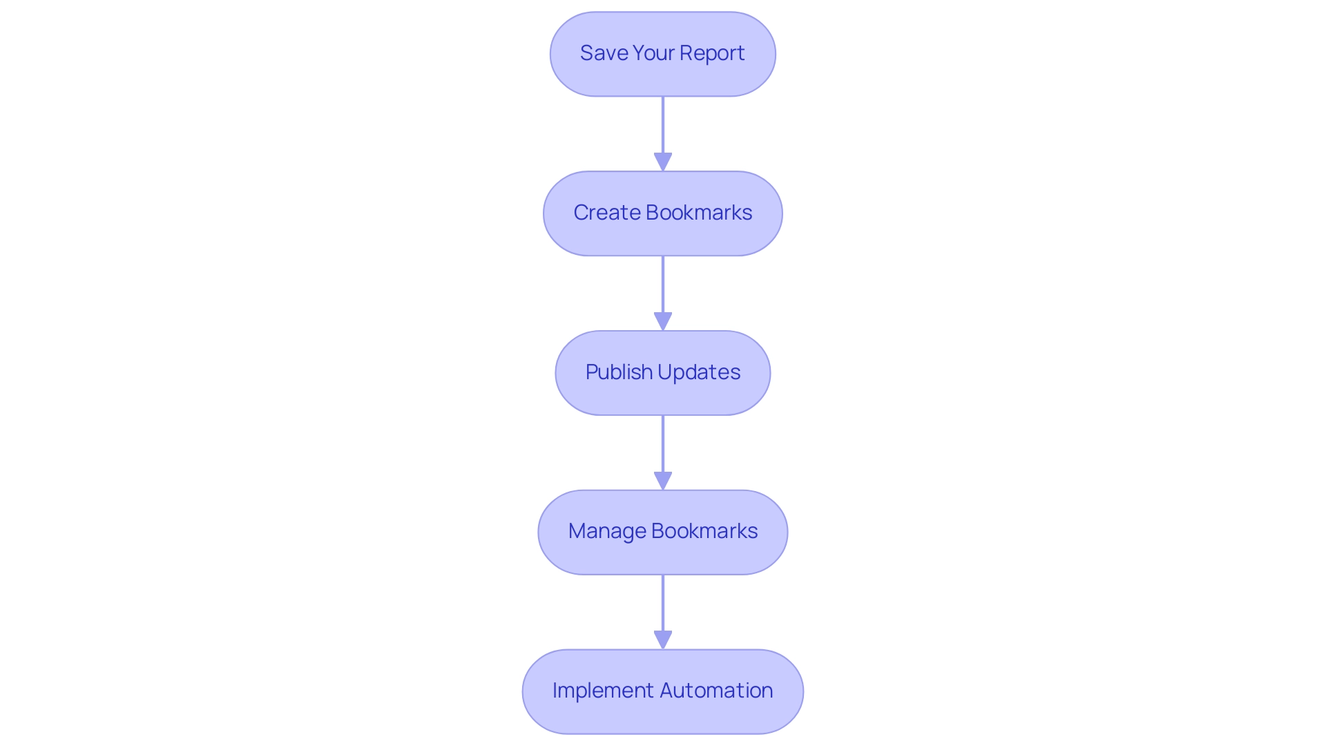
To effectively save and manage your personalized visuals in Business Intelligence, adhere to the following streamlined steps:
-
Save Your Report: After customizing your visuals, click on ‘File’ and select ‘Save’ to ensure that all your changes are securely stored. Keeping your reports up-to-date is crucial, especially considering that many reports go unused over time, highlighting the importance of regular updates to avoid the accumulation of unused reports. This practice can alleviate some of the repetitive tasks that may burden your team, contributing to a more efficient workflow and helping to retain talent by reducing frustration with outdated processes.
-
Create Bookmarks: Navigate to the ‘View’ tab to establish bookmarks that help you personalize visuals in Power BI for your customized views. This feature allows you to swiftly return to specific settings or layouts, greatly enhancing your workflow. Additionally, consider pinning key metrics to a dashboard to make them readily accessible to interested parties, facilitating better decision-making. Automating these processes with Robotic Process Automation (RPA) can further streamline your operations, freeing your team to focus on strategic initiatives rather than repetitive tasks.
-
Publish Updates: If you are using Power BI Service, don’t forget to publish your updates. This action makes the latest changes accessible to your team, fostering collaboration and ensuring everyone is on the same page. In a rapidly evolving AI landscape, maintaining up-to-date visualizations is essential for driving insight and operational efficiency for business growth, particularly in overcoming challenges posed by outdated systems.
-
Manage Bookmarks: Access the ‘Bookmarks’ pane to manage your bookmarks effectively. Here, you can rename, reorder, or delete bookmarks as needed, streamlining your navigation process. Such organization is essential in tackling challenges associated with time-consuming report creation and data inconsistencies, which can impede talent retention by generating frustration among staff.
Utilizing these techniques not only improves your reporting experience but also aligns with best practices in behavior analysis. For instance, in a case study on ‘Custom Usage Report Creation’, users faced challenges with new usage metrics due to admin access restrictions. This illustrates the practical challenges that can arise in managing how to personalize visuals in Power BI.
As mentioned by a Microsoft staff member, > For your daily tasks moving files around, I’m guessing Automate could assist you there, but I don’t know the details of what you are doing. Implementing Automation alongside these bookmarking strategies can further optimize your operations. By saving your preferences and leveraging bookmarks, you ensure a consistent and tailored reporting experience, empowering you to focus on the insights that matter most.
Considerations and Limitations of Visual Personalization
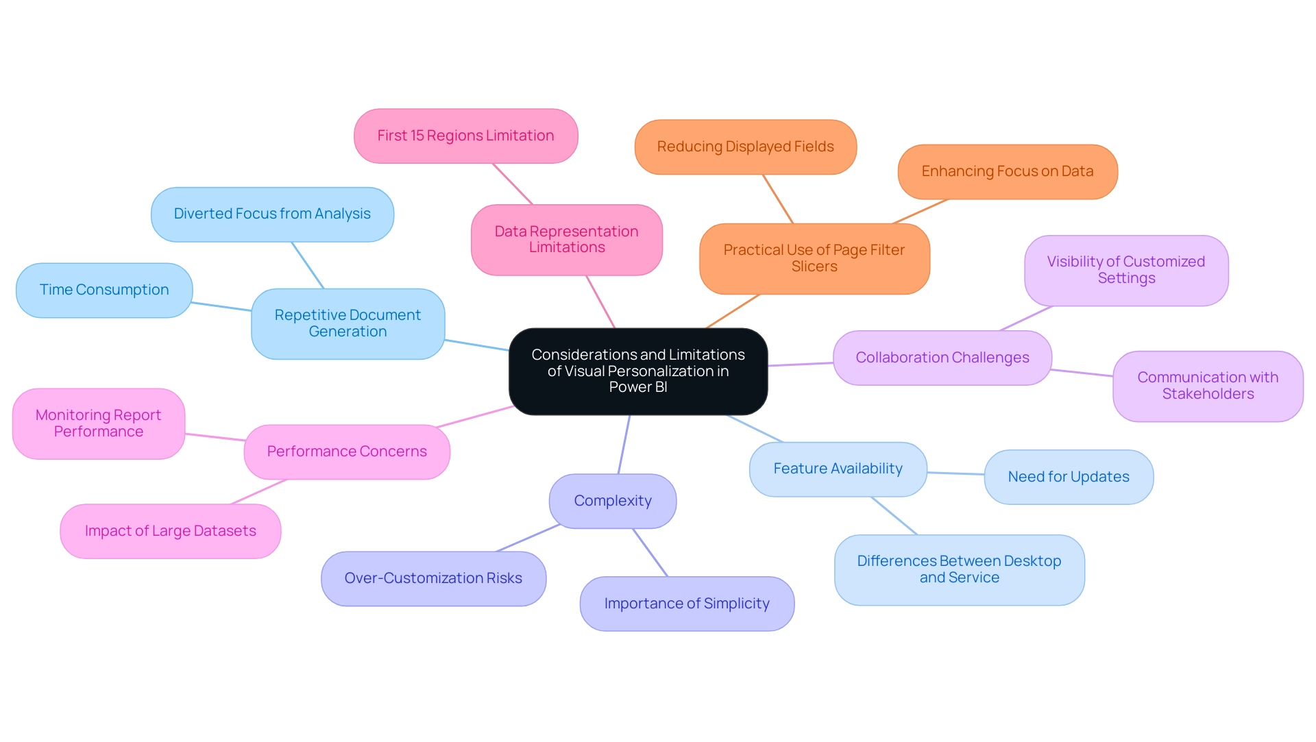
While personalizing visuals in Power BI can significantly enhance data presentation, it’s crucial to navigate several key considerations and limitations that often challenge operations directors:
-
Repetitive Document Generation: Numerous operations directors discover they spend too much time creating documents instead of utilizing insights from BI dashboards. This repetitive nature of document creation diverts focus from meaningful analysis, which can lead to inefficiencies.
-
Feature Availability: Users should be aware that not all personalization features may be accessible in both Power BI Desktop and Power BI Service simultaneously. Staying informed about Microsoft’s latest releases is essential to utilize the most current functionalities and avoid time-consuming creation processes.
-
Complexity: Striking a balance is essential; over-customization can lead to confusion for viewers. Opt for simplicity and clarity in visuals to maintain focus and avoid overwhelming your audience with excessive detail, which is vital in ensuring actionable guidance is clear.
-
Collaboration Challenges: Customized settings may not be consistently visible to all individuals, depending on how they access the document. It’s vital to communicate with key stakeholders about specific viewing options and how they can replicate or adapt personalized settings to ensure consistent reporting and mitigate data inconsistencies.
-
Performance Concerns: Extensive personalization can degrade performance, particularly with large datasets. Consistently observe how your reports react to alterations to sustain effectiveness and experience, thus improving operational efficiency.
-
Data Representation Limitations: It’s also important to note that the visualization will only show the bubbles for the first 15 regions, which may restrict insights when individuals analyze larger datasets.
-
Practical Use of Page Filter Slicers: Utilizing page filter Slicers can help reduce the value of fields displayed, allowing for a more focused and manageable dataset in your visuals.
Considering these factors, comprehending the limitations of BI visual customization will enable individuals to personalize visuals in Power BI effectively, making informed choices and enhancing their data visualization efforts while being aware of possible constraints. Furthermore, as emphasized in the case analysis named ‘Online-Only Access,’ this service necessitates internet connection, which can create difficulties for individuals requiring offline access or those with unreliable connectivity. Users often resort to generating reports and downloading them in PDF or PPT formats to share information, emphasizing the importance of a robust governance strategy.
This sentiment is echoed by users transitioning from platforms like Tableau to Power BI, highlighting the need for clarity and strategy when adapting to Power BI’s unique environment. Furthermore, the struggle to extract meaningful insights can place businesses at a competitive disadvantage, underscoring the importance of Business Intelligence in driving data-driven growth.
Conclusion
Personalizing Power BI visuals is a game-changer for enhancing reporting experiences and driving operational efficiency. By enabling users to tailor reports to their specific needs—whether through adjusting colors, fonts, or layouts—organizations can transform complex datasets into clear, actionable insights. This customization fosters deeper engagement and significantly increases the ability to derive meaningful conclusions, ultimately empowering decision-makers to act with confidence.
However, it is essential to approach these personalization features with awareness of the potential limitations and challenges. The repetitive nature of report creation, variability in feature availability, and the risk of overwhelming viewers with overly complex visuals are all factors that must be navigated carefully. By following the outlined steps for enabling personalization and understanding the considerations involved, users can maximize the benefits while minimizing pitfalls.
In summary, leveraging the full potential of Power BI through personalized visuals not only enhances the clarity and relevance of reports but also positions organizations to thrive in a competitive landscape. Embracing these practices will not only streamline reporting processes but also ensure that insights are effectively utilized, leading to improved operational outcomes and informed strategic decisions. The time to embrace personalization in Power BI is now, as it paves the way for a more efficient, data-driven future.
Overview:
The article focuses on the step-by-step process and significance of adding titles to visuals in Power BI, emphasizing how effective titles enhance data interpretation and audience engagement. It provides a detailed guide on the procedure, highlights best practices for creating impactful titles, and discusses the importance of clear labeling in driving informed decision-making and operational efficiency.
Introduction
In the realm of data visualization, the significance of titles in Power BI cannot be overstated. They serve as the critical first impression, guiding viewers through complex datasets and ensuring clarity in communication. A well-crafted title not only captures attention but also sets the context, transforming mundane reports into engaging narratives.
As organizations grapple with the challenges of report creation and data inconsistencies, understanding the art of titling becomes paramount. By embracing best practices and leveraging innovative tools, professionals can enhance user engagement, streamline reporting processes, and ultimately drive informed decision-making.
This article delves into the strategies for creating impactful titles, troubleshooting common issues, and implementing dynamic features that elevate Power BI visuals from simple displays to powerful storytelling devices.
Understanding the Importance of Titles in Power BI Visuals
In Power BI, you can add a title to visual headings, which serve as the initial touchpoint between your audience and the presented data, setting the stage for effective interpretation. A thoughtfully crafted heading is essential when you power BI add title to visual, as it directs viewers’ focus and provides crucial context that enhances understanding. For instance, rather than defaulting to a vague label like ‘Sales Data,’ opt for a more descriptive alternative such as ‘Monthly Sales Performance by Region.’
This approach clarifies the content and captivates the audience by showing how to power bi add title to visual specific insights at hand. Given the common challenges of time-consuming report creation and data inconsistencies, research has shown that the effect of headings extends beyond mere labeling; they play a significant role in audience engagement and influence data interpretation. Enrico Bertini’s findings reveal that ‘to examine the impact of headings, they exposed the participants to different headings, one supporting and one not supporting a given policy.’
This demonstrates how various labels can influence audience perceptions and reactions. Furthermore, as emphasized in a 1914 book on charts, the choice of headings can introduce biases that influence how data is perceived. By recognizing and applying these principles, professionals, particularly those in Decision Intelligence positions, can effectively utilize designations to convey their diverse capabilities and enhance their reporting abilities.
Along with improving designations, integrating RPA solutions can streamline the reporting process, reduce time spent on manual tasks, and ultimately provide clearer, actionable guidance for stakeholders. This ensures that their BI visuals not only inform but also inspire action, driving operational efficiency and informed decision-making.

Step-by-Step Guide to Adding Titles to Your Power BI Visuals
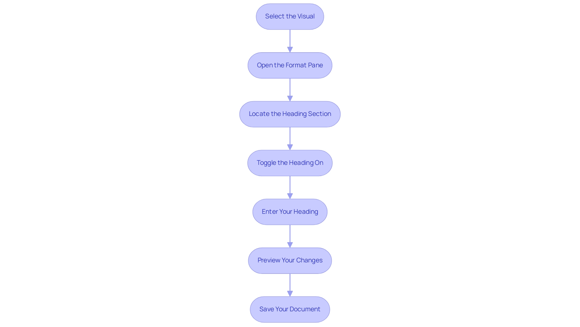
To improve the clarity of your reports, particularly when facing common issues such as time-consuming report creation and information inconsistencies, you can use the procedure to power bi add title to visual. This practice not only aids in clear communication but also plays a crucial role in deriving actionable insights from your data. Follow these empowering steps to ensure your visuals effectively communicate their purpose:
- Select the Visual: Begin by clicking on the visual that you wish to title.
- Open the Format Pane: In the Visualizations pane, locate and click on the paint roller icon to access the Format options, a key area for customization.
- Locate the Heading Section: Scroll down to the ‘Heading’ section within the Format pane, where you can make your heading adjustments.
- Toggle the Heading On: Switch the ‘Heading’ toggle to ‘On’ to activate the heading field, ensuring your visual has a designated area for the heading.
- Enter Your Heading: Type your desired heading in the provided text box. Here, you can also modify the font size, color, and alignment to align with your design vision.
- Preview Your Changes: After entering the heading, click outside the text box to preview how it appears on your visual. Make any necessary adjustments to enhance its visibility and appeal.
- Save Your Document: Once you’re satisfied with how it looks, be sure to save your Power BI document to preserve your changes.
By following these steps, you can power bi add title to visual, which not only makes your visuals informative but also contributes to a more structured and engaging experience. This practice is essential, especially as organizations endeavor to tackle the difficulties of document creation and improve data integrity. For instance, Avison Young’s client experienced a notable increase in document adoption and usage after transitioning from legacy tools, highlighting the benefits of clarity in analytics.
Additionally, developing data-oriented leaders and establishing an Analytics Council can propel organizational transformation, highlighting the significance of distinct roles in boosting user involvement and facilitating analytics efforts. Integrating RPA tools can further streamline the reporting process, ensuring that governance strategies are in place to minimize inconsistencies and enhance the actionable guidance provided by your reports. The ‘Checklist for Adoption Tracking‘ case study offers a structured method for ensuring accountability and progress monitoring, further demonstrating how clear labels contribute to effective reporting and user engagement.
Creating Dynamic Titles for Enhanced Data Context
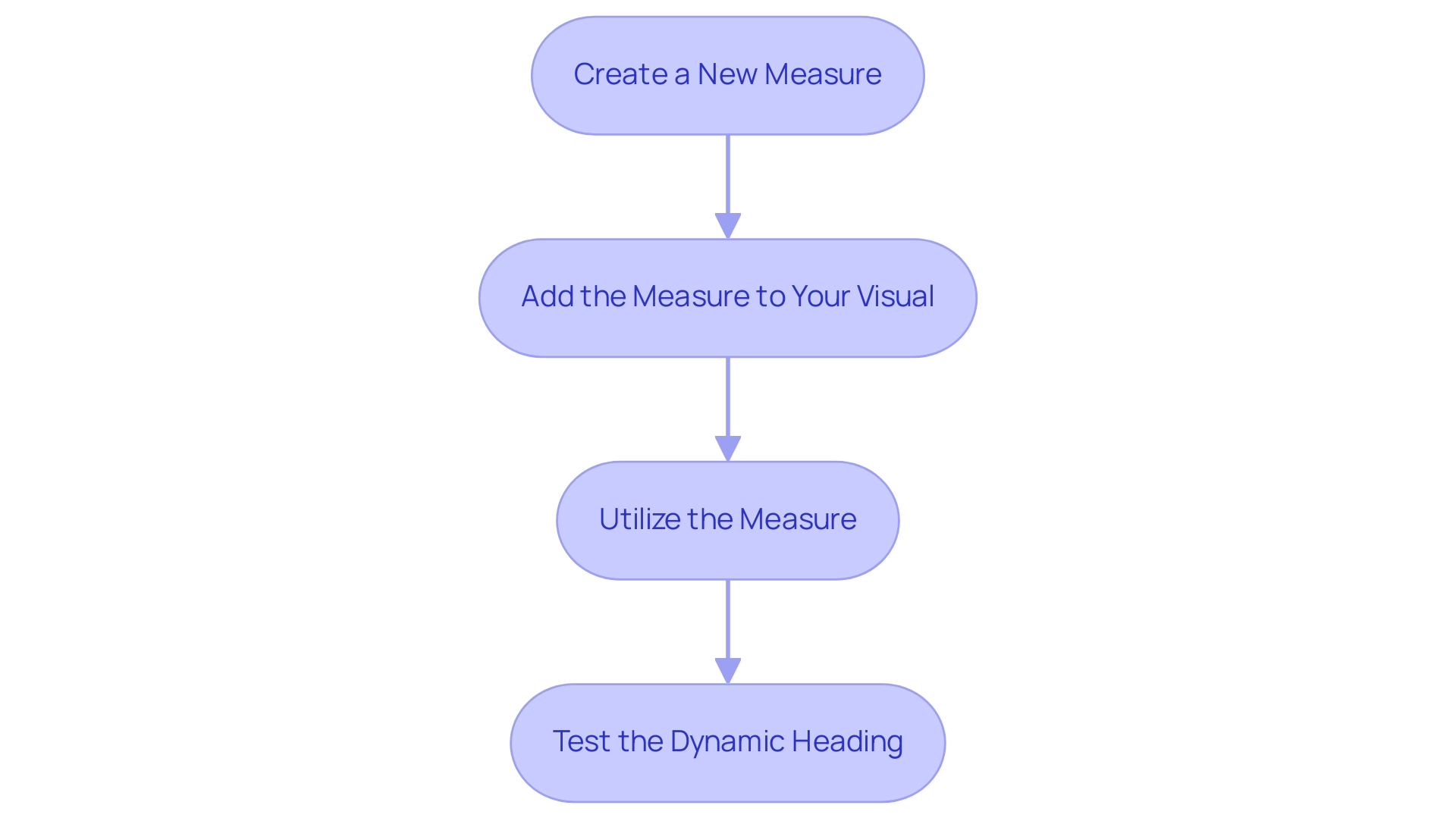
Dynamic labels in Power BI serve as a powerful mechanism to adapt visualizations based on user interactions, enriching the storytelling aspect of data presentation. With a count of all dashboards or reports in the organization that had at least one view in the past 90 days being maintained, implementing dynamic headings can significantly enhance user engagement and report visibility. To create a dynamic title using DAX (Data Analysis Expressions), follow these straightforward steps:
- Create a New Measure: Navigate to the Data view and select ‘New Measure’. Enter a DAX formula to define your title, such as:
Dynamic Title = "Sales Data for " & SELECTEDVALUE(Region[RegionName])
This formula enables the title to dynamically reflect the selected region, providing immediate context for viewers.
-
Add the Measure to Your Visual: Return to the visual where you wish to implement the dynamic label. In the Format pane, locate the Title section and select the ‘Title text’ option.
-
Utilize the Measure: Rather than inputting a fixed label, insert the measure you just created. This ensures that the heading updates automatically in response to user selections, which is important for how to power bi add title to visual, enhancing user engagement.
-
Test the Dynamic Heading: Preview your visual and experiment with different selections to observe how the heading adjusts in real time.
The application of dynamic headings greatly enhances the interactivity of your documents, which is essential for operational efficiency as emphasized in our 3-Day BI Sprint service. This quick turnaround not only streamlines report creation but also helps in addressing challenges like inconsistencies and lack of actionable guidance. Furthermore, the ability to power bi add title to visual elements facilitates clearer communication of data insights, aligning with the latest advancements in DAX for Business Intelligence.
Alongside BI, our General Management App and Automate play vital roles in enhancing operational efficiency by providing comprehensive management solutions and streamlined workflow automation. These tools work together to ensure that your organization can effectively leverage data-driven insights for informed decision-making. As noted by software engineer Douglas Rocha,
Hope I’ve helped you in some way and see you next time!
This sentiment reflects the collaborative spirit of leveraging tools like BI, alongside our General Management Application and Automate, to enhance operational efficiency and drive informed decision-making.
Troubleshooting Common Issues with Visual Titles in Power BI
When attempting to power bi add title to visual, users frequently face several challenges that can hinder their effectiveness. Here’s how to tackle these issues:
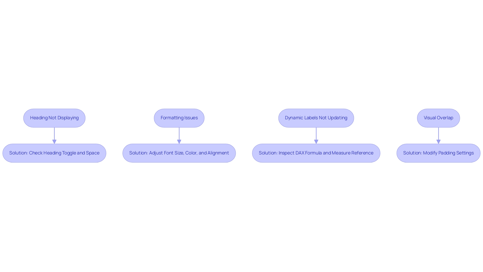
- Heading Not Displaying: If your heading fails to appear, first verify that the Heading toggle in the Format pane is set to ‘On.’ Additionally, ensure there is sufficient space within the visual to accommodate the heading.
- Formatting Issues: Should the heading appear misaligned or inconsistent, revisit the Format pane. Adjust the font size, color, or alignment settings to ensure they harmonize with the overall design of your report. Consistency in formatting enhances readability and professionalism.
- Dynamic Labels Not Updating: If a dynamic label doesn’t reflect the expected changes, inspect your DAX formula for potential errors. Confirm that the measure is properly referenced in the Title text option, as accurate formulas are key to dynamic functionality.
- Visual Overlap: In situations where the heading overlaps with other elements, consider modifying the padding settings in the Format pane. Creating additional space around the title can significantly improve the visual layout and clarity.
By tackling these typical title-related issues, you can enhance both the functionality and visual appeal of your BI visuals, which is essential when you consider how to power bi add title to visual to effectively convey your narrative. This is especially crucial in a data-rich environment where extracting meaningful insights can provide a competitive advantage. Utilizing tools such as Robotic Process Automation (RPA) can help in automating report generation and cleaning processes, enabling your team to concentrate on analysis and strategy.
Additionally, tailored AI solutions can enhance the functionality of BI visuals by providing advanced analytics capabilities, further addressing the challenges of extracting actionable insights. As srinudatanalyst aptly puts it, “Hope this helps. Did I answer your question?
Mark my post as a solution! Proud to be a Super User!” This community support can be invaluable when troubleshooting.
Remember, maintaining proper configuration is crucial for information integrity, especially when dealing with large datasets that may impact your visuals. Stay equipped with the latest strategies to tackle BI challenges.
Best Practices for Designing Effective Titles in Power BI
Generating influential headings in Power BI is essential for efficient information presentation and storytelling, especially in addressing typical obstacles such as time-consuming report development and information inconsistencies. As Dorothy Walter, a statistics student, remarked, ‘It was really helpful for my research,’ emphasizing the importance of clear headings in understanding data insights. To achieve impactful headings and address these challenges, consider the following best practices:
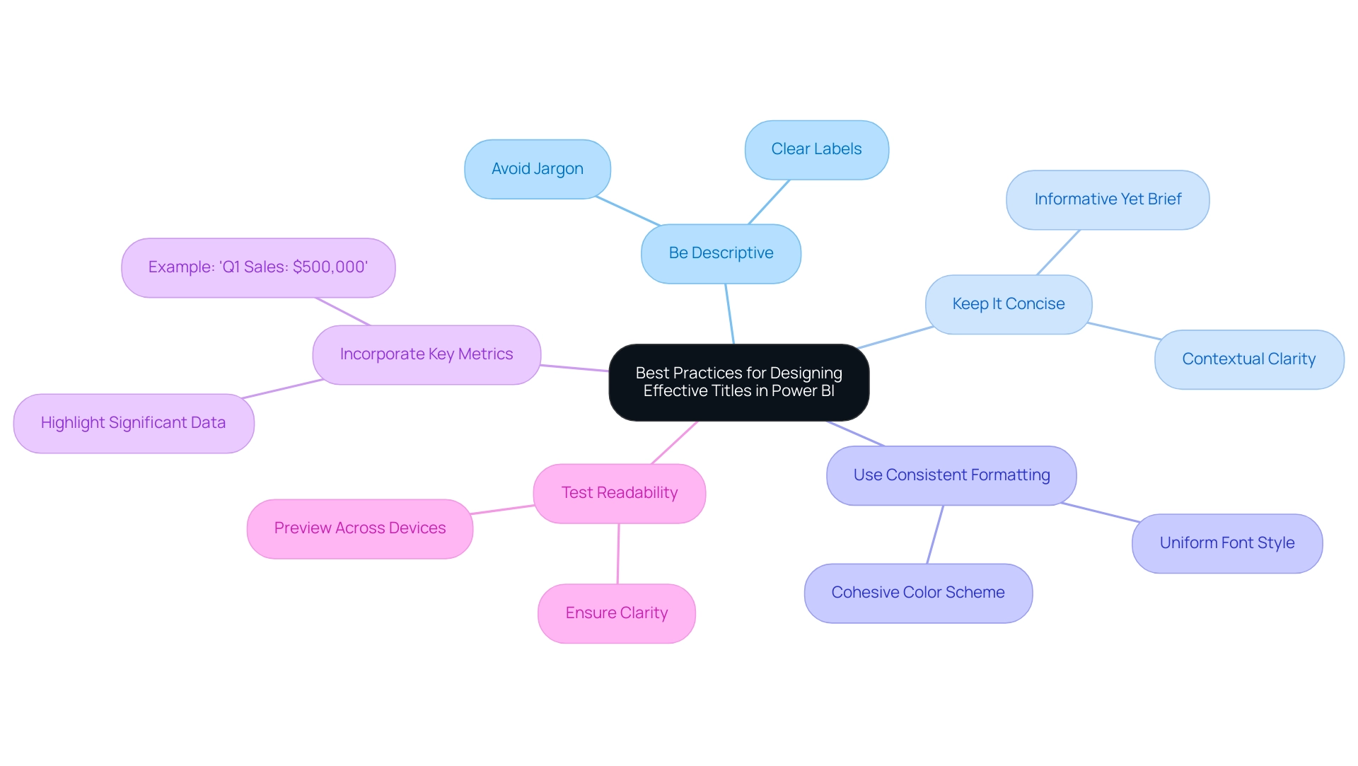
- Be Descriptive: Choose clear and descriptive labels that communicate the central insight or message of the visual. Avoid jargon or overly technical language that could confuse viewers.
- Keep It Concise: Strive for brevity while providing sufficient context. A well-crafted heading should be informative without overwhelming the audience.
- Use Consistent Formatting: Ensure a uniform font style, size, and color scheme across all headings in your report. This consistency fosters a cohesive look and enhances readability.
- Incorporate Key Metrics: When applicable, include key metrics or figures in the heading to spotlight significant data points. For instance, a label like ‘Q1 Sales: $500,000’ immediately draws attention to the key figure, enhancing the visual’s impact.
- Test Readability: Preview your report in various formats (desktop, mobile) to confirm that headings remain clear and readable across devices.
Effective headings not only improve the clarity of your visuals but also facilitate communication with stakeholders regarding model maintenance and modifications. In a data-rich environment, where deriving meaningful insights is crucial for competitive advantage, clear labels in BI visuals play a significant role in fostering informed decision-making and operational efficiency. By adhering to these best practices, you can significantly enhance the effectiveness of your labels, as well as learn how to power bi add title to visual, transforming your Power BI visuals into not just informative tools but also visually compelling narratives.
Additionally, by implementing a governance strategy, you can ensure data consistency across reports, further enhancing the clarity and actionable guidance provided by your titles.
Conclusion
Crafting effective titles in Power BI is not merely a matter of aesthetics; it is an essential strategy for enhancing data communication and user engagement. The article has explored the pivotal role titles play in guiding viewers, providing context, and transforming raw data into compelling narratives. By adopting best practices such as being descriptive, concise, and consistent in formatting, professionals can significantly improve the clarity of their reports, ultimately enabling better decision-making.
Moreover, the implementation of dynamic titles and troubleshooting common issues can further enhance the functionality of Power BI visuals, ensuring they resonate with the audience and adapt to their interactions. As organizations face challenges like time-consuming report creation and data inconsistencies, leveraging innovative tools and strategies becomes increasingly crucial.
In summary, the thoughtful application of titling techniques in Power BI not only elevates the quality of reports but also fosters a culture of data-driven decision-making. By prioritizing impactful titles, organizations can transform their data storytelling, making insights more accessible and actionable for all stakeholders involved. Embracing these strategies paves the way for operational efficiency and a deeper understanding of data narratives, ultimately driving success in today’s data-centric landscape.
Overview:
To effectively add images in Power BI, users can utilize various methods such as importing from local files, web visuals, or picture hosting services, each with its own advantages and privacy considerations. The article provides a comprehensive guide on these methods, detailing step-by-step processes and best practices to enhance visual appeal and audience engagement while addressing common challenges like image quality and alignment.
Introduction
In the realm of data visualization, the integration of images within Power BI reports stands as a transformative approach to enhancing both clarity and engagement. As organizations strive to convey complex data narratives, visuals emerge as powerful tools that can reinforce branding, illustrate critical insights, and provide essential context. With studies revealing that visuals can significantly reduce errors and boost user engagement, the importance of effectively incorporating images cannot be overstated.
However, many face hurdles such as:
- Time-consuming report creation
- Inconsistencies in data presentation
This article delves into practical methods for:
- Importing images
- Formatting them for optimal display
- Overcoming common challenges
All while empowering users to elevate their data storytelling capabilities. By embracing these strategies, organizations can not only enhance the aesthetic appeal of their reports but also foster deeper connections with their audience, ultimately driving informed decision-making and operational efficiency.
Introduction to Adding Images in Power BI
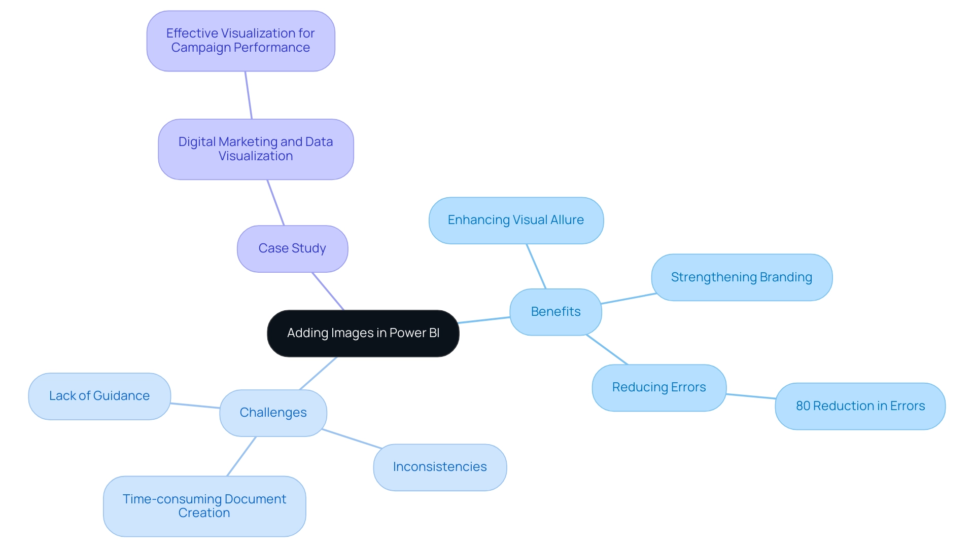
In BI, you can use the power bi add image feature to dramatically enhance both the visual allure and the overall efficiency of your presentations. Images serve a multifaceted purpose; they can strengthen branding, illustrate key information, or provide essential context to your analysis. Notably, studies indicate that some researchers experienced an impressive 80% reduction in errors when using visuals to clarify tasks, highlighting the power of visuals in enhancing comprehension.
Moreover, with 29% of businesses monitoring behavior through session replays, user engagement and tracking capabilities in your Power BI visuals can be significantly enhanced when you power bi add image. However, many organizations encounter difficulties such as time-consuming document creation, inconsistencies in information, and a lack of clear, actionable guidance. These challenges can hinder the effective use of Business Intelligence (BI) tools, which are designed to transform raw information into actionable insights.
A case study titled ‘Digital Marketing and Data Visualization’ illustrates how effective visualization aids marketers in quickly understanding campaign performance and optimizing strategies. Additionally, leveraging Robotic Process Automation (RPA) solutions can streamline the reporting process, reduce errors, and enhance operational efficiency. This guide will equip you with crucial steps to efficiently bring in visuals and style them, including how to use power bi add image, ensuring that your reports not only showcase information but also captivate your audience on a deeper level.
By addressing these challenges and utilizing the right visuals, your data storytelling can resonate more profoundly, fostering better decision-making and insights that drive operational efficiency and business growth.
Methods for Importing Images into Power BI
When it comes to importing visuals into Power BI, there are several effective methods to consider, each suited for different needs while also keeping privacy concerns in mind:
-
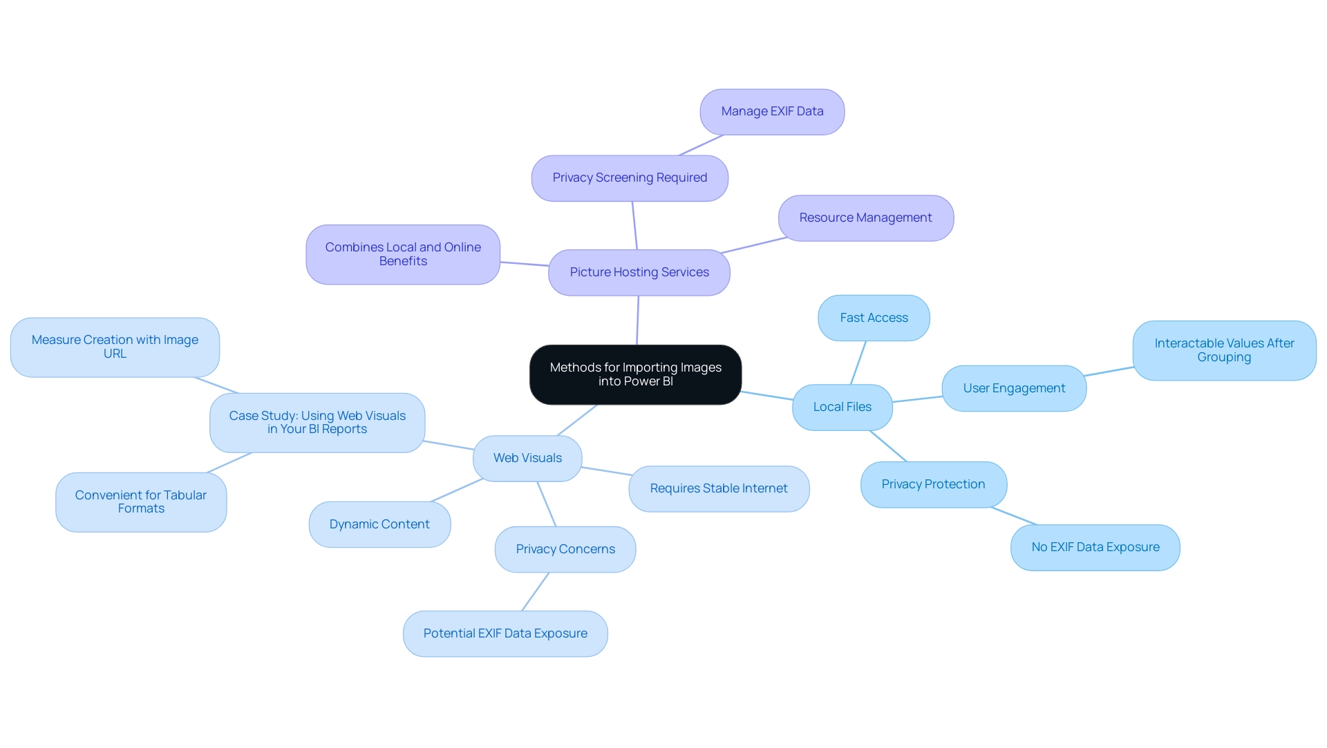
Local Files: A straightforward method to power BI add image is by uploading pictures directly from your computer. This method guarantees fast access to visuals without needing an internet connection, making it especially beneficial for static documents. Furthermore, individual values in the chart remain interactable even after grouping, enhancing user engagement. Importantly, using local files eliminates the risk of exposing embedded location data (EXIF GPS), safeguarding privacy.
-
Web Visuals: By connecting to visuals stored online via a URL, you can effortlessly incorporate dynamic content into your documents. This method enables a smooth updating procedure, as modifications made to the original visual online are shown in your Power BI dashboard. However, it does require a stable internet connection to load visuals each time the report is accessed. It’s essential to verify that these visuals do not hold sensitive EXIF details, as visitors to your website can download and retrieve such information. The dangers linked to web visuals involve the possible revelation of location information, which can have serious privacy consequences. A case study titled ‘Using Web Visuals in Your BI Reports’ highlights how this approach facilitates the incorporation of online visuals, emphasizing its convenience in managing visuals, especially in tabular formats.
-
Picture Hosting Services: Platforms such as Imgur and Dropbox can be used to host pictures, supplying URLs for BI integration. This approach merges the advantages of both local and online visuals, enabling effective handling of asset resources while reducing privacy concerns if the visuals are adequately screened for embedded information. However, similar to web visuals, there is a risk of exposing EXIF data if not carefully managed.
According to recent insights, visuals can be up to 250kb after conversion for use in Power BI, ensuring that displays remain crisp and clear without compromising performance. Monika Kastner, a BI Developer in London, emphasizes the importance of selecting the appropriate import method, stating, > Hope it helped! <.
Furthermore, utilizing the knowledge of Cloud can improve your Azure experience and implement cloud solutions efficiently, similar to how a power bi add image can enhance visual data representation.
Each method has its distinct benefits: local files offer reliability and privacy, web visuals provide flexibility but necessitate caution, and hosting services enhance accessibility. By understanding the utilization rates of local versus online visuals, you can power bi add image in your Power BI presentations to make informed decisions that cater to your specific use case while addressing privacy concerns. The right approach will ultimately enhance your data storytelling and presentation, ensuring your reports are both visually appealing and functional.
Furthermore, aligning your import strategy with operational efficiency can lead to better resource management and streamlined reporting processes.
Step-by-Step Guide to Adding Images from Local and Web Sources
Adding Images from Local Files
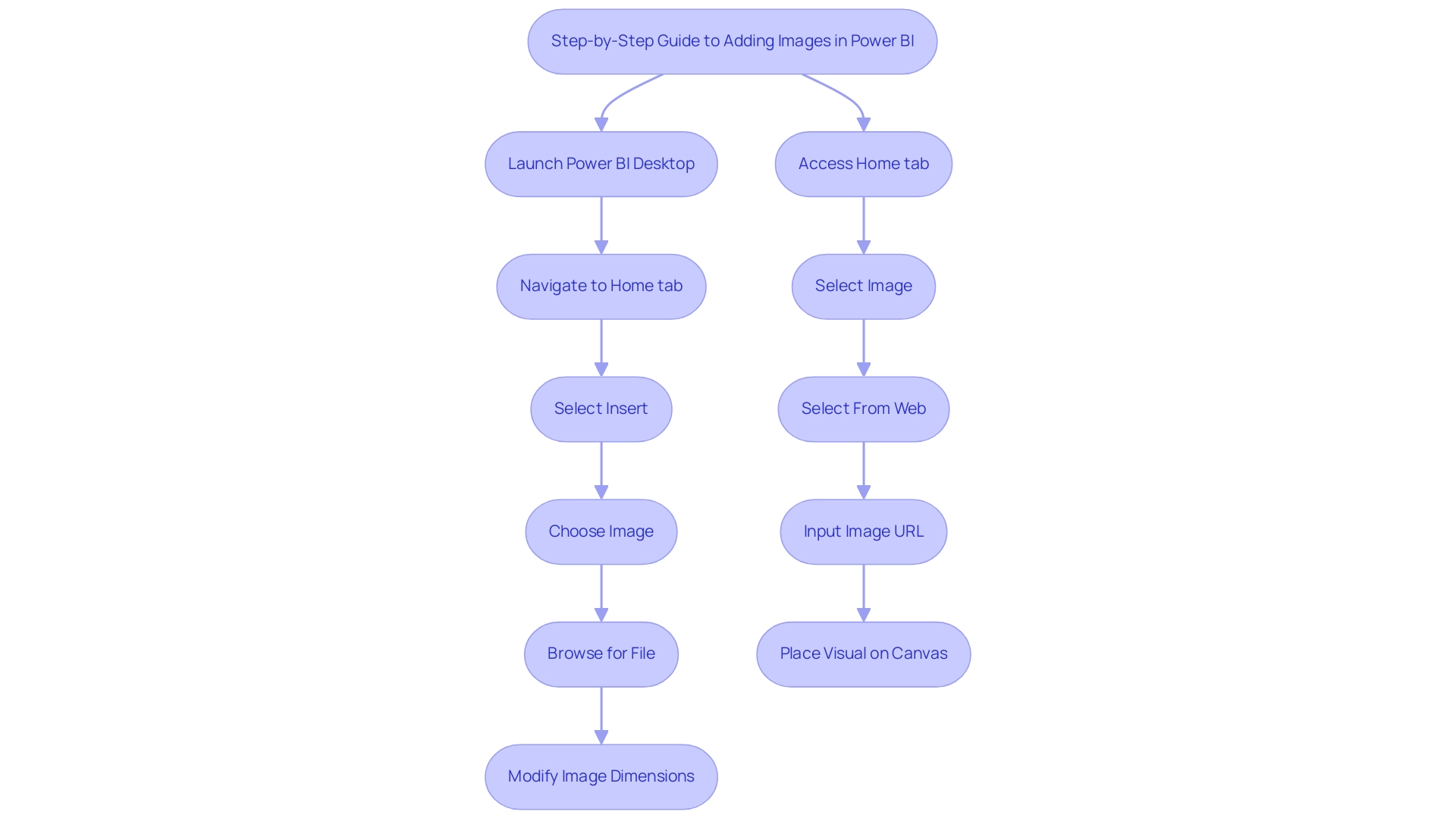
- Begin by launching your Power BI Desktop application to learn how to power bi add image.
- To power bi add image, navigate to the Home tab and click on Insert to power bi add image.
- From the dropdown menu, select power bi add image to insert an image.
- In the file dialog that appears, browse to the location of your desired picture for the power bi add image feature, select it, and click Open.
- Modify the dimensions and placement of the visual on your layout to meet your design specifications.
Adding Images from the Web
- To use the power bi add image feature, access the Home tab and click on Insert.
- Choose Image and then select From Web to utilize the power bi add image option.
- Input the URL of the graphic you wish to power bi add image.
- Click OK and place the visual on your report canvas as desired.
When uploading photos, be aware of privacy issues, especially steering clear of those with embedded location information (EXIF GPS). Visitors can download and extract any location information, which emphasizes the need for careful selection of images. Visual content is crucial in enhancing user engagement; statistics show that tweets with visual elements receive 150% more retweets than their text-only counterparts.
Moreover, an enhancement in UX design that boosts customer retention by merely 5% can result in a 25% increase in profit, highlighting the importance of visual components in documents. However, creating these visuals can be time-consuming and may lead to inconsistencies in presentation if not managed properly. By effectively integrating images, you not only enhance the aesthetic appeal of your documents but also significantly boost audience interaction.
For instance, polls are effective for gathering audience opinions and preferences, as demonstrated by the NBA’s Twitter poll that garnered over 70,000 votes. As Nikola Gemes, a content marketer at Whatagraph, emphasizes,
It’s highly customizable so you can adapt the template to the individual needs of your firm or your clients.
This flexibility enables you to customize your presentations to connect with your audience, enhancing the storytelling experience.
Furthermore, the success of video content on platforms like Facebook and YouTube, where videos generate eight billion daily views, showcases the potential of visual content in reaching a wide audience. By tackling these challenges in document creation and ensuring data consistency, you can generate more actionable insights through your BI dashboards.
Formatting Images for Optimal Display in Power BI
To format visuals effectively in Power BI, follow these essential steps:
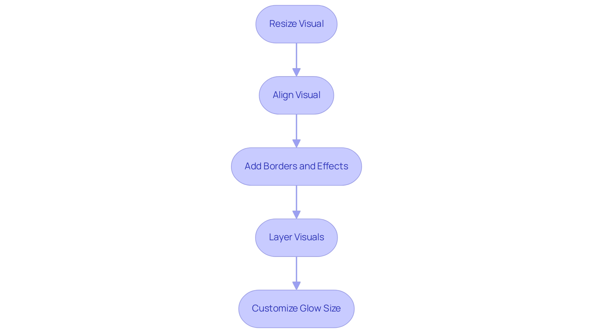
- Resize: To maintain the aspect ratio while resizing, simply click and drag the corners of the visual. This method ensures that your visuals do not appear distorted, enhancing their professional look.
- Align: Utilize the alignment tools in the Format pane to position your visual accurately within your report layout. Proper alignment is essential for achieving a refined and orderly look.
- Add Borders and Effects: Enhance your visuals by incorporating borders, shadows, and other effects available in the Format pane. These features can enhance the visual allure of your visuals, making them stand out in your reports.
- Layering: When using multiple visuals, ensure they are layered correctly for optimal clarity and visual impact. This avoids clutter and confusion, enabling your audience to concentrate on the essential components of your report.
For instance, a user faced challenges while trying to create a traffic light indicator with a PNG file that had a transparent center. The problem arose from BI applying padding around the graphic, which created an undesirable ‘bleed’ effect. Jing Zhang, a community support expert, proposed a practical workaround:
Try inserting a blank button and using the logo graphic to fill the button.
Adjust the button’s height and width to leave no space around the logo. This approach not only resolved the ‘bleed’ issue but also showcased how careful formatting can significantly improve the presentation quality of visuals.
Additionally, it’s important to note that the glow size of visuals can be customized from 0 to 10 pixels, allowing for further enhancement of your visuals.
By adopting these best practices and leveraging the latest features for visual formatting in Power BI, such as the option to power bi add image, you can enhance the effectiveness of your reports, ensuring they communicate your data stories with clarity and professionalism. Furthermore, incorporating user feedback options can help enhance the tools available for visual formatting, making it essential to engage with your audience for continuous improvement.
Common Challenges and Best Practices for Adding Images in Power BI
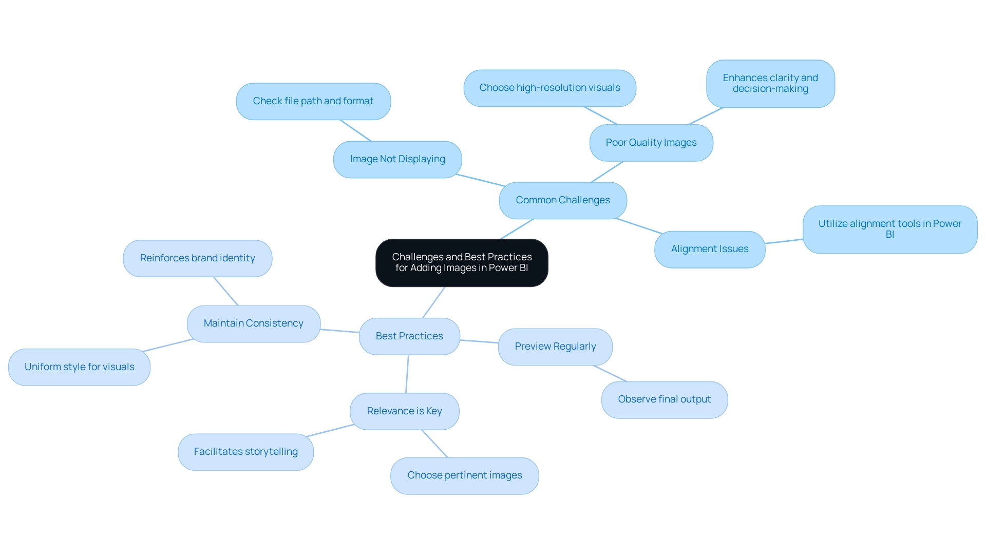
Common Challenges
- Image Not Displaying: One of the most frequent issues encountered is when images fail to display correctly. To resolve this, double-check the file path and ensure the file format is supported, such as JPEG or PNG.
- Poor Quality Images: The clarity of your documents can significantly impact data interpretation. Always choose high-resolution visuals to maintain professional quality and ensure that details are not lost. Research suggests that superior visual quality can enhance overall clarity of documentation, resulting in better decision-making. In fact, effective business data visualization can increase your ROI from business intelligence tools by producing faster and better insights.
- Alignment Issues: Correct positioning of visuals within your document layout can be tricky. Utilize the alignment tools available in Power BI to position visuals accurately, ensuring they complement the surrounding content without disrupting the flow.
Best Practices
- Preview Regularly: To get an accurate representation of your final output, always preview your report. This step enables you to observe how visuals combine with your representations and make necessary adjustments.
- Relevance is Key: Choose images that are not only pertinent but also improve the comprehension of the information being presented. Effective visuals can drive home key messages and facilitate storytelling within your documents. Justyna, a PMO Manager, emphasizes, “Let me be your single point of contact and guide you through the cooperation process,” highlighting the significance of clear communication and impactful visuals in presenting information.
- Maintain Consistency: Adopting a uniform style for visuals throughout your document fosters a professional appearance and reinforces brand identity. This consistency aids your audience in concentrating on the information without distractions.
By following these best practices, you can ensure that the power bi add image functionality enhances your visuals, making them more interactive and engaging for stakeholders. Additionally, consider the challenges highlighted in today’s data-rich environment, such as time-consuming document creation and data inconsistencies, which can be effectively addressed with RPA solutions. These solutions not only streamline report generation but also mitigate staffing shortages, ensuring that your organization remains competitive by leveraging data-driven insights for operational efficiency and business growth.
Conclusion
Integrating images into Power BI reports is a game-changer for enhancing visual appeal and engagement. By leveraging various methods such as:
- Importing local files
- Utilizing web images
- Employing image hosting services
Organizations can effectively address privacy concerns while making their reports visually compelling. Each approach offers unique benefits, allowing users to choose the best fit for their specific needs and ensuring that data storytelling resonates with the audience.
Effective formatting techniques are essential for optimizing image display, including:
- Resizing
- Aligning
- Layering visuals
Implementing best practices can significantly enhance the clarity and professionalism of reports, ultimately leading to improved decision-making. By regularly previewing reports and maintaining consistency in style, businesses can create a cohesive narrative that highlights key insights and reinforces brand identity.
Recognizing and overcoming common challenges such as image display issues and quality concerns is crucial for maximizing the impact of visuals. By adopting a strategic approach to image integration and presentation, organizations can transform their data reporting processes, foster deeper connections with stakeholders, and drive operational efficiency. Embracing these strategies not only elevates the aesthetic quality of reports but also empowers users to make informed decisions based on clear and engaging visual narratives.
Overview:
Object Level Security (OLS) in Power BI is crucial for safeguarding sensitive data by allowing organizations to control access at the level of tables, columns, and measures. The article emphasizes that OLS not only helps in complying with privacy regulations but also enhances operational efficiency by enabling tailored access for users, thereby fostering trust and reducing the risk of unauthorized information exposure.
Introduction
In an age where data is both a valuable asset and a potential liability, Object Level Security (OLS) in Power BI emerges as a critical solution for organizations striving to protect sensitive information.
As compliance demands escalate and privacy regulations tighten, the implementation of OLS allows businesses to define precise access controls at the object level, ensuring that only authorized personnel can view sensitive data.
This strategic approach not only mitigates risks associated with unauthorized access but also fosters transparency, aligning with the growing public expectation for responsible data governance.
By integrating OLS with cutting-edge technologies like Robotic Process Automation (RPA), organizations can streamline their reporting processes while enhancing operational efficiency.
As the landscape of data security continues to evolve, understanding and applying OLS will empower organizations to navigate compliance challenges and bolster their data protection strategies effectively.
Understanding Object Level Security in Power BI
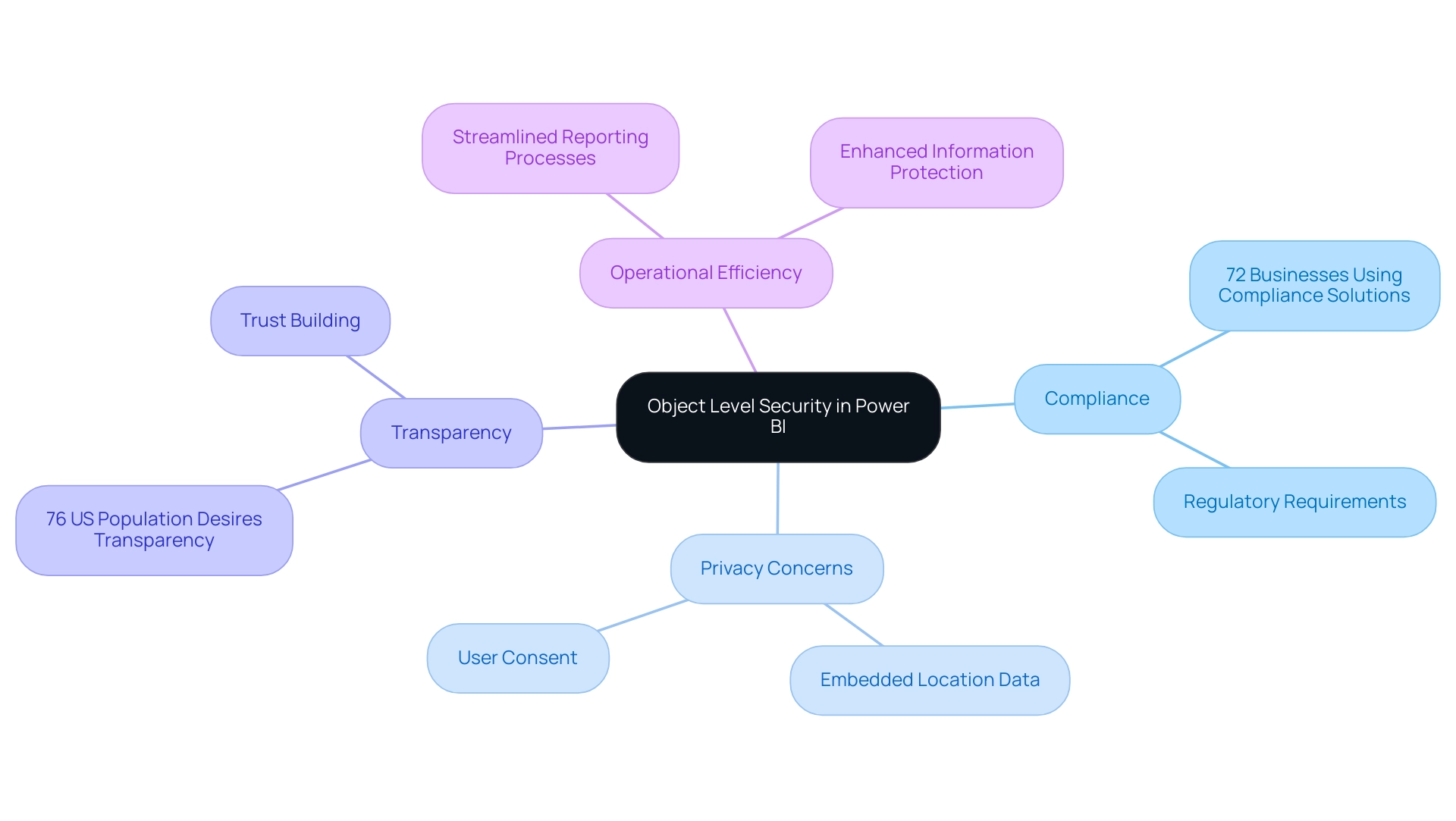
Object level security in Power BI is essential for protecting sensitive information as it allows entities to implement access controls at the object level, which includes tables, columns, and measures. This functionality is not just a technical enhancement; it is essential for ensuring compliance with increasingly stringent privacy regulations. In today’s information-rich environment, organizations must also be aware of privacy concerns associated with uploading images containing embedded location details (EXIF GPS), as this information can be extracted by visitors.
With 72% of businesses currently employing compliance solutions to navigate privacy law requirements, the implementation of object level security in Power BI becomes a strategic necessity. For example, a financial services company might limit access to customer financial information using object level security in Power BI, ensuring that only authorized personnel can view this sensitive content, while others can access only non-sensitive details. This practice not only reduces the risk of unauthorized information exposure but also aligns with the desires of 76% of the US population for greater transparency in information usage, highlighting the critical need for entities to communicate clearly about access.
As Osman Husain, a content lead at Enzuzo, aptly notes, ‘This indicates a failing on behalf of the industry as informed consent is a cornerstone of effective compliance.’ Furthermore, with 43% of websites employing tactics to nudge users towards accepting all cookies, entities must prioritize transparency to foster trust. Along with OLS, entities encounter difficulties in deriving insights from Power BI dashboards, including lengthy report generation and inconsistencies in information.
By integrating Business Intelligence and RPA solutions, companies can streamline their reporting processes and enhance operational efficiency. By adopting object level security in Power BI alongside robust Business Intelligence strategies, entities not only enhance their information protection measures but also build trust with stakeholders, reinforcing their commitment to responsible information governance and operational efficiency.
Practical Applications and Use Cases of Object Level Security
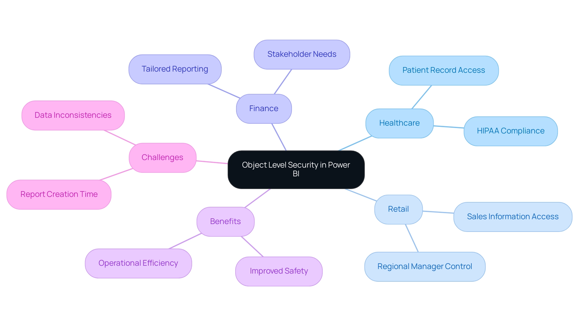
The practical applications of object level security in Power BI are extensive and impactful. In healthcare, for example, OLS can be employed to ensure that patient records are accessible only to authorized personnel, maintaining compliance with HIPAA regulations. This not only safeguards sensitive patient information but also reduces the risk of expensive breaches, which average nearly $11 million in the healthcare sector.
A recent case study titled ‘How to Prepare Your Entity to Avoid Vulnerabilities in 2024’ emphasizes that remediating cybersecurity vulnerabilities is an urgent priority for entities. In the retail sector, OLS can strategically restrict access to sales information by geographic area, allowing regional managers to view only the details relevant to their operations while protecting sensitive details from competitors. Additionally, in financial reporting, various stakeholders frequently need different levels of detail; OLS supports the development of tailored reports that satisfy these unique requirements.
By utilizing OLS alongside Robotic Process Automation (RPA), entities can improve safety and usability, cultivating an atmosphere where enhanced decision-making and operational efficiency flourish. RPA not only streamlines repetitive tasks, reducing errors, but also frees up team resources for more strategic initiatives, allowing them to focus on high-value work. OLS ensures that sensitive information is protected while enabling this efficiency.
The capability to implement detailed access controls through OLS is not merely a protective measure; it’s a strategic asset entities must utilize to remain competitive in an ever more interconnected and susceptible environment. However, organizations often face challenges when leveraging insights from Power BI dashboards, such as time-consuming report creation and data inconsistencies. Addressing these challenges is crucial for maximizing the value of BI solutions.
With the growing number of known spear-phishing groups and the alarming statistics around supply chain attacks, the urgency to prioritize protective measures like object level security in Power BI becomes even more evident. Moreover, as emphasized in a study of 24 incidents, over 50% of supply chain attacks were linked to prominent cyber crime groups, highlighting the necessity for strong protective measures, including object level security in Power BI. It is also crucial to note that penetration testing is essential for understanding vulnerabilities in interconnected computer systems, further reinforcing the importance of object level security in Power BI as an integral part of a broader protection strategy.
Implementing Object Level Security in Power BI
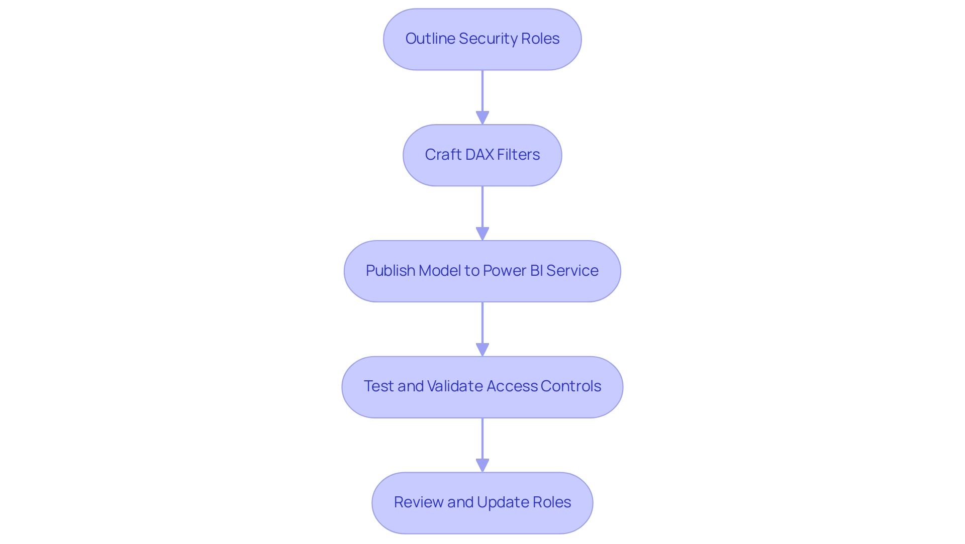
Implementing object level security in Power BI entails several crucial steps that empower organizations to manage access effectively while addressing common challenges such as time-consuming report creation, inconsistencies, and the lack of actionable guidance in reports. The process starts with outlining the specific security roles that will determine access to designated objects within the model. This can be accomplished in Power BI Desktop by selecting the ‘Modeling’ tab and clicking on ‘Manage Roles.’
Once roles are established, the next step involves crafting DAX (Data Analysis Expressions) filters to delineate the information each role can access. For instance, a DAX filter might be employed to restrict a sales manager’s visibility to sales information pertinent solely to their designated region. After establishing roles and filters, it is crucial to publish the model to the Power BI service, where the applied access controls can be thoroughly tested and validated.
Consistently reviewing and updating these roles is essential to adjust to changes within the organizational structure or shifts in information sensitivity. By following these guidelines, organizations can effectively leverage object level security in Power BI, thereby enhancing their security posture and ensuring compliance with privacy standards. Furthermore, OLS not only assists in concealing sensitive information but also enables the creation of actionable insights by ensuring that users have access to the most pertinent details for their roles.
As mentioned in recent discussions, the introduction of object level security in Power BI has been a game-changer since its release in February 2021, allowing users to hide not only columns and tables but also derived calculations like measures and calculated columns, thus providing an additional layer of protection. This capability is essential for driving data-driven insights that lead to informed decision-making, ultimately driving growth and operational efficiency. As Sapana Taneja remarked, ‘I hope you found this article helpful!’
This sentiment reflects the importance of sharing knowledge on such pivotal topics. Furthermore, during an Unplugged session lasting 45:22, experts discussed the practical implications of object level security in Power BI, emphasizing its role in improving data protection and addressing the challenges associated with data governance. A case study on object level security in Power BI highlights how users can set security roles within Power BI Desktop and test the user experience, showcasing the effectiveness of object level security in Power BI in real-world scenarios.
Challenges and Considerations in Object Level Security
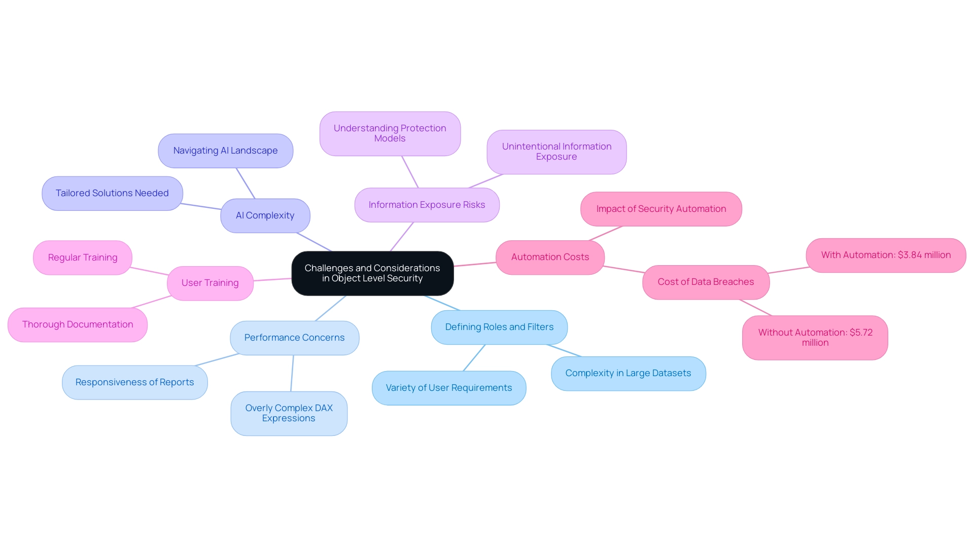
Implementing object level security in Power BI within enterprises can yield significant advantages, yet several challenges often arise during its deployment. One prevalent issue is the intricacy involved in defining roles and filters, particularly in expansive datasets that cater to a variety of user requirements. Performance concerns may also emerge, especially if organizations rely on overly complex DAX expressions, which can hinder the responsiveness of Power BI reports.
Furthermore, navigating the overwhelming AI landscape necessitates tailored solutions that simplify these complexities, enhancing efficiency through tools like Robotic Process Automation (RPA). The risk of unintentional information exposure emphasizes the necessity of ensuring that all users understand the protection model effectively. With the average company sharing confidential information with 583 third-party vendors, the urgency of implementing robust protective measures cannot be overstated.
Regular training and thorough documentation play a crucial role in alleviating these obstacles; studies indicate that effective user training significantly enhances security awareness. Organizations should also prioritize the periodic review of their object level security in Power BI configurations to maintain their relevance and efficiency as business needs evolve. The challenges in leveraging insights from Power BI dashboards, such as time-consuming report creation and inconsistencies, can be effectively addressed through our 3-Day Power BI Sprint.
This service is designed to create professional reports quickly, focusing on actionable outcomes and ensuring that teams can leverage insights without the burden of extensive report-building processes. By providing a structured method for report creation, the 3-Day Power BI Sprint enables companies to streamline their reporting efforts, ultimately enhancing decision-making capabilities. Based on a case study examining the average expense of breaches related to automation levels, entities with significant use of automation encountered an average cost of $3.84 million in 2024, in contrast to $5.72 million for those without automation.
As Nick Rago, Field CTO at Salt Security, notes, ‘In many instances, the barrier to breach was pretty low, and the attacker did not need any herculean effort to take advantage of a misconfigured API.’ By proactively tackling these challenges and leveraging tailored AI solutions, organizations can fully utilize the benefits of object level security in Power BI while effectively minimizing associated risks.
The Future of Object Level Security in Power BI
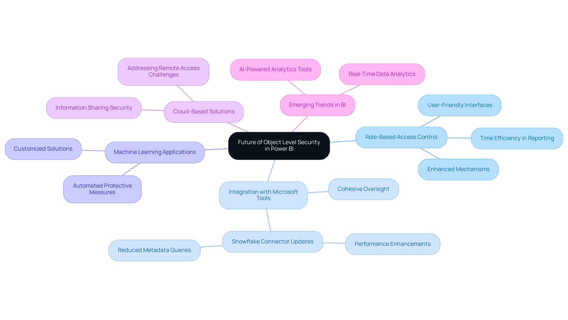
As the environment of information protection changes, notable progress is expected in object level security in Power BI, which will directly address typical challenges faced by Directors of Operations Efficiency. The enhanced role-based access control (RBAC) mechanisms guarantee that sensitive information is available solely to permitted individuals, highlighting the significance of protection in information access while decreasing the time invested in creating reports. Future advancements are anticipated to showcase more user-friendly interfaces for defining roles and filters, optimizing the management process and assisting in reducing inconsistencies.
Improved integration with other Microsoft protection tools is also on the horizon, offering a cohesive approach to oversight across platforms. Significantly, the incorporation of machine learning algorithms could transform how sensitive information is recognized, automating the suggestion of suitable protective measures customized to particular organizational requirements. With the growing adoption of cloud-based solutions, OLS will likely adjust to address new security challenges arising from remote access and information sharing, particularly through the use of object level security in Power BI.
For instance, recent updates to the Snowflake connector have enhanced efficiency in information handling and connectivity, showcasing practical advancements relevant to object level security in Power BI. Furthermore, as entities navigate the overwhelming options in the AI landscape, tailored AI solutions can help cut through the noise, aligning technologies with specific business goals and challenges. Insights from the community highlight emerging trends in Business Intelligence (BI), including the future of real-time information analytics and the necessity of AI-powered analytics tools.
By actively remaining aware of these trends, companies can enhance their information protection approaches, guaranteeing adherence and strong defense in a constantly changing digital environment. Jason Himmelstein stresses the urgency of these advancements, stating, ‘Users can now update their visuals in real time, interact with their information through Power BI’s standard features such as filtering, cross-highlighting, and tooltips.’ This adaptability is crucial as organizations prepare for the future of data security in 2024 and beyond.
Conclusion
Implementing Object Level Security (OLS) in Power BI is not just a technical necessity; it’s a strategic imperative for organizations aiming to safeguard sensitive data while fostering a culture of transparency and trust. By defining precise access controls at the object level, businesses can ensure that only authorized personnel have access to critical information. This capability is particularly vital in today’s regulatory environment, where compliance with data privacy laws is paramount.
The practical applications of OLS across various industries, from healthcare to finance, illustrate its versatility in enhancing data protection. By tailoring access to sensitive information, organizations can mitigate risks associated with unauthorized data exposure, ultimately protecting their assets and reputation. Moreover, integrating OLS with Robotic Process Automation (RPA) streamlines reporting processes, allowing teams to focus on high-value tasks and improving operational efficiency.
While challenges such as defining roles and managing complex datasets exist, organizations can overcome these hurdles with regular training, comprehensive documentation, and periodic reviews of their security configurations. By adopting a proactive approach to OLS implementation, organizations can not only enhance their security posture but also drive informed decision-making through actionable insights.
As the landscape of data security continues to evolve, the future of OLS in Power BI looks promising. Anticipated advancements in role-based access control, user interface improvements, and enhanced integrations with security tools will further empower organizations to navigate the complexities of data governance. Staying ahead of these trends will be crucial for organizations committed to robust data security and compliance in an increasingly interconnected world.
Overview:
Creating one-to-many relationships in Power BI involves establishing connections between datasets, such as linking a ‘Customers’ table to an ‘Orders’ table, which enhances data analysis and reporting. The article provides a detailed step-by-step guide that emphasizes the importance of correctly defining cardinality and managing connections to ensure accurate insights, ultimately improving operational efficiency and decision-making.
Introduction
Navigating the complexities of data relationships in Power BI can be a transformative experience for organizations seeking to enhance their analytical capabilities. One-to-many relationships, where a single record in one table corresponds to multiple entries in another, form the backbone of effective data modeling. Mastering these connections not only streamlines report creation but also empowers businesses to derive actionable insights from their data.
As the landscape of business intelligence evolves, understanding how to create, manage, and troubleshoot these relationships is essential for ensuring data integrity and visualization accuracy. By embracing practical strategies and leveraging automation tools, organizations can overcome common challenges and harness the full potential of their data, driving informed decision-making and operational efficiency.
Understanding One-to-Many Relationships in Power BI
In Power BI, the concept of a one to many relationship is defined as a scenario where a single record in one table corresponds to multiple records in another table. For instance, in a sales database, one customer may have multiple associated orders, illustrating this dynamic relationship. Comprehending these connections is crucial as they determine how information interacts and flows within your reports, directly affecting your capability to utilize insights effectively.
This foundational knowledge not only enhances the accuracy of your visualizations but also empowers you to conduct thorough analyses and derive actionable insights amidst the common challenges of time-consuming report creation and inconsistent information. As noted by the expert, Cosmos, “If the other joins will collapse the rows by high factor, you should consider doing a join between your first dataset and second dataset.” Ensuring that your information format is suitable for analysis is crucial; tools like Query can assist in transforming information to meet these requirements.
Furthermore, consider the case study of the one to many relationship in Power BI, where the ‘Categories’ table contains unique CategoryIDs while the ‘Products’ table includes multiple entries associated with these IDs. This structure facilitates operations such as aggregating product counts within each category, thereby enriching the reporting process and allowing for more insightful analyses. As the terrain of BI information modeling transforms into 2024, understanding the subtleties of the one to many relationship in Power BI will be vital for maintaining information integrity and visualization precision, particularly considering the common challenges that can obstruct effective decision-making.
Moreover, addressing the lack of data-driven insights can significantly impact your competitive edge. Incorporating automation solutions such as EMMA RPA and Automate can streamline reporting processes and enhance operational efficiency, ultimately providing clearer, actionable guidance for stakeholders.
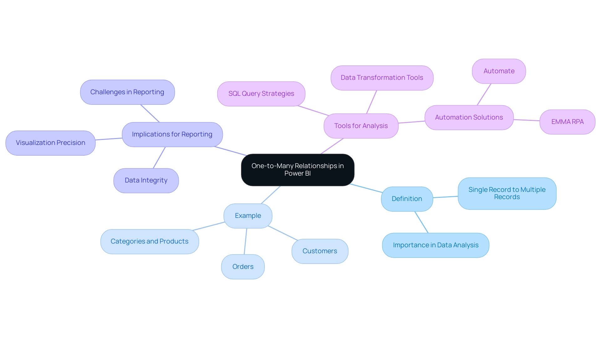
Step-by-Step Guide to Creating One-to-Many Relationships
Establishing a one to many relationship in Power BI is a simple procedure that greatly enhances your analysis capabilities, particularly in addressing the common issues organizations face with report generation and inconsistencies. Furthermore, utilizing RPA solutions can automate report generation, decreasing the time spent on creating reports and enhancing consistency. Follow these step-by-step instructions:
- Launch Power BI Desktop and import your datasets to begin.
- Navigate to the Model view by selecting the Model icon on the left sidebar, which provides a visual representation of your data model.
- Identify the lists you wish to connect. For example, choose the ‘Customers’ dataset alongside the ‘Orders’ dataset, as these often illustrate a common one to many relationship in Power BI.
- Choose a method to establish the connection: You can use auto detection, drag and drop, or the Edit Connection tab option. For this example, we’ll use the drag and drop method.
- Drag the primary key from the ‘Customers’ table—such as CustomerID—and drop it onto the corresponding foreign key in the ‘Orders’ table. This action initiates the connection creation.
- In the Create Relationship dialog, verify that the relationship type is set to ‘One to Many’. It’s crucial to confirm the cardinality settings here, as Power BI supports four types of cardinality, including the one to many relationship, along with Many-to-one (:1), One-to-one (1:1), and Many-to-many (:*). Comprehending these cardinalities is crucial for precise modeling and avoiding the pitfalls of time-consuming report preparation.
- Click OK to finalize the connection. Your model will now visually reflect this connection, facilitating comprehensive data analysis across the selected tables.
As you advance, remember that model calculations using certain DAX functions may change the filter context of these associations. As mentioned by specialist Harshitha Balasankula, ‘model calculations that employ specific DAX functions can deactivate connections or alter the filter context of connections in BI.’ Furthermore, implementing governance strategies can help address inconsistencies in information, ensuring that all stakeholders can trust the insights derived from your reports.
By excelling in the creation of connections and incorporating RPA solutions, you will unleash the complete capability of your information model in BI, ultimately fostering insight-driven understanding and operational effectiveness for your business expansion.
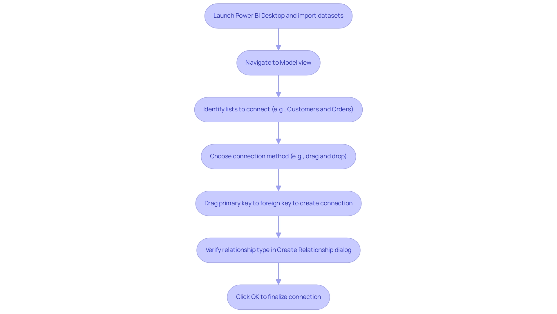
Managing and Editing Relationships in Power BI
Overseeing and modifying connections in Power BI is crucial for preserving the integrity and precision of your information model, especially in an environment where Business Intelligence and RPA enhance operational efficiency. Struggling to extract meaningful insights can leave your business at a competitive disadvantage. Here’s a straightforward guide to help you navigate this process and enhance your data-driven insights:
- Access the Model View: Begin by going to the Model view, where all current connections in your information model are shown. This visibility is crucial for identifying inefficiencies in your information setup.
- Edit Connections: To modify a specific connection, right-click on the line you wish to adjust and select ‘Edit Connection’. Fine-tuning crucial settings like cardinality and cross-filter direction is essential for creating a one to many relationship in Power BI that aligns your structure with analytical requirements. As one user noted, “I just switched the ‘relationships’ around which seems to have worked,” underscoring the importance of careful adjustment to eliminate time-consuming report creation processes.
- Delete Connections: If you need to remove a connection altogether, simply right-click on the connection line and choose ‘Delete’. This practice helps maintain a clean and relevant information model, reducing the risk of inconsistencies.
- Employ Automatic Updates: Power BI can handle connections automatically based on source definitions, simplifying the process of maintaining precise connections. However, exercise caution when using row-level security to prevent unintended consequences.
- Validate Regularly: Consistent validation of your model by examining connections ensures they accurately represent your data structure. This ongoing maintenance is crucial in preventing discrepancies and enhancing the overall accuracy of your reports.
Additionally, actionable guidance is vital in managing connections effectively. Participants can view on-demand sessions with database experts and the Microsoft product team to learn more about best practices in BI. By adhering to these steps, you can efficiently oversee connections within Business Intelligence, resulting in more trustworthy analysis and insights, ultimately fostering growth and innovation for your enterprise.
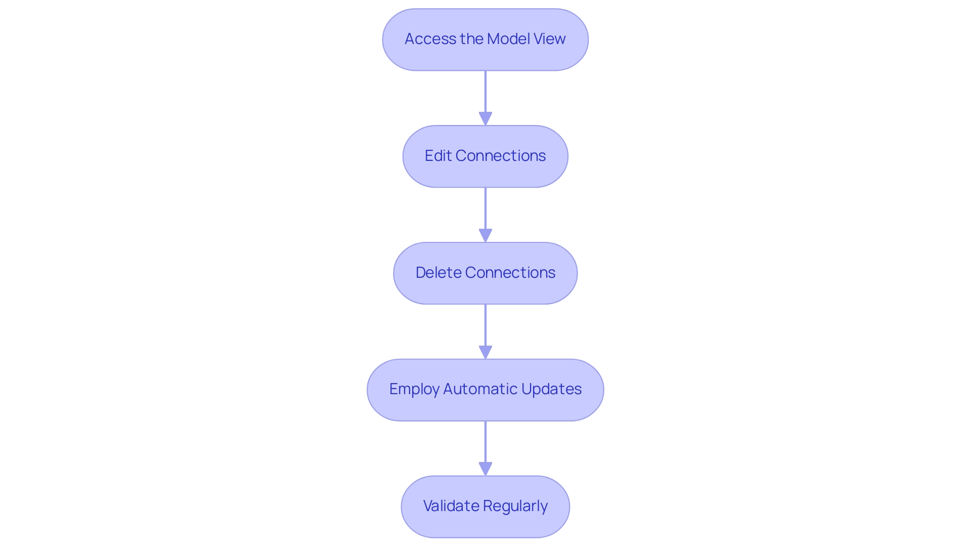
The Importance of Cardinality in Power BI Relationships
Cardinality is a fundamental concept that refers to the uniqueness of data values in a relationship, crucial for structuring effective data models in Power BI. There are three primary types of cardinality:
- One-to-One (1:1): In this scenario, each record in one table corresponds to exactly one record in another table. For example, consider an Employee Table linked to a Salary Table, where each EmployeeID matches precisely one salary record.
- One-to-Many (1:N): In this scenario, a single record in one dataset can be associated with multiple records in another dataset, leading to a more enriched dataset. For instance, a single professor may teach multiple courses.
- Many-to-One (N:1): This type represents the opposite of one-to-many, where multiple records in one table relate to a single record in another. An example would be many students enrolled in a single course.
Grasping these cardinality types, particularly the one-to-many relationship in Power BI, is crucial for organizing your models effectively, as it guarantees that your reports precisely represent the underlying connections. This accuracy is essential for deriving actionable insights that can drive decision-making. Moreover, implementing governance strategies can help mitigate inconsistencies across reports, fostering trust in the information presented.
Utilizing DAX formulas can assist in handling intricate connections and establishing virtual links between tables, further improving your analytical capabilities. As Nitin Kunigal emphasizes,
When you establish connections effectively using tools like Power Pivot, you gain control over your information, allowing for better reports, deeper insights, and a more streamlined workflow.
Furthermore, a recent case study titled ‘Defining Cardinality in Relational Databases’ highlights that accurately defining these connections is vital for efficient database design and preserving information integrity.
For instance, in educational institutions, many-to-many relationships often exist between courses, students, and professors, illustrating the practical implications of cardinality types.
By grasping cardinality in Business Intelligence, you position yourself to significantly enhance your analysis capabilities and tackle common challenges such as time-consuming report creation and inconsistencies. Furthermore, utilizing our 3-Day Business Intelligence Sprint can expedite your reporting process, while the General Management App ensures comprehensive oversight and actionable guidance. To explore how these solutions can benefit your organization, we invite you to book a free consultation, empowering you to leverage insights effectively.
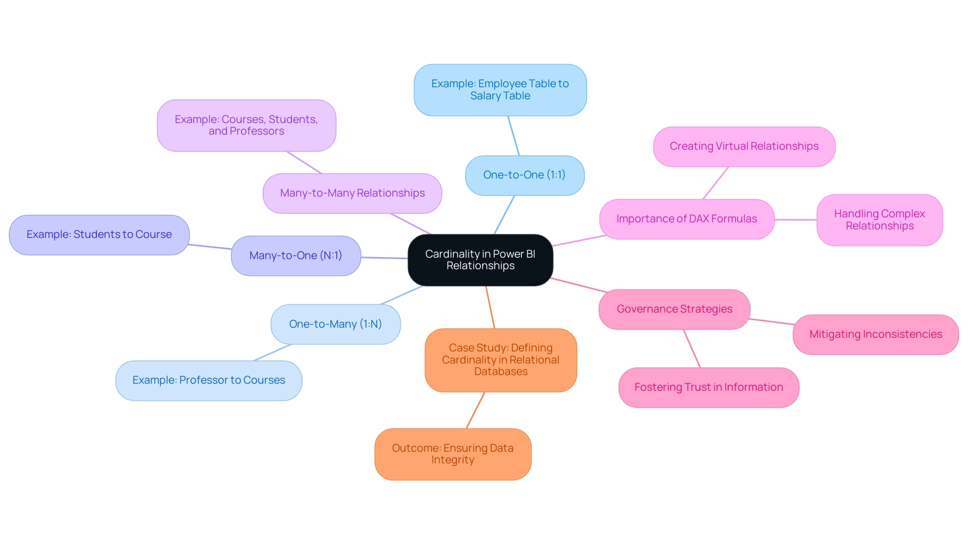
Troubleshooting One-to-Many Relationships in Power BI
When facing challenges with one-to-many relationships in Power BI, implementing the following troubleshooting strategies can greatly improve your data analysis process and contribute to enhanced operational efficiency:
- Check for duplicate values in the primary key on the ‘one’ side of the relationship. Duplicate entries can disrupt information aggregation and lead to inaccuracies in analysis, hindering your ability to derive actionable insights.
- Ensure consistent information types between the related fields. Both fields should share the same format, such as integers or text, to avoid compatibility issues that may complicate your data-driven decision-making.
- Examine connection settings to confirm that cardinality is appropriately defined. Identifying whether the association is a one to many relationship Power BI or many-to-one is essential for precise information modeling and efficient reporting.
- Test the connection by generating a simple report. This can help confirm that the anticipated information is returned. If discrepancies arise, revisit your connection settings for adjustments, as ensuring data quality is vital for efficient operations.
- Engage with the BI community forums to gather insights and solutions from other users who have encountered similar challenges. This collaborative approach can provide valuable perspectives and innovative solutions, aiding in the integration of AI into your processes.
For instance, a user from New Zealand encountered unexpected null value rows after importing an Excel file into Power BI, which hindered their ability to create a one to many relationship Power BI. The resolution involved converting the range in Excel into a formal table, which eliminated the null entries and facilitated the desired relationship. This outcome reinforces the importance of ensuring information consistency and proper formatting as part of the troubleshooting process.
As noted by Kudo Kingpin,
My Table = VAR OuterComplaints = COUNTROWS ( PMS_COMPLAINT )

RETURN ADDCOLUMNS (

    VALUES ( PMS_FINANCIAL_PDS[Month Start] ),

    "CountComplaints", CALCULATE ( COUNTROWS ( PMS_COMPLAINT ) ),

    "Index", RANKX ( PMS_FINANCIAL_PDS, PMS_FINANCIAL_PDS[Month Start],,, DENSE ),

    "Outer Complaints", OuterComplaints

)

Something along these lines...
This quote highlights the practical application of the strategies discussed, showcasing how users can leverage DAX functions to enhance their analysis and overcome challenges in report creation.
Furthermore, tackling inadequate master information quality is essential for surmounting obstacles to AI adoption. By resolving these issues, organizations can facilitate smoother integration of AI technologies into their existing processes. Moreover, RPA solutions can complement these troubleshooting strategies by automating cleansing and management tasks, thereby enhancing operational efficiency.
For those looking to deepen their understanding of Power BI, use code MSCUST for a $150 discount on the conference registration. By leveraging these strategies and sharing experiences within the community, you can significantly enhance your operational efficiency in data analysis and drive growth through improved Business Intelligence.
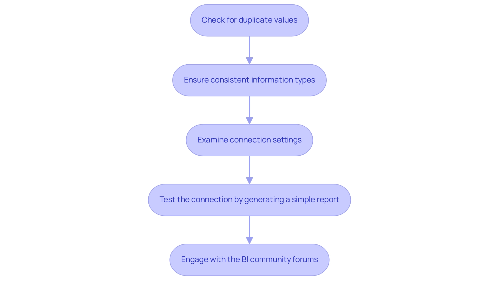
Conclusion
Mastering one-to-many relationships in Power BI is critical for organizations aiming to enhance their data analysis and reporting capabilities. By understanding the foundational concepts of relationships, such as cardinality, and effectively managing them, businesses can ensure data integrity and produce accurate visualizations. This knowledge is essential for overcoming common challenges like time-consuming report creation and data inconsistencies, which can hinder informed decision-making.
The process of creating, managing, and troubleshooting these relationships is made accessible through practical steps and automation tools. Whether it’s:
– Utilizing Power Query for data transformation
– Leveraging RPA solutions to streamline reporting
– Engaging with the Power BI community for support
Each strategy contributes to a more efficient data management process. Regular validation and thoughtful adjustments to relationships can further enhance the reliability of insights derived from data models.
Ultimately, by embracing these strategies, organizations not only improve their analytical capabilities but also position themselves for sustained operational efficiency. As the landscape of business intelligence continues to evolve, the ability to navigate and optimize data relationships will be a key differentiator, enabling businesses to harness the full potential of their data and drive meaningful growth.
Overview:
Merging two tables in Power BI involves a systematic process that enhances data integration for improved analysis and decision-making. The article outlines a step-by-step guide, emphasizing the importance of selecting appropriate join types and best practices to ensure data accuracy and operational efficiency, ultimately enabling users to derive actionable insights from their merged datasets.
Introduction
In the dynamic landscape of data analysis, mastering the art of table merging in Power BI can unlock a wealth of insights and drive operational efficiency. This essential skill enables users to consolidate diverse data sources into cohesive datasets, paving the way for impactful reporting and decision-making. By understanding the intricacies of various join types and leveraging advanced techniques such as fuzzy matching, organizations can enhance their data integrity and streamline workflows.
This article delves into practical strategies for merging tables effectively, exploring:
- Step-by-step processes
- Best practices
- Common pitfalls to avoid
As businesses increasingly rely on data-driven insights, embracing these methodologies will empower teams to harness the full potential of their data and foster growth in an ever-evolving technological landscape.
Understanding Table Merging in Power BI
Merging two tables in Power BI is a crucial practice that enables users to integrate information from multiple sources into a cohesive collection. This operation is crucial for crafting detailed reports and dashboards that unveil deeper insights into operational performance. By efficiently merging two tables in Power BI, you enhance your model, ensuring that all relevant information is available for thorough analysis.
This capability not only enhances your analysis efficiency but also significantly improves decision-making processes within your organization. As emphasized by sector practices, mastering the skill of merging two tables in Power BI can enhance your information management, enabling more informed strategies and operational progress. Additionally, integrating Robotic Process Automation (RPA) can further streamline these workflows, reducing the time spent on manual processes and enhancing overall operational efficiency in a rapidly evolving AI landscape.
A case study on inner joins illustrates that this operation returns only the rows with matches in both sets, effectively filtering the information to include only pertinent entries. This practical effect of combining datasets underscores the importance of Business Intelligence in driving data-driven insights that foster business growth. Notably, this topic has garnered significant interest, as evidenced by the 15,842 views on related discussions.
Matt Clapp, a new member, emphasizes the importance of a cohesive solution, stating, ‘We are likely targeting a solution that looks like below. It’s not a strong solution as the lineage is a little messy but with the reports now in a common location, we can move forward with delivering the solution to the intended audience.’ Moreover, employing features such as the ‘3-Day Business Intelligence Sprint’ enables swift report generation, while the ‘General Management App’ offers thorough management and intelligent evaluations, tackling prevalent issues like labor-intensive report generation and information inconsistencies.
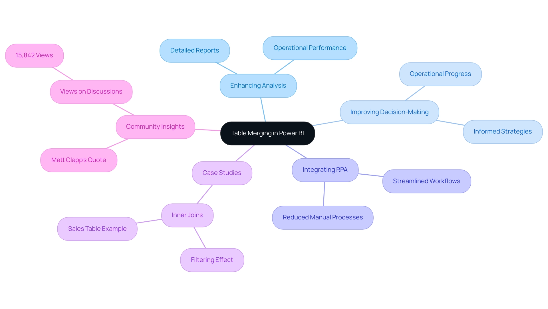
Step-by-Step Process for Merging Tables
-
Start by launching BI Desktop and importing the tables you want to combine into your model. This foundational step is crucial for merging two tables in Power BI and ensuring your information is ready to yield actionable insights.
-
Navigate to the ‘Home’ tab and click on ‘Transform Data’ to access the Query Editor. This tool is essential for manipulating your information effectively, enabling you to tackle the challenges of time-consuming report creation and inconsistencies.
-
In the Power Query Editor, select the first table you want to merge. This selection will serve as your primary dataset and is essential for ensuring precise information integration.
-
Under the ‘Home’ tab, click on ‘Merge Queries’ from the drop-down menu. This option starts the integration process, a crucial step in merging two tables in Power BI to utilize your information for improved decision-making.
-
In the Merge dialog box, select the second dataset you wish to combine with the first. It’s essential to verify that both sets are suitable for merging two tables in Power BI, which will enable you to derive valuable insights from your information.
-
Select the columns from both datasets that will serve as the basis for the merge. Precision is essential for merging two tables in Power BI; selecting the appropriate columns helps in avoiding the introduction of errors into your merged information. Be cautious not to modify any items that are part of the merge, as this can lead to critical errors.
-
Decide on the type of join you want to perform, such as Left Outer, Right Outer, or Inner. Each join type offers different insights, so select the one that aligns with your analytical goals and operational efficiency objectives.
-
After configuring your choices, click ‘OK’ to execute the merge. This step involves merging two tables in Power BI based on the specified parameters, which facilitates the extraction of actionable insights that drive growth.
-
Finally, review the merged table thoroughly and make any necessary adjustments before loading it back into BI. This final review ensures that your information remains precise and actionable, which is crucial when merging two tables in Power BI to enhance your reports and user experience.
To further enhance operational efficiency, consider incorporating RPA tools to automate repetitive tasks related to information preparation and combining in BI. For a practical example, consider the case study on combining tables using DAX in Business Intelligence, which highlights the need to create calculated columns and establish relationships for dynamic information operations. The result indicates that DAX permits dynamic recalculation of columns as information updates, maintaining reports up to date, although with a steeper learning curve in comparison to simpler methods like Coupler.io and Query Editor.
Remember, as Denys Arkharov highlights, the integration of risk indicators into platforms like Ukraine’s ProZorro system exemplifies the significance of accurate information merging in real-world applications. Furthermore, embracing these best practices not only improves user experience but also corresponds with the rising user adoption rates of BI features, aiding in unlocking the full potential of your insights. As Joleen Bothma emphasizes, “Unlock the potential of BI slicers with our step-by-step tutorial.”
Learn to create, customize, and optimize slicers for better reports.
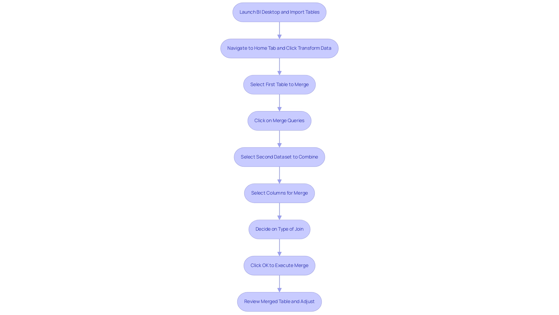
Exploring Join Types for Effective Merging
Power BI offers a versatile array of join types for effectively merging tables, each serving a unique purpose in data analysis:
- Left Outer Join: This option returns all records from the left table along with matched records from the right table. It excels at retaining all observations from the primary dataset, making it ideal for comprehensive analysis. For instance, in a case study titled “Using Left Join to Retain Observations,” a left join was utilized to merge income and demographic data, ensuring that all observations from smaller counties were retained, even if demographic data was missing.
- Right Outer Join: Conversely, this join returns all records from the right dataset, including matched records from the left. This method is beneficial when the right dataset is the focal point of your analysis.
- Inner Join: This option is particularly stringent, as it only returns records with matching values in both datasets. It’s perfect when you need to focus solely on common entries.
- Full Outer Join: This join type ensures that all records from both tables are returned, regardless of whether there is a match. It’s invaluable for gaining a holistic view of your informational landscape.
A solid understanding of these join types is essential for Directors of Operations Efficiency, empowering them to select the most effective method for merging two tables in Power BI based on their needs. This choice not only impacts the quality of insights gained from Power BI dashboards but also alleviates challenges such as time-consuming report creation and inconsistencies. For instance, by choosing the suitable join types, analysts can optimize their workflows, decreasing the time spent on report creation while maintaining information integrity.
As Matt David noted, “Choosing the right join type is essential for precise information representation and analysis.” Furthermore, integrating RPA solutions can automate repetitive merging tasks, enhancing operational efficiency and allowing teams to focus on deriving insights rather than getting bogged down in preparation. Furthermore, considering a dataset such as the counties dataset, which has a shape of (58, 3), permits a quantitative perspective on the information being discussed, further highlighting the significance of choosing the suitable join type.
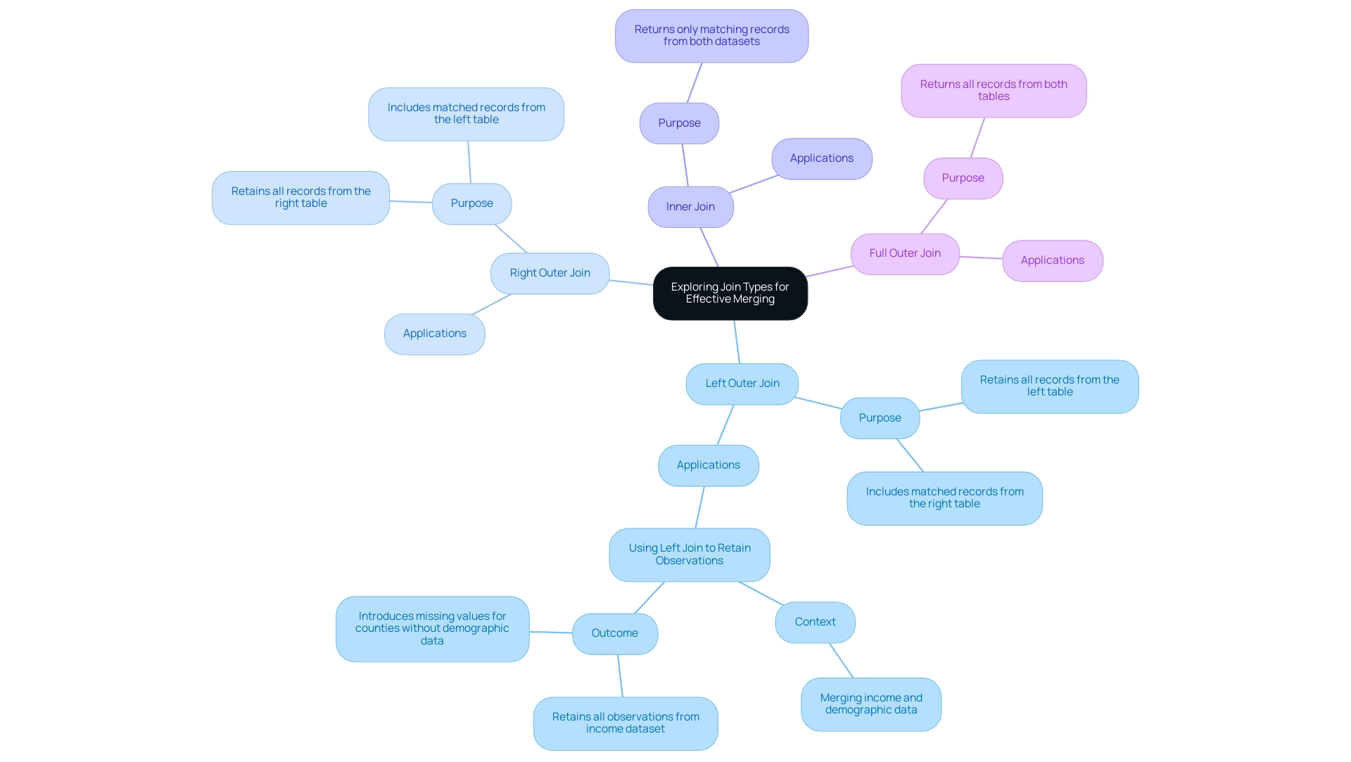
Advanced Merging Techniques: Fuzzy Matching
Fuzzy matching in Power BI is a powerful technique that enables users to perform merging two tables in Power BI effectively, even when discrepancies arise—an essential capability in the face of challenges like poor master quality and inconsistent reporting. This approach is especially advantageous for text-based areas, where variations in spelling or formatting can undermine accuracy, resulting in inefficient operations. To harness the power of fuzzy matching, follow these steps:
- In the Merge dialog box, activate the ‘Use fuzzy matching to perform the merge’ option.
- Adjust the similarity threshold, typically set at 85%, to dictate how closely values need to align for a successful match.
For instance, it may identify ‘J. Smith’ and ‘Jon Smith’ as matches, enhancing the quality of your merges. - Before executing the merge, consider filtering the distance matrix to improve performance and relevance of matches.
- After executing the merge, carefully review the results and make any necessary adjustments to ensure the combined information aligns with your operational objectives.
Alongside Power BI’s built-in fuzzy matching features, various methods can be utilized for merging two tables in Power BI, including no-code platforms, AI services, and programming languages like Python and R. By applying fuzzy matching during the process of merging two tables in Power BI, you significantly enhance the accuracy of your merges, ultimately resulting in more trustworthy insights and better decision-making.
As Nikhil Muthukrishnan notes,
I’m going to generate a signature from country names to reduce some of the minor differences between strings
—a testament to the effectiveness of this approach in refining information quality. Moreover, methods such as Soft TF-IDF, which merges conventional TF-IDF with an additional similarity metric for better text matching precision, showcase practical uses of fuzzy matching that can improve your strategies, enabling your organization to utilize actionable insights and foster growth.
This approach not only enhances information quality but also alleviates concerns about the complexity and expenses associated with AI integration, making it a valuable tool in your journey towards adopting AI in your organization.
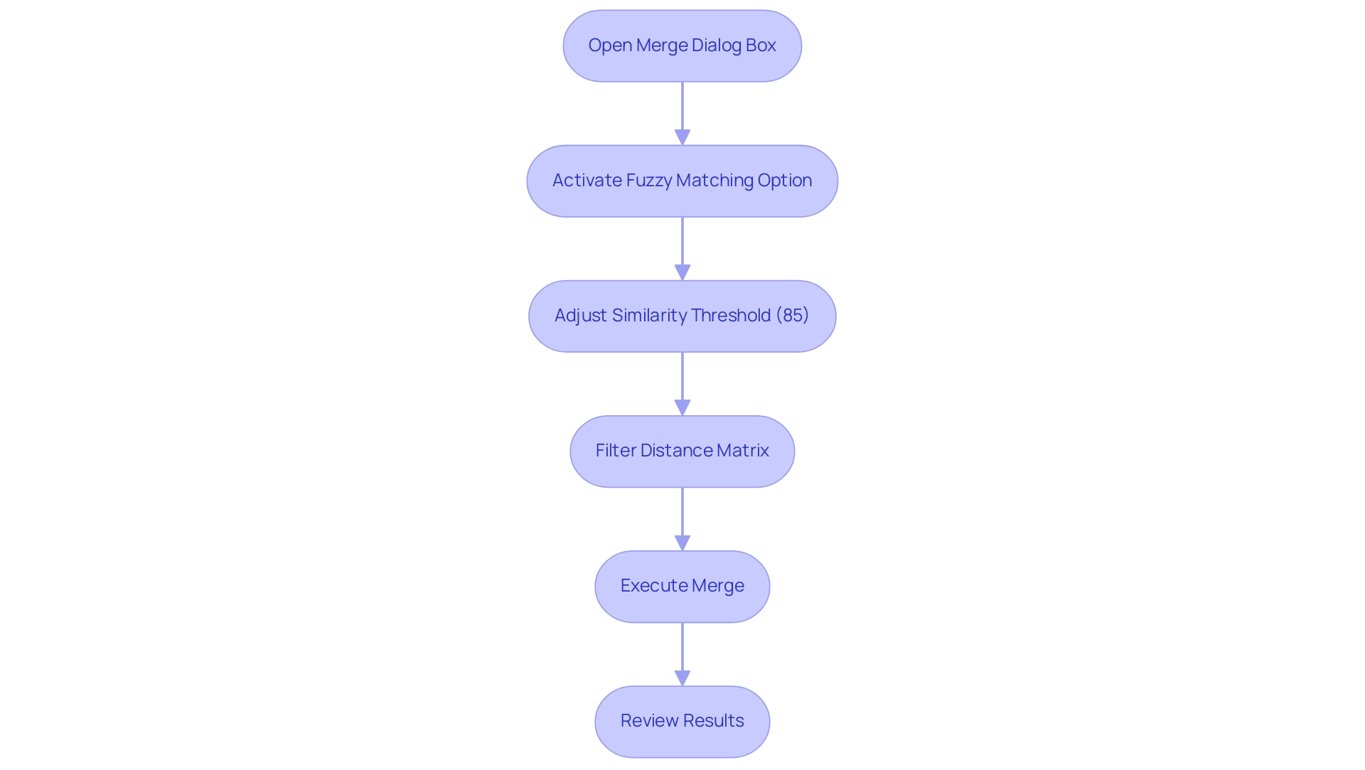
Best Practices and Common Pitfalls in Table Merging
To attain effective combination of datasets in BI, it is essential to follow several best practices:
- Start by verifying the information in both sets to ensure precision and relevance. This foundational step is essential for maintaining information integrity, especially as you leverage Robotic Process Automation (RPA) to automate manual workflows, enhance operational efficiency, and reduce errors, freeing up your team for more strategic, value-adding work in a rapidly evolving AI landscape.
- Employ clear and descriptive column names throughout your datasets; this practice minimizes confusion during the combining process and fosters better collaboration among team members.
- Regularly back up your information to safeguard against potential loss during operations or unforeseen issues.
- Exercise caution with fuzzy matching; carefully set an appropriate similarity threshold to prevent incorrect combinations that could skew your analysis.
Additionally, be mindful of common pitfalls that can arise during the combining process:
- Failing to review the combined information for accuracy after the merge can lead to overlooked errors that compromise your reports.
- Choosing inappropriate join types may result in incomplete information, hindering your analytical efforts.
- Overlooking quality issues can yield misleading insights, ultimately affecting decision-making processes.
By implementing these best practices and being aware of potential pitfalls, you can optimize merging two tables in Power BI, ensuring the integrity and reliability of your reports. Significantly, information refresh in BI updates content with the latest details from the source, emphasizing the necessity of keeping your datasets up to date during the integration process. As Greg Deckler emphasizes,
In general, the more that you can push back to the server the better.
This is a general rule. This principle is especially pertinent when examining how to utilize server capabilities for efficiency in your operations. Furthermore, Power Query’s automation capabilities underscore the practical benefits of merging two tables in Power BI, as illustrated in the case study titled ‘Power Query – Source Reference as File Path in Cell,’ which demonstrates that utilizing specific file paths can enhance efficiency in data transformation tasks.
Additionally, it is essential to navigate the challenges of identifying the right AI solutions that align with your specific business needs, ensuring that your automation strategies effectively support your operational goals.
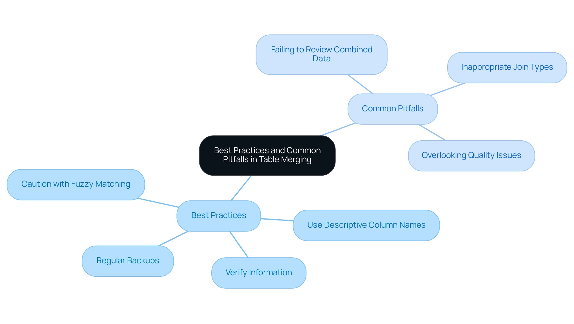
Conclusion
Mastering the art of table merging in Power BI is an invaluable skill that can significantly enhance data analysis and operational efficiency. By understanding the step-by-step processes and various join types, organizations can create cohesive datasets that provide deeper insights and drive informed decision-making. The ability to merge tables effectively not only streamlines workflows but also improves the overall quality of data, which is essential in today’s data-driven landscape.
Implementing advanced techniques such as fuzzy matching further augments the merging process, allowing for greater accuracy even when faced with data discrepancies. By adopting best practices and being vigilant about common pitfalls, teams can optimize their table merging strategies, ensuring that the resulting datasets are both reliable and actionable. This proactive approach not only mitigates risks associated with poor data quality but also empowers organizations to leverage their data for strategic growth.
Ultimately, embracing these methodologies positions teams to harness the full potential of Power BI, transforming raw data into valuable insights. As organizations continue to evolve in a rapidly changing technological environment, the skills acquired through effective table merging will serve as a cornerstone for operational excellence and sustained business success.
Overview:
The article provides a comprehensive step-by-step guide for installing Power BI Report Server, detailing essential prerequisites, the installation process, configuration for optimal performance, and troubleshooting common issues. It emphasizes the importance of meeting system requirements and following specific steps to ensure a successful installation, thereby enhancing data management and operational efficiency in business intelligence applications.
Introduction
In the realm of data-driven decision-making, the installation and configuration of Power BI Report Server stand as pivotal steps toward harnessing the full potential of business intelligence. With the right prerequisites in place, organizations can streamline their reporting processes and enhance operational efficiency. This article delves into the essential requirements for installation, a step-by-step guide to set up the server, and practical strategies for optimizing performance. Additionally, it addresses common installation challenges and clarifies the distinctions between Power BI Report Server and Power BI Service, empowering organizations to make informed choices that elevate their data management strategies. By mastering these elements, teams can transform complex data into actionable insights, driving growth and innovation in their operations.
Essential Prerequisites for Installing Power BI Report Server
Before starting the installation of Power BI Report, it is crucial to confirm that your system meets the following prerequisites to enhance operational efficiency and leverage the full potential of Business Intelligence:
- Operating System: Windows operating system 2016 or a later version is necessary for optimal functionality, ensuring a robust environment for your data-driven insights and minimizing the risk of inconsistencies in output generation.
- Database Host: Installation of SQL 2016 or a more recent version is crucial, as this functions to store metadata and content efficiently. A robust database server aids in maintaining consistent information across documents, thereby tackling frequent problems associated with data discrepancies.
- Licensing: Ensure that you have the suitable BI Reporting System license, obtainable through BI Premium, to enable complete features and support, thus avoiding time-consuming creation processes and facilitating quicker access to actionable insights.
- System Requirements: While a minimum of 4 GB of RAM and a dual-core processor is advisable, investing in additional RAM can significantly enhance performance, especially for analysts handling large datasets. A well-equipped server can greatly enhance operational efficiency and streamline document generation, making it easier to derive insights.
- .NET Framework: Ensure that .NET Framework 4.6 or a newer version is set up on your machine to support the application.
By addressing these prerequisites, you will not only streamline installing Power BI Report Server but also enhance the overall performance and functionality of BI Report Host. As noted by Qiuyun Yu from the Community Support Team, understanding the hardware and software requirements is pivotal for installing Power BI Report Server successfully. Furthermore, BV Kumar’s recent request for detailed hardware and software requirements underscores the importance of this information in the current industry landscape.
Moreover, case studies have indicated that employing SSDs with a minimum of 1 TB of space can significantly enhance performance because of their quicker access capabilities relative to conventional SATA drives, further aiding in effective report generation and actionable insights.
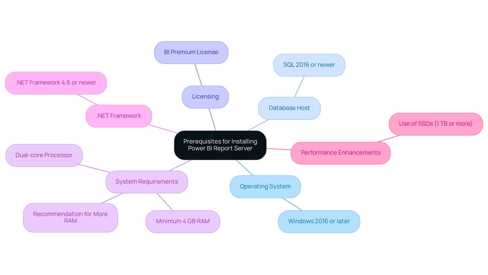
Step-by-Step Installation Process for Power BI Report Server
To successfully install BI Report System and lay the groundwork for effective data utilization, follow these essential steps:
- Download the Installer: Navigate to the official Microsoft website to download the installer for installing Power BI Report Server, ensuring you have the latest version for optimal performance.
Installing Power BI Report Server is an essential step for managing data reports effectively. - Run the Installer: Initiate the process of installing Power BI Report Server by double-clicking the downloaded file, which will launch the installation wizard. To proceed with installing Power BI Report Server, you must carefully read and accept the terms of the license agreement.
- Select Installation Type: Choose between a default installation for standard settings or a custom installation tailored to your specific needs when installing Power BI Report Server.
- Choose Installation Location: Specify the desired folder for installing Power BI Report Server, ensuring that it aligns with your organizational storage practices.
The process of installing Power BI Report Server is crucial for effective data management. - Configure Service Account: Input the credentials for the service account designated to run the server service, as proper account configuration is crucial for performance and security when installing Power BI Report Server.
Installing Power BI Report Server is essential for effective data management. - Complete the Installation: Click ‘Install’ to commence installing Power BI Report Server. Once it concludes, click ‘Finish’ to exit the wizard, confirming that the installation was successful after installing Power BI Report Server. After completing the installation, it is vital to verify that the service is operational. Check the Windows Services panel to ensure that installing Power BI Report Server has been completed successfully.
Implementing these steps not only streamlines the process of installing Power BI Report Server but also establishes the foundation for successful management. This is crucial in overcoming common challenges like time-consuming document creation, ensuring data consistency across documents, and providing actionable guidance to stakeholders. As Thomas LeBlanc, a Microsoft Data Platform MVP, remarked,Great article, and template. Downloaded and deployed to our Report Server (May 2019). Thanks!!!
This emphasizes the community-driven assistance and knowledge accessible to improve your installation experience.
Moreover, given that Enhansoft offers customers nearly 100 SSRS documents, it is crucial to have a strong analytics system established after installation. To optimize performance, remember to set the Execution Log Level to verbose or normal on the Advanced page. This adjustment can assist in identifying performance issues, as demonstrated by a case study where enabling execution logging significantly enhanced insights into slow loading times.
Additionally, implementing a governance strategy is crucial to mitigate data inconsistencies, ensuring that reports not only present numbers and graphs but also offer clear, actionable guidance for decision-making.
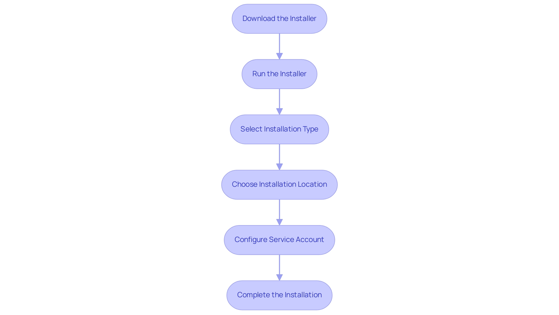
Configuring Power BI Report Server for Optimal Performance
To set up Business Intelligence Report System for optimal performance and leverage the full potential of Business Intelligence and Robotic Process Automation (RPA), adhere to the following steps:
- Access the Web Portal: Begin by launching a web browser and navigating to the Power BI Report Server web portal using the designated URL provided during installation.
- Configure Email Settings: Navigate to the ‘Email Settings’ section within the portal to establish email configurations for notifications and subscriptions, crucial for keeping users informed and engaged with actionable insights.
- Set Up Information Sources: Configure your information sources by entering the necessary connection strings and credentials to access your databases. Import only the essential columns; eliminating unused columns with large dictionary sizes can significantly free up space and improve performance, ensuring seamless integration crucial for effective decision-making. This step also aids in reducing inconsistencies, a frequent issue in document creation.
- Adjust Performance Settings: Review and modify performance settings in the ‘Settings’ menu. Pay special attention to memory allocation and processing options. Loading a large PBIX file into BI Desktop can inflate memory usage well beyond the file’s actual size, potentially leading to out-of-memory errors on systems with less than 16GB of RAM. Improper settings can exacerbate these issues and hinder the efficiency of your BI efforts.
- Enable Scheduled Refresh: If applicable, set up scheduled refresh for your data sources, ensuring that documents always contain the most current information, thus addressing one of the main challenges of time-consuming document creation.
By following these configuration steps, you will enhance the efficiency of BI Report Server, effectively meeting the demands of your users and leveraging the capabilities of BI and RPA to drive growth. As Avishek Ghosh, an analytics expert, notes,
By focusing on importing only necessary columns, reducing column cardinality, and leveraging effective aggregation strategies, you can significantly enhance performance and efficiency.
These insights are instrumental in optimizing your BI environment.
A case study titled ‘Memory Management in Business Intelligence Reports‘ illustrates that high memory usage can hinder responsiveness, particularly when a document grows to 800 MB and expands to over 1 GB in memory. Thus, careful configuration is essential to cultivate a strong and responsive reporting experience, ultimately addressing the challenges encountered in utilizing insights from BI dashboards.
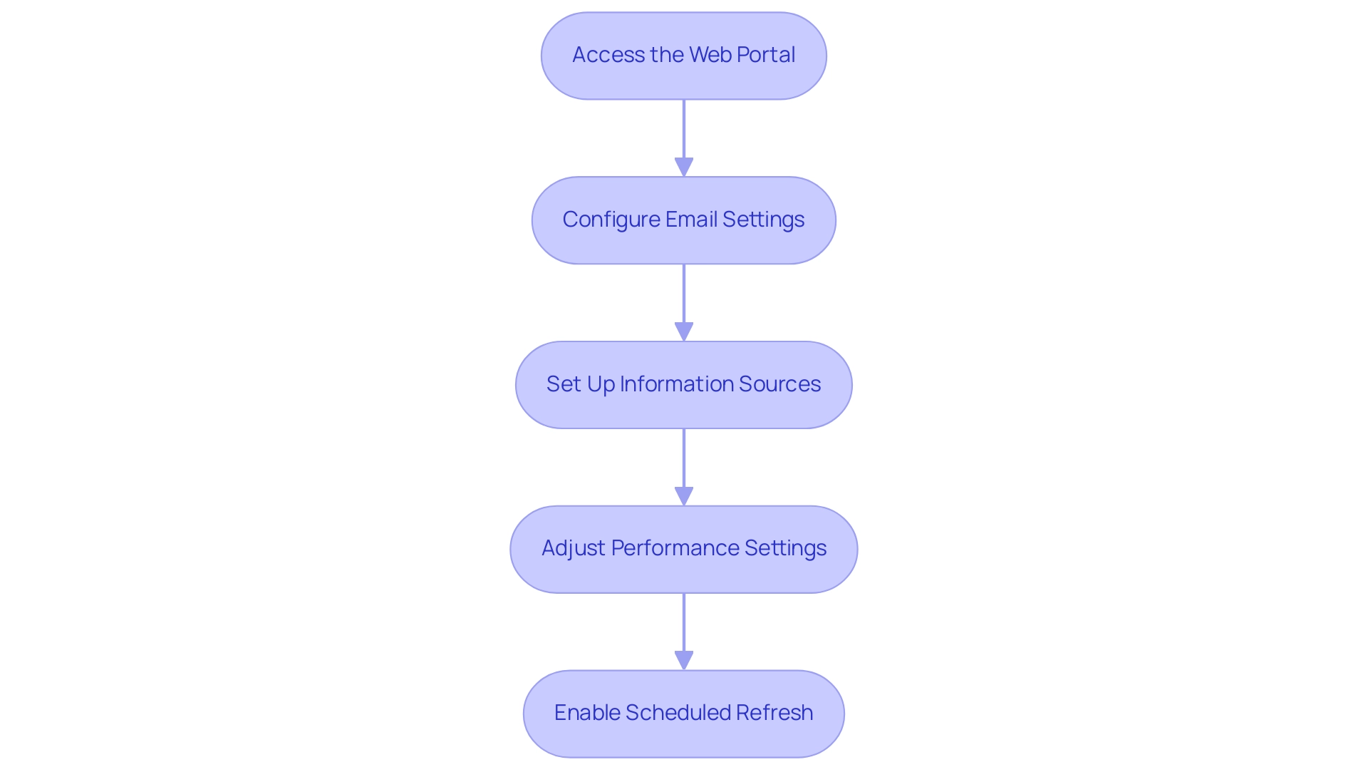
Troubleshooting Common Installation Issues
When setting up BI Report System, it’s not unusual to face challenges that can obstruct your capacity to utilize insights efficiently, frequently resulting in labor-intensive report generation and information inconsistencies. Here are practical troubleshooting tips that empower you to navigate these challenges and enhance your operational efficiency:
-
Installation Fails: A common issue arises when users lack the necessary administrative privileges on the server.
Additionally, be sure to check for antivirus software that might inadvertently block the installation process, as this can waste valuable time that could be spent analyzing data and creating reports. -
Service Not Starting: Verify that the service account has sufficient permissions to run the Power BI Report Server service. This simple check can prevent potential startup failures, ensuring that you can access your documents without delay and avoid interruptions in your processes.
-
Connection Errors: Frustrating connection issues with your database can arise. Double-check the connection strings and credentials used in the source settings to ensure they are accurate and current, thus reducing discrepancies in your documents and enhancing information governance.
-
Performance Issues: If the server is sluggish, review configuration settings. Consider increasing the allocated memory or processing resources to significantly enhance performance, allowing you to focus on deriving actionable insights rather than grappling with technical limitations that can delay document creation.
Implementing these troubleshooting strategies can effectively resolve common installation problems encountered while installing Power BI Report Server and facilitate a smoother experience in utilizing BI for data-driven decision-making. Users have reported that following these tips often leads to successful resolutions. Recent feedback highlights the importance of addressing specific issues like those encountered after the October 2020 release.
For example, one regular visitor observed,
Since we’ve upgraded our Report Server and Desktop Versions to the October 2020 Release, we encountered issues with various reports, especially when utilizing folders as sources.
This insight is crucial, especially in light of the recent fix confirmed by a Microsoft employee, which addresses these reported issues.
Moreover, it’s timely to consider that prices for related conferences will increase on February 11th, providing a valuable opportunity for further learning. BI also provides usage metrics across distinct national/regional clouds, ensuring compliance with local regulations, which is crucial for users concerned about governance when installing Power BI report server.
Incorporating a robust governance strategy can help mitigate inconsistencies, ultimately leading to more effective insights and improved decision-making.
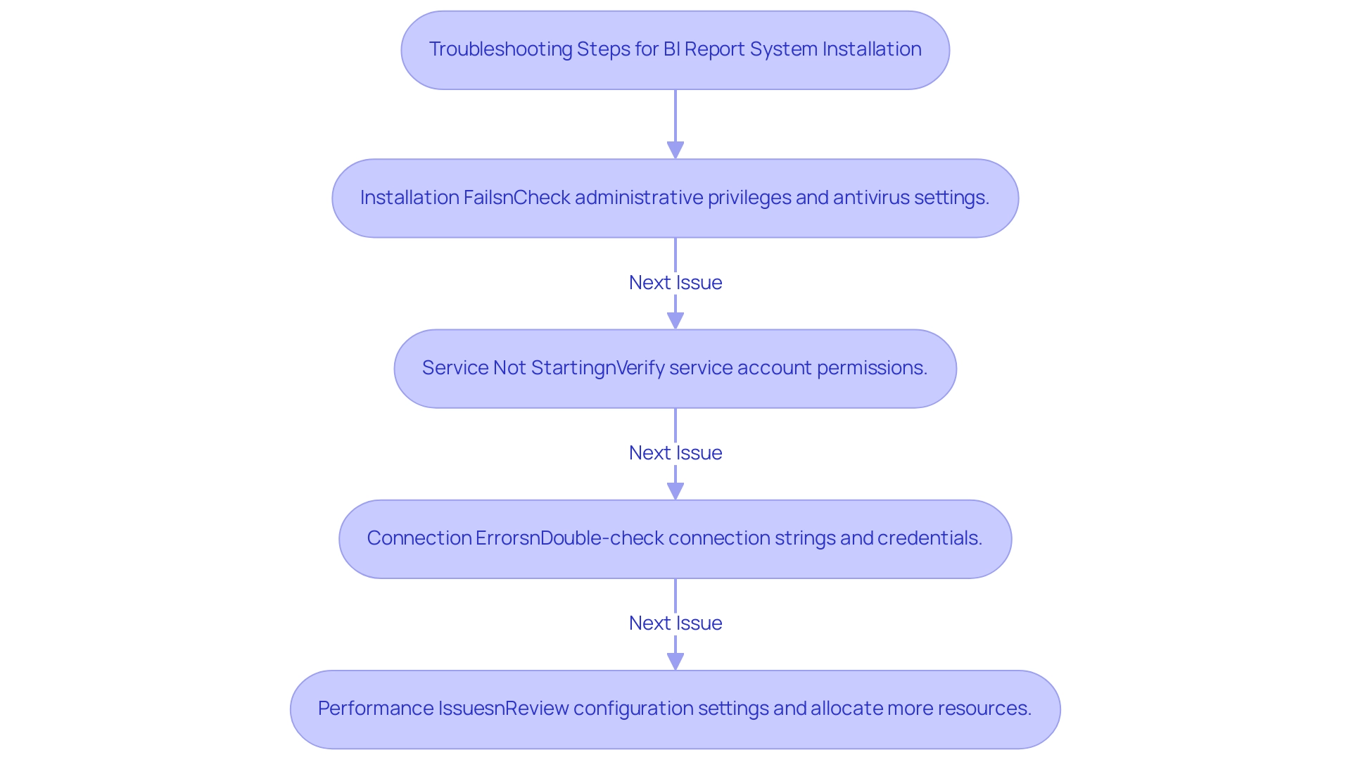
Understanding the Differences: Power BI Report Server vs. Power BI Service
When assessing the differences between BI Report Platform and BI Service, it is vital to consider several key factors that can assist in addressing typical challenges in utilizing insights:
- Deployment:
- Installing Power BI Report Server functions as an on-premises solution, making it ideal for organizations with stringent data governance policies, thereby addressing issues related to data inconsistencies.
- In contrast, BI Service is a cloud-based platform that facilitates accessibility and collaboration, allowing teams to focus on leveraging insights rather than getting bogged down in report creation.
- Installing Power BI Report Server requires a BI Premium license, ensuring that users can leverage the full capabilities of the tool.
-
BI Service, on the other hand, offers multiple licensing options tailored to various usage scenarios, making it adaptable for diverse organizational needs and alleviating potential licensing complexities.
-
Features:
- Power BI Service provides enhanced functionalities, including advanced collaboration tools and seamless integration with other Azure services. This can significantly improve workflow efficiency and provide clear, actionable guidance, addressing the common issue of reports filled with numbers yet lacking direction.
-
Meanwhile, installing Power BI Report Server emphasizes on-premises reporting, which caters to specific compliance and security requirements.
-
Information Update:
- One of the notable benefits of the BI Service is its ability for more frequent information updates, which is essential for organizations depending on real-time analytics.
- On the other hand, installing Power BI Report Server may encounter refresh limitations determined by the underlying infrastructure, a factor that can influence decision-making processes.
By understanding these distinctions and acknowledging the significance of a governance strategy to ensure consistency, you can make a well-informed choice that aligns with your organization’s reporting and management strategies. This ultimately enables your team to convert information into actionable insights. As noted in recent discussions with experts like Greg Deckler, the impact of data loading speeds and overall efficiency is critical in optimizing Power BI implementations.

Conclusion
Successfully installing and configuring Power BI Report Server is a transformative step toward enhancing data-driven decision-making within an organization. By ensuring that all essential prerequisites—such as the appropriate operating system, database server, and licensing—are in place, teams can create a robust foundation for efficient reporting processes. The step-by-step installation guide further simplifies the setup, enabling users to navigate potential challenges with confidence.
Post-installation, the emphasis on optimizing performance through strategic configuration is crucial. By adjusting settings, managing data sources effectively, and implementing scheduled refreshes, organizations can ensure that their reports deliver accurate, timely insights. Troubleshooting common installation issues empowers users to resolve challenges swiftly, reducing downtime and enhancing operational efficiency.
Understanding the distinctions between Power BI Report Server and Power BI Service also plays a vital role in making informed decisions that align with organizational needs. By evaluating deployment options, licensing, and feature sets, teams can choose the solution that best supports their data management strategies.
In conclusion, mastering the installation and configuration of Power BI Report Server not only streamlines reporting processes but also enables organizations to harness the full potential of their data. By prioritizing these steps, teams can transform complex data into actionable insights, driving growth and innovation in their operations. Embracing these strategies will lead to more effective data governance and a significant enhancement in operational efficiency.
Overview:
The article provides a comprehensive guide on how to effectively use the ‘Is Null’ function in Power BI to manage missing values and ensure data integrity in reporting. It emphasizes the importance of identifying and handling null entries through various methods, such as DAX functions and Power Query techniques, to enhance the reliability of analyses and decision-making processes.
Introduction
In the realm of data analytics, managing null values in Power BI is not just a technical necessity; it is a critical component of achieving reliable insights and informed decision-making. As organizations increasingly rely on data to drive their strategies, the presence of nulls can skew results, leading to misguided conclusions and missed opportunities.
This article delves into the complexities surrounding null values, offering practical strategies for identification, management, and resolution. From leveraging advanced DAX functions to implementing robust data governance practices, the insights provided here will empower professionals to enhance data integrity and operational efficiency.
By mastering the art of null management, businesses can transform their data landscape, ensuring that every report is a true reflection of reality and a catalyst for growth.
Understanding Null Values in Power BI
In Power BI, missing entries indicate the lack of information within a dataset, which can occur due to various reasons such as absent records, incomplete input, or computations producing no outcome. Identifying and resolving these missing entries is essential for upholding data integrity and guaranteeing precise reporting. In today’s data-rich environment, datasets exhibiting less than one-fifth of their worth can prove ineffective, emphasizing the necessity of managing these gaps.
Essential areas with empty entries can lead to misleading insights, potentially resulting in incorrect conclusions. Thus, comprehending how to recognize and handle when a value is null in Power BI is essential to the reliability of your reports. One effective method for estimating missing values is K-Nearest Neighbors Imputation, utilizing the values from the nearest points to fill in gaps.
Additionally, employing debiasing techniques can enhance these estimates, especially for correlated measures, ensuring a more precise representation. This is highlighted in the case study ‘Imputing Missing Values,’ which demonstrates the application of different imputation methods, emphasizing the importance of selecting the right strategy based on the characteristics of the missing information. As Adamo aptly notes, ‘The information recovery using missing techniques warrants consideration, but it is (as with most things) a sliding scale.’
This perspective highlights the nuanced challenges in addressing absent information and the necessity of adopting appropriate strategies to ensure the accuracy of your visualizations. By utilizing RPA solutions such as EMMA RPA and Automate, organizations can streamline information management processes, enhancing operational efficiency and informed decision-making. Ultimately, unlocking the power of Business Intelligence through effective information management enables businesses to transform raw information into actionable insights, fostering growth and innovation.
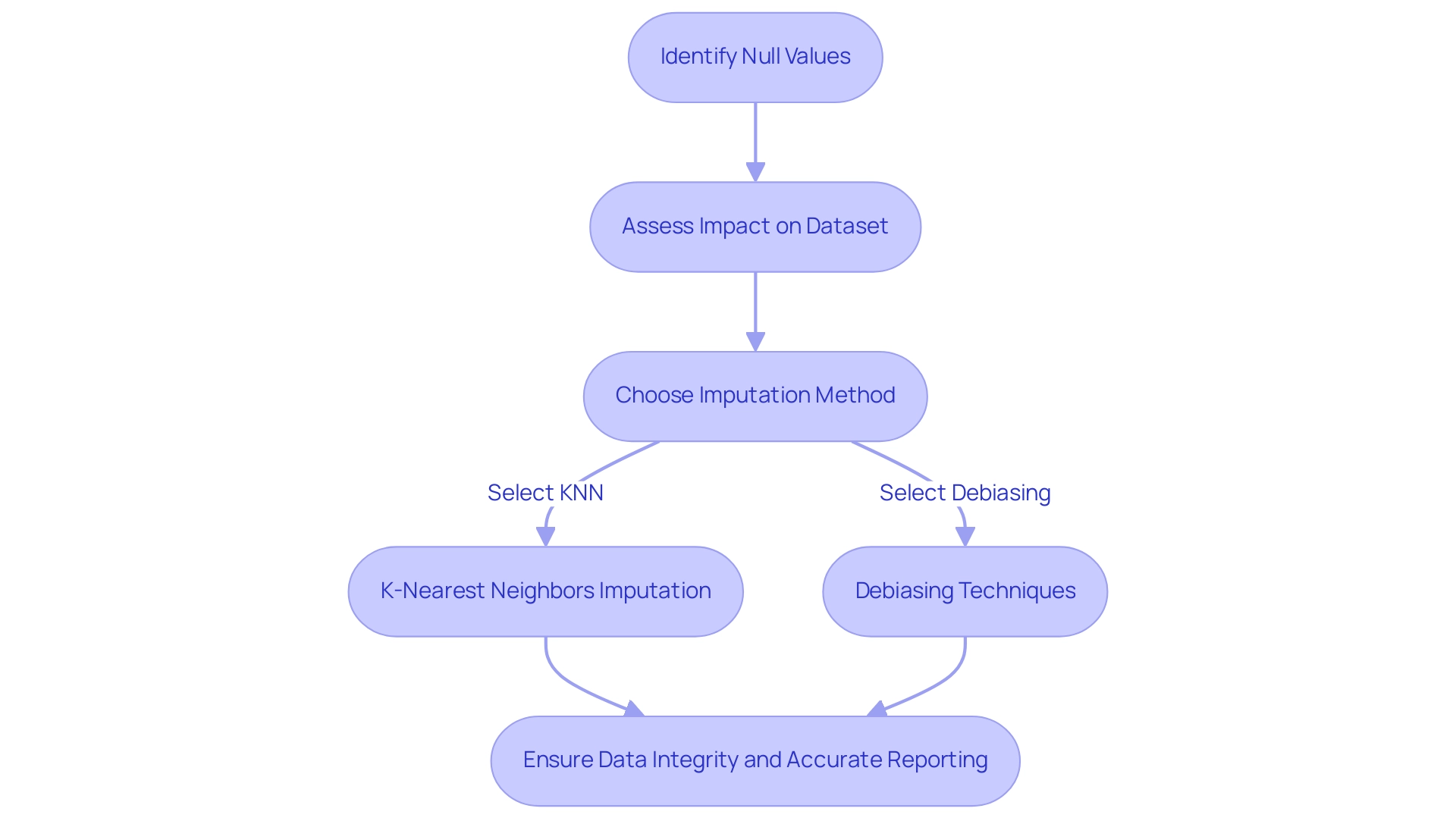
Practical Applications of ‘Is Null’ in Power BI
The ‘Is Null’ function, which is null in Power BI, serves as a powerful tool applicable across multiple scenarios such as filtering information in reports, calculating measures, and cleansing datasets. In the context of operational efficiency and information governance, consider a sales report where you’re aiming to filter out records with missing values to focus on completed transactions. You can achieve this by creating a calculated column using the DAX formula: SalesData[SalesAmount] = BLANK().
This method efficiently recognizes and omits empty entries, ensuring your analysis relies exclusively on pertinent information. Furthermore, addressing the lack of governance strategy is essential, as inconsistencies in information can arise without proper oversight. The ‘Is Null’ function can be utilized in conditional formatting in Power BI to highlight rows where the value is null in Power BI, drawing attention to missing information that requires further investigation.
Such practices not only enhance the clarity of your reports but also support improved decision-making by ensuring that all information presented is complete and actionable. For instance, a case study involving a user named Sebastian illustrates this: he faced a challenge where a measure totaling amounts over a period showed nothing when there were no entries. By using the ISBLANK function in combination with conditional expressions, he managed to return 0 when the measure was blank, effectively addressing his challenge.
As mentioned by Harris Malik, ‘Do not forget to mark it as answered in order to help others,’ these practices not only assist individual users but also enhance a shared comprehension of effective information management in BI. This subject is evidently important, as handling missing entries is essential for preserving data integrity and utilizing Business Intelligence for expansion.
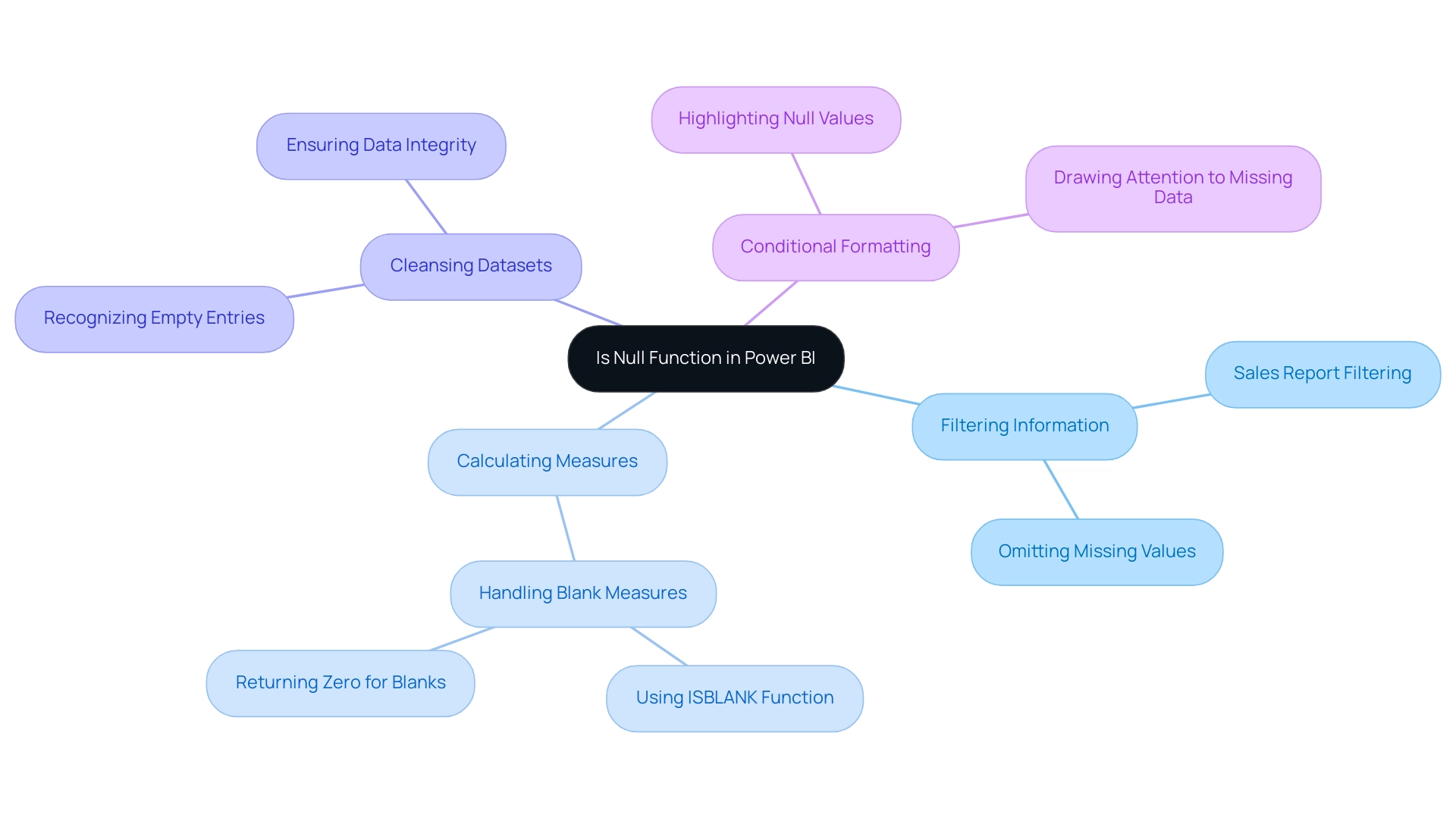
Common Challenges and Solutions for Handling Null Values
Managing absent entries in Power BI, where the value is null in Power BI, poses several typical difficulties, especially in pinpointing their origin and comprehending their effect on calculations and visual representations. A significant hurdle is that empty values can lead to misleading insights if not addressed properly. For example, data obtained from Quadratic Interpolation, such as figures ranging from 78.00000 to 98.28024, underscore the variability that can occur from unaddressed missing entries, highlighting the significance of effective management.
One effective solution is to use the Power Query Editor to exclude empty entries before importing data into Power BI. This process can be accomplished by:
- Selecting the relevant column.
- Accessing the filter dropdown.
- Unchecking the ‘null’ option to ensure that any value that is null in Power BI is excluded, resulting in a cleaner dataset for analysis.
Furthermore, empty values can disrupt DAX calculations, generating unexpected results.
To mitigate this, consider employing the IF function to create conditional expressions that manage empty values seamlessly. For instance, using the formula IF(ISBLANK(Sales Data[Sales Amount]), 0, SalesData[Sales Amount]) substitutes any empty values in the Sales Amount field with zero, thereby maintaining the integrity of your calculations. As noted by expert Nasima, identifying the type of missing data—whether it is Missing Completely at Random (MCAR), Missing at Random (MAR), or Missing Not at Random (MNAR)—is crucial for determining the appropriate handling method.
Additionally, referencing the case study titled ‘Handling Missing Data’ illustrates that various methods, such as deleting rows or imputing with averages, can be employed to manage situations where data is null in Power BI effectively. This proactive method not only improves quality but also enables you to obtain more precise insights from your analysis. In the context of your operations, utilizing RPA solutions such as EMMA RPA and Automate can further streamline the management of information processes, enhancing overall productivity while addressing challenges related to poor master information quality and barriers to AI adoption.
Tailored AI solutions can also be integrated to provide additional support, ensuring that your data management strategies are both efficient and effective.
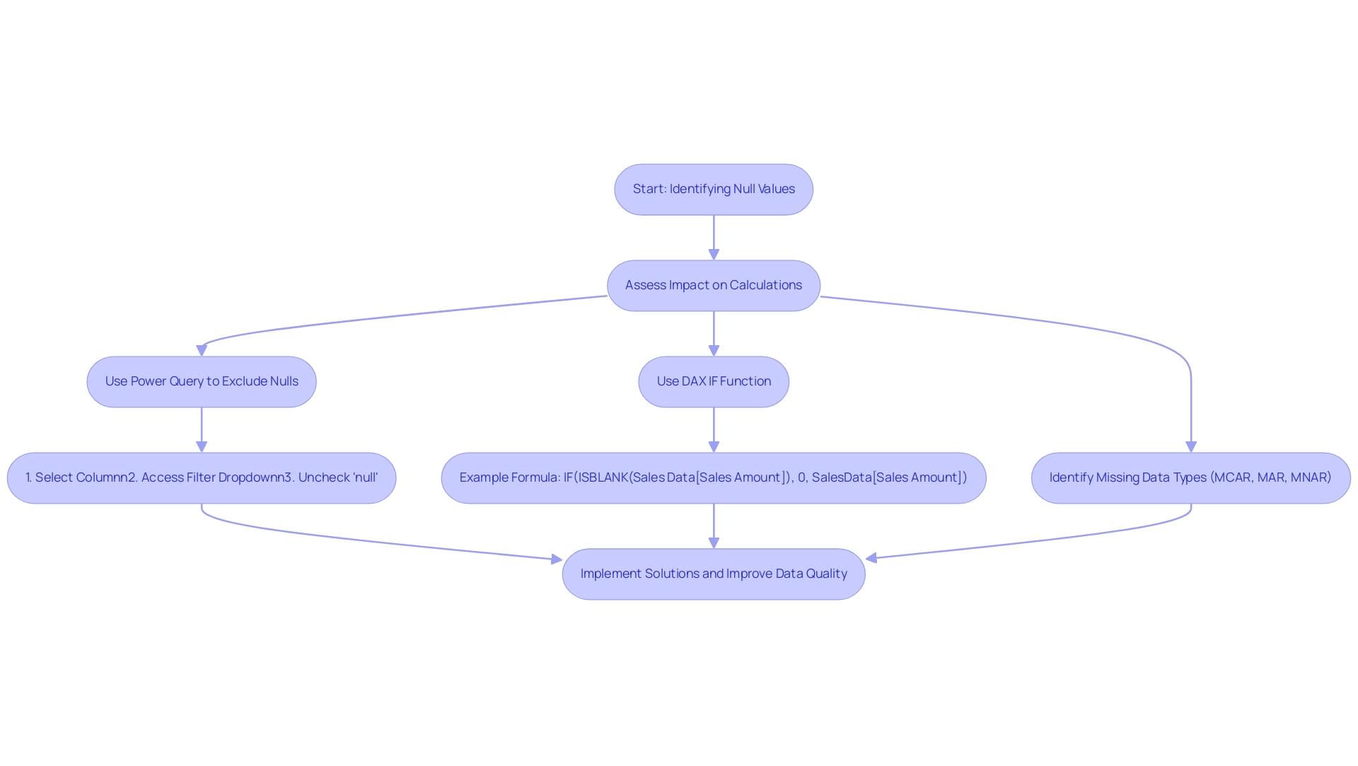
Advanced Techniques for Managing Null Values
To effectively handle missing entries in Power BI, advanced methods such as employing DAX functions like COALESCE and IFERROR are essential. The COALESCE function is especially strong as it returns the first non-empty entry from a list of arguments, making it a superb option for substituting missing entries with default options. For instance, the formula Sales Data[Sales Amount] = COALESCE(Sales Data[Sales Amount], 0) ensures that any values that are null in Power BI in the Sales Amount column are replaced with zero, thus maintaining the integrity of your analysis.
This proactive approach tackles common challenges in report creation, such as inconsistencies in information quality and the absence of clear guidance for stakeholders. To provide actionable insights, after implementing these techniques, stakeholders should regularly review their reports to ensure that the information remains clean and reliable, facilitating informed decision-making. The Grand Total sales ratios emphasize the importance of handling missing values:
- Accessories have a sales ratio of 0.83
- Bikes at 2.51
- Clothing at 5.45
This indicates varying quality across categories and reinforces the need for robust missing value management techniques to enhance overall reliability.
Furthermore, the LOOKUPVALUE function provides a more flexible alternative to the RELATED function, particularly useful for complex scenarios involving multiple criteria or indirect relationships. The Power Query Editor further enhances your transformation capabilities by allowing you to substitute missing values effortlessly when a value is null in Power BI during the preparation phase. By selecting a specific column, right-clicking, and choosing ‘Replace Values’, you can specify what values should replace those that are null in Power BI, significantly enhancing the quality of your information prior to analysis.
This process not only streamlines analytics but also empowers you to derive actionable insights from clean, reliable information, thereby leveraging Business Intelligence effectively for operational efficiency. For example, by making sure that empty entries are managed properly, companies can lower the chance of making choices based on insufficient information, ultimately fostering growth and enhancing overall performance.
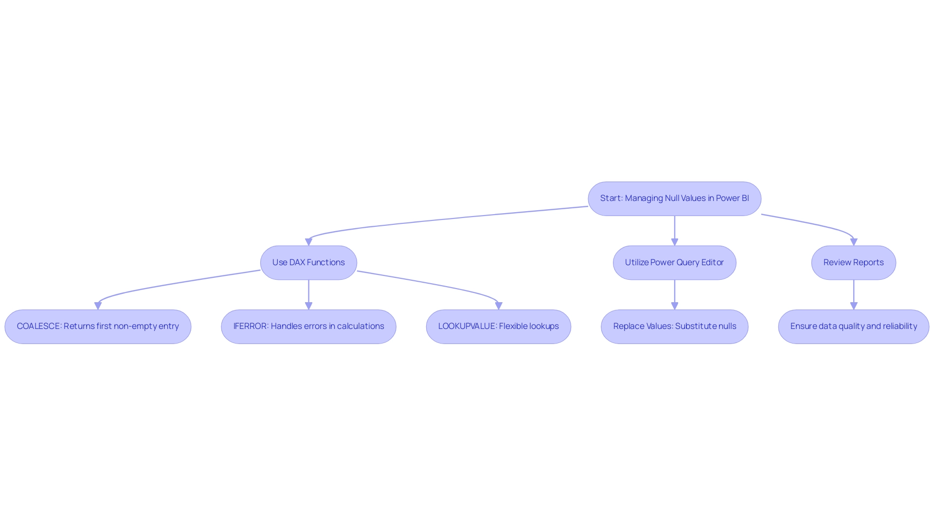
Best Practices for Handling Null Values in Power BI
Effectively handling missing values in Power BI, where the value is null in Power BI, is essential for maintaining the integrity of your reports and unlocking actionable insights. Here are several best practices to consider:
-
Regularly review your information sources to uncover potential issues where data is null in Power BI before they can disrupt your analysis.
This proactive method is essential, as frequent auditing can significantly influence the quality of insights derived. -
Employ the Query Editor to meticulously clean your datasets prior to analysis, ensuring that your information is ready for consumption.
Additionally, consider creating custom functions in Power Query M to tackle specific quality issues not covered by built-in tools, enhancing your handling capabilities. -
Utilize DAX functions to dynamically handle cases where a value is null in Power BI, preserving the accuracy of your calculations even in the presence of incomplete information.
-
Document your information handling processes and the roles and corresponding permissions within your team thoroughly.
This practice enhances transparency, aids in onboarding new users, and facilitates role reviews, which are vital for effective collaboration.
By adhering to these best practices, you can bolster the reliability of your reports and empower your decision-making processes with accurate data. As part of our 3-Day Business Intelligence Sprint, we promise to create a fully functional, professionally designed report on a topic of your choice, which you can use as a template for future projects. If your organization is struggling to make the most of your Power BI tools, contact us to schedule a quick chat with one of our experts or visit our Technology Services site to learn more about Creatum’s comprehensive Power BI services, including custom dashboards and advanced analytics.
Implementing robust data governance policies can ensure consistency across your data sources and pave the way for enhanced operational efficiency, much like RevGen’s innovative GenAI tool that significantly improves customer experience.
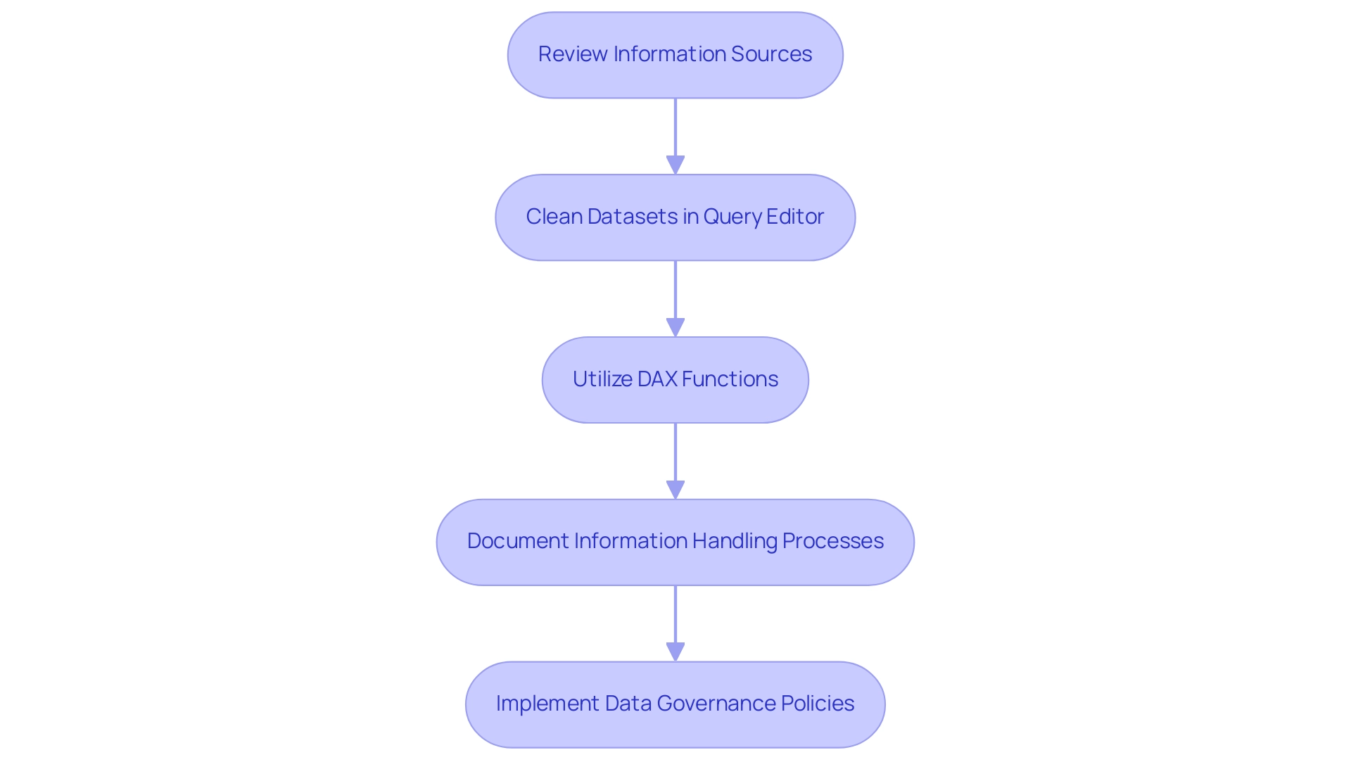
Conclusion
Managing null values in Power BI is not merely a technical task; it is a fundamental practice that underpins the integrity of data-driven decision-making. This article has explored various dimensions of null value management, from understanding their origins to employing advanced techniques like DAX functions and Power Query Editor tools. By recognizing the critical impact of nulls on reporting and analysis, organizations can take proactive steps to mitigate their effects, ensuring that insights derived from data are both accurate and actionable.
Implementing strategies such as:
- Regular data audits
- Utilizing the ‘Is Null’ function for data cleansing
- Applying best practices in data governance
can significantly enhance the quality of reports. The examples illustrated throughout the article demonstrate that by leveraging tools like EMMA RPA and Power Automate, businesses can streamline data management processes, ultimately driving operational efficiency and fostering a culture of informed decision-making.
As organizations continue to navigate a data-rich landscape, mastering null value management will not only improve data integrity but also unlock opportunities for growth and innovation. By prioritizing robust data handling practices, businesses can transform their analytics capabilities, ensuring that every report reflects a true representation of reality and serves as a catalyst for success. Embracing these methodologies is essential for any organization aiming to thrive in today’s competitive environment.
Overview:
The LEN function in DAX is crucial for measuring text string lengths, which enhances data quality and facilitates better decision-making in Business Intelligence processes. The article emphasizes its practical applications, such as data validation and filtering, and highlights that integrating RPA solutions can automate these tasks, ultimately leading to improved operational efficiency and data integrity.
Introduction
In the realm of data analysis, the LEN function in DAX emerges as a powerful ally, enabling organizations to enhance data quality and operational efficiency. As businesses grapple with the complexities of managing vast datasets, the ability to accurately measure text length becomes crucial. This article delves into the multifaceted applications of the LEN function, illustrating how it not only aids in data validation and reporting but also integrates seamlessly with Robotic Process Automation (RPA) to streamline workflows.
By mastering this function, teams can unlock insights that drive informed decision-making, ultimately fostering a culture of data-driven success. With a focus on best practices and advanced techniques, this guide empowers professionals to navigate the challenges of data management while harnessing the full potential of DAX for their operational needs.
Understanding the LEN Function: Definition and Purpose
The LEN DAX operation is an essential text tool that computes the character count of a particular text string, playing a vital role in assessing quality and preparing datasets for more in-depth analysis. In today’s information-rich environment, leveraging tools like LEN DAX is essential for overcoming challenges related to poor master information quality, which can hinder AI adoption and decision-making based on insights. For instance, if you possess a dataset featuring product names, the LEN function can swiftly identify names that exceed a predefined character limit, enabling consistency and clarity in your information.
Additionally, integrating RPA solutions can automate the process of validation, ensuring that datasets remain clean and compliant with business standards. Recent studies indicate that effective text quality evaluation can lead to a 20% increase in overall integrity, underscoring the importance of Business Intelligence in driving growth. Best practices for profiling suggest enabling all profiling options during the initial review, as shown in a case study where addressing issues in Power Query significantly enhanced quality.
For example, a retail organization utilized the LEN DAX method alongside RPA tools to automate the identification of inconsistent product names, leading to an efficient entry process and enhanced reporting precision. As Mojgan Taheri, a Business Intelligence Analyst, aptly puts it,
Information profiling is like a 🔎 magnifying glass for our information. It helps us see the big picture, spot inconsistencies, and uncover hidden keys.
Thus, the LEN DAX feature serves not just as a tool, but as a gateway to advanced strategies for information manipulation. Mastering this capability enables you to handle information processes efficiently, promoting informed decision-making throughout your operations.
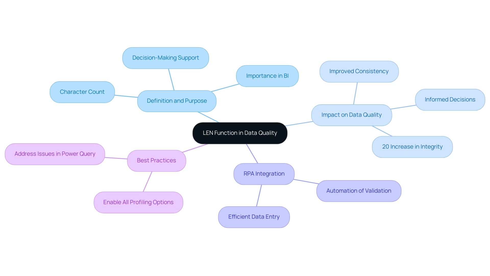
Practical Applications of the LEN Function in DAX
The LEN capability in DAX provides numerous practical uses that can significantly improve information quality and operational efficiency, especially when incorporated into automated workflows:
- Data Validation: Utilizing the LEN tool allows for systematic checks for missing entries or unexpected text lengths in your dataset. Integrating this process within Robotic Process Automation (RPA) can drastically reduce manual oversight, ensuring that your reports are based on reliable information. As observed by specialist Marco Russo, effective validation techniques, such as those employing
len dax, are essential for reducing quality issues that can occur from text length variations. By automating these checks, RPA reduces the time and effort spent on manual validation, allowing your team to concentrate on more strategic tasks. - Conditional Formatting: By creating measures that utilize the LEN operation, you can implement conditional formatting in your reports. This technique highlights entries that exceed specific length thresholds, making it easier for users to identify outliers and take corrective actions promptly. Automating this process through RPA not only enhances efficiency but also ensures consistency in how information is presented, reducing the likelihood of human error.
- Filtering Data: When combined with other operations,
len daxcan serve as a powerful tool for filtering datasets according to text length criteria. For instance, you might create a calculated column that flags product names exceeding 30 characters, prompting a review process and assisting in maintaining consistency across your reports. Automating this process with RPA can free your team to focus on higher-value tasks, ultimately driving better business outcomes while addressing the challenges of managing large datasets in a rapidly evolving AI landscape.
Recent updates to SSDT, from version 14.0.1.432 to 16.0.70.21, enhance the capabilities of DAX functions like LEN, making these applications even more relevant in the context of RPA. Furthermore, for individuals seeking to enhance their comprehension of these concepts, a Power BI Masterclass is accessible, offering valuable insights into practical uses of DAX functions.
These uses not only simplify the validation process but also enable your team to make informed decisions based on high-quality information. Recent statistics indicate that implementing these strategies can lead to significant improvements in overall information integrity, crucial for informed decision-making in today’s rapidly evolving AI landscape. By leveraging RPA, organizations can navigate these challenges more effectively, ensuring operational efficiency and data-driven insights.
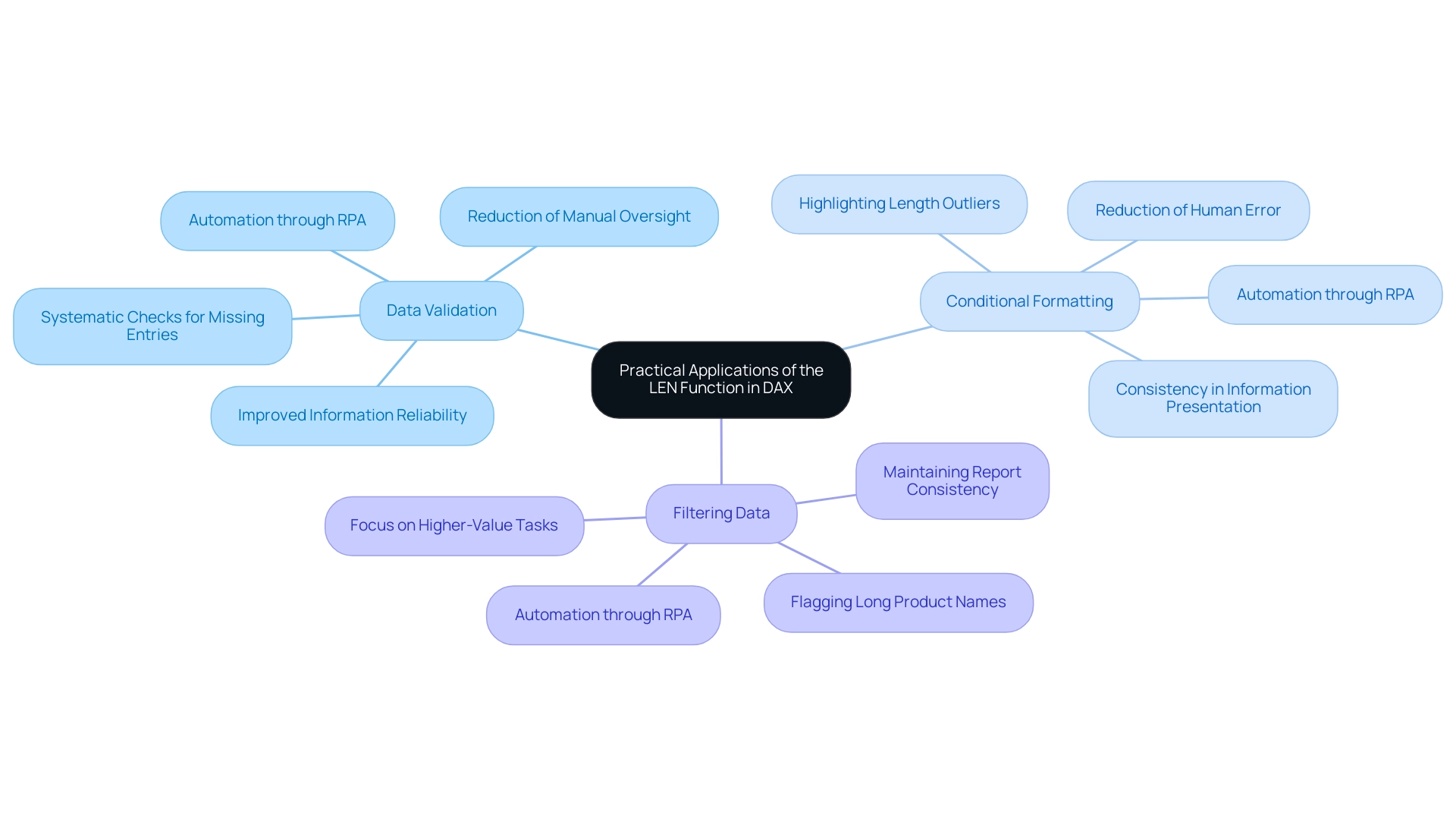
Best Practices and Considerations for Using LEN in DAX
When utilizing the LEN method in DAX, it’s essential to adopt best practices that improve both accuracy and efficiency in the realm of Business Intelligence and RPA:
- Type Awareness: Always confirm that the information being measured is of text type. Using the LEN DAX method on non-text types can lead to mistakes or produce unforeseen outcomes. Ensuring the appropriate format will enhance your calculations and support precise insights.
- Handling Blanks: Be mindful that the LEN operation returns a value of 0 for empty strings. This characteristic can be beneficial for filtering information, but may require additional handling in your calculations to ensure that your reports accurately reflect your intent with LEN DAX, thereby addressing common inconsistencies.
- Performance Optimization: In scenarios involving large datasets, consider the frequency of LEN function calls within your calculations. Excessive invocations can negatively impact performance. Instead, aim to compute the length once and store it in a calculated column using LEN DAX whenever feasible. This approach not only streamlines your calculations but also enhances the overall efficiency of your Power BI reports, addressing the time-consuming nature of report creation that many developers face.
To illustrate the significance of performance optimization, consider the Average Order Value (AOV), calculated as DIVIDE(Total Revenue, Total Order Quantity). By applying best practices in LEN DAX, developers can significantly enhance the performance of their reports, thereby improving user experience and supporting informed decision-making. Moreover, effectively leveraging these best practices is essential to avoid the competitive disadvantage of struggling to extract meaningful insights from information, which can hinder business growth and innovation.
As noted by Sovan Pattnaik, a Technical Specialist in Data and Analytics, ‘this is very helpful.’ Thank you so much! This feedback underscores the value of implementing these best practices within the framework of Business Intelligence initiatives.
Additionally, a case study titled ‘How to Improve Your Power BI Report Performance’ highlights that slow report performance is a common challenge faced by Power BI developers.
The strategies outlined in this study can be instrumental in helping developers create more efficient reports that drive growth and innovation through actionable insights obtained from information.
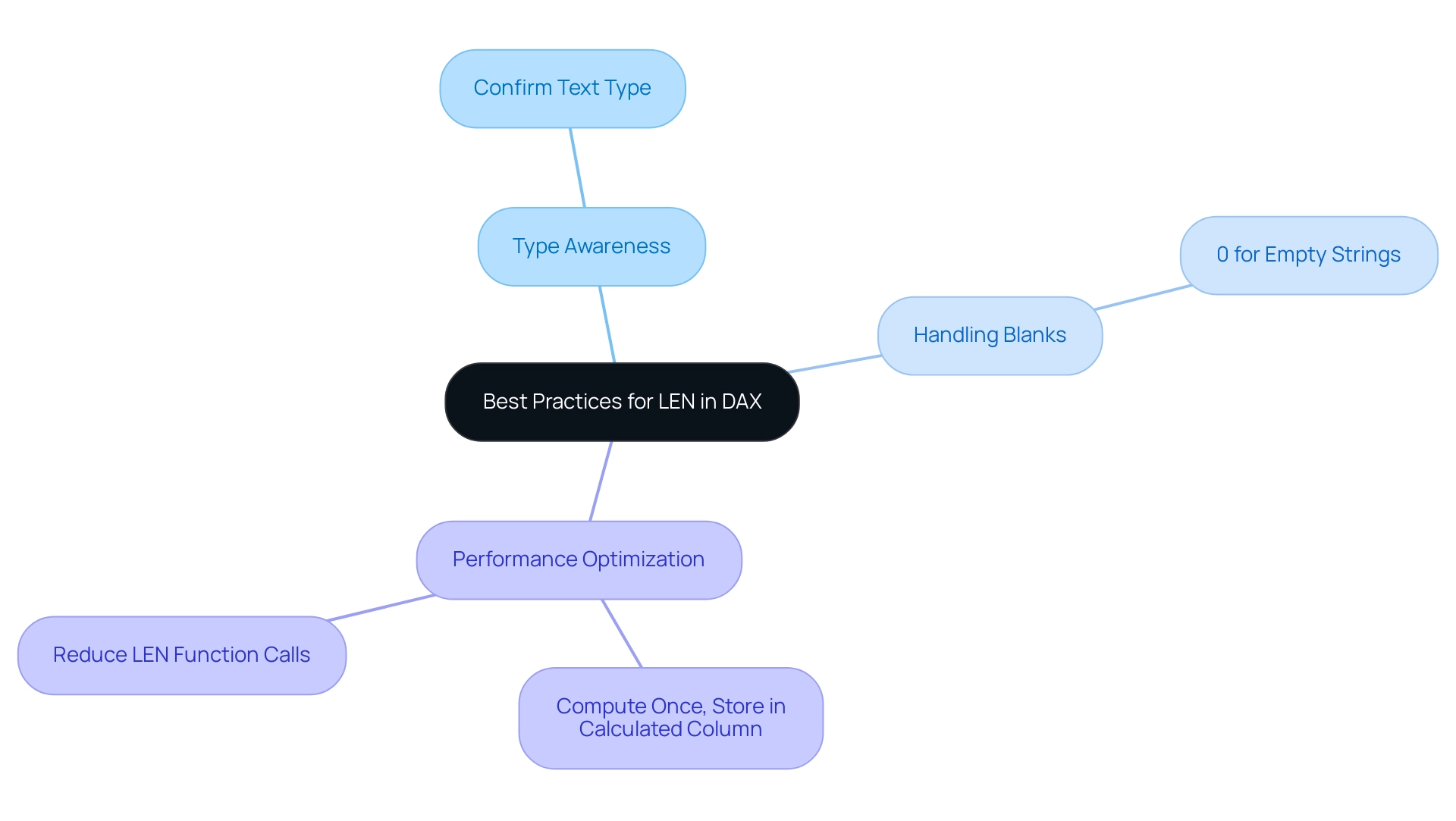
Advanced Techniques: Combining LEN with Other DAX Functions
To enhance your DAX expertise, a strategic method includes merging the LEN DAX operation with several other DAX operations to tackle frequent issues in utilizing insights from Power BI dashboards, such as time-consuming report creation, inconsistencies in information, and the absence of a governance strategy that can result in confusion and mistrust in the information. Here are some effective methods:
-
IF Function: Leverage the LEN function alongside IF to formulate conditional measures based on text length. For instance, the expression
IF(LEN(ProductName) > 30, 'Long Name', 'Short Name')effectively categorizes product names based on their character count, allowing for immediate understanding of attributes and enhancing clarity amidst complex datasets. -
FILTER Function: Merging the FILTER function with the LEN DAX function can significantly enhance your reporting capabilities. A practical example would be
FILTER(Products, LEN(ProductName) > 30), which filters your dataset to showcase only those products with longer names. This targeted method facilitates a focused analysis, enabling better decision-making processes and reducing confusion in interpretation. -
CALCULATE Function: Utilizing LEN DAX within CALCULATE allows you to adapt filter contexts dynamically based on text length. This technique is instrumental in generating insightful visual representations. For instance, employing
CALCULATE(SUM(Sales[Amount]), LEN(ProductName) > 30)modifies the context to sum sales only for products exceeding a specified name length, revealing crucial sales insights that can drive operational efficiency.
Incorporating a governance strategy can further enhance the reliability of your reports, ensuring consistency across all dashboards. Additionally, integrating Robotic Process Automation (RPA) can streamline repetitive tasks, allowing your team to focus on strategic analysis rather than time-consuming report creation. Tailored AI solutions can also provide insights that align with your specific business goals, further enhancing decision-making capabilities.
With 5,720 users online currently engaging with DAX, mastering these combinations not only enhances your analytical capabilities but also connects you with a vibrant community of learners committed to overcoming common DAX challenges. As Anmolgan, a Post Prodigy, noted, “It helped but it’s not subtracting the amounts from the hours measure,” reflecting the ongoing journey many face in their DAX proficiency. Furthermore, the case study titled “Power BI DAX Tutorial for Beginners” illustrates the foundational importance of DAX and its impact on enhancing users’ skills, reinforcing the educational purpose of this tutorial.
By mastering these combinations, professionals can unlock advanced techniques in LEN DAX, significantly enhancing their analytical capabilities and driving informed decision-making.
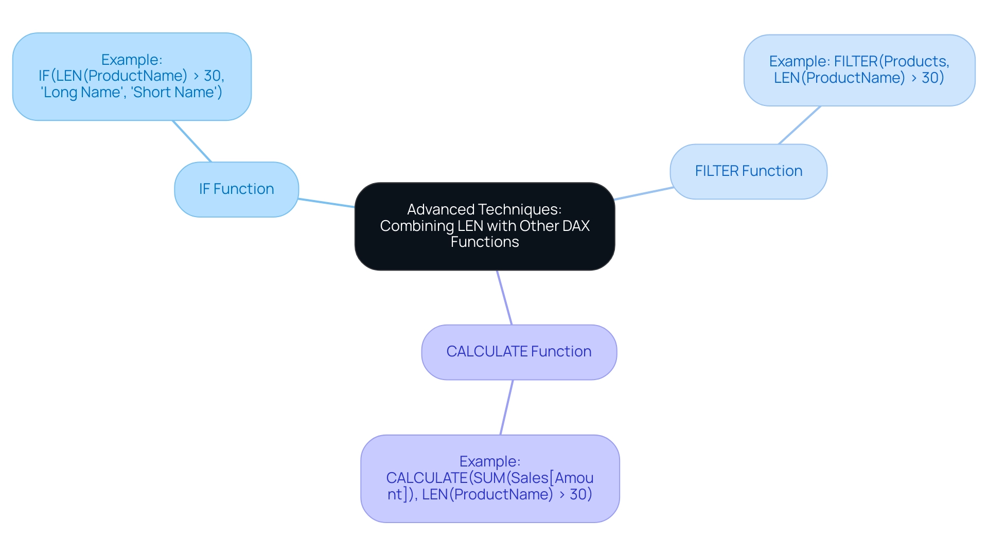
Key Takeaways and Next Steps in Mastering DAX Functions
Mastering the len dax operation is crucial for effective analysis, as it offers insights into text length, facilitating numerous practical applications that enhance operational efficiency. To genuinely excel and tackle typical challenges such as time-consuming report creation and inconsistencies, consider the following key strategies:
- Practice Regularly: Consistent use of the len dax operation in different situations will enhance your comprehension and boost your confidence. For instance, using len dax to assess the length of product descriptions can aid in enhancing presentations, ultimately resulting in more actionable insights.
- Explore Additional DAX Capabilities: To improve your information manipulation skills, get acquainted with other crucial text operations, such as LEFT, RIGHT, and MID. These operations, combined with LEN, enable thorough analyses that contribute to improved decision-making and operational effectiveness.
- Join DAX Learning Communities: Engaging with online forums and participating in workshops creates opportunities to share insights and learn from the experiences of peers. Recent workshops have emphasized the significance of community support in mastering DAX techniques, which can ease the difficulties of interpretation and reporting. This community engagement also ties into the benefits of RPA solutions, like EMMA RPA and Power Automate, which streamline processes and enhance data handling.
- Utilize Expert Advice: Learning through practice is vital; experts emphasize that hands-on experience is the best way to navigate the complexities of DAX. Applying your knowledge in real-world scenarios, such as calculating ‘Percent of Total’ using the expression:
Percent of Total = DIVIDE([Total Sales], [Total Sales All Countries])
can significantly enhance your analytical capabilities and provide clarity in report generation. - Review Case Studies: Consider case studies that demonstrate the application of the len dax operation along with other DAX capabilities. For example, utilizing AutoSum to create a measure for average return quantities illustrates how DAX simplifies standard aggregation processes, showcasing its value in operational contexts. Additionally, the Related Table Count feature, which uses COUNTROWS with RELATEDTABLE, can provide valuable insights into related sets, enhancing your overall strategy.
By integrating these strategies into your learning journey, you will not only master the len dax function but also significantly enhance your proficiency in DAX. This empowerment will enable you to conduct insightful data analysis, driving operational efficiency and unlocking the full potential of Business Intelligence in your organization. Remember, failing to extract meaningful insights can leave your business at a competitive disadvantage, making the effective use of DAX and RPA tools essential for growth and innovation.
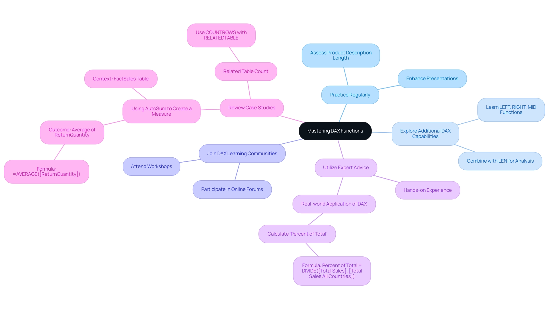
Conclusion
Mastering the LEN function in DAX is essential for organizations seeking to enhance data quality and operational efficiency. By effectively measuring text length, businesses can tackle challenges related to data inconsistencies and improve the integrity of their datasets. The practical applications of LEN, such as:
- Data validation
- Conditional formatting
- Filtering
empower teams to streamline workflows and focus on strategic decision-making. Moreover, integrating LEN with other DAX functions and Robotic Process Automation (RPA) not only automates repetitive tasks but also enriches data analysis capabilities.
Adopting best practices, such as being aware of data types and optimizing performance, further enhances the effectiveness of the LEN function. This approach not only mitigates common pitfalls but also ensures that reports are generated efficiently and accurately. By embracing these strategies and engaging with learning communities, professionals can deepen their DAX expertise and unlock advanced analytical techniques.
Ultimately, leveraging the LEN function is a gateway to fostering a culture of data-driven success. Organizations that prioritize mastering DAX functions will position themselves to navigate the complexities of data management effectively, driving informed decision-making and operational excellence. The journey towards data mastery is ongoing, and the insights gained through these practices will serve as a catalyst for growth and innovation in any business landscape.
