Overview:
The article provides a comprehensive guide on various methods for exporting data from Power BI, including exporting to Excel, using Power BI Service, and leveraging advanced tools like DAX Studio and the Power BI API. It emphasizes the importance of best practices such as data privacy, access permissions, and automation to enhance the efficiency and security of the data export process, thereby enabling organizations to effectively utilize their insights.
Introduction
In the dynamic world of data analytics, the ability to export information efficiently from Power BI is crucial for organizations seeking to harness their data’s full potential. With a variety of methods available—from simple exports to advanced automated solutions—users can tailor their approach to meet specific needs and enhance their operational efficiency.
This article delves into essential techniques for exporting data, explores advanced tools that streamline the process, and provides best practices to ensure security and compliance. By adopting these strategies, organizations can overcome common challenges and transform their data into actionable insights that drive informed decision-making.
Essential Methods for Exporting Data from Power BI
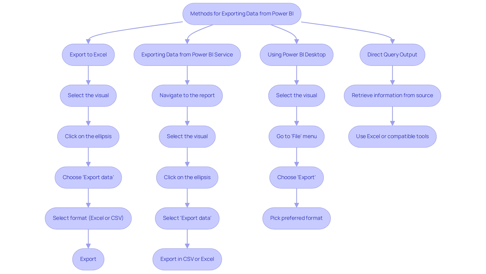
Transferring information from the BI tool can be effortlessly accomplished through various efficient techniques, each addressing different user requirements. Here are the most prevalent techniques:
- Export to Excel: This straightforward method allows for quick information retrieval.
To export data: - Open your Power BI report and select the visual you wish to export.
- Click on the ellipsis (three dots) located in the upper right corner of the visual.
- Choose ‘Export data’ from the drop down menu.
-
Select your desired format (Excel or CSV) and click ‘Export’.
-
Exporting Data from Power BI Service: For users leveraging Power BI Service:
- Navigate to the report and select the visual you want to export.
- Click on the ellipsis and select ‘Export data’.
-
You can then export the data in either CSV or Excel format, facilitating versatile data usage.
-
Using Power BI Desktop: In Power BI Desktop, exporting data is just as simple:
- Select the visual, then go to the ‘File’ menu.
-
Choose ‘Export’ and pick your preferred format for the export.
-
Direct Query Output: When functioning in Direct Query mode, individuals can retrieve information directly from the underlying source. This can be accomplished by retrieving the information through Excel or other compatible tools, offering flexibility in management.
These methods serve as a strong foundation for individuals aiming to understand how to export data from Power BI efficiently, enabling them to share insights and analyze information effectively. However, many users encounter challenges such as time-consuming report creation and inconsistencies, which can hinder their ability to leverage insights effectively. Incorporating Robotic Process Automation (RPA) can greatly improve these processes, decreasing the time spent on manual report creation and ensuring consistency.
RPA can automate repetitive tasks related to information transfer, allowing teams to concentrate on obtaining actionable insights instead of getting bogged down in the mechanics of report generation. Notably, many individuals are seeking automated solutions on how to export data from Power BI’s Usage Metrics Dataset, which is essential for ensuring compliance and security across national and regional clouds. As one individual pointed out, ‘Microsoft told me that it is not possible.’
Reports in the PBI admin portal are in read-only mode, highlighting the challenges faced by users. Furthermore, BI operates in distinct national/regional clouds, ensuring compliance with local regulations while providing usage metrics, which illustrates the importance of these exporting methods in maintaining security and privacy standards.
Leveraging Advanced Tools for Data Export in Power BI
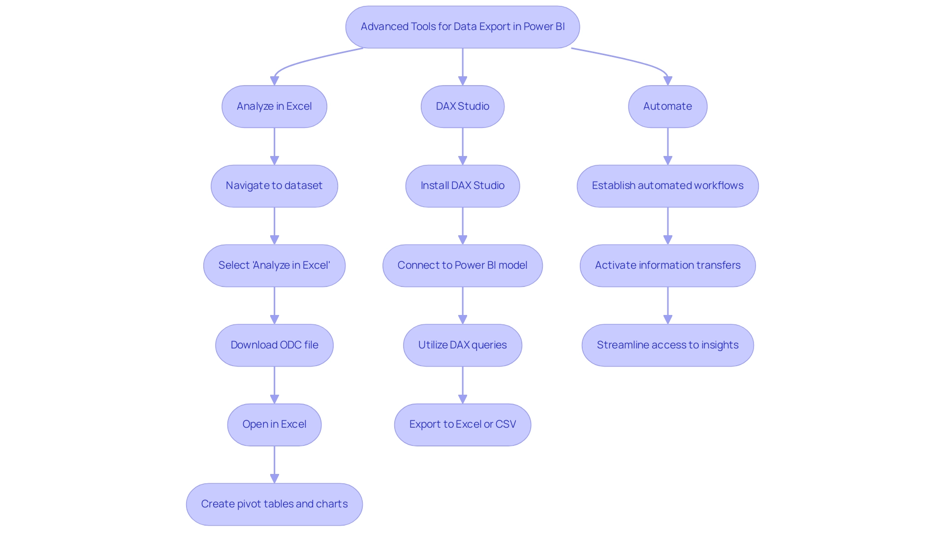
To elevate your data export capabilities in Power BI, consider implementing the following advanced tools:
- Analyze in Excel: This powerful feature facilitates a direct connection between your BI datasets and Excel, allowing for sophisticated analysis and reporting.
- To leverage this feature:
- In the Power BI Service, navigate to the dataset you wish to analyze.
- Click on ‘More options’ (represented by three dots) and select ‘Analyze in Excel’.
- Download the ODC file and open it in Excel. You can now create pivot tables and charts using your BI information, enhancing your analytical capabilities.
-
Recent advancements in this feature have improved logging, addressing past concerns about documentation alignment. As noted by a regular visitor, SormaBigH, “If you can confirm that now the activity usage of the ‘Analyze in Excel’ is really logged, I will request for sure. Thanks!”
-
DAX Studio: For users skilled in DAX (Data Analysis Expressions), DAX Studio is an invaluable tool for querying and exporting information.
- To utilize DAX Studio:
- Install the application and connect it to your Power BI model.
- Utilize DAX queries to extract targeted information sets, which can be exported to Excel or CSV formats, enabling greater flexibility in your reporting processes.
-
The adoption rates of DAX Studio among BI users continue to rise, reflecting its effectiveness and user-friendly interface.
-
Automate (previously Microsoft Flow): Streamline your information transfer process with Automate. This tool enables you to establish automated workflows that activate information transfers under specific conditions or schedules, ensuring timely access to current details.
- For instance, establish a flow that regularly exports BI data to SharePoint or OneDrive, streamlining access for teams to the latest insights. By leveraging Automate’s AI-powered automation and accessible automation features, you not only enhance workflow efficiency but also mitigate risk through professional execution that guarantees ROI. This empowers your organization to focus on strategic, value-adding tasks rather than manual processes.
- To discover how automation can transform your workflow, consider booking a free consultation with our experts. We will guide you through the process of automating workflows, calculating ROI, and ensuring successful implementation.
By incorporating these advanced tools into your workflow, you can significantly improve how to export data from Power BI, which will lead to deeper insights and more effective reporting within your organization. It’s important to note that while utilizing usage metrics reports, pinned tiles cannot be added to an app, which is a limitation to consider as you develop your strategies. Additionally, the case study titled ‘Limitations of Usage Metrics’ highlights that usage metrics do not track dashboards and reports embedded via certain credential flows or those published to the web, affecting the completeness of insights.
Exporting Data via Power BI API
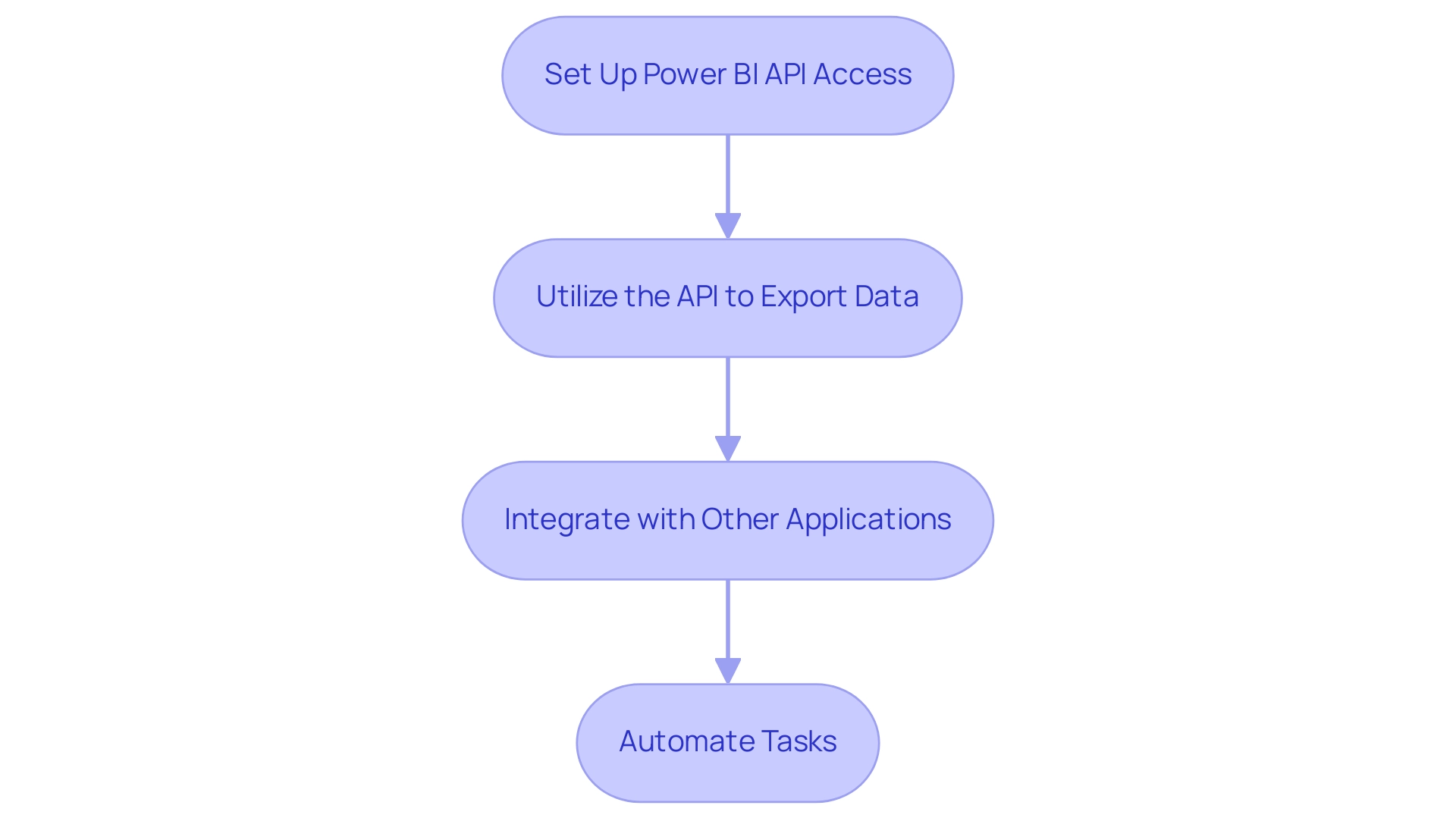
For individuals with programming skills, the BI REST API provides a strong solution for programmatically exporting information, which is essential for understanding how to export data from Power BI, thereby improving your organization’s capacity to utilize insights driven by information effectively. Notably, when a copy of the usage report is made, BI creates an editable report saved in the current workspace, showcasing its capabilities. Follow these essential steps to begin your journey towards improved operational efficiency:
- Set Up Power BI API Access:
- Begin by registering your application within the Azure portal to acquire crucial credentials, including Client ID and Client Secret.
-
Ensure that your application has the necessary permissions to access the desired Power BI datasets, positioning your team to overcome challenges like data inconsistencies.
-
Utilize the API to Export Data:
- Access the
Get Datasetsendpoint to identify and retrieve the dataset ID that you wish to export. - Use the
Export to Fileendpoint to initiate the export process, allowing you to specify the desired format (such as CSV or Excel) along with additional parameters. This streamlines the traditionally time-consuming report creation process. -
Keep track of your export request’s progress by utilizing the
Get Export Statusendpoint, providing real-time updates on the status of your export operations and ensuring compliance with local regulations. -
Integrate with Other Applications:
- Upon successful data export, seamlessly integrate the exported data into other applications or workflows, significantly enhancing your reporting and data analysis capabilities. This integration is vital for fostering growth and innovation in your organization.
Additionally, consider automating repetitive tasks within your information workflows using RPA solutions like EMMA RPA and Automate. These tools can help streamline processes further, improving operational efficiency. By utilizing the BI API alongside RPA technologies, advanced users can learn how to export data from Power BI, automate export procedures, and seamlessly integrate BI information into their existing systems.
As highlighted at the Microsoft Analytics Community Conference, global leaders are stepping up to share their knowledge on mastering the latest in Microsoft Fabric, Copilot, and Purview, emphasizing the importance of staying informed in this evolving landscape. Furthermore, while the API offers access to usage information for the past 30 days, organizations can ensure adherence to local regulations and privacy standards, as demonstrated by case studies concentrating on usage metrics in national and regional clouds.
Best Practices for Data Exporting in Power BI
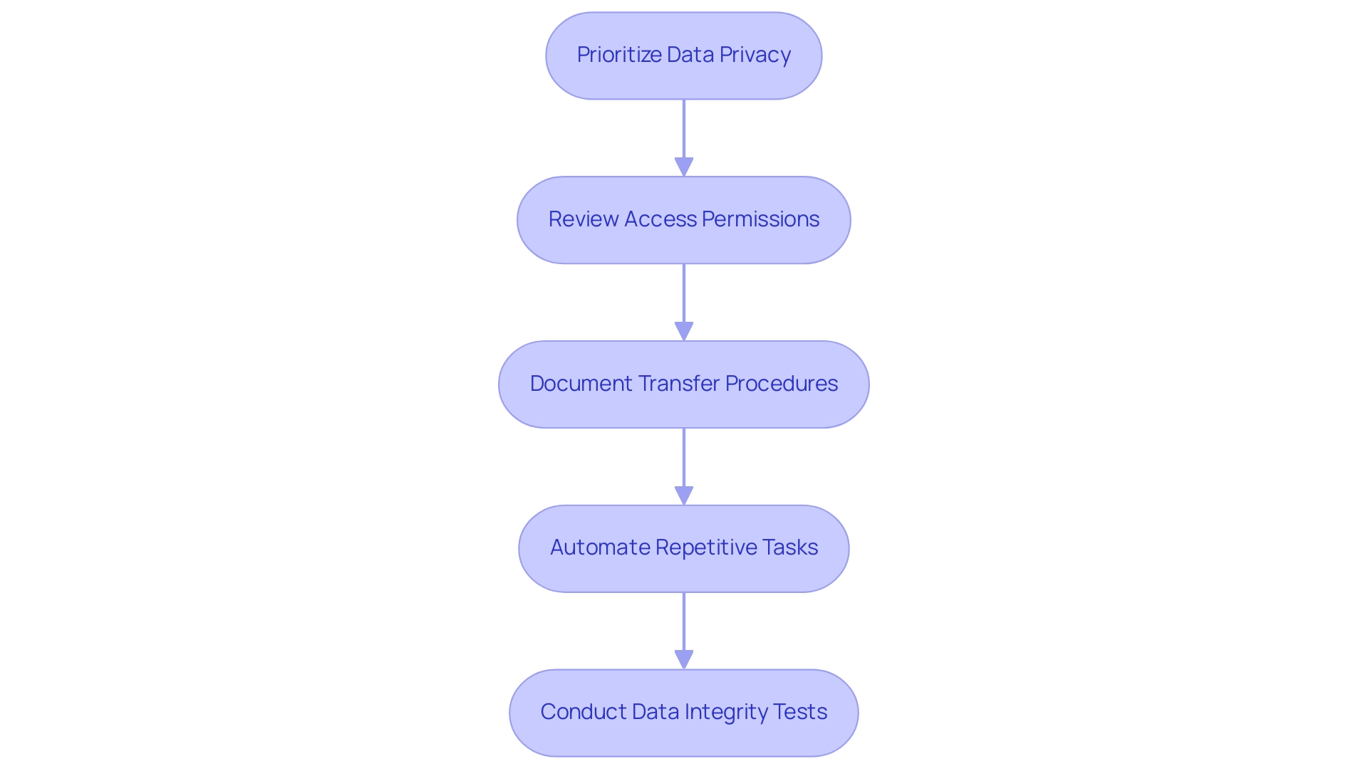
To guarantee effective and secure data exporting from Power BI, it is crucial to adopt the following best practices:
-
Prioritize Data Privacy: Safeguarding sensitive information is paramount. Utilize masking or obfuscation methods when transferring personal or confidential information to reduce risks linked to breaches, particularly considering recent talks regarding privacy in Power BI transfers.
-
Regularly Review Access Permissions: Restrict transfer capabilities to approved individuals only. Conduct periodic assessments of user permissions to maintain information security, ensuring that only individuals who need access to sensitive information can transfer it.
-
Thoroughly Document Transfer Procedures: Maintain comprehensive records of your information transfer methodologies and the specific datasets transferred. This documentation is invaluable for audits and compliance checks. By evaluating the source of statistical information, as highlighted in the case study titled “Evaluating Statistical Information,” you can assess the reliability of your exported data by asking critical questions about the data’s author, currency, and cross-checking capabilities.
-
Automate Repetitive Tasks: Utilize automation tools like Automate to streamline export tasks. This not only minimizes the potential for human error but also significantly enhances operational efficiency, allowing your team to focus on more strategic initiatives. Incorporating insights from our 3-Day Power BI Sprint can help you create a fully functional, professionally designed report that serves as a template, ensuring a polished look. The sprint includes steps such as preparation, report design, and implementation of best practices for management, all of which support efficient exporting processes.
-
Conduct Data Integrity Tests Post-Export: After completing an export, verify the integrity of the information. Ensure that it is complete and accurate, as missing parts of dates can lead Excel to guess and produce erroneous entries, creating confusion later on. It is essential to handle date information with caution; consider splitting dates into their component values for easier handling and to avoid Excel’s incorrect assumptions. Always evaluate the information against predefined criteria to confirm it meets your operational requirements.
By following these best practices, organizations can significantly improve their information management strategies, particularly in understanding how to export data from Power BI efficiently and securely. Leveraging solutions such as Robotic Process Automation (RPA) can further streamline processes, reinforcing trust in your data handling practices while enabling informed decision-making that drives growth and innovation. The 3-Day Power BI Sprint not only provides the framework for creating polished reports but also integrates RPA tools to automate these workflows, enhancing overall productivity.
Conclusion
Efficient data export from Power BI is essential for organizations aiming to maximize their data-driven insights. By employing various methods such as:
- Exporting to Excel
- Utilizing Power BI Service
- Leveraging advanced tools like Analyze in Excel and DAX Studio
users can tailor their approach to meet specific needs. The integration of Robotic Process Automation (RPA) can further enhance these processes, reducing manual effort and ensuring data consistency.
Moreover, the Power BI REST API offers a sophisticated means for programmatic data exports, enabling organizations to automate workflows and integrate data seamlessly into existing systems. This capability not only streamlines reporting processes but also supports compliance with local regulations and privacy standards.
Implementing best practices, such as:
- Prioritizing data privacy
- Regularly reviewing access permissions
- Automating repetitive tasks
is crucial for ensuring secure and efficient data exporting. By adhering to these strategies, organizations can overcome common challenges, enhance their operational efficiency, and transform their data into actionable insights that drive informed decision-making.
In conclusion, mastering the art of data export in Power BI is a powerful step towards operational excellence. By leveraging the right tools and practices, organizations can unlock the full potential of their data, fostering a culture of informed decision-making that propels growth and innovation. Now is the time to embrace these strategies and elevate data management practices for a more efficient and effective future.
Overview:
The article provides a comprehensive step-by-step guide on how to remove duplicates in Power BI, emphasizing the significance of maintaining data integrity for accurate analysis and decision-making. It outlines practical methods like using DAX and Power Query, along with best practices and troubleshooting tips, to ensure effective data cleaning and enhance operational efficiency.
Introduction
In the realm of data analysis, the integrity of information is paramount, and duplicates can pose significant challenges. Within Power BI, repeated entries not only skew analysis but also mislead decision-makers, potentially resulting in inflated metrics and misguided strategies. As organizations strive for accuracy and efficiency, understanding the implications of duplicate data becomes crucial.
This article delves into the importance of identifying and removing duplicates, offering practical methods and best practices to enhance data quality. From leveraging Power Query and DAX to implementing automated solutions like Robotic Process Automation, readers will discover actionable strategies that empower teams to maintain clean datasets and drive informed decision-making.
Embracing these insights can transform data management processes, ensuring that businesses are equipped to harness the full potential of their analytics.
Understanding Duplicates in Power BI: Importance and Implications
In Power BI, understanding how to remove duplicate in power bi is essential, as repeated entries signify occurrences within your dataset, which can significantly distort analysis and lead to misleading insights. The necessity of understanding how to remove duplicate in power bi cannot be overstated; they distort key performance indicators and misrepresent critical trends. For example, think of a situation where customer transaction information is affected by repeated entries.
Such redundancy can result in inflated sales figures, ultimately distorting the financial outlook of the business. Notably, the training dataset in this context has over 78% redundancy, with 1,074,992 records over-represented in a total of 4,898,431 records. As emphasized by Aditya Sasmal, a Microsoft-certified Business Analyst, ‘Duplicate information consists of repeated details within a dataset, often resulting from entry errors, multiple sources integration, or inadequate management.’
Consequently, prioritizing information integrity by understanding how to remove duplicate in power bi is crucial for precise reporting and informed decision-making. This becomes even more crucial in light of recent discussions on the importance of establishing a knowledge management process to ensure consistency when teams work with the same dataset. By promoting an atmosphere of openness concerning information gathering and challenges, teams can reduce the risks linked to redundancies and maintain the integrity of their analyses.
Furthermore, the challenge of time-consuming report creation often diverts attention from leveraging insights effectively. As illustrated in the case study titled ‘Critical Thinking in Data Analysis,’ while software can identify repeated data, the role of analysts in applying critical thinking to understand how to remove duplicate in power bi is vital for deciding the best approach to handle repetitions. By integrating robust Business Intelligence practices and RPA solutions such as EMMA RPA, which streamlines repetitive tasks, and Automate, which enhances operational workflows, organizations can transform their analytical processes.
This guarantees not only the elimination of repeated items but also teaches how to remove duplicate in power bi, leading to actionable insights that drive business growth and operational efficiency. To explore how these solutions can benefit your organization, book a free consultation today.
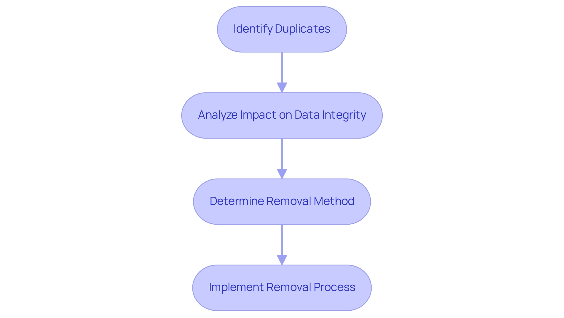
Step-by-Step Guide to Removing Duplicates in Power BI
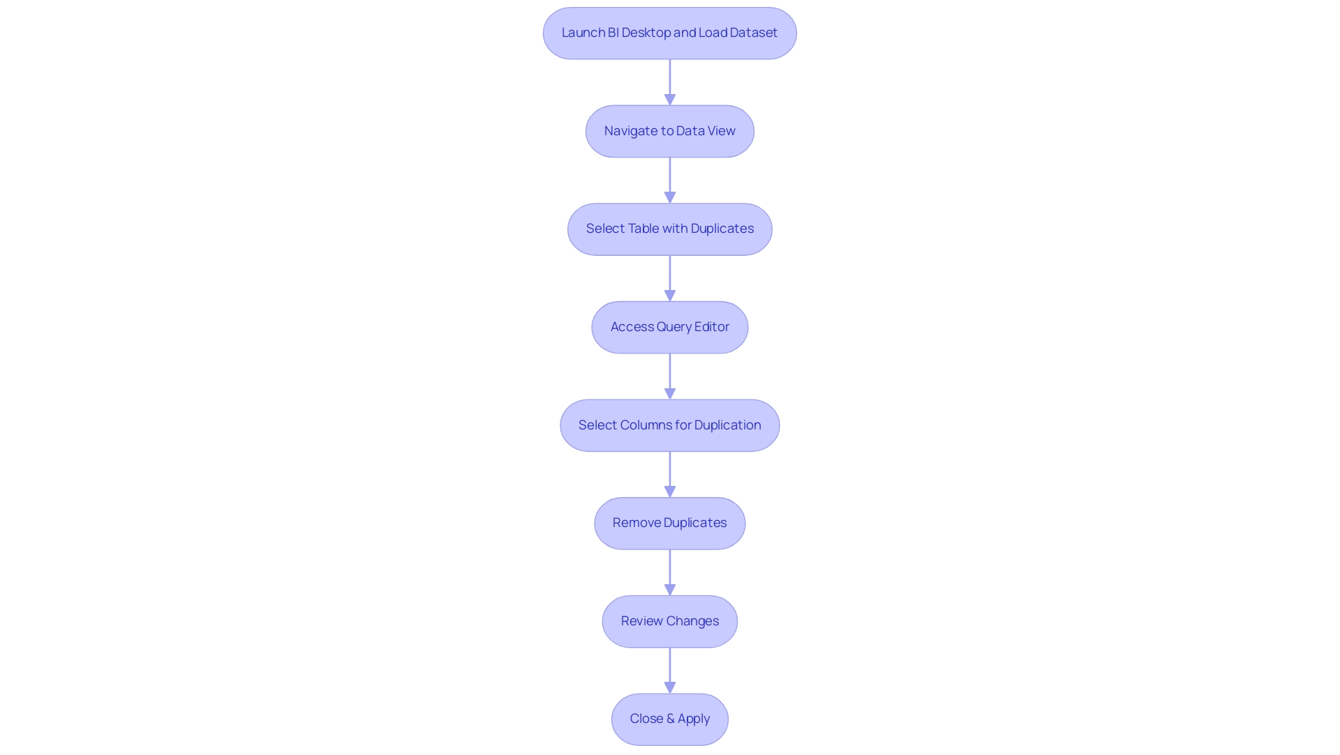
- Start by launching BI Desktop and loading the dataset you wish to clean.
- Navigate to the ‘Data’ view by clicking on the table icon located on the left sidebar.
- Identify and select the table that contains the repeated entries.
- Click on the ‘Transform Data’ button to access the Query Editor.
- Within the query tool, select the specific columns where repetitions may occur.
- In the ‘Home’ tab, find the ‘Remove Rows’ option and select ‘Remove Duplicates’.
- Carefully review the changes displayed in the preview pane to confirm that all duplicates have been effectively removed.
- Finally, click ‘Close & Apply’ to save your changes and return to the main Power BI interface.
Consistently engaging in information cleaning practices is essential for maintaining accuracy and integrity. These practices not only assist in how to remove duplicates in Power BI but also help tackle inconsistencies and reduce the time-consuming nature of report creation that can obstruct effective decision-making. As Neeraj Sharma aptly puts it,
Remember, clean information is the foundation of accurate and reliable insights.
By utilizing Business Intelligence tools like BI alongside RPA solutions such as EMMA RPA and Automate, you can automate these data cleaning tasks, significantly enhancing efficiency and ensuring actionable insights for your business growth. For further insights, consider the case study titled “Best Practices for Data Cleaning in Business Intelligence,” which outlines effective techniques that can be adopted.
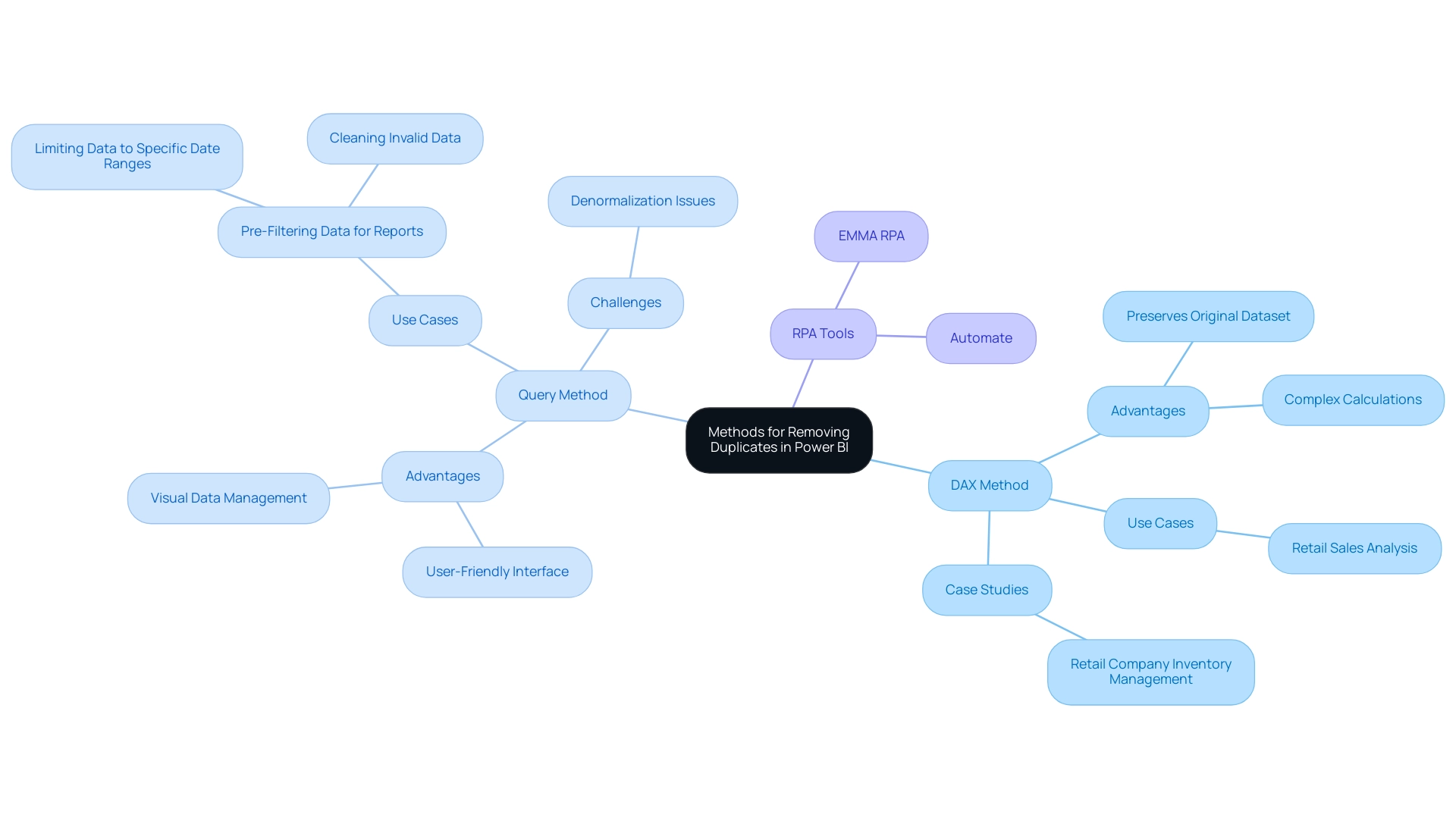
Methods for Removing Duplicates: DAX vs. Power Query
When tackling the challenge of how to remove duplicate in Power BI, two main methods stand out: DAX and Query, both crucial in leveraging Business Intelligence for operational efficiency and actionable insights.
-
DAX Method: Utilizing the DAX formula
DISTINCT, you can learn how to remove duplicate in Power BI by creating a new table that retains only unique values. This approach is particularly advantageous for those who wish to preserve their original dataset while gaining insights from unique entries. Analysts often favor this method for its flexibility and precision, allowing for complex calculations without altering the original structure. For instance, a case study may highlight how a retail company utilized DAX to analyze sales information, effectively identifying unique transactions for improved inventory management. -
Query Method: Query provides a user-friendly interface that simplifies how to remove duplicate in Power BI directly from the dataset. This method is ideal for those who prefer a visual approach to information management, showing users how to remove duplicate in Power BI and efficiently clean their sets before analysis. However, as Eason from Community Support notes, another case would be the denormalization of tables originating from various information sources, because this would not be optimized using the query folding technique in Query. This highlights the difficulties in preserving information integrity during the cleaning procedure, especially when addressing discrepancies among diverse information sources.
Alongside these techniques, incorporating RPA tools such as EMMA RPA and Automate can greatly improve operational efficiency. These tools can automate repetitive tasks involved in information cleaning, reducing the time spent on manual processes and minimizing errors. For instance, EMMA RPA can be employed to automate the extraction and transformation of information, ensuring that only pertinent and unique entries are processed in Business Intelligence.
Both approaches have unique benefits and are essential in fostering insights based on information for business expansion, particularly in understanding how to remove duplicate in Power BI. The decision between them ultimately depends on your operational needs and familiarity with BI functionalities. Recent conversations among analysts indicate a trend toward utilizing DAX for unique value analysis, while Query continues to be a preferred choice for pre-filtering and cleaning datasets, particularly in improving report quality.
Common tasks executed with Query, such as restricting information to specific date ranges or sanitizing invalid content, further demonstrate its practical applications. Consider your team’s preferences and the specific nature of your data when deciding which method to implement, and don’t overlook the potential benefits of incorporating RPA to streamline these processes.
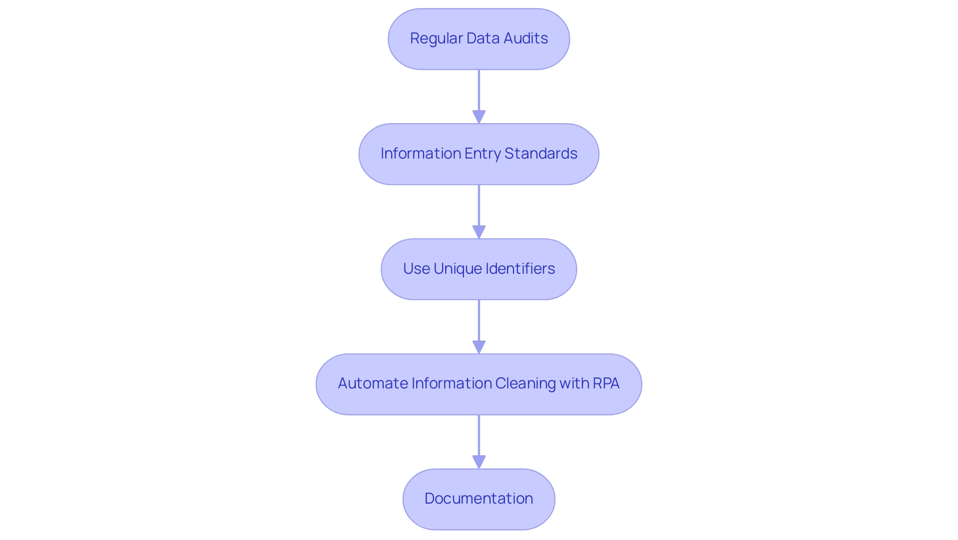
Best Practices for Managing Duplicates in Power BI
To effectively handle repetitions in Power BI and enhance operational efficiency, consider implementing the following best practices:
-
Regular Data Audits:
Conduct periodic reviews of your datasets to pinpoint and rectify duplicates. This proactive approach ensures information integrity and reliability, allowing for informed decision-making. As highlighted in the article ‘Good enough practices in scientific computing,’ effective information management can significantly reduce errors, with studies indicating that poor quality can cost organizations up to 25% of their revenue. -
Information Entry Standards:
Establish comprehensive guidelines for information entry. By standardizing formats for names, addresses, and other critical fields, organizations can significantly reduce the likelihood of duplicates arising. Cindy Turner, SAS Insights Editor, emphasizes that,Most of them spend 50 to 80 percent of their model development time on information preparation alone
— underscoring the importance of these standards. -
Use Unique Identifiers:
Implement unique identifiers, such as customer IDs or transaction numbers, to distinctly differentiate records. This practice not only aids in information accuracy but also simplifies tracking and retrieval processes. The case analysis on information modeling demonstrates how comprehending the relationships and flow of knowledge can improve the management of redundancies, resulting in enhanced operational efficiency. -
Automate Information Cleaning with RPA:
Utilize tools such as Query to automate the process of how to remove duplicates in Power BI during your information preparation phase. Incorporating Robotic Process Automation (RPA) not only streamlines operations but also minimizes manual errors, enhancing overall efficiency. By automating these manual workflows, your team can focus on more strategic, value-adding tasks. Our 3-Day BI Sprint can assist you in establishing these methods, guaranteeing a fully operational, professionally crafted report on a subject of your choice within just three days, which can act as a template for upcoming projects. -
Documentation:
Keep comprehensive records of your information sources and the cleaning methods utilized. This ensures transparency and reproducibility, which are essential for compliance and effective auditing. Moreover, following the ‘Ethical Guidelines for Statistical Practice’ emphasizes the significance of ethical considerations in information management, which is vital for preserving integrity.
By embracing these optimal practices, including utilizing our 3-Day BI Sprint for generating professional reports, organizations can significantly enhance their information management procedures in BI, thereby promoting improved decision-making and operational efficiency.
Troubleshooting Common Issues When Removing Duplicates
When addressing the challenge of eliminating repetitions in Power BI, users frequently encounter several typical problems that can obstruct their efforts:
-
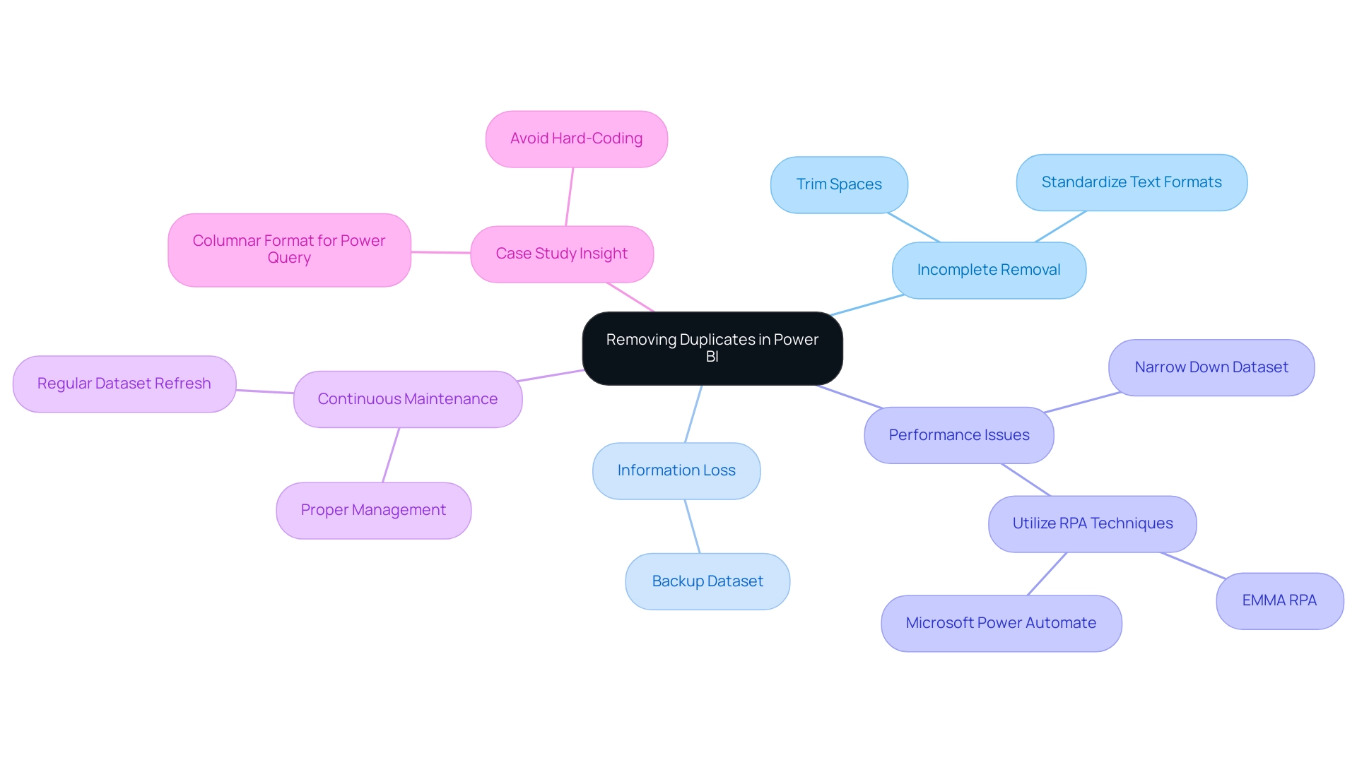
Incomplete Removal: Variations in information entry, such as extra spaces or inconsistent casing, can result in repetitions remaining in the dataset. To effectively resolve this, it’s crucial to clean your information beforehand by trimming spaces and standardizing text formats. This step greatly improves the precision of the replication removal method and relates to how to remove duplicate in Power BI, ensuring that your information is trustworthy and actionable.
-
Information Loss: A common mistake is the unintentional removal of essential information while trying to eliminate replicas. To safeguard against this, always back up your dataset prior to making any modifications. This precaution guarantees that you can retrieve your initial information if necessary, preserving information integrity critical for informed decision-making.
-
Performance Issues: Handling large datasets can create performance challenges during the duplicate elimination procedure, potentially hindering operations. To alleviate this, think about narrowing your information to a more manageable size before you learn how to remove duplicate in Power BI. This approach not only accelerates performance but also improves overall efficiency, directly benefiting from Robotic Process Automation (RPA) techniques such as EMMA RPA or Microsoft’s Power Automate that automate and expedite information handling tasks.
-
Continuous Maintenance: Regular upkeep of the Power BI environment is essential for optimal performance and reliability. By making certain that your datasets are regularly refreshed and properly managed, you can lower the chances of facing problems when figuring out how to remove duplicate in Power BI. Highlighting the importance of RPA in automating these maintenance tasks can greatly enhance operational efficiency.
-
Case Study Insight: As noted in the case study concerning Excel’s matrix information models, improper formatting can complicate the removal of repetitions. Feeding data into Power Query in a columnar format minimizes transformation needs and reduces the risk of errors, thereby facilitating a smoother process on how to remove duplicate in Power BI. Additionally, as Les Isaac advises, content creators should avoid any kind of hard-coding in Power Query, which can lead to complications in data management and increase the risk of errors during cleaning processes. By being aware of these challenges and implementing these strategies, including the use of tailored AI solutions for enhanced data cleaning, users can confidently learn how to remove duplicate in Power BI, ultimately preserving data integrity while leveraging Business Intelligence and RPA to enhance their analysis capabilities.
Conclusion
The significance of addressing duplicate data in Power BI cannot be overstated. As outlined in this article, duplicates distort analysis and mislead decision-makers, leading to inflated metrics and misguided strategies. By employing methods such as Power Query and DAX, organizations can effectively identify and remove duplicates, ensuring that their datasets reflect true insights. Regular audits, standardized data entry practices, and the use of unique identifiers are essential best practices that further enhance data integrity and operational efficiency.
Moreover, the integration of Robotic Process Automation (RPA) tools like EMMA RPA and Power Automate streamlines the data cleaning process, allowing teams to focus on strategic analysis rather than tedious data management tasks. By automating repetitive processes, organizations not only improve efficiency but also maintain high-quality data that drives informed decision-making.
In conclusion, embracing the strategies discussed in this article empowers organizations to transform their data management practices. By prioritizing the removal of duplicates and leveraging advanced tools and methodologies, businesses can unlock the full potential of their analytics, fostering a culture of accuracy that leads to better outcomes and sustainable growth. Now is the time to take decisive action to enhance data quality and ensure that every analysis leads to actionable insights.
Overview:
The article focuses on how to effectively sort data by month in Power BI, emphasizing the importance of creating a calendar table and using a Month Number column to achieve chronological order in visualizations. It supports this by outlining step-by-step techniques for setting up the calendar and sorting methods, while also addressing common challenges and best practices that enhance data analysis and reporting efficiency.
Introduction
In the realm of data analysis, the ability to sort information by month is not just a technical necessity but a strategic advantage that can transform insights into action. As organizations strive to harness the full potential of Power BI, understanding the nuances of month sorting becomes crucial for effective reporting and decision-making.
With the incorporation of Robotic Process Automation (RPA), businesses can streamline their workflows, eliminate manual errors, and ensure their data remains organized and chronologically accurate.
This article delves into practical techniques and best practices for mastering month sorting in Power BI, addressing common challenges while empowering teams to elevate their analytical capabilities and drive impactful business growth.
By adopting these methods, organizations can unlock deeper insights, enhance operational efficiency, and foster a culture of data-driven decision-making that is essential in today’s fast-paced environment.
Understanding Month Sorting in Power BI
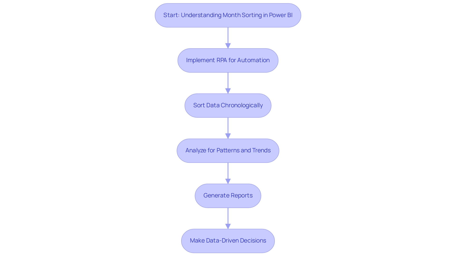
Understanding how to sort by month in Power BI is essential for crafting visualizations that provide meaningful insights into trends over time. By automating manual workflows through Robotic Process Automation (RPA), organizations can streamline the process of sorting information and enhance operational efficiency. RPA reduces errors by removing the need for manual information entry and repetitive tasks, allowing teams to concentrate on more strategic initiatives.
When information is organized chronologically, it empowers decision-makers to uncover patterns, seasonal variations, and operational efficiencies crucial for driving business growth. Understanding how to sort by month in Power BI is vital for generating reports that monitor performance metrics, sales figures, or any time-sensitive information. For example, a case study on sorting date values stored as text highlights how improper storage can lead to incorrect sorting outcomes, emphasizing the necessity of careful practices and the role of RPA in ensuring accurate analysis.
Furthermore, in an evolving AI landscape, leveraging RPA not only improves accuracy but also aligns with contemporary technological advancements. By skillfully organizing months and learning how to sort by month in Power BI, users can significantly enhance their analytical prowess and overcome challenges such as time-consuming report creation and inconsistencies, leading to improved business outcomes. As Gregor Aisch observes, neglected insights frequently emerge from poor information arrangement, which highlights the importance of careful categorization techniques in information examination.
This method not only aligns with current trends in information visualization but also enhances the relevance and impact of your insights, ultimately informing better decision-making.
Creating a Calendar Table for Month Sorting
Establishing a calendar table in BI is crucial for efficient data evaluation and month categorization, particularly when it comes to understanding how to sort by month in Power BI, which helps address typical obstacles like labor-intensive report generation and data discrepancies. Furthermore, incorporating Robotic Process Automation (RPA) can streamline the report creation process, allowing your team to focus more on analysis rather than manual tasks. Here are the steps to establish one:
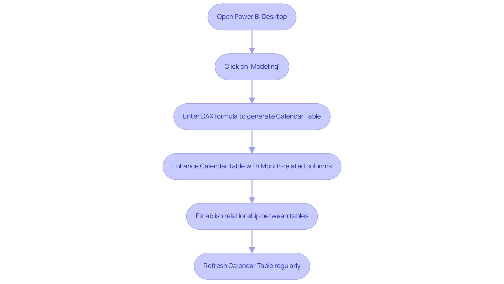
- Open Power BI Desktop and navigate to the ‘Data’ view.
- Click on ‘Modeling’ in the ribbon, then select ‘New Table’.
- Enter the following DAX formula to generate a calendar table:
DAX

   Calendar = CALENDAR(MIN(YourData[Date]), MAX(YourData[Date]))
Replace YourData[Date] with the date column from your dataset.
- Enhance your calendar table by adding month-related columns using DAX, such as Month Name and Month Number:
DAX

   Month Name = FORMAT(Calendar[Date], "MMMM")

   Month Number = MONTH(Calendar[Date])
- Establish the relationship between your calendar table and your primary information table based on the date fields. This step is crucial for enabling effective filtering and sorting, ensuring your reports are trustworthy and actionable.
Additionally, customized AI solutions can assist in identifying the appropriate technologies for improving analysis and reporting efficiency. Consistently refreshing the Calendar Table is essential to incorporate new date ranges, holidays, or fiscal changes, ensuring your model remains relevant. In fact, information refresh can be set as frequently as every 15 minutes, highlighting the need for timely updates.
As Shubhnoor Gill emphasizes, > You can create a date table in your model by leveraging the CALENDAR and CALENDARAUTO DAX functions. < By employing these techniques, you establish a strong basis for understanding how to sort by month in Power BI and improve your information assessment abilities. Date-based filtering facilitates focused examination, allowing users to narrow down information by specific date ranges, which is vital for effective insights and informed decision-making, addressing the need for clear, actionable guidance in your reporting.
Techniques for Chronological Month Name Sorting
To achieve chronological arrangement of month names in Power BI effectively and enhance your operational efficiency, consider the following techniques:
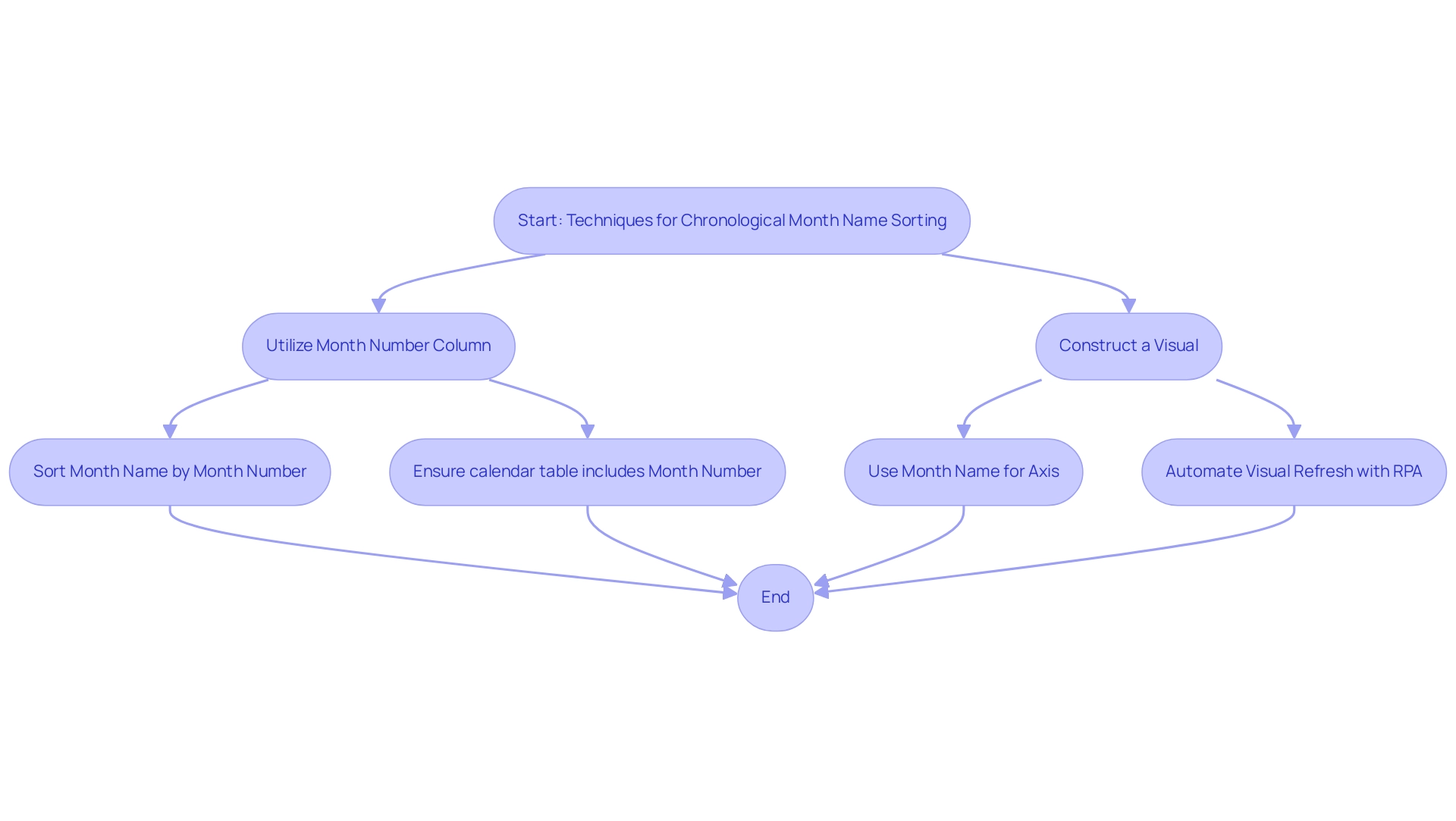
- Utilize the Month Number Column: Ensure your calendar table includes a Month Number column, which should contain integers ranging from 1 (January) to 12 (December). This essential step is vital for precise organization and can greatly enhance your analysis process. RPA can automate the creation and updating of this calendar table, ensuring it remains accurate as new information is added.
-
Sort by Column: Within your calendar table, select the ‘Month Name’ column. Navigate to the ‘Column tools’ section in the ribbon and click on ‘Sort by Column’. Select the ‘Month Number’ column to implement an arrangement that aligns with the calendar sequence. This method is essential for knowing how to sort by month in Power BI, ensuring that your visualizations are both intuitive and logically ordered, which contributes to more effective business intelligence. RPA can help by automating this categorization process, enabling real-time updates as information changes.
-
Construct a Visual: When creating visuals, such as bar charts, utilize the ‘Month Name’ field for your axis. This setup enables Power BI to illustrate how to sort by month in Power BI in chronological order according to the arrangement applied. RPA can improve this by automating the refresh of visuals whenever new information is imported, ensuring that your reports are always current.
By implementing these techniques, you will enhance the clarity and effectiveness of your visualizations, ensuring they accurately reflect the chronological flow of your information. As Himani Gulati aptly expresses,
Hope this article helps!!
This sentiment resonates with the importance of mastering these arrangement techniques to drive operational efficiency, particularly in analyzing data sets such as the ‘Median family income’ from the ACS dataset, where precise chronological representation can significantly impact decision-making.
Furthermore, incorporating Robotic Process Automation (RPA) into your workflow can further streamline these processes, allowing you to focus on deriving data-driven insights that foster business growth. Insights from case studies on visualizing numerical variables emphasize the necessity of effective visualization techniques, reinforcing the value of these categorization methods in a rapidly evolving AI landscape.
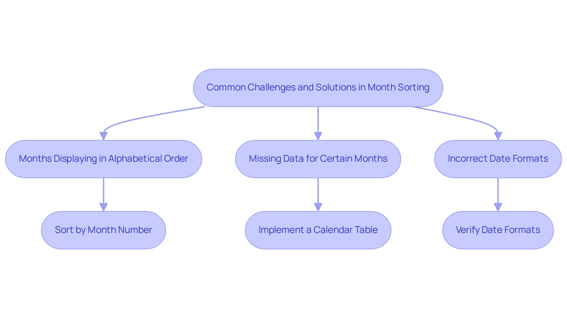
Common Challenges and Solutions in Month Sorting
Sorting months in Power BI can present several common challenges that, when addressed, can significantly enhance your data analysis capabilities:
- Months Displaying in Alphabetical Order: One of the most frequent issues arises when the Month Name column is sorted alphabetically rather than chronologically. To resolve this, ensure that you have established the correct sort order by learning how to sort by month in Power BI by linking the Month Name to the Month Number.
This alignment not only enhances visual representation but also supports data-driven decision-making. Efficient arrangement algorithms, such as counting sort or radix sort, have a computational complexity of O(m + n). Optimizing your sorting methods is essential for improving performance and ensuring that actionable insights can be derived quickly.
- Missing Data for Certain Months: Gaps in visualizations often occur when specific months lack corresponding entries in the dataset. To mitigate this, consider implementing a calendar table. This guarantees that all months are represented, even in the absence of entries, thereby creating a more complete and informative visualization.
Addressing such gaps is crucial for operational efficiency and is emphasized by the ongoing need for improved statistical methods in analyzing locational information. Additionally, integrating RPA solutions can streamline the process of information entry and management, further enhancing your operational efficiency.
- Incorrect Date Formats: Data integrity is crucial for precise month arrangement. Verify that all date fields are in a compatible format. Examine the type of your date columns and transform them to the suitable date format if necessary, ensuring uniformity and avoiding arrangement errors.
Acknowledging the significance of information integrity enables you to utilize insights efficiently and make educated choices.
By identifying these challenges and implementing the suggested solutions, you can effectively learn how to sort by month in Power BI to enhance your monthly organization in Business Intelligence. Such improvements not only enhance your data visualization but also empower your analytical capabilities, allowing for more strategic decision-making and fostering a culture of data-driven insights within your organization. Failing to utilize Business Intelligence effectively can leave your business at a competitive disadvantage, making it essential to adopt these practices for growth and innovation.
Best Practices for Sorting Months in Power BI
To achieve effective month organization in this tool, incorporating the following best practices is essential:
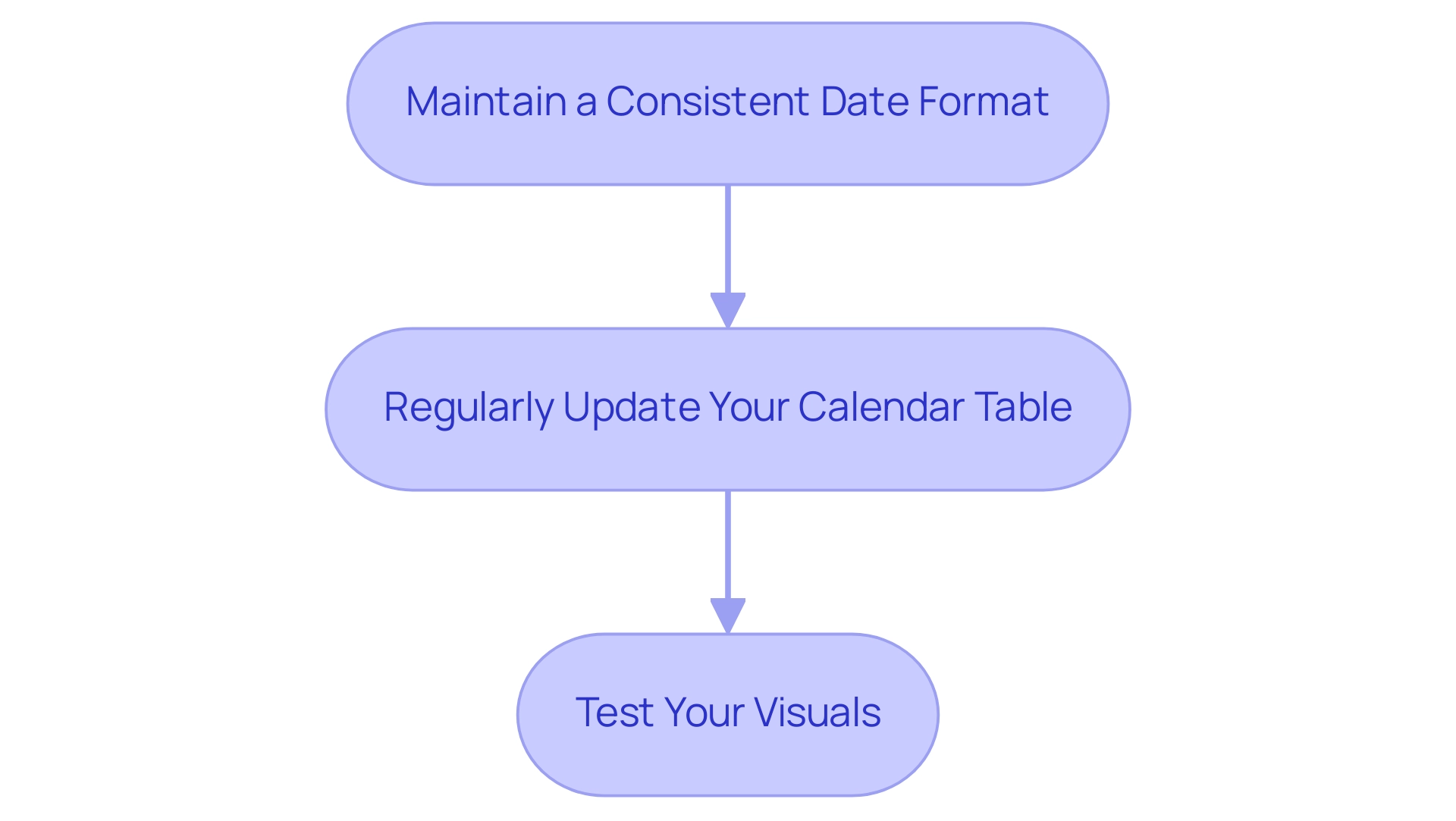
- Maintain a Consistent Date Format: Standardizing date formats across your dataset is crucial for preventing sorting discrepancies. A consistent format ensures that Power BI can accurately interpret and sort your information, which is crucial when learning how to sort by month in Power BI, paving the way for reliable analysis and enhancing overall insights driven by information.
- Regularly Update Your Calendar Table: As new information is introduced, it’s vital to keep your calendar table current. This practice not only reflects any changes in date ranges but also allows for seamless integration of the latest information into your reports, addressing common challenges like inconsistencies that can arise from outdated details. Creating measures that adapt based on user selections or filters is essential for understanding how to sort by month in Power BI, significantly enhancing the interactivity of your reports. This flexibility enables users to experience customized insights, maximizing the analytical potential of your information and driving operational efficiency. For instance, integrating RPA can automate the preparation process, reducing the time spent on report creation and allowing teams to focus on analysis rather than management.
- Test Your Visuals: After applying sorting methods, thorough testing of your visuals is essential to ensure they correctly depict the intended order and relationships. This step guarantees that your insights are both actionable and reliable, enabling informed decision-making throughout your organization.
Anjali Singh, a skilled data analyst, highlights the importance of building strong connections in Business Intelligence, stating,
Creating and managing relationships in Business Intelligence is essential for unlocking the full potential of your information.
This holistic approach to information management will foster collaboration and elevate your team’s analytical capabilities. In fact, the Microsoft Business Intelligence community, which boasts 8.6K followers, highlights the growing interest and relevance of effective information practices.
Additionally, case studies like ‘Collaborating with Colleagues’ showcase how encouraging comments, annotations, and dedicated collaboration workspaces can significantly enhance team projects in Power BI, ultimately leading to more insightful data analysis.
Conclusion
Mastering month sorting in Power BI is a transformative step for organizations aiming to enhance their data analysis capabilities. By implementing techniques such as:
- Creating a well-structured calendar table
- Utilizing a Month Number column
teams can ensure their data visualizations reflect chronological accuracy, leading to more meaningful insights. The integration of Robotic Process Automation (RPA) not only streamlines these processes but also minimizes manual errors, allowing teams to focus on strategic decision-making.
Addressing common challenges, such as:
- Incorrect sorting orders
- Missing data
is essential for maintaining data integrity and operational efficiency. By adopting best practices like:
- Regular updates to the calendar table
- Maintaining consistent date formats
organizations can foster a culture of accurate reporting and data-driven insights. These practices empower decision-makers to uncover valuable trends and patterns, driving impactful business growth.
In today’s fast-paced environment, the ability to sort information by month is not just a technical skill; it’s a strategic advantage that can set organizations apart. Embracing these methodologies will not only enhance analytical capabilities but also ensure that insights are timely, relevant, and actionable. By prioritizing effective month sorting in Power BI, organizations can unlock the full potential of their data, ultimately leading to more informed decisions and sustained success.
Introduction
In the fast-evolving landscape of digital analytics, the integration of Google Analytics with Power BI emerges as a game-changer for organizations striving to enhance their operational efficiency and data-driven decision-making.
As businesses increasingly rely on robust data insights to refine their marketing strategies and improve customer engagement, leveraging these connectors becomes essential.
This article delves into the intricacies of Google Analytics connectors for Power BI, exploring their benefits, challenges, and best practices.
By understanding how to effectively harness these tools, organizations can unlock a wealth of opportunities for growth and innovation, ensuring they remain competitive in a data-centric world.
Understanding Google Analytics Connectors for Power BI
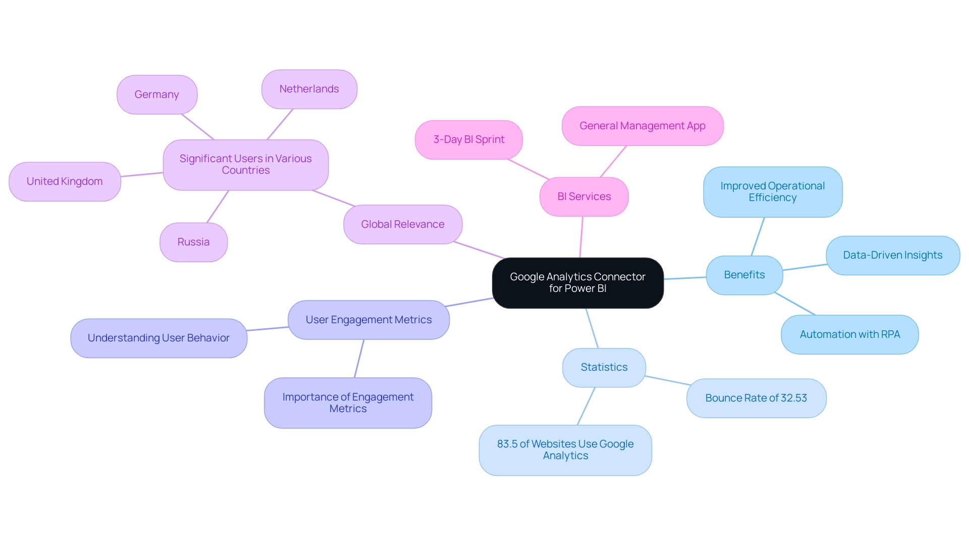
Google Analytics connector Power BI serves as a vital tool that facilitates the smooth integration of web analytics information into Microsoft Power BI, a prominent intelligence platform. By utilizing the google analytics connector power bi, organizations can visualize and analyze web traffic and user behavior data with greater interactivity and depth, thereby enhancing operational efficiency through informed decision-making. This integration with the google analytics connector power bi is particularly crucial for businesses aiming to refine their digital performance and marketing strategies based on data-driven insights.
In fact, approximately 83.5% of all websites leverage Google Analytics or similar tools, which highlights the importance of the google analytics connector power bi as a strategic advantage in today’s competitive landscape. Notably, Google Analytics 4 reports a bounce rate of 32.53%, highlighting the importance of understanding user engagement metrics. As Gaurav Jain aptly states, ‘Whether you’re a small enterprise or a multinational corporation, leveraging Google Analytics can empower you to make data-driven decisions and achieve your goals.’
This capability not only unlocks actionable insights into customer engagement but also complements the use of Robotic Process Automation (RPA), allowing organizations to automate manual workflows and focus on strategic initiatives. Furthermore, significant Google Analytics users span across countries such as the United Kingdom, Russia, Germany, and the Netherlands, underscoring its global relevance. Furthermore, the development of Google Analytics, as detailed in the case study ‘Google Analytics 4 Timeline & History,’ showcases its emphasis on privacy, cross-platform tracking, and improved AI-driven insights, which are essential for enterprises aiming to sustain a competitive advantage in information integration and operational effectiveness.
To further improve information reporting and insights, our BI services include:
– A 3-Day BI Sprint for swiftly generating professionally designed reports
– The General Management App for comprehensive oversight and intelligent reviews
In the context of a rapidly evolving AI landscape, these features enable businesses to utilize information effectively and drive operational efficiency.
Exploring Connection Methods: Native vs. Third-Party Connectors
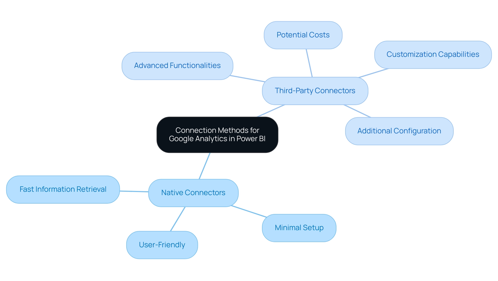
When integrating the google analytics connector power bi, users have two primary options: native connectors and third-party connectors. Native connectors, embedded directly within Power BI, streamline the process of accessing Google Analytics information using the google analytics connector power bi, offering user-friendly solutions that require minimal setup—ideal for organizations aiming to improve operational efficiency. These connectors enable fast information retrieval and simple document generation, which can greatly decrease the time invested in creating reports.
In contrast, the google analytics connector power bi and other third-party connectors offer advanced functionalities and customization capabilities, enabling businesses to tailor their integration to meet specific analytical needs. However, these options often come with additional configuration requirements and potential costs, which organizations must carefully evaluate against their budget considerations. Comprehending the benefits and drawbacks of each method is essential for organizations aiming to utilize Business Intelligence efficiently for expansion.
As organizations maneuver through the intricacies of information integration, obstacles such as time-consuming document generation, inconsistencies in information, and a deficiency of actionable direction can impede their analytical goals. The choice between straightforward native connectors and the enhanced performance offered by third-party solutions must align with operational goals. Moreover, comparing BI with Tableau, which excels in performance with large datasets and offers wider compatibility, can provide invaluable insights into the strengths and weaknesses of each platform in relation to connector options.
As Reid Havens aptly points out, ‘Do your users keep asking what’s the formula behind a DAX measure?’ This highlights the importance of selecting the right connector that not only meets technical requirements but also enhances user experience. Furthermore, RPA solutions can play a crucial role in streamlining these processes by automating repetitive tasks related to extraction and report generation, ultimately driving insights that support informed decision-making.
Benefits of Integrating Google Analytics Data into Power BI
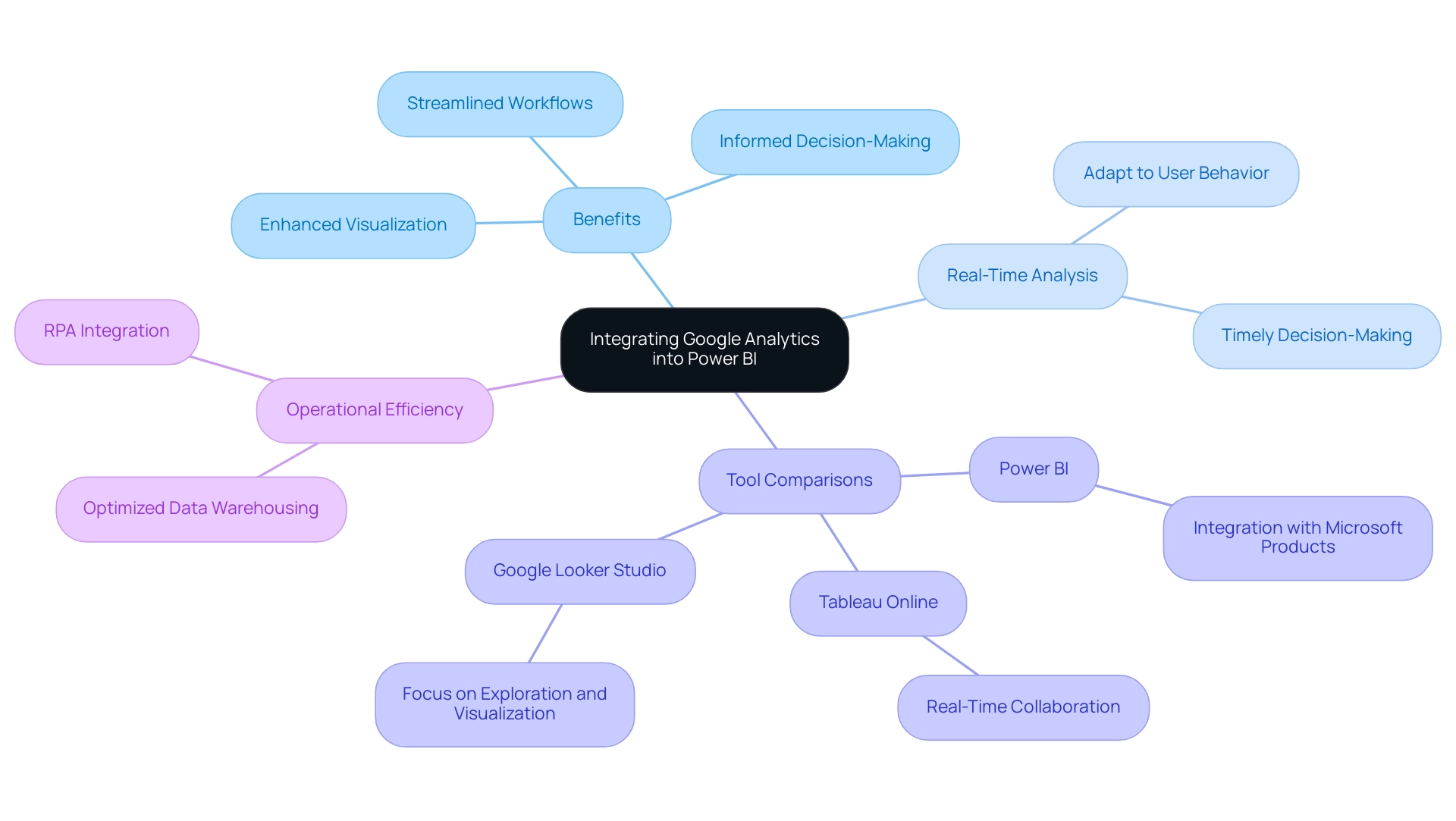
The google analytics connector power bi allows for the integration of Google Analytics information, unlocking a wealth of advantages that can significantly enhance business intelligence and operational efficiency. This integration not only enhances visualization capabilities but also aligns with Robotic Process Automation (RPA) principles, streamlining workflows and boosting productivity. By developing interactive dashboards that display web traffic information in an intuitive format, organizations can identify trends and patterns more easily.
The capability to perform real-time information analysis empowers leaders to swiftly adapt to shifts in user behavior, driving timely and informed decision-making essential in today’s rapidly evolving AI landscape. Recent statistics show that 88% of organizations utilizing cloud-based intelligence tools report enhanced flexibility in accessing and analyzing information, which is vital for remaining competitive. Moreover, utilizing advanced analytical methods alongside visualization has been proven to decrease warranty claims by predicting customer requirements and vehicle upkeep, showcasing concrete advantages in a commercial context.
By merging data from the Google Analytics connector Power BI with additional sources, companies obtain a thorough perspective of their operational performance. This holistic perspective fosters strategic decision-making, empowering leaders to align their actions with emerging trends and customer needs. However, businesses that struggle to extract meaningful insights may face a competitive disadvantage, making it essential to implement effective BI strategies.
As emphasized in case studies of cloud-based BI tools, Power BI, Tableau Online, and Google Looker Studio each provide distinct benefits:
1. Power BI integrates flawlessly with Microsoft products
2. Tableau Online facilitates real-time collaboration
3. Google Looker Studio concentrates on exploration and visualization
A robust engineering approach integrates diverse sources, optimizing warehousing and utilizing RPA to alleviate the challenges of manual workflows and extract actionable insights. By leveraging these capabilities, organizations can realize the full potential of their information, translating analytics into powerful, informed business strategies.
Challenges and Limitations of Google Analytics Connectors in Power BI
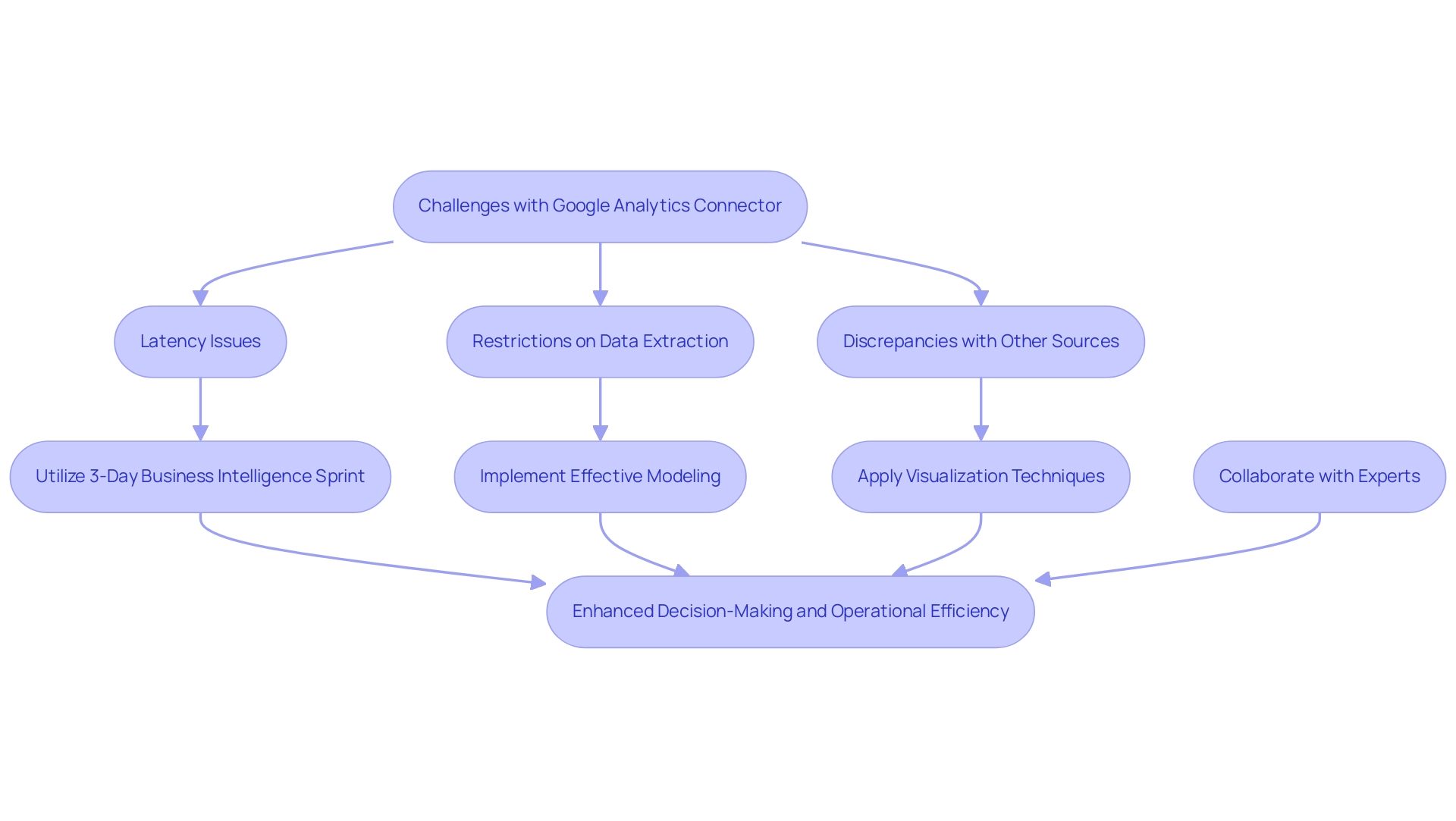
While the Google Analytics connector Power BI offers valuable advantages, organizations frequently face considerable obstacles, especially concerning latency and the restrictions on the amount of information that can be extracted. Discrepancies between information in the Google Analytics connector Power BI and other sources can complicate the integration process. As observed by Darya Drobova, a leading BI developer, “Selecting the appropriate Business Intelligence tools is crucial for tackling these challenges and optimizing the capabilities of your information.”
These hurdles necessitate a commitment to learning how to effectively utilize the Google Analytics connector Power BI and troubleshoot any arising issues. By understanding these challenges, organizations can set realistic expectations and devise targeted strategies to mitigate potential problems, ultimately enhancing their integration efforts. For instance, legacy systems frequently create information silos that restrict access and interoperability, significantly hindering analytics capabilities.
A recent study indicated that 70% of organizations face latency issues that affect decision-making. To tackle these challenges, consider utilizing our 3-Day Business Intelligence Sprint, where we will create a fully functional, professionally designed document tailored to your needs. During this sprint, we employ methodologies such as:
- Modeling
- Visualization techniques
- Best practices in report design
to ensure your report not only meets your expectations but also enhances insights.
This initiative, combined with using the Google Analytics connector Power BI and staging areas, such as lakes, can centralize information and enhance integration with Power BI. A case study demonstrates that tackling information silos resulted in a 30% enhancement in accessibility. Furthermore, collaborating with a skilled team such as AlphaBOLD, recognized for their proficiency in integration and analytics, can offer the essential support to address these integration challenges efficiently, guaranteeing your organization utilizes its analytics tools to their maximum potential for informed decision-making and operational efficiency.
Best Practices for Using Google Analytics Connectors with Power BI
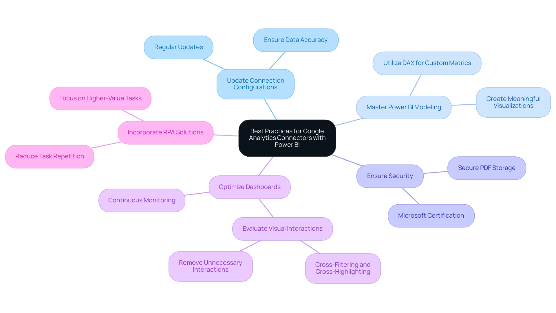
To fully utilize the Google Analytics connector in Power BI, it is essential to follow several best practices that improve integration and visualization. Firstly, consistently updating connection configurations is vital for preserving information accuracy and dependability, as this proactive method guarantees that your summaries reflect the most up-to-date details available—essential for informed decision-making in today’s information-driven environment. Business Intelligence applications such as Power BI can convert unprocessed information into practical insights, tackling the frequent issues of time-intensive documentation generation and information inconsistencies.
Significantly, subscriptions can now be sent to OneDrive SharePoint (ODSP) for large documents, enhancing better information management and accessibility. Secondly, gaining proficiency in Power BI’s modeling capabilities allows users to craft meaningful visualizations that truly represent the underlying information. Utilizing DAX (Data Analysis Expressions) further empowers users by enabling the creation of custom calculations and metrics tailored to specific analytical needs.
Furthermore, Microsoft certification ensures that the visual does not interact with external services, guaranteeing that your PDF files are securely stored and encrypted within the document, in alignment with your document sensitivity settings. Ongoing supervision and enhancement of documents and dashboards are essential; as organizations progress, their data requirements transform, requiring that documents stay aligned with these changing objectives to promote operational efficiency and organizational growth. For instance, evaluating relevant interactions in reports can optimize interactivity, as demonstrated in the case study titled ‘Optimizing Visual Interactions.’
Furthermore, incorporating RPA solutions can reduce task repetition fatigue and staffing shortages, allowing teams to concentrate on higher-value tasks that enhance outcomes. By addressing these operational challenges, organizations can mitigate the competitive disadvantage of struggling to extract meaningful insights from their data. By following these best practices, users can significantly enhance the effectiveness of their Power BI dashboards, ultimately driving better insights and business outcomes.
Conclusion
Integrating Google Analytics with Power BI offers organizations a powerful avenue to enhance their data-driven decision-making processes. By utilizing Google Analytics connectors, businesses can seamlessly visualize and analyze web traffic and user behavior data, leading to improved operational efficiency and strategic insights. Understanding the differences between native and third-party connectors allows organizations to choose the best approach for their specific analytical needs, ensuring that they can maximize the benefits of their data integration efforts.
Despite the challenges such as data latency and potential discrepancies, the advantages of this integration cannot be overstated. Organizations that effectively harness these tools can create interactive dashboards that facilitate real-time analysis, empowering leaders to swiftly adapt to evolving market conditions. By adhering to best practices, such as regular updates and proficiency in data modeling, businesses can optimize their reporting processes and drive operational excellence.
In a landscape where data is critical to success, leveraging the capabilities of Google Analytics and Power BI is not just beneficial—it is essential. Organizations that commit to understanding and overcoming the challenges of data integration will find themselves better equipped to make informed decisions, ultimately positioning themselves ahead of the competition. Embracing these tools and strategies unlocks the full potential of data, transforming insights into actionable business strategies that foster growth and innovation.
Introduction
Navigating the complexities of data management in Power BI can often feel overwhelming, especially when it comes to the practice of table duplication. This powerful feature not only allows users to create exact copies of existing tables but also opens the door to experimentation and enhanced analytical capabilities without compromising the integrity of the original data.
As organizations increasingly rely on data-driven insights to inform their decisions, understanding how to effectively duplicate tables becomes essential for optimizing workflows and driving operational efficiency. However, while the benefits are substantial, so too are the potential pitfalls, including data overload and performance issues.
This article will explore the intricacies of table duplication in Power BI, offering practical guidance on:
- Methods
- Benefits
- Risks
- Best practices
to ensure that users can harness this tool to its fullest potential.
Understanding Table Duplication in Power BI
Understanding how to duplicate table in Power BI acts as a robust resource for individuals seeking to produce an exact replica of a current dataset, enabling a broad spectrum of tasks such as testing, manipulation, and creating alternative versions of collections. This capability is vital for improving analysis, enabling individuals to experiment with information without modifying the original dataset. Significantly, replicating a chart maintains the integrity of the initial information, allowing individuals to examine different analytical methods without the danger of losing or damaging source details.
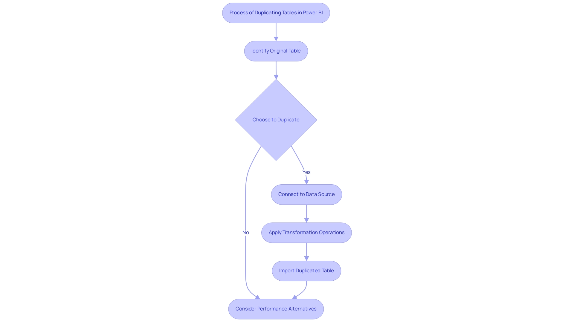
However, many individuals struggle with the challenges of utilizing insights effectively, such as time-consuming report creation and inconsistencies in information. According to recent statistics, approximately 30% of users frequently employ duplication of records in their workflows, emphasizing its importance in information management. As Jing from the Community Support Team notes, understanding how to duplicate table in Power BI will create a total copy of the original table.
It connects to the same information source and repeats all transformation operations, then imports content into the model. So I believe it will double the size of the information. To alleviate possible performance concerns linked to larger information volume, consider alternative approaches such as combining a dataset with itself, which has been suggested in community discussions.
This method not only preserves the original structure but also enhances efficiency in analysis by maintaining a streamlined dataset. Furthermore, comprehending the usage tables, which display contributions to individual counts, including open percentages and viewing trends, is essential for effective information management. Additionally, automating repetitive tasks through RPA solutions can significantly improve operational efficiency, allowing teams to focus on leveraging insights rather than spending excessive time on report creation.
Offering clear, actionable guidance in reports is also essential, ensuring that stakeholders can make informed choices based on the information presented. Addressing these nuances is essential for enhancing your workflow in BI, converting information into actionable insights that drive growth and innovation.
Methods for Duplicating Tables: Step-by-Step Instructions
Learning how to duplicate a table in Power BI is a simple procedure that can greatly improve your data management skills and boost operational efficiency. Follow these steps to efficiently create a duplicate of a chart:
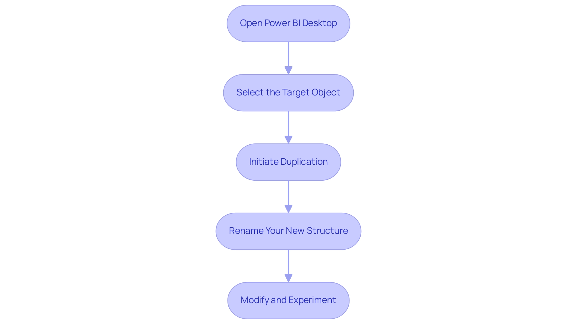
- Open Power BI Desktop: Begin by launching the application and loading the report that includes the dataset you wish to duplicate.
- Select the Target Object: Navigate to the Fields pane and right-click on the item you want to duplicate.
- Initiate Duplication: From the context menu that appears, select the ‘Duplicate’ option. This will create a new arrangement that reflects the structure and data of the original.
- Rename Your New Structure: To maintain clarity, click on the newly created structure and rename it. This can be accomplished by right-clicking the item again and selecting ‘Rename’. A clear naming convention will help avoid confusion as you manage multiple tables.
- Modify and Experiment: With the knowledge of how to duplicate a table in Power BI, feel free to make modifications without impacting the original. This flexibility allows you to experiment with different configurations or analyses as needed.
Utilizing these steps not only streamlines your workflow but also empowers you to explore insights more effectively. As Tijani Azeez Titilope emphasizes, having a robust understanding of these functions is crucial for maximizing the potential of Power BI, particularly in overcoming challenges like time-consuming report creation and ensuring consistency across your information. Furthermore, utilizing Business Intelligence tools is crucial for converting raw information into actionable insights, enabling informed decision-making that fosters growth.
Implementing a governance strategy can also help address inconsistencies, ensuring that stakeholders can trust the information presented. Moreover, considering participant consent for information submission and communication preferences is crucial in handling information responsibly. For example, utilizing summary statistics such as Minimum, Median, and Mean on your duplicated datasets can offer valuable insights, as emphasized in the case study on ‘Statistical Measures in BI‘, illustrating how individuals can effectively employ basic statistical measures to improve their analyses.
Benefits of Duplicating Tables in Power BI
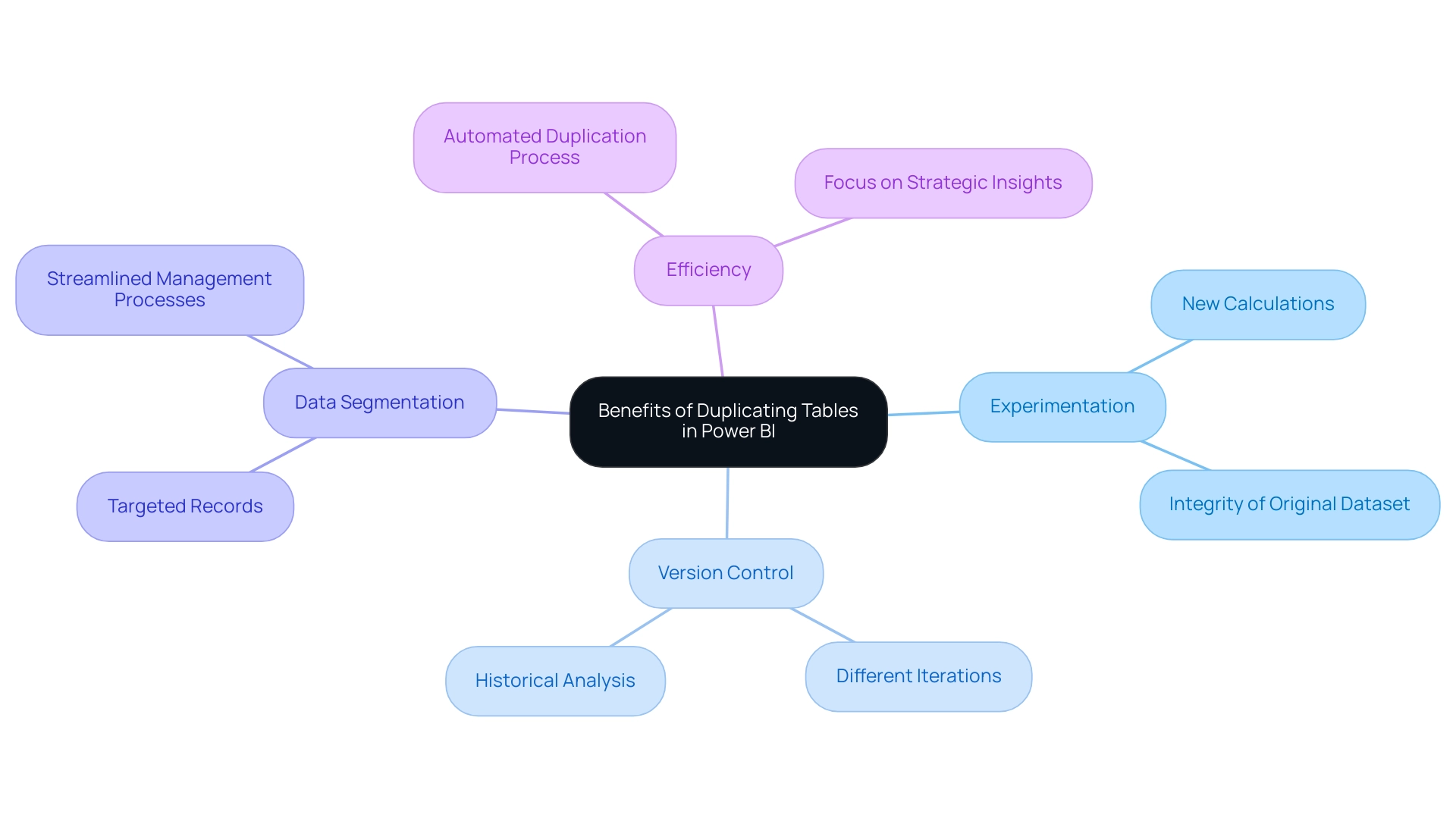
Understanding how to duplicate table in Power BI can provide numerous benefits that greatly improve information management and analysis, particularly in the context of utilizing Robotic Process Automation (RPA) for operational efficiency. Here are some key advantages:
- Experimentation: Duplicated records empower individuals to experiment with new calculations or alterations without compromising the integrity of the original dataset, fostering an environment of innovation that is crucial in a rapidly evolving AI landscape.
- Version Control: Maintaining different iterations of datasets becomes seamless, allowing for effective comparison and historical analysis, which is essential for informed decision-making and aligns with RPA’s goal of reducing manual errors.
- Data Segmentation: By creating targeted records for specific analyses, individuals can streamline their management processes, leading to clearer visualizations and more focused insights—key components of effective Business Intelligence.
- Efficiency: RPA can automate the duplication process, simplifying complex manipulation tasks and freeing up resources. This allows users to focus on obtaining strategic insights instead of getting overwhelmed by repetitive information entry, a challenge RPA can assist in alleviating.
As Raconteur emphasizes, with the expected increase of 463 exabytes of information produced daily by 2025, knowing how to duplicate table in Power BI is not only beneficial but crucial for upholding operational efficiency and information integrity in any organization. Furthermore, features in Microsoft Dynamics 365 Business Central, such as duplicate detection and customizable rules, play a critical role in preventing duplication and enhancing overall integrity. These features, in conjunction with RPA, ultimately support the operational efficiency that organizations strive for.
The case analysis on Microsoft Dynamics 365 Business Central demonstrates how these sophisticated information management tools enhance workflows, improve reporting precision, and cultivate better customer relations, emphasizing how to duplicate table in Power BI as a significant advantage in today’s information-driven environment.
Risks and Considerations When Duplicating Tables
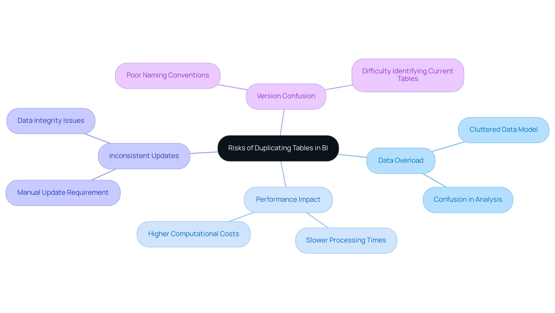
While duplicating tables in BI can enhance certain analytical capabilities, it is essential to navigate the associated risks thoughtfully, especially in light of common challenges faced in leveraging insights from dashboards:
- Data Overload: Creating multiple duplicates can clutter the data model, complicating management and leading to confusion that hinders effective data analysis. This challenge can detract from the goal of deriving actionable insights from Power BI dashboards.
- Performance Impact: Excessive duplication adversely affects the performance of Power BI reports. When handling large datasets, unnecessary duplicates can slow processing times, affecting the experience and decision-making. Eliminating duplicates is crucial for enhancing performance and lowering computational costs.
- Inconsistent Updates: A significant concern arises when the original table is updated; duplicated tables will not automatically reflect these changes unless manually updated, leading to discrepancies that undermine the integrity of the insights derived from the data.
- Version Confusion: Poor naming conventions may result in users struggling to identify the most current or relevant table. This confusion further complicates information management and analysis efforts, which is counterproductive to the goal of effective insight generation.
Deboky Saha, a Data Engineer and Data Scientist, aptly notes that Duplicate information consists of repeated details within a dataset, often resulting from entry errors, multiple source integrations, or inadequate management. Therefore, careful planning and execution of information collection processes are crucial for understanding how to duplicate tables in Power BI and prevent duplicates. Effective information management not only aids in maintaining integrity but also enables stakeholders to have clearer next steps based on the insights derived.
The relevance of this topic is underscored by the statistic that the associated message received 458 views, indicating significant interest in managing duplicates effectively. Moreover, the case study titled ‘Validation Before Deletion’ by Abner Huertas stresses the significance of verifying information prior to removal to avoid the loss of valuable details, underscoring the necessity for a strong strategy in handling duplicates and ensuring that insights from BI dashboards are both reliable and actionable.
Best Practices for Duplicating Tables in Power BI
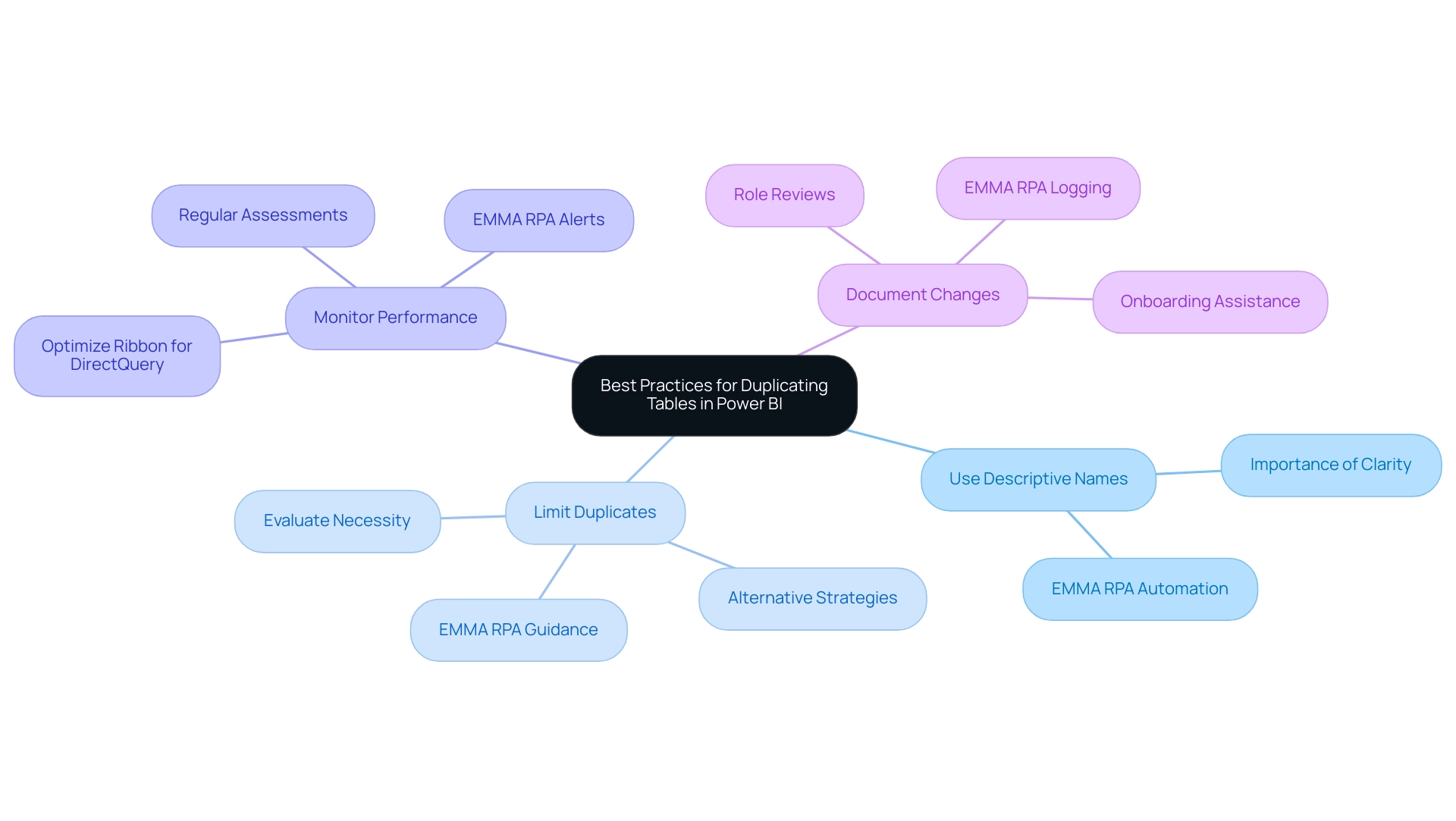
To simplify the duplication of datasets in BI and improve your operational efficiency, consider applying the following best practices:
-
Use Descriptive Names: Renaming replicated sets with clear and descriptive titles is crucial for preventing confusion in your models. As Sam aptly puts it, once you’ve fully grasped how to set up information models, you can easily create intuitive and significant BI reports. This clarity in naming not only aids in navigation but also fosters understanding among team members and aligns with the goal of leveraging Robotic Process Automation (RPA) for enhanced productivity. EMMA RPA can assist in this process by automating the naming conventions based on predefined rules, ensuring consistency across your models.
-
Limit Duplicates: Exercise caution when considering how to duplicate tables in Power BI; only do so when absolutely necessary. Before proceeding, evaluate whether alternative strategies could meet your objectives while minimizing clutter in your reports. EMMA RPA can help automate the assessment of data needs, guiding you to make informed decisions that streamline your data management process and help overcome stagnation caused by outdated systems.
-
Monitor Performance: Regularly assess the performance of your Power BI reports. Evaluating and removing unnecessary interactions among visuals is crucial, as highlighted in the case study on optimizing visual interactions. By utilizing tools such as the Optimize Ribbon for DirectQuery reports, you can boost interactivity and ensure that your visuals function harmoniously, ultimately enhancing experience and operational efficiency. EMMA RPA can automate performance monitoring and alert you to potential issues before they affect your reporting, which is important when considering how to duplicate tables in Power BI.
-
Document Changes: Maintaining clear documentation of any modifications to duplicated tables is crucial. This practice not only assists in onboarding new users but also enables role reviews and ensures continuity within your management framework. Moreover, routinely assessing and refreshing security roles, along with recording roles and their associated permissions, can offer clarity and consistency, which are essential for effective information governance. By keeping a comprehensive record, you enhance the overall understanding of your data management practices, navigating the overwhelming AI landscape with tailored solutions for business growth. EMMA RPA can streamline this documentation process by automatically logging changes and updates, ensuring that your records are always current.
Conclusion
Navigating the complexities of table duplication in Power BI is essential for maximizing data management capabilities and driving operational efficiency. This article has explored the methods for effectively duplicating tables, highlighting the significant benefits such as:
- Fostering experimentation
- Enabling version control
- Enhancing data segmentation
Each of these advantages plays a critical role in empowering organizations to leverage data-driven insights, streamline workflows, and improve decision-making processes.
However, it is equally important to remain vigilant about the potential risks associated with table duplication. Issues such as:
- Data overload
- Performance impacts
- The challenges of maintaining consistency across duplicated datasets
can hinder effective analysis. By adhering to best practices, including:
- Using descriptive naming conventions
- Limiting unnecessary duplicates
- Monitoring performance
users can mitigate these risks and harness the full power of Power BI.
Ultimately, mastering the art of table duplication not only enhances analytical capabilities but also transforms how organizations approach data management. By following the guidance provided, users can turn their data into actionable insights that drive growth and innovation, ensuring that they stay ahead in an increasingly data-driven landscape. Embracing these strategies will lead to a more efficient and effective use of Power BI, paving the way for informed decision-making and operational excellence.
Introduction
In the realm of data analysis, histograms emerge as indispensable tools that bridge the gap between raw numbers and actionable insights. By visually representing the distribution of numerical data, they not only simplify complex datasets but also illuminate patterns and trends that might otherwise go unnoticed.
As organizations grapple with the intricacies of Business Intelligence and the rapid evolution of technology, understanding how to effectively utilize histograms in platforms like Power BI becomes crucial.
This article delves into the fundamental concepts of histograms, offering a comprehensive guide on their creation, customization, and troubleshooting, while also highlighting their real-world applications across various industries.
By mastering these techniques, professionals can enhance their analytical capabilities, driving operational efficiency and informed decision-making in an increasingly data-driven world.
Understanding Histograms: Basics and Importance
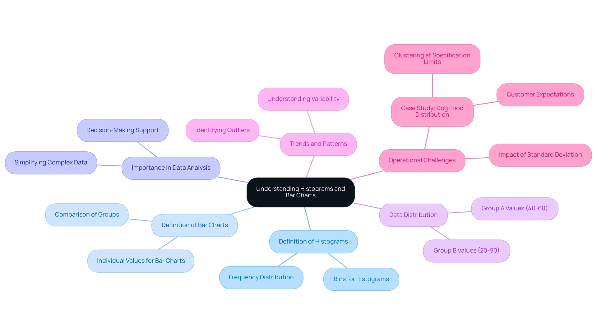
A bar chart functions as a robust visual instrument for illustrating the distribution of numerical information, and when combined with histograms in Power BI, it can greatly improve your analytical abilities. In the context of navigating the overwhelming AI landscape, selecting the right BI tools is essential for effective visualization. By organizing information into bins or intervals, histograms in Power BI enable a clear representation of the frequency of points across these ranges.
For instance, in analyzing Group A’s values, which predominantly fall between 40 and 60, and Group B’s range of 20 to 90, bar charts can effectively illustrate how these groups distribute across the specified intervals. This method is particularly effective in identifying patterns, trends, and outliers within datasets, especially in the context of RPA and BI, which drive operational efficiency and data-driven insights. The importance of bar charts in information analysis cannot be overstated; they simplify complex sets, enabling decision-makers to interpret and act upon the visualized information effectively.
The standard deviation, indicating the spread of values, further emphasizes the importance of understanding variability in information. In the dog food allocation case study, a bar chart indicated that the information lacked results around the average, clustering instead at the upper and lower specification limits. This insight underscores how variation can lead to operational challenges, as customers may receive items within specifications but that do not meet their expectations.
Furthermore, while frequency distributions are utilized in histograms in Power BI to group values based on bin ranges, bar charts display each value as an individual bar. As Jim appropriately states, ‘I believe charts are an excellent resource for comprehending the spread of your information.’ Their capacity to offer transparency in information representation, especially when combined with customized BI solutions, renders graphical charts an essential resource in the toolkit of any Director of Operations Efficiency, particularly in tackling the operational challenges presented by the intricacies of information analysis.
Step-by-Step Guide to Creating Histograms in Power BI
Generating histograms in Power BI is a simple procedure that can greatly enhance your visualization abilities and promote informed decision-making. As highlighted, many users face the challenge of needing to create separate reports for each workspace, which can be cumbersome and time-consuming. By following these steps, you can effectively create a bar chart and streamline your reporting process:
- Open Power BI Desktop and load your dataset.
- Select the ‘Report’ view from the left sidebar to begin your visualization.
- Access the ‘Visualizations’ pane and choose the ‘Clustered Column Chart’ icon, which functions as the foundation for creating histograms in Power BI.
- Drag the field you wish to analyze into the ‘Values’ field well; this will determine the height of the bars in your histogram.
- Drag the same field into the ‘Axis’ field well. Power BI will automatically create histograms in Power BI based on your information distribution, which facilitates a clear visual representation.
- Customize your chart for histograms in Power BI by adjusting the bin size in the ‘Format’ pane under ‘Data colors’ and ‘X-Axis’ settings. This enables you to customize the visualization to better highlight your insights.
- Save your report to ensure your data visualization is readily available for future analysis and presentations.
Additionally, consider how RPA solutions can automate repetitive tasks in the report creation process, enhancing your operational efficiency and freeing up valuable time for analysis. Don’t forget that the early bird discount for Power BI features ends on December 31, which may be a great opportunity to explore new functionalities that enhance your operational efficiency. Applying these steps not only enables you to create impactful charts but also aligns with the latest Power BI features, significantly enhancing your visualization and user engagement.
The enhanced usage metrics report contains sections for report usage, performance, and FAQs, offering thorough insights into how your data visualizations contribute to overall report engagement and viewer behavior.
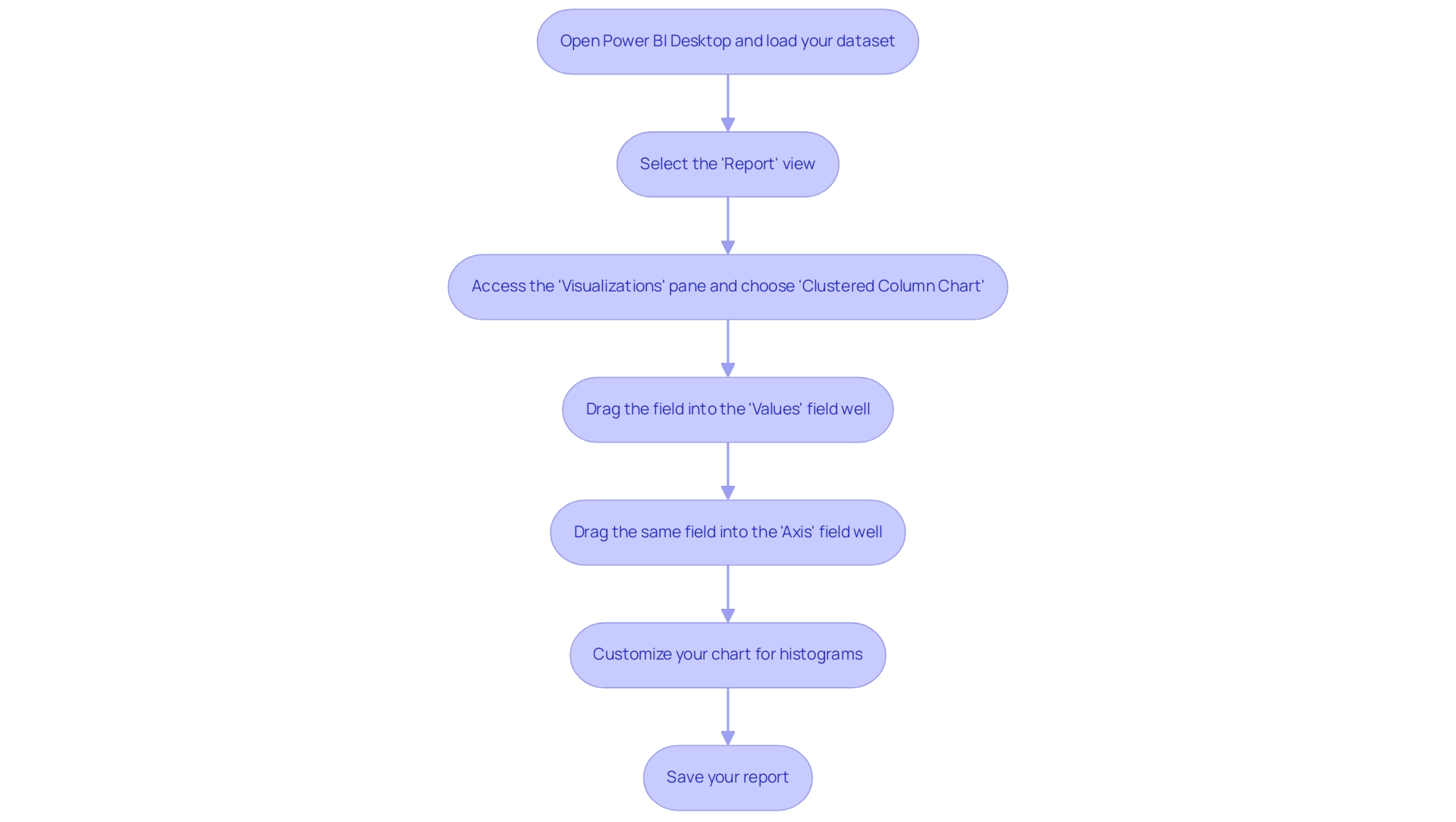
Enhancing Your Histograms: Customization Techniques
To enhance the effectiveness of your graphical representations in Power BI, consider applying the following advanced customization techniques:
-
Dynamic Bin Sizes: Adjust the bin sizes to better represent the underlying information accurately. For instance, when visualizing the distribution of outcomes from summing the result of five die rolls, repeated 20,000 times, adjusting the ‘Bin size’ settings within the ‘Information’ section can significantly enhance the accuracy of histograms in Power BI.
-
Informative Labels: Incorporate information labels to give viewers immediate context about your information. By enabling data labels in the ‘Format’ pane, you allow your audience to see precise values, making the chart more informative.
-
Color Schemes: Utilize color gradients or distinct hues to differentiate between bins, effectively highlighting trends or critical data points. This visual distinction can guide viewers in quickly identifying significant patterns within the data.
-
Titles and Legends: Ensure clarity by adding descriptive titles and legends that explain what your graphical representation shows. These elements can be easily configured in the ‘Format’ pane under ‘Title’ and ‘Legend’ settings, contributing to a more interpretable visualization.
-
Text Reports: Remember that three types of text reports can be generated from bar charts: Text Report (bars), Text Report (raw), and Stats Report. These reports offer significant perspectives on your information, further improving the usefulness of your charts.
-
Case Study Reference: Consider the case study on faceted charts for group comparisons. This approach enables a more distinct comparison of distributions among various groups, demonstrating how the mentioned customization strategies can be utilized in a practical context.
By utilizing these strategies, you can produce graphical representations that not only communicate information effectively but also involve your audience in significant analysis.
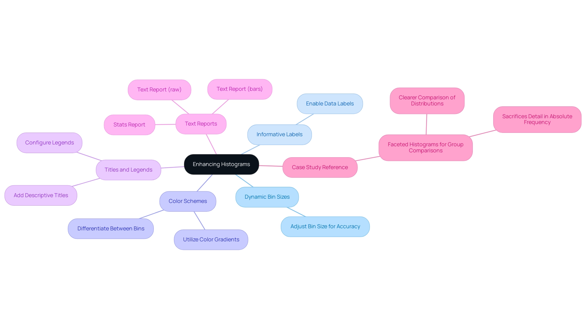
Troubleshooting Common Histogram Issues in Power BI
Generating bar charts in Power BI can pose several challenges that mirror wider issues in analytics and visualization, especially for individuals aiming for operational efficiency. Comprehending these typical problems and their remedies can greatly improve your visual representation skills:
-
Inadequate Data Containers: A chart’s effectiveness largely relies on the quantity of containers utilized. If your graph does not reflect the desired arrangement, it may be because of an insufficient quantity of intervals. To address this, navigate to the ‘Data’ settings and adjust the bin size accordingly. Histograms in Power BI that are well-constructed will clearly illustrate the general shape and distribution of your variable. Figures 2 and 3 illustrate how changing the number of bins affects the visibility of the center, shape, and spread of the information.
-
Empty Bins: It’s not uncommon for bins to appear empty, particularly if the range of values is not aligned with the selected bins. To resolve this, double-check your information input and adjust the bin range to ensure all relevant points are captured. This practice helps reduce inconsistencies that can lead to confusion and mistrust in your insights.
-
Visual Overlap: Overlapping bars can obscure your message. To improve visual clarity, adjust the spacing and width settings in the ‘Format’ pane. This adjustment can help delineate the bars, making the graphical representation more interpretable and actionable for stakeholders.
-
Data Type Issues: Ensure that the fields designated for your chart are of numeric or date types. Utilizing unsuitable information types can result in mistakes in representation, detracting from the chart’s effectiveness and adding to the overall challenge of inadequate master quality.
Furthermore, it’s crucial to distinguish between frequency charts and bar graphs. While bar charts are more appropriate for discrete or categorical variables and exhibit gaps between bars, frequency distributions represent continuous information without gaps, offering a clearer picture of distribution. This distinction is crucial in selecting the appropriate visualization for your information.
By grasping these troubleshooting tips, you not only streamline the creation process but also enhance the overall effectiveness of your visualizations in Power BI. As you improve your data representations, consider that nearly half of user tickets are responded to within five hours. Implementing effective information visualization practices can significantly reduce user errors, ultimately improving response times and operational efficiency.
Furthermore, addressing these challenges related to histograms in Power BI can provide clearer insights and actionable guidance for stakeholders, thereby facilitating better decision-making and overcoming barriers to AI adoption. Adopting these techniques can enable your organization to leverage insights more effectively and navigate the complexities of governance and AI integration.
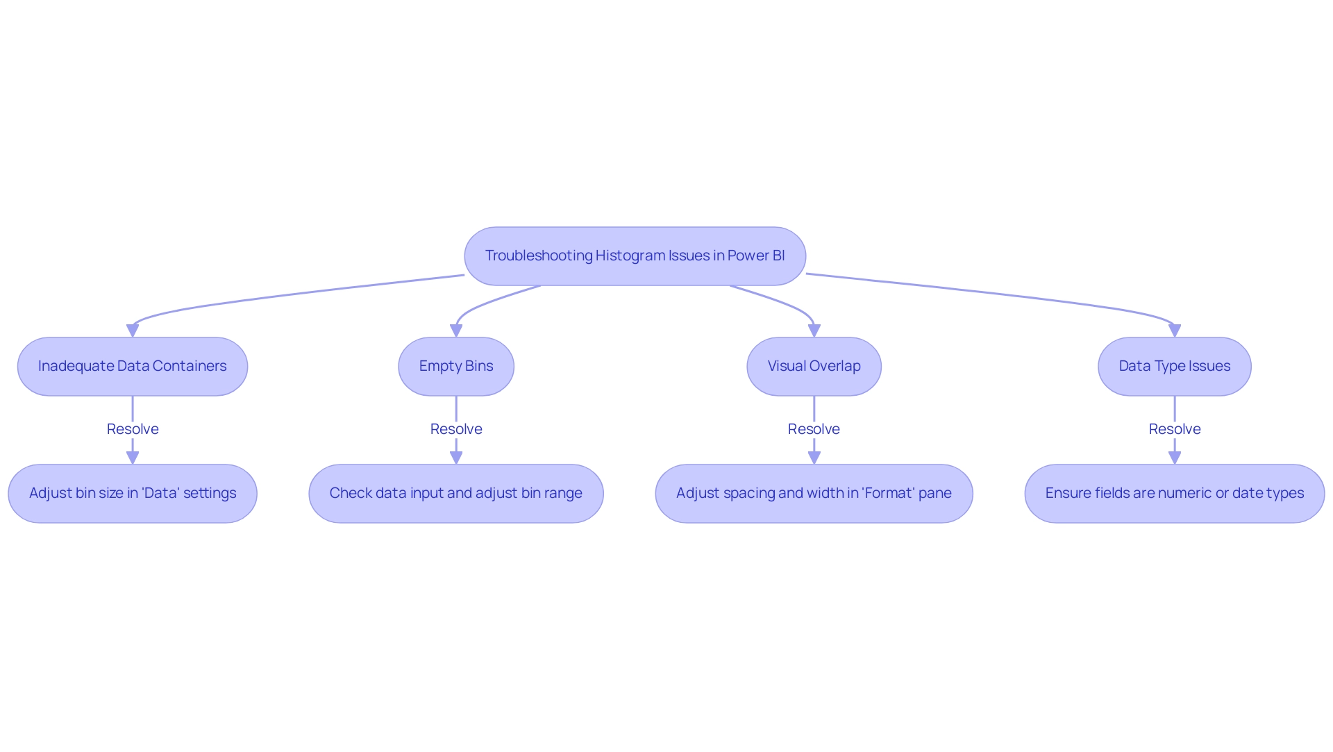
Real-World Applications of Histograms in Data Analysis
Histograms serve as a powerful tool in diverse fields for effective analysis, particularly within the framework of Business Intelligence and Robotic Process Automation (RPA). Their applications encompass:
- Healthcare: By examining patient information patterns, healthcare professionals can recognize important trends in health metrics, resulting in enhanced patient outcomes and focused interventions.
- Finance: Financial analysts employ graphical representations to illustrate the spread of returns, assisting in risk evaluation and investment strategy development. This method enables clearer insights into performance variability, addressing common challenges like information inconsistencies.
- Marketing: Marketers can leverage graphical representations to dissect customer demographics, analyzing purchasing behaviors to refine targeting and enhance engagement strategies, thus driving growth through informed decision-making.
- Manufacturing: In manufacturing settings, graphical representations are employed to monitor production processes by analyzing defect rates, assisting in quality control and process optimization, which are crucial for operational efficiency.
- Human Resources: HR professionals can develop talent management strategies based on employee tenure information. For instance, the case study named ‘Distribution of Employee Tenure in Company XYZ’ demonstrates how examining employee tenure distributions can evaluate staff stability and guide personnel management strategies.
Moreover, bins for a bar chart can be defined by decade, such as 0-10 years, 11-20 years, and so forth, offering a structured method to visualize distributions.
By mastering bar chart techniques in Power BI, professionals can convert raw information into actionable insights, enabling them to make informed, strategic decisions suited to their specific operational requirements. As organizations increasingly adopt information-driven approaches, the relevance of histograms in analysis continues to grow, solidifying their status as an essential analytical tool in 2024 and beyond. RPA further enhances this capability by automating repetitive tasks associated with report generation, allowing teams to focus on strategic analysis and innovation.
However, many businesses still face a lack of data-driven insights, which can hinder their decision-making processes. By utilizing specific RPA tools like EMMA RPA and Power Automate, organizations can streamline their workflows and enhance operational efficiency, ultimately transforming their data into valuable insights.
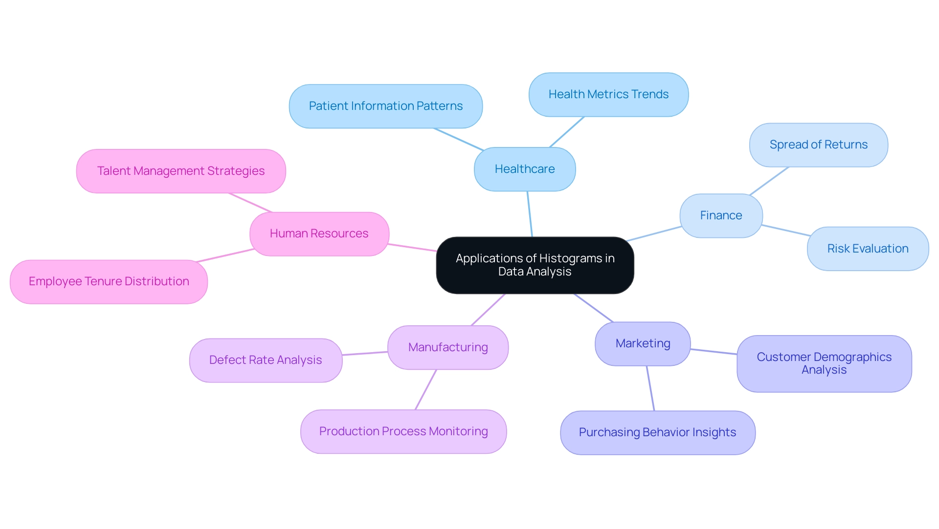
Conclusion
Histograms stand as a cornerstone in the landscape of data analysis, offering clarity and insight into the distribution of numerical data. By mastering their creation and customization in platforms like Power BI, professionals can transform overwhelming datasets into visual narratives that drive informed decision-making. The step-by-step guide provided illustrates how to streamline the creation process, while advanced customization techniques enhance the interpretability and engagement of the visualizations.
Addressing common challenges associated with histograms ensures that data is accurately represented and easily understood. By troubleshooting issues like insufficient data bins or visual overlap, analysts can refine their visual tools to convey meaningful insights. This proactive approach not only improves data visualization but also fosters a culture of operational efficiency and informed strategy.
The real-world applications of histograms across various industries underscore their versatility and importance. From healthcare to finance, the ability to visualize data distributions empowers professionals to identify trends, optimize processes, and enhance decision-making. As organizations increasingly embrace data-driven strategies, the role of histograms will only grow in significance, solidifying their place as essential instruments for navigating the complexities of data analysis in 2024 and beyond. Embracing these techniques will enable teams to unlock the full potential of their data, driving operational excellence and strategic innovation.
Introduction
In the dynamic landscape of data-driven decision-making, the ability to effectively extract and analyze data is paramount for organizations aiming to stay competitive. Power BI stands out as a powerful tool that simplifies this process, enabling users to retrieve data from diverse sources and transform it into actionable insights.
From mastering the intricacies of data extraction methods to leveraging automation tools like RPA, this article delves into practical strategies that enhance reporting accuracy and operational efficiency.
By understanding the essential steps involved in data extraction and preparation, organizations can unlock the full potential of their data, driving informed decisions that propel business growth.
Understanding Data Extraction in Power BI
Information retrieval in BI is a crucial procedure that involves obtaining details from various sources to create insightful reports and dashboards. This procedure is essential as it directly affects how information is represented and examined, ultimately shaping decision-making. The BI tool excels in its ability to extract data from Power BI and support extraction from a wide range of sources, including databases, cloud services, and Excel files.
The extraction procedure generally includes three essential steps:
- Connecting to a source
- Transforming the information as required
- Loading it into BI to extract data from Power BI for thorough analysis
As Chinwe O. noted,
I also gave my first technical talk on Industrial Lagos PowerBI User Group on ‘Performing ETL using Microsoft PowerBI.’
Recent statistics indicate that organizations that extract data from Power BI using effective methods have seen up to a 30% improvement in reporting accuracy.
To further enhance your reporting capabilities, our Power BI services provide:
- A 3-Day Sprint for quick creation of professionally designed documents
- A General Management App for comprehensive management and intelligent reviews
Furthermore, the case study named “Creating Reports & Dashboards for Data Analytics” demonstrates the practical application of this method, showcasing how users can effectively publish and share informative documents, thereby enhancing data-driven decision-making. For example, a client indicated a 25% decrease in document generation time after utilizing our services.
The automation capabilities of Automate also streamline workflow processes, ensuring efficiency and a risk-free ROI assessment. Furthermore, automating information refreshes in BI enhances efficiency by guaranteeing that reports and dashboards represent the most recent information, enabling deeper analysis and better insights. Mastering these concepts and utilizing tools like EMMA RPA and Automate will enable you to manage information effectively and improve reporting precision, leading to more informed strategic decisions.
User feedback emphasizes that our solutions not only save time but also greatly enhance the quality of insights obtained from information.
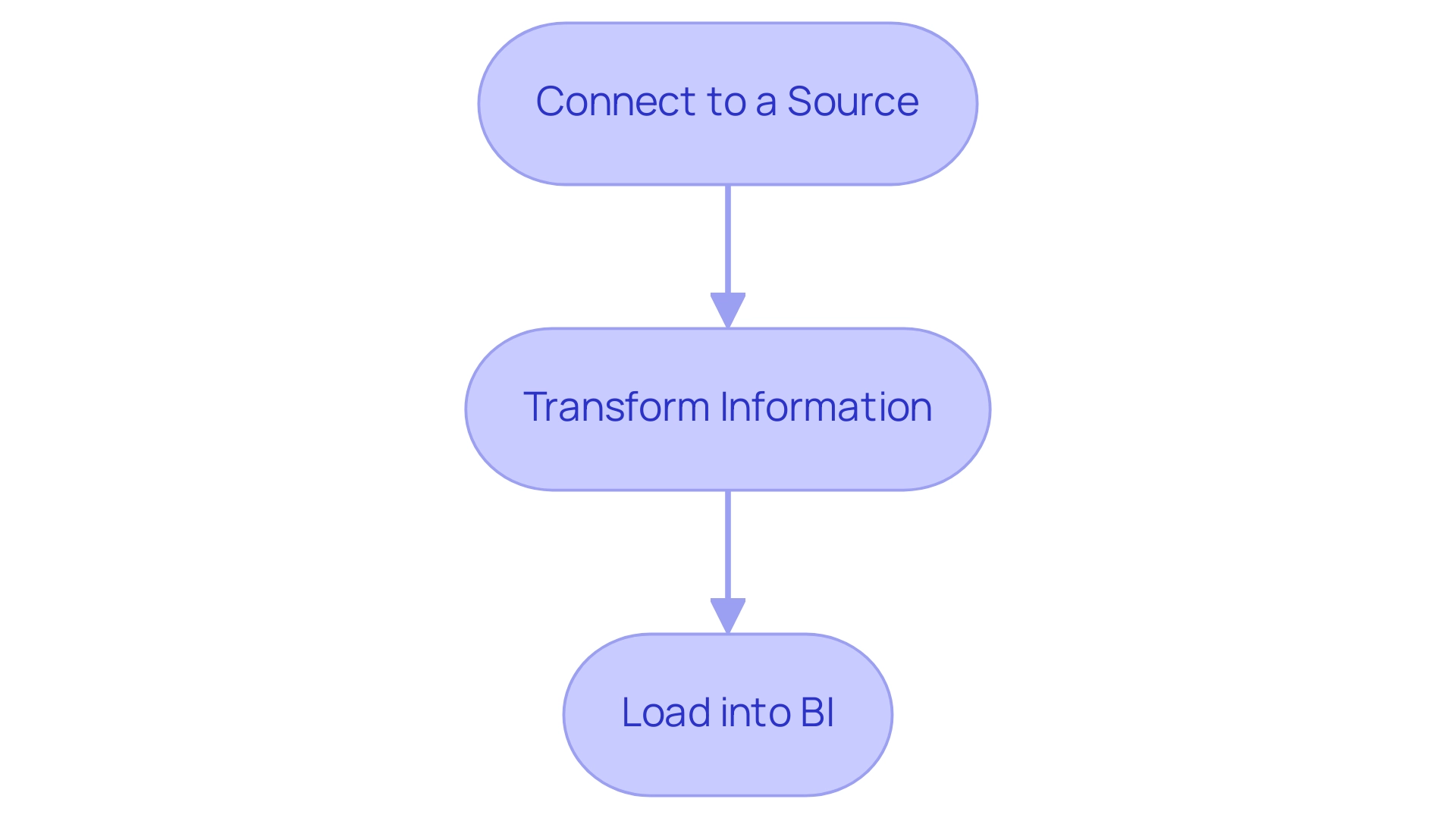
Methods for Extracting Data from Power BI
This tool offers several effective approaches for retrieving information, each customized to particular requirements and circumstances:
-
Direct Query: This method links directly to your information source, providing real-time access without importing the information into BI. It’s particularly advantageous for larger datasets where performance and up-to-date information are critical. Recent advancements, including features introduced in the January 2025 update, underscore the importance of this method, making it a preferred choice for users who require immediate insights. As noted by community support representative v-nikhilan-MSFT, ‘Whether to import or use Direct Query for a table depends on several factors, and your intuition about using Import for dimensions and DirectQuery for facts is often a good starting point.’ This method aligns well with the principles of Business Intelligence, enabling organizations to harness information effectively and address the challenge of inconsistencies.
-
Import Mode: By bringing information into Power BI, users can perform complex calculations and transformations on smaller datasets. This mode is ideal when detailed analysis is necessary, allowing for extensive modeling and manipulation of the information. However, it is important to consider the trade-offs, as this method can lead to larger model sizes and outdated information if not refreshed regularly, posing challenges in maintaining integrity and contributing to time-consuming report creation.
-
Query Editor: This intuitive tool allows connections to diverse information sources, enabling individuals to carry out transformations before loading the refined content into BI. Its intuitive interface makes it accessible, allowing for effective information management without extensive technical knowledge, which is crucial for overcoming barriers to insight-driven conclusions.
-
REST API: For those seeking to automate and integrate data workflows, BI supports data extraction through REST APIs. This method is invaluable for advanced users seeking programmatic access to datasets and documents, enhancing functionality and interoperability with other applications. The integration of RPA, particularly tools like EMMA RPA and Automate, with BI can streamline these processes, providing operational efficiencies and addressing the challenge of outdated systems.
-
Exporting Information from Documents: Users can conveniently export information from Power BI documents and dashboards into Excel or CSV formats. This feature offers a quick method for analyzing information externally, ensuring that insights can be shared and utilized effectively. Addressing the common challenge of time-consuming report creation, this functionality enhances overall productivity.
Each of these methods offers distinct advantages. A case study on best practices for selecting between Import and DirectQuery modes highlights the significance of assessing size, query complexity, and reporting requirements, advising users to contemplate trade-offs and specific use cases when determining the import approach. By utilizing these varied extraction techniques, along with the functionalities of Business Intelligence and RPA tools such as EMMA RPA and Automate, you can extract data from Power BI, improve your information utilization abilities, and promote informed decision-making, encouraging business growth. For further engagement, consider booking a free consultation to explore how these solutions can be tailored to your operational needs.
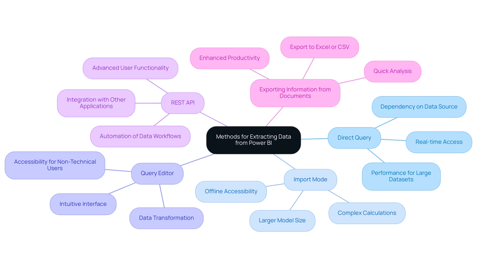
Preparing Your Data for Extraction
Effective preparation is paramount before you extract data from Power BI to ensure accuracy and relevance in your reports. Here are key steps to guide your process:
-
Identify Information Sources: Begin by determining which sources will drive your analysis.
This may involve databases, Excel spreadsheets, or cloud-based services, depending on your organizational needs. -
Preview and Clean Your Information: Utilize Power Query to preview and clean your information before loading it into Power BI.
This includes eliminating duplicates, addressing missing values, and standardizing formats.
As highlighted by industry insights, cleaned information is vital for ensuring reporting accuracy, with expert Jane Smith emphasizing,We expect significant growth next quarter,
underscoring the need for reliable information to support such forecasts.
Utilizing Robotic Process Automation (RPA) can greatly simplify this process, decreasing the time spent on repetitive tasks and enhancing information accuracy, while allowing your team to concentrate on more strategic, value-adding activities. -
Define Your Information Model: Establish clear relationships among various tables.
A robust information model not only contextualizes your analysis but also enhances the effectiveness of your reporting, driving operational efficiency in a rapidly evolving AI landscape. -
Select Relevant Columns: Extract only the necessary columns pertinent to your analysis.
This practice minimizes clutter, ensuring improved performance and focus on essential metrics. -
Document Your Process: Maintain thorough documentation of your information preparation steps.
This not only aids in replicability but also fosters transparency in your handling practices, which is crucial in navigating challenges like integration and security—issues identified as key hurdles in self-service business intelligence, accounting for 20% and 14% respectively.
A recent case study titled ‘Challenges in Self-Service Business Intelligence’ highlights these critical areas that need addressing for successful BI implementation. -
Leverage AI Insights: Consider the broader implications of information preparation in operational efficiency, as observed with AI-powered chatbots that manage 85% of customer interactions.
Effective information management enhances the performance of such technologies, ensuring they operate on accurate and timely details.
Moreover, incorporating customized AI solutions can enhance RPA initiatives, tackling particular obstacles in information management and boosting overall workflow effectiveness.
By following these preparation steps and employing RPA where suitable, you establish a solid groundwork for successful information extraction and the ability to extract data from Power BI, ultimately enhancing operational efficiency and facilitating insights for business growth.
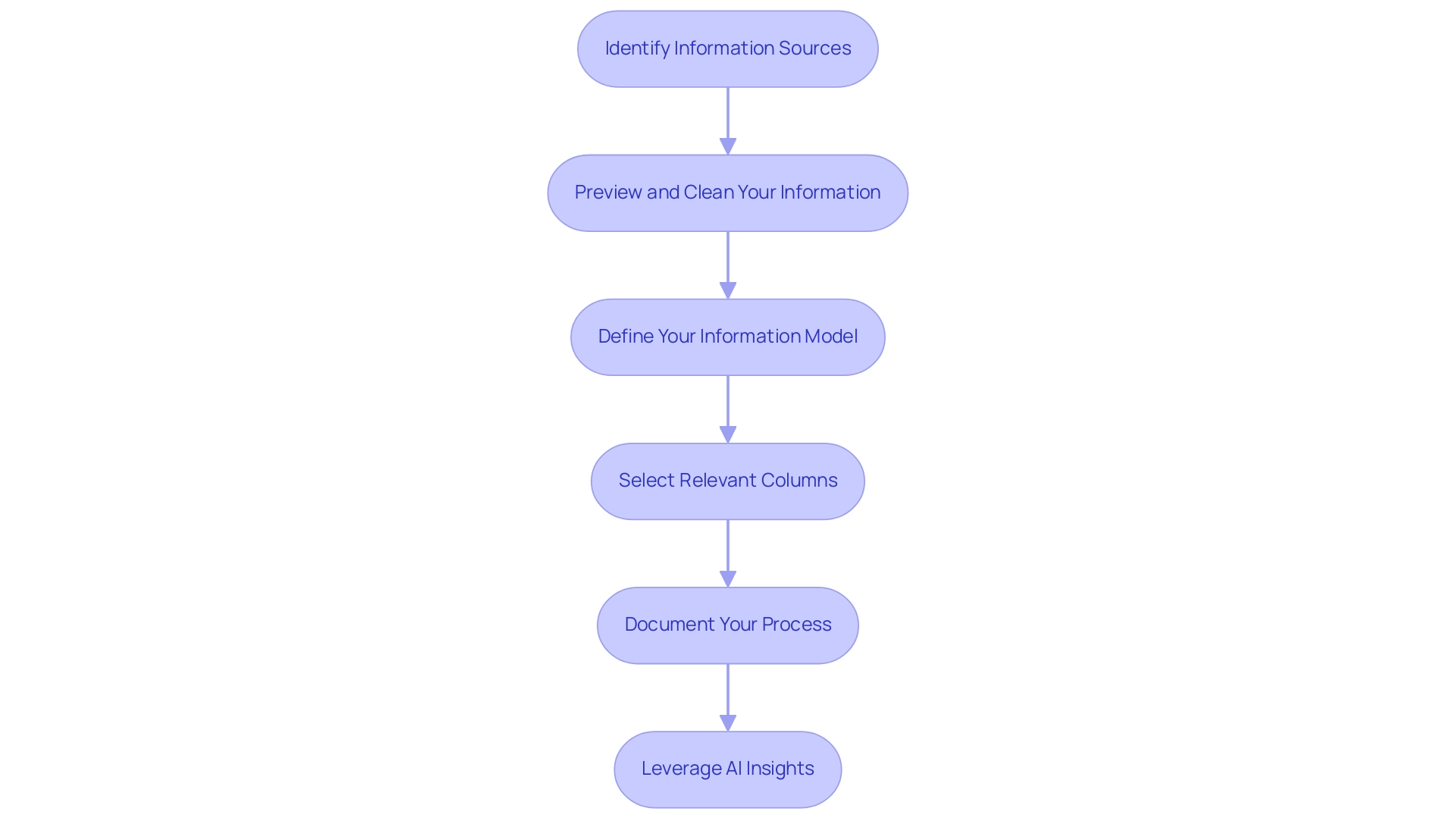
Using Power BI Desktop for Data Extraction
To efficiently extract information using BI Desktop and enhance your information-driven decision-making, follow this comprehensive step-by-step guide:
- Launch Power BI Desktop: Begin by opening the application on your computer, ensuring you are ready to address your information needs.
- Get Data: Navigate to the Home ribbon and click the ‘Get Data’ button. This action will prompt a dialog box displaying various source options, allowing you to choose the one that best fits your requirements.
- Choose Your Source: Identify and select your preferred source, whether it be SQL Server, Excel, or Web. Click ‘Connect’ to initiate the process, paving the way for information integration.
- Enter Connection Details: If prompted, input the necessary connection information, which may include the server name, database name, or file path. This step is crucial for establishing a solid link to your data.
- Transform Information: Upon successful connection, utilize the Query Editor to refine your information. This can involve filtering rows, altering types, or merging tables, practices that align with best practices for transformation in Power BI. Remember to remove the default filter to see metrics for all dashboards or reports in your workspace, ensuring you have a comprehensive view of your data.
- Load Information: Once your information is transformed to meet your analysis needs, click ‘Close & Apply’. This action will load the refined information into Power BI Desktop, setting the stage for impactful reporting and analysis.
Additionally, consider how RPA solutions can enhance your Power BI experience. By automating repetitive information collection tasks, RPA can streamline your workflow, reduce errors, and free up time for more strategic analysis. Republish your reports in your workspace and use the subscription option to send emails to yourself and your colleagues for this report, as suggested by industry experts.
This practice can improve teamwork and keep your group updated.
By mastering these steps in BI Desktop, users can harness the full potential of their processes to extract data from Power BI and analyze it, significantly enhancing their reporting capabilities. For instance, BI offers usage metrics in various national/regional clouds, ensuring compliance with local regulations while maintaining the same security and privacy as the global version. Staying current with the latest features and tutorials is essential to maximizing the effectiveness of your management strategies.
Remember, failing to leverage data-driven insights can leave your business at a competitive disadvantage.
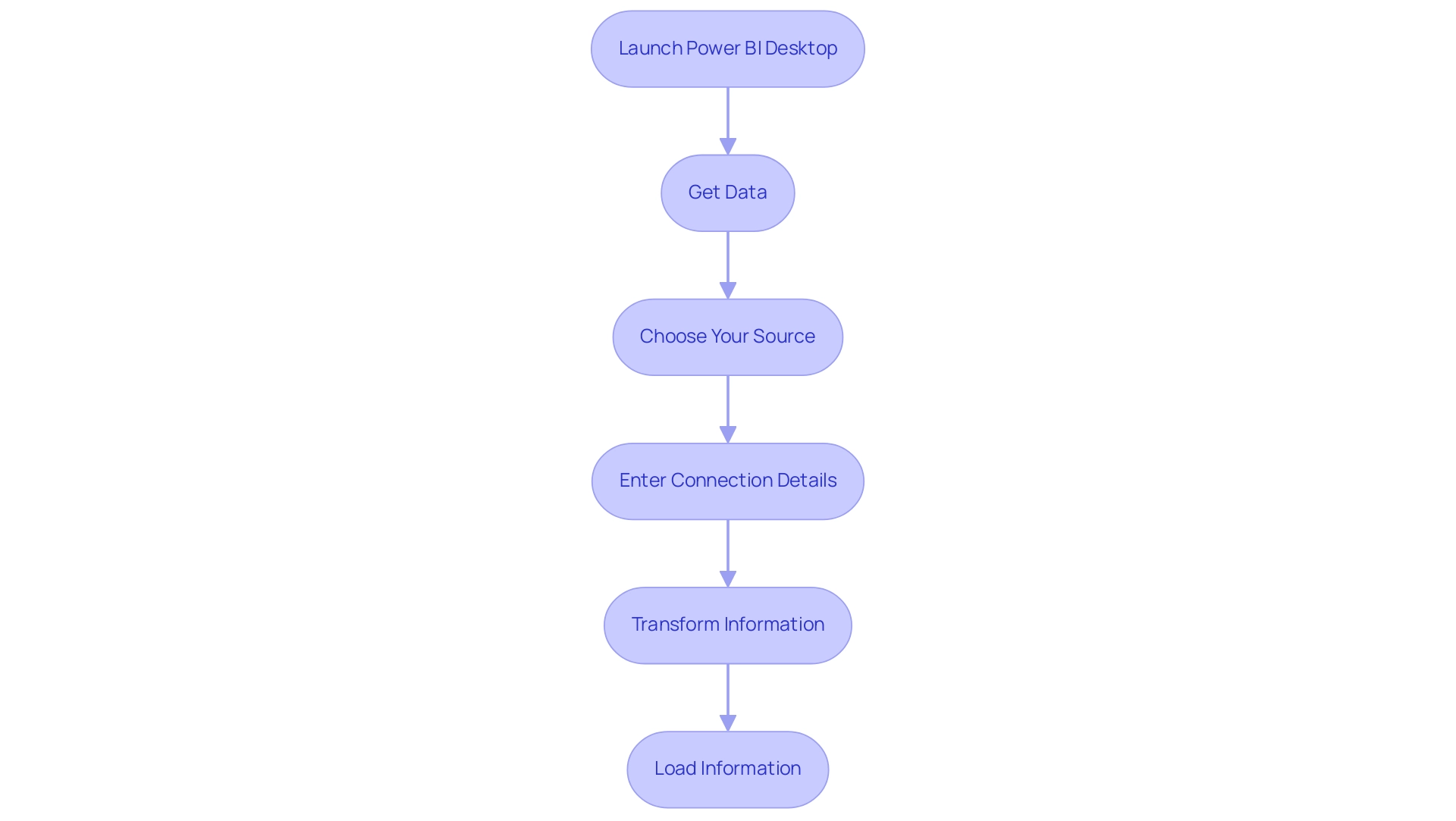
Extracting Data from Power BI Service
To retrieve information from the BI Service efficiently and utilize the full capabilities of Business Intelligence for your organization, follow these streamlined steps:
- Log in to Power BI Service: Start by visiting the Power BI website and entering your credentials to log in.
- Navigate to Your Document: Locate the particular document from which you wish to retrieve information. This is key for ensuring you’re working with the correct information set and helps mitigate inconsistencies.
- Begin Information Export: Click on the ellipsis (three dots) next to the title and choose ‘Export information’. You will then be prompted to choose your preferred format, either Excel or CSV.
- Configure Export Options: If prompted, adjust your export preferences, deciding whether to include summarized information or the underlying details. This decision can significantly impact your analysis and should be made with care to avoid time-consuming report creation later on. Addressing potential information inconsistencies at this stage can save time and enhance the quality of your insights.
- Download the File: After finalizing your options, click ‘Export’. Your file will be generated and prepared for download shortly.
- Open and Analyze: Once the download is complete, open the file in Excel or another compatible program. This final step enables you to explore further into the extracted information, facilitating informed decision-making and empowering your operational strategies.
By adhering to these steps, users can efficiently leverage the Power BI Service for information extraction, thereby optimizing their cloud-based information management strategies and enhancing operational efficiency. It’s important to note that the Usage Metrics Report contains information for the last 30 days and may take up to 24 hours to import new information, reinforcing the need for timely information extraction. As Steve Bedford, Advocate II, noted, ‘Hopefully that’s useful to someone,’ highlighting the practical utility of these steps.
Furthermore, incorporating Robotic Process Automation (RPA) into your information extraction procedure can enhance these steps further, decreasing manual effort and diminishing the potential for mistakes. Adhering to best practices for publishing reports in Power BI, including testing report performance and verifying permissions, is essential for ensuring that your data management activities are effective and secure. Recent trends indicate that organizations increasingly rely on these capabilities for dynamic analytics, reinforcing the importance of mastering the export process.
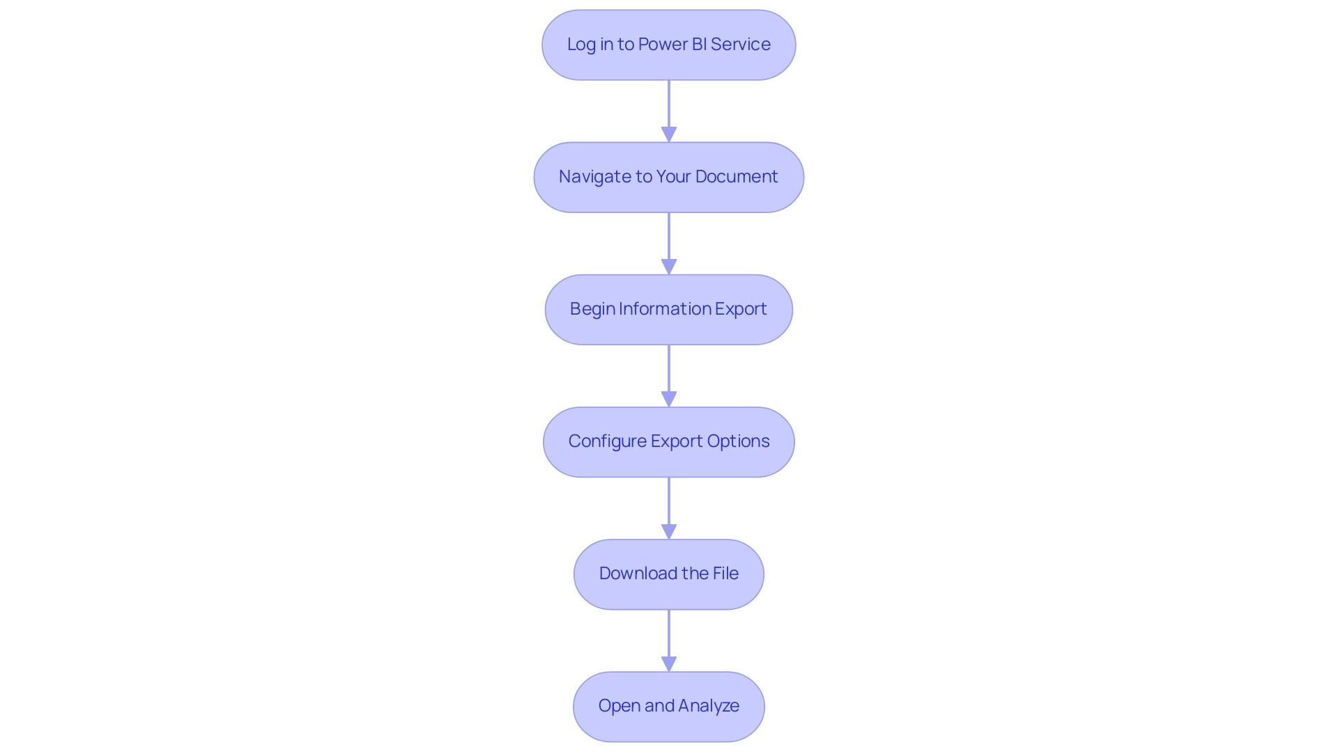
Conclusion
Unlocking the full potential of Power BI for data extraction is a strategic move that can significantly enhance organizational efficiency and decision-making. By understanding the various methods available, from Direct Query and Import Mode to leveraging the Power Query Editor and REST APIs, users can tailor their data extraction processes to meet specific needs. Each method offers unique advantages that can lead to improved reporting accuracy and operational efficiencies.
Preparation is equally critical in this journey. Identifying data sources, cleaning data, defining data models, and documenting processes are essential steps that lay the groundwork for successful data extraction. Integrating RPA tools can further streamline these processes, reducing manual effort and enhancing data quality, ultimately fostering a culture of data-driven decision-making.
Utilizing Power BI Desktop and Service effectively allows organizations to harness insights that drive business growth. By following best practices for data extraction and leveraging automation, teams can enhance collaboration and ensure that they are working with the most accurate and timely information. As organizations embrace these strategies, they position themselves to stay competitive in an increasingly data-centric landscape, making informed decisions that fuel success. The time to act is now—embrace the power of data extraction with Power BI and unlock new possibilities for your organization.
Introduction
In the realm of data analysis, the ability to accurately manipulate and interpret dates is paramount, especially for financial reporting. The EOMONTH function in Power BI emerges as a vital resource, enabling users to pinpoint the last day of the month relative to any given date. This functionality not only streamlines the reporting process but also integrates seamlessly with Robotic Process Automation (RPA) to enhance operational efficiency.
By automating date calculations and reporting tasks, organizations can minimize errors and optimize their workflows, freeing teams to focus on strategic initiatives that drive growth. Through practical examples and best practices, this article delves into the implementation of EOMONTH, showcasing its potential to transform data analysis and improve decision-making in today’s fast-paced business environment.
Understanding the EOMONTH Function in Power BI
The eomonth powerbi calculation provides an essential resource for analysts, enabling users to identify the final day of the month that is a specified number of months prior to or following a given date. This capability is especially beneficial for financial reporting, where accurate month-end calculations are essential. The syntax for utilizing the eomonth powerbi function is straightforward: EOMONTH(<start_date>, <months>), where <start_date> signifies the date from which calculations commence and <months> indicates the number of months to adjust—using a negative value for prior months and a positive value for subsequent months.
Incorporating the month-end calculation within automated workflows not only enables users to manage dates with accuracy but also greatly improves analytical efficiency, especially when paired with Robotic Process Automation (RPA). With RPA, manual reporting processes can be streamlined, reducing errors and freeing up your team for more strategic, value-adding work. Furthermore, reports generated through Vena are automated and refreshed multiple times daily, showcasing the efficiency benefits of this integration.
Power Bi’s AI capabilities, including predictive forecasting and anomaly detection, further enhance the eomonth powerbi process by providing deeper insights into financial information, thereby streamlining the reporting procedure. As demonstrated by several case studies, organizations utilizing the end-of-month calculation have reported enhanced precision in financial reporting results. As Darrell Rooney, Associate Vice President of Continuous Improvement and Finance for Saint Mary’s University, aptly states,
The biggest thing we’ve been able to bring is the simplicity of how we display the data.
And it makes it much less threatening for people.
This simplicity, coupled with automation, is vital for leveraging the eomonth powerbi capabilities to streamline financial reporting and achieve clearer insights, ultimately driving data-driven decisions for business growth. Additionally, our Power Automate solutions offer AI-powered and accessible automation that ensures a risk-free ROI assessment.
Together, we will assess your processes, calculate the efforts required for automation, estimate time savings, and execute the automation with certified professionals. You only pay if the process is automated as planned, ensuring you see tangible benefits from our collaboration.
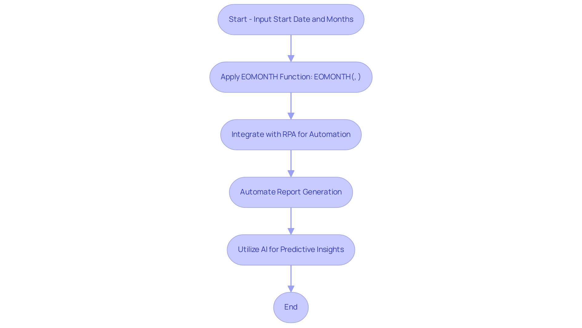
How to Implement EOMONTH in DAX Formulas
To effectively apply the end-of-month function in your DAX formulas, follow these straightforward steps:
- Begin by opening Power BI Desktop and navigating to the ‘Data’ view.
- Select the appropriate table where you wish to add a new calculated column.
- Click on the ‘Modeling’ tab in the top menu, then choose ‘New Column’.
- In the formula bar, enter your DAX formula using the end of month function. For instance:
DAX

   EndOfMonth = EOMONTH([Order Date], 0)
This specific formula calculates the last day of the month for each entry in the ‘OrderDate’ column.
You can modify the second parameter to retrieve dates for prior or upcoming months, thereby enhancing the dynamic nature of your date calculations in reports. Utilizing the end-of-month function not only simplifies your analysis but also enables more meaningful reporting, aligning with the necessity for actionable guidance amidst information inconsistencies in Power BI dashboards. As emphasized in the case study titled ‘Building the Dashboard,’ visualizing calculated measures in a dashboard rather than solely in numerical view is crucial.
Utilizing EOMONTH in your reporting can effectively convey insights, such as identifying outliers and variations in metrics segmented by different variables. Moreover, in a rapidly evolving AI landscape, tailored AI solutions can complement the use of DAX functions by providing advanced analytics capabilities that enhance decision-making processes. RPA can also automate manual workflows related to preparation, reducing the time spent on repetitive tasks and ultimately enhancing operational efficiency.
Douglas Rocha, a Software Engineer, once said, “Hope I’ve helped you in some way and see you next time!” This sentiment resonates with the collaborative spirit of data analysis, where sharing knowledge can lead to better insights and improved operational efficiency.
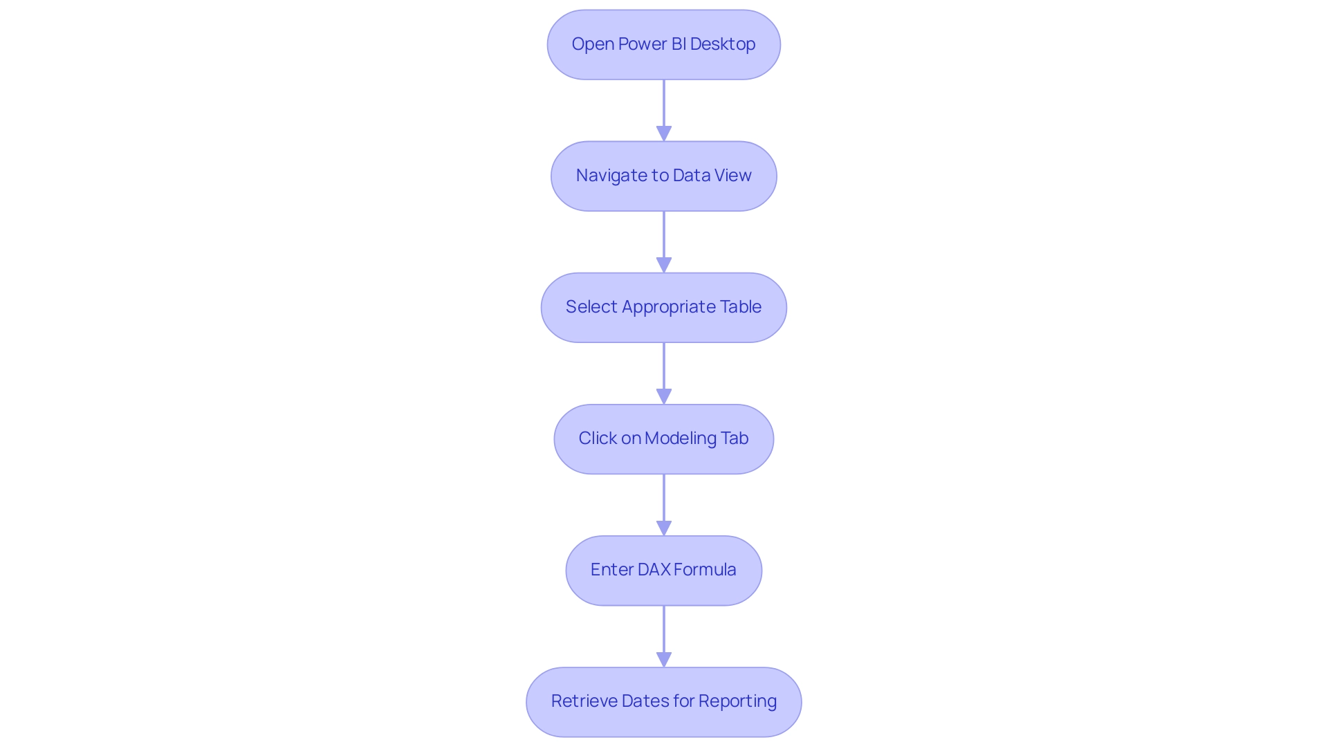
Practical Examples of EOMONTH Usage
The month-end function in Excel is a powerful tool that can significantly enhance your operational efficiency, especially as Excel remains a cornerstone tool for professionals across industries as we move into 2024. In the context of leveraging Robotic Process Automation (RPA) and tailored AI solutions, here are several practical applications of EOMONTH that can streamline your reporting and planning while also reducing manual workloads and costs:
- Monthly Sales Reports: To accurately calculate the last day of the month for each sale, you can establish a calculated column with the following DAX formula:
DAX

   SaleEndDate = EOMONTH([SaleDate], 0)
This calculation is essential for compiling comprehensive monthly sales reports, enabling better data analysis and decision-making that aligns with your operational goals. By automating this process, you can significantly cut down on the time spent on manual calculations, leading to cost savings.
- Future Planning: For effective forecasting, you might need to identify the end of the next quarter based on a given date. This can be achieved with:
DAX

   next quarter end = EOMONTH([StartDate], 3)
Utilizing this function allows for precise future planning, ensuring that your strategic initiatives align with financial timelines, ultimately enhancing productivity through informed decision-making and reducing the need for repetitive manual tasks.
- Year-End Calculations: When preparing for financial year-end reporting, determining the last day of the year is crucial. You can dynamically calculate this with:
DAX

   YearEnd = EOMONTH([StartDate], 12 - MONTH([StartDate]))
This formula adjusts based on your specified start date, ensuring accurate year-end summaries for your financial reports and facilitating operational efficiency. Automating this calculation not only saves time but also minimizes the risk of human error, further driving down costs.
Moreover, merging the month-end calculation and current time methods can streamline financial reporting processes, establishing automated due dates and verifying time-sensitive discounts. These contemporary applications make the month-end calculation even more pertinent in today’s business environment where RPA can further optimize manual workflows.
These examples highlight how incorporating the EOMONTH Power BI capability into your reporting framework, along with RPA and Business Intelligence tools, can lead to more accurate insights and better operational strategies. For instance, a case study titled ‘Highlighting Dates by Month and Day’ demonstrates how utilizing Excel tools such as DAY and MONTH can effectively manage specific dates, showcasing the versatility and power of Excel in practical scenarios while driving operational efficiency. This case study also demonstrates how RPA and Business Intelligence can collaborate with Excel capabilities to enhance productivity and cost-effectiveness.
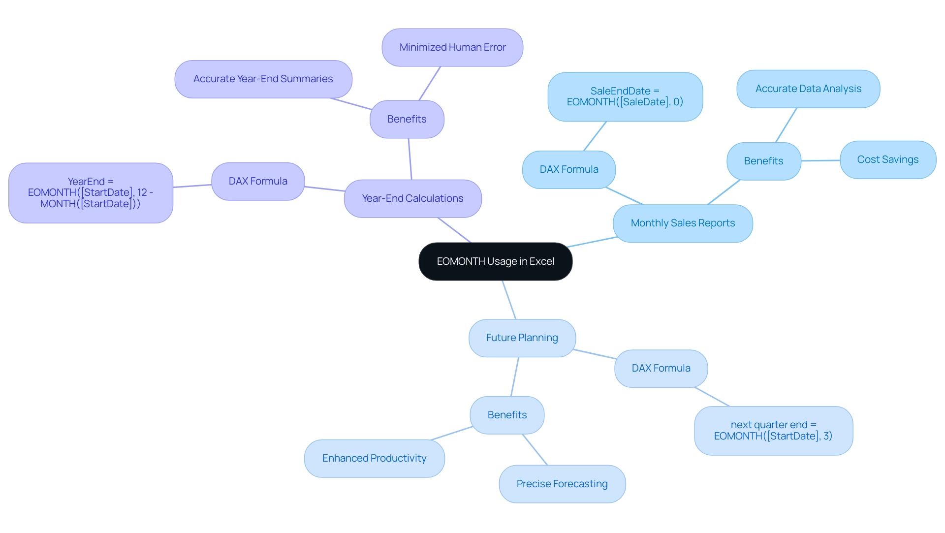
Best Practices and Considerations for Using EOMONTH
When utilizing the EOMONTH function in DAX, adhering to the following best practices is crucial for driving data-driven insights and enhancing operational efficiency:
- Avoid Hardcoding Dates: Utilize dynamic date fields within your model rather than hardcoded dates. This approach ensures that your calculations remain relevant and precise as your information evolves over time, addressing challenges like inconsistencies that can arise from static inputs.
- Implement the end-of-month function primarily in scenarios that require month-end calculations, such as financial reporting or various time intelligence analysis, to ensure its effectiveness. It’s important to note that the query results can vary depending on the type of the column, which can influence how eomonth powerbi interacts with your data, ultimately impacting your Power BI dashboards.
- Test Your Formulas: Always validate your DAX formulas with sample information to confirm they yield the expected results prior to deployment in reports. This step is essential for preserving information integrity and reliability, helping to alleviate the time-consuming nature of report creation.
- Documentation: Meticulously document your DAX formulas and calculations to enhance transparency and facilitate understanding among team members. Clear documentation not only aids future reference but also streamlines collaboration, ensuring that everyone can leverage the insights from your dashboards.
Furthermore, integrating Robotic Process Automation (RPA) into your workflows can significantly enhance the efficiency of DAX implementations. RPA can automate the repetitive tasks related to preparation and reporting, allowing your team to concentrate on strategic analysis and decision-making. As Douglas Rocha, a Software Engineer, states, “This is a quick and simple tutorial on using the most basic statistical measures in Power BI and should be looked at as that.”
In a recent case study titled ‘Building the Dashboard,’ the significance of visualizing calculated measures was highlighted. Utilizing column charts to display statistical measures like mean, median, mode, and standard deviation allowed for a clearer understanding of the information, including the identification of outliers. This further highlights the importance of adopting best practices in DAX, especially when utilizing operations such as eomonth powerbi calculations, to ensure your visualizations effectively convey insightful data stories.
By avoiding hardcoding and rigorously testing your formulas, while also leveraging RPA, you can enhance the operational efficiency of your dashboards, ultimately driving growth and innovation in your business.
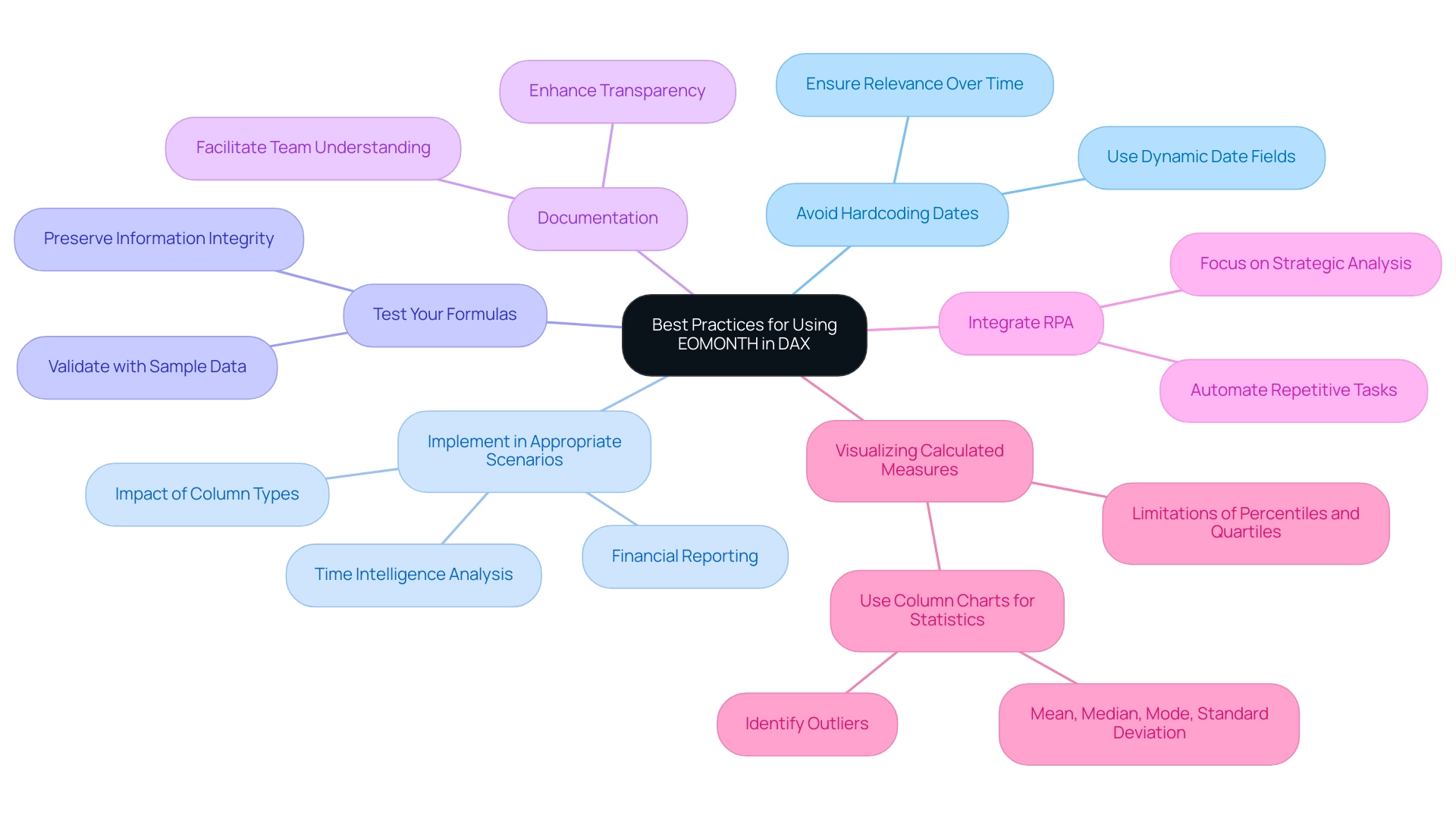
Further Learning Resources for EOMONTH and DAX in Power BI
To enhance your knowledge in applying the monthly calculation and DAX within Power BI, it’s crucial to utilize a range of educational materials that correspond with the changing AI environment. Start with Microsoft Documentation, which provides comprehensive guides and best practices for DAX, including a detailed focus on eomonth in Power BI, ensuring you have a solid foundation. Next, consider enrolling in Online Courses on platforms such as Coursera and Udemy, providing structured learning paths tailored specifically to Power BI and DAX, allowing you to progress at your own pace.
Engaging with Community Forums like the Power BI Community or Stack Overflow can also be invaluable; these platforms enable you to connect with fellow users, exchange experiences, and seek guidance on specific challenges you may encounter. As noted by community member ‘stretcharm’, “There are lots of sources. Start here with guided learning Microsoft Learning.”
This personal touch underscores the importance of guided resources in navigating the overwhelming options in AI and Business Intelligence. Furthermore, think about participating in the forthcoming Microsoft Fabric Community Conference set for March 31 – April 2, 2025, in Las Vegas, Nevada, which will offer chances to interact with specialists and gain more knowledge about DAX operations. Furthermore, it is crucial to recognize that as you explore these resources, they can help you address common challenges such as time-consuming report creation and data inconsistencies when leveraging insights from Power BI dashboards.
Finally, dive into YouTube Tutorials, where numerous channels are dedicated to Power BI. For instance, Curbal, led by Ruth Pozuelo, provides a wealth of video content that visually demonstrates the application of DAX operations, including eomonth in Power BI, making complex concepts more accessible. Additionally, incorporating Robotic Process Automation (RPA) in your workflows can significantly enhance operational efficiency by automating repetitive tasks, allowing you to focus on strategic decision-making.
The Power BI Native Visuals Series case study on the Stacked Bar Chart showcases practical applications of DAX functions in real-world scenarios, enriching your understanding. By utilizing these resources, you’ll not only enhance your understanding of DAX but also empower yourself to implement these skills effectively in your operations, ultimately driving growth and operational efficiency.
Conclusion
The EOMONTH function in Power BI stands out as an essential tool for enhancing data analysis, particularly in the realm of financial reporting. By enabling users to accurately determine the last day of any month relative to a specified date, EOMONTH simplifies complex date manipulations, thereby streamlining reporting processes. When integrated with Robotic Process Automation (RPA), this function not only minimizes errors but also optimizes workflows, allowing teams to focus on strategic initiatives that foster growth.
Implementing EOMONTH within DAX formulas unlocks a range of practical applications, from generating monthly sales reports to facilitating precise future planning and year-end calculations. By adhering to best practices—such as avoiding hardcoded dates and thoroughly testing formulas—organizations can significantly enhance the accuracy and reliability of their data insights. Coupled with RPA, the potential for operational efficiency is further amplified, enabling teams to move beyond repetitive tasks and engage in higher-value analysis.
As the business landscape continues to evolve, leveraging the capabilities of EOMONTH and DAX within Power BI is not just beneficial; it is imperative for informed decision-making. With the right resources and tools at their disposal, organizations can transform their data analysis capabilities, driving innovation and efficiency in their operations. The time to embrace these solutions is now, positioning teams to thrive in an increasingly data-driven environment.
Introduction
Navigating the complexities of SharePoint can be a game changer for organizations aiming to enhance operational efficiency and data management. As businesses increasingly rely on SharePoint for collaboration and data storage, understanding how to connect, extract, and secure data becomes paramount. This article delves into essential strategies for:
- Connecting to SharePoint
- Extracting data effectively
- Troubleshooting common access issues
- Managing multiple files
- Ensuring data integrity and security
With the integration of advanced tools like Power Query, Robotic Process Automation (RPA), and tailored AI solutions, organizations can streamline their workflows and make informed decisions that drive growth. Embracing these practices not only mitigates risks but also empowers teams to focus on strategic initiatives, ultimately transforming the way data is utilized in a rapidly evolving digital landscape.
Connecting to SharePoint: Initial Steps and Considerations
Connecting to a folder in the platform is a straightforward process, provided you have the right permissions in place. Begin by ensuring that you possess the necessary access rights to your site. You will need your site URL and valid credentials to proceed.
To excel get data from SharePoint folder, launch Power Query in Excel or Power BI, navigate to ‘Get Data’, select ‘From Online Services’, and choose ‘From Online List’. Input your site URL and click ‘OK’. If prompted, enter your credentials to verify your access, which is essential for efficiently using Excel to get data from the SharePoint folder.
As we approach the end-of-life for InfoPath on July 14, 2026, maintaining proper access controls becomes increasingly important. Recent updates in permissions management emphasize the significance of these controls, particularly as we approach 2024. PierreL69, a seasoned IT professional, noted, ‘I reported it to the IT team; we will see if they can manage something.
When you speak about other APIs, won’t it be the same result?’ This highlights the challenges faced in managing permissions and accessing logs. Leveraging Robotic Process Automation (RPA) can streamline these manual tasks, enhancing operational efficiency, reducing errors, and freeing up team resources for more strategic initiatives.
Additionally, integrating tailored AI solutions can help navigate technology implementation challenges, ensuring that your organization adopts the most effective tools for its specific needs. Regular permissions audits can mitigate risks associated with outdated access rights, ensuring that team members have appropriate permissions as roles change. By integrating these practices, you can foster a more efficient workflow and harness the power of Business Intelligence for informed decision-making.
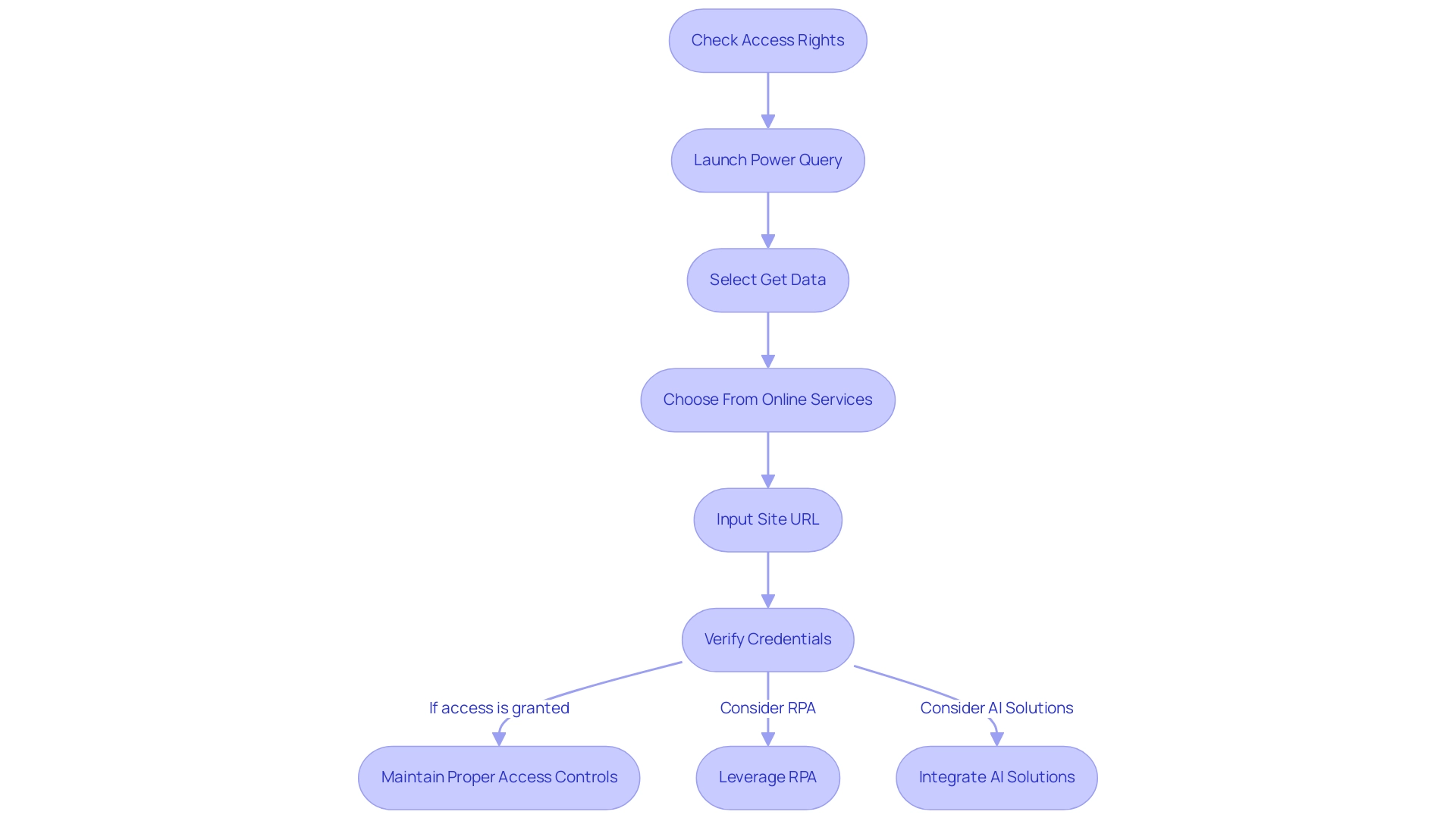
Extracting Data from SharePoint Folders: Techniques and Tools
Retrieving information from document repositories can greatly improve your operational efficiency, particularly when combined with advanced automation tools such as EMMA RPA and Automate. Employing Query remains one of the most common methods to excel and get data from SharePoint folder, facilitating direct connections to SharePoint lists and libraries for smooth management. Recent statistics indicate that Power Query has emerged as a preferred solution for organizations seeking to optimize their extraction processes.
It’s important to note that effective management often requires collaboration; typically, you will need two people to run a pipeline—one to trigger it and another to approve it, which is essential when dealing with outdated systems. As Khalid Maghni emphasizes, ‘Tracking your transactions is essential to keep a clear picture of your business’ financial health.’ For those seeking more customized information retrieval options, leveraging REST APIs or the Microsoft Graph API can provide tailored solutions to meet specific needs.
Additionally, for large-scale extraction, third-party tools such as ShareGate and Metalogix stand out for their user-friendly interfaces and advanced features, making them ideal for migration and management tasks. Effective SharePoint strategies depend on comprehending user behavior and utilizing information to excel at getting data from the SharePoint folder for actionable insights. By integrating EMMA RPA and GUI automation, businesses can not only simplify their extraction processes but also enhance overall productivity and operational efficiency in 2024 and beyond.
EMMA RPA specifically helps reduce errors and boost productivity, making it a vital tool for modernizing outdated systems. Furthermore, tools like VisualCron provide practical automation features, enabling users to create tasks without programming skills, offering extensive logging and error handling to enhance your extraction efforts. The case study on GUI automation demonstrated a 70% reduction in entry errors and an 80% improvement in workflow efficiency, showcasing the transformative impact of these automation solutions.
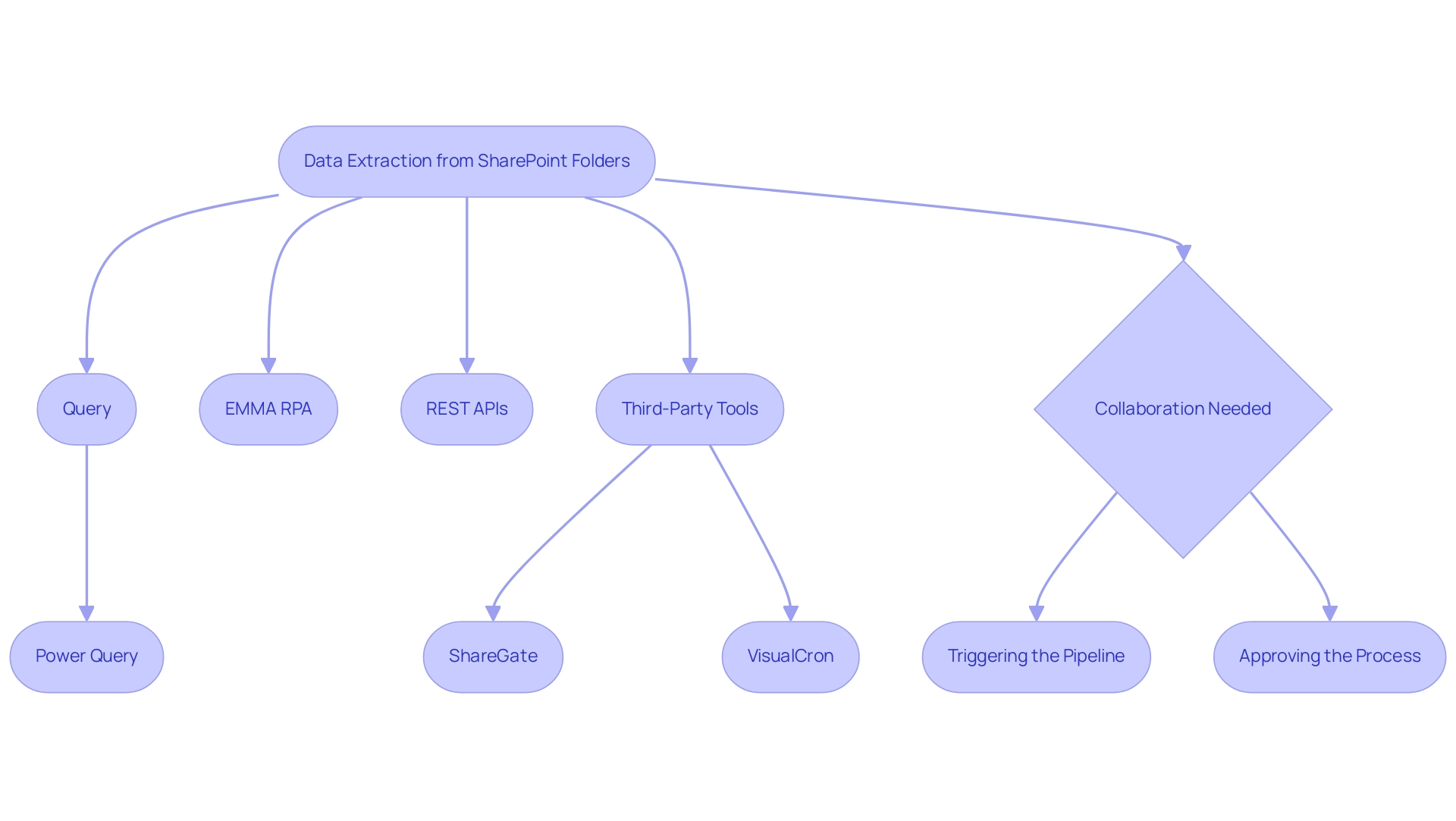
Troubleshooting Common SharePoint Data Access Issues
When navigating data access in the platform, users often encounter common issues such as authentication errors, permission discrepancies, and connectivity challenges. In 2024, statistics indicate that approximately 30% of users experience authentication errors, highlighting the need for effective solutions. Authentication errors can usually be resolved by carefully verifying your credentials and checking that your account has the required permissions for the specific folder.
As BulldogTom, a new member, noted, ‘This fix worked for me. Thanks!’ This personal touch adds credibility to the solutions presented.
Furthermore, another user confirmed that the fix provided by bwag2023 worked for them, showcasing the effectiveness of these approaches. As a proactive measure, it’s crucial to ensure you have the appropriate access rights, as misconfigured permissions can lead to frustrating access denials. In situations where connectivity problems occur, verify that your network connection is stable and that the site is operational.
A useful tip for addressing temporary access problems is to utilize the ‘Refresh’ option in Power Query, which can effectively re-establish connections and resolve minor disruptions. Furthermore, recent reports emphasize that phishing attacks can jeopardize access to collaborative platforms, highlighting the significance of cybersecurity in information management. By systematically checking these areas, you can enhance your efficiency in managing information and minimize downtime.
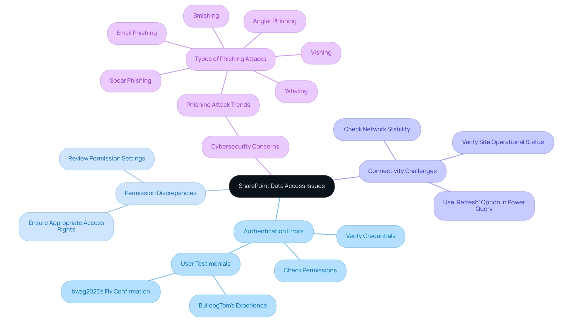
Managing Multiple Files: Advanced Strategies for SharePoint Data Extraction
Effectively managing multiple files in SharePoint can be significantly streamlined when you use the method to excel get data from SharePoint folder through Query’s folder connector. This powerful tool not only allows users to connect directly to a folder but also seamlessly combines files that share a similar structure, thereby enhancing reporting and actionable insights. Recent statistics indicate a growing trend in the use of Query’s folder connector, with an estimated 35% increase in adoption across organizations in 2024, reflecting its efficiency in information handling.
Query functionalities are also accessible in Microsoft Excel, allowing users to excel get data from SharePoint folder and BI, offering versatile options for preparation and transformation. By integrating these tools, organizations can leverage Power BI services for enriched reporting, including:
- The 3-Day Power BI Sprint, which facilitates quick creation of professionally designed reports
- The General Management App for comprehensive management and smart reviews
Additionally, RPA can automate manual workflows, ultimately enhancing operational efficiency in a rapidly evolving AI landscape.
Once connected, users can apply various transformations to clean and reshape the information as necessary. Automation tools and scripts play a critical role in this process, facilitating bulk updates and information extraction. For instance, a case study from a leading retail company showcased how implementing Power Query’s folder connector to excel get data from SharePoint folder reduced their processing time by 50%, allowing their teams to focus on more strategic tasks.
This reduction in manual effort not only enhances accuracy but also empowers teams to concentrate on higher-value activities. As pointed out by Saveen Reddy, Director of Community & Learning at Microsoft Fabric, ‘This enhancement provides better control over your tabular visuals, reducing unnecessary noise and ensuring cleaner presentation.’ This insight emphasizes the significance of adopting advanced tools and techniques for effective information management in today’s dynamic operational landscape, driving growth and innovation through informed decision-making.
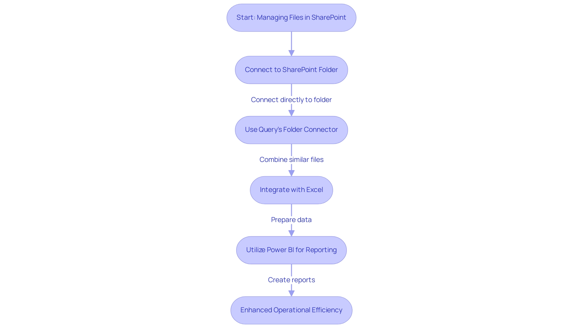
Best Practices for Data Integrity and Security in SharePoint
To ensure information integrity and security within the platform, organizations should adopt a set of best practices that align with the latest trends in information management and security, especially in the context of leveraging Robotic Process Automation (RPA) and Business Intelligence. Here are crucial steps to implement:
-
Conduct regular reviews and updates of user permissions, ensuring that only authorized personnel have access to sensitive information. RPA can automate the monitoring of these permissions, reducing the risk of unauthorized access.
-
Leverage version control features to meticulously track changes and maintain a comprehensive history of document revisions, thereby enhancing accountability and transparency. RPA can streamline the versioning process by automatically logging changes and notifying relevant stakeholders.
-
Activate loss prevention (DLP) policies to safeguard sensitive information from unintentional sharing, a necessity in today’s environment where cyberattacks are increasingly prevalent. RPA can help enforce these policies by automatically flagging potential violations.
-
Establish a routine for backing up information to protect against loss due to accidental deletions or corruption, reinforcing organizational resilience. RPA can schedule and execute these backups, ensuring they occur consistently and without manual intervention.
Furthermore, integrating RPA can automate these tasks, significantly reducing manual effort and enhancing operational efficiency. Methodologies such as Practical Information Migration and Information Asset Inventory can significantly assist organizations in managing complex information landscapes effectively.
As we launch Version 5.0 of this article, it is crucial to highlight that current solutions like Sotero’s industry-leading protection for SharePoint Online tackle the increasing expenses of breaches and cyber attacks, emphasizing the urgency of these proactive measures.
As Yonatan Hatzor, co-founder and CEO of Parametrix, aptly stated,
Downtime is an inevitable reality for almost every business,
which reinforces the necessity of these strategies. By systematically implementing these practices and leveraging RPA, organizations can significantly enhance their data management strategies, reduce errors, and free up their teams for more strategic tasks, bolstering the protection of their critical assets against evolving threats, including the rising costs associated with data breaches.
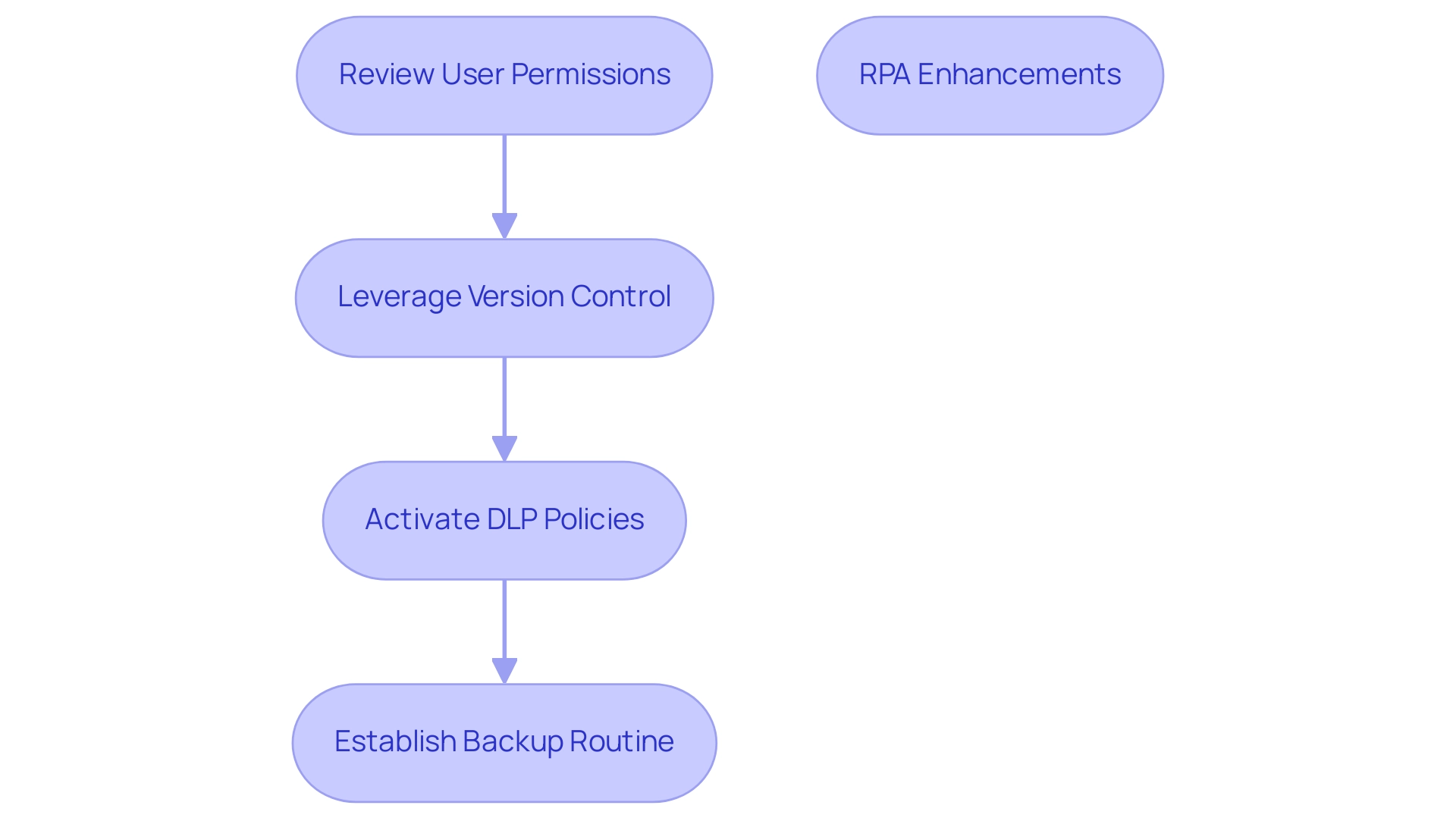
Conclusion
Leveraging SharePoint effectively can transform an organization’s approach to data management and operational efficiency. By understanding the critical steps for connecting to SharePoint, users can gain seamless access to essential data. Effective extraction techniques, including the use of Power Query and RPA, empower teams to streamline their workflows and enhance productivity. Addressing common access issues through proactive troubleshooting not only minimizes downtime but also promotes a smoother user experience.
Managing multiple files becomes significantly easier with the integration of advanced tools that facilitate data consolidation and transformation. This capability allows organizations to shift their focus from routine data handling to strategic initiatives, ultimately driving innovation and growth. Additionally, prioritizing data integrity and security through best practices, including:
- Regular permissions reviews
- DLP policies
safeguards sensitive information against potential threats.
In an era where digital transformation is paramount, embracing these practices not only mitigates risks but also positions organizations to harness the full potential of their data. By fostering an environment of efficiency and security, businesses can navigate the complexities of SharePoint with confidence, ensuring they remain competitive in a rapidly evolving landscape. Now is the time to adopt these strategies, empowering teams to unlock invaluable insights and drive meaningful results.
Introduction
In the realm of data analytics, the ability to harness time intelligence is a game-changer for organizations striving for operational excellence. The ENDOFMONTH function in DAX stands out as a critical tool for professionals looking to derive insightful trends from their data. By pinpointing the last date of any given month, this function empowers users to conduct thorough analyses that inform strategic decision-making. As the landscape of business intelligence continues to evolve, mastering ENDOFMONTH not only simplifies reporting processes but also enhances the overall efficiency of data management strategies.
This article delves into practical applications of the ENDOFMONTH function within Power BI, addresses common challenges, and explores related DAX functions that further augment analytical capabilities. By understanding and leveraging these tools, businesses can transform their data into actionable insights, driving growth and innovation in an increasingly competitive environment.
Understanding the ENDOFMONTH Function in DAX
The endofmonth dax calculation is essential in time intelligence computations as it returns the last date of the month that includes a specified date. This operation is crucial for examining trends over time, rendering it indispensable for anyone engaged in information-driven decision-making. The syntax is straightforward: ENDOFMONTH(<dates>), where <dates> refers to a column containing date values.
Mastering this capability not only simplifies the identification of endofmonth dax dates—critical for accurate reporting and analysis—but also enhances overall data management strategies that align with Business Intelligence initiatives. As Suhaib Arshad aptly states,
Context matters especially in the case of DAX operations.
With the ongoing advancements in Power BI and the DAX language, leveraging the endofmonth dax function can significantly enhance your analytical capabilities, ultimately leading to more informed business decisions.
Comprehending time intelligence is becoming more essential for business analytics, as it allows professionals to extract meaningful insights from their information, paving the way for innovative solutions and operational efficiency. For instance, calculating the Average Order Value using the formula Average Order Value = DIVIDE(Total Revenue, Total Order Quantity) can provide valuable insights when examining trends, especially at month-end. Moreover, recent case studies emphasize how advancements in DAX tools are intended to improve user experience, demonstrating practical uses of the endofmonth dax feature in real-world situations.
Furthermore, mastering statistical operations in DAX is crucial for business analysts, data scientists, and BI professionals, emphasizing the significance of the endofmonth dax calculation within the broader context of analysis and Business Intelligence, especially amid the overwhelming AI landscape. By tackling the challenges of time-consuming report creation and inconsistencies in information, the endofmonth dax tool can streamline processes and enhance accuracy. Furthermore, incorporating customized AI solutions can further improve the efficiency of DAX operations, equipping companies with the resources needed to handle the intricacies of analysis.
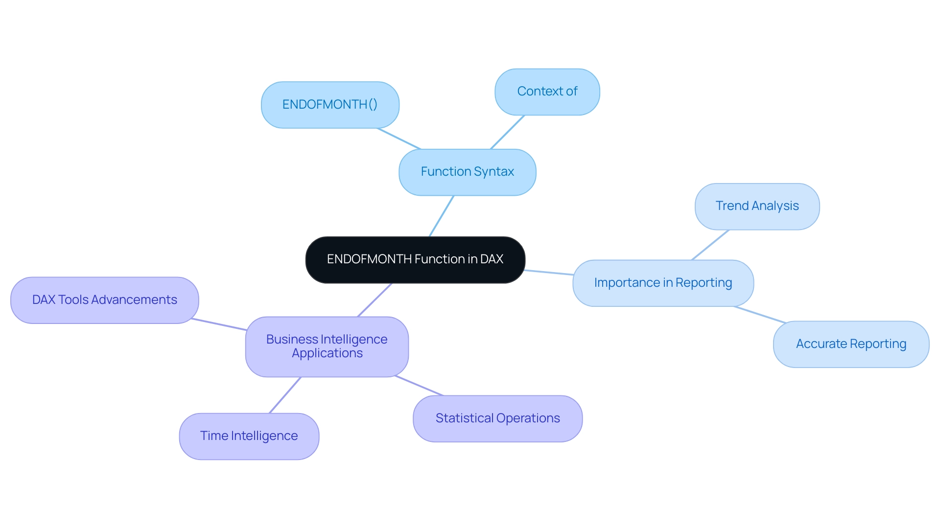
Practical Applications: Using ENDOFMONTH in Power BI
In Power BI, the endofmonth dax function serves as an effective tool for performing month-end calculations in both calculated columns and measures, which is essential for improving operational efficiency in reporting. For instance, to calculate total sales up to the end of the month, you can create a measure using the following formula: Total Sales of Month = CALCULATE(SUM(Sales[Amount]), LASTDAY(Sales[Date])). This measure facilitates quick analysis of sales data using the endofmonth dax, delivering valuable insights into monthly performance trends essential for informed decision-making.
Expert Greg Deckler emphasizes the importance of correctly applying this function, stating,
You want EOMONTH, not the end of the month. The endofmonth dax function returns the last day of the month based on the current context of the date column specified, which in your case is always TODAY().
This emphasizes a potential challenge in utilizing insights from Power BI dashboards, as incorrect usage can lead to inconsistencies.
Comprehending this behavior is essential for precise analysis. By merging certain elements with additional tools such as CALCULATE and FILTER, you can greatly improve your analysis abilities, resulting in more informed decision-making in sales strategies. Furthermore, integrating RPA solutions such as EMMA RPA and Power Automate can streamline data processes and reduce manual errors, ultimately improving operational efficiency.
Effectively employing the endofmonth dax capability, alongside RPA tools, enables a thorough comprehension of sales performance over time, fostering business growth and innovation.
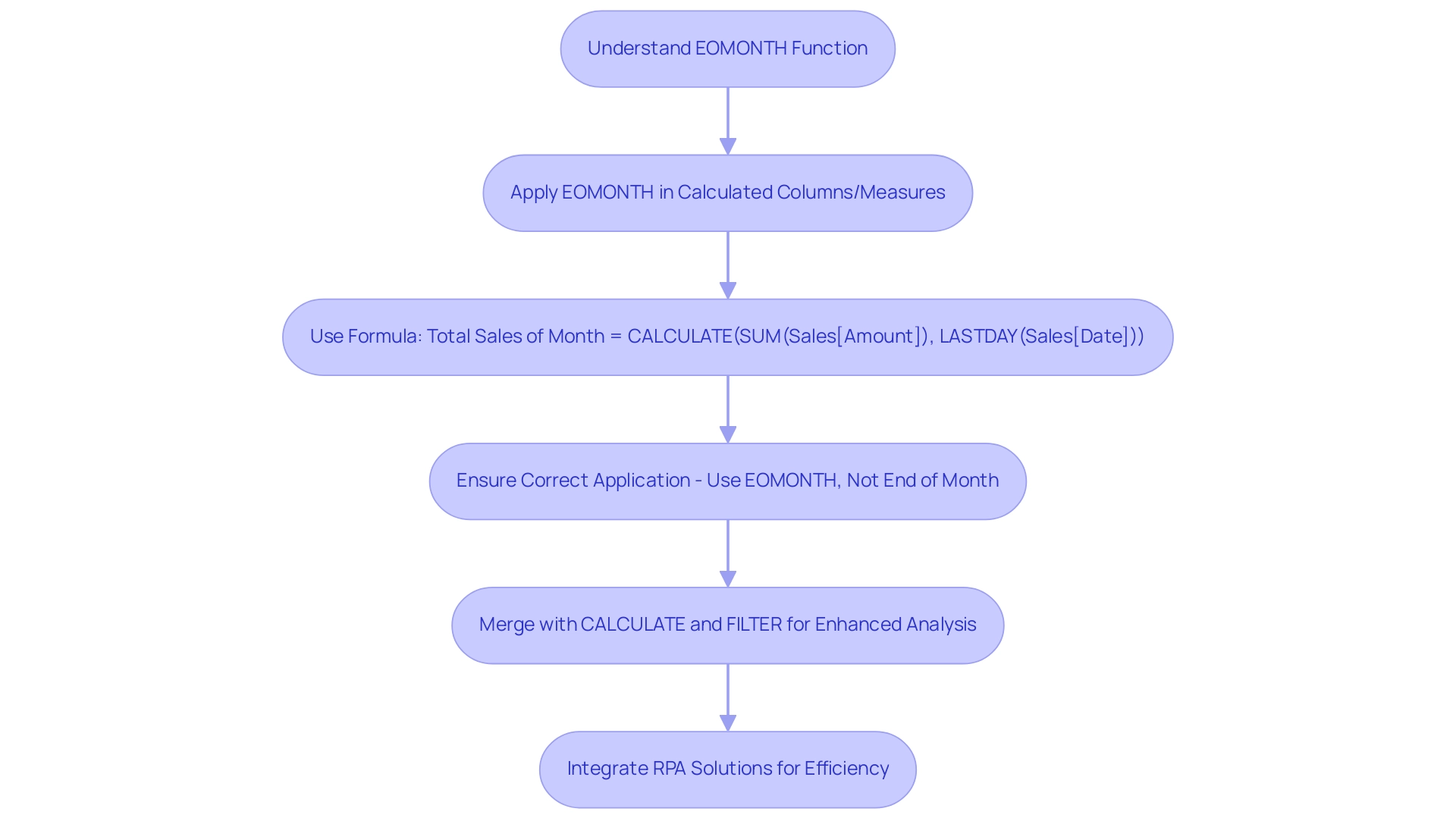
Common Challenges and Considerations with ENDOFMONTH
When utilizing the ENDOFMONTH feature, users often face challenges such as incorrect date formats and unexpected results stemming from the calculation context. A prevalent issue arises when the date column includes blank values, leading to potential errors in your analysis. To avoid this pitfall, ensure that your date column is correctly formatted and free of null values.
Additionally, consider the context in which you apply the function; for example, if used within a visual that filters by year, the function will yield the end date for the filtered month, which may not align with your initial expectations.
In today’s data-rich environment, addressing these challenges with Business Intelligence tools can drive informed decision-making and operational efficiency. Comprehending set operations in DAX—such as UNION, INTERSECT, and EXCEPT—can significantly enhance your management capabilities in Power BI. For instance, these operations allow you to combine information sets or find intersections that can be crucial when working with date-related calculations.
The case study titled ‘UNION, INTERSECT, EXCEPT: Set Operations in DAX‘ illustrates how these operations can be utilized effectively in conjunction with endofmonth dax functions to refine your analysis and avoid common pitfalls.
Moreover, implementing Robotic Process Automation can streamline reporting processes, saving time and reducing errors. For example, RPA tools can automate the extraction and transformation of information, ensuring consistent formatting and reducing the risk of human error in your DAX calculations. To enhance your troubleshooting process, test your DAX expressions directly in the formula bar.
As Albert Einstein aptly stated, ‘Anyone who has never made a mistake has never tried anything new.’ Embracing this mindset is essential in the realm of information analysis, as learning from mistakes can lead to improved DAX calculations. By incorporating set operations into your strategy and utilizing RPA, customized AI solutions, and Business Intelligence, you can more effectively manage the challenges related to the endofmonth dax process and enhance your data analysis abilities.
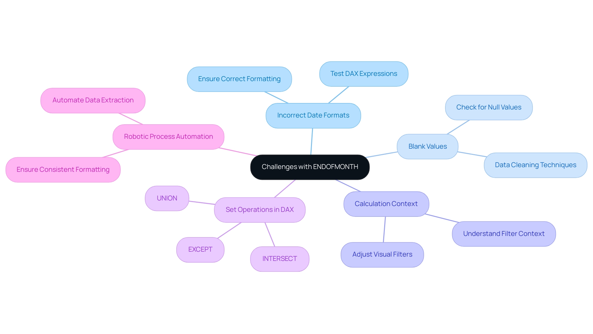
Example Scenarios: Implementing ENDOFMONTH in DAX
To effectively analyze monthly expenses, the endofmonth dax feature is invaluable. By establishing a measure like Monthly Expenses = CALCULATE(SUM(Expenses[Amount]), LASTDATE(Expenses[Date])), businesses can aggregate expenses up to the conclusion of each month. This measure not only provides clarity on monthly spending but can also be visualized through line charts, revealing expense trends over time.
However, in today’s data-rich environment, extracting meaningful insights can be challenging, leaving businesses at a competitive disadvantage. This is where customized AI solutions and Robotic Process Automation (RPA) come into play, enhancing operational efficiency and aiding in analysis. Furthermore, think about improving financial insights by incorporating endofmonth dax data with other DAX calculations for year-to-date sales comparisons.
For instance, you can juxtapose current month sales against the previous month, offering a clearer picture of financial performance. As Suhaib Arshad, a Sales Executive turned Data Scientist, states, “With more than 3+ years experience solving problems in Ecommerce, Finance, and Recruitment Domain!” Mastering such DAX operations is essential for converting unstructured information into actionable insights that promote growth.
Furthermore, the case study titled ‘Proficiency in DAX Expressions‘ illustrates how mastering various DAX expressions, particularly endofmonth dax, can enhance data analysis capabilities in Power BI. This aligns with the need to unlock the power of Business Intelligence amidst the overwhelming AI landscape. To provide a concrete example, consider the unit price of Product P008 at 14.5, which can be analyzed alongside monthly expenses to optimize financial strategies effectively, ensuring your operations run smoothly and efficiently.
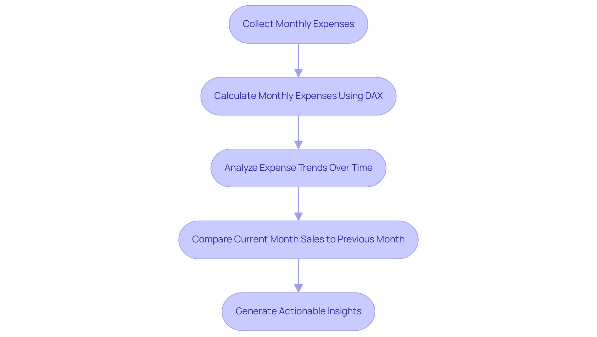
Exploring Related DAX Functions: Enhancing Your Time Intelligence Skills
To enhance your proficiency in time intelligence with DAX, it’s essential to explore powerful tools such as EOMONTH and DATEADD. The EOMONTH operation returns the last day of the month for a specified number of months before or after a designated date, while DATEADD enables you to shift dates by a defined interval. Utilizing these features in conjunction with endofmonth dax can enable complex computations that improve your reporting abilities.
For instance, combining EOMONTH with endofmonth dax can yield insightful comparisons across various months, allowing for a more nuanced understanding of trends in your information. In today’s information-abundant environment, where challenges such as time-consuming report creation and inconsistencies can hinder your efficiency, utilizing DAX formulas becomes essential to overcoming the lack of insights based on information. These tools can assist in identifying anomalies, such as outliers in sales information, enhancing the accuracy of your reports.
Additionally, recognizing that formulas in tabular models can be assessed in various contexts—row context, query context, and filter context—significantly influences how these operations work. The case study titled ‘Building the Dashboard’ emphasizes the significance of visualizing calculated measures in a dashboard instead of merely in numerical view, showcasing how effective use of BI can enhance operational efficiency. Furthermore, integrating RPA solutions like EMMA RPA and Power Automate can automate repetitive tasks and improve overall efficiency, addressing staffing shortages and outdated systems.
By mastering these functions and tools, you not only sharpen your analysis skills but also unlock the potential to derive deeper insights from your datasets, ultimately driving growth and innovation in your operations. As Douglas Rocha, a passionate data science enthusiast, aptly puts it,
Last but definitely not least is the Mode,
underscoring the significance of effectively utilizing various statistical measures in your analyses.
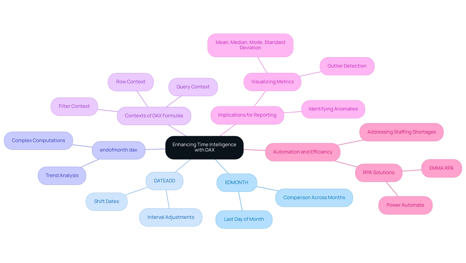
Conclusion
Harnessing the power of the ENDOFMONTH function in DAX is crucial for organizations aiming to enhance their data analytics capabilities. This function not only provides the last date of the month for specified date values but also serves as a foundation for deeper insights into operational performance. By effectively utilizing ENDOFMONTH alongside other DAX functions and tools, businesses can streamline reporting processes, improve data accuracy, and drive informed decision-making.
Navigating potential challenges, such as incorrect date formats or unexpected calculation contexts, is essential for maximizing the effectiveness of the ENDOFMONTH function. With the right strategies in place, including the integration of Robotic Process Automation and tailored AI solutions, organizations can overcome these hurdles and unlock the full potential of their data. This proactive approach not only enhances analytical capabilities but also positions businesses for sustainable growth in an increasingly competitive landscape.
Ultimately, mastering the ENDOFMONTH function and its related DAX counterparts equips professionals with the tools necessary to transform data into actionable insights. By embracing these technologies and methodologies, organizations can elevate their operational efficiency, foster innovation, and establish a data-driven culture that thrives in the face of evolving challenges. The journey towards operational excellence in data analytics begins with a commitment to understanding and leveraging these powerful functions effectively.
