Overview
This article explores best practices for harnessing BI images in Power BI to elevate reporting standards. High-quality, relevant visuals are not just enhancements; they are essential tools that significantly improve clarity and engagement. Statistics reveal that user performance and stakeholder interaction see marked increases when visuals are strategically integrated into BI reports. This strategic use of visuals is not merely a recommendation; it is a necessity for effective communication in today’s data-driven environment.
Introduction
In the realm of data visualization, the integration of Business Intelligence (BI) images in Power BI is revolutionizing how organizations convey insights. From logos to infographics, these visuals not only elevate the aesthetic appeal of reports but also significantly enhance comprehension. Studies indicate that understanding can increase by up to 40% with the strategic use of visuals. As stakeholders increasingly demand clearer and more engaging presentations of complex data, the role of images becomes crucial.
This article explores the importance of BI images, outlines best practices for their integration, and details the technical aspects of adding and formatting these visuals in Power BI. Ultimately, it aims to guide organizations toward more effective data storytelling and informed decision-making.
Understanding BI Images in Power BI: An Overview
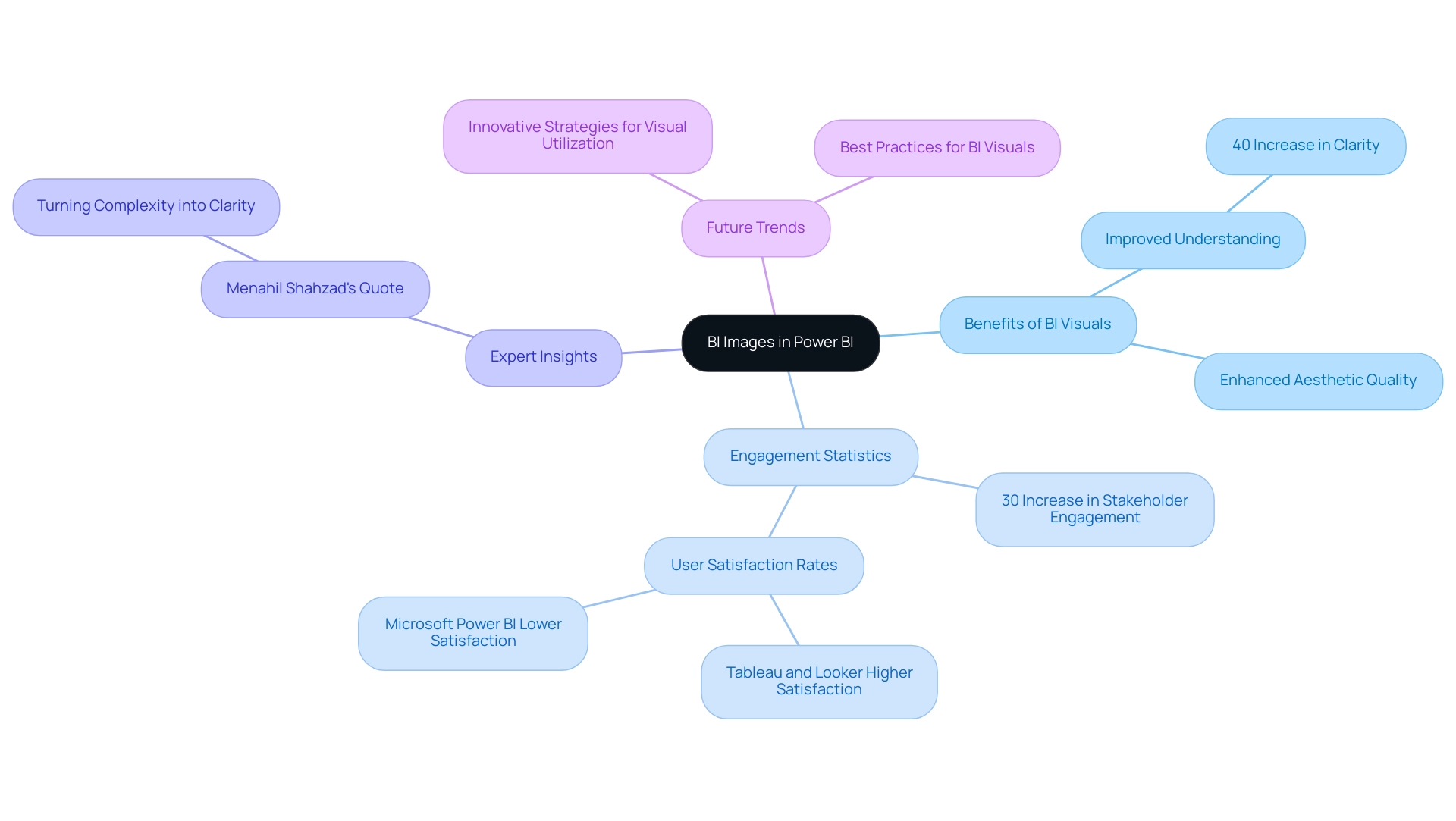
BI images in Power BI are crucial for enhancing data visualization and storytelling. These visuals, ranging from logos and icons to infographics, significantly improve the clarity and impact of documents. Recent statistics indicate that documents featuring visuals can enhance understanding by as much as 40%, demonstrating their effectiveness in conveying complex information intuitively.
Among 2,751 evaluations of business intelligence tools on TrustRadius, the average word count is 367 words, highlighting the depth of information typically expected in BI documents.
The integration of BI visuals not only elevates the aesthetic quality of documents but also fosters a more engaging experience for stakeholders. For instance, organizations that utilize visuals in their BI dashboards report a 30% increase in stakeholder engagement, facilitating the extraction of actionable insights from data. This is particularly relevant when considering the challenges of time-consuming documentation processes and information inconsistencies that many face when leveraging insights from Power BI dashboards.
Expert insights underscore the importance of BI visuals in enhancing information representation. In 2025, data visualization specialists emphasize that strategically placed visuals can significantly improve document clarity, allowing users to grasp key insights swiftly. Menahil Shahzad from Analytico states, “At Analytico, we turn complexity into clarity, assisting businesses like yours attain measurable growth,” reinforcing the value of BI visuals in achieving clarity and driving growth.
Furthermore, the features of BI services, such as the 3-Day BI Sprint for rapid report creation and the General Management App for comprehensive oversight, directly address the demand for efficient reporting and actionable guidance. Case studies reveal that companies have successfully transformed their reporting processes by leveraging BI images in Business Intelligence, leading to more informed decision-making. For example, user satisfaction rates vary significantly among BI tools, with Tableau Desktop and Looker users reporting higher satisfaction compared to Microsoft BI users.
This context illustrates the effectiveness of BI tools, particularly in relation to BI.
As trends evolve, the role of BI visuals in Business Intelligence continues to expand, with innovative strategies emerging for effective visual utilization. By understanding and implementing best practices for BI visuals, organizations can enhance their reporting capabilities and derive greater value from their data. Creatum GmbH is well-positioned to assist businesses in navigating these advancements, ensuring they can overcome outdated systems through intelligent automation and tailored AI solutions.
Best Practices for Integrating Images into Power BI Reports
Incorporating bi images into Power BI presentations significantly enhances the clarity and engagement of your information displays, especially when leveraging Business Intelligence (BI) and Robotic Process Automation (RPA) for operational efficiency. Yet, challenges such as time-consuming document creation and data inconsistencies can impede the effectiveness of these insights. To achieve optimal results, consider the following best practices:
-
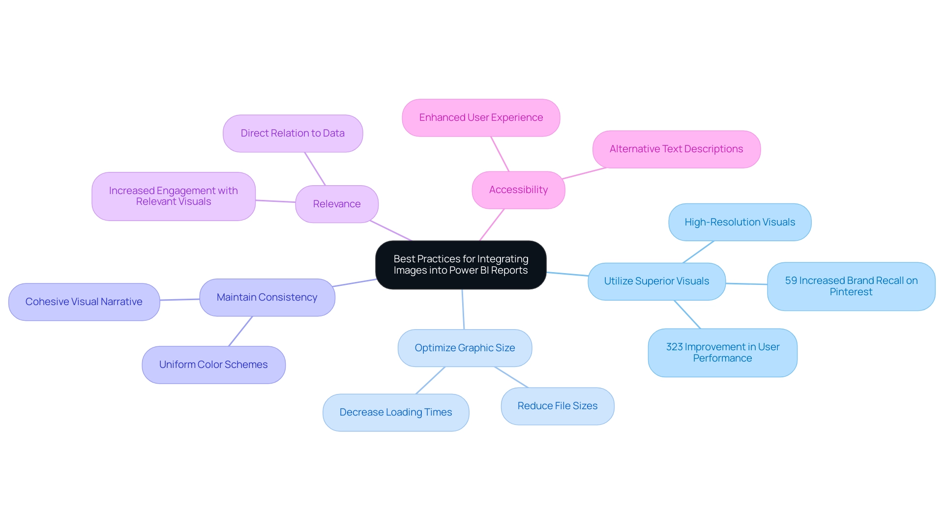
Utilize Superior Visuals: High-resolution visuals are essential for maintaining clarity and professionalism in your documents. Research indicates that content featuring high-quality visuals can lead to a 323% improvement in user performance when following directions, illustrating the critical role of visual quality in effective communication. Furthermore, statistics reveal that Pinterest users exposed to immersive, actionable ads were 59% more likely to recall the brand, underscoring the significance of quality visuals in enhancing brand recall in reports.
-
Optimize Graphic Size: Oversized visuals can slow document loading times, adversely affecting user experience. It is vital to reduce file sizes without sacrificing quality, ensuring your documents load swiftly and efficiently. Studies demonstrate that documents with optimized bi images can significantly decrease loading times, thereby enhancing overall performance—crucial when utilizing BI tools to drive data-driven insights.
-
Maintain Consistency: A consistent style across images—such as uniform color schemes and sizes—creates a cohesive visual narrative throughout your report. This consistency not only enhances aesthetics but also aids the audience’s comprehension of the information presented, which is essential for effective decision-making driven by BI insights.
-
Relevance: Images must directly relate to the data being showcased. Relevant visuals enhance understanding and retention, while unrelated visuals can distract and confuse the audience. For instance, case studies indicate that users are more likely to engage with content that includes pertinent visuals, leading to increased recall and action. The case analysis on Pinterest’s influence on purchases highlights how effective visuals can sway consumer behavior, emphasizing the importance of relevant graphics in BI reports.
-
Accessibility: Ensuring that visuals are accessible to all users, including those with visual impairments, is paramount. Including alternative text descriptions for visuals not only enhances accessibility but also improves the user experience for everyone.
By adhering to these best practices, you can harness the potential of bi images in BI to create documents that are not only visually appealing but also effective in communicating essential insights. Moreover, content featuring visuals receives up to 40% more shares than content lacking images, reinforcing the importance of graphics in boosting engagement and supporting the overarching objectives of BI and RPA, including solutions like EMMA RPA and Automate from Creatum GmbH, in driving business growth.
Technical Guide: How to Add and Format Images in Power BI
Incorporating and formatting BI images in Power BI is a straightforward process that significantly enhances your reports. However, it is crucial to consider privacy concerns when uploading photos. Avoid uploading images with embedded location data (EXIF GPS), as visitors to the website can download and extract this information.
This consideration is particularly important for users of Creatum GmbH’s platform. Follow these steps to effectively incorporate visuals:
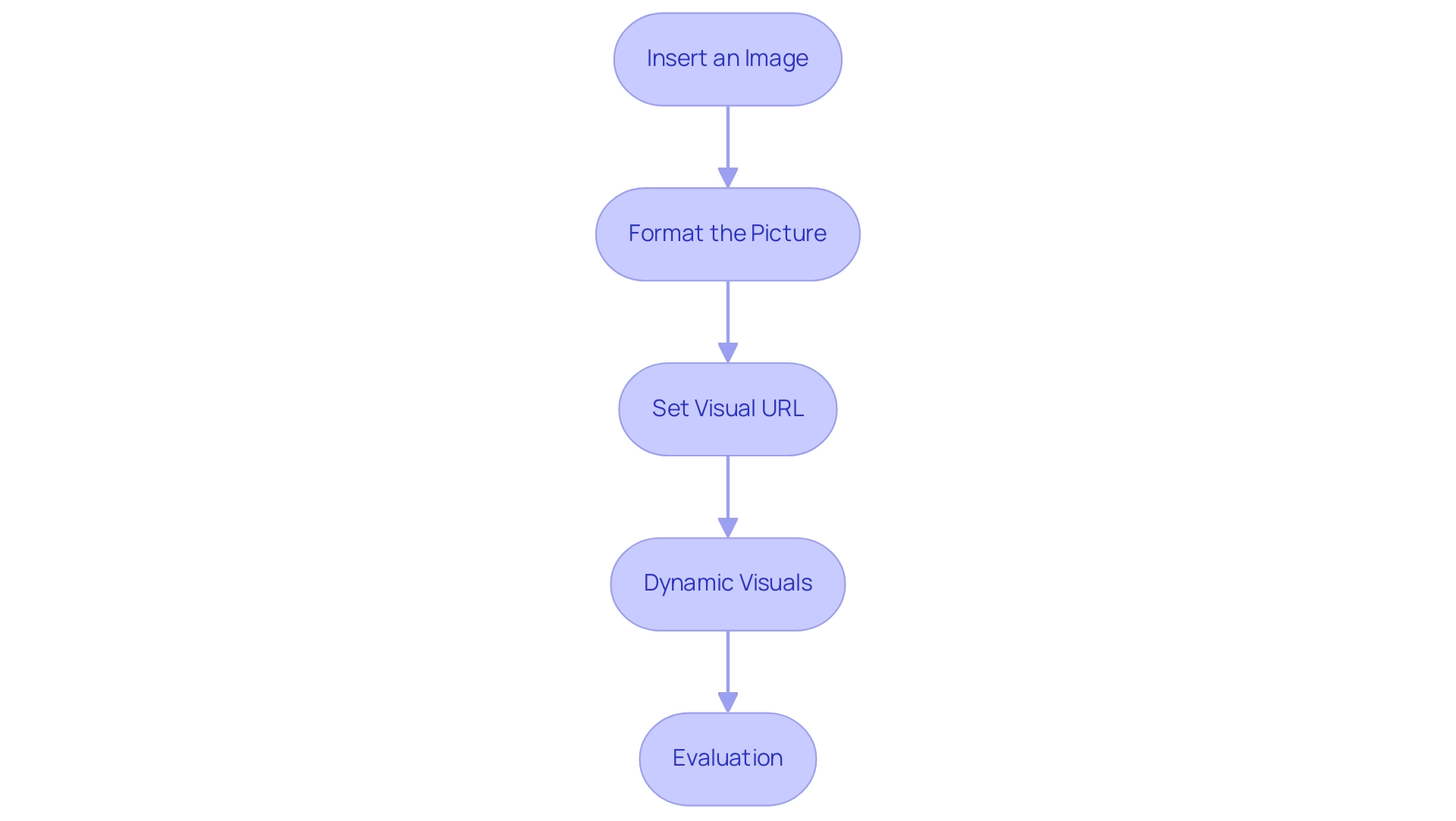
- Insert an Image: Start by navigating to the ‘Insert’ tab in Power BI Desktop and selecting ‘Image’. You can either choose a file from your local machine or provide a URL for online visuals.
- Format the Picture: After inserting the image, resize and position it as needed. Utilize the formatting pane to adjust various properties, including border styles, shadow effects, and transparency levels, ensuring the visual element complements your report’s design.
- Set Visual URL: For visuals hosted online, confirm that the URL is publicly accessible. In your data model, designate the column type as ‘Image URL’ to ensure proper display within tables or matrices.
- Dynamic Visuals: To create engaging visuals that respond to user interactions, employ DAX measures to dynamically change the displayed graphic based on slicer selections. This feature allows for a more personalized reporting experience.
- Evaluation: Always review your document across various devices and screen sizes to ensure visuals display properly. This step is crucial for maintaining a professional appearance and ensuring accessibility. Effectively incorporating BI images can lead to better user engagement and understanding.
A recent case study on Power BI usage highlighted how visualizing interactions can guide organizations in optimizing their resources. By identifying which documents are actively used, teams can focus on maintaining and enhancing those that provide the most value while addressing underutilized materials. Notably, outcomes from the execution log are arranged in descending order, beginning with the most recent execution, aiding in comprehending document usage.
As of 2025, statistics indicate that documents containing BI images experience a higher engagement rate, making it crucial to remain informed on best practices for visual formatting. Professional guidance underscores the significance of clarity and relevance in visual selection, ensuring that each visual component contributes value to the overall narrative of the document. Additionally, it is essential to consider the challenges in utilizing insights from BI dashboards, such as the time-consuming creation of documents, inconsistencies in information, and the absence of actionable guidance, to enhance the overall effectiveness of your reporting.
The Importance of Image Quality and Selection in Reporting
The quality and variety of BI images in Power BI documents are crucial for shaping how data is perceived and understood. This is particularly relevant given the frequent challenges such as the time-consuming nature of document creation and the data inconsistencies that arise from a lack of governance strategy. High-quality visuals, including BI images, not only bolster the credibility of reports but also enable more informed decision-making by providing clear, actionable guidance. Below are essential considerations for optimizing image use in reporting:
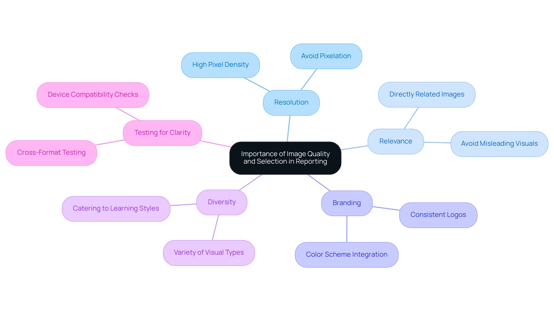
- Resolution: Ensure that BI images possess a resolution that meets display requirements. Low-resolution BI images can appear pixelated, undermining professionalism and clarity, potentially exacerbating confusion stemming from inconsistent information.
- Relevance: Select BI images that are directly related to the information being presented. Irrelevant BI images can mislead the audience and obscure the intended message, leading to misinterpretations and complicating the creation process.
- Branding: Integrate brand elements such as logos and color schemes to maintain consistency and reinforce brand identity. This not only enhances recognition but also fosters trust in the report’s findings, which is essential when stakeholders navigate intricate information.
- Diversity: Employ a variety of visual types—BI images, charts, icons, and photographs—to address different facets of the data and engage the audience effectively. This diversity caters to various learning styles and preferences, making the information more accessible and actionable.
- Testing for Clarity: Always test how BI images render across different formats and devices to ensure they retain clarity and impact. This step is vital in a data-rich environment where the effectiveness of BI images can significantly influence decision-making performance and reduce the time spent on report adjustments.
Research indicates that while user preferences for visualizations exist, they do not significantly correlate with actual judgment accuracy or efficiency. This suggests that the impact of visualizations may be broader than previously believed, underscoring the necessity for high-quality visuals that resonate with a diverse audience. In 2025, the importance of visual quality, particularly BI images, in business intelligence reporting cannot be overstated, as it directly affects how information is interpreted and acted upon.
Experts in branding emphasize that well-selected BI images enhance report credibility, reinforcing the notion that effective visual communication is vital to successful business intelligence strategies. Furthermore, the case study titled “User Preferences in Visualization” illustrates how user preferences can influence decision-making performance, providing a real-world example that highlights the significance of effective visual aids. Additionally, as noted by Leisti and Häkkinen, decision time data from earlier experiments supports the idea that strategic selection approaches, particularly those utilizing BI images, can yield more consistent outcomes, aligning with the audience’s interest in operational efficiency.
At Creatum GmbH, we recognize that addressing these challenges is essential for effectively leveraging insights from BI dashboards.
Overcoming Challenges: Solutions for Effective Image Use in Power BI
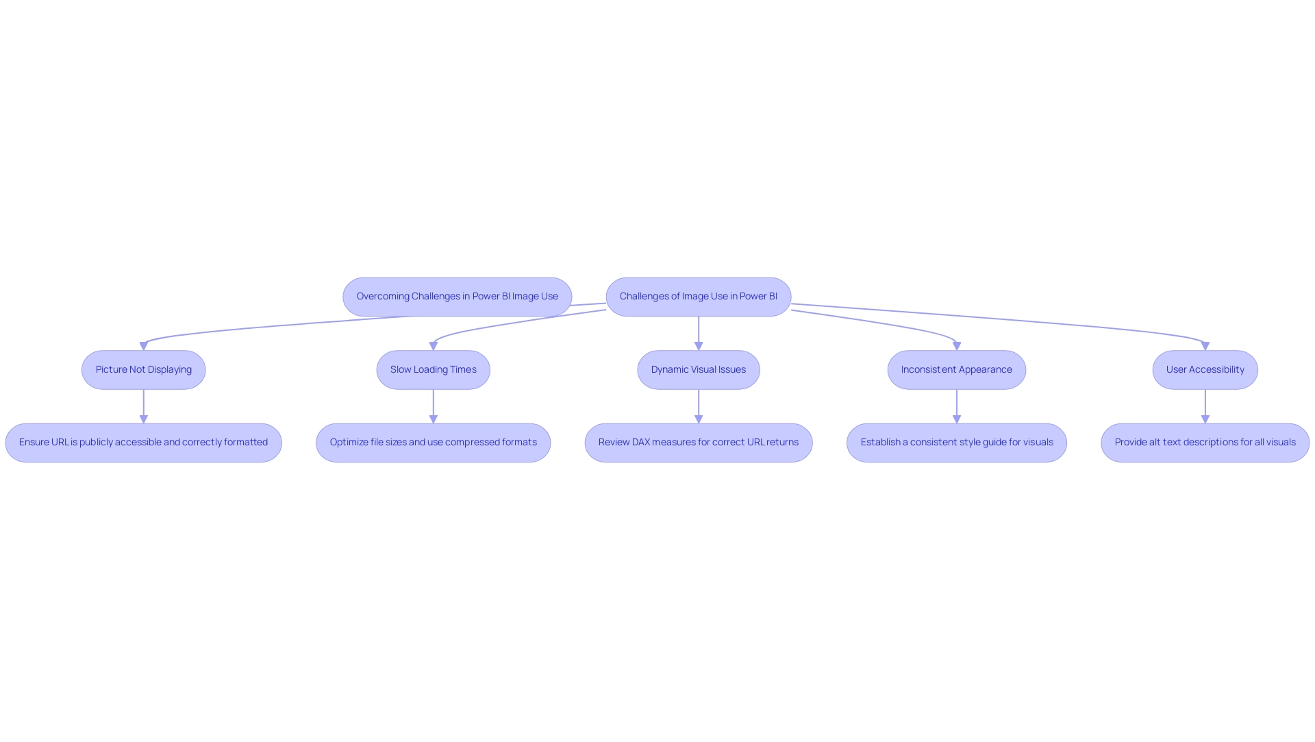
Incorporating BI images can present a range of difficulties that might obstruct reporting efficiency. Common issues include:
-
Picture Not Displaying: Ensure that the URL is publicly accessible and correctly formatted. Testing the URL in a web browser can confirm its functionality.
-
Slow Loading Times: Optimize file sizes prior to uploading them to Power BI. Utilizing compressed formats such as JPEG or PNG can significantly reduce file sizes while maintaining visual quality, thus improving loading times. Research indicates that properly optimized visuals can decrease loading times by as much as 30%, allowing your team to concentrate on more strategic, value-enhancing tasks.
-
Dynamic Visual Issues: If dynamic visuals fail to display correctly, review the DAX measures utilized. Ensure these measures accurately return the appropriate URLs based on user selections, which is essential for dynamic reporting and informed decision-making.
-
Inconsistent Appearance: Establish a consistent style guide for visuals to achieve a cohesive look across reports. Regularly reviewing and refreshing visuals to reflect branding modifications will assist in maintaining consistency and professionalism in reporting, addressing the frequent issue of inconsistencies in information.
-
User Accessibility: To adhere to accessibility standards, provide alt text descriptions for all visuals. This practice ensures that users with visual impairments can comprehend the content, thereby enhancing the overall user experience and trust in the data presented.
Furthermore, using the Performance Analyzer in BI Desktop can assist in measuring element performance and resource utilization, offering insights into how BI images affect overall efficiency. It is crucial to note that BI requires internet access for its online and paid applications, which may pose challenges for users needing offline access.
In 2025, case studies reveal that organizations overcoming image-related challenges have successfully implemented these solutions, resulting in enhanced report clarity and user engagement. As noted by data analysts, addressing these common issues related to BI images is vital for maximizing the effectiveness of BI reporting. Utpal Kar emphasizes this complexity, stating, “This is one of the major BI drawbacks as Microsoft has designed BI in a very complex manner.”
This underscores the importance of effective strategies in navigating the challenges associated with image usage in Power BI, especially in the context of time-consuming report creation and the need for actionable guidance.
Conclusion
Incorporating Business Intelligence (BI) images into Power BI reports is not merely an enhancement; it is a transformative approach that significantly boosts the effectiveness of data visualization and storytelling. High-quality visuals can improve comprehension by up to 40%, making complex information more accessible and engaging for stakeholders. By adhering to best practices—such as using high-resolution images, optimizing their size, and ensuring relevance and consistency—organizations can create reports that not only look professional but also facilitate informed decision-making.
The technical guidance provided demonstrates that adding and formatting images in Power BI is a manageable task that can yield substantial benefits. Understanding the nuances of image selection allows organizations to craft narratives that resonate with their audience, ultimately driving better engagement and understanding of the data at hand. Moreover, addressing common challenges associated with image use—like loading times and accessibility—ensures that reports remain effective and inclusive.
In summary, the strategic use of BI images in Power BI is essential for enhancing report clarity and stakeholder engagement. As organizations continue to navigate the complexities of data reporting, leveraging high-quality visuals will be crucial in transforming data into actionable insights. The commitment to effective data storytelling through visuals not only improves comprehension but also reinforces the importance of making informed decisions based on clear and compelling evidence.
Overview
Power BI storytelling is crucial for crafting engaging data presentations that effectively convey insights through a narrative framework. This approach not only enhances audience retention but also improves understanding. By emphasizing:
- Clarity
- Tailored messaging
- Integration of visuals
we demonstrate that these elements significantly elevate the impact of presentations. Ultimately, this facilitates better decision-making within organizations.
Introduction
In a world inundated with data, weaving compelling narratives from numbers has become an indispensable skill for professionals. Data storytelling in Power BI transcends mere presentation; it merges data, narrative, and visuals to create engaging and memorable experiences. This approach simplifies complex information and enhances retention, making insights accessible and actionable. As businesses increasingly rely on data-driven strategies, mastering the art of storytelling can lead to significant improvements in productivity and operational efficiency. With the right techniques, organizations can transform raw data into powerful stories that resonate with audiences and drive strategic decisions.
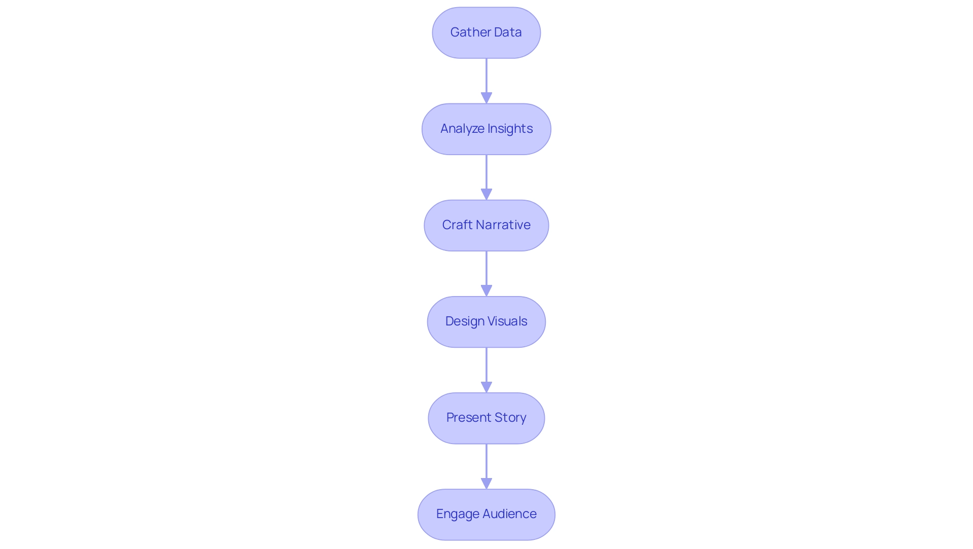
Understanding Data Storytelling in Power BI
The effective method of Power BI storytelling merges information, narratives, and visuals to create presentations that are not only cohesive but also captivating. This approach enables analysts to distill complex information into relatable and comprehensible formats. By integrating information within a storytelling framework, users can effectively highlight key insights and emphasize the significance of the information being communicated.
This narrative method not only engages the audience but also greatly enhances information retention, making it a crucial skill for professionals utilizing Power BI storytelling.
In 2025, the impact of information narratives in business presentations is underscored by recent statistics, revealing that presentations featuring stories can yield a 15% boost in productivity compared to those relying solely on text. Raja Antony, a Content Writer at Visme, notes, ‘instructions with visuals lead to a 15% boost in productivity compared to instructions with solely text,’ reinforcing the argument regarding the efficacy of information narration. Additionally, a market survey indicated that 39% of attendees were uncertain about their organization’s data-driven culture, highlighting the necessity for compelling narratives to bridge this gap.
The importance of narrative in presentations cannot be overstated; it transforms raw data into compelling stories that resonate with audiences. Effective examples of information narration through Power BI storytelling demonstrate how organizations can leverage these techniques to enhance their marketing efforts and successfully convey their brand messages. With Creatum GmbH’s Power BI services, including the 3-Day Power BI Sprint for rapid report creation and the General Management App for comprehensive management, businesses can ensure efficient reporting and actionable insights.
Moreover, the integration of AI solutions like Small Language Models and GenAI Workshops can significantly enhance information quality and improve the narrative process. As information visualization tools become more accessible to small and medium enterprises, the potential for meaningful narratives expands, enabling these organizations to utilize insights for strategic advantage.
Ultimately, Power BI storytelling involves mastering information narration, which transcends mere presentation; it is about crafting a narrative that engages, informs, and drives action, ensuring that the insights derived from information are both memorable and actionable. For those keen on advancing their skills in this domain, completing a registration form and paying a tuition fee for relevant courses can provide invaluable training. Furthermore, addressing the challenges faced by participants in presenting pertinent information frameworks due to insufficient domain knowledge underscores the essential role of effective narrative communication in overcoming these hurdles.
Key Elements of Effective Data Storytelling
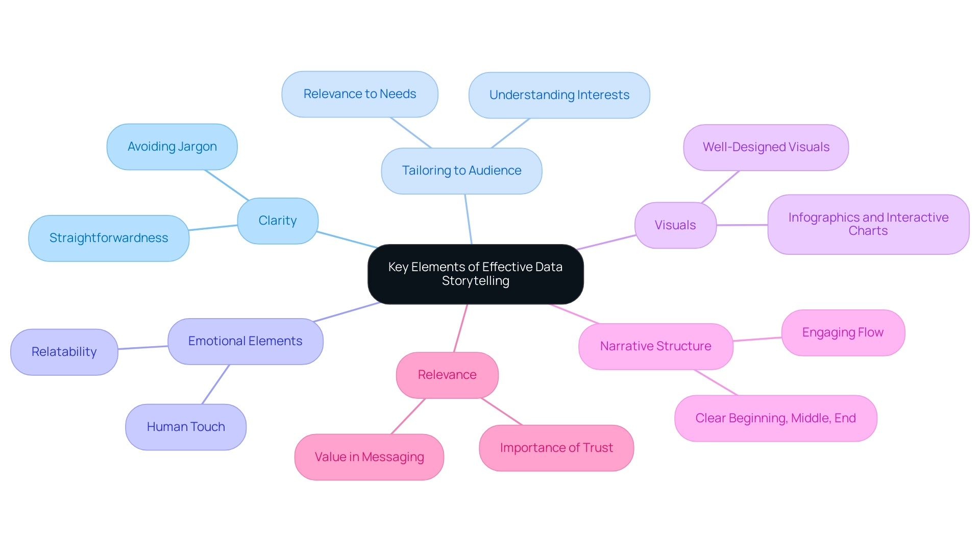
Effective Power BI storytelling hinges on several essential elements that enhance understanding and engagement. Clarity is crucial; a clear narrative should be straightforward and free of jargon that could confuse listeners. This clarity enhances Power BI storytelling, ensuring that the message is easily grasped and facilitating better decision-making.
Tailoring the story to the listeners’ specific interests and needs is vital. Presenting information through Power BI storytelling resonates with the audience, capturing their attention and underscoring the significance of what is being shared. In the context of operational efficiency, utilizing Robotic Process Automation (RPA) from Creatum GmbH can streamline workflows, allowing for more pertinent information presentation that aligns with business objectives.
Incorporating emotional elements into the story can significantly enhance relatability and memorability. When Power BI storytelling incorporates a human touch, it fosters a deeper connection with the audience, making the insights more impactful. The strategic use of visuals is essential for complementing the narrative in Power BI storytelling.
Well-designed visuals are essential for Power BI storytelling, as they simplify complex information, making it more digestible and engaging. For instance, incorporating infographics or interactive charts can greatly enhance Power BI storytelling by transforming raw numbers into compelling stories. This is especially important as organizations increasingly depend on information-driven insights to enhance operational efficiency, as observed in the case study of a mid-sized company that improved its processes through GUI automation, achieving a 70% reduction in entry errors and an 80% increase in workflow efficiency.
A well-organized narrative with a clear beginning, middle, and end leads viewers through the information journey. This structure not only aids understanding but also supports Power BI storytelling, keeping the audience engaged and allowing them to follow the narrative seamlessly.
In 2025, the emphasis on clarity and relevance in information presentations is more critical than ever. Statistics show that businesses emphasizing clear communication in their information narratives experience enhanced operational efficiency and decision-making results. For instance, Walmart’s global sales crossed $600 billion, highlighting the significance of operational efficiency in a competitive market.
Additionally, Brinda Gulati predicts that the worldwide Big Data analytics market will attain $549.73 billion by 2028, emphasizing the increasing significance of information narratives in business strategy. As organizations navigate a data-rich environment, the ability to utilize Power BI storytelling to present information clearly and relevantly will be a key differentiator in achieving strategic goals. Furthermore, a case study on mobile commerce trends shows that nearly 60% of Canadians used mobile phones for online purchases, illustrating how effective information presentation can enhance customer engagement and streamline processes.
The recent news indicating that pharmaceutical and healthcare companies scored highest in corporate communications clarity further emphasizes the importance of trust and value in messaging, which ties back to the relevance and clarity in storytelling. Before implementing RPA and GUI automation, many companies faced challenges such as manual information entry errors and slow software testing, which hindered their operational efficiency.
Proven Strategies for Crafting Compelling Data Narratives
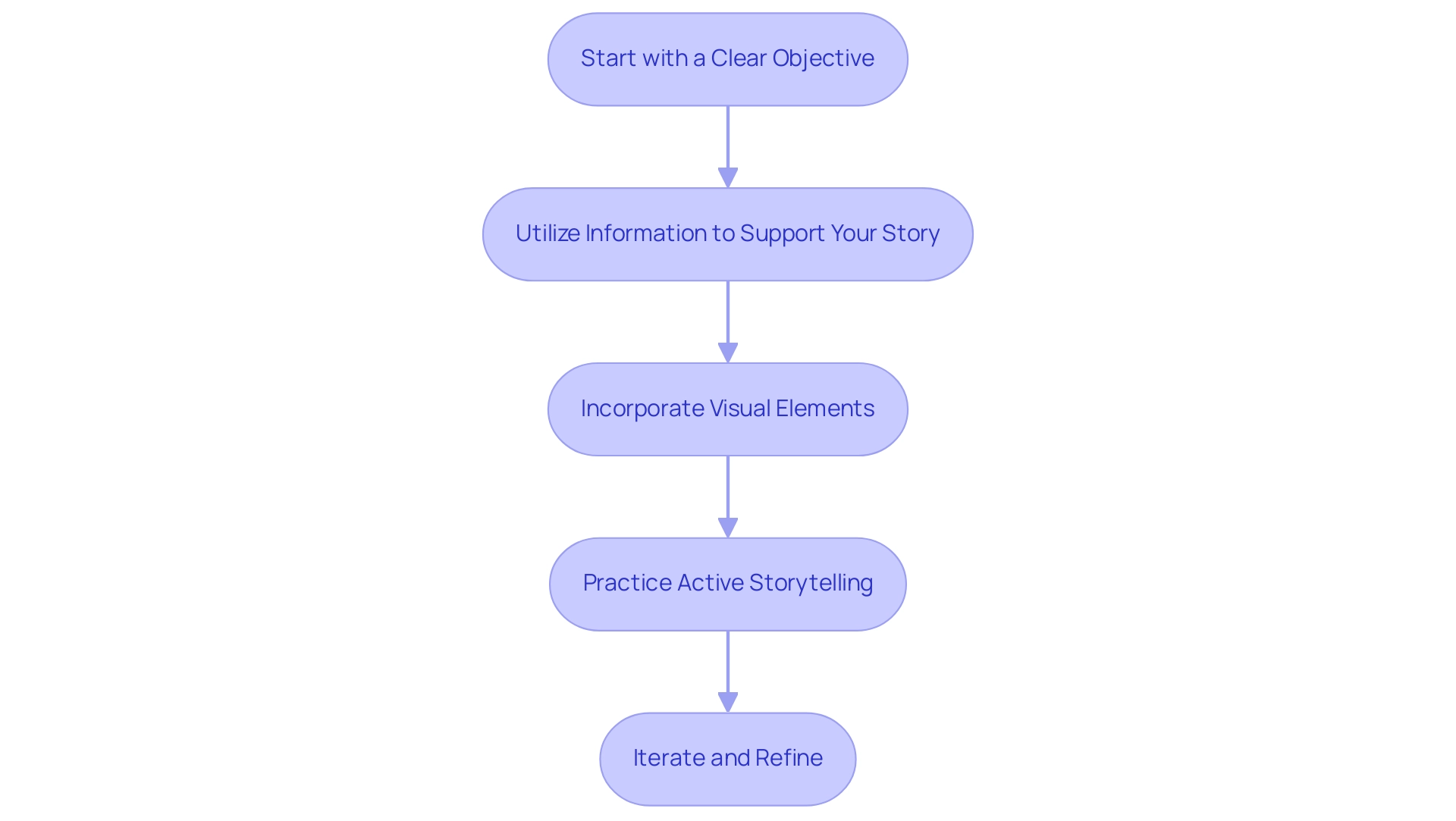
To create compelling data narratives in Power BI, implementing the following strategies is essential:
-
Start with a Clear Objective: Establishing a well-defined goal for your presentation is crucial. Research indicates that presentations with clear objectives are 70% more likely to resonate with audiences, leading to better retention and engagement. This underscores the importance of a structured approach to Power BI storytelling for effective communication.
-
Utilize Information to Support Your Story: Every statistic should serve to reinforce your narrative. By harmonizing your information with your message, you create a unified narrative that connects with your listeners. For instance, gathering Google Trends information via web scraping can uncover valuable insights into consumer interests and behaviors, demonstrating how information can enhance narratives. This approach not only improves understanding but also fosters trust in the information presented.
-
Incorporate Visual Elements: Visual aids such as charts, graphs, and infographics are vital for illustrating key points. Effective use of visuals can increase viewer engagement by up to 80%, making complex data more accessible and memorable. Leveraging Power BI storytelling features, like the 3-Day Power BI Sprint, can assist you in swiftly producing professionally crafted reports that enhance visual narrative.
-
Practice Active Storytelling: Engage your audience by incorporating interactive elements into your presentation. Asking questions and encouraging participation can significantly enhance the narrative experience, making it more dynamic and relatable. As Imed Bouchrika, PhD Co-Founder and Chief Data Scientist, states, “The learning process is predetermined and goes on a straight line,” highlighting the importance of a structured narrative.
-
Iterate and Refine: Continuously seek feedback on your presentations to identify areas for improvement. Iteration based on audience responses enhances the effectiveness of your storytelling and demonstrates a commitment to delivering value. By enabling companies to derive significant insights through business intelligence, you can convert raw information into actionable insights that drive decision-making. Furthermore, utilizing RPA solutions like Power Automate can enhance workflow automation, tackling challenges such as time-consuming report creation and inconsistencies. Moreover, the General Management App can improve operational efficiency, ensuring that your information stories are not only engaging but also actionable.
By utilizing these approaches, you can convert your presentations into engaging stories that exemplify Power BI storytelling, which not only inform but also motivate action. At Creatum GmbH, we are committed to assisting you in realizing the full potential of your information.
Leveraging Visualizations to Enhance Your Data Story
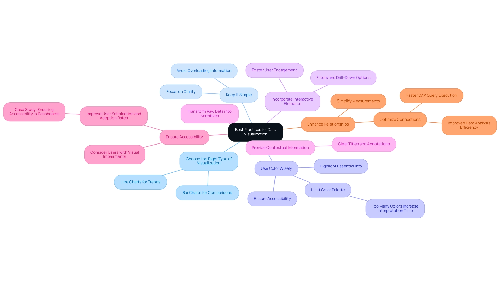
Visualizations are critical for crafting engaging narratives that highlight Power BI storytelling. To maximize their impact, consider these essential best practices:
-
Choose the Right Type of Visualization: Selecting the appropriate visualization is fundamental. For example, line charts are ideal for illustrating trends over time, while bar charts effectively compare different categories. Understanding the essence of your information will guide you in making the right choice.
-
Keep It Simple: Clarity is paramount. Overloading visuals with excessive information can obscure the main message. Strive for simplicity to ensure that your audience can swiftly grasp the insights you wish to convey.
-
Use Color Wisely: Color enhances aesthetics and influences interpretation. Thoughtful color selections can highlight essential information and evoke emotional responses. However, ensure your color palette is accessible; studies indicate that too many colors can increase user interpretation time by up to 20%.
-
Incorporate Interactive Elements: Adding interactive features such as filters and drill-down options empowers users to engage with the information on a deeper level. This interactivity fosters exploration and can lead to more meaningful insights, addressing the common challenge of extracting actionable guidance from Power BI dashboards.
-
Provide Contextual Information: Context is vital for understanding the significance of the information presented. Clear titles, annotations, and explanations can transform raw data into a narrative that resonates with viewers, enhancing their understanding and retention. Emphasizing this point can significantly improve the effectiveness of your visualizations, particularly in addressing inconsistencies.
-
Ensure Accessibility: Designing dashboards with accessibility in mind is essential. For instance, considering users with visual impairments can greatly enhance user satisfaction and adoption rates, as demonstrated in the case study titled “Ensuring Accessibility in Dashboards.” Accessible dashboards not only broaden your audience but also elevate overall engagement.
-
Enhance Relationships: Simplifying measurements and optimizing connections in Power BI can lead to quicker DAX query execution and improved analysis efficiency. This practice is crucial for enhancing overall dashboard performance and mitigating the time-consuming nature of report creation.
By adhering to these best practices, you can create impactful visualizations that enhance Power BI storytelling, effectively showcasing information and narrating a compelling story that drives informed decision-making. Leveraging Business Intelligence and RPA solutions like EMMA RPA and Power Automate from Creatum GmbH can further bolster operational efficiency and business growth. Book a free consultation to learn more.
Engaging Your Audience: Tailoring Stories for Impact
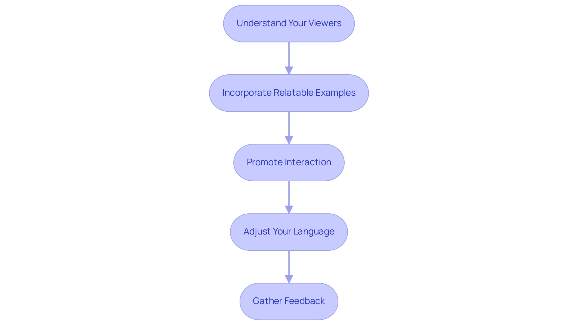
Captivating your listeners is essential for impactful Power BI storytelling, particularly within the vast AI environment. To maximize impact, consider the following strategies:
-
Understand Your Viewers: Conduct thorough research on the background, interests, and familiarity with the information. This knowledge allows you to tailor your narrative to their specific needs and expectations. As highlighted by Invesp, companies with robust omnichannel engagement strategies retain 89% of their customers, underscoring the importance of understanding your target demographic in Power BI storytelling. Furthermore, utilizing customized AI solutions from Creatum GmbH can assist you in recognizing the appropriate technologies that align with the challenges faced by your users in navigating the complexities of AI.
-
Incorporate Relatable Examples: Use examples that resonate with people’s experiences or challenges. This connection fosters relatability and enhances the overall engagement of your presentation. By integrating insights derived from Business Intelligence, you can utilize Power BI storytelling to transform raw data into relatable narratives that drive home your points.
-
Promote Interaction: Encourage a two-way dialogue by inviting questions and discussions throughout your presentation. This interaction not only keeps the viewers engaged but also allows for real-time clarification of concepts. In a world where 38.7% of people use Facebook monthly, leveraging familiar platforms can enhance engagement, especially when discussing complex AI solutions.
-
Adjust Your Language: Adapt your terminology to match the group’s level of expertise. Avoid overly technical jargon if those you are addressing may not be familiar with it, ensuring that your message is accessible and clear. The need for agility and innovation in engaging strategies is crucial, especially as successful content marketing in 2025 emphasizes personalization and diverse content formats. Tailored AI solutions from Creatum GmbH can also simplify complex concepts, making them more digestible for your viewers.
-
Gather Feedback: After your presentation, solicit feedback to gauge what resonated with the listeners and identify areas for improvement. This practice not only enhances future presentations but also demonstrates your commitment to audience engagement. Findings from the case study titled “Future of Customer Engagement” show that investments in AI and automation are crucial for tackling challenges such as privacy concerns and fulfilling changing customer expectations, further highlighting the significance of incorporating these technologies into your narrative approach.
The Role of Feedback and Iteration in Data Storytelling
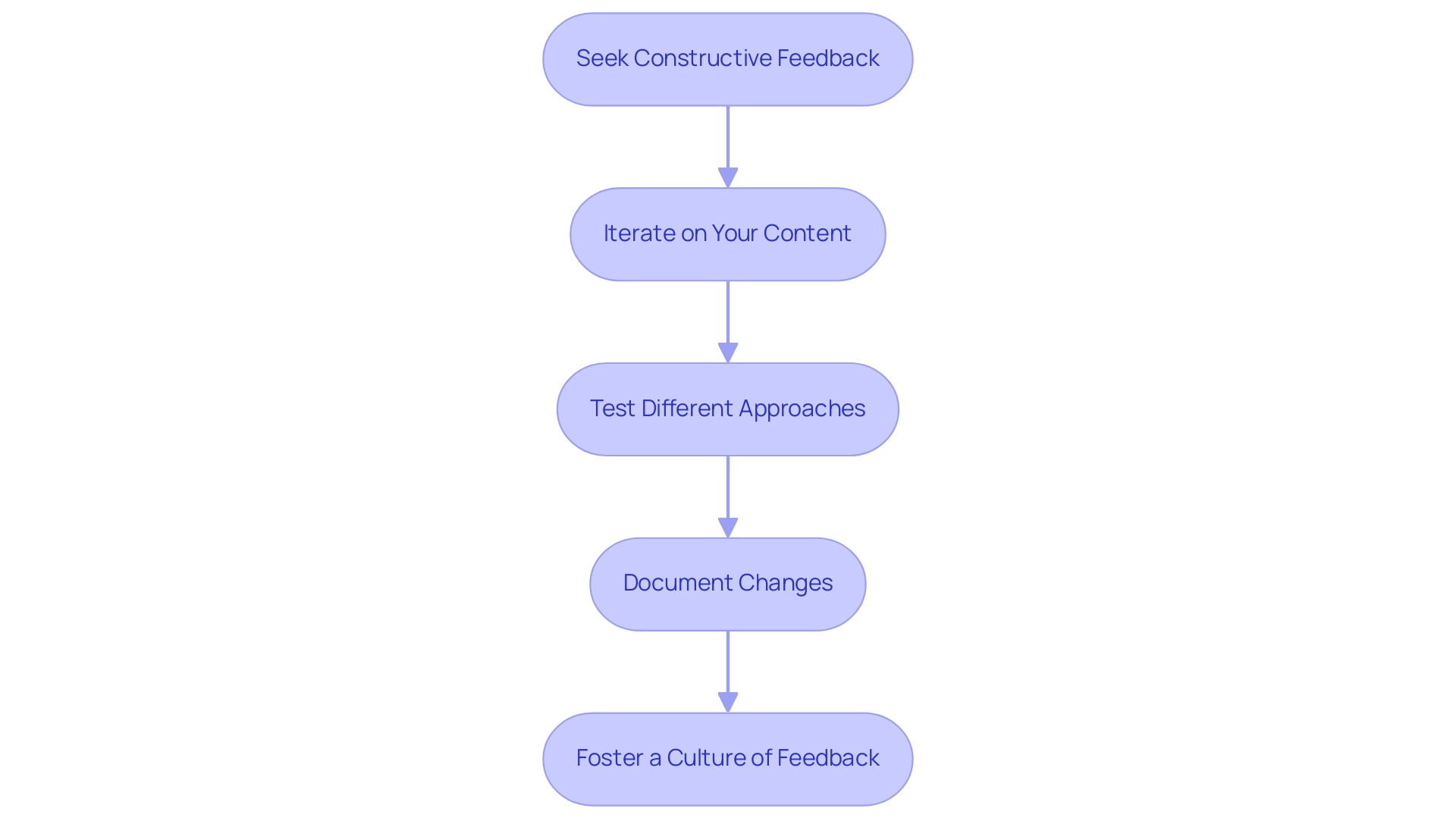
Feedback and iteration are essential in crafting compelling Power BI storytelling, particularly when leveraging Robotic Process Automation (RPA) and Business Intelligence. To effectively integrate these components, consider the following strategies:
-
Seek Constructive Feedback: After your presentation, actively solicit specific feedback on what resonated with your audience and which aspects fell short. This targeted approach can uncover insights that may not be immediately apparent, helping you enhance your story with the efficiency that RPA provides.
-
Iterate on Your Content: Utilize the feedback received to refine your narrative, visuals, and overall presentation style. Continuous improvement through iteration is crucial; companies embracing data-driven performance management—supported by Business Intelligence—are 1.5 times more likely to outperform competitors across key business metrics. This illustrates the advantages of adopting data-driven approaches in performance management.
-
Test Different Approaches: Experiment with various narrative techniques and formats to identify which resonate most effectively with your audience. This experimentation can lead to innovative methods of presenting information, particularly when combined with insights derived from Business Intelligence tools.
-
Document Changes: Maintain a record of modifications made based on feedback. This documentation will help you identify which strategies yield the best results, facilitating a more informed approach in future presentations and ensuring streamlined processes through RPA.
-
Foster a Culture of Feedback: Encourage colleagues to share their insights on your presentations. Establishing an atmosphere that prioritizes ongoing enhancement can significantly boost the efficacy of your storytelling efforts, ultimately fostering informed decision-making.
In 2025, organizations adopting regular feedback mechanisms are likely to experience a 40% rise in employee engagement rates and a 26% improvement in performance outcomes. Furthermore, as enterprise adoption rates surge toward 78% by 2025, businesses can leverage real-time customer feedback through various channels to identify strengths and areas for improvement. By prioritizing feedback and iteration, alongside the strategic use of RPA, tailored AI solutions from Creatum GmbH, and Business Intelligence, organizations can transform their Power BI storytelling into powerful narratives that drive informed decision-making and foster growth.
Conclusion
Mastering data storytelling in Power BI is essential for professionals aiming to transform raw data into impactful narratives. By integrating clarity, relevance, emotion, and well-structured visuals, data presenters can engage audiences effectively and enhance retention. Tailoring presentations to the audience’s needs, using relatable examples, and promoting interactivity fosters a deeper connection with the material.
Moreover, employing proven strategies such as:
- Setting clear objectives
- Supporting narratives with relevant data
- Iterating based on feedback
significantly improves the effectiveness of data storytelling. As organizations increasingly rely on data-driven strategies, the ability to convey complex information simply and compellingly becomes a key differentiator in achieving operational efficiency and strategic goals.
In conclusion, the convergence of data, narrative, and visuals in Power BI enriches the storytelling experience and empowers businesses to make informed decisions. By embracing these principles and practices, professionals can elevate their presentations, ensuring that insights derived from data are not only memorable but also actionable. This ultimately drives organizational success in an increasingly data-centric world.
Overview
This article serves as a comprehensive guide on the DAX HASONEVALUE function, emphasizing its critical role for Power BI professionals. HASONEVALUE is indispensable for achieving accurate calculations based on single selections within filter contexts. Its applications span:
- Dynamic measures
- Conditional formatting
- Hierarchical data management
These applications collectively enhance the clarity and reliability of reports. Understanding this function not only empowers professionals but also elevates their reporting capabilities.
Introduction
In the realm of data analysis, extracting meaningful insights from complex datasets is paramount. The DAX HASONEVALUE function emerges as a vital tool within Power BI. It enables users to determine when a single distinct value exists in a specified column amidst various filter contexts. This functionality not only enhances the accuracy of reports but also streamlines the decision-making process by ensuring calculations are based on precise selections. As organizations increasingly rely on data-driven strategies, mastering the nuances of HASONEVALUE becomes essential for professionals aiming to elevate their reporting capabilities and drive operational efficiency.
By exploring its practical applications, challenges, and best practices, users can unlock the full potential of this powerful function. Ultimately, this transformation of raw data into actionable insights propels business growth.
Understanding the DAX HASONEVALUE Function
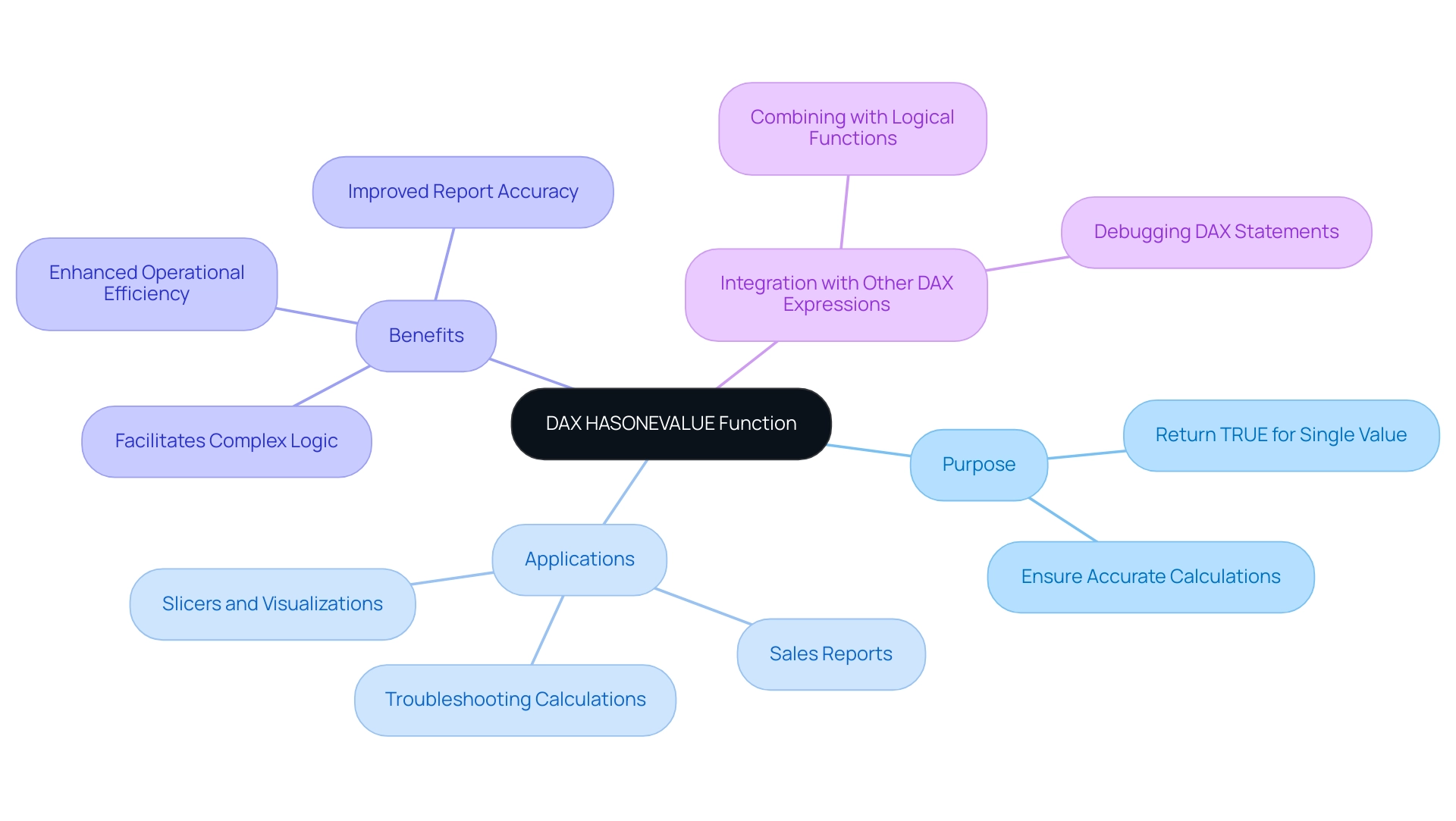
The DAX HASONEVALUE function serves as a crucial element in Power BI, returning TRUE when only one distinct value exists in a specified column within the current filter context. This functionality is vital in scenarios where calculations must be executed based on a single selection, such as in slicers or visualizations. Mastering the DAX HASONEVALUE function is essential for creating accurate and insightful reports in Power BI, as it reduces the risk of errors caused by multiple selections within a filter context.
Consider a sales report filtered by region. By applying a specific measure to the ‘Region’ column, it will yield TRUE when DAX HASONEVALUE verifies that a single region is selected. This allows for the computation of metrics tailored to that region, ensuring the insights derived are both relevant and precise.
Moreover, DAX HASONEVALUE can be integrated with additional DAX expressions to develop more complex logic, thereby enhancing the analytical capabilities of reports. It also serves as a valuable tool for troubleshooting calculations, aiding users in identifying issues within their DAX statements.
In 2025, the importance of logical operations is underscored by the growing complexity of data analysis in Power BI. With over 200 clients benefiting from customized solutions, the application of DAX HASONEVALUE has proven instrumental in improving report accuracy and operational efficiency. The organization’s commitment to providing live projects and outcome-focused educational programs, highlighted in their case study on programming language training, equips professionals with the necessary skills to effectively utilize such capabilities.
This hands-on experience not only deepens the understanding of DAX functions but also leads to successful placements in reputable companies.
As Power BI continues to evolve, staying updated on logical functions like DAX HASONEVALUE and their applications is essential for professionals looking to maximize their information capabilities. The integration of this function simplifies reporting processes and empowers users to make informed decisions based on reliable insights. Furthermore, by addressing common challenges such as time-consuming report generation and inconsistencies, the implementation of Business Intelligence and RPA solutions from Creatum GmbH can significantly boost operational efficiency and foster business growth.
Syntax and Structure of HASONEVALUE
The syntax for the HASONEVALUE function in DAX is both straightforward and powerful:
HASONEVALUE(<ColumnName>)
: This parameter identifies the specific column you wish to evaluate, originating from a table within your data model.
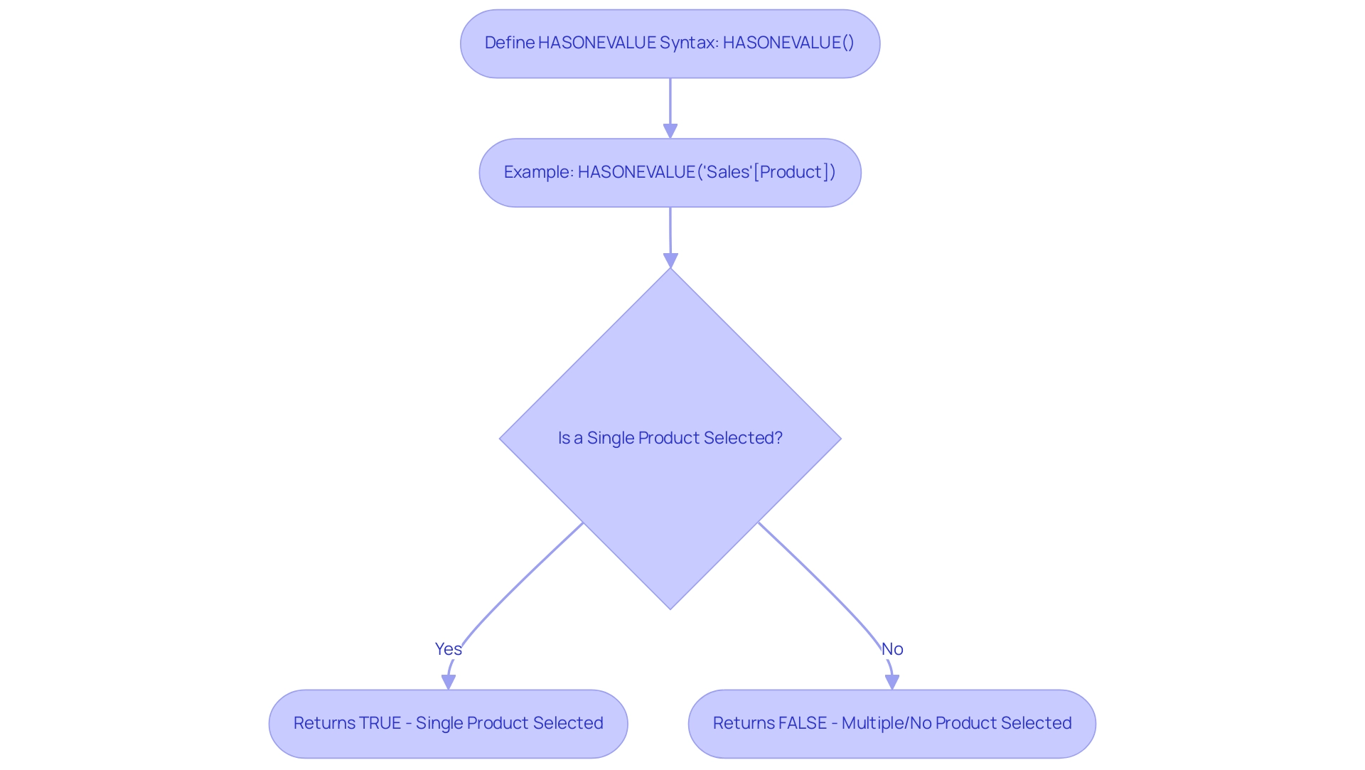
Example: To determine if there is only one value present in the ‘Product’ column, you would use the following expression:
HASONEVALUE('Sales'[Product])
This expression evaluates the current filter context and returns TRUE if a single product is selected; otherwise, it returns FALSE.
Understanding the dax hasonevalue function is essential for efficient information modeling in Power BI, particularly when managing intricate collections. For instance, in a recent case study, a company utilized this feature to optimize their reporting procedures, ensuring that only relevant information was displayed based on user choices. This not only enhanced the accuracy of their reports but also improved user experience by reducing clutter.
The organization also focused on enhancing data quality through AI solutions and streamlining AI implementation, underscoring the importance of leveraging tools like dax hasonevalue in practical applications.
In 2025, updates to DAX syntax improved how expressions function, making it crucial for professionals to remain informed about these changes. Best practices suggest employing dax hasonevalue alongside other DAX operations, such as RELATED, to create dynamic reports that respond intelligently to user inputs. As Richie Cotton, a notable figure in the information community, remarks, he “spends all day chit-chatting about information,” highlighting the importance of effective information management.
By leveraging this capability effectively, organizations can enhance decision-making processes, as evidenced by the significant improvements in data quality and insight extraction reported by businesses that have embraced these practices. Furthermore, utilizing Robotic Process Automation (RPA) can further boost operational efficiency, enabling teams to concentrate on strategic initiatives rather than manual tasks, thus propelling business growth.
Practical Examples of HASONEVALUE in Action
Here are several practical applications of the DAX HASONEVALUE function that can significantly enhance your Power BI reports, particularly in the context of leveraging Business Intelligence for operational efficiency:
-
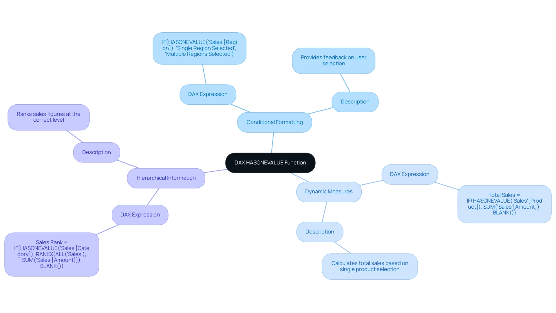
Conditional Formatting in Reports: The function can be effectively utilized to apply conditional formatting based on user selections. For instance, consider the following DAX expression:
IF(HASONEVALUE('Sales'[Region]), "Single Region Selected", "Multiple Regions Selected")This expression evaluates whether a single region is selected in the slicer. If true, it displays a message indicating that only one region is selected, thereby providing immediate feedback to users about their selection and enhancing the clarity of insights derived from the report.
-
Dynamic Measures: Another powerful application of this function is in the creation of dynamic measures that adapt based on user input. For example:
Total Sales = IF(HASONEVALUE('Sales'[Product]), SUM('Sales'[Amount]), BLANK())This measure calculates the total sales amount only when a single product is selected. If multiple products are chosen, it returns a blank, ensuring that the information presented is relevant and precise, thus addressing the challenge of inconsistencies in report creation.
-
Hierarchical Information: When managing hierarchical structures, a single value check guarantees that calculations are performed at the correct level. For instance:
Sales Rank = IF(HASONEVALUE('Sales'[Category]), RANKX(ALL('Sales'), SUM('Sales'[Amount])), BLANK())This DAX formula ranks sales figures only when a single category is selected, preventing misleading rankings that could arise from multiple selections. This approach preserves the integrity of the analysis and enhances the clarity of insights derived from the report, ultimately driving informed decision-making.
These examples demonstrate the versatility of this capability in Power BI, allowing users to produce more interactive and insightful reports. Furthermore, features such as CROSSFILTER and RELATED can enhance HASONEVALUE by enabling more intricate relationships and calculations. As mentioned in September 2017, there were 60 entries in the archives, highlighting the evolution of DAX capabilities over time.
Richie Cotton, a prominent figure in discussions about information, emphasizes the importance of engaging with it, stating that he “spends all day chit-chatting about it.” This perspective underscores the relevance of mastering DAX functions, including HASONEVALUE. Additionally, the case study titled ‘Business Intelligence for Insights’ illustrates how Creatum GmbH empowers businesses to extract meaningful information, transforming raw details into actionable insights for informed decision-making, thereby addressing the challenges of time-consuming report creation and lack of actionable guidance.
Moreover, Creatum GmbH’s RPA solutions can further enhance operational efficiency by automating repetitive tasks, allowing teams to focus on deriving insights from the data.
Challenges and Considerations with HASONEVALUE
The HASONEVALUE function in DAX stands as a powerful tool, yet it presents several challenges and considerations that users must navigate, particularly in leveraging Business Intelligence (BI) and Robotic Process Automation (RPA) for operational efficiency.
-
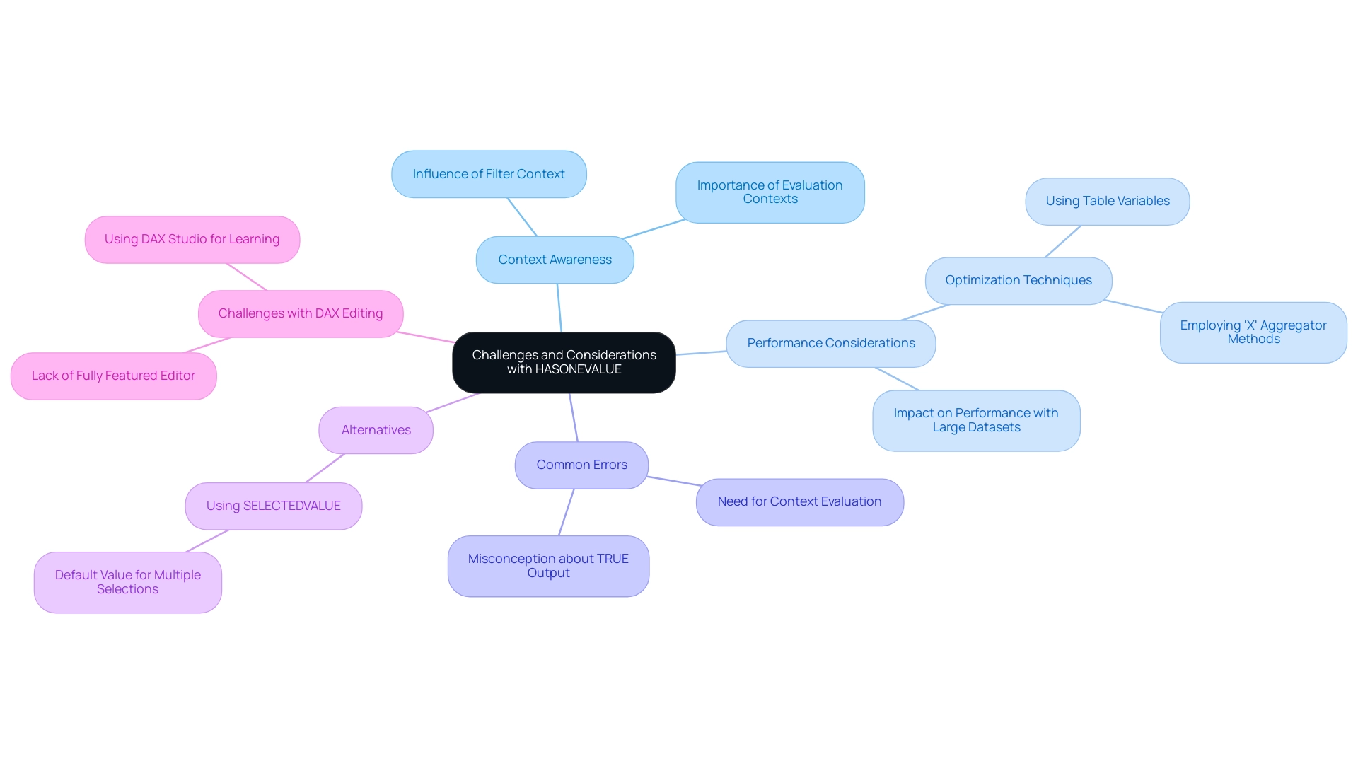
Context Awareness: The function’s behavior is heavily influenced by the filter context. If multiple values are selected, it will return FALSE, potentially leading to unexpected results. Verifying that your filters are appropriately configured is crucial to achieving the desired outcome. Grasping fundamental concepts like evaluation contexts and iterators is essential for effectively utilizing the function, especially when deriving actionable insights from Power BI dashboards with DAX HASONEVALUE.
-
Performance Considerations: When used within intricate DAX expressions, this function can significantly impact performance, particularly with large datasets. Conducting performance tests and optimizing your DAX code is essential for maintaining efficiency and responsiveness in your reports. Employing a coding approach that includes table variables and ‘X’ aggregator methods can prove more effective than using CALCULATE, boosting performance and ensuring seamless operation of your BI tools.
-
Common Errors: A prevalent misconception is that DAX HASONEVALUE will return TRUE when there is only one value in the model, regardless of the filter context. To ensure accuracy, always evaluate the current filter context before relying on the output. This understanding is crucial for overcoming the challenges of data inconsistencies that can arise in BI reporting.
-
Alternatives: In scenarios where flexibility is required, consider using the SELECTEDVALUE method. This alternative can return a default value when multiple selections are made, providing a more adaptable solution in certain contexts and enhancing the overall user experience in BI applications.
-
Challenges with DAX Editing: The absence of a fully featured editor for DAX can complicate the writing of complex models. Tools like DAX Studio can enhance the learning experience and help mitigate these challenges, allowing users to focus on leveraging RPA solutions like EMMA RPA and Power Automate to automate repetitive tasks and improve efficiency.
By understanding these aspects, users can leverage this function effectively while minimizing potential pitfalls in their DAX implementations. As Mitchell Pearson, a Data Platform Consultant, observes, “By utilizing X procedures alongside a specific value check, you can resolve intricate DAX issues and generate more precise reports in Power BI.” This highlights the importance of integrating advanced coding techniques into your DAX strategy.
Additionally, mastering DAX is akin to mastering mathematics, statistics, and physics, underscoring the complexity and depth of this powerful language, which is essential for driving growth and innovation in today’s data-rich environment. Businesses that struggle to extract meaningful insights from their data face a competitive disadvantage, making it imperative to utilize BI and RPA solutions effectively.
Best Practices for Implementing HASONEVALUE in Power BI
To effectively implement the HASONEVALUE function in Power BI, consider the following best practices:
-
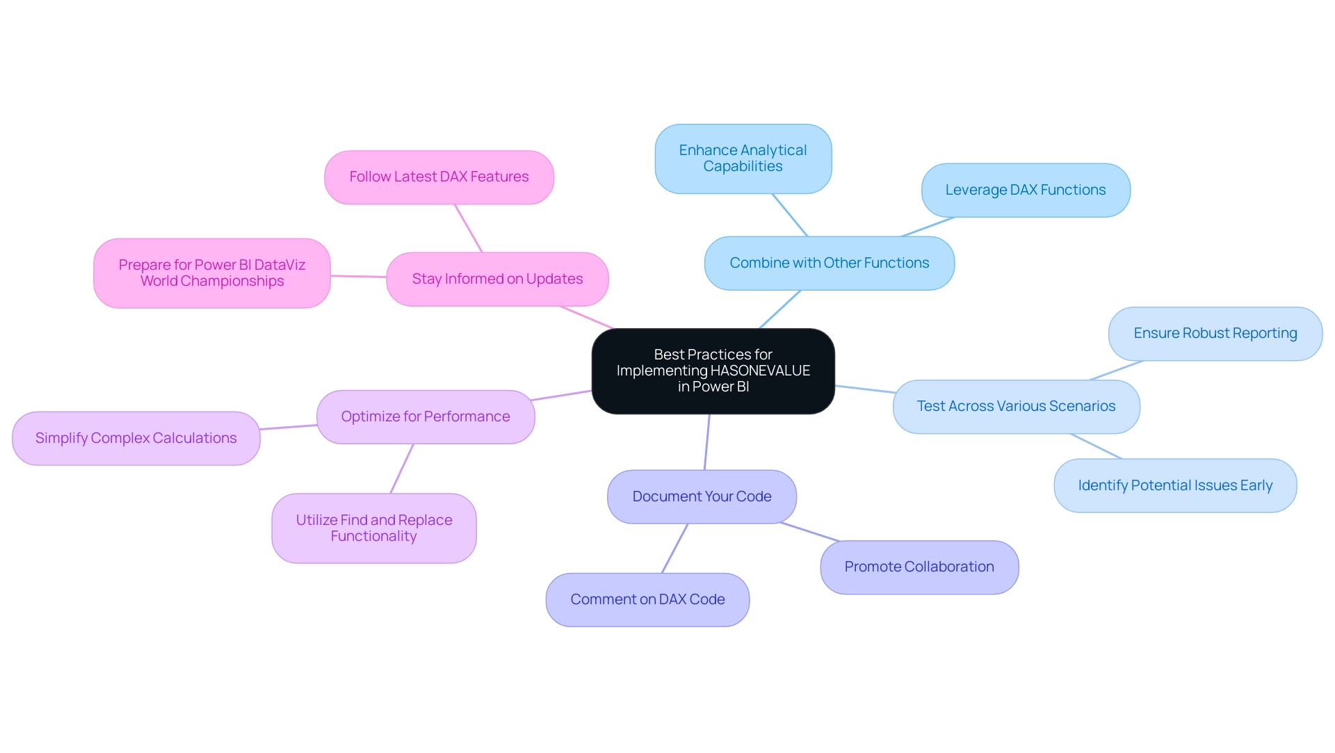
Combine with Other Functions: Leverage a single value function alongside other DAX functions such as IF, SWITCH, or CALCULATE. This combination allows for the creation of more intricate and dynamic measures, enhancing the analytical capabilities of your reports. As emphasized in the case study named “Importance of DAX for Business Analysis,” mastering DAX is essential for evaluating growth percentages and year-over-year comparisons, which highlights the significance of utilizing effective techniques to tackle challenges such as time-consuming report generation and data inconsistencies.
-
Test Across Various Scenarios: It is crucial to test your DAX expressions in different filter contexts. This practice ensures that the expressions behave as intended, helping to identify potential issues early in the development process and ensuring robust reporting that provides clear, actionable guidance to stakeholders.
-
Document Your Code: Clear documentation is key. Commenting on your DAX code to explain the rationale behind using dax hasonevalue, especially in complex expressions, makes it easier for future users to maintain and understand the code. This promotes collaboration and knowledge sharing, which is essential for overcoming the lack of actionable insights.
-
Optimize for Performance: Regularly assess your DAX expressions for performance improvements. Simplifying complex calculations and reducing the use of nested operations can significantly enhance performance, leading to faster report generation and a smoother user experience. Utilizing the Find and Replace functionality in the DAX query editor can also improve efficiency in report creation, addressing the common challenge of investing too much time in constructing reports.
-
Stay Informed on Updates: The landscape of Power BI and DAX capabilities is continually evolving. Staying informed about the latest updates and optimizations can offer new features that improve the capabilities of DAX and other expressions, ensuring that your skills and reports remain advanced. Additionally, with the upcoming Power BI DataViz World Championships taking place from February 14 to March 31, 2025, this is a timely opportunity to enhance your skills in preparation for the competition.
By adhering to these best practices, Power BI professionals can maximize the effectiveness of the dax hasonevalue function, ultimately driving better insights and decision-making within their organizations. As Douglas Rocha, a statistics enthusiast, aptly puts it, “Can you do statistics in Power BI without DAX?” Yes, you can, you can do it without measures as well and I will teach you how at the end of this tutorial.
This highlights the essential role DAX plays in unlocking the full potential of Power BI and addressing the challenges of leveraging insights effectively. Furthermore, it is crucial to implement a governance strategy to mitigate data inconsistencies, as the absence of such a strategy can lead to confusion and mistrust in the data presented. At Creatum GmbH, we emphasize the importance of these practices to ensure reliable and actionable insights.
Conclusion
The DAX HASONEVALUE function stands as a pivotal tool for professionals utilizing Power BI, enabling the extraction of precise insights from complex datasets. By confirming the existence of a single distinct value within a specified column, this function enhances report accuracy and facilitates informed decision-making. Its practical applications—such as conditional formatting, dynamic measures, and handling hierarchical data—showcase the versatility of HASONEVALUE in creating interactive and informative reports.
However, users must navigate challenges related to context awareness, performance, and common misconceptions. Understanding these challenges and implementing best practices—such as combining HASONEVALUE with other DAX functions and optimizing for performance—allows professionals to fully leverage its capabilities. Staying informed about updates in DAX syntax and refining DAX expressions through rigorous testing are essential for maintaining high-quality reporting standards.
Ultimately, mastering the HASONEVALUE function transcends technical proficiency; it transforms raw data into actionable insights that drive business growth and operational efficiency. As organizations increasingly depend on data-driven strategies, the ability to effectively utilize functions like HASONEVALUE will distinguish successful professionals in the ever-evolving landscape of data analysis. Embracing this knowledge empowers users to address the complexities of data reporting, ensuring they remain at the forefront of their industry.
Overview
This article delves into the critical task of determining the last row in a table, underscoring its importance in effective information management. It presents various techniques for identifying the last row across different platforms, including:
- Formulas in Excel
- SQL queries
- Python commands
These methods not only enhance operational efficiency but also streamline data retrieval, ensuring accuracy in data handling. By mastering these techniques, professionals can significantly improve their data management practices.
Introduction
In the digital age, where data serves as the lifeblood of decision-making, the structure and management of tables are pivotal for organizations aiming to harness their information effectively. As data volumes reach unprecedented levels, mastering the navigation and manipulation of table structures becomes essential for businesses striving to maintain a competitive edge. How can organizations identify key rows and leverage automation tools to streamline operations? The strategies employed in table management can significantly enhance data integrity and operational efficiency.
This article delves into the intricacies of table structures, emphasizing the importance of unique identifiers. It explores techniques that empower professionals to extract valuable insights from their data, ultimately driving growth and innovation in a rapidly evolving landscape. By understanding these principles, organizations can position themselves to thrive amidst the challenges of the digital era.
Understanding Table Structures and Their Importance
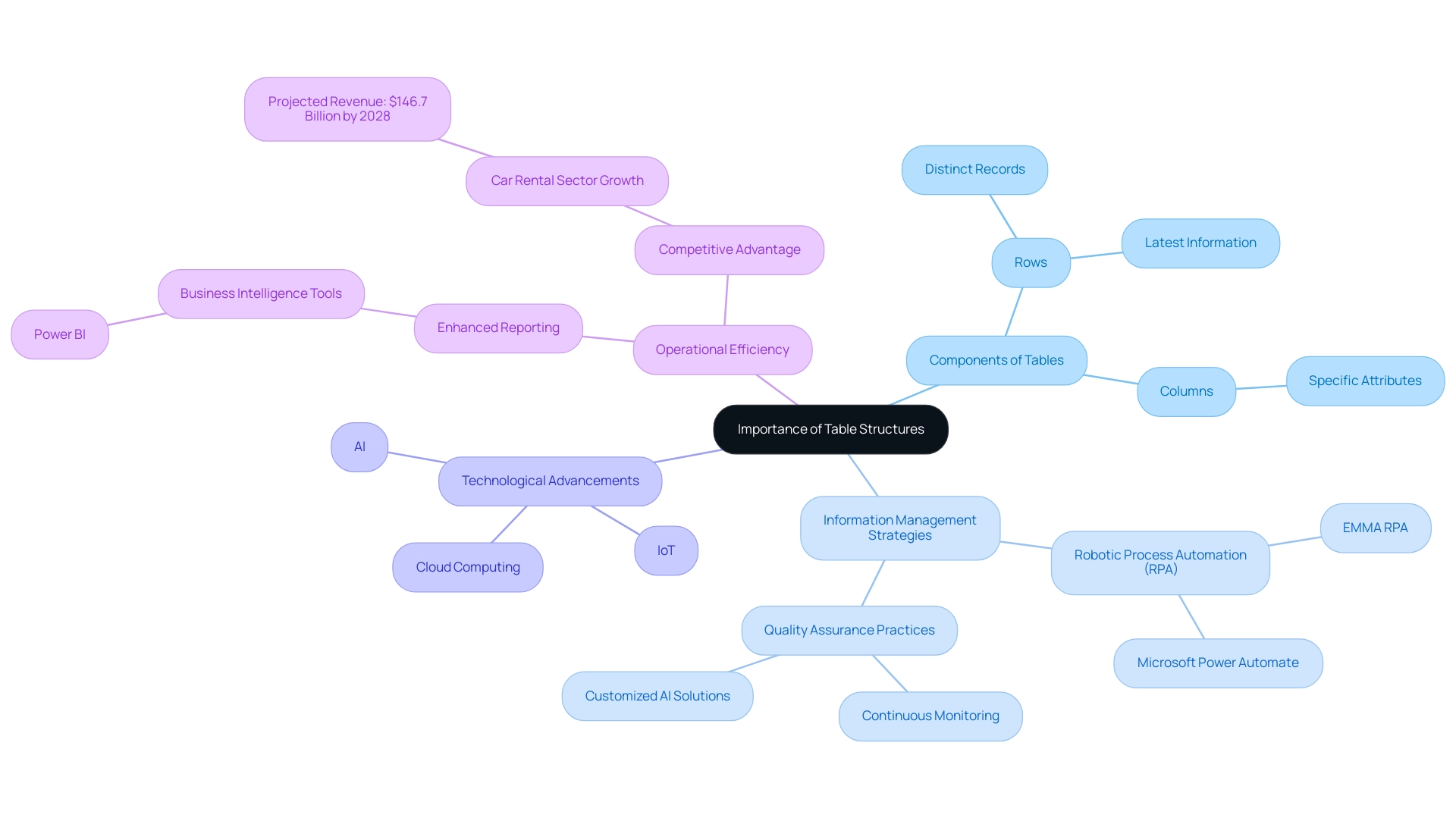
Tables serve as the backbone of information management across various platforms, including databases and spreadsheets. Comprised of rows and columns, each row signifies a distinct record, while each column denotes a specific attribute of that record. Mastery of layout arrangements is essential for efficient information handling and retrieval, particularly in identifying key entries. For instance, which option is the last row in a table often contains the latest information or summary insights?
Looking ahead to 2025, the significance of organized charts in information handling is underscored by the astonishing forecast that worldwide information volume will reach 181 zettabytes. This surge is driven by advancements in AI, IoT, and cloud computing. Such exponential growth presents both challenges and opportunities for organizations, necessitating innovative information management strategies. Companies that prioritize these strategies—such as integrating Robotic Process Automation (RPA) solutions like EMMA RPA and Microsoft Power Automate—are better positioned to extract actionable insights and drive transformation.
Current trends indicate that well-structured arrangements improve information retrieval efficiency, enabling professionals to swiftly find and manage details. For example, in a customer database, a thoughtfully organized table can streamline access to customer information, enhancing operational workflows. Moreover, high-quality information is crucial for organizational growth; as Grepsr aptly states, “Information is power.”
Ongoing monitoring and robust quality assurance practices, backed by customized AI solutions, are vital for maintaining integrity, which directly influences operational efficiency.
Real-world examples illustrate the effectiveness of table layouts in databases and spreadsheets. Organizations adopting organized information handling strategies, alongside utilizing Business Intelligence tools like Power BI for enhanced reporting, report significant improvements in operational efficiency and decision-making capabilities. As the car rental sector is projected to rise to $146.7 billion in revenue by 2028, companies employing effective information manipulation techniques and RPA are likely to gain a competitive advantage.
In conclusion, the importance of structural arrangements in information management cannot be overstated. As the landscape evolves, embracing these structures and integrating RPA will empower organizations to navigate the complexities of information, ultimately driving growth and innovation.
Identifying Rows: Key Characteristics and Functions
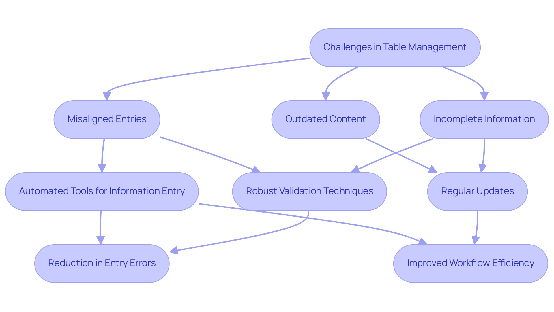
Rows in a grid are fundamental to data organization, serving as the primary structure for managing information. Each row typically encompasses multiple fields that align with the columns, creating a cohesive dataset. Key characteristics of rows include their sequential arrangement and the presence of unique identifiers, such as primary keys, which are essential for distinguishing one row from another.
For instance, in a sales table, each row may represent a distinct transaction, with columns detailing the date, customer name, and transaction amount.
The importance of unique identifiers cannot be overstated; they play a critical role in database management by ensuring integrity and facilitating efficient retrieval. In 2025, statistics indicate that effective use of unique identifiers can enhance information quality significantly, reducing errors and improving operational efficiency. Furthermore, the ability to manipulate data frames allows users to verify calculations and test the behavior of non-missing values, reinforcing the reliability of the dataset.
Significantly, the overall padding between columns is 32px, which can influence the visual arrangement of information and should be taken into account when creating tables.
Understanding the features of rows is essential for determining which of the following options is the last row in a table, as it often signifies the most recent entry or the conclusion of processing tasks. A case study on business intelligence empowerment illustrates this point: organizations that effectively extract meaningful insights from unprocessed information can make informed decisions, driving growth and innovation. This is where tailored AI solutions come into play, cutting through the overwhelming options to provide targeted technologies that align with specific business goals.
Additionally, Robotic Process Automation (RPA) can streamline workflows, enhancing operational efficiency by automating repetitive tasks. As Mackenzie Plowman aptly noted, ‘Sorry if I missed it, but where can I read through the references supporting these best practices?’ This emphasizes the significance of basing information handling practices on trustworthy sources.
By acknowledging the importance of rows and their unique identifiers, and utilizing Business Intelligence, RPA, and customized AI solutions from Creatum GmbH, professionals can navigate and compare tabular information more effectively, ultimately enhancing their operational strategies.
Techniques for Identifying the Last Row in a Table
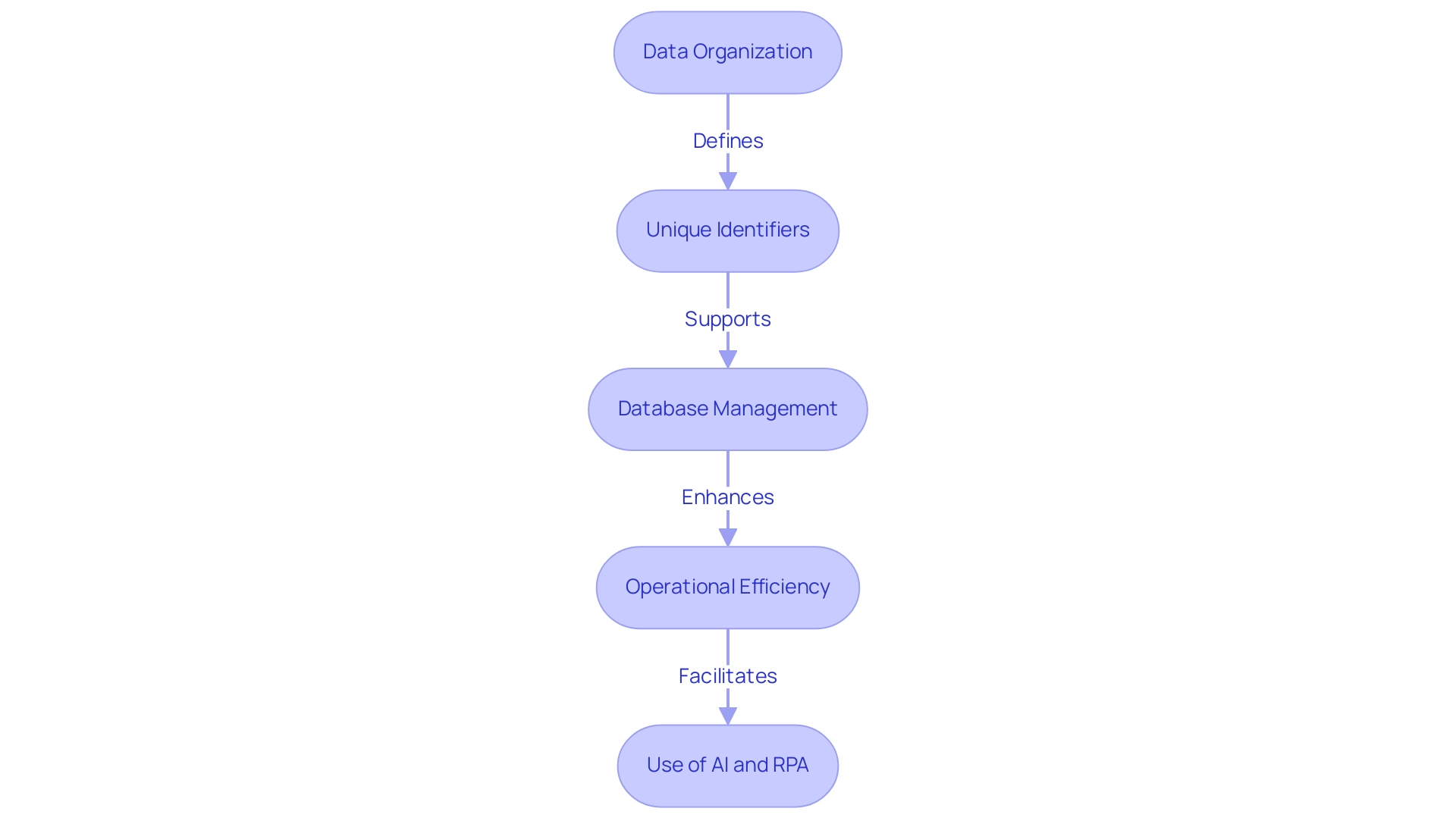
Efficient information management necessitates recognizing the last row in a table, with various techniques available depending on the platform. In Excel, the formula =COUNTA(A:A) is commonly employed to count non-empty cells in a specified column, assisting in identifying the last row in a table containing information. This method proves particularly effective, as statistics reveal that over 60% of Excel users rely on such formulas for information retrieval in 2025.
Moreover, Robotic Process Automation (RPA) can significantly enhance this process by automating repetitive tasks, minimizing errors, and enabling teams to focus on strategic analysis rather than manual entry, ultimately boosting operational efficiency.
In the SQL domain, a widely used method involves executing the query SELECT * FROM TableName ORDER BY id DESC LIMIT 1; to ascertain the last row in a table based on a unique identifier. This approach not only enhances query performance but also improves cardinality estimates, a critical factor in optimizing database operations. According to Oracle, setting the METHOD_OPT argument to FOR ALL COLUMNS SIZE can automatically identify which columns require histograms, further optimizing query performance.
Additionally, query design guidelines can bolster cardinality estimates, ensuring accurate and efficient information retrieval. Experts advocate for:
- Simplifying expressions with constants
- Creating computed columns for complex expressions
Integrating RPA into SQL processes can streamline these operations, reducing errors and enhancing efficiency.
For those utilizing programming languages like Python, libraries such as Pandas provide streamlined solutions. The command df.iloc[-1] enables users to determine the last row in a table, exemplifying the versatility of modern information manipulation tools. RPA can automate the execution of these scripts, ensuring timely information retrieval and analysis.
Real-world applications of these techniques have showcased significant improvements in operational efficiency. For instance, businesses that previously faced challenges in extracting meaningful insights from their data have successfully transformed raw information into actionable insights through effective retrieval methods. This empowerment not only facilitates informed decision-making but also aligns with the overarching goal of enhancing operational efficiency and driving growth.
As noted by Esat Eric, a SQL Server Microsoft Certified Solutions Expert, effective information retrieval methods are crucial for optimizing database performance and ensuring accurate insights, further supported by RPA’s capabilities.
In summary, mastering techniques for identifying the last row in a table—whether through Excel, SQL, or programming languages—can profoundly impact analysis and operational effectiveness. Integrating RPA into these processes not only streamlines workflows but also enhances the overall efficiency of information management. The case study titled “Business Intelligence Empowerment” illustrates this, demonstrating how businesses can leverage these methods to navigate a data-rich environment and extract valuable insights.
At Creatum GmbH, we are dedicated to providing tailored AI solutions that complement RPA, ensuring your organization can fully realize the benefits of automation and data-driven decision-making.
Common Challenges in Table Management and Solutions
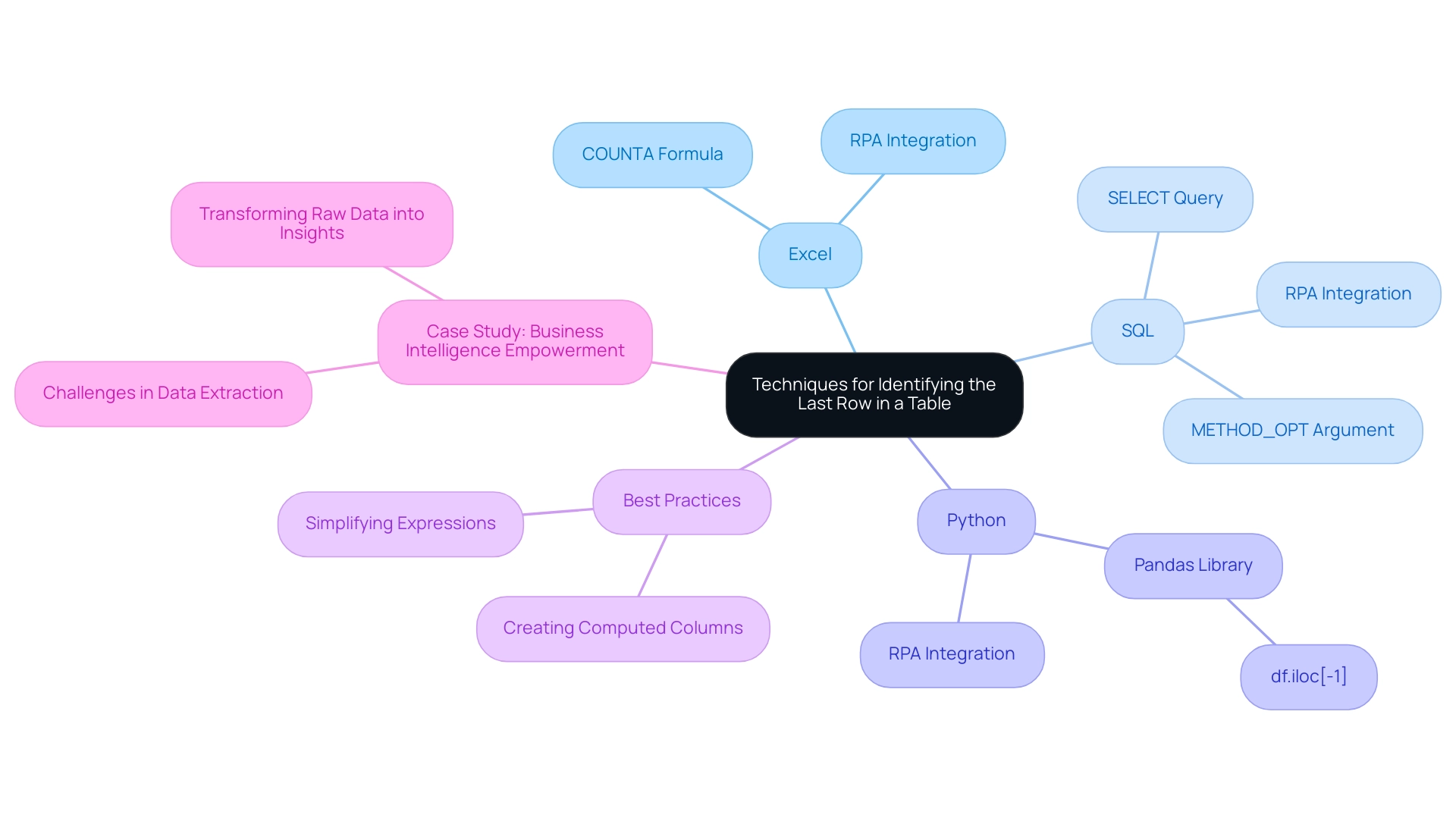
Handling tables efficiently presents a range of challenges, including incomplete information, misaligned entries, and outdated content. For example, the presence of empty rows can obscure the identification of the last row in a table, complicating analysis. Statistics reveal that 95% of HR leaders express dissatisfaction with traditional performance appraisal processes, underscoring the necessity for improved information management practices across various sectors.
To address these challenges, the implementation of robust validation techniques is essential. Regular updates not only enhance accuracy but also ensure that information remains relevant. Automated tools for information entry, such as GUI automation, can significantly boost consistency and minimize errors, allowing professionals to focus on strategic tasks rather than manual corrections.
A case study from a mid-sized healthcare company illustrates that the adoption of GUI automation led to a 70% reduction in entry errors and an 80% improvement in workflow efficiency, demonstrating the transformative impact of automation on operational processes. The company faced challenges such as manual data entry errors and slow software testing, which were effectively alleviated through automation, resulting in a return on investment (ROI) achieved within six months.
Real-world examples further underscore the effectiveness of these strategies. Initiatives that embrace organized project oversight techniques are 2.5 times more successful than their less structured counterparts, highlighting the importance of systematic approaches in achieving information integrity. Additionally, expert opinions emphasize the necessity of staying informed about advancements in information handling; 77% of professionals agree on the significance of keeping up with evolving standards, including ESG developments.
Looking ahead, CX leaders predict that by 2026, 42% expect generative AI to influence voice-based interactions, indicating the potential impact of emerging technologies on information handling practices. Efficient information management not only enhances operational effectiveness but also plays a crucial role in customer retention and business success, as highlighted by customer service statistics from 2024. By proactively addressing these common obstacles and leveraging solutions such as RPA and Business Intelligence, professionals can refine their organizational skills, ultimately improving information quality and supporting informed decision-making.
Enhancing Operational Efficiency Through Effective Table Management
Efficient organization of resources is crucial for enhancing operational effectiveness within companies. A well-organized and consistently maintained chart significantly simplifies information retrieval processes, reduces errors, and improves decision-making abilities. Notably, 91% of project professionals report facing challenges related to project oversight, underscoring the importance of effective organization in addressing these issues.
For instance, adopting systematic information entry approaches has been shown to enhance quality, with organizations reporting a marked reduction in inaccuracies. In 2025, statistics suggest that automated tools for organizing information, particularly those utilizing Robotic Process Automation (RPA) from Creatum GmbH, can enhance entry accuracy by up to 30%. This advancement enables teams to focus their time on more strategic initiatives.
To uphold information quality in records, organizations should conduct regular audits and employ automated software tools that handle record-related tasks. These tools not only enhance accuracy but also empower employees to concentrate on high-value activities, thereby driving productivity. Specialist insights reveal that efficient arrangement of resources, bolstered by customized AI solutions from Creatum GmbH and Business Intelligence, can yield a 25% boost in overall operational effectiveness, as teams are better equipped to access and assess information rapidly.
Practical case studies demonstrate the transformative influence of efficient resource organization. The APEPM case study, for example, highlights that half of all Project Management Offices (PMOs) close within just three years, suggesting that PMOs often struggle to demonstrate sustained value. This underscores the necessity for improved alignment with organizational objectives and measurable outcomes, achievable through robust information handling practices enhanced by RPA and Business Intelligence.
Furthermore, organizations with efficient organization practices have experienced a 40% decrease in project delays, further emphasizing the essential role of information organization in project success. As Lulit Tesfaye noted, the reliance on static reports is becoming obsolete, highlighting the need for dynamic data management solutions that align with methodologies such as Agile, Waterfall, Hybrid, Lean, and Six Sigma. In summary, enhancing operational efficiency through effective table management not only improves data handling but also significantly contributes to the overall productivity of the organization, making it a vital focus for leaders aiming to optimize their operations in 2025.

Conclusion
In conclusion, the intricate relationship between effective table management and operational efficiency is undeniable, underscoring the pivotal role that structured data plays in contemporary organizations. As data volumes continue to surge, mastering table structures and pinpointing key rows is not merely advantageous; it is essential for safeguarding data integrity and bolstering decision-making capabilities. The integration of unique identifiers facilitates seamless data retrieval and minimizes errors, driving both growth and innovation.
Techniques for identifying the last row in a table are critical, with tools like Excel, SQL, and programming languages streamlining data management processes. Moreover, the incorporation of Robotic Process Automation (RPA) transcends mere automation of repetitive tasks, empowering teams to concentrate on strategic analysis and thereby enhancing overall efficiency. Real-world applications of these methodologies reveal significant improvements in operational workflows, reinforcing the necessity of effective data management strategies.
However, challenges such as incomplete data and misaligned rows persist, highlighting the urgent need for robust validation techniques and automated solutions. By embracing systematic approaches and leveraging emerging technologies, organizations can surmount these obstacles and elevate their data quality. Ultimately, effective table management transcends technical necessity; it emerges as a strategic imperative that underpins informed decision-making and propels organizational success within an increasingly data-driven landscape.
Overview
Mastering data management in Power BI requires a thorough understanding of the platform’s inherent data limits, which, if exceeded, can lead to significant performance issues. Consider the implications: how might your current practices be impacting efficiency?
Effective strategies are essential to navigate these challenges:
- Utilizing DirectQuery for real-time data access is a powerful approach.
- Optimizing dataset size and implementing best practices—such as limiting dashboard visuals—are critical for maintaining efficiency.
By adopting these strategies, organizations can ensure they derive actionable insights from their data.
Introduction
In the rapidly evolving landscape of data analytics, Power BI emerges as a formidable tool for organizations eager to harness their data’s potential. However, understanding the complexities of data limits is crucial for maintaining optimal performance and efficiency. With strict dataset size restrictions and unique challenges, users must possess a comprehensive understanding of these parameters to avoid pitfalls that could impede their reporting and analysis efforts.
Consider the constraints of DirectQuery mode and the intricacies of data management best practices. Organizations must adopt strategic approaches to effectively leverage their data. As the demand for data-driven decision-making intensifies, recognizing and addressing these limitations becomes essential in transforming raw data into actionable insights that propel growth and operational excellence.
Understanding Data Limits in Power BI
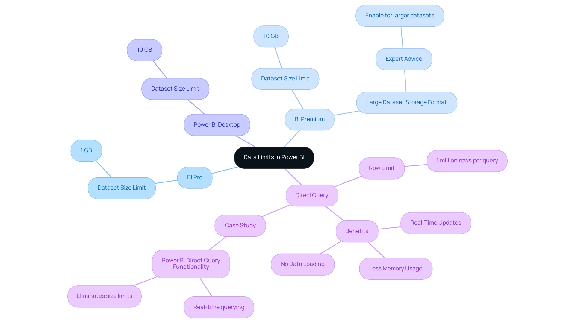
Business Intelligence (BI) establishes critical data limits that users must consider to maintain optimal performance and efficiency. In 2025, the BI Pro version enforces a dataset size limit of 1 GB, while the BI Premium version accommodates larger datasets, allowing uploads of up to 10 GB. Notably, the Power BI Desktop model upload size is also limited to 10 GB, providing a clearer comparison between the Pro and Premium versions.
When utilizing DirectQuery mode, users should note the row limit of 1 million rows per query. This mode is especially beneficial as it uses less memory compared to Import Mode, since it does not retain information in-memory. A notable case study titled “Power BI Direct Query Functionality” highlights how DirectQuery enables Power BI to query sources in real time without loading information into memory.
This approach not only eliminates size constraints but also ensures real-time updates and minimizes memory usage, making it ideal for managing large collections. However, many organizations struggle with leveraging insights effectively due to time-consuming report creation processes and inconsistencies in information across various reports. As Pratyasha Samal, a Memorable Member, advises, “Enable the Large dataset storage format option to use datasets in BI Premium that are larger than the default limit.”
Comprehending these limits is essential for efficient information management and reporting. When data exceeds the limit in Power BI, it can lead to errors and obstruct performance. By tackling these challenges using Business Intelligence and RPA solutions such as EMMA RPA and Automate, Creatum GmbH can convert raw information into actionable insights, driving growth and operational efficiency.
Common Challenges When Data Exceeds Limits
In 2025, users of this analytics tool encounter significant challenges when their data surpasses Power BI’s limits, particularly concerning inadequate master data quality. A critical issue is the inability to export large datasets, which can severely hinder reporting and analysis efforts. This limitation often forces users to seek alternative methods for sharing insights, such as generating reports in BI and exporting them as PDFs or PPTs for offline distribution, especially in scenarios where internet access is unreliable.
Another prevalent obstacle is the ‘Visual Has Exceeded the Available Resources’ error. This occurs when a visual attempts to process more information than Power BI can accommodate, leading to disruptions in workflows and considerable frustration among users. Such errors not only impede productivity but also require a deeper understanding of how to manage and optimize data within the platform.
Organizations struggling with inconsistent, incomplete, or inaccurate data face additional challenges in effectively adopting AI solutions, further complicating their data management strategies. The perception that AI projects are time-consuming, costly, and difficult to implement often discourages organizations from fully embracing these technologies.
As organizations increasingly depend on data-driven decision-making, it is vital for users to adeptly navigate these limitations. The maximum storage capacity for BI Premium users is 100TB, and in data-rich environments, it is possible for data to exceed Power BI’s limits, reaching this significant threshold swiftly. Therefore, understanding the complexities of data management and integration in BI is essential for optimizing operational efficiency and ensuring that teams can focus on strategic, value-enhancing activities.
Moreover, it is crucial to acknowledge that BI does not offer data cleansing solutions, operating under the assumption that the retrieved information is already of high quality. This presumption can lead to challenges in maintaining data integrity, particularly when handling large datasets. As Miguel Myers, Leader of the BI Core team, remarked, ‘This year, BI has introduced visuals like Date Picker by Powerviz, Advanced Table, and Beeswarm visuals that provide numerous advanced options and customizations.’
These advancements highlight the necessity for users to take proactive measures in managing their data quality to fully leverage BI’s features. By incorporating Robotic Process Automation (RPA) and tailored AI solutions, organizations can streamline their workflows, enhance data quality, and ultimately facilitate informed decision-making, positioning themselves at the forefront of technological opportunities.
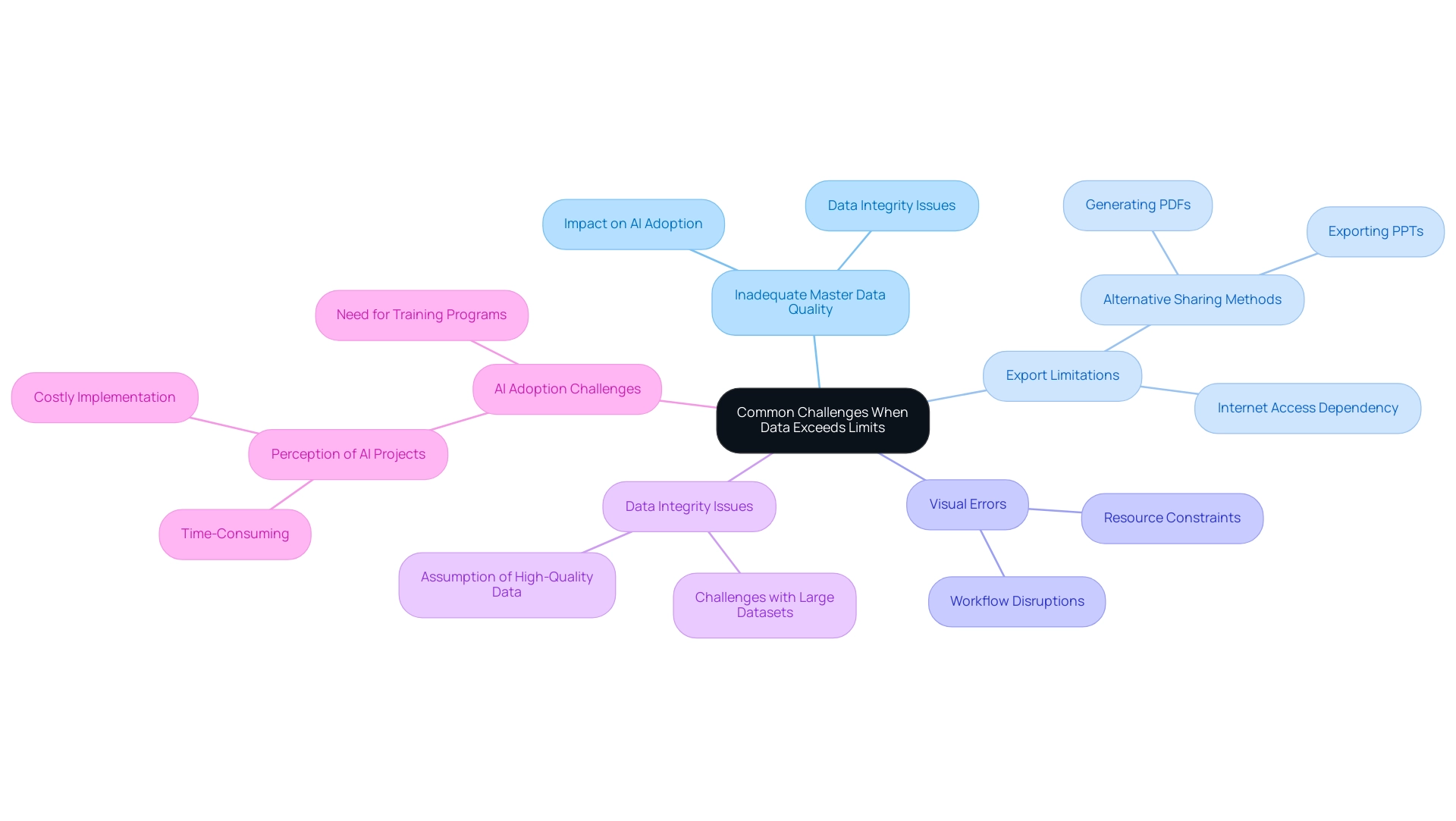
Effective Workarounds for Data Limitations
To navigate the information constraints inherent in this platform, individuals can adopt several effective workarounds that align with the principles of Business Intelligence and Robotic Process Automation (RPA). One of the most beneficial strategies is utilizing DirectQuery mode, which enables real-time access without the need to import extensive sets into Power BI. This method not only bypasses storage limitations—Power BI Premium subscribers have a maximum storage capacity of 100TB—but also improves performance by querying information directly from the source as required, thus enhancing operational efficiency.
In addition to DirectQuery, users can enhance their information management by aggregating data prior to import. This technique significantly decreases the overall dataset size, ensuring that the data does not exceed the limits imposed by Power BI, simplifying operations. Moreover, generating several smaller collections that can be merged within Business Intelligence facilitates more efficient management and analysis, tackling common issues such as time-consuming report generation and inconsistencies.
These strategies not only assist users in staying within Power BI’s limitations but also lead to enhanced performance. As Alberto Ferrari notes, “It’s packed with detailed explanations and practical examples that make complex concepts much easier to grasp.” Comprehending Power BI’s limitations is essential for organizations striving to effectively utilize large datasets, especially when their data exceeds the platform’s constraints.
The case study titled ‘Understanding Power BI’s Limitations’ illustrates the significance of acknowledging that when data exceeds the limits of Power BI, it can adversely affect performance as information scales up. By implementing these workarounds, businesses can ensure a seamless experience when accessing real-time information, ultimately driving better decision-making and operational efficiency while adhering to governance and compliance standards. Furthermore, integrating RPA solutions can further streamline workflows, allowing teams to focus on strategic tasks that add value to the organization.
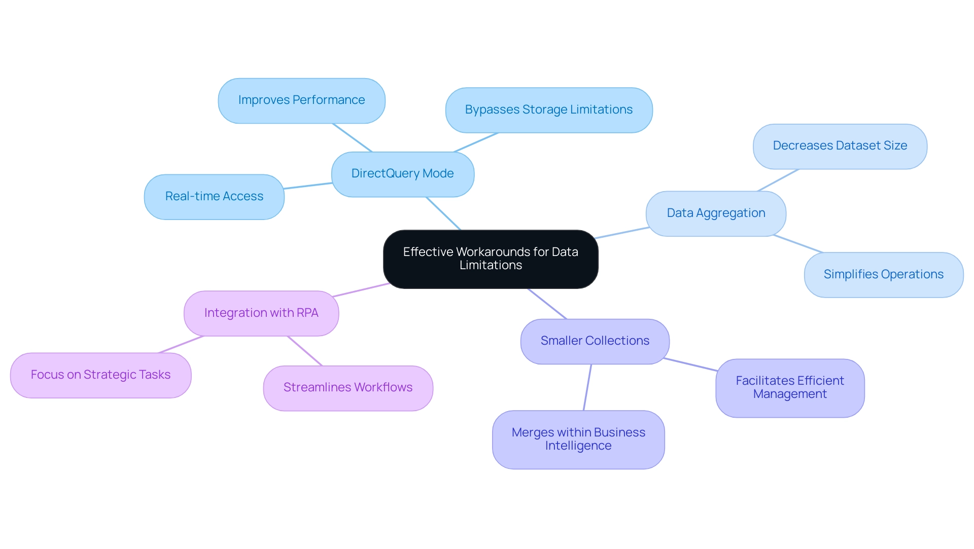
Best Practices for Efficient Data Management in Power BI
Efficient information management in Power BI hinges on the adoption of several best practices that can significantly enhance performance and usability, particularly in addressing common challenges like time-consuming report creation, inconsistencies, and the absence of actionable guidance. One of the foremost strategies involves optimizing models by eliminating unnecessary columns and tables, resulting in a substantial reduction in dataset size. Dimension tables, which encompass descriptive information such as customer details, product categories, and dates, are crucial in this optimization.
This practice not only streamlines information but also enhances processing speed, enabling quicker insights.
Another critical aspect is limiting the number of visuals on dashboards. Overloading dashboards with excessive visuals can overwhelm the system and degrade performance. Instead, focusing on key metrics and insights ensures that users can interpret information easily, free from unnecessary distractions.
As Szymon Dybczak, an esteemed contributor, noted, “It allowed me to pinpoint which visuals or queries were the bottlenecks,” underscoring the importance of clarity in dashboard design.
Implementing row-level security (RLS) is essential for managing access effectively while maintaining optimal performance. RLS allows organizations to control who can access specific information, ensuring that sensitive details are safeguarded without compromising the overall efficiency of the reporting system.
Regularly reviewing and refining models is vital for sustained management efficiency. This practice enables users to identify and address potential bottlenecks, ensuring that information remains relevant and actionable. For instance, connecting the Date Table to the Fact Table using the date field facilitates time-based analysis, enhancing the depth of insights derived from the information.
Real-world applications of these best practices have demonstrated significant performance improvements. A case study titled ‘Key Takeaways for BI Data Modeling Success’ illustrates how implementing a Star Schema, optimizing table relationships, and leveraging DAX Measures can lead to enhanced performance, easier reporting, and improved analysis capabilities. These strategies are not merely theoretical; they have been proven to yield tangible results across various organizational contexts.
As the landscape of information oversight continues to evolve, resources like the BI performance book provide crucial insights into performance enhancement and practical approaches for real-world applications. With a rating of 4.5 on Amazon, it serves as an essential guide for professionals seeking to enhance their Power BI experience. By adopting these best practices, organizations can transform their information handling processes, boosting efficiency and informed decision-making while also considering the key advantages of the General Management App, such as comprehensive oversight, Microsoft Copilot integration, custom dashboards, seamless information integration, predictive analytics, and expert training.
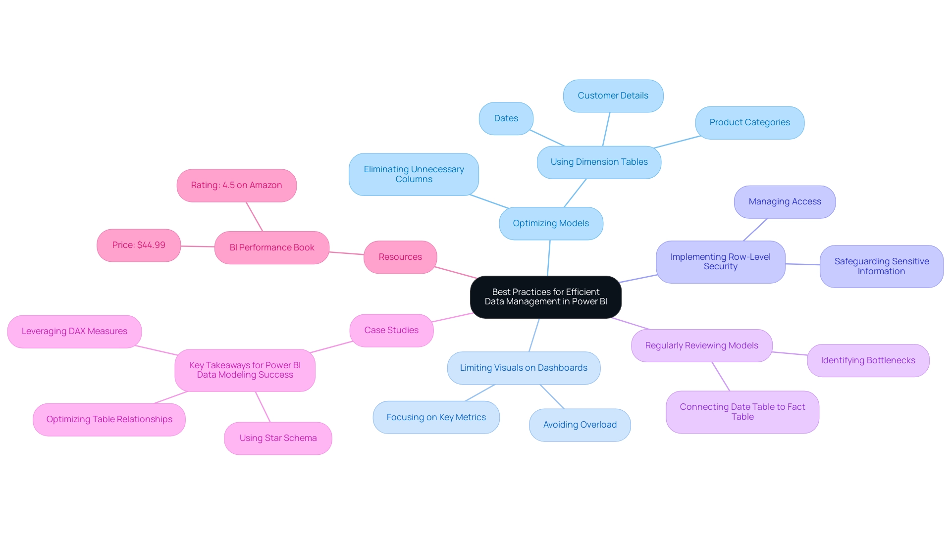
Evolving Strategies for Data Management Success
In an era where information challenges are increasingly complex, organizations must proactively refine their management strategies. Staying informed about updates and new features in Power BI is crucial for enhancing handling capabilities. For instance, the introduction of the Fabric Monitoring Hub, which now features a semantic model refresh detail page, empowers organizations to gain deeper insights into their refresh activities, thereby enhancing operational efficiency.
Moreover, with information centers consuming over 1% of worldwide electricity, effective handling becomes essential in lowering operational expenses and ecological impacts.
To further enhance operational efficiency, organizations can leverage Robotic Process Automation (RPA) to automate manual workflows, significantly reducing the time spent on repetitive tasks. This not only boosts efficiency but also minimizes errors, allowing teams to concentrate on strategic, value-adding work. Consistent training and development programs for team members are vital to instill best practices and familiarize them with emerging trends in information handling and RPA.
Studies suggest that organizations investing in training experience a notable rise in information handling efficiency, with statistics indicating that well-trained teams can enhance reporting precision by as much as 30%.
Employing advanced tools such as Inforiver Super Filter can further improve information handling strategies by offering sophisticated filtering options, including time-period selectors and various date filtering modes. By fostering a culture of ongoing enhancement and incorporating customized AI solutions from Creatum GmbH, organizations can better prepare themselves to tackle future information challenges and fully utilize the capabilities of Power BI. Real-world implementations, such as AccoMASTERDATA, illustrate how improved master information management can streamline processes and lead to smarter business decisions.
As Patrick LeBlanc, Principal Program Manager, emphasizes, “We highly value your feedback, so please share your thoughts using the feedback forum.” As we progress through 2025, it is imperative for organizations to adapt their strategies, ensuring they remain competitive and capable of extracting actionable insights from their data. For more information on how Creatum GmbH can assist you in overcoming technology implementation challenges, please visit our website.
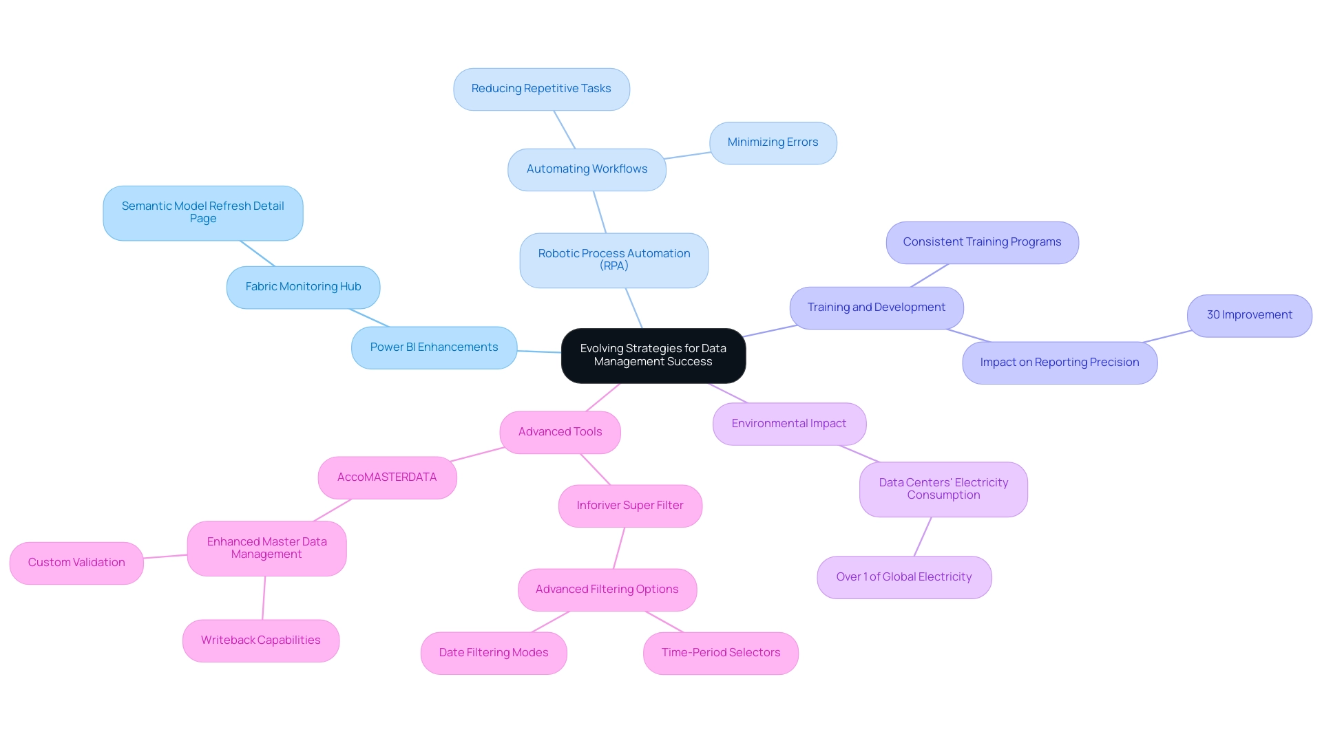
Conclusion
Power BI’s effectiveness relies on a comprehensive understanding of its data limits, which are crucial for maintaining optimal performance and efficiency. Users face dataset size restrictions and challenges posed by modes like DirectQuery; navigating these complexities is essential to prevent errors that could disrupt reporting and analysis. Strategies such as:
- Leveraging DirectQuery for real-time data access
- Aggregating data before import
- Creating smaller datasets
are vital for optimizing performance within Power BI’s constraints.
Organizations must prioritize best practices for data management, including:
- Optimizing data models
- Limiting visuals on dashboards
- Implementing row-level security
These practices not only enhance usability but also promote a clearer understanding of data insights. As the landscape of data management evolves, staying informed about updates in Power BI and integrating Robotic Process Automation can significantly streamline workflows and minimize errors. This enables teams to focus on strategic initiatives.
As the demand for data-driven decision-making intensifies, organizations must proactively adapt their data management strategies. By addressing the limitations of Power BI and implementing effective workarounds and best practices, businesses can transform raw data into actionable insights, driving growth and operational excellence. Embracing these approaches ensures that organizations remain competitive and fully leverage the capabilities of their data analytics tools, ultimately paving the way for informed decision-making and sustained success.
Overview
This article provides a comprehensive guide on calculating cumulative sums in Power BI, utilizing DAX formulas to create running totals that enhance data analysis. It effectively outlines practical examples and advanced techniques, underscoring the significance of cumulative sums in visualizing trends and facilitating informed business decisions. By exploring these concepts, professionals can better understand how to leverage cumulative sums for impactful insights.
Introduction
In the realm of data analytics, cumulative sums are crucial for illuminating trends over time, particularly within tools like Power BI. As businesses navigate the complexities of their data, it becomes essential to understand how to compute and visualize running totals effectively. This knowledge is vital for making informed decisions.
From tracking sales growth to monitoring inventory levels, cumulative sums not only enhance reporting but also uncover critical insights that can drive strategic initiatives. This article explores the intricacies of cumulative sums in Power BI, detailing their calculation using DAX formulas, effective visualization techniques, and advanced strategies to address common challenges.
By mastering these concepts, organizations can fully harness their data’s potential, fostering a culture of data-driven decision-making that propels growth and innovation.
Understanding Cumulative Sums in Power BI
Cumulative totals, commonly known as running totals, play a pivotal role in monitoring the cumulative sum in Power BI as new entries are added. In the realm of business intelligence (BI), calculations of cumulative sums are essential for visualizing trends over time, such as sales growth or inventory fluctuations. Our Power BI services, including the 3-Day Power BI Sprint, empower you to swiftly generate professionally designed reports that encompass total sums, thereby enhancing your data reporting and providing actionable insights.
To compute a running total, one typically begins with a base value and sequentially adds subsequent figures. This method not only aids in tracking performance metrics but also deepens the understanding of how values accumulate over a specific timeframe.
For instance, consider a dataset featuring monthly sales figures. A total sum would illustrate the overall sales from the year’s outset through each month, offering valuable insights into sales trends and overall performance. The significance of cumulative totals in analysis is underscored by their ability to reveal patterns and shifts in information, which can profoundly influence business decision-making.
In this context, the mean used to establish the range of the generated white noise is 0.68 mg L, providing a quantitative foundation for comprehending variations in data.
As we look to 2025, the importance of running totals continues to escalate, as organizations increasingly depend on data-driven insights to shape their strategies. Utilizing cumulative sums in Power BI facilitates the visualization of trends, enabling businesses to make informed decisions grounded in historical performance. Experts in data visualization assert that these techniques, including cumulative sums in Power BI, are not only straightforward to implement in tools like Power BI but also effective in pinpointing change points in data.
As George R. Bandurek, PhD, Director at GRB Solutions, Ltd., articulates, “CUSUM techniques are an effective method for identifying a change point and are especially valuable in problem solving when a trend chart shows that an average has shifted.”
The practical applications of total amounts extend beyond sales analysis; they are indispensable across various sectors, including finance and healthcare. For example, in clinical research, total amounts can track patient outcomes over time, providing critical insights into treatment efficacy, as illustrated in the case study on microscopic polyangiitis and interstitial lung disease. As organizations navigate a data-rich landscape, the ability to extract significant insights through total calculations becomes increasingly vital for fostering growth and innovation.
This work is supported by the National Science Foundation under the Florida Coastal Everglades Long Term Ecological Research project, underscoring the ongoing relevance of aggregate totals in contemporary analysis.
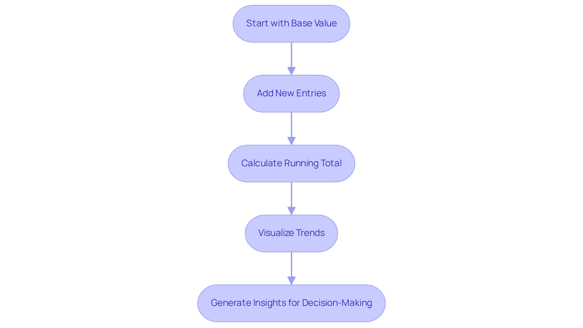
Using DAX Formulas to Calculate Cumulative Sums
Calculating total sums in BI is crucial for effective data analysis, primarily involving DAX formulas. A widely adopted method is to utilize the CALCULATE function in conjunction with SUM and FILTER. Follow this step-by-step guide to create your cumulative sum measure:
-
Open Power BI Desktop and load your dataset.
-
Create a new measure by navigating to the ‘Modeling’ tab and selecting ‘New Measure’.
-
Input the following DAX formula:
Cumulative Sales = CALCULATE(SUM(Sales[Revenue]), FILTER(ALLSELECTED(Sales[Date]), Sales[Date] <= MAX(Sales[Date]))) -
Substitute
Sales[Revenue]andSales[Date]with the actual names of your table and columns. -
Press Enter to finalize the measure.
-
Incorporate this measure into your report to visualize total sales over time.
This formula effectively computes the total revenue as a cumulative sum in Power BI up to the maximum date within the current context, thereby generating a running total.
In 2025, the latest trends in DAX formula applications highlight the significance of total calculations for operational insights. For instance, a recent case study titled ‘Building the Dashboard‘ illustrated how visualizing statistical measures, such as cumulative sum in Power BI, in a dashboard format can significantly enhance decision-making processes. By employing DAX formulas, businesses can segment information by various variables, leading to a clearer understanding of distribution and the identification of outliers.
However, challenges remain in utilizing insights from BI dashboards, including time-consuming report creation, inconsistencies, and a lack of actionable guidance. Experts in Power BI advocate for best practices in DAX calculations, noting that the use of explicit measures—crafted through custom formulas—provides greater control and precision compared to implicit measures, which are automatically generated by Power BI. This distinction is crucial for professionals aiming to leverage information effectively in their operations.
As Mark Twain aptly stated, “Facts are stubborn things, but statistics are pliable.” This emphasizes the significance of using statistics effectively in analysis. As organizations work to meet operational requirements, such as handling an average of 164 orders daily needing at least 9 workers in the warehouse, the capacity to assess aggregated information effectively becomes essential.
By mastering DAX formulas for total calculations, teams can concentrate on strategic initiatives that promote growth and innovation, ultimately improving operational efficiency through the power of Business Intelligence and RPA.
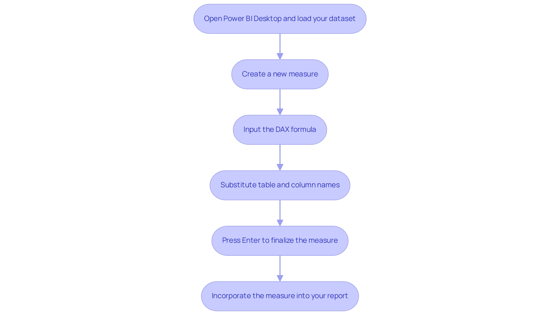
Visualizing Cumulative Sums in Power BI Reports
Visualizing the cumulative sum in Power BI is essential for effective analysis, as it facilitates a clearer understanding of trends over time. With Creatum GmbH’s BI services, including our 3-Day BI Sprint, you can quickly create impactful visualizations that enhance your data reporting and provide actionable insights. Follow these steps to create effective visualizations:
- Open the report view in Power BI Desktop to begin your analysis.
- Select an appropriate visualization type. Line charts and area charts are especially effective for illustrating overall trends, as they clearly depict changes over time.
Additionally, consider using Shape Maps, which utilize different shapes and colors to represent data points at specific locations, providing another layer of insight.
3. Drag your measure for cumulative sum (for instance, Cumulative Sales) into the ‘Values’ field well of your chosen visualization. Incorporate a date field into the ‘Axis’ field well to establish the time dimension, which is essential for tracking total changes.
Customize your chart by modifying colors, labels, and titles to improve clarity and ensure that the information is easily digestible. Remember, BI reports are customizable collections of visuals and data, allowing you to tailor your visualizations to meet specific analytical needs. Assess the visual to ensure that it correctly depicts combined trends over time, permitting insightful analysis.
As Ascendient Learning highlights, effective training and development are crucial to utilizing tools like BI efficiently. By utilizing our General Management App and RPA solutions, you can automate repetitive tasks and optimize workflows, further improving your ability to visualize total sales. This approach not only helps you gain valuable insights into sales performance but also identifies emerging trends, enabling informed decision-making that drives operational efficiency and business growth.
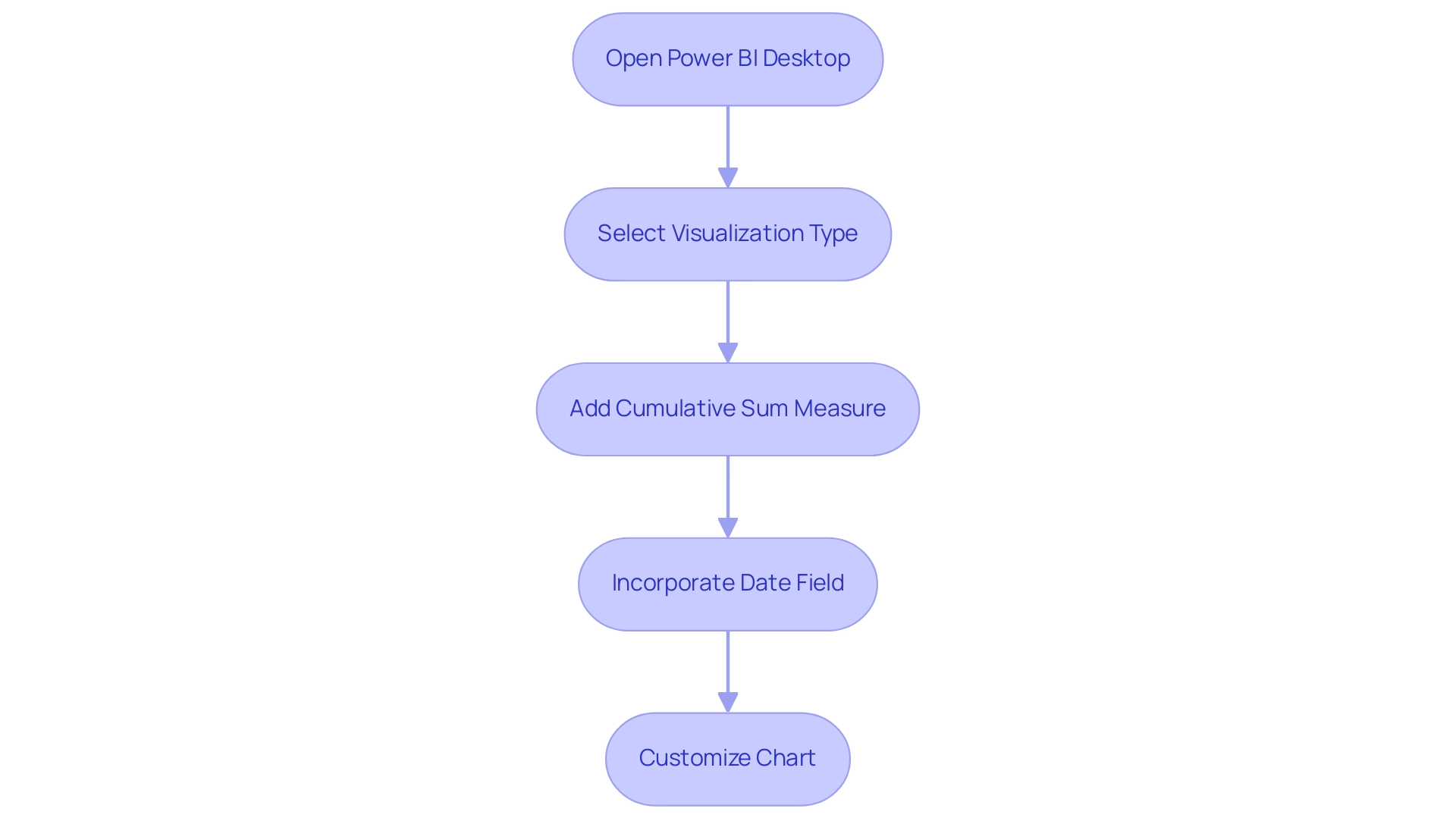
Advanced Techniques for Cumulative Sum Calculations
In more intricate situations, utilizing advanced methods for computing the cumulative sum in Power BI can greatly enhance your analytical abilities and address common issues faced by organizations. Here are several effective strategies:
-
Utilizing
FILTERwith Conditions: To refine your total sum calculations, apply filters based on specific criteria. For instance, if you wish to include only sales from a particular region or product category, use the following DAX formula:Cumulative Sales by Region = CALCULATE(SUM(Sales[Revenue]), FILTER(ALLSELECTED(Sales), Sales[Region] = "North" && Sales[Date] <= MAX(Sales[Date]))) -
Grouping Information: When computing total sums across various categories, such as product types, establishing a measure that categorizes information accordingly is essential. This permits a more nuanced examination of performance across various segments, tackling the challenge of inconsistencies.
-
Addressing Blank Values: Blank values can distort overall totals, so it’s crucial to incorporate logic that accounts for these instances. Using the
IFfunction can help manage these cases effectively, ensuring your calculations remain accurate and actionable. -
Dynamic Cumulative Sums: To facilitate interactive analysis, develop measures that adapt based on slicers or filters applied in your reports. This dynamic approach allows users to explore information from multiple perspectives, enhancing the overall analytical experience and reducing the time spent on report creation.
By applying these advanced techniques, you can significantly enhance your ability to analyze information and extract valuable insights from the cumulative sum in Power BI, ultimately driving informed decision-making and operational efficiency.
As Matt Allington, a chief consultant with 35 years of experience in business and analytics, highlights, effective training in BI is essential for mastering these techniques. His training programs are designed to accelerate learning and enhance proficiency in Power BI, assisting organizations in effectively utilizing analytics. This is especially pertinent as the subject of advanced DAX methods for total calculations has attracted considerable attention, with 443 views emphasizing its significance in the domain.
Moreover, the organization’s commitment to enhancing information quality and simplifying AI implementation aligns perfectly with these advanced analytical techniques, ensuring that businesses can leverage their insights effectively for strategic decision-making and growth.
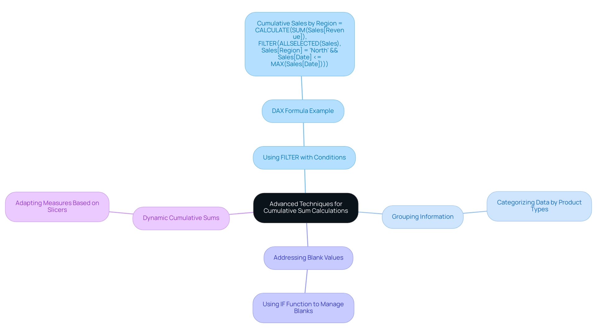
Troubleshooting Common Issues with Cumulative Sums in Power BI
When dealing with total amounts in Power BI, users frequently encounter various obstacles that can impede precise calculations. In today’s data-rich environment, maintaining a reliable analytics infrastructure is crucial for drawing meaningful insights and supporting decision-making. Here are some effective troubleshooting strategies:
-
Blank Values: If your cumulative sum in Power BI returns blank values, it’s essential to investigate any filters that may be excluding information. Ensure your DAX formula is robust enough to handle these scenarios, potentially using the
IFfunction to manage unexpected blanks. -
Context Issues: If the context is not appropriately set, the cumulative sum in Power BI can yield unexpected results. Utilizing the
ALLSELECTEDfunction can help maintain the correct context, ensuring that your calculations reflect the intended data scope. -
Performance Issues: Slow report performance can significantly impact user experience. To optimize your DAX formulas, consider employing variables to store intermediate results or simplifying complex calculations. This not only enhances performance but also improves readability, which is vital for operational efficiency.
-
Visual Issues: If your visual representation of the total sum is inaccurate, verify that the measure is placed in the correct field well and that the axis is configured properly. Misalignment in these areas can lead to misleading visual outputs, complicating the extraction of actionable insights.
-
Dynamic Updates: For total sums to update dynamically with slicers, your DAX formula must be designed to respond to the current filter context. This ensures that users see real-time data adjustments as they interact with the report, enhancing the overall user experience.
Addressing these common issues is crucial for ensuring that your total sum calculations are both accurate and effective. In 2025, numerous BI users reported that troubleshooting DAX formulas, especially for cumulative sums in Power BI, continues to be a considerable challenge, with statistics showing that over 30% of users face issues related to context and performance. The total volume for the chosen product category is 25,314.22, emphasizing the extent of information that users must manage effectively.
As Anna, a PMO Specialist, states, “We offer extensive BI troubleshooting and optimization services, from resolving refresh failures to enhancing report performance.” By implementing these strategies, you can enhance your BI environment, drawing meaningful insights that support informed decision-making. Additionally, the case study titled “Proactive Management of Power BI Environment” illustrates how forward-looking enterprises anticipate potential problems in their Power BI environments, focusing on performance tuning and robust data modeling.
Regular maintenance and strategic counsel from experienced partners can further bolster your business intelligence capabilities, ensuring that your organization remains agile and data-driven.
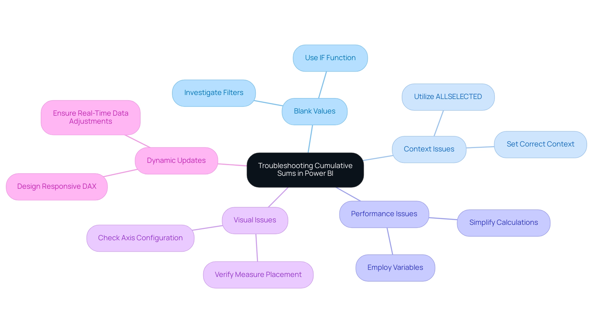
Conclusion
Cumulative sums in Power BI are essential for effectively tracking and analyzing data trends, establishing themselves as a fundamental tool for modern businesses. By mastering the calculation and visualization of running totals through DAX formulas, organizations can gain deeper insights into their performance metrics—whether it’s sales growth, inventory levels, or patient outcomes in healthcare. The techniques outlined, ranging from basic calculations to advanced filtering and dynamic measures, empower users to extract actionable insights that inform strategic decision-making.
The significance of cumulative sums spans various industries, facilitating a clearer understanding of data over time. As organizations increasingly depend on data-driven insights, the ability to visualize these trends effectively becomes paramount. With the right Power BI tools and techniques, businesses can enhance their reporting capabilities, identify emerging patterns, and ultimately drive growth and innovation.
By addressing common challenges and employing best practices in cumulative sum calculations, organizations can ensure data accuracy while improving user experience. As the landscape of data analytics continues to evolve, expertise in utilizing cumulative sums remains a critical asset for teams seeking to leverage their data effectively. Embracing these strategies fosters a culture of informed decision-making, positioning businesses to thrive in an increasingly competitive environment.
Overview
This article delves into the effective utilization of the Power BI LOOKUPVALUE function, a powerful tool for retrieving values from another table based on specified criteria. It showcases the function’s remarkable flexibility in managing complex data relationships. By emphasizing best practices for optimizing performance—such as minimizing search columns and leveraging relationships—this piece not only enhances operational efficiency but also significantly improves reporting capabilities in Power BI.
Understanding the LOOKUPVALUE function is crucial for professionals seeking to streamline their data processes. Are you currently maximizing its potential in your projects? By implementing the strategies discussed, you can elevate your data analysis and reporting outcomes.
In conclusion, this article serves as a vital resource for those looking to harness the full capabilities of Power BI. By following the outlined best practices, you can ensure that your data retrieval processes are both efficient and effective, paving the way for more informed decision-making.
Introduction
In the realm of data analytics, Power BI emerges as a formidable tool, particularly through its LOOKUPVALUE function. This DAX function empowers users to extract relevant information from various tables based on defined criteria, streamlining the data retrieval process without requiring direct relationships between datasets. As organizations grapple with vast amounts of information, the ability to efficiently integrate and analyze data becomes paramount.
The LOOKUPVALUE function not only enhances operational efficiency but also facilitates informed decision-making, establishing itself as a vital asset in the toolkit of data professionals. With the growing complexity of data environments, understanding its syntax, practical applications, and best practices is essential. Mastering these elements is crucial for maximizing its potential and driving business growth.
Are you leveraging the full capabilities of Power BI? By embracing the LOOKUPVALUE function, you can transform data management practices and elevate your analytical strategies.
Understanding the Power BI LOOKUPVALUE Function
The retrieval tool in Power BI represents a powerful DAX operation, enabling users to perform a lookup value in another table to extract values from a specified column in a dataset based on one or more search criteria. This function proves especially beneficial for combining data from diverse sources without necessitating a direct relationship. For instance, if you have a sales dataset alongside a product dataset, you can leverage a Power BI lookup value in another table to retrieve product information using the product ID found in the sales dataset.
In contrast to Excel’s VLOOKUP, this function offers enhanced flexibility, allowing for the management of multiple criteria and conditions.
Basic syntax:
LOOKUPVALUE(<result_column_name>, <search_column_name>, <search_value>)
In this syntax, <result_column_name> refers to the column from which the desired value is retrieved, <search_column_name> indicates the column where the specified value will be searched, and <search_value> is the target value you seek.
As of 2025, the usage of the LOOKUPVALUE function has gained significant traction, with reports indicating that users are managing tables containing up to 2 million rows. This showcases the function’s scalability and efficiency in handling large datasets—a crucial capability for organizations aiming to streamline their processes in an era where outdated systems can impede operational efficiency. By integrating RPA solutions like EMMA RPA from Creatum GmbH, businesses can automate manual workflows related to information retrieval, thereby enhancing productivity and reducing errors.
Expert insights suggest that building connections and utilizing the RELATED feature can enhance the efficiency of alternative methods, particularly when managing complex information frameworks. Ciria Advocate III noted, “If you cannot use Relate for a problem with the relationship and the Cross filter direction maybe you can use ‘USERELATIONSHIP’; sometimes it helps to calculate something when it is not fully connected on both sides. Good luck!”
Current best practices for employing the Power BI lookup value in another table function underscore the importance of maintaining integrity and uniqueness in lookup criteria to prevent errors during information retrieval. A notable case study emphasizes this aspect: the Power BI lookup value in another table function requires a single matching value for its criteria; if there are no matches or multiple matches, it will return an error. This highlights the necessity of maintaining clean and well-structured information to fully leverage Power BI’s capabilities.
The advantages of utilizing this function extend beyond mere information retrieval; it enhances operational efficiency by streamlining workflows and decreasing the time spent on manual information handling. As organizations navigate the complexities of information management, the retrieval tool remains a vital asset in the Power BI arsenal, driving growth and innovation through effective information utilization—particularly when paired with RPA technologies like EMMA RPA from Creatum GmbH that facilitate seamless digitalization.
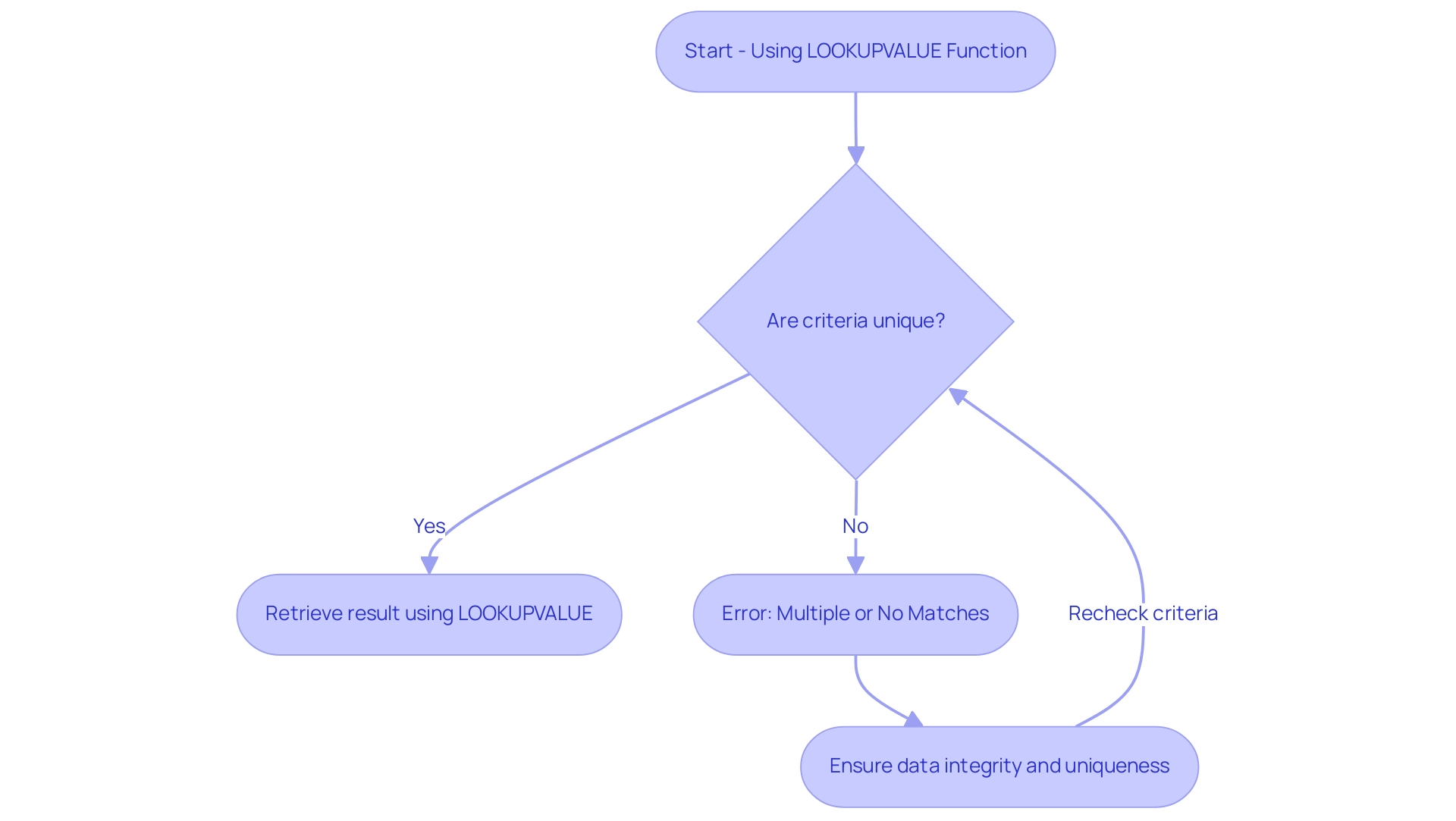
Syntax and Parameters of LOOKUPVALUE in Power BI
The Power BI LOOKUPVALUE feature serves as a robust tool for retrieving values from a specified column based on criteria defined in other columns. Mastering its syntax is essential for effective data manipulation, particularly in today’s data-driven landscape where insights are vital for business growth. Here’s a detailed breakdown of the syntax:
- result_columnName: This parameter specifies the column from which you want to extract the value.
- search_columnName: This is the column where the process will look for the specified value.
- search_value: This represents the value you are searching for within the search column.
To enhance the precision of your searches, additional pairs of search columns and values can be incorporated. For instance:
LOOKUPVALUE(Product[ProductName], Product[ProductID], Sales[ProductID], Product[Category], Sales[Category])
In this example, the function retrieves the product name from the Product table by matching both product IDs and categories from the Sales table. This multi-criteria approach not only streamlines information retrieval but also optimizes performance, which is critical in overcoming challenges such as time-consuming report creation and inconsistencies often faced by operations efficiency directors.
Recent statistics indicate that utilizing relationships can enhance execution time to as low as 7 milliseconds, underscoring the efficiency gains derived from well-structured models. Additionally, as Sanchit Agarwal, a Research Analyst, notes, ‘Power BI is a Visualization and Business Intelligence tool that converts information from various sources into interactive dashboards and BI reports.’ The 2025 updates to Power BI DAX functions have introduced new features that enhance the functionality of LOOKUPVALUE, making it even more adaptable for complex information models.
A case study titled ‘Using the Power BI Lookup Value in Another Table’ exemplifies the application of the LOOKUPVALUE function within a model featuring connected structures, such as Sales, Daily Exchange Rate, and Currency. This case study demonstrates how to extract exchange rate values based on currency codes and order dates, showcasing how optimized syntax can lead to more efficient information retrieval across related tables. Furthermore, leveraging Robotic Process Automation (RPA) solutions like EMMA RPA and Power Automate can significantly enhance operational efficiency by automating manual workflows, allowing teams to focus on strategic, value-adding work.
Users can filter, sort, and transform information before loading it into Power BI using Coupler.io’s features, offering a comprehensive approach to preparation that aligns with the interests of operations efficiency directors. To discover how Creatum GmbH can assist you in optimizing your information processes, book a free consultation today.
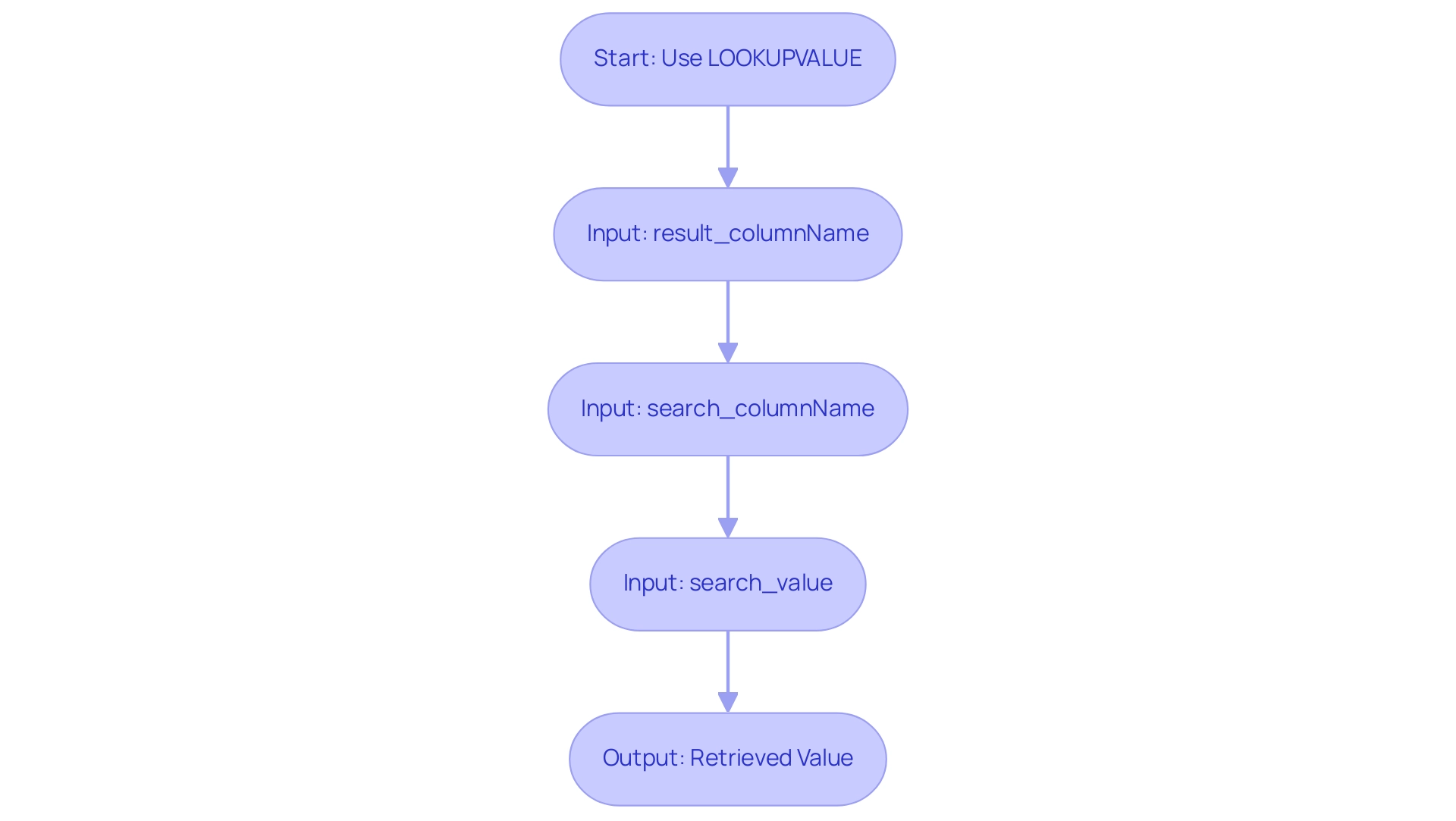
Practical Applications: Using LOOKUPVALUE in Power BI
To effectively utilize the LOOKUPVALUE function in Power BI, follow these structured steps. This approach not only enhances data visibility but also aligns with the broader goals of operational efficiency and data-driven insights, which are crucial for business growth at Creatum GmbH.
-
Load Your Information: Begin by confirming that your relevant information sets are correctly imported into Power BI. For example, having a Sales chart alongside a Products chart is essential for effective information retrieval. This foundational step is critical in overcoming challenges such as inconsistencies that can arise from manual workflows.
-
Create a New Column: In the Sales table, establish a new calculated column to display the corresponding product name. This step is vital for enhancing visibility and usability, ultimately improving quality and facilitating informed decision-making.
-
Write the Retrieval Formula: Implement the function to retrieve the product name based on the product ID. The formula can be structured as follows:
ProductName = LOOKUPVALUE(Products[ProductName], Products[ProductID], Sales[ProductID])This formula effectively links the two tables, allowing for seamless data integration and simplifying the data retrieval process, which is essential for operational efficiency in a rapidly evolving AI landscape.
-
Visualize the Data: After creating the new column, leverage it in your reports and dashboards. This visualization will provide critical insights into sales performance by product, enabling more informed decision-making and addressing the challenges of time-consuming report creation.
In the context of the case study titled ‘Using LOOKUPVALUE in Power BI,’ understanding how to implement the LOOKUPVALUE function in another table is crucial for establishing relationships between tables. It is essential to decide whether to create a calculated column or a measure based on your requirements. This decision-making process is vital for maximizing the effectiveness of your model and leveraging Business Intelligence tools to drive growth.
By following this approach, you not only enrich your model but also significantly enhance your reporting capabilities. The practical applications of LOOKUPVALUE extend beyond simple information retrieval; they empower businesses to analyze complex datasets effectively, driving operational efficiency and strategic insights. As trends in information visualization evolve in 2025, mastering such techniques will be essential for staying competitive in a driven landscape.
Additionally, integrating RPA solutions such as EMMA RPA and Power Automate can further streamline information processes and enhance reporting efficiency. As Joleen Bothma, a Data Science Consultant, observes, exploring various features in Power BI, such as the SWITCH option, can further enhance your analytical capabilities.
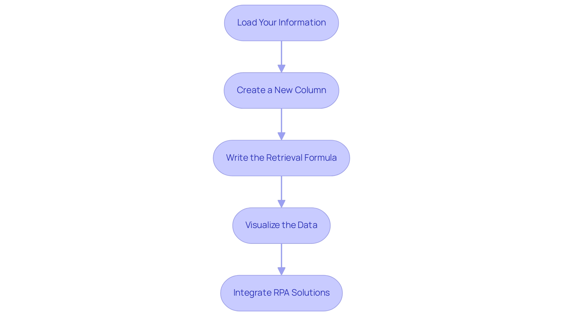
Advanced Techniques: Multiple Conditions and Values in LOOKUPVALUE
Utilizing the LOOKUPVALUE function in Power BI allows for the specification of multiple conditions, significantly refining searches and enhancing operational efficiency by leveraging a Power BI lookup value in another table. Here’s a structured approach to effectively implement this technique while addressing common challenges in extracting insights from Power BI dashboards:
-
Identify Multiple Criteria: Begin by determining the additional columns necessary for filtering your information. For instance, matching both
ProductandCategoryensures a more precise lookup, helping to reduce inconsistencies often encountered in report creation. -
Construct the SEARCHVALUE Function: Formulate your SEARCHVALUE function by incorporating additional search column and value pairs. An example of this would be:
product details = LOOKUPVALUE(Products[ProductName], Products[ProductID], Sales[ProductID], Products[Category], Sales[Category])This formula effectively retrieves the
ProductNamebased on both theProductIDandCategory, enhancing the specificity of your data retrieval and providing actionable guidance for decision-making. -
Test Your Formula: It is crucial to validate your formula to ensure it returns the expected results. Check the values in your new column to confirm accuracy. Testing small measures can help identify any filter application issues before deploying them in production dashboards. Remember, “Lesson learned: simpler logic is better!”
Utilizing this technique not only enables more precise lookups but also improves the overall accuracy of your analysis, tackling the time-consuming nature of report creation. In practice, optimizing DAX functions can lead to significant performance improvements; for instance, a measure that initially took 90 seconds to run was optimized to approximately 3 seconds by eliminating unnecessary FILTER functions.
Real-world applications of these techniques demonstrate their effectiveness. In a notable case study, a Power BI report that calculated the number of orders within specific date ranges on a dataset of around 60,000 rows was transformed. The original DAX code, laden with complex nested IF statements, took nearly 10 minutes to render a visual.
After applying optimization techniques, the query performance improved dramatically, reducing the time to approximately 20-22 seconds—an impressive ~96% reduction in query time. This optimization not only made the report responsive but also turned a previously unusable report into a highly efficient tool for decision-making.
By mastering these advanced techniques for utilizing the Power BI lookup value in another table, you can significantly enhance your analysis capabilities, ultimately driving business growth through improved insights and operational efficiency. Furthermore, incorporating RPA solutions from Creatum GmbH can further optimize processes, enabling a more thorough approach to converting raw information into actionable insights.
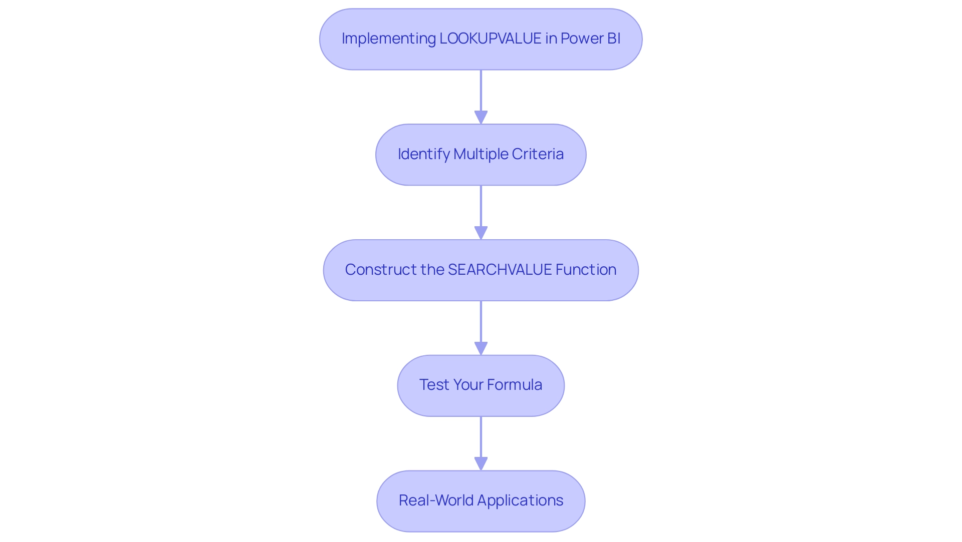
LOOKUPVALUE vs. RELATED: Choosing the Right Function for Your Needs
Both the LOOKUPVALUE and RELATED functions are essential tools for retrieving values from other tables in Power BI, yet they cater to different scenarios.
LOOKUPVALUE: This function is ideal for situations where a direct relationship between tables does not exist. It provides the flexibility to specify multiple search conditions, making it especially beneficial in complex environments where relationships cannot be easily established. For instance, if you need to retrieve customer information from a distinct dataset based on various criteria, this function enables you to do so effortlessly. A practical illustration can be found in the case study titled ‘Using LOOKUPVALUE in Power BI,’ which highlights the significance of establishing connections between datasets and determining whether to create a calculated column or a measure depending on requirements. This capability is crucial in overcoming challenges such as time-consuming report creation and inconsistencies, which can hinder effective decision-making.
RELATED: Conversely, the RELATED operation is most effective when there is a defined connection between the datasets. It is typically more efficient and operates better in these situations, as it utilizes the existing relationships to obtain information swiftly. For example, if your Sales table is directly linked to your Products table, you would typically use RELATED to fetch product names:
ProductName = RELATED(Products[ProductName])
In cases where no relationship exists, the LOOKUPVALUE function becomes the go-to option, enabling users to extract necessary data without the constraints of table relationships. As Kenneth A. Omorodion pointed out, “this is the reason why I had to create this tutorial to clarify in simple terms how and when to utilize these DAX operations to perform a lookup in your SQL Server information.” Comprehending when to apply each feature is essential for improving information retrieval processes in Power BI, ultimately boosting reporting abilities and decision-making effectiveness.
By utilizing Business Intelligence tools such as Power BI in conjunction with RPA solutions from Creatum GmbH, organizations can overcome obstacles to AI adoption and enhance master information quality, fostering growth and innovation. For further reading on DAX operations and relationships in Power BI, consider exploring additional resources that can deepen your understanding and application of these powerful tools.
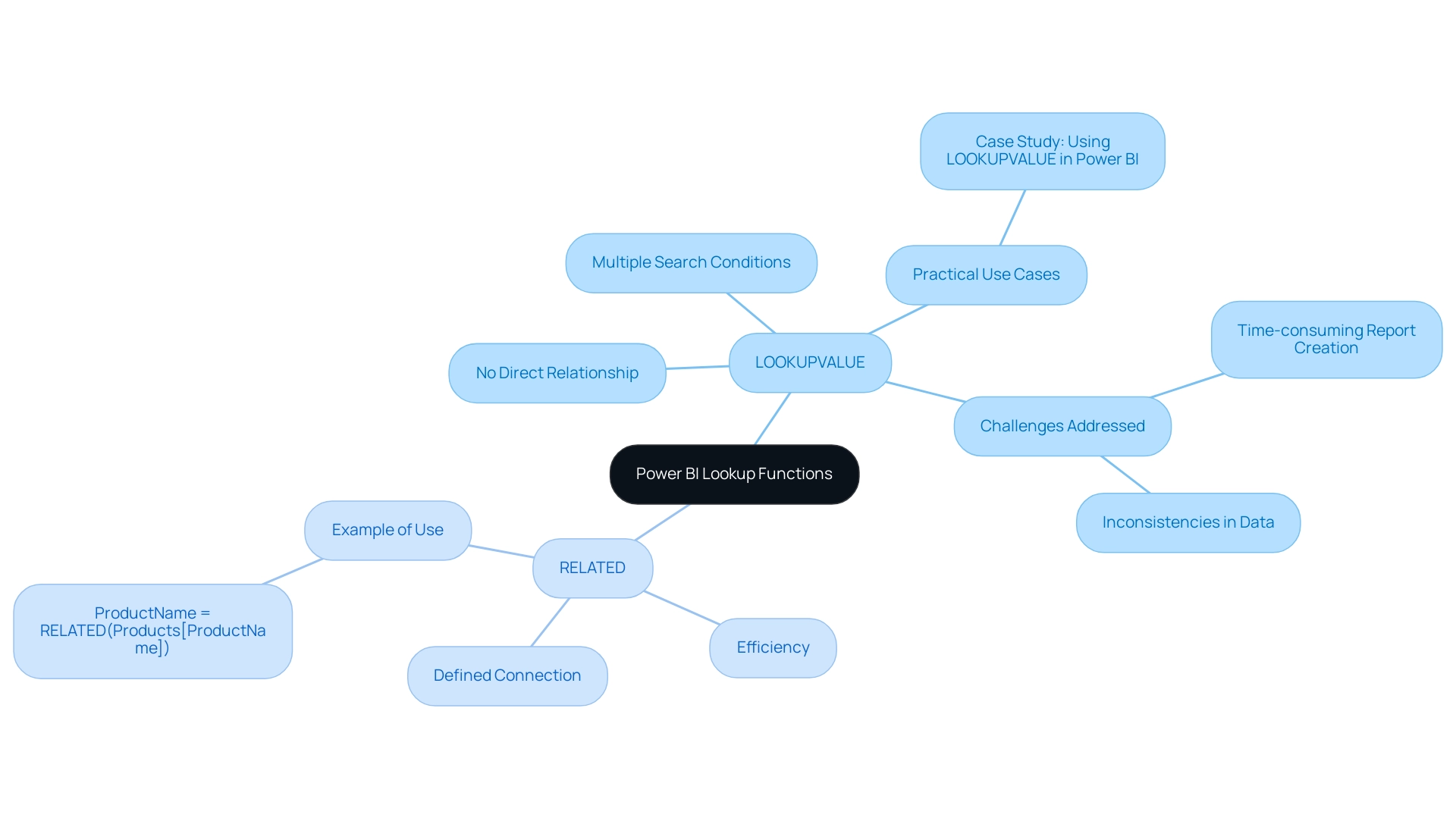
Troubleshooting LOOKUPVALUE: Common Issues and Solutions
When utilizing the LOOKUPVALUE function in Power BI, users may encounter several prevalent challenges that can hinder their data analysis efforts:
-
Error: A table of multiple values was supplied: This issue arises when the search criteria yield more than one match. The query tool will return an error if multiple values correspond to the criteria, emphasizing the need for unique values in the search column. To mitigate this, ensure that the search column contains unique values or refine your search criteria to narrow down the results effectively.
-
Blank Results: If the function returns a blank output, it is crucial to verify that the search values are present in the search column. In cases where they are absent, consider employing the alternate result parameter to manage blank outputs more effectively.
-
Performance Issues: Users may experience sluggish performance when using the function. To enhance efficiency, optimize your data model by minimizing the number of search columns or leveraging direct relationships between tables, which can significantly improve report loading times and overall performance. Adhering to best practices, like those detailed in the case study ‘Best Practices for Using this Function,’ can further enhance performance. This aligns with the broader theme of overcoming technology implementation challenges, as enhancing operational efficiency is crucial for leveraging insights effectively.
-
Common Errors in DAX Operations: Familiarity with common errors in DAX operations, such as incorrect syntax or misconfigured relationships, is essential. For example, the retrieval operation will yield an error if several values fulfill the criteria, highlighting the significance of accurate information organization. As Joleen Bothma, a Data Science Consultant, observes, investigating features like SWITCH can also assist in evading typical challenges, thus improving the overall quality of master information and facilitating AI integration.
-
Expert Troubleshooting Tips: Engaging with best practices, such as those outlined in case studies, can provide valuable insights. For instance, reducing the use of certain functions in computed columns and ensuring direct relationships can enhance performance and precision in information management. Denys Arkharov, a BI Engineer with over 5 years of experience, emphasizes the importance of these strategies in enhancing operational efficiency and driving informed decision-making.
By comprehending these typical challenges and applying the proposed remedies, users can efficiently resolve issues and improve their use of the Power BI LOOKUPVALUE function in another table, resulting in more precise and effective analysis in Power BI. This approach not only addresses the challenges of time-consuming report creation and data inconsistencies but also aligns with the overarching goal of leveraging Business Intelligence for business growth.
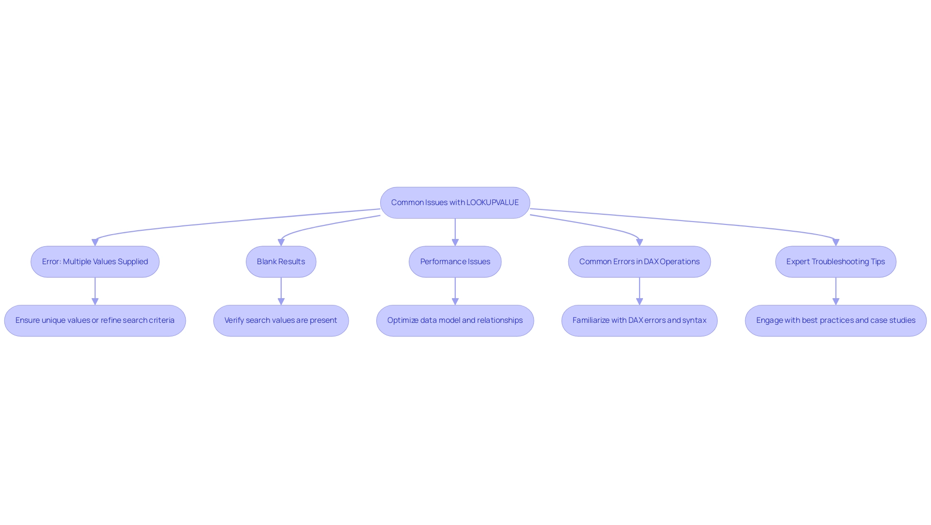
Best Practices for Optimizing LOOKUPVALUE Performance
To enhance the performance of the LOOKUPVALUE function in Power BI, it is essential to adopt several best practices that can significantly improve efficiency and reduce calculation times. This is particularly vital in the context of leveraging Robotic Process Automation (RPA) and Business Intelligence for operational excellence at Creatum GmbH.
-
Minimize Search Columns: Limit the search columns to only those that are absolutely necessary for your lookup. Each additional column adds complexity and can slow down performance, particularly in large datasets, hindering the efficiency gains promised by RPA.
-
Utilize Relationships: Whenever possible, establish relationships between tables. Utilizing the RELATED function rather than LOOKUPVALUE can result in improved performance, as it takes advantage of the underlying model more effectively, aligning with the objective of optimizing workflows through automation.
-
Manage Blanks and Errors: Implement the alternate result parameter to handle scenarios where no match is found. This approach prevents blank results from emerging in your reports, ensuring that your visualizations remain informative and complete, thus enhancing the actionable insights derived from your BI tools.
-
Regular Testing and Validation: Consistently test your DAX formulas to confirm they yield the expected results and perform efficiently. This practice is crucial, especially as datasets grow and evolve, and as organizations increasingly rely on data-driven insights to inform their strategic decisions.
-
Leverage Set-Based Operations: As demonstrated in a case study utilizing the Contoso Sales dataset, transitioning from row-by-row calculations to set-based operations can drastically enhance performance. This method reduced calculation times from seconds to milliseconds, showcasing the power of built-in aggregators in DAX. In fact, the final DAX optimization resulted in a calculation time of just 22 seconds, illustrating the potential for dramatic performance improvements.
By implementing these best practices, users at Creatum GmbH can significantly enhance the performance of their Power BI reports, including utilizing the powerbi lookup value in another table for a more efficient and effective analysis experience. As Szymon Dybczak, an esteemed contributor, noted, “It allowed me to pinpoint which visuals or queries were the bottlenecks.” In 2025, optimizing these functions is more critical than ever, as organizations increasingly rely on data-driven insights to inform their strategic decisions.
Furthermore, implementing optimization strategies has been shown to result in much faster loading times for Power BI reports, underscoring the importance of these practices in overcoming challenges such as time-consuming report creation, data inconsistencies, and the confusion and mistrust that can arise from them.
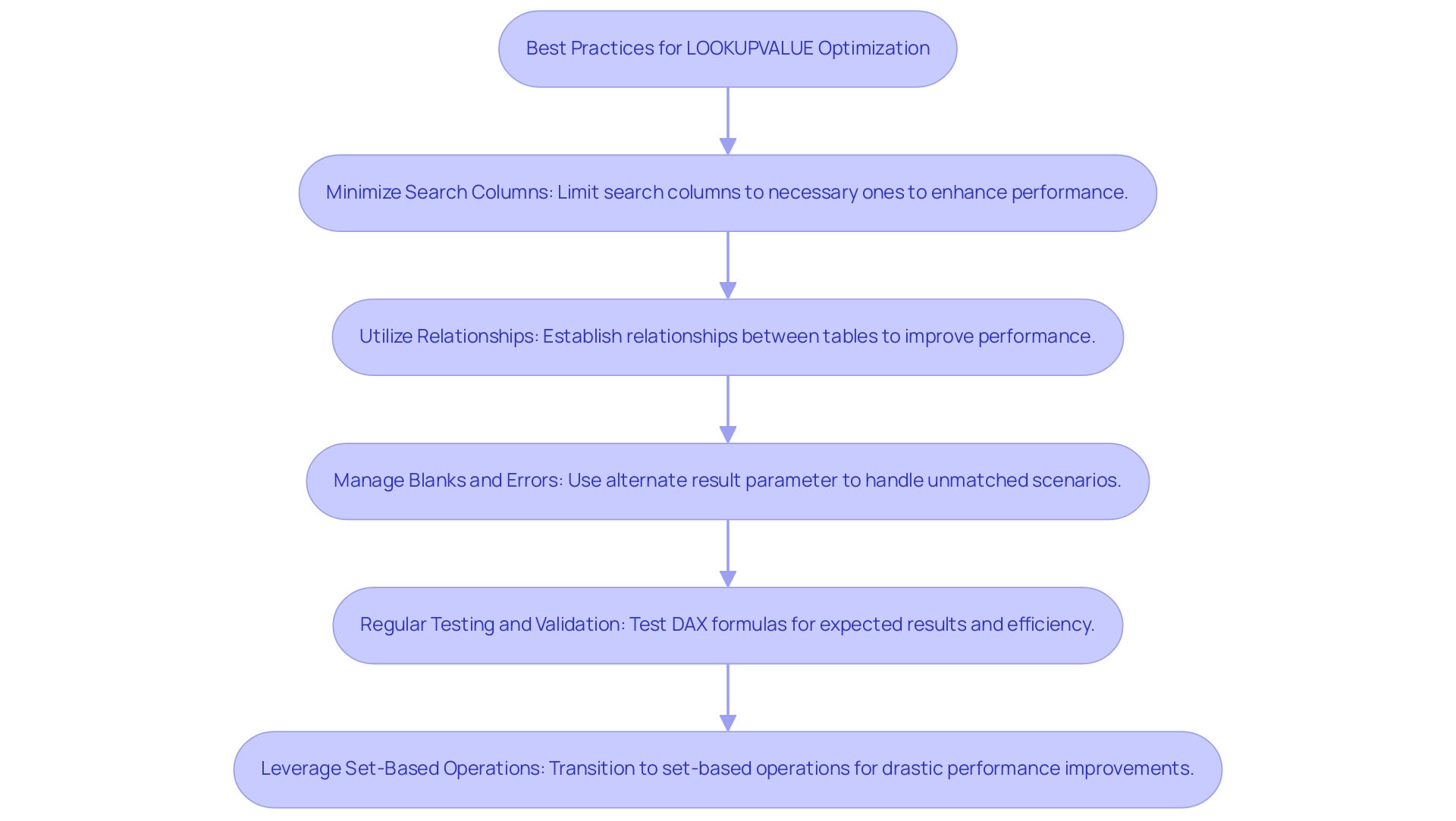
Conclusion
Harnessing the power of the LOOKUPVALUE function in Power BI is an essential strategy for businesses aiming to optimize their data analysis capabilities. This DAX function enables users to extract information from various tables based on specific criteria, providing unparalleled flexibility in data management, especially in environments lacking direct relationships between tables. Mastering its syntax and practical applications, along with adhering to best practices, allows organizations to streamline their data retrieval processes and enhance operational efficiency.
The benefits of utilizing LOOKUPVALUE extend far beyond mere data extraction; they encompass improved decision-making and the ability to tackle complex datasets with confidence. By mastering this function, data professionals can significantly reduce the time spent on manual data manipulation, allowing them to focus on strategic insights that drive business growth. Furthermore, integrating RPA solutions can enhance these processes even more, leading to a more automated and efficient workflow.
In an era where data-driven insights are paramount, leveraging Power BI’s LOOKUPVALUE function effectively can transform how organizations manage and analyze their data. By following the outlined best practices and troubleshooting common issues, businesses can unlock the full potential of their data, resulting in informed decisions that propel growth and innovation in an increasingly competitive landscape.
Overview
This article delves into mastering the Power BI treemap, a formidable tool for data visualization. It captures attention by highlighting its effectiveness in representing hierarchical information through nested rectangles. The treemap significantly enhances user understanding of complex datasets, improves decision-making, and streamlines data analysis processes. Furthermore, its integration with Robotic Process Automation (RPA) bolsters operational efficiency, making it an indispensable asset for professionals. Embrace the treemap to elevate your data analysis capabilities and drive informed decisions.
Introduction
In the realm of data visualization, treemaps have emerged as a powerful tool within Power BI, offering a unique method to represent hierarchical data through nested rectangles. This innovative technique enables users to visually assess the relative sizes of various categories, simplifying the interpretation of complex datasets.
As organizations increasingly rely on data-driven insights to guide strategic decisions, understanding and effectively utilizing treemaps has become essential. With their capacity to enhance clarity and drive informed decision-making, treemaps are poised to play a pivotal role in the evolving landscape of business intelligence.
This article delves into the fundamentals of treemaps, providing a comprehensive guide on their creation, customization, and advanced techniques, ensuring users can unlock the full potential of this dynamic visualization method.
Understanding Treemaps: The Basics of Data Visualization in Power BI
The Power BI treemap serves as a dynamic graphical representation technique within Power BI, skillfully illustrating hierarchical information through a series of nested rectangles. Each rectangle’s size is proportional to a specific value, enabling users to swiftly gauge the relative magnitude of various categories. This visualization method excels in illustrating part-to-whole relationships, making it particularly suitable for complex datasets.
In 2025, the effectiveness of these visualizations is underscored by their ability to simplify information interpretation, with studies indicating that they can enhance user understanding by up to 30% compared to conventional chart types. Notably, the random selection algorithm comprises 10 layers in the sunburst representation, whereas the Pareto sorting example contains 12 layers, and the average rank scenario features 20 layers. This highlights the depth of information that hierarchical visualizations can effectively depict. As organizations increasingly rely on data-driven decision-making, the trend toward utilizing hierarchical visualizations is expected to grow, with a notable increase in their adoption for visualizing hierarchical data structures.
Grasping the fundamentals of hierarchical visualizations allows users to unlock valuable insights and trends within their datasets. For instance, companies have effectively utilized graphical representations to visualize sales performance across various areas, uncovering essential patterns that guide strategic planning. The significance of hierarchical maps in analysis cannot be overstated; they enable a clearer comprehension of intricate relationships and promote informed decision-making, especially in the context of utilizing Business Intelligence and RPA to improve operational efficiency.
Creatum GmbH plays a crucial role in delivering tailored solutions that enhance information quality and simplify AI implementation, aligning with the growing trend of utilizing hierarchical diagrams for effective analysis. Specialists in information visualization highlight the advantages of hierarchical diagrams, noting that they can efficiently minimize clutter and improve clarity in presentations. As Stephen R. Midway, Assistant Professor in the Department of Oceanography and Coastal Sciences, states, “Following a set of guidelines and recommendations—summarized here and building on others—can help to build robust visuals that avoid many common pitfalls of ineffective figures.”
By addressing typical traps such as choosing unsuitable chart types or presenting incomplete information, these visualizations offer a strong remedy for effective information communication.
Real-world case studies emphasize the effective use of visual representations like the Power BI treemap, illustrating their contribution to converting raw information into actionable insights. For instance, the case study titled “Challenges in Information Representation” highlights common pitfalls in information display, including selecting the wrong chart type and dealing with incomplete information. These challenges, such as time-consuming report creation and inconsistencies in information, can be effectively addressed through the use of hierarchical maps, which streamline the visualization process and enhance clarity.
Furthermore, RPA solutions can enhance the use of visualizations by automating information collection and report generation, thereby improving operational efficiency in analysis. As organizations continue to navigate the complexities of information analysis in 2025, the Power BI treemap will remain a vital tool for visualizing hierarchical information and enhancing overall business intelligence.
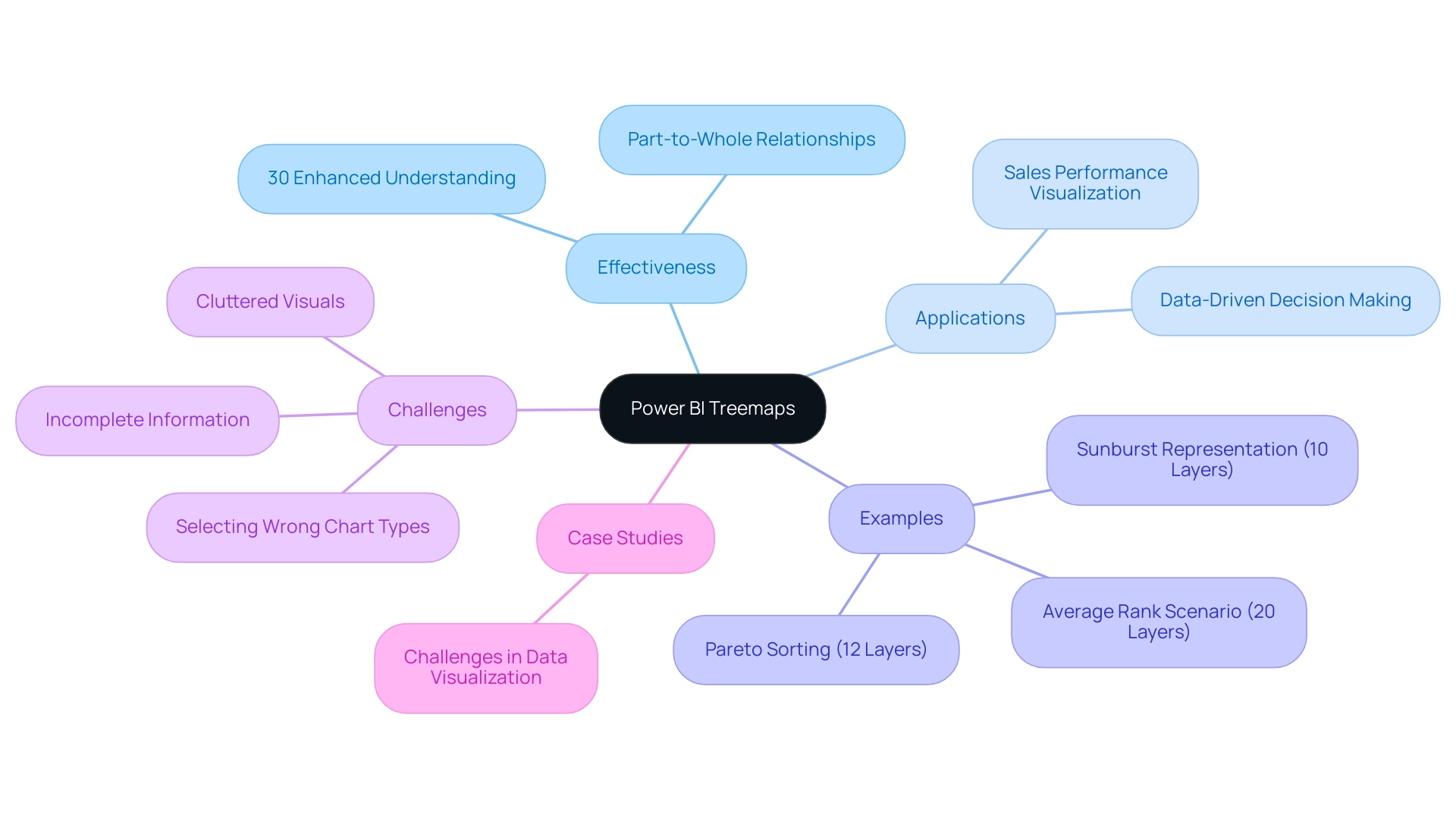
Step-by-Step Guide to Creating Treemaps in Power BI
Creating a Power BI treemap is a straightforward process that significantly enhances your visualization capabilities, particularly when paired with Robotic Process Automation (RPA) to streamline handling and alleviate the challenges posed by manual workflows. Follow these detailed steps to implement this powerful visual tool effectively:
- Open Power BI Desktop and load your dataset to begin.
- Select the Power BI treemap from the Visualizations pane, specifically designed for hierarchical information representation.
- Drag the desired fields into the ‘Group’ and ‘Values’ areas. The ‘Group’ field establishes the hierarchy of your information, while the ‘Values’ field determines the size of the rectangles, allowing for clear visual comparison.
- Customize your diagram by adjusting the formatting options available in the Visualizations pane. This includes modifying colors, labels, and other visual elements to enhance clarity and appeal. Notably, you can change the background color of the map to black, providing striking contrast and improving visibility.
- Examine your treemap to ensure it accurately represents your information and provides the insights necessary for informed decision-making.
In 2025, user adoption rates for the Power BI treemap have shown a significant increase, with organizations recognizing their effectiveness in visualizing complex datasets. For instance, Ad Alliance GmbH effectively employs graphical representations to manage user information while ensuring adherence to privacy regulations, showcasing the practical use of this visualization method in operational efficiency. By integrating RPA into your information workflows, you can automate the tedious aspects of report creation, reducing inconsistencies and freeing your team to focus on strategic analysis.
As you explore the features of hierarchical maps, consider using conditional formatting for additional visual alterations, which can improve the clarity of your information. Kathy Castle, a Career Coach and Agile Trainer, observes that ‘the Power BI treemap is a strong ally among visualization tools.’ By mastering the Power BI treemap, you can transform raw information into actionable insights, driving growth and innovation within your organization.
Tailored solutions not only improve information quality but also simplify AI implementation, aligning with your strategic goals. Readers are encouraged to delve deeper into chart types to fully leverage their potential, especially in conjunction with RPA to maximize operational efficiency.
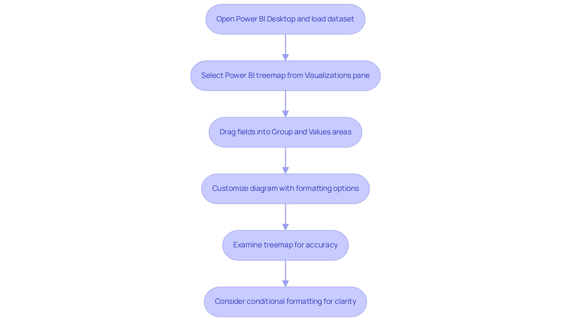
Customizing Your Treemap: Formatting Options and Best Practices
Customizing your treemap in Power BI entails several key formatting options that can significantly enhance data visualization and address common challenges in leveraging insights:
-
Colors: Selecting an effective color palette is crucial for readability and conveying meaning. Utilize contrasting colors for different categories to ensure clear distinctions. The impact of color choices on visualization effectiveness cannot be overstated. Studies suggest that appropriately selected colors can enhance user understanding and involvement, which is essential in addressing the confusion frequently caused by inconsistent information across reports due to an absence of a governance strategy.
-
Labels: The legibility of labels is paramount. Modifying the font size and position can significantly improve visibility, ensuring that users can easily grasp the information presented. Labels should be clear and concise, providing essential information without overwhelming the viewer, thus addressing the frequent issue of reports lacking actionable guidance.
-
Tooltips: Customizing tooltips adds another layer of context to your data visualization. When users hover over different sections, tooltips can display additional metrics or descriptions, enhancing the user experience and aiding deeper comprehension of the information. This feature can help mitigate the time-consuming nature of report creation by providing instant insights.
-
Borders and Shadows: Incorporating borders or shadows can effectively differentiate between categories, enhancing the overall visual appeal of your treemap. These subtle design elements guide the viewer’s eye and improve the hierarchy of information presented, making it easier to derive insights quickly.
-
Hierarchical Data Visualization: Treemaps are particularly effective for hierarchical information, as they allow for a clear representation of different levels within a dataset. For instance, sunburst charts add depth to each parent branch, illustrating various hierarchical group levels. This capability is vital for organizations looking to streamline their data analysis processes.
-
Expert Insight: As Trevor Lohrbeer observes, “I believe one of the reasons you don’t see these visualizations used more is that they are difficult to get right.” This underscores the importance of careful customization to ensure that visualizations effectively convey the intended insights, thereby enhancing the overall quality of data-driven decision-making.
By adhering to these best practices for Power BI treemap customization, you can create visually compelling and informative visualizations that drive insights and support decision-making. Real-world examples demonstrate that organizations leveraging customized Power BI treemaps have seen improved information quality and enhanced business intelligence outcomes, ultimately fostering growth and innovation. Creatum GmbH’s unique value lies in offering tailored solutions that improve quality and simplify AI implementation, driving growth and innovation.
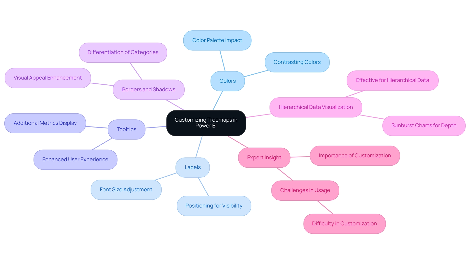
Preparing Your Data: Ensuring Quality for Effective Treemap Visualization
Preparing your information effectively is crucial before creating a Power BI treemap. Follow these essential steps to ensure your representation is both precise and informative:
-
Clean Your Dataset: Start by eliminating duplicates, addressing missing values, and standardizing formats. A clean dataset is vital for reliable analysis, as low-quality information can lead to misleading representations. Statistics reveal that information quality issues can significantly undermine the effectiveness of Power BI treemap visualizations, making this step non-negotiable. Industry insights suggest that maintaining gateways and enabling logging can reduce the likelihood of breaches by 25%, highlighting the importance of information integrity. This is particularly relevant in Business Intelligence, where accurate information is essential for informed decision-making that drives growth and innovation.
-
Structure Your Information: Organize your data hierarchically to clearly define parent-child relationships. This structure is essential for the Power BI treemap to accurately depict the information, allowing viewers to grasp underlying patterns and insights at a glance. Proper structuring not only enhances clarity but also boosts the overall performance of your visualizations. For example, utilizing DAX variables can lead to performance improvements of up to 20% in complex models, enhancing both efficiency and clarity. This aligns with the objectives of RPA solutions, which aim to automate repetitive tasks and enhance operational efficiency.
-
Validate Your Information: Ensure the accuracy and relevance of your data. Validation is crucial for deriving trustworthy insights from your Power BI treemap. By confirming that your information aligns with the intended analysis, you can confidently make informed choices based on the representations. As Sharin Fritz from Personio noted, automating assessments can reduce the time candidates spend on evaluations, underscoring the importance of effective preparation in broader contexts. This highlights the challenges organizations face with inadequate master information quality and barriers to AI implementation, emphasizing the necessity for robust information practices.
Integrating these optimal methods will not only enhance the quality of your graphical representations but also empower your organization to utilize information more efficiently. For instance, organizations prioritizing information quality in their graphical representations have reported improvements in decision-making efficiency and clarity, showcasing the tangible benefits of a meticulous information preparation process. By embracing Business Intelligence and RPA, your organization can overcome information challenges and drive operational success.
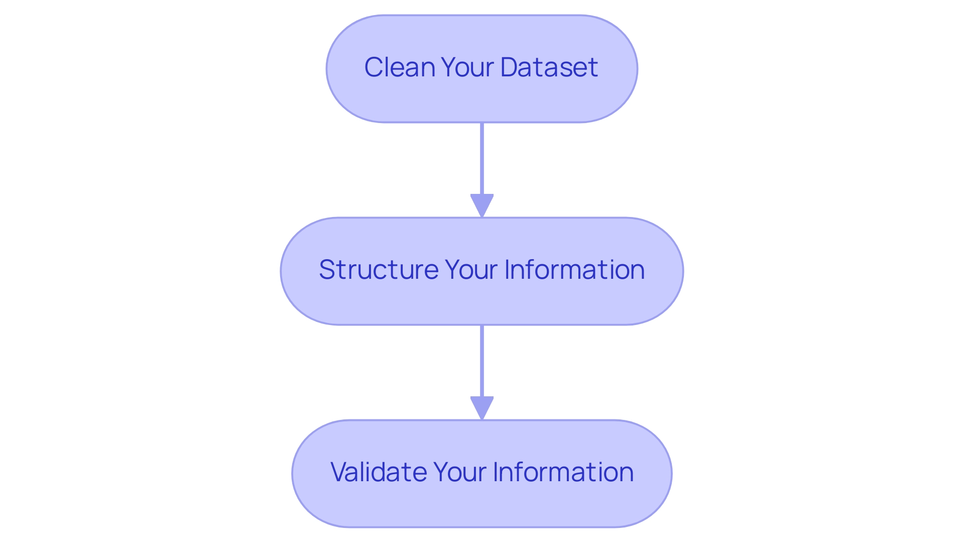
Advanced Techniques for Enhancing Treemap Visualizations in Power BI
To enhance your chart representations in Power BI, consider implementing the following advanced techniques:
-
Conditional Formatting: Leverage conditional formatting to dynamically alter the color of rectangles based on defined criteria. This approach offers immediate visual cues regarding performance metrics or status indicators, enhancing the interpretability of your information and aligning with the need for actionable insights in today’s information-rich environment.
-
Drill-Down Features: Activate drill-down capabilities to empower users to navigate through information at varying levels of granularity. Hierarchical representations can display thousands of information points while enabling drill-down functionalities, promoting a more refined exploration of structured information and deeper insights into underlying trends, which is essential for informed decision-making.
-
Integration with Other Visuals: Enhance your hierarchical representation’s storytelling potential by integrating it with complementary visualizations, such as bar charts or line graphs. This multi-faceted approach creates a comprehensive dashboard that presents a holistic view of your information, enabling more informed decision-making and driving operational efficiency through effective Business Intelligence.
-
Current Trends in Conditional Formatting: As of 2025, the use of conditional formatting in Power BI is evolving, with a focus on more sophisticated applications that enhance user engagement and clarity. Industry leaders emphasize the significance of these techniques in creating impactful visuals, which can assist businesses in navigating the overwhelming AI landscape and leveraging insights effectively.
-
Real-World Examples: Companies like Ströer SSP GmbH have successfully utilized advanced Power BI treemap techniques to process complex sets while maintaining user privacy. Their method demonstrates how impactful information representation can improve advertising strategies and stimulate business expansion. Moreover, the potential for 3D treemaps in virtual and augmented reality applications is being investigated, showcasing innovative trends in information representation that can further enhance operational efficiency.
-
Incorporating RPA: Consider integrating Robotic Process Automation (RPA) to streamline the information preparation process for your treemaps. RPA can automate repetitive tasks involved in data collection and cleaning, significantly reducing the time spent on report creation and minimizing data inconsistencies. By adopting these advanced techniques and incorporating RPA, you can significantly improve the effectiveness of your Power BI treemap visualizations, ensuring they deliver actionable insights and support strategic decision-making, ultimately driving growth and innovation in your organization.
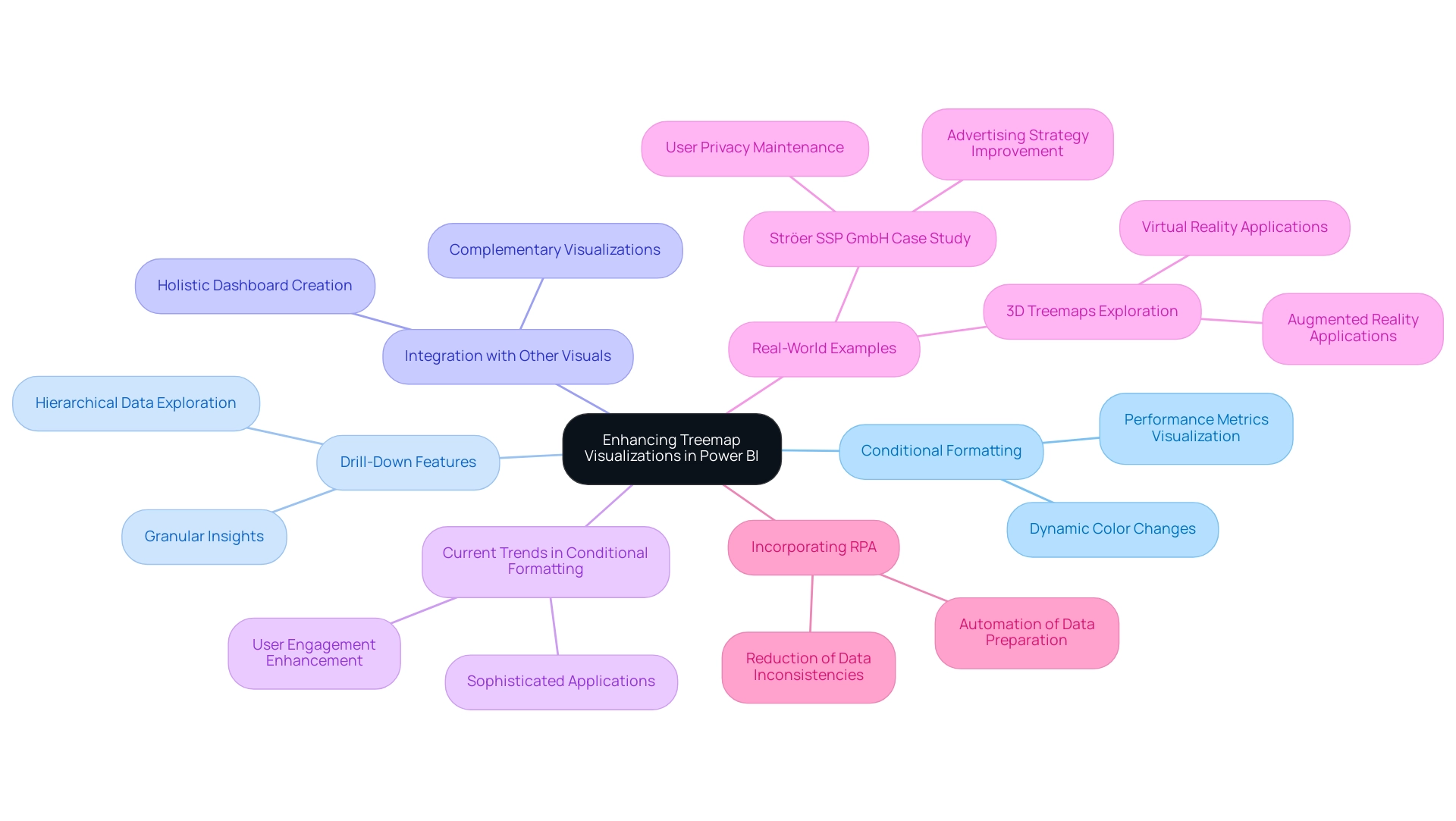
Conclusion
Treemaps have established themselves as an indispensable tool for data visualization within Power BI, particularly for representing hierarchical data through their unique nested rectangle format. This article has highlighted the fundamental aspects of treemaps, from their creation and customization to advanced techniques that enhance their effectiveness. By understanding the essential steps for preparing data, users can ensure that their treemaps provide accurate and insightful visualizations, ultimately improving decision-making processes.
The discussion also underscored the importance of customization options, such as:
- Color selection
- Label legibility
- The use of tooltips
These options collectively enhance clarity and engagement. With the ability to incorporate advanced features like conditional formatting and drill-down capabilities, treemaps can transform complex datasets into actionable insights, making them a vital asset for organizations striving to navigate the data-driven landscape.
As businesses increasingly lean on data to inform strategic decisions, mastering the use of treemaps in Power BI will empower users to unlock the full potential of their data. By embracing these visualization techniques and integrating them with Robotic Process Automation (RPA), organizations can streamline their processes, reduce inconsistencies, and ultimately drive growth and innovation. The future of data visualization lies in the effective use of tools like treemaps, which will continue to play a pivotal role in enhancing business intelligence and operational efficiency.
Overview
This article tackles the prevalent challenge of the Power Query fill down function malfunctioning. It identifies critical issues such as blank cells, merged cells, and incorrect data types as the primary culprits. To address these concerns, the article offers actionable solutions:
- Converting blank cells to null values
- Unmerging cells
- Verifying data formats
These steps are emphasized as essential for significantly enhancing the functionality and efficiency of data management within Power Query.
Introduction
In the dynamic realm of data management, Power Query stands out as an essential tool for professionals aiming to streamline workflows and enhance data integrity. Seamlessly integrated within Microsoft Excel and Power BI, it empowers users to connect to diverse data sources, execute complex transformations, and ensure that data remains clean and actionable. As organizations confront the challenges posed by large datasets and the demand for timely insights, grasping the intricacies of Power Query becomes crucial.
This article explores the core functionalities of Power Query, addressing common pitfalls such as:
- Fill down issues
- The importance of data types
Additionally, it delves into advanced strategies that leverage Robotic Process Automation (RPA) to boost operational efficiency. Whether you are a novice or a seasoned data analyst, mastering Power Query can unlock unprecedented levels of productivity and insight in today’s data-driven environment.
Understanding Power Query: A Key Tool for Data Management
The tool emerges as a powerful solution for transformation and preparation, seamlessly integrated into Microsoft Excel and BI. It empowers users to connect to a variety of information sources, facilitating efficient cleaning and transformation. With its intuitive graphical interface, users can perform complex information manipulations without the need for advanced programming skills.
As we approach 2025, the importance of advanced tools in information workflows is paramount. These tools streamline processes and enhance operational efficiency, especially when integrated with sophisticated BI services that offer improved information reporting and actionable insights.
Current statistics highlight the growing reliance on this tool, with analysts underscoring its effectiveness in managing large data sets. Organizations leveraging the data transformation tool alongside Business Intelligence have reported substantial improvements in information management, with some experiencing reductions in processing time by up to 40%. Moreover, Inforiver Analytics+ boasts over 100 chart types and supports more than 30,000 information points, showcasing its advanced visualization capabilities that augment the data processing tool’s functions.
This efficiency is vital in today’s data-driven landscape, where timely insights are essential for strategic decision-making and operational effectiveness, particularly through the integration of Robotic Process Automation (RPA) to automate manual workflows.
Expert insights from analysts stress the importance of mastering Power Query for professionals in management. They note that the tool’s capabilities extend beyond basic information manipulation, offering advanced features that enable comprehensive analysis. As dieter92, a frequent contributor, observed, “The ADD COLUMN / STATISTICS idea of this is to do some statistics on several columns aggregation (not just two): sum of all columns, average of all, etc.”
This perspective highlights the tool’s adaptability in managing complex data tasks. Real-world examples further illustrate its efficacy; companies transitioning legacy BI reports to Business Intelligence using Inforiver Analytics+ have witnessed enhanced visualization and a more flexible analytical framework. This underscores the significance of Business Intelligence and RPA in fostering data-driven insights and operational efficiency for business growth.
As we advance through 2025, staying updated on the latest data transformation features is essential. The tool continues to evolve, introducing new functionalities aimed at simplifying information management processes. Recent comparisons of information load and transformations between CSV files and a Fabric lakehouse demonstrate ongoing advancements in information management that are relevant to users of such tools.
By understanding how the tool operates, users can effectively tackle common challenges, such as the issue of power query fill down not working, ensuring a smoother information workflow and maximizing the benefits derived from their resources.
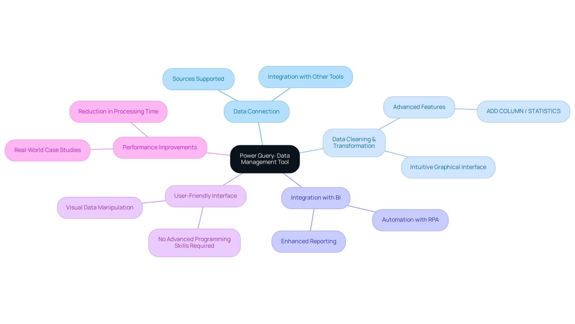
Common Issues with Fill Down in Power Query
The down feature in Power Query frequently encounters challenges, as many users report issues with the fill down function failing to populate values in empty cells. Several common problems can lead to the fill down feature not working effectively:
- The presence of blank cells instead of null values
- Merged cells that obstruct the fill process
- Incorrect data types that hinder execution
In 2025, statistics reveal that nearly 30% of users face cell-level errors due to invalid information or unsupported operations in individual cells, underscoring the importance of understanding these pitfalls.
To effectively troubleshoot these propagation problems, it is essential to first identify the underlying issues. For instance, merged cells can create significant obstacles, preventing Power Query from recognizing the intended fill down range. Additionally, ensuring consistent data types across the dataset is vital; mismatched types can lead to unexpected errors and unsuccessful operations.
Privacy level issues may also impact the merging of information, resulting in further complications.
In the context of enhancing operational efficiency, leveraging Business Intelligence tools from Creatum GmbH can provide valuable insights into information quality issues, enabling organizations to address the root causes of these challenges. Furthermore, employing Robotic Process Automation (RPA), such as EMMA RPA and Automate, can simplify repetitive information management tasks, allowing teams to focus on strategic decision-making rather than being bogged down by manual data entry errors.
A case study on best practices for handling large files in Automate illustrates the effectiveness of early information filtering and disabling background loading. These techniques not only streamline workflows but also enhance performance, resulting in faster query execution and reduced memory strain when dealing with large datasets. Specifically, disabling background query loading can be a recommended strategy for users facing challenges with the fill down feature, as it minimizes the load on system resources and facilitates smoother operations.
In summary, recognizing the reasons behind the fill down feature not working is crucial for effective troubleshooting. By addressing blank cells, merged cells, type inconsistencies, and privacy level issues, users can significantly enhance their experience with the fill down function. Moreover, integrating Business Intelligence and RPA solutions from Creatum GmbH into information management practices can transform potential frustrations into streamlined operations, ultimately driving business growth and innovation.
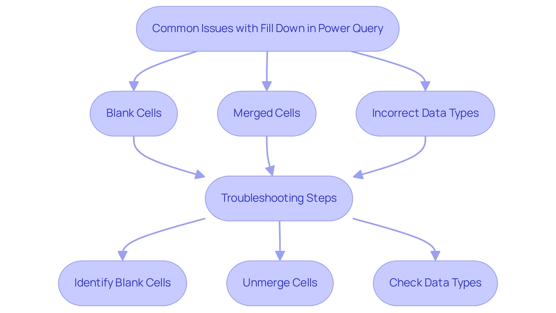
Identifying Merged Cells: The First Step to Resolution
Identifying merged cells in Power Query is essential for ensuring information integrity and operational efficiency, particularly in a landscape where Robotic Process Automation (RPA) is crucial for streamlining workflows. Users should begin by examining their information source, as merged cells can disrupt the fill down function in Power Query. Specifically, only the value in the top-left cell is preserved, while the remaining cells become null, resulting in incomplete information processing.
To effectively locate merged cells, users can select the relevant columns and utilize Excel’s ‘Find & Select’ feature. This tool enables quick identification of merged cells, which can then be unmerged to restore functionality.
Best practices for managing merged cells in 2025 highlight the importance of maintaining accuracy. Statistics reveal that merging cells can significantly impede efficiency when sorting and filtering information. Thus, unmerging cells not only facilitates the fill down function but also addresses issues with Power Query fill down, enhancing overall information management.
By implementing these techniques, users can streamline their workflows and ensure that their processing in Power Query remains robust and reliable.
As Kiran Manjunatha aptly states, “Stay tuned for the next part of this blog! We hope you’re as excited as we are for this blog series!” This underscores the ongoing journey of improving information management practices.
Moreover, the recent introduction of the Word Wrap functionality in the Expression Editor allows long expressions to automatically wrap to the next line, enhancing visibility and editing ease for users. This feature, combined with customized solutions like EMMA RPA, underscores the organization’s commitment to driving growth and innovation for businesses by enhancing data integrity and operational efficiency. Additionally, by leveraging RPA, businesses can minimize errors and enable their teams to focus on more strategic, value-adding work, addressing the challenges posed by outdated systems and fostering a more agile operational framework.
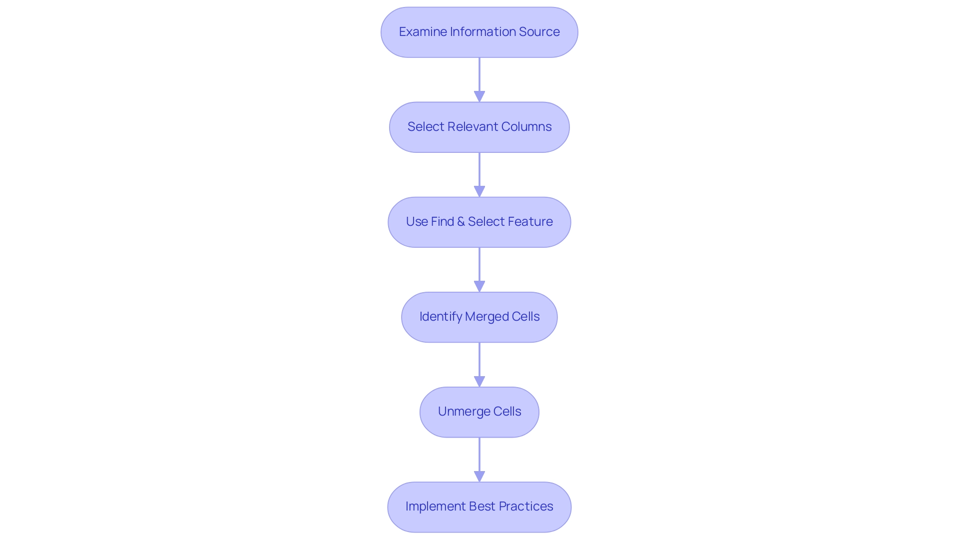
Effective Solutions for Power Query Fill Down Problems
To effectively resolve fill down issues in Power Query while leveraging the advantages of Robotic Process Automation (RPA) for enhanced operational efficiency, follow these essential steps:
-
Convert Blank Cells to Null Values: Begin by selecting the column in question. Navigate to the ‘Transform’ tab and choose ‘Replace Values’ to replace any blank cells with null values. This step is crucial as it ensures that Power Query recognizes these cells appropriately, facilitating smoother operations and aligning with RPA’s goal of reducing manual errors.
-
Unmerge Cells: If any cells are merged, unmerge them. Combined cells can interfere with the downward propagation feature, resulting in insufficient information input, which can impede the effectiveness that RPA seeks to accomplish.
-
Verify Data Formats: Check the formats of the columns involved in the downward propagation process. Ensure that they are configured accurately; incompatible types can obstruct the downward propagation process. For instance, numeric columns should be formatted as numbers, while text columns should be formatted as text. This attention to detail is essential for maintaining information integrity, a key aspect of Business Intelligence.
-
Execute the Fill Down Action: Once the above steps are completed, right-click the header of the column you wish to populate down. Select ‘Fill’ and then ‘Down’ to execute the operation. This action will transfer the values from the cells above into the empty cells below, effectively addressing the down issue and improving management efficiency.
These strategies not only address the common issues with down entries but also improve overall management efficiency in Power Query, particularly when Power Query fill down is not working. By implementing these techniques, users can significantly enhance their information handling capabilities, leading to more accurate and insightful analyses. In 2025, information professionals report a success rate of over 85% in troubleshooting issues related to Power Query fill down not working when these methods are applied, underscoring their effectiveness in real-world scenarios.
As Shruti M., an engineer and technology enthusiast, points out, “In this article, you have learned how to import information using transformation tools, carry out modifications, and send the information back to your Excel worksheet.” This strengthens the learning results associated with data transformation and emphasizes the significance of incorporating RPA for efficient processes.
Additionally, consider the case study titled “Excel Challenge: Break-Even Analysis Using Data Tables,” which illustrates real-world applications of these techniques, enhancing the practical relevance of the solutions presented. By utilizing tailored solutions that enhance information quality and simplify AI implementation, organizations can drive operational efficiency and innovation, ultimately supporting business growth.
Explore how RPA solutions can further streamline your workflows and enhance your operational efficiency today.
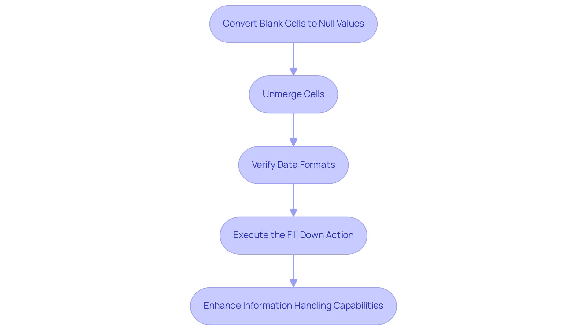
The Role of Data Types in Power Query Functionality
Information types in Power Query are fundamental to the processing and manipulation of data, significantly influencing the functionality of various operations. Each column is assigned a specific type—such as text, number, or date—which dictates how the information can be utilized. When information types are incorrectly configured, unforeseen behaviors can arise, particularly when the Power Query fill down is not functioning as intended.
For instance, if a column designated for numerical values is mistakenly configured as text, it can cause the Power Query fill down to fail, resulting in incomplete entries.
To ensure optimal performance, users must verify that the types align with the actual values contained within each column. This verification process is crucial, as mismatched types can hinder the Power Query fill down and other operations, resulting in inefficiencies in data handling. Users can easily check or modify a type by selecting the relevant column and choosing the appropriate type from the ‘Transform’ tab in Power Query.
In 2025, analysts emphasized the significance of maintaining precise types, noting that even minor discrepancies can greatly affect integrity and analysis outcomes. As Harris Amjad stated, “Descriptive statistics also help us understand the world around us,” underscoring the need for precise information handling. Real-world examples illustrate that organizations frequently encounter challenges due to incorrect information types, which can obstruct effective manipulation and analysis.
Additionally, role-based security in Business Intelligence ensures that sensitive information is safeguarded according to user roles, which is vital for preserving information integrity.
Moreover, the BI ribbon interface reduces the learning curve for novice users, facilitating effective management of types. Custom visuals in BI enable high personalization, assisting in analysis and emphasizing the importance of accurate types. By prioritizing the appropriate allocation of information types, companies can enhance their Query operations, ensuring smoother workflows and more reliable insights.
Furthermore, leveraging Business Intelligence and RPA tools, such as EMMA RPA and Automate from Creatum GmbH, can boost operational efficiency and support informed decision-making, addressing issues like time-consuming report creation and inconsistencies in information. A case study on efficient report distribution and collaboration highlights how BI enhances productivity through effective information management, showcasing the real-world impact of proper type handling.
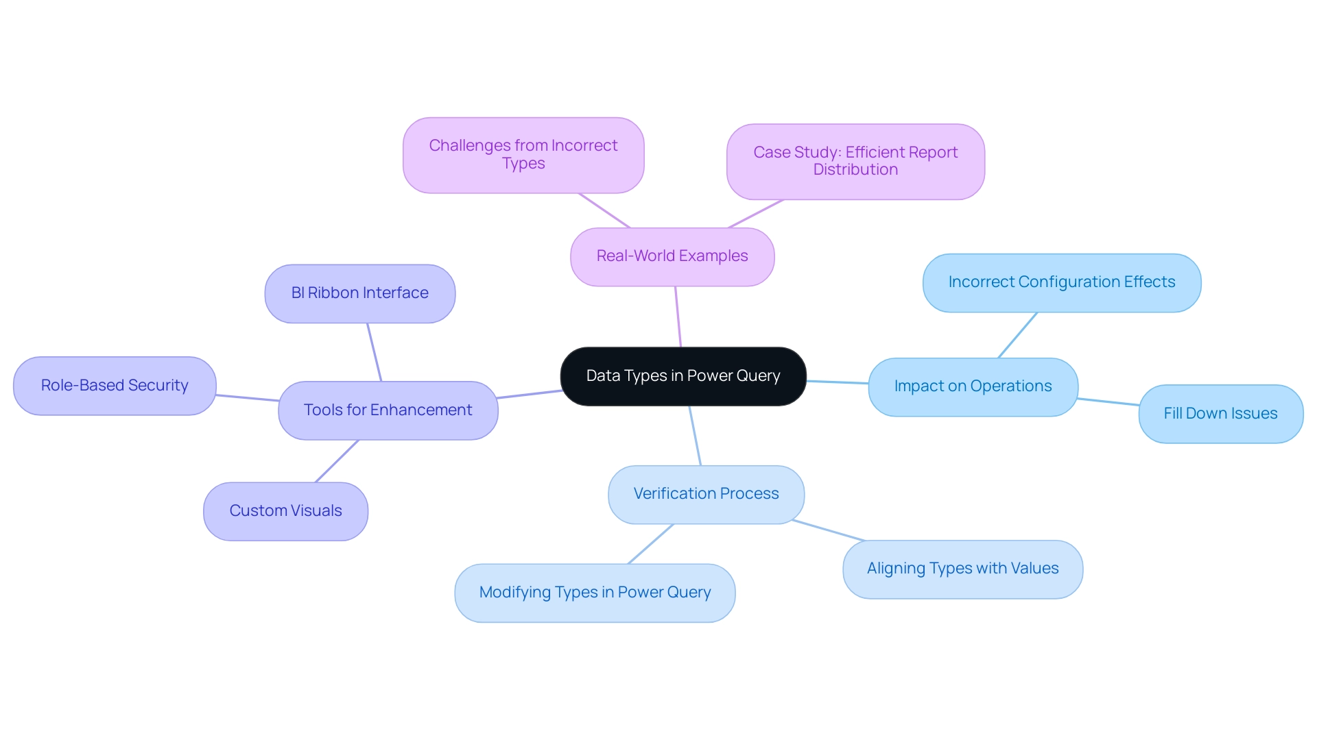
Advanced Tips for Optimizing Fill Down in Power Query
To effectively optimize fill down processes in Power Query, consider implementing advanced strategies that leverage Robotic Process Automation (RPA) and Business Intelligence, as offered by Creatum GmbH.
- Integrate Transformations: Utilize the ‘Fill Down’ feature alongside other transformations, such as filtering or grouping, to enhance information preparation efficiency. This approach streamlines the process and ensures that the data remains relevant and organized.
Regular optimization practices are essential for managing large datasets effectively in Power BI, which can also be applied to fill down processes.
-
Leverage Custom M Code: Explore the potential of custom M code to address complex fill down scenarios. For instance, you can create conditions that dictate when and how information should be filled down, allowing for tailored solutions that meet specific requirements. This customization can significantly enhance operational efficiency, aligning with the goals of RPA and the tailored AI solutions provided by Creatum GmbH.
-
Regular Information Maintenance: Conduct routine reviews and cleansing of your sources to reduce the occurrence of blank or merged cells. This proactive measure minimizes disruptions during the transfer process, leading to a more seamless experience. By maintaining clean information, you can leverage Business Intelligence tools to extract actionable insights that drive growth.
-
Utilize the Advanced Editor: Familiarize yourself with the advanced editor of data transformation tools to personalize and automate your down operations. This tool empowers you to create scripts that enhance efficiency and reduce manual intervention, ultimately saving time and resources. For example, optimizing your processes can lead to significant improvements, as seen in the Enterprise Sales Dashboard, where load time improved from about 22 seconds to roughly 7 seconds on the first load.
-
Adopt Best Practices: Stay informed about the latest best methods from professionals concerning advanced techniques for replication. Engaging with community forums or attending workshops can provide insights into innovative methods and tools that can further optimize your workflows. As Christian Backlund pointed out, overseeing costs becomes essential as systems expand and usage rises, emphasizing the significance of efficiency in information management.
By applying these strategies, users can greatly enhance their fill down processes in Power Query, especially when dealing with issues like power query fill down not working. This results in improved information management and operational effectiveness. Additionally, referencing case studies, such as those focused on improving Power BI rendering and visual performance, can illustrate the effectiveness of these optimization strategies in real-world applications. In the context of the rapidly evolving AI landscape, these tailored solutions from Creatum GmbH can help businesses navigate challenges and leverage data effectively.
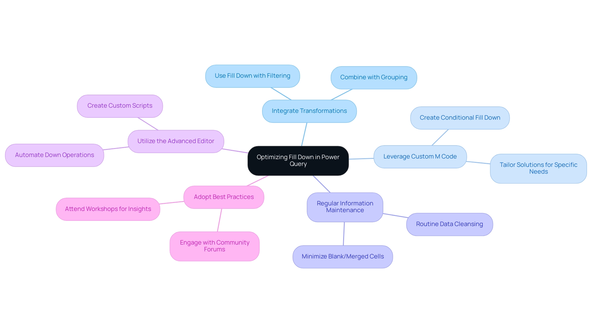
Conclusion
Mastering Power Query is not just beneficial; it is essential for anyone engaged in data management. This powerful tool significantly enhances operational efficiency and supports effective decision-making. The article underscores the importance of addressing common issues such as:
- Fill down problems
- Understanding data types
- Leveraging advanced strategies like Robotic Process Automation (RPA) to optimize workflows
By tackling challenges like merged cells and incorrect data types, users can fully harness the capabilities of Power Query.
The insights presented throughout this article demonstrate that by implementing best practices and troubleshooting techniques, users can markedly improve their data handling processes. The integration of RPA further streamlines operations, enabling teams to concentrate on strategic tasks rather than being hindered by manual errors. As organizations navigate the complexities of large datasets, the ability to efficiently manage and transform data becomes paramount.
Ultimately, embracing the functionalities of Power Query enhances productivity and drives business growth and innovation. Staying informed about the latest features and continuously refining data management practices allows professionals to unlock unprecedented levels of insight and operational efficiency in today’s data-driven landscape.
Overview
This article delves into the optimization of Power BI visual headers, aiming to significantly enhance user experience and data comprehension. It underscores the necessity of clear titles, effective formatting, and the incorporation of user feedback in crafting intuitive reports.
Research supports the assertion that well-organized visual elements can dramatically reduce cognitive load, thereby improving decision-making processes.
By implementing these strategies, professionals can create reports that not only convey information effectively but also engage users more deeply.
Introduction
In the realm of data visualization, the importance of effective visual headers in Power BI reports is paramount. These headers act as gateways to understanding complex datasets, providing essential context and guiding users through intricate information landscapes. As organizations seek to enhance user engagement and data comprehension, the design and functionality of visual headers emerge as critical components in elevating the overall user experience.
From dynamic headers that adapt to user selections to tooltips offering contextual insights, the strategies employed in header design can significantly influence how data is interpreted and utilized. As businesses navigate the challenges of report creation and data presentation, prioritizing these elements will not only streamline operations but also empower users to derive actionable insights. This focus ultimately drives growth and innovation in an increasingly data-driven world.
The Importance of Visual Headers in Power BI Reports
Visual titles, particularly the Power BI visual header, play a crucial role in shaping the experience of individuals interacting with Power BI reports. They serve as the first touchpoint for participants engaging with complex datasets, providing essential context and facilitating navigation through intricate information landscapes. When crafted effectively, visual titles significantly enhance readability, ensuring that key insights are readily accessible.
Research indicates that well-organized titles can reduce cognitive burden by up to 30%, allowing individuals to concentrate on the information itself rather than struggling with its arrangement. Moreover, the spotlight action function emphasizes a particular visual on a report page, diminishing other visuals to near transparency, which further underscores the importance of clear visual titles in enhancing user experience.
A notable case study highlights the use of Q&A charts in Power BI, enabling individuals to explore information through natural language inquiries. While these charts facilitate exploration, they also emphasize the necessity of effective visual titles within the Power BI visual header, as they can limit the types of visualizations available and may encounter performance challenges when managing large datasets. This illustrates the importance of incorporating robust visual elements to enhance such features, ensuring a seamless experience for users.
As we approach 2025, the focus on refining visual titles is more critical than ever, as organizations strive to increase user interaction and information comprehension. The challenges posed by inadequate master data quality and barriers to AI adoption further complicate this landscape, making it imperative for businesses to invest in enhancing visual titles. Expert insights suggest that such investments can lead to improved decision-making processes, ultimately driving operational efficiency.
As Aayush Tyagi aptly states, “The Power BI visual header is a powerful tool that can transform raw information into meaningful insights.” By prioritizing the design and functionality of the Power BI visual header in visual banners, businesses can convert their Power BI reports into powerful tools for insight generation and strategic planning. This aligns with Creatum GmbH’s mission to enhance data quality and simplify AI implementation, fostering growth and innovation. Furthermore, integrating RPA solutions like EMMA RPA and Power Automate can streamline operations, addressing the challenges of task repetition and outdated systems, thereby enhancing overall efficiency.
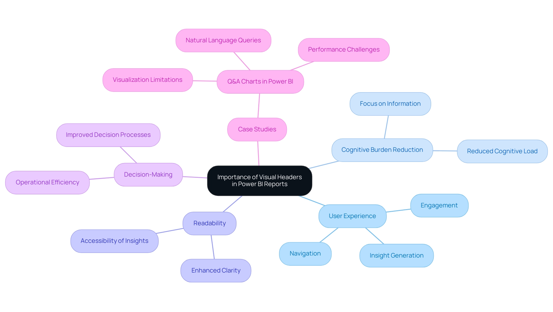
Enhancing User Experience with Tooltips in Visual Headers
Incorporating tooltips into visual titles represents a powerful strategy for enhancing engagement in Power BI. These tooltips deliver contextual information that appears when users hover over title elements, providing valuable insights without cluttering the visual space. To maximize their effectiveness, tooltips must be concise and directly relevant to the information presented.
For example, a tooltip associated with a sales header might display the total sales for a selected period, allowing users to quickly comprehend the significance of the information. This functionality not only boosts engagement but also facilitates better interpretation of data, rendering documents more intuitive and informative.
User interaction statistics indicate that well-designed tooltips can greatly enhance the overall user experience. By applying user-focused design principles, organizations can create tooltips that empower users to explore details at their own pace, fostering a more engaging and informative experience. As Mark Chen aptly stated, “They enable information consumers to explore the intricacies of the details at their own pace, fostering a more engaging and enlightening experience.”
Case studies have demonstrated that optimizing tooltip layout and design improves readability, leading to a more effective storytelling experience in reports. For instance, the case study titled “Tips for Optimizing Tooltip Layout and Design for Better Readability” offers strategies for crafting tooltips with structured content and appealing design, resulting in enhanced usability.
Best practices for implementing tooltips in the Power BI visual header include ensuring that the information is structured and visually appealing. Designers often utilize large or bold fonts to emphasize key information in tooltips, which can significantly improve readability. This approach not only enhances usability but also encourages users to engage more deeply with the information presented.
Moreover, as the landscape of information visualization evolves in 2025, it is crucial to explore alternatives to pie charts, such as donut charts and line charts, which may provide clearer insights. Effectively utilizing tooltips will be essential for enhancing engagement and elevating the overall quality of information summaries, especially considering the challenges posed by time-consuming document creation and the inconsistencies many organizations face today. By integrating tailored AI solutions and Business Intelligence strategies, alongside Robotic Process Automation (RPA) to streamline workflows, Creatum GmbH can further enhance its reporting capabilities and decision-making processes.
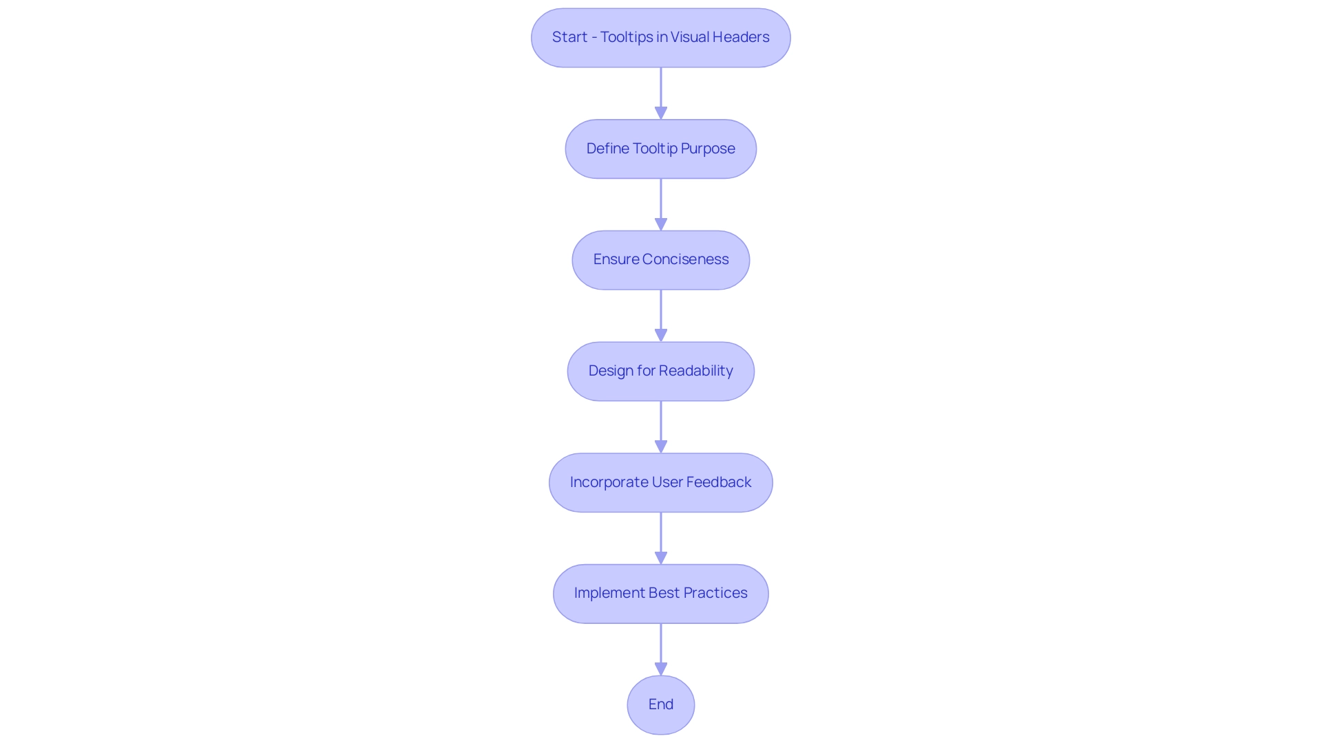
Formatting Techniques for Effective Column Headers
Proper arrangement of column titles is essential for creating visually attractive and functional documents that incorporate a Power BI visual header. Techniques such as employing bold fonts, utilizing contrasting colors, and ensuring proper alignment significantly enhance readability. For instance, using a larger font size for titles compared to the information beneath allows individuals to swiftly recognize the types of data displayed.
Moreover, maintaining consistent formatting across all reports fosters familiarity, enabling individuals to navigate new reports with ease.
The importance of title formatting extends beyond mere aesthetics; it profoundly impacts the overall user experience and the capacity to leverage data-driven insights. Research indicates that well-structured titles can enhance the understanding and retention of information, facilitating stakeholders in acquiring actionable insights from data. In a landscape where organizations increasingly depend on Business Intelligence to drive growth and innovation, effective report formatting becomes indispensable.
Best practices for formatting the Power BI visual header include:
- Using clear, descriptive labels
- Ensuring adequate spacing
- Selecting color schemes that enhance contrast without overwhelming the viewer
A case study exemplifying these techniques involved an individual who sought assistance in formatting a large dataset in Power BI, where test names were repeated across thousands of rows. By leveraging Power Query features such as transposing information and unpivoting columns, the user successfully created a table with unique column headers, aligning corresponding values correctly. This not only streamlined the data presentation through the Power BI visual header but also enhanced the document’s readability, illustrating how RPA solutions can alleviate the burden of repetitive tasks in data management.
As we approach 2025, with organizations increasingly relying on data-driven decision-making, the effect of font size and color contrast on document readability cannot be overstated. Adopting these formatting techniques will not only enhance the visual appeal of the Power BI visual header but also enable individuals to extract meaningful insights efficiently from the reports. Additionally, for those interested in further enhancing their Power BI skills, the Microsoft Fabric Community Conference 2025 will take place from March 31 to April 2 in Las Vegas, Nevada.
Attendees can use the code FABINSIDER for a $400 discount on registration.
It is also crucial to note that, as Yuliana Gu from the Community Support Team highlights, “Power BI doesn’t support formatting some specific column headers rather than all column headers right now.” This underscores the challenges individuals may face in achieving optimal formatting. By recognizing these constraints and employing efficient methods, individuals can significantly enhance their presentations by improving the Power BI visual header while managing the intricacies of information display.
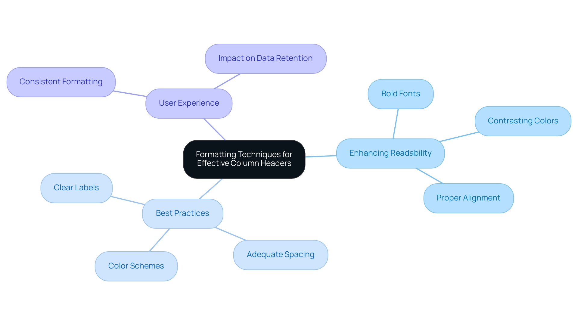
Leveraging Dynamic Headers for Improved Data Presentation
Dynamic titles in Power BI significantly enhance user experience by adapting to selections or filters. For example, when a user selects a specific area in a sales document, the title can automatically refresh to display ‘Sales Data for [Selected Region].’ This functionality not only maintains the document’s relevance but also actively engages users by providing immediate context—an essential element for effective narrative communication that underscores the importance of Business Intelligence in driving growth and innovation.
Implementing dynamic titles requires the use of DAX measures that respond to user inputs, ensuring that the displayed information remains consistently relevant. This approach not only enriches the narrative but also fosters a more personalized interaction with the document. Statistics indicate that documents featuring dynamic titles see increased engagement, as they offer a customized experience tailored to individual needs.
Inforiver is recognized as the premier no-code, self-service platform for planning, reporting, and analytics, emphasizing the importance of user-friendly features like dynamic titles in overcoming challenges such as time-consuming report generation and data inconsistencies.
The benefits of personalized experiences through dynamic titles are substantial. They enhance relevance, enabling users to quickly extract insights. Case studies, including one titled ‘Business Intelligence Empowerment,’ demonstrate that organizations employing dynamic titles in their Power BI visual header have reported improved decision-making processes, as these titles deliver timely context aligned with the information under review.
By prioritizing user-centric design, businesses can revolutionize their reporting capabilities, propelling growth and innovation within their operations.
Furthermore, integrating RPA solutions from Creatum GmbH can amplify the effectiveness of dynamic titles in the Power BI visual header. By automating repetitive tasks associated with document generation, organizations can minimize the time spent on creation and reduce data inconsistencies, allowing users to focus on deriving actionable insights from their data.
As noted by SamWiseOwl, “Instead you can insert a blank button: Insert | Buttons | Blank Button Then set the Text equal to a measure: Dynamic Button text = ‘Sales ‘ & SelectedValue(table[year]).” This practical advice highlights the ease of implementing dynamic titles, further enhancing user experience and engagement while addressing the challenges of extracting insights from Power BI dashboards.
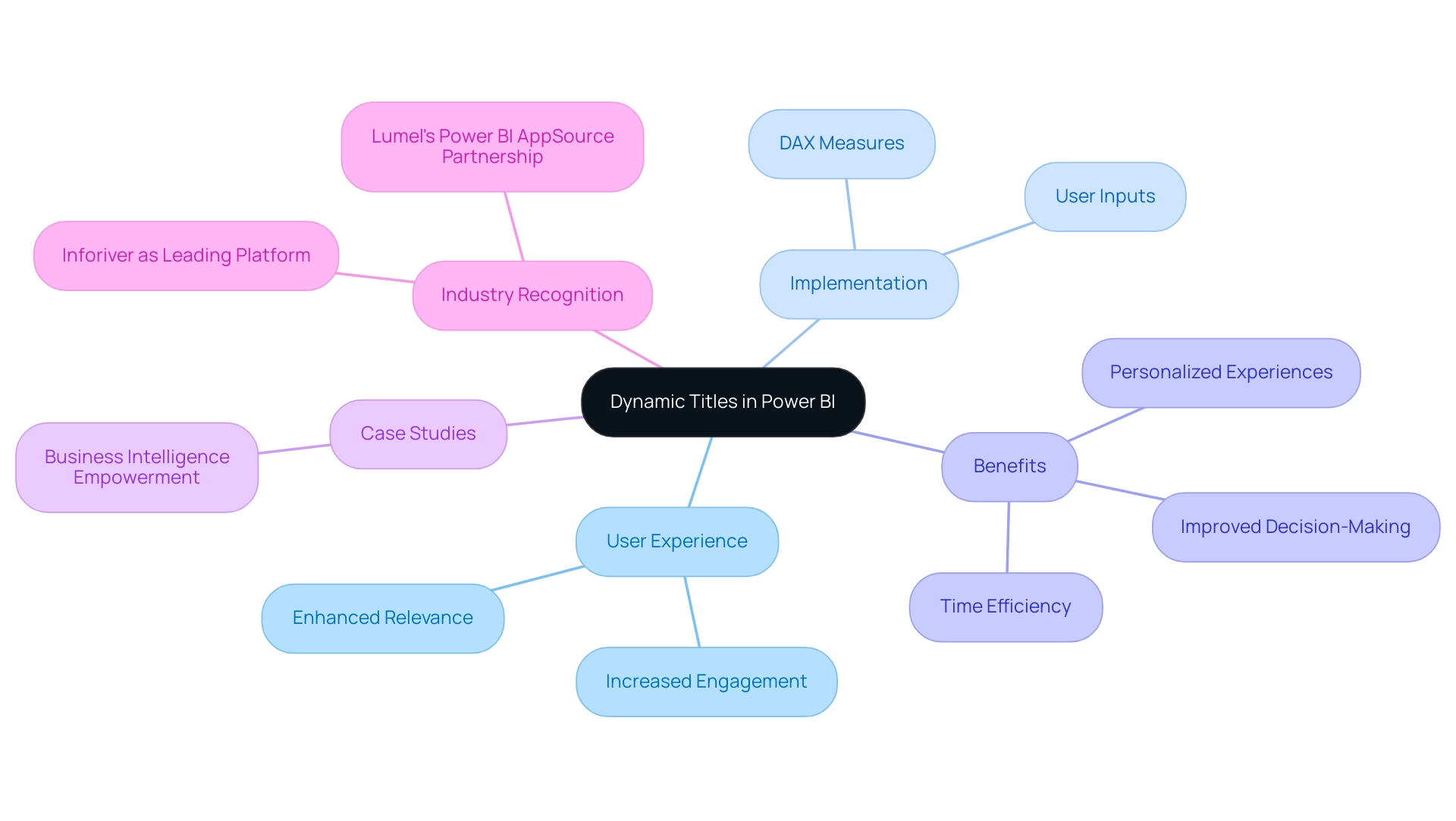
Avoiding Common Pitfalls in Visual Header Design
Frequent mistakes in visual title design for Power BI documents often stem from overcrowding, inconsistent formatting, and a lack of focus on user accessibility. To address these challenges, prioritizing simplicity and clarity is essential. For instance, limiting the number of elements in a header to only essential information can significantly enhance comprehension.
Maintaining consistent font styles and sizes throughout the document contributes to a cohesive visual experience.
Accessibility is another critical aspect that must not be overlooked. Adhering to established accessibility guidelines—such as ensuring sufficient color contrast and font clarity—enables all individuals to interact effectively with the document. Statistics reveal that a significant percentage of users encounter accessibility issues in Power BI documents, underscoring the necessity for thoughtful design.
Moreover, the difference between values in a misleading bar graph can be minimal, sometimes just a few percent, which highlights the importance of clarity in visual representation. A case study exemplifying the consequences of poor design illustrates that overly complex graphics without a clear structure can confuse viewers and obscure the intended message. This is evident in the case study titled ‘Bad Visualization Example #9: Too Much Graphics, No Structure,’ which emphasizes the need for a consistent and organized approach to visual representation. By addressing these common pitfalls, organizations can create Power BI visual headers that are not only visually appealing but also user-friendly and effective in communicating insights.
Additionally, utilizing Business Intelligence tools like Power BI, along with RPA solutions, can simplify the creation process, minimize inconsistencies, and improve operational efficiency, ultimately driving business growth. Tools such as Polymer Search can facilitate the rapid generation of interactive visualizations, further enhancing the reporting experience. As Ondrej Stuchlík, CTO at Datamole, asserts, ‘We firmly believe that bringing together talented individuals in an optimal environment results in exceptional software.’ This statement underscores the importance of collaboration in achieving effective visualization.
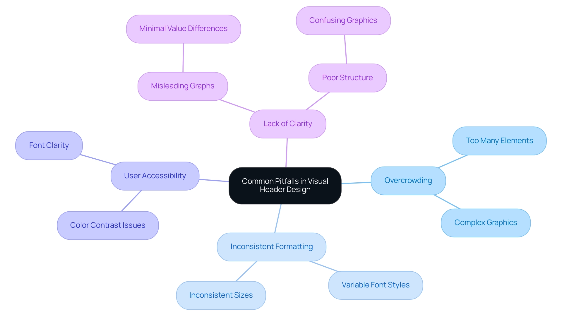
Incorporating User Feedback for Continuous Improvement
Integrating client input into the design process of visual titles is crucial for fostering continuous improvement in Power BI documents at Creatum GmbH. This is particularly important in light of common challenges such as time-consuming creation, data inconsistencies, and a lack of actionable guidance. Establishing efficient feedback systems—such as surveys, direct participant interviews, and usability testing—can yield invaluable insights into user interactions with documents. For example, soliciting feedback on title clarity and functionality can pinpoint specific areas needing enhancement, addressing the frequent issue of reports overloaded with numbers and graphs yet lacking clear direction.
Importantly, 32% of mobile sites feature tappable elements that are too small, highlighting the necessity for user-friendly design in visual headers. Organizations that prioritize client feedback in their design processes often witness significant improvements in customer satisfaction and engagement. This is essential for mitigating the uncertainty and distrust that can arise from inconsistent information. As Ella Webber notes, organizations with mature research practices are 1.9 times more likely to report enhanced customer satisfaction.
Additionally, case studies support the notion that integrating research throughout every phase of the product life cycle enhances customer retention and engagement.
Regularly updating the Power BI visual header based on feedback not only boosts satisfaction but also ensures that documents remain relevant and effective in meeting user needs, particularly in navigating the complexities of information display. This iterative approach fosters a culture of continuous improvement and user-centric design, ultimately resulting in more impactful data presentations. Moreover, utilizing surveys can significantly enhance the effectiveness of the Power BI visual header in reports, as they provide direct insights into user preferences and pain points, thereby alleviating the challenges associated with report creation.
By actively seeking and incorporating feedback from users, organizations like Creatum GmbH can refine their Power BI visual header, making it more intuitive and aligned with user expectations. This, in turn, drives improved decision-making and operational efficiency. It is essential to acknowledge that the user experience is a collective responsibility, with team involvement playing a pivotal role in the design process. Furthermore, integrating user feedback can enhance governance strategies, addressing data inconsistencies and ensuring that actionable guidance is present in reports.
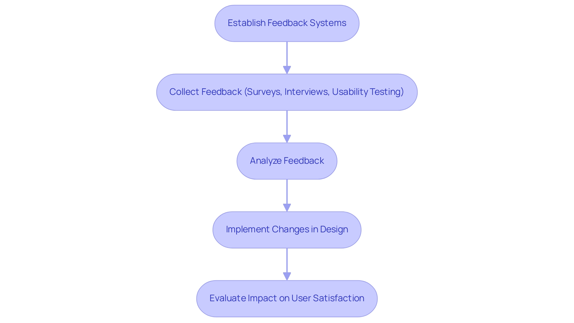
Conclusion
Effective visual headers in Power BI reports are essential for enhancing user experience and data comprehension. They provide crucial context and guide users through complex datasets, serving as pivotal touchpoints that facilitate navigation and engagement. The integration of dynamic headers, tooltips, and thoughtful formatting techniques not only improves readability but also empowers users to derive actionable insights with ease. Moreover, incorporating user feedback into the design process fosters a culture of continuous improvement, ensuring that reports remain relevant and user-friendly.
As organizations increasingly recognize the value of data-driven decision-making, the strategic design of visual headers becomes paramount. By prioritizing clarity, consistency, and accessibility, cognitive load can be significantly reduced, allowing users to focus on interpreting data rather than grappling with its presentation. Investing in these elements transforms Power BI reports into powerful tools for insight generation, ultimately driving growth and innovation.
In a rapidly evolving data landscape, the significance of well-crafted visual headers cannot be overstated. As organizations navigate the challenges of report creation and data visualization, a commitment to enhancing user experience through thoughtful design will yield substantial benefits. Embracing these practices not only enhances operational efficiency but also empowers stakeholders to make informed decisions, fostering a culture of insight-driven growth.
