Overview
The article provides a comprehensive step-by-step guide on creating effective business intelligence (BI) pictures that enhance decision-making and operational efficiency. It emphasizes the importance of understanding the audience, ensuring data relevance, and utilizing storytelling techniques, supported by best practices in design and evaluation methods to ensure the visuals effectively convey insights and engage stakeholders.
Introduction
In the realm of business intelligence, the ability to create impactful visuals is not just an art; it is a strategic necessity. As organizations navigate through an increasingly complex data landscape, the challenge lies in transforming raw data into clear, actionable insights that resonate with stakeholders.
This article delves into the essential components of crafting effective BI visuals, offering practical techniques and best practices that empower decision-makers. From understanding the audience and maintaining clarity to leveraging automation tools, each section provides a roadmap to enhance the effectiveness of BI presentations.
By embracing these strategies, businesses can not only improve their data storytelling but also drive operational efficiency and foster a culture of informed decision-making.
Understanding the Basics of BI Picture Creation
Developing effective business intelligence (BI) pictures starts with a clear understanding of their purpose. These representations, such as BI pictures, are not just charts or graphs; they are powerful tools that convey insights concisely and clearly, empowering stakeholders to make informed decisions. In today’s overwhelming AI landscape, where identifying the right solutions can be challenging, ensuring your BI pictures are impactful is vital.
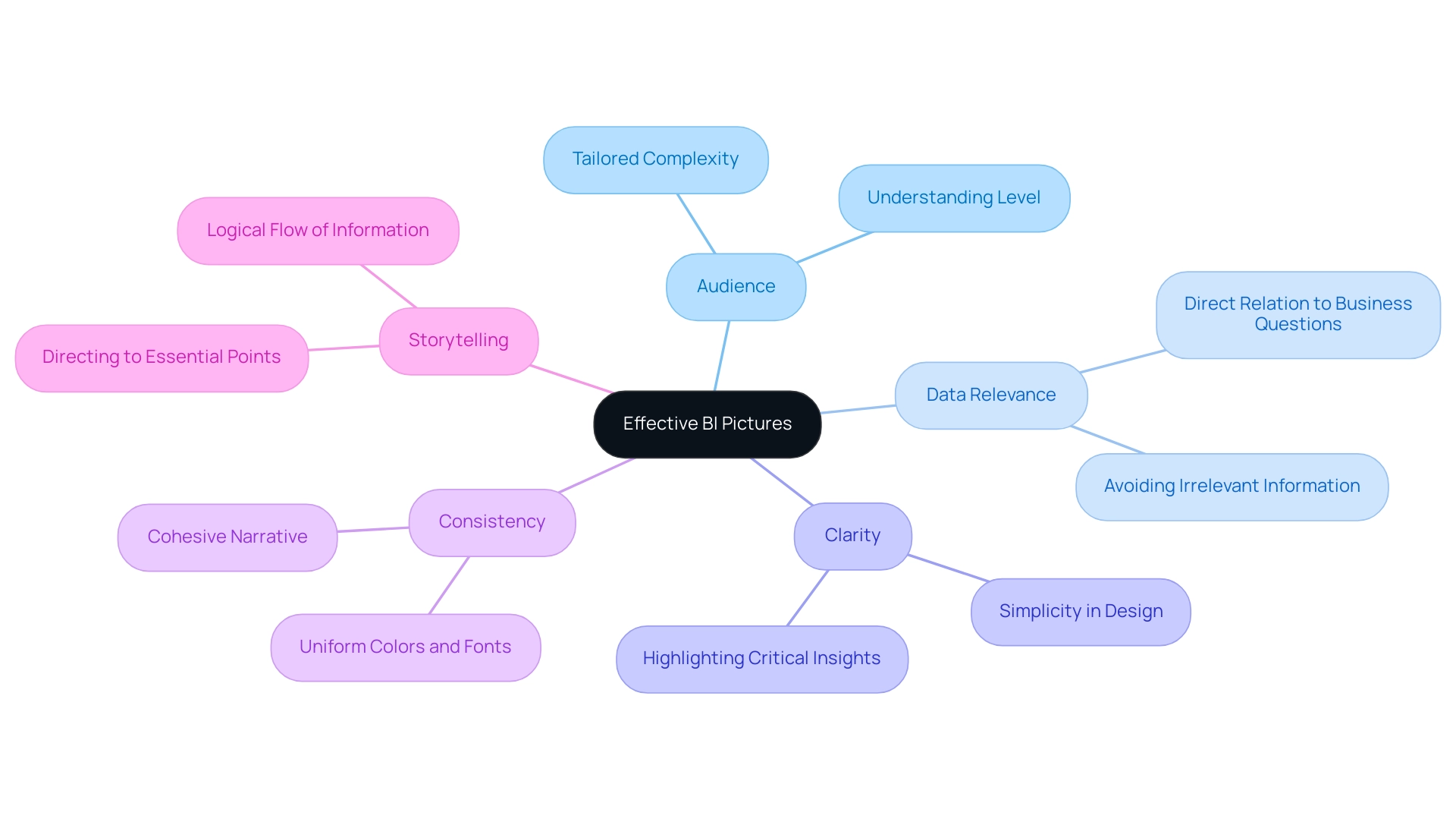
Key components to consider include:
- Audience: Identifying who will view the BI pictures is paramount. Tailor the complexity and detail of your representations to match their level of understanding, ensuring that the message resonates.
- Data Relevance: The data presented must directly relate to the specific business question or objective at hand. Presenting irrelevant information can lead to confusion and misinterpretation, detracting from the overall effectiveness of your visuals.
- Clarity: Strive for simplicity. Utilize clear and straightforward images, avoiding unnecessary clutter. Highlight the most critical insights in your BI pictures to effectively drive your message home.
- Consistency: Consistency in colors, fonts, and styles across all graphics fosters a cohesive narrative. This uniformity enhances comprehension and maintains viewer engagement.
- Storytelling: Approach your BI representations as a narrative. They ought to steer viewers through the information, logically directing them to essential points and insights.
Emphasizing these fundamental elements not only improves the effectiveness of your BI pictures but also guarantees they connect with your audience. As Bang Wong, Creative Director of MIT’s Broad Institute, insightfully notes,
Plotting the information allows us to see the underlying structure of the information that you wouldn’t otherwise see if you’re looking at a table.
Moreover, with 85% of talent professionals indicating that people analytics will be ‘very important’ in shaping the future of HR and recruiting, the significance of effective BI pictures in this context cannot be overstated.
Additionally, 39.7% of US marketers utilize online tools for data visualization, underscoring the importance of these tools in modern marketing strategies. Lastly, case studies such as ‘Business Intelligence and Data Visualization ROI‘ illustrate that organizations that utilize BI pictures and have advanced analytics capabilities are more likely to perform better financially, yielding an ROI of $13.01 for every dollar spent on BI tools. By applying these principles and leveraging customized AI solutions, you create the environment for impactful BI pictures that drive decision-making and foster stakeholder engagement.
Failing to leverage BI pictures effectively can result in a significant competitive disadvantage, highlighting the necessity of utilizing these tools to remain ahead in a data-driven market.
Step-by-Step Techniques for Crafting Effective BI Visuals
To craft compelling BI visuals that drive informed decision-making and enhance operational efficiency, follow these step-by-step techniques:
-
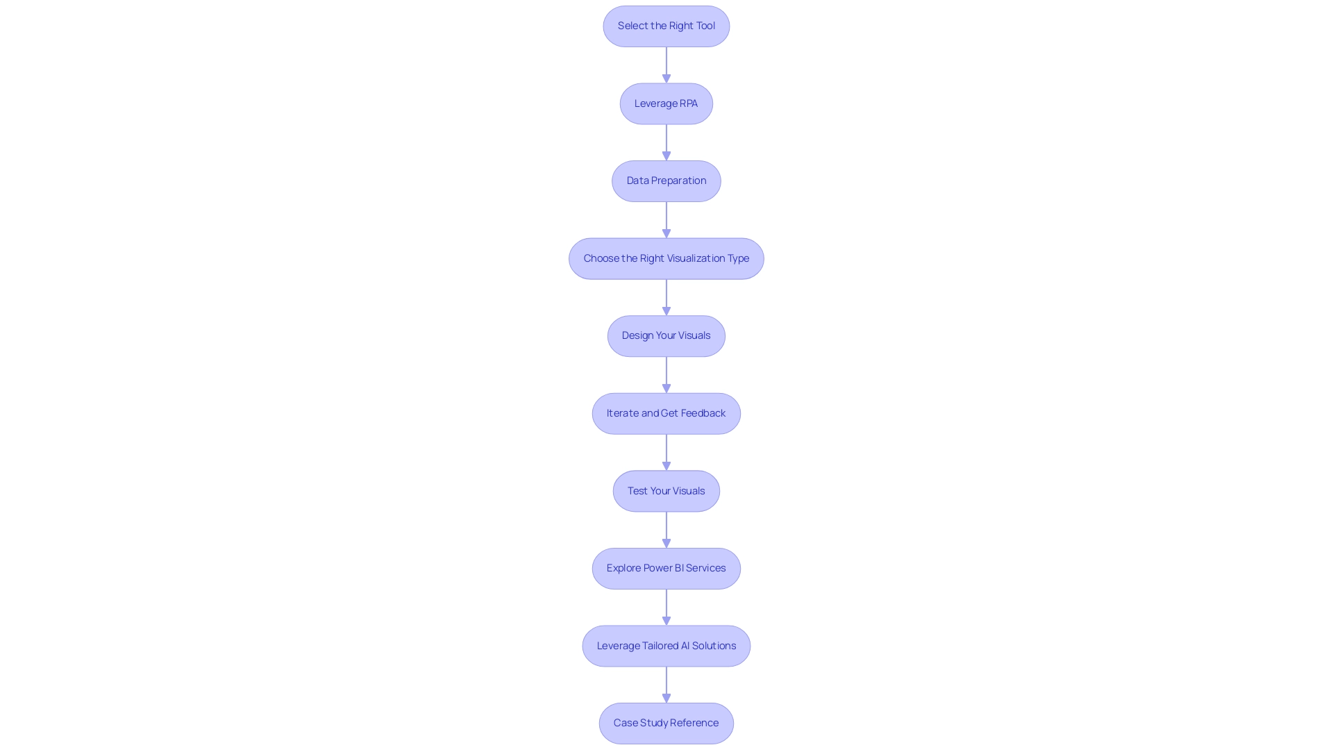
Select the Right Tool: Begin by choosing a business intelligence tool that aligns with your specific needs. Leading options such as Tableau, Power BI, and Google Data Studio each offer unique capabilities that can significantly enhance your visualizations, including the use of bi pictures. However, it’s important to consider challenges like information integration and information security, which account for 20% and 14% of issues in self-service business intelligence, respectively.
-
Leverage Robotic Process Automation (RPA): Consider integrating RPA to automate manual information workflows. This not only boosts efficiency but also reduces errors, freeing up your team for more strategic tasks that can drive business growth. Additionally, be aware of the potential risks and ROI assessment related to workflow automation, ensuring a risk-free implementation.
-
Data Preparation: Prioritize the cleaning and organization of your information prior to visualization. Accurate, complete, and well-organized information is crucial to avoid misrepresentation and ensure insightful analysis. As Sean Dougherty, an experienced copywriter in branding and advertising, observes, “Effective information preparation is the basis of powerful bi pictures.”
-
Choose the Right Visualization Type: Select the visualization type that best suits your data and the message you intend to communicate. For instance, bar charts are excellent for comparisons, line charts effectively illustrate trends, and pie charts are ideal for showcasing proportions.
-
Design Your Visuals: Implement design principles such as alignment, contrast, and hierarchy to develop visually appealing graphics. Thoughtful color choices are essential to enhance accessibility and facilitate comprehension for your audience.
-
Iterate and Get Feedback: Once your BI representations are created, seek constructive feedback from colleagues or stakeholders. Their perspectives can be essential in enhancing your imagery, ensuring they connect with your audience’s needs.
-
Test Your Visuals: Before finalizing your work, test the effectiveness of your visuals in conveying the intended message. Assess clarity and ease of understanding, making necessary adjustments to optimize impact.
-
Explore Power BI Services: Take advantage of Power BI services for improved reporting and actionable insights. Features like the 3-Day Power BI Sprint can help you quickly create professionally designed reports, while the General Management App ensures comprehensive management and smart reviews.
-
Leverage Tailored AI Solutions: Address the challenges of poor master information quality and AI complexities by utilizing tailored AI solutions and participating in GenAI Workshops. These resources can significantly enhance quality and improve your ability to leverage AI effectively.
-
Case Study Reference: Consider the TIBCO Statistica case study, which illustrates how AI-driven algorithms can enhance workflow refinement in BI tools. Despite its complex user interface, it effectively supports predictive analytics, showcasing the importance of mastering the right tool for your needs.
By following these steps and utilizing RPA with effective bi pictures and customized AI solutions, you can create representations that do more than merely present data—they narrate a compelling story that encourages informed decision-making throughout your organization.
Incorporating Data Storytelling Techniques
Incorporating storytelling techniques into your BI pictures can significantly enhance the effectiveness of your presentations. Here are essential steps to achieve this:
-
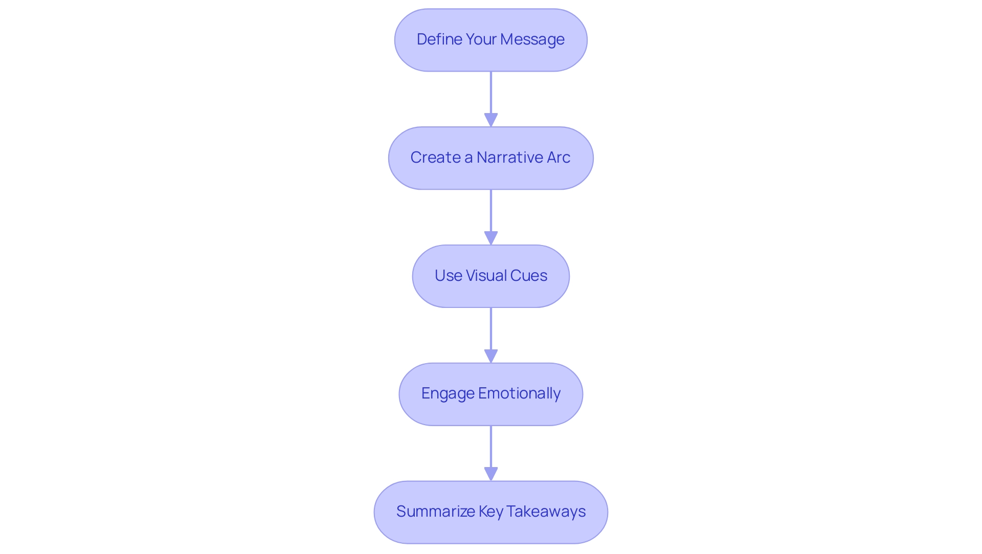
Define Your Message: Start by identifying the core insight or message you wish to convey.
This clarity will act as the foundation of your narrative, ensuring your audience comprehends the purpose of your information from the outset. -
Create a Narrative Arc: Organize your presentation into a coherent structure with a clear beginning, middle, and end.
The introduction presents the information, the middle explores analysis and understanding, and the conclusion provides suggestions or practical steps.
This flow mirrors effective storytelling, making it easier for your audience to follow along. -
Use Visual Cues: Enhance comprehension and engagement by incorporating visual elements such as arrows, annotations, and highlights.
These cues guide the audience through your story, drawing attention to key points and facilitating understanding.
This is particularly vital considering that many organizations face challenges with inconsistencies and time-consuming report creation when utilizing insights from tools like Power BI. -
Engage Emotionally: Connect with your audience on a personal level by using relatable examples or scenarios.
This emotional resonance makes the information more memorable and impactful.
Significantly, 49% of individuals feel their organizations lack storytelling abilities, regardless of differing levels of literacy.
By addressing this gap through effective storytelling, you can elevate the impact of your presentations and drive operational efficiency through data-driven insights. -
Summarize Key Takeaways: Conclude your presentation by summarizing the main insights and necessary actions.
This recap reinforces your narrative, ensuring that your audience leaves with a clear understanding of the information’s implications for their decision-making process.
By effectively integrating these storytelling techniques into your BI pictures, you not only inform your audience but also engage and inspire them.
This method can result in improved decision-making and practical outcomes, aligning with current trends in storytelling, where the global search volume for the term reached 16,000 in 2023.
Moreover, as emphasized by the Purdue Online MBA program, which concentrates on business analytics and narrative analytics, students are being equipped with the skills to navigate the complexities of information presentation.
The program emphasizes the need for effective storytelling to transform how data and analytics are consumed, reinforcing the importance of these skills in the evolving landscape of business intelligence.
Additionally, by integrating RPA solutions like EMMA RPA and Power Automate, businesses can automate repetitive tasks, further enhancing employee morale and productivity.
These tools streamline operations, allowing teams to focus on strategic initiatives rather than mundane tasks, ultimately driving growth and innovation.
Best Practices for BI Picture Design
To maximize the impact of your Business Intelligence (BI) representations and drive operational efficiency, consider these essential best practices:
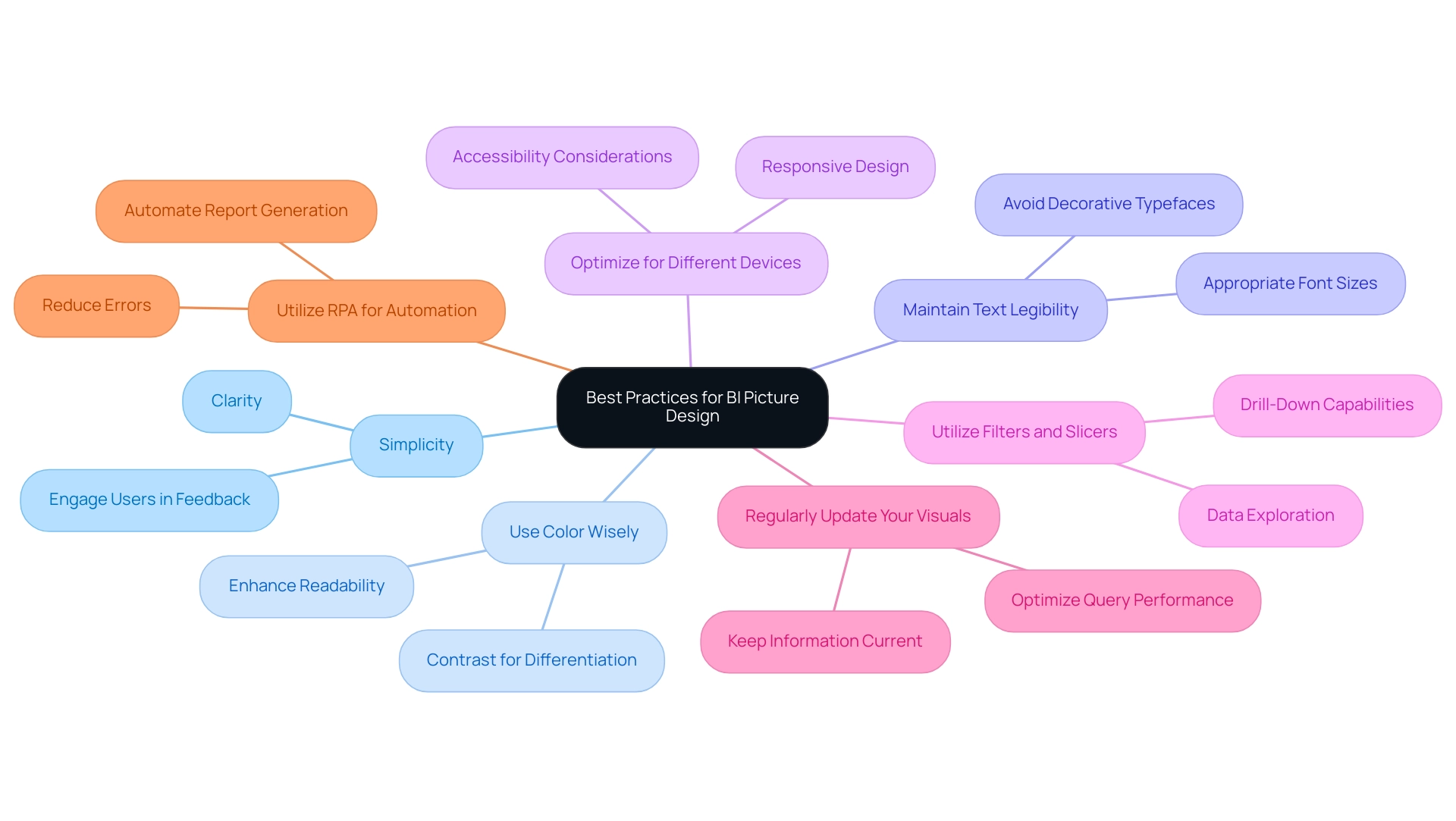
- Simplicity is Key: Strive for clarity by avoiding clutter in your designs. Focus on the most critical data points to facilitate comprehension and decision-making. Simplified images are more likely to resonate with users, enhancing their ability to grasp complex information quickly.
-
Engage Users in Feedback: Actively involving users in the feedback process is crucial for ensuring that dashboards evolve to meet their needs and expectations. Consistent feedback from users can direct design enhancements, making your BI displays more relevant and effective. RPA can streamline the feedback collection process, allowing for quicker iterations based on user insights.
-
Use Color Wisely: A thoughtfully chosen color palette not only enhances your designs but also significantly boosts readability. Employ contrasting colors to clearly differentiate between various datasets, making it easier for viewers to interpret the information presented.
-
Maintain Text Legibility: Ensure that any text within your images is easily readable. Select appropriate font sizes and styles, steering clear of overly decorative typefaces that may distract or confuse users. Remember, clear communication is paramount in data visualization.
-
Optimize for Different Devices: As accessibility is crucial, design your BI visuals to be responsive across multiple devices—desktops, tablets, and smartphones. This adaptability guarantees that information is accessible to users whenever and wherever they require it.
-
Utilize Filters and Slicers: Implementing effective filters and slicers in your dashboards allows for extensive exploration and drill-down capabilities. This functionality enables users to engage with the information, obtaining understandings customized to their particular requirements.
-
Regularly Update Your Visuals: Given the dynamic nature of data, it is imperative to keep your BI visuals current. Regular updates will reflect the latest information, thus maintaining user satisfaction and engagement. According to a case study on performance optimization, user satisfaction is closely linked to the speed of accessing information; minimizing wait times is essential for enhancing user experience. Enhancing query efficiency and information retrieval times will guarantee that users obtain prompt understanding, further boosting their involvement with BI reports.
-
Utilize RPA for Automation: Consider incorporating Robotic Process Automation (RPA) to automate the repetitive tasks involved in report generation and information management. This not only speeds up the process but also decreases errors, enabling your team to concentrate on analyzing information rather than spending time on manual data management. RPA can also alleviate task repetition fatigue and help address staffing shortages by streamlining workflows.
By implementing these best practices and harnessing the power of RPA alongside your BI pictures, you can create representations that are not only informative but also visually compelling, fostering greater audience engagement and understanding. As Sudha, a recognized author in the field, aptly advises,
Before you start making the dashboard, ask yourself one simple question: ‘Who is going to consume the dashboard?’
This mindset will guide you in tailoring your designs to meet the needs of your users effectively, ensuring that the insights provided are actionable and relevant.
Evaluating the Effectiveness of Your BI Pictures
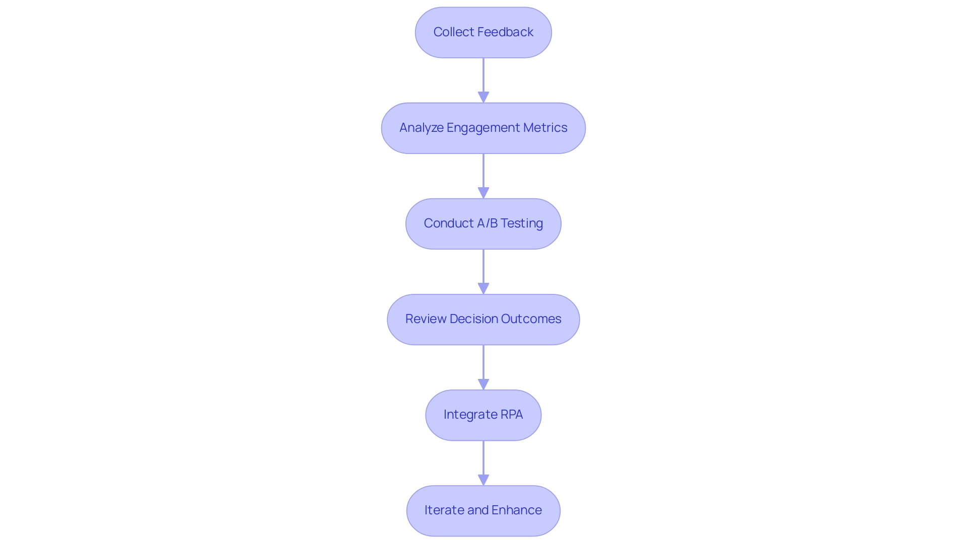
To effectively assess the impact of your BI representations, consider implementing the following strategies:
-
Collect feedback: After presenting your BI pictures, actively seek feedback from your audience. Inquire about the strengths and weaknesses of each visual to understand their perspectives and areas for improvement. This feedback can help gauge the average satisfaction, which ranges from -1 (negative) to 1 (positive), providing a quantifiable measure of effectiveness.
-
Analyze engagement metrics for BI pictures that are digitally shared, by scrutinizing metrics such as views, shares, and the duration of time spent on each representation. These metrics, along with understanding how viewers accessed the report (distribution) and the technology used to open it (platform), offer valuable information about audience interest and the overall effectiveness of your presentations.
-
Conduct A/B Testing: Experiment with various iterations of your designs to determine which concepts resonate more effectively with your audience. This method allows you to identify the most impactful design elements that facilitate better comprehension and engagement.
-
Review Decision Outcomes: Assess whether the insights obtained from your BI pictures influenced informed decision-making. By analyzing the outcomes of these decisions, you can gauge the real-world impact of your visuals on strategic initiatives. For instance, in national/regional clouds, Power BI ensures compliance with local regulations while providing usage metrics that help assess the effectiveness of BI visuals.
-
Integrate RPA: Automate repetitive tasks associated with data collection and presentation to enhance efficiency and accuracy. By implementing RPA solutions such as EMMA RPA and Power Automate, you can reduce errors, streamline workflows, and free up your team to concentrate on analyzing information rather than spending time on manual processes.
-
Iterate and Enhance: Use the knowledge obtained from feedback and metrics to refine and boost your future BI representations. Continuous improvement is essential for creating compelling data presentations, or BI pictures, that consistently drive informed decision-making within your organization. By applying these evaluation techniques and leveraging RPA alongside your BI pictures, you can ensure that your visuals remain effective and aligned with your organization’s objectives, fostering an environment of informed decision-making and operational efficiency while gaining a competitive advantage through actionable insights.
Conclusion
The journey to creating impactful business intelligence visuals is one that combines understanding, strategy, and creativity. By recognizing the importance of:
- Audience
- Data relevance
- Clarity
- Consistency
- Storytelling
organizations can transform raw data into compelling visuals that drive decision-making. Each component plays a crucial role in ensuring that BI presentations resonate with stakeholders, ultimately enhancing operational efficiency.
Implementing step-by-step techniques, such as:
- Selecting the right tools
- Leveraging automation
- Preparing data meticulously
lays a solid foundation for effective visuals. Furthermore, integrating data storytelling techniques not only informs but also engages the audience, creating a narrative that enhances comprehension and retention. Best practices like:
- Simplicity
- User feedback
- Regular updates
are vital to maintaining the relevance and effectiveness of BI visuals, ensuring they adapt to the dynamic nature of business needs.
Finally, evaluating the effectiveness of BI visuals through feedback, engagement metrics, and A/B testing is essential for continuous improvement. By embracing these strategies and leveraging advanced tools, organizations can foster a culture of informed decision-making that not only meets current challenges but also positions them for future success in an increasingly data-driven world. The time to elevate BI visuals is now—empower your teams to harness the full potential of their data and drive meaningful outcomes.

