Overview
Creating stunning visuals with Charticulator in Power BI involves mastering the design canvas, data binding, and leveraging customizable templates to craft unique graphical representations. The article outlines a step-by-step guide that emphasizes the importance of clear labeling, simplicity, and the integration of advanced features, all aimed at enhancing data storytelling and improving decision-making processes within organizations.
Introduction
In the realm of data visualization, the ability to create custom visuals that resonate with audiences is paramount. Charticulator emerges as a powerful tool within Power BI, enabling users to transcend traditional limitations and craft unique representations of their data. By mastering key components such as:
- The design canvas
- Data binding
- Customizable templates
users can transform complex datasets into compelling visual stories. As organizations increasingly recognize the value of data-driven insights, understanding how to effectively utilize Charticulator becomes essential for enhancing decision-making processes. This article delves into the intricacies of Charticulator, offering a comprehensive guide on:
- Creating stunning visuals
- Best practices for design
- Solutions to common challenges
all while empowering organizations to elevate their data storytelling capabilities.
Understanding Charticulator: The Basics of Custom Visuals in Power BI
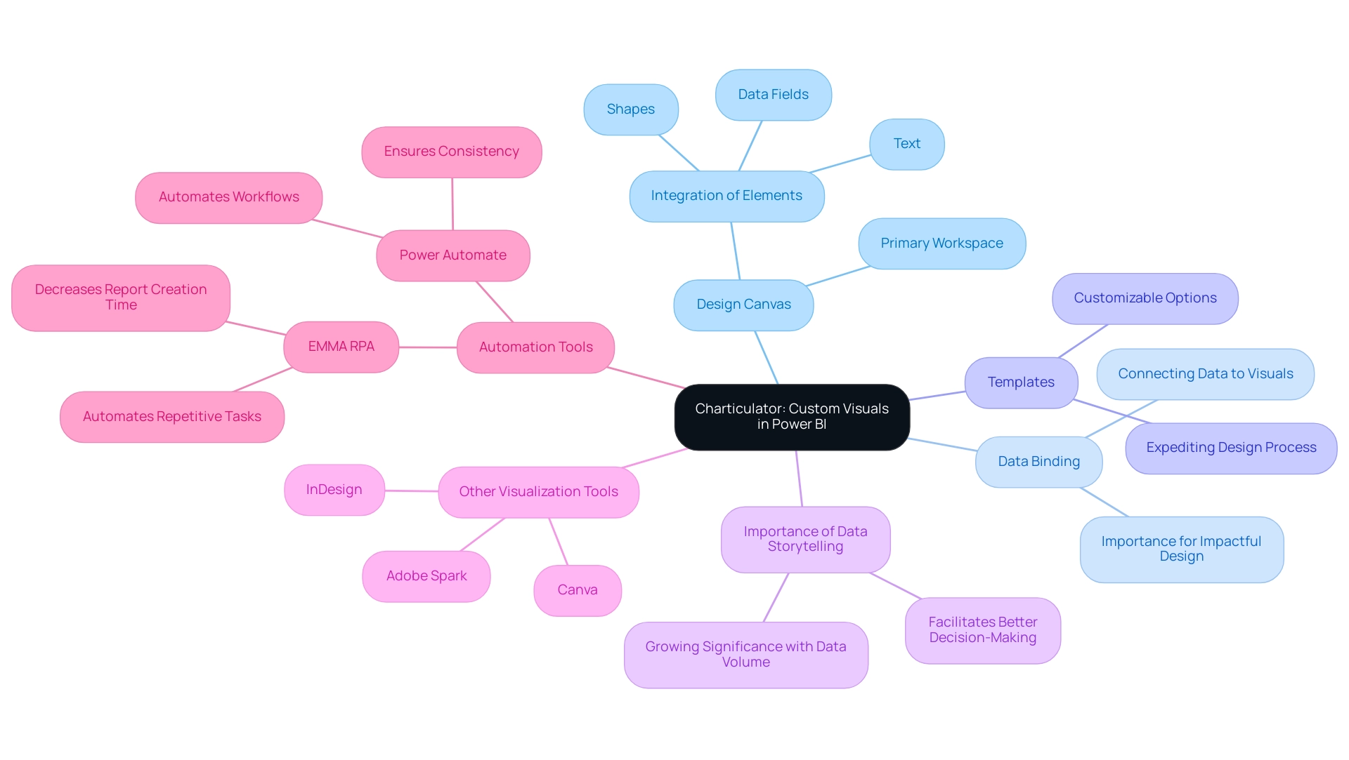
Charticulator power bi is an innovative tool that stands out for crafting custom visuals, transcending the limitations of standard offerings. At the core of this process is the design canvas, a dynamic workspace where users can effortlessly drag and drop information fields to create distinctive graphical representations. Key components to master include:
- Design Canvas: This is your primary workspace for visual creation, allowing the integration of elements such as shapes, text, and data fields.
- Data Binding: The cornerstone of effective visual design, data binding connects your data to the visual elements. Mastering this process is crucial for generating impactful and meaningful images.
- Templates: This tool provides a variety of customizable templates, which can significantly expedite your design process by offering a solid foundation to build upon.
Understanding these foundational elements equips you to explore the practical steps involved in creating stunning visuals using charticulator power bi. Moreover, in an era where information storytelling is increasingly essential—evidenced by a global search volume reaching 16,000 in 2023—the ability to present information compellingly has never been more vital. As emphasized in the Client Reporting Guide of the digital analytics company Agency Analytics, “Utilizing a storytelling approach, the marketing agency offers a clear narrative that assists the client in comprehending the effect of the marketing agency’s efforts.”
This emphasizes the necessity of effective information presentation in decision-making processes. Furthermore, the case study titled “Importance of Data Storytelling” illustrates how storytelling with information facilitates better decision-making and comprehension, indicating its growing significance as information volume expands. While Charticulator offers unique advantages, it’s crucial to recognize that other popular visualization tools like Adobe Spark, InDesign, and Canva also contribute to the evolving landscape of presentation.
By leveraging custom visuals, you can enhance your storytelling capabilities and facilitate better decision-making within your organization, addressing the challenges of time-consuming report creation and inconsistencies effectively.
Furthermore, integrating tools such as EMMA RPA and Power Automate can further simplify your processes. EMMA RPA automates repetitive tasks, decreasing the time utilized for report creation, while Power Automate assists in ensuring consistency across platforms by automating workflows. For example, a recent case study from a top retail firm showed how adopting EMMA RPA decreased their report generation time by 50%, enabling their team to concentrate on analysis instead of information gathering.
These tools not only improve operational efficiency but also provide actionable insights that drive business growth.
Step-by-Step Guide to Creating Stunning Visuals with Charticulator
Creating stunning visuals in Power BI using Charticulator Power BI is a straightforward process that enhances your data storytelling while overcoming common implementation challenges. With an active community of 2,497 users online, you can find support and inspiration as you embark on this journey. Follow these steps for success:
-
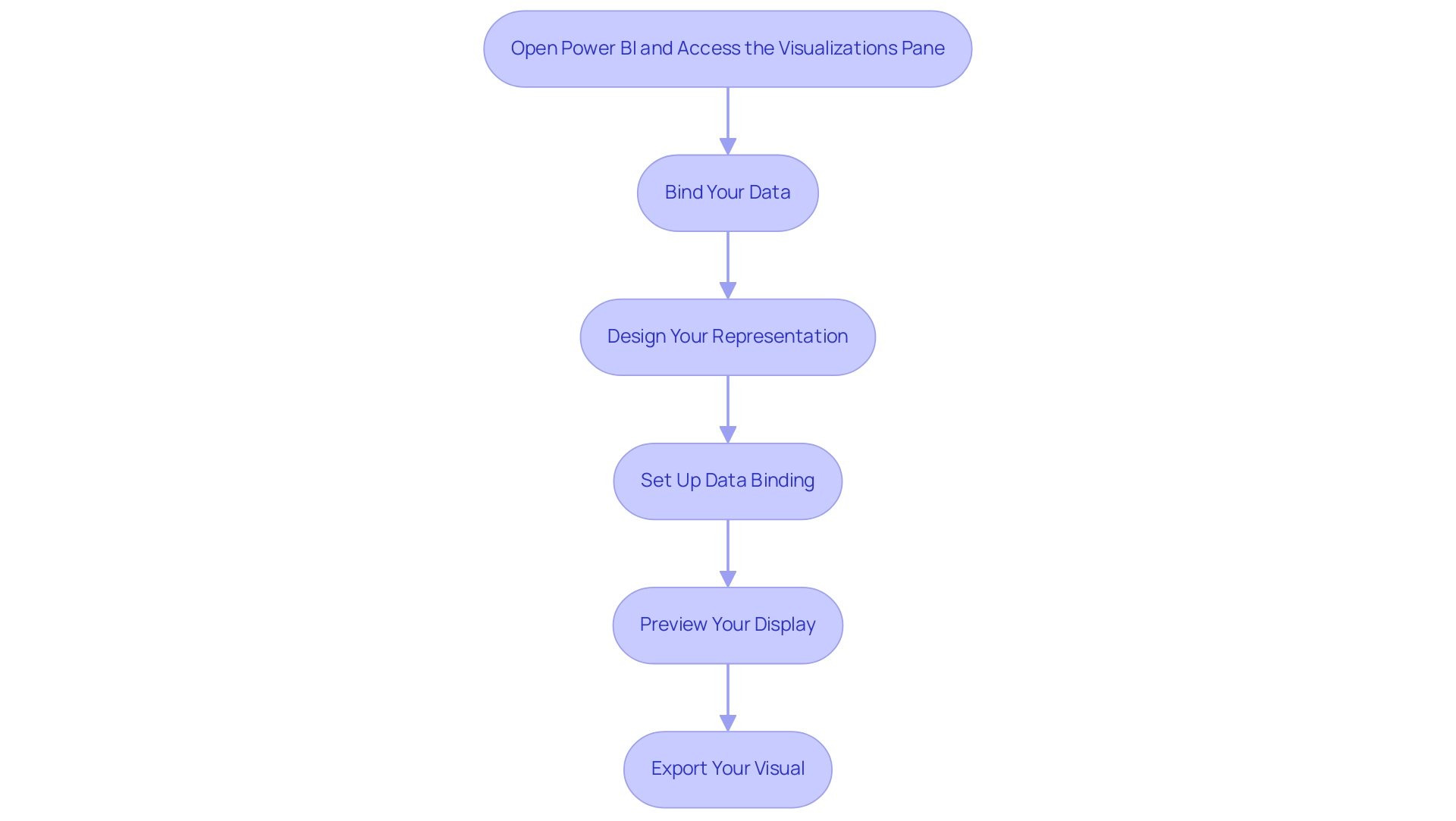
Open Power BI and Access the Visualizations pane: Click on the icon to access the interface.
Create a New Chart: Initiate a fresh project by clicking on ‘New.’ This action will direct you to the design canvas. -
Bind Your Data: Import the dataset you wish to visualize. Drag the relevant fields from the information pane onto the canvas, enabling Charticulator Power BI to create graphical elements based on your information.
As mentioned by Daniel, a Super User, challenges can arise with binding, so be attentive to ensure that each visual element is correctly linked to your dataset. Utilizing Business Intelligence tools can assist in enhancing this process, ensuring that the information is consistent and actionable. Additionally, RPA can automate binding tasks, reducing manual errors and saving time. -
Design Your Representation: Utilize the design tools to customize your display. Add shapes, text, and adjust colors to suit your narrative. Experiment with various layouts to find the optimal representation for your information.
RPA can also assist in automating layout adjustments, allowing for a more efficient design process. -
Set Up Data Binding: It is essential to ensure that each graphical element is correctly bound to your data. This step is crucial for enabling your representation to dynamically reflect any changes in the dataset.
Remember, as highlighted in a case study on error handling, issues can arise when adding calculated measures, so troubleshooting may be necessary to ensure smooth integration. Implementing RPA can streamline repetitive tasks in this phase, allowing for greater focus on strategic analysis. -
Preview Your Display: Click on the ‘Preview’ button to evaluate how your display will appear in Power BI. Make necessary adjustments to enhance clarity and aesthetic impact.
Export Your Visual: Once you are satisfied with the design, export the visual back to Power BI. You can now integrate it into your reports and dashboards.
By carefully adhering to these steps and being mindful of frequent obstacles, you can produce visually appealing and informative custom representations in Power BI with Charticulator Power BI, thereby significantly improving your storytelling abilities. Furthermore, the integration of RPA and tailored AI solutions will empower your operations to become more data-driven and efficient. For instance, companies that have implemented RPA in their visualization processes have reported a 30% reduction in time spent on report creation, showcasing the tangible benefits of these technologies.
Best Practices for Designing Custom Visuals
To create impactful custom visuals in Power BI and effectively overcome common challenges such as time-consuming report creation, data inconsistencies, and lack of actionable guidance, it is essential to adhere to several best practices:
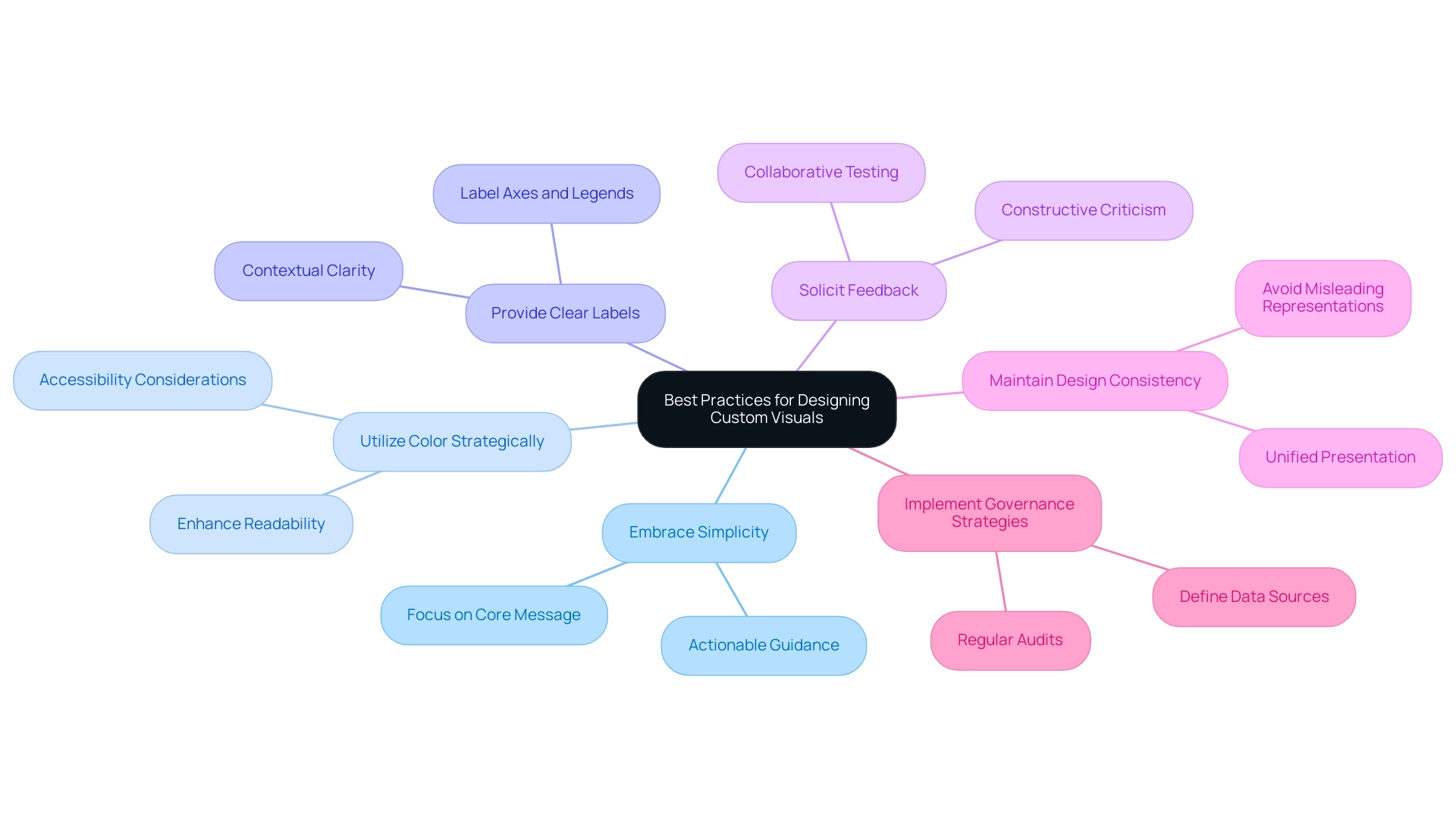
- Embrace Simplicity: Clarity is paramount; avoid overloading visuals with extraneous information. Concentrate on the core message that you wish to communicate. Statistics indicate that 65% of businesses claim that utilizing visualization in pitches has enhanced client engagement and comprehension, emphasizing the significance of simplicity in design and the necessity for actionable guidance.
- Utilize Color Strategically: Select a color palette that not only enhances readability but also accommodates individuals with color vision deficiencies. Thoughtful color choices can significantly enhance understanding and engagement. Additionally, be mindful of accessibility concerns, as choropleth maps can be difficult to decipher for individuals with sight differences.
- Provide Clear Labels: Ensure that axes, legends, and points are clearly labeled. This clarity offers viewers the necessary context, allowing them to grasp the data’s significance without confusion.
- Solicit Feedback: Share your images with colleagues for constructive feedback. This collaborative testing process can uncover opportunities for improvement and validate that your graphics convey the intended message effectively.
- Maintain Design Consistency: Consistency in design elements—such as colors, fonts, and styles—across all visuals fosters a unified presentation, enhancing the overall effectiveness of your storytelling. The case study titled “Don’t Distort the Information” illustrates that precise information representation is crucial for clear storytelling in visualizations, as misleading representations can undermine a designer’s credibility.
- Implement Governance Strategies: Establishing a governance strategy is essential to manage inconsistencies effectively. This includes defining data sources, ensuring data quality, and regularly auditing reports to maintain trust and reliability in the insights presented.
By implementing these best practices, you can elevate the quality of your custom graphics using Charticulator Power BI, transforming them into not just eye-catching presentations but also insightful, functional tools that drive understanding and engagement while addressing the significant challenges managers face in leveraging Power BI insights.
Common Challenges and Solutions in Using Charticulator
Working with Charticulator Power BI can present several challenges, but understanding these hurdles—and how to overcome them—can empower you to create impressive visuals with ease. Here are some common problems and effective solutions:
-
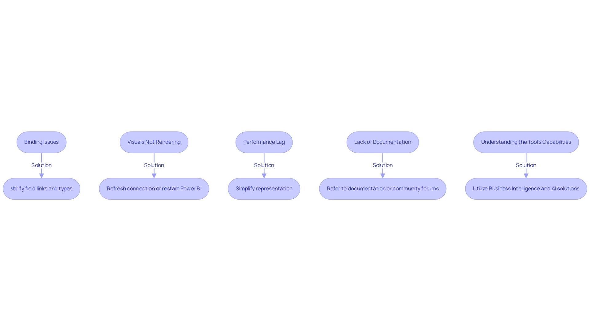
Binding Issues: If your information isn’t displaying correctly, it’s crucial to verify that you’ve accurately linked the fields to the graphical elements. Ensure that the types align with the expected formats; mismatches can lead to display errors. Frequent visitor David highlights this concern, stating,
My question comes because when I see the preview table in Charticulator, I can’t see more than 10,000 rows, and that makes me suspect that there’s a limit in the number of rows that the visual can manage.
This limitation can be critical for users working with large datasets when using Charticulator Power BI. Utilizing Business Intelligence and Charticulator Power BI can assist you in effectively managing and visualizing large volumes of information, improving your reporting capabilities. Additionally, tailored AI solutions can assist in optimizing information handling, ensuring smoother integration and visualization processes. -
Visuals Not Rendering: Occasionally, visuals may fail to render as anticipated. This is often resolved by refreshing your connection or restarting Power BI. Regular upkeep of your connections can significantly enhance your experience. Implementing Robotic Process Automation (RPA) can streamline these processes, ensuring that your graphics are consistently up-to-date and accurately represented. Furthermore, customized AI solutions can examine rendering patterns to anticipate and avert possible problems before they occur.
-
Performance Lag: If you observe that the tool is functioning slowly, think about simplifying your representation by decreasing the number of data points or graphical elements. High complexity can lead to performance bottlenecks, so a more straightforward design may enhance responsiveness. Tailored AI solutions can help optimize performance by analyzing usage patterns and suggesting more efficient visual strategies, ensuring that your visuals remain responsive and effective.
-
Lack of Documentation: Difficulty in locating specific features can be frustrating. In such cases, refer to the documentation or engage with community forums. With 2,611 users online, the active community surrounding the application can offer valuable insights and tips from fellow users, enhancing your ability to leverage the tool effectively. By leveraging Business Intelligence, you can utilize community insights as a resource to overcome challenges and enhance your experience with Charticulator Power BI as the visualization tool.
-
Understanding the Tool’s Capabilities: It is presented as an interactive authoring instrument that employs a constraint-solving algorithm for layout attributes. This unique feature allows for bespoke chart layouts without requiring coding knowledge, which can be both a strength and a challenge for users unfamiliar with its functionalities. By utilizing the strength of Business Intelligence and customized AI solutions, you can acquire deeper insights into how to optimize the functionalities of Charticulator Power BI, empowering you to produce graphical representations that truly resonate with your audience.
Comprehending these common obstacles and their respective solutions will allow you to traverse this environment with assurance, enabling you to concentrate on crafting impressive representations tailored to your requirements. Additionally, insights from qualitative studies, such as those surrounding the Data Illustrator framework, can provide further context about effective visualization practices and user experiences.
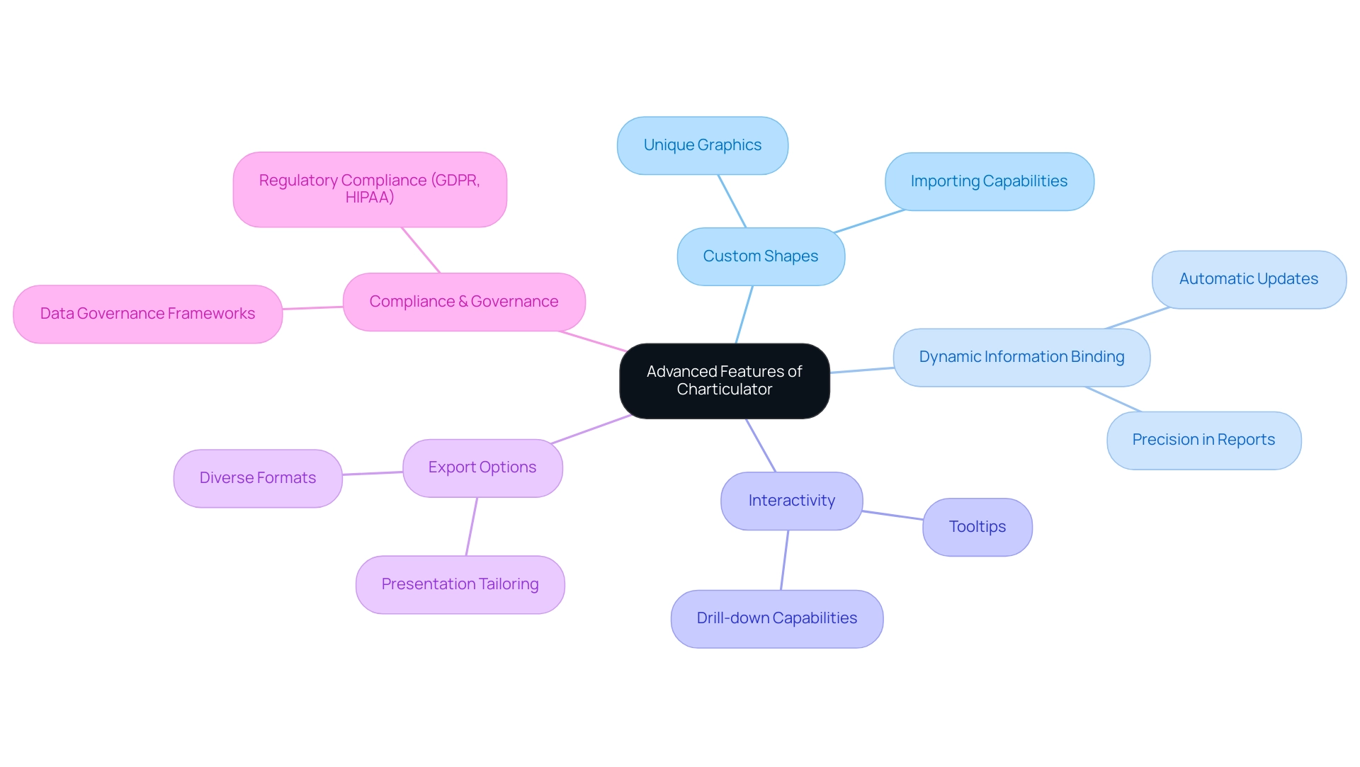
Exploring Advanced Features of Charticulator
Once you have mastered the foundational aspects of Power BI, it’s time to delve into the advanced features offered by Charticulator that can significantly enhance your representations, especially in light of common challenges faced in leveraging insights:
- Custom Shapes: Empower your graphics by creating and importing custom shapes. This capability enables you to add a unique touch to your presentations, distinguishing your graphics from traditional charts and graphs.
- Dynamic Information Binding: Learn how to apply dynamic information binding, which guarantees your graphics automatically update and represent alterations in your foundational information. This feature is crucial for sustaining precision and relevance in your reports, especially to address the challenges of time-consuming report creation and inconsistencies.
- Interactivity: Enhance user engagement by incorporating interactive elements such as tooltips and drill-down capabilities. These features offer users deeper insights and a more immersive experience, allowing them to explore the information on their own terms, thereby addressing the often-missed actionable guidance and the lack of insight-driven recommendations.
- Export Options: Familiarize yourself with the diverse export choices available, enabling you to share your graphics in various formats tailored for presentations or detailed reports. This versatility ensures that your insights are accessible and impactful across various platforms.
Incorporating these advanced features aligns with the reporting standards and best practices defined by Aegis Softtech’s Power BI consultants, who emphasize the importance of secure and compliant information management. Robust governance frameworks are essential for ensuring that your visuals not only convey insights effectively but also adhere to regulations like GDPR and HIPAA. For instance, Aegis’s case study on information governance and security expertise illustrates how advanced features can support compliance efforts, ensuring robust access management.
Furthermore, incorporating RPA solutions can further improve operational efficiency, enabling the automation of repetitive tasks that often detract from analysis. By leveraging these advanced features alongside RPA, you can transform your data visualizations using Charticulator in Power BI into not only visually stunning displays but also powerful tools for analysis and decision-making, effectively addressing the challenges of data-driven insights.
Conclusion
By mastering Charticulator, users can unlock the potential of custom visuals in Power BI, transforming complex data into engaging narratives. The article outlines the essential components, such as:
- The design canvas
- Data binding techniques
- Customizable templates
These components serve as the foundation for effective data storytelling. With practical steps for creating stunning visuals and best practices for design, users are well-equipped to elevate their presentations while addressing common challenges.
The insights provided emphasize the importance of:
- Simplicity
- Strategic use of color
- Clear labeling in visual design
These elements collectively enhance understanding and engagement. Furthermore, the integration of RPA and tailored AI solutions not only streamlines processes but also promotes efficiency, allowing organizations to focus on analysis rather than report generation.
As organizations increasingly prioritize data-driven decision-making, leveraging advanced features within Charticulator becomes crucial. From dynamic data binding to interactive elements, these capabilities enable users to create visuals that are not only aesthetically pleasing but also functional and insightful. Embracing these tools and best practices empowers users to effectively communicate their data stories, ultimately driving better outcomes and fostering a culture of informed decision-making within their teams.

