Overview
The article titled “How to Create Heat Maps in Power BI: A Step-by-Step Guide” focuses on providing a comprehensive methodology for generating heat maps within Power BI, emphasizing both the technical steps and the significance of visual data representation. It outlines essential techniques such as conditional formatting, utilizing matrix visuals, and integrating R or Python scripts, while also addressing common challenges and best practices to enhance clarity and effectiveness in data visualization, thus ensuring users can derive actionable insights from their data.
Introduction
In a world increasingly driven by data, the ability to visualize complex information effectively has become paramount for organizations striving for operational excellence. Heatmaps emerge as a transformative tool, offering a vibrant, intuitive way to uncover trends, patterns, and anomalies within vast datasets. As businesses navigate the rapid advancements in technology and the challenges of data overload, leveraging heatmaps in Power BI can significantly enhance decision-making processes and streamline workflows.
This article delves into the definition and importance of heatmaps, explores practical methods for creating them, and provides a step-by-step guide to optimizing data for impactful visualizations. By embracing these techniques, organizations can not only improve clarity in their reporting but also foster a culture of data-driven insights that propel growth and innovation.
Understanding Heatmaps: Definition and Importance
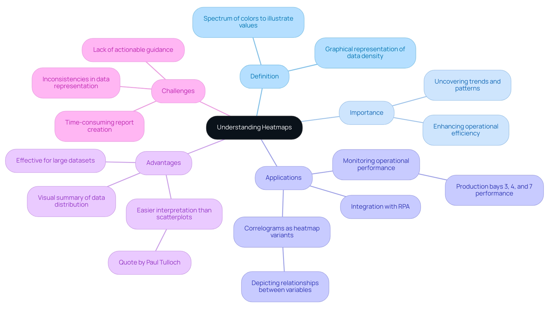
Heatmaps function as impactful graphical representations of information, where individual values are illustrated through a spectrum of colors. This visualization technique proves particularly advantageous for uncovering trends, patterns, and anomalies within extensive datasets. In the context of Power BI, heat maps in Power BI provide graphical representations that enable users to swiftly interpret complex information, offering a visual summary of data density and distribution.
By utilizing visual data representations alongside Robotic Process Automation (RPA), organizations can automate manual workflows, significantly reducing time and errors, thereby enhancing operational efficiency—crucial in today’s rapidly evolving AI landscape. For instance, production bays 3, 4, and 7 are performing within their expected thresholds, demonstrating how visual data representations can be utilized in monitoring operational performance. However, challenges such as time-consuming report creation, inconsistencies, and a lack of actionable guidance can hinder the effective use of Power BI dashboards.
As we enter 2024, the use of visual patterns in organizations is anticipated to increase, propelled by their capacity to enable swift analysis and enhance the understanding of information—essential elements in the pursuit of operational excellence. Paul Tulloch aptly notes, ‘Heatmaps are advantageous over scatterplots when there are too many data points to view on a scatterplot,’ highlighting their crucial role in effective data visualization. Furthermore, the integration of heat maps in Power BI into decision-making processes, along with Power BI’s 3-Day Sprint for report creation and the General Management App, has shown to significantly enhance organizational effectiveness, as evidenced by real-world applications where they have led to improved outcomes.
Additionally, correlograms serve as heatmap variants that replace the axes of a heatmap with lists of numeric variables, depicting the relationships between intersecting variables. These visualizations assist analysts in exploring relationships between variables, thereby supporting the narrative on decision-making and driving data-driven insights for business growth.
Methods to Create Heatmaps in Power BI: A Comprehensive Overview
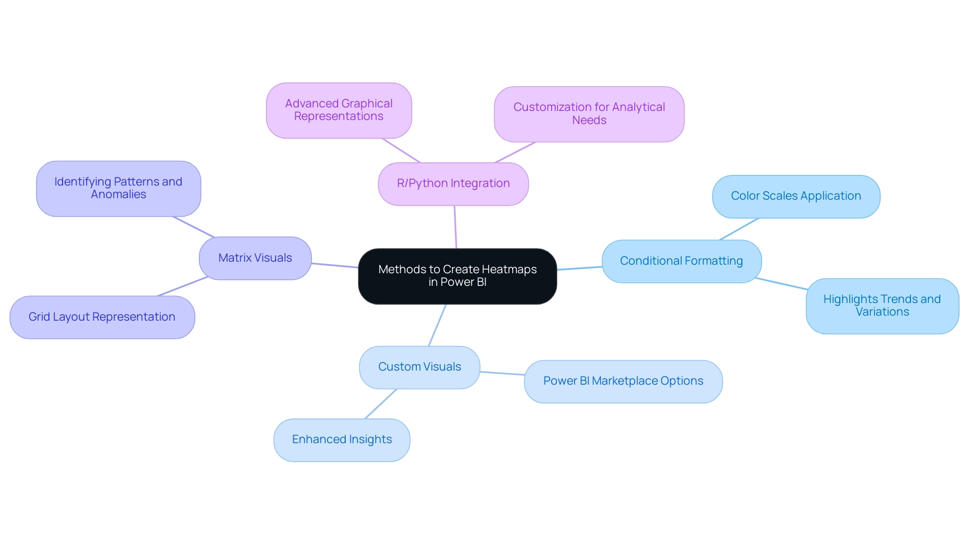
Generating visualizations in Power BI not only provides a dynamic method to illustrate data trends but also tackles common issues encountered by organizations, such as time-consuming report creation and data inconsistencies. The rapidly evolving AI landscape can make it challenging to identify the right solutions, but visual representations can help in navigating these complexities. Here are several effective methods for crafting compelling heatmaps that drive actionable insights:
-
Conditional Formatting: This technique enables users to apply color scales directly to cells according to their values, effectively highlighting trends and variations. It serves as a straightforward yet powerful way to interpret complex information sets, ensuring stakeholders have clear, actionable guidance.
-
The Power BI marketplace offers a range of custom visuals, including specialized heat maps in Power BI that can be imported for advanced visualizations. Utilizing these visuals can enhance the depth of insights gained from the information, aligning with the need for comprehensive management solutions.
-
By leveraging matrix visuals, users can create heat maps in Power BI within a grid layout. This method streamlines the distribution representation of information, making it easier to identify patterns and anomalies, thereby improving operational efficiency.
-
R or Python Integration: For individuals seeking to explore further into analysis, incorporating R or Python scripts into Power BI enables the development of advanced graphical representations customized to particular analytical requirements. This method is especially beneficial for advanced users aiming to improve their storytelling and strategic decision-making.
Additionally, Coupler.io facilitates the integration of various data sources, including Google Sheets and Excel, into Power BI, significantly enhancing the data utilized for creating heat maps in Power BI visualizations.
A practical example of creating visual representations can be seen in the case study titled ‘Getting Started with Data Visualization in Power BI,’ where participants learned to design and customize various plots, including graphical representations of data, during a training webinar. This real-world application underscores the importance of mastering these techniques in navigating the overwhelming AI landscape and utilizing business intelligence for growth.
Moreover, graphical representations have found applications in the Sports Industry, where they are used to illustrate favorite zones of players and areas where bowlers achieve maximum wickets. This specific use case highlights the versatility and impact of graphical data representations across various fields.
As noted by Tarun Chaturvedi, a Data Science intern with Pickl.ai, > I am exploring the enormous potential of machine learning and artificial intelligence to provide solutions for businesses & learning <. This sentiment reflects the transformative impact of visualization techniques like heat maps in Power BI on driving operational efficiencies. Moreover, with usage rates of tailored visuals expected to rise in 2024, mastering these visualization creation techniques not only enhances your analytical abilities but also places you at the forefront of evidence-based decision-making.
To effectively manage inconsistencies and foster trust, implementing a governance strategy is essential.
Step-by-Step Guide to Creating Heatmaps in Power BI
Producing a visual representation in Power BI is a simple task that can significantly improve your visualization abilities, particularly when addressing typical obstacles. Follow these empowering steps to create an effective heatmap while utilizing insights from your information:
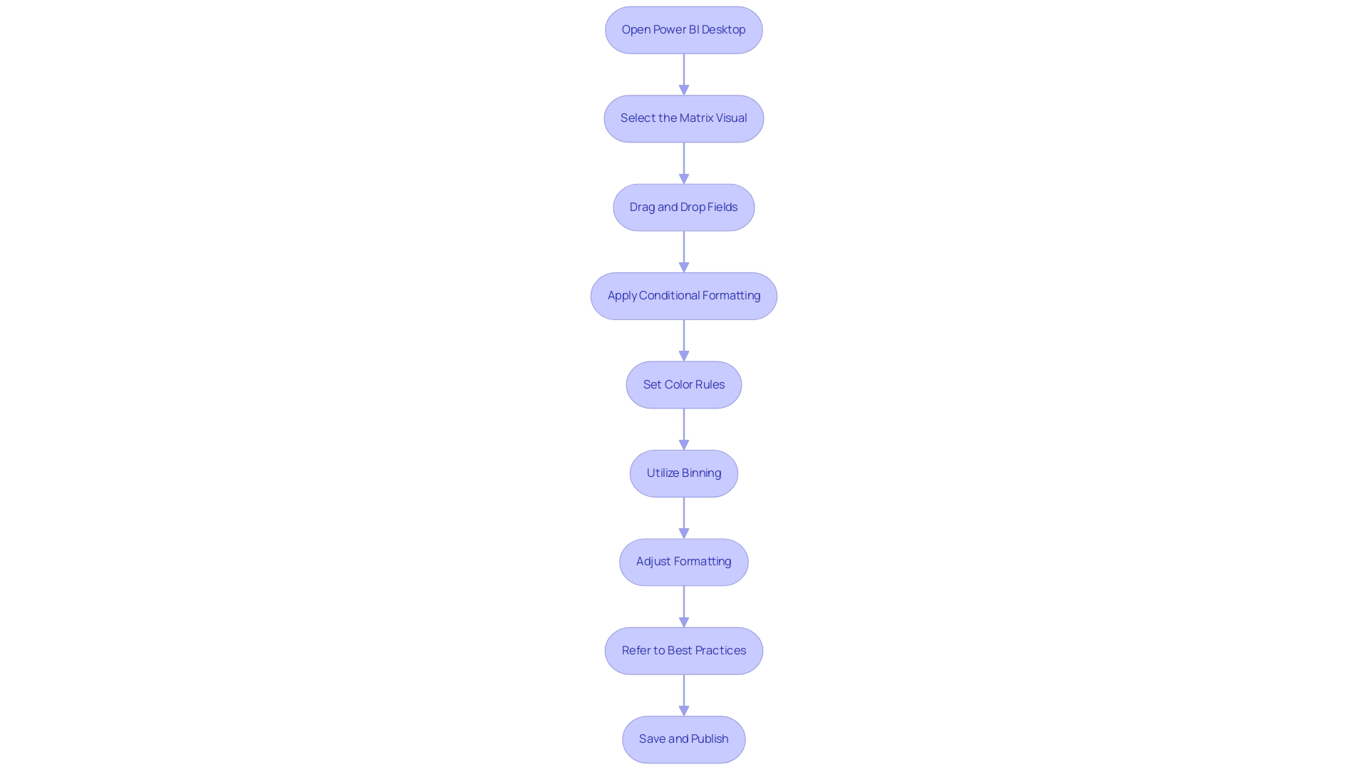
- Open Power BI Desktop and load your dataset to get started. This initial step ensures you are working with the most relevant data.
- Select the Matrix Visual from the Visualizations pane, which will serve as the foundation for your heatmap.
- Drag and Drop Fields: Organize your information by placing categorical entries in the Rows and Columns fields, while numerical figures go in the Values field. This structure is essential for effective visualization and helps to mitigate inconsistencies.
- Apply Conditional Formatting: Click the dropdown arrow in the Values field, select ‘Conditional formatting’, and then choose ‘Background color’ to add a dynamic visual element. This aids in establishing clarity in your reports, tackling the common problem of unclear information presentations.
- Set Color Rules: Define your color scale to represent value ranges effectively. For example, a gradient from red (indicating low values) to green (indicating high values) can provide immediate visual cues to users, guiding them towards actionable insights.
- Utilize Binning: To enhance readability, particularly when measure values differ significantly, consider applying binning. This technique groups data points into defined ranges, enhancing clarity and assisting in delivering clear guidance from your reports.
- Adjust Formatting: Tailor your visual representation’s appearance by modifying font sizes, gridlines, and overall layout. Customization is essential for enhancing readability and ensuring user engagement metrics are met.
- Refer to Best Practices: As highlighted in the case study titled ‘Key Points for Using heat maps in Power BI’, it is important to pay attention to color choices and handling empty values in your dataset. These considerations are vital for creating effective visualizations that stakeholders can trust.
- Save and Publish: After finalizing your visualization, save your Power BI report and publish it to the Power BI service for enhanced sharing and collaboration. This enables broader access to the insights obtained from your information, promoting a knowledge-driven culture within your organization.
By following these steps, you not only create impactful heat maps in Power BI but also provide clear, actionable guidance that addresses the common challenge of report clarity. As Iason Prassides emphasizes,
Learn principles of dashboard design to apply to your own dashboards.
Additionally, understanding user engagement metrics, such as tracking requests during browsing sessions (with cookies expiring after 6 months), can provide valuable insights for future analysis.
This approach ensures that your heat maps in Power BI function as a powerful tool for driving operational efficiency and informed decision-making.
Optimizing Your Data for Effective Heat Mapping
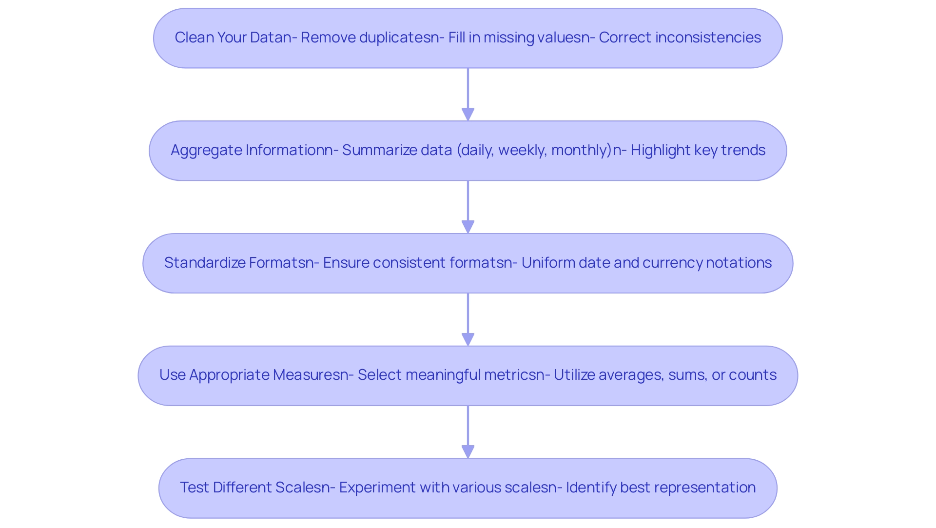
To enhance your information for effective heat mapping and drive operational efficiency, follow these essential steps:
-
Clean Your Data: Start by removing duplicates, filling in missing values, and correcting inconsistencies. Managing absent information appropriately is crucial for creating an accurate and meaningful visual representation, as emphasized by Adrian Wallace, a Solution Architect and Machine Learning Engineer. In Python, the Pandas library provides functions like
isnull()andisna()to assist in identifying and managing missing information effectively. Implementing RPA can streamline this process, reducing the manual effort needed for cleansing, while tailored AI solutions can further enhance quality by ensuring consistency and accuracy throughout the cleaning phase. -
Aggregate Information: Summarize your information at the appropriate level—whether daily, weekly, or monthly—to reduce clutter and enhance clarity in your heatmap. This practice not only simplifies the visualization but also highlights key trends through the use of heat maps in Power BI. Recent developments, such as JMP’s addition of heatmaps for pairwise correlations in scatter plot matrices, demonstrate the growing importance of effective information aggregation in visual analytics. Utilizing Business Intelligence tools can aid in automating and optimizing this aggregation process, ensuring that the information is both relevant and actionable.
-
Standardize Formats: Ensure all entries maintain a consistent format, such as uniform date formats and currency notations. This standardization is vital for facilitating precise comparisons across different sets, which can be enhanced through tailored AI solutions that ensure quality and consistency during the standardization process.
-
Use Appropriate Measures: Select metrics that will yield meaningful insights when visualized. Utilize averages, sums, or counts to provide clarity and relevance in your heat maps in Power BI. A well-structured Business Intelligence framework can help in identifying the right metrics that align with your business goals, while tailored AI solutions can assist in determining which measures provide the most significant insights.
-
Test Different Scales: Experiment with various scales and aggregations to identify the best representation for your specific dataset. This iterative method enables the identification of the most effective visual storytelling techniques, improving the decision-making process based on precise analysis. Heat maps in Power BI are especially potent because they can demonstrate relationships between multiple variables. As shown in the case study on generating a heat map based on a correlation matrix using Covid information, effectively visualizing relationships can reveal significant correlations, such as the strong link between total cases and total deaths (0.93). By optimizing your information preparation processes with RPA and Business Intelligence, and leveraging tailored AI solutions, you can create insightful heat maps in Power BI that enhance informed decision-making and operational efficiency.
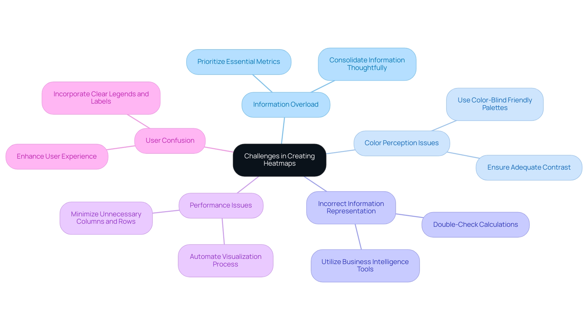
Common Challenges in Creating Heatmaps and How to Overcome Them
Creating effective heat maps in Power BI can present several challenges, but with the right strategies and tools like RPA, tailored AI solutions, and Business Intelligence, these obstacles can be overcome.
-
Information Overload: An abundance of information can clutter your heatmap, making it difficult for viewers to discern key insights. To combat this, prioritize essential metrics and consolidate your information thoughtfully, ensuring clarity and focus.
-
Robotic Process Automation (RPA) can assist in streamlining information collection, enabling the prioritization of relevant details, while customized AI solutions can analyze trends to guide your selection of content for your heatmap.
-
Color Perception Issues: Not all viewers perceive colors the same way. Opt for color-blind friendly palettes and ensure your choices provide adequate contrast. This method improves accessibility and guarantees that your visual representation is comprehensible to a broader audience, fostering inclusivity in information interpretation.
-
Incorrect Information Representation: Misleading visualizations often stem from inaccurate aggregation or formatting. It’s essential to double-check your calculations and information sources before finalizing your heatmap to maintain accuracy and reliability. Utilizing Business Intelligence tools, such as heat maps in Power BI, can assist in ensuring that the information is accurately represented, avoiding potential pitfalls in interpretation. Without these insights, your organization risks falling behind competitors who utilize precise information for decision-making.
-
Performance Issues: Large datasets can hinder the performance of heat maps in Power BI. Streamline your information model by minimizing unnecessary columns and rows, which can significantly enhance loading times and responsiveness. Automating the visualization process with tools like Power Automate ensures accuracy and timely updates, further enhancing performance. RPA can also aid in optimizing processing, allowing for quicker turnaround times on reports.
-
User Confusion: To facilitate easy interpretation of your heatmap, incorporate clear legends and labels. This clarity helps viewers understand the context and significance of the data presented, reducing confusion and enhancing user experience. As Micah Bowers, a verified expert in design, notes,
Crafting meaningful connections through design is essential in all forms of visualization.
By ensuring that your heatmaps are not only visually appealing but also clear and informative, you can empower your audience to make data-driven decisions effectively, driving growth and innovation for your organization.
Conclusion
Harnessing the power of heatmaps in Power BI is an essential strategy for organizations striving for operational excellence in today’s data-driven landscape. By effectively visualizing complex datasets, heatmaps not only reveal trends and patterns but also enhance decision-making processes across the board. The article has outlined the definition and significance of heatmaps, the various methods to create them, and the steps required to optimize data for impactful visualizations.
As businesses face challenges such as data overload and inconsistencies, implementing heatmaps offers a solution that streamlines reporting and fosters a culture of data-driven insights. Techniques such as:
- Conditional formatting
- Custom visuals
- Integration with programming languages like R and Python
provide robust avenues for creating compelling heatmaps that drive actionable insights. Furthermore, optimizing data preparation through cleaning, aggregation, and standardization ensures that heatmaps convey clear and reliable narratives.
In conclusion, the adoption of heatmaps represents a transformative step towards enhancing operational efficiency and informed decision-making. By embracing these visual tools, organizations can navigate the complexities of their data landscape, ultimately positioning themselves for growth and innovation. The time to act is now; leveraging heatmaps can propel organizations forward, making data not just a resource but a strategic asset in achieving excellence.

