Overview
This article delves into mastering the Power BI treemap, a formidable tool for data visualization. It captures attention by highlighting its effectiveness in representing hierarchical information through nested rectangles. The treemap significantly enhances user understanding of complex datasets, improves decision-making, and streamlines data analysis processes. Furthermore, its integration with Robotic Process Automation (RPA) bolsters operational efficiency, making it an indispensable asset for professionals. Embrace the treemap to elevate your data analysis capabilities and drive informed decisions.
Introduction
In the realm of data visualization, treemaps have emerged as a powerful tool within Power BI, offering a unique method to represent hierarchical data through nested rectangles. This innovative technique enables users to visually assess the relative sizes of various categories, simplifying the interpretation of complex datasets.
As organizations increasingly rely on data-driven insights to guide strategic decisions, understanding and effectively utilizing treemaps has become essential. With their capacity to enhance clarity and drive informed decision-making, treemaps are poised to play a pivotal role in the evolving landscape of business intelligence.
This article delves into the fundamentals of treemaps, providing a comprehensive guide on their creation, customization, and advanced techniques, ensuring users can unlock the full potential of this dynamic visualization method.
Understanding Treemaps: The Basics of Data Visualization in Power BI
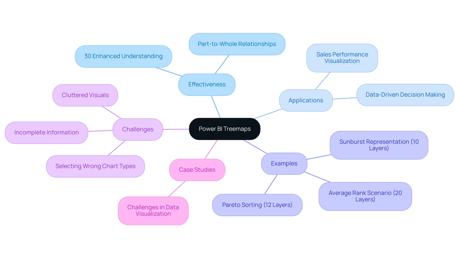
The Power BI treemap serves as a dynamic graphical representation technique within Power BI, skillfully illustrating hierarchical information through a series of nested rectangles. Each rectangle’s size is proportional to a specific value, enabling users to swiftly gauge the relative magnitude of various categories. This visualization method excels in illustrating part-to-whole relationships, making it particularly suitable for complex datasets.
In 2025, the effectiveness of these visualizations is underscored by their ability to simplify information interpretation, with studies indicating that they can enhance user understanding by up to 30% compared to conventional chart types. Notably, the random selection algorithm comprises 10 layers in the sunburst representation, whereas the Pareto sorting example contains 12 layers, and the average rank scenario features 20 layers. This highlights the depth of information that hierarchical visualizations can effectively depict. As organizations increasingly rely on data-driven decision-making, the trend toward utilizing hierarchical visualizations is expected to grow, with a notable increase in their adoption for visualizing hierarchical data structures.
Grasping the fundamentals of hierarchical visualizations allows users to unlock valuable insights and trends within their datasets. For instance, companies have effectively utilized graphical representations to visualize sales performance across various areas, uncovering essential patterns that guide strategic planning. The significance of hierarchical maps in analysis cannot be overstated; they enable a clearer comprehension of intricate relationships and promote informed decision-making, especially in the context of utilizing Business Intelligence and RPA to improve operational efficiency.
Creatum GmbH plays a crucial role in delivering tailored solutions that enhance information quality and simplify AI implementation, aligning with the growing trend of utilizing hierarchical diagrams for effective analysis. Specialists in information visualization highlight the advantages of hierarchical diagrams, noting that they can efficiently minimize clutter and improve clarity in presentations. As Stephen R. Midway, Assistant Professor in the Department of Oceanography and Coastal Sciences, states, “Following a set of guidelines and recommendations—summarized here and building on others—can help to build robust visuals that avoid many common pitfalls of ineffective figures.”
By addressing typical traps such as choosing unsuitable chart types or presenting incomplete information, these visualizations offer a strong remedy for effective information communication.
Real-world case studies emphasize the effective use of visual representations like the Power BI treemap, illustrating their contribution to converting raw information into actionable insights. For instance, the case study titled “Challenges in Information Representation” highlights common pitfalls in information display, including selecting the wrong chart type and dealing with incomplete information. These challenges, such as time-consuming report creation and inconsistencies in information, can be effectively addressed through the use of hierarchical maps, which streamline the visualization process and enhance clarity.
Furthermore, RPA solutions can enhance the use of visualizations by automating information collection and report generation, thereby improving operational efficiency in analysis. As organizations continue to navigate the complexities of information analysis in 2025, the Power BI treemap will remain a vital tool for visualizing hierarchical information and enhancing overall business intelligence.
Step-by-Step Guide to Creating Treemaps in Power BI
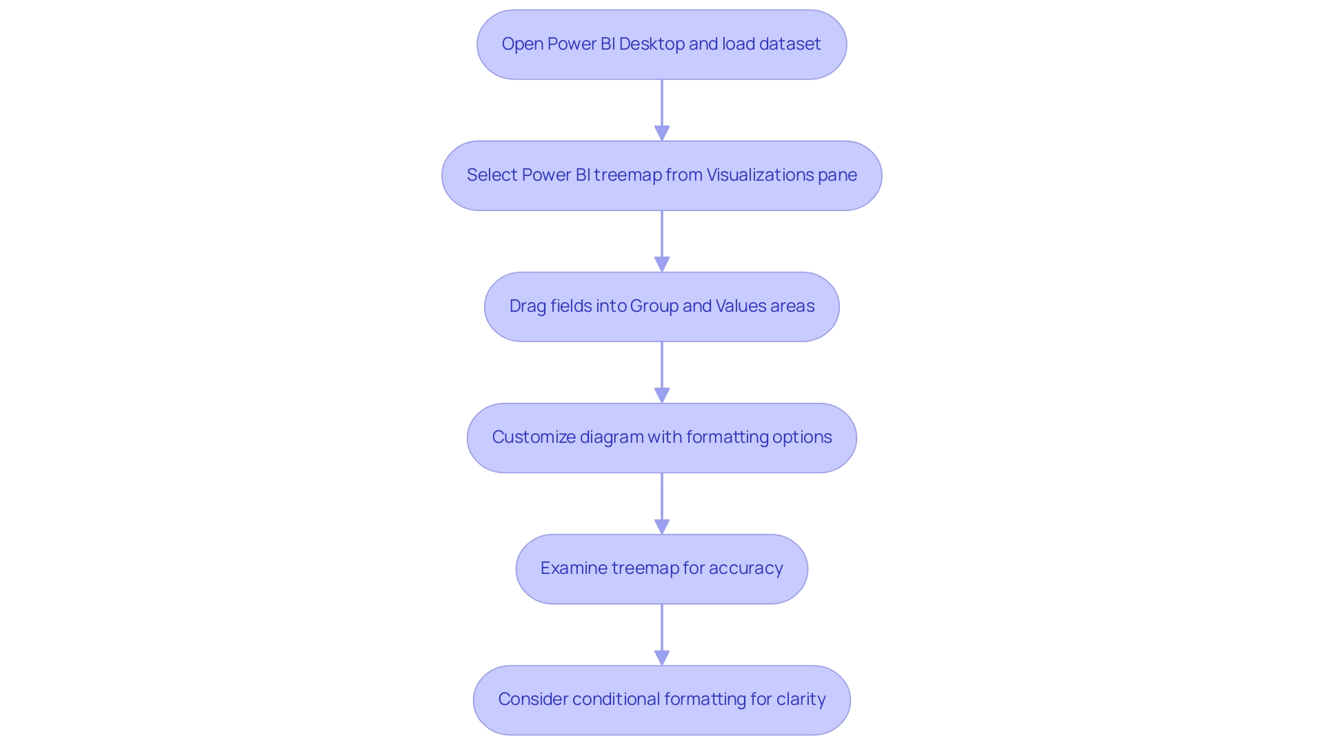
Creating a Power BI treemap is a straightforward process that significantly enhances your visualization capabilities, particularly when paired with Robotic Process Automation (RPA) to streamline handling and alleviate the challenges posed by manual workflows. Follow these detailed steps to implement this powerful visual tool effectively:
- Open Power BI Desktop and load your dataset to begin.
- Select the Power BI treemap from the Visualizations pane, specifically designed for hierarchical information representation.
- Drag the desired fields into the ‘Group’ and ‘Values’ areas. The ‘Group’ field establishes the hierarchy of your information, while the ‘Values’ field determines the size of the rectangles, allowing for clear visual comparison.
- Customize your diagram by adjusting the formatting options available in the Visualizations pane. This includes modifying colors, labels, and other visual elements to enhance clarity and appeal. Notably, you can change the background color of the map to black, providing striking contrast and improving visibility.
- Examine your treemap to ensure it accurately represents your information and provides the insights necessary for informed decision-making.
In 2025, user adoption rates for the Power BI treemap have shown a significant increase, with organizations recognizing their effectiveness in visualizing complex datasets. For instance, Ad Alliance GmbH effectively employs graphical representations to manage user information while ensuring adherence to privacy regulations, showcasing the practical use of this visualization method in operational efficiency. By integrating RPA into your information workflows, you can automate the tedious aspects of report creation, reducing inconsistencies and freeing your team to focus on strategic analysis.
As you explore the features of hierarchical maps, consider using conditional formatting for additional visual alterations, which can improve the clarity of your information. Kathy Castle, a Career Coach and Agile Trainer, observes that ‘the Power BI treemap is a strong ally among visualization tools.’ By mastering the Power BI treemap, you can transform raw information into actionable insights, driving growth and innovation within your organization.
Tailored solutions not only improve information quality but also simplify AI implementation, aligning with your strategic goals. Readers are encouraged to delve deeper into chart types to fully leverage their potential, especially in conjunction with RPA to maximize operational efficiency.
Customizing Your Treemap: Formatting Options and Best Practices
Customizing your treemap in Power BI entails several key formatting options that can significantly enhance data visualization and address common challenges in leveraging insights:
-
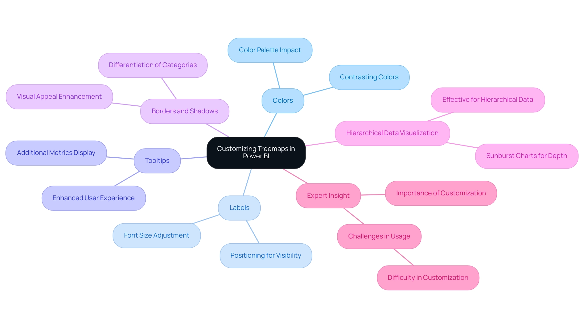
Colors: Selecting an effective color palette is crucial for readability and conveying meaning. Utilize contrasting colors for different categories to ensure clear distinctions. The impact of color choices on visualization effectiveness cannot be overstated. Studies suggest that appropriately selected colors can enhance user understanding and involvement, which is essential in addressing the confusion frequently caused by inconsistent information across reports due to an absence of a governance strategy.
-
Labels: The legibility of labels is paramount. Modifying the font size and position can significantly improve visibility, ensuring that users can easily grasp the information presented. Labels should be clear and concise, providing essential information without overwhelming the viewer, thus addressing the frequent issue of reports lacking actionable guidance.
-
Tooltips: Customizing tooltips adds another layer of context to your data visualization. When users hover over different sections, tooltips can display additional metrics or descriptions, enhancing the user experience and aiding deeper comprehension of the information. This feature can help mitigate the time-consuming nature of report creation by providing instant insights.
-
Borders and Shadows: Incorporating borders or shadows can effectively differentiate between categories, enhancing the overall visual appeal of your treemap. These subtle design elements guide the viewer’s eye and improve the hierarchy of information presented, making it easier to derive insights quickly.
-
Hierarchical Data Visualization: Treemaps are particularly effective for hierarchical information, as they allow for a clear representation of different levels within a dataset. For instance, sunburst charts add depth to each parent branch, illustrating various hierarchical group levels. This capability is vital for organizations looking to streamline their data analysis processes.
-
Expert Insight: As Trevor Lohrbeer observes, “I believe one of the reasons you don’t see these visualizations used more is that they are difficult to get right.” This underscores the importance of careful customization to ensure that visualizations effectively convey the intended insights, thereby enhancing the overall quality of data-driven decision-making.
By adhering to these best practices for Power BI treemap customization, you can create visually compelling and informative visualizations that drive insights and support decision-making. Real-world examples demonstrate that organizations leveraging customized Power BI treemaps have seen improved information quality and enhanced business intelligence outcomes, ultimately fostering growth and innovation. Creatum GmbH’s unique value lies in offering tailored solutions that improve quality and simplify AI implementation, driving growth and innovation.
Preparing Your Data: Ensuring Quality for Effective Treemap Visualization
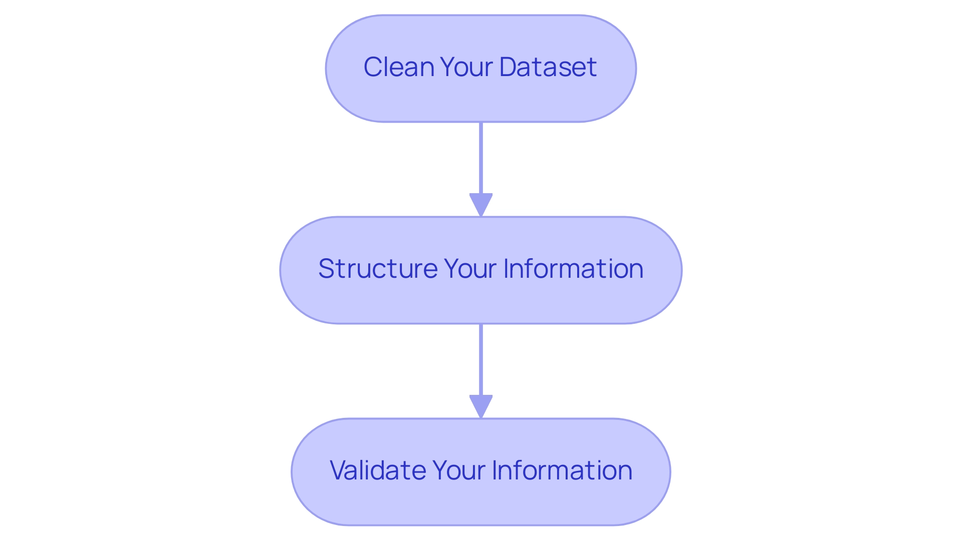
Preparing your information effectively is crucial before creating a Power BI treemap. Follow these essential steps to ensure your representation is both precise and informative:
-
Clean Your Dataset: Start by eliminating duplicates, addressing missing values, and standardizing formats. A clean dataset is vital for reliable analysis, as low-quality information can lead to misleading representations. Statistics reveal that information quality issues can significantly undermine the effectiveness of Power BI treemap visualizations, making this step non-negotiable. Industry insights suggest that maintaining gateways and enabling logging can reduce the likelihood of breaches by 25%, highlighting the importance of information integrity. This is particularly relevant in Business Intelligence, where accurate information is essential for informed decision-making that drives growth and innovation.
-
Structure Your Information: Organize your data hierarchically to clearly define parent-child relationships. This structure is essential for the Power BI treemap to accurately depict the information, allowing viewers to grasp underlying patterns and insights at a glance. Proper structuring not only enhances clarity but also boosts the overall performance of your visualizations. For example, utilizing DAX variables can lead to performance improvements of up to 20% in complex models, enhancing both efficiency and clarity. This aligns with the objectives of RPA solutions, which aim to automate repetitive tasks and enhance operational efficiency.
-
Validate Your Information: Ensure the accuracy and relevance of your data. Validation is crucial for deriving trustworthy insights from your Power BI treemap. By confirming that your information aligns with the intended analysis, you can confidently make informed choices based on the representations. As Sharin Fritz from Personio noted, automating assessments can reduce the time candidates spend on evaluations, underscoring the importance of effective preparation in broader contexts. This highlights the challenges organizations face with inadequate master information quality and barriers to AI implementation, emphasizing the necessity for robust information practices.
Integrating these optimal methods will not only enhance the quality of your graphical representations but also empower your organization to utilize information more efficiently. For instance, organizations prioritizing information quality in their graphical representations have reported improvements in decision-making efficiency and clarity, showcasing the tangible benefits of a meticulous information preparation process. By embracing Business Intelligence and RPA, your organization can overcome information challenges and drive operational success.
Advanced Techniques for Enhancing Treemap Visualizations in Power BI
To enhance your chart representations in Power BI, consider implementing the following advanced techniques:
-
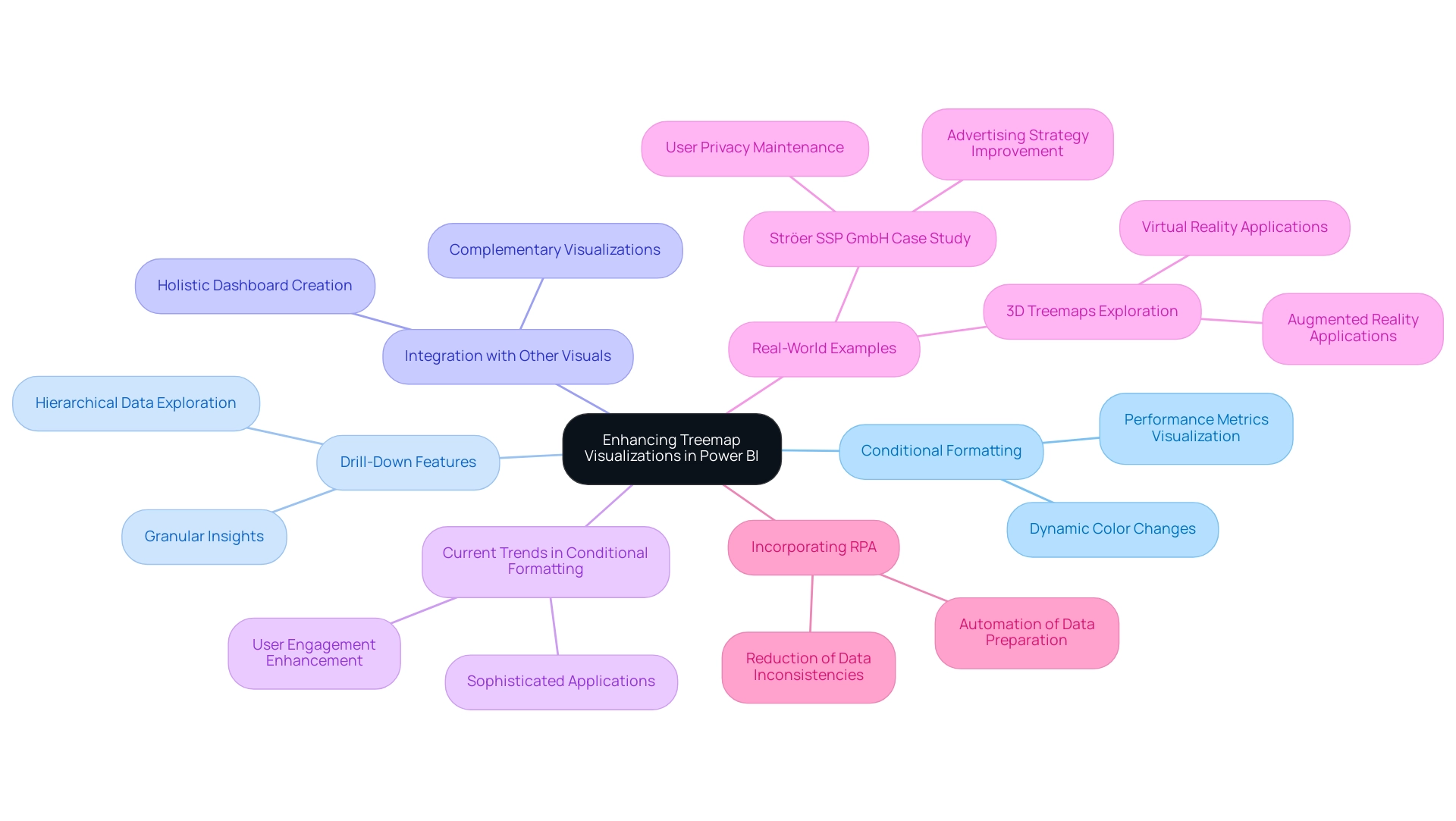
Conditional Formatting: Leverage conditional formatting to dynamically alter the color of rectangles based on defined criteria. This approach offers immediate visual cues regarding performance metrics or status indicators, enhancing the interpretability of your information and aligning with the need for actionable insights in today’s information-rich environment.
-
Drill-Down Features: Activate drill-down capabilities to empower users to navigate through information at varying levels of granularity. Hierarchical representations can display thousands of information points while enabling drill-down functionalities, promoting a more refined exploration of structured information and deeper insights into underlying trends, which is essential for informed decision-making.
-
Integration with Other Visuals: Enhance your hierarchical representation’s storytelling potential by integrating it with complementary visualizations, such as bar charts or line graphs. This multi-faceted approach creates a comprehensive dashboard that presents a holistic view of your information, enabling more informed decision-making and driving operational efficiency through effective Business Intelligence.
-
Current Trends in Conditional Formatting: As of 2025, the use of conditional formatting in Power BI is evolving, with a focus on more sophisticated applications that enhance user engagement and clarity. Industry leaders emphasize the significance of these techniques in creating impactful visuals, which can assist businesses in navigating the overwhelming AI landscape and leveraging insights effectively.
-
Real-World Examples: Companies like Ströer SSP GmbH have successfully utilized advanced Power BI treemap techniques to process complex sets while maintaining user privacy. Their method demonstrates how impactful information representation can improve advertising strategies and stimulate business expansion. Moreover, the potential for 3D treemaps in virtual and augmented reality applications is being investigated, showcasing innovative trends in information representation that can further enhance operational efficiency.
-
Incorporating RPA: Consider integrating Robotic Process Automation (RPA) to streamline the information preparation process for your treemaps. RPA can automate repetitive tasks involved in data collection and cleaning, significantly reducing the time spent on report creation and minimizing data inconsistencies. By adopting these advanced techniques and incorporating RPA, you can significantly improve the effectiveness of your Power BI treemap visualizations, ensuring they deliver actionable insights and support strategic decision-making, ultimately driving growth and innovation in your organization.
Conclusion
Treemaps have established themselves as an indispensable tool for data visualization within Power BI, particularly for representing hierarchical data through their unique nested rectangle format. This article has highlighted the fundamental aspects of treemaps, from their creation and customization to advanced techniques that enhance their effectiveness. By understanding the essential steps for preparing data, users can ensure that their treemaps provide accurate and insightful visualizations, ultimately improving decision-making processes.
The discussion also underscored the importance of customization options, such as:
- Color selection
- Label legibility
- The use of tooltips
These options collectively enhance clarity and engagement. With the ability to incorporate advanced features like conditional formatting and drill-down capabilities, treemaps can transform complex datasets into actionable insights, making them a vital asset for organizations striving to navigate the data-driven landscape.
As businesses increasingly lean on data to inform strategic decisions, mastering the use of treemaps in Power BI will empower users to unlock the full potential of their data. By embracing these visualization techniques and integrating them with Robotic Process Automation (RPA), organizations can streamline their processes, reduce inconsistencies, and ultimately drive growth and innovation. The future of data visualization lies in the effective use of tools like treemaps, which will continue to play a pivotal role in enhancing business intelligence and operational efficiency.

