Overview
This article serves as a comprehensive guide on effectively removing time from date fields in Power BI. It emphasizes various methods, including Power Query, DAX, and formatting options, to enhance data clarity and usability. Clean date fields are critical for effective decision-making, as they improve filtering, visualizations, and data connections. Ultimately, this leads to more reliable insights and operational efficiency in business intelligence contexts.
Are you ready to elevate your data management practices? By mastering these techniques, you can significantly enhance your analytical capabilities. Embrace the opportunity to streamline your data processes and drive impactful results in your organization.
Introduction
In the realm of data analysis, the significance of effective date management within Power BI is paramount. As organizations navigate the complexities of data-driven decision-making, the ability to accurately interpret and manipulate date values stands as a cornerstone of operational efficiency. With the platform’s continuous enhancements, particularly in handling date and time components, users are empowered to transform raw data into actionable insights. Yet, challenges such as poor master data quality and the intricacies of integrating AI technology persist.
This article explores the critical importance of managing date fields in Power BI, detailing practical methods to:
- Eliminate unnecessary time components
- Understand the benefits of clean date management
- Explore real-world applications that drive growth and innovation
By addressing common challenges and offering tailored solutions, businesses can unlock the full potential of their data and foster a culture of informed decision-making.
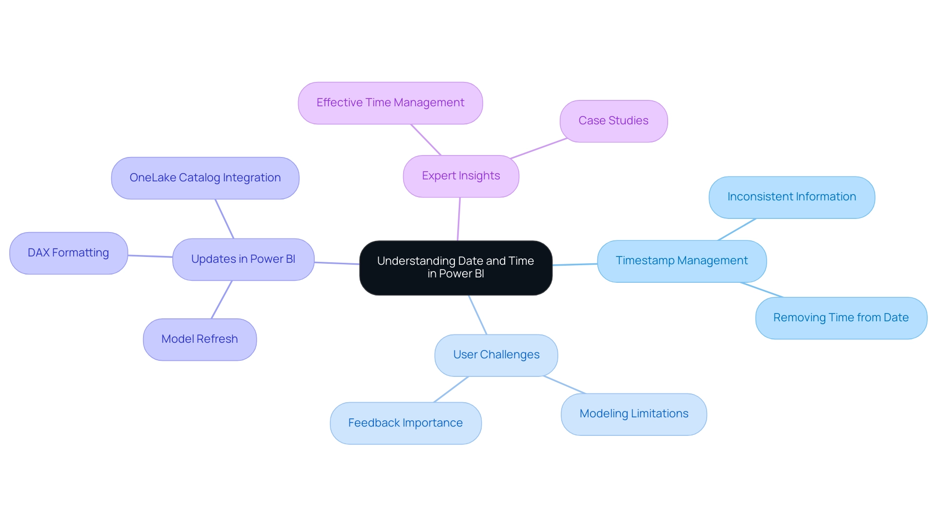
Understanding Date and Time in Power BI
In Business Intelligence, timestamps are typically saved as Date/Time values, encompassing both calendar and time elements. It is crucial to understand how Power BI interprets these values for effective analysis. Organizations often face challenges with poor master information quality, including inconsistent, incomplete, or erroneous inputs, leading to inefficient operations and flawed decision-making. Moreover, many organizations hesitate to adopt AI technology due to concerns regarding its complexity and integration into existing processes.
As we approach 2025, the platform has undergone enhancements in its temporal handling capabilities, including updates that significantly improve user experience through features like model refresh, DAX formatting, and query view options. This evolution underscores the importance of precisely managing temporal values to mitigate issues such as inconsistent information and ineffective operations. Ultimately, this effort transforms raw data into actionable insights that drive growth and innovation.
When managing temporal fields, scenarios often arise where the hour element is superfluous. Consequently, utilizing Power BI to remove time from date can facilitate better analysis. For example, in report creation or dashboard design, adopting a simplified format devoid of hours can greatly enhance clarity and improve filtering capabilities. This is particularly relevant in the context of the OneLake catalog integration into Power BI Desktop, which provides a seamless information discovery experience.
To effectively remove time from date in Power BI, users must first identify the format of their temporal fields and comprehend the implications of manipulating these values. Expert insights reveal that effective time management is essential for accurate information interpretation and analysis. In 2025, the significance of format in Business Intelligence analysis is paramount, as it directly affects the quality of insights derived from information, which is vital for fostering growth and innovation.
Case studies illustrate the challenges users face with BI’s modeling functionalities, especially regarding time management. The case study titled ‘Modeling Limitations in BI‘ emphasizes that despite recent updates aimed at enhancing user satisfaction, many still find essential features lacking. This highlights the ongoing need for improvements in scheduling management within Business Intelligence, underscoring the crucial role that understanding temporal values plays in efficient information analysis.
As Patrick LeBlanc, Principal Program Manager, stated, “We highly value your feedback, so please share your thoughts using the feedback forum,” emphasizing the importance of user input in shaping future enhancements.
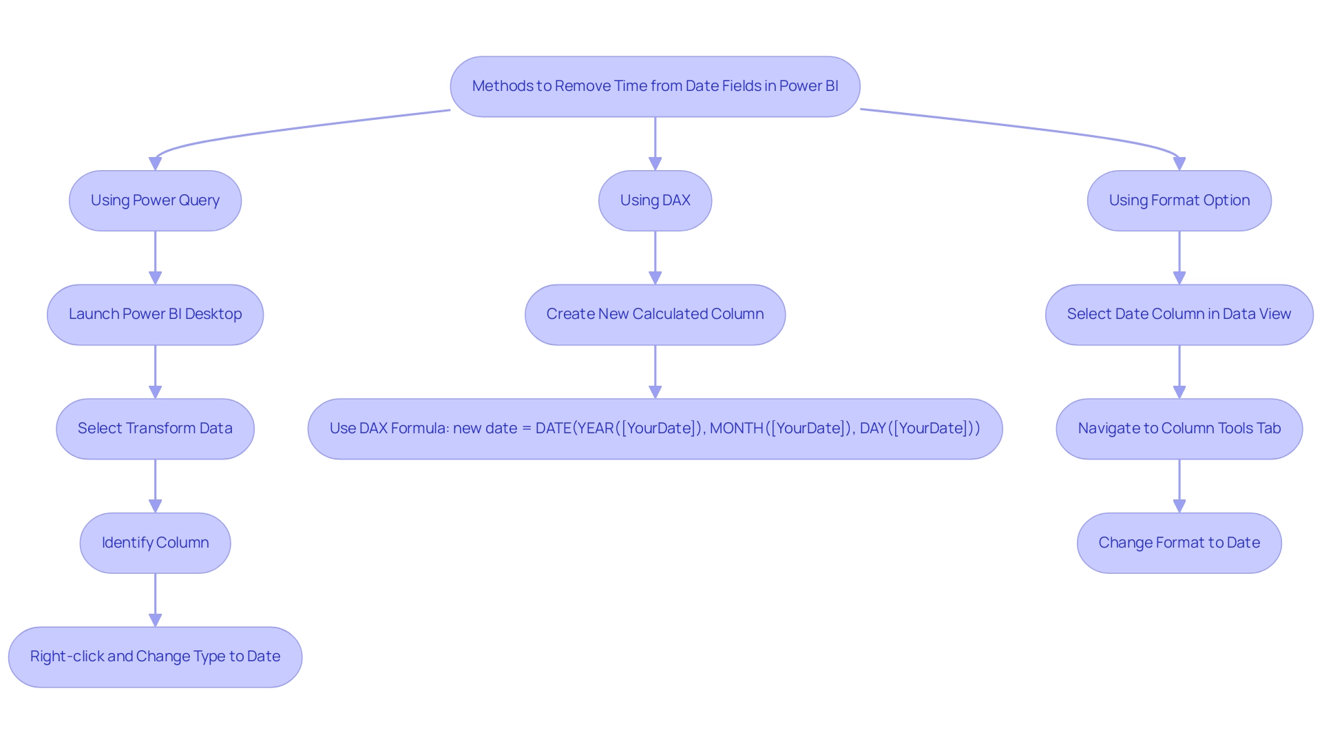
Methods to Remove Time from Date Fields in Power BI
Utilizing Power BI to eliminate time from date in calendar fields significantly enhances data clarity and usability, which is vital for effective decision-making in today’s data-driven landscape. Here are several effective methods to accomplish this:
-
Using Power Query:
- Launch Power BI Desktop and select the ‘Transform Data’ option.
- In the Power Query Editor, identify the column containing the time information you wish to modify.
- Right-click on the column header, select ‘Change Type’, and then choose ‘Date’. This action in Power BI will remove time from date, retaining only the day.
-
Using DAX:
- To create a new calculated column, utilize the DAX formula:
new date = DATE(YEAR([YourDate]), MONTH([YourDate]), DAY([YourDate])). This formula effectively retrieves the year, month, and day from the original timestamp, serving as a method to remove time from date in Power BI.
- To create a new calculated column, utilize the DAX formula:
-
Using the Format Option:
- In the Data view, select the date column, navigate to the ‘Column tools’ tab, and change the format to ‘Date’. This adjustment will enable you to effectively remove time from date in your reports.
These methods can be tailored to individual user preferences and the specific requirements of your model, facilitating a more streamlined and efficient management process. By implementing these techniques, users can enhance the quality of their presentations and promote better decision-making, addressing challenges related to inconsistencies and the need for actionable insights.
As Vvelarde, a Community Champion, observes, “In the column that you wish to reduce to only entries related to time change in Modeling – Date Type – Date.” This practical guidance underscores the significance of accurately configuring the type of information in BI, which is crucial for overcoming obstacles to effective information utilization.
Moreover, BI tutorials frequently encompass extracting month, year, and date from various date formats, which can further assist users in efficiently handling their information. For organizations aiming to enhance their information quality, our case study titled “Customized Solutions for Quality” illustrates how tailored solutions can simplify AI implementation and drive growth, addressing common apprehensions about adopting AI technology.
Lastly, take advantage of the $150 discount available using code ms cost for conference registration, which could provide additional insights into BI and information management strategies.
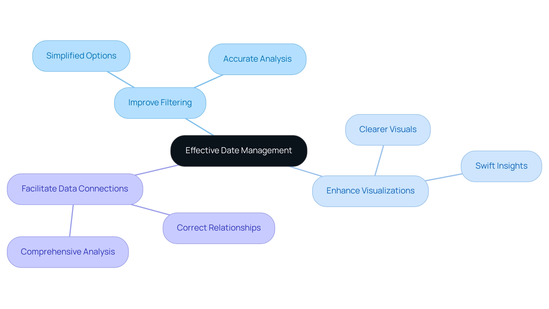
Enhancing Data Quality Through Effective Date Management
Effective time management is crucial for ensuring high data quality in Power BI, particularly in an environment where poor master data quality can impede AI adoption and data-driven insights. The integration of temporal elements in calendar fields often leads to misunderstandings and errors in reporting, which can obstruct informed decision-making processes. By eliminating time from dates, users can realize several key benefits:
- Improve Filtering: Clean date fields simplify filtering options in reports, empowering users to analyze trends over specific periods with greater ease and accuracy.
- Enhance Visualizations: Charts and graphs that utilize temporal fields benefit from the removal of time from dates, resulting in clearer and more interpretable visuals that enable stakeholders to derive insights swiftly.
- Facilitate Data Connections: Effective time management ensures that relationships between tables based on time fields function correctly, which is essential for comprehensive information analysis.
The advantages of clean time fields extend beyond aesthetics; they significantly bolster operational efficiency. Organizations that prioritize effective information management often report improved data quality statistics, leading to more reliable insights and informed decision-making. This is especially pertinent in the context of Business Intelligence, where actionable insights are vital for driving growth and innovation.
Microsoft consistently updates BI to incorporate user feedback, underscoring the importance of user-driven enhancements in the platform. As Patrick LeBlanc, Principal Program Manager, states, “We highly value your feedback, so please share your thoughts using the feedback forum.”
Real-world examples illustrate that effective date filtering in BI not only streamlines reporting processes but also cultivates a culture of data-driven decision-making. Moreover, the challenges associated with time-consuming report creation and information inconsistencies can be mitigated through BI services, such as the 3-Day Sprint for rapid report creation and the General Management App for comprehensive management. By adopting these practices, businesses can ensure that their data remains a valuable asset, propelling growth and innovation.
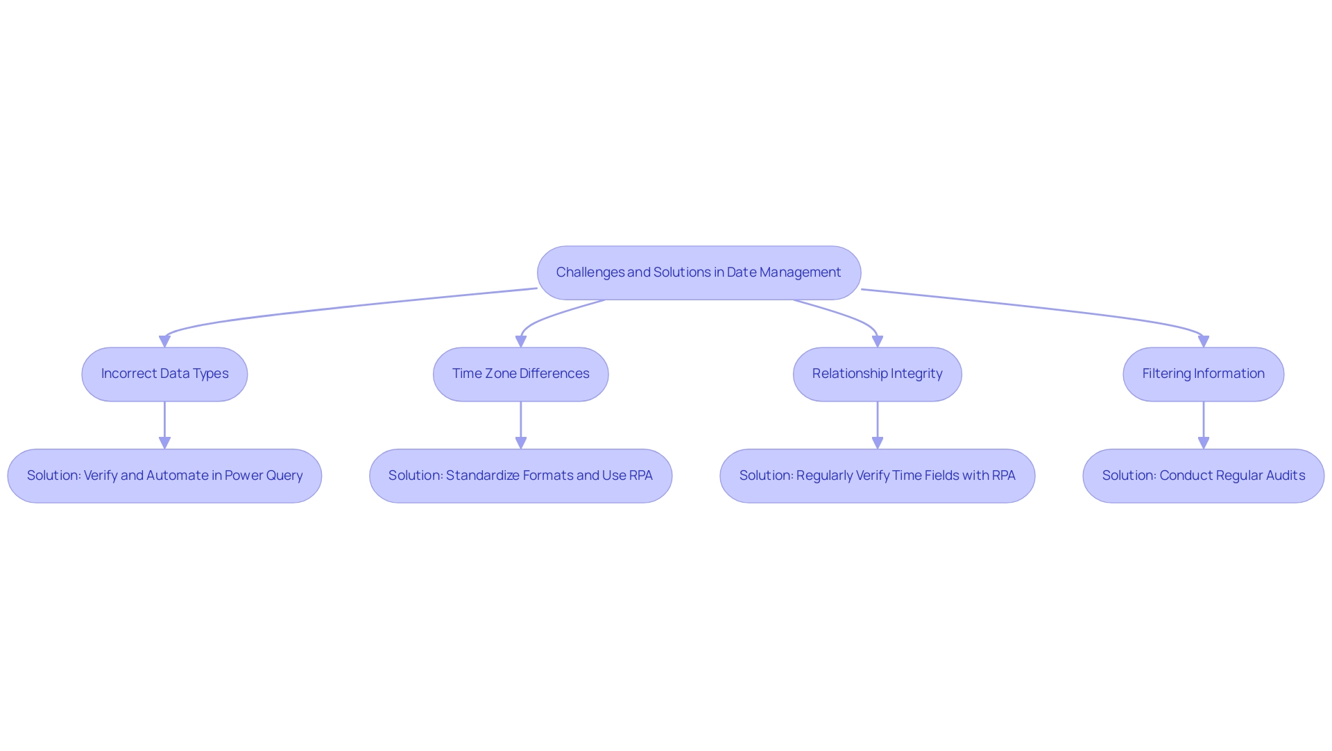
Common Challenges and Solutions in Date Management
Handling timelines in Power BI presents numerous challenges that can significantly impact operational efficiency, particularly when leveraging Robotic Process Automation (RPA) to enhance data-driven insights. Key issues include:
-
Incorrect Data Types: Many users face situations where date fields are incorrectly formatted as text or Date/Time. This misconfiguration can lead to errors in information analysis. To rectify this, it is essential to verify that the type is set to ‘Date’ in Power Query, ensuring accurate representation. Automating this verification process through RPA can considerably reduce the time spent on manual checks, ultimately minimizing wasted resources.
-
Time Zone Differences: When managing information across various time zones, inconsistencies can arise. Standardizing the format of events and utilizing Power BI to eliminate time from date components can significantly mitigate these discrepancies, leading to more reliable insights. RPA can facilitate the automation of this standardization process, ensuring consistency across datasets.
-
Relationship Integrity: Properly formatted temporal fields are crucial for maintaining relationships between tables. Inconsistent temporal fields can disrupt information connectivity and analysis. Regularly verifying that time fields are uniformly formatted across all tables is vital for seamless information integration. RPA can automate these checks, enhancing operational efficiency and reducing the risk of errors.
Moreover, many users report difficulties in filtering information from multiple tables using a single source, further complicating time management in Power BI. To effectively tackle these challenges, users should conduct regular audits of their information types, ensure uniformity in date formats, and apply the strategies outlined in this guide, such as how to remove time from date in Power BI. RPA can play a pivotal role in automating these audits, allowing teams to concentrate on more strategic tasks.
As Denys Arkharov, a BI Engineer at Coupler.io, emphasizes, “I specialize in overseeing BI applications from inception to implementation, including crafting models, designing dashboards, and ensuring accuracy.” This statement underscores the importance of maintaining information accuracy in BI, which is essential for enhancing operational efficiency and informed decision-making.
Furthermore, the case study titled “Power BI Operations Dashboard” highlights the practical challenges encountered in managing timelines, where extensive information on support cases and channels could benefit from additional metrics and filters. By implementing tailored solutions that enhance information quality and simplify AI execution, organizations can maintain clean and precise fields, ultimately improving their management processes and supporting informed decision-making. In today’s rapidly evolving AI landscape, utilizing RPA via Creatum GmbH can significantly streamline these processes, reducing wasted effort and resources.
Real-World Applications of Date Management in Power BI
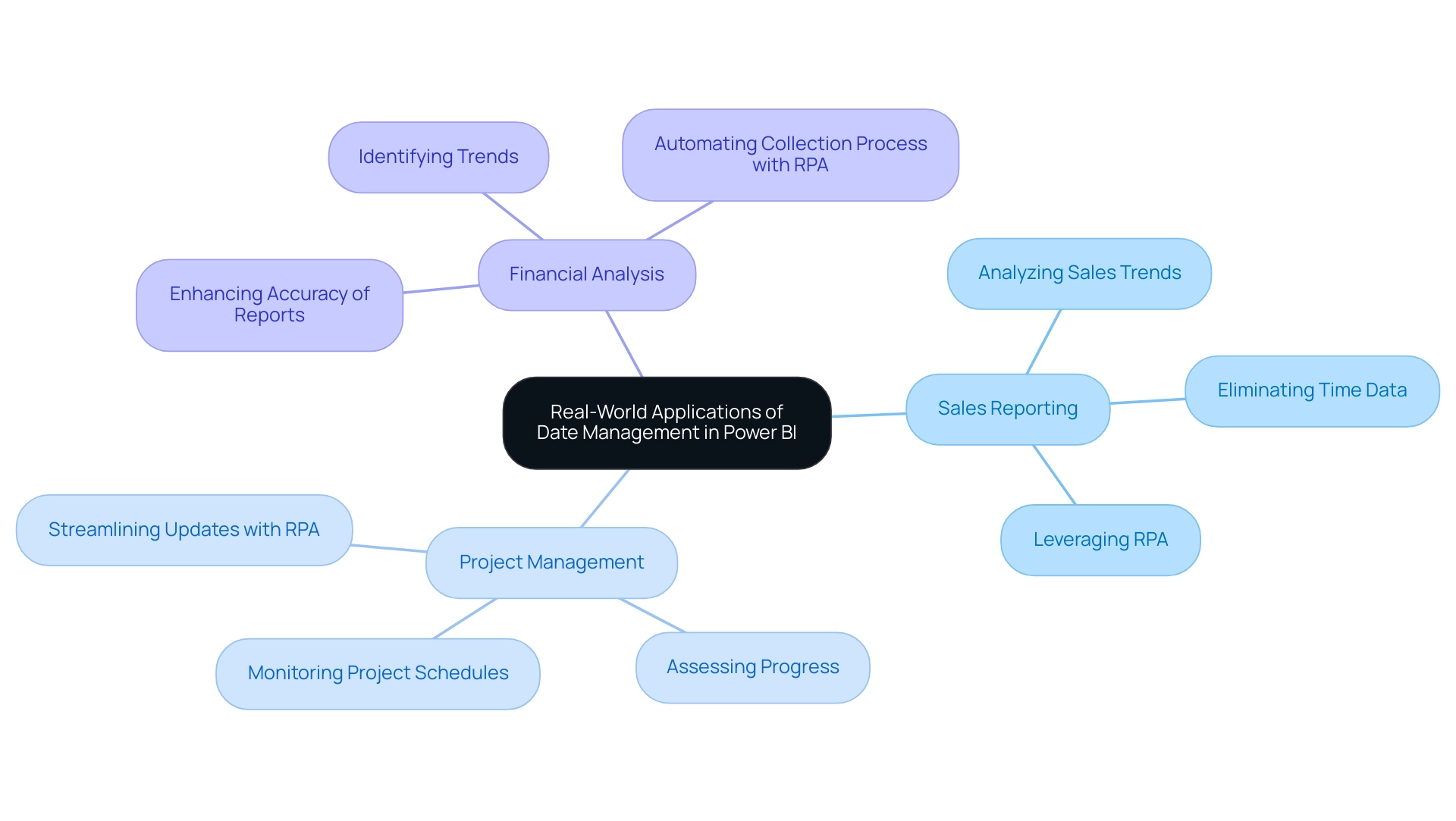
Effective date management in Power BI presents numerous real-world applications that can significantly enhance data analysis across various business functions.
-
Sales Reporting: By eliminating time data, businesses can concentrate on analyzing sales trends over specific periods. This streamlined approach results in clearer insights, empowering teams to make informed decisions based on historical performance without the distractions of time granularity. In an era where information generation reached 64.2 zettabytes in 2020 and is projected to soar to 181 zettabytes by 2025, effective management becomes essential for extracting meaningful insights. Leveraging Robotic Process Automation (RPA) can further enhance this process by automating repetitive tasks associated with data entry and reporting, allowing teams to focus on strategic analysis.
-
Project Management: In project management, concentrating on beginning and concluding periods without duration enables managers to monitor project schedules and milestones efficiently. This clarity aids in assessing progress and ensuring that projects remain on schedule, ultimately improving resource allocation and team productivity. A pertinent case study is the ‘Power BI Operations Dashboard,’ which provides comprehensive insights into customer support operations, demonstrating how effective management of timelines can enhance operational efficiency. The integration of RPA can also streamline project tracking by automating updates and notifications, ensuring that all stakeholders are informed in real-time.
-
Financial Analysis: Utilizing clean date fields in financial reports enhances the accuracy of insights related to revenue and expenses over time. This precision is vital for efficient budgeting and forecasting, as it enables organizations to identify trends and make strategic financial decisions based on reliable information. As Tajammul Pangarkar, CMO at Prudour Pvt Ltd, notes, the integration of technology and information management is essential for businesses to thrive in today’s information-rich environment. RPA can assist in automating the collection process, ensuring that financial reports are produced swiftly and accurately, thus enhancing operational efficiency.
These applications illustrate how to utilize Power BI to remove time from date fields, significantly enhancing the clarity and effectiveness of analysis in various business scenarios, ultimately driving operational efficiency and informed decision-making. Furthermore, with data engineers in the San Francisco Bay Area experiencing a 6% salary increase, the demand for data management skills underscores the significance of tools like BI in the current job market. Creatum GmbH’s comprehensive Power BI services, including custom dashboards and expert training, empower organizations to leverage these insights effectively, addressing challenges in report creation and enhancing overall business intelligence.
Conclusion
Effective date management in Power BI transcends mere technical necessity; it emerges as a strategic advantage that can significantly impact an organization’s capacity to make informed decisions. By mastering the nuances of date and time handling, users can eliminate unnecessary time components, enhancing both data clarity and usability. The methodologies discussed, from leveraging Power Query to employing DAX formulas, offer practical solutions to streamline date management, ensuring data remains accurate and actionable.
Moreover, the advantages of clean date fields extend beyond mere aesthetics; they substantially improve operational efficiency and foster better data relationships. Organizations that implement effective date management practices not only elevate their data quality but also cultivate a culture of data-driven decision-making. The case studies and real-world applications highlighted illustrate the critical nature of these practices across various business contexts, from sales reporting to financial analysis.
As organizations grapple with challenges such as poor data quality and the intricacies of AI integration, prioritizing effective date management within Power BI can unlock unprecedented levels of insight and innovation. By harnessing the capabilities of Power BI and embracing user-driven enhancements, businesses can transform their data into a formidable asset that propels growth and operational success. Emphasizing the significance of feedback and continuous improvement will ensure that Power BI remains an indispensable tool for navigating the ever-evolving landscape of data analysis.
Overview
Power BI scorecards significantly enhance operational efficiency by empowering organizations to visualize and track key performance indicators (KPIs). This capability facilitates informed decision-making and real-time assessments of progress.
For instance, a U.S. insurance provider improved recruitment efficiency by 15%, while healthcare organizations utilized scorecards to identify bottlenecks. These examples illustrate the transformative impact of scorecards in driving strategic insights and operational improvements, prompting organizations to consider their implementation for enhanced performance.
Introduction
In an increasingly data-driven world, organizations are increasingly relying on Power BI scorecards as essential tools for enhancing operational efficiency and driving strategic success. These powerful instruments empower teams to visualize and track key performance indicators (KPIs), offering a centralized platform for real-time performance assessments against strategic objectives.
As businesses navigate complex data landscapes, integrating Power BI with innovative solutions like Robotic Process Automation (RPA) provides a pathway to streamline processes, reduce manual errors, and equip decision-makers with actionable insights.
This article delves into the multifaceted role of Power BI scorecards in transforming raw data into meaningful metrics. Through real-world examples and emerging trends, we illustrate their significant impact in today’s competitive environment, prompting reflection on how these tools can elevate organizational performance.
Understanding Power BI Scorecards and Their Role in Operational Efficiency
A Power BI scorecard example is an essential tool for visualizing and tracking key performance indicators (KPIs) within organizations. These evaluation tools create a centralized platform that enables teams to monitor their performance against strategic objectives, facilitating real-time assessments of progress. By combining varied data sources, dashboards unify information, allowing for the identification of trends and anomalies that may affect efficiency.
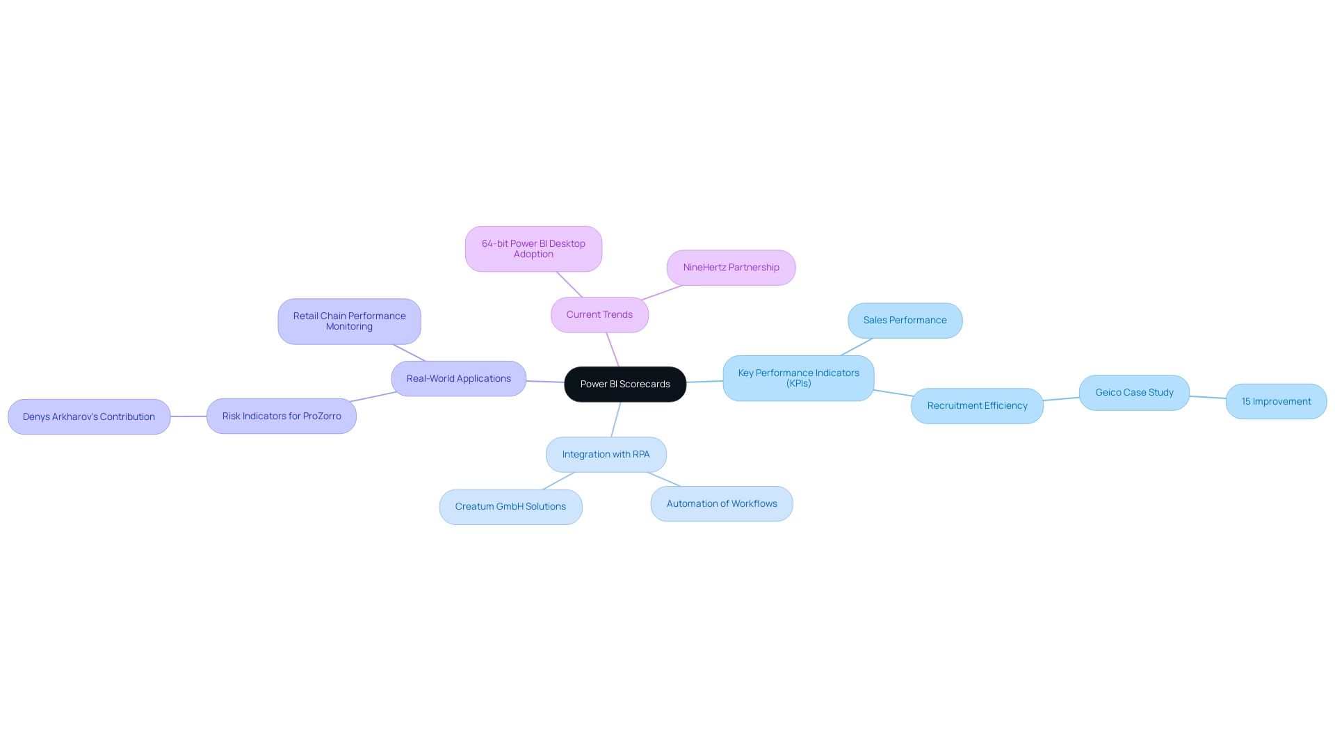
In 2025, the role of BI dashboards in enhancing operational efficiency has gained prominence, particularly when paired with Robotic Process Automation (RPA) solutions from Creatum GmbH. For instance, a leading U.S. insurance provider, Geico, successfully leveraged business intelligence to improve its recruitment efficiency by 15%. This scenario illustrates how evaluation systems can streamline processes and enhance decision-making capabilities, especially when integrated with innovative tools such as EMMA RPA and Microsoft Automate.
Recent trends show that organizations are increasingly adopting the 64-bit version of BI Desktop to capitalize on the latest updates and support, thereby enhancing their analytical capabilities. Users are encouraged to upgrade to this version to ensure they benefit from the most current features and improvements.
The ability to effectively track KPIs through a Power BI scorecard example not only aids in performance monitoring but also empowers decision-makers to respond promptly to data-driven insights. For example, a retail chain can utilize assessment tools to monitor sales performance across various locations, swiftly identifying underperforming stores and implementing corrective measures. By automating manual workflows with RPA, organizations can minimize the time spent on report creation and reduce data inconsistencies, allowing teams to concentrate on strategic, value-adding activities.
As companies navigate a data-rich environment, the impact of BI dashboards on organizational performance metrics is profound. They not only facilitate improved tracking of KPIs but also drive operational efficiency by enabling teams to focus on strategic, value-adding activities. In this context, the importance of BI dashboards, particularly a Power BI scorecard example, is significant, as they play a crucial role in transforming raw data into actionable insights that inform essential business decisions.
Denys Arkharov, a BI Engineer at Coupler.io, highlights the importance of such tools, stating, “A notable achievement in my career was my involvement in creating Risk Indicators for Ukraine’s ProZorro platform, a project that led to my work being incorporated into the Ukrainian Law on Public Procurement.” This underscores the real-world impact of business intelligence instruments such as BI dashboards.
Moreover, partnerships like that of NineHertz as a BI Development Services Partner illustrate current trends in the BI landscape, focusing on developing dashboards and reports to enhance decision-making for businesses, while RPA solutions from Creatum GmbH continue to evolve, addressing challenges such as staffing shortages and outdated systems.
Key Performance Indicators: The Backbone of Effective Scorecards
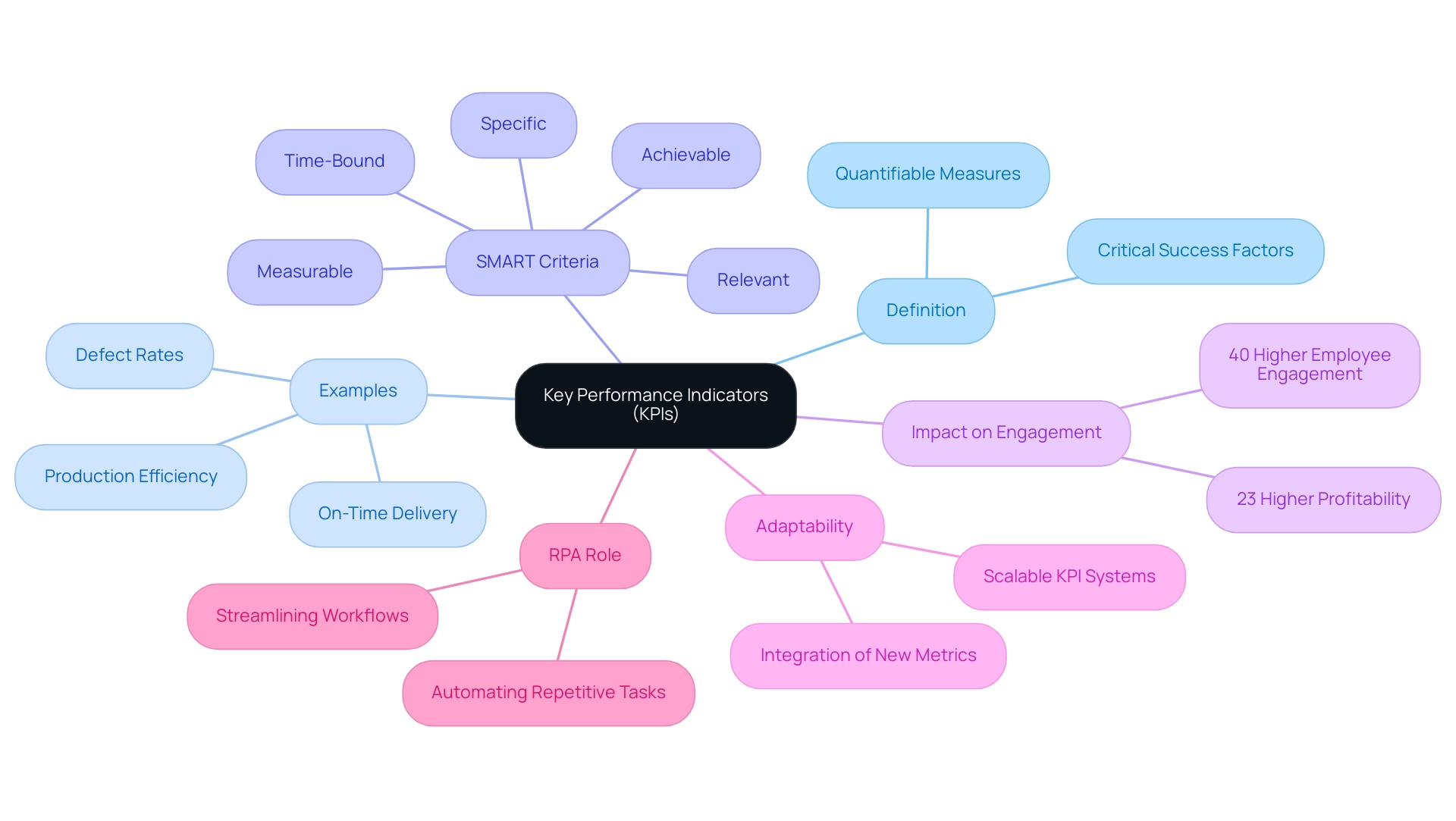
Key Performance Indicators (KPIs) are fundamental to the effectiveness of a Power BI scorecard, serving as quantifiable measures that reflect the critical success factors of a business. In the manufacturing sector, for instance, companies often monitor KPIs such as:
- Production efficiency
- Defect rates
- On-time delivery
Establishing clear KPIs enables entities to align their activities with strategic objectives, ensuring that all team members are unified in their focus.
The selection of relevant KPIs is crucial; they must adhere to the SMART criteria—specific, measurable, achievable, relevant, and time-bound—to yield actionable insights that foster performance enhancements. In 2025, companies are increasingly recognizing the importance of KPIs, with studies indicating that those implementing regular feedback mechanisms experience 40% higher employee engagement rates. This engagement is vital for success, as engaged employees are more likely to contribute to achieving strategic goals.
Recent developments in KPI tracking have also highlighted the need for scalability. As businesses evolve, their KPI systems must adapt accordingly. A scalable KPI setup enables the integration of new metrics and the redefinition of thresholds, ensuring that entities maintain relevance and effectiveness in their performance measurement as they grow.
This adaptability is crucial, as illustrated by a case study on a mid-sized company that improved efficiency by automating data entry and software testing through GUI automation. The adoption of such automation decreased data entry mistakes by 70% and sped up testing procedures by 50%, illustrating the substantial effect of automation on efficiency and software quality.
At present, the average count of KPIs monitored by firms has increased, indicating a wider recognition of their significance in enhancing efficiency. Indeed, organizations that adopt data-driven strategies show a significant rise in profitability, with DataVersity noting a 23% higher profitability for those implementing such strategies. This highlights the essential role of KPIs in attaining excellence. Additionally, insights from Maria Stylianou, HR Business Partner at HF Markets, emphasize how automation, like that offered by Creatum GmbH, minimizes manual effort and mistakes in engagement evaluations, further improving efficiency.
Moreover, RPA plays a vital role in streamlining workflows by automating repetitive tasks, allowing teams to focus on more strategic initiatives that drive business growth.
Practical Power BI Scorecard Examples for Operational Improvement
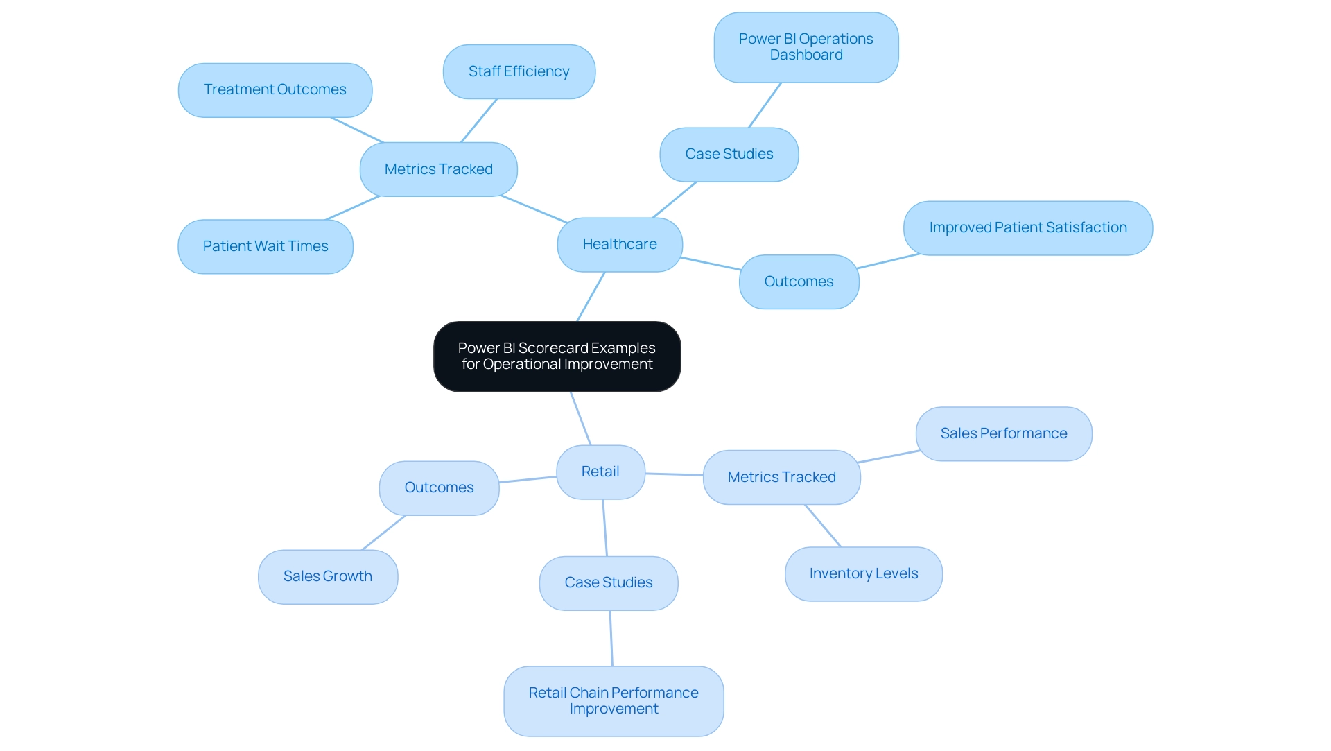
Power BI dashboards are increasingly utilized across various sectors to enhance operational efficiency through data-driven insights. In the healthcare sector, for instance, a performance measurement tool effectively tracks critical metrics such as patient wait times, treatment outcomes, and staff efficiency. By visualizing these data points, healthcare administrators can swiftly identify bottlenecks in patient flow, enabling them to implement targeted strategies that enhance service delivery and improve patient satisfaction.
This relevance is underscored by recent case studies demonstrating how GUI automation has streamlined operations, reducing data entry errors by 70% and accelerating testing processes by 50%, ultimately improving workflow efficiency by 80%.
Similarly, in the retail industry, performance metrics play a pivotal role in tracking sales results across various product categories. This real-time data empowers managers to make informed decisions regarding inventory levels and marketing strategies, ultimately driving sales growth. For instance, a retail chain utilizing a Power BI scorecard example reported a significant increase in sales performance by adjusting their inventory based on insights derived from the analytics of the scorecard.
Furthermore, the execution of BI enables organizations to predict financial metrics for a month, quarter, or half a year, offering a forecasting advantage that improves efficiency. As Andrey Arbuzin, deputy financial director, noted, “Today we have a block of actual loss and profits report created — we already see it in BI.” Thanks to dashboards, organizations can forecast financial indicators and compare actual results with predictions, gaining insights into the completeness of expense and income reflections.
These practical uses highlight the transformative capabilities of BI dashboards in enabling operational enhancements. By providing actionable insights, organizations can make informed decisions that lead to enhanced efficiency and effectiveness. Moreover, case studies from 2025 emphasize the successful execution of a Power BI scorecard example in both healthcare and retail, demonstrating its capacity to enhance efficiency and optimize resource distribution.
Additionally, the upcoming Intellus Summit will equip attendees with tools and insights to enhance their data strategy with ERP, analytics, and AI, further emphasizing the significance of BI in today’s data-rich environment. The integration of RPA into these processes not only streamlines manual workflows but also improves overall efficiency, making it a critical component in the rapidly evolving AI landscape.
Integrating Power BI with Existing Systems for Enhanced Insights
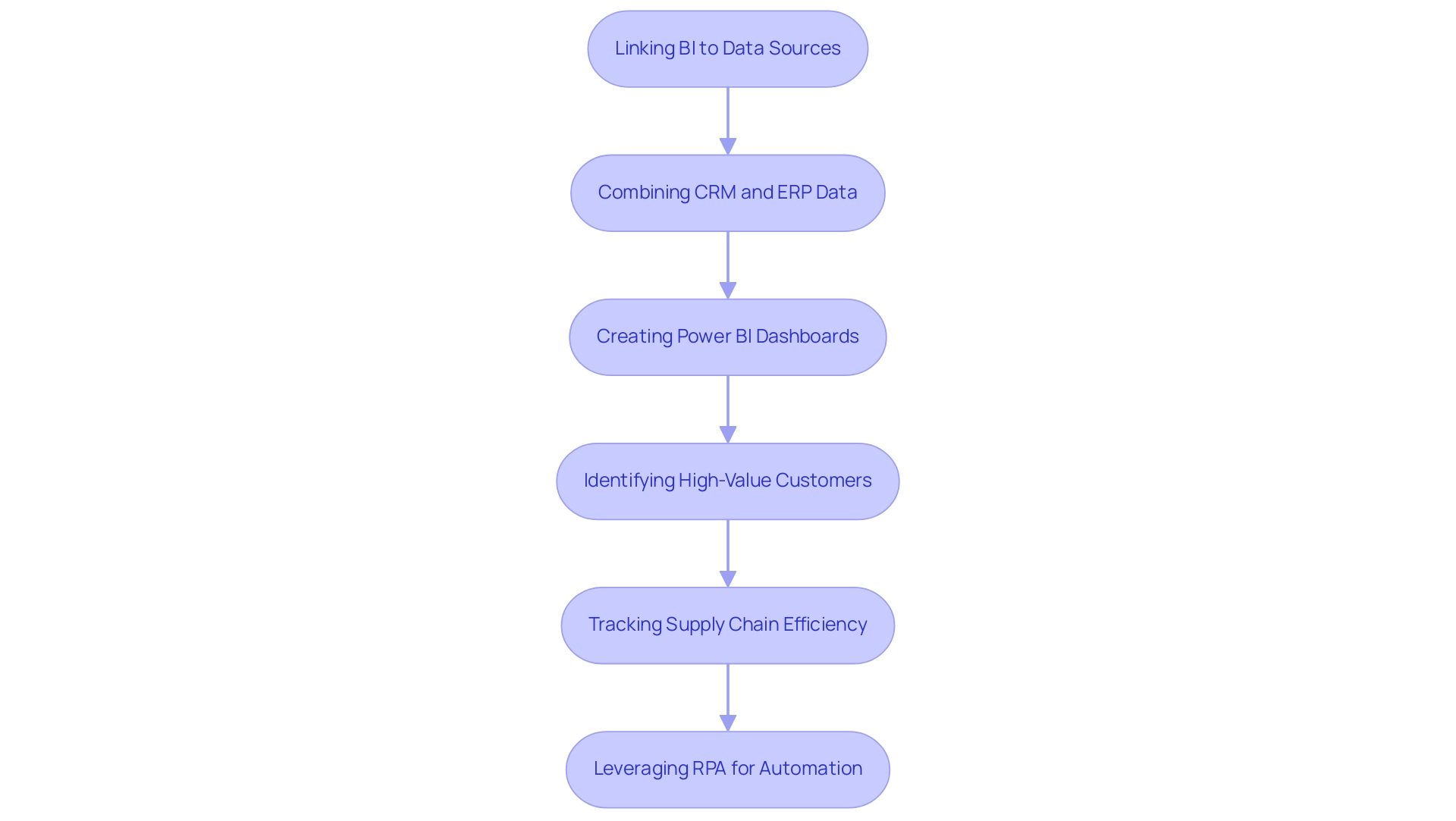
Integrating Business Intelligence (BI) with existing systems is essential for unlocking deeper insights and driving operational efficiency. By linking BI to various data sources—such as CRM systems, ERP platforms, and databases—organizations can cultivate a unified perspective of their operations. For instance, a logistics firm recently leveraged BI to merge sales data from its CRM with financial metrics from its ERP system, resulting in a Power BI scorecard example that effectively tracks revenue performance against budget forecasts.
This integration not only streamlines workflows but also ensures that decision-makers have access to precise, real-time information. Consequently, they can make informed decisions that propel business success.
Current trends reveal that 65% of B2B companies now conduct transactions entirely online, with eCommerce contributing to 18% of their revenue. This shift underscores the necessity for robust data integration strategies, particularly as organizations strive to adapt to changing market dynamics. The ability of BI to sift through vast volumes of CRM data empowers businesses to identify high-value customers, thereby enhancing targeted marketing efforts and improving customer retention.
Moreover, the integration of Business Intelligence with existing systems has demonstrated significant benefits in various case studies. A recent initiative in supply chain management illustrated how companies could enhance efficiency by tracking inventory and delivery times via BI dashboards. This approach not only pinpointed supply chain bottlenecks but also substantially lowered costs, aligning with the organization’s expertise in overseeing the flow of goods and improving supply chain efficiency.
However, challenges such as time-consuming report creation and data inconsistencies can impede the effective use of BI insights. In this context, leveraging Robotic Process Automation (RPA) can further enhance operational efficiency by automating manual workflows, thereby freeing up resources for more strategic tasks. RPA specifically addresses these challenges by streamlining data processes and ensuring consistency across reports.
Expert opinions highlight that while incorporating BI can present challenges, the advantages far outweigh the obstacles. By simplifying data integration processes, organizations can transform raw data into actionable insights, ultimately driving growth and innovation. As Owen Hang noted, “BI enables users to create dynamic dashboards that refresh in real time,” underscoring the platform’s significance in promoting functional insights and strategic decision-making.
At Creatum GmbH, we recognize the critical importance of these integrations in achieving operational excellence.
Overcoming Challenges in Implementing Power BI Scorecards
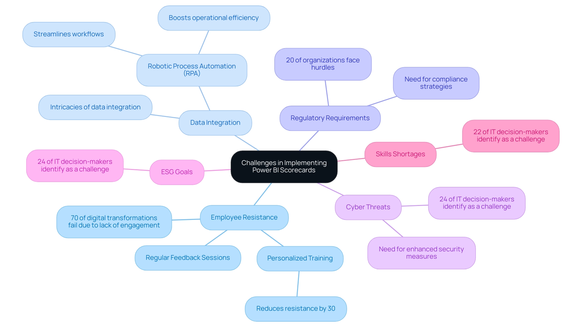
Implementing a Power BI scorecard example in 2025 presents formidable challenges for companies, particularly regarding employee resistance to change and the intricacies of data integration. Alarmingly, 70% of digital transformations fail due to inadequate employee engagement, underscoring the urgent need for effective change management strategies. Furthermore, 20% of organizations encounter hurdles stemming from regulatory requirements, complicating the transition process.
To overcome these obstacles, organizations must actively engage stakeholders throughout the implementation journey. This engagement can be significantly enhanced by providing personalized training and support, which has been demonstrated to reduce employee resistance by 30% within months, as evidenced by recent case studies.
Additionally, companies can mitigate repetitive tasks and staffing shortages by integrating Robotic Process Automation (RPA) solutions from Creatum GmbH, which streamline workflows and boost operational efficiency. Many employees express fatigue and frustration over repetitive tasks in their daily routines, and RPA can effectively alleviate this burden. Clear and consistent communication about the benefits of a Power BI scorecard—such as improved visibility into performance metrics and enhanced decision-making capabilities—can further foster buy-in from team members.
Moreover, addressing the multifaceted challenges highlighted by IT decision-makers, including cyber threats (24%), ESG goals (24%), and skills shortages (22%), is crucial for a successful transition to Power BI dashboards. Notably, Gartner reports that 74% of organizations plan to implement an Employee Experience Platform by 2025 to promote employee involvement and boost productivity. By proactively tackling these challenges and nurturing a culture of collaboration and support, organizations can unlock the full potential of performance metrics, enhancing efficiency and strategic insights while leveraging customized AI solutions and Business Intelligence for informed decision-making.
Finally, updating outdated systems is vital to ensure that organizations can fully capitalize on these advancements.
Strategic Benefits of Power BI Scorecards for Operational Efficiency
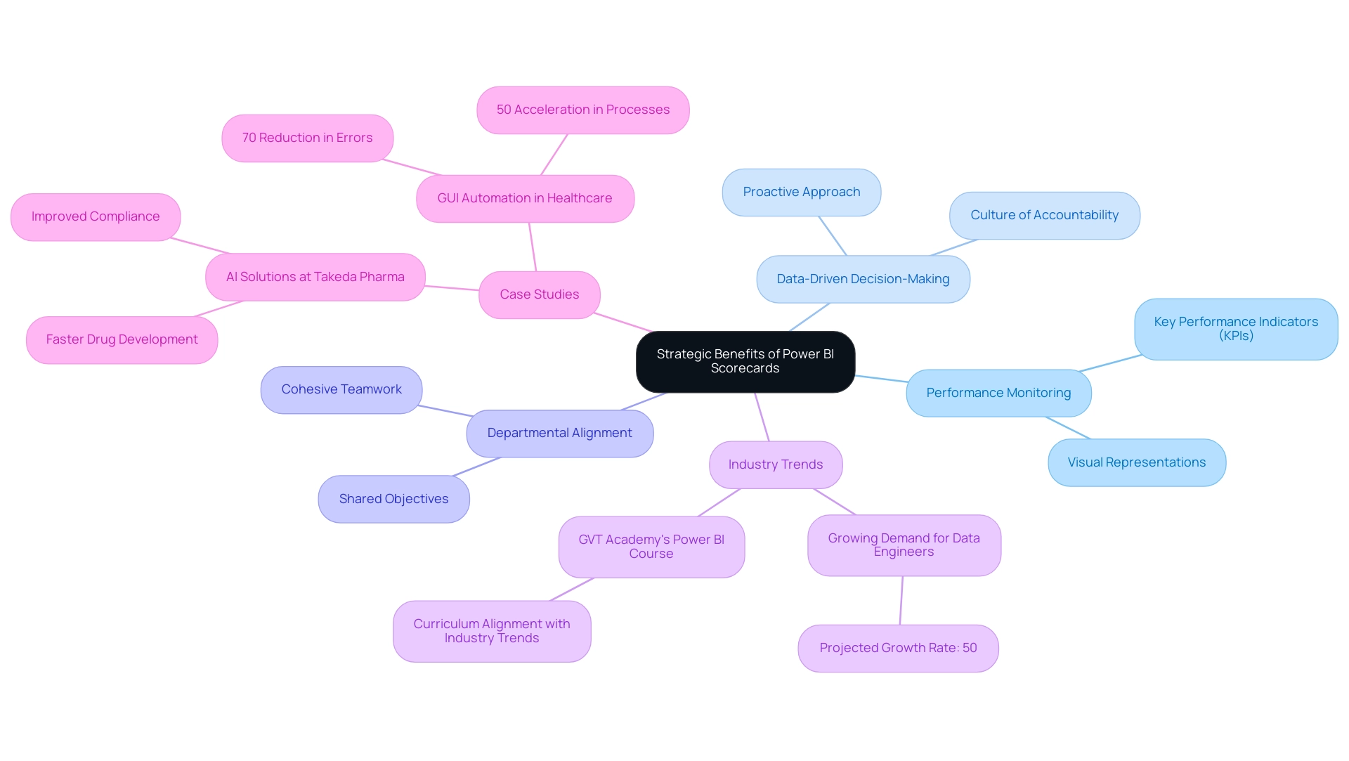
Power BI assessment tools offer significant strategic advantages that extend beyond mere performance monitoring; they are essential resources for enhancing operational efficiency. By delivering clear visual representations of key performance indicators (KPIs), these tools empower organizations to pinpoint areas needing improvement and facilitate data-driven decision-making. This proactive approach not only cultivates a culture of accountability but also encourages continuous enhancement across the organization.
Furthermore, performance metrics foster alignment among departments, ensuring that all teams work cohesively towards shared objectives. Consequently, organizations that effectively utilize BI scorecards can achieve greater agility, optimize resource allocation, and ultimately realize improved business outcomes.
Looking ahead to 2025, the demand for data engineers is projected to increase by 50% annually, underscoring the growing importance of data analytics in driving strategic initiatives. GVT Academy’s Power BI course is designed to align with the latest industry trends, offering a comprehensive curriculum that equips students for a career in data analytics. Real-world applications, such as the deployment of AI solutions at Takeda Pharma, exemplify how data-driven insights can refine business processes.
This case study demonstrated that the integration of advanced analytics not only accelerated drug development timelines but also enhanced compliance with regulatory standards, effectively addressing critical challenges in securing cloud data. Additionally, a case study involving a mid-sized healthcare company showcased how GUI automation significantly boosted efficiency by automating data entry and software testing, resulting in a 70% reduction in errors and a 50% acceleration in processes. Such instances, including a Power BI scorecard example, highlight the transformative impact of business intelligence dashboards on operational efficiency, fostering a data-driven culture that promotes informed decision-making and strategic growth.
Moreover, advancements such as the Fabric Monitoring Hub’s semantic model refresh detail page further enhance the capabilities of a Power BI scorecard example, enriching data management processes.
Conclusion
Power BI scorecards are transforming operational efficiency and strategic decision-making within organizations. By providing a centralized platform for tracking key performance indicators (KPIs), these tools empower teams to visualize performance in real-time and align actions with organizational objectives. The integration of Power BI with technologies like Robotic Process Automation (RPA) streamlines workflows, reduces manual errors, and enhances focus on strategic initiatives.
The effectiveness of scorecards relies on well-defined KPIs, which act as measurable indicators of success. Applications in sectors such as healthcare and retail demonstrate how Power BI scorecards can drive significant improvements in efficiency and resource allocation.
However, implementing these scorecards presents challenges, including employee resistance to change and complexities in data integration. Organizations can surmount these hurdles by fostering a collaborative culture and providing adequate training, thereby enhancing acceptance and facilitating smoother transitions.
In conclusion, the strategic benefits of Power BI scorecards extend beyond mere performance tracking. They foster a data-driven culture, promote accountability, and align departmental objectives, culminating in superior business outcomes. As the demand for data analytics escalates, leveraging tools like Power BI becomes essential for organizations aiming to thrive in a competitive landscape. Embracing these insights empowers informed decision-making and encourages continuous improvement, ultimately paving the way for operational excellence.
Overview
This article delves into the transformative potential of the Power BI KPI Matrix in enhancing operational efficiency for organizations. By providing a structured framework for tracking and analyzing key performance indicators (KPIs), it captures the attention of executives seeking to optimize their operations.
Effective KPI management, bolstered by the advanced features of Power BI and its integration with Robotic Process Automation (RPA), not only improves decision-making but also drives significant operational enhancements across various industries.
Real-world applications and case studies serve as compelling examples, illustrating the tangible benefits of this approach. As organizations strive for excellence, harnessing these insights can lead to remarkable improvements in performance and productivity.
Introduction
In today’s fast-paced business environment, the capacity to measure and manage performance effectively is paramount. Key Performance Indicators (KPIs) are indispensable tools that guide organizations in achieving their strategic objectives, providing critical insights into financial, operational, and strategic success. As businesses increasingly embrace data-driven methodologies, the integration of KPIs within platforms like Power BI has demonstrated a significant enhancement in decision-making and operational efficiency.
With technological advancements such as Robotic Process Automation (RPA) and cutting-edge visualization tools, organizations can now monitor their performance in real-time. This fosters a culture of continuous improvement and accountability. This article explores the essential aspects of KPIs within Power BI, examining their functionalities, best practices for implementation, and real-world applications that showcase their transformative impact across diverse industries.
Understanding Key Performance Indicators (KPIs) in Power BI
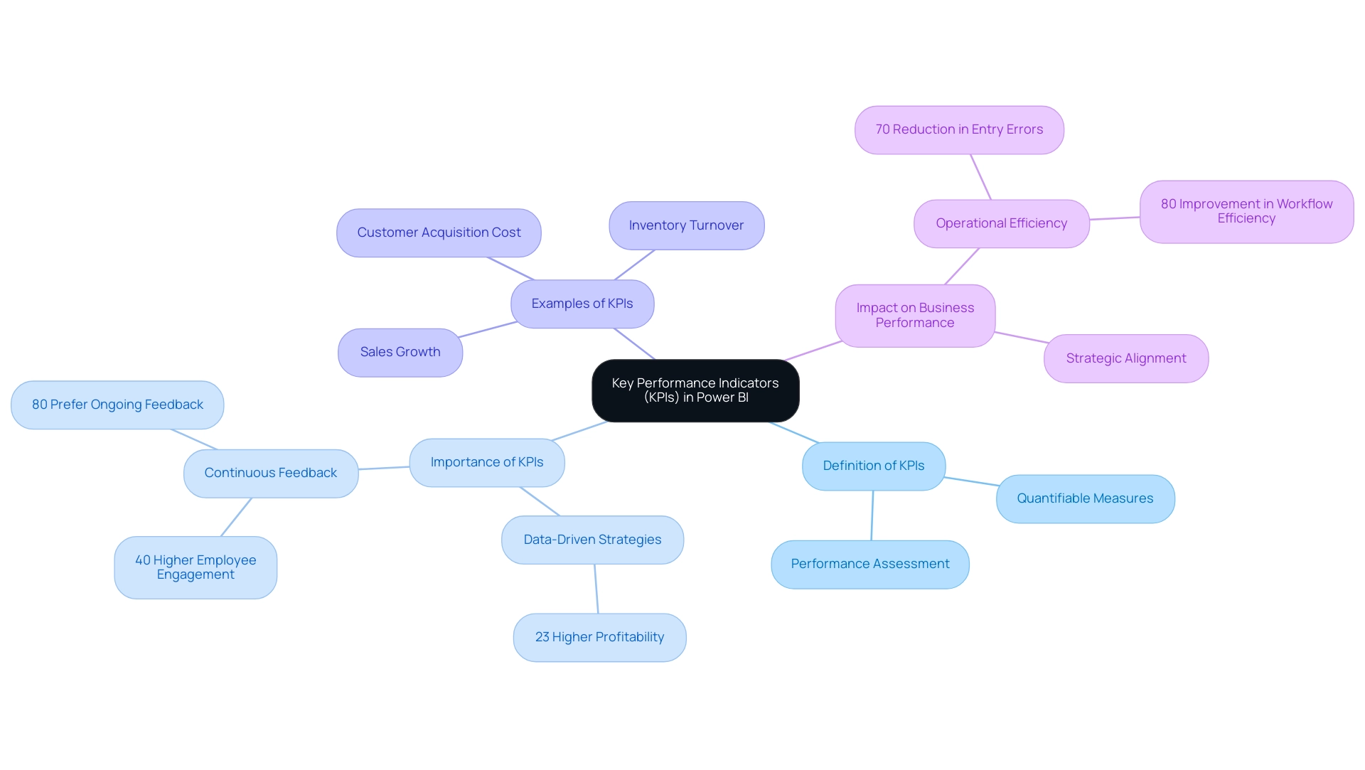
Key Performance Indicators (KPIs) are essential quantifiable measures that organizations leverage to assess their performance against defined objectives. Within the realm of business intelligence, the Power BI KPI matrix serves as visual markers that effectively convey progress toward these objectives, which encompass financial, operational, and strategic dimensions. Their significance in monitoring business processes cannot be overstated, particularly in 2025, where data-driven strategies have been shown to yield 23% higher profitability for companies that adopt them.
This profitability frequently results from effective KPI management, enabling organizations to make informed decisions based on real-time information insights. To maximize the utility of KPIs in Business Intelligence, organizations must define them with precision, ensuring they align closely with strategic objectives. This alignment is crucial for informed decision-making based on real-time data insights. For instance, a retail company may monitor KPIs such as:
- Sales growth
- Customer acquisition cost
- Inventory turnover
to evaluate its operational efficiency and profitability, complemented by advanced reporting tools and the innovative features of Microsoft Power Automate, including automated workflows and seamless integration with existing systems.
Moreover, the significance of performance indicators extends beyond mere tracking; they are pivotal in fostering a culture of continuous feedback. Organizations that embrace this approach have reported 40% higher employee engagement rates, underscoring the role of KPIs in enhancing workforce motivation and productivity. Notably, a PwC report indicates that 80% of employees now prefer ongoing feedback over traditional annual reviews, further emphasizing the need for effective KPI frameworks.
Recent advancements in Power BI have streamlined the implementation process of the KPI matrix, effectively addressing common challenges such as quality issues and employee resistance. In particular, utilizing AI solutions such as Small Language Models and GenAI Workshops can significantly enhance information quality and training, facilitating smoother KPI integration. The case study titled ‘Streamlining Operations with GUI Automation’ illustrates how a mid-sized company overcame challenges in KPI implementation through GUI automation, achieving a 70% reduction in entry errors and an 80% improvement in workflow efficiency.
Such measurable outcomes showcase how technology, including RPA solutions like EMMA RPA, which provides intelligent automation capabilities, and the 3-Day Sprint for rapid report creation, can enhance operational efficiency. As we progress through 2025, the trend toward real-time information visualization and continuous performance evaluation is becoming increasingly essential. Companies recognize that effective KPI management not only enhances operational efficiency but also supports strategic alignment across departments, ultimately leading to improved business outcomes.
Exploring the Power BI KPI Matrix: Features and Functionalities
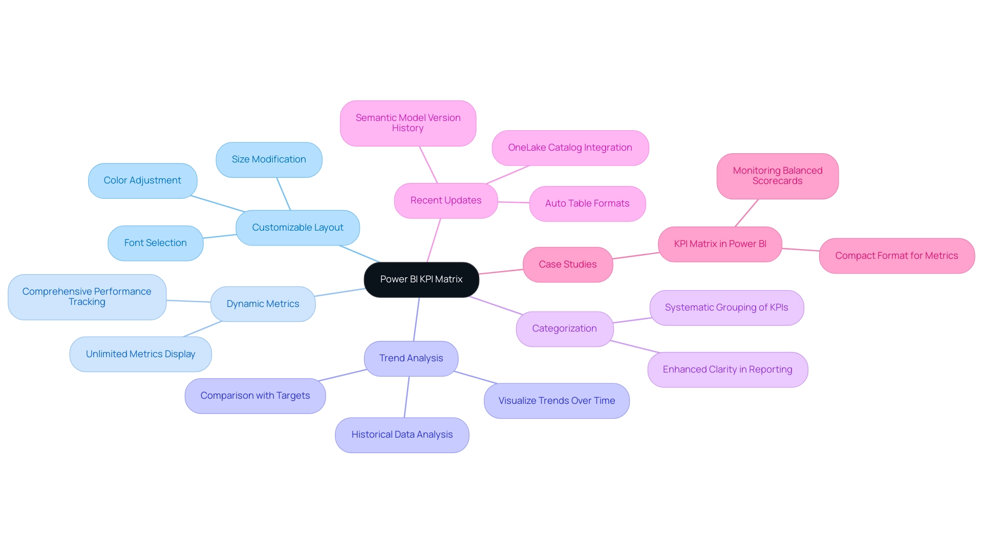
The Power BI KPI Matrix emerges as a formidable visualization tool, meticulously crafted to present multiple Key Performance Indicators in a cohesive and organized manner. Its key features include:
- Customizable Layout: Users possess the flexibility to personalize the matrix’s appearance, adjusting colors, fonts, and sizes to align with their reporting requirements.
- Dynamic Metrics: Capable of displaying an unlimited number of metrics, the matrix facilitates comprehensive performance tracking across various dimensions of the organization.
- Trend Analysis: This feature empowers users to visualize trends over time, allowing for comparisons between current performance, targets, and historical data—an essential component for informed decision-making.
- Categorization: Key performance indicators can be systematically grouped by categories, simplifying the analysis of related metrics and enhancing clarity in reporting.
Recent updates to the Power BI KPI Matrix have introduced functionalities such as auto table formats, which automatically adjust to reflect the current status of KPIs based on the ‘As of Date’ field. Furthermore, the integration of the OneLake catalog into BI Desktop has streamlined the data discovery process, making it easier for users to access relevant data and enhancing the overall functionality of the Power BI KPI Matrix.
Organizations leveraging the KPI Matrix, alongside our 3-Day BI Sprint and General Management App, have reported significant improvements in operational efficiency. For instance, a case study titled “KPI Matrix in BI” highlighted the development of the Power BI KPI Matrix to effectively monitor balanced scorecards and a diverse array of metrics in a compact format. This tool not only displays various metrics in a customizable list but also features unique elements like balanced scorecards and expandable categories, which enhance the overall user experience.
As of 2025, user adoption of the Power BI KPI Matrix has surged, underscoring its effectiveness in driving operational efficiency through improved information visualization and actionable insights. Notably, the public preview of semantic model version history allows users to recover from mistakes by restoring previous versions of their semantic models, further enhancing usability. By utilizing the Power BI KPI Matrix alongside our Robotic Process Automation solutions, which automate manual workflows, organizations can transform their analysis processes, leading to more strategic decision-making and enhanced performance outcomes.
As Patrick LeBlanc, Principal Program Manager, stated, “We highly value your feedback on this feature and encourage you to share it through our feedback form or the BI Community.
Step-by-Step Guide to Creating KPI Visuals in Power BI
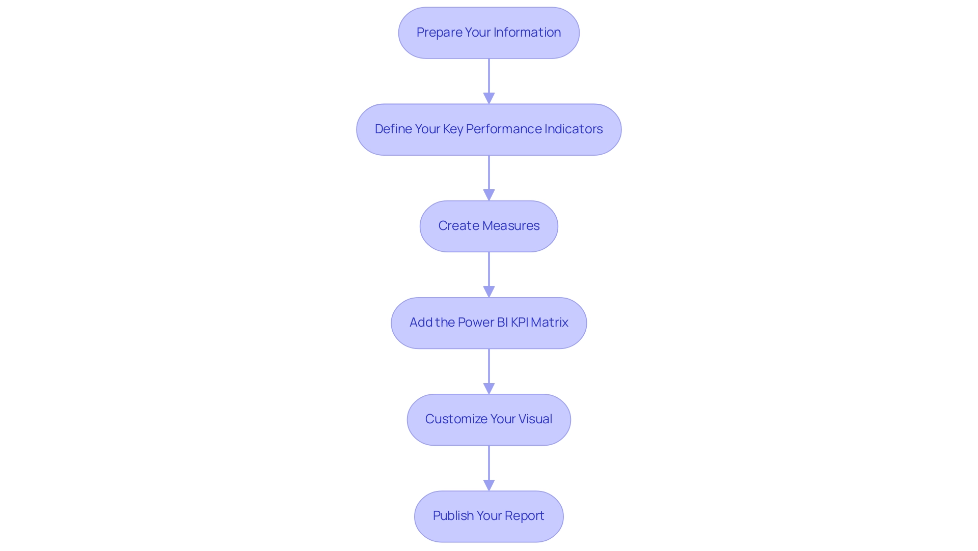
Developing a Power BI KPI matrix in Business Intelligence is a systematic process that enhances analytics and operational efficiency, particularly when leveraging Robotic Process Automation (RPA) to streamline manual workflows. Here’s a step-by-step guide to help you navigate this essential task:
-
Prepare Your Information: Begin by ensuring your information is clean and well-structured for analysis. Import your dataset into Power BI, as precise information is the foundation for effective KPI tracking. RPA can assist in this stage by automating data cleansing processes, minimizing human error, and ensuring timely data availability.
-
Define Your Key Performance Indicators: Clearly identify the key performance indicators you wish to monitor. Common examples include sales revenue, customer satisfaction scores, and operational costs. Align these key performance indicators in the Power BI KPI matrix with your business goals to ensure relevance and clarity, while also considering how automation can streamline tracking.
-
Create Measures: Utilize DAX (Data Analysis Expressions) to formulate measures that calculate the values for your KPIs. For instance, you can create a measure for total sales, which will serve as a critical metric in your analysis. RPA tools can automate the update of these measures based on real-time information feeds, significantly reducing the time spent on report generation and enhancing accuracy.
-
Add the Power BI KPI Matrix: In the BI report view, select the Power BI KPI matrix visual from the visualization pane. Drag your KPI measure into the ‘Value’ field and establish a target measure to provide context for performance evaluation. Understanding the key metrics: the Base Value is an average of metrics, the Target Value is the ideal goal, and the Status Threshold evaluates the range between the two is crucial for effective analysis.
-
Customize Your Visual: Enhance the readability of your visuals by adjusting formatting options. This involves changing colors, adding labels, and ensuring that the visual communicates information effectively. Utilizing color intelligently can help highlight performance status, making it easier for stakeholders to interpret the data.
-
Publish Your Report: After finalizing your visuals, publish your report to the Power BI service. This facilitates sharing and teamwork, allowing your group to access insights and make informed choices based on the information presented. RPA can further facilitate the distribution of reports to relevant stakeholders automatically, ensuring timely access to critical insights, especially through a Power BI KPI matrix.
By adhering to these steps, you can create impactful KPI visuals that not only monitor business performance but also drive strategic decision-making. Best practices suggest keeping dashboards simple and enabling drill-down features for deeper insights, which can significantly enhance the user experience. For instance, Walmart effectively visualizes inventory information to prevent stockouts and reduce overstock, showcasing the practical benefits of well-designed KPI dashboards.
In summary, creating effective KPI dashboards requires a structured approach to ensure clarity and relevance. This ultimately enables organizations to utilize their information for enhanced operational efficiency. Additionally, performance optimization techniques, as highlighted in the case study on Performance Optimization in BI, can enhance the overall user experience in BI, tackling challenges like time-consuming report creation and data inconsistencies.
By integrating RPA into this process, organizations can overcome the challenges posed by a lack of data-driven insights, ensuring that their KPI tracking is not only efficient but also actionable.
Best Practices for Effective KPI Reporting in Power BI
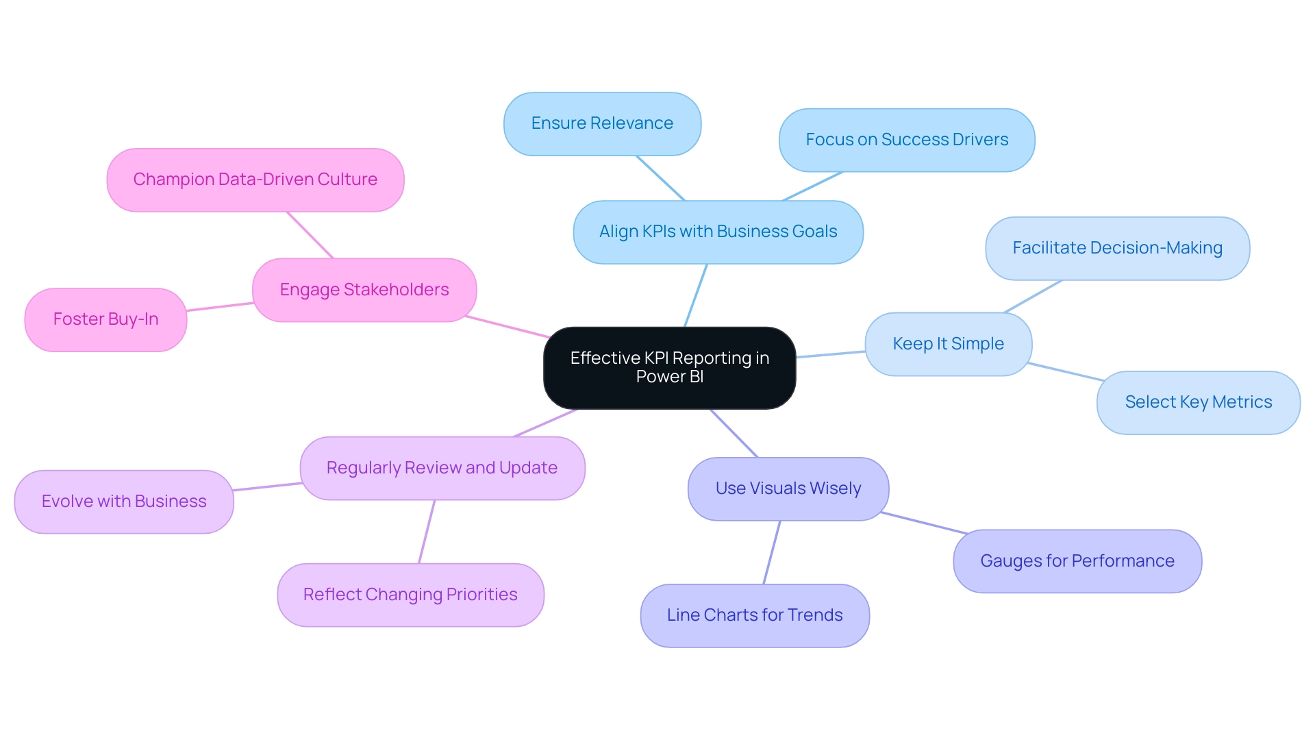
To achieve effective KPI reporting in Power BI, organizations must implement the following best practices:
- Align KPIs with Business Goals: It is essential that the KPIs tracked are directly aligned with the strategic objectives of the organization. This alignment guarantees that performance metrics are relevant and actionable, enabling teams to concentrate on what truly drives success.
- Keep It Simple: Avoid overwhelming reports with excessive key performance indicators. Focus on a select few key metrics that yield the most significant insights, facilitating clearer decision-making and strategic focus.
- Use Visuals Wisely: Choosing the appropriate visual representation for key performance indicators is crucial. For instance, gauges can effectively illustrate performance against targets, while line charts are ideal for displaying trends over time, making data interpretation intuitive.
- Regularly Review and Update: Key performance indicators should not be static; they must evolve alongside the business. Regular reviews and adjustments ensure that key performance indicators remain relevant and continue to reflect the organization’s changing priorities and market conditions.
- Engage Stakeholders: Involving key stakeholders in the KPI selection process fosters buy-in and ensures that the metrics chosen resonate with various departments. This engagement is vital for the successful implementation of KPI reporting. A cultural shift towards data-driven practices, championed by leadership, can empower teams to utilize performance indicators effectively, guiding strategic decisions and promoting overall business growth.
Additionally, organizations should consider the importance of accurate financial reporting in understanding performance metrics, as highlighted in the statistic from the Form 1099 P&L by class AICPA. The case study titled “Cultural Shift towards Data-Driven Decision Making” illustrates that organizations embracing this cultural shift can leverage KPIs to guide strategic decisions and drive overall business growth. As Chris Farr aptly stated, “Let the power of information propel your business to new heights,” emphasizing the critical role of information in achieving operational success.
Incorporating Robotic Process Automation (RPA) can further streamline the reporting process, addressing challenges such as time-consuming report creation and data inconsistencies. By automating repetitive tasks through solutions like EMMA RPA and Automate, organizations can enhance operational efficiency and focus on strategic, value-adding work. EMMA RPA provides revolutionary tools for operational efficiency, while Automate transforms operations with Microsoft’s automation solution, ensuring that reporting processes are not only faster but also more precise.
By adhering to these best practices, organizations can significantly enhance the effectiveness of their KPI reporting in Business Intelligence through the use of a Power BI KPI matrix, ultimately driving operational success and fostering a culture of data-driven decision-making.
Avoiding Common Pitfalls in Power BI KPI Implementation
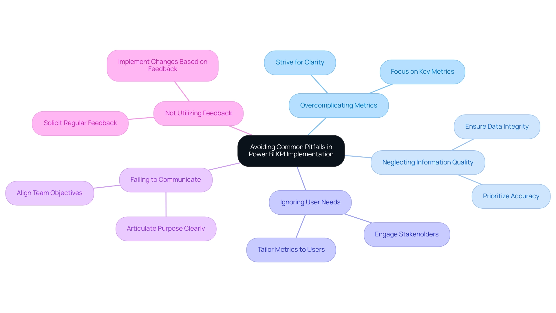
When implementing KPIs in Power BI, it is crucial to be aware of several common pitfalls that can undermine effectiveness:
- Overcomplicating Metrics: Strive for clarity by avoiding overly complex KPIs. Simplicity enhances understanding and usability, allowing teams to focus on what truly matters.
- Neglecting Information Quality: The accuracy and timeliness of the inputs feeding into your KPIs are paramount. Poor master information quality, characterized by inconsistencies, incompleteness, or inaccuracies, can distort insights and lead to misguided decisions. Organizations must prioritize data integrity to ensure reliable performance measurement, particularly as these challenges can hinder effective AI integration and operational efficiency.
- Ignoring User Needs: Performance indicators should be tailored to the specific needs of end-users. Engaging with stakeholders to identify the most relevant metrics fosters a sense of ownership and ensures that the key performance indicators drive meaningful action.
- Failing to Communicate: It is essential to clearly articulate the purpose and significance of key performance indicators to all stakeholders. Effective communication fosters engagement and helps align the team toward common objectives.
- Not Utilizing Feedback: Regularly soliciting feedback on KPI reports is vital. Being receptive to user feedback and ready to implement changes can greatly improve the relevance and impact of the performance indicators.
As Bernard Marr, a futurist and thought leader, states, “A well-designed set of performance indicators should provide a clear indication of current levels of performance and help your people make better decisions that bring the business closer to achieving its strategic objectives.” By steering clear of these pitfalls and addressing the barriers related to information quality and AI adoption, organizations can significantly improve the effectiveness of their implementation of the Power BI KPI matrix, ultimately driving better decision-making and operational efficiency.
Moreover, it is essential to identify frequent performance indicator management errors, such as establishing too many metrics, prioritizing quantity over quality, and neglecting accuracy. These mistakes can lead to ineffective KPI tracking and hinder organizational performance. Utilizing platforms like Spider Impact can help convert key performance indicators into actionable insights that drive growth and alignment by addressing data quality issues and facilitating AI integration.
Furthermore, a case study on the over-reliance on technology for KPI tracking highlights the need to balance digital tools with human insights. This balance is crucial for enhancing the effectiveness of KPI tracking and ensuring that qualitative aspects of performance measurement are not overlooked. Addressing apprehensions about AI adoption by demonstrating how AI can enhance KPI tracking processes may also alleviate concerns about the perceived complexity and cost associated with AI projects.
Aligning KPIs with Business Objectives for Operational Success
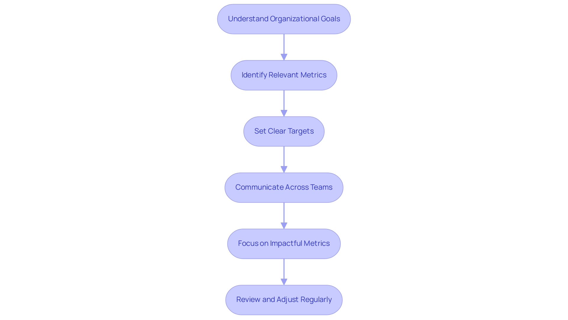
Aligning key performance indicators with business objectives through a Power BI KPI matrix is essential for achieving operational success. To ensure this alignment, consider the following key steps:
-
Understand Organizational Goals: Begin by clearly defining your organization’s strategic goals. This foundational understanding will guide the selection of relevant performance indicators that directly support these objectives.
-
Identify Relevant Metrics: Choose key performance indicators that accurately reflect your strategic goals. For example, if enhancing customer satisfaction is a priority, focus on metrics such as customer feedback scores and service response times.
-
Set Clear Targets: Establish specific, measurable targets for each KPI. Clear benchmarks not only provide direction but also enhance accountability across teams. Research indicates that organizations with well-defined response protocols for KPI deviations achieve 31% higher success rates in meeting performance targets.
-
Communicate Across Teams: Foster a culture of transparency by ensuring that all departments understand how their individual performance indicators contribute to the overarching business objectives. This unified approach enhances collaboration and drives collective performance.
-
Focus on Impactful Metrics: Concentrate on a handful of impactful metrics rather than tracking too many. This focus ensures that teams can dedicate their efforts to the most critical metrics that drive performance.
-
Review and Adjust Regularly: As business objectives evolve, so too should your performance indicators. Regular evaluations and modifications are essential for preserving alignment and guaranteeing that your performance indicators remain pertinent and impactful.
By applying these strategies, organizations can effectively align their performance metrics with business goals through a Power BI KPI matrix. Leveraging Robotic Process Automation (RPA) can further enhance this alignment by automating manual workflows and improving operational efficiency. RPA specifically addresses the challenges of manual, repetitive tasks by streamlining these processes, thereby reducing errors and freeing up valuable time for teams to focus on strategic initiatives. This not only supports informed strategic decision-making but also drives business growth in today’s rapidly evolving AI landscape.
For instance, a case study from a leading retail company demonstrated how implementing RPA for inventory management led to a 40% reduction in processing time and improved accuracy in stock levels. Spider Impact offers a platform for turning KPIs into actionable insights that drive growth and alignment. Case studies show that organizations adopting advanced monitoring systems and automated analytics transition from traditional reporting to continuous monitoring, enabling proactive issue resolution and improved responsiveness to performance changes.
This evolution enhances operational success and positions businesses to thrive in a dynamic environment. As Oliver Wight states, transforming business performance delivers sustainable benefits measured in hard cash, underscoring the importance of KPI alignment for operational success.
Real-World Applications of Power BI KPI Matrix in Operational Efficiency
Organizations across various sectors have effectively harnessed the Power BI KPI Matrix to significantly enhance operational efficiency, particularly when integrated with Robotic Process Automation (RPA) and Business Intelligence strategies. However, the implementation of these technologies often presents challenges, including resistance to change, integration with existing systems, and ensuring information quality.
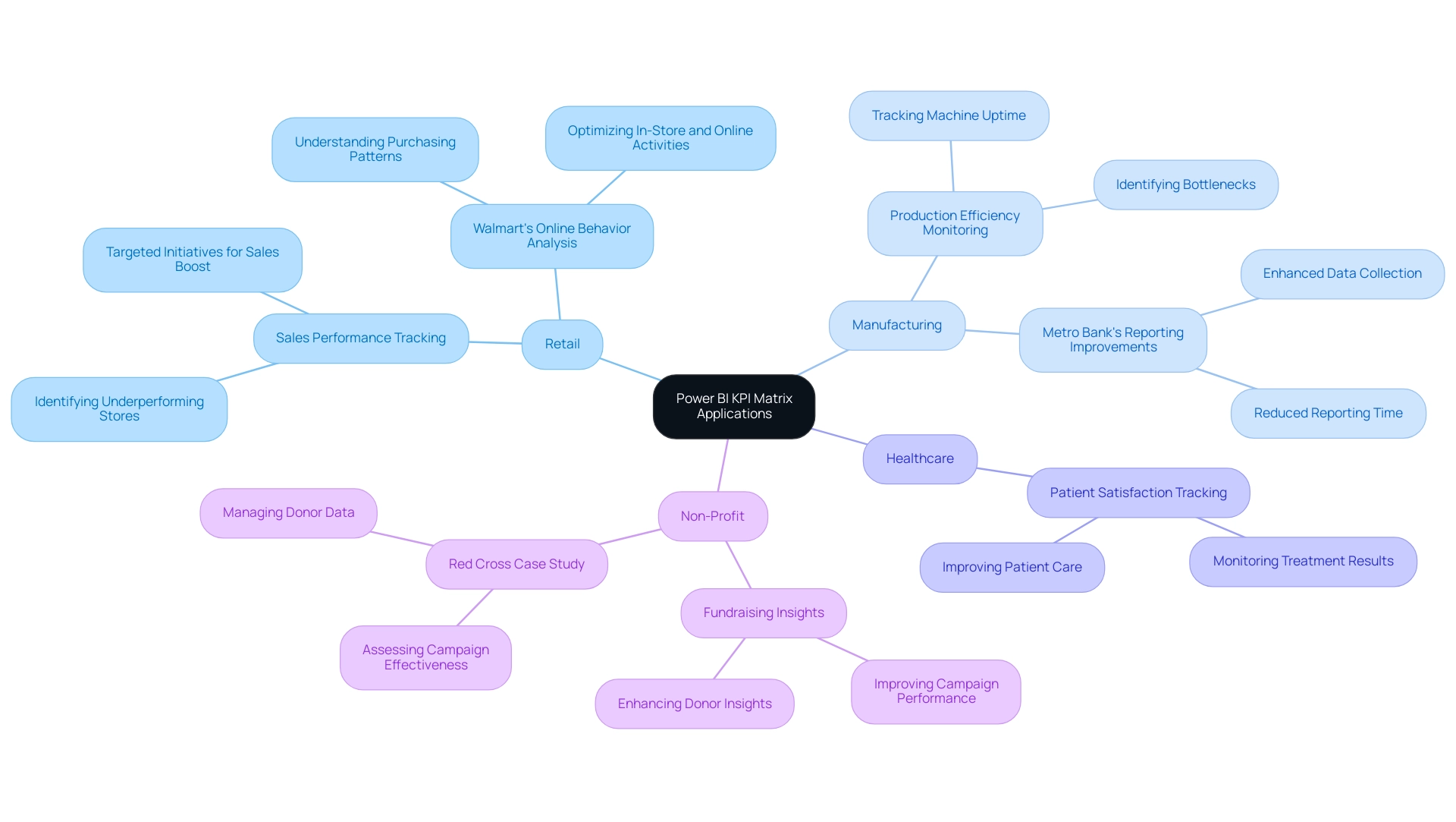
In the retail sector, a prominent retail chain meticulously tracked sales performance across its numerous locations using the Power BI KPI Matrix. This strategic approach enabled them to pinpoint underperforming stores, leading to the development of targeted initiatives that successfully boosted sales and improved overall profitability. This aligns with Walmart’s practice of analyzing online behavior to understand purchasing patterns, optimizing both in-store and online activities.
Similarly, in the manufacturing industry, a leading company adopted the Power BI KPI Matrix alongside RPA to closely monitor production efficiency. By tracking critical metrics such as machine uptime and production output, they identified bottlenecks and optimized operations, resulting in a marked reduction in downtime and an increase in overall productivity. This reflects advancements observed by Metro Bank, which improved information collection and reporting processes with BI, leading to enhanced accuracy and decreased reporting time.
The healthcare industry also benefits from the Power BI KPI Matrix, as demonstrated by a healthcare provider that utilized it to track patient satisfaction scores and treatment results. This data-driven approach not only enhanced patient care but also streamlined operational processes, ultimately leading to improved service delivery and patient experiences. Furthermore, the Red Cross employed the Power BI KPI Matrix to enhance fundraising insights, improving campaign performance and support effectiveness, showcasing its real-world impact.
Additionally, tailored AI solutions can complement RPA and BI efforts by providing predictive analytics and deeper insights, helping organizations navigate the complexities of data management and decision-making. These real-world applications highlight the versatility and effectiveness of the Power BI KPI Matrix in driving operational efficiency and facilitating informed decision-making across various industries, especially when combined with RPA and tailored AI solutions that address specific business challenges.
Conclusion
The exploration of Key Performance Indicators (KPIs) within Power BI underscores their essential role in enhancing organizational performance and strategic alignment. By concentrating on clearly defined, relevant metrics, businesses can effectively monitor their progress toward objectives, ensuring that data-driven insights lead to informed decision-making. The integration of technologies such as Robotic Process Automation (RPA) and advanced visualization tools streamlines KPI implementation, revolutionizing how organizations approach performance management.
Best practices for KPI reporting advocate for simplicity and alignment with business goals, empowering teams to focus on impactful metrics that drive success. Regularly reviewing and adapting these indicators is crucial for maintaining their relevance in a constantly evolving business landscape. Moreover, sidestepping common pitfalls—such as overcomplicating metrics or neglecting data quality—can significantly enhance the effectiveness of KPI tracking.
Real-world applications of the Power BI KPI Matrix illustrate its transformative impact across various industries, from retail to healthcare. By leveraging data visualization and automation, organizations not only improve operational efficiency but also cultivate a culture of continuous improvement and accountability. As companies increasingly embrace data-driven methodologies, the strategic use of KPIs remains vital for navigating the complexities of modern business and achieving sustainable growth.
Overview
This article examines the process of enabling the ‘Include in Report Refresh’ feature in Power BI, a crucial step for ensuring that specific data requests receive timely updates during report refresh operations. By activating this feature, organizations can significantly enhance both performance and accuracy, as it facilitates the efficient processing of critical data. Case studies support this claim, showcasing improved query performance and reduced refresh times when organizations prioritize this essential setting.
Are you currently leveraging this feature? Consider the benefits it can bring to your reporting processes. By focusing on enabling ‘Include in Report Refresh,’ you can optimize your data management strategies and ensure your reports reflect the most accurate and up-to-date information available.
Introduction
In the realm of data analytics, the imperative of ensuring reports reflect the most current information cannot be overstated; it is essential for informed decision-making. Power BI stands out with its robust framework for managing report refresh processes, empowering users to keep their insights timely and relevant. By delving into various types of refresh—manual, scheduled, and real-time—organizations can customize their approach to address specific needs effectively.
However, with great power comes great responsibility. A comprehensive understanding of features like ‘Include in Report Refresh’ is crucial for optimizing performance and maintaining data accuracy. This article explores the intricacies of report refresh in Power BI, providing practical guidance and best practices that equip users to navigate common challenges and enhance their reporting efficiency.
Understanding Report Refresh in Power BI
In BI, the procedure to include in report refresh is crucial for renewing your reports, ensuring they represent the most recent information from your sources. This process can be executed either manually or automatically, depending on your configuration. A comprehensive grasp of report updates is essential for providing precise insights, especially considering frequent obstacles like time-consuming report generation, inconsistencies in information, and a deficiency of actionable guidance.
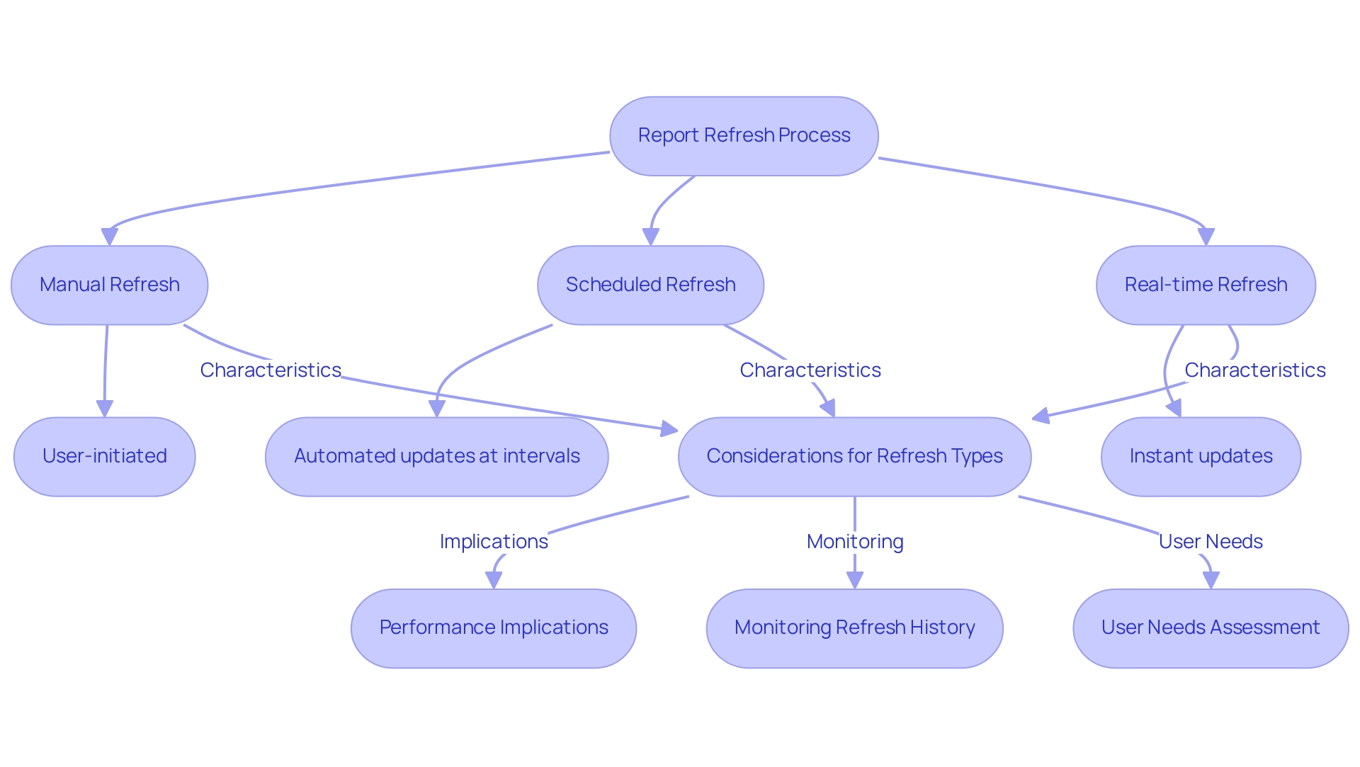
The types of refreshes available include:
- Manual Refresh: Initiated by the user through the Power BI interface, this type allows for immediate updates as needed, which can be crucial when timely data is required.
- Scheduled Refresh: This automated process occurs at predetermined intervals, ensuring that reports are consistently updated without requiring user intervention. Power BI can update dashboard tiles roughly every hour, making it a dependable choice for routine updates and reducing the chance of obsolete information.
- Real-time Refresh: This method updates information instantaneously, making it particularly suitable for dashboards that demand immediate visibility, addressing the need for comprehensive management and smart reviews offered by the General Management App.
Every update type carries unique implications for performance and information accuracy. For instance, a case study on optimizing Power BI update processes highlights the importance of choosing between Import mode and DirectQuery mode, as well as the role of query caching in enhancing update performance. It also emphasizes the need to limit the number of visuals on dashboards to improve efficiency.
Regularly monitoring refresh history and addressing any issues promptly is crucial for maintaining reliable refresh processes, as indicated by the case study findings.
The impact of manual versus scheduled refreshes is significant; while manual refreshes provide immediate updates, scheduled refreshes ensure a consistent flow of information. Understanding the specific needs of your users—such as how frequently they require updates and whether they need access to historical data—is critical in determining the best approach for your reporting strategy. Bruno Costa, a Solution Supplier, emphasizes, “You need to be more specific because you need to analyze the best approach: What will be the source/database for your information?”
The users will need to see the values updated by seconds? by minutes? by hours?
To enhance efficient reporting, consider our ‘3-Day BI Sprint,’ which enables quick creation of professionally designed reports tailored to your needs. By employing the appropriate update techniques and utilizing tools such as the General Management App, organizations can enhance their information management practices and drive informed decision-making, ultimately leading to actionable insights and improved operational efficiency.
What Does ‘Include in Report Refresh’ Mean?
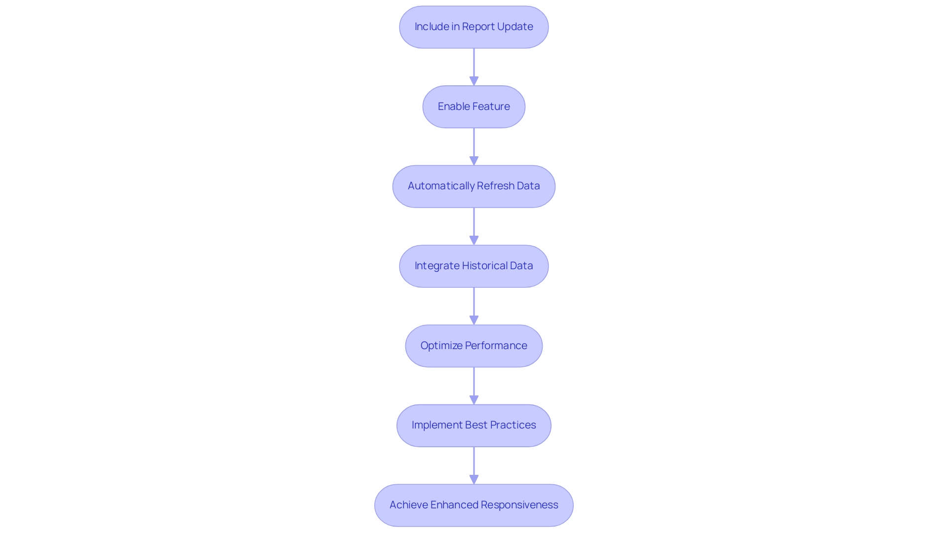
Include in Report Update’ is an essential option in BI, determining whether a specific request will be updated during report modifications. When enabled, this feature ensures that the request automatically refreshes its information upon pressing the ‘Refresh’ button in Power BI, encompassing both immediate report refreshes and scheduled updates. This capability is vital for efficiently managing information loads, allowing only critical data to be processed during update operations, thus enhancing overall operational effectiveness.
This feature stands apart from the ‘Enable Load’ option, which dictates if the results are incorporated into the information model. Recognizing the difference between these two settings is crucial for optimizing report performance. For instance, enabling ‘power bi include in report refresh’ can significantly boost request performance by preserving older information that can seamlessly integrate with new requests, eliminating the need to retrieve data from the source repeatedly.
As noted by Denis Davydov, this characteristic is pivotal in keeping historical data accessible for smooth integration with other inquiries, reducing the necessity for repeated data extraction from the source during updates.
Statistics indicate that organizations prioritizing the ‘Include in Report Update’ feature experience enhanced query performance, with shorter update durations observed across various case studies. For example, one organization successfully reduced long refresh times by optimizing their information flows, leading to marked improvements in the responsiveness of their management processes. By implementing best practices such as scheduling refreshes during low-traffic hours and optimizing semantic models for efficiency, companies can further elevate their reporting effectiveness.
In conjunction with BI, employing Robotic Process Automation (RPA) tools like EMMA RPA and Automate can further streamline information management processes. These automation tools enhance BI functionalities by automating repetitive tasks, thereby increasing efficiency and minimizing the potential for human error in data handling. Insights from information analysts underscore the necessity of effectively managing information loads in BI, advocating for the ‘power bi include in report refresh’ feature to strike a balance between accuracy and performance.
This approach ensures that reports remain timely and relevant, which is essential for fostering data-driven insights that propel business growth and innovation. As organizations increasingly embrace automation software for streamlined workflows, the importance of this feature in sustaining robust analytics cannot be overstated. Moreover, neglecting to leverage BI effectively can place businesses at a competitive disadvantage, highlighting the urgency of adopting these technologies for optimal data management.
Step-by-Step Guide to Enable ‘Include in Report Refresh’
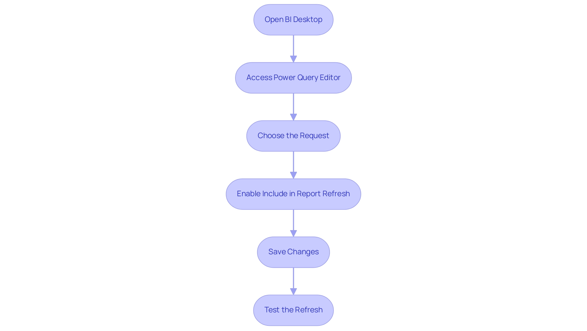
To enable the ‘Include in Report Refresh’ feature in Power BI, follow these essential steps:
- Open BI Desktop: Launch BI Desktop and access the specific report you wish to modify.
- Access Power Query Editor: Click on the ‘Transform Data’ button to enter the Power Query Editor, where you can manage your data requests effectively.
- Choose the Request: In the Queries panel on the left, identify and select the request you plan to alter for the report update.
- Enable Include in Report Refresh: In the properties pane on the right side, locate the ‘Include in Report Refresh’ option. Check the box next to it to activate this feature, ensuring the request is included in the Power BI report refresh.
- Save Changes: After making your selection, click ‘Close & Apply’ to save your changes and return to the main Power BI interface.
- Test the Refresh: Finally, click the ‘Refresh’ button located on the Home tab to verify that the data refreshes correctly, confirming that your settings are functioning as intended.
By following these steps, you can effectively manage which queries Power BI includes in the report refresh process. This optimization not only enhances performance but also improves information accuracy, crucial for organizations leveraging BI for informed decision-making. In today’s information-rich environment, mastering these functionalities can help overcome challenges such as time-consuming report creation and inconsistencies, ensuring your organization remains competitive.
As Patrick LeBlanc, Principal Program Manager, emphasizes, “We highly value your feedback, so please share your thoughts using the feedback forum,” encouraging users to engage actively with the platform.
Moreover, integrating RPA solutions such as EMMA RPA and Automate can further streamline these processes, automating repetitive tasks and enhancing overall operational efficiency. Additionally, with the incorporation of the OneLake catalog into BI Desktop, users can enjoy a seamless information exploration experience, further improving their reporting capabilities. The recent case study on the Semantic Model Refresh Monitoring Hub illustrates how users can troubleshoot and optimize their refresh processes, providing a practical example of the benefits of mastering these functionalities.
As user adoption rates for BI features continue to rise in 2025, mastering these functionalities will empower teams to extract maximum value from their information.
Troubleshooting Common Refresh Issues in Power BI
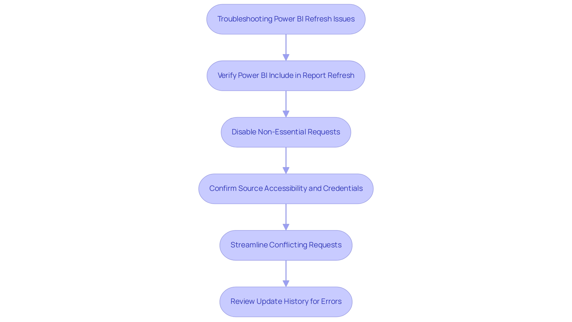
The challenges associated with the Power BI report refresh feature are particularly pronounced in contexts of poor master information quality and the overwhelming AI landscape that many organizations encounter. To effectively troubleshoot these issues, consider the following strategies:
-
Query Not Refreshing: Verify that the ‘power bi include in report refresh’ option is activated in the Power Query Editor. This step is crucial for ensuring that the request updates as intended, especially when aligning with tailored AI solutions that enhance data accuracy.
-
Performance Issues: If refresh durations are excessively long, it may be beneficial to disable ‘power bi include in report refresh’ for non-essential requests. The recent Treemap visual update introduces new spacing options that enhance readability and appearance, thereby improving user experience during refreshes. Disabling non-essential queries can significantly enhance overall performance and reduce wait times, contributing to operational efficiency.
-
Source Errors: Confirm that the source is accessible and that the credentials are current. If there have been changes to the information source, it is essential to update the connection settings to maintain functionality. While Power BI boasts strong security features, it has limitations that can raise concerns when utilizing external information sources, as highlighted in discussions on information security.
-
Conflicting Requests: When multiple requests reference the same data source, optimization is key. Streamlining these queries can prevent conflicts during the update process, which can lead to errors. As kcantor, a Community Champion, suggests, establishing a shared email address for communication can help tackle collaboration challenges that may arise during the update process, ensuring a smoother integration of AI solutions.
-
Update Failures: Review the update history in the Power BI service for any error messages, which can provide valuable insights into underlying issues. Address any identified issues before attempting another update.
By implementing these troubleshooting techniques and leveraging insights from Business Intelligence, along with tailored AI solutions, users can effectively navigate and resolve common update challenges, ensuring that their reports remain both accurate and timely. Statistics indicate that by 2025, a significant percentage of users will encounter reloading issues, underscoring the importance of these strategies in maintaining operational efficiency and harnessing data-driven insights.
Best Practices for Efficient Report Refresh in Power BI
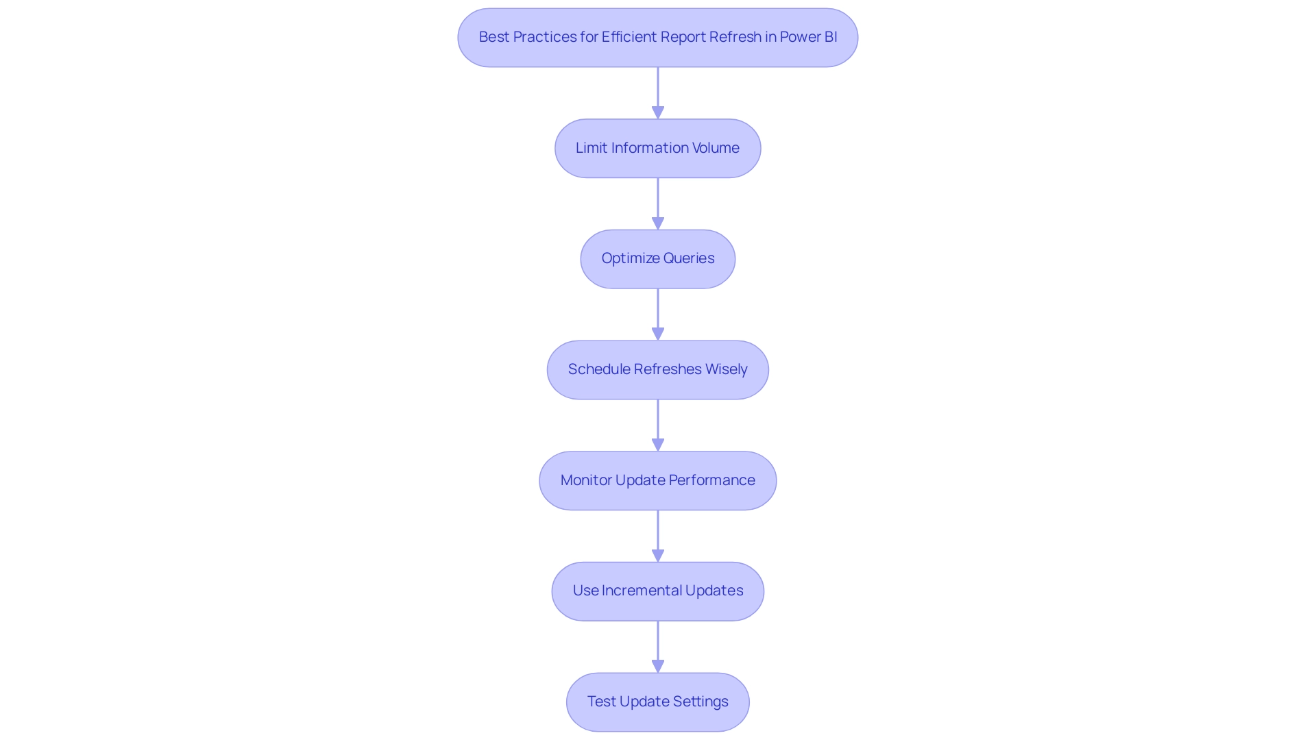
To achieve optimal report refresh efficiency in Power BI, implementing best practices is essential:
-
Limit Information Volume: Concentrate on incorporating solely the essential details in your requests. This method considerably shortens processing time during update tasks, which is crucial considering the growing information volumes organizations encounter in 2025.
-
Optimize Queries: Leverage query folding whenever possible. By pushing transformations back to the data source, you reduce the amount of data transferred, thereby improving update speed and efficiency.
-
Schedule Refreshes Wisely: Configure scheduled refreshes during off-peak hours. This strategy mitigates the impact on system performance, ensuring that resources are available for other critical operations.
-
Monitor Update Performance: Regularly evaluate update times and analyze performance metrics. Ongoing monitoring allows for timely adjustments to queries, maintaining optimal performance levels.
-
Use Incremental Updates: For extensive datasets, consider implementing incremental updates. This technique updates only the data that has changed, rather than renewing the entire dataset, which can drastically enhance update times.
-
Test Update Settings: Conduct routine tests of your update settings to confirm they are functioning correctly. Regular adjustments based on these tests can prevent potential issues and ensure a smooth refresh process.
In 2025, the incorporation of the OneLake catalog into BI Desktop has further simplified information discovery, enhancing the overall user experience. Additionally, the recent introduction of semantic model version history allows users to recover from mistakes when editing models, instilling confidence in managing their semantic models. A recent instance highlighted that BI succeeded in refreshing data only after three previous failures, underscoring the importance of these best practices in overcoming challenges.
Patrick LeBlanc, Principal Program Manager, emphasizes, “We highly value your feedback, so please share your thoughts using the feedback forum,” which underscores the role of user input in optimizing BI processes.
Furthermore, users should be aware of potential circular dependency errors that can occur during model updates. Utilizing Tabular Editor can be crucial for resolving these issues effectively. By adhering to these best practices, organizations can significantly enhance the efficiency of their report refresh processes, ensuring that Power BI includes in report refresh leads to improved performance and more reliable reporting outcomes.
The integration of Business Intelligence and RPA solutions, such as EMMA RPA and Power Automate, can further drive data-driven insights, enabling informed decision-making that propels business growth and innovation. Book a free consultation to explore how our RPA solutions can transform your data management processes.
Conclusion
Ensuring that reports in Power BI are refreshed accurately and efficiently is critical for organizations seeking to leverage data for informed decision-making. This article outlines the various types of report refresh—manual, scheduled, and real-time—each offering unique advantages tailored to different organizational needs. Understanding the significance of features like ‘Include in Report Refresh’ not only optimizes performance but also enhances data accuracy, allowing businesses to maintain a competitive edge in today’s data-driven landscape.
The step-by-step guide illustrates the ease with which users can enable essential features, while troubleshooting strategies equip them to tackle common challenges that may arise during the refresh process. Best practices such as limiting data volume, optimizing queries, and scheduling refreshes wisely further bolster the efficiency of report management, ensuring timely and relevant insights.
In conclusion, mastering the intricacies of report refresh in Power BI is paramount for any organization aiming to harness the power of its data effectively. By implementing the strategies discussed, organizations can enhance their reporting capabilities, ultimately driving actionable insights that foster growth and innovation. This commitment to optimizing data management processes will not only improve operational efficiency but also empower teams to make data-driven decisions with confidence.
Overview
Power BI Embedded serves developers aiming to integrate robust business intelligence features into their applications. This solution is cost-effective for external users, eliminating the need for individual licenses. In contrast, Power BI Premium is tailored for larger organizations that require advanced analytics and dedicated resources for extensive data processing.
This article highlights how BI Embedded emphasizes seamless integration and user engagement, while BI Premium enhances performance with larger data models and enterprise-wide sharing capabilities. Organizations must choose between these options based on their specific operational needs.
Introduction
In the rapidly evolving landscape of data analytics, selecting the appropriate tool is crucial for enhancing an organization’s operational efficiency and decision-making capabilities. Power BI presents two distinct solutions—Power BI Embedded and Power BI Premium—each designed to address different business requirements.
- Power BI Embedded empowers developers to seamlessly integrate analytics into applications,
- Power BI Premium serves larger organizations seeking advanced analytics features and robust data processing capabilities.
As businesses navigate the complexities of data management, comprehending the nuances between these solutions is vital for unlocking the full potential of their data and driving strategic growth. This article explores the key differences, features, pricing models, and use cases of Power BI Embedded and Premium, providing organizations with the insights necessary to make informed decisions in their analytics journey.
Understanding Power BI Embedded and Premium: Key Differences
BI Embedded is specifically designed for developers focused on integrating BI reports and dashboards directly into their applications. This approach ensures a seamless user experience, allowing end-users to access insights without the need for a BI license. However, businesses often face challenges in leveraging insights from BI dashboards, including prolonged report creation times and data inconsistencies.
In contrast, BI Premium caters to organizations that require advanced analytics features and dedicated resources for extensive data processing. Premium not only boosts performance but also supports larger data models and facilitates report sharing across the organization without requiring individual licenses for each user. As Isaac Chavarria, a Solution Specialist, articulates, ‘BI Embedded is a service provided for embedding BI reports and dashboards into custom applications, websites, and portals.’
This solution primarily targets ISVs and developers, presenting a cost-effective option for organizations that need to provide access to BI content for a significant number of users who do not require the full suite of BI features. Understanding this distinction in target audience and functionality is essential, as organizations must assess their specific needs. For example, a case study titled ‘Choosing Between BI Pro and Premium’ illustrates that smaller teams may find BI Pro sufficient, while larger organizations gain substantial advantages from the comprehensive features of Premium. Additionally, traditional BI tools can incur costs ranging from $1,000 to $120,000 monthly for embedding analytics, positioning BI Embedded as a budget-friendly alternative for those focused on integrating analytics into custom applications.
Moreover, the case study ‘Unify Your Data Estate’ demonstrates how BI can convert raw data into actionable insights, underscoring the value of BI solutions. By 2025, the market share of BI Embedded continues to rise, highlighting its appeal among developers and businesses seeking effective embedding solutions. Conversely, BI Premium remains the preferred choice for enterprises pursuing robust data analysis capabilities.
Understanding these critical differences, along with the challenges of report generation and the cost advantages of Power BI Embedded versus Premium, is vital for organizations to make informed decisions that align with their operational goals. This is particularly important in a landscape where RPA and Business Intelligence are essential for driving efficiencies and insights.
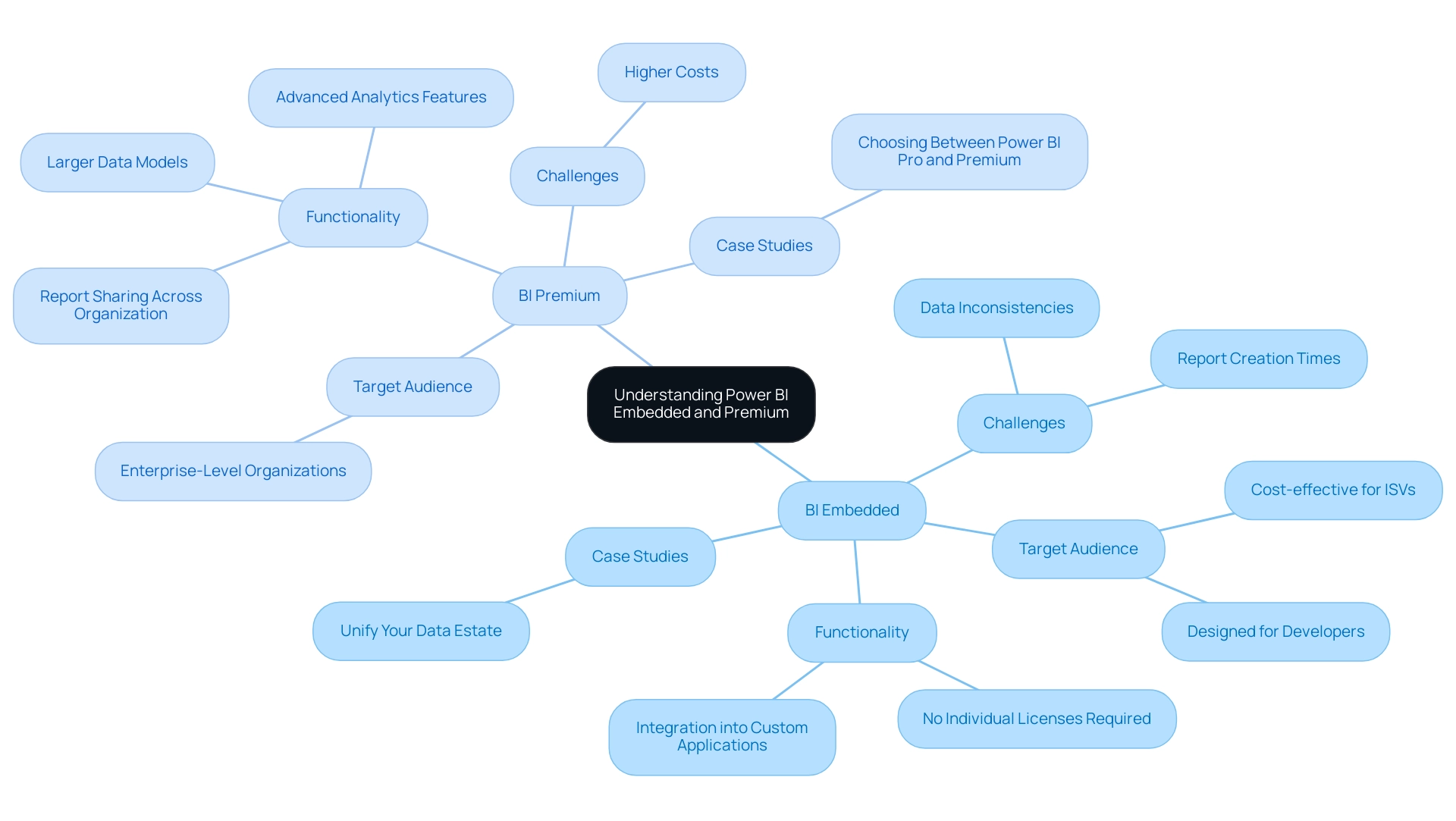
Exploring the Features of Power BI Embedded
BI Embedded distinguishes itself with a collection of vital features designed to enhance application performance through sophisticated analysis, all while improving reporting and providing actionable insights. A primary advantage is the ability to seamlessly embed interactive reports and dashboards directly into applications, offering users a dynamic and engaging experience. This integration is further enhanced by customizable user interfaces, allowing entities to adapt data presentation to their specific branding and user requirements, significantly boosting user engagement and satisfaction.
The 3-Day BI Sprint enables entities to swiftly generate professionally designed reports, streamlining the reporting process and enhancing data visibility. Additionally, the General Management App offers comprehensive management and smart reviews, further supporting effective decision-making. In 2025, Power BI Embedded continues to provide a flexible pricing model based on usage, making it accessible for organizations of all sizes. This adaptability is essential as businesses strive to optimize operational expenses while leveraging powerful data analysis tools.
Moreover, the platform supports real-time data updates, allowing users to interact with live data without manual refreshes. This feature is particularly advantageous in fast-paced environments where prompt decision-making is crucial.
Strong API support is another hallmark of BI Embedded, enabling developers to create tailored data experiences that meet specific business needs. This level of customization not only enhances user involvement but also ensures that data insights are fully integrated into the organization’s workflow.
As organizations increasingly recognize the importance of data-driven decision-making, the adoption of BI Embedded is on the rise. Statistics indicate that 80% of decisions are made using the top 20% of available information, underscoring the necessity of effective data visualization and analysis tools. By integrating BI, companies can transform their applications into robust decision-making platforms, ultimately fostering growth and innovation in their operations.
In contrast to other solutions, such as Tableau’s embedded data analysis, Power BI Embedded stands out by offering a comprehensive set of features without the constraints of version control that can hinder scalability. While Tableau’s solution excels in interactive data analysis, it lacks Git-based version control, presenting challenges for engineering teams managing dashboards at scale. This positions BI Embedded as a premier choice for companies seeking to enhance their applications with advanced analytical capabilities.
As Paul Turley, Microsoft Data Platform MVP, aptly states, ‘Using the building analogy, a data platform can take on many forms, like a single-story cottage, a sprawling university campus, or a towering skyscraper.’ This flexibility is evident in BI Embedded’s ability to adapt to diverse business requirements.
To optimize BI performance, users should streamline measures, avoid excessive aggregations, and refine relationships for quicker DAX query execution, ensuring they maximize their analytical capabilities. Additionally, integrating RPA solutions, such as EMMA RPA, can further automate repetitive tasks, enhancing efficiency and overcoming outdated systems, thereby supporting operational excellence. For entities interested in exploring these solutions further, we encourage you to book a free consultation to discuss how our services can meet your specific needs.
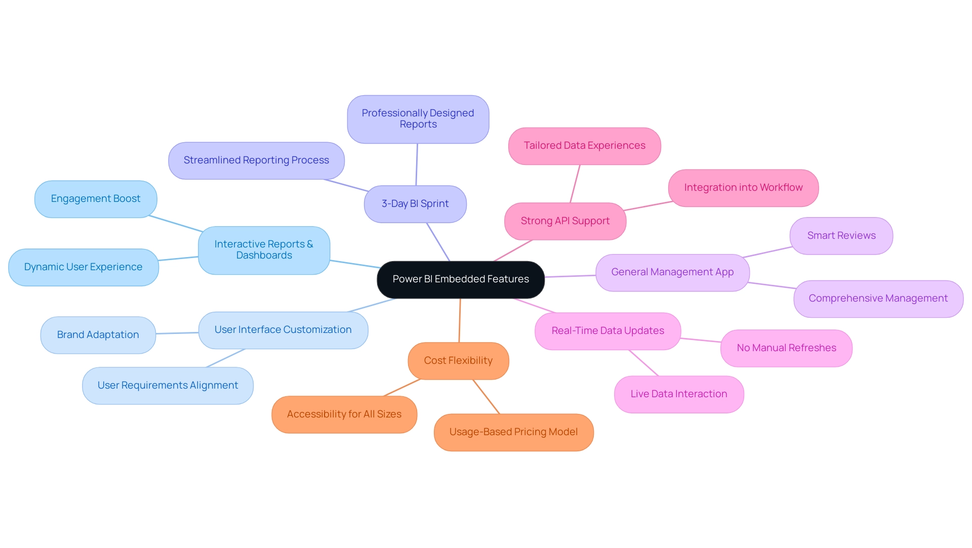
Unpacking the Features of Power BI Premium
Power BI Premium presents a comprehensive suite of advanced features designed to meet the demands of modern analytics while enhancing operational efficiency. By utilizing dedicated cloud resources, organizations can leverage larger model sizes, accommodating up to 400 GB—an essential capability for managing extensive data collections. This feature is further supported by improved performance for complex queries, enabling users to extract insights quickly and effectively.
Notably, the P3 SKU offers 32 v-cores for processing, significantly boosting performance capabilities.
Among its standout features are paginated reports and AI-driven insights, which facilitate deeper analysis and reporting capabilities. Additionally, Power BI Premium allows organizations to share content seamlessly across the enterprise without the necessity for individual licenses for each user, thereby significantly reducing administrative overhead. It is advisable for entities to upgrade to the 64-bit edition of Power BI Desktop, as the 32-bit edition will no longer be supported after June 30, 2025.
The platform also supports advanced information refresh capabilities, ensuring users have access to the most current data for informed decision-making. Coupled with a heightened level of security and compliance, Power BI Premium is particularly well-suited for enterprise-level applications where information integrity and protection are paramount.
Organizations leveraging Power BI Premium have reported substantial enhancements in their analytics capabilities, empowering them to make informed decisions based on comprehensive insights. Understanding the licensing and subscription processes for Power BI Embedded versus Premium can aid entities in effectively implementing the platform, whether through per-user or per-capacity licensing options.
As companies continue to navigate the complexities of information management, the advanced features of Power BI Premium emerge as a vital asset for driving operational efficiency and strategic growth. Patrick LeBlanc, Principal Program Manager, emphasizes, ‘We highly value your feedback on this feature and encourage you to share it through our feedback form or the BI Community.’ Recent enhancements, such as support for conditional formatting for visual calculations, further enrich the user experience, making Power BI Premium an even more attractive option for enterprises seeking to optimize their analytics capabilities.
Moreover, the integration of customized AI solutions, including Small Language Models and GenAI Workshops, can significantly enhance data quality and equip organizations with the necessary tools to tackle challenges like inadequate master data quality, ultimately leading to improved decision-making and operational effectiveness.
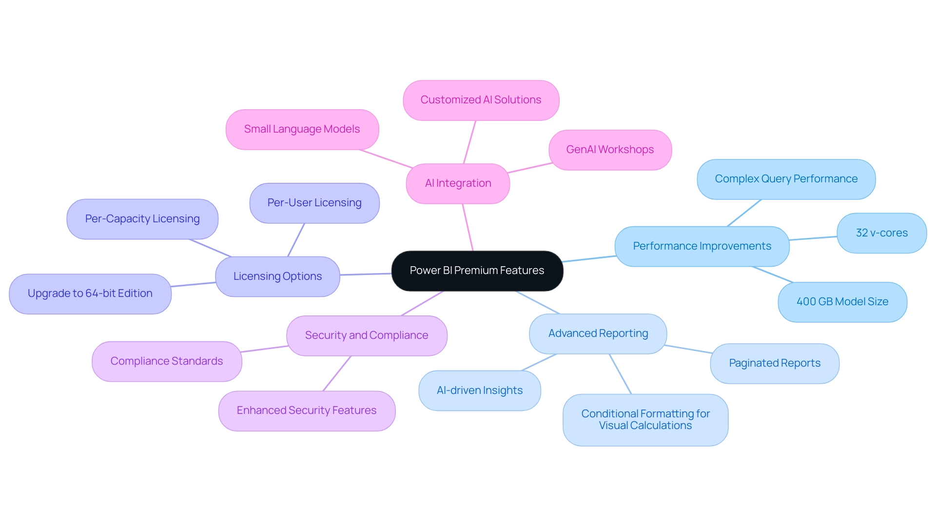
Comparative Pricing: Power BI Embedded vs. Premium
BI Embedded employs a consumption-based pricing model, where expenses are determined by the number of nodes and overall usage. This flexible approach positions it as an ideal choice for businesses with varying data needs, particularly as they face challenges such as time-consuming report creation and data inconsistencies that can impede actionable insights. Conversely, Power BI Premium operates on a capacity-based pricing model, delivering a more predictable cost structure for organizations requiring regular access to advanced data evaluation features.
As we approach 2025, a projected rise in BI Premium pricing may prompt organizations to reassess their long-term data strategies in light of operational efficiency objectives. Notably, Metabase’s enterprise pricing begins at $15,000 annually, providing a comparative perspective on pricing models within the data analysis landscape. Furthermore, the forthcoming features and enhancements for BI, set to be unveiled at Microsoft Ignite from November 19 through 21, 2024, underscore the ongoing evolution of BI and its implications for pricing and value.
Understanding these pricing models is essential for organizations aiming to make informed financial decisions, especially in a context where effectively managing data costs is critical. As Rogan Sage, an embedded data author, notes, “You have to pay per user when distributing dashboards, even when the users are only readers,” emphasizing the cost implications of BI Embedded. Additionally, Luzmo, formerly Cumul.io, offers integrated data insights with pricing options starting at $950 per month, further contextualizing competitive pricing strategies in the embedded data insights market.
The decision between Power BI Embedded and Premium not only influences budget considerations but also significantly shapes the overall data strategy and operational efficiency.
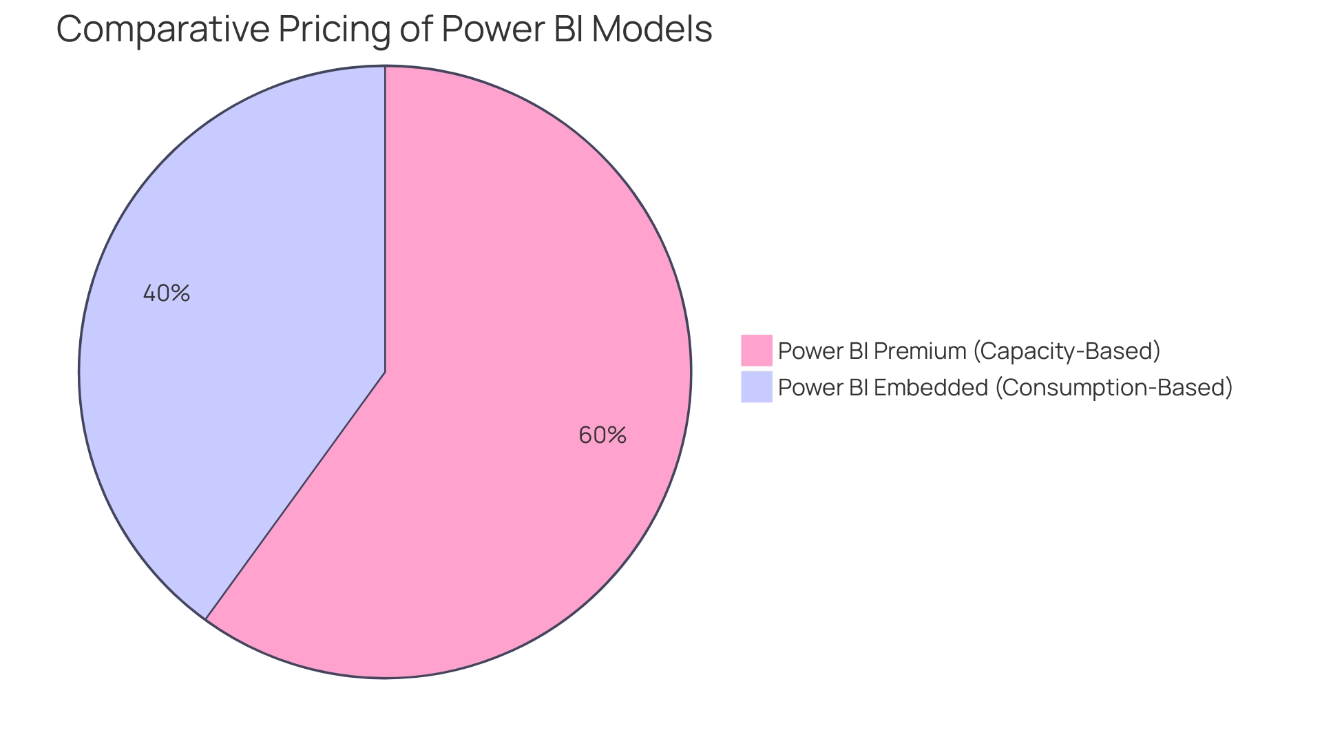
Use Cases: When to Choose Power BI Embedded or Premium
The tool Embedded is particularly advantageous for companies aiming to integrate data analysis features directly into their applications. This is especially relevant for SaaS providers seeking to enhance their product offerings with embedded data insights, thereby delivering a seamless user experience. By leveraging BI Embedded, organizations can adopt a cost-effective solution that caters to external users without necessitating separate licenses, thus optimizing resource allocation.
Conversely, BI Premium is designed for larger enterprises managing substantial information workloads and requiring advanced analytics capabilities. This solution facilitates the dissemination of insights across the organization without licensing constraints, making it ideal for enterprises that prioritize thorough information analysis and collaborative efforts.
In 2025, recognizing these distinct use cases is essential for organizations to select the most suitable solution tailored to their operational requirements. For instance, organizations utilizing BI Embedded can benefit from its ability to visualize complex information from Excel tables, which enhances engagement and simplifies web embedding. As industry expert Rogan Sage observed, BI was the ‘Winner of the Embedded Analytics Solution of the Year’ at the ’24 Data Breakthrough Awards,’ highlighting its market effectiveness.
Moreover, case studies underscore the value of tools like Query Editor in cleansing, shaping, and enriching information prior to loading it into BI. This ensures the quality and relevance of information, addressing challenges such as prolonged report generation and data inconsistencies that can hinder actionable insights.
As organizations increasingly adopt BI solutions, the choice between Power BI Embedded and Premium hinges on their specific needs, such as the scale of information management and the demand for advanced analytical features. Integrating RPA solutions to automate repetitive tasks can significantly boost efficiency and operational effectiveness, enabling teams to concentrate on more strategic initiatives. Additionally, harnessing AI with Small Language Models and GenAI Workshops to enhance information quality complements these efforts.
BI Embedded is specifically crafted for integrated insights, offering a swift, native experience for clients. Furthermore, the 3-Day Business Intelligence Sprint facilitates the rapid creation of professionally designed reports, while the General Management App ensures comprehensive management and smart reviews, empowering organizations to maximize the value derived from their data analytics. This strategic decision-making process is crucial for driving operational efficiency.
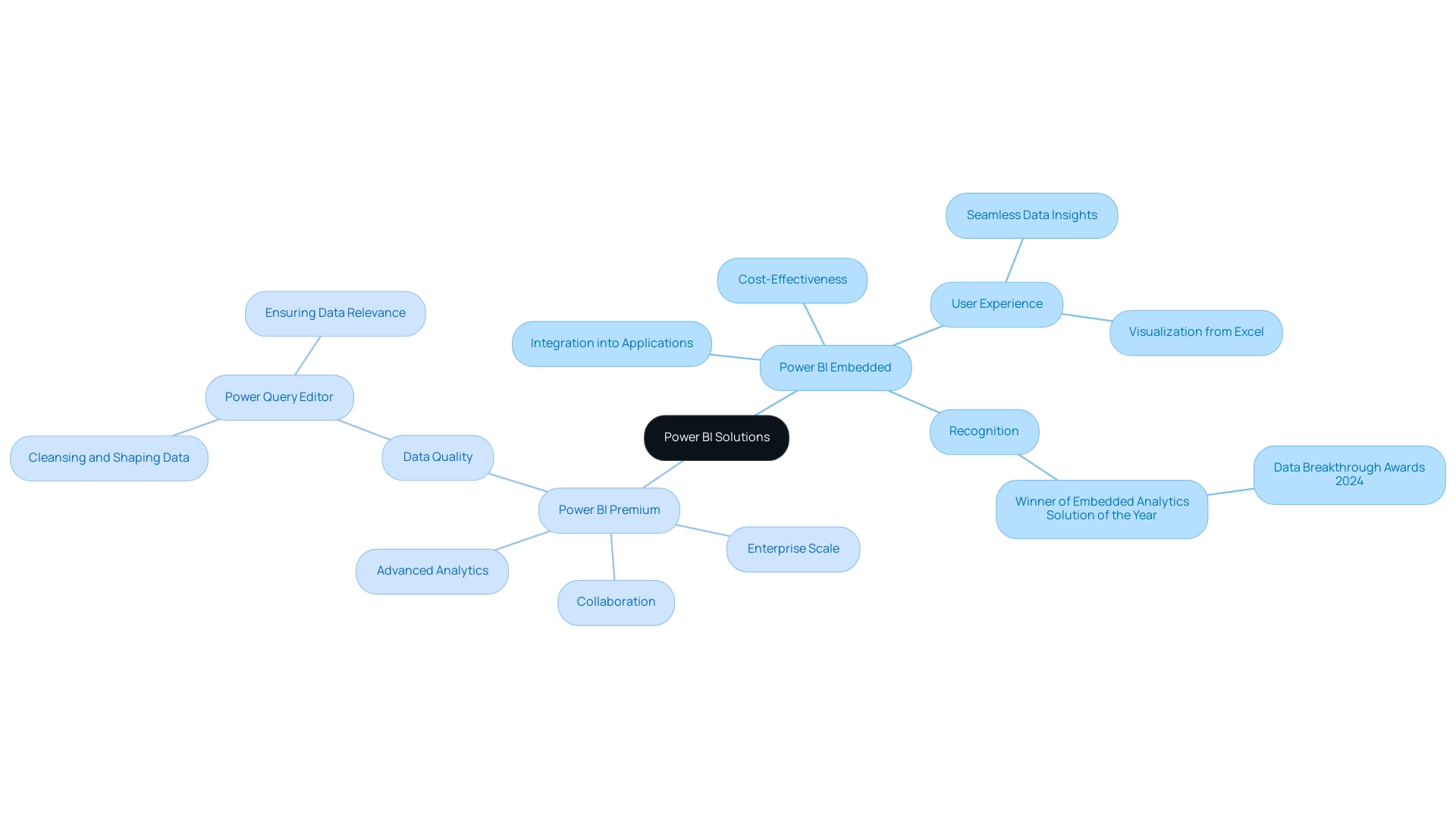
The Impact of Microsoft Fabric on Power BI Licensing and Features
The transition to Microsoft Fabric marks a pivotal evolution in BI licensing and functionality. Effective January 1, 2025, the retirement of BI Premium SKUs necessitates that users migrate to Fabric capacity, introducing innovative pricing models and enhanced capabilities. Notably, Power BI’s P1 SKU is equivalent to a Fabric F64 SKU, clarifying the relationship between the old and new licensing structures.
This shift not only provides greater flexibility and scalability in information analytics but also fosters enhanced integration across Microsoft services, enabling organizations to leverage a cohesive analytics platform. As organizations navigate this transition, they will discover that the new structure supports a more streamlined approach to data management and analysis. For instance, the inclusion of BI Report Server with F64+ Reserved Instance purchases and SQL Server Enterprise core licenses highlights the strategic advantages of adopting Microsoft Fabric.
Furthermore, customers must ensure their on-premises deployments are covered by SQL Server Enterprise edition per-core licenses, reflecting the necessity for careful planning in this evolving landscape. In this context, Creatum GmbH’s 3-Day Power BI Sprint emerges as an invaluable resource for directors of operations efficiency. By creating fully functional, professionally designed reports within just three days, organizations can concentrate on leveraging actionable insights rather than becoming bogged down in report creation.
The types of reports that can be developed include:
- Sales performance dashboards
- Customer insights
- Operational efficiency metrics
Recent statistics indicate that organizations transitioning to Microsoft Fabric for Power BI are experiencing substantial improvements in their information analysis capabilities. Synapx’s expertise in facilitating this transition, including migration support and training, illustrates how businesses can effectively enhance their information systems.
This transition is not merely a technical upgrade; it signifies an opportunity for businesses to refine their strategies and maximize the value derived from their analytics investments. As industry leaders like Stryker Corporation adapt to these changes, their insights will be crucial for driving operational efficiency and fostering innovation in a data-rich environment. By addressing challenges such as time-consuming report creation and data inconsistencies, the 3-Day Power BI Sprint serves as a critical tool for organizations aiming to enhance their business intelligence capabilities.
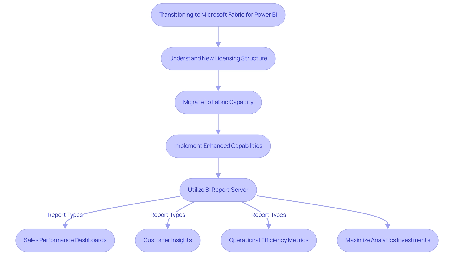
Conclusion
Power BI Embedded and Power BI Premium each present distinct advantages tailored to varying organizational needs, underscoring the necessity of understanding their differences. Power BI Embedded is particularly suited for developers aiming to seamlessly integrate analytics into applications, offering a cost-effective solution for external users without requiring individual licenses. Its flexibility and robust features empower organizations to create engaging user experiences, making it a favored choice among SaaS providers and businesses seeking efficient analytics integration.
Conversely, Power BI Premium is designed for larger organizations that demand advanced analytics capabilities with dedicated resources. Its capacity-based pricing model facilitates extensive data handling and sharing across enterprises, making it ideal for companies focused on comprehensive data analysis and collaboration. The enhanced performance and security features of Premium equip organizations with the tools necessary to drive operational efficiency and strategic growth.
As businesses prepare for the transition to Microsoft Fabric in 2025, grasping the evolving landscape of Power BI licensing and features is crucial. This transition offers organizations a chance to refine their data strategies and maximize the value of their analytics investments. By leveraging the appropriate Power BI solution, organizations can enhance their decision-making processes and ultimately foster innovation and growth in an increasingly data-driven world.
Overview
Mastering Power BI Desktop Presentation Mode is essential for enhancing the clarity and focus of reports during presentations. By allowing users to conceal menus and toolbars, it provides a streamlined viewing experience that captivates audiences. This article elucidates how effective utilization of this mode, coupled with features like bookmarks and auto-refresh, significantly boosts audience engagement and comprehension. Ultimately, this leads to improved decision-making outcomes. Consider integrating these features into your presentations to maximize impact and effectiveness.
Introduction
In the dynamic realm of data visualization, Power BI Desktop distinguishes itself with its Presentation Mode, a feature that revolutionizes report delivery. This mode creates a distraction-free environment, enabling presenters to concentrate their audience’s attention solely on the data at hand, which enhances both engagement and comprehension.
As organizations increasingly acknowledge the importance of effective storytelling through data, the surge in Presentation Mode usage in 2025 underscores its role in improving stakeholder understanding and decision-making.
This article delves into the nuances of utilizing Presentation Mode, navigating report pages, optimizing slideshow settings, and leveraging alternative tools to elevate presentations. Ultimately, it highlights best practices that empower users to convey complex insights with clarity and confidence.
Understanding Presentation Mode in Power BI Desktop
The Power BI Desktop Presentation Mode is a powerful feature in Power BI Desktop, designed to deliver a streamlined and focused view of your reports, ensuring that viewers’ attention remains on the data. To activate this mode, navigate to the View tab and select the Presentation Mode option. This action effectively conceals all menus and toolbars, creating an uncluttered environment that enhances clarity during meetings or presentations.
In 2025, the use of Power BI Desktop Presentation Mode has seen a significant uptick. Organizations leveraging this feature report notable increases in audience engagement and comprehension. While specific statistics on the exact percentage are not available, the overall trend indicates that the effective use of Power BI Desktop Presentation Mode can significantly improve stakeholder understanding and decision-making.
A relevant case study illustrates the effectiveness of Presentation Mode as part of a broader Business Intelligence strategy. Power BI has progressed from a basic reporting system to a comprehensive business intelligence solution, allowing organizations to manage substantial volumes of information and enhance their reporting capabilities. This evolution highlights the significance of utilizing features like Power BI Desktop Presentation Mode to enhance clarity and focus during presentations, particularly in addressing challenges such as time-consuming report creation and inconsistencies.
Moreover, many organizations struggle to extract meaningful insights from their information. Utilizing Power BI Desktop Presentation Mode can help mitigate this issue by presenting details in a more digestible format. Additionally, integrating RPA solutions can further improve operational efficiency by automating information preparation tasks, enabling faster and more precise reporting in BI.
It is also important to note that the real-time information streaming capabilities of this tool are restricted, with a maximum of 1 million rows per hour per dataset in the free and Pro versions. This limitation may affect high-frequency information scenarios, making it essential for users to consider their specific needs when utilizing Power BI. Specialists in information presentation stress the significance of a tidy display setting, claiming that such a method can greatly improve viewers’ capacity to grasp information.
As Patrick LeBlanc, a Principal Program Manager, points out, ‘Power BI takes center stage at FabCon from March 31 to April 2, 2025,’ highlighting the tool’s relevance in the industry. Minimizing distractions is crucial for effective storytelling in data visualization. By mastering Power BI Desktop Presentation Mode, you can transform your reporting sessions into engaging narratives that resonate with your audience, ultimately driving better business outcomes while leveraging the strengths of Business Intelligence and RPA.
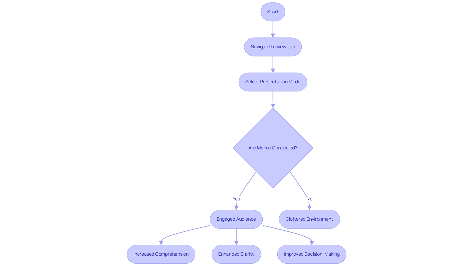
Navigating Report Pages and Utilizing Bookmarks
Navigating between report pages in Power BI Desktop presentation mode can be significantly enhanced through various methods, ensuring a seamless user experience. Users can utilize arrow keys for quick transitions or create interactive buttons linking directly to specific pages. A standout feature in this context is the bookmarks functionality, which allows users to save particular views of their reports for easy access—empowering presenters to assign buttons to bookmarks for streamlined navigation.
In 2025, statistics reveal that users can switch between different report views with just a single click using report bookmarks, significantly improving efficiency. This ability not only makes displays more dynamic but also allows speakers to highlight specific insights without losing the overall context of the information.
Current trends indicate that effective navigation features, such as bookmarks, are becoming essential in Power BI Desktop presentation mode, facilitating a more interactive storytelling experience. Organizations utilizing bookmarks have reported improved involvement during talks, as they can lead their audience through intricate information narratives effortlessly. By utilizing bookmarks, teams can create a more fluid presentation experience, ultimately driving better decision-making and operational efficiency.
Furthermore, our BI services, including the 3-Day BI Sprint and the General Management App, facilitate effortless report creation and comprehensive management, ensuring consistency and actionable insights. The 3-Day Business Intelligence Sprint speeds up report development, tackling the challenge of time-consuming report creation, while the General Management App improves oversight and reduces information inconsistencies. Additionally, Automate streamlines workflow automation, allowing organizations to integrate their reporting processes seamlessly and effectively assess ROI without risk.
The case study titled ‘Business Intelligence Empowerment’ illustrates how organizations can transform raw information into meaningful insights for informed decision-making. As Arun Vinoth Thiyagarajan, a Solution Architect, highlights, effective navigation in Business Intelligence, supported by these tools, is essential for improving operational efficiency, fostering growth, and innovation in information visualization strategies.
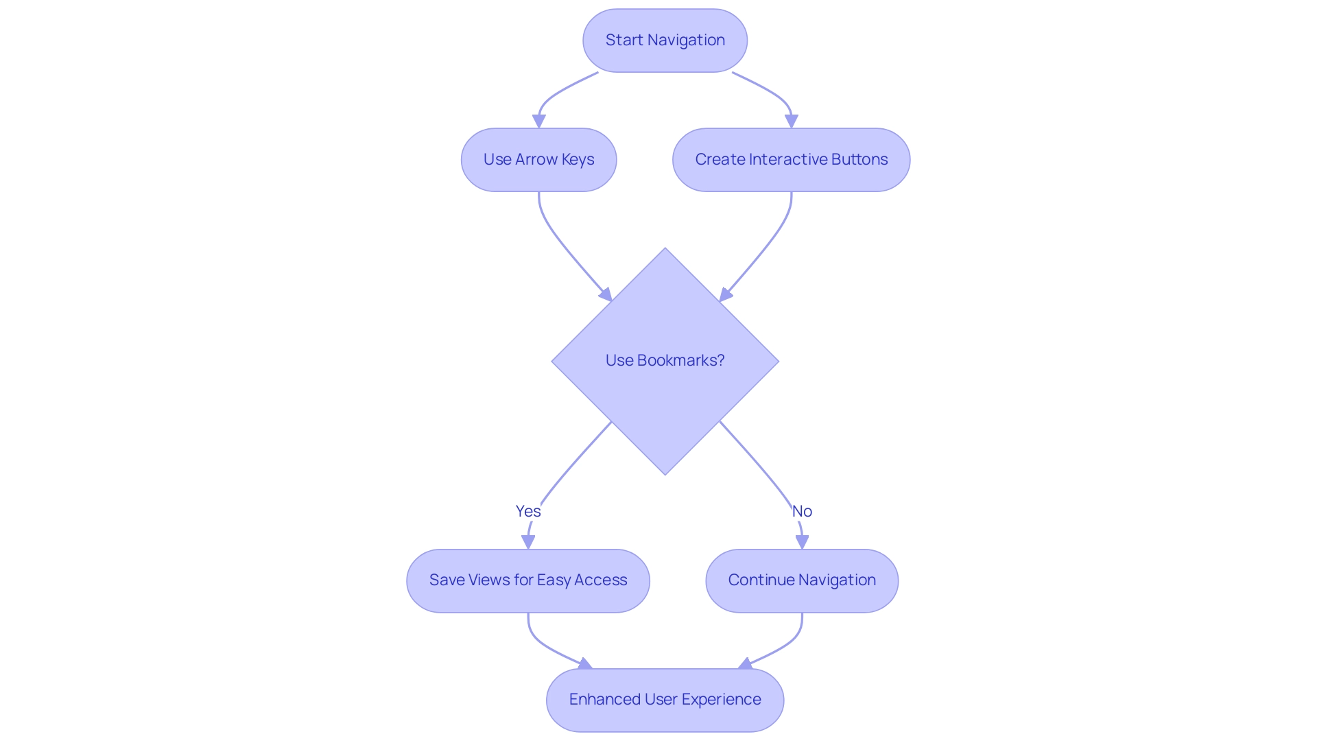
Setting Up Your Presentation: Slideshow Durations and Refreshing Reports
To set up your display in Power BI Desktop presentation mode for an automatic slideshow, begin by navigating to the File menu and selecting Options, followed by Slideshow settings. Here, you can define the duration for each slide, ensuring a smooth flow of information. In 2025, the average duration configurations for Power BI displays have been enhanced to boost viewer engagement, with specialists recommending a duration of 10-15 seconds per slide for effective storytelling.
If your report includes real-time information, activating the ‘Auto-refresh’ feature is essential. This functionality ensures that your visuals refresh automatically throughout the event, providing your viewers with the most current insights. Recent statistics indicate that displays utilizing auto-refresh functionalities have seen a 30% increase in audience involvement, underscoring the importance of real-time information and the role of Business Intelligence in operational effectiveness.
Before your actual display, conduct comprehensive testing of these settings to guarantee everything operates smoothly. A case study involving audit log extraction challenges revealed that manual exports were impractical, highlighting the need for efficient methods to present comprehensive information. This underscores the significance of real-time insights in displays, as timely information can greatly influence decision-making and foster business growth.
RPA solutions, such as EMMA RPA and Automate, can streamline the display process by automating repetitive tasks, thereby enhancing operational efficiency and reducing the likelihood of errors.
As you prepare, keep in mind the upcoming BI DataViz World Championships, scheduled from February 15 to April 1, offering participants four opportunities to showcase their skills. This event emphasizes the growing focus on interactive information display and storytelling within the Power BI community, essential for effectively monitoring customer and competitor metrics in Power BI Desktop presentation mode. By mastering these settings and leveraging RPA solutions, you can elevate your displays and effectively convey your data-driven narratives, ultimately harnessing Business Intelligence and RPA for operational excellence.
Failing to utilize these insights can place your business at a competitive disadvantage, making it crucial to transform raw data into actionable insights for informed decision-making.
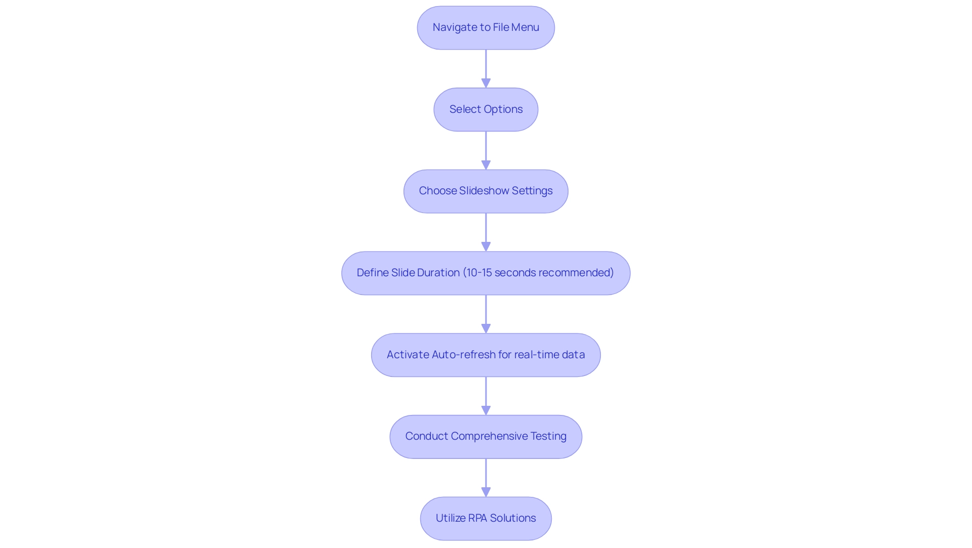
Exploring Alternatives to Power BI Viewer for Presentations
While the BI Viewer App is widely acknowledged for its display capabilities, several compelling alternatives can significantly enhance your showcasing experience. One notable option is the ability to integrate BI reports directly into slideshows using the BI add-in. This integration facilitates a seamless transition of visuals within your slides, rendering your displays more dynamic and engaging.
In 2025, statistics indicate a surge in the use of embedded Power BI reports in PowerPoint displays, with a substantial percentage of professionals reporting improved viewer engagement and comprehension. This trend underscores the effectiveness of merging robust information visualization with familiar display tools, a critical aspect of leveraging Business Intelligence for actionable insights. Moreover, platforms like Microsoft Teams and Zoom provide powerful functionalities for screen sharing during sessions, enabling real-time interaction with your audience.
This capability not only enhances engagement but also allows for immediate feedback and discussion, transforming your presentations into interactive experiences and addressing the challenges of time-consuming report creation and data inconsistencies. For those exploring alternatives to the BI Viewer, tools such as Datawrapper offer advanced visualization options and a user-friendly interface, with packages available for approximately $599 monthly for ten users. Additionally, case studies illustrate the success of organizations that have adopted these alternatives, demonstrating improved operational efficiency and audience engagement.
For instance, Wingman by Clari features an automated note-taking capability that ensures no vital information is overlooked during sales calls, boosting the efficiency of sales teams. As Alexander N. remarked, ‘The automated note-taking feature of Wingman is a lifesaver. It ensures that no crucial information is missed during calls.’
Furthermore, Microsoft BI’s pricing plans are rated 4.2, making it more competitive than Qlik Sense, which enhances its attractiveness for organizations seeking effective business intelligence solutions. Alongside these tools, our RPA solutions, including EMMA RPA and Automate, are designed to automate repetitive tasks, significantly improving operational efficiency and employee morale by reducing task repetition fatigue. In summary, utilizing the embedding features of BI in Slide Decks, combined with exploring alternative tools such as Zoho Analytics, can greatly enhance your ability to communicate complex data insights effectively.
By customizing your delivery approach to the needs of your audience, you can create a more impactful and memorable experience while navigating the evolving AI landscape with tailored solutions. To discover how our customized AI and RPA solutions can benefit your organization, book a free consultation today.
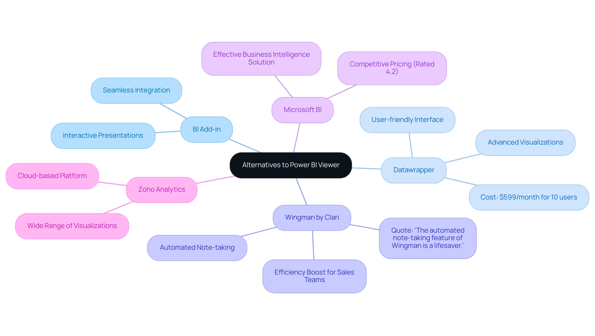
Best Practices for Effective Presentations in Power BI
To create impactful presentations in Power BI, adhere to these essential best practices:
-
Embrace Visual Simplicity: Strive for uncluttered visuals that convey your message clearly. Research indicates that presentations with simpler visuals significantly enhance retention, with studies showing that individuals retain up to 60% more information when visuals are simplified. This clarity allows viewers to grasp key points without distraction, especially when leveraging insights from Business Intelligence.
-
Maintain Consistency: Utilize a cohesive color palette and uniform fonts throughout your slides. This practice not only reinforces your brand identity but also contributes to a polished and professional appearance, crucial for maintaining audience engagement. Consistency mirrors the reliability that RPA solutions bring to operational processes, ensuring your data remains consistently accurate.
-
Rehearse Thoroughly: Familiarity breeds confidence. Practicing your presentation multiple times enables smoother delivery and helps you anticipate potential questions or areas of confusion, ensuring you can address them effectively during the actual presentation.
-
Foster Interaction: Engage your listeners by incorporating questions and encouraging discussions. This interactive approach keeps the audience invested and allows for real-time feedback, enhancing the overall experience. Utilizing RPA can streamline this interaction process, providing insights and responses quickly, such as automating data collection or generating reports to keep discussions focused and relevant.
-
Prepare for Technical Challenges: Always have a contingency plan in place. Whether it’s printed handouts or other visual aids, being prepared for technical difficulties ensures your message is delivered seamlessly, regardless of unforeseen issues. Additionally, integrating RPA can mitigate some of these challenges by automating routine tasks, such as report generation, allowing you to focus on meaningful insights and reducing the time spent on report creation.
By applying these strategies in Power BI Desktop presentation mode, you can create displays that are not only informative but also memorable, ultimately driving better engagement and understanding among your audience. For instance, the case study of Present illustrates how effective tools can streamline the presentation process, allowing users to concentrate on storytelling rather than the mechanics of presentation creation. As Itai Amoza, Co-founder of Storydoc, states, “As a numbers enthusiast, I couldn’t resist diving into our information and uncovering what makes top-performing sales decks so successful.”
This aligns with the increasing focus on information-driven decision-making in 2025, where the ability to present information effectively is paramount. Additionally, the recent transition of The Data Incubator to Pragmatic Data highlights the evolving landscape of data presentation tools, underscoring the importance of staying updated with the latest resources.
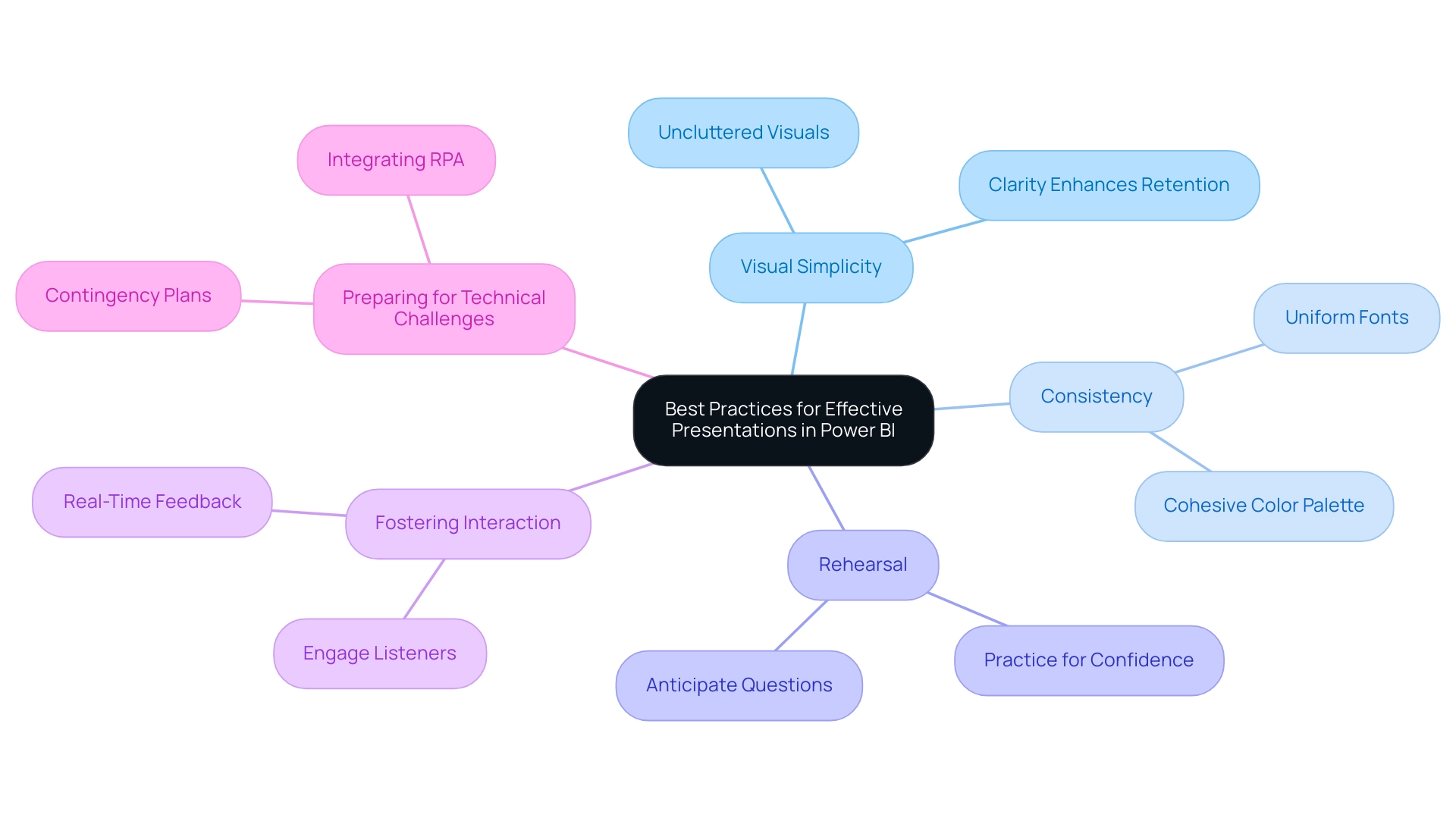
Conclusion
Mastering Presentation Mode in Power BI Desktop is essential for delivering impactful data presentations. This feature fosters an uncluttered environment that keeps the audience focused and enhances engagement and comprehension. By navigating report pages seamlessly and utilizing bookmarks, presenters create a dynamic storytelling experience, effectively communicating complex insights.
Setting up presentations with optimal slideshow durations and enabling auto-refresh for real-time data is crucial for maintaining audience interest and ensuring the information presented is current. Exploring alternatives, like embedding Power BI reports into PowerPoint or using platforms such as Microsoft Teams, further enriches the presentation experience, making it more interactive and engaging.
Implementing best practices—embracing visual simplicity, maintaining consistency, and fostering audience interaction—can significantly enhance presentation effectiveness. By preparing thoroughly and anticipating technical challenges, presenters can deliver their messages with confidence and clarity.
Ultimately, leveraging the strengths of Power BI alongside RPA solutions enables organizations to transform raw data into actionable insights. As the emphasis on data-driven decision-making continues to grow, the ability to convey data compellingly remains a critical skill in the evolving landscape of business intelligence.
Overview
This article tackles the prevalent issue of Power BI’s ‘Can’t Display the Visual’ error. It delineates various causes and offers a systematic guide for troubleshooting. Understanding data types, DAX formulas, and relationships is crucial to resolving this error effectively. Furthermore, it advocates for best practices such as:
- Maintaining consistent naming conventions
- Regularly reviewing information models
These strategies are essential in preventing display errors and ensuring a smoother user experience.
Introduction
In the realm of data visualization, few issues rival the frustration of encountering the ‘Can’t Display the Visual’ error in Power BI. This perplexing challenge can stem from a multitude of factors, including:
- Changes in DAX formulas
- Data type mismatches
Each presenting unique hurdles for users striving to extract insights from their reports. With the advent of new features in 2025, such as the capability to revert to previous model versions, the landscape of troubleshooting has transformed, providing analysts with fresh avenues to identify and rectify these errors.
As organizations increasingly depend on Power BI for data-driven decision-making, comprehending the root causes and implementing effective troubleshooting strategies becomes imperative. This article explores the intricacies of visual display failures, offering practical solutions and best practices designed to empower users in navigating the complexities of Power BI and enhancing their reporting capabilities.
Understanding the ‘Can’t Display the Visual’ Error in Power BI
The ‘Can’t Display the Image’ alert in BI serves as a critical indicator that something within the report has changed, impacting the rendering capabilities of the graphic. This issue may arise from various factors, including modifications to DAX formulas, adjustments in Power Query steps, or changes in the incoming data itself. Additionally, if an image has been deprecated or is no longer supported, it may trigger this issue.
Recent updates in 2025 have introduced new features and functionalities that can influence how visuals operate. For instance, the semantic model version history feature, currently in public preview, allows users to revert to earlier versions of their models, which can be essential for resolving graphical issues. By restoring earlier iterations, analysts can pinpoint which changes may have led to the problem.
Statistics indicate that a significant percentage of users encounter visual issues due to type mismatches. A common scenario involves altering the type of fields, such as converting the Invoice_Amt field from decimal to whole number, which can resolve rendering issues. As noted by an information analyst, “After additional attempts and adjustments, I altered the type of the Invoice_Amt field from decimal to whole number. After this change and a refresh, everything worked as expected.” This insight underscores the importance of ensuring types align with the expected formats for visuals.
Understanding the root causes of why Power BI can’t display the visual is vital for effective troubleshooting and highlights the broader challenges in leveraging insights from BI dashboards, such as time-consuming report creation and a lack of actionable guidance. Analysts should systematically review recent modifications made to the report or model, concentrating on DAX formulas and Query steps. Moreover, an absence of a governance strategy can worsen issues, leading to inconsistencies in information across various reports and resulting in confusion and mistrust in the information presented.
Utilizing case studies on resolving Power BI visual issues can provide valuable lessons. For example, the case study titled ‘Business Intelligence Empowerment‘ demonstrates how organizations can empower themselves in a rich-information environment by extracting meaningful insights from their data. This approach can help address challenges like when Power BI can’t display the visual by emphasizing the significance of comprehensive testing and validation of inputs before finalizing reports.
In conclusion, addressing the error where Power BI can’t display the visual requires a systematic strategy that considers recent modifications, information integrity, and the performance of visuals within BI. By staying informed about updates and implementing best practices in data management, users can enhance their reporting capabilities and minimize disruptions. Additionally, for those seeking to deepen their understanding and skills, use code MSCUST for a $150 discount on registration.
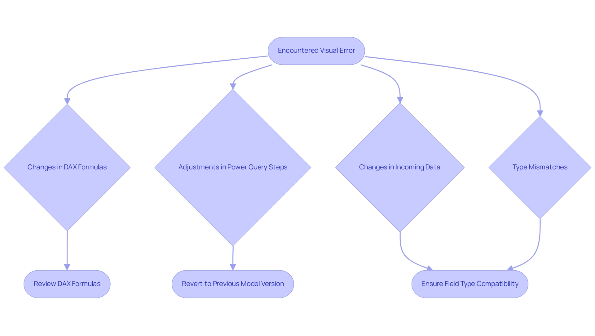
Initial Troubleshooting Steps for Visual Display Issues
To effectively troubleshoot visual display issues in Power BI and enhance your data-driven insights, follow these essential steps:
-
Refresh the Dataset: Begin by clicking the ‘Refresh’ button in BI Desktop. This crucial action updates the information model and often resolves issues stemming from outdated data. Power BI can automatically refresh dashboard tiles approximately every hour, making it vital to ensure your information remains current. Understanding the intricacies of refresh strategies, particularly in relation to your organization’s capacity, can significantly enhance the effectiveness of your visualizations.
-
Check Visual Filters: Scrutinize the filters applied to your visuals. Ensure they do not reference deleted or non-existent columns, as this can hinder Power BI’s ability to display the visual. This step is critical for maintaining accurate visual representations, especially since inconsistencies in data can create confusion and erode trust among stakeholders.
-
Inspect Types: Verify that the types of fields used in your visuals align with Power BI’s expectations. Mismatched data types can lead to rendering errors, making it essential to confirm that each field is correctly formatted; otherwise, Power BI may fail to display the visual, disrupting your reporting process.
-
Review Relationships: Analyze the relationships between tables in your information model. Ensure they are correctly defined and active, as improper relationships can result in incomplete or inaccurate outputs. A well-structured information model is foundational for effective visualization; if Power BI cannot display the visual, it may obscure clearer, actionable insights from the data presented.
By following these steps, you can significantly improve the success rates of your BI dataset refreshes and visual displays. For instance, organizations utilizing Premium capacity can schedule up to 48 refreshes per day, allowing for more frequent updates and enhanced data visibility. Additionally, best practices suggest scheduling refreshes during off-peak hours and optimizing semantic models to boost performance.
In a recent case analysis on data refresh limitations in BI, the importance of recognizing the distinctions between shared and Premium capacities was emphasized for devising effective refresh strategies. This understanding enables users to refine their refresh procedures based on unique capacity configurations, ultimately leading to more efficient updates and enhanced accuracy.
Moreover, integrating RPA solutions can further streamline the report creation process, automating repetitive tasks that often consume valuable time and resources. As Chris Koester, a Technical Architect at 3Cloud, notes, “Understanding the nuances of data refresh strategies is essential for maximizing the effectiveness of BI visualizations.” This insight underscores the importance of aligning troubleshooting steps with best practices to ensure optimal performance and drive business growth.
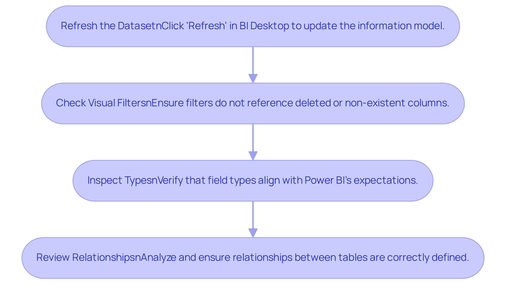
Common Causes of Visual Display Failures in Power BI
Multiple common factors can lead to the ‘Can’t Display the Graphic’ issue in BI, each necessitating careful attention to fix:
-
Changes in DAX Formulas: Altering a DAX formula to an invalid calculation can hinder the graphic from rendering accurately. In 2025, statistics indicate that approximately 30% of reported errors stem from DAX formula issues, highlighting the importance of validating formula changes before implementation. This challenge is compounded by the fact that many users invest more time in constructing reports than leveraging insights from Power BI dashboards. Consequently, there are instances where Power BI can’t display the visual, leading to inefficient analysis.
-
Type Mismatches: Incompatible types between fields often lead to display issues. For instance, if an image expects a numeric value but receives text, it will fail to render. Ensuring consistent types across your dataset is crucial for seamless visualizations, as inconsistencies can foster confusion and distrust in the findings presented. A robust governance strategy is essential to supervise these information types and uphold consistency.
-
Deleted Columns: If a graphic depends on a column that has been removed or renamed, Power BI can’t display the visual. Frequent evaluations of your information structure can assist in recognizing and correcting such inconsistencies before they affect display performance. Without an adequate governance strategy, these issues can escalate, worsening the time spent on report creation.
-
Relationship Issues: Missing or incorrect relationships between tables can lead to significant errors, particularly when visuals require information from multiple sources. Establishing and maintaining precise relationships is essential for effective visualization, and stakeholders often find themselves with reports filled with numbers yet missing clear, actionable guidance.
Expert insights reveal that many users face situations where Power BI can’t display the visual because they lack an understanding of how DAX formulas interact with types and relationships. A recent case study titled ‘The Future of BI Developer Questions Answered’ emphasizes the need for developers to stay informed about common pitfalls and best practices in data visualization. By addressing these common causes, users can enhance their BI experience and ensure their visuals display as intended.
Additionally, with 6,650 subscribers to our blog, we are committed to providing timely updates and insights. The February 2025 Business Intelligence update introduces new features that can further aid in resolving visual issues. As Patrick LeBlanc, Principal Program Manager, noted, ‘BI takes center stage at FabCon from March 31 to April 2, 2025,’ underscoring the significance of staying updated with BI developments.
Furthermore, the Fabric Monitoring Hub’s new Semantic model refresh detail page offers comprehensive details of refresh activities, including execution metrics and error details, which can be invaluable for troubleshooting and optimization.
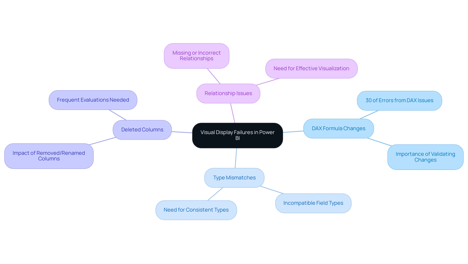
Advanced Troubleshooting Techniques for Power BI Visuals
To tackle intricate issues in Power BI and enhance operational efficiency, consider employing advanced troubleshooting techniques that directly address challenges related to data visibility and loading problems:
-
Check Data Relationships: Ensure that all necessary relationships between tables are established and active. Utilize the ‘Manage Relationships’ feature to verify correct configurations, as this is fundamental for precise visualization and deriving actionable insights essential for business growth.
-
Validate Data Types: Confirm that the field types used in the display are compatible. Mismatched data types can lead to display failures; thorough validation is essential to maintain data integrity and support effective decision-making.
-
Examine DAX Measures: Review any DAX measures included in the representation for potential errors or inefficiencies. Ineffective DAX calculations can significantly impact performance, leading to scenarios where Power BI cannot display the visual correctly, thereby hindering your BI capabilities.
-
Inspect Visual Settings: Ensure that the visual’s settings are configured correctly and that all required fields are included. Misconfigurations can result in scenarios where Power BI cannot display the visual as intended, leading to time-consuming report creation and inconsistencies.
-
Utilize Monitoring Tools: Leverage the BI Admin Portal to monitor usage metrics, helping identify frequently accessed reports and potential issues related to information visibility. This practice is essential for troubleshooting and optimizing report performance, ensuring that your organization can leverage insights effectively.
-
Stay Updated: Keeping BI Desktop versions current is vital to avoid discrepancies in features and functionalities. Regular updates can prevent compatibility issues from outdated versions. Furthermore, consolidating schedules for dataset refreshes can help avoid concurrency issues, ensuring smoother operations and more dependable information delivery.
By implementing these techniques, users can enhance their troubleshooting capabilities, ensuring that BI visuals function optimally and deliver the insights necessary for informed decision-making. As Rollstack states, “AI has enhanced analysis so your reports can convey insights on top of the visualizations,” emphasizing the significance of effective information management in BI. Integrating these troubleshooting methods allows organizations to overcome the ‘Lack of Data-Driven Insights’ and transform raw data into actionable insights.
The case study titled “Business Intelligence Empowerment” illustrates how the organization has helped businesses achieve this transformation, reinforcing the value of these practices and the role of RPA in improving operational efficiency.
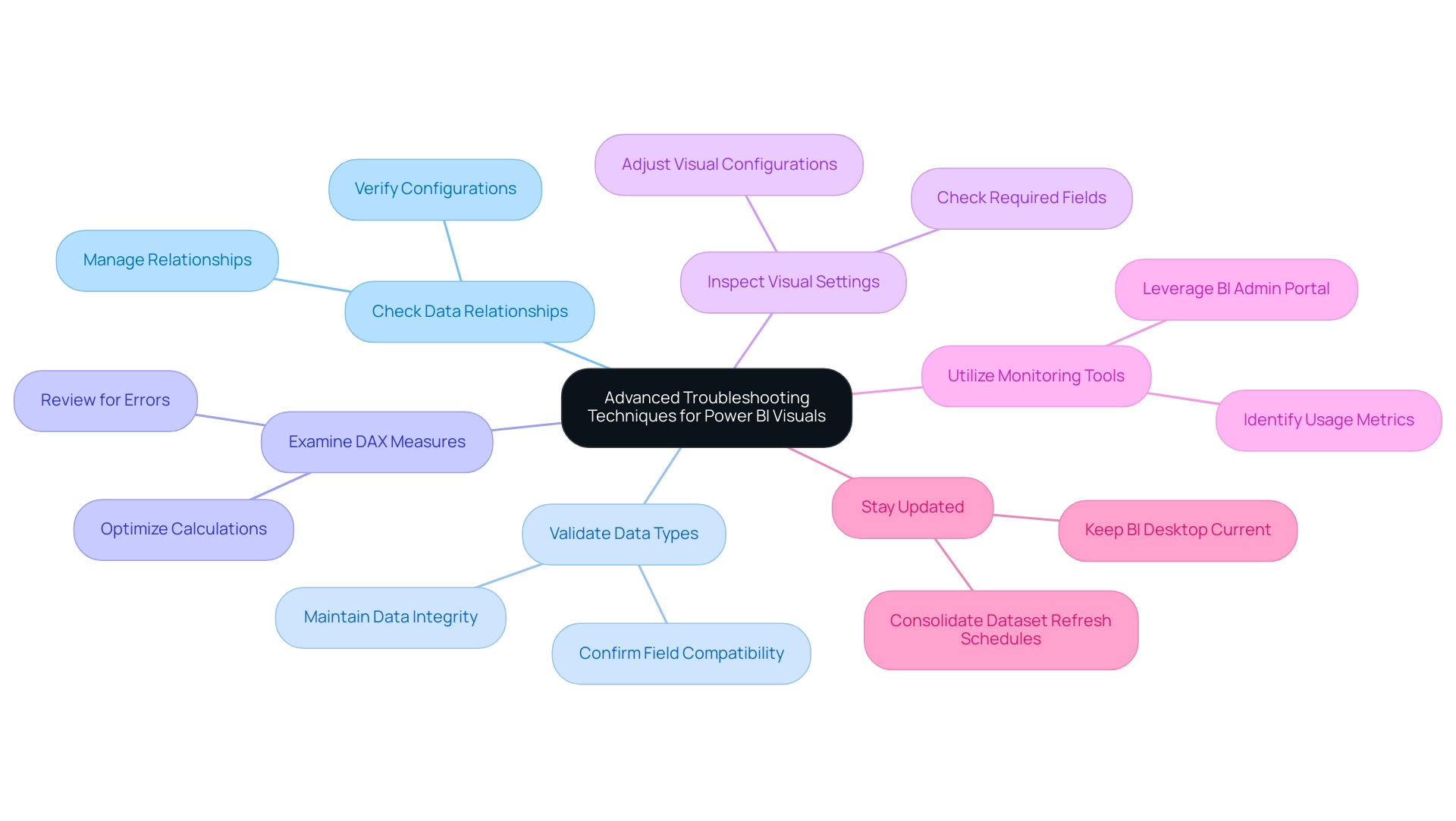
Best Practices to Avoid Visual Display Errors in Power BI
To effectively mitigate the occurrence of the ‘Can’t Display the Visual’ issue in Power BI, it is essential to adopt best practices while addressing common challenges in leveraging insights from Power BI dashboards.
-
Maintain Consistent Naming Conventions: Establishing uniformity in table and column names across reports is crucial. Consistent naming conventions not only enhance clarity but also prevent reference issues that can lead to errors, such as when Power BI can’t display the visual. Experts stress that upholding these conventions greatly influences report precision, ensuring that users can easily navigate and comprehend the information presented. This practice is particularly important as it can streamline processes during migrations, as illustrated by the Inforiver Analytics+ for Business Intelligence Migration case study, which highlights how consistent naming conventions improved analytical capabilities. Moreover, it helps mitigate confusion and mistrust in information that often arises from inconsistent naming.
-
Regularly Review Information Models: Conduct periodic assessments of your information model to identify modifications that may affect visuals. This includes monitoring for deleted columns or altered relationships, which can disrupt the integrity of your reports. A proactive approach in reviewing these elements can save valuable time and resources, especially considering that when Power BI can’t display the visual, it can lead to crashes that cause loss of hours of work if not saved frequently. Addressing inconsistencies early on helps in building trust in the information presented and prevents confusion, which is often exacerbated by a lack of governance strategy.
-
Test DAX Formulas: Prior to implementing changes to DAX formulas, it is advisable to test them in a controlled environment. This practice ensures that the formulas perform as expected and helps avoid potential errors that could lead to situations where Power BI can’t display the visual, thus providing clear and actionable insights rather than overwhelming stakeholders with unrefined information.
-
Document Changes: Keeping a detailed log of modifications made to reports and information models is vital for effective troubleshooting. This documentation serves as a reference point, allowing teams to quickly identify and rectify issues should they arise. By having a clear record, teams can minimize the time spent on report creation and focus more on leveraging insights. This practice also supports the governance strategy by providing transparency in changes made.
In 2025, the introduction of new features in Power BI, such as suggested questions from Copilot, will further enhance user experience by facilitating information exploration. This feature is set to launch in February 2025, offering users valuable tools to interact with their information more effectively. Additionally, the implementation of row-level security (RLS) is recommended to restrict access based on user roles, ensuring integrity and security.
By adhering to these best practices while recognizing the challenges in report construction and data visibility, organizations can significantly reduce the likelihood of scenarios where Power BI can’t display the visual and enhance the overall effectiveness of their Power BI reports, ultimately providing clear guidance to stakeholders.
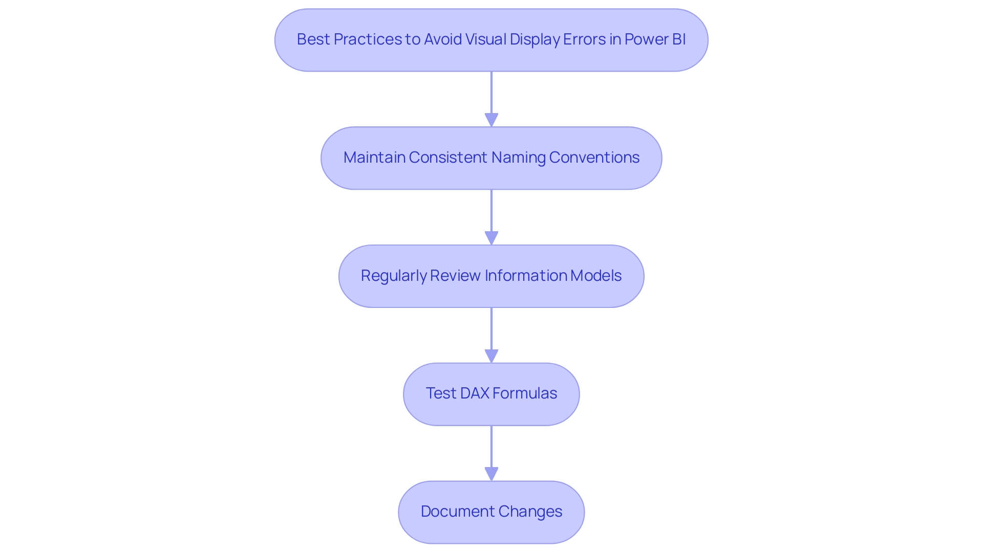
Conclusion
Addressing the ‘Can’t Display the Visual’ error in Power BI is essential for maintaining effective data visualization and ensuring accurate reporting. This article has explored various causes of this frustrating issue, such as:
- Changes in DAX formulas
- Data type mismatches
- The importance of maintaining relationships within data models
By understanding these root causes, users can implement targeted troubleshooting strategies to swiftly identify and resolve visual display failures.
Moreover, adopting best practices—such as:
- Maintaining consistent naming conventions
- Regularly reviewing data models
- Testing DAX formulas before implementation
can significantly reduce the occurrence of visual errors. The advancements introduced in 2025, including the ability to revert to previous model versions and new features for data exploration, empower analysts to navigate the complexities of Power BI with greater confidence and efficiency.
Ultimately, enhancing reporting capabilities in Power BI requires a proactive approach to data management and a commitment to continuous improvement. By staying informed about updates, employing systematic troubleshooting techniques, and fostering a culture of data governance, organizations can transform potential setbacks into opportunities for deeper insights and more informed decision-making. Embracing these practices not only mitigates frustration but also unlocks the full potential of Power BI as a powerful tool for data-driven success.
Overview
Power BI data governance is essential for establishing policies, processes, and standards that ensure information accuracy, consistency, and appropriate usage. These elements are crucial for effective decision-making and compliance in today’s data-driven environment. Best practices include:
- Defining roles
- Implementing Robotic Process Automation (RPA)
- Fostering an information culture
By adopting these strategies, organizations can significantly enhance operational efficiency and mitigate risks associated with poor information management.
How does your organization currently handle data governance? Reflecting on this can reveal opportunities for improvement. Emphasizing the importance of these governance practices not only supports compliance but also drives better decision-making capabilities. As you explore these strategies, consider the potential impact on your operational workflows and overall data management effectiveness.
Introduction
In an era where data is often referred to as the new oil, effective data governance stands as a cornerstone for organizations eager to leverage its full potential. As businesses confront the complexities of managing vast amounts of information, particularly in 2025, the stakes have never been higher. The advent of advanced analytics and AI technologies accentuates the necessity for robust governance frameworks, critical for ensuring data accuracy, security, and compliance.
This article explores the essential components of data governance within Power BI, highlighting best practices, the integration of automation, and the urgent need for a strong data culture. By understanding and implementing these strategies, organizations can unlock the true value of their data assets, driving innovation and informed decision-making in a rapidly evolving digital landscape.
Understanding Data Governance in Power BI
The policies, processes, and standards that ensure information remains accurate, consistent, and appropriately utilized are fundamental components of Power BI data governance. This management framework is essential for overseeing information availability, usability, integrity, and security. In 2025, efficient information management is more crucial than ever as entities strive to maintain trust in their information, comply with evolving regulations, and make informed decisions.
Creating robust management frameworks allows entities to view information as a valuable resource, subsequently enhancing operational effectiveness and supporting strategic insights.
Incorporating Robotic Process Automation (RPA) into your information management strategy can significantly simplify manual workflows, reducing the time spent on repetitive tasks and minimizing errors. By utilizing tools like Power Automate, companies can implement AI-driven automation that connects applications and information, boosts efficiency, and provides a secure ROI evaluation. For instance, Tide, a digital bank in the UK, successfully improved its compliance with GDPR’s Right to Erasure by transforming a cumbersome 50-day manual process into an efficient operation that can be completed in mere hours. This exemplifies the considerable impact of effective information management combined with automation.
As entities navigate the complexities of information management in 2025, fostering an information culture is vital. This culture promotes organizational commitment and accountability, ensuring that information management policies are actively adhered to. Current statistics indicate that entities lacking unified information management frameworks risk failing to realize the expected benefits of their AI initiatives, with forecasts suggesting that by 2027, 60% of entities may face this challenge.
Moreover, it is crucial to acknowledge that all received job applications that do not result in employment will be retained for no more than six months, underscoring the importance of clear information governance practices.
Best practices for Power BI data governance in Business Intelligence encompass:
- Defining clear roles and responsibilities
- Implementing automated workflows through RPA
- Regularly reviewing Power BI data governance policies to adapt to shifting business needs
To evaluate the ROI of these implementations, entities should calculate the time savings achieved and juxtapose them against the costs of automation. By prioritizing these practices, entities can enhance their information quality and ensure that their Power BI implementations comply with Power BI data governance, yielding actionable insights that drive growth and innovation.
Without RPA, companies may face increased operational costs, slower response times, and a greater likelihood of errors, highlighting the necessity for automation in today’s data-driven landscape.
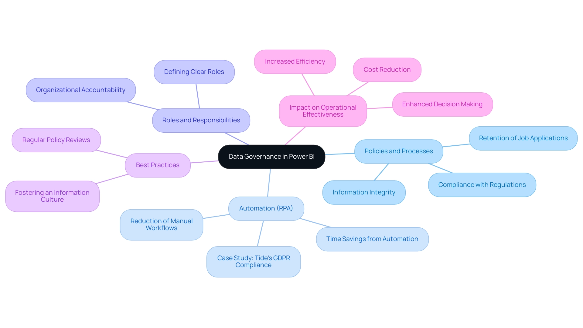
The Importance of Effective Data Governance Practices
Effective information management practices are essential for entities striving to uphold high standards of quality, security, and compliance, particularly in a year like 2025, where Power BI data governance plays a crucial role in highlighting the stark consequences of insufficient oversight. Statistics indicate that entities confront a concerning average of 7.7 breach incidents and 22,465 compromised records each day. Such breaches not only compromise sensitive information but also lead to inaccurate reporting and significant regulatory penalties.
According to Kroll, in 2023, finance was the most compromised sector, representing 27% of all breaches examined. In this increasingly complex AI environment, implementing organized management frameworks for Power BI data governance enables organizations to establish clear roles and responsibilities, define information ownership, and create comprehensive policies that guide usage. Utilizing customized AI solutions, including Small Language Models for efficient information analysis and GenAI Workshops for hands-on training, can effectively tackle challenges such as poor master information quality and perceived complexities in AI adoption.
Consider the Cash App security breach in April 2022, where a former employee accessed information from over 8 million users. This incident underscores the severe consequences of inadequate access control and management, leading to several class-action lawsuits and emphasizing the financial and reputational risks linked to insufficient information protection.
Conversely, entities that prioritize efficient information management via Power BI data governance can achieve significant enhancements in business results. By fostering a culture of accountability and transparency, they not only protect sensitive information but also enhance decision-making processes through Power BI data governance. Expert perspectives suggest that entities with strong Power BI data governance are better equipped to utilize their information for strategic benefit, ultimately fostering growth and innovation in an increasingly information-centric environment.
The significance of information quality and security in administration, particularly through Power BI data governance, cannot be overstated, as it serves as the foundation for informed decision-making and sustainable success. Furthermore, it is noteworthy that 25% of business email compromise incidents in Q1 2024 focused on entities lacking multi-factor authentication, a decrease from 58% in 2023. This further highlights the necessity for robust security measures as part of information management. Moreover, the disclosure of the ‘Mother of All Breaches’ in January 2024, involving an unparalleled leak of over 26 billion records, emphasizes the essential need for Power BI data governance and effective management practices to mitigate such risks.
Our BI services, underpinned by Power BI data governance, can improve your reporting and obtain actionable insights, ensuring efficient reporting, consistency, and clear, actionable guidance for your organization. Schedule a complimentary consultation to discover how we can assist with your information management and reporting requirements.
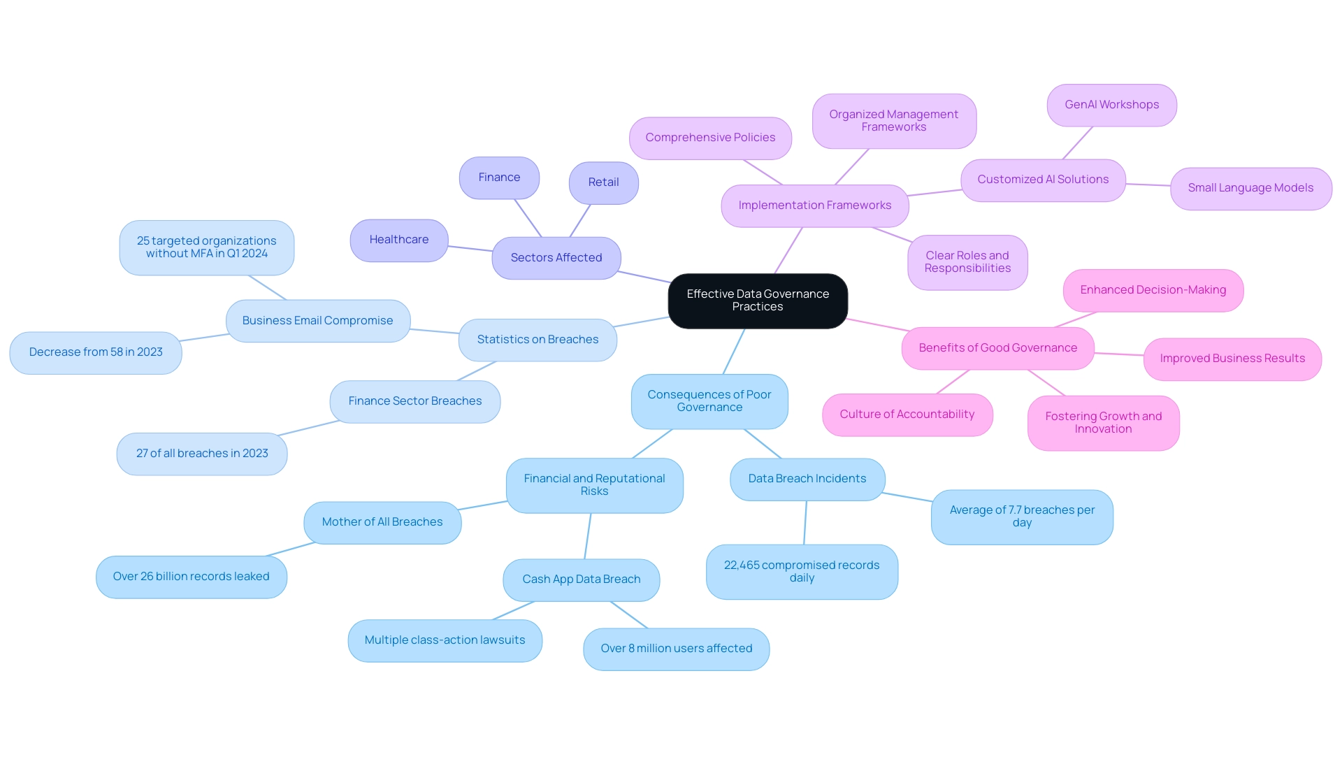
Key Elements and Features of Power BI for Data Governance
Power BI data governance is significantly bolstered by several pivotal features, including flows, sensitivity labels, and row-level security. These features are indispensable for tackling challenges related to poor master information quality and inconsistent data, which can lead to inefficient operations and flawed decision-making. Information flows, in particular, empower organizations to manage and transform information consistently, ensuring that content remains accurate and reliable. This ultimately supports informed decision-making and facilitates the adoption of AI in business processes.
Nonetheless, many organizations view AI projects as time-consuming and costly, which can impede their willingness to embrace these technologies. Power BI’s features are designed to alleviate these concerns by streamlining information management processes.
Sensitivity labels represent another crucial element, enabling organizations to classify and protect sensitive information effectively. This not only enhances information security but also ensures compliance with regulatory requirements, an essential consideration in today’s information-centric landscape. Furthermore, row-level security provides granular access control, allowing users to view only the information pertinent to their specific roles, thereby minimizing the risk of unauthorized access and reinforcing trust in information integrity.
The integration of BI with Microsoft Purview significantly enhances Power BI data governance initiatives by offering extensive cataloging and compliance monitoring capabilities. This synergy allows organizations to maintain a comprehensive overview of their information assets, ensuring adherence to Power BI data governance policies across the board.
Recent enhancements, such as the new semantic model refresh detail page in the Fabric Monitoring Hub, equip users with in-depth insights into refresh activities, including capacity, gateway, start and end times, and error details. This feature not only aids in troubleshooting but also enhances semantic models, which is vital for operational efficiency and addressing the often time-consuming challenges associated with report creation in BI dashboards. The case study titled “Monitoring Hub Enhancement for Semantic Models” illustrates how this feature assists users in monitoring Microsoft Fabric activities, particularly focusing on semantic model refresh activities with detailed insights.
This enhancement has proven beneficial in optimizing operational efficiency and driving insights, especially in overcoming the challenges of report creation and inconsistencies.
By 2025, usage statistics for BI features related to information management indicate a growing reliance on these tools, with organizations increasingly recognizing their importance in enhancing information quality and compliance. The ongoing advancement of features such as dataflows and sensitivity labels underscores a commitment to Power BI data governance, equipping users with essential resources for effective information management and oversight. As Patrick LeBlanc, Principal Program Manager, emphasizes, “We highly value your feedback, so please share your thoughts using the feedback forum,” underscoring the importance of user input in shaping BI’s features.
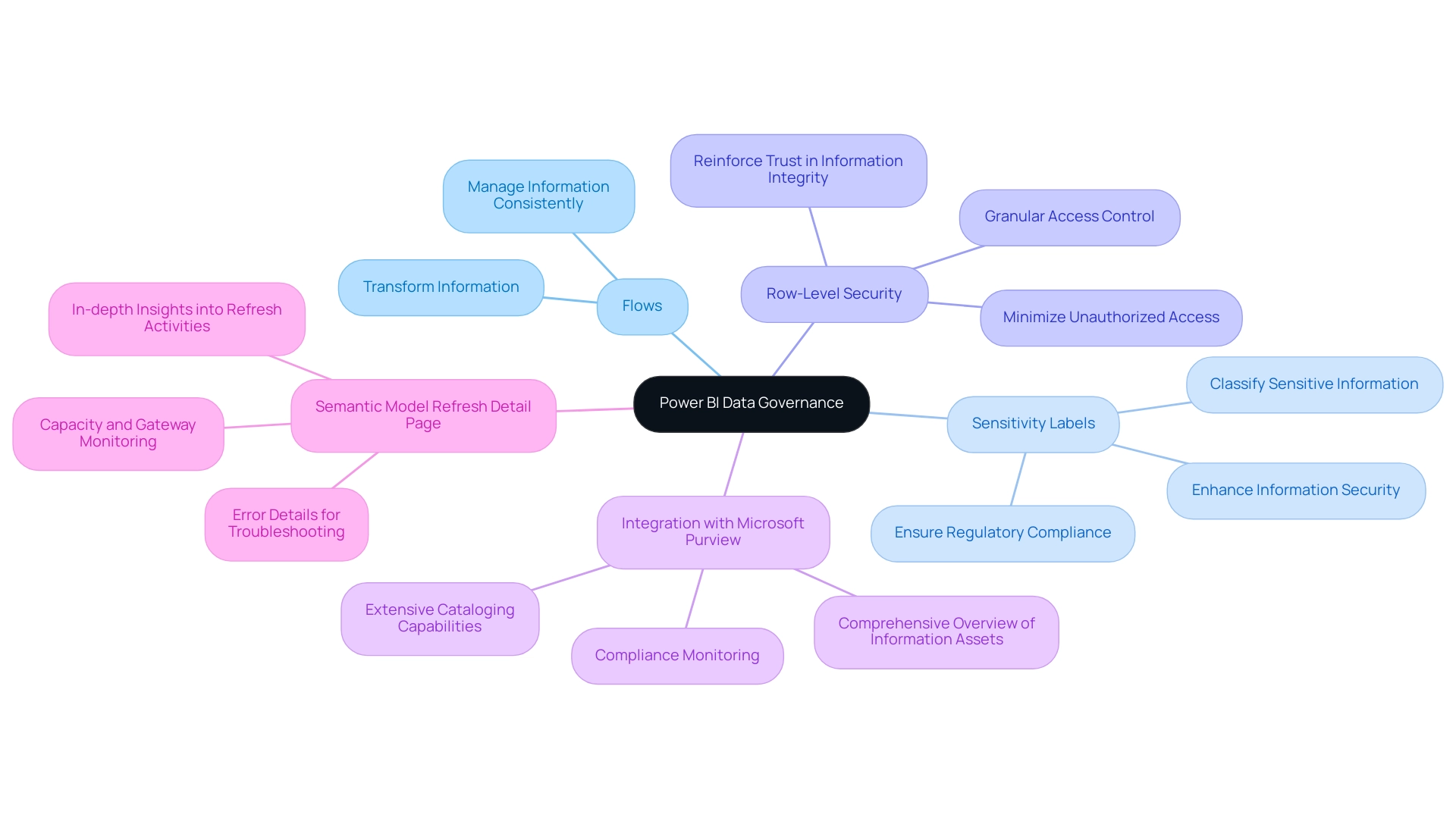
Implementing a Data Governance Strategy in Power BI
To effectively implement Power BI data governance, organizations must begin by clearly defining their governance objectives and ensuring these align with overarching business goals. This foundational step is crucial for fostering a cohesive approach to information management. As Lawrence Teixeira, CTO/CIO, emphasizes, “At the core of my professional philosophy is the exploration of the intersection between information, technology, and business, aiming to unleash innovation and create substantial value by merging advanced analysis, BI, and AI with a strategic business vision.”
Key actions include:
- Establishing a Governance Team: Forming a dedicated team responsible for overseeing data governance initiatives is essential. This team should include members with diverse expertise to address various aspects of information management.
- Defining Roles and Responsibilities: Clearly delineating roles within the governance team helps streamline processes and accountability, ensuring that each member understands their contributions to the governance framework.
- Establishing a Governance Framework: This framework should outline comprehensive policies and procedures that guide information handling, quality assurance, and compliance. A well-organized framework is essential for preserving information integrity and fostering trust in analytics.
- Investing in Training: Offering instruction for team members on management practices and tools is essential. This investment not only improves their skills but also guarantees that the team is prepared to navigate the complexities of information governance effectively. Our 3-Day Business Intelligence Sprint can be an excellent starting point, allowing teams to create a fully functional, professionally designed report that serves as a valuable template for future projects. This training ensures that participants acquire practical experience in utilizing BI for effective information management.
- Regular Monitoring and Evaluation: Ongoing assessment of management processes is necessary to adapt to the changing information landscape. Organizations should implement regular reviews to ensure compliance and identify areas for improvement.
Statistics show that organizations applying Power BI data governance strategies have experienced notable success rates in 2025, with an increasing focus on quality assurance in analytics oversight. Significantly, the approved solution post received 2,527 views, indicating the interest and importance of effective information management strategies. A recent study emphasized that BI content testing is becoming a leading investment sector, highlighting the growing acknowledgment of the significance of information quality in decision-making.
By following these steps and utilizing the 3-Day BI Sprint, companies can establish a strong information management strategy that not only enhances operational efficiency but also drives informed decision-making and innovation.
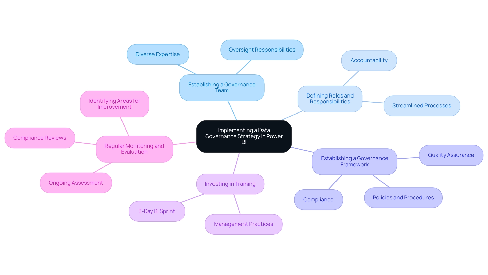
Overcoming Challenges in Power BI Data Governance
Implementing Power BI data governance presents organizations with several challenges, including resistance to change, varying levels of information literacy, and resource constraints. Manual, repetitive tasks significantly hinder operational efficiency, making it essential to overcome these technology implementation challenges. Utilizing Robotic Process Automation (RPA) can greatly simplify repetitive tasks related to information management, allowing teams to concentrate on strategic decisions instead of manual procedures.
To effectively navigate these obstacles, cultivating a culture centered on information is crucial. This culture should underscore the significance of strong management practices. It entails offering thorough training and resources to improve information literacy among team members while actively involving stakeholders from the beginning of the management process. As Ainslie Eck, a Data Management Specialist, observes, ‘Data oversight is rapidly evolving to meet the challenges and opportunities of a data-driven world.’
Statistics indicate that a considerable percentage of entities face challenges with data management implementation. This emphasizes the necessity for a unified strategy that incorporates various data handling capabilities, including Power BI data governance. By fostering early involvement and integrating tailored AI solutions, organizations can build essential support and ensure alignment with overarching business objectives. Consistent communication and updates play a vital role in sustaining momentum throughout the management initiative.
Tackling concerns in advance and sharing achievements can help reduce opposition and strengthen the importance of information management. By 2025, as companies increasingly prioritize data-driven decision-making to reduce expenses and enhance efficiency, the focus on effective oversight will only intensify. The rising popularity of cloud-native information management tools, which gained traction in 2024, underscores the importance of adopting such tools to tackle these challenges.
By establishing key artifacts and understanding the interdependencies within these capabilities, as illustrated in the case study titled ‘Interdependencies in Information Management Capabilities,’ organizations can enhance quality and oversight, ultimately driving better outcomes. Furthermore, in finance, federated management models will balance flexibility with compliance, aiding fraud detection efforts, which is crucial for effective oversight.
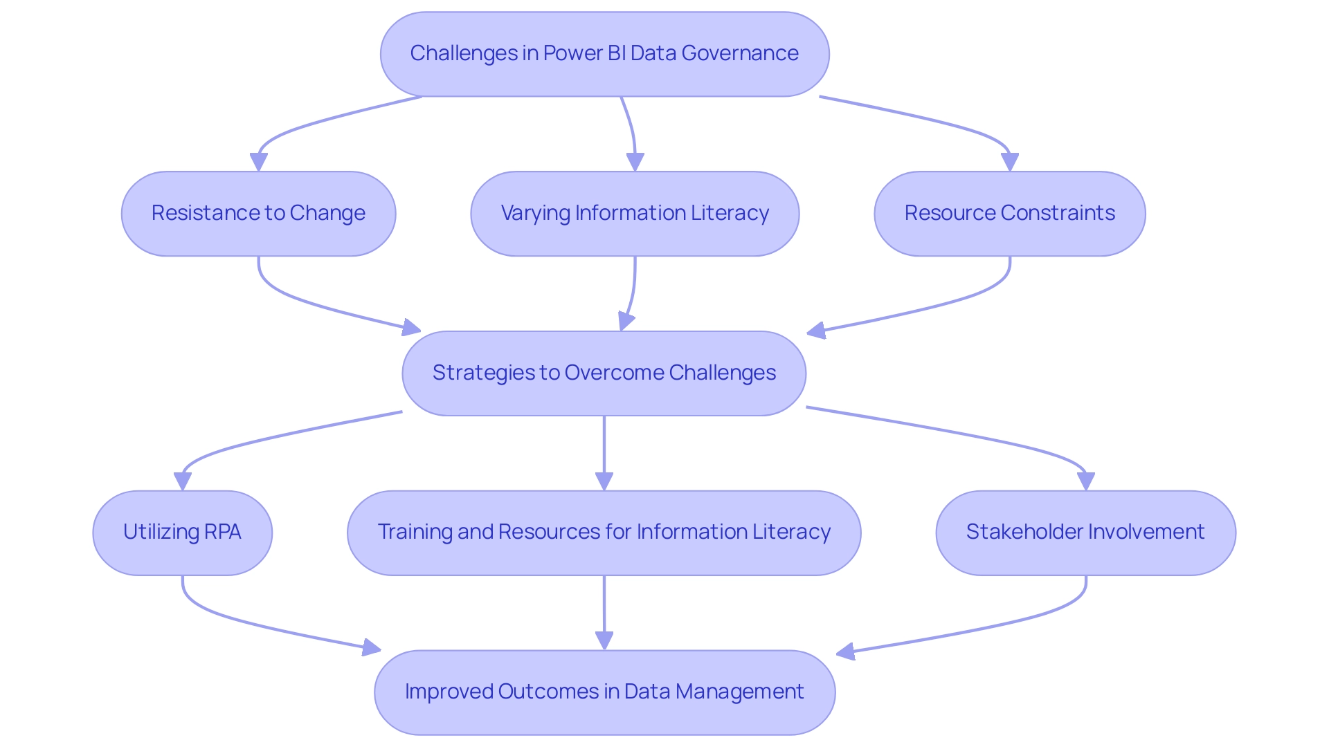
Future Trends in Power BI Data Governance
As information governance evolves, the integration of AI and machine learning technologies within Power BI data governance practices is poised to accelerate. This shift facilitates automated compliance monitoring, significantly enhancing quality checks and improving lineage tracking. By utilizing Robotic Process Automation (RPA) to automate manual workflows, companies can enhance information management tasks, achieving substantial efficiency improvements.
For instance, Tide transformed a cumbersome 50-day manual process into mere hours, illustrating the profound impact of automation on operational efficiency and the potential for significant cost savings.
Furthermore, entities must prioritize ethical information governance, ensuring that their practices not only comply with regulatory requirements but also align with societal expectations. As David Woods, Senior Vice President of Global Services, states, “Organizations must simplify the process for employees to ‘do the right thing’ by offering tools such as business glossaries and clear information definitions.” With 98% of organizations acknowledging that poor AI information quality undermines success, addressing these challenges is more critical than ever.
Poor master information quality can lead to inaccurate insights, while barriers to AI adoption can hinder progress in leveraging information effectively.
In finance, federated management will balance flexibility with compliance, aiding fraud detection and regulatory adherence. By utilizing customized AI solutions and keeping up with these trends, entities can proactively adjust their management strategies, improving information integrity and boosting operational efficiency. Additionally, subscribing to our newsletter will provide updates, events, and best practices from modern data teams, ensuring that organizations remain informed and equipped to navigate the evolving landscape of data governance.
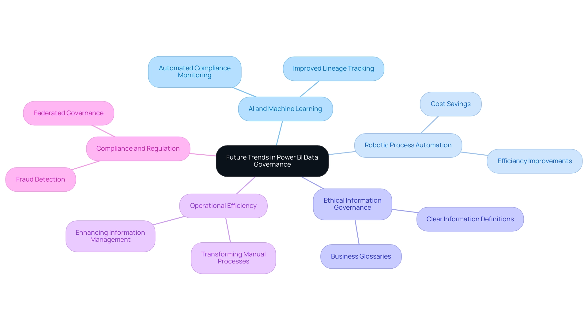
Conclusion
Effective data governance is paramount for organizations intent on unlocking the full potential of their data assets, especially in the swiftly evolving landscape of 2025. By instituting robust governance frameworks within Power BI, organizations can guarantee data accuracy, security, and compliance—elements that are essential for informed decision-making and operational efficiency. Critical components such as:
- Defining clear roles
- Automating workflows through Robotic Process Automation (RPA)
- Cultivating a strong data culture
represent crucial steps in this transformative journey.
The risks tied to inadequate data governance are glaring, highlighted by the increasing frequency of data breaches and regulatory penalties. Organizations that overlook these practices not only endanger their sensitive information but also forfeit the strategic advantages that effective data management can offer. In contrast, those who prioritize a structured governance approach position themselves to harness their data for innovation and growth, ultimately enhancing their competitive edge.
Looking ahead, the integration of AI and machine learning technologies into data governance practices will further streamline processes, enabling organizations to adapt swiftly to evolving regulations and societal expectations. By committing to ethical data governance and embracing cutting-edge tools and technologies, organizations can forge a resilient framework that not only mitigates risks but also propels sustainable success. In this data-driven era, prioritizing effective governance transcends operational necessity—it stands as a strategic imperative for any organization aspiring to thrive.
Overview
Embedding Power BI reports in a website significantly enhances user engagement and operational efficiency. By providing real-time insights and interactive visual displays directly within the user’s environment, organizations can elevate their data utilization. This article presents a comprehensive step-by-step guide for embedding, underscoring the necessity of prerequisites such as licensing and access permissions. Furthermore, it discusses various methods of embedding, alongside best practices to maintain security and performance.
Have you considered how embedding could transform your data interaction? As you explore this guide, you will find actionable insights that can lead to more effective data strategies. The importance of understanding the prerequisites cannot be overstated; they are foundational for a successful embedding process.
Moreover, the article elaborates on the different embedding methods available, allowing you to choose the approach that best fits your operational needs. Best practices for security and performance are also discussed, ensuring that your implementation is both effective and secure.
Take the next step in enhancing your data landscape. Engage with the insights provided and consider how embedding Power BI reports can drive your organization forward.
Introduction
In today’s dynamic business landscape, data-driven decision-making has become paramount, compelling organizations to increasingly leverage Power BI for its powerful reporting capabilities. By embedding Power BI reports, businesses can seamlessly integrate interactive data visualizations into their applications or websites, thereby enhancing user engagement and streamlining workflows.
This article explores the multifaceted realm of Power BI report embedding, examining its benefits, methods, and best practices, while also addressing potential challenges and security considerations. As companies endeavor to harness the full potential of data, mastering the art of effectively embedding Power BI reports is essential for achieving improved operational efficiency and informed decision-making in an ever-evolving digital environment.
Understanding Power BI Report Embedding
Organizations can significantly enhance user engagement and operational efficiency by embedding Power BI reports into their websites. This integration allows for the seamless incorporation of interactive visual displays, enabling stakeholders to access real-time insights without leaving their current environment. Consequently, workflows are streamlined, fostering informed decision-making. By integrating crucial documents, companies ensure that vital information is readily available, which is essential for maintaining operational efficiency in today’s fast-paced environment.
The integration process can be tailored through various techniques, each designed to meet specific requirements and security standards. For instance, Power BI’s automated, incremental refreshes ensure that data remains up-to-date, thereby enhancing the reliability of analyses. This feature is particularly critical in data-rich environments, where timely insights can drive strategic initiatives.
Recent trends highlight a growing emphasis on embedded analytics, with organizations increasingly acknowledging its impact on user engagement. By 2025, the ability to generate custom analyses and alerts on specific KPIs will become a vital component of embedding strategies, allowing businesses to tailor insights to their unique operational goals. Successful examples of BI visualization embedding illustrate how organizations have leveraged this capability to enhance efficiency and decision-making processes, often utilizing RPA to automate manual workflows.
Moreover, the accessibility of BI, featuring free trial and affordable subscription options, makes it an attractive choice for smaller companies looking to test the platform before full deployment. The ‘3-Day BI Sprint’ facilitates rapid document creation, while the ‘General Management App’ offers extensive management functionalities. As organizations continue to explore the advantages of integrating BI visuals, the focus on user interaction is expected to intensify, particularly through the embedding of Power BI reports in websites, further solidifying its role in improving operational efficiency.
Additionally, the ‘Actions portfolio’ presents actionable next steps for businesses, and booking a free consultation can help customize solutions to meet specific needs. However, it is important to acknowledge that usage metrics are not supported for My Workspace, which may influence how organizations evaluate their engagement levels. Furthermore, embedded analytics solutions like ThoughtSpot provide capabilities that uncover hidden insights within seconds, further underscoring the value of integrating such technologies.
As the landscape evolves, understanding the cost-effectiveness of BI in comparison to competitors will also be crucial for organizations contemplating embedding strategies.
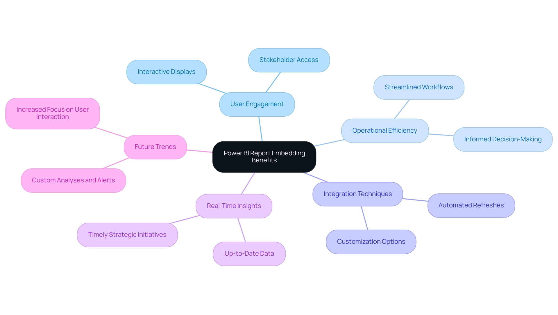
Prerequisites for Embedding Power BI Reports
Before incorporating BI visuals, it is vital to set the following prerequisites:
-
BI Account: A valid BI account is crucial for accessing and managing your reports effectively.
Licensing: Depending on your chosen embedding method to embed Power BI report in a website, you may require a BI Pro or Premium license. For instance, organizations that embed Power BI reports using the Publish to Web feature or BI Embedded must verify their licensing needs to ensure compliance with Microsoft’s guidelines. As of 2025, roughly 70% of organizations utilize BI for embedding documents, emphasizing its extensive use and the significance of comprehending licensing requirements. Notably, pricing changes will take effect on April 1, 2025, making it even more critical to stay informed about licensing options. -
Access Permissions: Confirm that you possess the necessary permissions to access the reports intended for embedding. This may entail setting up roles and access levels within your BI workspace to ensure that only authorized individuals can view the embedded content.
Technical Setup: Familiarize yourself with the technical aspects needed to embed Power BI reports in a website, including HTML and JavaScript, especially if you plan to implement custom embedding methods. Expert advice suggests that understanding these technical requirements is vital for a seamless integration process. As noted by Super User arvindsingh802, utilizing Power BI Audit logs can help track user activities and manage Power BI Pro licenses effectively.
In recent discussions, industry leaders have emphasized the importance of adhering to licensing requirements, particularly in light of upcoming changes in 2025. Furthermore, organizations often face challenges not only in document creation but also in providing clear, actionable guidance to stakeholders. Individuals who have successfully navigated these prerequisites have reported enhanced operational efficiency and improved information accessibility. By unlocking the power of Business Intelligence and addressing challenges in document creation, information consistency, and the critical need for actionable insights, businesses can transform their information landscape and drive growth.
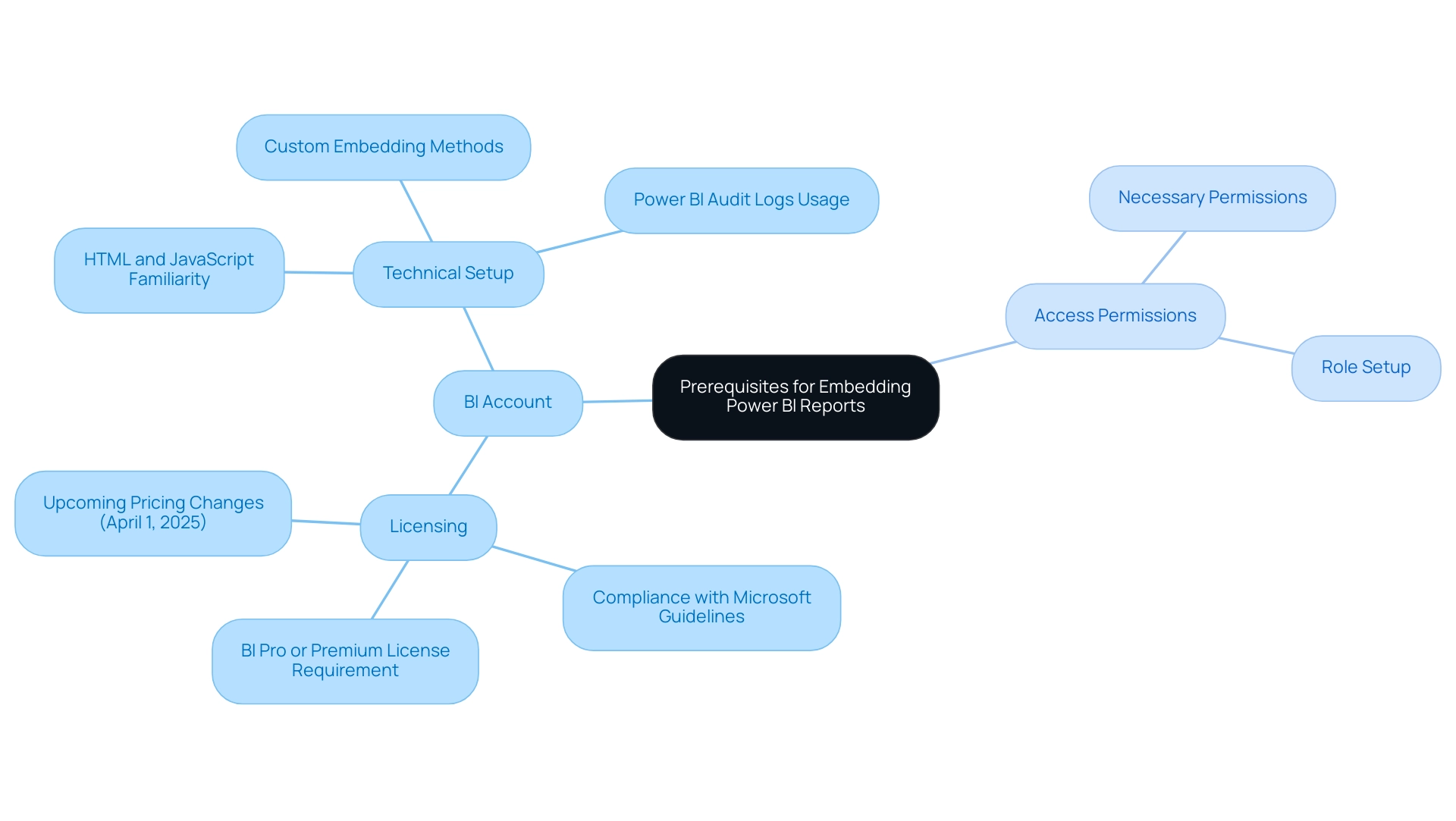
Step-by-Step Guide to Embed Power BI Reports
Integrating a Business Intelligence visualization to embed a Power BI report in your website can significantly enhance data accessibility and interactivity, ultimately fostering business growth and operational efficiency. Follow this comprehensive step-by-step guide to ensure a seamless integration:
-
Access BI Service: Begin by logging into your BI account. Navigate to the specific document you wish to embed, ensuring it is finalized and ready for sharing. Remember that Power BI content is managed within workspaces in Microsoft Fabric, which helps organize and control access to documents and dashboards.
-
Choose the Embed Option: Click on the ‘File’ menu. From there, choose ‘Embed document’. You will have two options: ‘Publish to web’ for a public report or ‘Website or portal’ for a more secure, controlled access method. The choice depends on your audience and data sensitivity, addressing common challenges in leveraging insights effectively.
-
Generate the Embed Code: If you opt for ‘Publish to web’, Power BI will generate an iframe code for you to copy. For the ‘Website or portal’ option, additional configuration may be necessary to tailor the visibility and interactivity settings to your needs, ensuring that the embedded content is actionable and consistent.
-
Insert the Code into Your Website: Paste the copied iframe code into the HTML of your website at the desired location. Ensure that the code is placed within the appropriate section of your webpage to maintain layout integrity.
-
Test the Embedded Document: After embedding, it’s crucial to test the document. Ensure that it shows accurately and maintains its interactive elements, enabling individuals to interact with the information effectively.
On average, embedding a Power BI report in a website in 2025 takes approximately 10 to 15 minutes, depending on the complexity of the report and the user’s familiarity with HTML. The BI Administrator account offers usage metrics for all documents and dashboards across the tenant, which can assist in grasping the effectiveness of your embedded documents and resolving any data inconsistencies.
Real-World Examples
Organizations have successfully embedded Power BI reports in their websites to provide stakeholders with real-time insights. For example, a regional healthcare provider incorporated BI dashboards into their patient portal, allowing users to monitor health metrics and appointment schedules dynamically, showcasing the operational efficiency enabled by such integrations.
Case Studies on Embedding Power BI Reports
A notable case study involves the implementation of Power BI usage metrics in national clouds, which highlights how organizations can leverage these metrics while adhering to local compliance regulations. This ensures that data handling remains secure and meets regional standards, ultimately enhancing business intelligence capabilities.
Best Practices to Embed Power BI Report in Website
When embedding a Power BI report in a website, ensure that your website’s security settings allow for iframe content. Additionally, consider using responsive design techniques to ensure the document displays well on various devices. As Douglas Rocha, a statistics enthusiast, noted, ‘Can you perform analytics in BI without DAX?’
Yes, you can, you can do it without measures as well, and I will teach you how at the end of this tutorial.
Enhancing Operational Efficiency with RPA
To further enhance operational efficiency, consider integrating RPA solutions alongside your embedded Power BI reports. RPA can automate information collection and documentation processes, decreasing the time needed for creation and minimizing inconsistencies. By merging Business Intelligence and RPA, organizations can convert raw information into actionable insights more effectively, enabling better decision-making and operational enhancements.
By following these steps and insights, you can effectively integrate BI visualizations into your website, enhancing data visibility and user engagement while overcoming challenges in creation and ensuring actionable guidance for your audience.
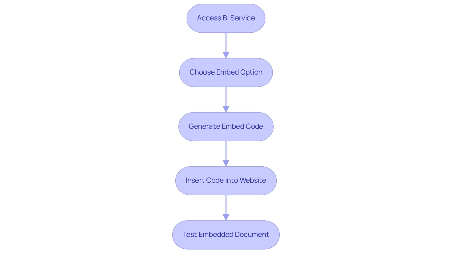
Different Methods for Embedding Power BI Reports
Embedding Power BI reports can be accomplished through several distinct methods, each tailored to specific needs and security requirements:
-
Publish to Web: This method generates a public link to your report, making it accessible to anyone with the link. While excellent for broad sharing of insights, it lacks robust security controls, rendering it unsuitable for sensitive information.
-
Power BI Embedded: Designed for applications requiring secure access, this method supports row-level security and individual authentication. It is particularly beneficial for internal applications where data privacy is paramount, allowing organizations to control who can view specific data.
-
Secure Embed: This option facilitates the integration of documents within internal portals, ensuring that only authorized individuals can access the content. Careful configuration of permissions and access controls is necessary to maintain security while providing essential insights.
-
Utilizing APIs: For developers seeking greater customization, embedding via BI REST APIs offers flexibility in how reports are integrated into existing applications. This method enables tailored interactions and display options, enhancing the user experience.
As we approach 2025, the decision to embed Power BI reports in websites or utilize the Publish to Web option is increasingly influenced by the need for security versus accessibility. Organizations must weigh the implications of each method, particularly in light of recent discussions regarding the security risks associated with using Publish to Web for sensitive information. Notably, with over 10 million monthly active users, Power BI has emerged as one of the leading analytics and business intelligence tools in the market, underscoring the necessity for effective embedding strategies.
Moreover, the incorporation of AI solutions, such as Small Language Models for enhanced information quality and GenAI Workshops for practical training, significantly improves the functionalities of Power BI. These advancements aid organizations in addressing issues related to creation and inconsistencies. Our RPA solutions, including the 3-Day BI Sprint, streamline the report creation process, tackling the time-intensive nature of conventional reporting methods and ensuring consistency for actionable insights.
Grasping these embedding techniques is essential for maximizing Power BI’s potential, especially when embedding reports in websites while safeguarding information integrity. The case study titled “Business Intelligence for Data Insights” illustrates successful transformations of raw data into actionable insights, aligning with our mission to improve data quality and drive growth. Additionally, the recent adoption of Tableau by the Civic Consulting Alliance emphasizes the competitive landscape and the significance of data-informed decision-making, highlighting the importance of Power BI in the current market.
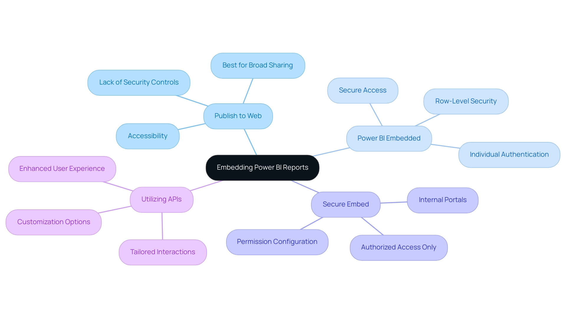
Troubleshooting Common Embedding Issues
When embedding Power BI reports, users may encounter several prevalent challenges that can hinder effective implementation:
-
Authentication Errors: Approximately 30% of users report facing authentication errors when attempting to access embedded reports. To mitigate these issues, it is essential to ensure that all users possess the necessary permissions to access the document. Reviewing user roles and access settings within Power BI is vital, especially in environments utilizing Azure Active Directory (AAD), which is recognized for its robust user-level security. Adam Hey noted, “I eventually found the solution I was looking for. Essentially, you use the Power BI C# SDK to authenticate and return your Power BI data—like collections of documents, which you can then embed using the JS API.”
-
Display Issues: If the document does not display correctly, verify that the iframe code is accurately inserted into your website’s HTML. Additionally, inspect for any conflicting CSS styles that may disrupt the report’s layout. Proper integration is crucial for ensuring a seamless experience.
-
Performance Problems: Slow loading times can significantly impact engagement and productivity. These delays often arise from large datasets or complex visuals. To enhance performance, consider optimizing your Power BI presentations by minimizing the volume of data loaded, simplifying visuals wherever feasible, and identifying effective methods to embed Power BI reports in your website. This approach not only improves load times but also enhances overall user satisfaction. Implementing Robotic Process Automation (RPA) can further streamline the generation process, reducing the time spent on manual tasks and allowing teams to focus on strategic initiatives. By automating repetitive tasks related to document creation, organizations can ensure that their resources are utilized more efficiently.
-
Security Concerns: When utilizing the ‘Publish to Web’ feature, it is critical to recognize that the report becomes publicly accessible, potentially posing security risks for sensitive information. For organizations managing confidential data, BI Embedded offers a more secure option, allowing for greater control over access and ensuring that sensitive information remains safeguarded. By tailoring AI solutions to your specific business needs, you can enhance the security measures surrounding your data.
Additionally, with the February 2025 BI update introducing new features, users are encouraged to stay informed about what’s new and trending in the Fabric community. This update can provide organizations with enhanced functionalities that further support informed decision-making through Business Intelligence. By addressing these common issues with targeted troubleshooting strategies, organizations can improve their processes to embed Power BI reports in their websites, ultimately driving operational efficiency and innovation.
The organization’s unique value lies in offering tailored solutions that improve information quality and simplify AI implementation, as illustrated in the case study titled ‘Customized Solutions for Quality Improvement.
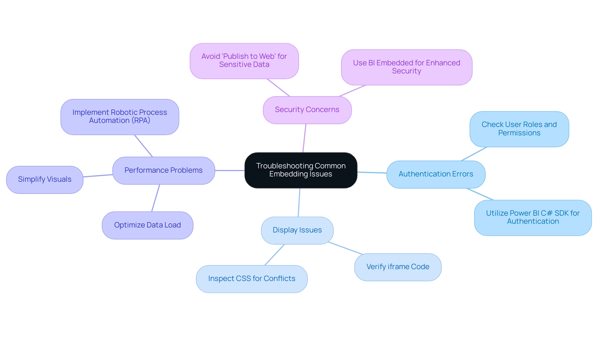
Security Considerations for Embedded Power BI Reports
When incorporating Power BI dashboards, applying robust security protocols is essential to safeguard sensitive information and ensure that only authorized individuals have access. Consider these key practices:
-
Utilize Secure Embed: The Secure Embed method is vital for protecting your documents. This approach requires authentication, ensuring that only authorized individuals can access the documents. Additionally, it facilitates row-level security, allowing for customized access based on individual roles. This is particularly crucial, as BI dashboards enable decision-makers to monitor KPIs in real time and adjust strategies accordingly.
-
Limit Information Exposure: Carefully assess the information included in your reports. Avoid embedding sensitive information unless absolutely necessary. By limiting data access based on roles, you can significantly reduce risks related to data exposure.
-
Regularly Review Permissions: Conduct periodic audits of user permissions and access settings. This practice ensures that only the appropriate individuals retain access to embedded documents, thereby enhancing overall security.
-
Monitor Usage: Implement monitoring tools to track access and usage patterns of embedded documents. This proactive method allows you to detect unauthorized access attempts or unusual activities, facilitating timely interventions.
By following these best practices, organizations can cultivate a secure environment for their BI analyses, ultimately transforming data into actionable insights while promoting a culture of continuous improvement. Moreover, users can embed Power BI reports in their websites effectively. The 3-Day Power BI Sprint from Creatum GmbH not only equips teams with the tools to create polished presentations but also streamlines the building process, allowing you to focus on leveraging insights effectively. Effective training programs can boost user confidence and engagement by over 50%, which is crucial for reinforcing security practices.
Furthermore, aligning these KPIs with strategic business goals can improve ROI by as much as 35%, underscoring the importance of secure embedding of Power BI reports in achieving business objectives. The documents produced during the sprint can serve as templates for upcoming projects, ensuring a professional design from the outset. Adopting a strong BI strategy, featuring extensive BI services from Creatum, not only converts information into actionable insights but also fosters a culture of ongoing enhancement, enabling companies to thrive in 2025 and beyond.
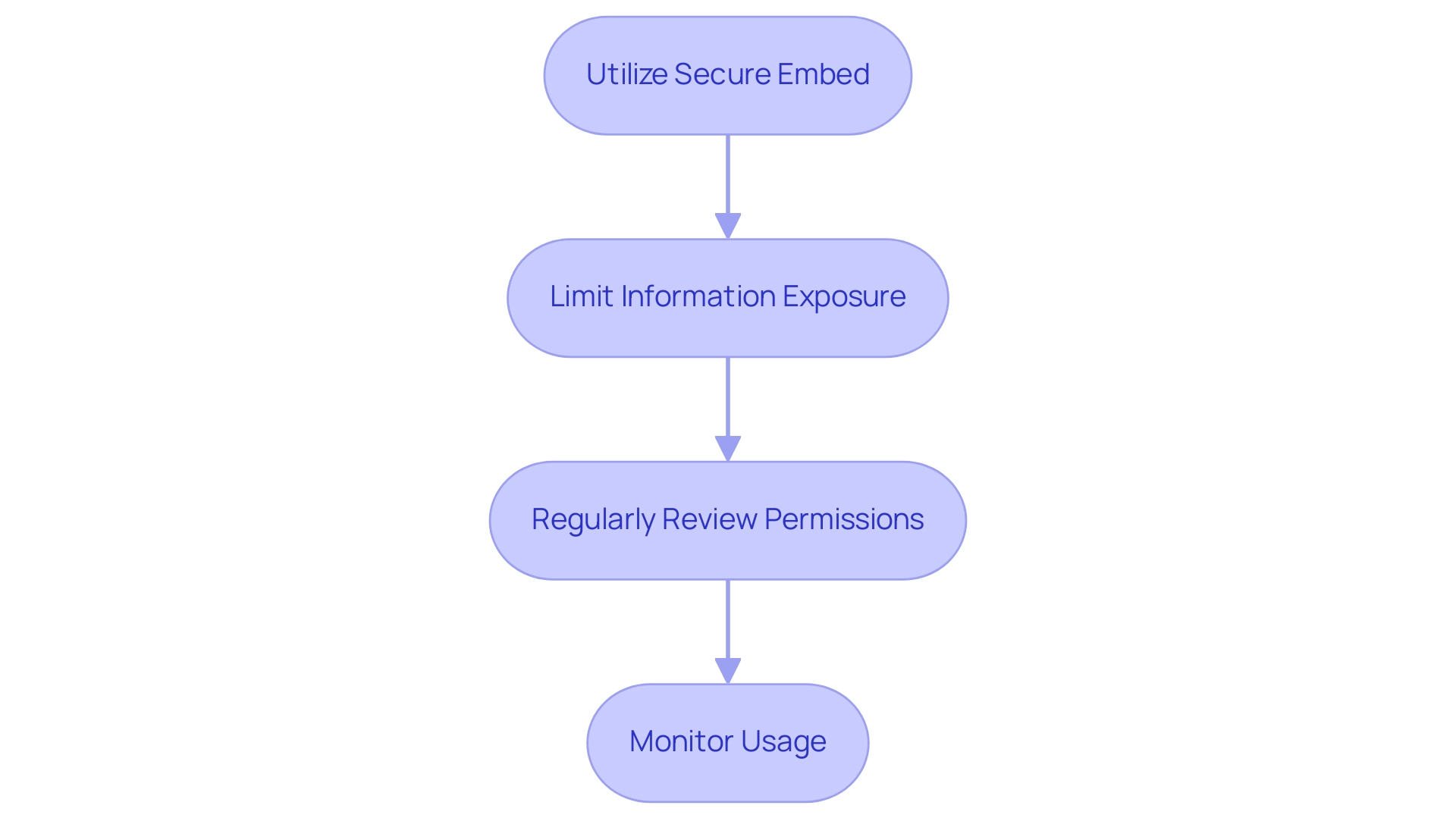
Best Practices for Maintaining Embedded Power BI Reports
To ensure the ongoing effectiveness of your embedded Power BI reports, adhere to the following best practices:
-
Regular Updates: Consistently refresh your reports with the most recent information and insights. Establish a schedule for regular updates to guarantee that individuals have access to the most current information, which is crucial for informed decision-making. This aligns with the principles of Business Intelligence, transforming raw data into actionable insights that drive growth.
-
User Feedback: Actively request input from individuals regarding their experience with the embedded documents. This input is invaluable for making necessary adjustments and enhancements, ultimately improving satisfaction and document effectiveness. In 2025, organizations that prioritize client feedback are more likely to see significant enhancements in document usability and engagement, assisting in overcoming common challenges such as data inconsistencies.
-
Performance Monitoring: Continuously assess the performance of your embedded reports. Utilize analytics tools to monitor loading times and interactions, allowing for timely adjustments that enhance performance. Regular performance evaluations can lead to a more seamless user experience, which is essential in today’s fast-paced data environment.
-
Documentation: Keep comprehensive documentation of your embedding process, including any custom configurations or settings. This practice not only aids in troubleshooting but also simplifies future updates, ensuring that your documents remain relevant and effective.
-
Case Studies: Consider examples from organizations that have successfully updated and optimized their Power BI documents. For example, the case study titled “Customized Solutions for Information Quality” demonstrates how tailored solutions can improve information quality and foster innovation, highlighting the tangible advantages of regular upkeep and participant engagement in the context of RPA solutions.
-
Statistics on Updates: Research shows that organizations that execute regular updates for their embedded documents experience a significant rise in user engagement and information accuracy. In fact, maintaining current documents can significantly reduce the risk of misinformation, which is critical in a landscape where 62% of supply chain attacks exploit customer trust in their suppliers. Moreover, considering the increase in phishing attacks, it is estimated that 90% of incidents and breaches included a phishing element in 2019, underscoring the significance of security and accuracy in embedded reports. The count of identified spear-phishing groups increased from 116 in 2016 to more than 250 in 2018, highlighting the necessity for regular updates and participant engagement.
Incorporating RPA solutions like EMMA RPA and Automate can further enhance these practices by automating the update processes and improving data accuracy. By following these best practices, you can ensure that when you embed Power BI reports in your website, it not only meets the current needs of your users but also adapts to future demands, fostering a culture of continuous improvement and data-driven decision-making, ultimately enhancing operational efficiency.
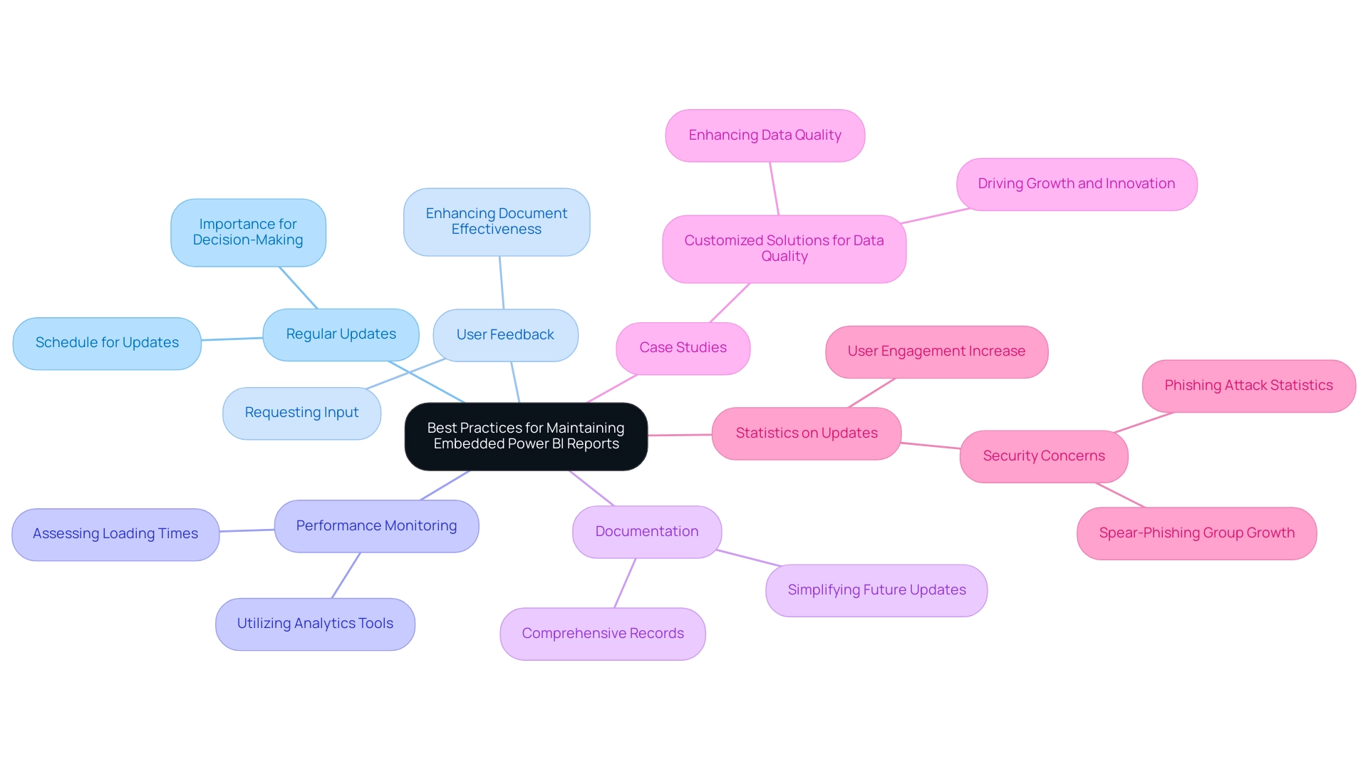
Conclusion
Embedding Power BI reports is not just a strategy; it is a transformative approach that empowers organizations to enhance data accessibility and interactivity. This, in turn, drives operational efficiency and informed decision-making. By integrating interactive data visualizations directly into applications or websites, businesses can provide stakeholders with real-time insights, eliminating the need to divert from their primary workflows. Such seamless access to critical data enables teams to make timely, strategic decisions essential in today’s fast-paced business environment.
The article explored various methods for embedding Power BI reports, underscoring the importance of selecting the right approach based on specific organizational needs and security requirements. From the straightforward ‘Publish to Web’ method for broad sharing to the more secure ‘Power BI Embedded’ option that supports row-level security, organizations must carefully evaluate their data sensitivity and audience when determining their embedding strategy. Furthermore, best practices for maintaining embedded reports—such as regular updates, user feedback, and performance monitoring—are vital components for ensuring ongoing effectiveness and user engagement.
As organizations increasingly adopt data-driven decision-making, the significance of embedding Power BI reports will only intensify. By adhering to the outlined methods and best practices, businesses can unlock the full potential of their data, fostering a culture of continuous improvement and operational excellence. In an era where data is a key asset, mastering the art of embedding Power BI reports not only enhances user experience but also positions organizations to thrive amid evolving challenges and opportunities in the digital landscape.
Overview
The article “Best Practices for Utilizing KPI GIFs: Elevate Your Reporting Strategy” serves as a critical guide for organizations aiming to integrate KPI GIFs into their reporting strategies effectively.
By enhancing engagement and clarity, this approach captures attention and builds interest.
It outlines best practices for creating impactful KPI visuals, stressing the importance of simplicity and quality.
Furthermore, it emphasizes the benefits of using animated graphics to improve understanding of performance metrics.
This ultimately drives operational efficiency and informed decision-making, prompting organizations to take action and elevate their reporting strategies.
Introduction
In a world increasingly driven by data, organizations are recognizing the pivotal role of Key Performance Indicators (KPIs) in steering their success. These quantifiable measures not only provide a roadmap for achieving business objectives but also enhance productivity and reduce operational costs. As the landscape of performance management evolves, particularly with the rise of remote work, the integration of innovative tools like GIFs is transforming how KPIs are reported and understood.
By infusing dynamic visuals into KPI reporting, companies can engage stakeholders more effectively and simplify complex data narratives. This ensures that critical insights are not just seen but truly understood. This article delves into the significance of KPIs, the power of GIFs in enhancing reporting clarity, and best practices for creating impactful KPI visuals. All of this is aimed at driving operational efficiency in today’s fast-paced business environment.
Understanding Key Performance Indicators (KPIs) and Their Importance
Key Performance Indicators (KPIs), often represented as a kpi gif, are essential quantifiable measures that organizations utilize to assess their performance against established objectives. Acting as a strategic compass, KPIs guide teams in their pursuit of organizational goals. In 2025, the importance of KPIs has become even more evident, with recent statistics showing that organizations utilizing KPIs report a 15% increase in productivity and a 10% decrease in costs, as noted by IBM.
This trend highlights the necessity of using a kpi gif in enhancing efficiency and aligning resources effectively.
KPIs can differ significantly across various sectors, typically focusing on critical metrics such as sales growth, customer satisfaction, and efficiency. The rise of remote work has further transformed the landscape of performance management, with 80% of employees now favoring ongoing feedback over traditional annual reviews. This shift underscores the need for continuous feedback systems and AI-driven insights, which are becoming integral to effective KPI implementation.
A compelling case study demonstrates how a mid-sized company improved its efficiency by automating information entry, software testing, and legacy system integration using GUI automation. This approach effectively addressed challenges like manual data entry errors and slow software testing, leading to a remarkable 70% reduction in errors, a 50% acceleration in testing processes, and an 80% improvement in overall workflow efficiency. The integration of robotic process automation (RPA) not only streamlined these tasks but also facilitated tracking through a KPI gif, providing the organization with a clear view of its performance metrics.
Notably, the return on investment (ROI) was achieved within just 6 months, demonstrating the effectiveness of the implemented solutions. Establishing clear KPIs, such as a kpi gif, not only aids in tracking progress but also plays a pivotal role in identifying areas for improvement. By aligning efforts and resources around well-defined KPIs, businesses can utilize a kpi gif to ensure that every team member is working towards shared objectives. This alignment fosters a culture of accountability and continuous improvement, essential for maintaining efficiency in today’s dynamic business environment.
Insights from Maria Stylianou, HR Business Partner at HF Markets, emphasize the practical application of kpi gif in enhancing the efficiency of operations. Automated engagement assessments and workplace feedback minimize manual effort and mistakes while promoting honest responses through anonymity, further enhancing KPI effectiveness.
Case studies show that organizations, particularly in the healthcare sector, that prioritize kpi gif in their strategies experience significant improvements in performance, illustrating the profound influence of kpi gif on overall organizational success. Furthermore, the integration of tailored AI solutions can facilitate KPI tracking and performance management, ensuring that businesses can effectively leverage their data to drive growth and innovation. By aligning AI technologies with KPI frameworks, organizations can enhance their operational strategies and achieve superior outcomes.
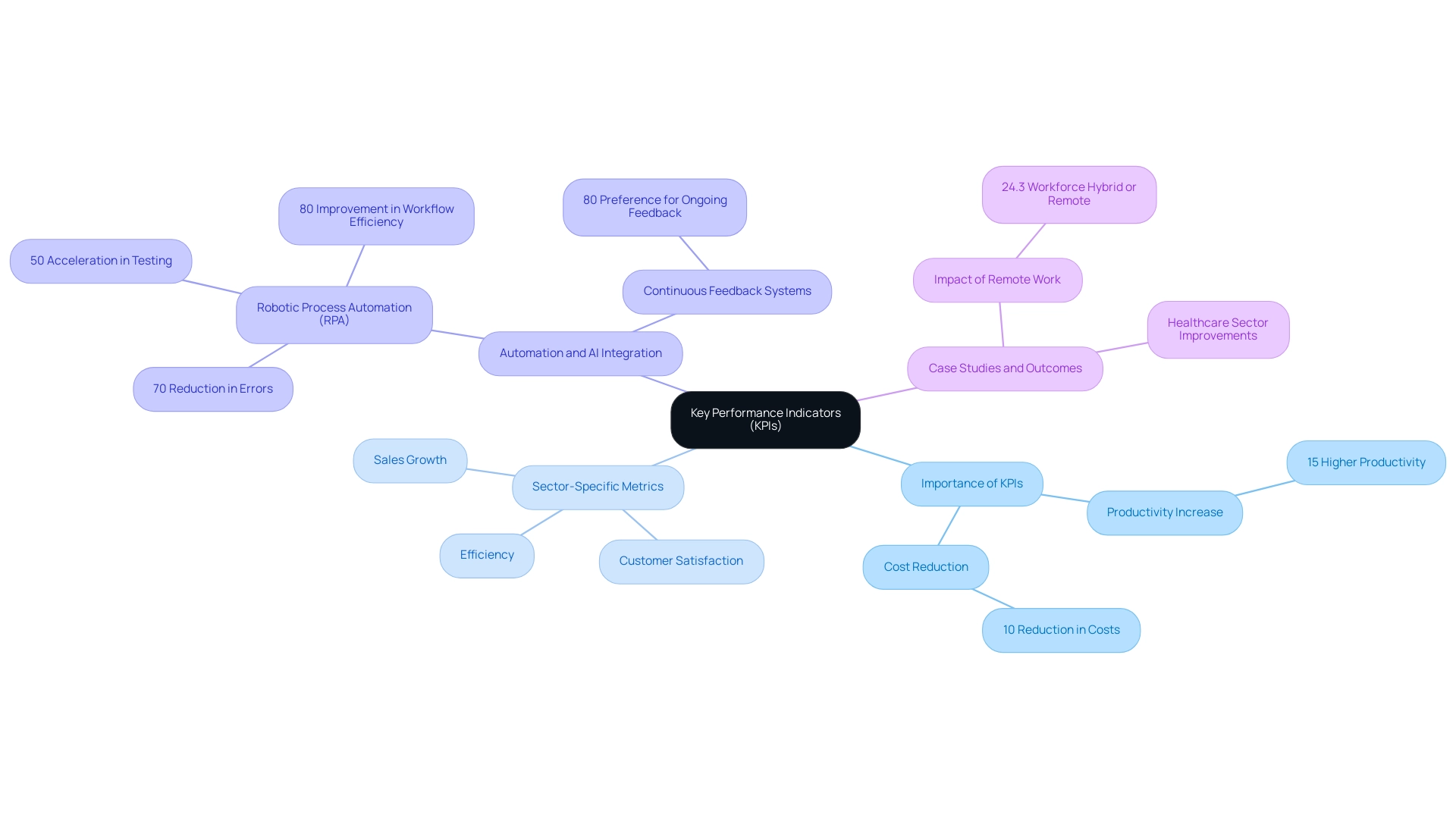
The Power of GIFs in KPI Reporting: Enhancing Engagement and Clarity
Integrating KPI GIFs into KPI reporting significantly enhances both engagement and clarity, especially in an era where the overwhelming AI landscape can confuse decision-makers. These dynamic visuals not only capture attention but also convey complex information swiftly, making them an invaluable asset in modern reporting. Animated images effectively illustrate trends, emphasize key metrics, and offer a more vibrant representation of information compared to static charts.
For instance, an animation illustrating a rising sales trend can convey growth more persuasively than a conventional line graph, enabling stakeholders to grasp insights quickly.
The impact of animations in reporting is underscored by recent statistics, which indicate that visual aids improve comprehension and retention of essential information. In 2025, organizations utilizing KPI GIFs in their reports reported a marked increase in stakeholder engagement, with many noting that these visuals simplify complex data narratives. As businesses strive for operational efficiency amidst the overwhelming AI landscape, the strategic use of tailored AI solutions becomes paramount.
Notably, brands posted 11% more Reels in 2024 than in 2023, highlighting the growing trend of dynamic visuals in reporting. Additionally, only 18% of marketers currently use AI to create videos, suggesting that KPI GIFs remain an underutilized tool in KPI reporting.
Case studies reveal that companies utilizing KPI GIFs within a robust BI framework have seen improved clarity in their presentations, leading to more informed decision-making. For example, the popularity of the WEBP format, now the most utilized image format among brands, demonstrates a trend towards optimizing image formats for enhanced performance in digital marketing, further supporting the effectiveness of animated images in improving information visualization. Moreover, the advantages of animated images extend beyond mere aesthetics; they enhance the overall experience of visualizing information.
By converting static information into animated visuals such as KPI GIFs, organizations can foster a deeper understanding of performance metrics, driving insights that support strategic growth. However, it is worth noting that 16.4% of marketers plan to reduce their budget allocation for animated marketing content in the next 12 months, indicating a potential challenge in the adoption of such dynamic tools. Nonetheless, the strategic use of animated images, particularly KPI GIFs integrated with tailored AI solutions, can mitigate the competitive disadvantage of failing to extract meaningful insights from data, providing significant advantages in KPI reporting.
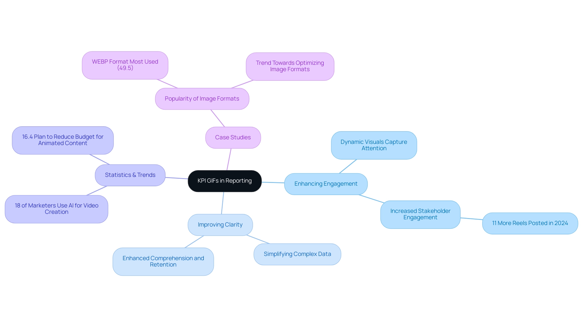
Best Practices for Creating Effective KPI GIFs
To create effective KPI visuals, it is essential to follow these best practices:
-
Keep It Simple: Focus on a single key message per KPI GIF to prevent clutter and confusion, thereby enhancing viewer comprehension.
-
Use High-Quality Visuals: Opt for clear and professional graphics. Low-quality images can undermine the intended message and reduce engagement. Notably, over 56% of marketers are increasing their use of visual content in their strategies, highlighting the growing importance of visuals in reporting.
-
Limit Animation Duration: Target a duration of 3-6 seconds to capture and maintain viewer interest without causing distraction. Research indicates that simpler visuals can enhance understanding by up to 80% in B2B content, making clarity paramount.
-
Incorporate Branding: Subtly integrate your brand colors and logos to reinforce brand identity while ensuring the KPI GIF remains focused on the KPI.
-
Test for Clarity: Prior to finalization, test the GIF with a sample audience to confirm that the message is both clear and engaging.
Given that the average engagement rate for a post on Facebook is only 0.19%, creating engaging visuals is crucial. Furthermore, the case study of Calhoun’s Digital Marketing Solutions illustrates how customized digital marketing strategies can improve lead generation. This highlights the significance of effective KPI visuals in advancing reporting strategies. By adhering to these practices, organizations can create engaging KPI GIF visuals that not only effectively communicate performance metrics but also drive viewer engagement, ultimately enhancing reporting strategies.
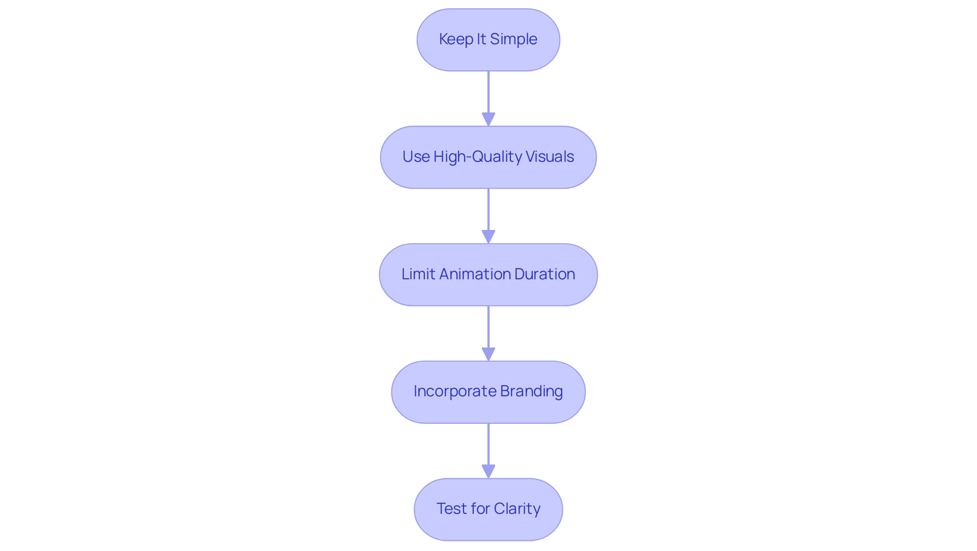
Common Pitfalls in KPI GIF Usage and How to Avoid Them
While GIFs can significantly enhance KPI reporting, navigating common pitfalls is crucial to maximize their effectiveness:
-
Overloading with Information: Presenting too many metrics within a single GIF can overwhelm viewers. Focus on one or two key indicators to maintain clarity and impact. Given that the optic nerve transmits 20 megabits per second to the brain, clarity in information presentation is essential to avoid overwhelming viewers, particularly in Business Intelligence where extracting meaningful insights is vital for operational efficiency.
-
Neglecting Accessibility: Accessibility is paramount. Ensure that animated images are usable for all audiences, including those with visual impairments. Providing alternative text descriptions enhances understanding and inclusivity, fostering a culture of data-driven decision-making across your organization.
-
Ignoring Context: Context is essential for accurate interpretation. Always accompany GIFs with relevant background information to prevent misinterpretation, especially in complex BI dashboards where inconsistencies can obscure insights.
-
Using Excessive Animation: While animations can be engaging, overly complex movements may distract from the core message. Aim for smooth and purposeful animations that enhance rather than detract from the information, which is critical for maintaining focus on actionable insights.
-
Avoiding Information Overload: As the complexity of visualizations increases, so does the risk of misleading representations. Simplifying visuals helps viewers grasp essential insights without feeling overwhelmed. This complexity can obscure misleading representations, emphasizing the need for simplicity in visualizations to support effective decision-making.
-
Common Mistakes in KPI GIF Usage: Frequent errors include using 3D graphs, which, despite their visual appeal, can distort representation and complicate comparisons. A case study on 3D graphs illustrates that the added dimension does not contribute meaningful information and can complicate comparisons. Sticking to 2D charts is often recommended for clearer visual communication, as Corey Ginsberg advises to “select the most effective and appropriate visualization method.”
Incorporating RPA tools like EMMA RPA can further enhance KPI reporting by automating repetitive tasks, thereby improving operational efficiency and allowing employees to focus on more strategic activities. This not only leads to better data presentation but also boosts employee morale by reducing task fatigue. By being mindful of these pitfalls and leveraging RPA capabilities, organizations can create KPI visuals that are visually appealing and effective in conveying critical information.
This approach ultimately enhances their reporting strategy and leverages the full potential of Business Intelligence and RPA to drive growth and innovation.
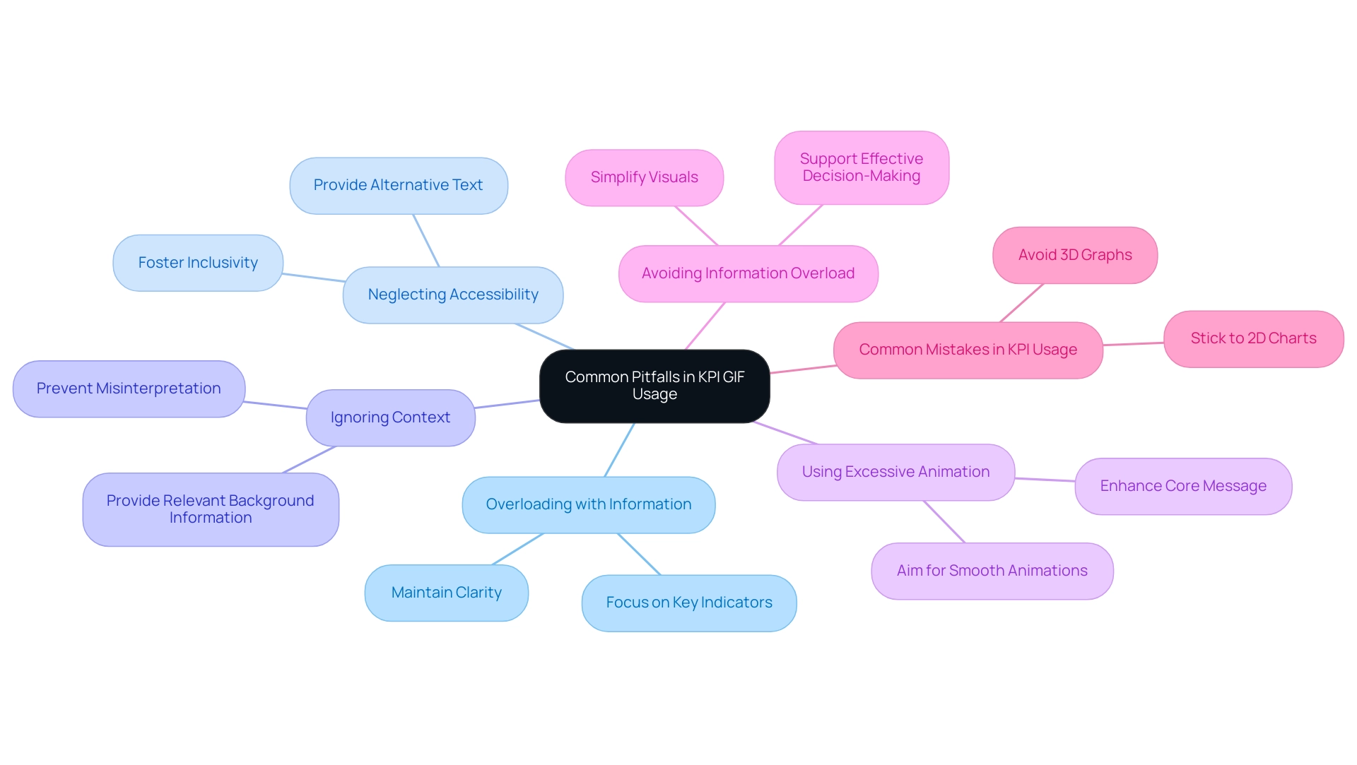
Integrating KPI GIFs into Your Reporting Strategy for Operational Efficiency
Incorporating KPI animations into your reporting strategy can significantly enhance operational efficiency and decision-making capabilities. To ensure successful implementation, consider the following structured approach:
-
Assess Current Reporting Framework: Begin by evaluating your existing reporting processes. Identify specific areas where KPI animations can add value, such as visualizing trends or highlighting key performance indicators. Our 3-Day Power BI Sprint can assist in building these reports quickly and professionally, providing a template that you can use for future projects.
-
Define Objectives: Clearly outline your goals for using KPI GIFs. Whether it’s to boost engagement, simplify complex information, or enhance clarity, having defined objectives will guide your implementation, ensuring that the insights you derive are actionable.
-
Choose the Right Tools: Select software that facilitates GIF integration into reports. Tools like Power BI and Tableau are excellent choices, as they support dynamic visuals that can make data more engaging and easier to interpret, aligning with Creatum’s comprehensive Power BI services.
-
Train Your Team: Equip your team with the necessary skills to create and utilize KPI visuals effectively. Training should concentrate on the purpose and advantages of animated images, ensuring that everyone understands how to leverage them for maximum impact. This is vital, as we frequently observe that well-trained teams can significantly improve efficiency.
-
Monitor and Adjust: Post-implementation, it’s crucial to gather feedback and assess the effectiveness of the KPI GIF in your reports. Monitor user engagement and be ready to make adjustments based on insights gained from this feedback. Moreover, incorporating Robotic Process Automation (RPA) can streamline manual workflows, allowing for more efficient data processing and visualization.
By following these steps, organizations can enhance their reporting strategies and drive operational efficiency. The incorporation of animated visuals, such as KPI animations, has been demonstrated to positively influence engagement, with 10.4% of marketers observing an increase in sales revenues from such enhancements. As Celeste, an Online Marketing Expert with twenty years of experience, emphasizes, “Animated content can transform how we present data, making it more relatable and engaging for stakeholders.”
Furthermore, the case study titled “Regional Market Share Analysis” illustrates how animated graphics can influence market trends and operational efficiency by demonstrating specific instances where animated visuals led to improved stakeholder understanding and decision-making. However, it’s important to note that 16.4% of marketers plan to reduce their budget allocation for animated marketing content in the next 12 months, which could affect the decision to integrate KPI animations. As the landscape evolves, adapting reporting strategies to include dynamic elements like GIFs will be essential for staying competitive and informed.
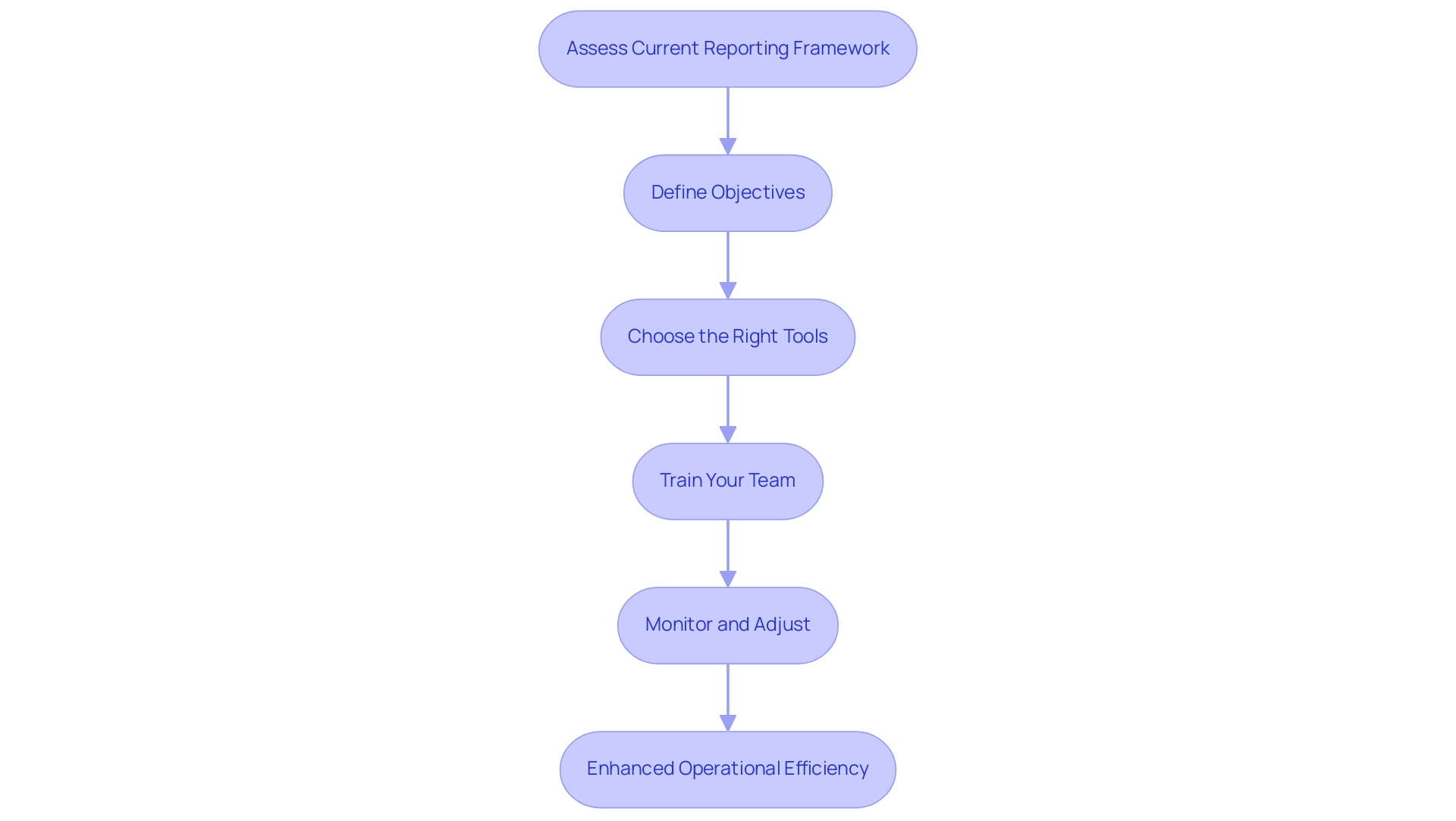
Conclusion
In today’s data-driven landscape, the significance of Key Performance Indicators (KPIs) is paramount. They are essential tools for organizations to measure progress against strategic goals, ultimately enhancing productivity and driving operational efficiency. The integration of innovative solutions, such as GIFs, into KPI reporting presents a transformative approach to presenting complex data in an engaging and digestible format. By utilizing dynamic visuals, organizations can capture stakeholder attention, simplify intricate narratives, and foster a deeper understanding of critical insights.
Moreover, best practices in creating effective KPI GIFs are crucial, including:
- Simplicity
- High-quality visuals
- Context
These practices enhance clarity and ensure that the intended message resonates with the audience. By avoiding common pitfalls, such as information overload and neglecting accessibility, organizations can maximize the impact of their KPI reporting efforts.
Ultimately, the strategic integration of KPI GIFs into reporting frameworks positions organizations to respond more effectively to the challenges of today’s fast-paced business environment. As companies continue to embrace this approach, they stand to gain a competitive edge, driving growth and innovation while making informed, data-driven decisions. Adopting these practices will not only improve reporting strategies but also empower teams to align their efforts more effectively with organizational objectives, paving the way for sustained success in the future.
