Overview
Effective report design in Power BI is crucial for enhancing clarity and facilitating user engagement. Well-structured visual headers play a pivotal role by providing context and guiding interactions with the data. By incorporating clear titles, interactive icons, and tooltips, organizations can significantly improve information comprehension. This approach not only supports actionable decision-making but also fosters a more insightful and efficient reporting experience.
Are you maximizing the potential of your reports? Consider these strategies to elevate your data presentation.
Introduction
In the realm of data visualization, the significance of visual headers in Power BI reports is paramount. These headers act as navigational beacons that enhance clarity and comprehension, guiding users through a sea of information while addressing common challenges such as time-consuming report creation and data inconsistencies. As organizations strive to make data-driven decisions, effective visual headers play a crucial role in facilitating user engagement and ensuring critical insights are readily accessible.
With the right design elements—titles, interactive icons, and tooltips—users can seamlessly interact with the data, leading to a more insightful reporting experience. This article delves into the essential components of visual headers, identifies common pitfalls to avoid, and presents strategies for continuous improvement. Ultimately, it empowers organizations to leverage Power BI for enhanced operational efficiency and informed decision-making.
1. The Significance of Visual Headers in Power BI Reports
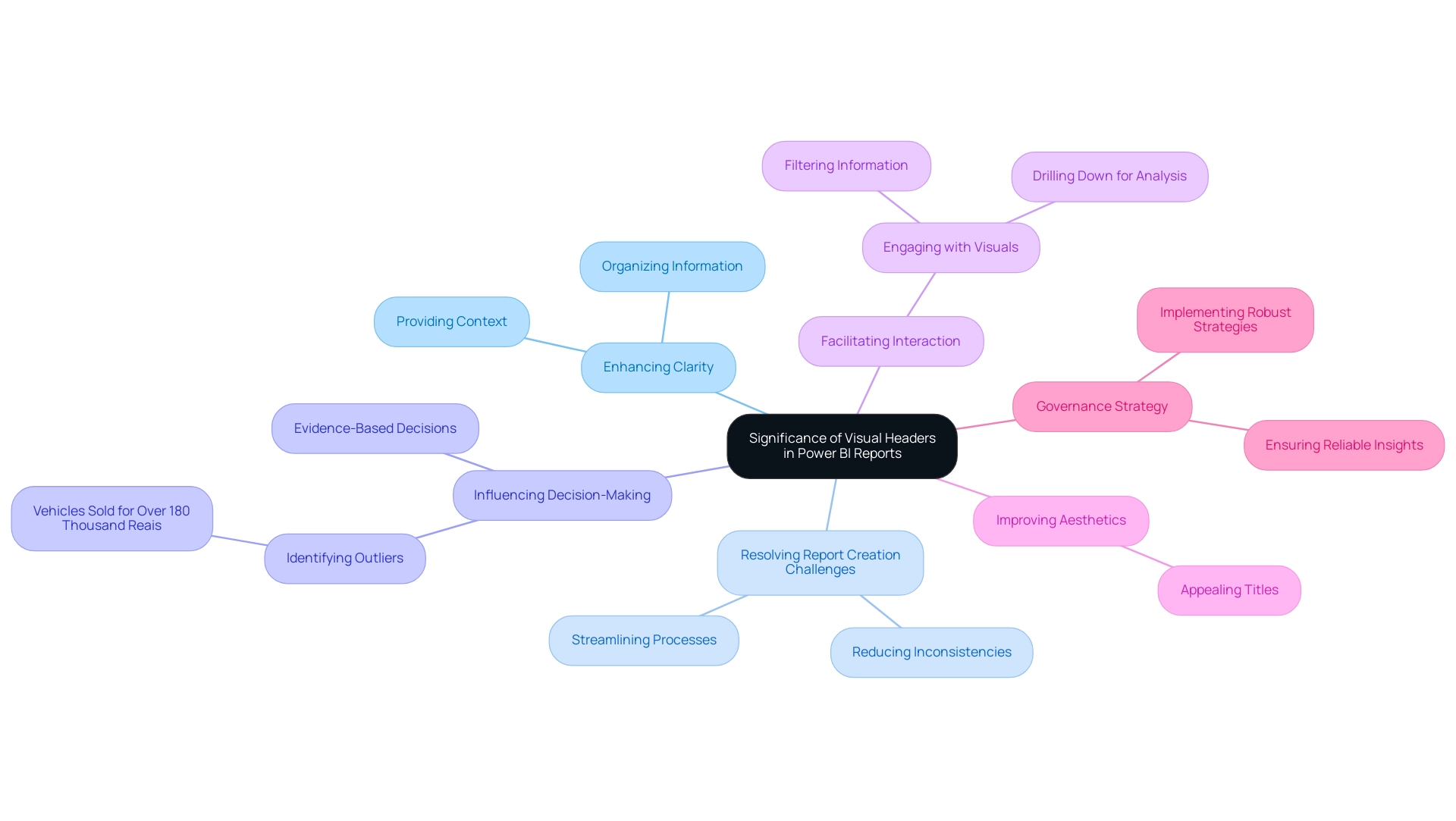
Visual titles are essential for enhancing clarity in Power BI reports, particularly in addressing common challenges such as prolonged report creation and inconsistencies due to a lack of governance strategy. By providing context and organizing information, they help stakeholders grasp key insights, effectively resolving the issue of accessing information without clear guidance on subsequent actions. This clarity is crucial in data-rich environments, significantly influencing decision-making, such as identifying outliers, including vehicles sold for over 180 thousand Reais.
Furthermore, visual titles facilitate interaction by indicating how to engage with the visuals, whether through filtering information or drilling down for deeper analysis, thereby enhancing actionable guidance. Douglas Rocha, a data science enthusiast, underscores the platform’s versatility, stating, “You can perform statistics in Power BI without DAX,” which emphasizes the importance of well-structured titles in fostering interaction. An appealing title not only clarifies information but also enhances the overall aesthetics of the reports.
For example, the case study titled ‘Dynamic Visuals Based on Slicer Selections‘ demonstrates how dynamic visuals in Power BI can adapt to user input, thereby improving report interactivity. As a result, effective visual headers in Power BI boost user engagement and contribute to a more interactive and insightful reporting experience, ultimately enabling better evidence-based decisions while leveraging the advantages of comprehensive management and seamless information integration. By implementing a robust governance strategy, organizations can further reduce inconsistencies, ensuring that insights derived from Power BI dashboards are both reliable and actionable.
2. Key Components of Effective Visual Headers
-
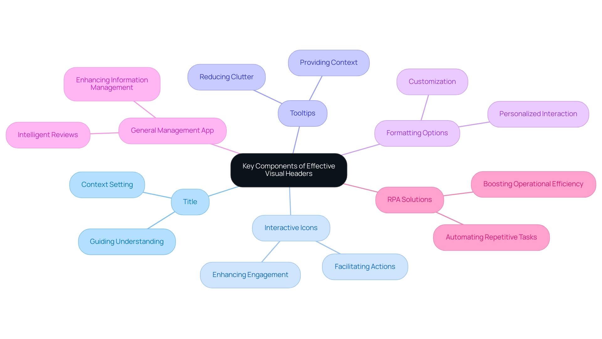
Title: Clearly articulating what the visual represents is essential. A well-defined title in the visual header of Power BI sets the context and guides the viewer’s understanding, ensuring they grasp the purpose of the visual at a glance. As Kelsey Miller states, “Information is playing an increasingly important role in the marketplace today, and information literacy is the first step in understanding how analytics can be utilized in business.” This highlights the effectiveness of the visual header in enhancing information literacy.
-
Interactive Icons: Incorporating icons that facilitate actions such as filtering, exporting, or drilling down enriches the report’s interactivity. These icons empower individuals to engage directly with the data, making navigation intuitive and seamless. Considering that 91% of consumers prefer visuals over plain text, these interactive components are crucial for improving experience and operational efficiency, especially when combined with Power BI’s streamlined reporting features.
-
Tooltips: Effective tooltips provide valuable context by offering additional information when users hover over specific elements. This feature enhances the overall experience, allowing for deeper insights without cluttering the visual. The case study titled ‘The Essential Nature of Visual Content’ illustrates that frequent use of visual content is vital for effective marketing strategies, underscoring the significance of tooltips in design, particularly in addressing inconsistencies in dashboards.
-
Formatting Options: Allowing users to customize their view—such as altering colors or layouts—fosters a more personalized interaction with the report. Flexibility in formatting, including the incorporation of a visual header in Power BI, caters to individual preferences and enhances overall comprehension, aligning with the increasing demand for literacy in today’s marketplace. This adaptability is key to maximizing the utility of Power BI’s reporting tools, ensuring informed decision-making that drives growth and innovation.
-
General Management App: The General Management App plays a pivotal role in enhancing information management and reporting. It provides extensive management tools and intelligent reviews, enabling users to make informed choices based on consistent analysis.
-
RPA Solutions: Integrating RPA solutions can significantly boost operational efficiency by automating repetitive tasks and addressing challenges related to data extraction and reporting. This synergy between RPA and Power BI enhances the ability to leverage insights effectively, driving business growth.
3. Step-by-Step Guide to Designing Visual Headers
-
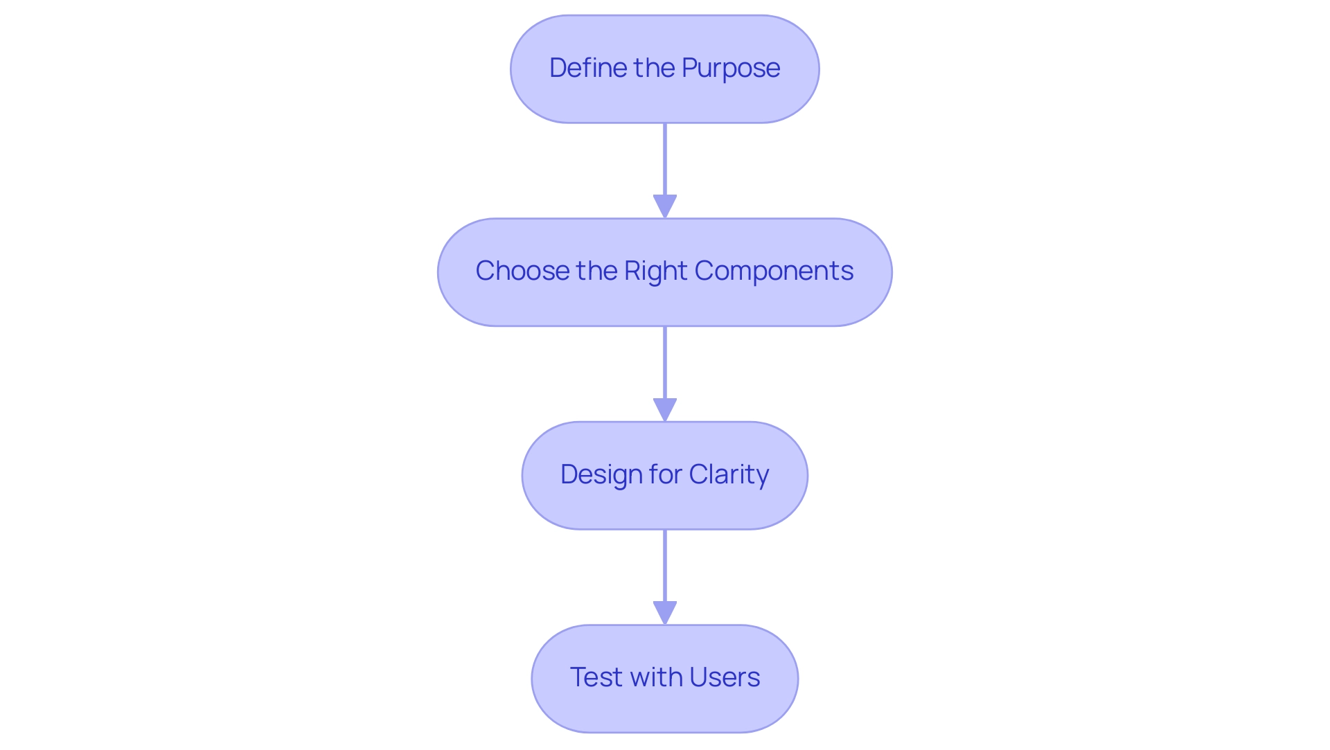
Define the Purpose: Begin by clarifying the information your visual title must convey, ensuring alignment with your operational efficiency goals. A well-defined purpose serves as a guiding element, directing attention to key insights that can drive data-driven decisions. With 39% of Americans regularly forgetting basic details in their daily lives, clarity in the visual header of Power BI becomes crucial for aiding memory and comprehension, ultimately supporting your operational strategies powered by Robotic Process Automation (RPA). RPA not only streamlines these processes but also significantly reduces errors, allowing your team to focus on more strategic, value-adding work.
-
Choose the Right Components: Select titles, icons, and tooltips that effectively cater to needs. Components should be intuitive and relevant, facilitating a seamless experience that enhances information interpretation and operational efficiency. Consider the context in which the data will be viewed to enrich comprehension and engagement, particularly in a landscape where leveraging RPA can lead to significant improvements in productivity and resource management. By automating repetitive tasks, RPA alleviates the burden on your team, enabling them to concentrate on high-impact initiatives.
-
Design for Clarity: Utilize clear fonts and color schemes that enhance readability. A clean design not only improves visual appeal but also aids in quick information retrieval, which is critical when managing automated workflows. Strive for a balance between aesthetic elements and functional clarity in the visual header of Power BI to ensure individuals can easily navigate the content. As Adrian G. states, ‘If you’re looking for improvements to your CRO campaigns, this tool is for you,’ underscoring the importance of effective tools in operational efficiency, particularly when powered by Business Intelligence and RPA.
-
Test with Users: Solicit feedback from users regarding the title’s effectiveness. Conduct usability testing to gather insights on how well the top section communicates its intended message. Be prepared to make adjustments based on this feedback to refine the design further, ensuring it effectively meets your audience’s needs. Additionally, consider the case study on cleaning and validating data; ensuring data precision is essential for deriving correct conclusions in documents, highlighting the necessity for effective visual labels that aid strategic decision-making and operational growth. Addressing the challenges posed by manual, repetitive tasks is vital for maximizing the benefits of RPA in your organization.
4. Common Mistakes in Visual Header Design and How to Avoid Them
-
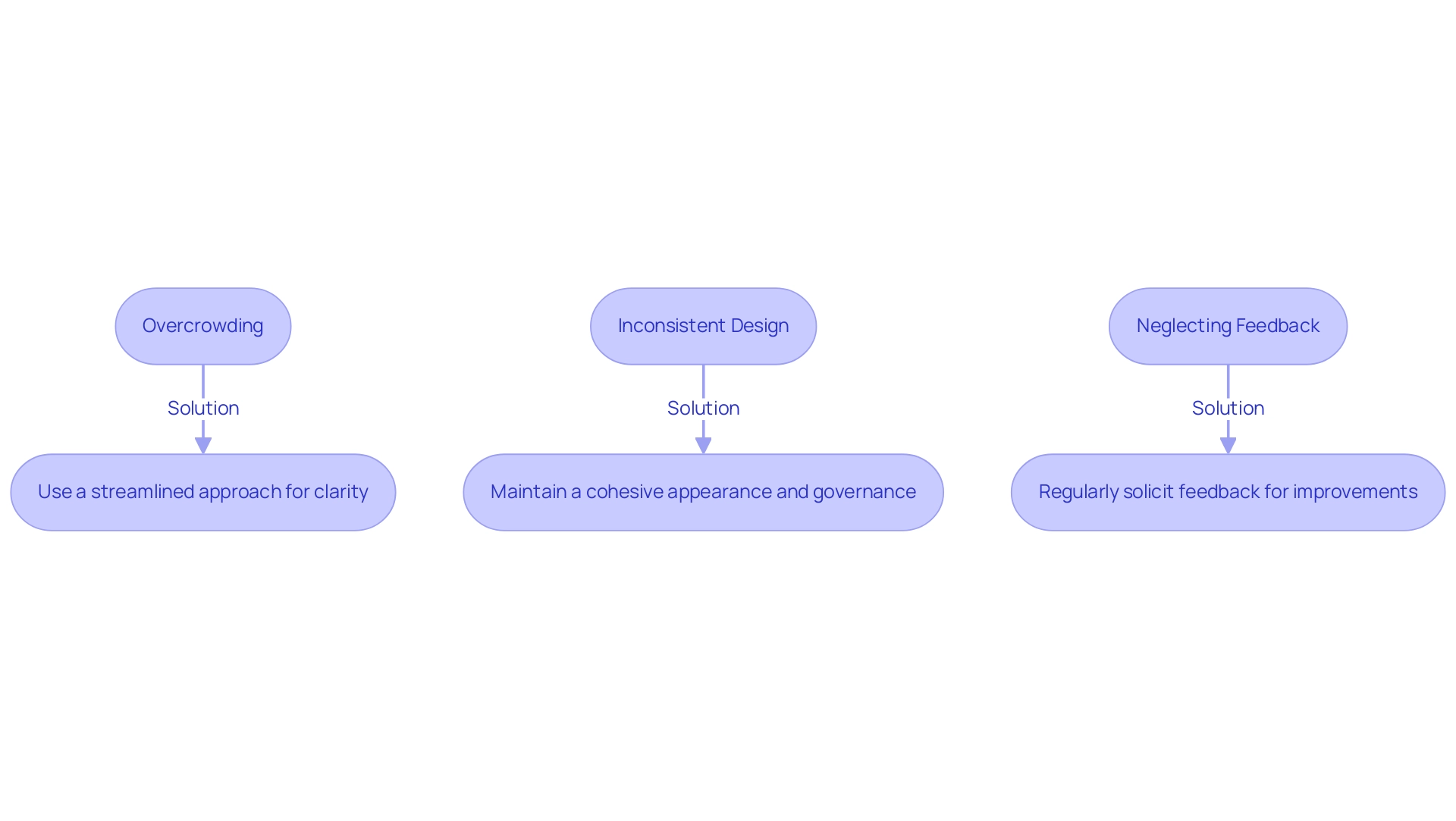
Overcrowding: Avoid cramming excessive information into the visual header of your Power BI reports. Overcrowding can significantly hinder user comprehension; studies indicate that users may overlook up to 70% of critical information in cluttered interfaces. A streamlined approach enhances readability and fosters effective data interpretation. This is particularly vital in the context of time-consuming document creation, where clarity is essential for facilitating actionable insights. As Bojan Janjanin, a recognized authority in design, asserts,
A healthy principle is to use colors sparingly—this principle applies equally to written content in titles. Employing relatable language instead of jargon can further enhance audience engagement and understanding, making it easier for Directors of Operations Efficiency to grasp the insights presented. -
Inconsistent Design: Consistency in design is paramount across all visuals within a document. Inconsistent headers can lead to misunderstandings and disrupt the flow of information, especially in documents where inconsistencies arise from a lack of governance strategy. By maintaining a cohesive appearance throughout your Power BI presentations, including a strong visual header, and emphasizing governance strategies, you enhance the experience for individuals and facilitate easier navigation. This principle supports a more intuitive understanding of the data presented and helps mitigate the mistrust that can stem from poorly governed data. Moreover, ensuring that documents provide clear, actionable guidance is crucial for empowering individuals to make informed decisions based on the data.
-
Neglecting Feedback: Regularly soliciting feedback from individuals is vital for identifying areas needing enhancement. Engaging with individuals reveals shared challenges, such as frustrations with ambiguous instructions in documents, and lays the groundwork for continuous improvements. By integrating feedback, you can refine your report titles to better align with their requirements and preferences, ultimately resulting in a more impactful presentation of your data. Furthermore, consider the case study titled
Not Considering the Sticky Navigation UX Issue on Mobile, which illustrates how responsive design can enhance user experience by employing different solutions for varying screen sizes, such as a smaller fixed navigation or a hamburger menu.
5. Incorporating User Feedback for Continuous Improvement in Header Design
-
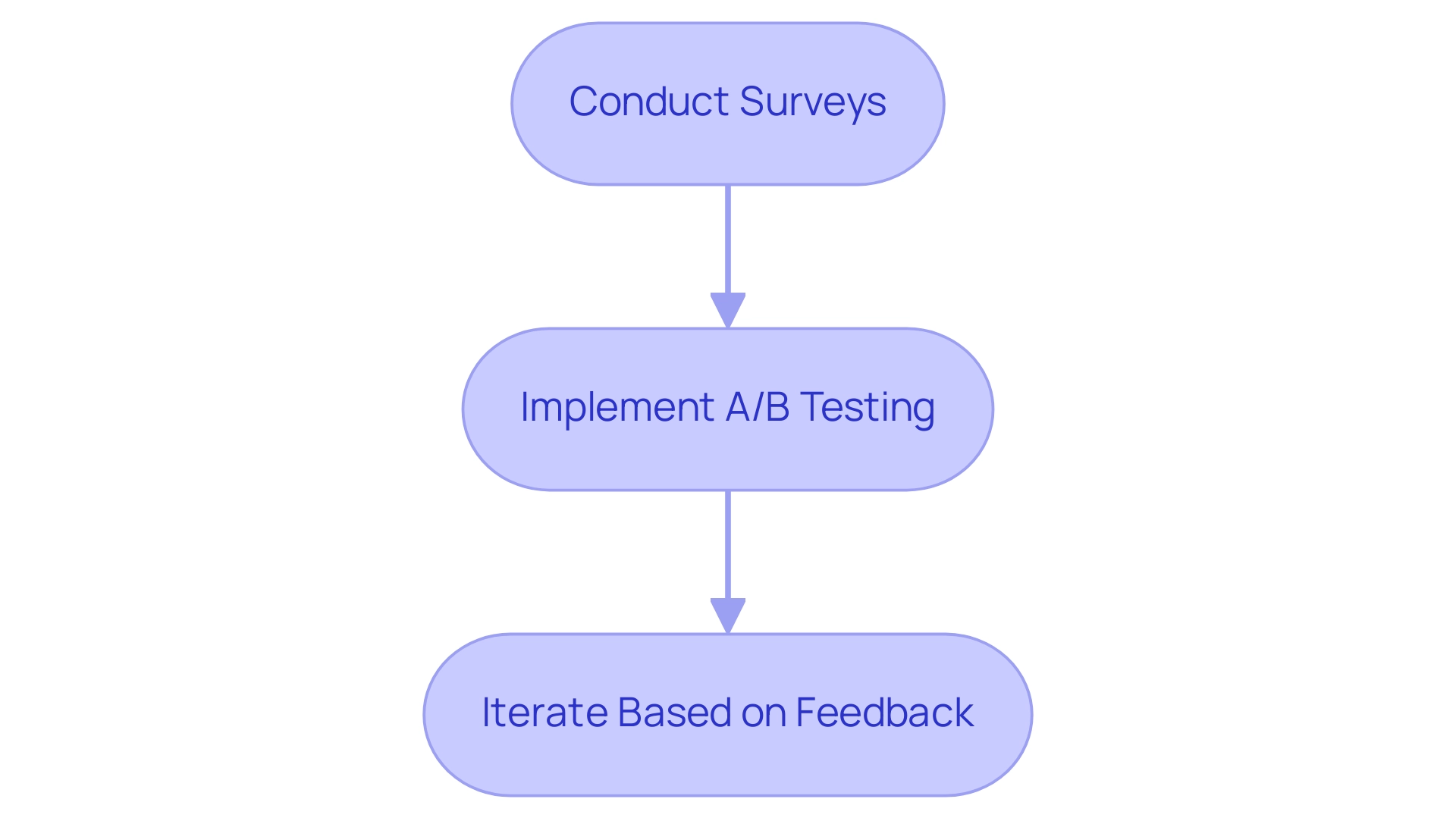
Conduct Surveys: Regular surveys are crucial for understanding user experiences and gathering insights on the usability of the visual header in Power BI. Personalized feedback requests significantly enhance engagement and relevance, leading to more thoughtful responses. By customizing these requests, organizations can identify specific enhancements that resonate with users. Moreover, sharing updates about changes made based on client feedback fosters trust and encourages ongoing engagement. This method not only addresses individual needs but also supports the broader objective of leveraging actionable insights from Power BI dashboards to drive operational efficiency. Additionally, implementing a governance strategy ensures data consistency across reports, thereby fostering greater trust in the insights derived, particularly when utilizing visual headers in Power BI.
-
Implement A/B Testing: A/B testing serves as an effective method for evaluating different header designs. By comparing performance metrics, teams can ascertain which styles resonate more with users, ensuring the chosen design maximizes engagement. For example, Spotify reported a 23% increase in active engagement after refining its algorithm based on user suggestions, highlighting the power of audience-driven design. This principle can be effectively applied to the visual headers in Power BI titles, enhancing user engagement while ensuring analyses deliver clear, actionable insights to stakeholders. Integrating RPA solutions can further streamline this process, automating repetitive tasks associated with report generation and allowing teams to concentrate on analysis.
-
Iterate Based on Feedback: Continuous improvement is vital in report design. Utilize the insights gathered from surveys and A/B testing to make informed adjustments to header designs. Sharing updates about changes made based on feedback builds trust and encourages ongoing engagement from users, akin to how Starbucks incorporated customer ideas into their product development, resulting in significant revenue growth. By integrating feedback into the design process, organizations can create more effective and accessible Power BI reports that feature visual headers, ultimately enhancing the ability to derive meaningful insights and address challenges related to data inconsistencies and time-consuming report creation. The combination of user feedback, iterative design, and RPA solutions can significantly elevate the operational efficiency of business intelligence efforts.
Conclusion
Effective visual headers are integral to optimizing Power BI reports, significantly enhancing user engagement and clarity. By addressing the common challenges of report creation and data inconsistencies, these headers serve as essential navigational tools that guide users toward critical insights. The article outlines the key components of effective visual headers, including:
- Clear titles
- Interactive icons
- Tooltips
- Customizable formatting options
All of these contribute to a more intuitive and informative reporting experience.
Designing visual headers with purpose and clarity is vital for fostering data literacy and ensuring that users can easily interpret and interact with the information presented. Common pitfalls such as overcrowding, inconsistent design, and neglecting user feedback can detract from the effectiveness of these headers. By avoiding these mistakes and focusing on user-centered design, organizations can create reports that not only convey information but also empower users to make informed decisions.
Incorporating user feedback through surveys and A/B testing is crucial for continuous improvement in header design. This iterative approach not only enhances usability but also strengthens the trust users place in the data presented. Ultimately, leveraging effective visual headers in Power BI is a strategic move that can lead to enhanced operational efficiency and more informed decision-making, driving businesses toward greater success in a data-driven world.

